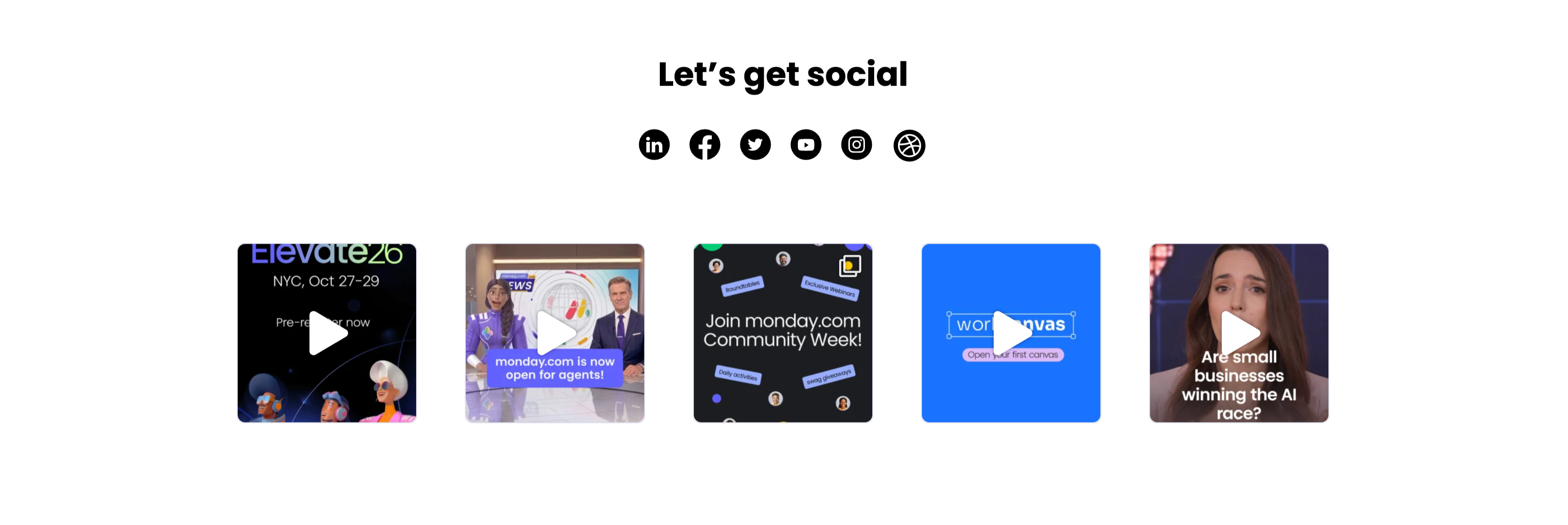
Let's Get Social Video Thumbnail Grid
Description
A social section headed by a centered bold ‘Let’s get social’ with a row of six round black social icons (LinkedIn, Facebook, Twitter, YouTube, Instagram and Dribbble) beneath it. Below sits a single row of five square video thumbnails, each with a white play-triangle overlay: an ‘Elevate26 — NYC, Oct 27–29 / Pre-register now’ event graphic with 3D characters, a news-desk clip captioned ‘monday.com is now open for agents!’, a dark ‘Join monday.com Community Week!’ promo, a bright blue ‘workcanvas — Open your first canvas’ card, and a talking-head clip asking ‘Are small businesses winning the AI race?’. The icon row plus playable video tiles invites the visitor to follow and watch, and the uniform square grid reads as a lightweight social feed.
Related
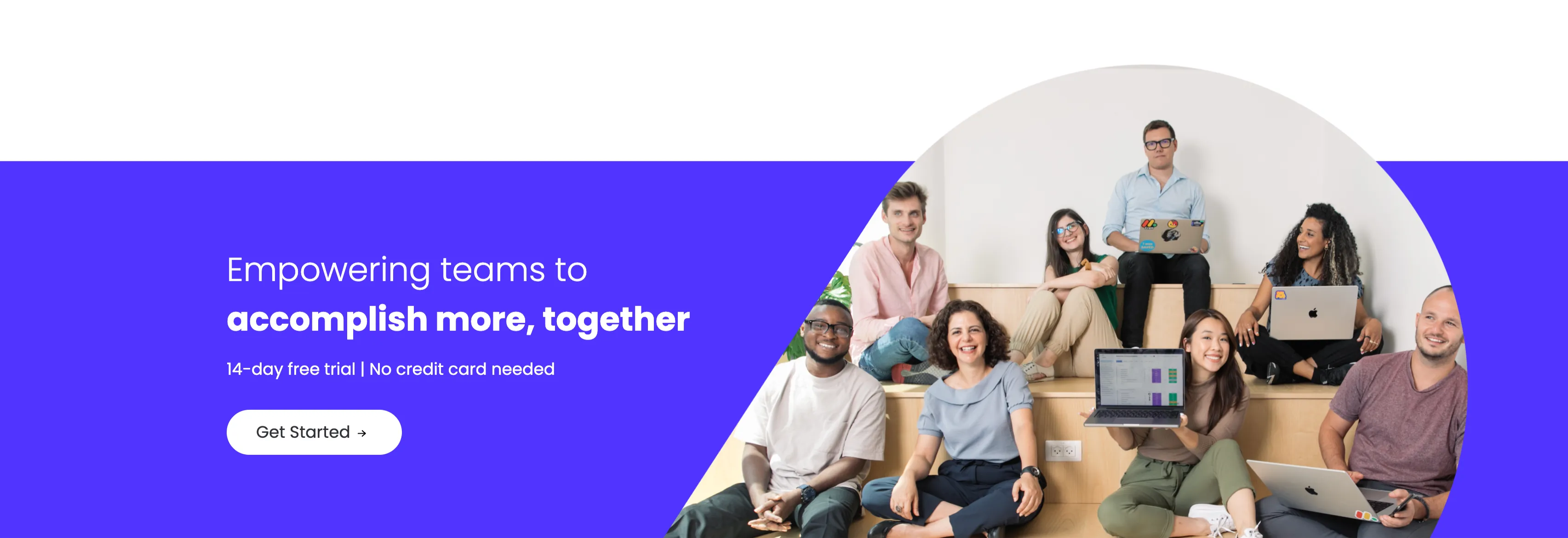
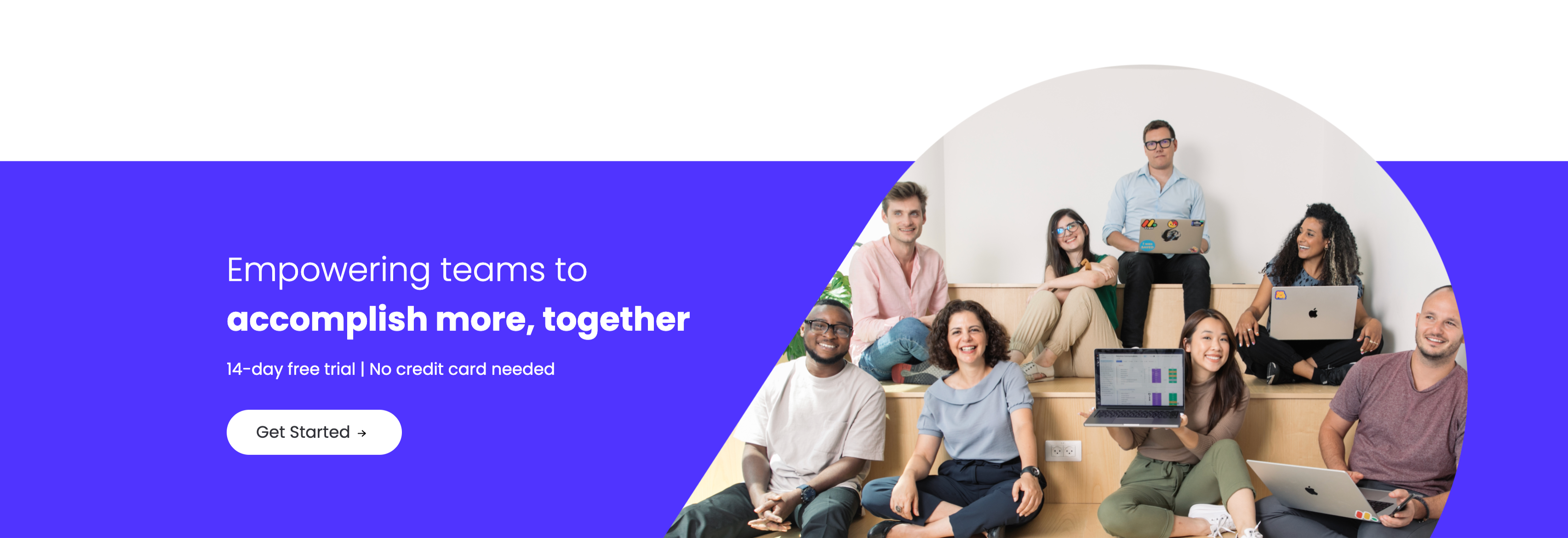
Empowering Teams Final Signup CTA
A closing sign-up call-to-action split between an indigo panel on the left and a large photo on the right. The left side stacks a two-line headline — a lighter 'Empowering teams to' over a bold 'accomplish more, together' in white — followed by the qualifier '14-day free trial | No credit card needed' and a white 'Get Started' pill button with an arrow. The right side is a circular-masked photograph of a diverse group of eight colleagues seated on tiered wooden steps, several holding laptops (one displaying a monday board), smiling toward the camera. The bold value headline, risk-reducing trial note and friendly team photo combine into a warm, low-friction final conversion prompt.
Monday ↗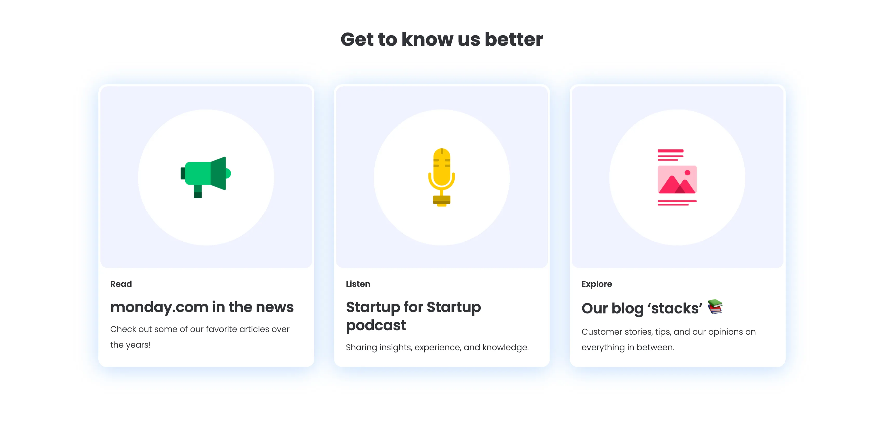
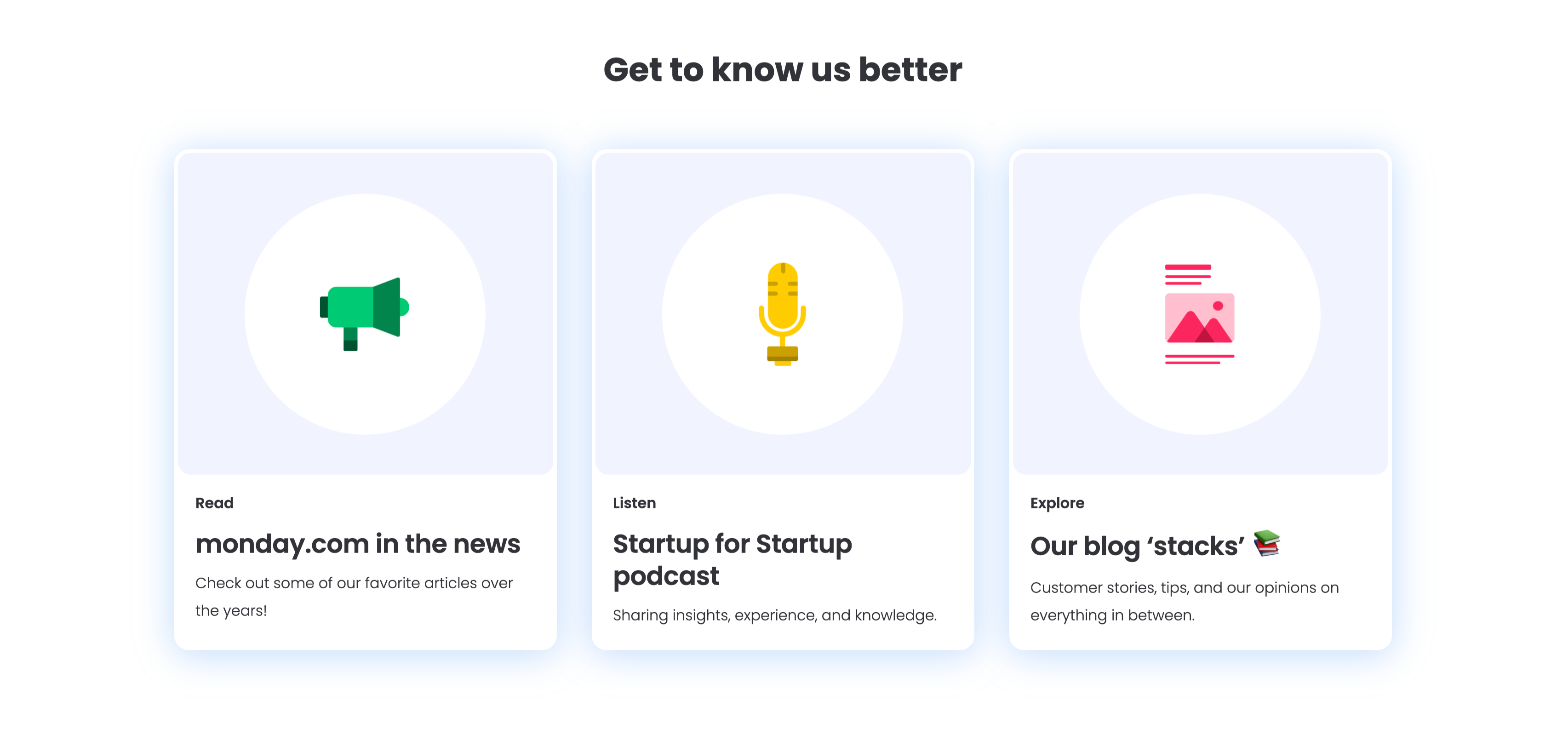
Get To Know Us Better Resource Cards
A three-up resource section under a centered bold 'Get to know us better' heading, with a soft blue glow behind the cards. Each of the three white rounded cards pairs a large circular flat icon with a small category label, a bold title and one line of copy: a green megaphone for 'Read — monday.com in the news' ('Check out some of our favorite articles over the years!'), a yellow microphone for 'Listen — Startup for Startup podcast' ('Sharing insights, experience, and knowledge.'), and a pink image icon for 'Explore — Our blog stacks' ('Customer stories, tips, and our opinions on everything in between.'). The colourful icons and consistent Read/Listen/Explore labelling make the content channels instantly distinguishable.
Monday ↗
Together We Can Impact Careers CTA Band
A careers call-to-action set in a wide dark-indigo rounded band. On the left, a two-line headline mixes weights — a bold 'Together we can impact' leading into a lighter 'how teams work across the globe' — in white type. Directly beneath sits a white pill button labelled 'Join our team!' with a right arrow. The right side of the band is pure decoration: overlapping brighter-indigo circular and arc shapes with a small glowing dot, adding depth without imagery or copy. The deep background, single bold headline and lone button make the recruiting ask focused and unmissable.
Monday ↗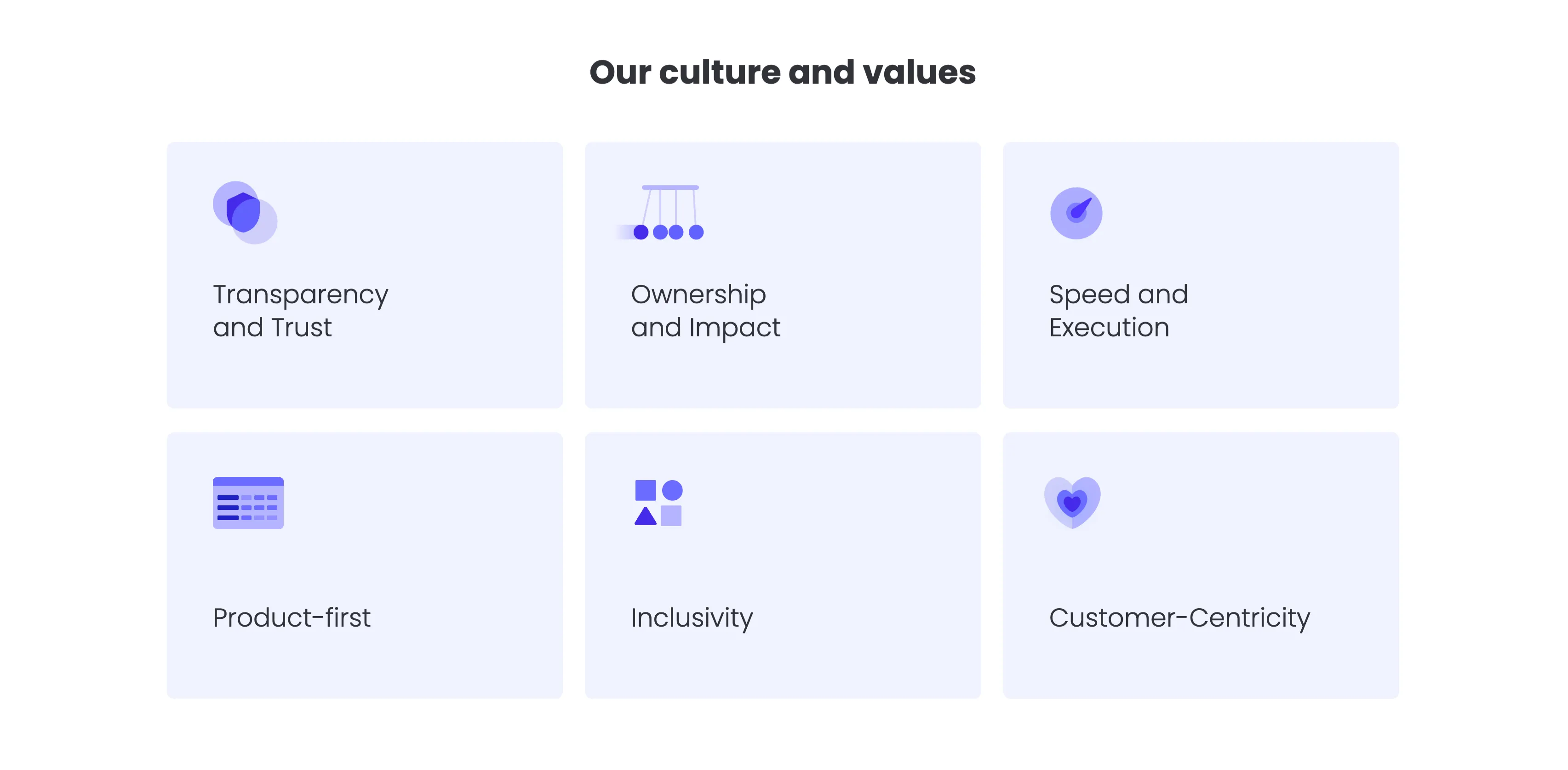
Our Culture And Values Icon Grid
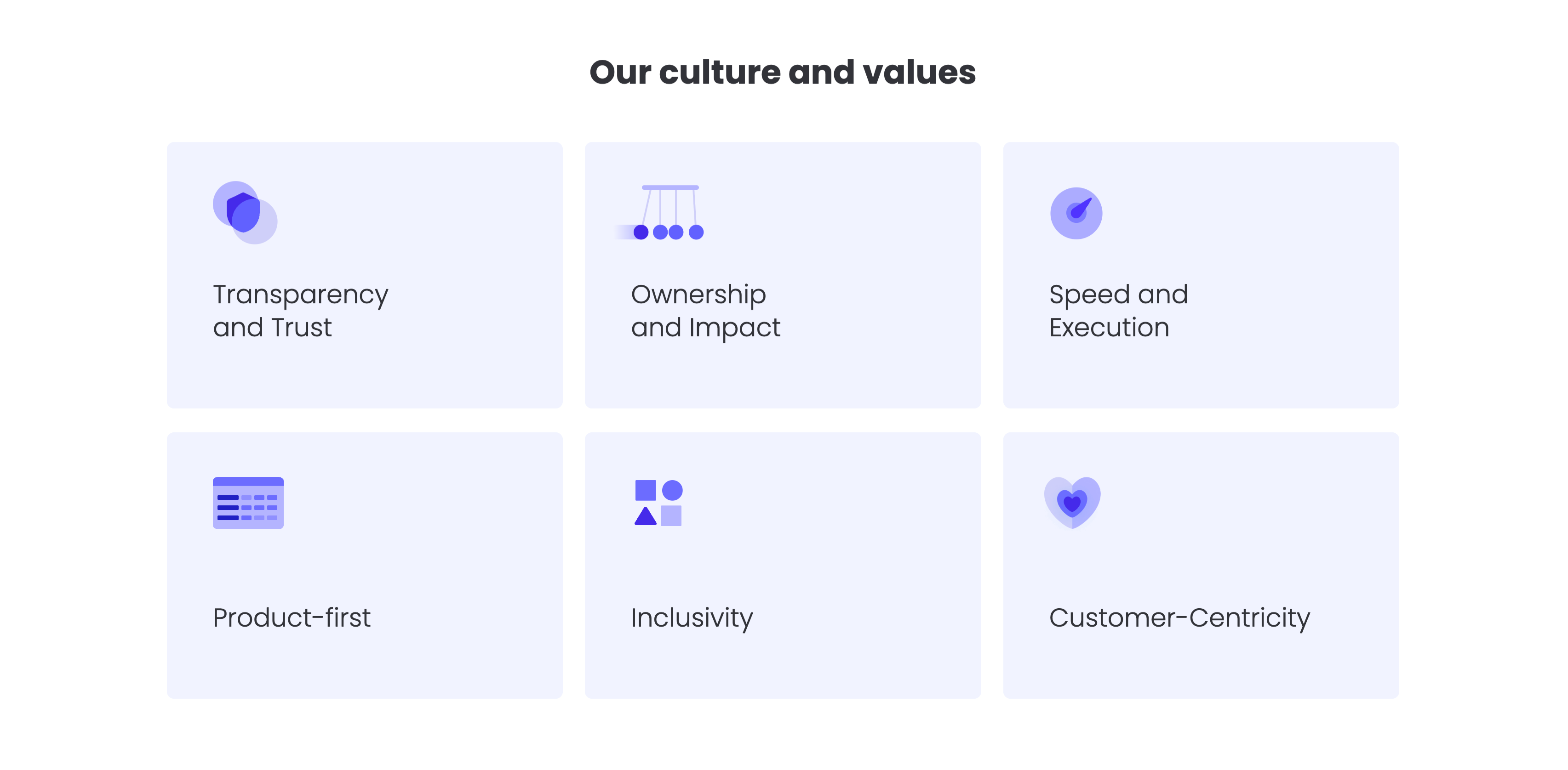
A values grid headed by a centered bold 'Our culture and values' title. Six pale-lavender rounded cards are arranged in a three-column by two-row grid, each holding a soft indigo illustrative icon in its upper-left corner and a value label below: 'Transparency and Trust', 'Ownership and Impact' and 'Speed and Execution' on the top row; 'Product-first', 'Inclusivity' and 'Customer-Centricity' on the bottom. The icons — a shield, a Newton's cradle, a speed gauge, a table, stacked shapes and a heart — visually cue each value. The uniform card sizing, restrained lavender palette and even spacing make the values easy to scan as a set.
Monday ↗Similar gallery sections
Intrio Latest Projects Showcase
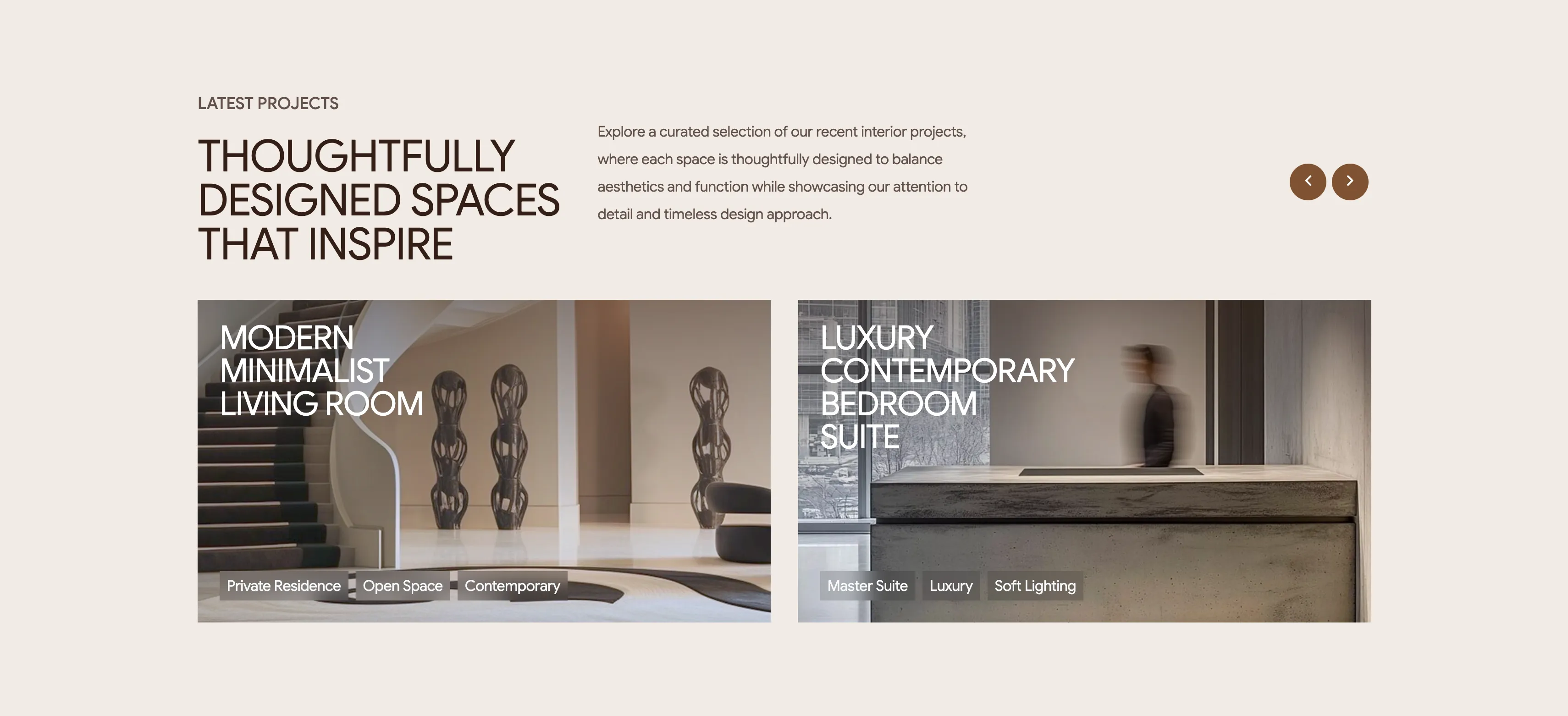
A latest-projects section on a pale background with a two-up row of wide project cards. The header stacks a 'LATEST PROJECTS' eyebrow over a large brown heading, 'THOUGHTFULLY DESIGNED SPACES THAT INSPIRE', a paragraph of intro copy to the right, and two circular bronze carousel arrows at the far right. Below, two landscape image cards sit side by side: the left shows a minimalist staircase-and-sculpture interior titled 'MODERN MINIMALIST LIVING ROOM', the right a concrete-and-glass space titled 'LUXURY CONTEMPORARY BEDROOM SUITE'. Each card overlays a white uppercase title on the upper-left and a row of small translucent tag pills along the bottom — 'Private Residence / Open Space / Contemporary' and 'Master Suite / Luxury / Soft Lighting' respectively. The arrows imply the two visible projects are the first of a longer scrollable set. Large photography with overlaid text and category chips makes the portfolio feel curated and browsable.
Madebydesignesia ↗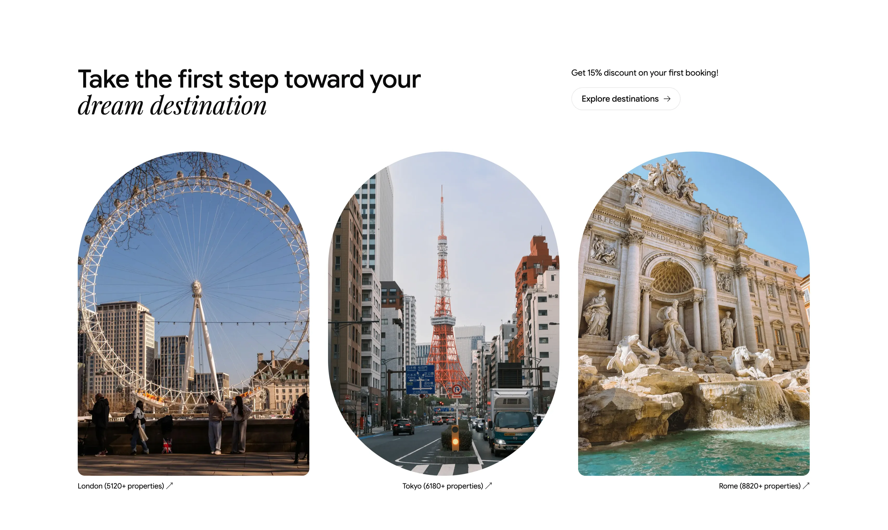
Dream Destination Trio With Arched Photos
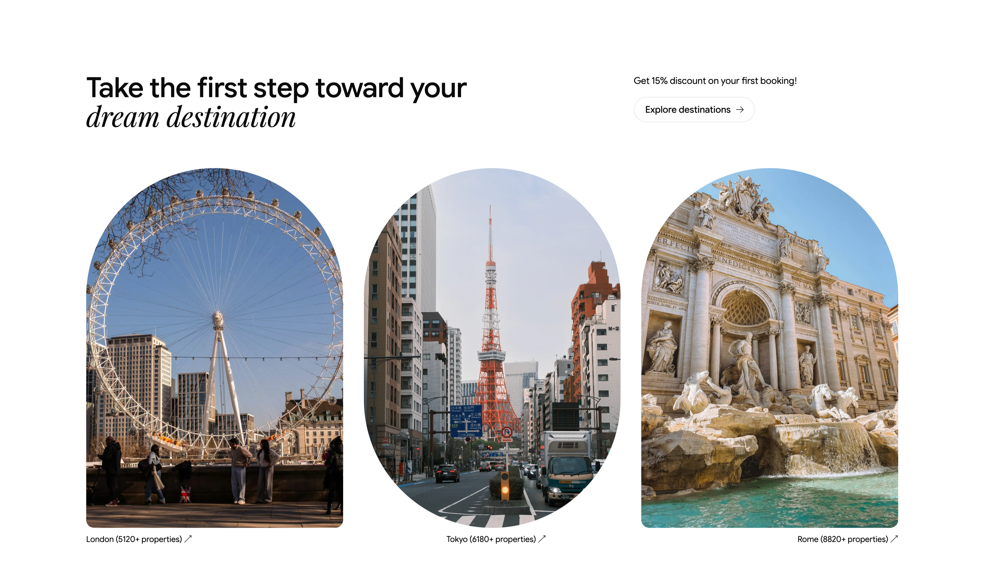
A clean white section that opens with a left-aligned heading, 'Take the first step toward your dream destination', where 'dream destination' is set in italic serif, balanced at upper-right by a promo line, 'Get 15% discount on your first booking!', above a pill button labeled 'Explore destinations →'. Below sits a three-up row of tall arch-topped photographs, each a city scene — the London Eye, Tokyo Tower, and the Trevi Fountain in Rome. Each image carries a small caption with a property count and an up-right arrow: 'London (5120+ properties)', 'Tokyo (6180+ properties)', and 'Rome (8820+ properties)'. The generous whitespace, soft arch framing, and serif accent give the destination gallery a refined, gallery-like presentation.
Ceepii-nextjs-template ↗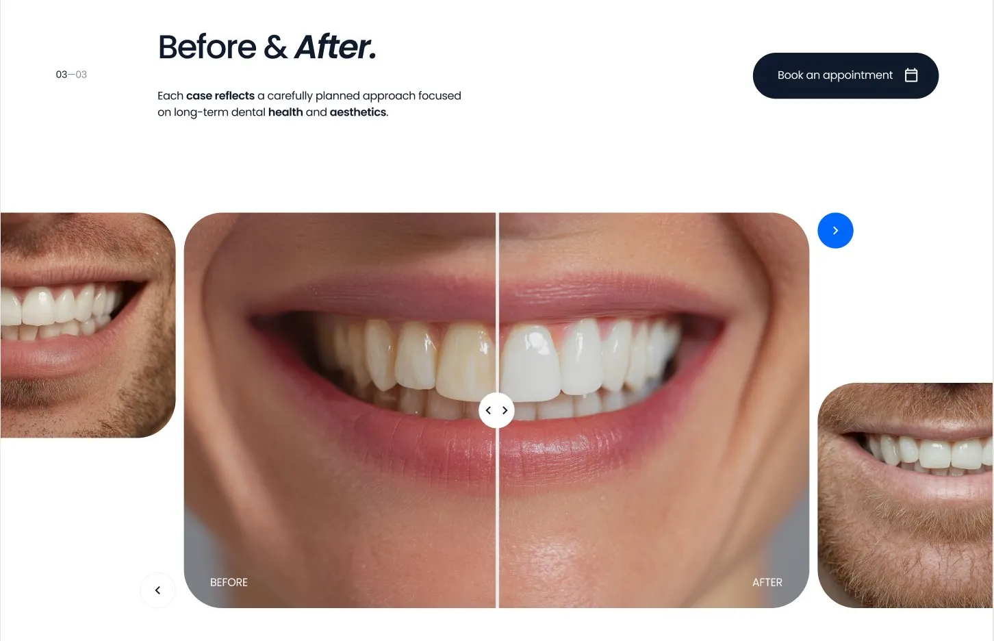
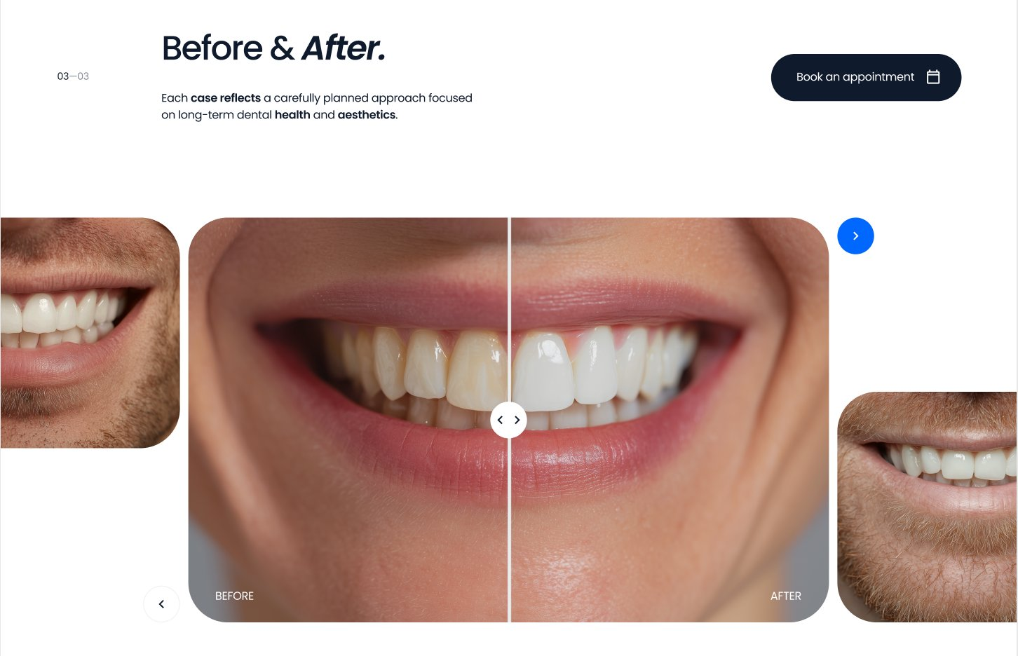
Before And After Smile Comparison
A before-and-after section with a heading, intro, and booking CTA above a split-slider smile comparison flanked by additional result thumbnails.
Behance ↗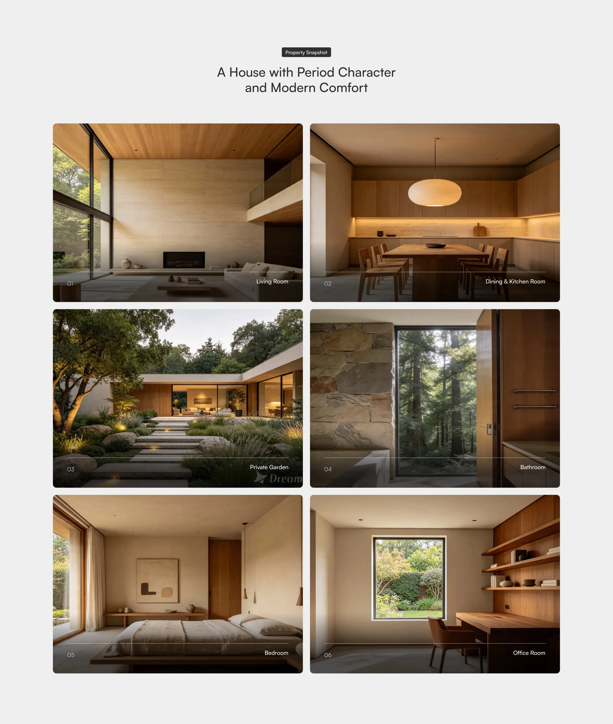
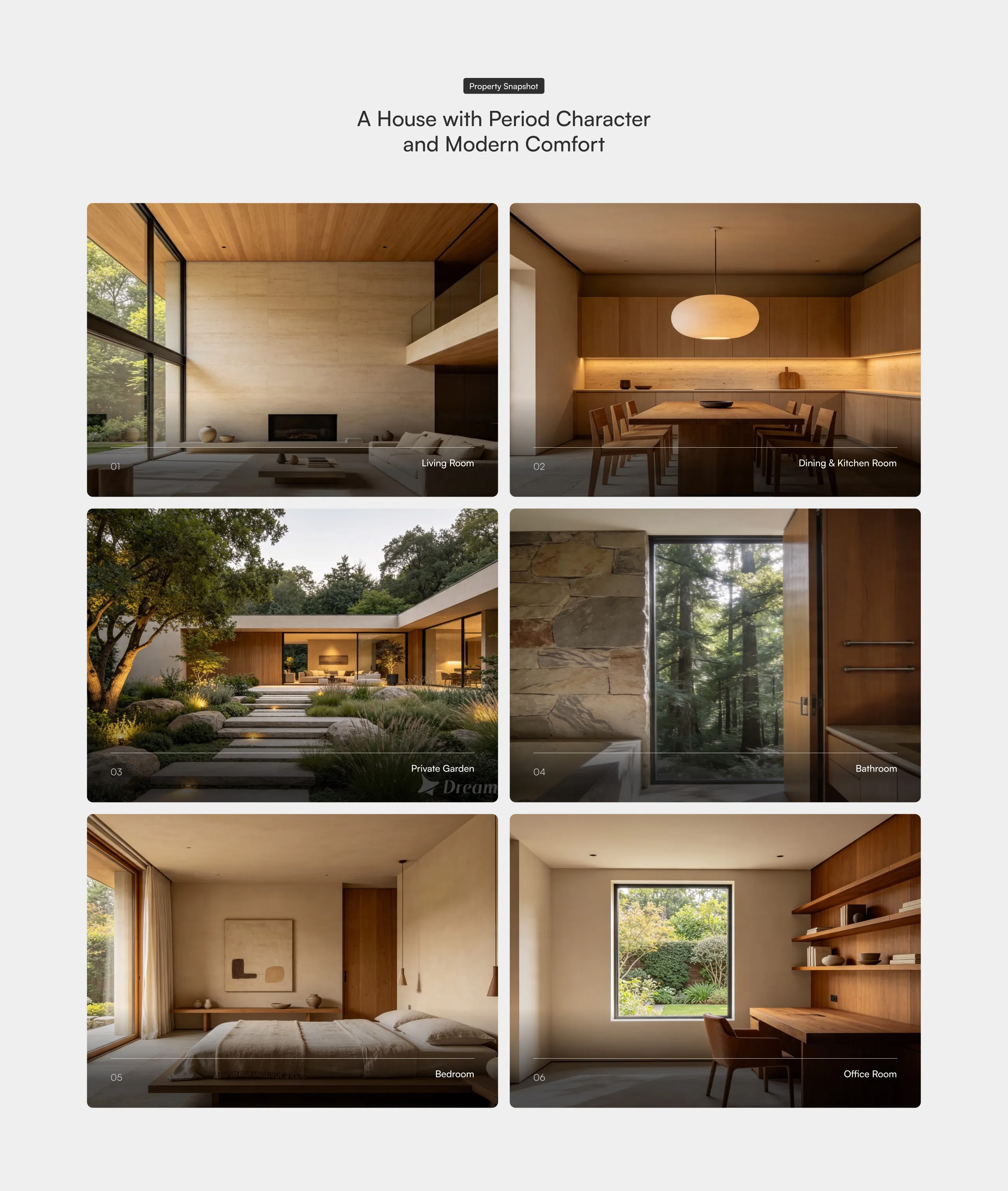
Avenor Image Cards Grid
A two-column grid of large image cards showcasing rooms or spaces, each with a numbered index and a caption label overlaid in the corner, beneath a centred badge label and headline. Best used on property or portfolio pages to present a visual tour of key spaces.
Dribbble ↗