Best Website Section Designs for Inspiration
Take Your Startup Dark Footer With CTA
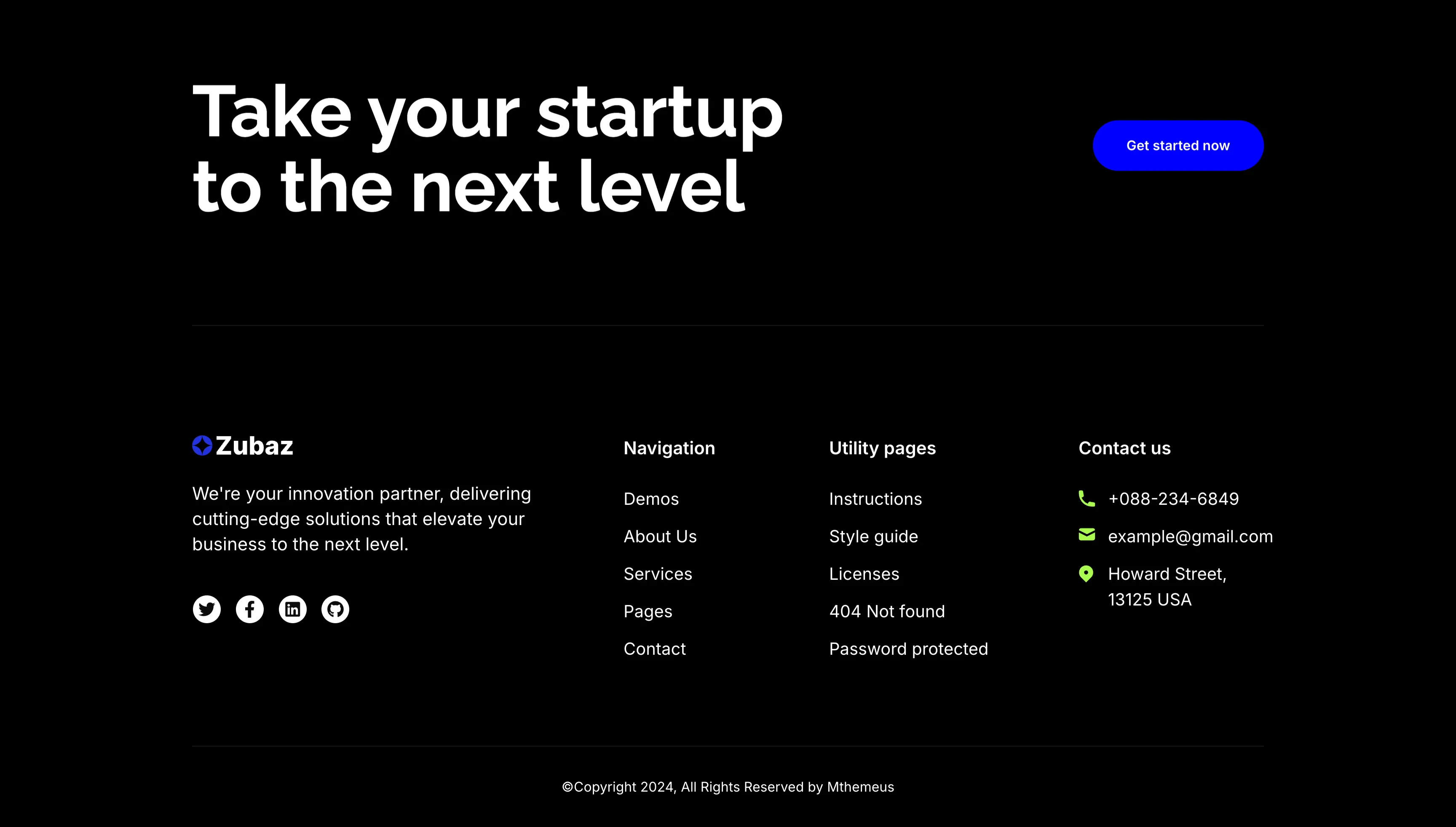
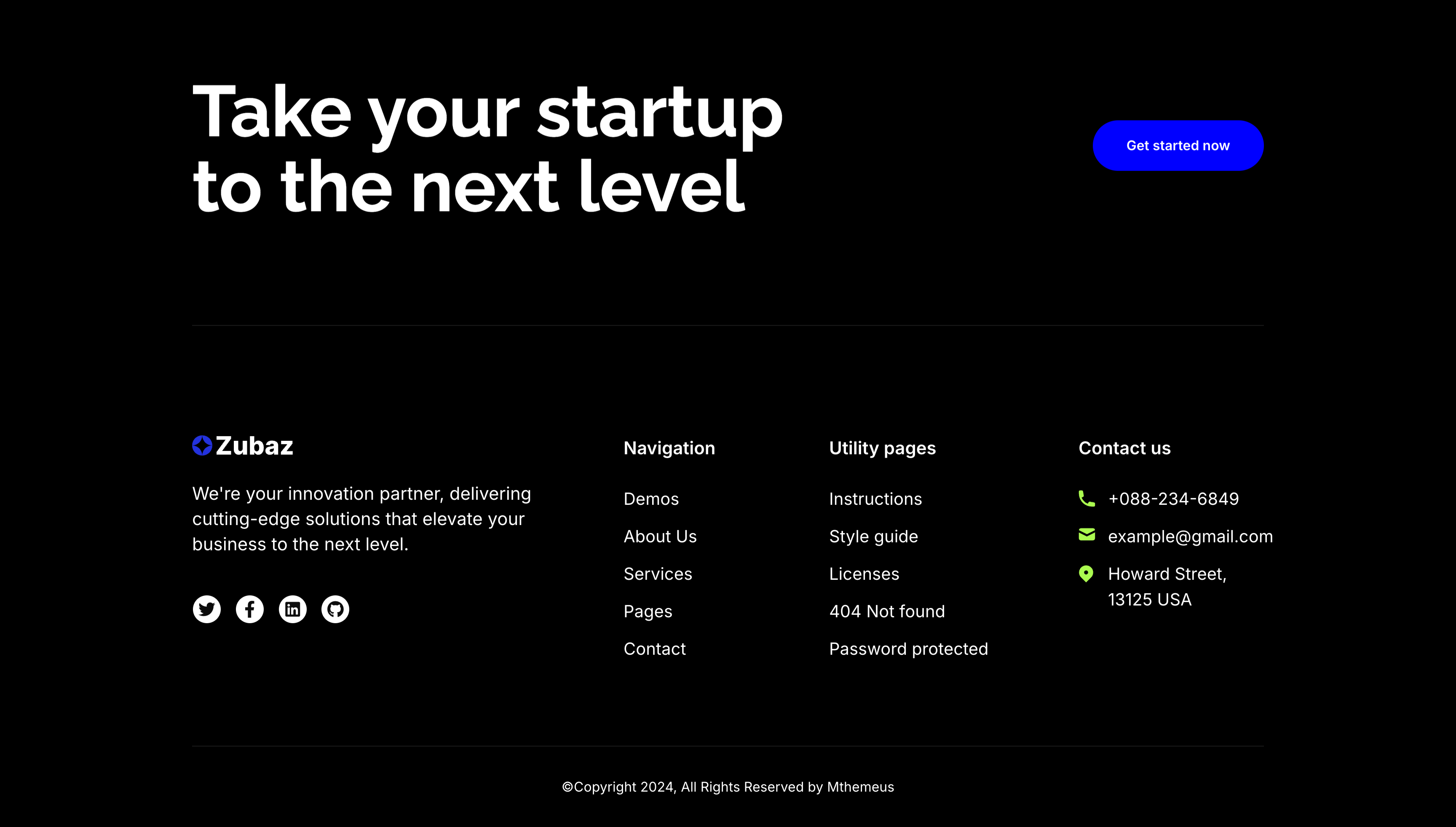
The dark Zubaz footer on a solid black background, opening with a call-to-action band: an oversized white 'Take your startup to the next level' headline on the left and a solid blue 'Get started now' button on the right, above a hairline divider. Below, the footer proper shows the Zubaz logo with a short blurb and a row of Twitter, Facebook, LinkedIn and GitHub icons, beside grouped link columns — 'Navigation' (Demos, About Us, Services, Pages, Contact), 'Utility pages' (Instructions, Style guide, Licenses, 404 Not found, Password protected) and a 'Contact us' column with a phone, email and Howard Street address. A centered '(c)Copyright 2024, All Rights Reserved by Mthemeus' line closes it. Pairing a bold recruiting CTA with the full footer makes it a strong page-closing block.
Zubuz ↗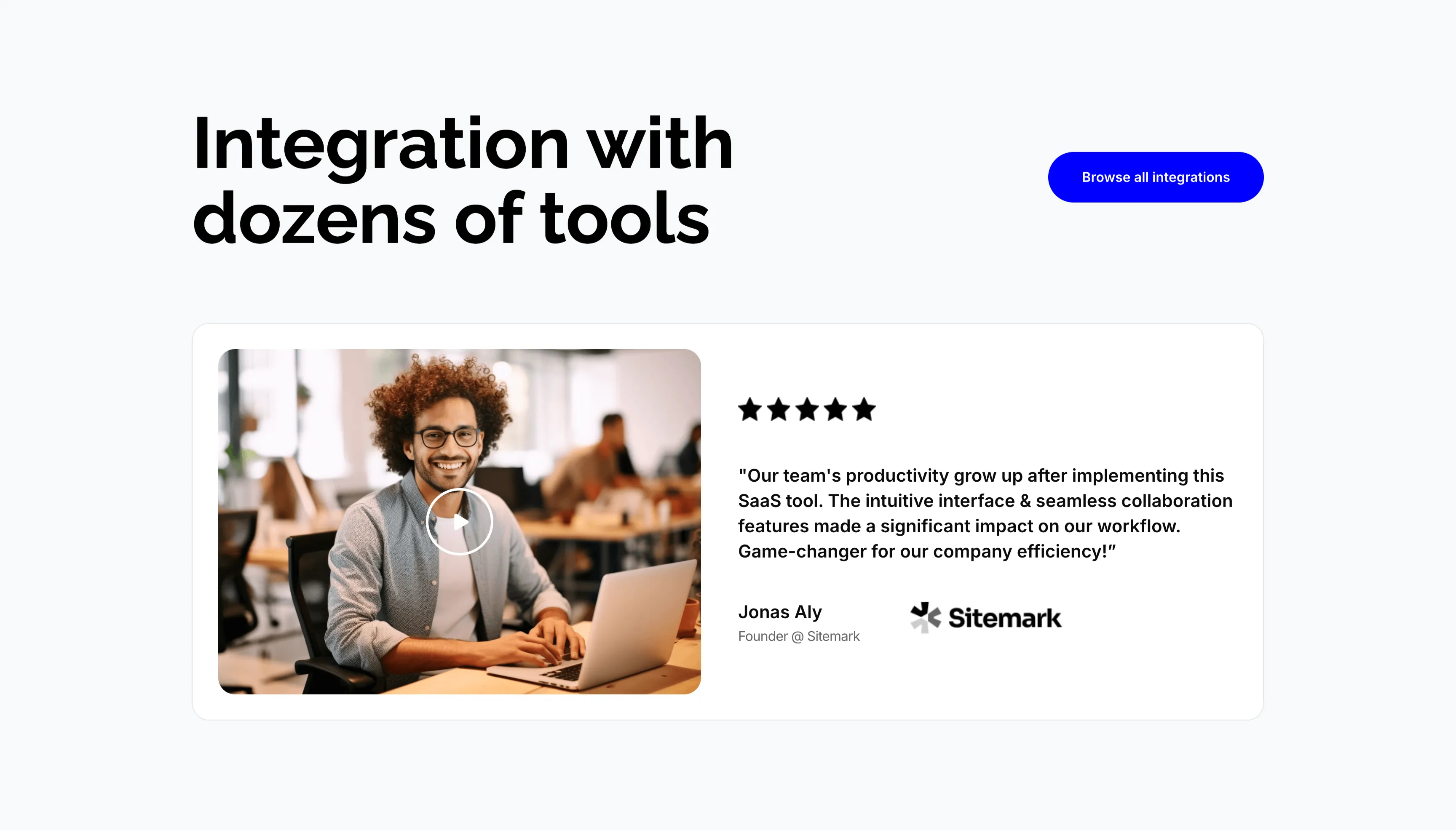
Integration Video Testimonial Card
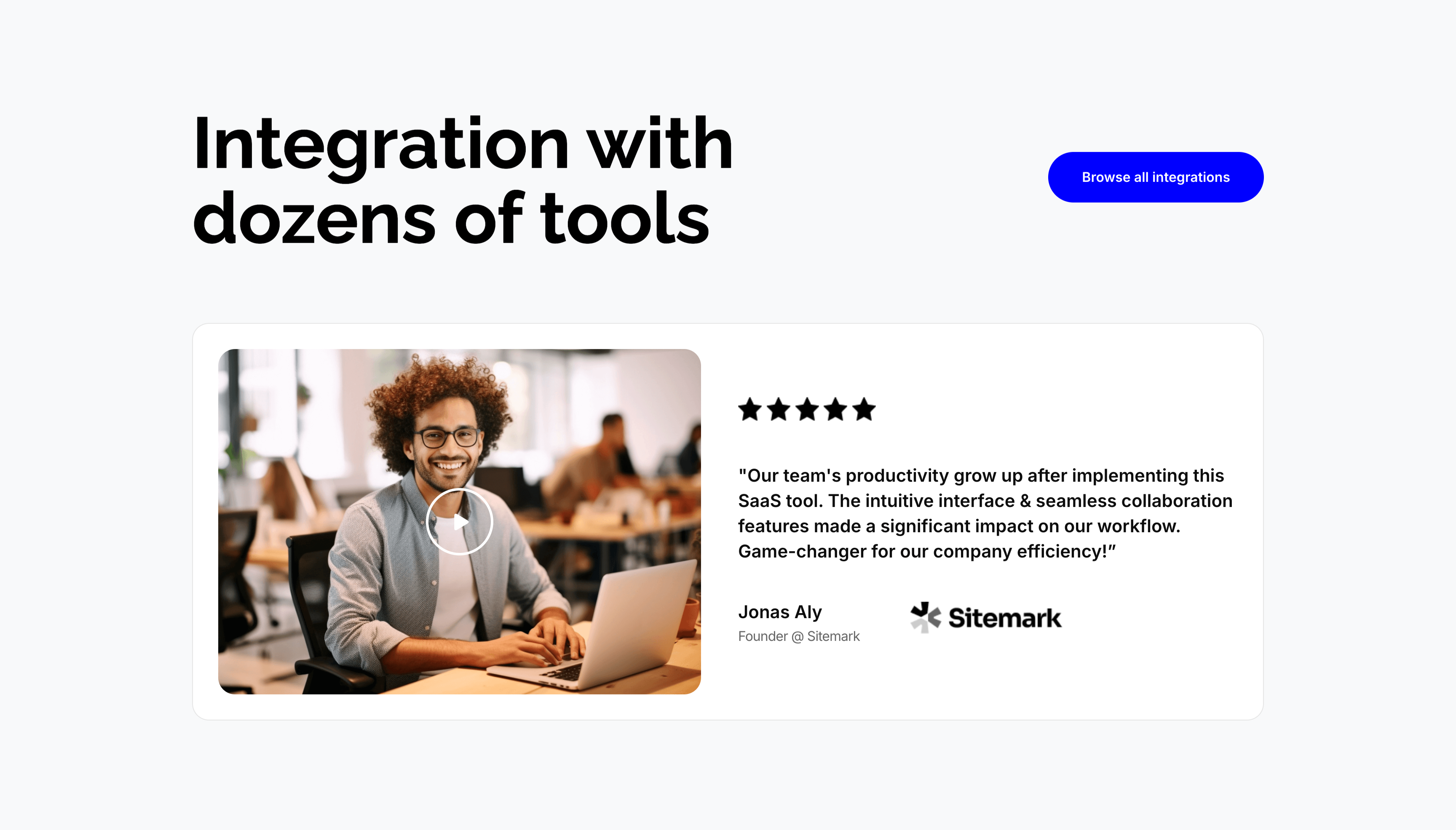
A section on a pale gray background pairing an integrations header with a video testimonial. The top places an oversized 'Integration with dozens of tools' heading on the left and a solid blue 'Browse all integrations' button on the right. Below sits a wide white card split in two: a left video thumbnail of a smiling man at a laptop with a circular play button, and a right panel showing five black stars, a bold quoted testimonial about team productivity growing after adopting the SaaS tool, and the attribution 'Jonas Aly, Founder @ Sitemark' beside the Sitemark logo. Combining a playable clip with a starred quote gives the endorsement both a face and a claim.
Zubuz ↗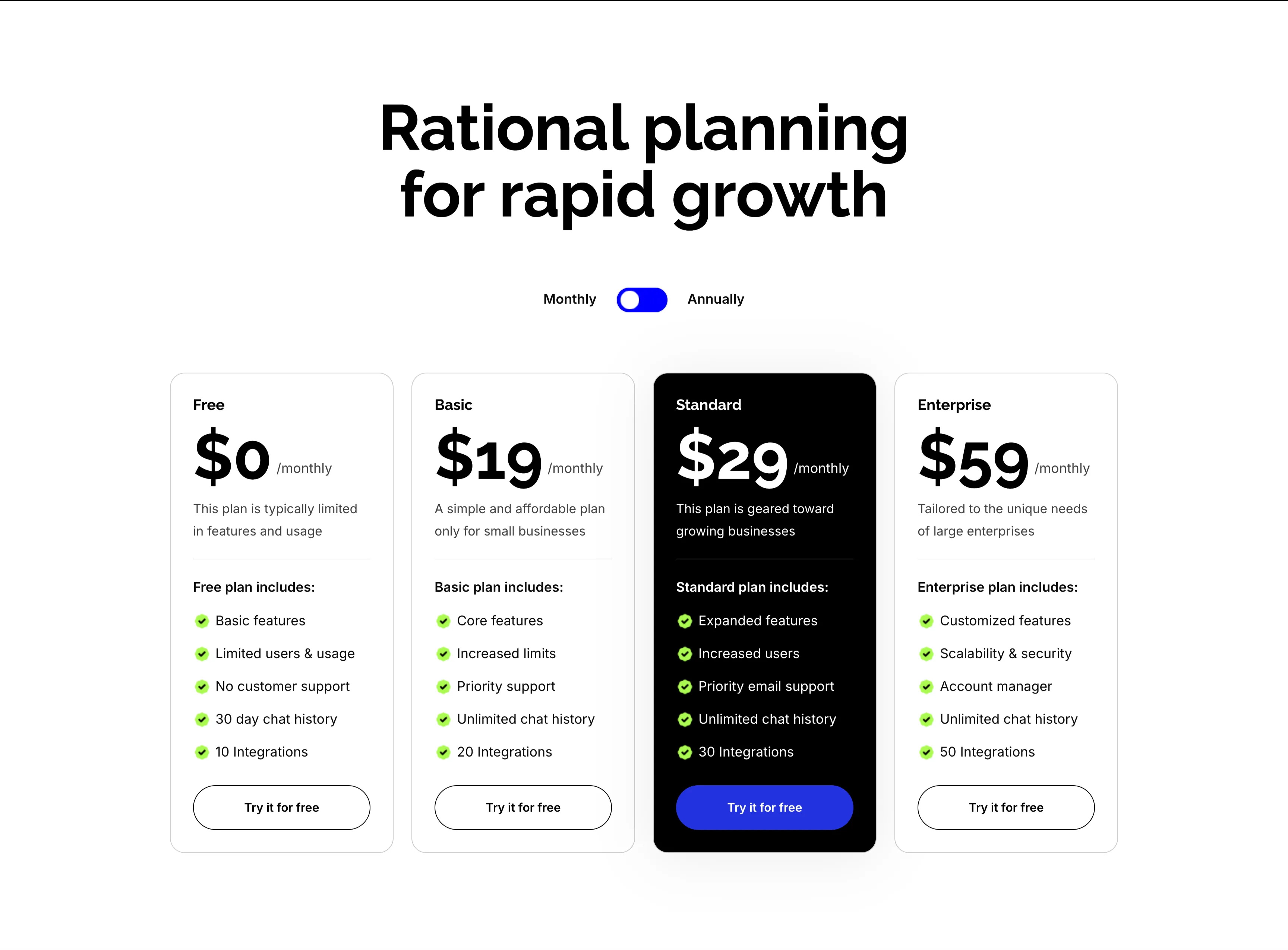
Rational Planning Four-Tier Pricing Cards
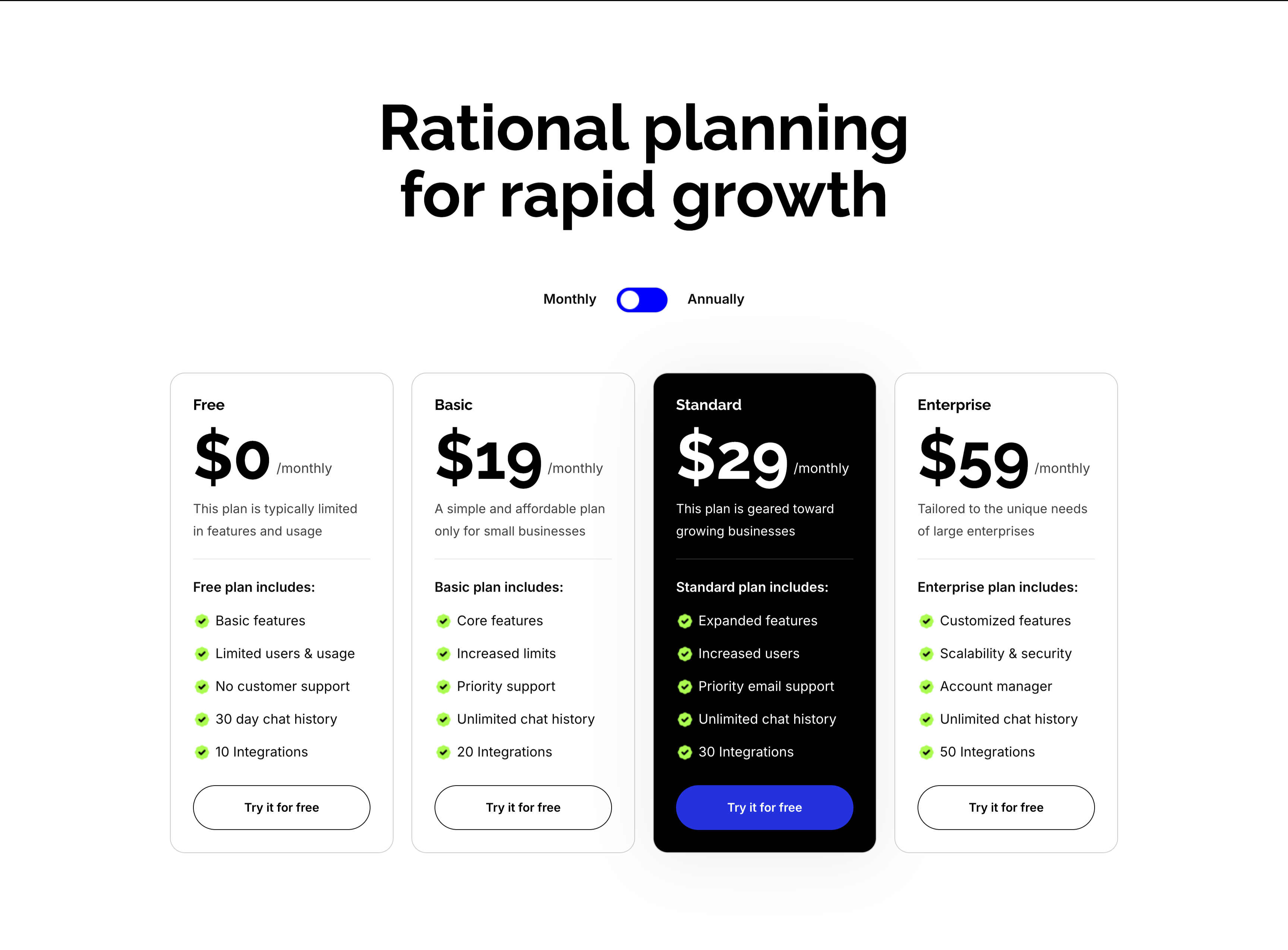
A four-tier pricing section on white under an oversized centered 'Rational planning for rapid growth' heading with a Monthly/Annually toggle. Four cards run in a row — Free ($0/monthly), Basic ($19/monthly), Standard ($29/monthly, elevated in a black card) and Enterprise ($59/monthly) — each pairing a large price and one-line description with a green-checkmarked feature list ('Basic features', 'Priority email support', 'Unlimited chat history', integration counts from 10 to 50). Every card closes with a 'Try it for free' button, solid blue on the highlighted Standard plan and outlined elsewhere. Rendering the Standard tier in black draws the eye straight to the recommended plan.
Zubuz ↗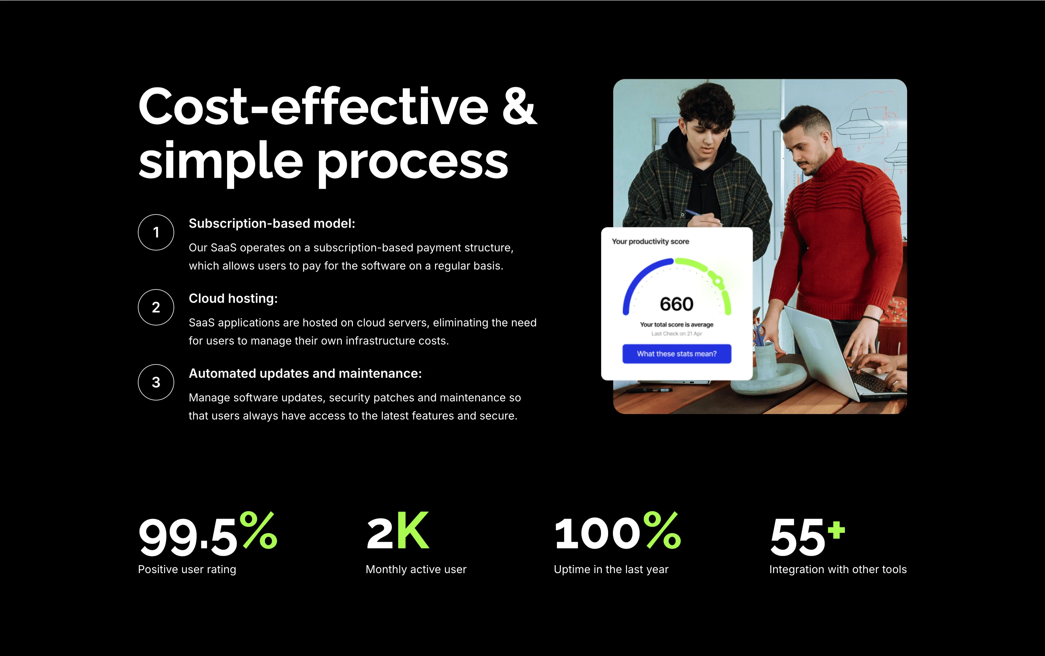
Cost-Effective Simple Process With Stats
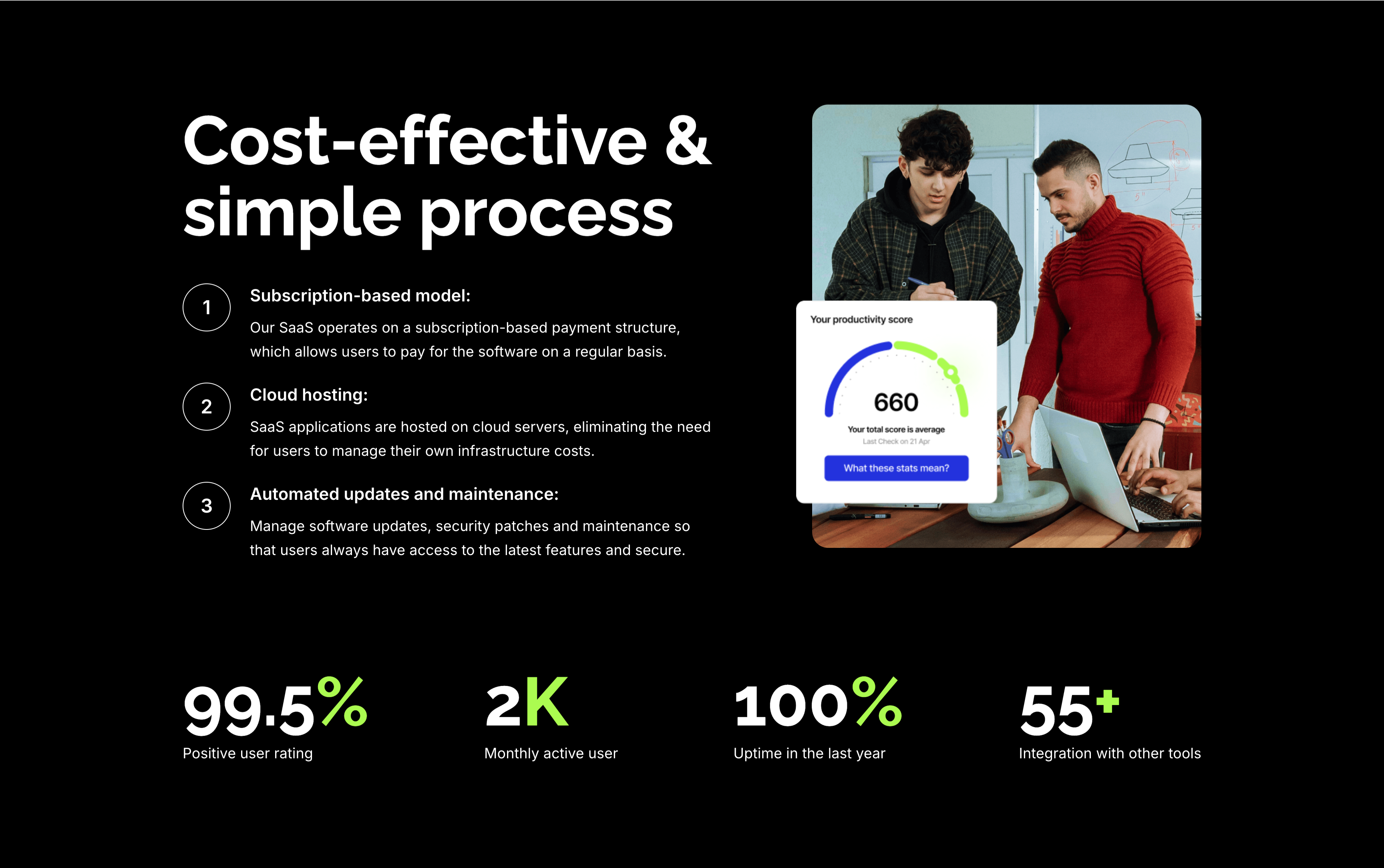
A feature section on a solid black background. The left column stacks an oversized white 'Cost-effective & simple process' heading over three numbered points — 'Subscription-based model:', 'Cloud hosting:' and 'Automated updates and maintenance:' — each with a circled number and a short white description. The right column shows a rounded photo of two colleagues at a laptop with a floating white 'Your productivity score' card reading 660. A row of four lime-green-accented stats runs across the bottom: '99.5%' positive user rating, '2K' monthly active users, '100%' uptime in the last year and '55+' integrations. The dark canvas, numbered list and green metrics give the section a confident, data-backed tone.
Zubuz ↗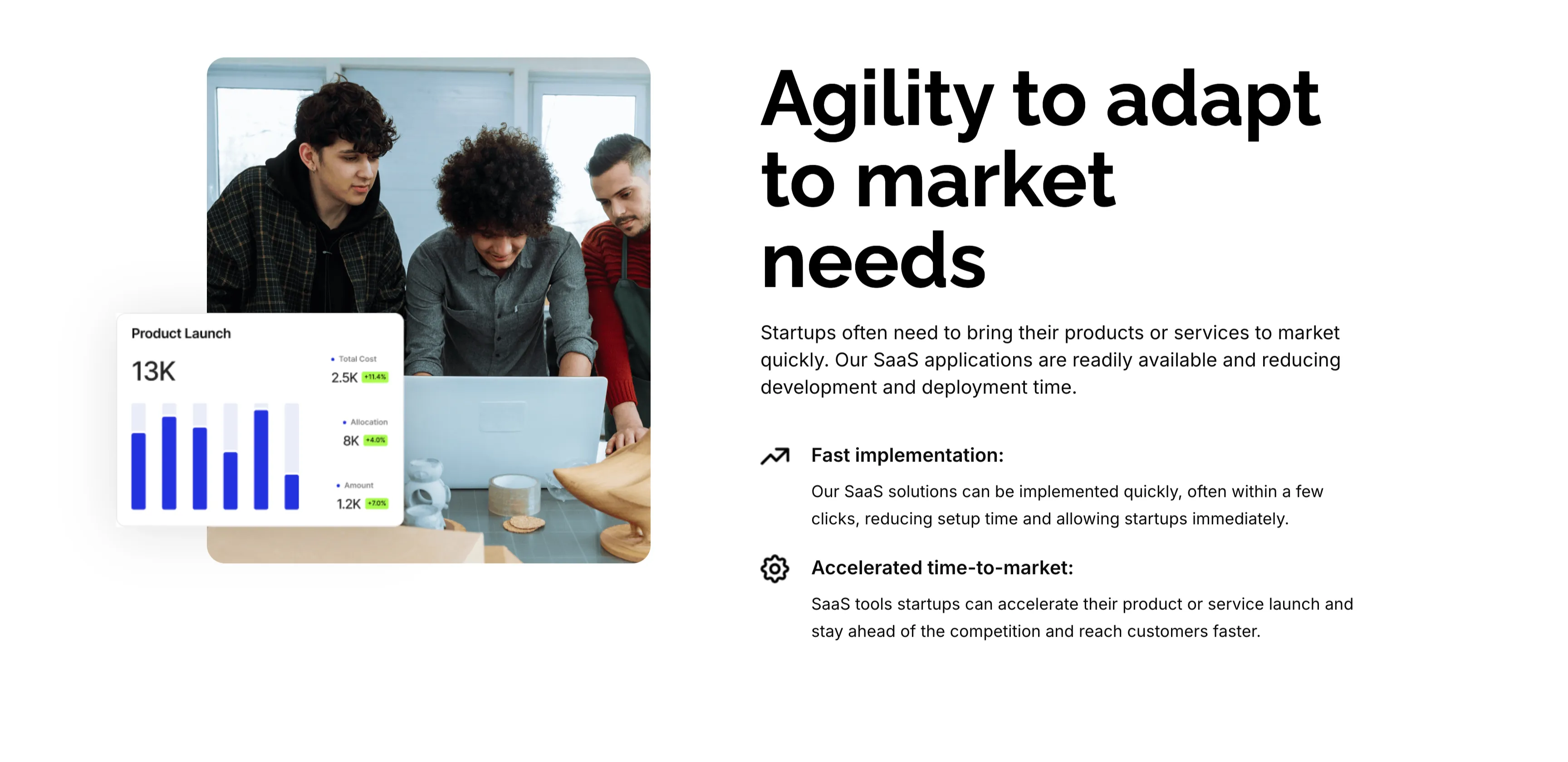
Agility To Adapt Split Feature
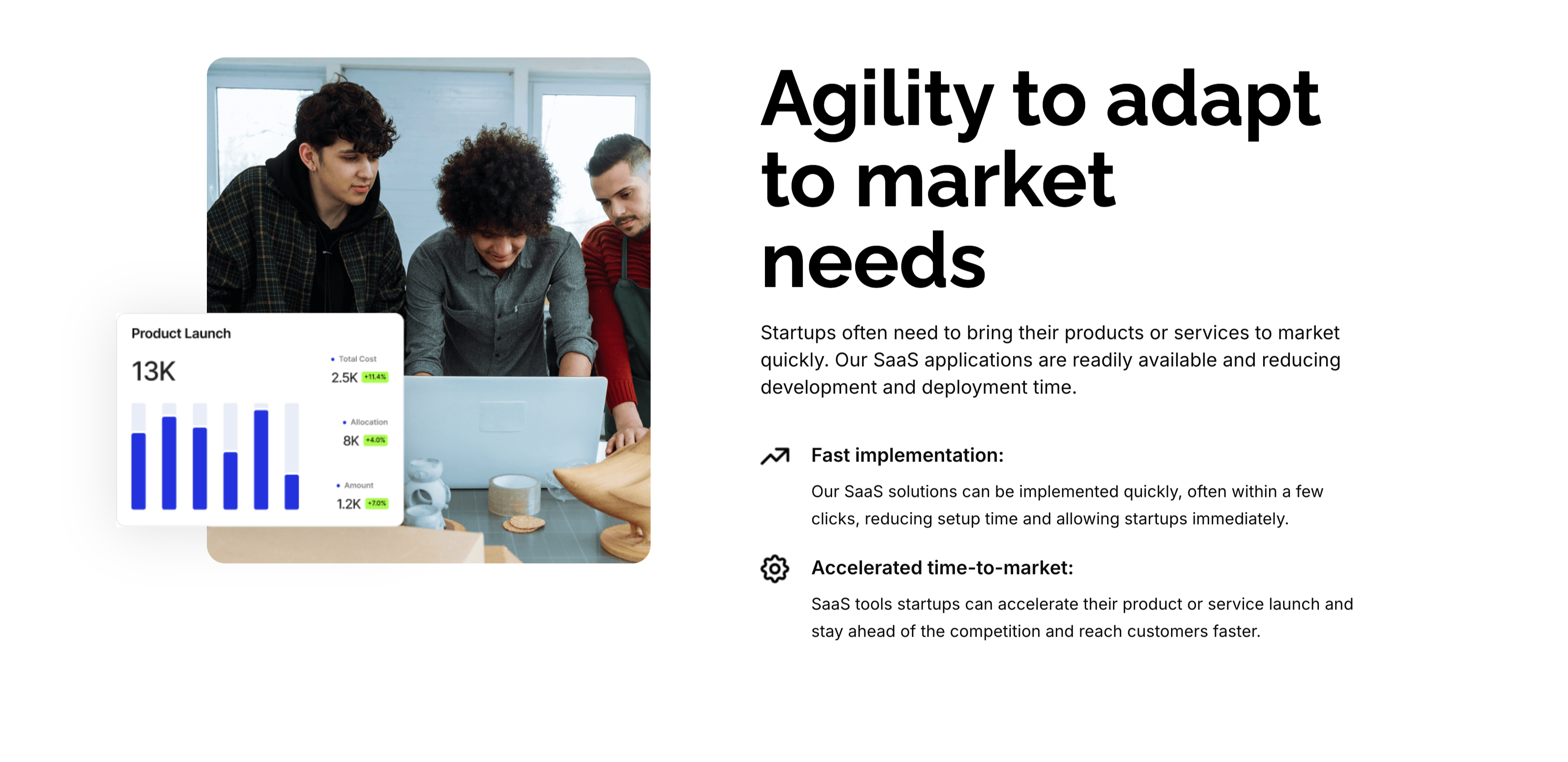
A two-column feature block on white. The left column holds a rounded photo of three colleagues at a laptop, overlaid at the corner with a floating 'Product Launch' analytics card (a 13K figure, bar chart and green percentage badges). The right column leads with an oversized 'Agility to adapt to market needs' heading and a short paragraph, then two icon-led points: 'Fast implementation:' (SaaS solutions deployed in a few clicks) and 'Accelerated time-to-market:' (launch faster and stay ahead of competitors). A small outline icon precedes each point. The photo-plus-icon-list layout pairs a human scene with a crisp benefit statement.
Zubuz ↗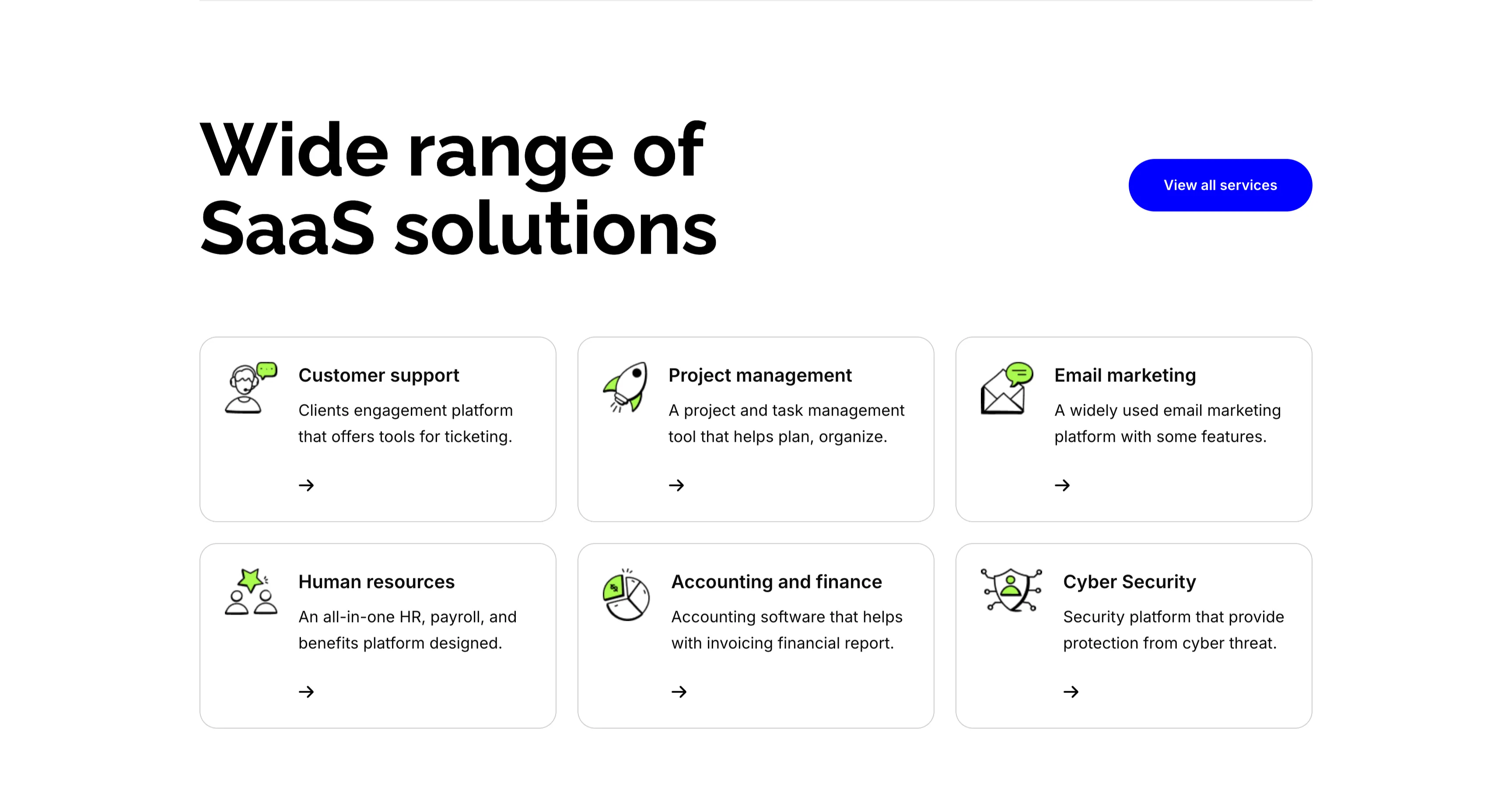
Wide Range Of SaaS Solutions Services Grid
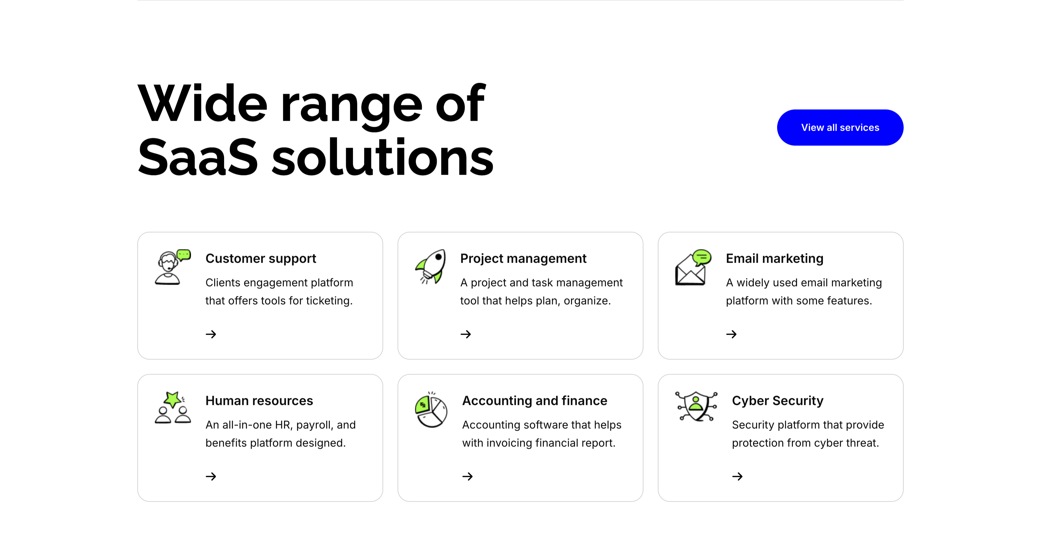
A services section on white. The top pairs an oversized 'Wide range of SaaS solutions' heading on the left with a solid blue 'View all services' button on the right. Below, six white bordered cards form a three-column, two-row grid, each led by a line-and-green illustrative icon, a bold title, a one-line description and a small arrow link: 'Customer support' (ticketing engagement platform), 'Project management' (plan and organize), 'Email marketing' (widely used platform), 'Human resources' (all-in-one HR and payroll), 'Accounting and finance' (invoicing and reports) and 'Cyber Security' (protection from threats). The even icon-card grid makes the breadth of offerings easy to scan.
Zubuz ↗

Launch Your Startup's Success SaaS Hero
The startup-SaaS landing hero, topped by the Zubaz nav. A centered oversized black headline, 'Launch your startup's success with SaaS', is accented by a lime-green brush swipe behind the words 'startup's' and 'SaaS', over a two-line gray subhead. Below sit an inline email field with a blue 'Get started' button and two green-checked reassurances — 'No credit card required' and '7-day free trial'. A large rounded photo of a startup team working around a laptop fills the lower half, overlaid with floating UI cards ('Profit and Loss $682.5', a bar chart, 'New clients 321'). The green brush accents and floating stat cards give the hero an energetic, product-backed feel.
Zubuz ↗

Start Managing Your Money Email CTA Band
A compact call-to-action set in a wide rounded blue band with a green-to-white wave sweeping across it. A centered bold white 'Start managing your money now!' headline spans the upper area, and directly beneath sits a single inline capture control — a white rounded field reading 'Enter your e-mail address' with an attached solid blue 'Get started' button. No imagery or extra copy competes with the message. The saturated blue field, one headline and single email input make this a focused, low-friction signup prompt.
Zubuz ↗
Integration With Dozens Of Tools Icon Grid
An integrations section on white. The top pairs an oversized 'Integration with dozens of tools' heading on the left with a solid blue 'Browse all integrations' button on the right. Below sits a two-row, six-column grid of white bordered tiles, each holding a recognizable full-color app logo — Google Drive, Slack, Dropbox, Notion, Mailchimp and Zapier on the top row; Facebook, WhatsApp, HubSpot, Discord, GitHub and Zoom on the bottom. The clean tile grid of familiar brand marks quickly signals broad ecosystem compatibility. The lone blue button offers a clear path to the full list.
Zubuz ↗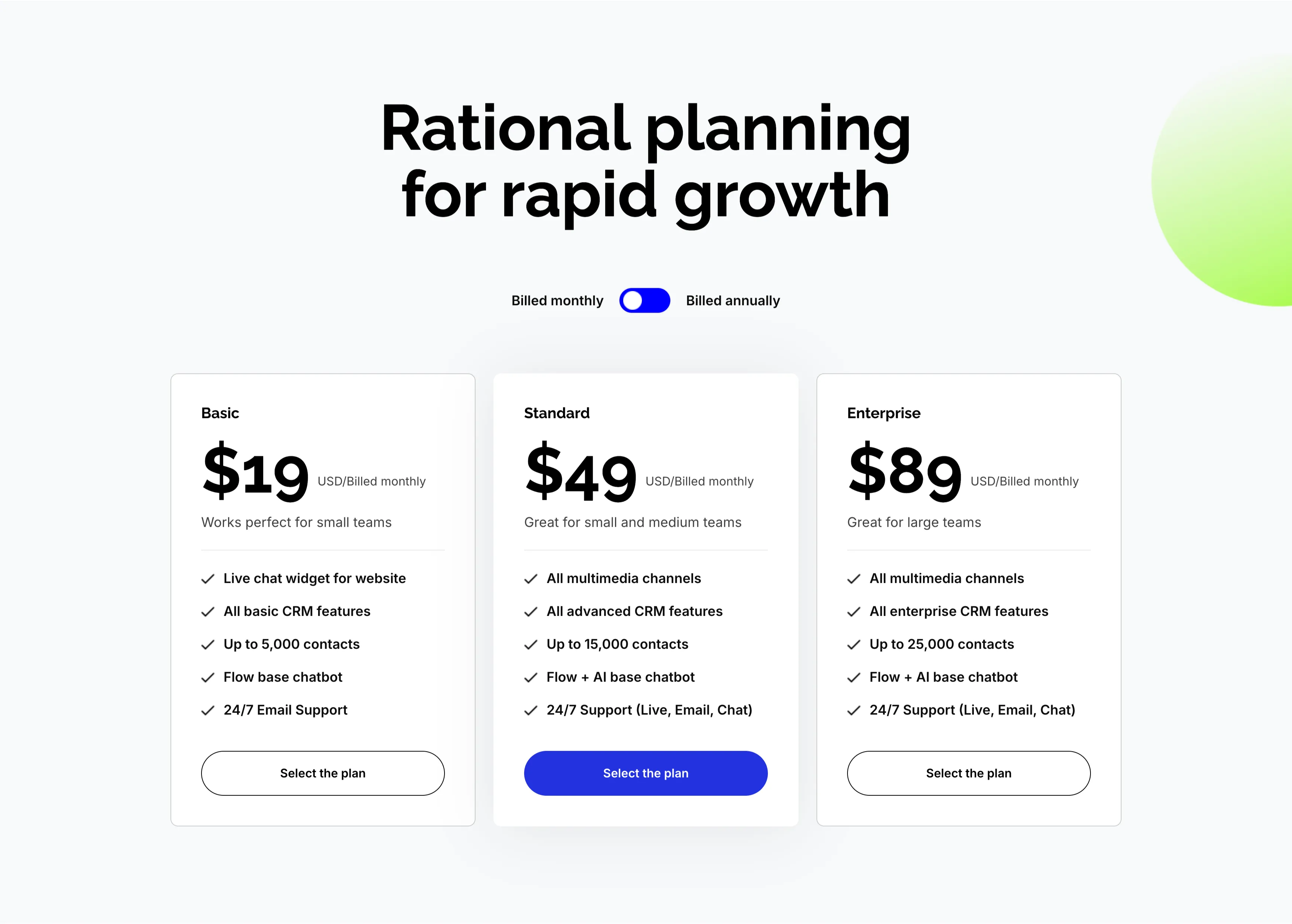
Rational Planning Three-Tier CRM Pricing
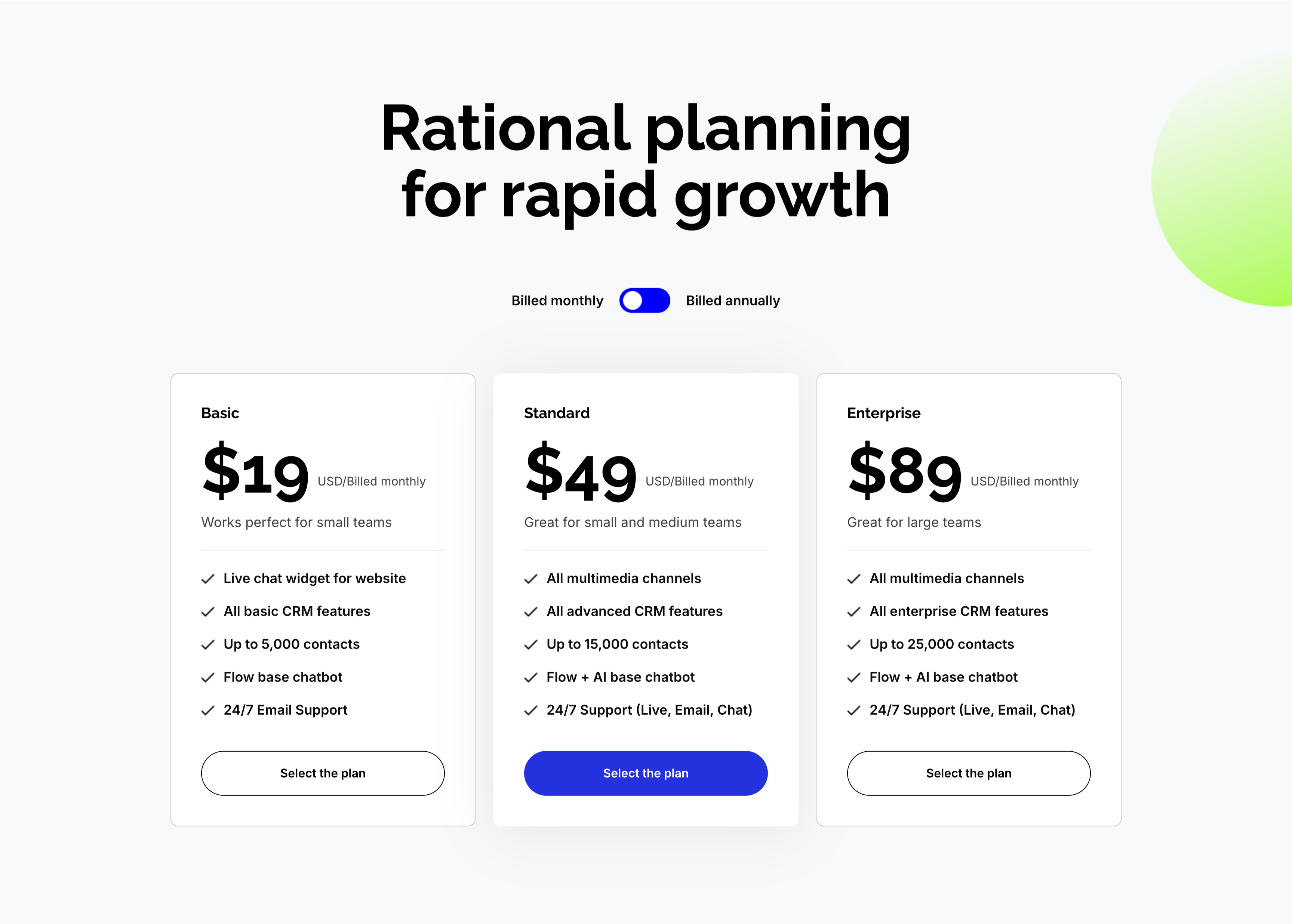
A three-tier pricing section on a pale gray background under an oversized centered 'Rational planning for rapid growth' heading, with a 'Billed monthly / Billed annually' toggle beneath. Three plan cards sit in a row — Basic ($19 USD/billed monthly, 'Works perfect for small teams'), Standard ($49, highlighted white card with a shadow, 'Great for small and medium teams') and Enterprise ($89, 'Great for large teams') — each listing checkmarked features like 'All multimedia channels', 'Up to 15,000 contacts', 'Flow + AI base chatbot' and '24/7 Support'. Every card ends with a 'Select the plan' button, solid blue on the featured Standard tier and outlined on the others. Highlighting the middle plan steers attention to the recommended option.
Zubuz ↗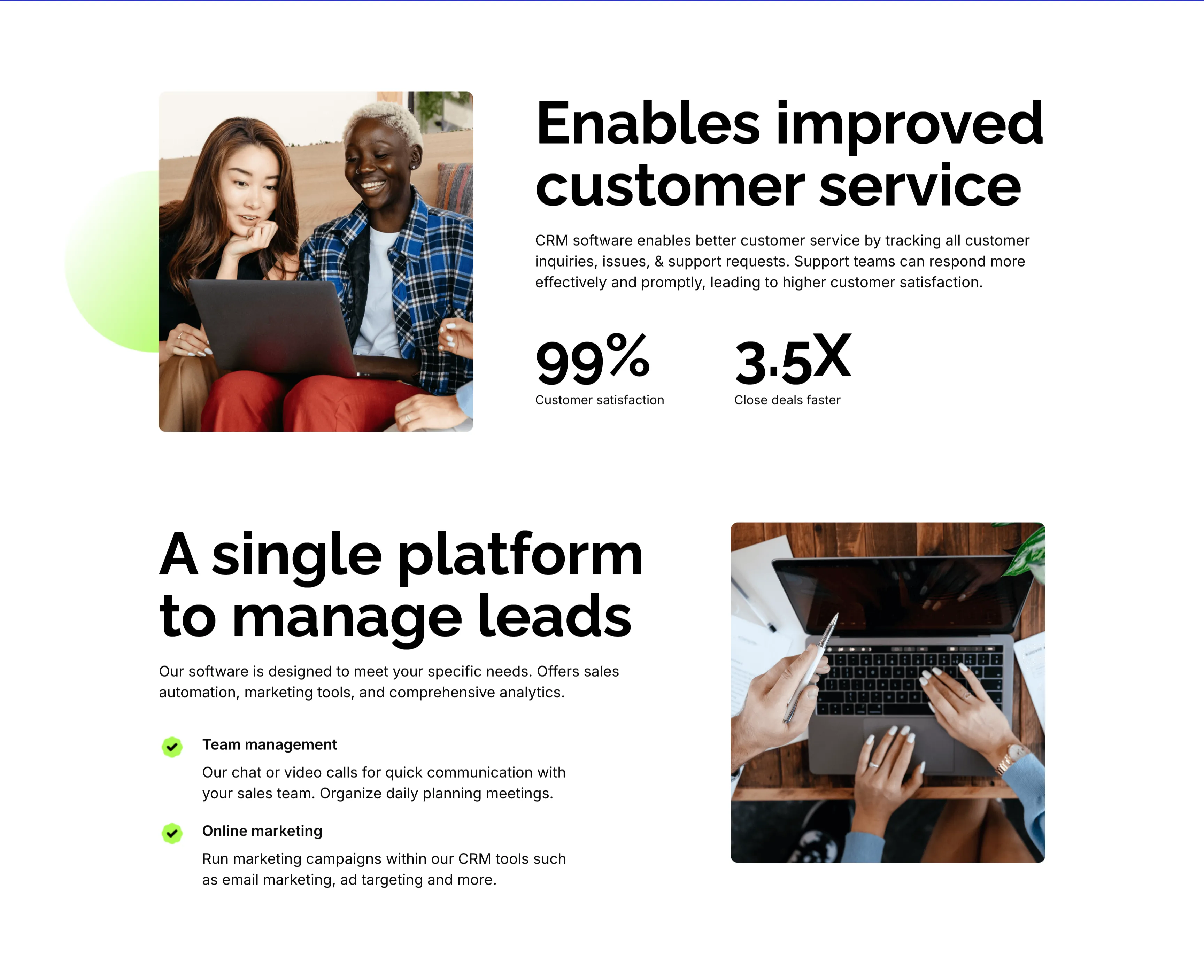
Customer Service And Lead Management Features
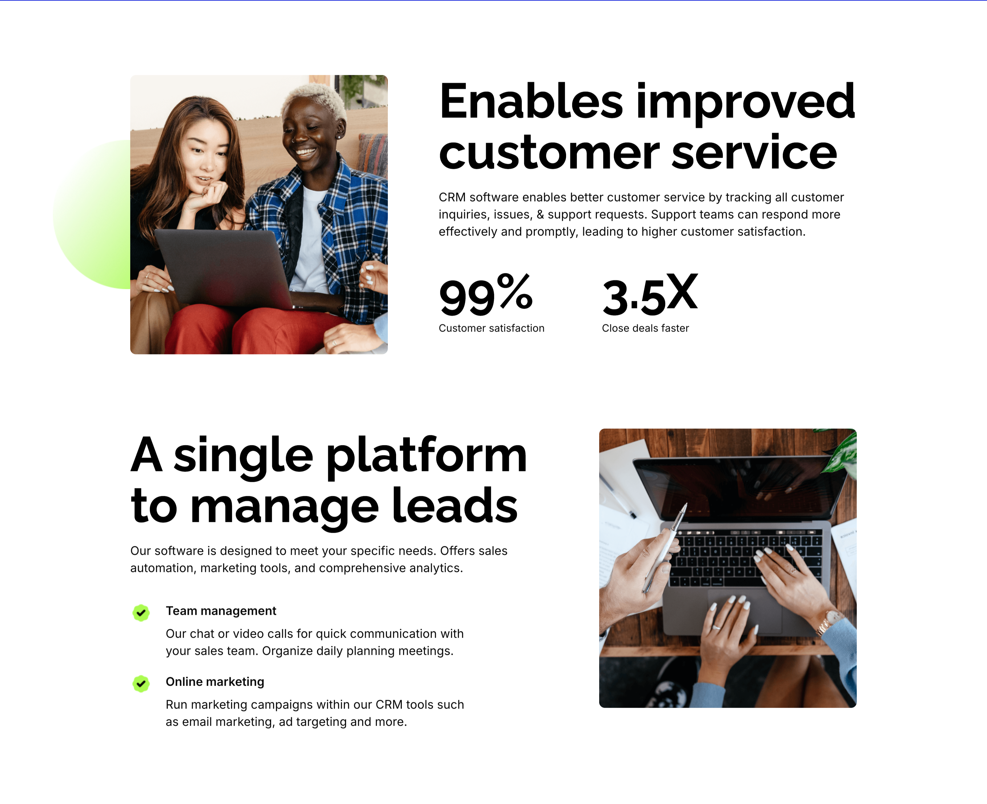
Two stacked alternating feature blocks on white, each mixing photography with copy. The upper block places a rounded photo of two colleagues at a laptop on the left beside an oversized 'Enables improved customer service' heading, a paragraph, and two bold stats — '99%' customer satisfaction and '3.5X' close deals faster. The lower block flips the layout: an oversized 'A single platform to manage leads' heading with green-checked items 'Team management' and 'Online marketing' sits left of a top-down photo of hands working at a laptop. The mirrored image-and-text rhythm, punchy metrics and checklist make the CRM benefits tangible and easy to compare.
Zubuz ↗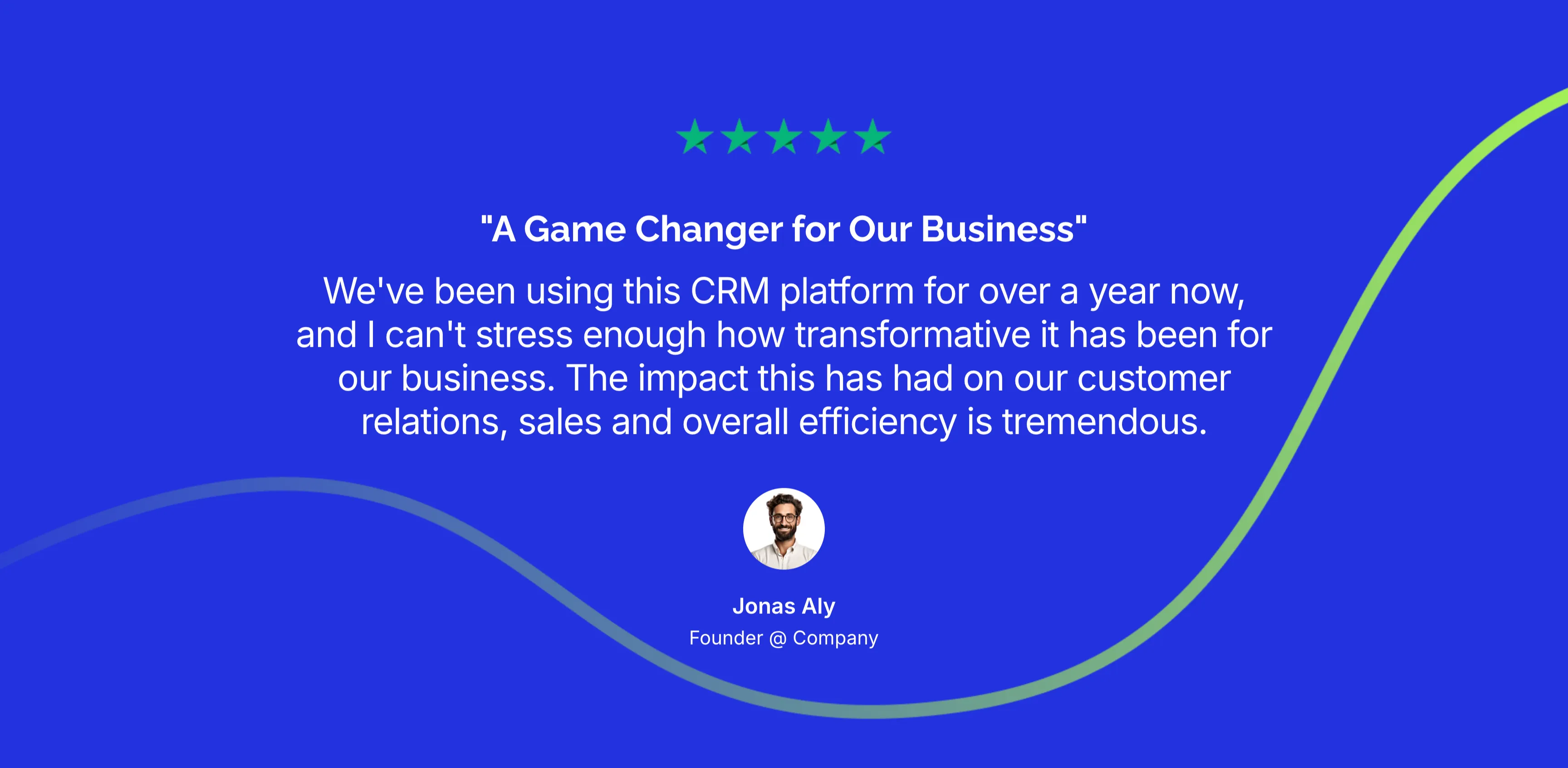
A Game Changer Single Testimonial
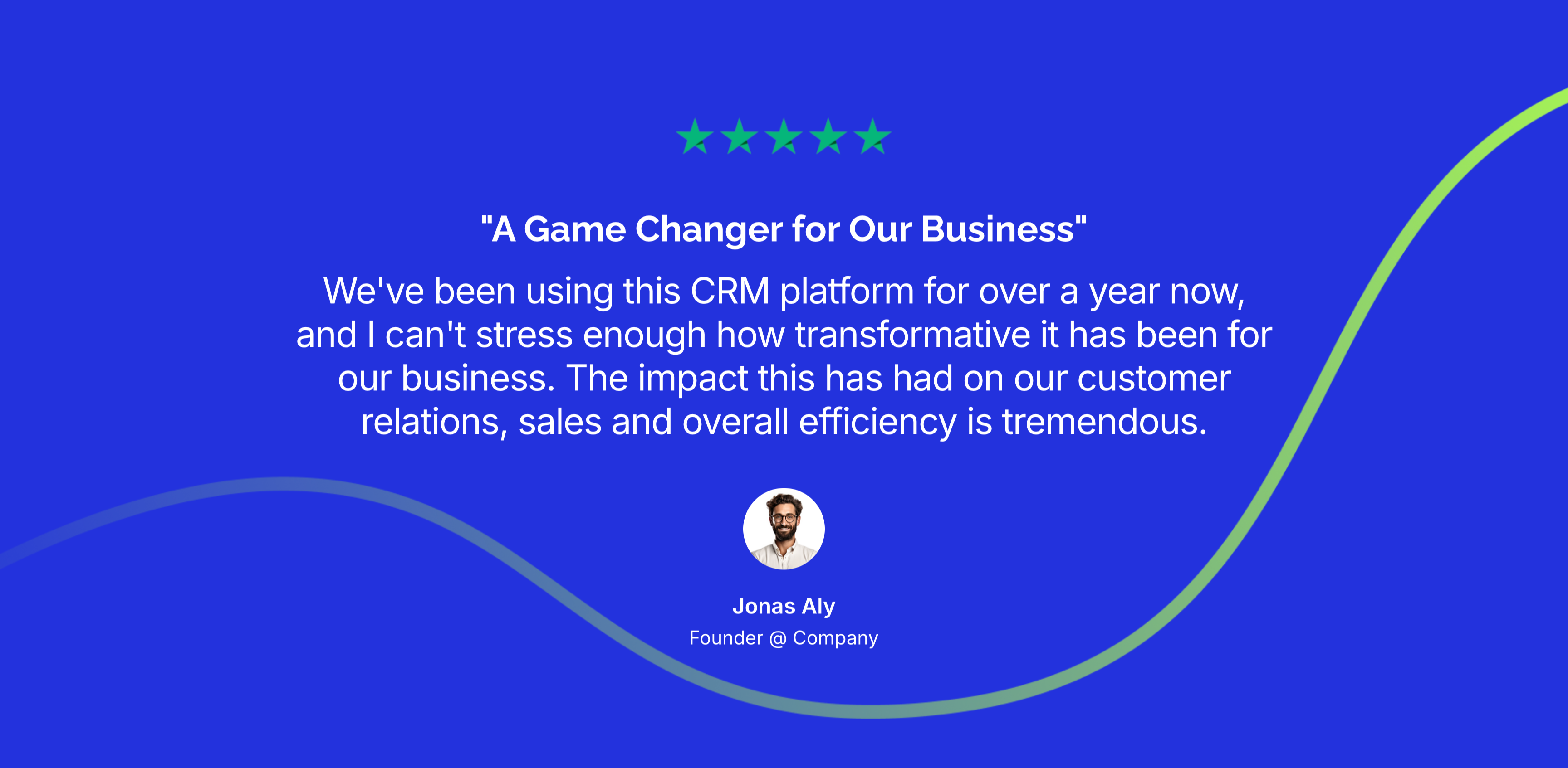
A single centered testimonial set on a saturated blue background with a soft green-to-white wave curving across it. A row of green five-star icons tops a bold white pull-quote title, '"A Game Changer for Our Business"', followed by a longer white quotation praising a year of CRM use and its impact on customer relations, sales and efficiency. Beneath the quote sits a circular avatar with the attribution 'Jonas Aly, Founder @ Company' in white. The vivid blue field and single large quote give the endorsement weight and focus. The flowing wave adds subtle motion to an otherwise minimal layout.
Zubuz ↗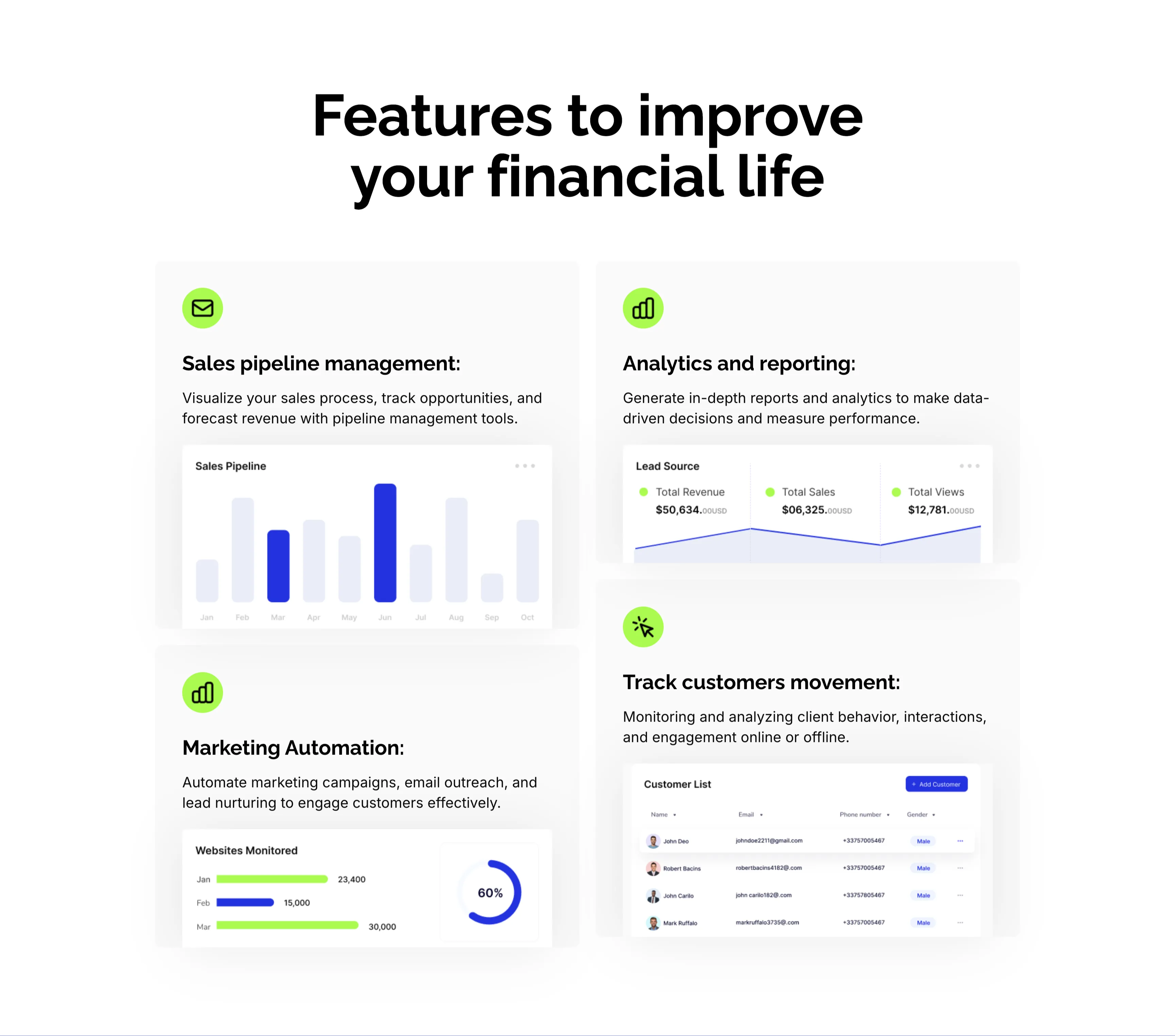
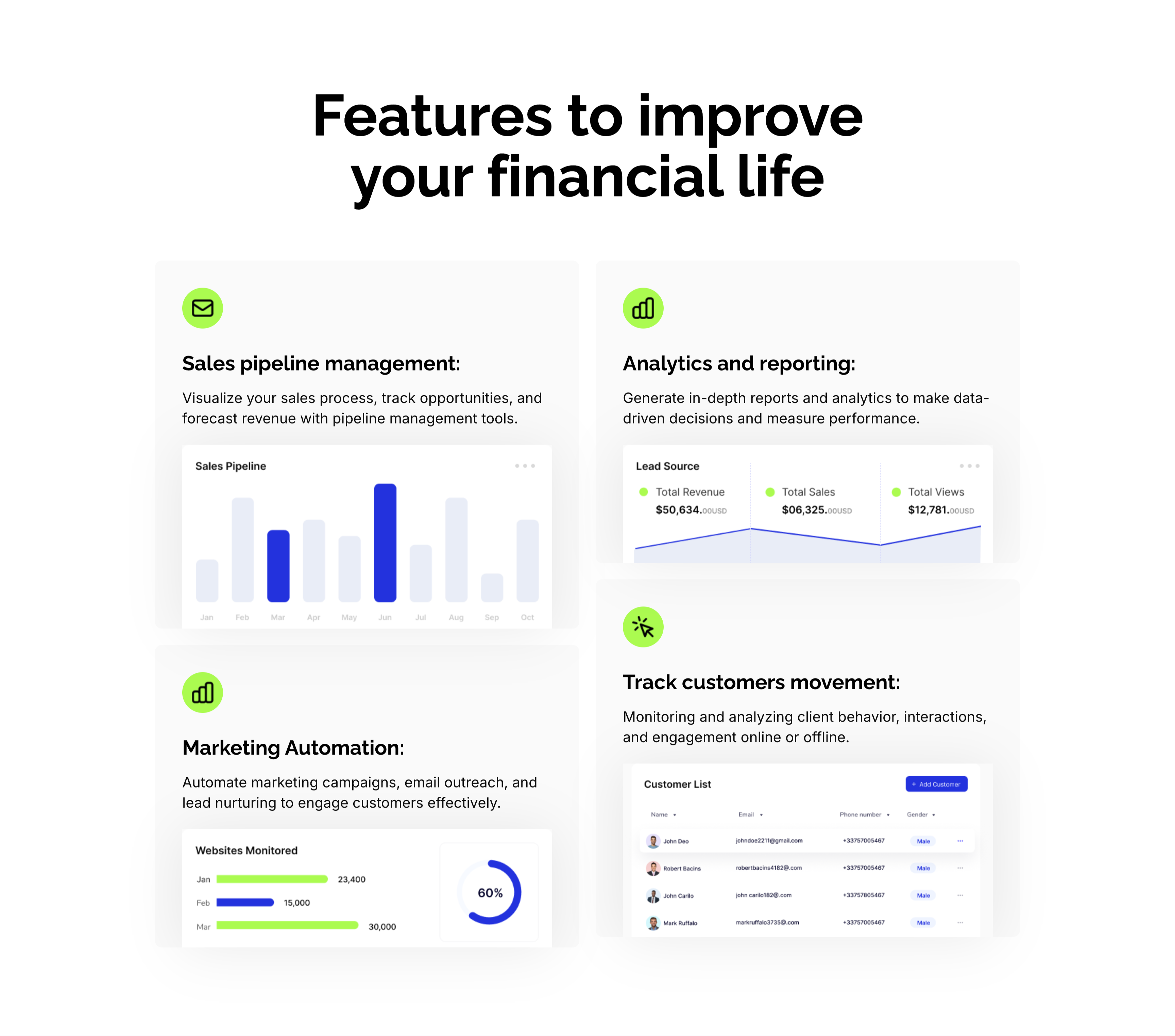
CRM Features With Dashboard Cards
A CRM feature section on a pale background under an oversized centered 'Features to improve your financial life' heading. Four large cards form a 2x2 grid, each led by a lime-green icon, a bold title and a line of copy, then a mini product screenshot: 'Sales pipeline management:' with a monthly bar chart, 'Analytics and reporting:' with a Lead Source panel (Total Revenue $50,634, Total Sales, Total Views), 'Marketing Automation:' with a 'Websites Monitored' bar-and-donut chart, and 'Track customers movement:' with a Customer List table. Embedding a real dashboard fragment in each card makes the abstract CRM capabilities feel concrete and demonstrable.
Zubuz ↗

Trusted By Innovative Companies Logo Row
A slim social-proof strip on white. A single centered line, 'Trusted by the most innovative companies worldwide', sits above one row of five monochrome customer wordmarks — Network, luminous, Sitemark, umbrella and Greenish — each paired with a small mark and rendered in uniform black. There is no other content in the band. The restrained single-row treatment and consistent logo weight read as understated credibility rather than decoration.
Zubuz ↗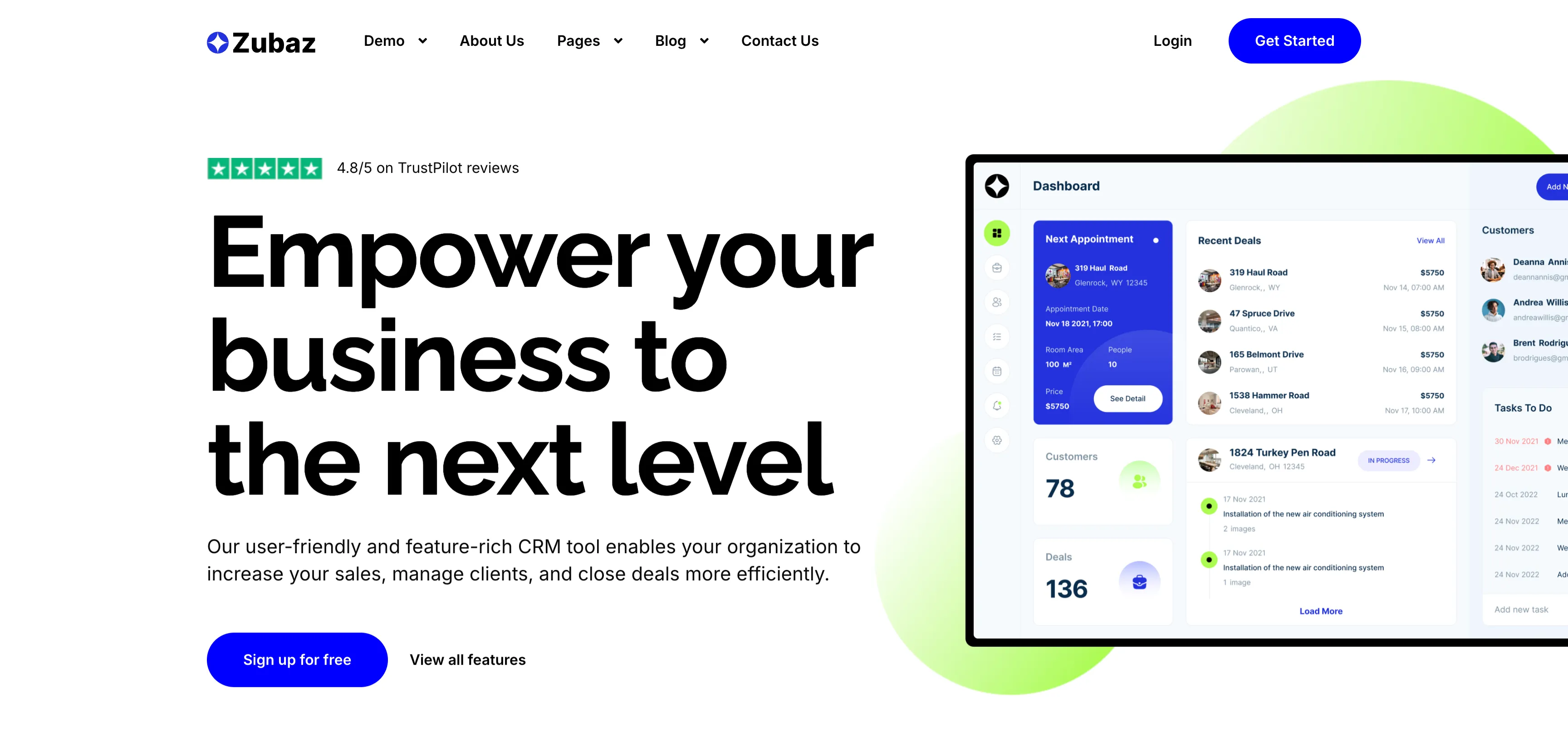
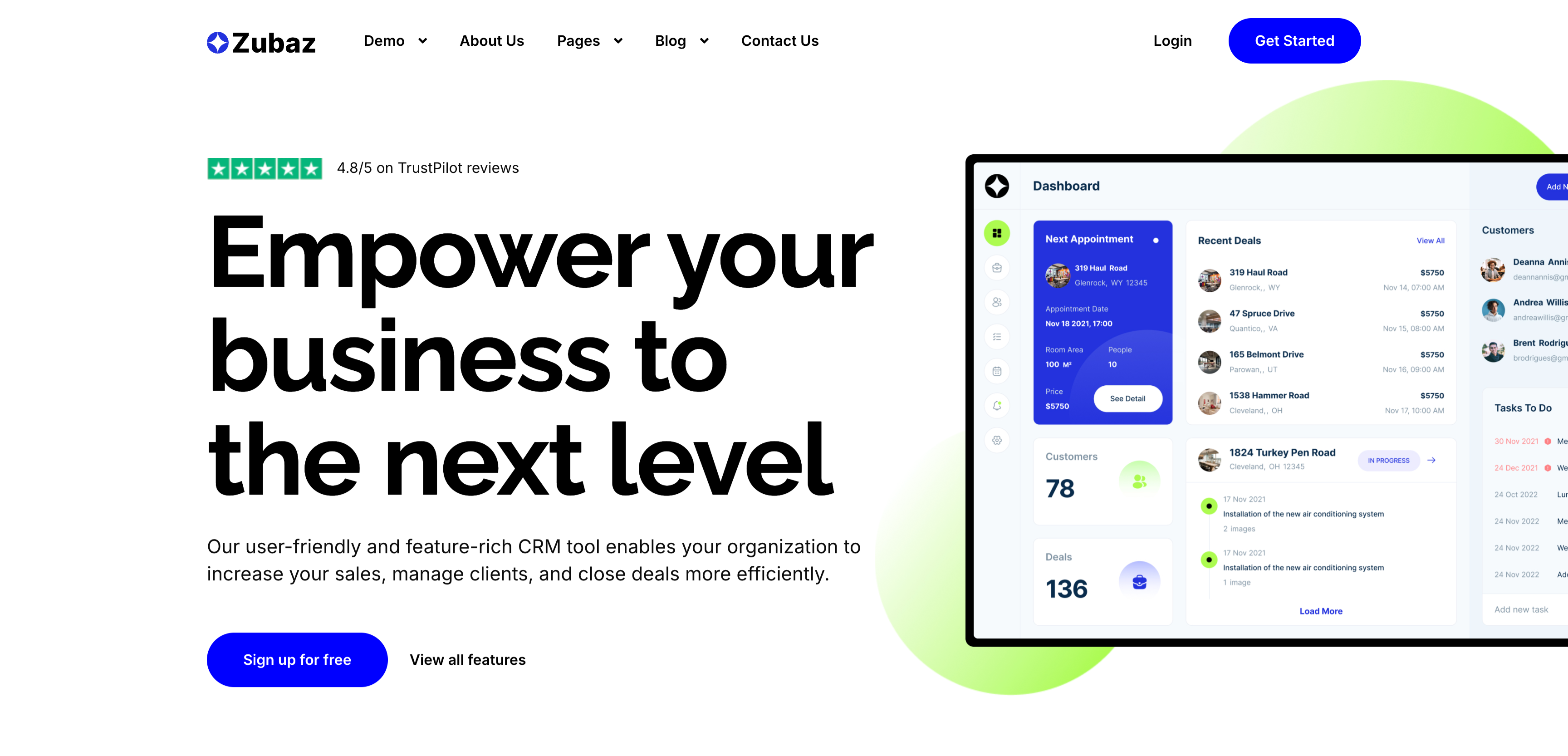
Empower Your Business CRM Hero
The CRM landing hero, topped by the Zubaz nav. The left column stacks a small green Trustpilot '4.8/5 on TrustPilot reviews' badge, an enormous four-line 'Empower your business to the next level' headline, a two-line supporting paragraph, and two actions — a solid blue 'Sign up for free' button and a plain 'View all features' link. The right column shows a large CRM 'Dashboard' screenshot with a Next Appointment card, Recent Deals list, Customers panel and a Tasks To Do column, set against a soft lime blob. The oversized headline plus the detailed product shot immediately convey a feature-rich sales tool.
Zubuz ↗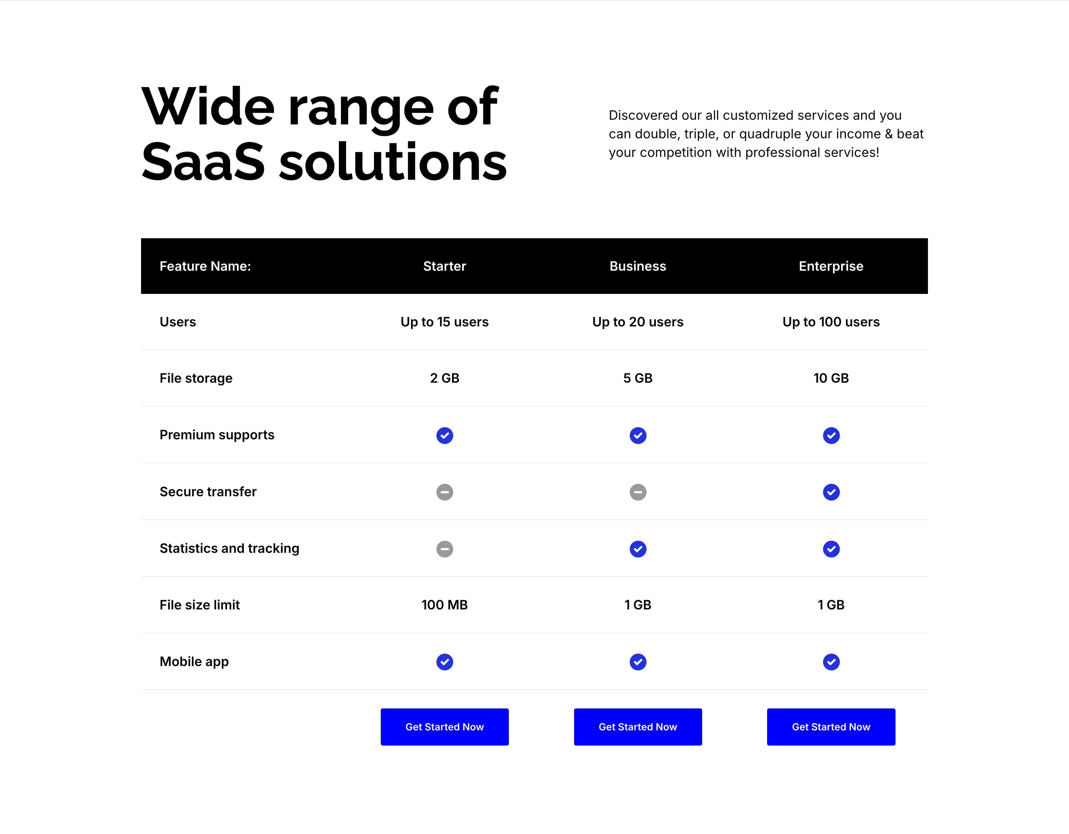
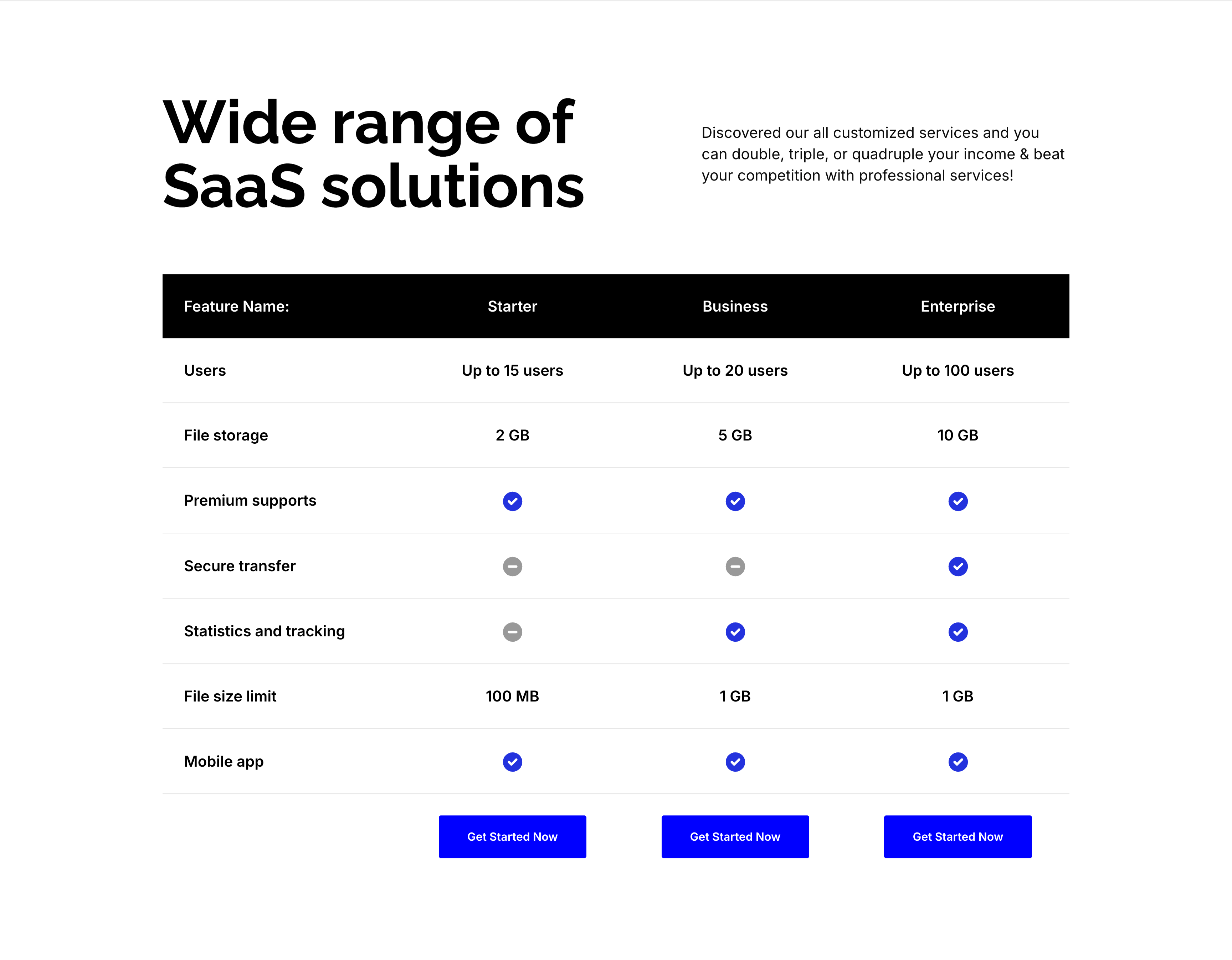
Wide Range Of SaaS Solutions Comparison Table
A plan-comparison section on white, introduced by an oversized 'Wide range of SaaS solutions' heading with a short right-column intro. Below sits a comparison table whose black header row names three columns — Starter, Business and Enterprise — over a 'Feature Name:' label. Successive rows compare features down the left ('Users', 'File storage', 'Premium supports', 'Secure transfer', 'Statistics and tracking', 'File size limit', 'Mobile app'), filled with either text values ('Up to 15 users', '2 GB', '100 MB') or blue check / gray dash status icons per tier. A row of blue 'Get Started Now' buttons under each column closes the table. The gridded matrix makes tier-by-tier differences easy to compare at a glance.
Zubuz ↗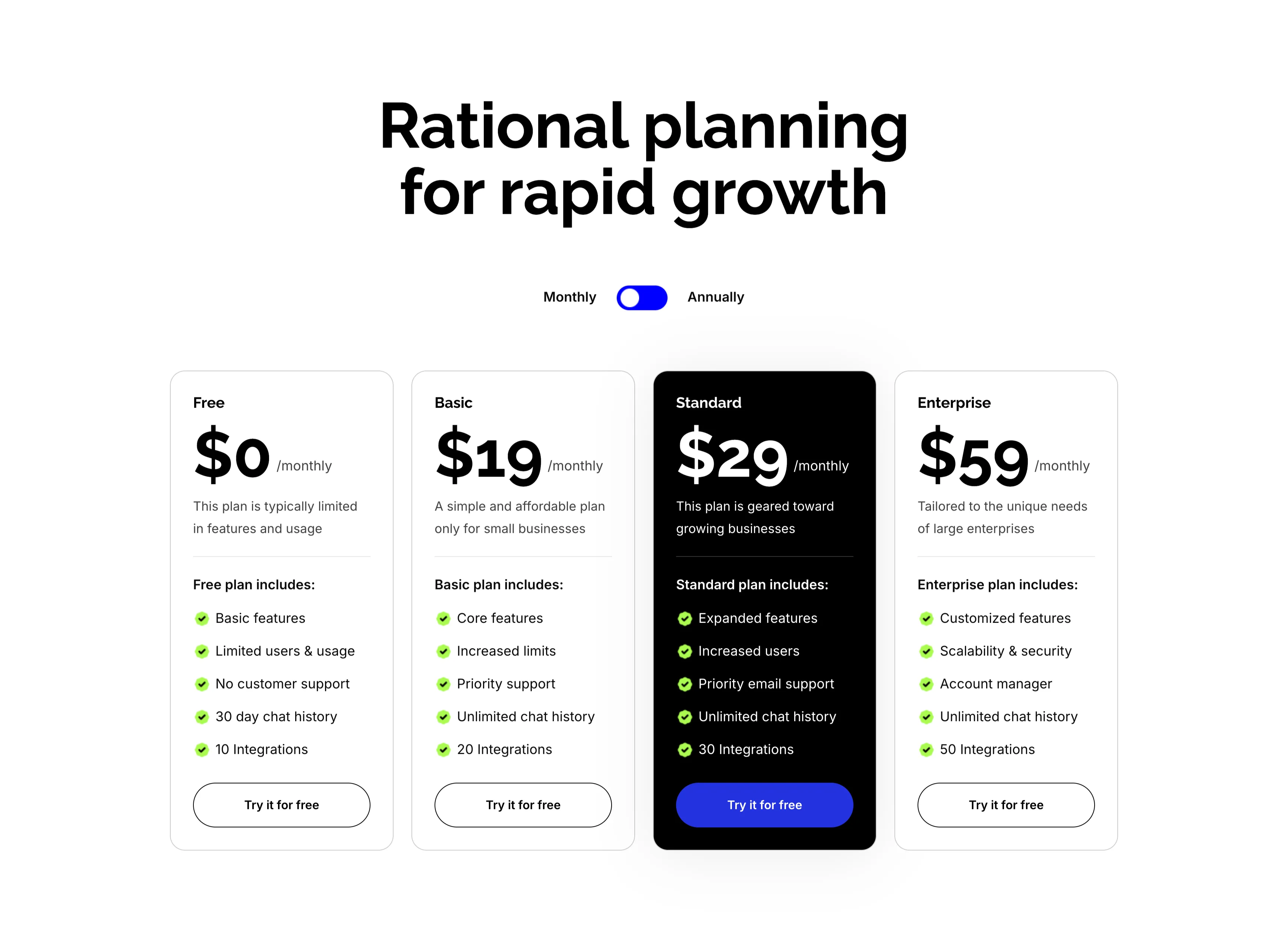
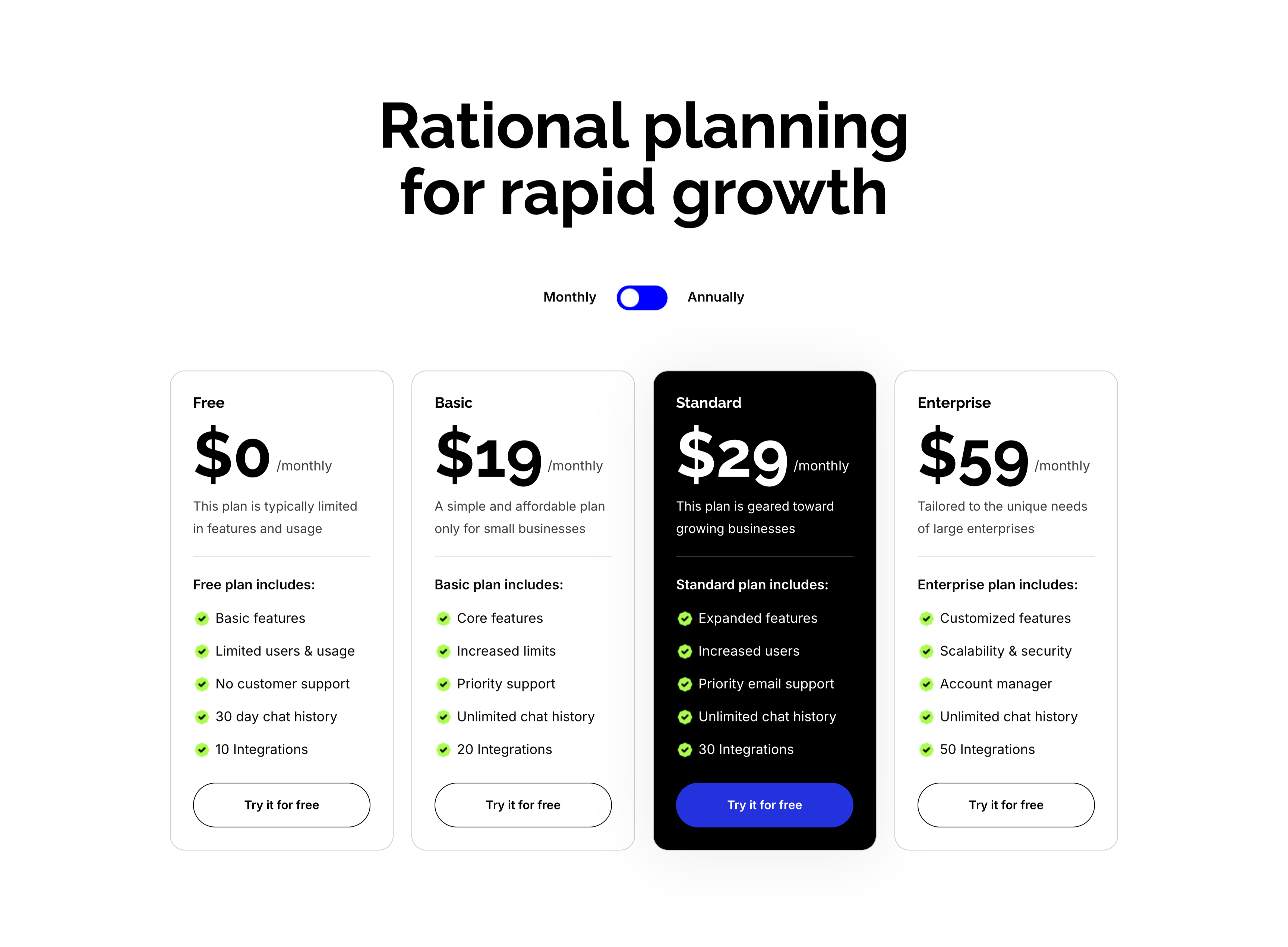
Rational Planning Four-Tier Pricing
A pricing section on white under an oversized centered 'Rational planning for rapid growth' heading, with a Monthly/Annually toggle beneath it. Four plan cards sit in a row — Free ($0/monthly), Basic ($19/monthly), Standard ($29/monthly, highlighted in a black card) and Enterprise ($59/monthly) — each showing a big price, a one-line description and a green-checkmarked feature list ('Basic features', 'Increased limits', 'Priority email support', 'Unlimited chat history', integration counts). Every card ends with a 'Try it for free' button, solid blue on the highlighted Standard plan and outlined on the rest. Elevating the Standard card in black clearly steers the eye to the recommended tier.
Zubuz ↗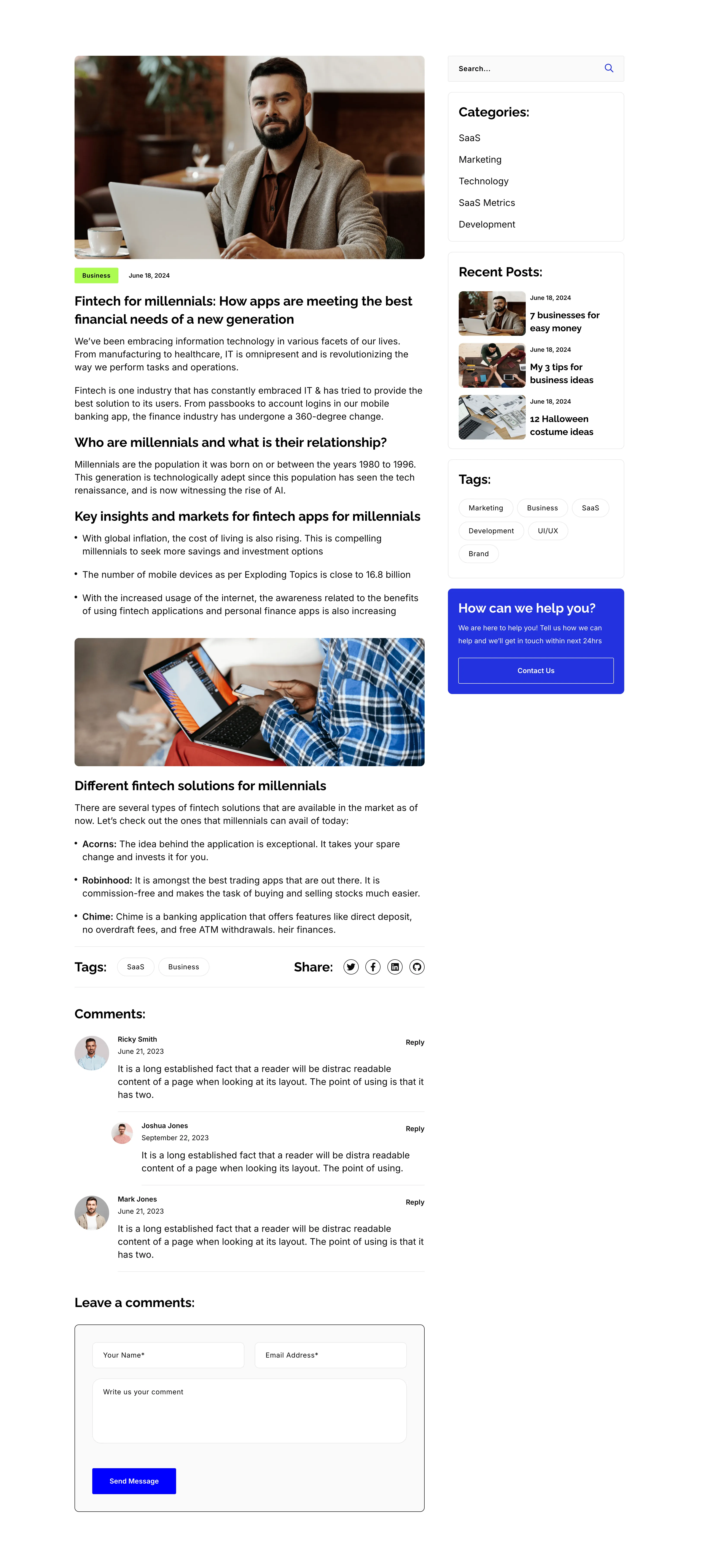
Blog Post Article Page With Comments
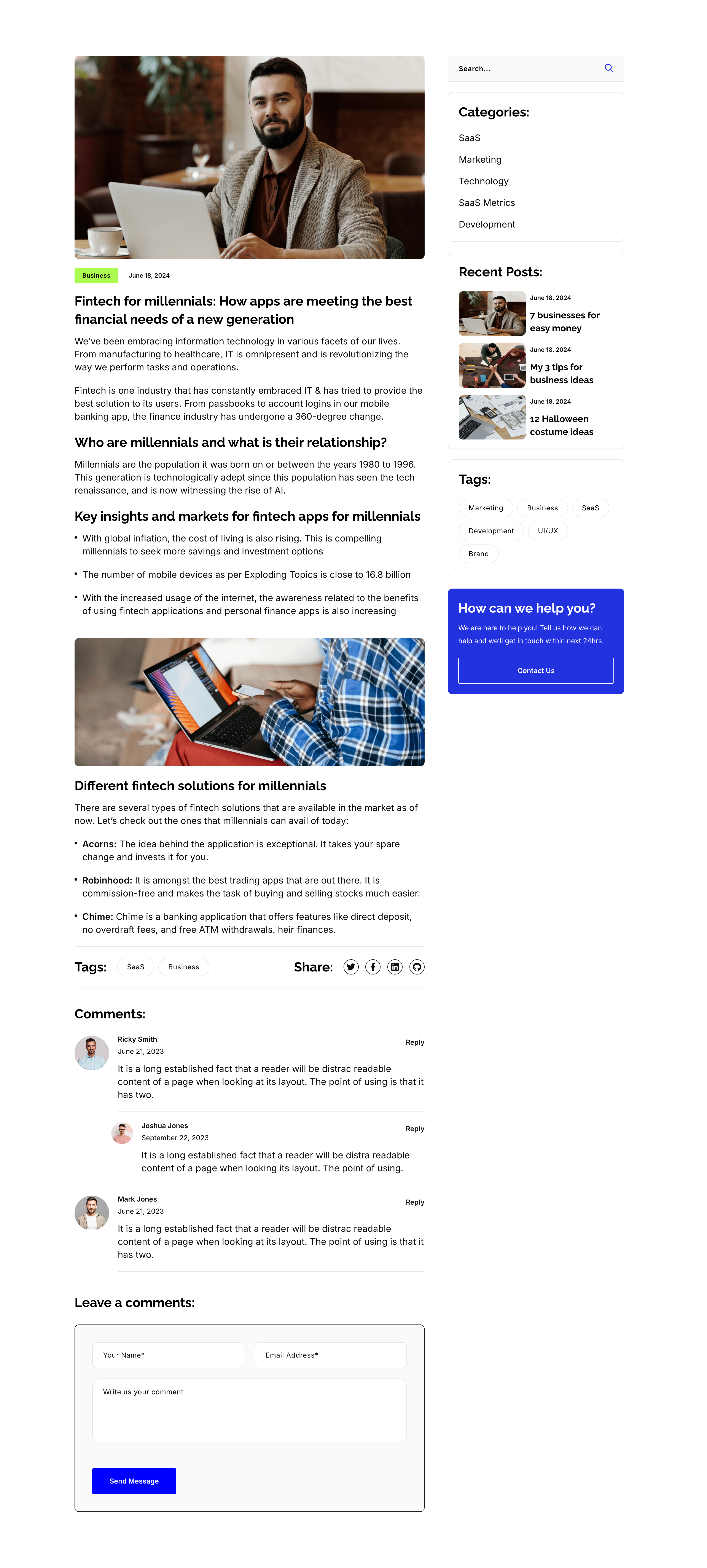
A single blog-post layout on white, again split into an article column and a right sidebar. The article opens with a hero photo, a 'Business' tag and date, the title 'Fintech for millennials: How apps are meeting the best financial needs of a new generation', then body copy broken by sub-headings ('Who are millennials…', 'Key insights…', 'Different fintech solutions…'), bullet lists, an inset photo, a Tags/Share row, and a threaded 'Comments:' list with a 'Leave a comments:' form. The sidebar repeats the search, Categories, Recent Posts, Tags and blue help card from the archive. The long-form column with a persistent sidebar is the standard editorial article template.
Zubuz ↗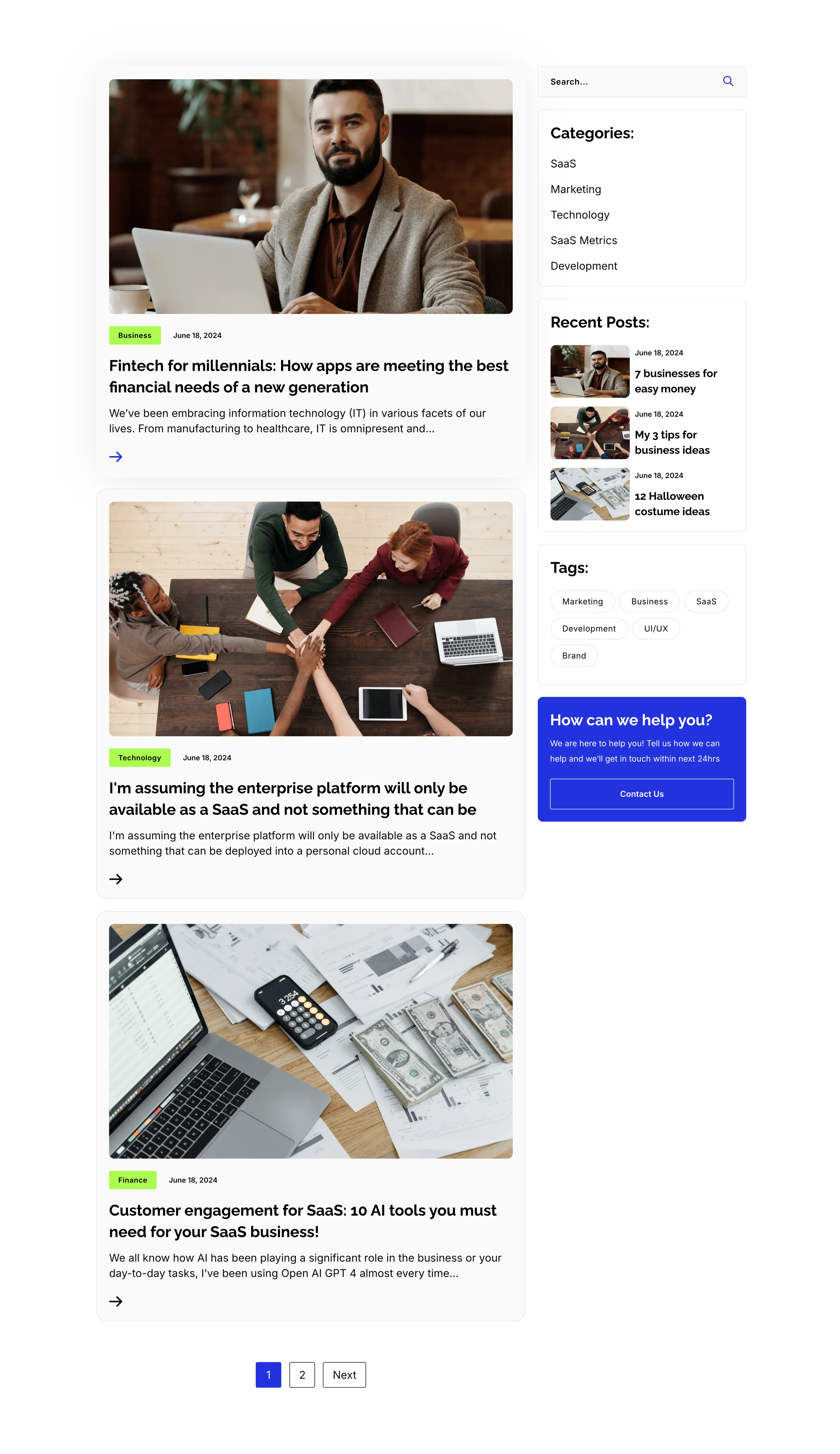
Blog Listing Page With Sidebar
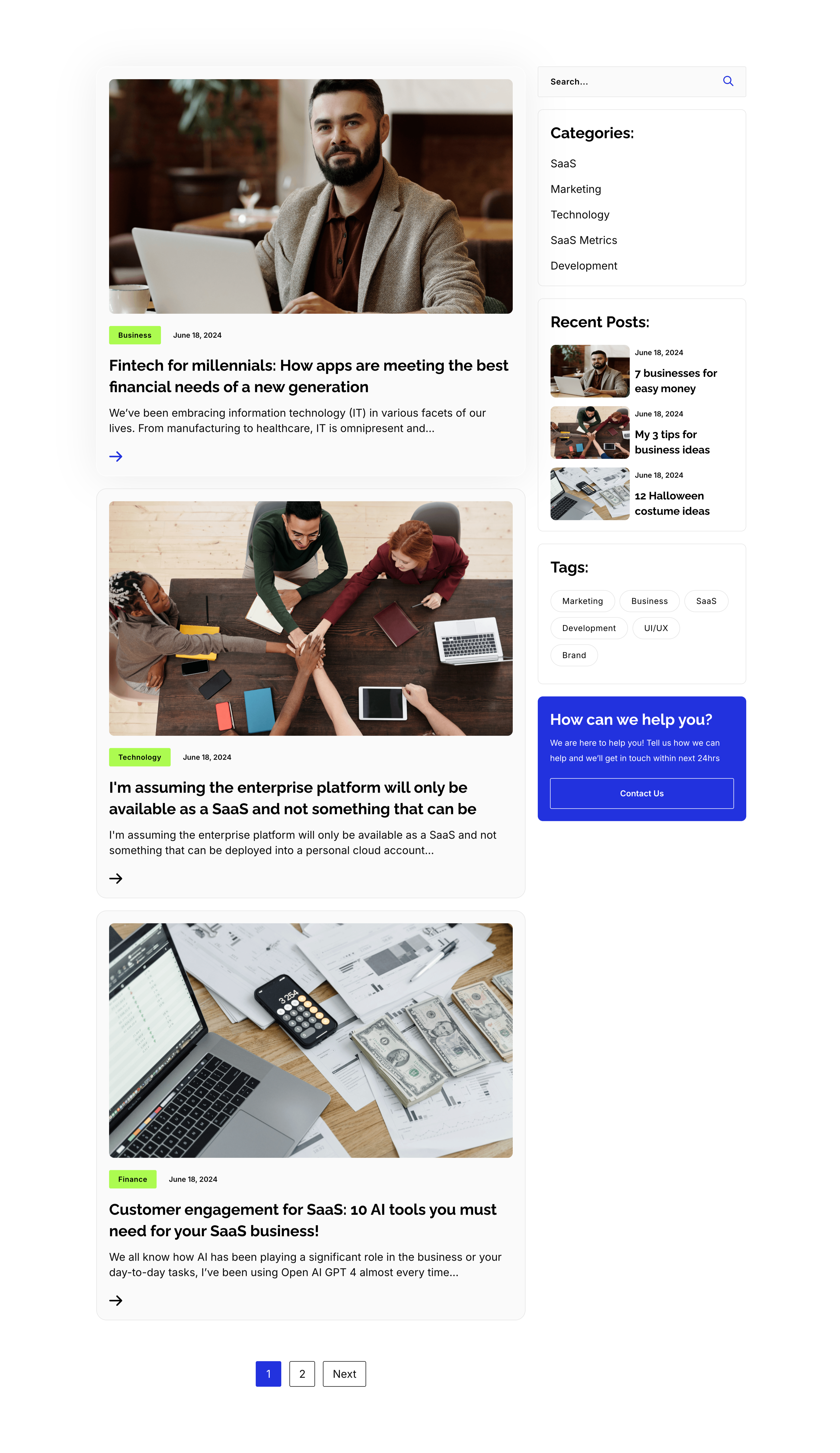
A full blog-listing layout on white, split into a wide article column and a right sidebar. The main column stacks post previews, each a photo with a category tag and date over a bold title, an excerpt and an arrow link — 'Fintech for millennials…', 'I'm assuming the enterprise platform…' and 'Customer engagement for SaaS: 10 AI tools…' — closing with a '1 / 2 / Next' pager. The sidebar holds a search field, a 'Categories:' list (SaaS, Marketing, Technology, SaaS Metrics, Development), a 'Recent Posts:' list with thumbnails, a 'Tags:' pill cloud, and a blue 'How can we help you?' card with a Contact Us button. The article-plus-sidebar structure is the classic content-hub archive pattern.
Zubuz ↗

Contact Details Dark Info Band
A slim contact-details band on a solid black background, laid out as three evenly spaced columns. Each column pairs a lime-green circular icon with a bold white label and two lines of detail: a phone icon beside 'Call us directly' (+088-234-6532-789 / +088-456-3217-005), an envelope beside 'Email us' (example@gmail.com, twice) and a location pin beside 'Our office address' (4132 Thornridge City, New York.). There is no other imagery or copy competing for attention. The dark field, bright green icons and tidy three-up split make the key contact methods instantly readable.
Zubuz ↗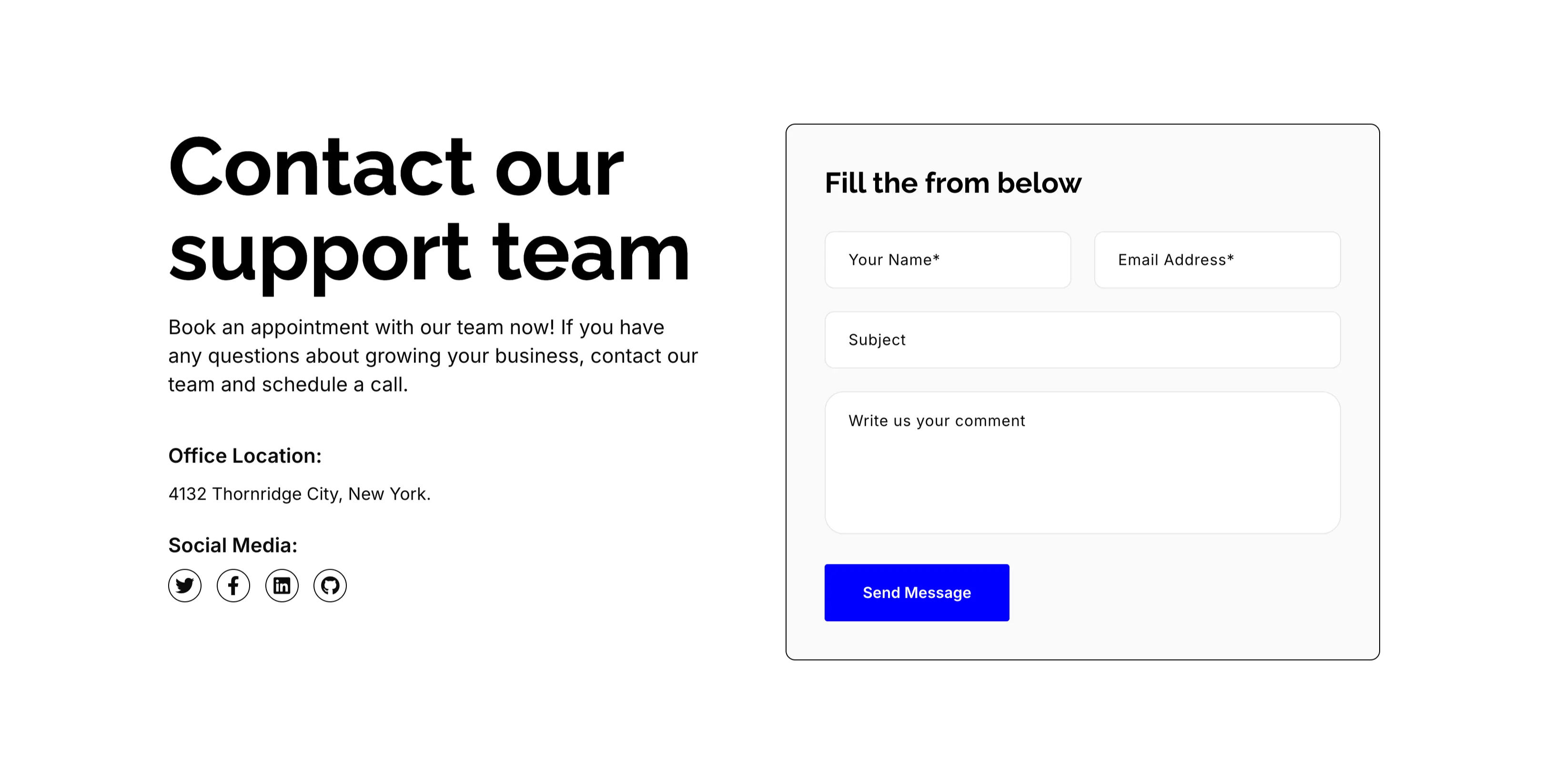
Contact Our Support Team Form
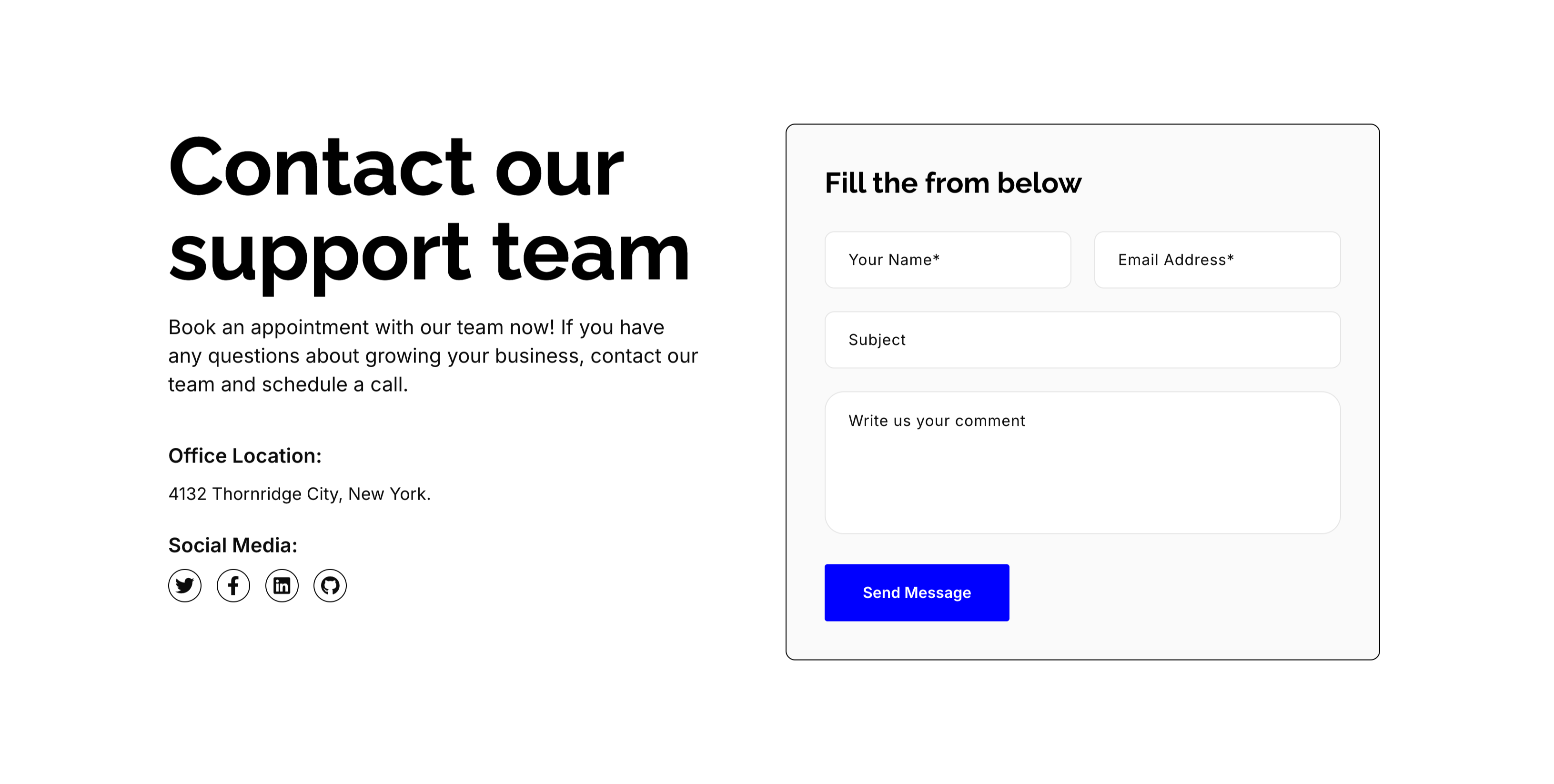
A split contact section on white. The left column leads with an oversized 'Contact our support team' heading, a short paragraph inviting the visitor to book an appointment, an 'Office Location:' line ('4132 Thornridge City, New York.') and a 'Social Media:' row of Twitter, Facebook, LinkedIn and GitHub icons. The right column is a light-gray rounded form card titled 'Fill the from below' with a two-up 'Your Name*' and 'Email Address*' row, a full-width 'Subject' field, a large 'Write us your comment' textarea and a solid blue 'Send Message' button. The address-and-social left rail balances the practical form, giving the visitor multiple ways to get in touch.
Zubuz ↗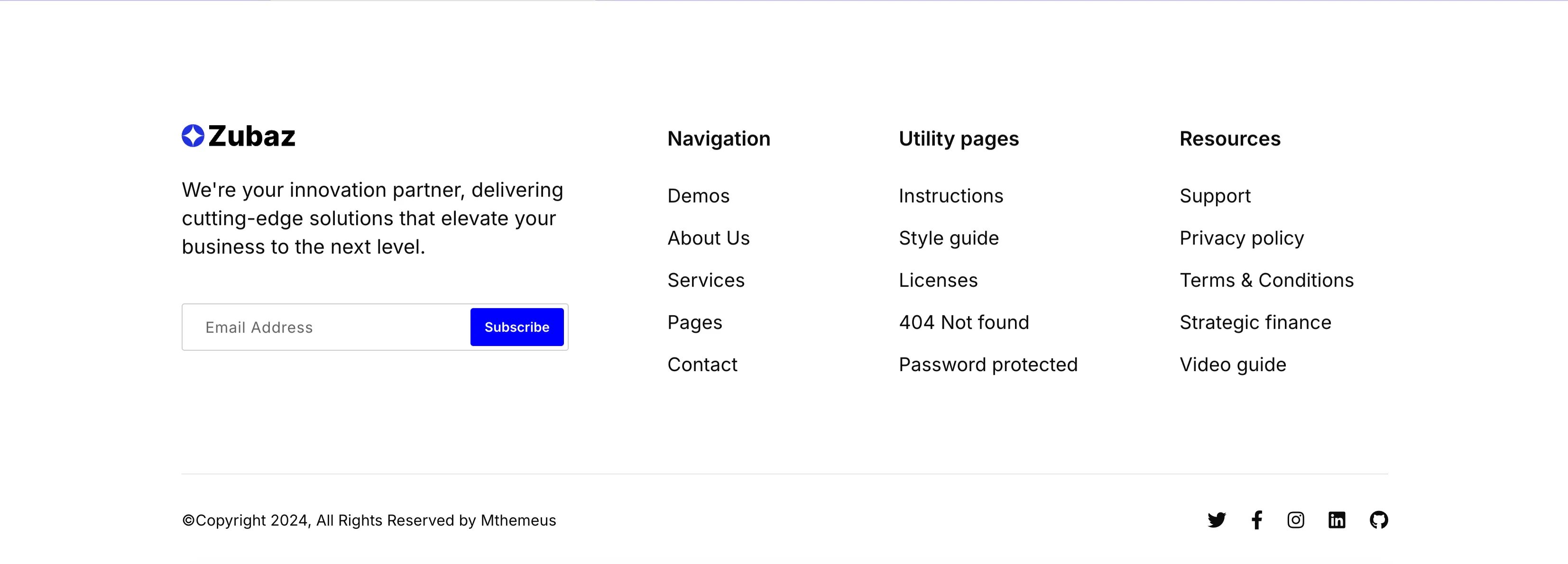
Zubaz Footer With Newsletter Signup
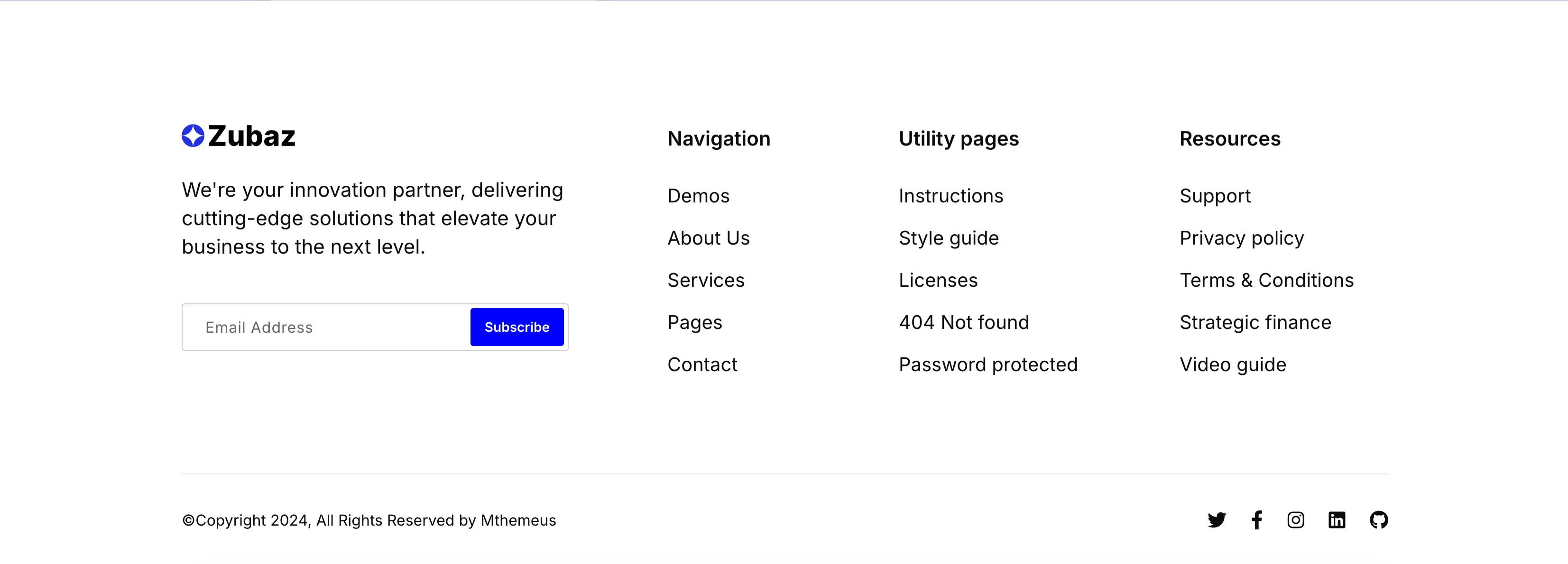
The Zubaz site footer on white. The left column shows the Zubaz logo, a short 'We're your innovation partner…' blurb and a newsletter field pairing an 'Email Address' input with a solid blue 'Subscribe' button. To the right, three link columns are grouped under bold headings — 'Navigation' (Demos, About Us, Services, Pages, Contact), 'Utility pages' (Instructions, Style guide, Licenses, 404 Not found, Password protected) and 'Resources' (Support, Privacy policy, Terms & Conditions, Strategic finance, Video guide). A hairline divider separates a bottom bar with the '(c)Copyright 2024, All Rights Reserved by Mthemeus' line on the left and Twitter, Facebook, Instagram, LinkedIn and GitHub icons on the right. The orderly columns and inline signup make it a complete, conventional global footer.
Zubuz ↗

Start Managing Your Money App CTA
A bold call-to-action set on a saturated blue background. The left side shows a smartphone mockup on an onboarding 'Setting up your account' screen with a line-art illustration and a green doodle burst. The right side stacks a large white 'Start managing your money now!' headline, a two-line subhead ('Your financial future is just a download away…'), and two dark app-store buttons — 'Get it on Google Play' and 'Download on the App Store' — with a hand-drawn green arrow curling toward them. The vivid blue field, device shot and store badges make downloading the obvious next step. The playful arrow adds energy to an otherwise direct conversion prompt.
Zubuz ↗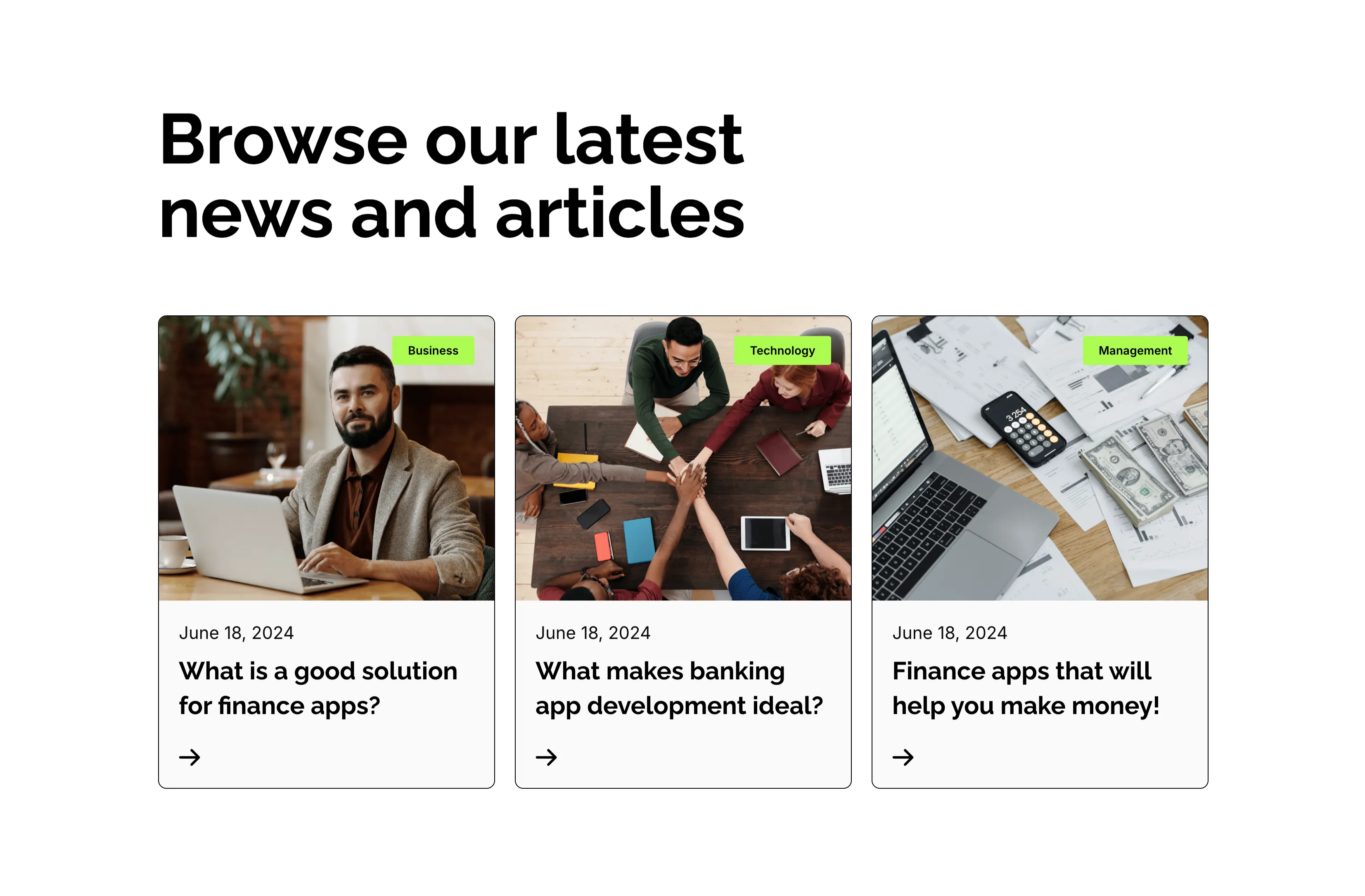
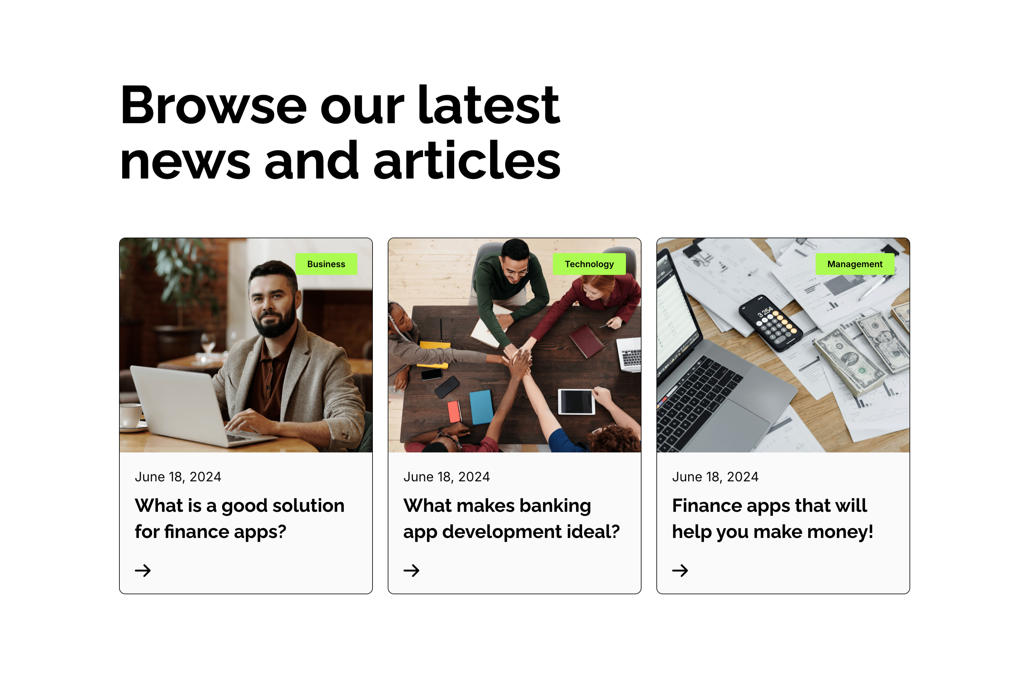
Browse Our Latest News Blog Cards
A blog-preview section on white under an oversized two-line 'Browse our latest news and articles' heading. Three equal cards sit in a row, each topped by a photograph with a small lime-green category tag in the corner — 'Business', 'Technology' and 'Management'. Beneath each image a light panel shows a 'June 18, 2024' date, a bold two-line article title ('What is a good solution for finance apps?', 'What makes banking app development ideal?', 'Finance apps that will help you make money!') and a small right-arrow link. The consistent image-over-text card rhythm and tidy category tags make the latest posts easy to browse.
Zubuz ↗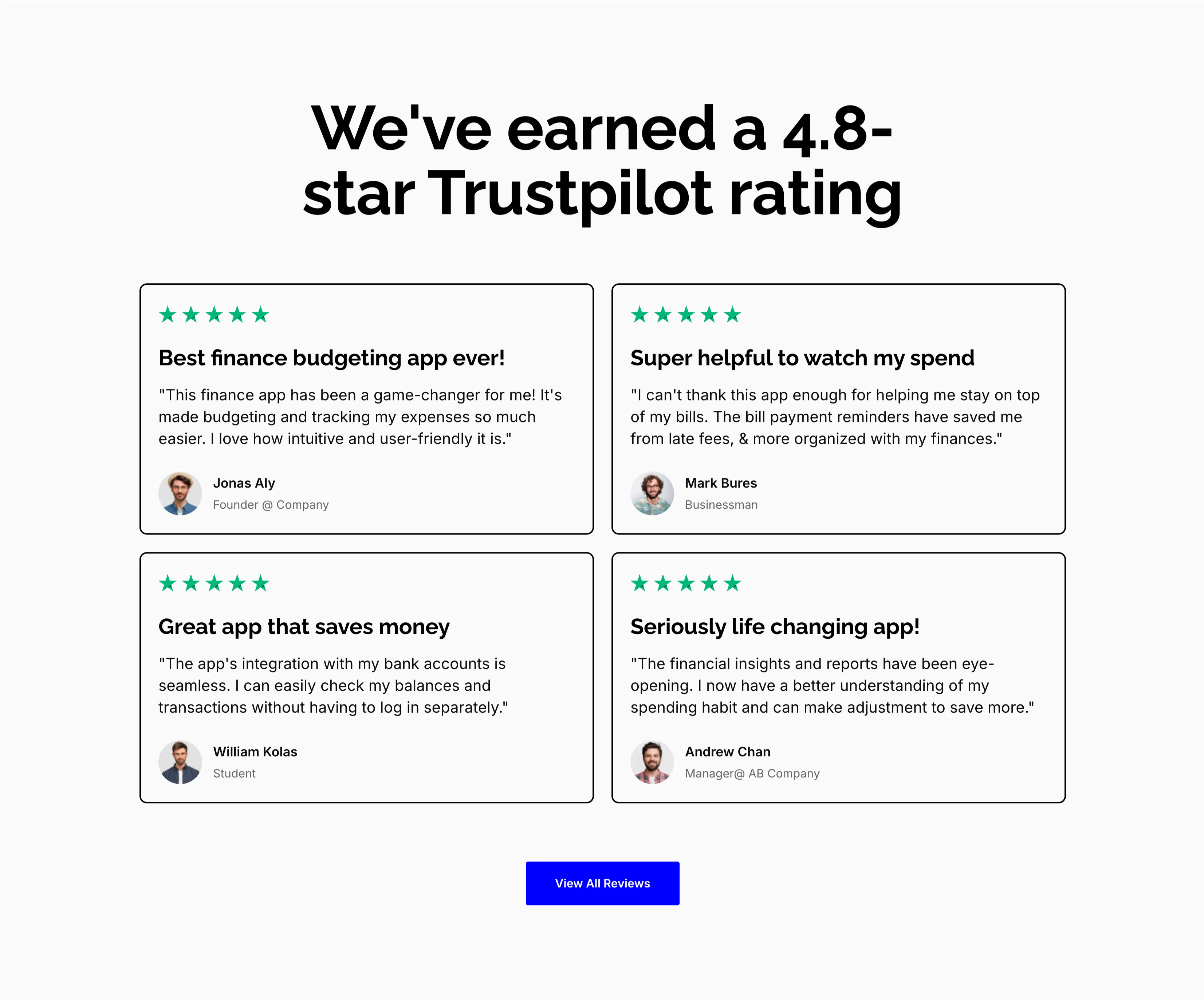
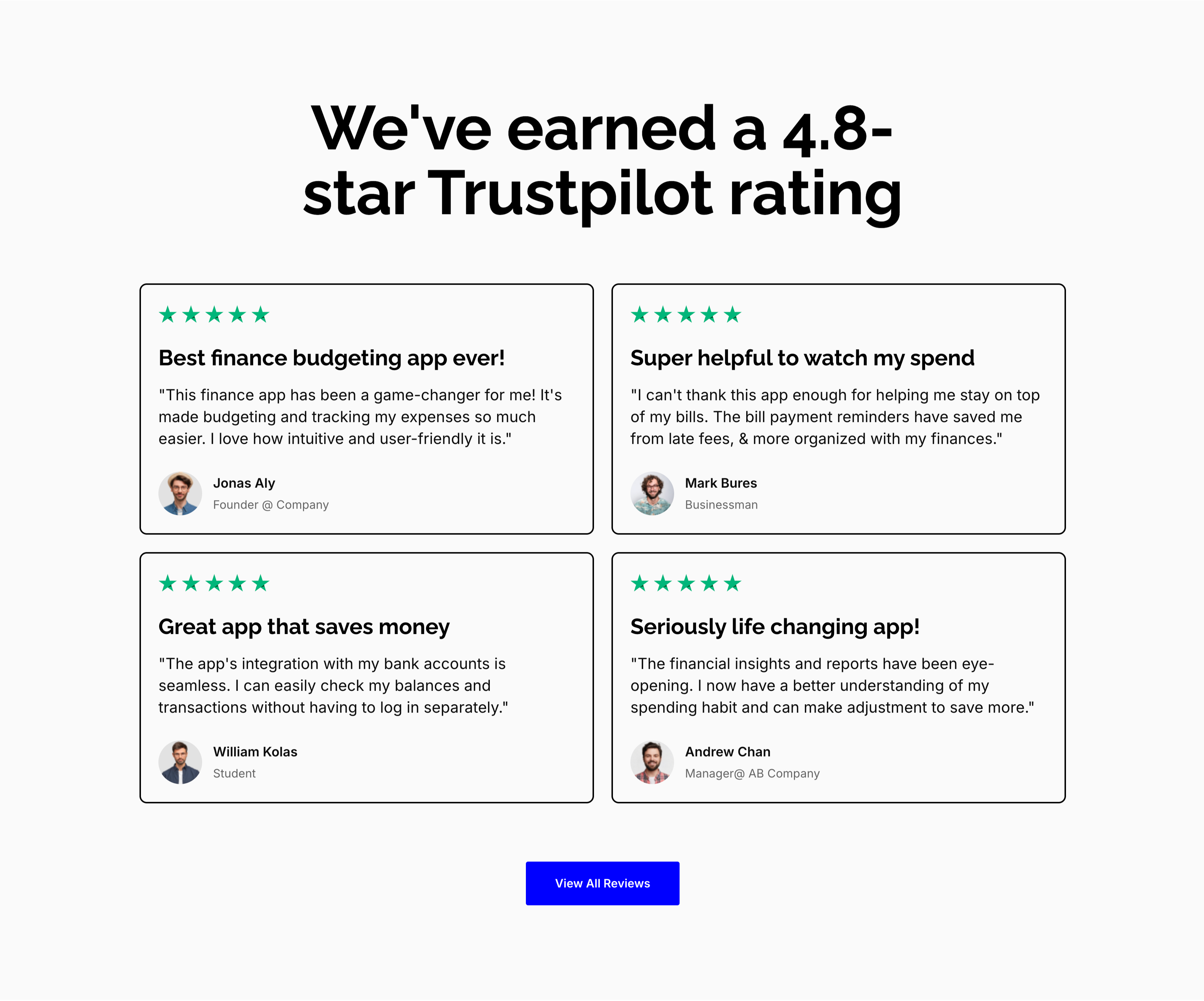
4.8-Star Trustpilot Review Cards
A reviews section on a light gray background, headed by an oversized centered 'We've earned a 4.8-star Trustpilot rating.' Four outlined white cards sit in a 2x2 grid, each opening with a row of green five-star icons, a bold review title and a quoted testimonial, then a small avatar with a name and role: 'Best finance budgeting app ever!' (Jonas Aly, Founder @ Company), 'Super helpful to watch my spend' (Mark Bures, Businessman), 'Great app that saves money' (William Kolas, Student) and 'Seriously life changing app!' (Andrew Chan, Manager @ AB Company). A solid blue 'View All Reviews' button is centered beneath the grid. The uniform starred cards and named reviewers make the social proof feel credible and specific.
Zubuz ↗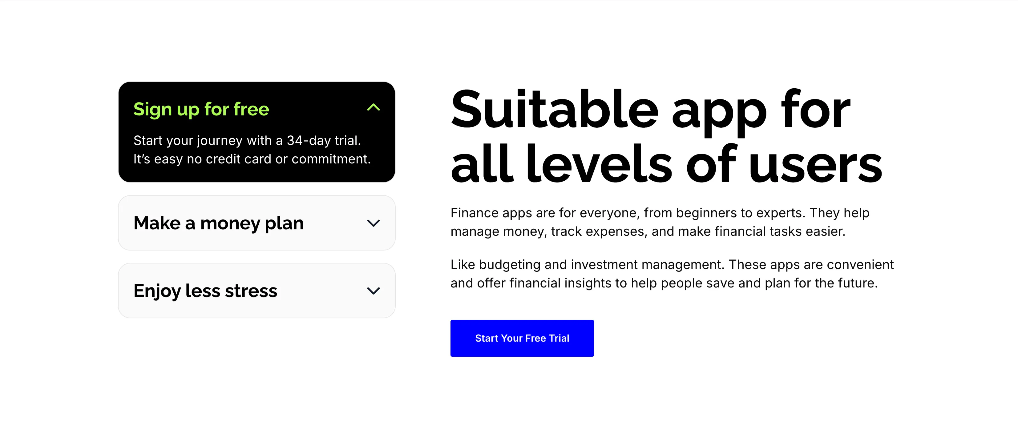
Suitable App For All Levels Accordion
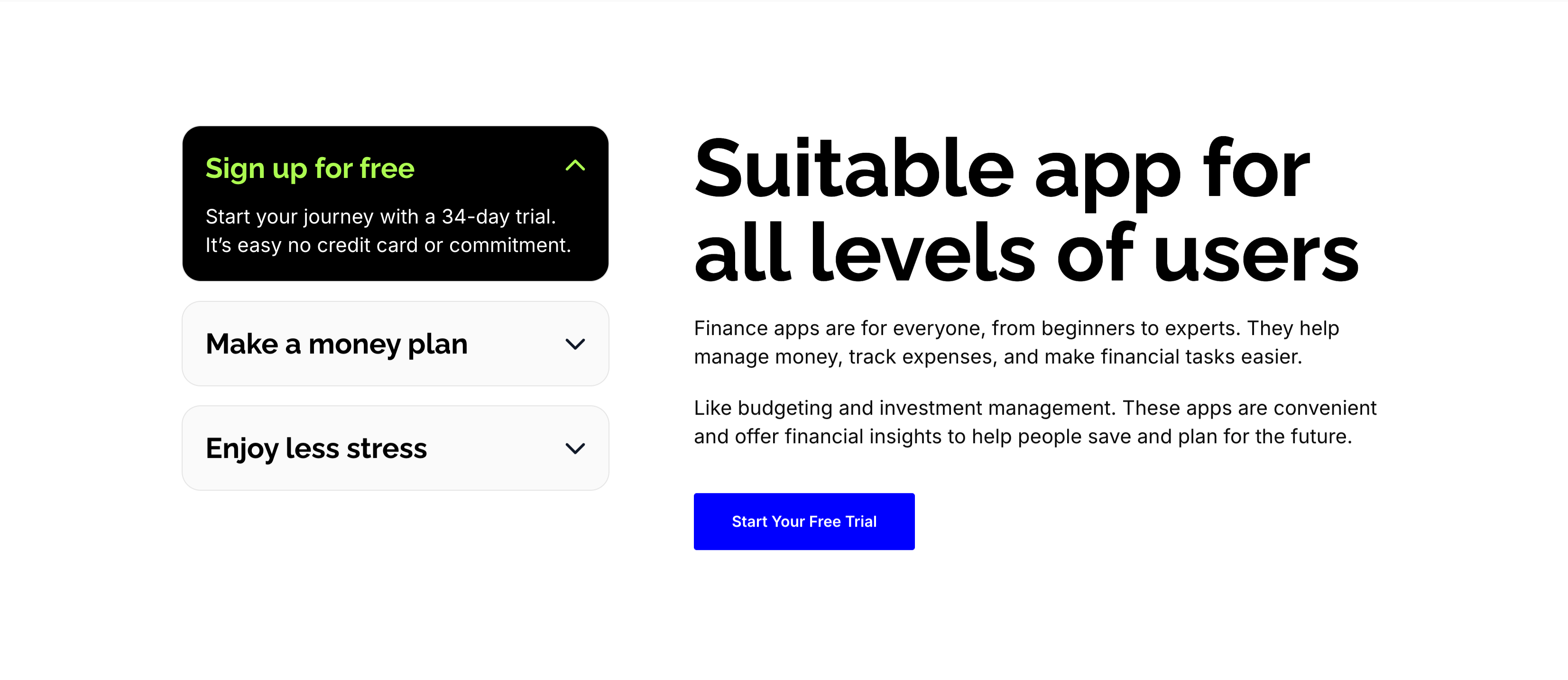
A split content section on white. The left column is a stacked accordion: an expanded black card, 'Sign up for free', with a lime-highlighted title and the line 'Start your journey with a 34-day trial. It's easy no credit card or commitment.', above two collapsed light rows, 'Make a money plan' and 'Enjoy less stress', each with a chevron. The right column carries an oversized 'Suitable app for all levels of users' heading, two explanatory paragraphs about budgeting and investment management, and a solid blue 'Start Your Free Trial' button. The expandable left panel plus the reassuring right-hand copy guide beginners and experts alike toward the trial.
Zubuz ↗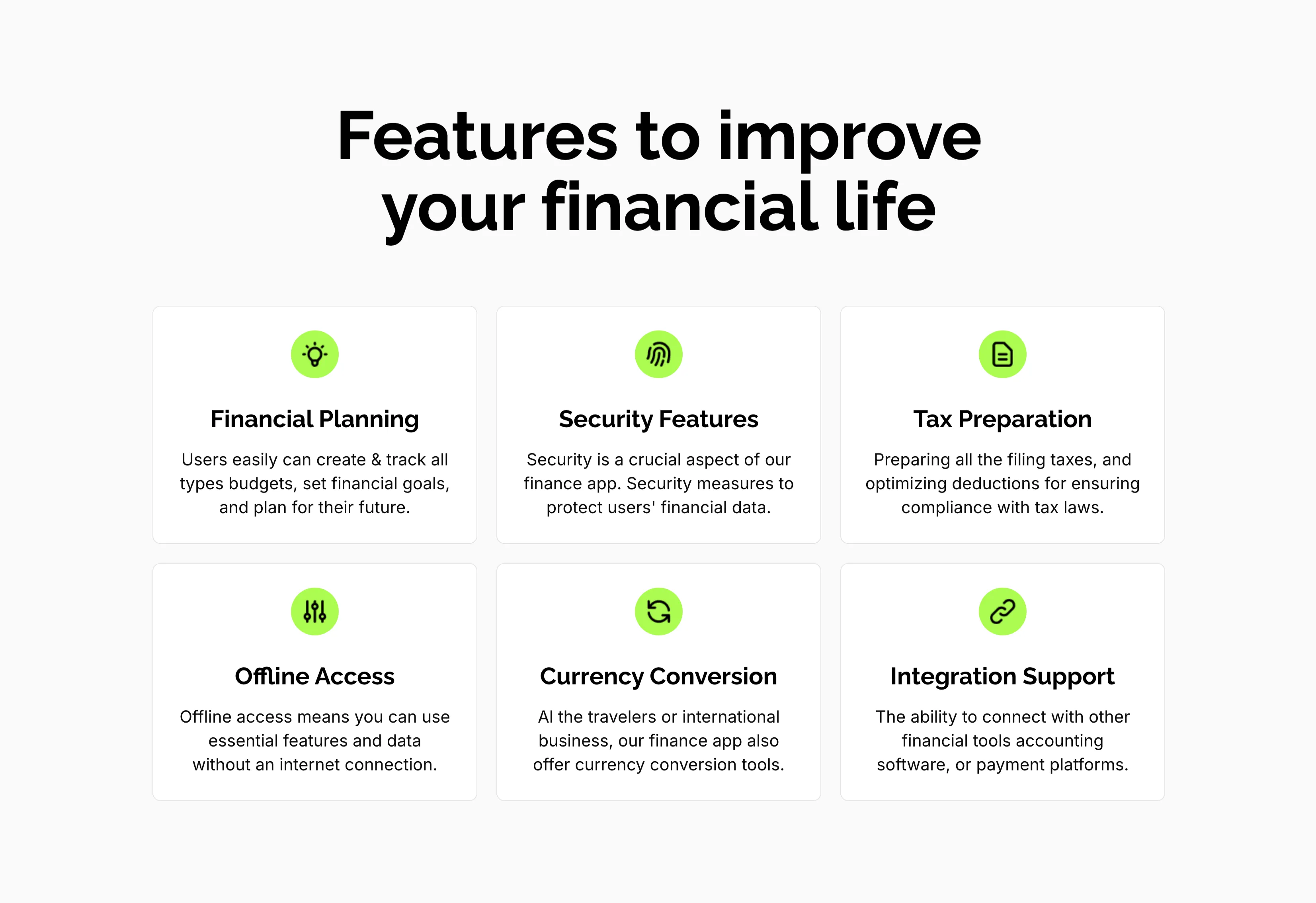
Features To Improve Financial Life Grid
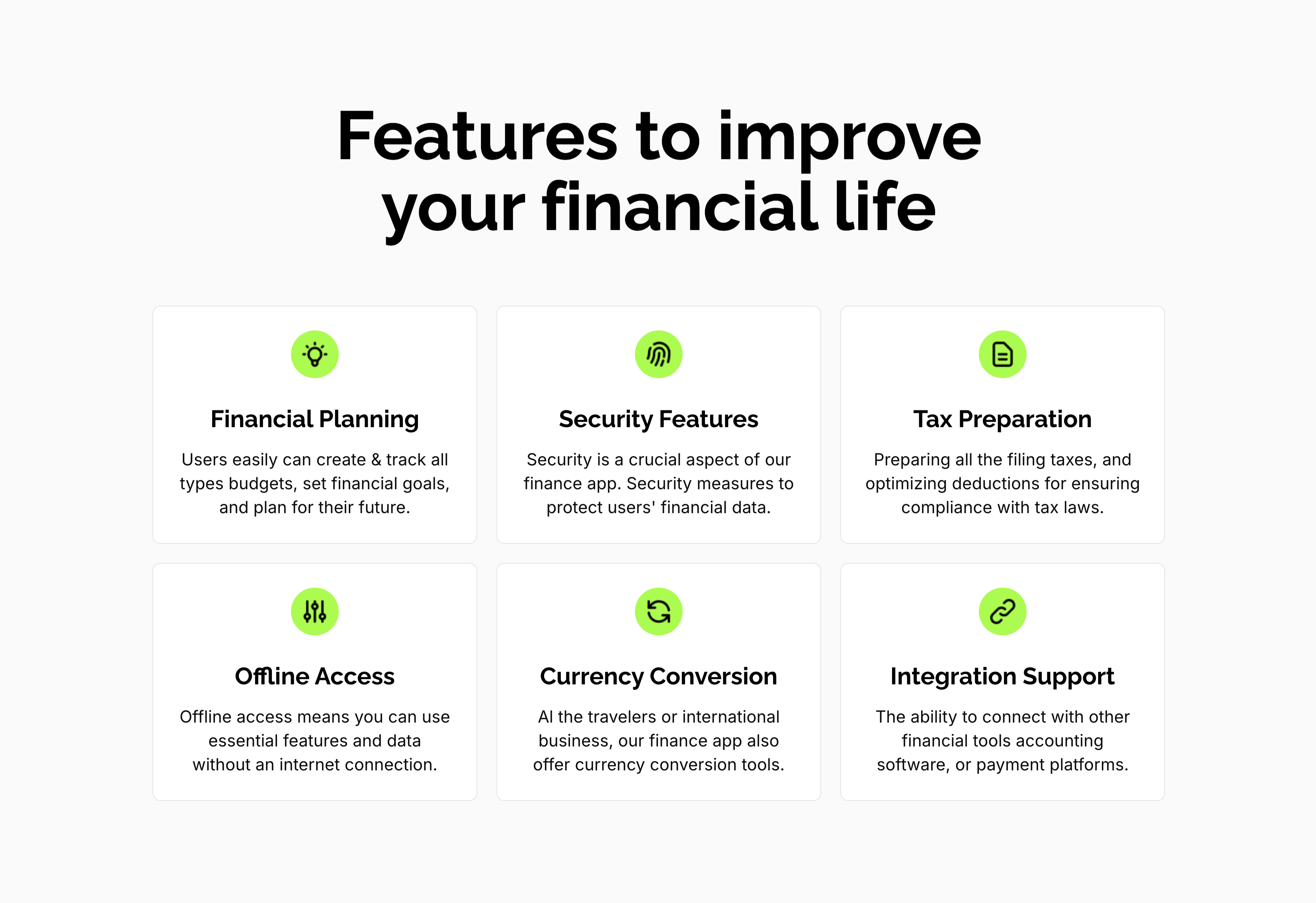
A feature grid on a pale background under a centered oversized 'Features to improve your financial life' heading. Six white rounded cards are arranged three across and two down, each centered on a lime-green circular icon above a bold title and a short gray description: 'Financial Planning' (create and track budgets, set goals), 'Security Features' (measures to protect financial data), 'Tax Preparation' (filing and deductions), 'Offline Access' (use essential features without internet), 'Currency Conversion' (tools for travelers and international business) and 'Integration Support' (connect with other financial tools). The even three-up rhythm and single green accent make the capabilities calm and scannable.
Zubuz ↗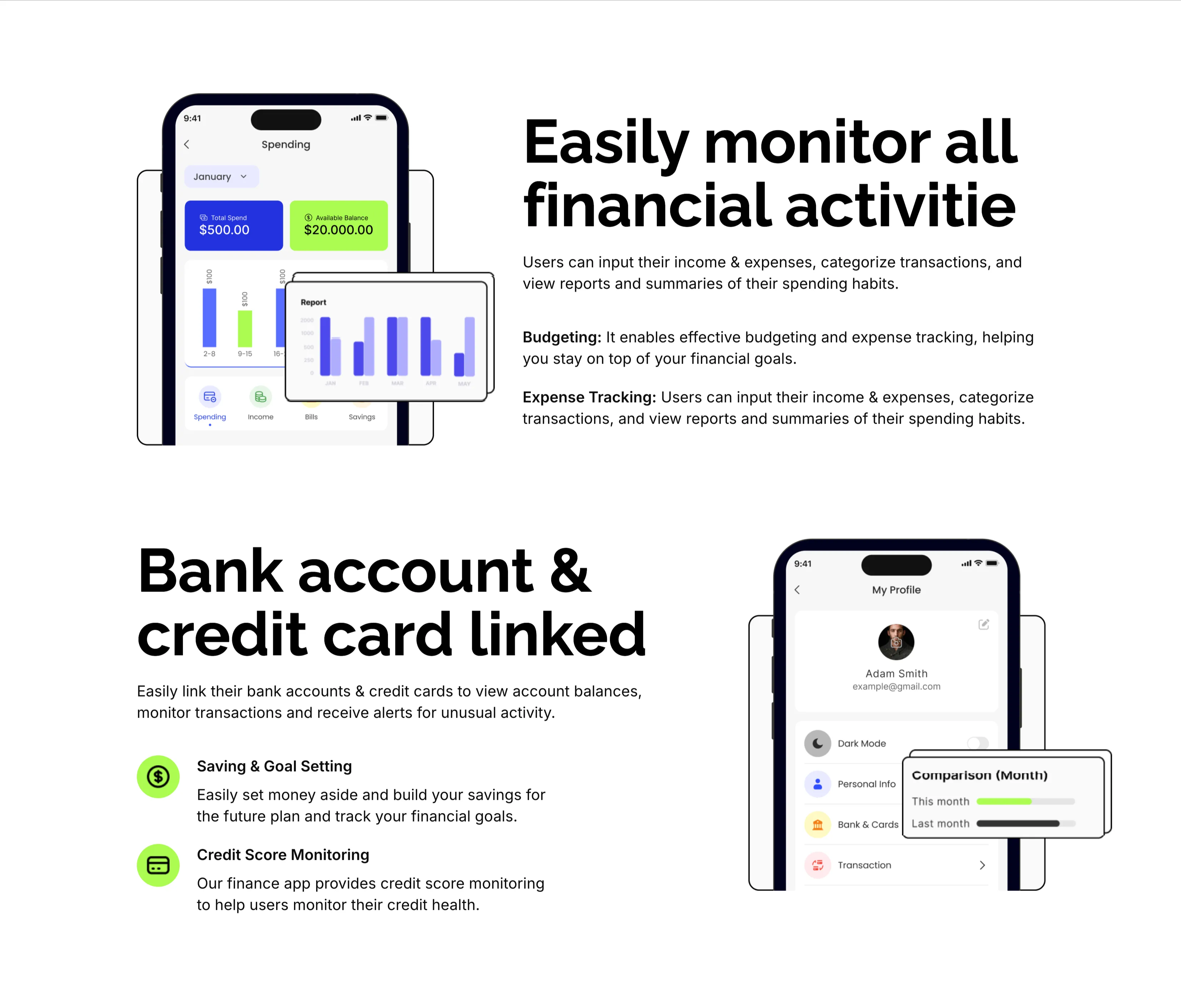
Monitor Finances And Linked Accounts Features
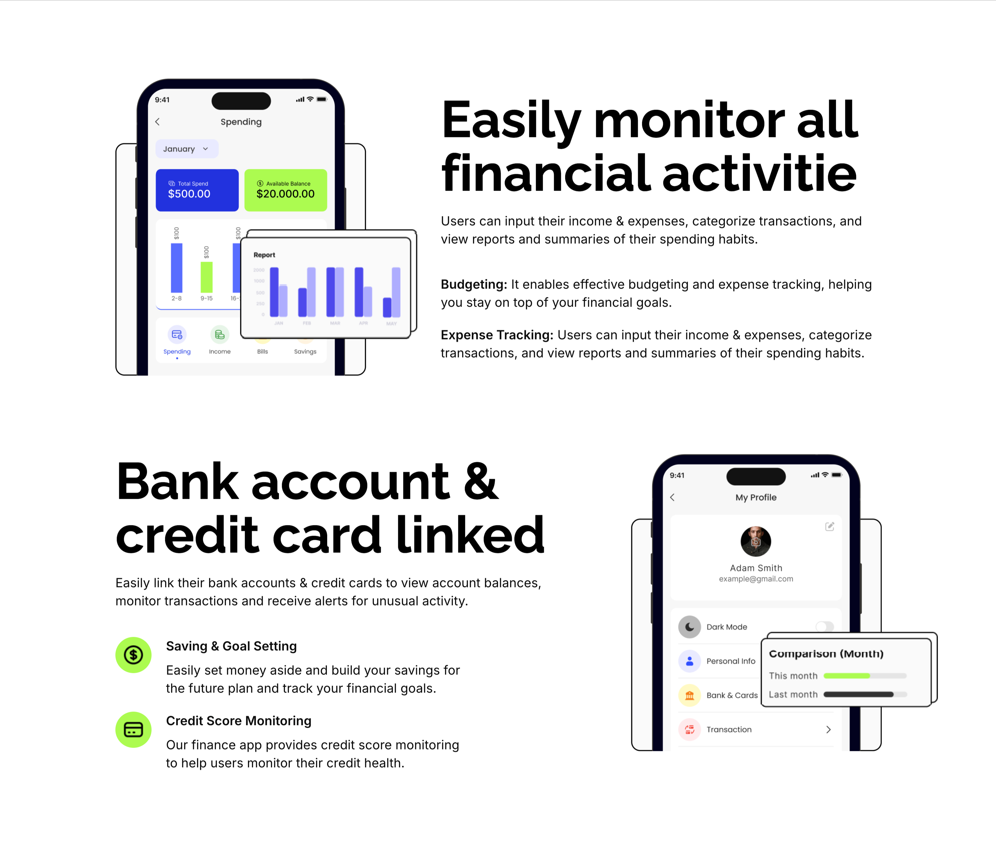
Two stacked alternating feature blocks on white, each pairing a phone mockup with copy. The upper block places a 'Spending' app screen (Total Spend $500, Available Balance $20,000 and a bar report) on the left beside an oversized 'Easily monitor all financial activitie' heading with Budgeting and Expense Tracking sub-points on the right. The lower block flips the layout: an oversized 'Bank account & credit card linked' heading and two green-icon items — 'Saving & Goal Setting' and 'Credit Score Monitoring' — sit left of a 'My Profile' phone screen showing a dark-mode toggle and a floating monthly comparison card. The mirrored phone-and-text rhythm makes each capability concrete and easy to compare.
Zubuz ↗

Trusted By 50,000 Dark Logo Strip
A slim social-proof strip on a solid black background. On the left, a two-line white sentence reads 'Over 50,000 people rely on our app for their money choices.' To its right, customer wordmarks — Sitemark, umbrella and Astonas among them — run in white across two slightly offset rows, with partial logos bleeding off both edges to suggest a scrolling marquee. Rendering every mark in flat white keeps the row uniform and understated. The dark band and edge-cropped logos read as quiet, continuous proof rather than a static grid.
Zubuz ↗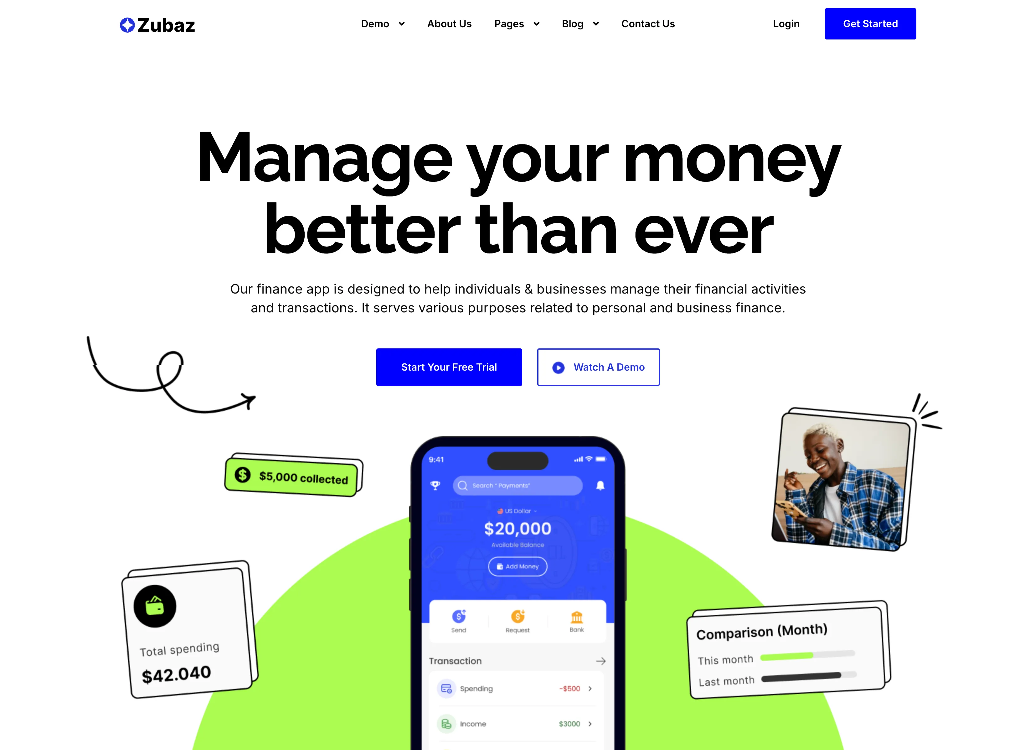
Manage Your Money Finance App Hero
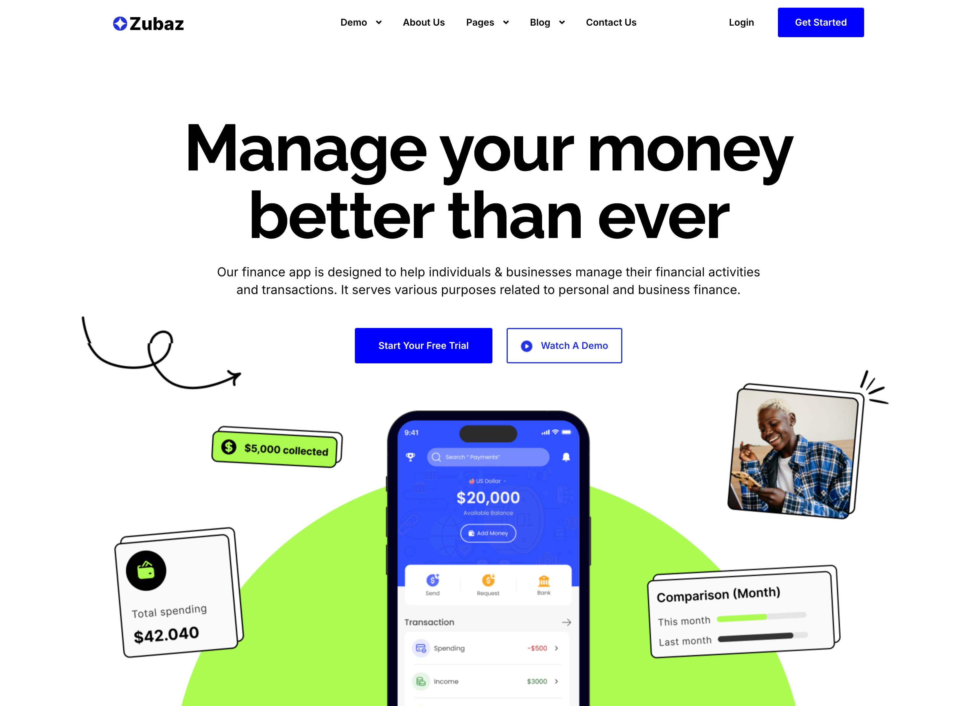
The finance-app landing hero, topped by the Zubaz nav (logo left; Demo, About Us, Pages, Blog, Contact Us center; Login and a blue Get Started right). A centered oversized black headline reads 'Manage your money better than ever' above a two-line gray subhead and two buttons — a solid blue 'Start Your Free Trial' and an outlined 'Watch A Demo' with a play icon. Below, a dark smartphone mockup shows the app's $20,000 balance and transaction list against a lime-green blob, flanked by floating UI cards ('$5,000 collected', 'Total spending $42.040', a monthly 'Comparison' bar) and a small photo of a smiling user. Hand-drawn arrow doodles and the playful green accent give the finance pitch an approachable, energetic tone.
Zubuz ↗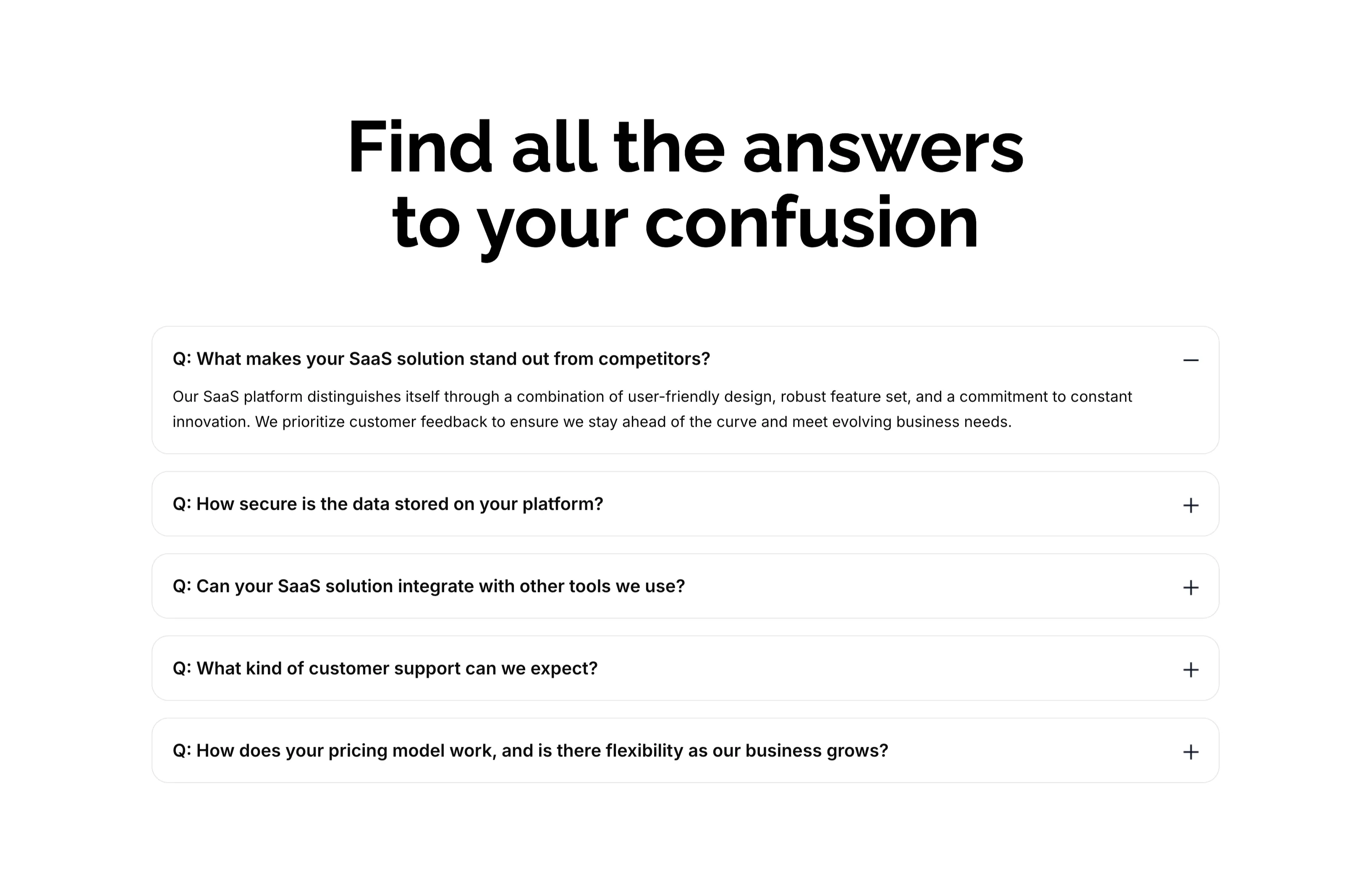
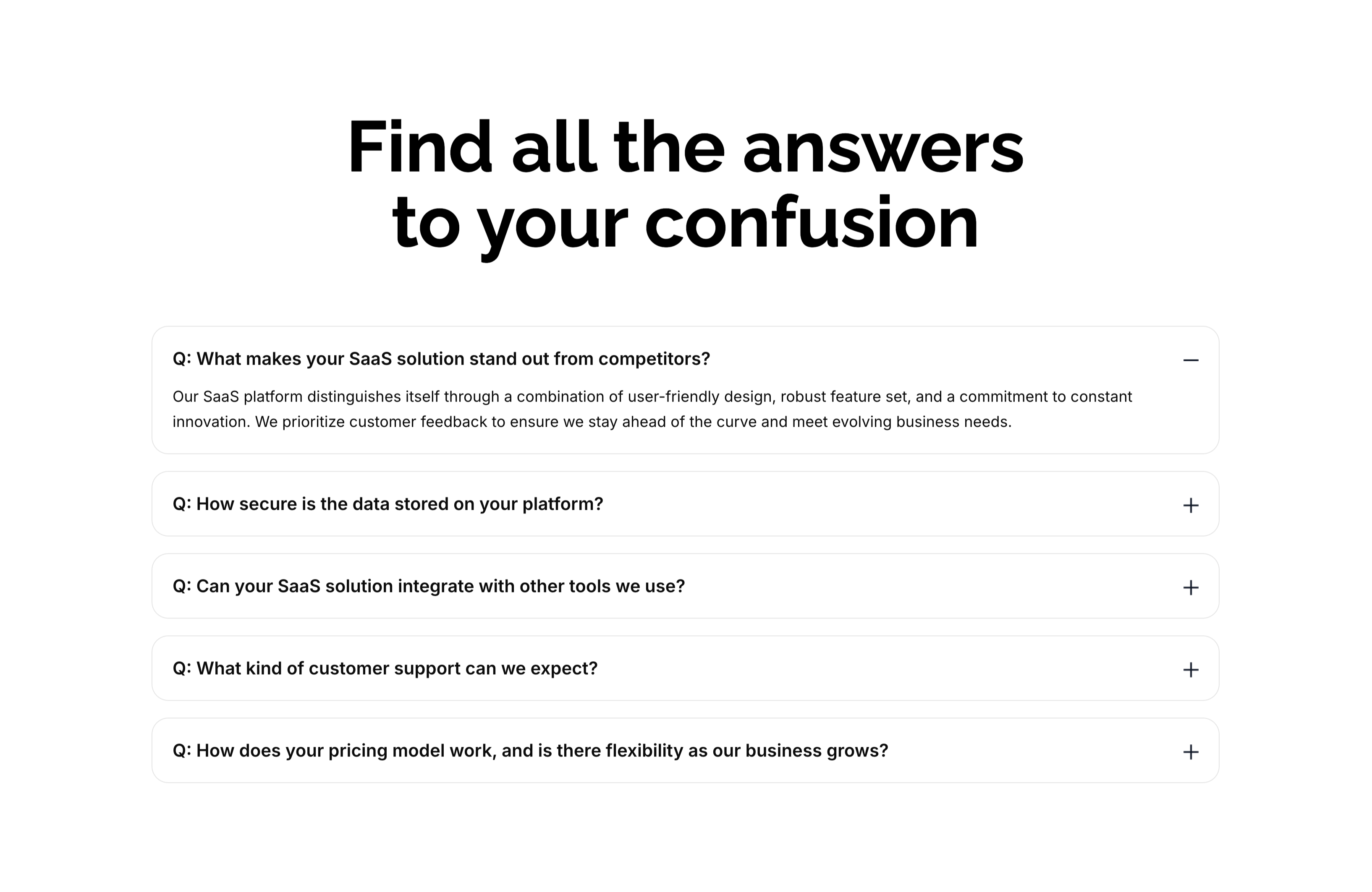
Find All The Answers FAQ Accordion
A FAQ section on white, led by an oversized centered two-line heading, 'Find all the answers to your confusion.' Below sit five stacked, rounded accordion rows, each a bold question prefixed with 'Q:'. The first row — 'What makes your SaaS solution stand out from competitors?' — is expanded, showing a gray paragraph answer and a minus toggle, while the remaining rows ('How secure is the data…', 'Can your SaaS solution integrate…', 'What kind of customer support…', 'How does your pricing model work…') are collapsed with plus toggles on the right. The clean single-column accordion with clear expand/collapse affordances makes the answers easy to scan one at a time.
Zubuz ↗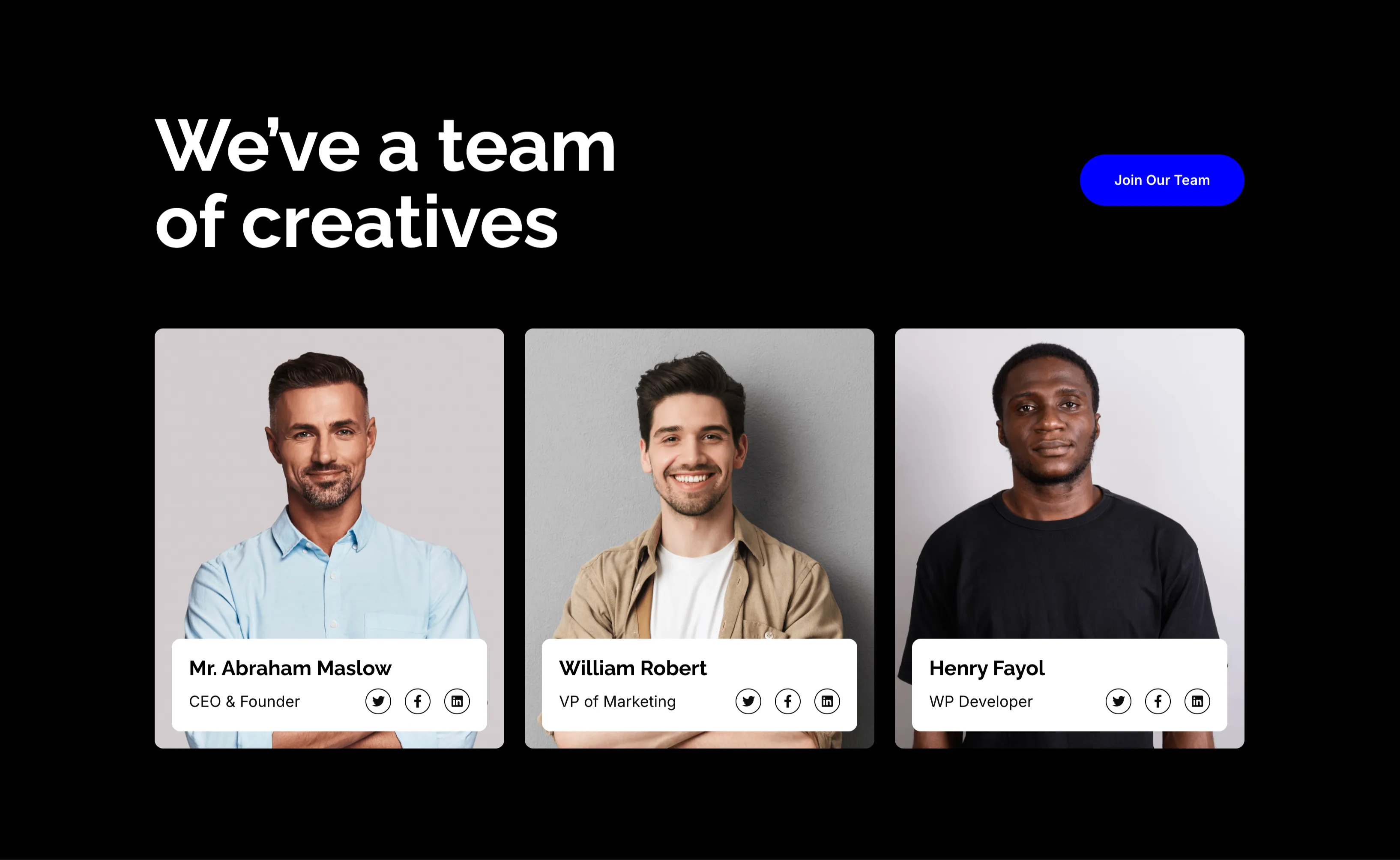
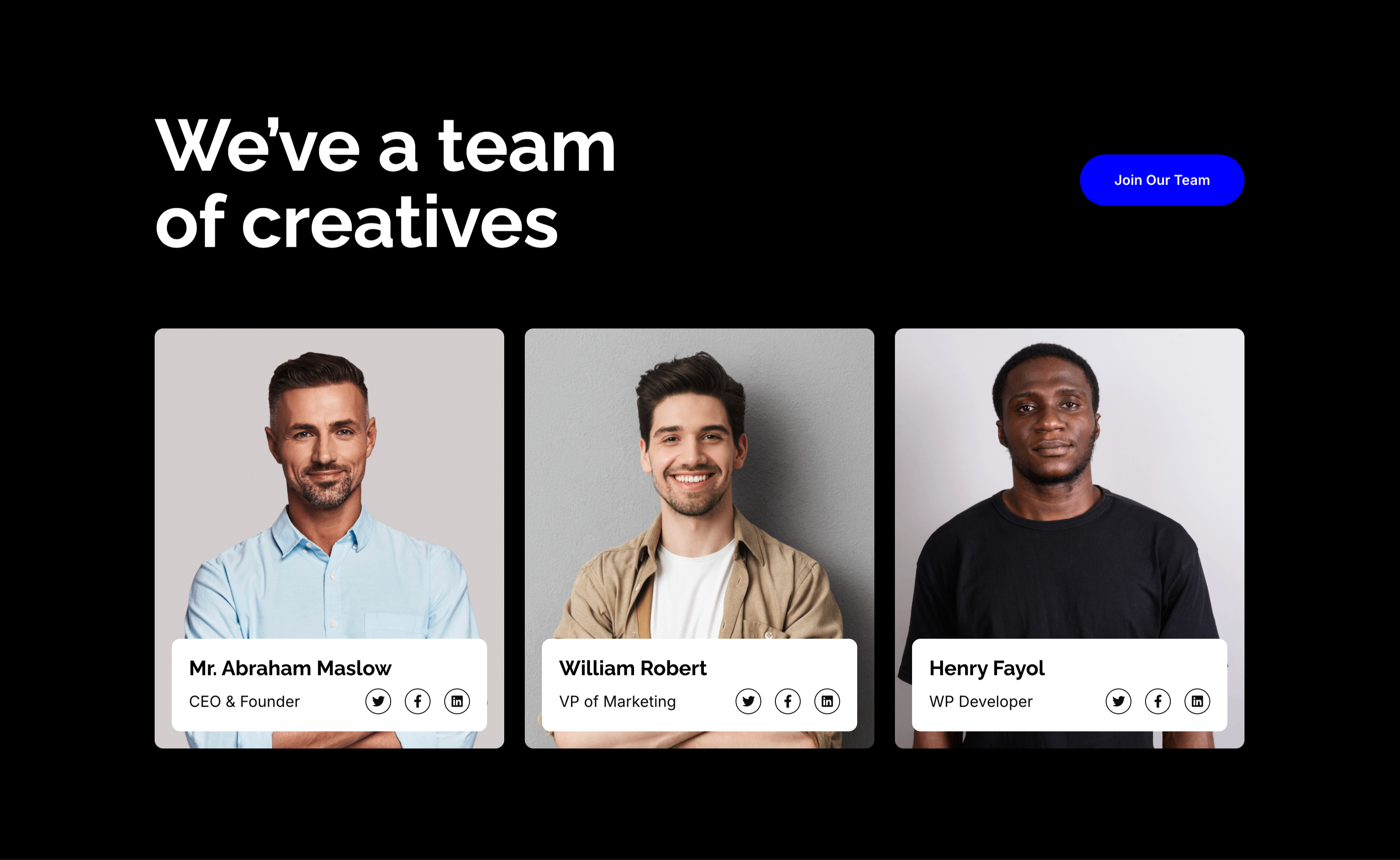
We've A Team Of Creatives Member Cards
A team section on a solid black background. The upper left carries a large white 'We've a team of creatives' headline, balanced by a blue 'Join Our Team' pill button floated to the upper right. Below sit three equal member cards, each a portrait photograph with a white info panel overlapping its lower edge: 'Mr. Abraham Maslow — CEO & Founder', 'William Robert — VP of Marketing' and 'Henry Fayol — WP Developer', each panel carrying small Twitter, Facebook and LinkedIn icons. The dark canvas makes the portraits and white cards pop. The recruiting headline plus the leadership line-up reads as both a team showcase and a hiring nudge.
Zubuz ↗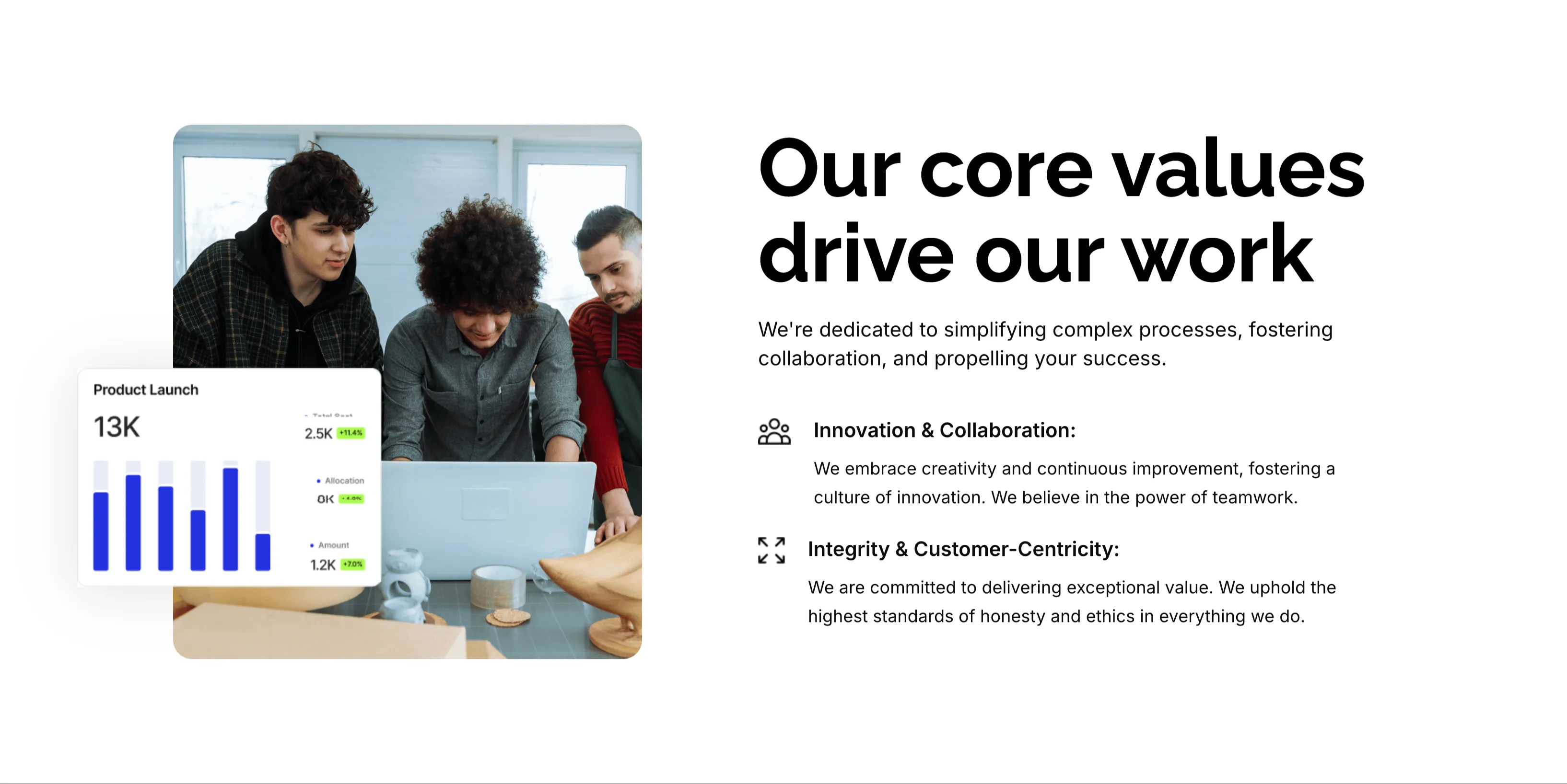
Our Core Values Split Feature
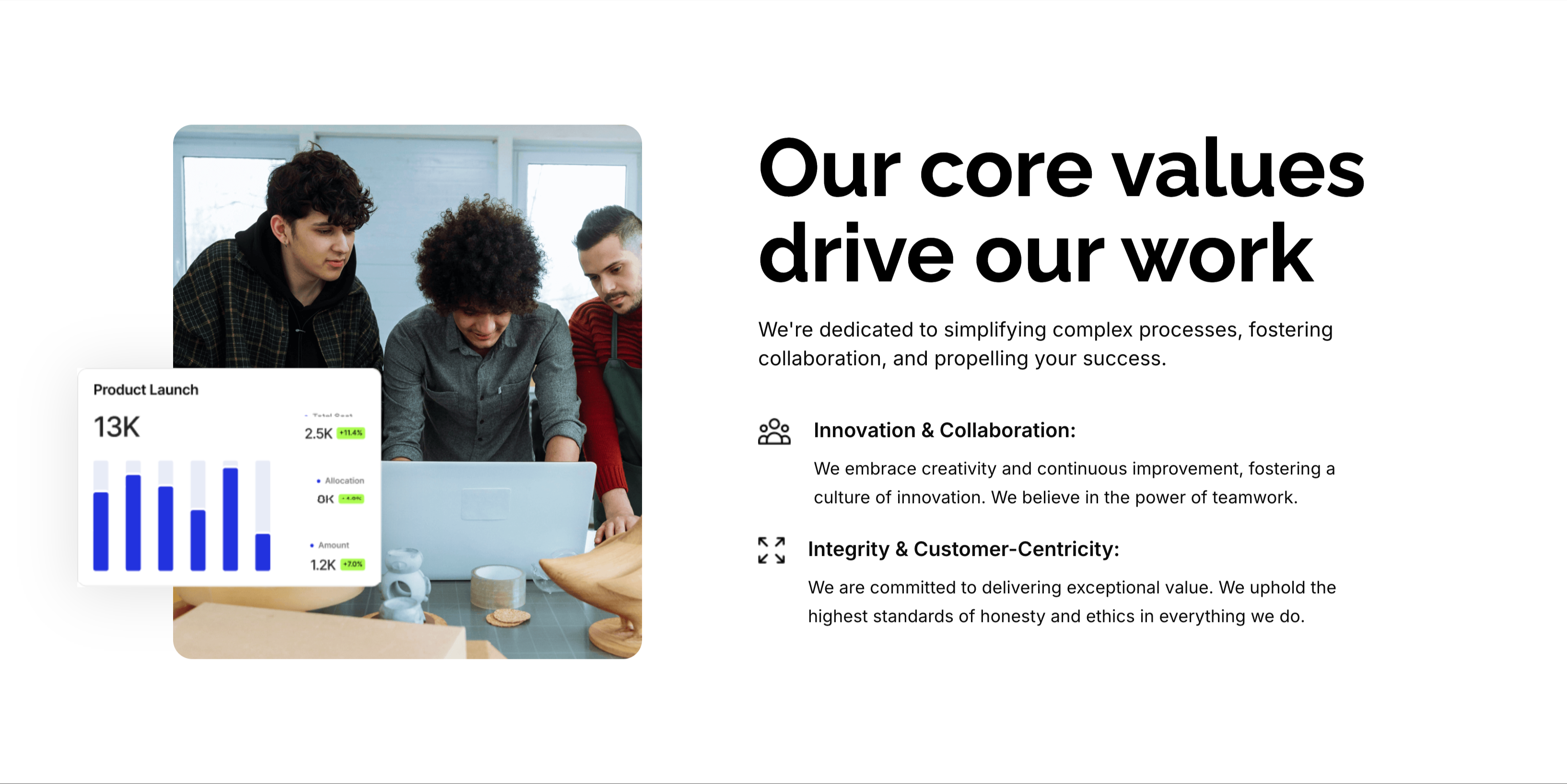
A two-column values section on white. The left column holds a rounded photo of three colleagues gathered around a laptop, overlaid at the corner with a floating 'Product Launch' analytics card showing a 13K figure and a small bar chart. The right column leads with an oversized 'Our core values drive our work' heading and a one-line intro, then two icon-led value blocks: 'Innovation & Collaboration:' (embracing creativity, continuous improvement and teamwork) and 'Integrity & Customer-Centricity:' (delivering exceptional value with the highest standards of honesty). A small outline icon precedes each value title. The photo-plus-icon-list layout balances human warmth with a crisp statement of principles.
Zubuz ↗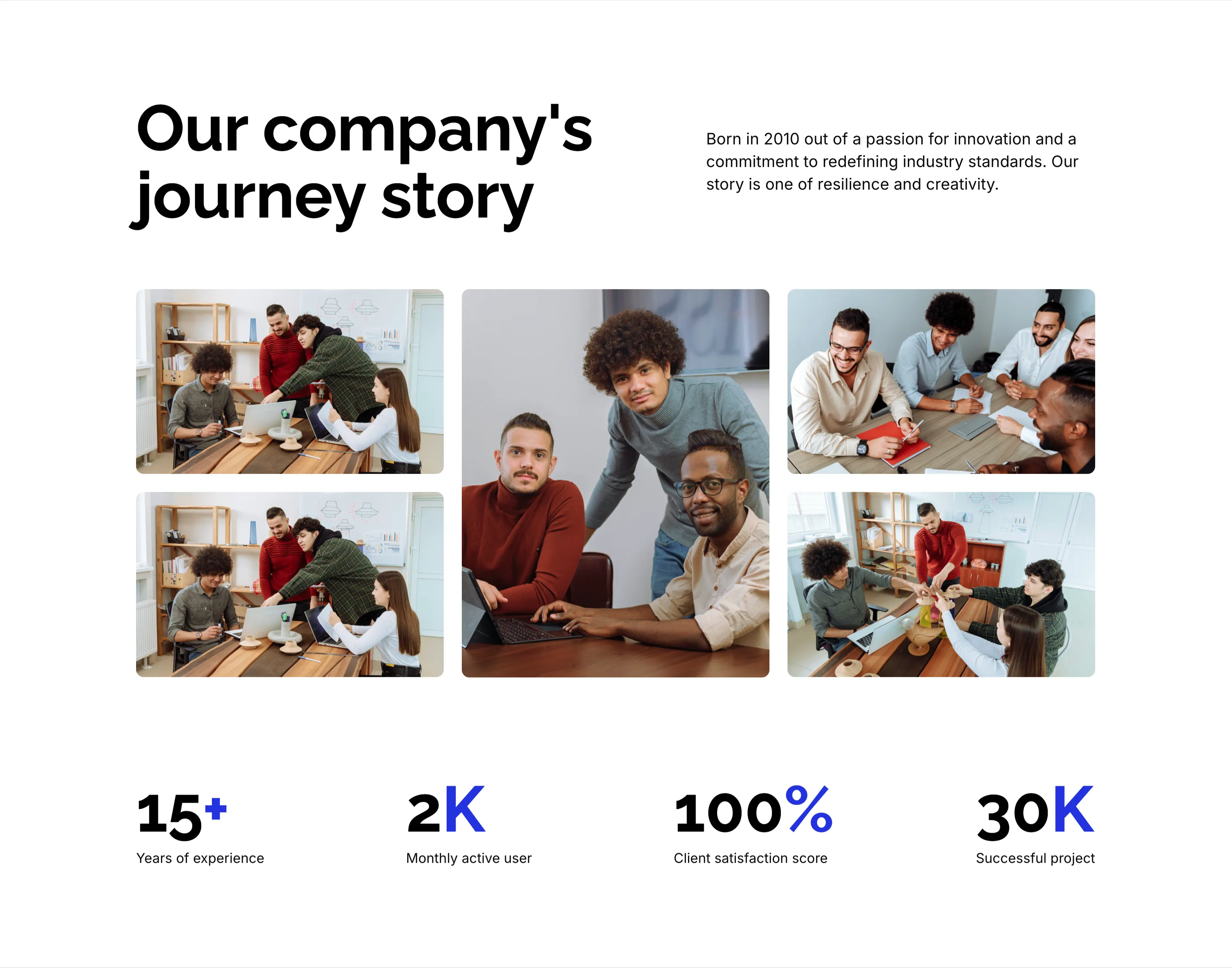
Our Company's Journey Story With Stats
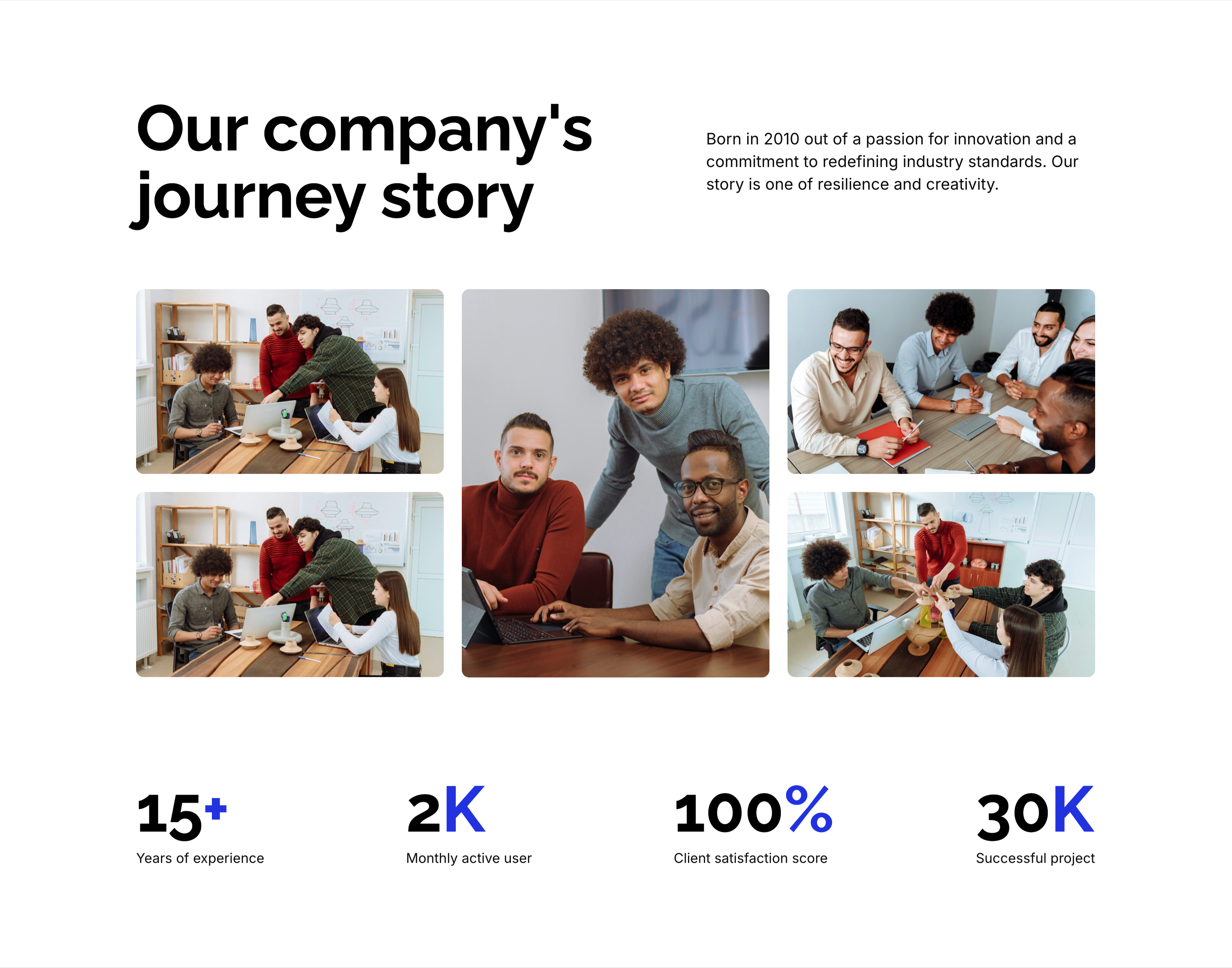
A company-story section on white. The top pairs an oversized black 'Our company's journey story' heading on the left with a short right-column paragraph noting the firm was 'Born in 2010 out of a passion for innovation…'. Below spans a five-image collage of candid office and team photos in a mixed grid, with one taller central portrait anchoring the group. A row of four blue-accented statistics closes the block — '15+' years of experience, '2K' monthly active users, '100%' client satisfaction score and '30K' successful projects — each figure over a small gray caption. The heading, photo montage and hard numbers together build an at-a-glance credibility story.
Zubuz ↗

About Us Minimal Page Hero
A minimal page-header hero on a solid black background. A single oversized white 'About Us' headline is centered in the upper third, with no imagery or supporting copy competing for attention. Directly beneath it sits a small breadcrumb trail — 'Home' in white followed by a slash and 'About Us' in blue to mark the current page. The vast empty black field and lone centered title give the header a stark, confident, editorial feel. It works as a lightweight page intro that orients the visitor without distraction.
Zubuz ↗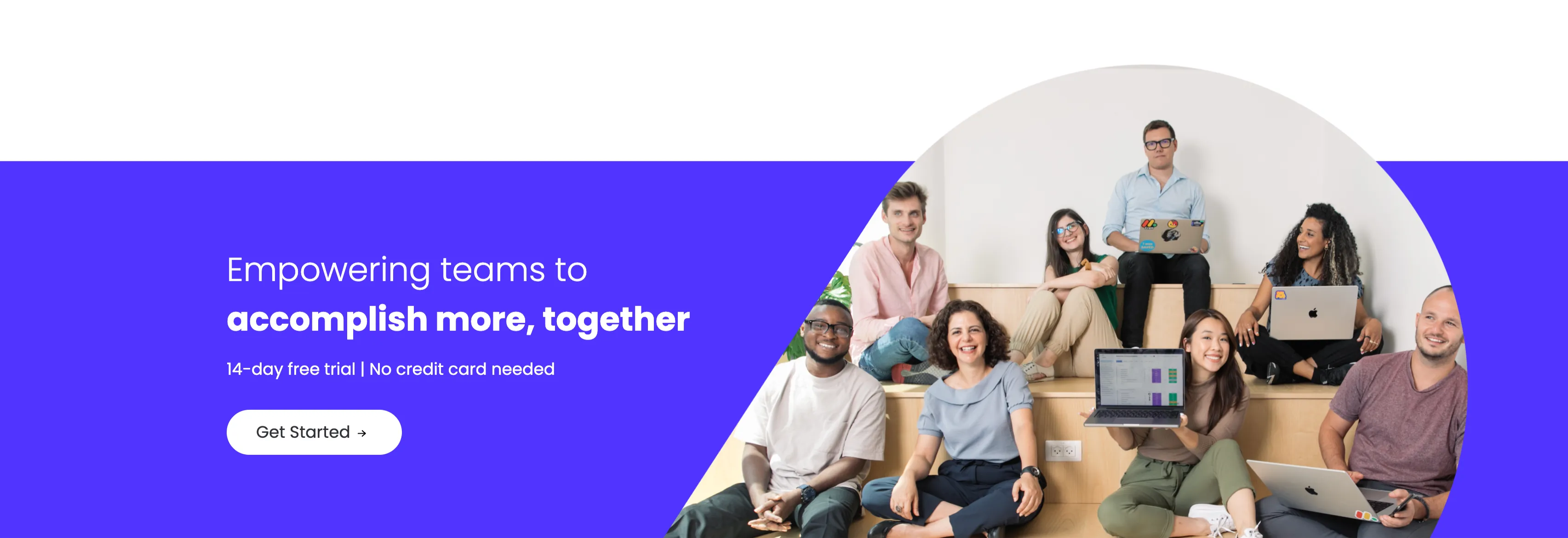
Empowering Teams Final Signup CTA
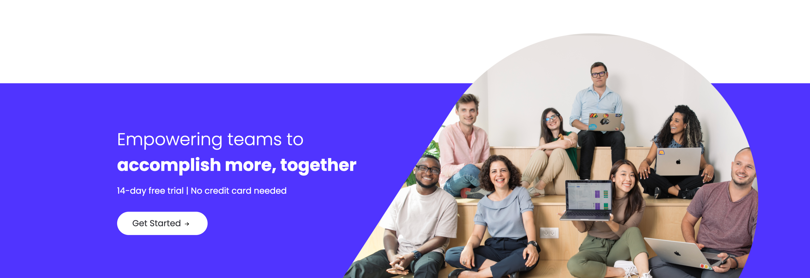
A closing sign-up call-to-action split between an indigo panel on the left and a large photo on the right. The left side stacks a two-line headline — a lighter 'Empowering teams to' over a bold 'accomplish more, together' in white — followed by the qualifier '14-day free trial | No credit card needed' and a white 'Get Started' pill button with an arrow. The right side is a circular-masked photograph of a diverse group of eight colleagues seated on tiered wooden steps, several holding laptops (one displaying a monday board), smiling toward the camera. The bold value headline, risk-reducing trial note and friendly team photo combine into a warm, low-friction final conversion prompt.
Monday ↗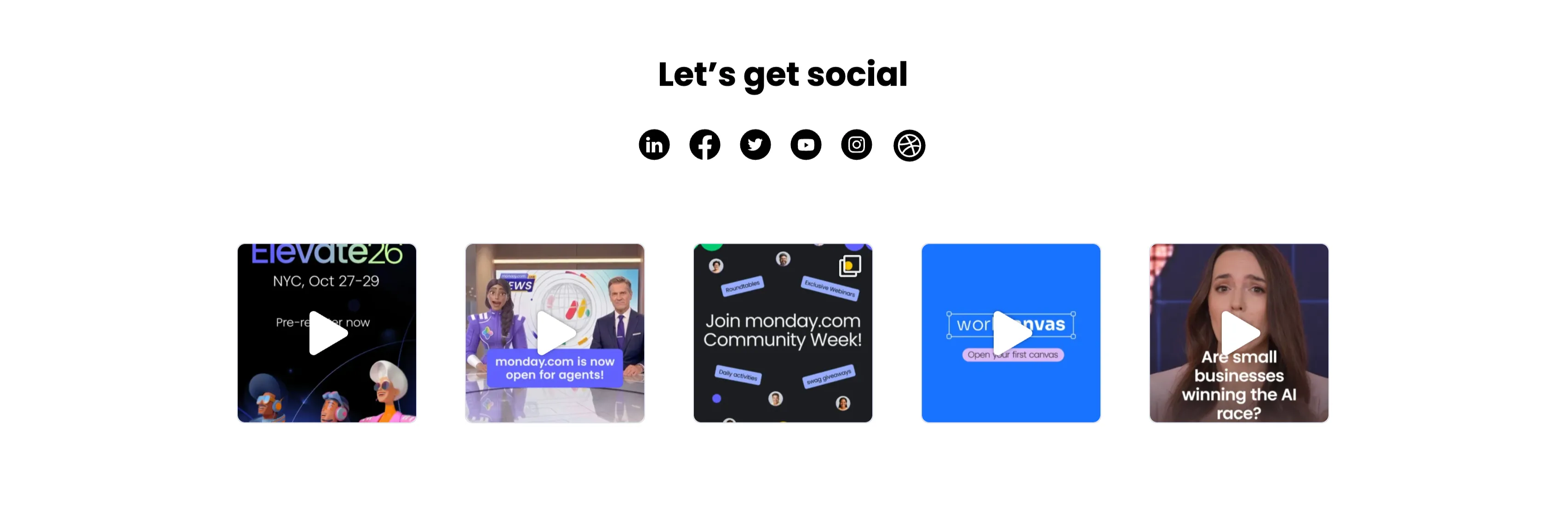
Let's Get Social Video Thumbnail Grid
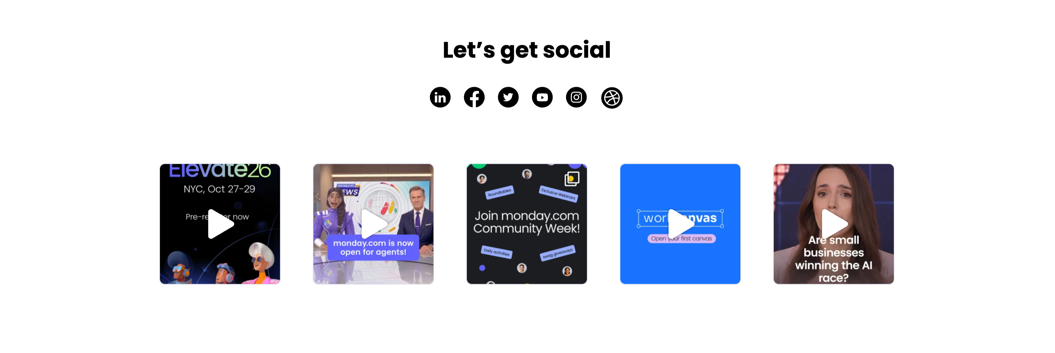
A social section headed by a centered bold 'Let's get social' with a row of six round black social icons (LinkedIn, Facebook, Twitter, YouTube, Instagram and Dribbble) beneath it. Below sits a single row of five square video thumbnails, each with a white play-triangle overlay: an 'Elevate26 — NYC, Oct 27–29 / Pre-register now' event graphic with 3D characters, a news-desk clip captioned 'monday.com is now open for agents!', a dark 'Join monday.com Community Week!' promo, a bright blue 'workcanvas — Open your first canvas' card, and a talking-head clip asking 'Are small businesses winning the AI race?'. The icon row plus playable video tiles invites the visitor to follow and watch, and the uniform square grid reads as a lightweight social feed.
Monday ↗
Get To Know Us Better Resource Cards
A three-up resource section under a centered bold 'Get to know us better' heading, with a soft blue glow behind the cards. Each of the three white rounded cards pairs a large circular flat icon with a small category label, a bold title and one line of copy: a green megaphone for 'Read — monday.com in the news' ('Check out some of our favorite articles over the years!'), a yellow microphone for 'Listen — Startup for Startup podcast' ('Sharing insights, experience, and knowledge.'), and a pink image icon for 'Explore — Our blog stacks' ('Customer stories, tips, and our opinions on everything in between.'). The colourful icons and consistent Read/Listen/Explore labelling make the content channels instantly distinguishable.
Monday ↗
Together We Can Impact Careers CTA Band
A careers call-to-action set in a wide dark-indigo rounded band. On the left, a two-line headline mixes weights — a bold 'Together we can impact' leading into a lighter 'how teams work across the globe' — in white type. Directly beneath sits a white pill button labelled 'Join our team!' with a right arrow. The right side of the band is pure decoration: overlapping brighter-indigo circular and arc shapes with a small glowing dot, adding depth without imagery or copy. The deep background, single bold headline and lone button make the recruiting ask focused and unmissable.
Monday ↗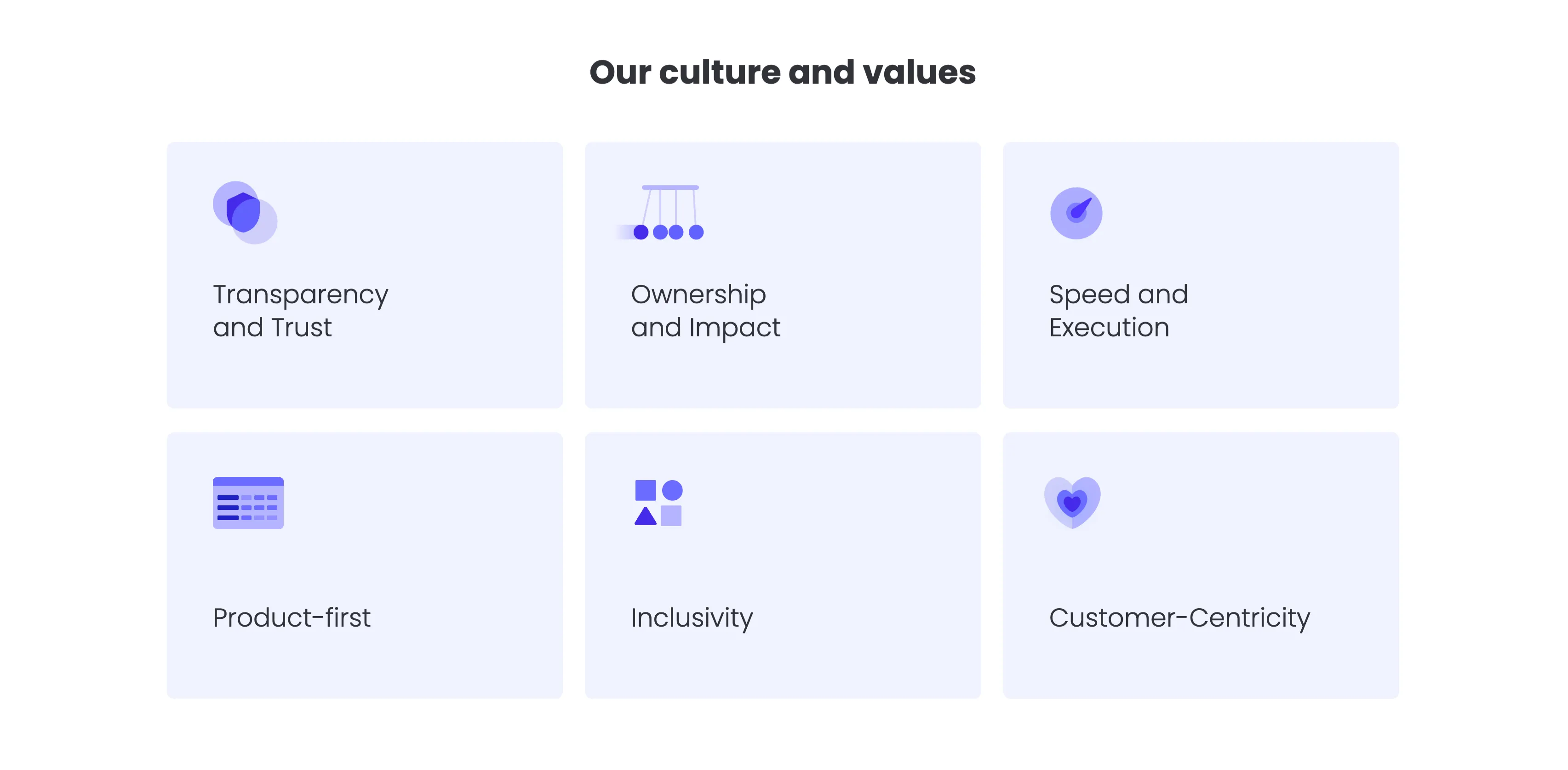
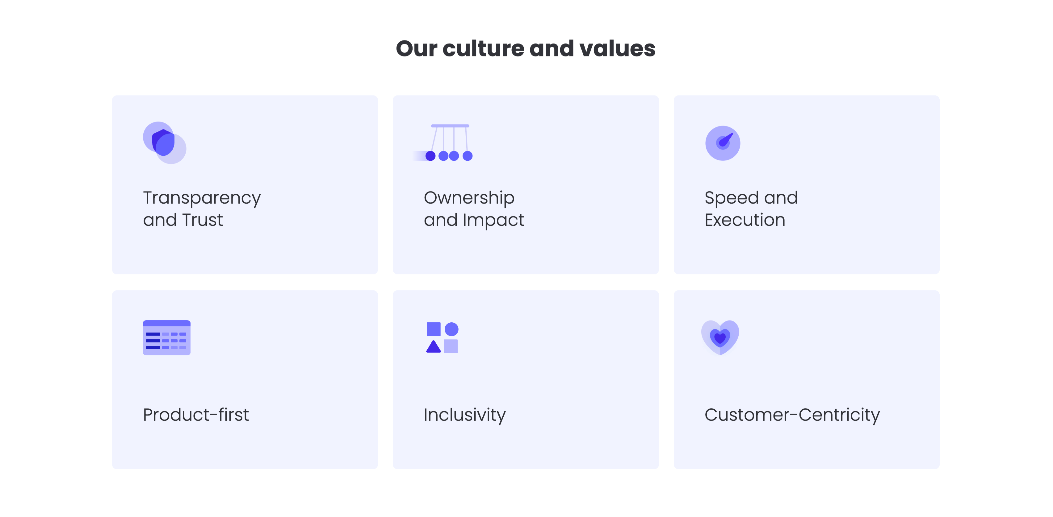
Our Culture And Values Icon Grid
A values grid headed by a centered bold 'Our culture and values' title. Six pale-lavender rounded cards are arranged in a three-column by two-row grid, each holding a soft indigo illustrative icon in its upper-left corner and a value label below: 'Transparency and Trust', 'Ownership and Impact' and 'Speed and Execution' on the top row; 'Product-first', 'Inclusivity' and 'Customer-Centricity' on the bottom. The icons — a shield, a Newton's cradle, a speed gauge, a table, stacked shapes and a heart — visually cue each value. The uniform card sizing, restrained lavender palette and even spacing make the values easy to scan as a set.
Monday ↗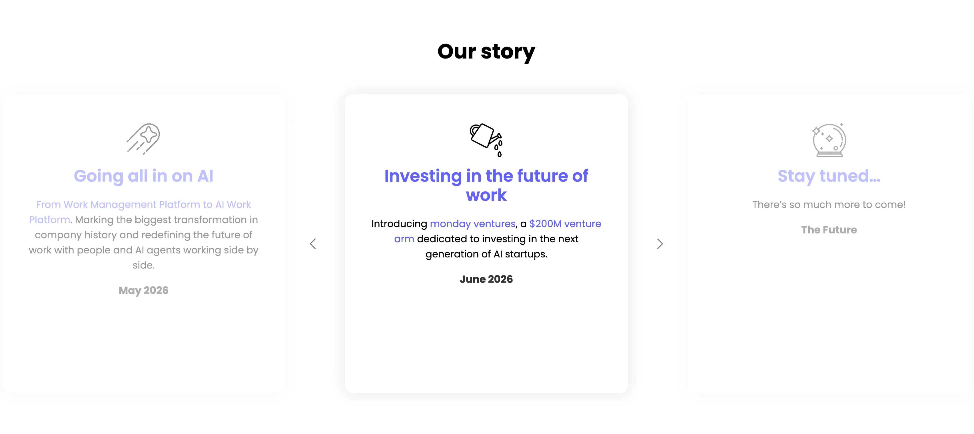
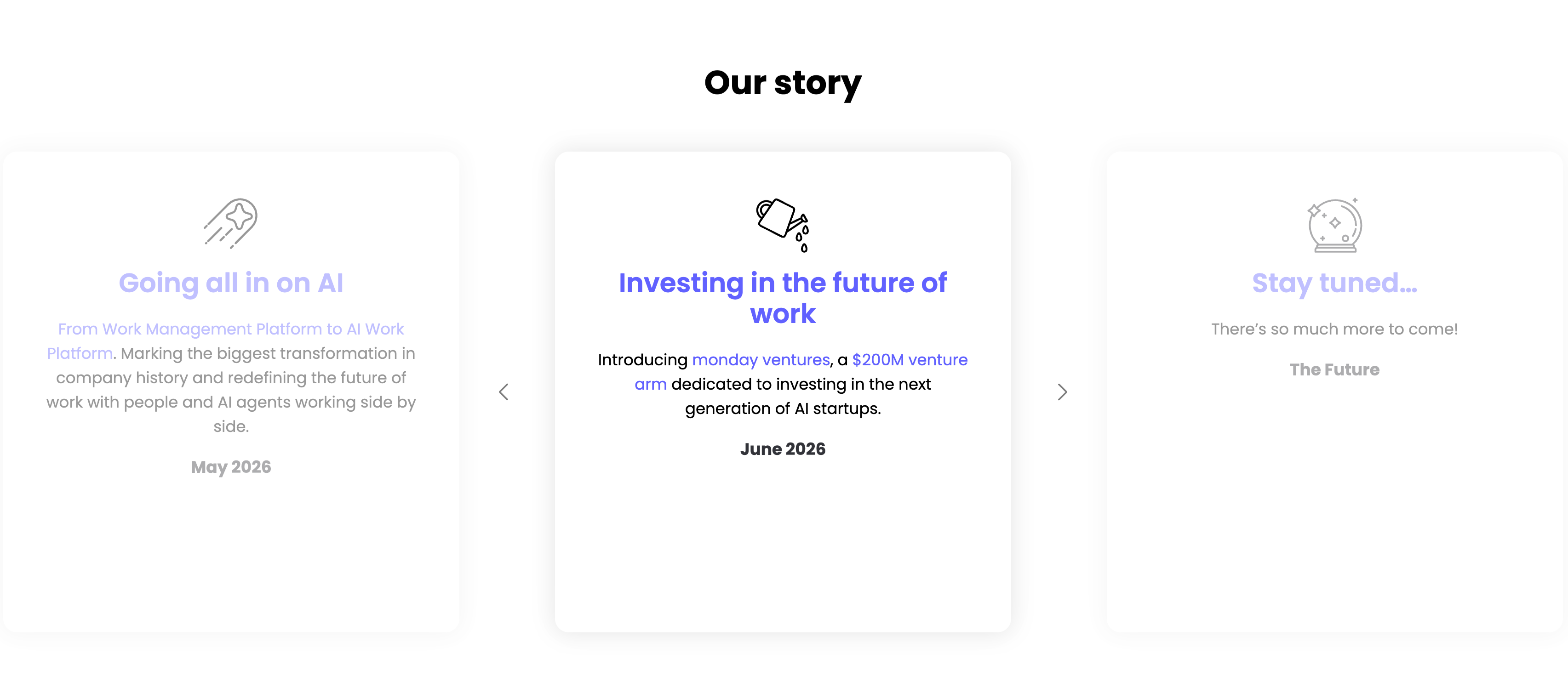
Our Story Timeline Carousel
A milestone carousel titled 'Our story', centered on a white background. Three tall rounded cards sit in a row with faded neighbours and left/right chevron arrows signalling more. The center, active card leads with a watering-can line icon and an indigo heading 'Investing in the future of work', body copy 'Introducing monday ventures, a $200M venture arm dedicated to investing in the next generation of AI startups.', and a bold 'June 2026' date. The dimmed left card reads 'Going all in on AI' ('From Work Management Platform to AI Work Platform…', May 2026) and the right card 'Stay tuned…' ('There's so much more to come!', The Future), each with its own line icon. The card-per-milestone format turns the roadmap into an easy horizontal browse.
Monday ↗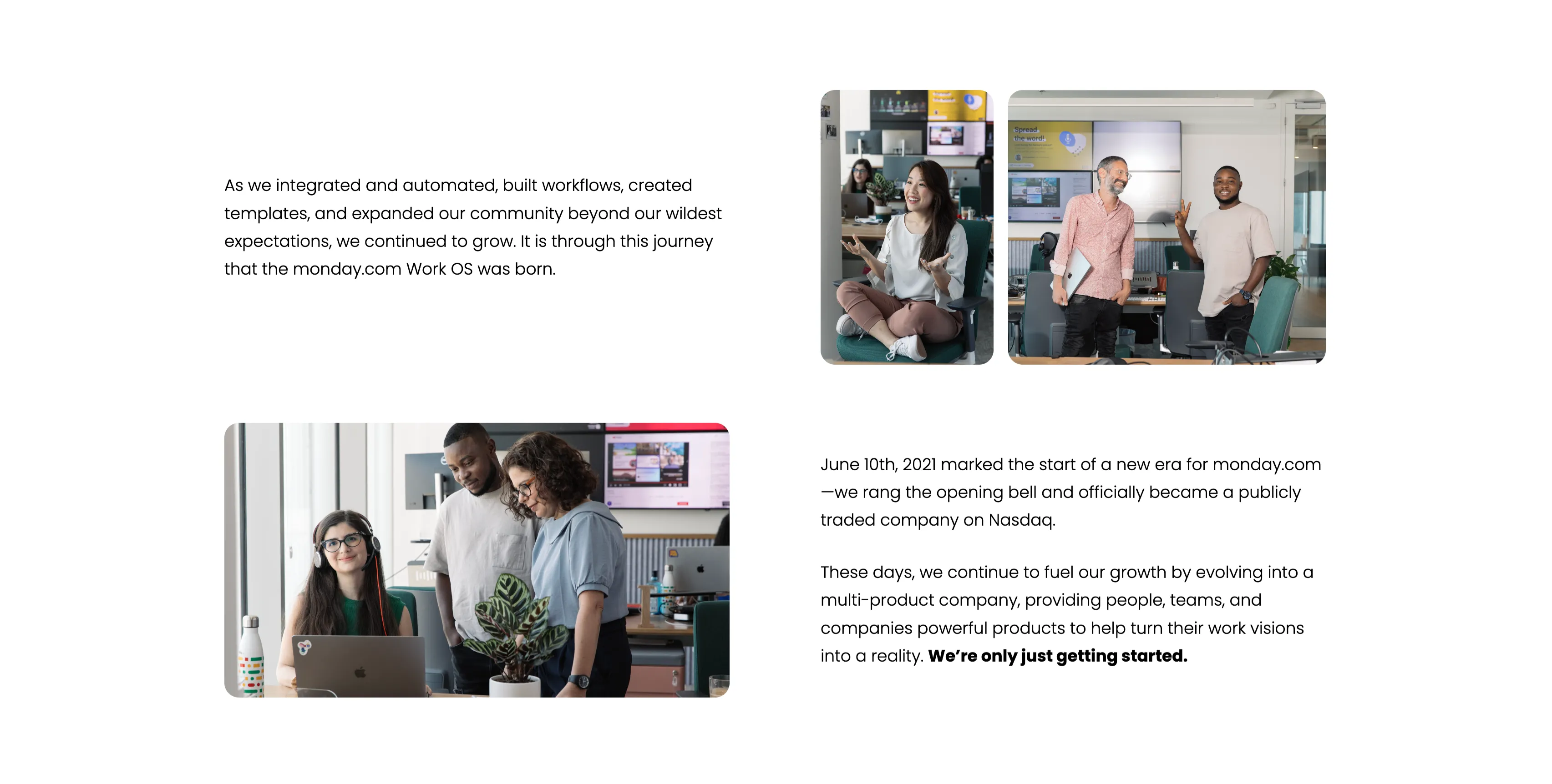
Company Journey Narrative With Team Photos
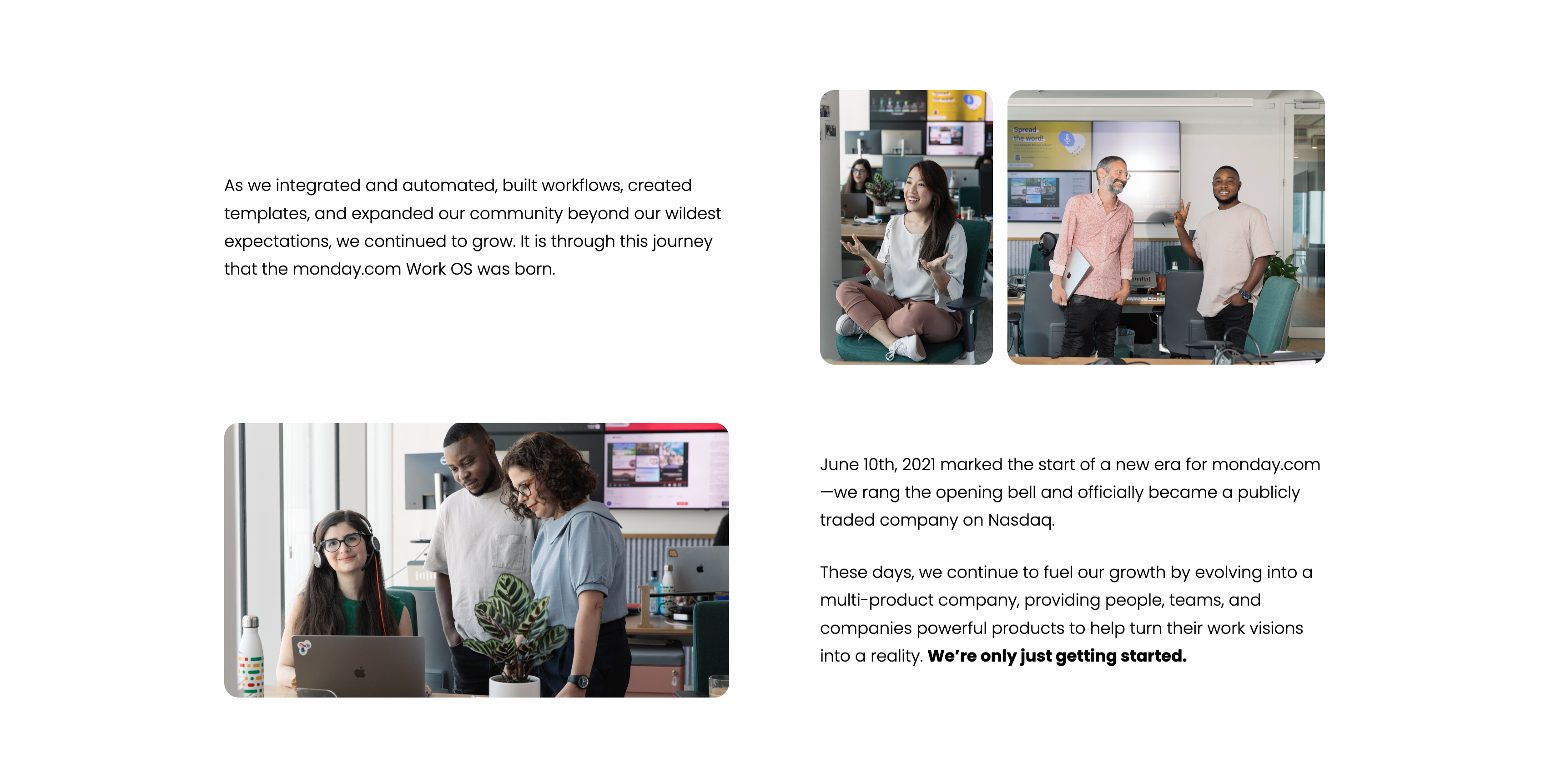
A narrative section alternating text and photography across a loose two-column grid on white. A top-left paragraph recounts how monday.com 'integrated and automated, built workflows, created templates, and expanded our community…', concluding 'It is through this journey that the monday.com Work OS was born', paired with an upper-right pair of candid office photos of employees. Lower down, a second block of copy notes the 'June 10th, 2021' Nasdaq IPO and the evolution into a multi-product company, ending with a bold 'We're only just getting started.', beside a lower-left photo of three colleagues at a desk with a plant. The mix of milestone copy and authentic team imagery makes the growth story feel personal rather than corporate.
Monday ↗

It's All About The People Photo Banner
A full-bleed photographic banner. The image shows three colleagues gathered around a laptop in a bright, plant-dotted open office — a woman with curly hair and two men, one leaning in and pointing at the screen, all smiling. Overlaid at the left in large bold white type, stacked across four lines, is the phrase 'It's all about the people', its weight and white colour standing out against the darker office background. There is no button or extra copy; the photo and headline alone carry the section. The candid workplace imagery gives the company-story a warm, human tone.
Monday ↗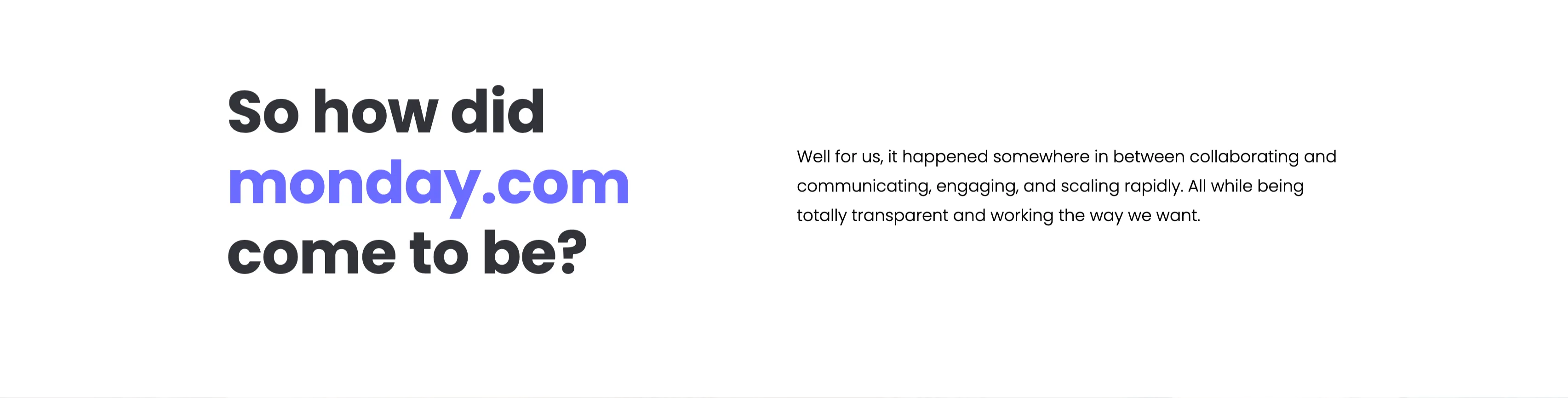
So How Did Monday.com Come To Be Intro
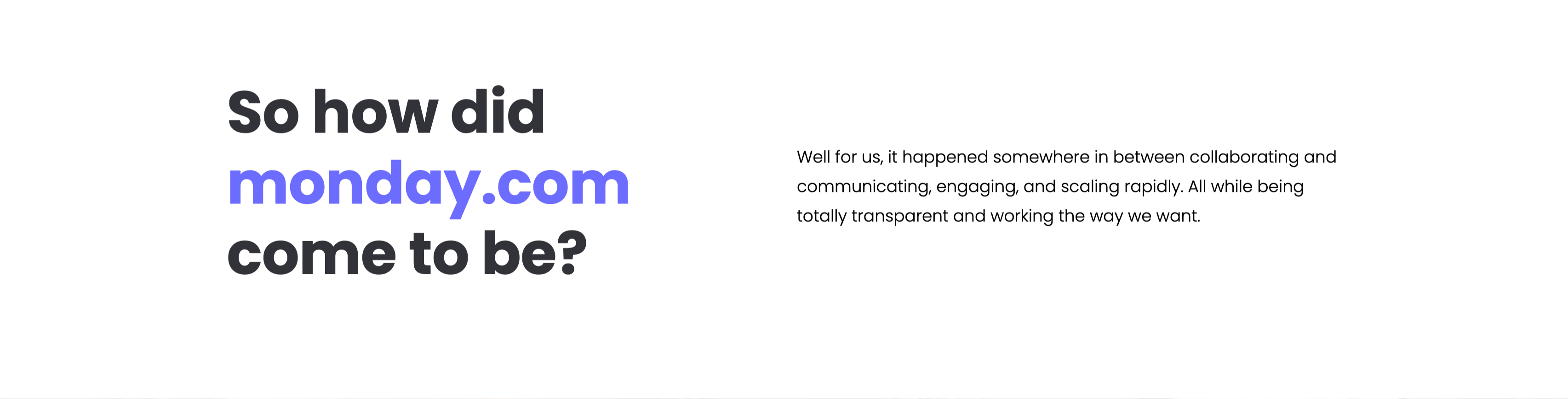
A two-column narrative intro on a white background. The left column carries an oversized bold question, 'So how did monday.com come to be?', with 'monday.com' emphasised in the brand's indigo while the rest sits in near-black. The right column answers in a short gray paragraph: 'Well for us, it happened somewhere in between collaborating and communicating, engaging, and scaling rapidly. All while being totally transparent and working the way we want.' The generous whitespace and the single splash of brand colour keep the section calm and editorial, easing the reader into the company-story sequence.
Monday ↗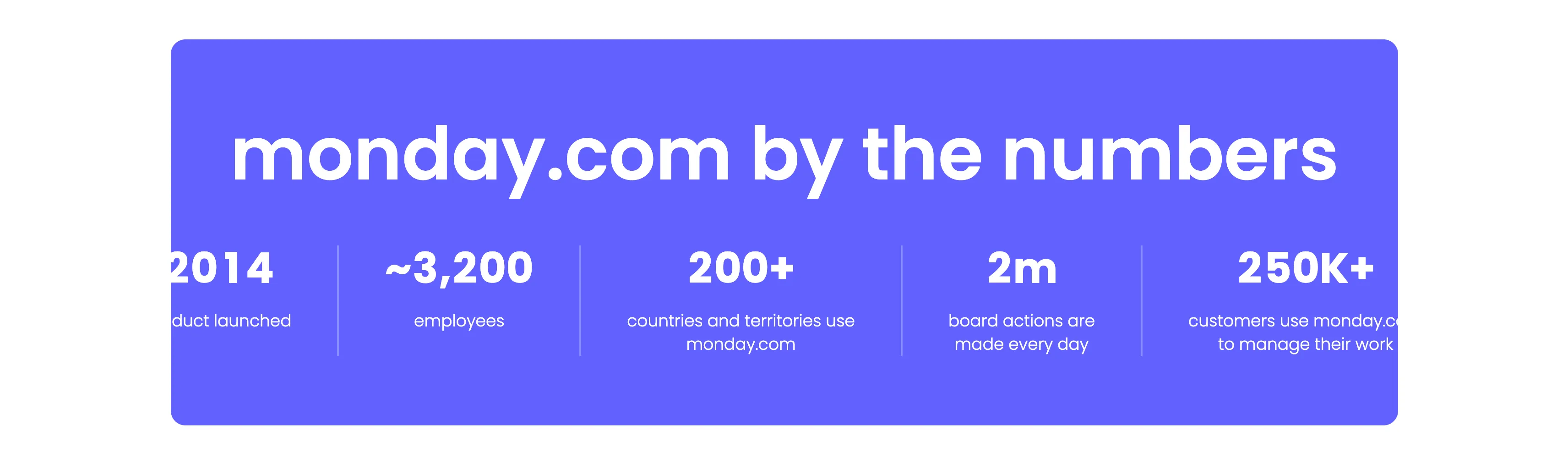
Monday.com By The Numbers Stats Band
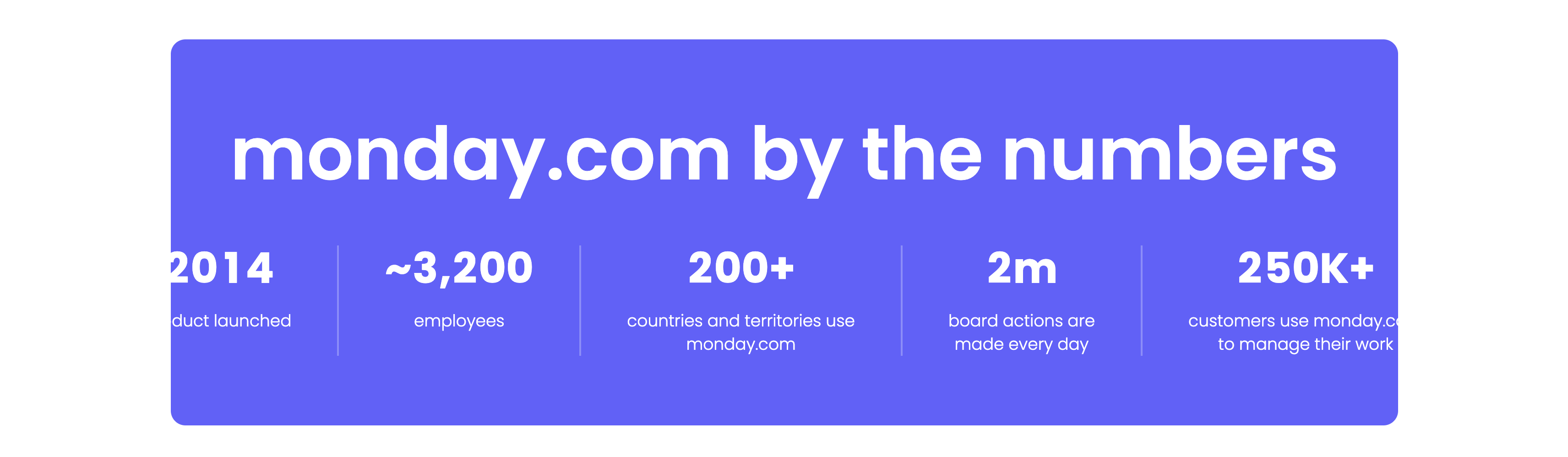
A bold statistics band set on a vibrant indigo rounded panel. A very large white headline, 'monday.com by the numbers', spans the top. Beneath it a single row of five metrics is separated by thin vertical dividers, each pairing an oversized white figure with a small caption: '2014' (product launched), '~3,200' (employees), '200+' (countries and territories use monday.com), '2m' (board actions are made every day) and '250K+' (customers use monday.com to manage their work). The saturated purple background and heavy numerals make the growth figures the sole focus. The clean five-up split reads as confident, at-a-glance proof.
Monday ↗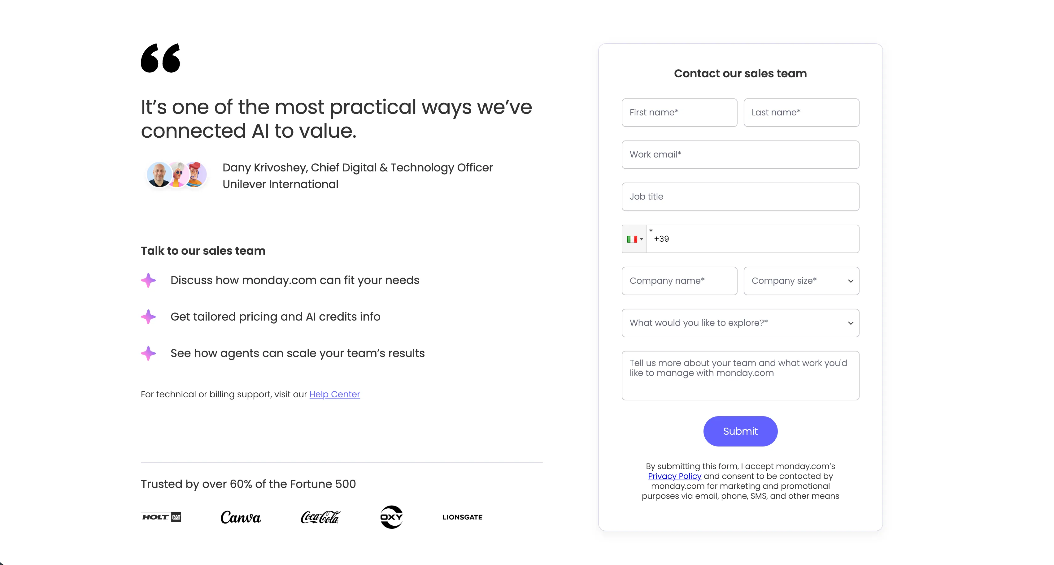
Contact Our Sales Team Form With Testimonial
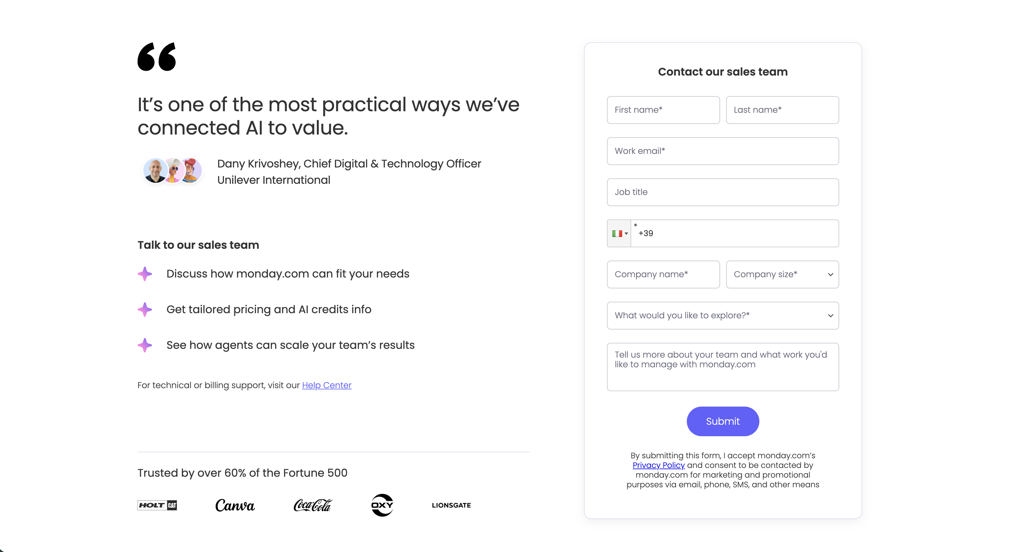
A split contact section pairing social proof on the left with a lead form on the right, on a white background. The left column opens with a large quotation mark and the pull-quote 'It's one of the most practical ways we've connected AI to value.', attributed to 'Dany Krivoshey, Chief Digital & Technology Officer, Unilever International' beside a trio of circular avatars. Below, a 'Talk to our sales team' heading introduces three purple sparkle-bulleted points — 'Discuss how monday.com can fit your needs', 'Get tailored pricing and AI credits info' and 'See how agents can scale your team's results' — followed by a 'For technical or billing support, visit our Help Center' line and, under a divider, a 'Trusted by over 60% of the Fortune 500' strip of monochrome logos (HOLT CAT, Canva, Coca-Cola, OXY, Lionsgate). The right column is a bordered white form card titled 'Contact our sales team' with fields for first and last name, work email, job title, a country-code phone input, company name and a company-size dropdown, a 'What would you like to explore?' dropdown and a free-text message box, closing with a solid purple 'Submit' button and a privacy-consent note. Pairing a named executive quote and customer logos with the form reassures the visitor right at the point of conversion.
Monday ↗
Monday.com Multi-Column Global Footer
The standard monday.com global footer on white. The monday.com logo sits above a left column of links (Pricing, Contact us, Templates, SMB, Enterprise, Nonprofits, App marketplace, 24/7 support, monday for agents, 'Hey AI, learn about us'), followed by grouped link columns — 'Use case', 'AI platform capabilities' (monday agents, sidekick, vibe, Integrations, Automations, Dashboard, Docs, Kanban), 'Business applications' with 'More by monday.com' (WorkCanvas, WorkForms), 'Company' and 'Resources.' A lower bar carries an English language selector, a row of social icons (X, LinkedIn, Facebook, YouTube, Instagram, TikTok), legal links (Security, Terms and privacy, Privacy policy, Your privacy choices, Status), compliance badges, Google Play and App Store download buttons, and an 'Accessibility statement.' The dense, orderly columns are a classic enterprise global-footer pattern.
Monday ↗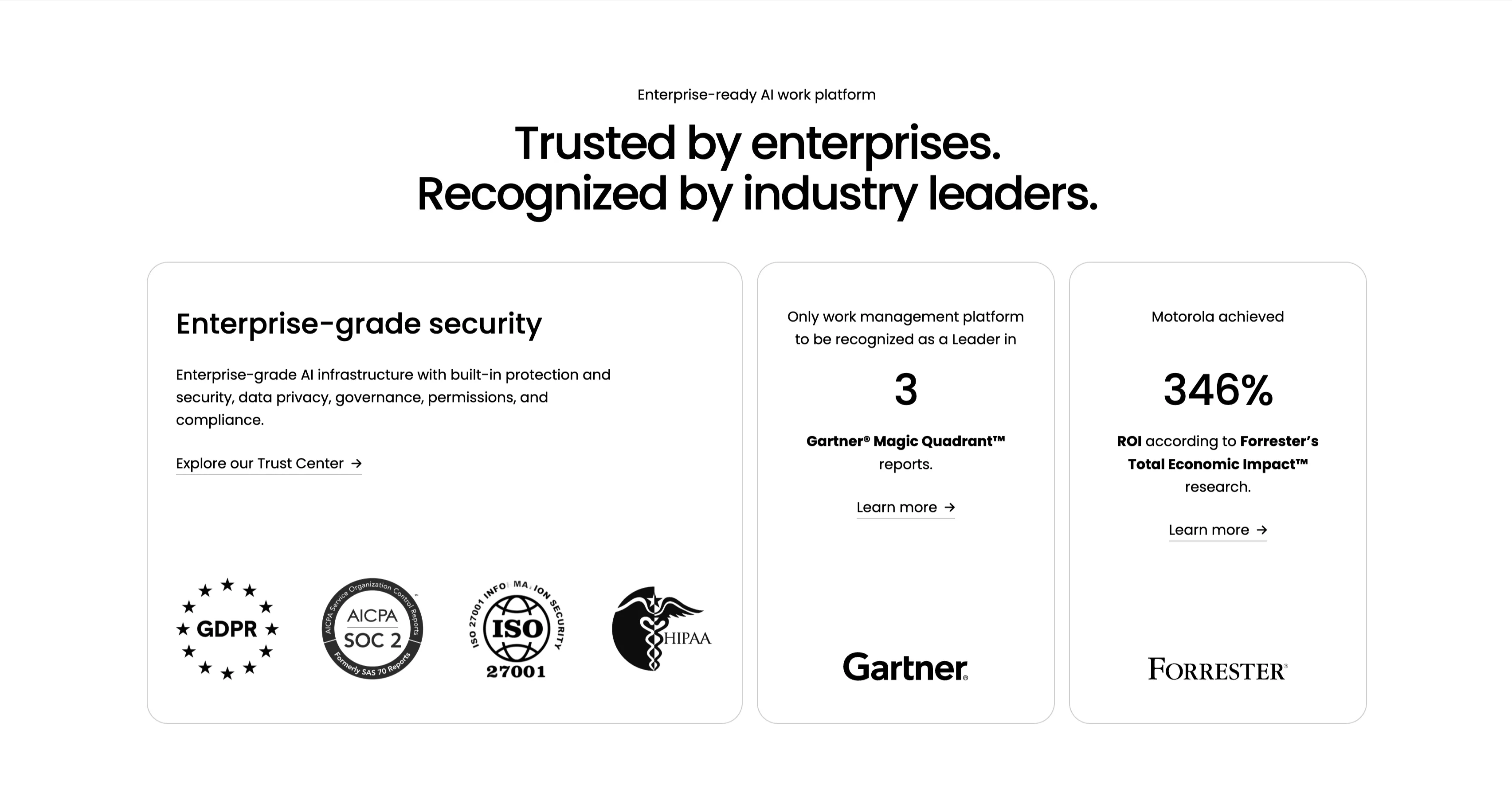
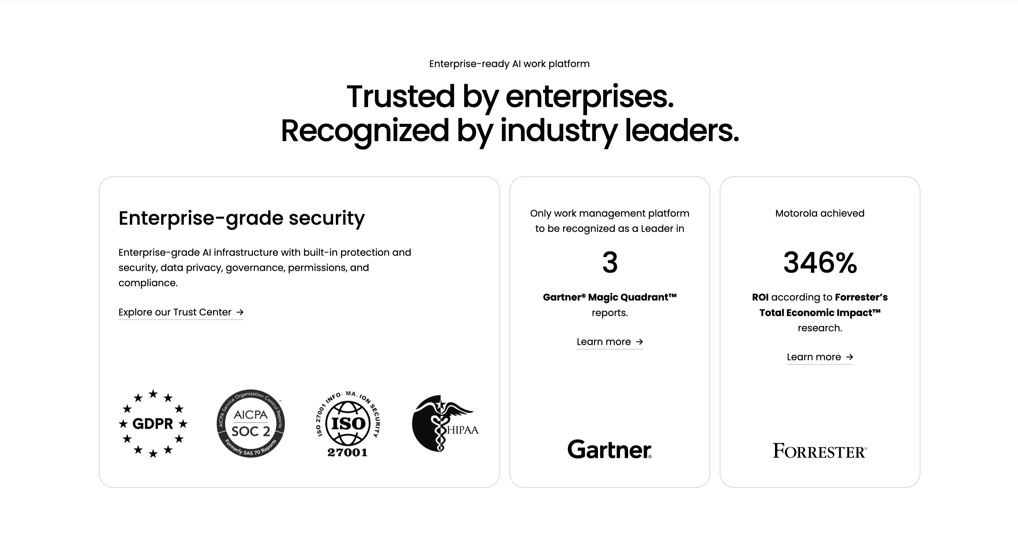
Trusted By Enterprises Recognition Cards
An enterprise-credibility section on white, led by a small 'Enterprise-ready AI work platform' eyebrow and a centered two-line headline, 'Trusted by enterprises. Recognized by industry leaders.' Three cards sit in a row. The wide left card, 'Enterprise-grade security', carries a paragraph on AI infrastructure, privacy and compliance, an 'Explore our Trust Center' link, and a row of compliance badges — GDPR, AICPA SOC 2, ISO 27001 and HIPAA. The middle card centers a large '3' with 'Gartner Magic Quadrant reports' and a 'Learn more' link above the Gartner logo. The right card centers '346%' with 'ROI according to Forrester's Total Economic Impact research', a 'Learn more' link and the Forrester logo. The badges and analyst figures stack third-party validation into one scannable trust row.
Monday ↗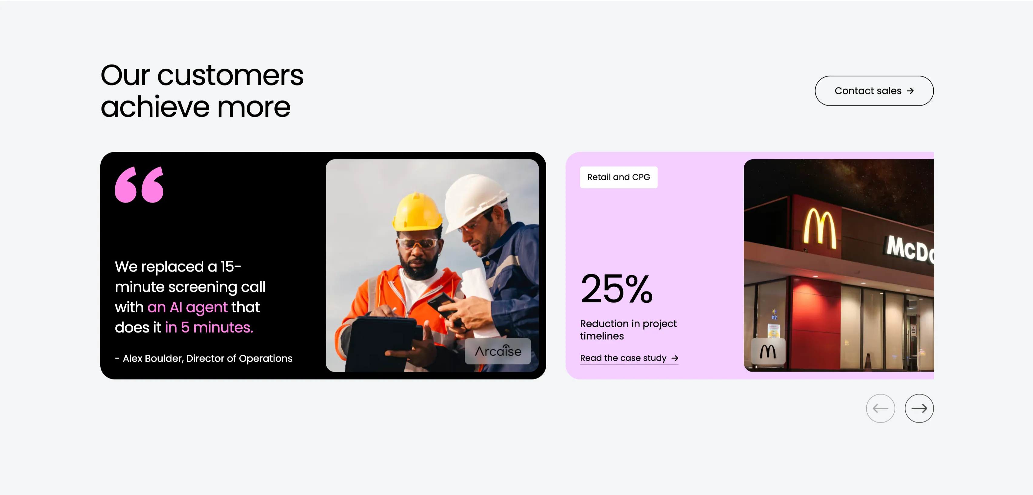
Our Customers Achieve More Testimonial Carousel
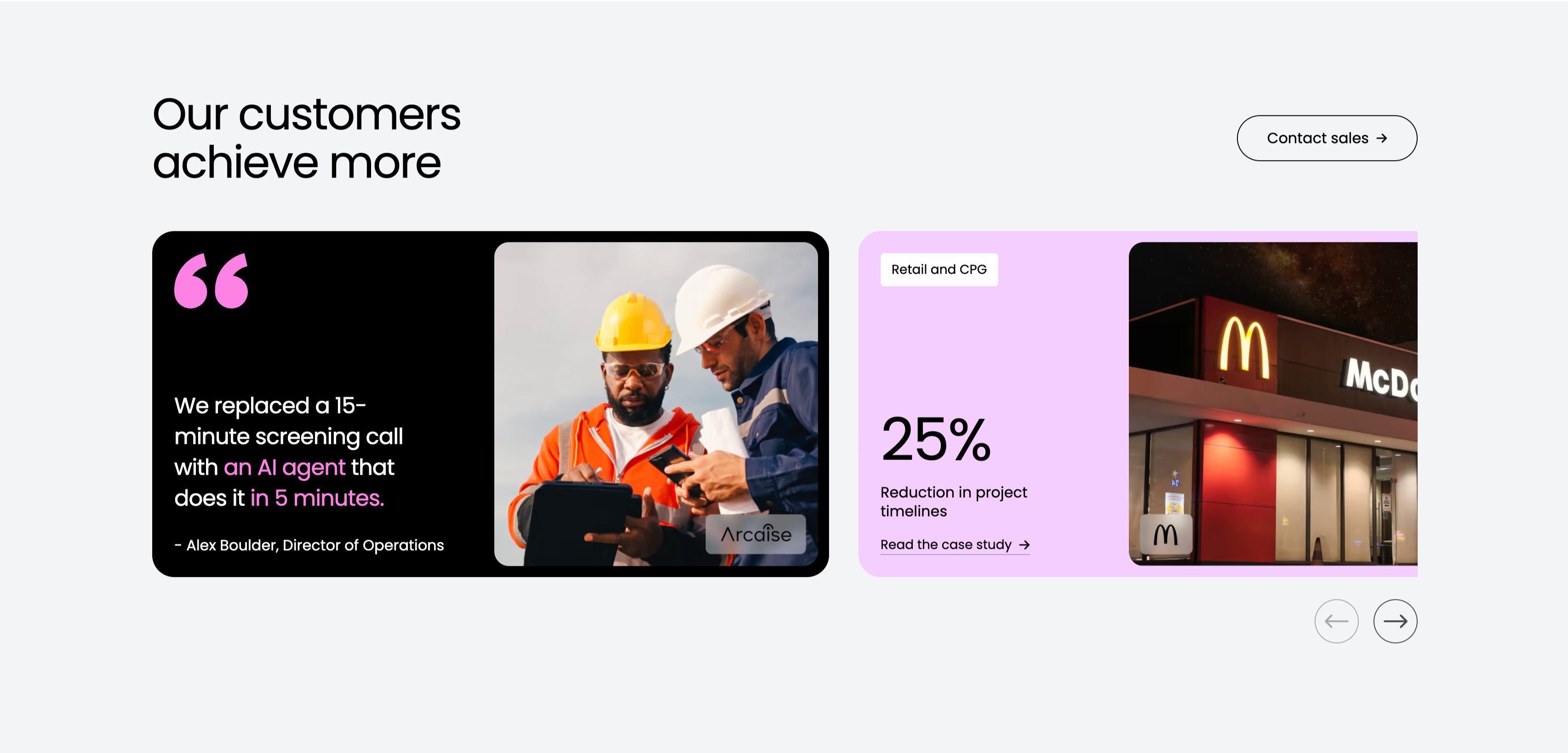
A customer-proof carousel on a pale-gray background. The upper left holds the heading 'Our customers achieve more' with an outlined 'Contact sales' button floated to the right. Below, two wide cards sit side by side: a black card with a large pink quotation mark and the pull-quote 'We replaced a 15-minute screening call with an AI agent that does it in 5 minutes.', attributed to 'Alex Boulder, Director of Operations', alongside a photo of two hard-hatted construction workers with an 'Arcaise' logo; and a lavender card labelled 'Retail and CPG' showing a bold '25% Reduction in project timelines' stat, a 'Read the case study' link and a night photo of a McDonald's storefront. Circular previous/next arrows in the lower right indicate more stories. Mixing a quote with a hard metric gives the section both emotional and numeric proof.
Monday ↗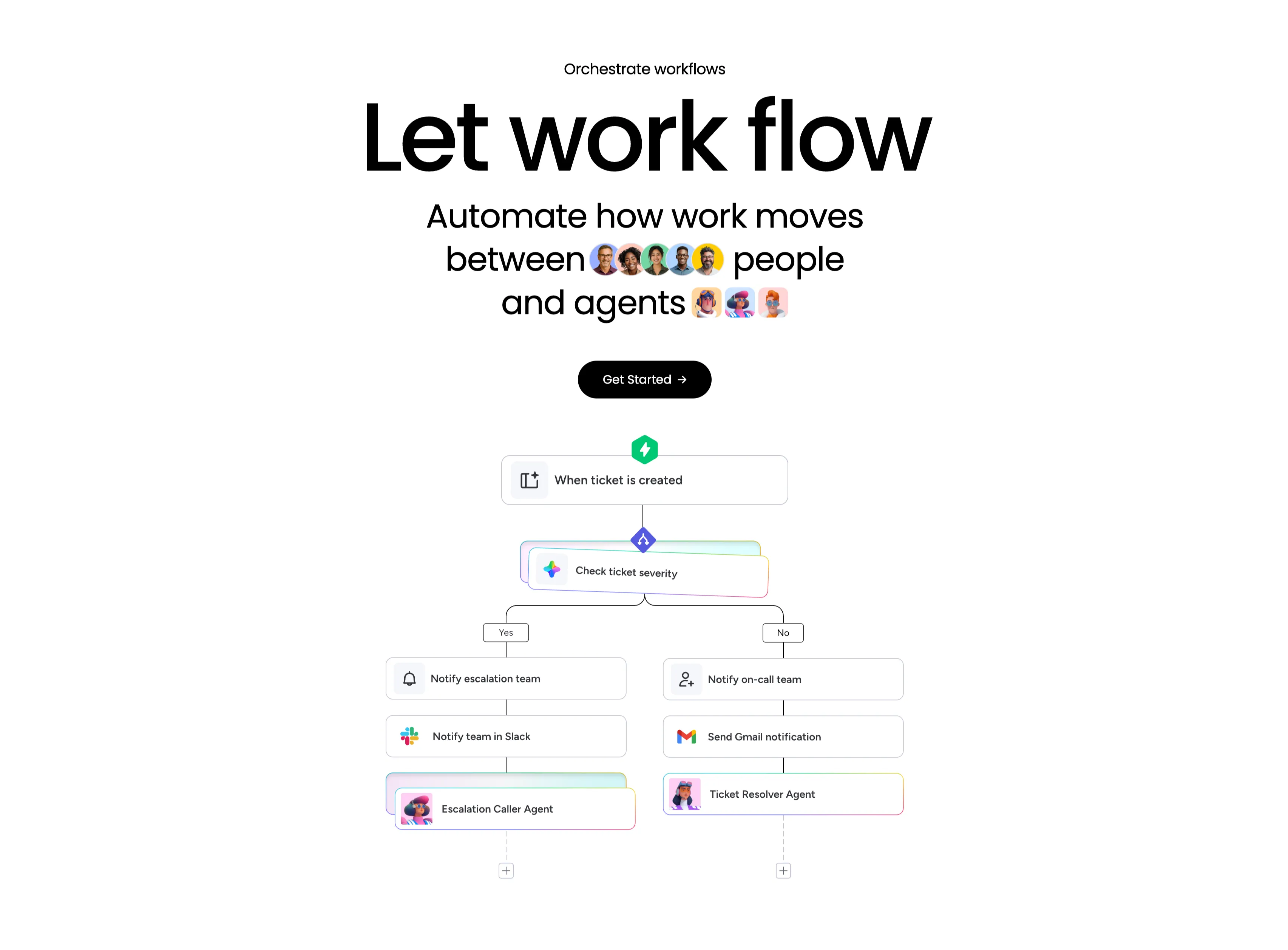
Let Work Flow Workflow Orchestration Diagram
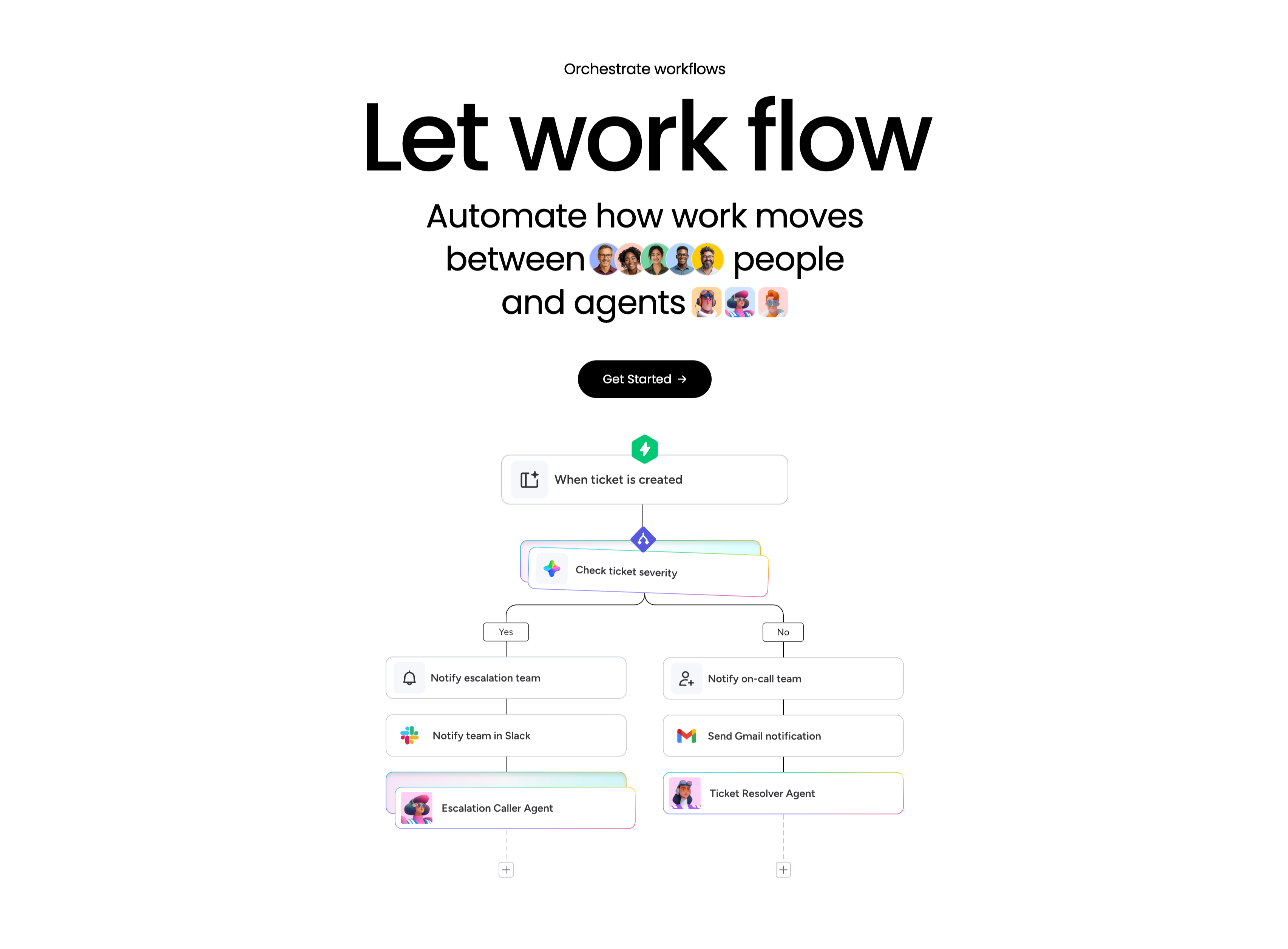
A workflow-orchestration section, centered, on a white background. A small 'Orchestrate workflows' eyebrow tops an enormous 'Let work flow' headline, followed by the subhead 'Automate how work moves between people and agents' with inline rows of human avatars and agent avatars set into the sentence, and a black 'Get Started' pill button. Below, a branching flowchart illustrates the concept: a green lightning trigger 'When ticket is created' leads into a rainbow-bordered decision node 'Check ticket severity', which splits into Yes and No paths. The Yes branch stacks 'Notify escalation team' → 'Notify team in Slack' → 'Escalation Caller Agent'; the No branch stacks 'Notify on-call team' → 'Send Gmail notification' → 'Ticket Resolver Agent', each step a labelled card with an app icon. The literal node diagram makes automation between people and agents easy to grasp.
Monday ↗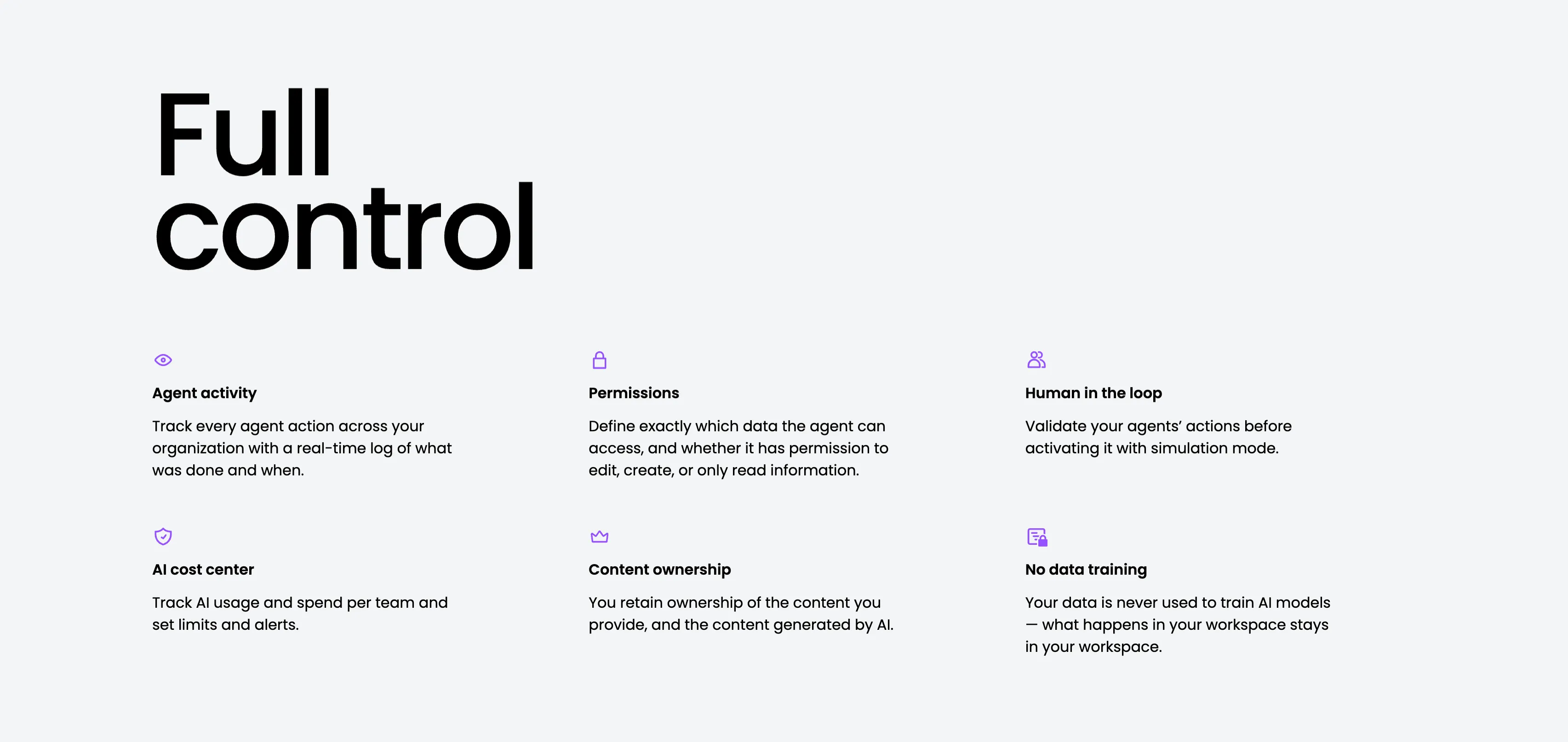
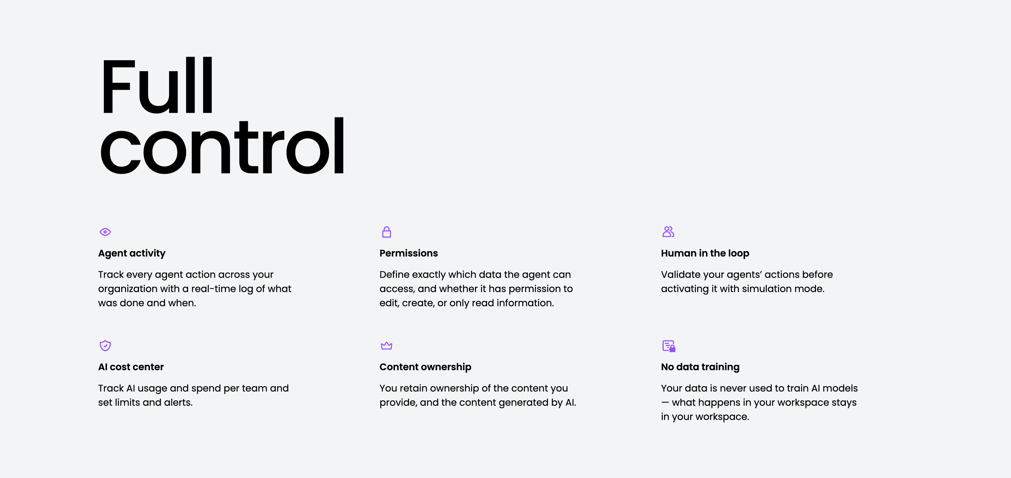
Full Control Governance Feature Grid
A governance feature grid on a pale-gray background, anchored by an oversized two-line 'Full control' heading in the upper left. Six items are laid out across three columns and two rows, each led by a small purple line icon, a bold title and a gray description: 'Agent activity' (a real-time log of what was done and when), 'Permissions' (define exactly which data an agent can access and whether it can edit, create or only read), 'Human in the loop' (validate actions with simulation mode), 'AI cost center' (track usage and spend, set limits and alerts), 'Content ownership' (you retain ownership of provided and generated content) and 'No data training' (your data is never used to train AI models). The even three-up rhythm and single accent colour keep the trust-and-control message calm and scannable.
Monday ↗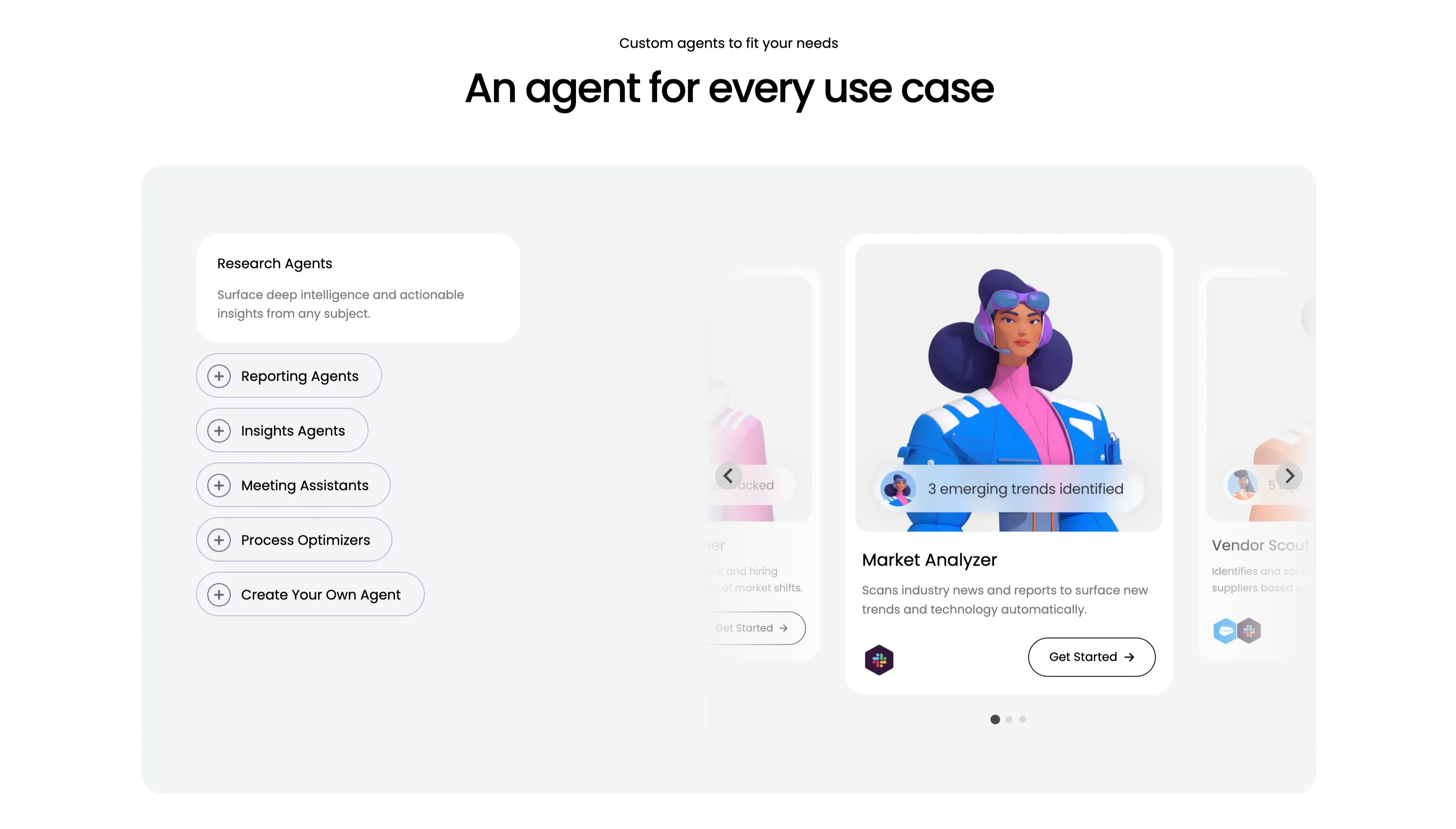
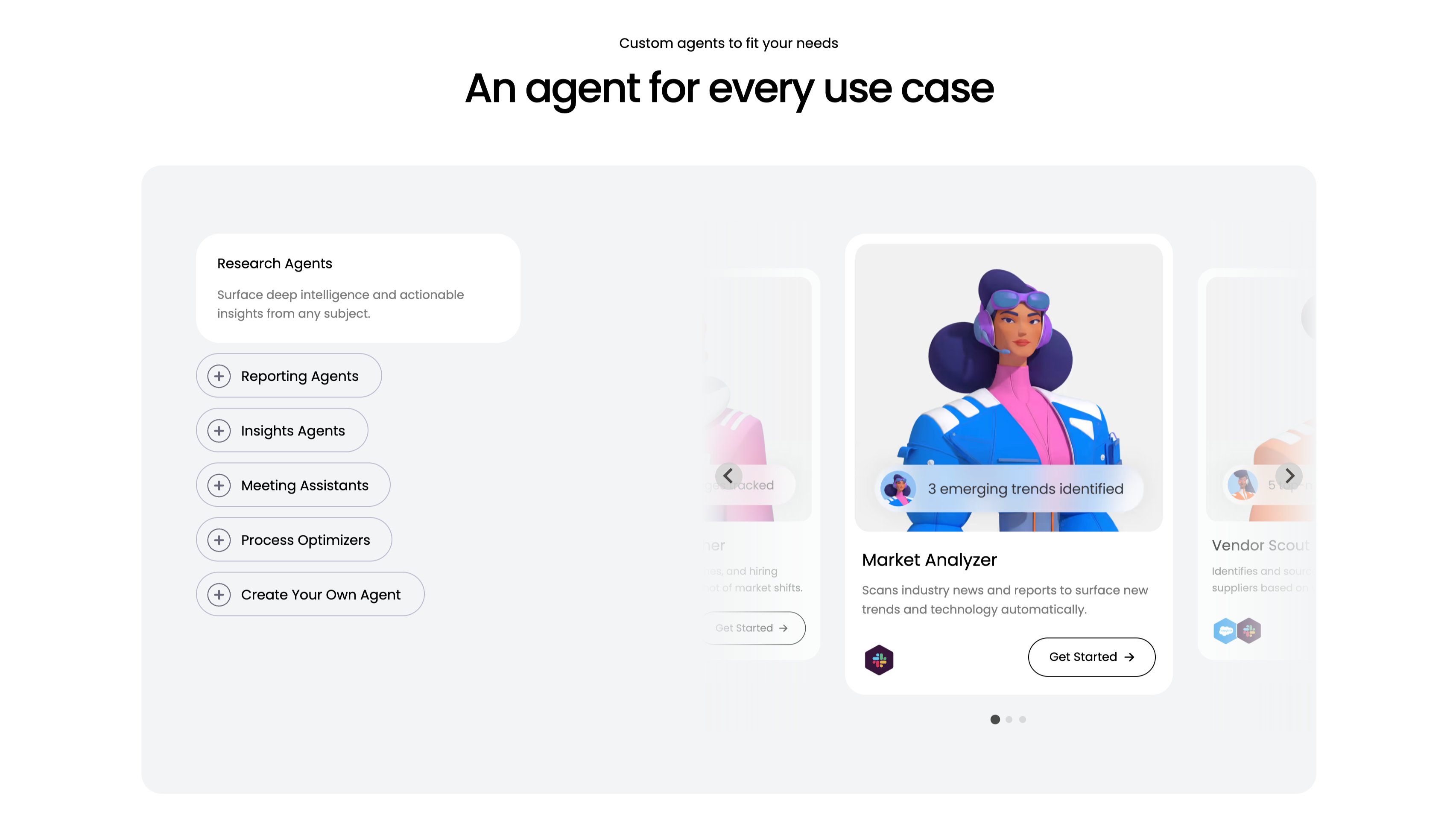
An Agent For Every Use Case Carousel
A use-case carousel introduced by a small 'Custom agents to fit your needs' eyebrow and the centered headline 'An agent for every use case.' Inside a large pale-gray panel, the left column is a vertical selector: a highlighted white 'Research Agents' card ('Surface deep intelligence and actionable insights from any subject.') above outlined pill buttons with plus icons — Reporting Agents, Insights Agents, Meeting Assistants, Process Optimizers and 'Create Your Own Agent.' The right column is a scrollable card deck centered on a 'Market Analyzer' card with a stylised 3D character, a '3 emerging trends identified' chip, the line 'Scans industry news and reports to surface new trends and technology automatically', an integration icon and a 'Get Started' button, flanked by faded neighbouring cards including 'Vendor Scout.' Circular arrows and three pagination dots confirm it scrolls. The category list plus previewed agent cards make the breadth easy to browse.
Monday ↗

Trusted By The Fortune 500 Logo Cloud
A slim social-proof strip on a white background. A single centered line of text, 'Trusted by over 60% of the Fortune 500', sits above one horizontal row of monochrome customer logos. Left to right the row shows Lionsgate, Carrefour, VML, Canva, Coca-Cola, Vistra, Universal Music Group and HOLT CAT, all rendered in uniform gray-black so no brand dominates. The restrained single-row treatment and consistent logo weight make the section read as credible, understated proof rather than decoration.
Monday ↗

Built For People And Agents CTA
A minimal full-width call-to-action built around one enormous line of type, 'Built for people and agents', that bleeds off both edges of the frame. Three circular human avatars in green, blue and yellow are set inline between the words 'people' and 'and', visually joining humans to the agent message. Centered directly beneath the headline sit two buttons — a solid purple 'Get Started' primary and an outlined 'Contact sales' secondary, each with a trailing arrow. The near-empty white canvas and the oversized headline give the closing pitch a confident, spacious feel.
Monday ↗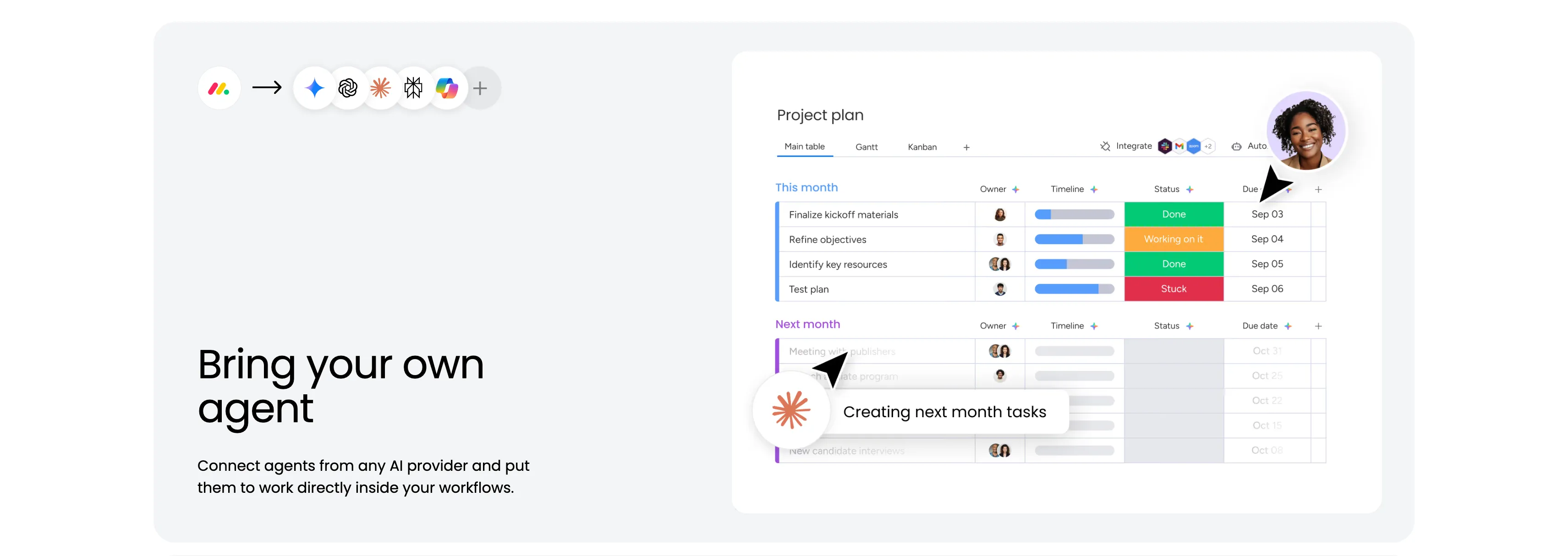
Bring Your Own Agent Split Feature
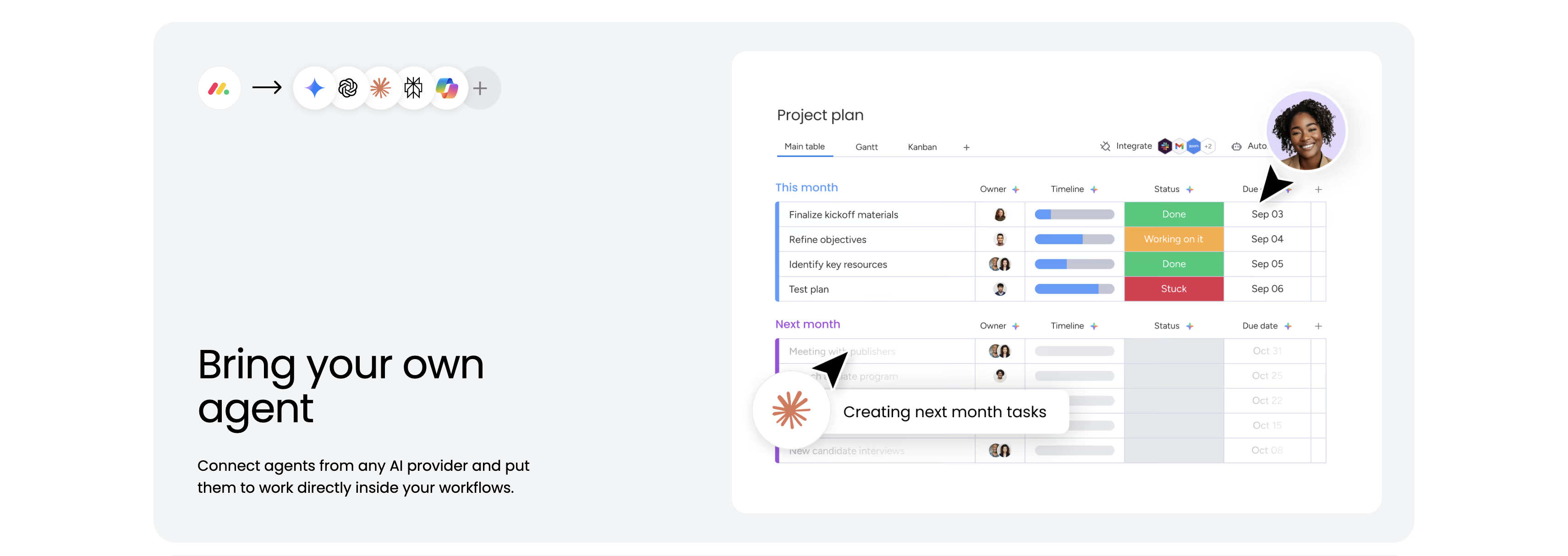
A feature block housed in a large pale-gray rounded panel. The upper area shows the monday logo, an arrow, and a row of AI-provider icons, signalling that outside agents plug in. The right side holds a 'Project plan' board screenshot with Main table / Gantt / Kanban tabs and status-coloured rows — 'Finalize kickoff materials' (Done, Sep 03), 'Refine objectives' (Working on it, Sep 04), 'Identify key resources' (Done), 'Test plan' (Stuck) — plus a 'Next month' group and a running agent chip reading 'Creating next month tasks.' The lower-left corner carries the heading 'Bring your own agent' and the line 'Connect agents from any AI provider and put them to work directly inside your workflows.' The board-with-live-agent visual makes the integration concrete.
Monday ↗

Consider Yourself Limitless Open Platform Band
A bold split call-to-action band on white. The left column is filled by a massive black three-line headline, 'Consider yourself limitless', its scale making it the visual anchor. The right column stacks a row of circular AI-provider icons (Gemini, OpenAI, an Anthropic-style burst, another mark, Microsoft Copilot and a '+' for more), then a bold line 'An open platform for every agent your team works with', the supporting sentence 'Connect to Claude, ChatGPT, Copilot, Gemini, or any MCP-connected tool.', and a black 'Get Started' pill button. The oversized type against generous whitespace and the recognizable model logos sell openness and breadth in a single glance.
Monday ↗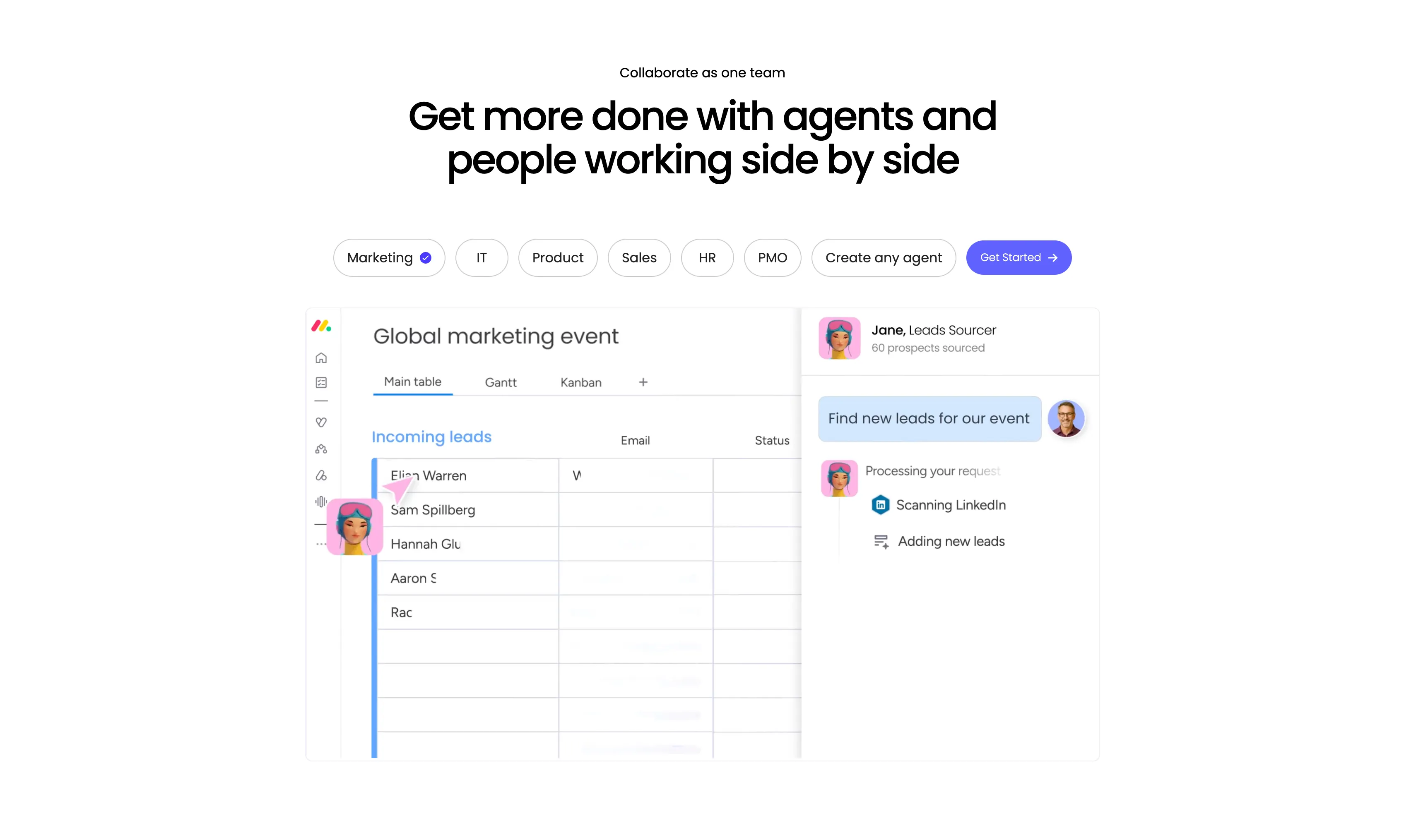
Collaborate As One Team Tabbed Agent Showcase
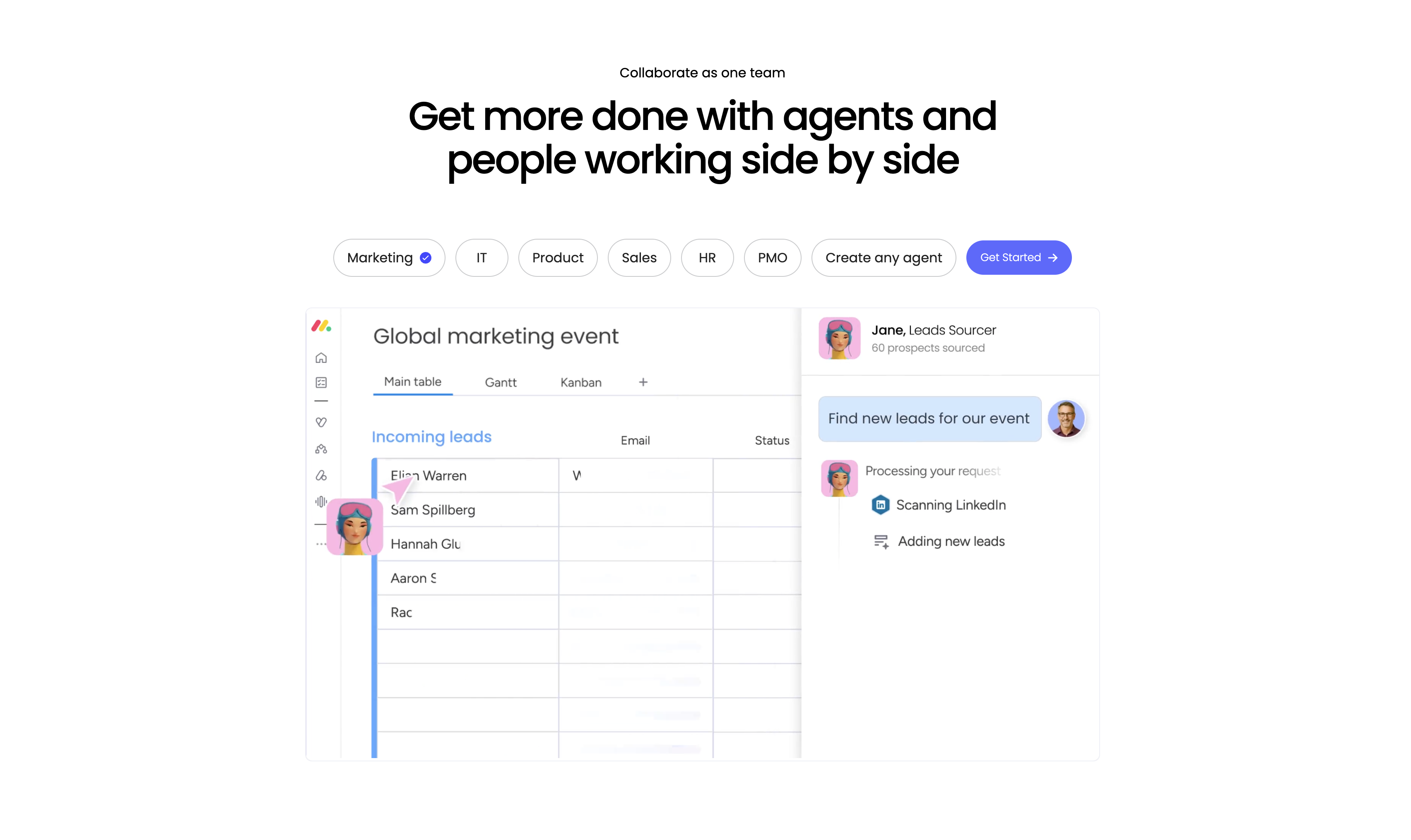
A centered feature showcase led by a small 'Collaborate as one team' eyebrow and a large two-line headline, 'Get more done with agents and people working side by side.' Beneath it sits a horizontal row of pill tabs — Marketing (selected, with a blue check), IT, Product, Sales, HR, PMO and 'Create any agent' — followed by a purple 'Get Started' button. A large product screenshot fills the lower half: on the left a monday board titled 'Global marketing event' with Main table / Gantt / Kanban tabs and an 'Incoming leads' table (Elian Warren, Sam Spillberg, Hannah Glu…) with an agent avatar cursor; on the right a chat panel where 'Jane, Leads Sourcer' responds to 'Find new leads for our event' by 'Scanning LinkedIn' and 'Adding new leads.' The tabbed personas plus the live agent-and-board split make the human-plus-agent workflow tangible.
Monday ↗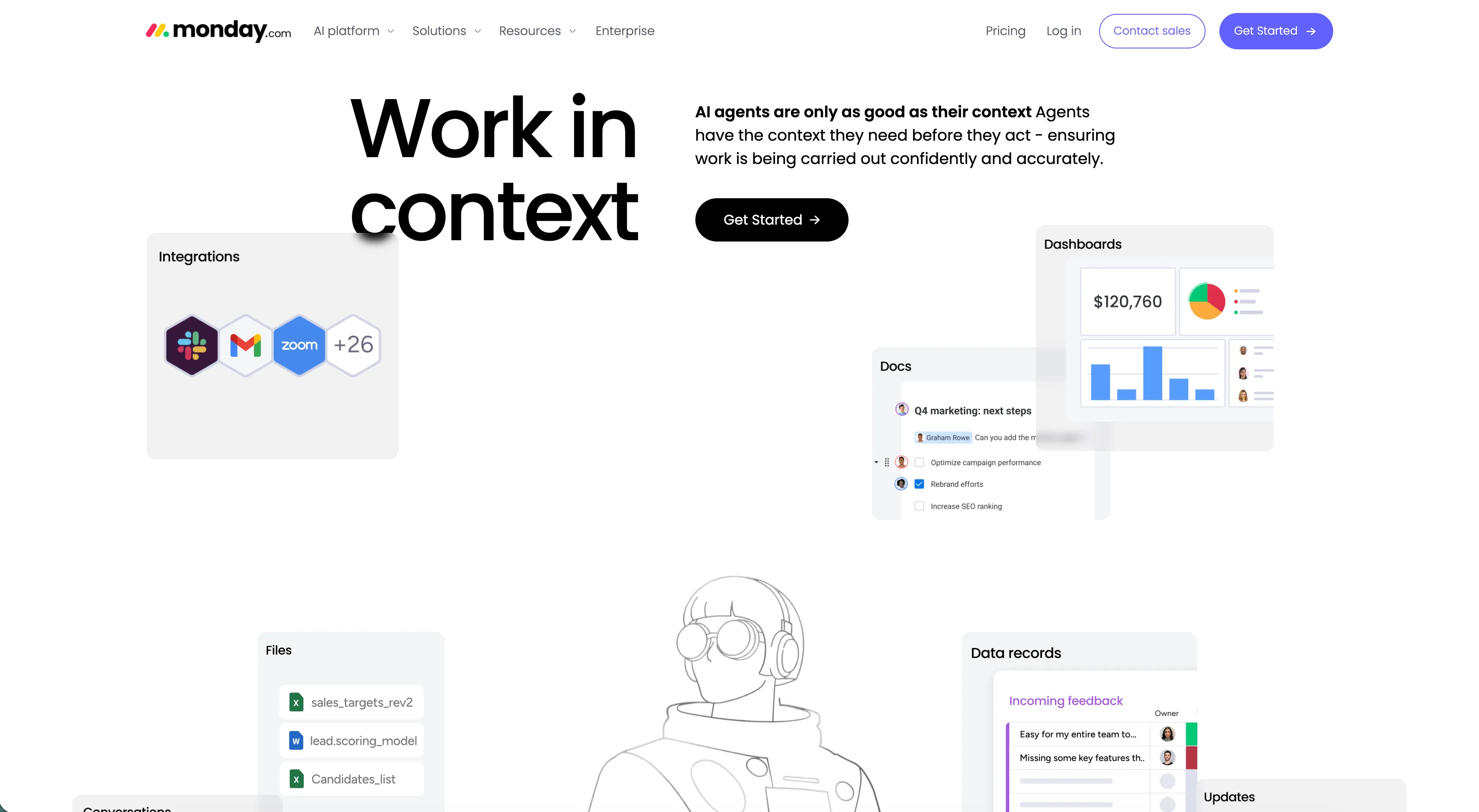
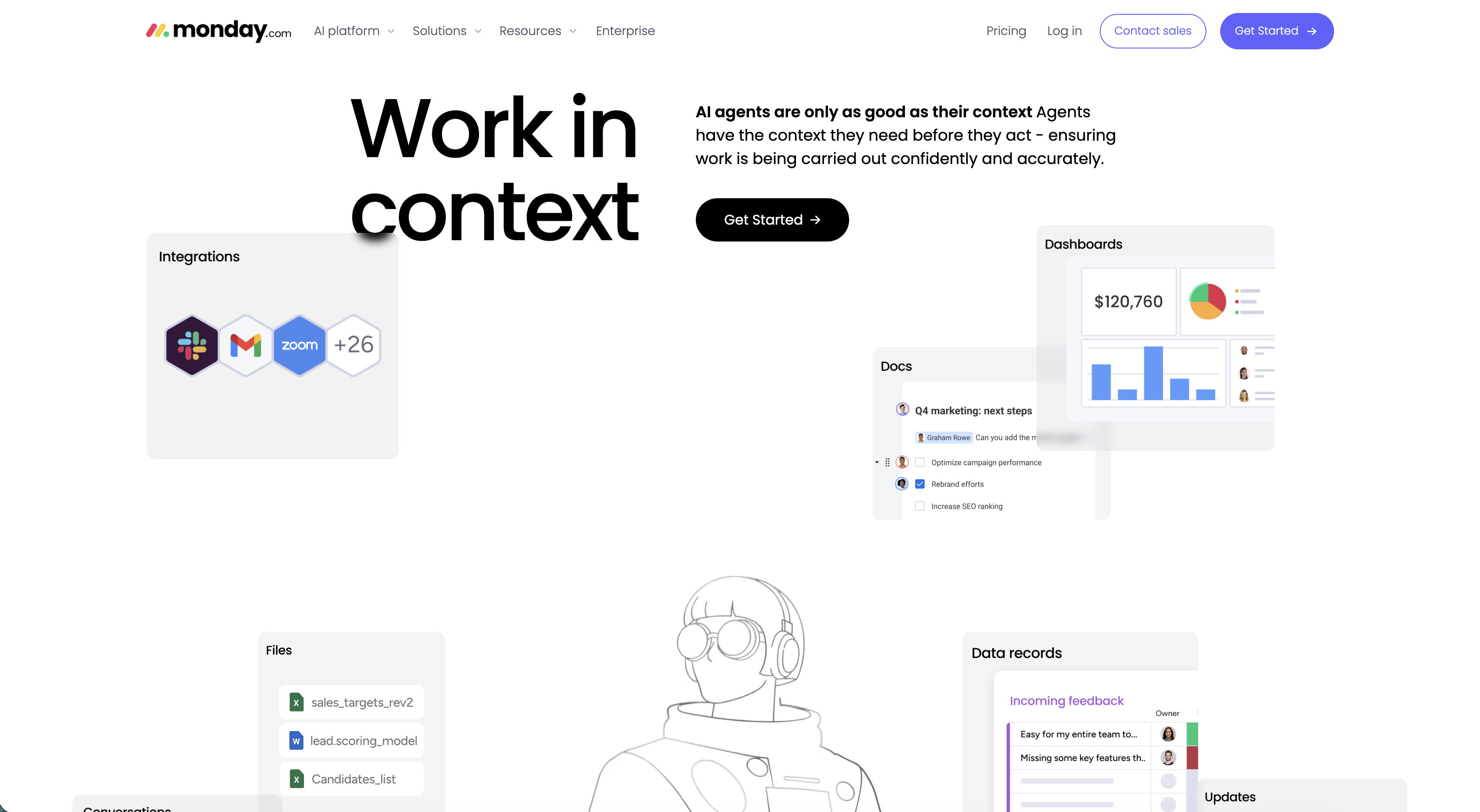
Monday.com Work In Context Hero
The page hero on a white background, topped by the monday.com nav (AI platform, Solutions, Resources, Enterprise on the left; Pricing, Log in, an outlined Contact sales and a purple Get Started button on the right). The left half is dominated by an oversized two-line 'Work in context' headline, while the right column carries a bold lead line 'AI agents are only as good as their context', a short supporting paragraph, and a black 'Get Started' pill button. Scattered around the headline float rounded product cards — an 'Integrations' card with Slack, Gmail and Zoom hexagon logos plus '+26', a 'Dashboards' card showing a $120,760 figure with pie and bar charts, a 'Docs' checklist, a 'Files' list and a 'Data records' feedback table — with a line-art astronaut illustration anchoring the center. The floating UI fragments make the abstract 'context' idea concrete and product-forward.
Monday ↗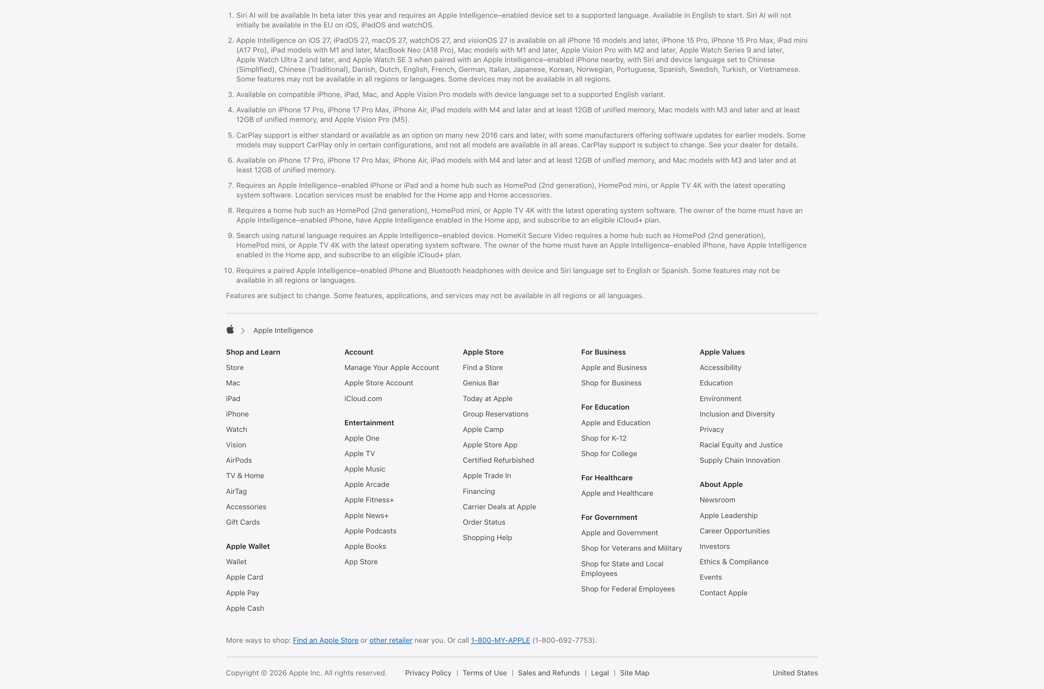
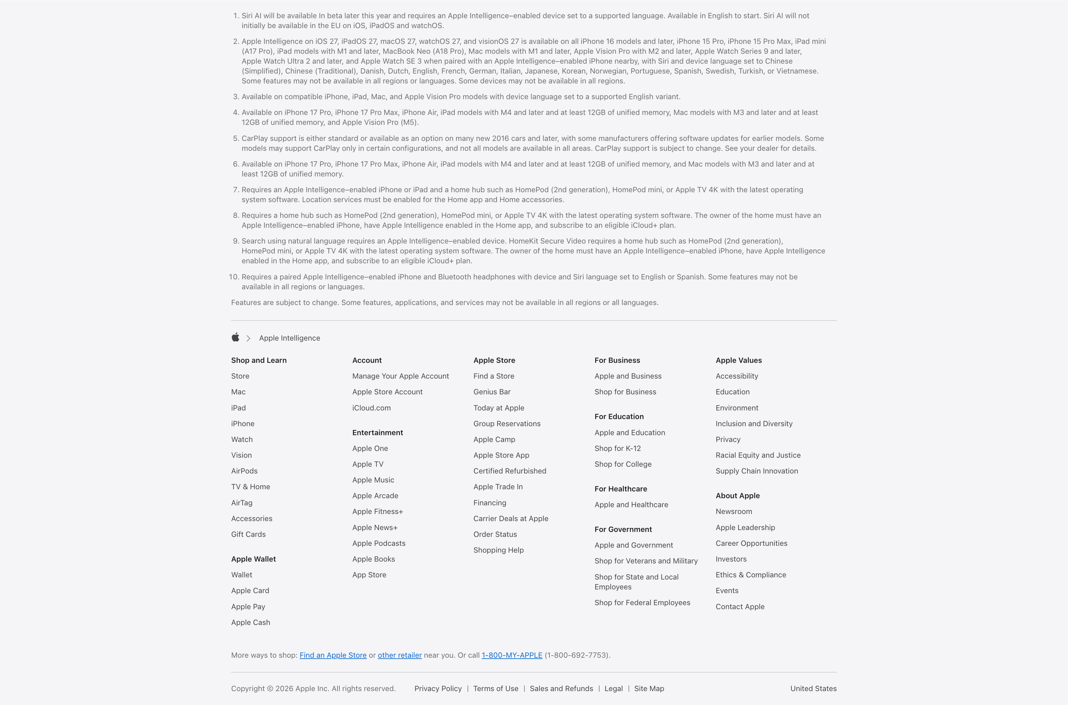
Legal Footnotes And Multi-Column Footer
A combined footnotes-and-footer block on white. The top portion is a numbered list of ten fine-print legal disclaimers covering Siri AI availability, supported devices and languages, CarPlay and HomeKit requirements, set in small gray type. Below a hairline divider an Apple-logo breadcrumb ('Apple > Apple Intelligence') introduces the standard Apple footer: a five-plus-column grid of link groups — Shop and Learn, Apple Wallet, Account, Entertainment, Apple Store, For Business, For Education, For Healthcare, For Government, Apple Values and About Apple — each a stack of small text links. A 'More ways to shop' line with a phone number and a bottom row of copyright, Privacy Policy, Terms of Use, Legal, Site Map and the 'United States' region close it out. The dense, orderly columns are a classic global-footer pattern.
Apple ↗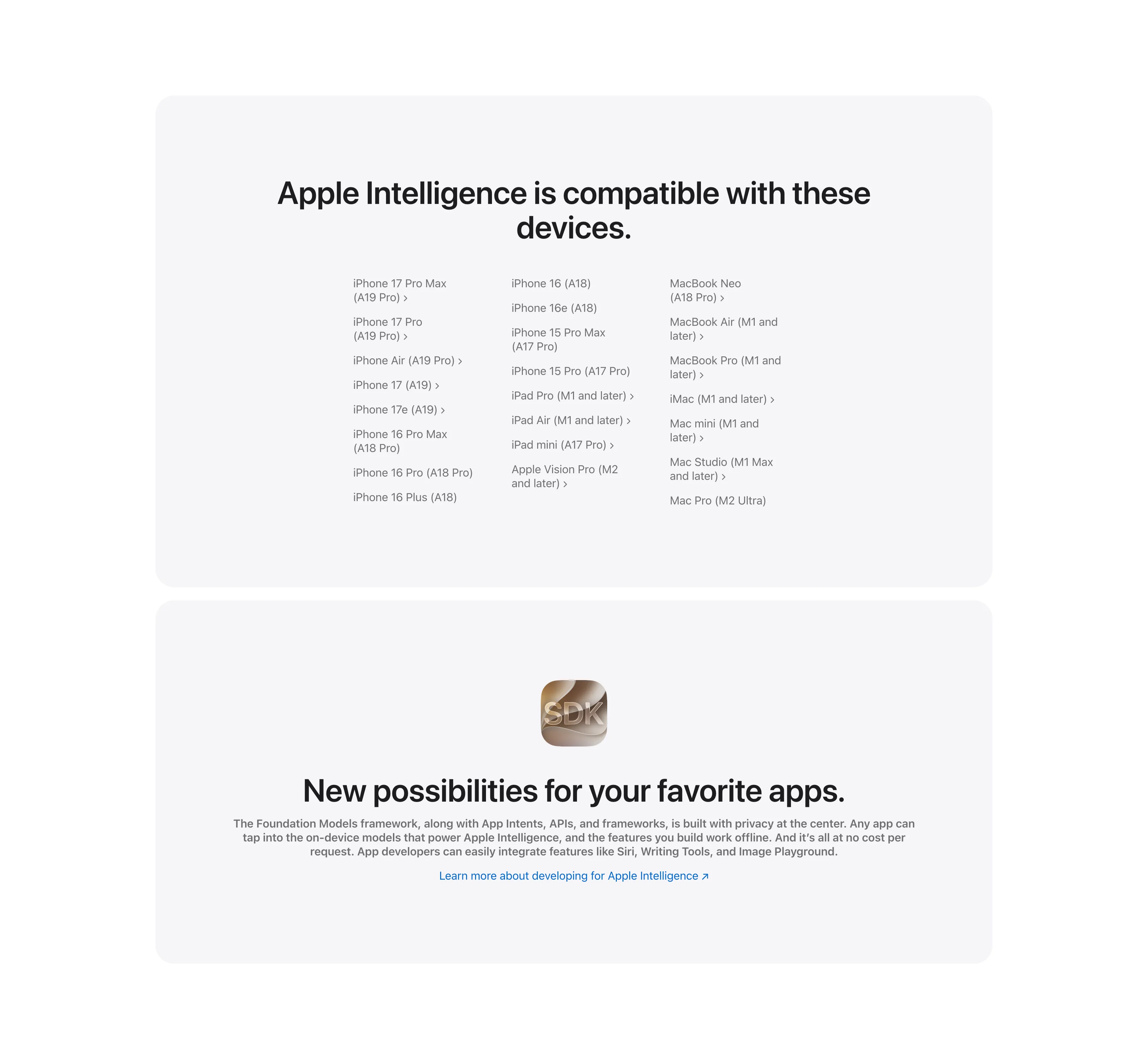
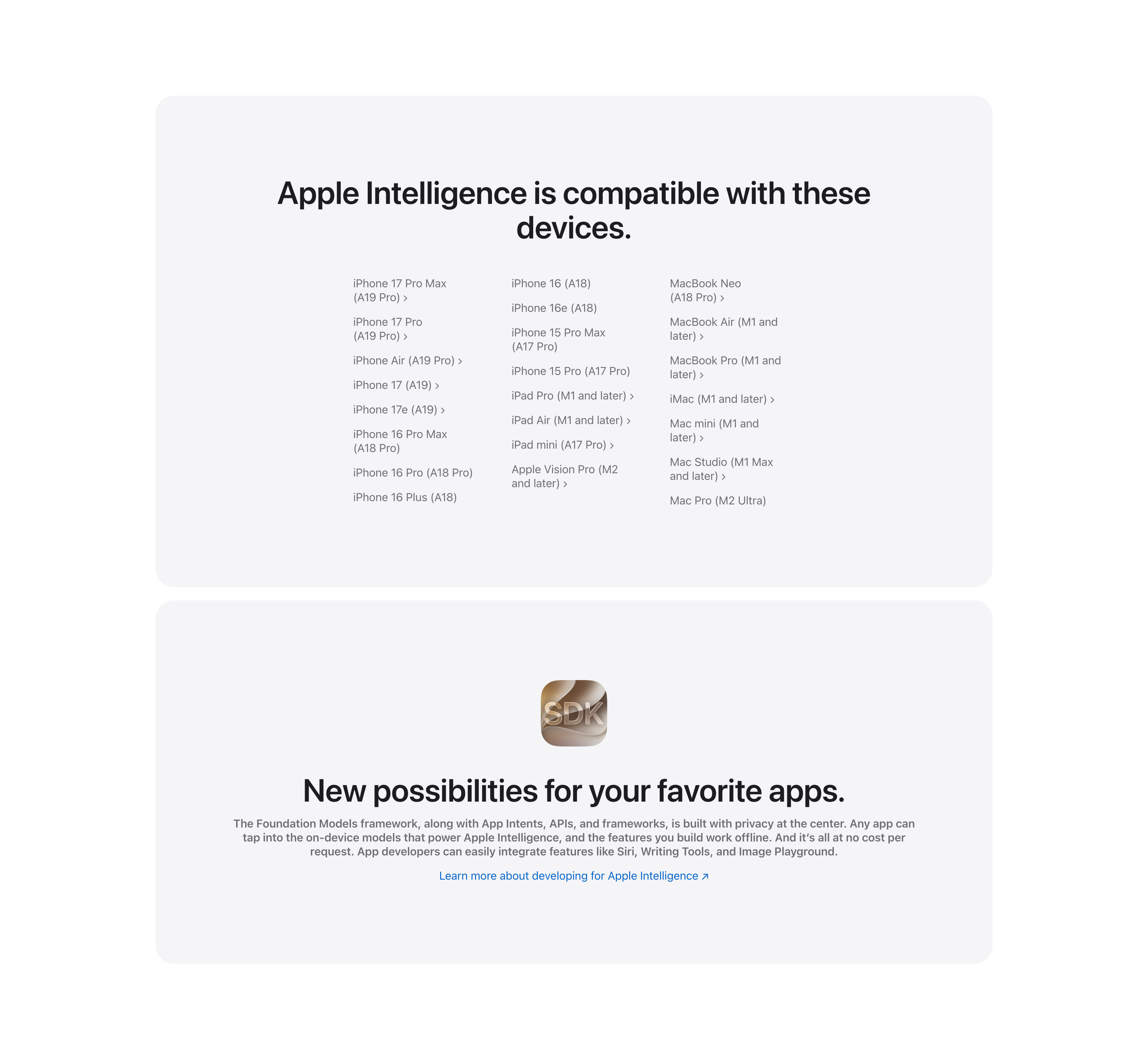
Compatible Devices List And Developer SDK Cards
Two stacked pale-gray rounded cards. The upper card, headed 'Apple Intelligence is compatible with these devices.', lays out a long three-column list of supported hardware — iPhone 17 Pro Max through iPhone 16 models, iPad Pro/Air/mini and Apple Vision Pro, and Mac models from MacBook Neo to Mac Pro — many entries carrying chevron links to detail pages. The lower card centers a glossy 'SDK' app icon above the bold headline 'New possibilities for your favorite apps.', a gray paragraph about the Foundation Models framework and App Intents, and a blue 'Learn more about developing for Apple Intelligence' link. The restrained monochrome cards keep the dense reference content and the developer call-to-action visually calm.
Apple ↗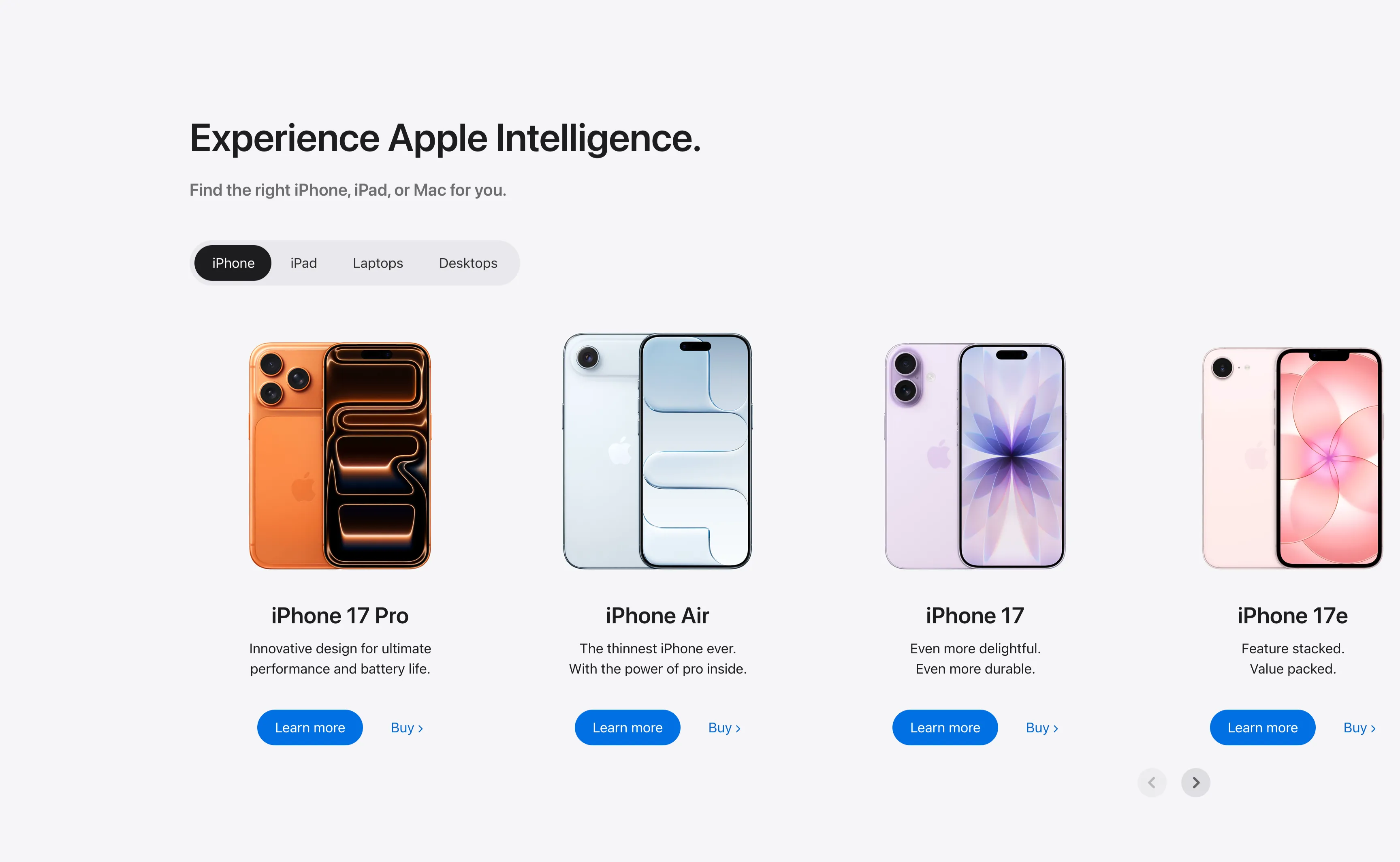
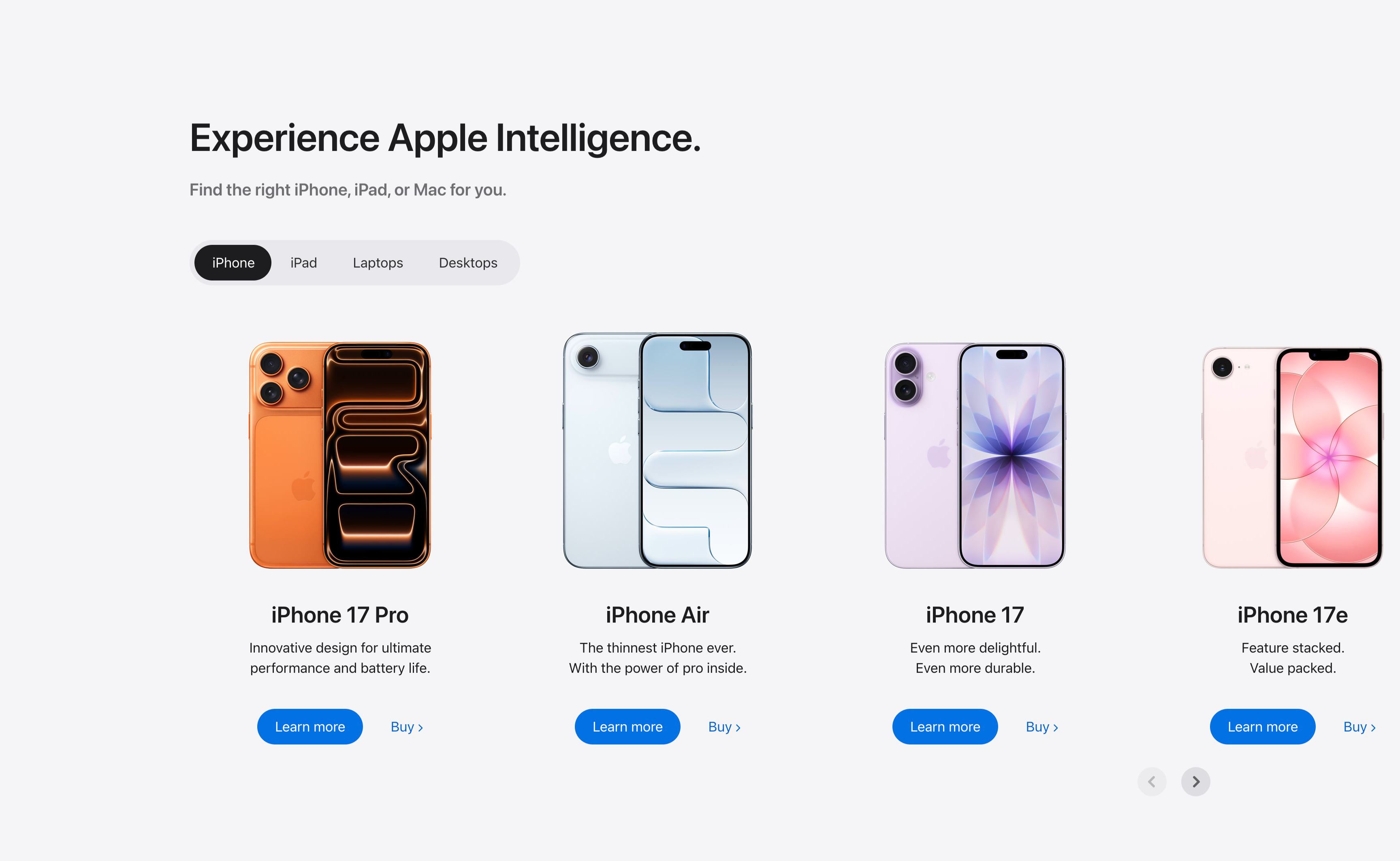
Experience Apple Intelligence Product Carousel
A product-finder carousel headed 'Experience Apple Intelligence.' with the subhead 'Find the right iPhone, iPad, or Mac for you.' A pill-shaped tab switcher offers iPhone (selected, dark), iPad, Laptops and Desktops. Below it four product cards sit in a scrollable row, each showing a device render, a bold model name, a two-line tagline, a solid blue 'Learn more' button and a 'Buy' text link: iPhone 17 Pro (orange), iPhone Air (light blue), iPhone 17 (purple) and iPhone 17e (pink). Circular previous/next arrows in the lower right reveal further models. The tabbed filter plus dual learn/buy calls-to-action make it a conversion-focused product showcase.
Apple ↗
Great Powers Come With Great Privacy Band
A centered privacy content band housed in a large pale-gray rounded card. At the top a black Apple logo rendered as a padlock sits above the centered headline 'Great powers come with great privacy.' A justified gray paragraph explains on-device processing and Private Cloud Compute running on Apple silicon. Below, a bold 'Private Cloud Compute' subhead introduces a single horizontal row of three checkmarked claims — 'Your data is never stored', 'Used only for your requests' and 'Verifiable privacy promise' — each prefixed by a circled check icon. The symmetrical, generously padded layout and restrained monochrome palette give the privacy message a calm, trustworthy, reassuring tone.
Apple ↗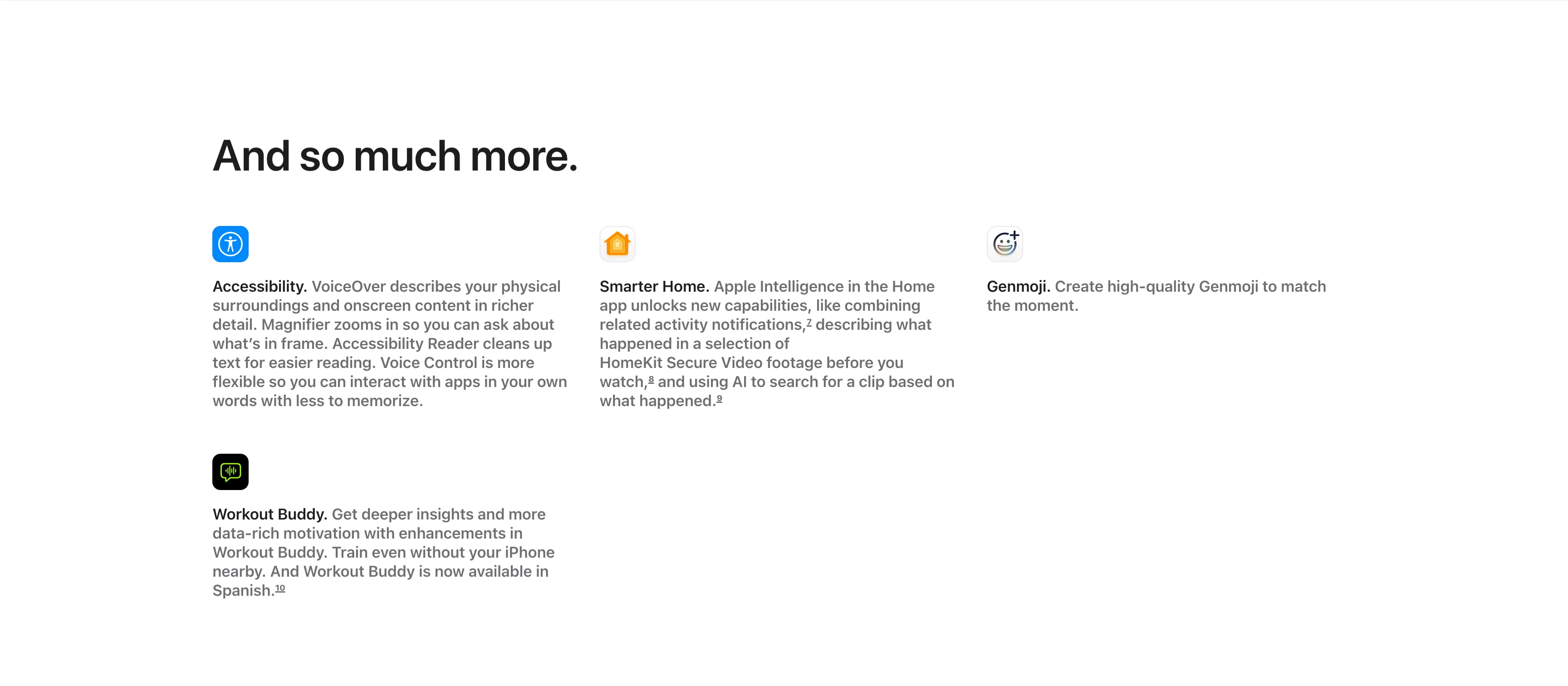
And So Much More Icon Feature Grid
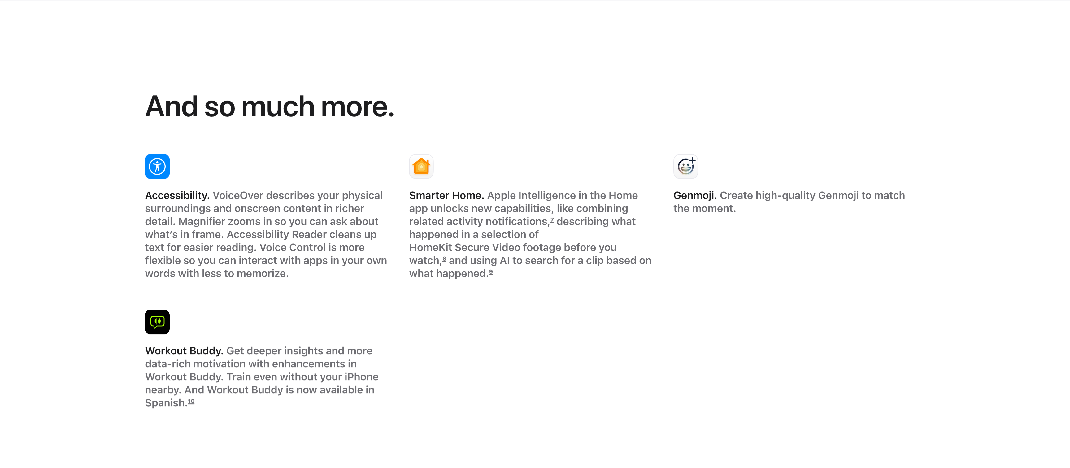
A compact 'And so much more.' feature grid on a white background, with the large left-aligned heading sitting above the items. Four entries are arranged across three columns and two rows, each led by a small rounded app icon, a bold inline title and a gray description: 'Accessibility.' (VoiceOver describing surroundings, Magnifier, Accessibility Reader, Voice Control), 'Smarter Home.' (combining activity notifications and AI search of HomeKit Secure Video), and 'Genmoji.' (creating high-quality Genmoji) fill the top row, with 'Workout Buddy.' (deeper insights, now in Spanish) below the first column. Superscript footnote markers appear after several phrases. The icon-led, text-heavy grid efficiently rounds up smaller features after the main showcases.
Apple ↗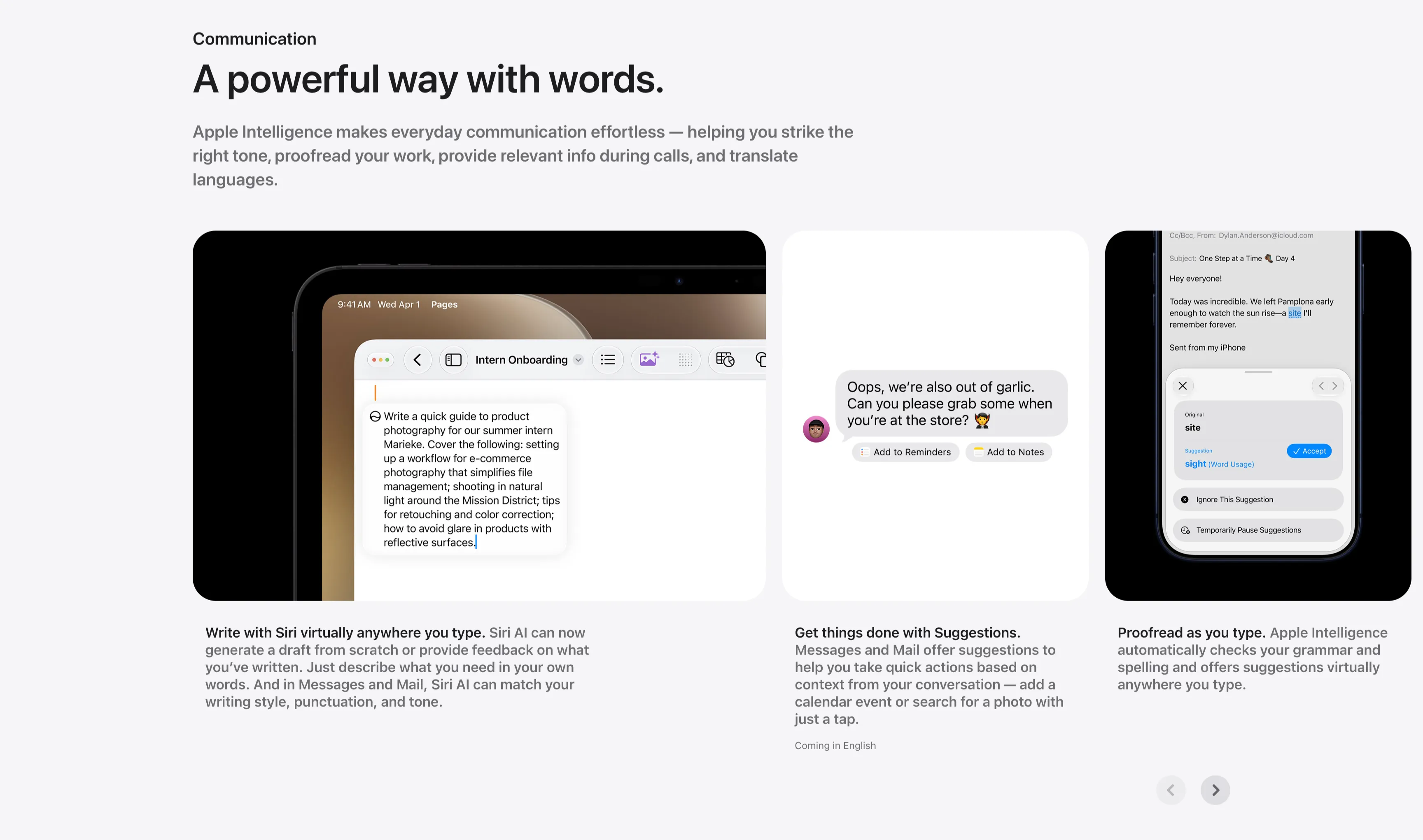
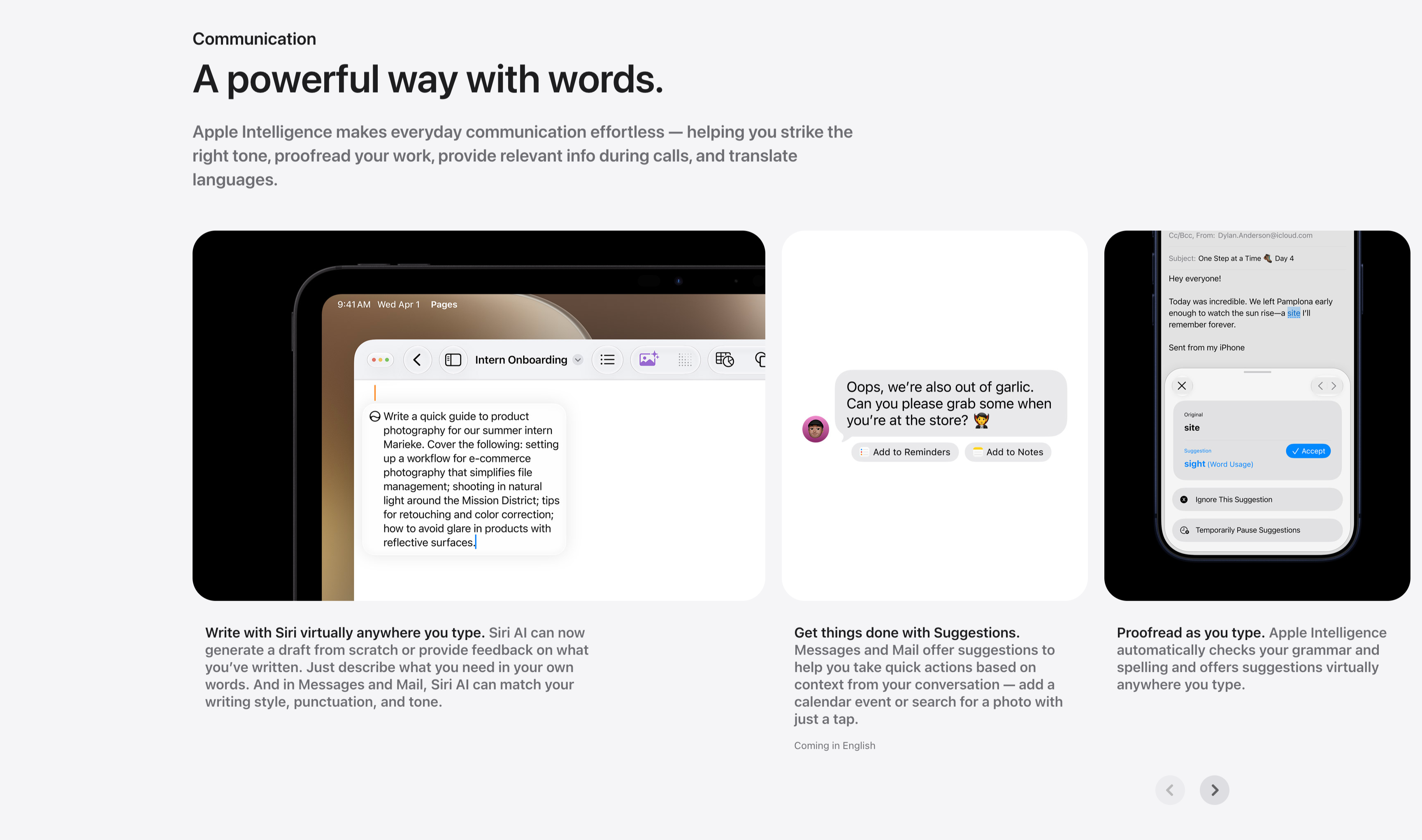
Communication Three-Up Feature Carousel
A communication feature row under a small 'Communication' label and the headline 'A powerful way with words.', with a gray paragraph about striking the right tone, proofreading and translating. Three cards sit side by side, each a screenshot with a bold-lead caption beneath: an iPad in Pages drafting a product-photography guide ('Write with Siri virtually anywhere you type.'), a Messages thread offering 'Add to Reminders' and 'Add to Notes' suggestion chips ('Get things done with Suggestions.'), and a Mail proofreading panel suggesting 'site' → 'sight' with an Accept button ('Proofread as you type.'). Circular previous/next arrows in the lower right indicate more cards. The consistent three-up screenshot layout keeps the writing-tool capabilities clear and comparable.
Apple ↗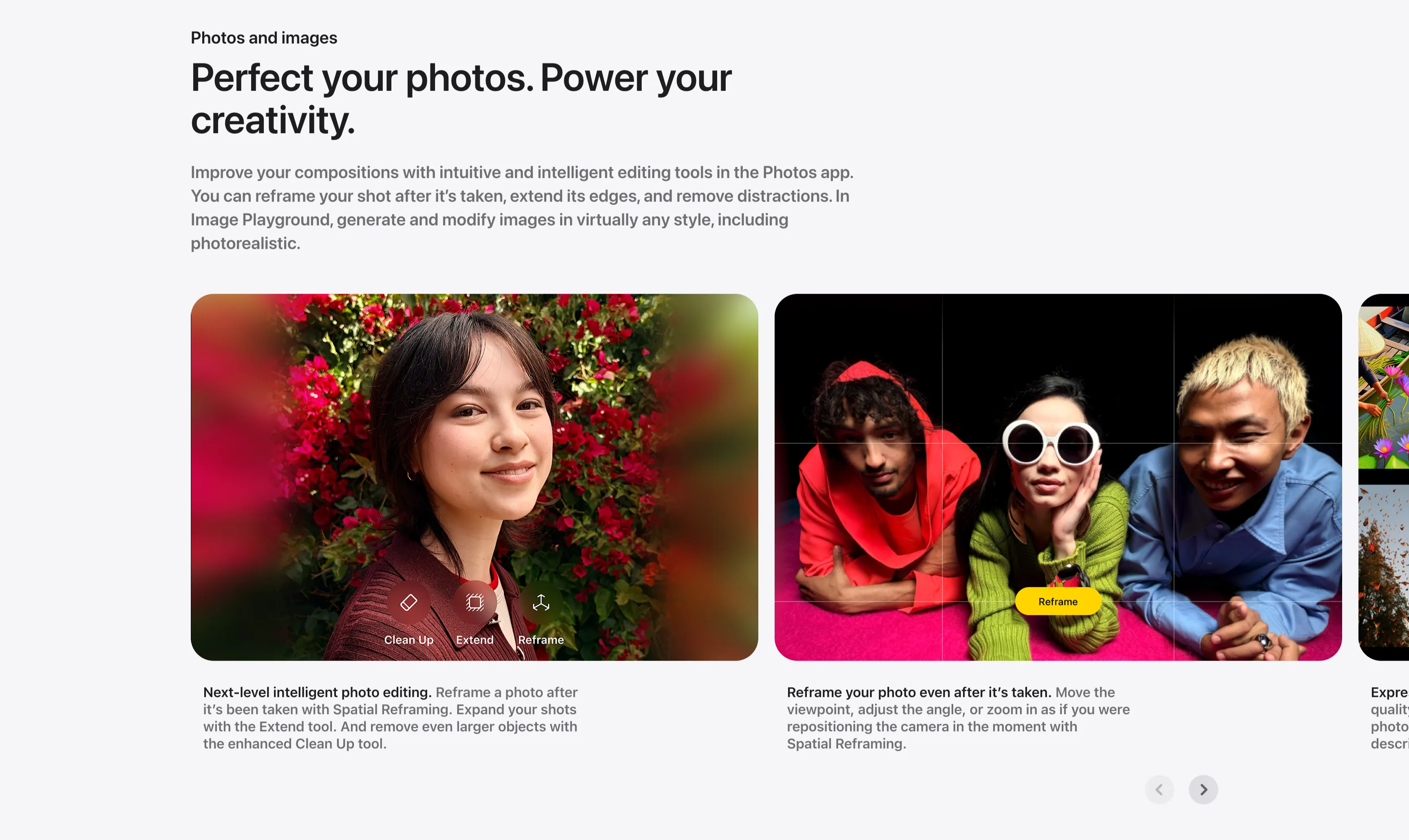
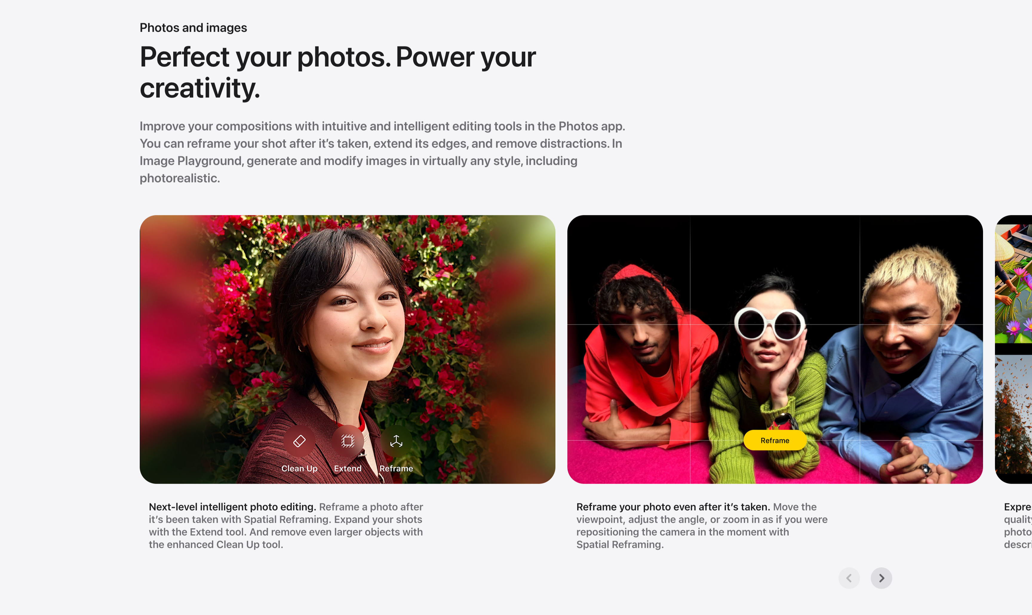
Photos And Images Editing Carousel
A photo-editing showcase carousel introduced by a small 'Photos and images' label and a two-line headline, 'Perfect your photos. Power your creativity.', with a gray paragraph about reframing, extending and Image Playground. Below, large rounded image cards scroll horizontally: a portrait of a woman against red bougainvillea overlaid with Clean Up, Extend and Reframe tool icons ('Next-level intelligent photo editing.'), and a wide shot of three friends on a pink floor with a Reframe grid and yellow 'Reframe' button ('Reframe your photo even after it's taken.'), with a third card just entering from the right edge. Bold-lead captions sit beneath each card and circular previous/next arrows anchor the lower right. The full-bleed photography and on-image tool chips make the editing features feel tangible.
Apple ↗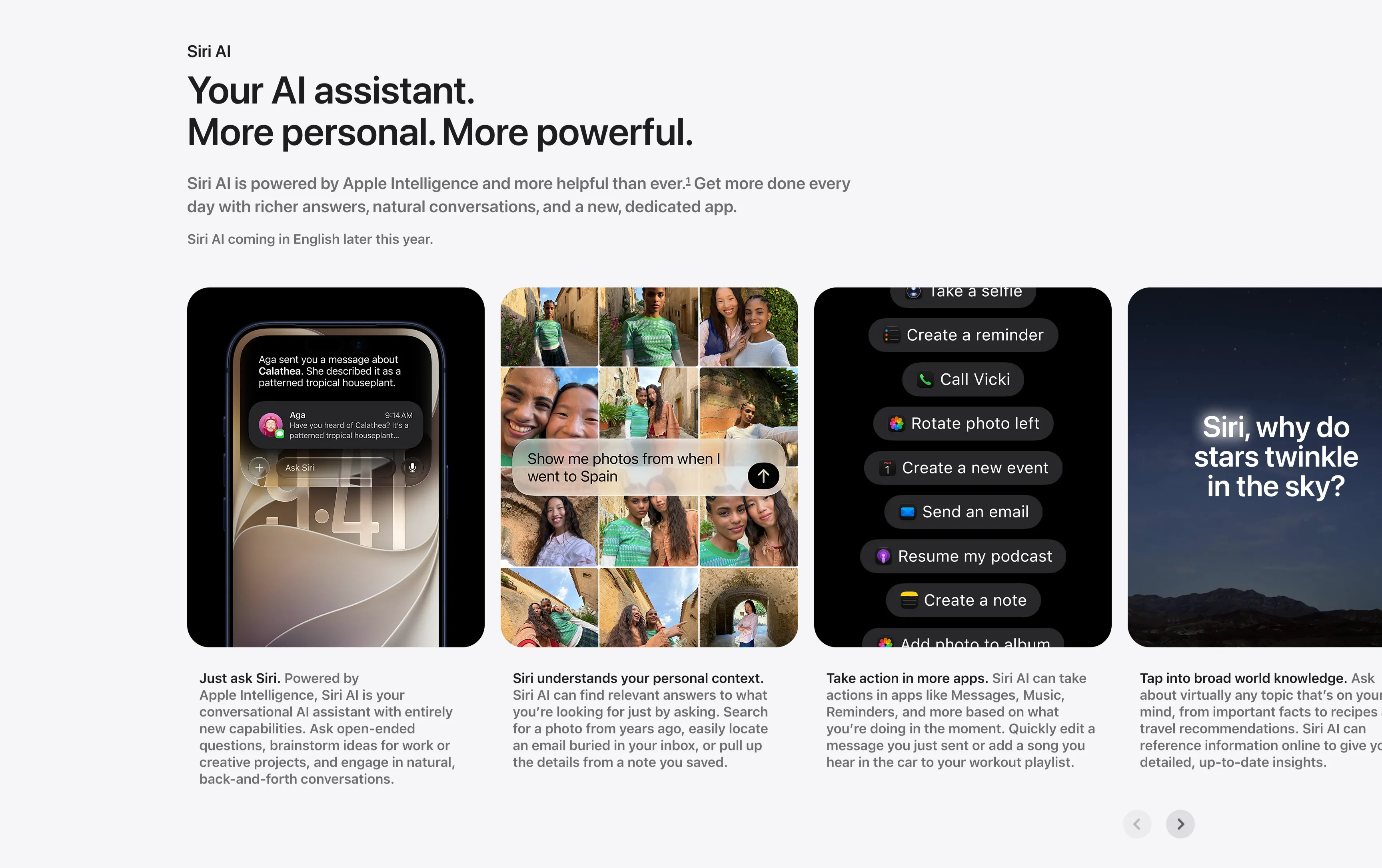
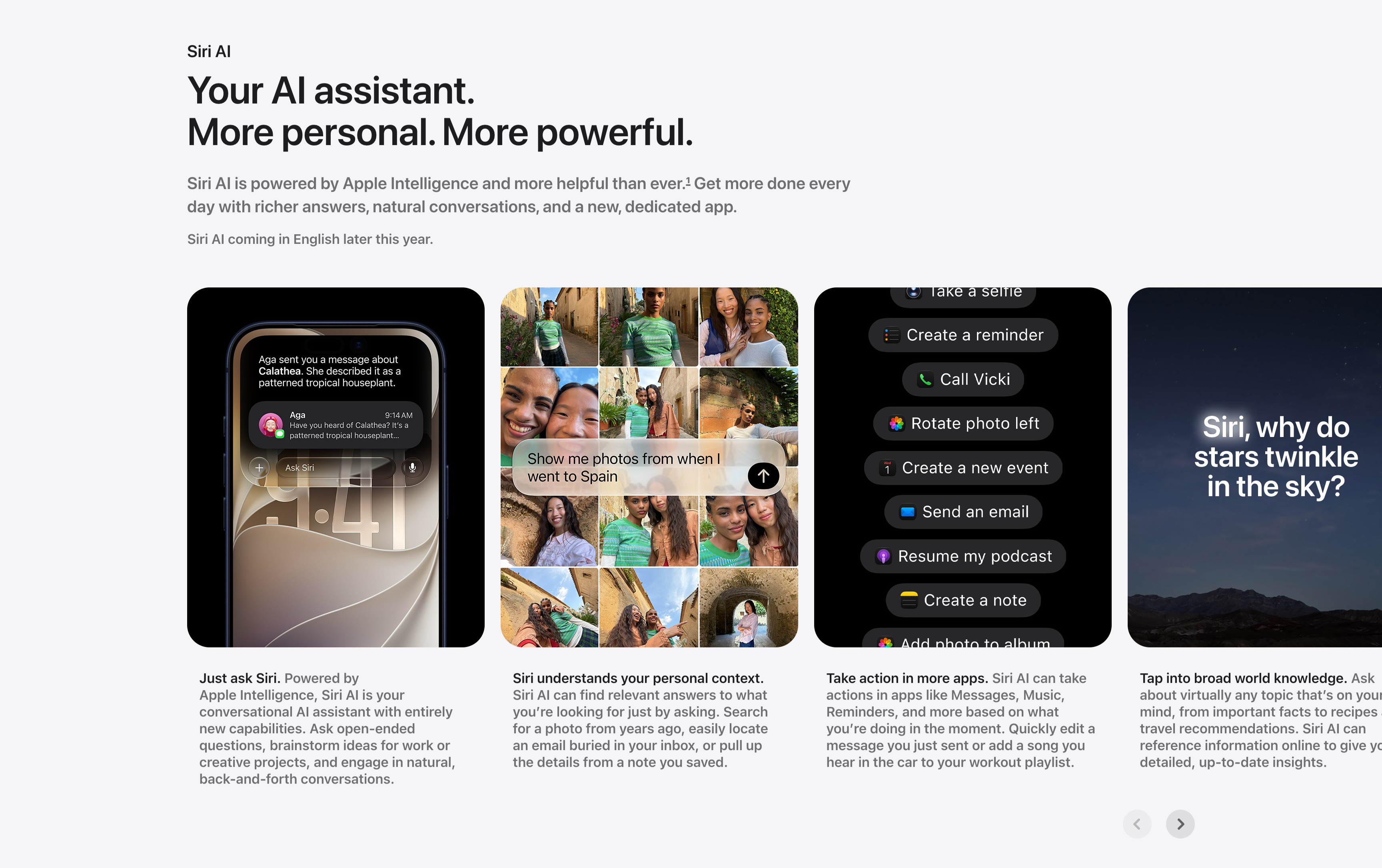
Siri AI Feature Card Carousel
A horizontally scrolling feature carousel under a small 'Siri AI' label and a two-line headline, 'Your AI assistant. More personal. More powerful.', with a gray supporting paragraph and a 'Siri AI coming in English later this year.' note. Four tall rounded cards sit in a row, each a screenshot with a bold-lead caption below it: a phone showing an 'Ask Siri' message thread ('Just ask Siri.'), a photo grid responding to 'Show me photos from when I went to Spain' ('Siri understands your personal context.'), a dark list of Siri actions like 'Create a reminder' and 'Call Vicki' ('Take action in more apps.'), and a starry-sky card asking 'Siri, why do stars twinkle in the sky?' ('Tap into broad world knowledge.'). A pair of circular previous/next arrows in the lower right confirms it scrolls. The captioned-screenshot rhythm makes each capability easy to scan.
Apple ↗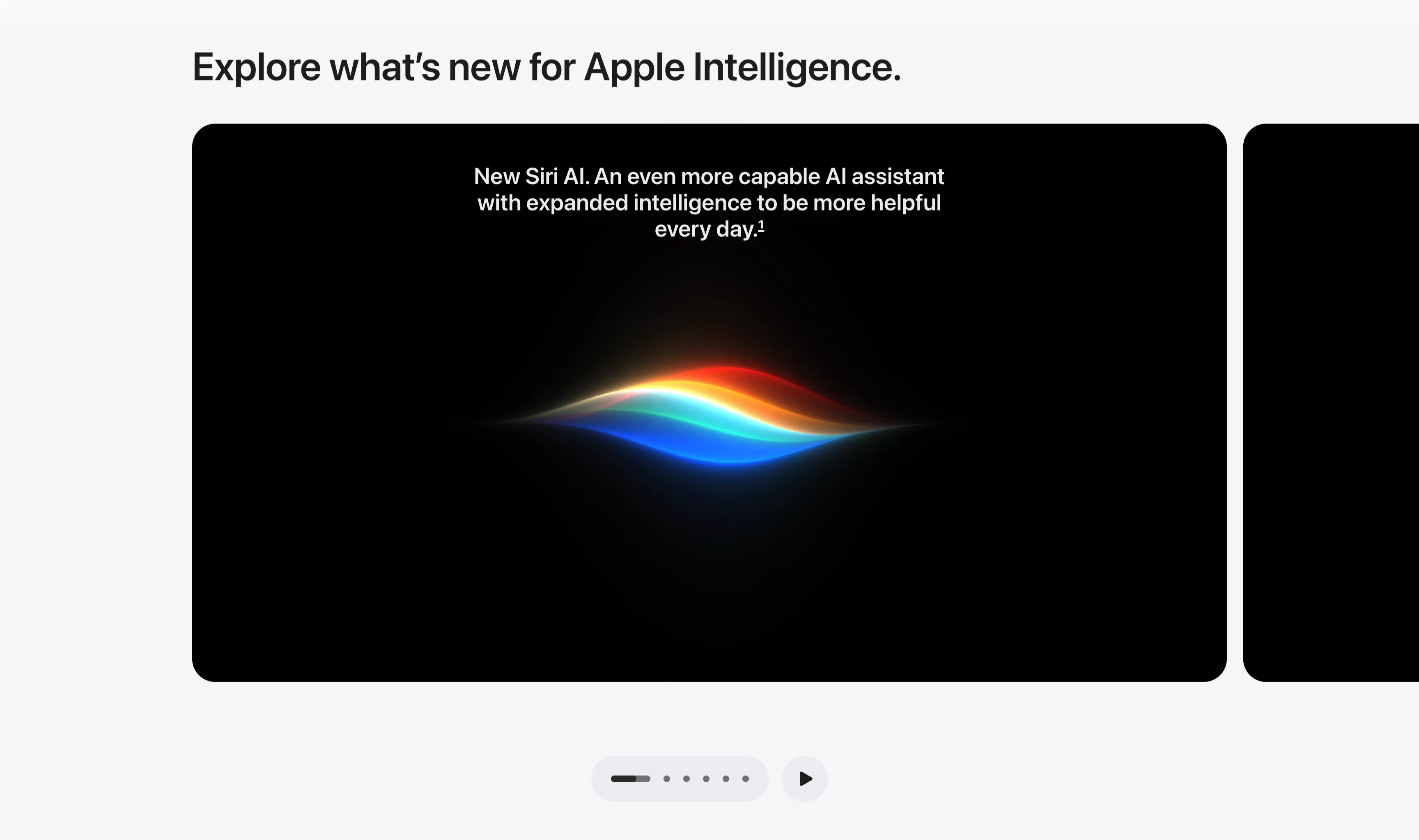
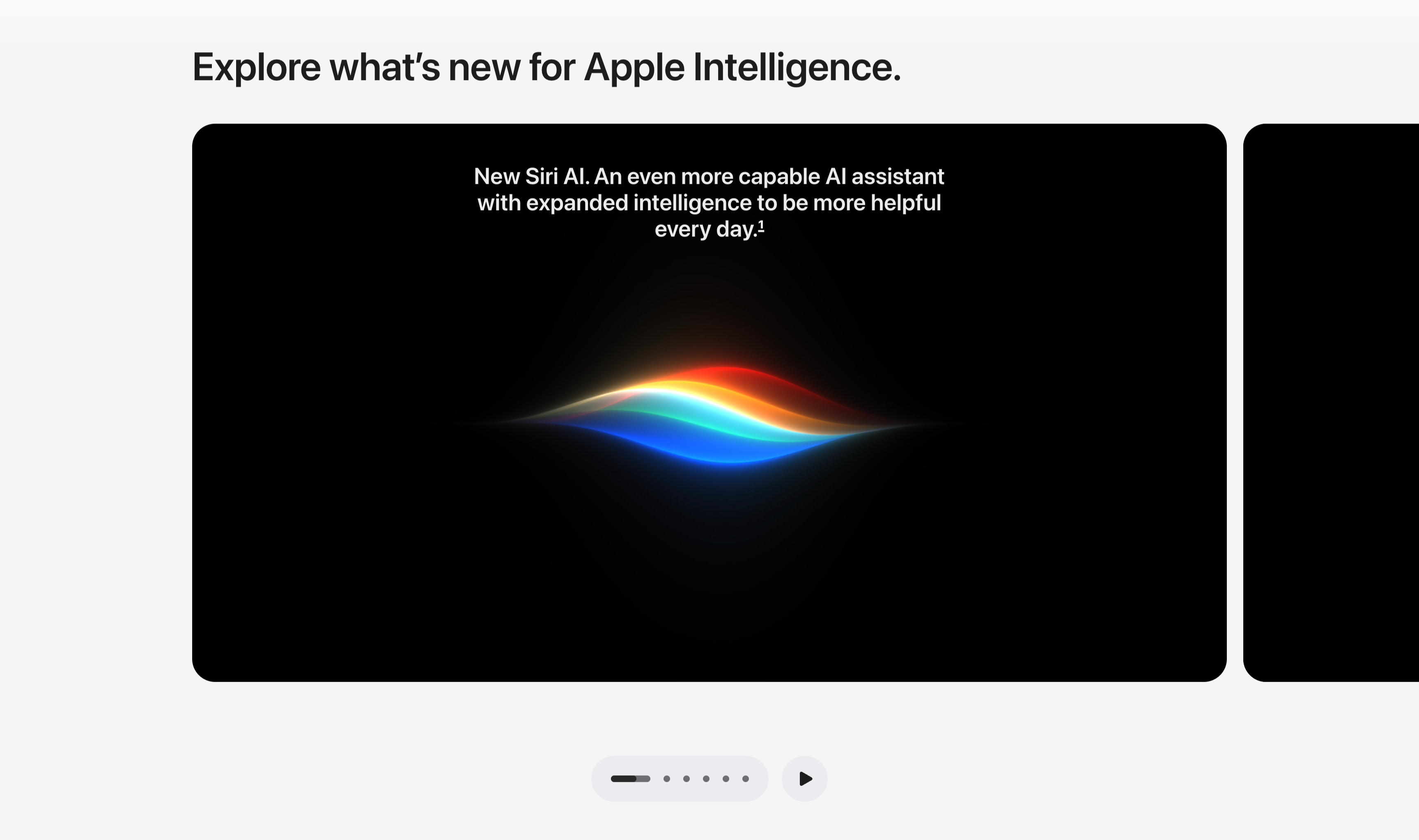
Explore What's New Dark Media Carousel
A media carousel set on a light gray background, led by a left-aligned section heading, 'Explore what's new for Apple Intelligence.' Below it a large black rounded-corner card dominates the row, with the edge of a second identical dark card peeking in from the right to signal scrollability. The active card centers white caption text — 'New Siri AI. An even more capable AI assistant with expanded intelligence to be more helpful every day.' — above the colorful Siri waveform glowing in red, orange, blue and cyan on black. Beneath the carousel sits a pill-shaped pagination control with five dots (the first elongated to mark position) and a circular play button to auto-advance. The dark cards against the pale frame give the section a cinematic, gallery-like feel.
Apple ↗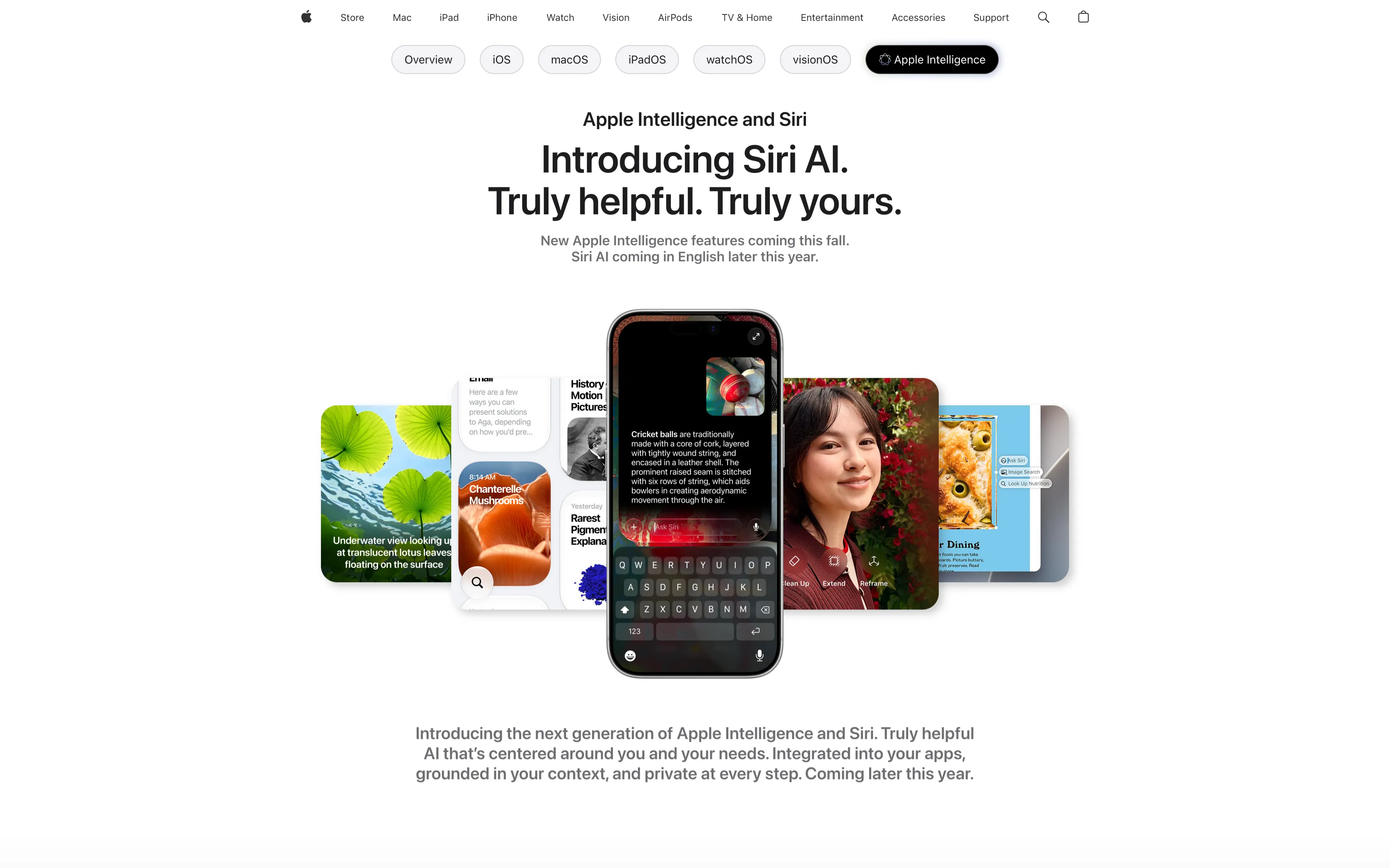
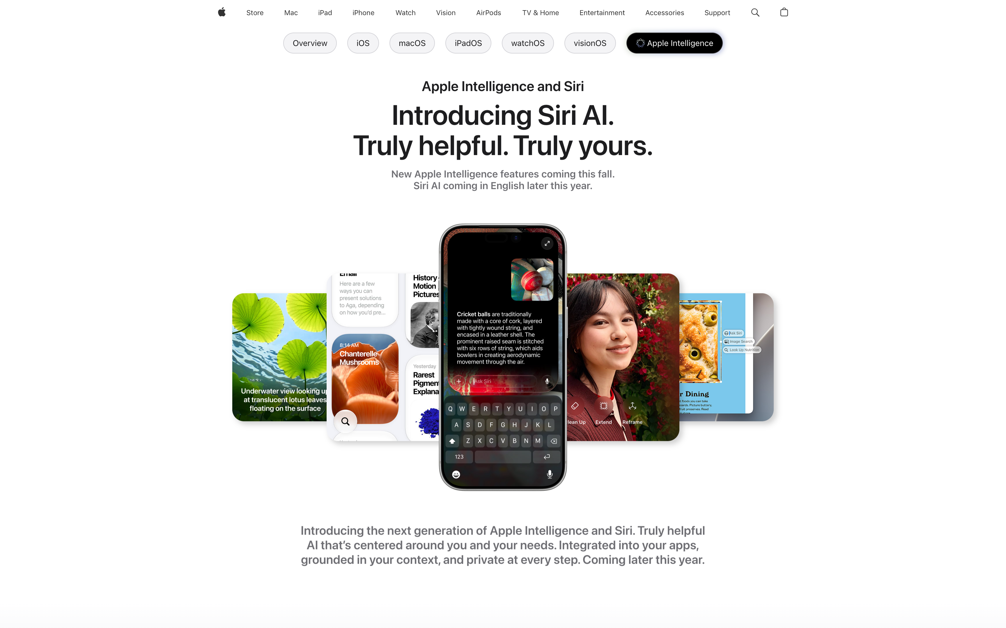
Apple Intelligence Centered Hero With Floating App Cards
A centered hero on a clean white background. A small 'Apple Intelligence and Siri' eyebrow sits above an oversized two-line headline, 'Introducing Siri AI. Truly helpful. Truly yours.', followed by a muted two-line subhead noting features 'coming this fall'. Below the type, a fanned cluster of floating, rounded screenshots surrounds a central dark iPhone showing a Siri 'Ask Siri' conversation about cricket balls — the cards include a green lotus photo, chanterelle mushrooms, a black-and-white history result, a smiling portrait against red flowers, and a dining card. A second gray paragraph closes the block with 'Introducing the next generation of Apple Intelligence and Siri.' Generous whitespace and the single hero device keep all focus on the headline.
Apple ↗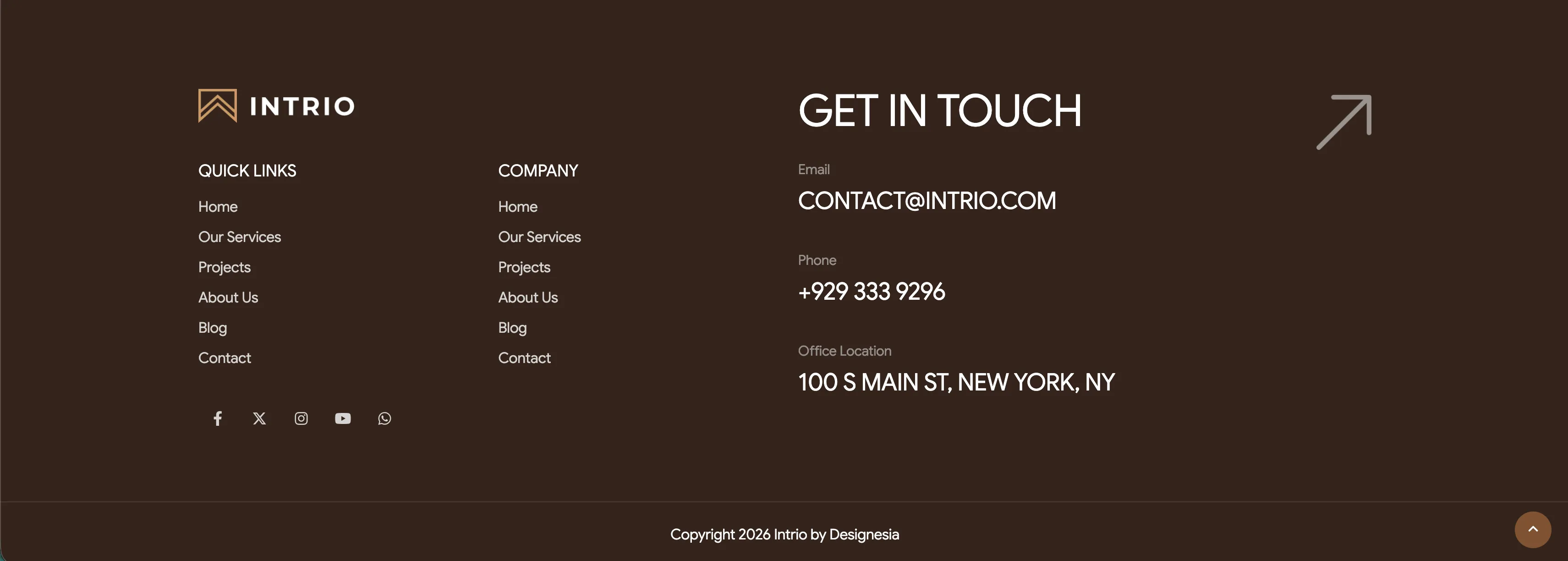
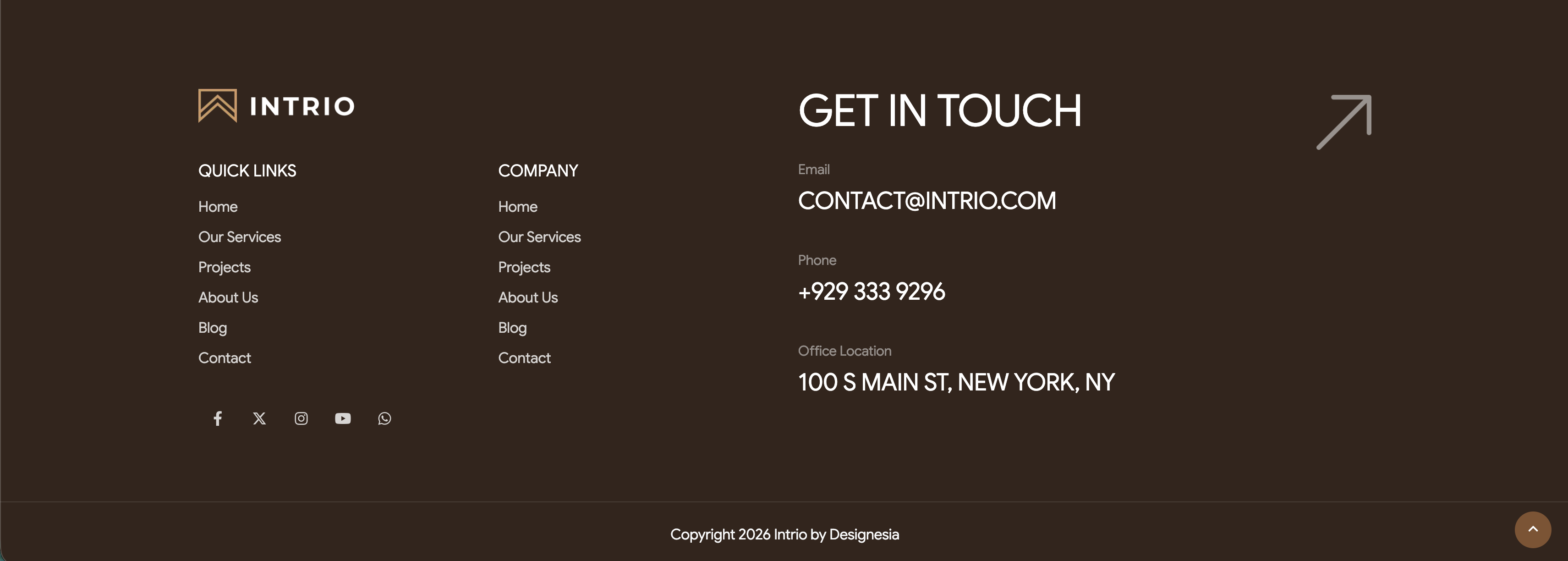
Intrio Multi-Column Footer With Social Links
A tall footer on a deep brown background. The upper-left holds the 'INTRIO' logo above two link columns, 'QUICK LINKS' and 'COMPANY', each listing Home, Our Services, Projects, About Us, Blog and Contact. The center-right is dominated by a very large 'GET IN TOUCH' heading, beside which a small grey-labelled contact block lists Email 'CONTACT@INTRIO.COM', Phone '+929 333 9296' and Office Location '100 S MAIN ST, NEW YORK, NY'. A large outlined up-right arrow sits in the top-right corner as a decorative get-in-touch cue. Below the logo a row of five circular social icons (Facebook, X, Instagram, YouTube, WhatsApp) appears, and a thin bottom bar centers the line 'Copyright 2026 Intrio by Designesia' with a circular scroll-to-top button at the lower right. The dark palette, oversized contact headline and tidy link columns make a confident, well-organised page close.
Madebydesignesia ↗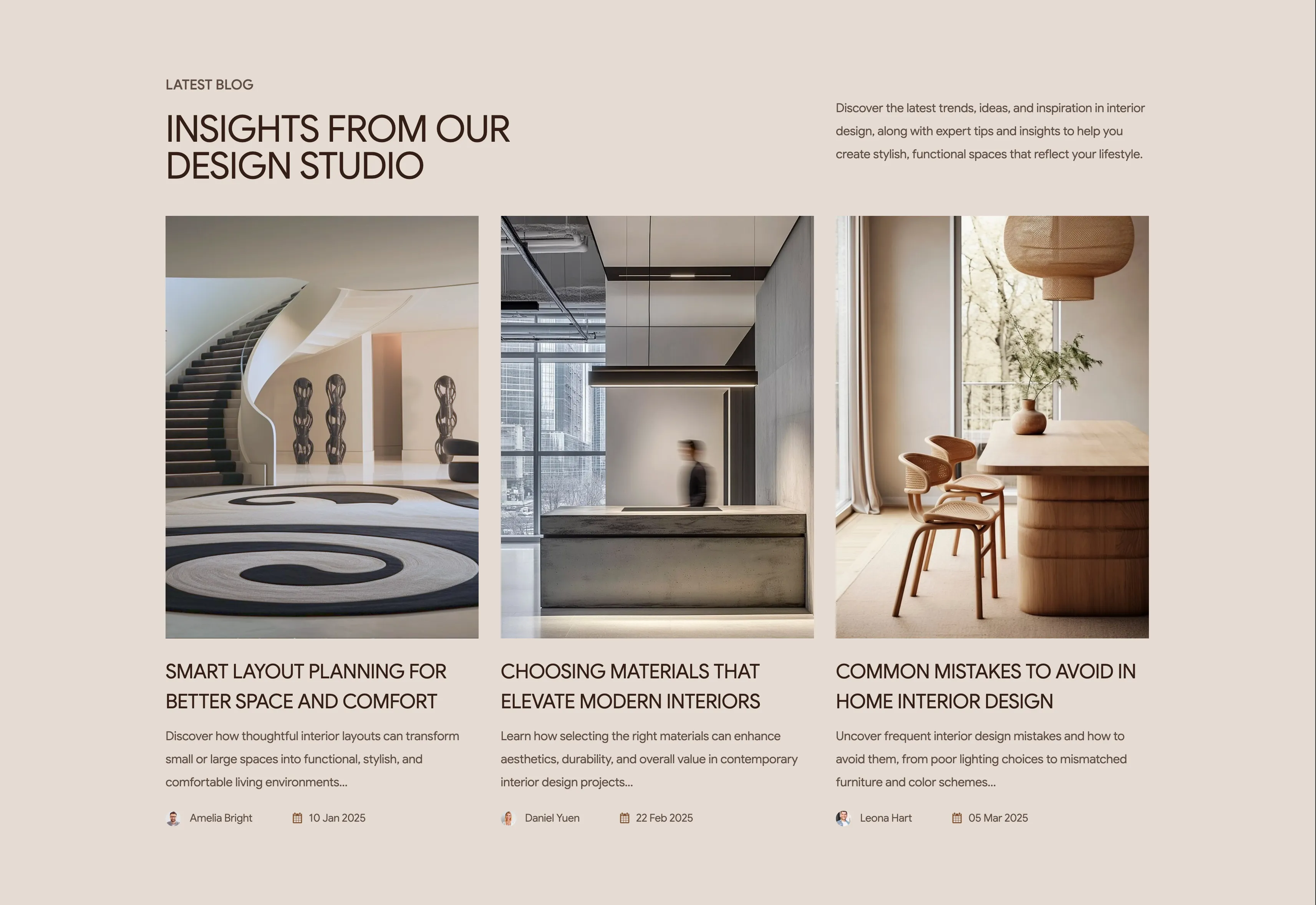
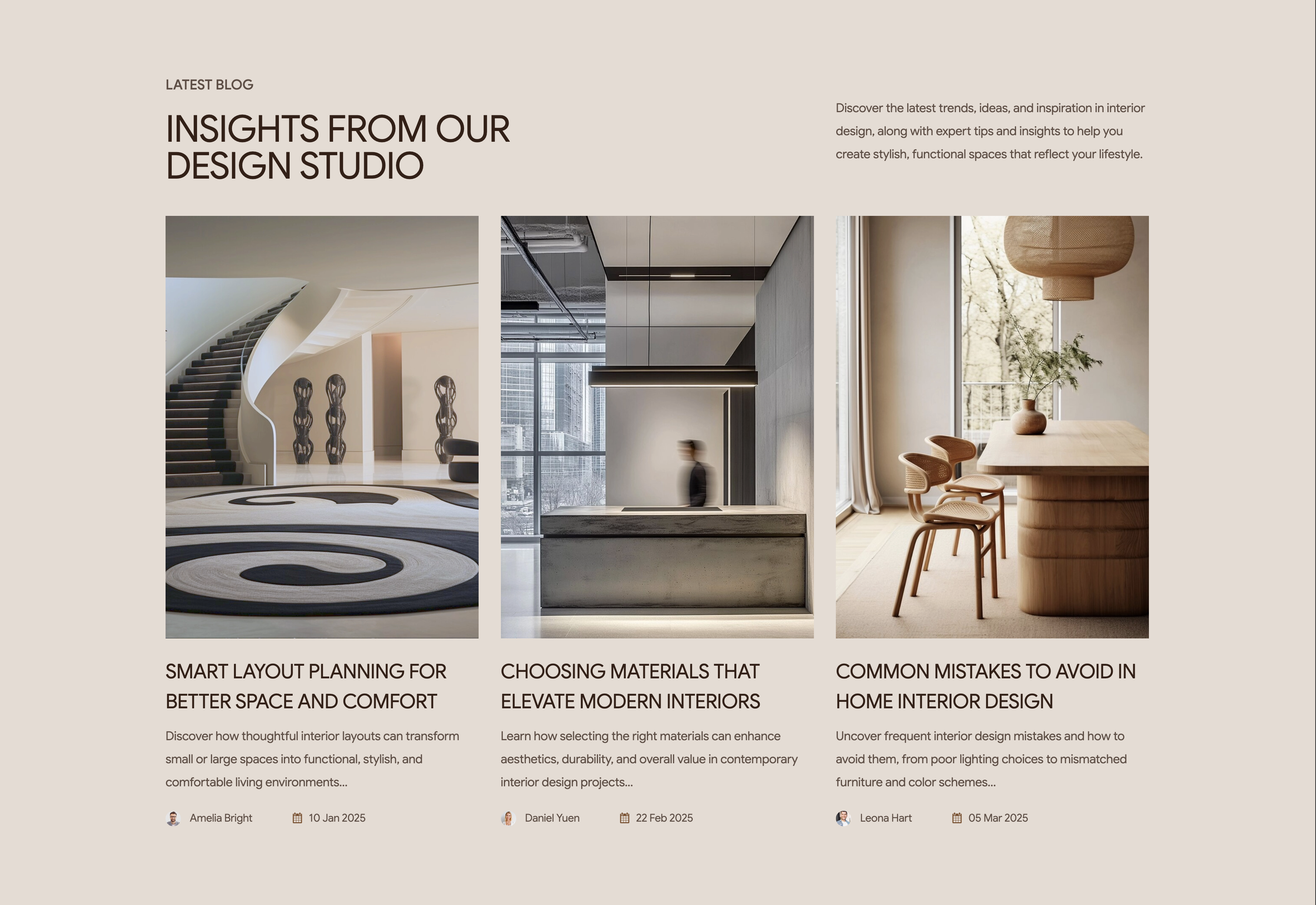
Intrio Latest Blog Three-Card Grid
A latest-blog section on a warm beige background presenting three article cards in a row. The header reads 'LATEST BLOG' as an eyebrow above a large brown heading, 'INSIGHTS FROM OUR DESIGN STUDIO', with an introductory paragraph about trends and tips set to the upper right. Each card stacks a tall portrait photograph of an interior, an uppercase article title, a two-line excerpt, and a footer row pairing a small circular author avatar and name with a calendar icon and date. The three posts are 'Smart Layout Planning For Better Space And Comfort' (Amelia Bright, 10 Jan 2025), 'Choosing Materials That Elevate Modern Interiors' (Daniel Yuen, 22 Feb 2025) and 'Common Mistakes To Avoid In Home Interior Design' (Leona Hart, 05 Mar 2025). The even three-up grid with consistent imagery, bylines and dates reads as a clean editorial index. It invites browsing while reinforcing the studio's expertise.
Madebydesignesia ↗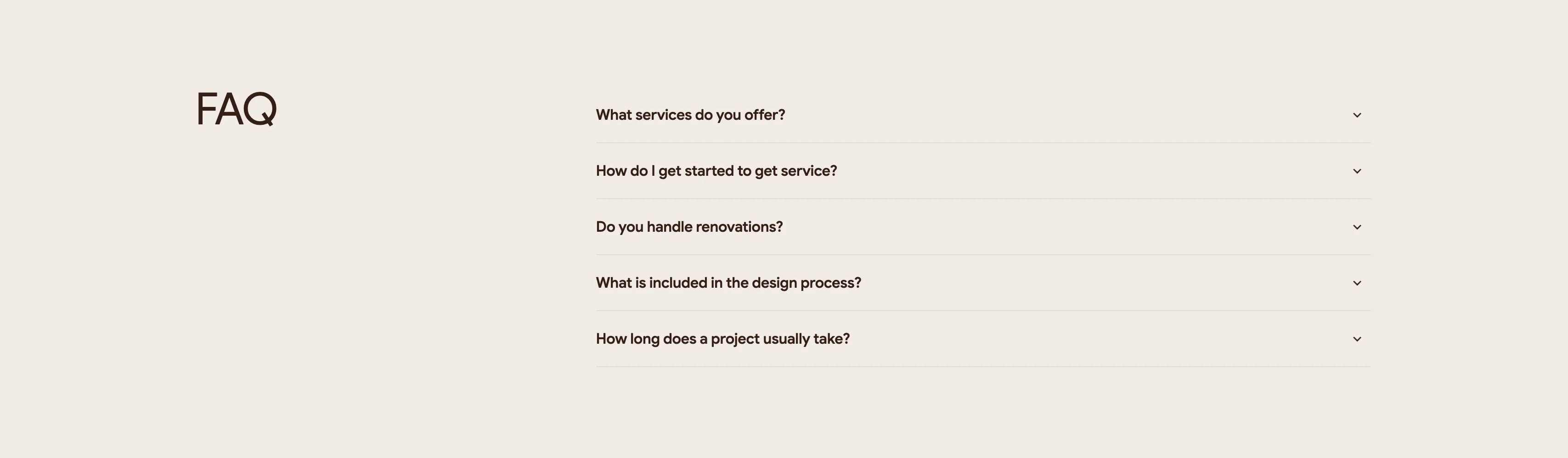
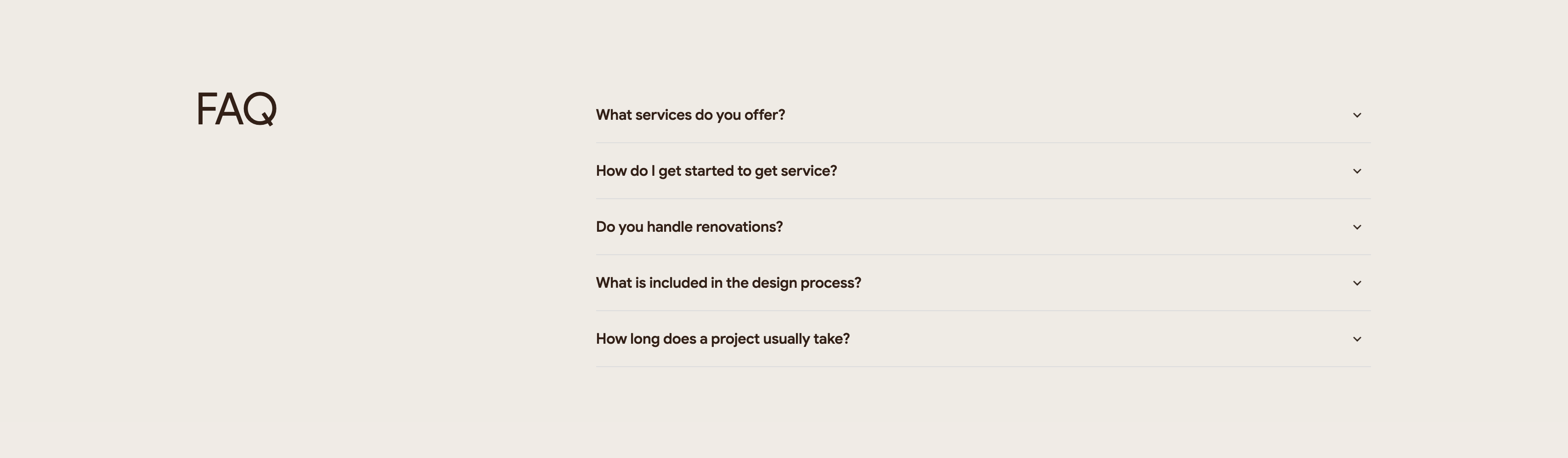
Intrio FAQ Accordion
A quiet two-column FAQ section on an off-white background. The left column holds only a large lowercase-to-caps brown heading, 'FAQ', leaving most of that side as whitespace. The right column is a stacked accordion of five collapsed questions, each a bold line of dark text with a chevron-down toggle at the far right and a thin hairline divider between rows. The questions read 'What services do you offer?', 'How do I get started to get service?', 'Do you handle renovations?', 'What is included in the design process?' and 'How long does a project usually take?'. The generous spacing and single accent-free palette keep the focus on the questions themselves. It is a straightforward expandable FAQ pattern that scales cleanly as answers open.
Madebydesignesia ↗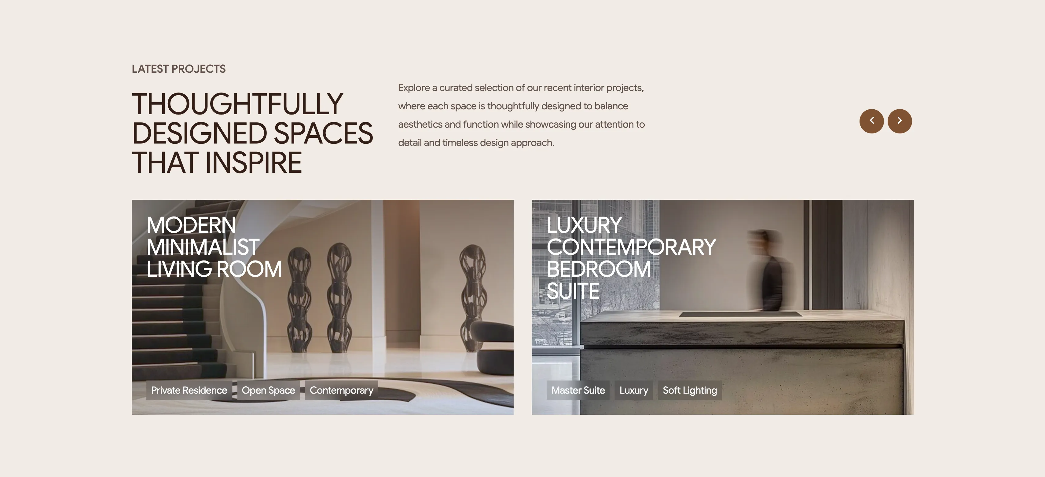
Intrio Latest Projects Showcase
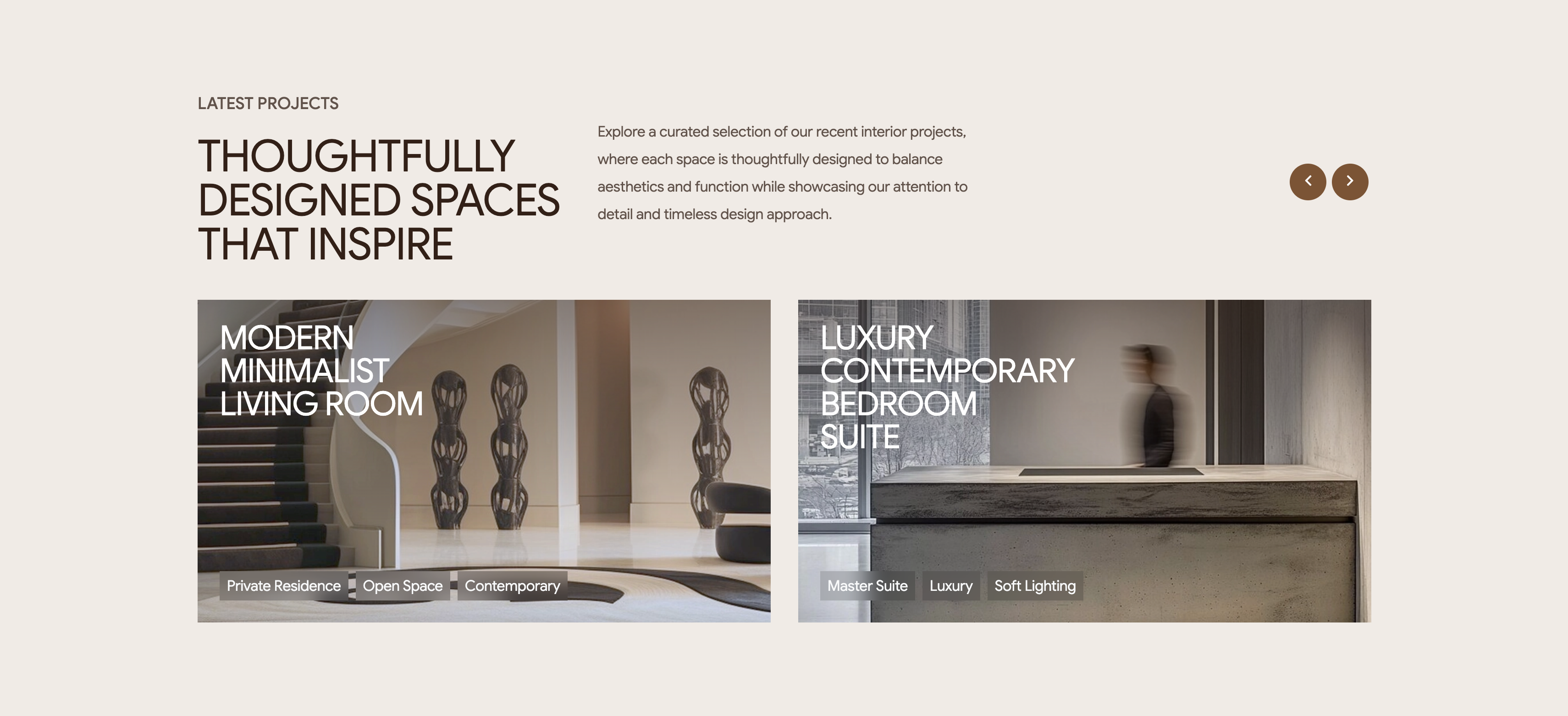
A latest-projects section on a pale background with a two-up row of wide project cards. The header stacks a 'LATEST PROJECTS' eyebrow over a large brown heading, 'THOUGHTFULLY DESIGNED SPACES THAT INSPIRE', a paragraph of intro copy to the right, and two circular bronze carousel arrows at the far right. Below, two landscape image cards sit side by side: the left shows a minimalist staircase-and-sculpture interior titled 'MODERN MINIMALIST LIVING ROOM', the right a concrete-and-glass space titled 'LUXURY CONTEMPORARY BEDROOM SUITE'. Each card overlays a white uppercase title on the upper-left and a row of small translucent tag pills along the bottom — 'Private Residence / Open Space / Contemporary' and 'Master Suite / Luxury / Soft Lighting' respectively. The arrows imply the two visible projects are the first of a longer scrollable set. Large photography with overlaid text and category chips makes the portfolio feel curated and browsable.
Madebydesignesia ↗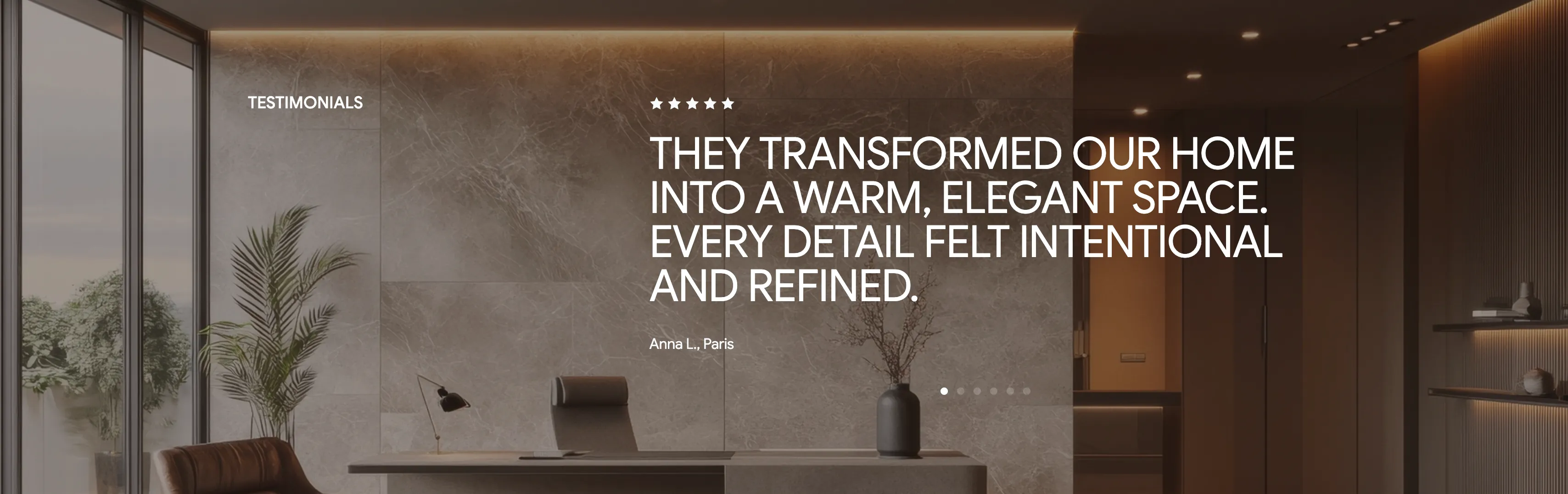
Intrio Full-Bleed Testimonial Quote
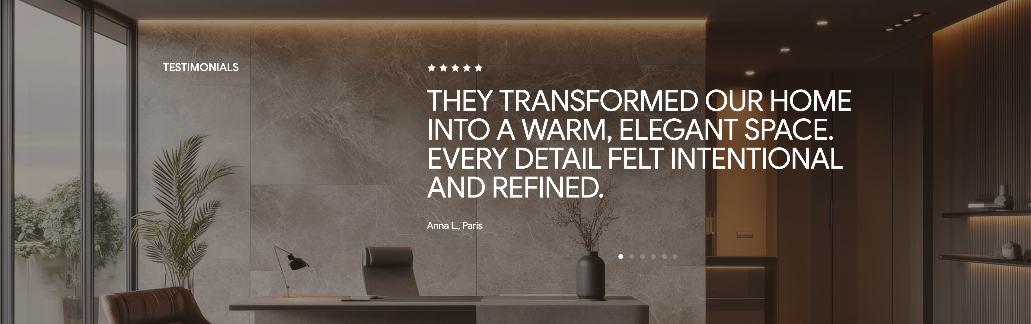
A single-testimonial section laid over a darkened full-bleed photo of a refined marble interior with a desk, plant and warm cove lighting. A small 'TESTIMONIALS' label sits to the left, while the focal content is centered: a row of five filled stars above a large white pull-quote, 'THEY TRANSFORMED OUR HOME INTO A WARM, ELEGANT SPACE. EVERY DETAIL FELT INTENTIONAL AND REFINED.' The attribution 'Anna L., Paris' appears in smaller grey type just beneath the quote. A row of six pagination dots at the bottom, with the first active, signals that several reviews rotate through this slot. The moody photographic backdrop and oversized quote give the praise a confident, editorial weight. It is a classic one-review-at-a-time carousel pattern that foregrounds a single strong endorsement.
Madebydesignesia ↗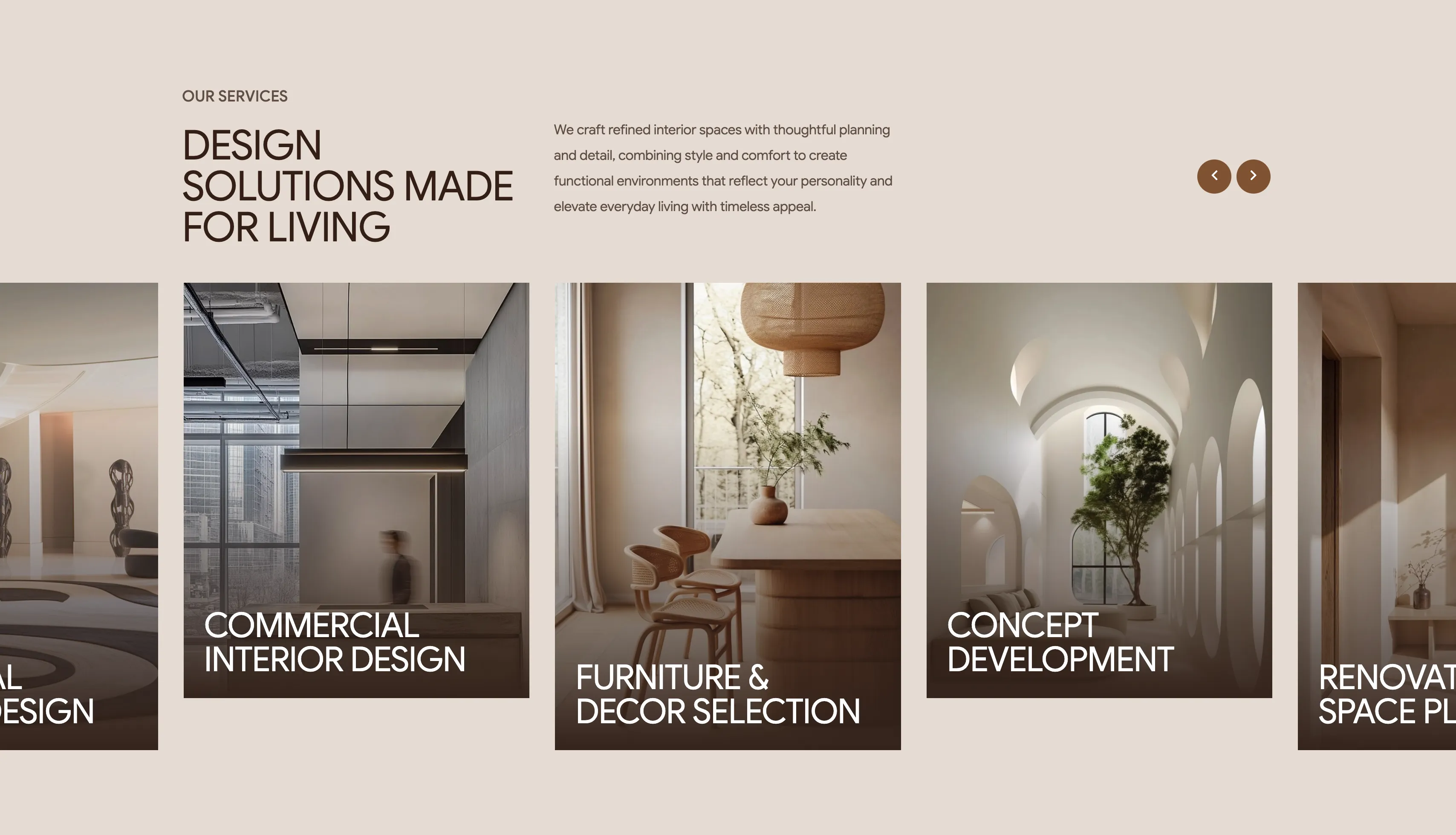
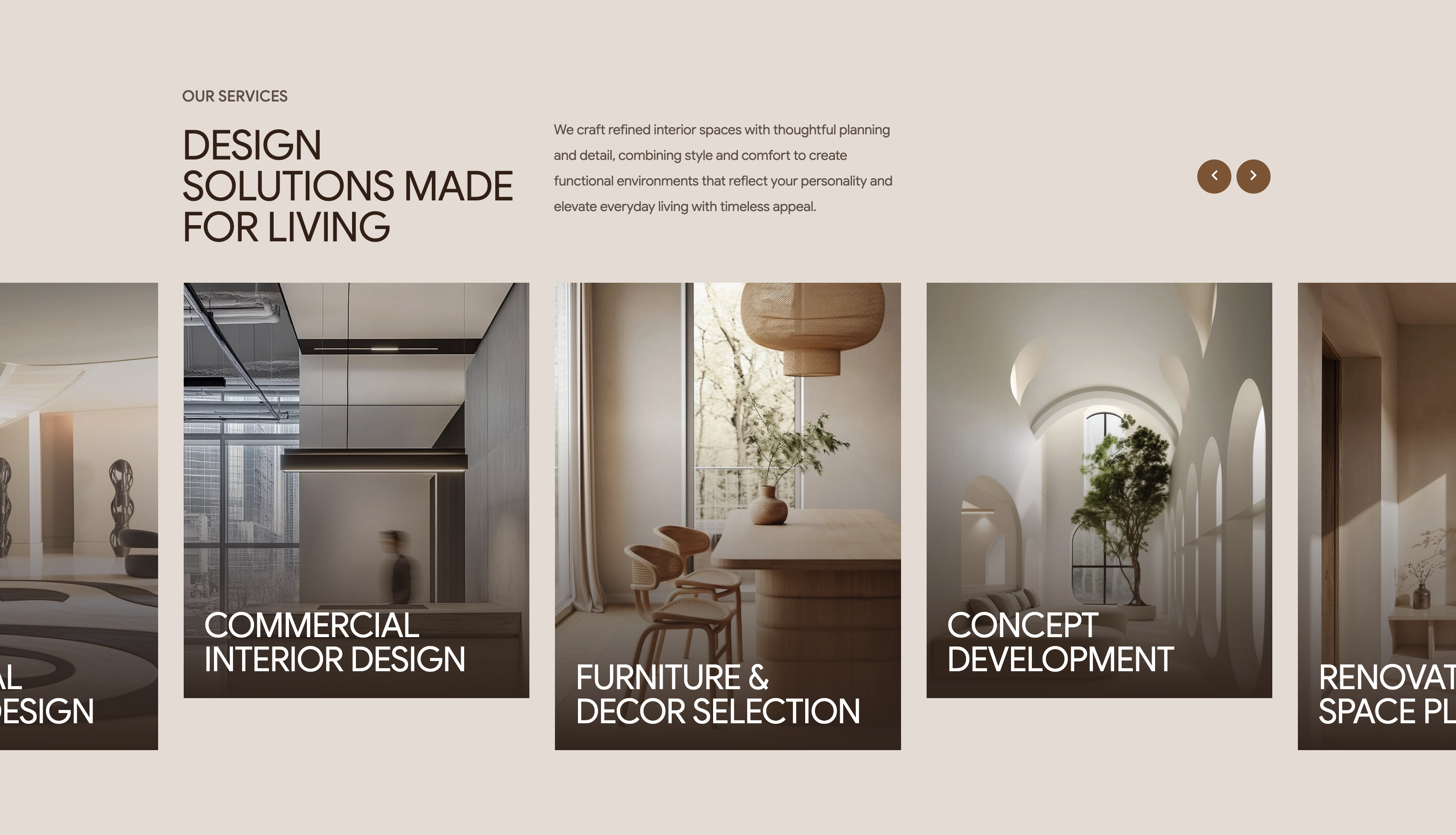
Intrio Services Image-Card Carousel
A services showcase on a soft beige background built as a horizontal carousel of tall image cards. The header area reads 'OUR SERVICES' as an eyebrow above a large brown heading, 'DESIGN SOLUTIONS MADE FOR LIVING', with a paragraph of supporting copy to the right and two circular bronze arrow buttons for navigating the slider. Beneath it, full-height portrait cards each show an interior photograph darkened by a gradient overlay with the service name set in white at the bottom: visible cards include 'Commercial Interior Design', 'Furniture & Decor Selection' and 'Concept Development', with neighbouring cards ('Residential Design', 'Renovation & Space Planning') cropped at the left and right edges to signal more on scroll. The consistent dark-overlaid imagery and white labels create a clean, gallery-like rhythm. The partially shown cards plus arrow controls make the carousel interaction obvious.
Madebydesignesia ↗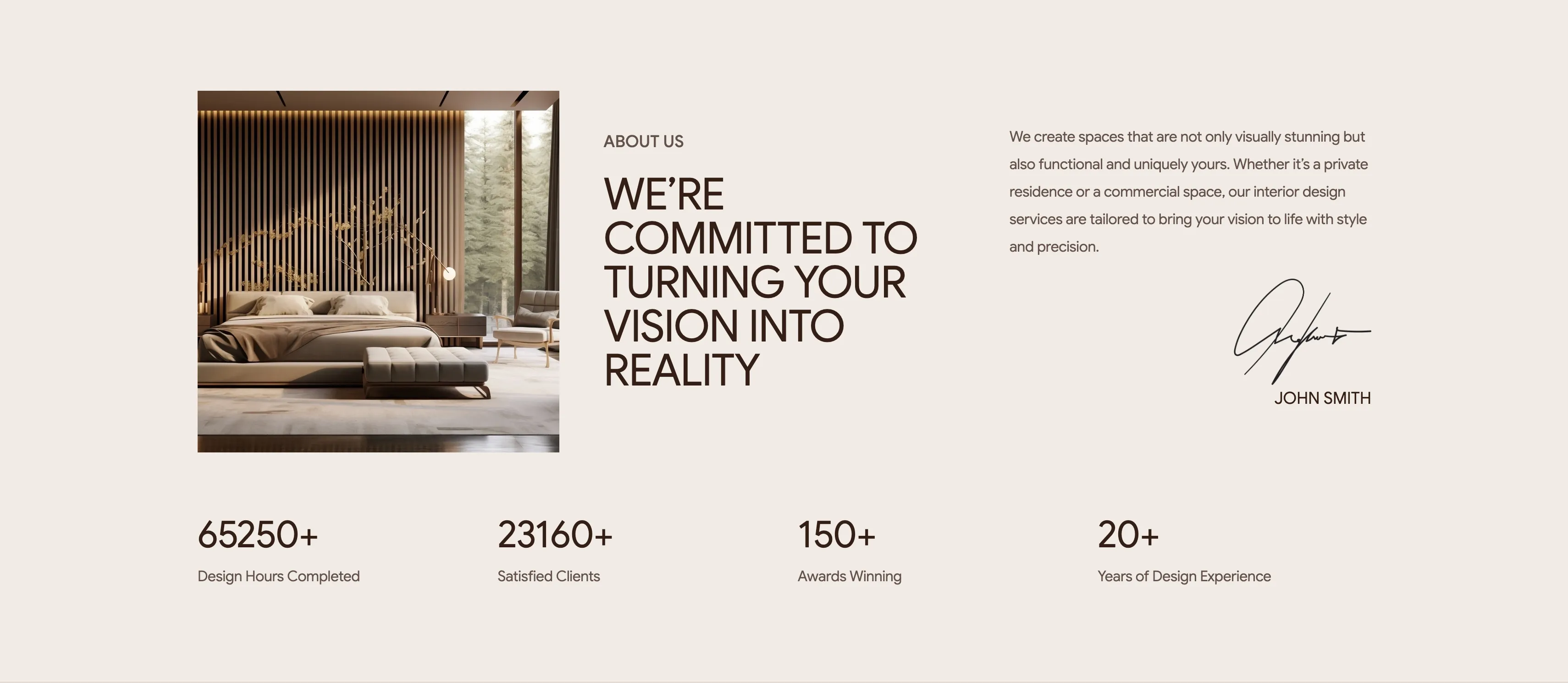
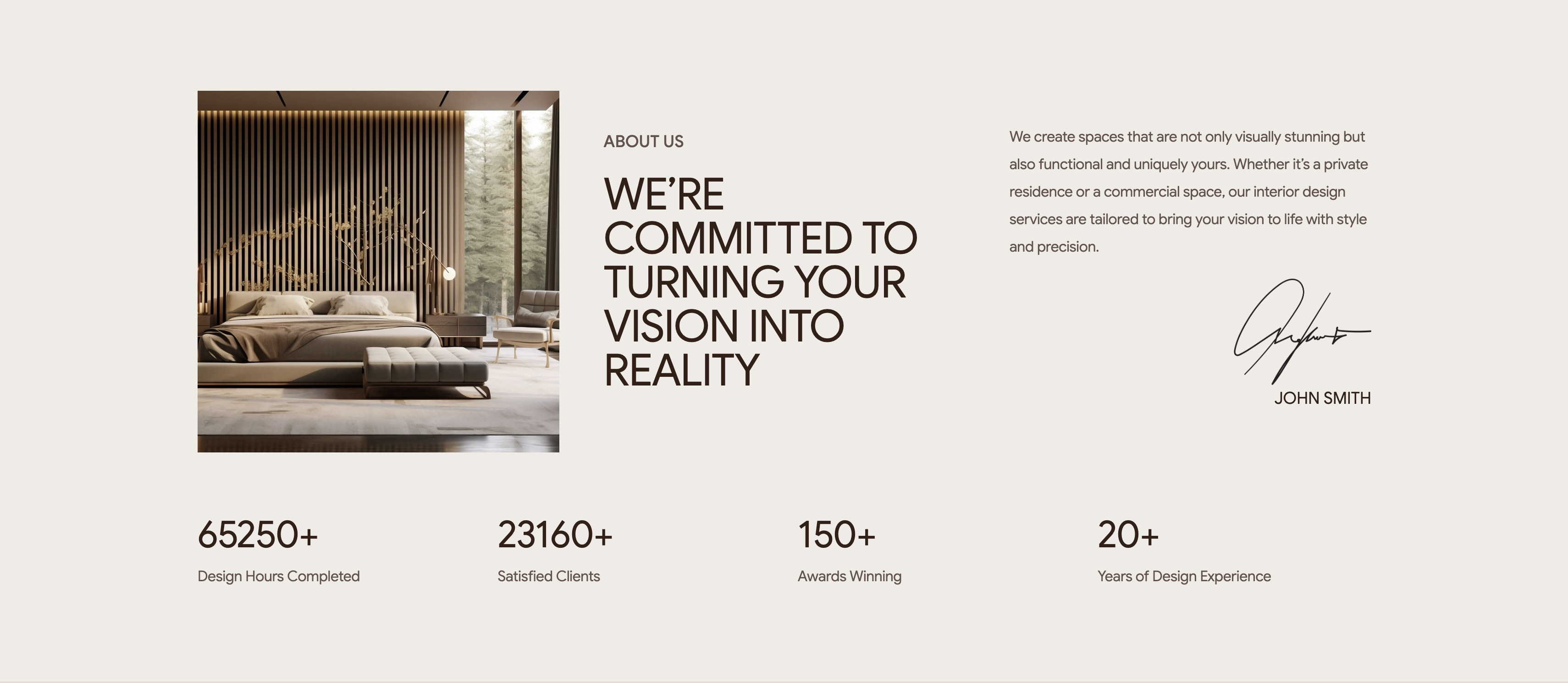
Intrio About Section With Stat Counters
A light-beige about section that pairs a story block with a row of headline statistics. On the left sits a square photograph of a wood-slatted bedroom with a forest view; to its right an 'ABOUT US' eyebrow tops a large brown display heading, 'WE’RE COMMITTED TO TURNING YOUR VISION INTO REALITY'. A third column holds a paragraph of body copy about creating functional, uniquely tailored spaces, closing with a handwritten ink signature and the name 'JOHN SMITH'. Below the whole block, four evenly spaced counters read '65250+ Design Hours Completed', '23160+ Satisfied Clients', '150+ Awards Winning' and '20+ Years of Design Experience'. The oversized numerals in the same brown sit above small grey captions, lending credibility. Generous whitespace and a muted palette keep the focus on the headline and the proof points.
Madebydesignesia ↗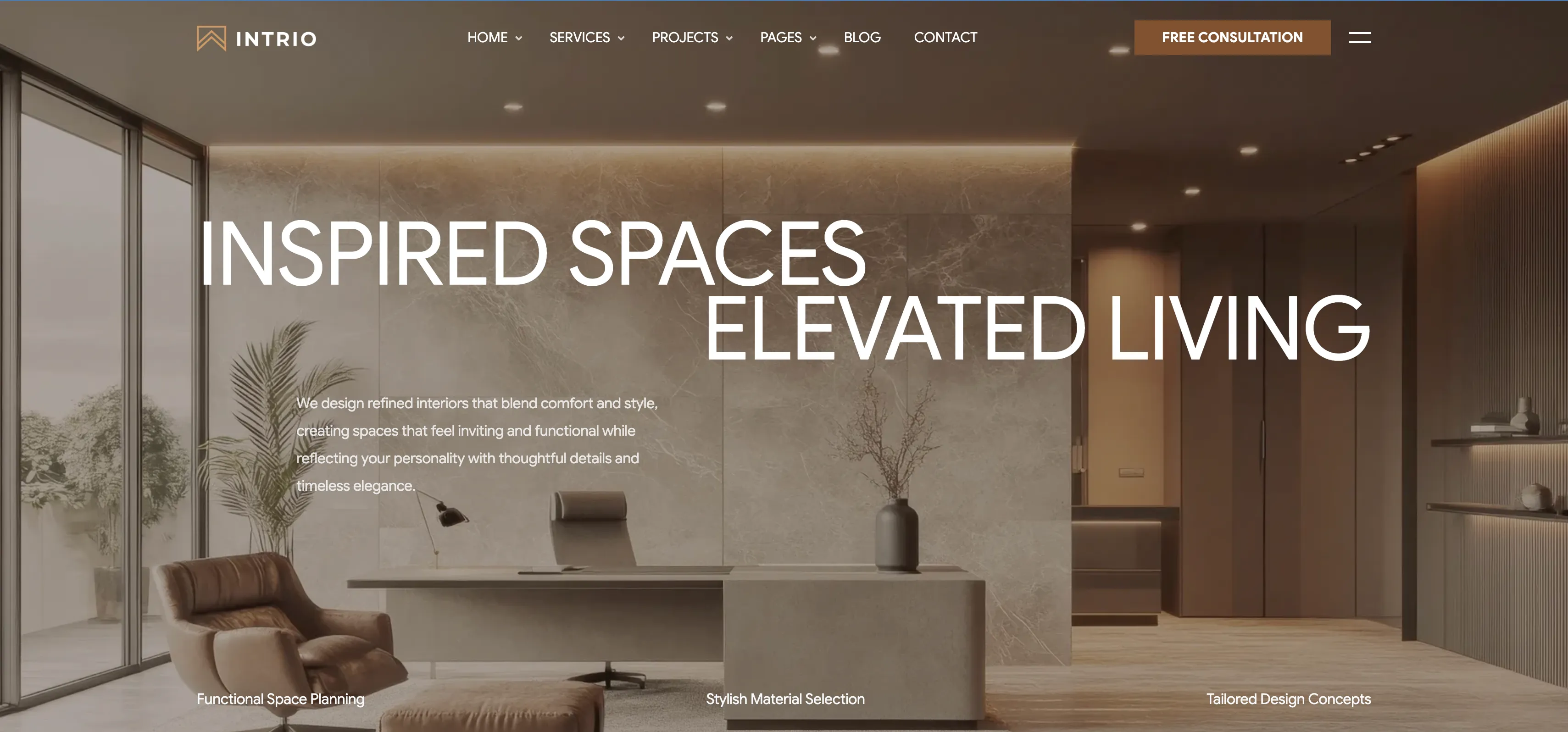
Intrio Full-Bleed Photo Hero
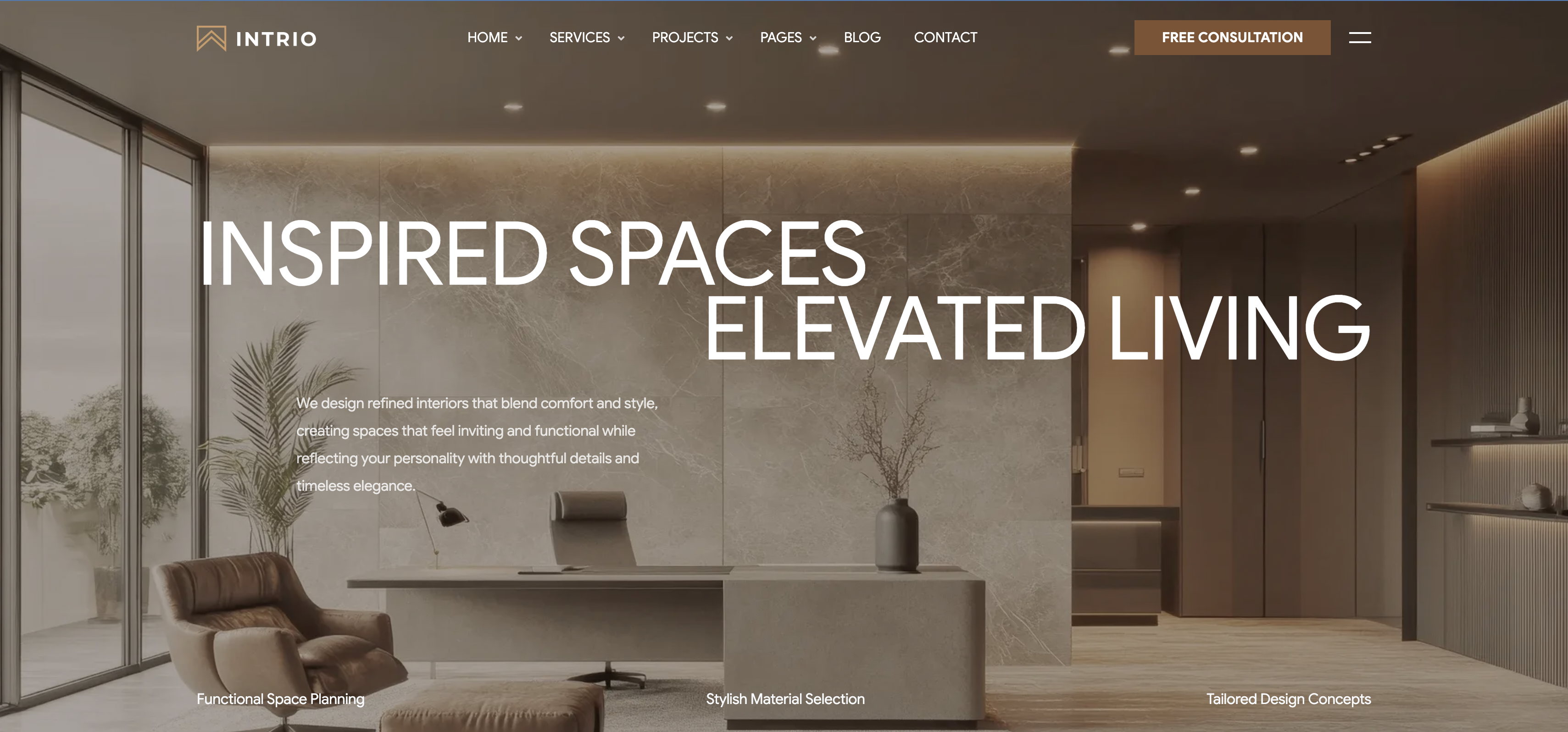
A full-bleed hero set over a warm, luxurious interior photograph of a marble-walled office with a leather lounge chair, desk and potted plants. A transparent top nav runs across the image: the 'INTRIO' wordmark on the left, a centered menu (Home, Services, Projects, Pages, Blog, Contact, each with a dropdown caret), and a bronze 'Free Consultation' button plus a hamburger icon on the right. The headline is an oversized white sans-serif set in two staggered lines, 'INSPIRED SPACES' on top and 'ELEVATED LIVING' shifted to the right below it. A short left-aligned paragraph of supporting copy sits beneath the first line, describing refined, comfortable interiors. Along the bottom edge three quiet labels — 'Functional Space Planning', 'Stylish Material Selection' and 'Tailored Design Concepts' — act as feature highlights. The photographic backdrop with airy white type makes the brand feel premium and immersive from the first scroll.
Madebydesignesia ↗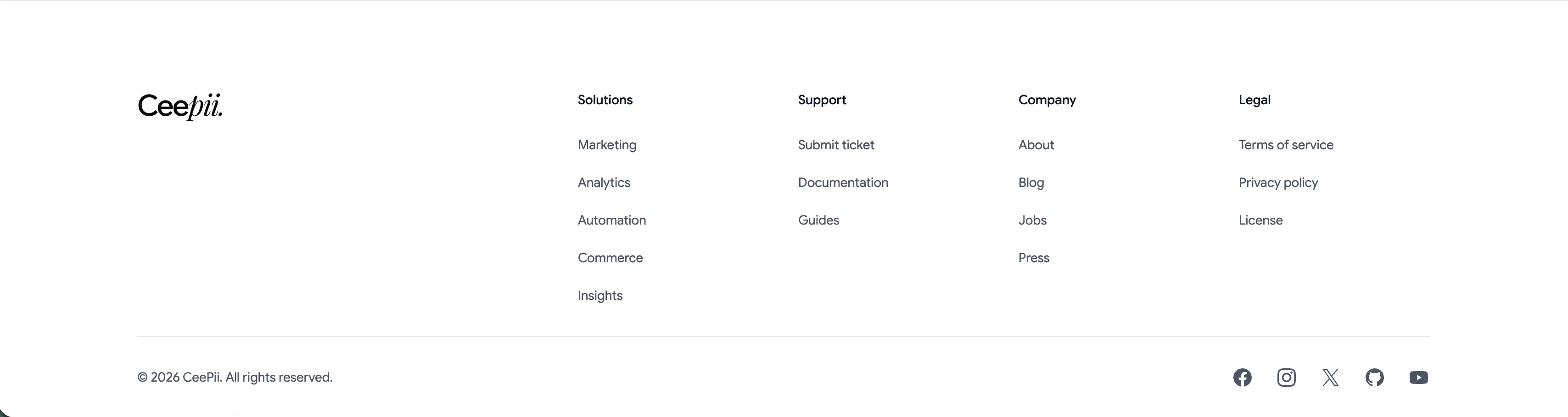
Ceepii Multi-Column Footer With Social Links
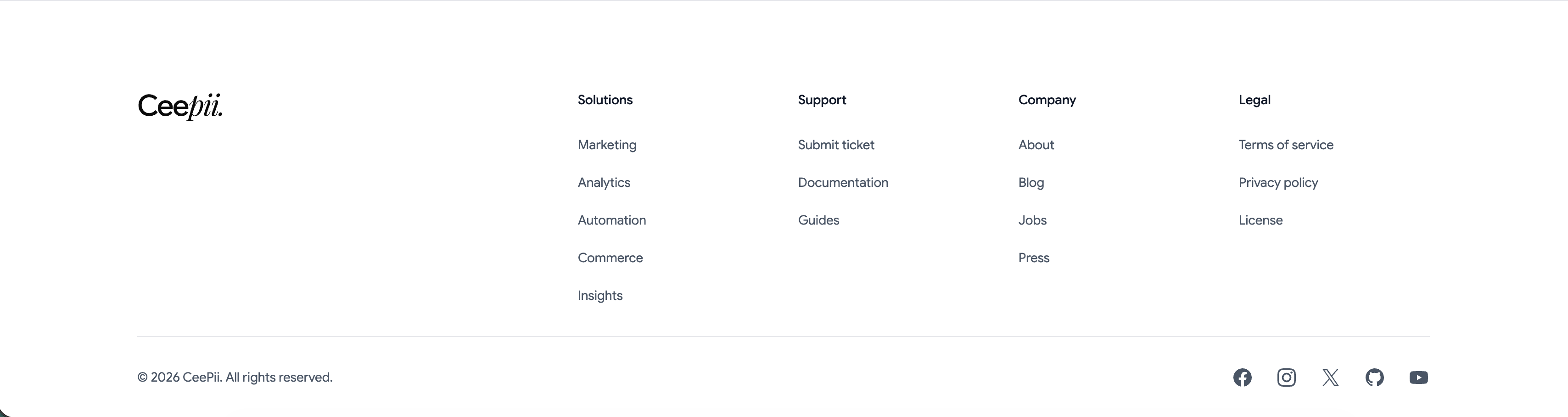
A clean white footer anchored by the 'Ceepii.' wordmark at far left. To its right sit four link columns under bold headings: 'Solutions' (Marketing, Analytics, Automation, Commerce, Insights), 'Support' (Submit ticket, Documentation, Guides), 'Company' (About, Blog, Jobs, Press) and 'Legal' (Terms of service, Privacy policy, License). A hairline divider runs across the full width, below which a copyright line, '© 2026 CeePii. All rights reserved.', sits at left and a row of monochrome social icons — Facebook, Instagram, X, GitHub and YouTube — sits at right. The restrained type, ample spacing and single divider give a simple, corporate-clean sitemap footer.
Ceepii-nextjs-template ↗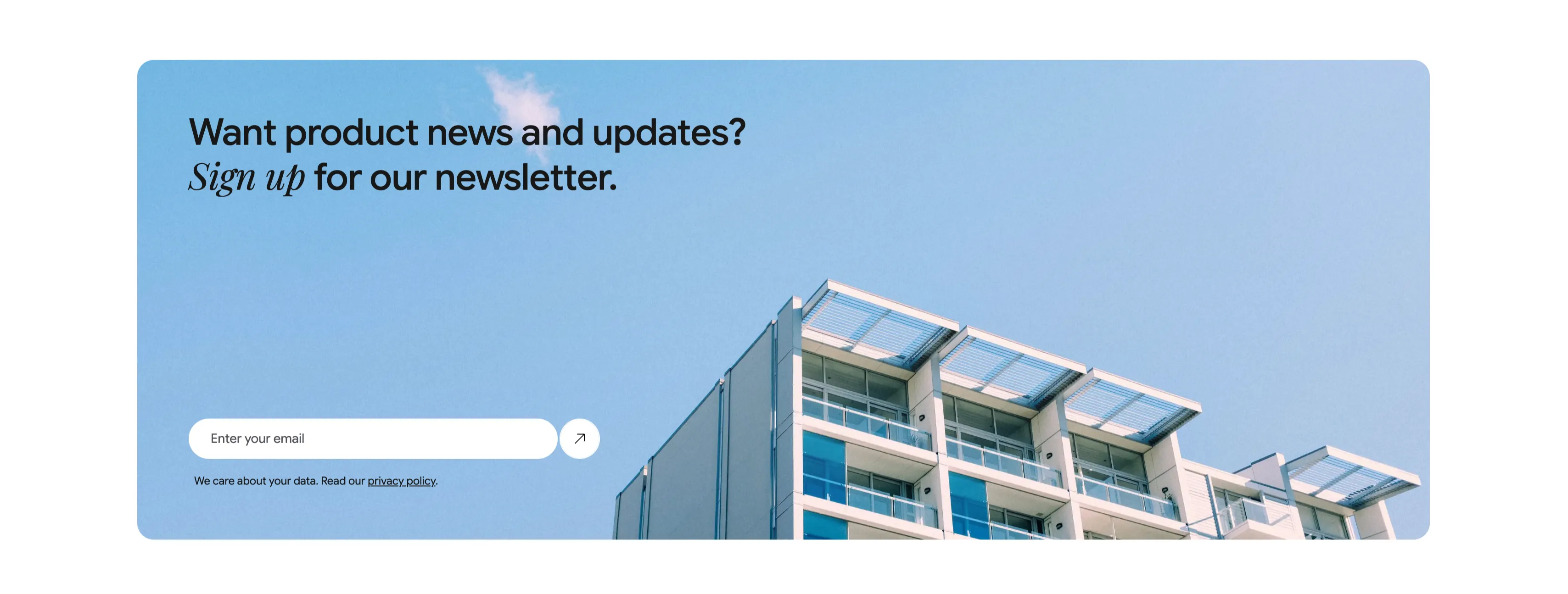
Newsletter Signup Banner With Email Field
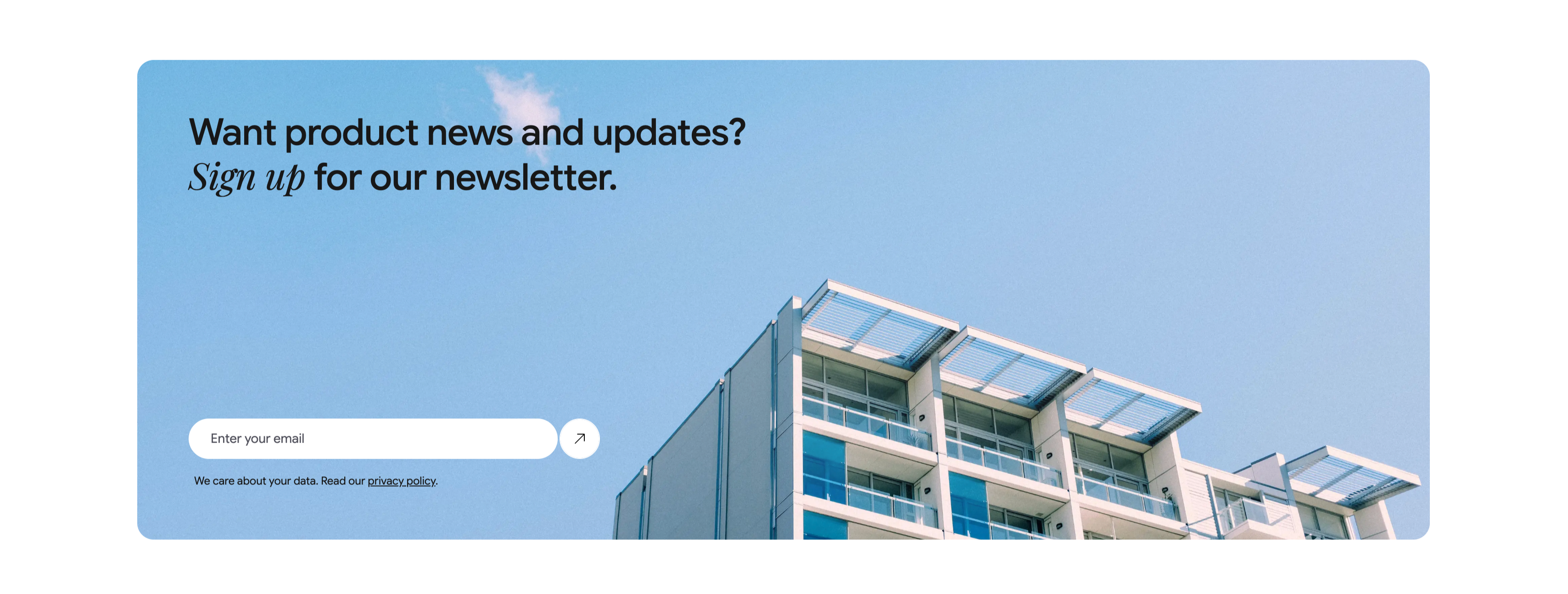
A wide, rounded light-blue banner with a photograph of a modern apartment building against a clear sky filling its right side. The left side carries a two-line heading, 'Want product news and updates? Sign up for our newsletter.', with 'Sign up' set in italic serif. Beneath it is a single email capture: a white rounded input placeheld 'Enter your email' paired with a circular up-right arrow submit button. A small line of fine print below reads 'We care about your data. Read our privacy policy.', with 'privacy policy' underlined as a link. The soft blue field, generous rounding and single-field form make a friendly, low-friction newsletter call-to-action.
Ceepii-nextjs-template ↗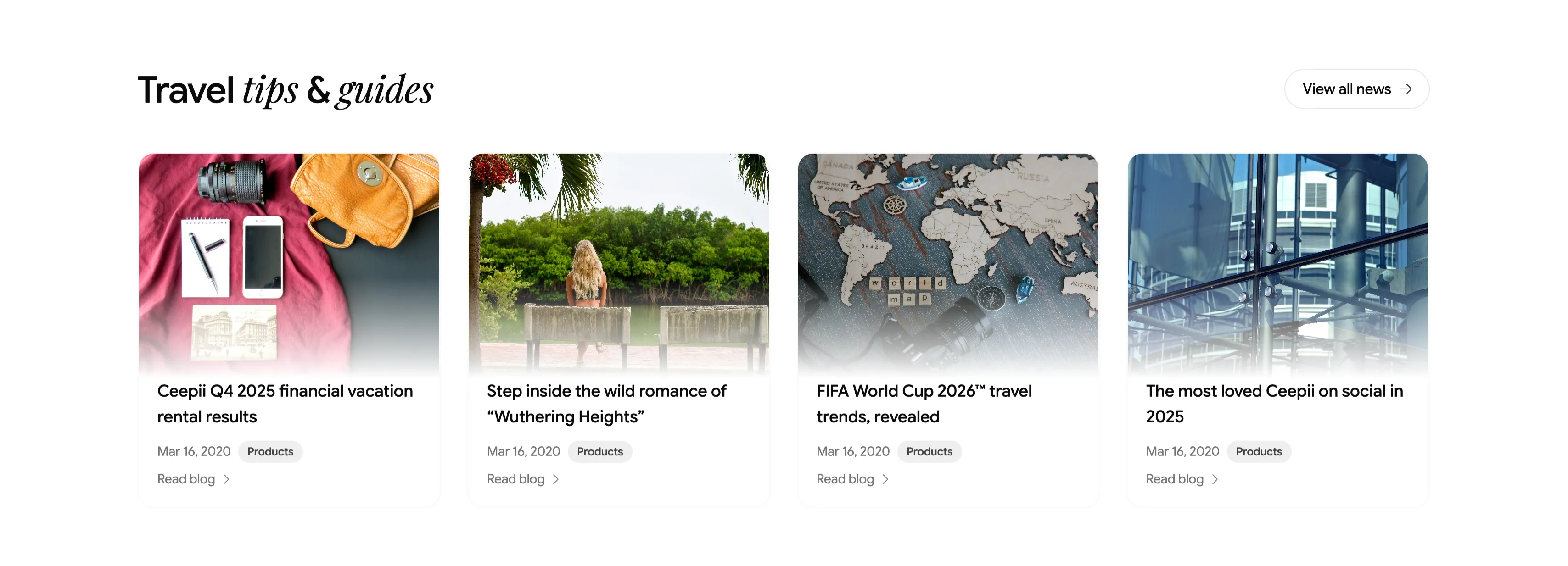
Travel Tips And Guides Blog Card Row
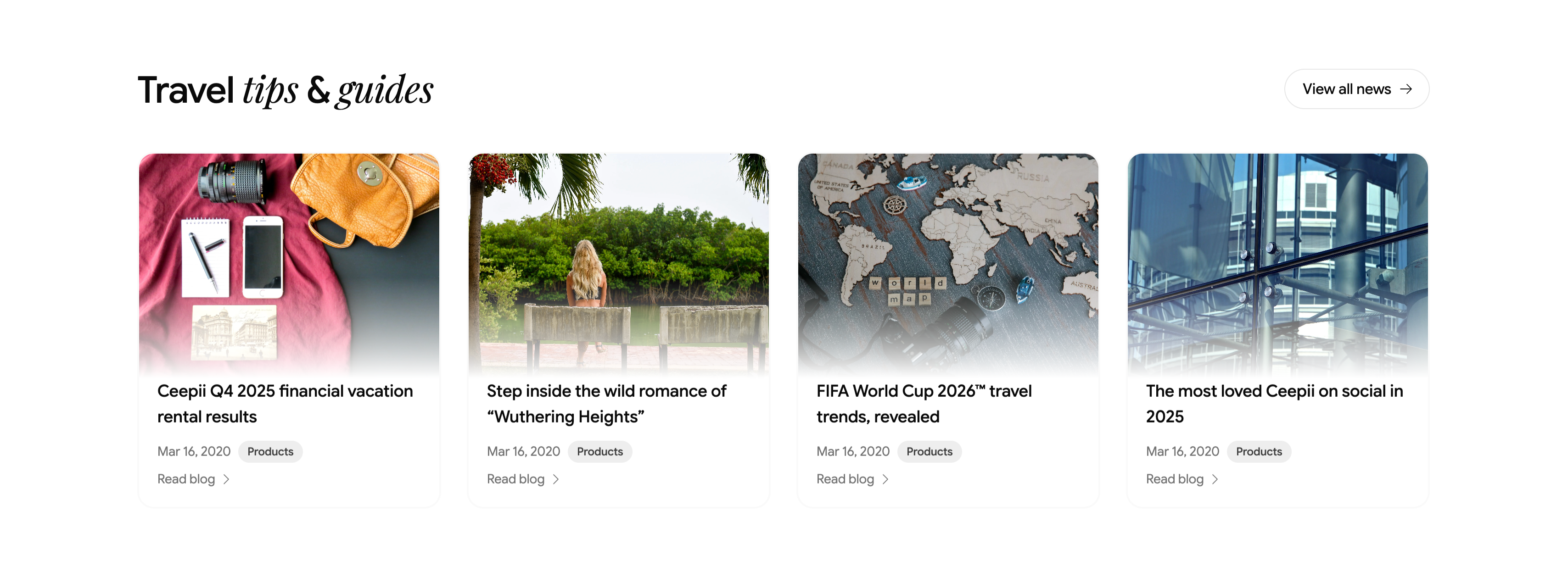
A blog teaser section headed 'Travel tips & guides', with 'tips & guides' in italic serif and a pill 'View all news →' button at upper-right. Below runs a four-up row of article cards, each a rounded cover image above a title, a 'Mar 16, 2020' date, a gray 'Products' category tag, and a 'Read blog →' link. The featured posts are 'Ceepii Q4 2025 financial vacation rental results', 'Step inside the wild romance of "Wuthering Heights"', 'FIFA World Cup 2026™ travel trends, revealed', and 'The most loved Ceepii on social in 2025', with editorial photography (a flat-lay travel kit, a lakeside figure, a wooden world map, and glass architecture). The clean image-over-text cards give a tidy, magazine-style content row.
Ceepii-nextjs-template ↗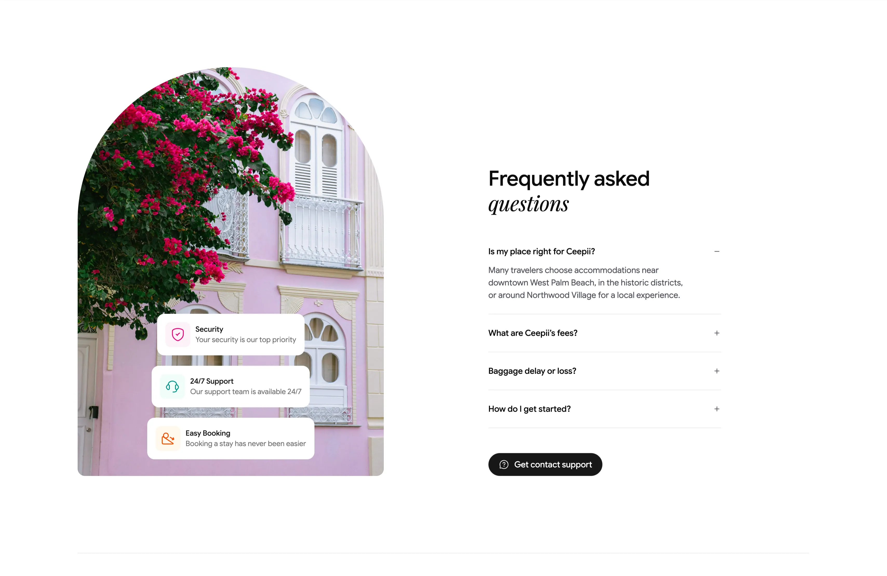
Frequently Asked Questions Accordion With Image
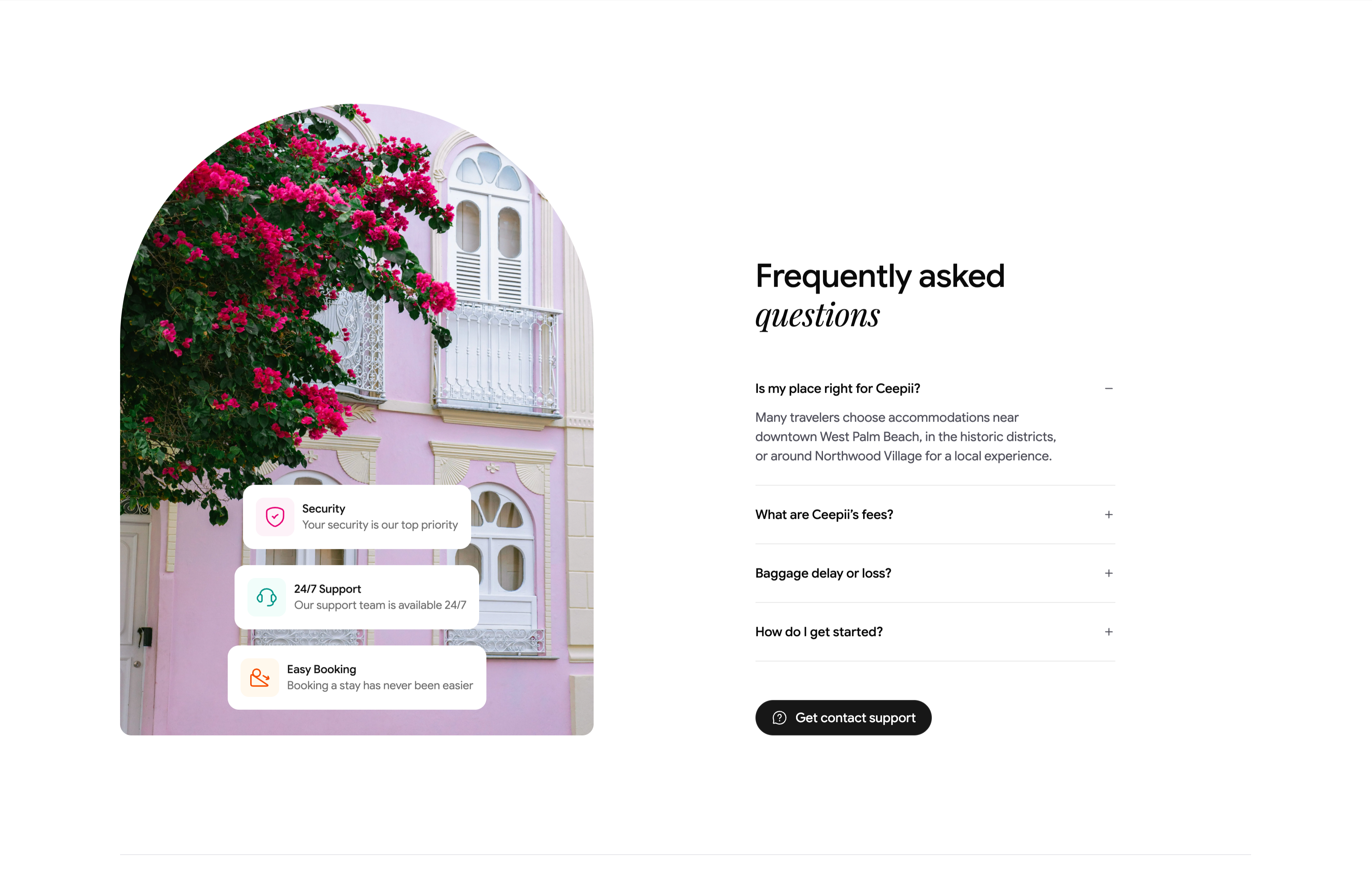
A two-column FAQ section. The left column is a tall arch-topped photograph of a pink colonial facade draped in magenta bougainvillea, with three floating white cards stacked over it — 'Security / Your security is our top priority', '24/7 Support / Our support team is available 24/7', and 'Easy Booking / Booking a stay has never been easier' — each fronted by a colored icon. The right column heads 'Frequently asked questions' (with 'questions' in italic serif) above an accordion list: 'Is my place right for Ceepii?' is expanded to reveal a paragraph about West Palm Beach neighborhoods, followed by collapsed rows 'What are Ceepii's fees?', 'Baggage delay or loss?' and 'How do I get started?', each with a +/− toggle. A black pill 'Get contact support' button closes the column. The expand/collapse toggles and supporting trust cards make a standard but polished FAQ.
Ceepii-nextjs-template ↗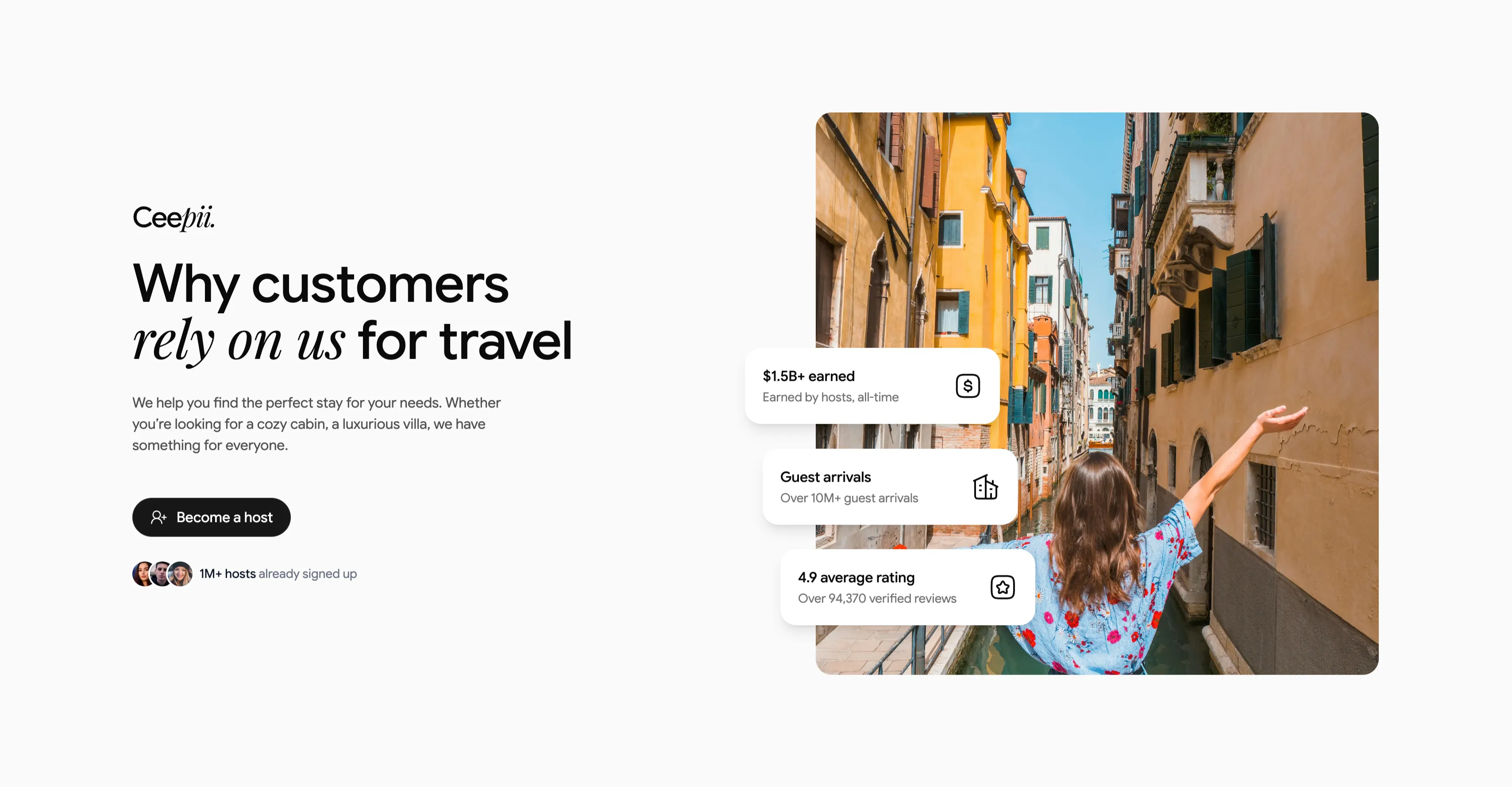
Why Customers Rely On Us Value Block
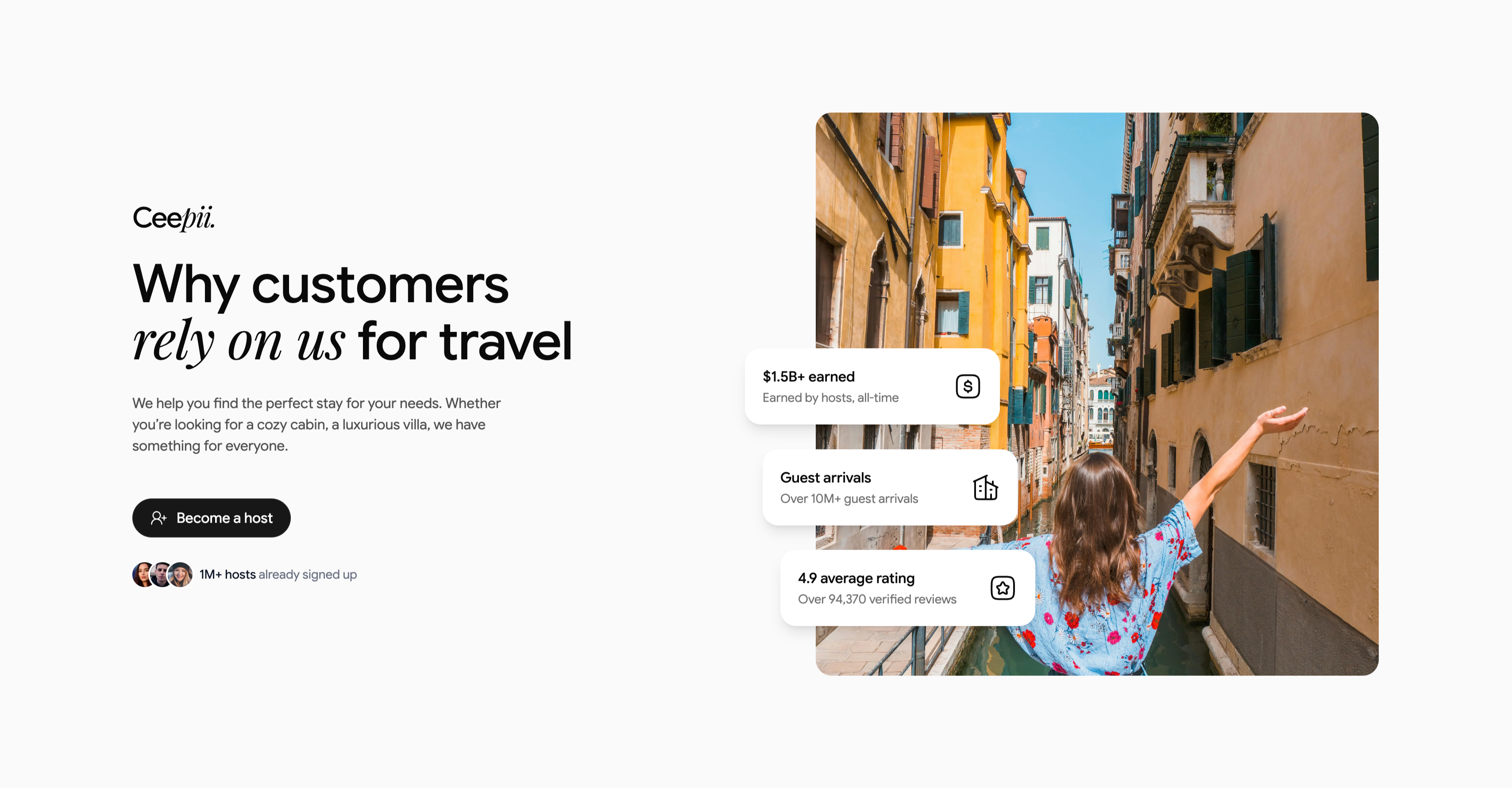
A two-column value proposition on a light gray background. The left column carries the 'Ceepii.' wordmark, a large heading 'Why customers rely on us for travel' (with 'rely on us' in italic serif), a short paragraph about finding the perfect stay, a black pill 'Become a host' button with a person-plus icon, and an avatar trio beside '1M+ hosts already signed up'. The right column is a tall rounded photograph of a woman with outstretched arms in a sunlit Venice canal, overlaid by three floating white stat cards, each with an icon: '$1.5B+ earned / Earned by hosts, all-time', 'Guest arrivals / Over 10M+ guest arrivals', and '4.9 average rating / Over 94,370 verified reviews'. The floating proof cards over an evocative travel photo turn a host-recruitment pitch into a credibility-led CTA.
Ceepii-nextjs-template ↗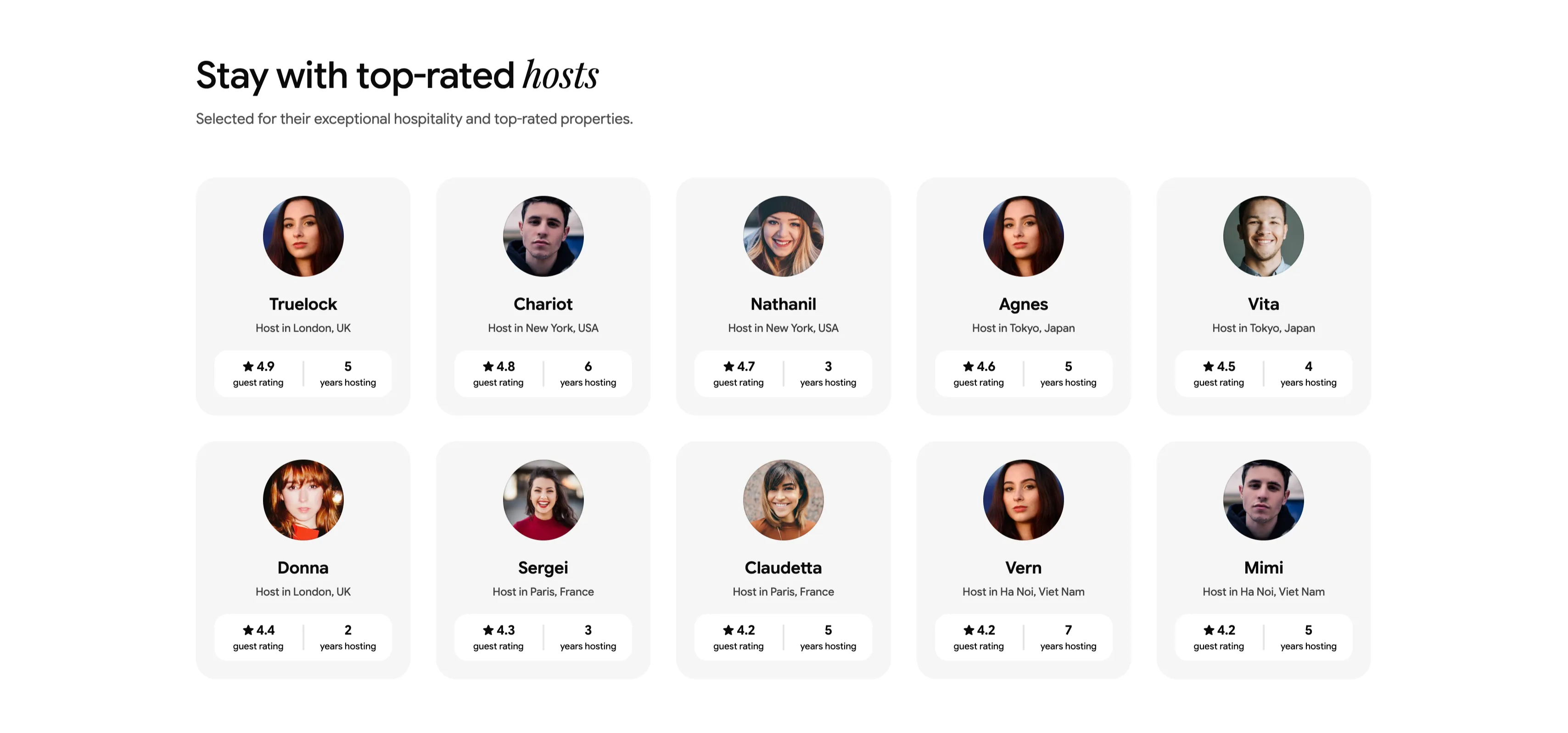
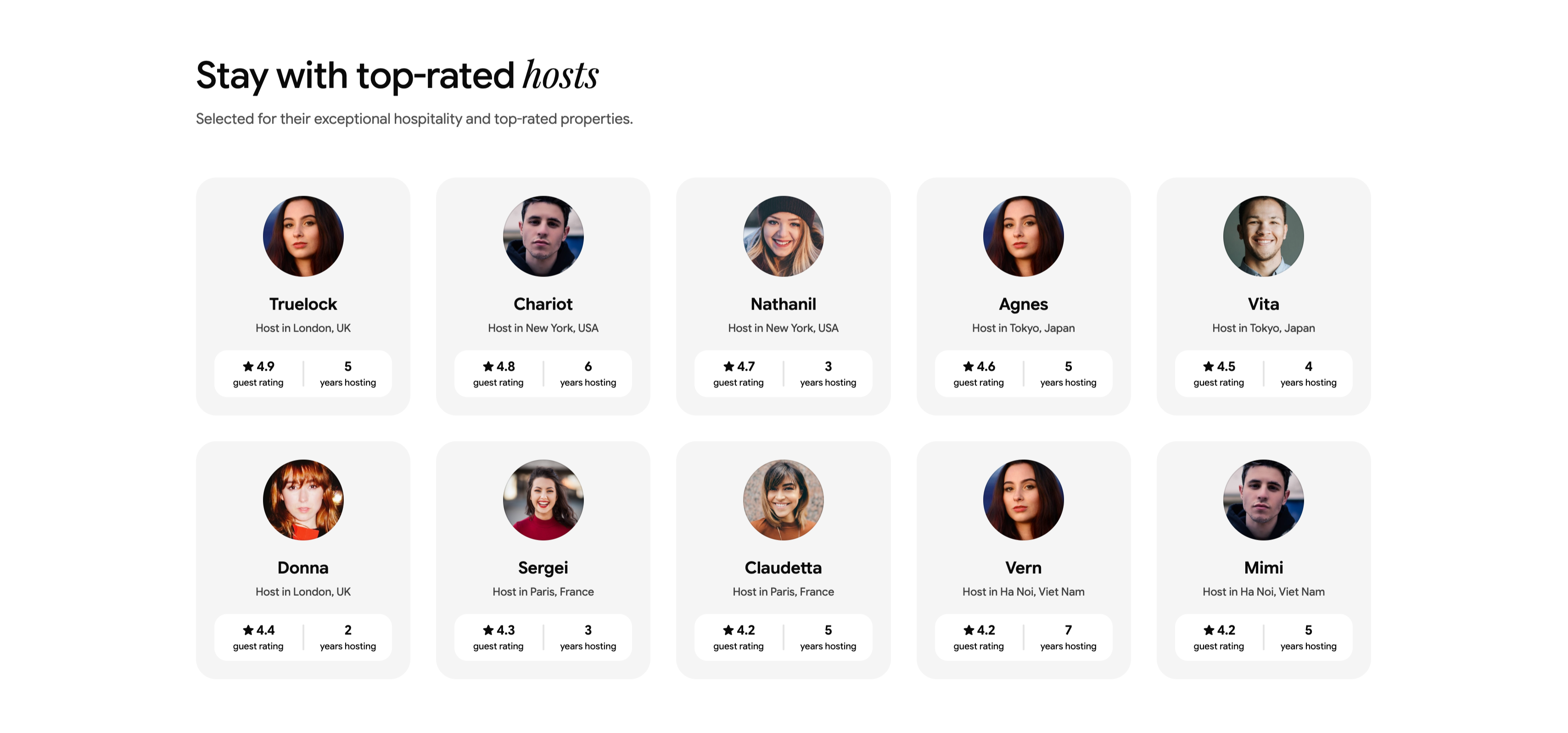
Top-Rated Hosts Profile Card Grid
A 'Stay with top-rated hosts' section (with 'hosts' in italic serif) under a one-line subhead about exceptional hospitality. The body is a 2x5 grid of soft gray profile cards, each centering a large circular host avatar above the host's name and location, with a two-cell stat strip at the bottom showing a star guest rating and years hosting. The ten hosts span cities — Truelock (London, 4.9, 5 yrs), Chariot (New York, 4.8, 6 yrs), Nathanil (New York, 4.7, 3 yrs), Agnes (Tokyo, 4.6, 5 yrs), Vita (Tokyo, 4.5, 4 yrs), Donna (London, 4.4, 2 yrs), Sergei (Paris, 4.3, 3 yrs), Claudetta (Paris, 4.2, 5 yrs), Vern (Ha Noi, 4.2, 7 yrs) and Mimi (Ha Noi, 4.2, 5 yrs). The uniform avatar cards and paired metrics make host credibility easy to compare at a glance.
Ceepii-nextjs-template ↗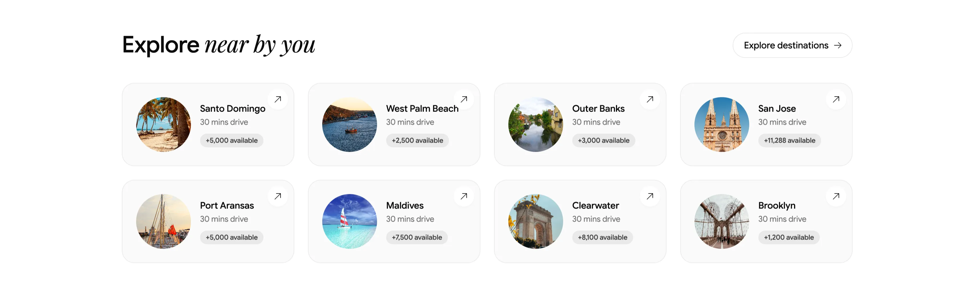
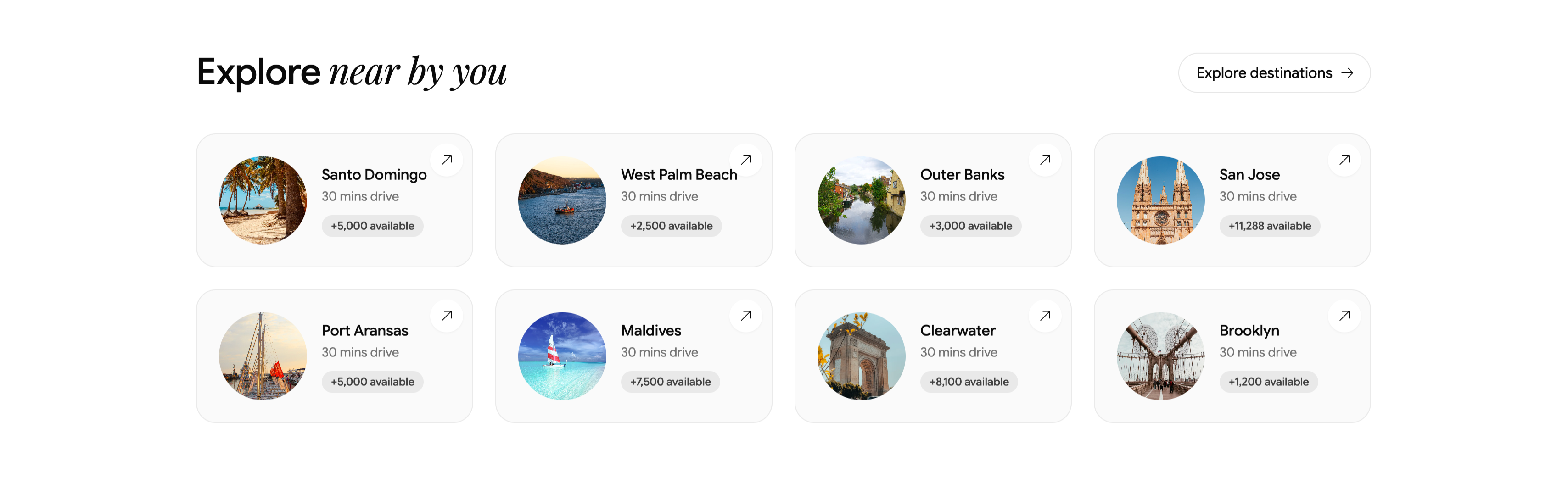
Explore Nearby Destinations Card Grid
A nearby-destinations block headed 'Explore near by you' (with 'near by you' in italic serif) and a pill button 'Explore destinations →' at upper-right. The body is a 2x4 grid of compact light cards, each combining a small circular photo thumbnail at left with a destination name, a '30 mins drive' subline, an availability chip, and an up-right arrow. The eight cards read: Santo Domingo (+5,000 available), West Palm Beach (+2,500), Outer Banks (+3,000), San Jose (+11,288), Port Aransas (+5,000), Maldives (+7,500), Clearwater (+8,100) and Brooklyn (+1,200). On a plain background with rounded thumbnails and quiet typography, it works as a scannable proximity-based destination grid.
Ceepii-nextjs-template ↗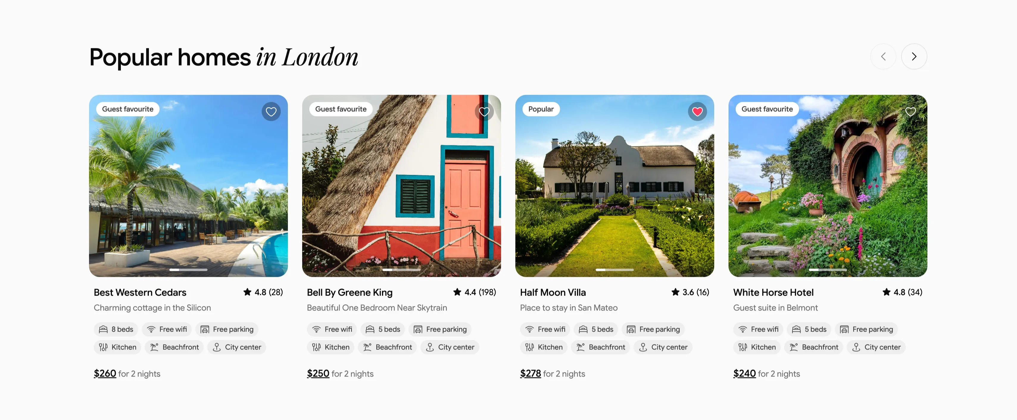
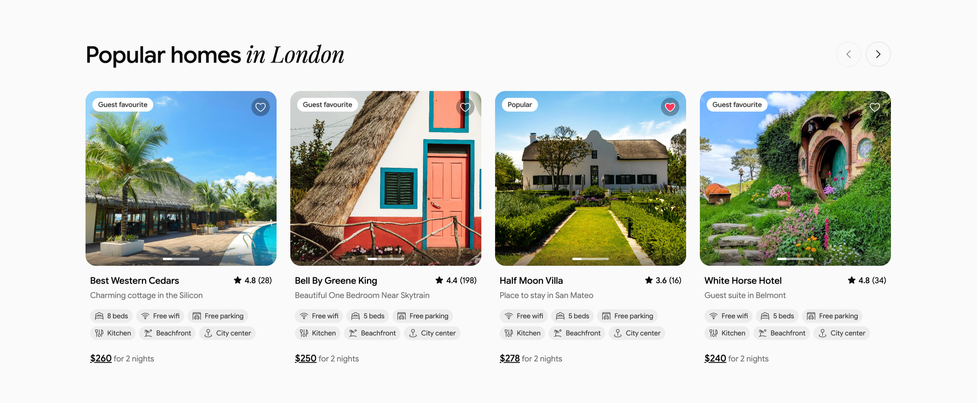
Popular Homes In London Listing Carousel
A property carousel headed 'Popular homes in London', with 'in London' in italic serif and circular previous/next arrows at upper-right. Four rounded listing cards sit in a row, each a large property photo topped with a status pill ('Guest favourite' or 'Popular') and a heart icon, above a title, location subline and star rating. The listings are 'Best Western Cedars' ★4.8 (28) at $260, 'Bell By Greene King' ★4.4 (198) at $250, 'Half Moon Villa' ★3.6 (16) at $278, and 'White Horse Hotel' ★4.8 (34) at $240. Each card stacks two rows of amenity chips (Free wifi, beds, Free parking, Kitchen, Beachfront, City center) and an underlined price with 'for 2 nights'. The consistent card anatomy and arrow controls make it a familiar marketplace listing carousel.
Ceepii-nextjs-template ↗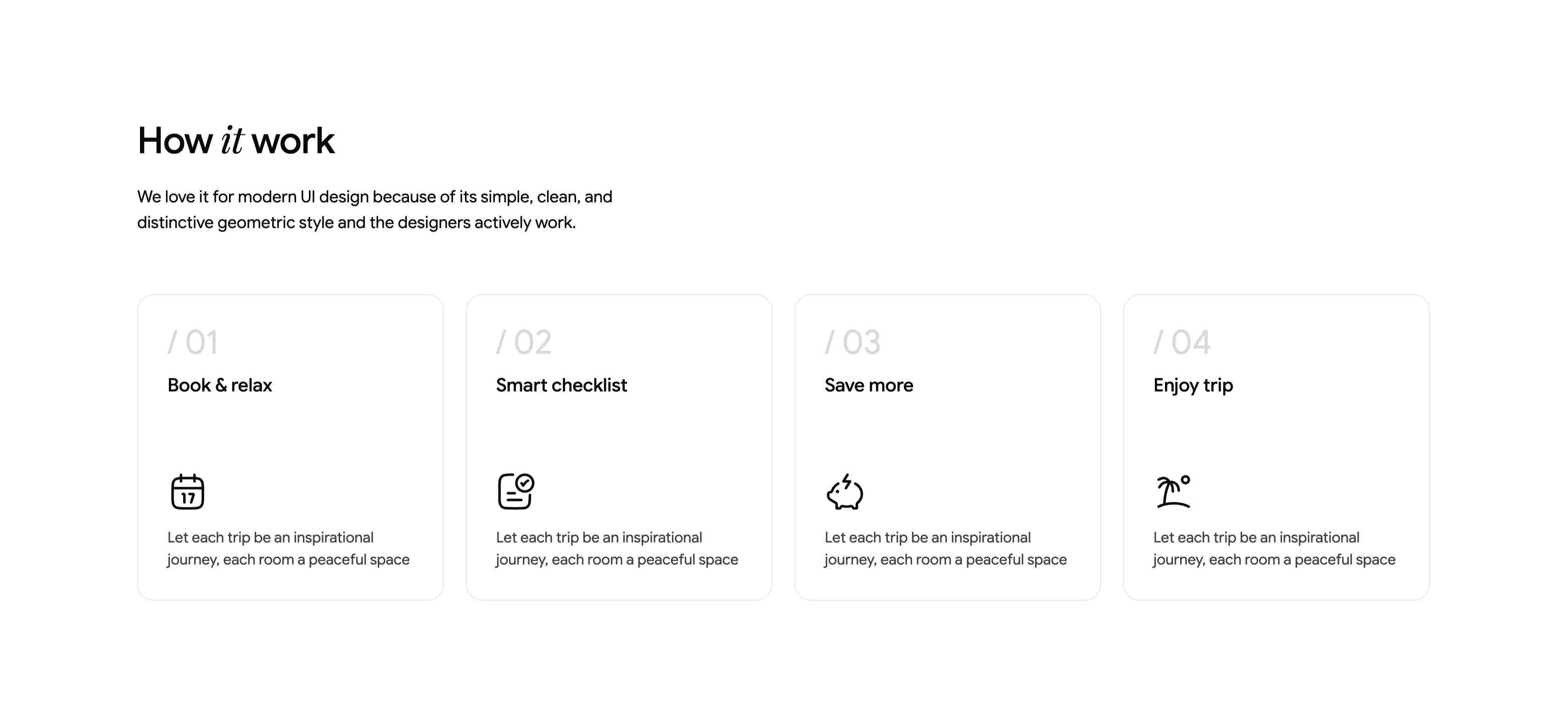
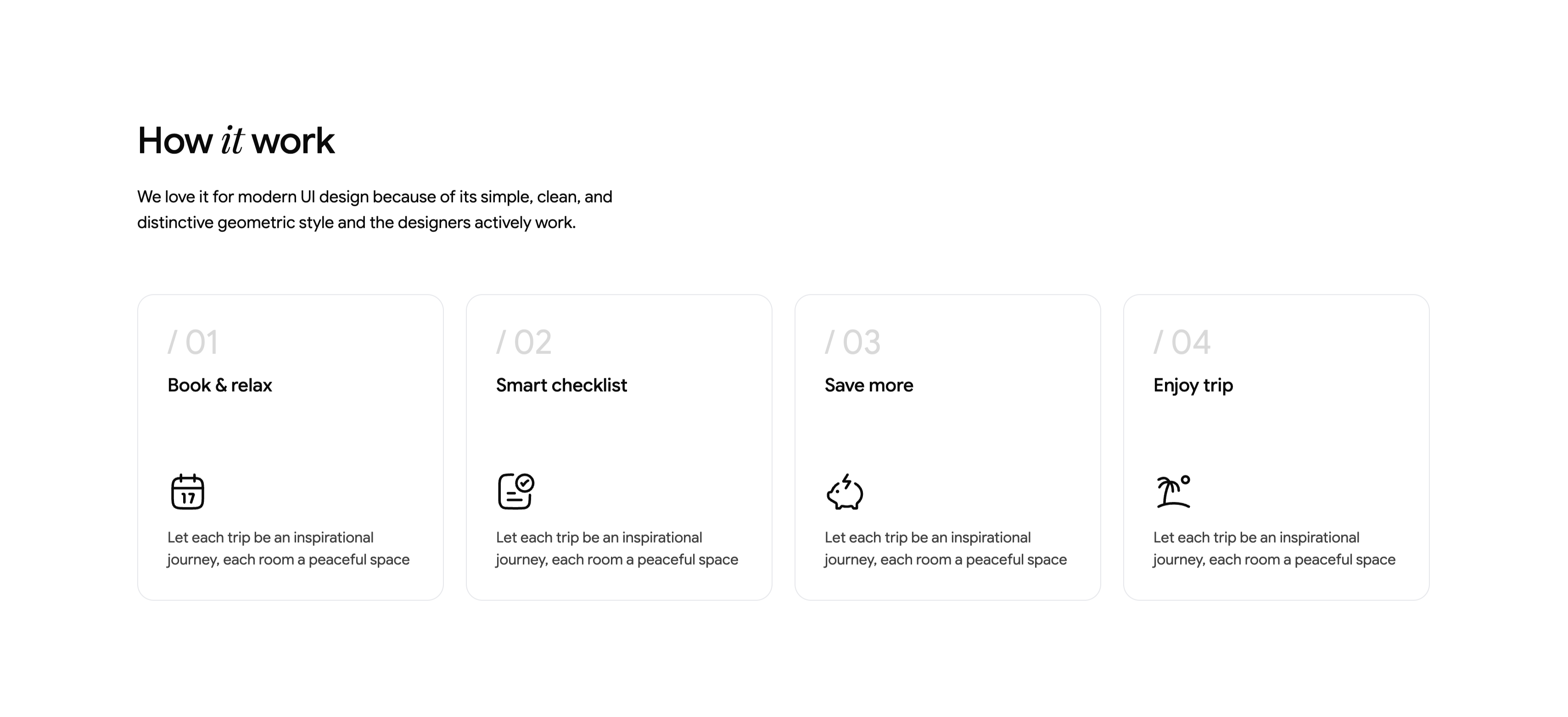
How It Works Four-Step Numbered Cards
A 'How it work' section (with 'it' in italic serif) introduced by a two-line subhead about a simple, clean, geometric style. Below sits a four-up row of equally sized cards with thin rounded borders, each numbered in light gray — '/ 01', '/ 02', '/ 03', '/ 04'. The cards are titled 'Book & relax', 'Smart checklist', 'Save more' and 'Enjoy trip', each carrying a single monoline icon (a calendar, a checklist, a piggy bank with a lightning bolt, and a palm beach) above the same placeholder body line, 'Let each trip be an inspirational journey, each room a peaceful space'. Set on white with lots of breathing room and uniform card sizing, it reads as a calm, geometric process explainer.
Ceepii-nextjs-template ↗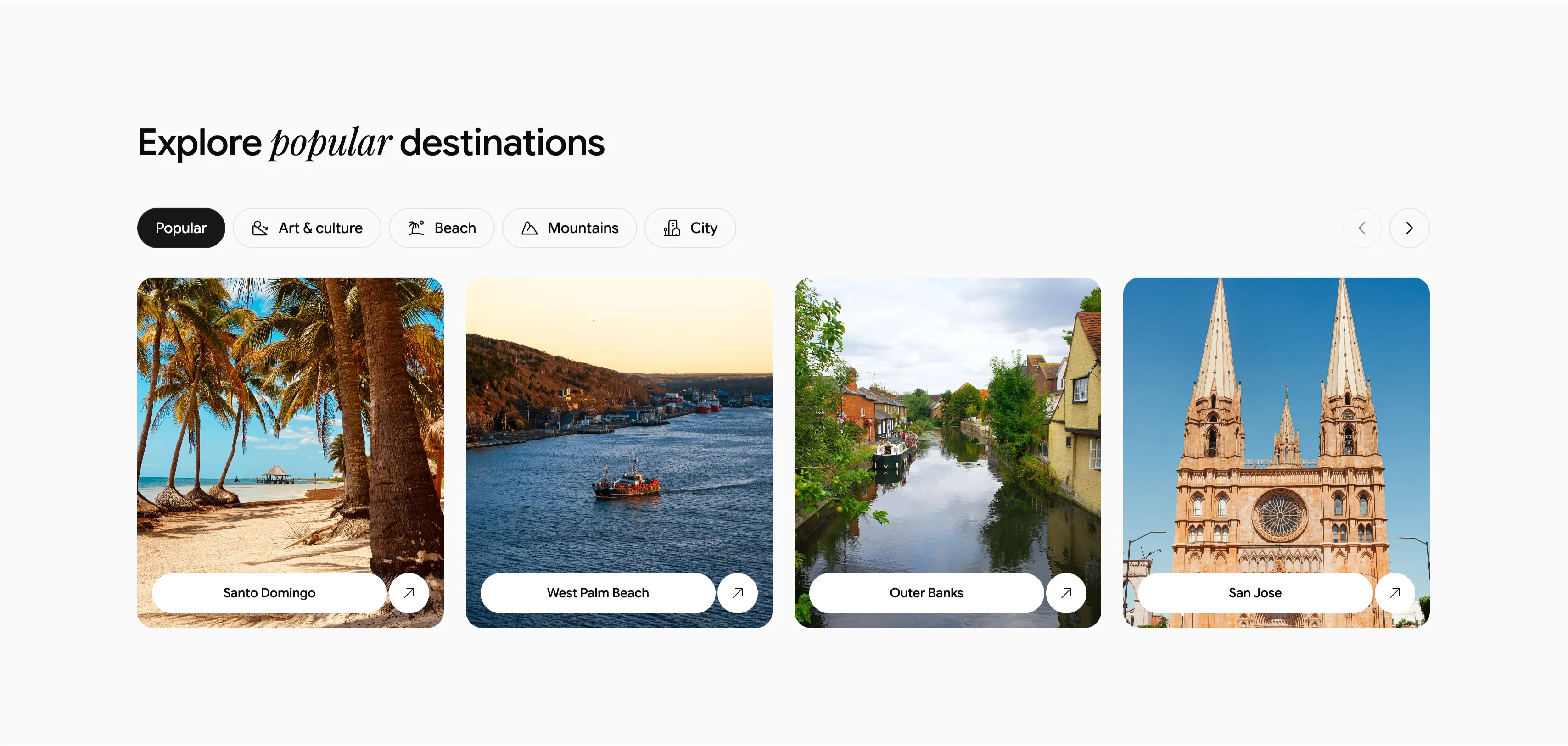
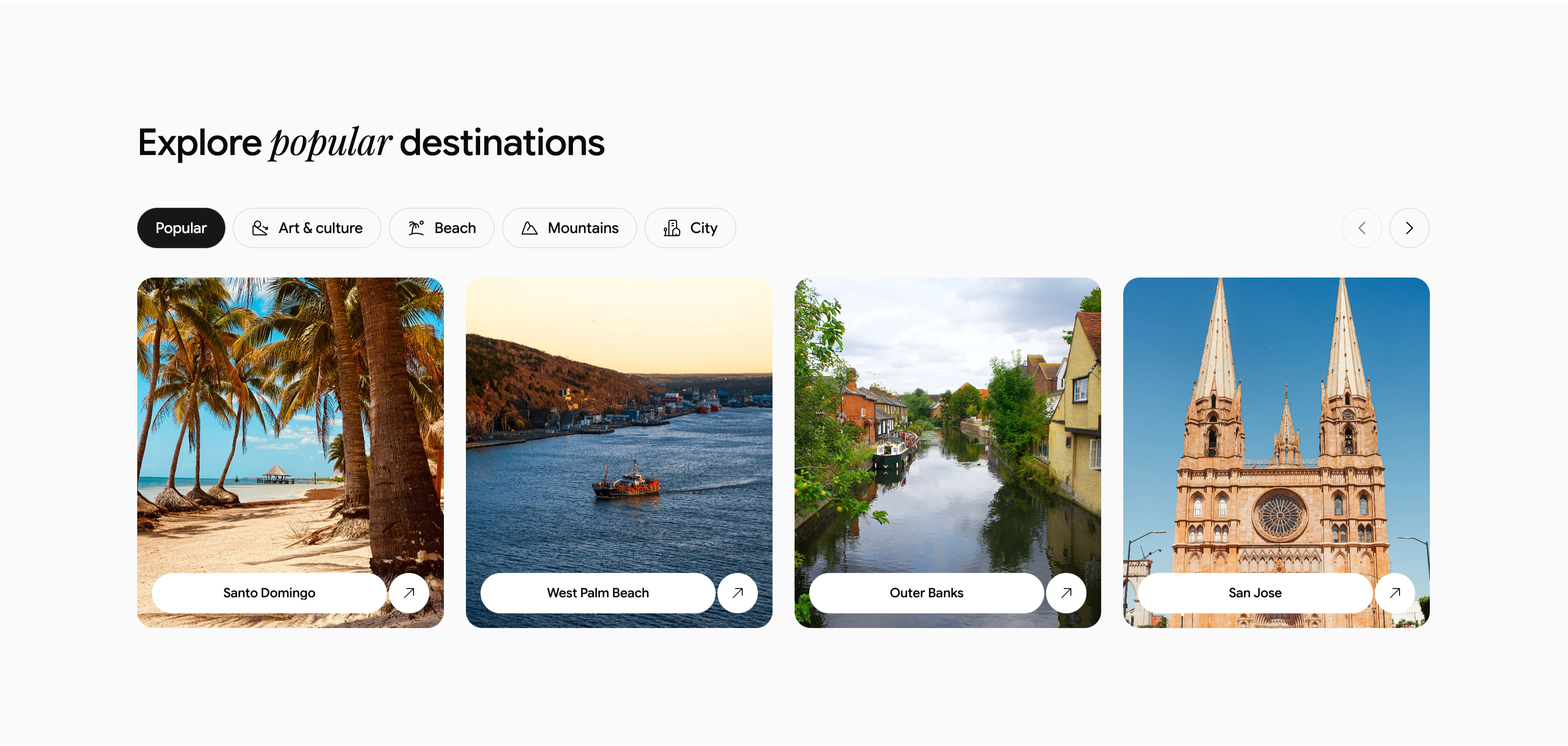
Explore Popular Destinations Carousel With Tabs
A destination browser headed 'Explore popular destinations', with 'popular' set in italic serif. Beneath it runs a row of filter tabs — a dark active 'Popular' pill followed by outlined 'Art & culture', 'Beach', 'Mountains' and 'City', each prefixed by a small icon — with circular previous/next carousel arrows at the far right. The body is a four-up row of rounded photographic cards, each with a white pill label and an up-right arrow: 'Santo Domingo' (a palm-lined beach), 'West Palm Beach' (a boat on water), 'Outer Banks' (a canal lined with houses), and 'San Jose' (a twin-spired cathedral). On a near-white background, the tabbed filtering plus arrow controls clearly signal a swappable, scrollable destination carousel.
Ceepii-nextjs-template ↗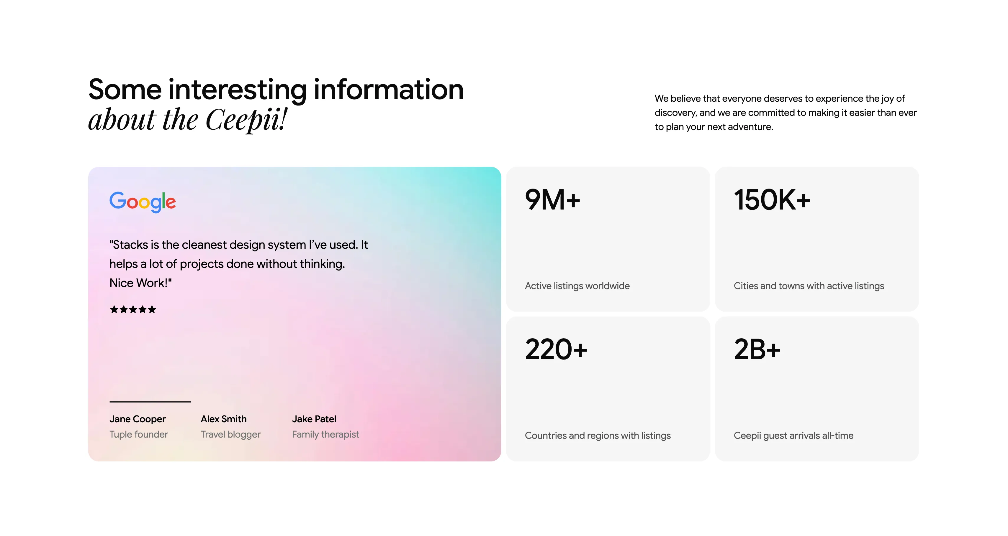
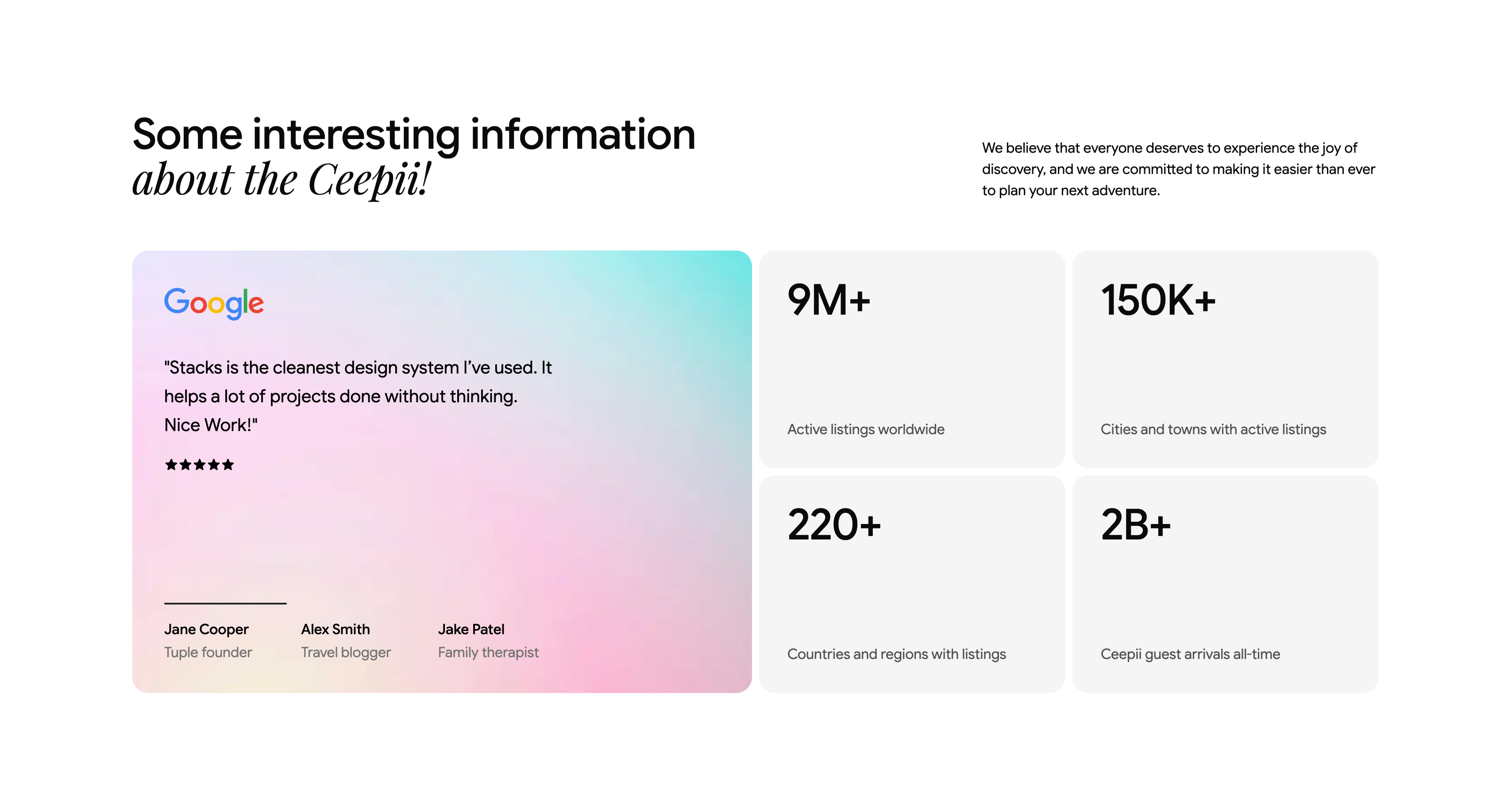
Company Stats With Google Review Card
An 'about the company' block opening with a heading, 'Some interesting information about the Ceepii!' (with 'about the Ceepii!' in italic serif), and a short intro paragraph at upper-right about making discovery easier. Below, the left half is a large soft pink-to-teal gradient testimonial card carrying the multicolor 'Google' logo, the quote '"Stacks is the cleanest design system I've used..."', a five-star row, and three attributed names — Jane Cooper, Alex Smith and Jake Patel. The right half is a 2x2 grid of light stat cards with oversized numerals: '9M+' active listings worldwide, '150K+' cities and towns, '220+' countries and regions, and '2B+' guest arrivals all-time. Pairing one warm gradient review against four crisp metric tiles balances social proof with hard numbers.
Ceepii-nextjs-template ↗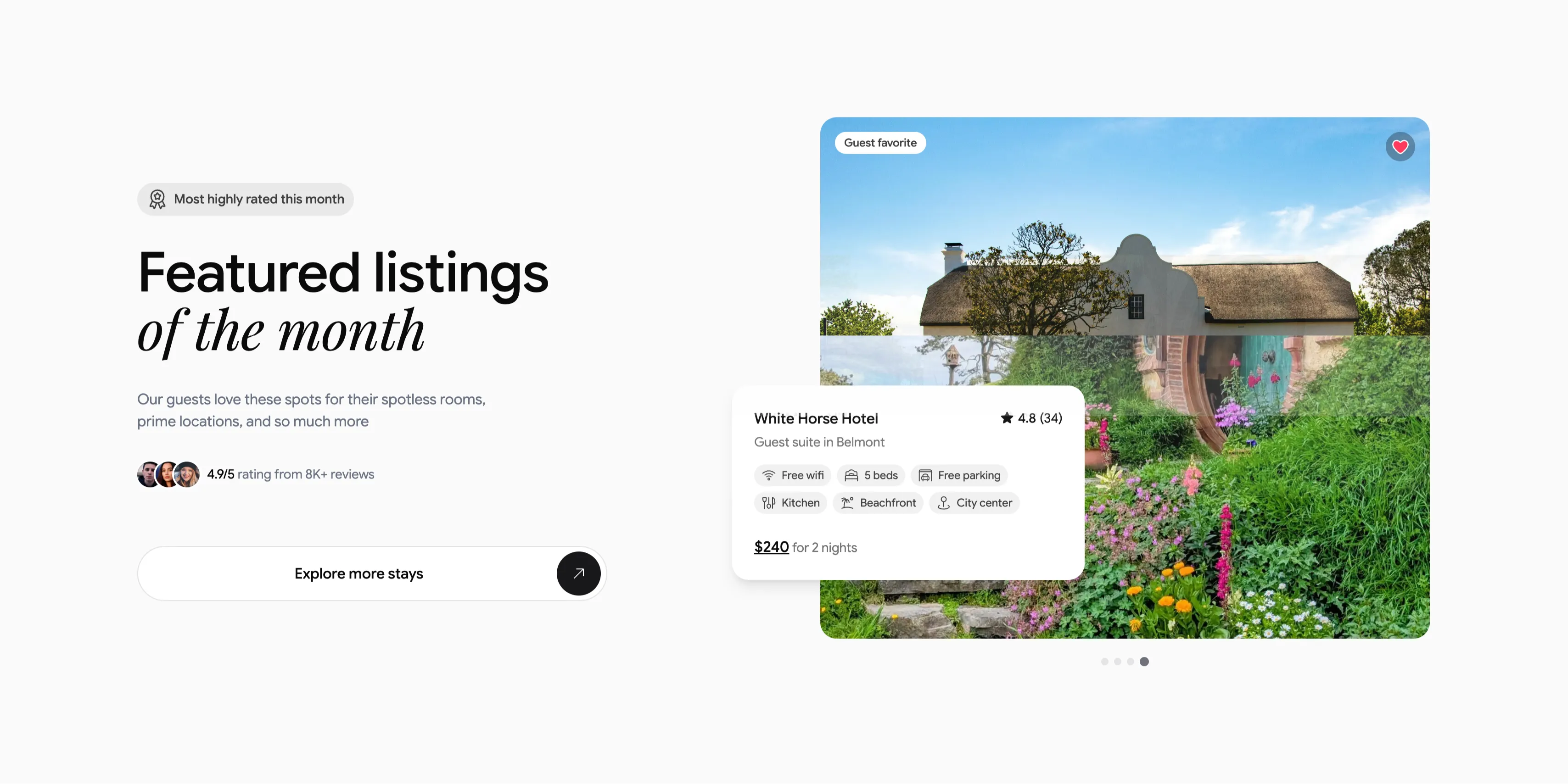
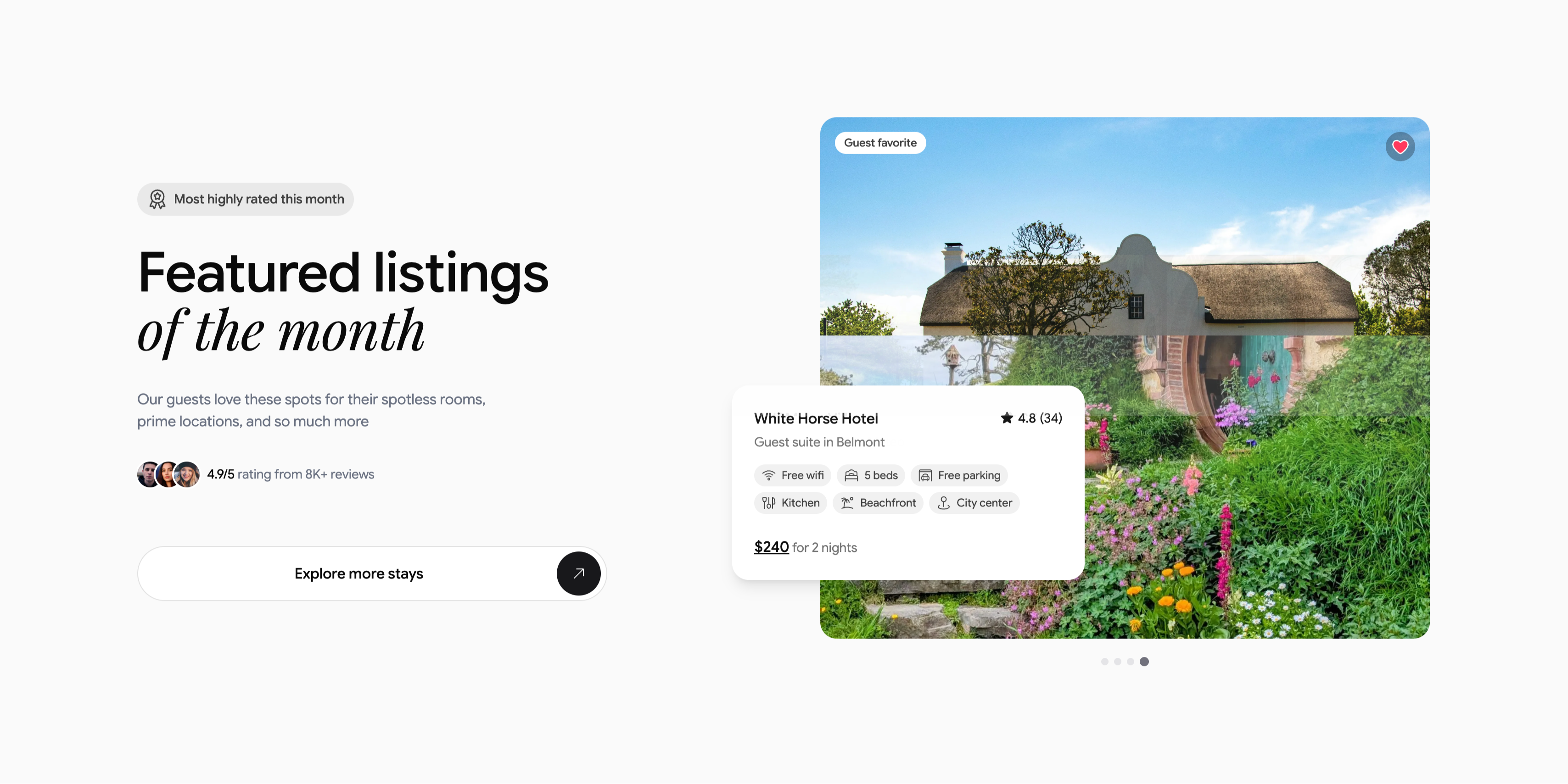
Featured Listing Of The Month Spotlight
A two-column spotlight on a light gray background. The left column stacks a small pill badge, 'Most highly rated this month', a large heading 'Featured listings of the month' (with 'of the month' in italic serif), a short subhead about spotless rooms and prime locations, an avatar trio beside '4.9/5 rating from 8K+ reviews', and a wide white 'Explore more stays' button capped with a circular arrow. The right column shows a large rounded photograph of a thatched cottage in a lush flowering garden, tagged 'Guest favorite' with a heart icon. Overlapping its lower-left corner is a white listing card: 'White Horse Hotel', '★ 4.8 (34)', 'Guest suite in Belmont', a set of amenity chips (Free wifi, 5 beds, Free parking, Kitchen, Beachfront, City center) and '$240 for 2 nights', with carousel dots beneath. The overlapping card and proof points make a single listing feel premium and clickable.
Ceepii-nextjs-template ↗

Rental Category Icon Marquee Strip
A slim horizontal marquee strip listing rental categories, each shown as a small rounded icon tile paired with a label. Across two staggered rows it cycles through 'Apartment rentals', 'Beachfront rentals', 'Condo rentals', 'Pet-friendly rentals', 'House rentals', 'Villa rentals' and 'Unique stays', with simple monoline icons (a building, a palm beach, a boat, a UFO for unique stays, a house, a hot-air balloon). The items repeat and fade out softly at both edges, signalling a continuous auto-scrolling ticker. On a plain light background with thin black line icons and clean sans labels, it reads as a quick, low-key category browser bridging two larger sections.
Ceepii-nextjs-template ↗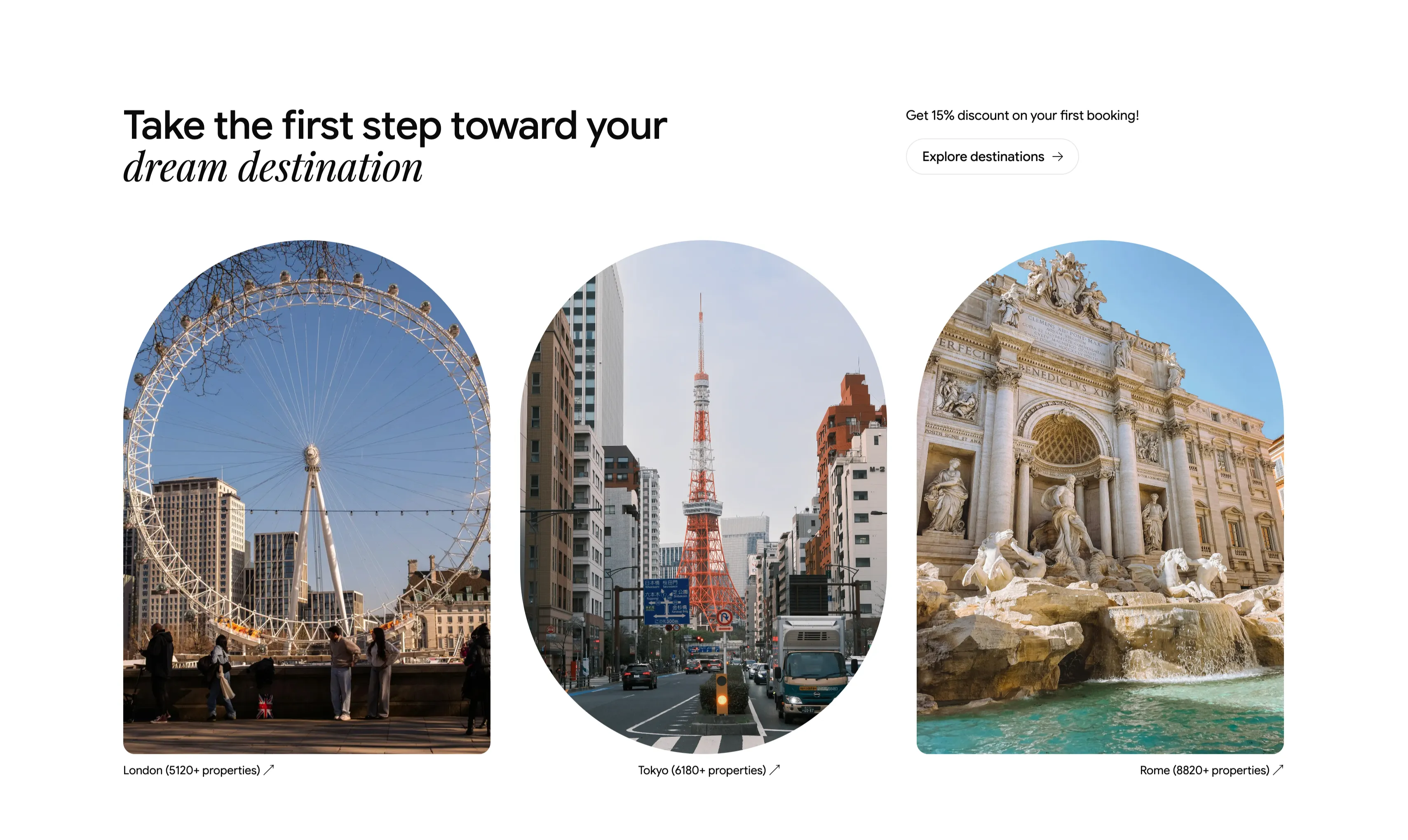
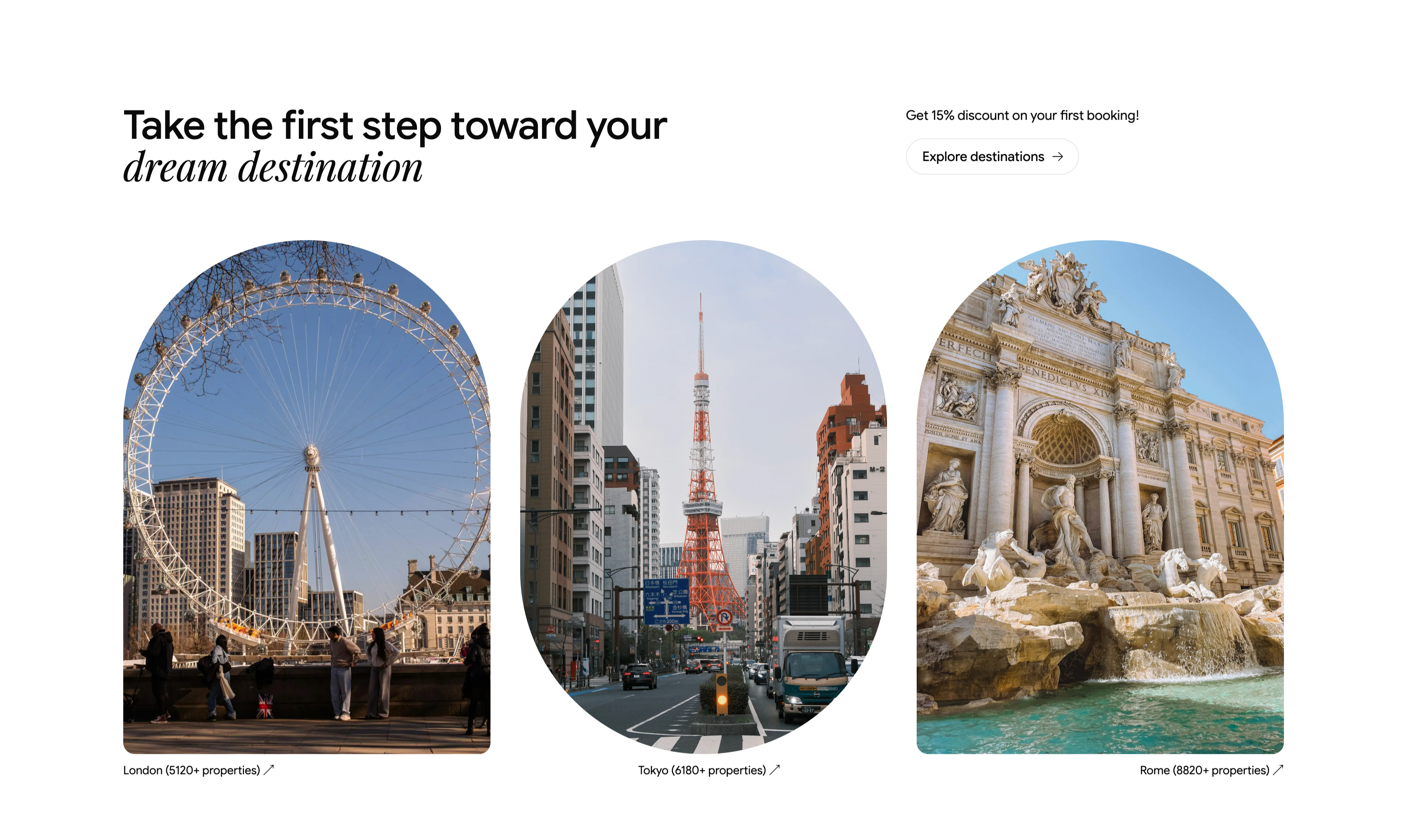
Dream Destination Trio With Arched Photos
A clean white section that opens with a left-aligned heading, 'Take the first step toward your dream destination', where 'dream destination' is set in italic serif, balanced at upper-right by a promo line, 'Get 15% discount on your first booking!', above a pill button labeled 'Explore destinations →'. Below sits a three-up row of tall arch-topped photographs, each a city scene — the London Eye, Tokyo Tower, and the Trevi Fountain in Rome. Each image carries a small caption with a property count and an up-right arrow: 'London (5120+ properties)', 'Tokyo (6180+ properties)', and 'Rome (8820+ properties)'. The generous whitespace, soft arch framing, and serif accent give the destination gallery a refined, gallery-like presentation.
Ceepii-nextjs-template ↗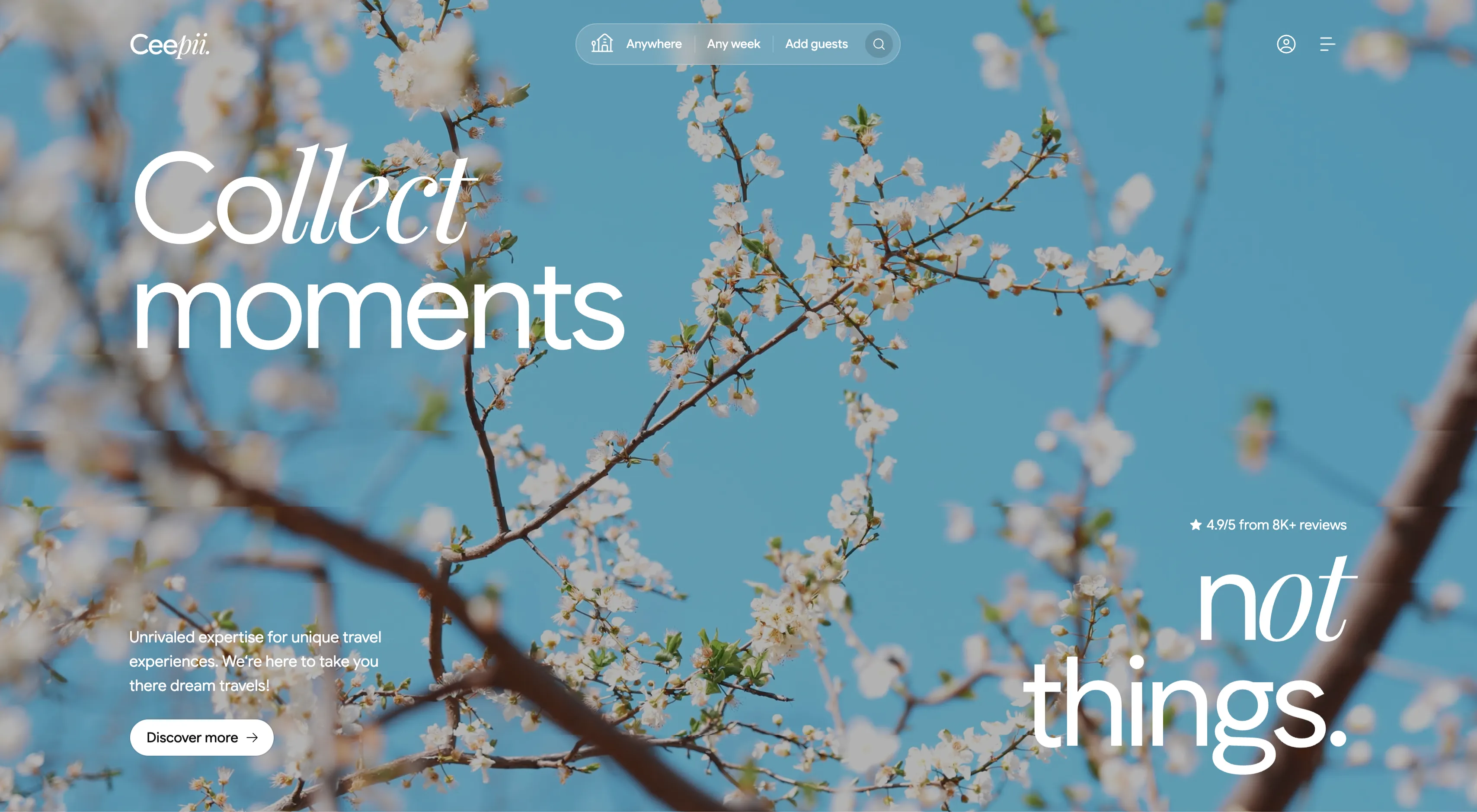
Ceepii Full-Bleed Photo Hero With Search Bar
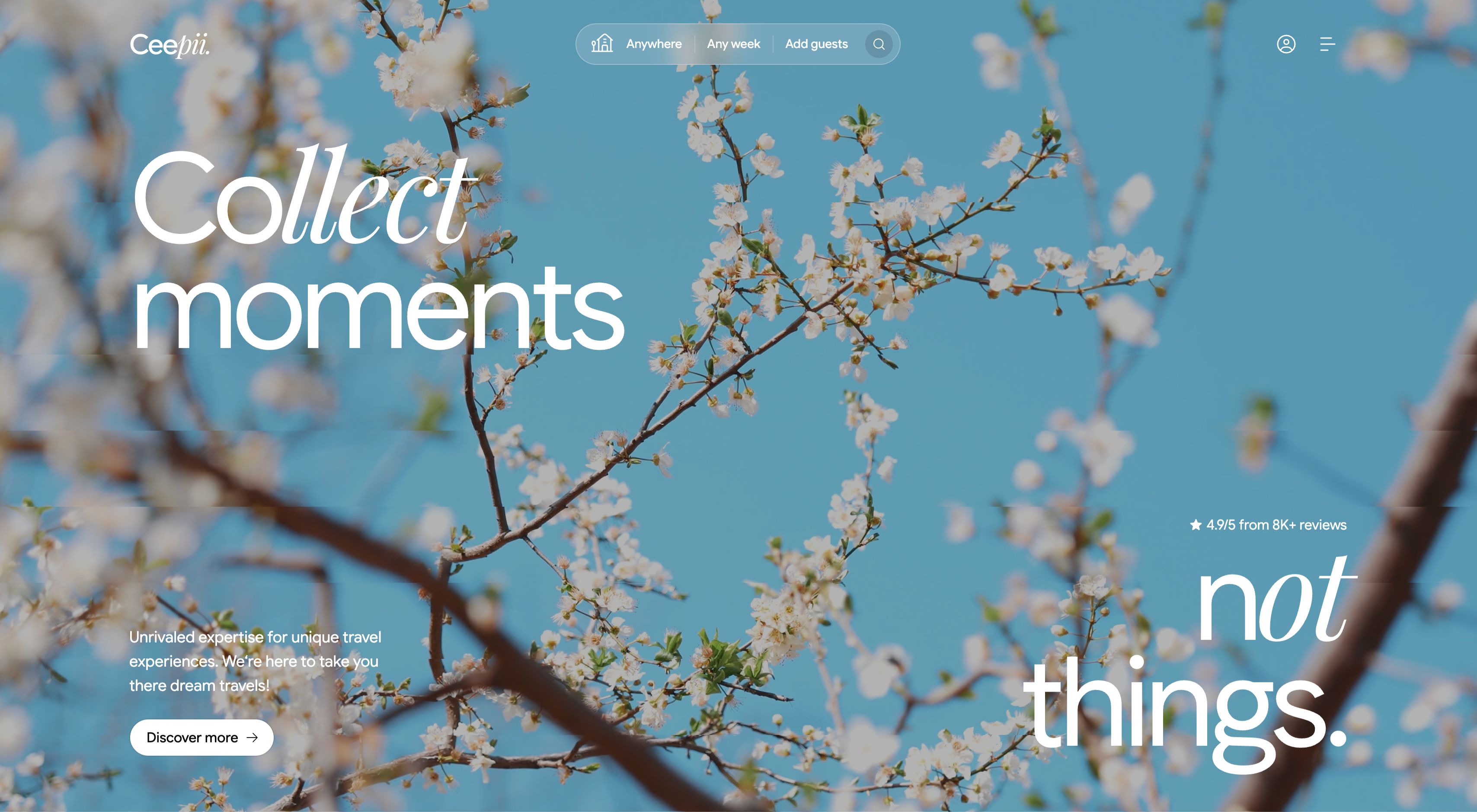
A full-bleed hero built over a soft-focus photograph of white cherry blossom branches against a clear blue sky. A thin top bar carries the 'Ceepii.' wordmark at left, a centered pill-shaped search bar split into 'Anywhere | Any week | Add guests' with a circular search icon, and an account icon plus hamburger menu at right. The headline is set in two contrasting cuts of an oversized display face — an italic serif 'Collect' over a light sans 'moments' top-left, balanced by a giant 'not things.' in the lower-right with an italic 'not'. Lower-left sits a short subhead, 'Unrivaled expertise for unique travel experiences...', above a white pill button reading 'Discover more →', while a small star rating, '4.9/5 from 8K+ reviews', floats mid-right. The airy imagery and split display type give it an editorial, aspirational travel feel.
Ceepii-nextjs-template ↗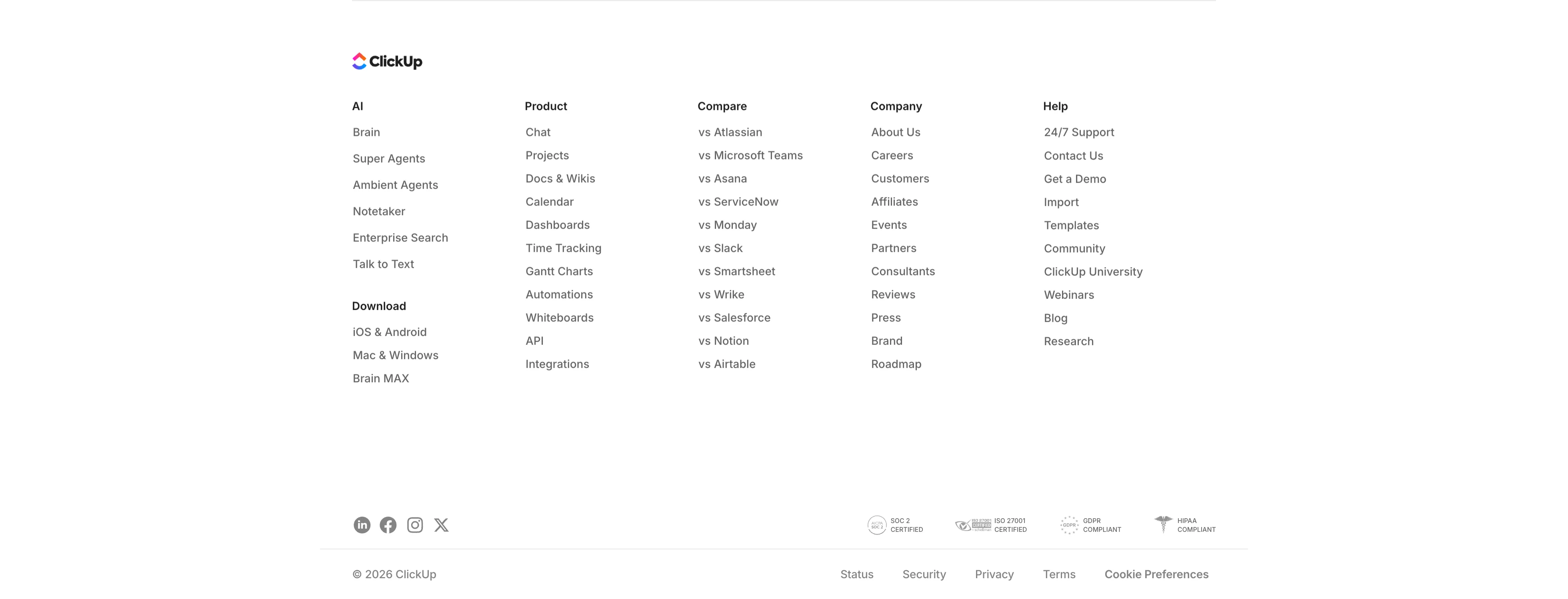
ClickUp Multi-Column Footer
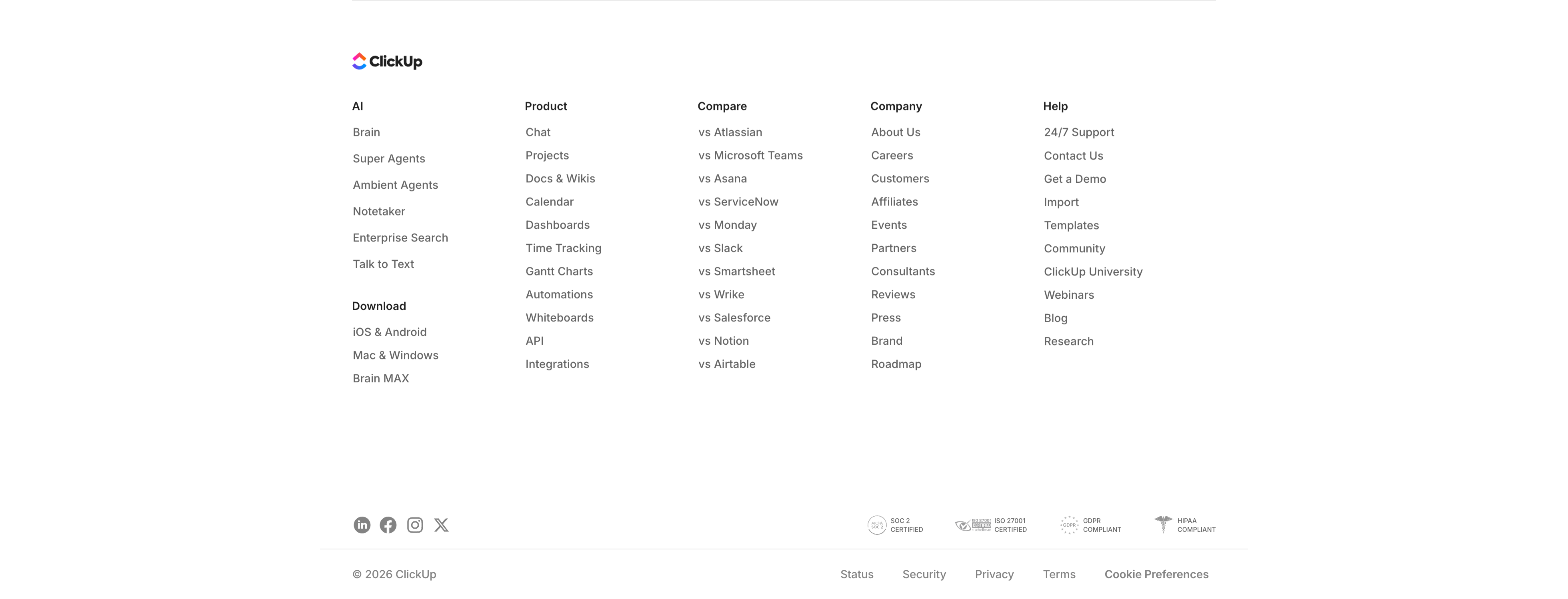
A standard multi-column site footer on white. The ClickUp logo sits at the top left, followed by five link columns — AI (Brain, Super Agents, Ambient Agents, Notetaker…), Product (Chat, Projects, Docs & Wikis, Calendar…), Compare (vs Atlassian, Microsoft Teams, Asana, Slack…), Company (About Us, Careers, Customers, Events…), and Help (24/7 Support, Contact Us, Templates, Blog…), with a 'Download' sub-block under the AI column. A divider separates a bottom bar holding social icons (LinkedIn, Facebook, Instagram, X) at the left and four compliance marks (SOC 2, ISO 27001, GDPR, HIPAA) at the right. The very bottom row shows '© 2026 ClickUp' beside Status, Security, Privacy, Terms, and Cookie Preferences links. Dense, organised navigation typical of a large SaaS site.
Clickup ↗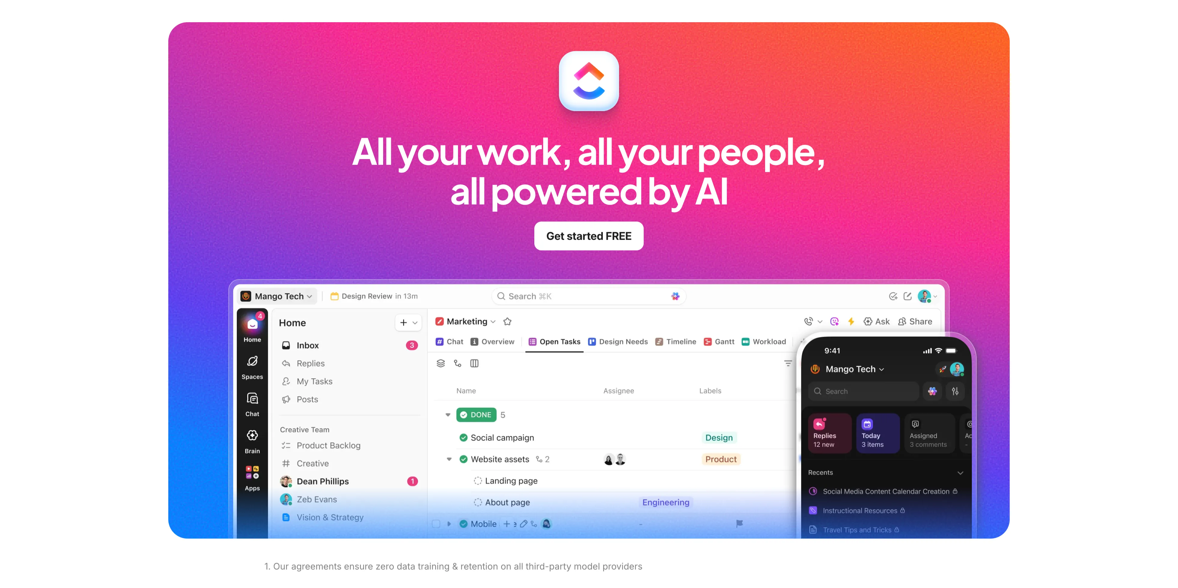
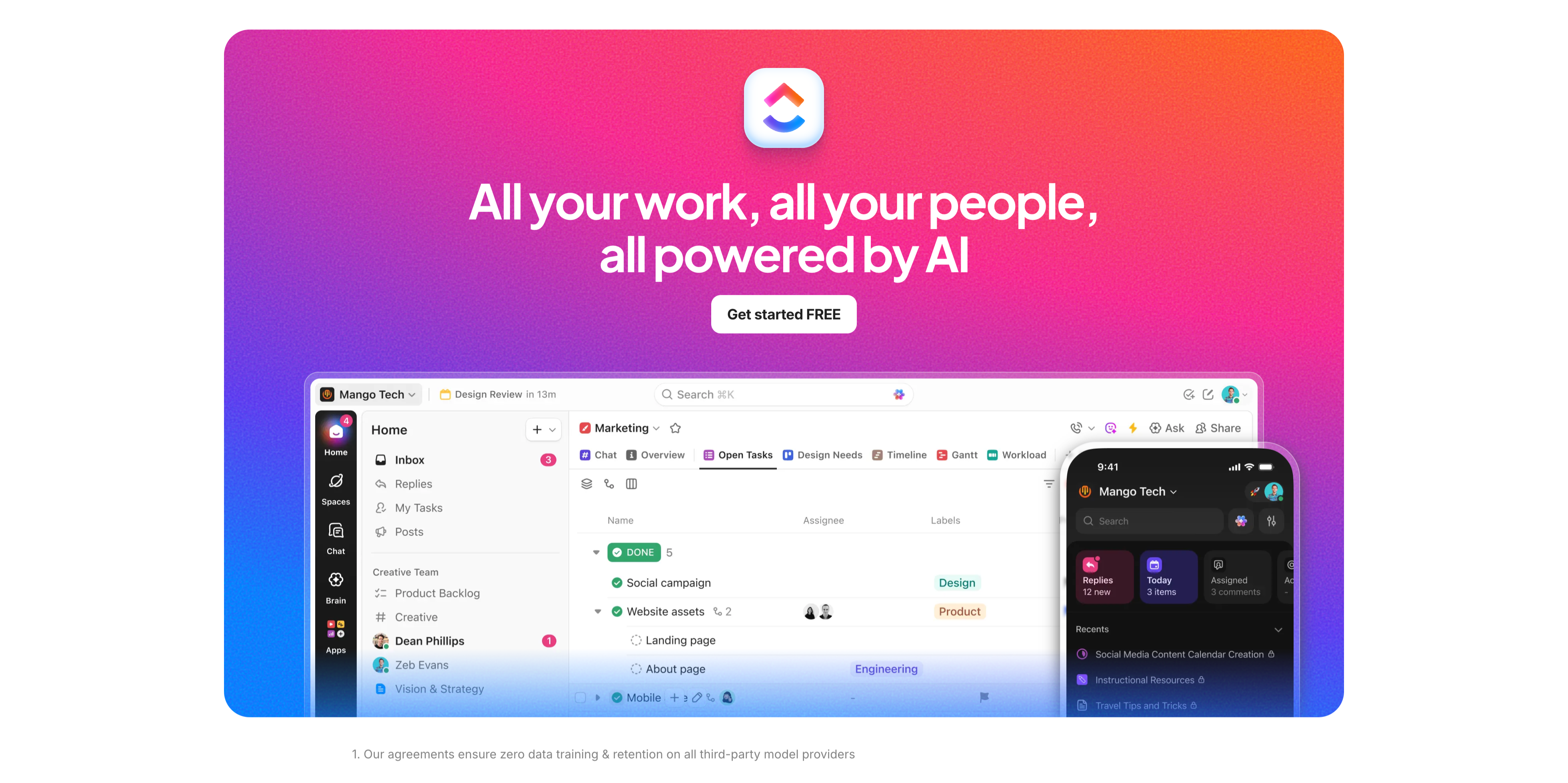
Gradient Closing CTA With App UI
A full-bleed closing call-to-action on a vivid purple-to-pink-to-orange gradient. Centered near the top sit the rounded ClickUp app icon, a large white headline 'All your work, all your people, all powered by AI', and a white 'Get started FREE' button. Below, a large rounded product screenshot of the ClickUp desktop app (a marketing workspace with task lists) overlaps the gradient, with a smaller mobile app screen layered at its right edge. A small footnote at the very bottom on white reads 'Our agreements ensure zero data training & retention on all third-party model providers'. The saturated gradient and oversized UI make this the upbeat final conversion push before the footer.
Clickup ↗

Enterprise-Grade Security Strip
A compact security-assurance strip on white. The left side carries a two-tone heading 'Enterprise-grade everything' above a small grey line: 'Out of the box security & AI that's even more private than ChatGPT'. The right side lines up four monochrome compliance badges — AICPA SOC 2, ISO 27001 Certified, GDPR, and a HIPAA caduceus. A thin baseline row repeats them as all-caps labels (24/7 SUPPORT, SOC 2 TYPE II, ISO 27001, GDPR, HIPAA) with a small globe icon at the far left. The restrained grey palette and certification marks reassure enterprise buyers about security and privacy in a single horizontal band.
Clickup ↗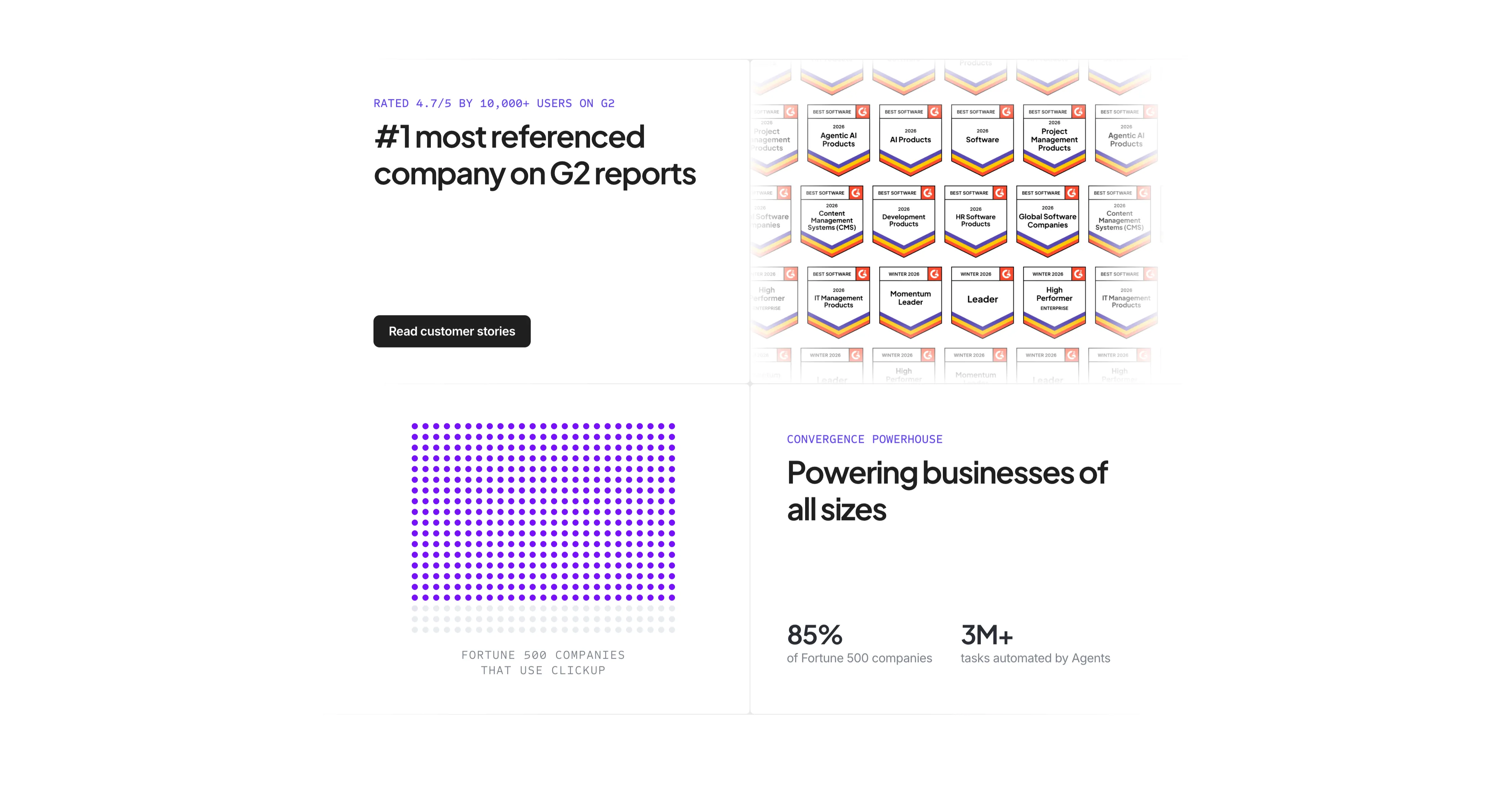
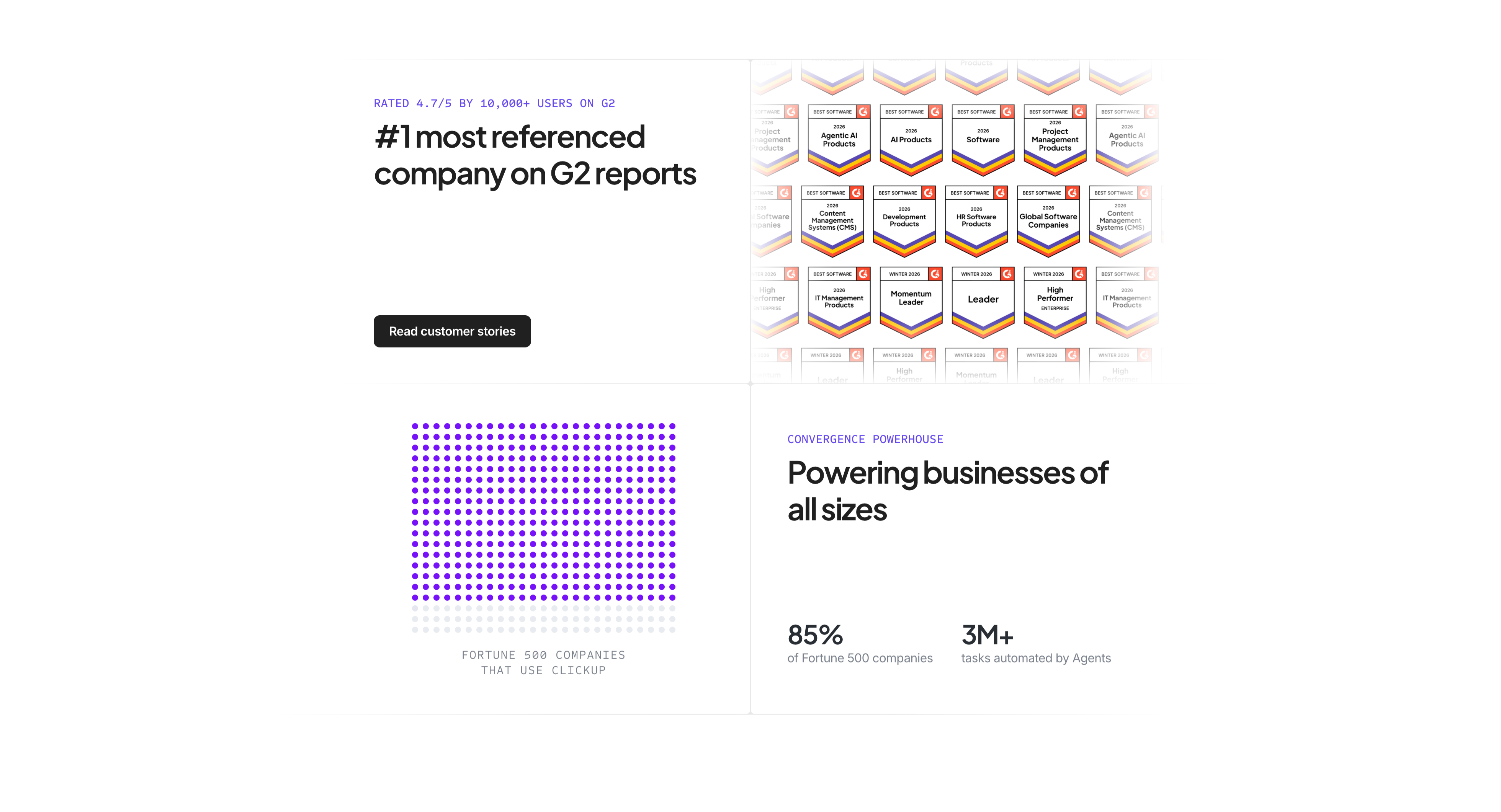
G2 Awards And Fortune 500 Proof
A four-quadrant social-proof section on white. The top-left quadrant carries an indigo label 'RATED 4.7/5 BY 10,000+ USERS ON G2', a bold headline '#1 most referenced company on G2 reports', and a black 'Read customer stories' button. The top-right shows a dense wall of G2 'Best Software 2026' award badges in rows, fading at the edges. The bottom-left renders 'FORTUNE 500 COMPANIES THAT USE CLICKUP' as a grid of purple dots (most filled, a few faded) acting as an infographic. The bottom-right pairs an indigo eyebrow 'CONVERGENCE POWERHOUSE' and heading 'Powering businesses of all sizes' with two stats — '85% of Fortune 500 companies' and '3M+ tasks automated by Agents'. The quadrant layout stacks multiple proof types into one screen.
Clickup ↗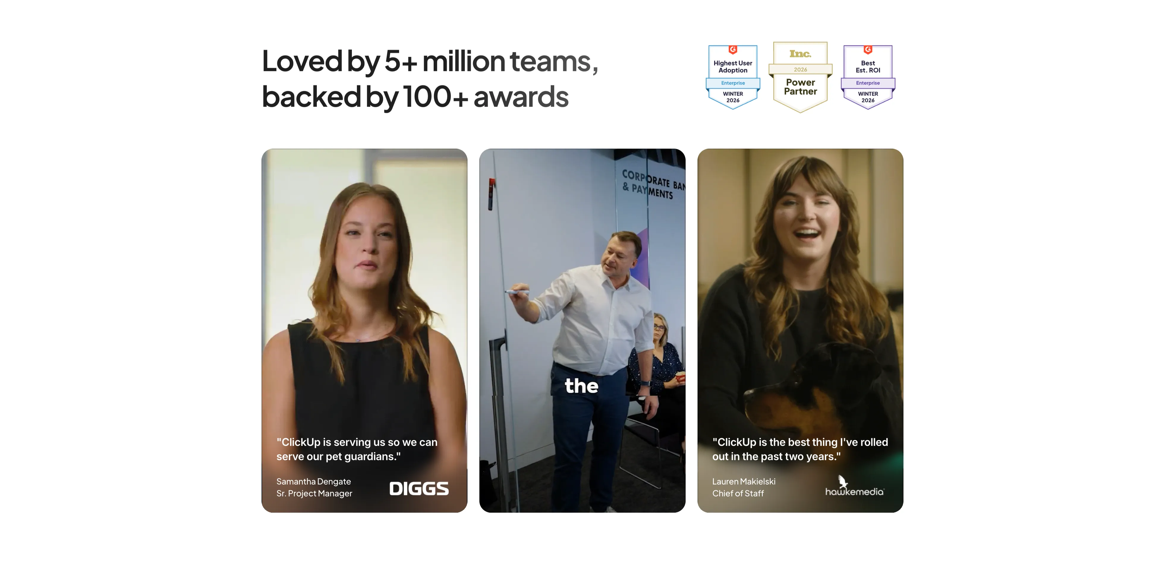
Customer Video Testimonials Three-Up
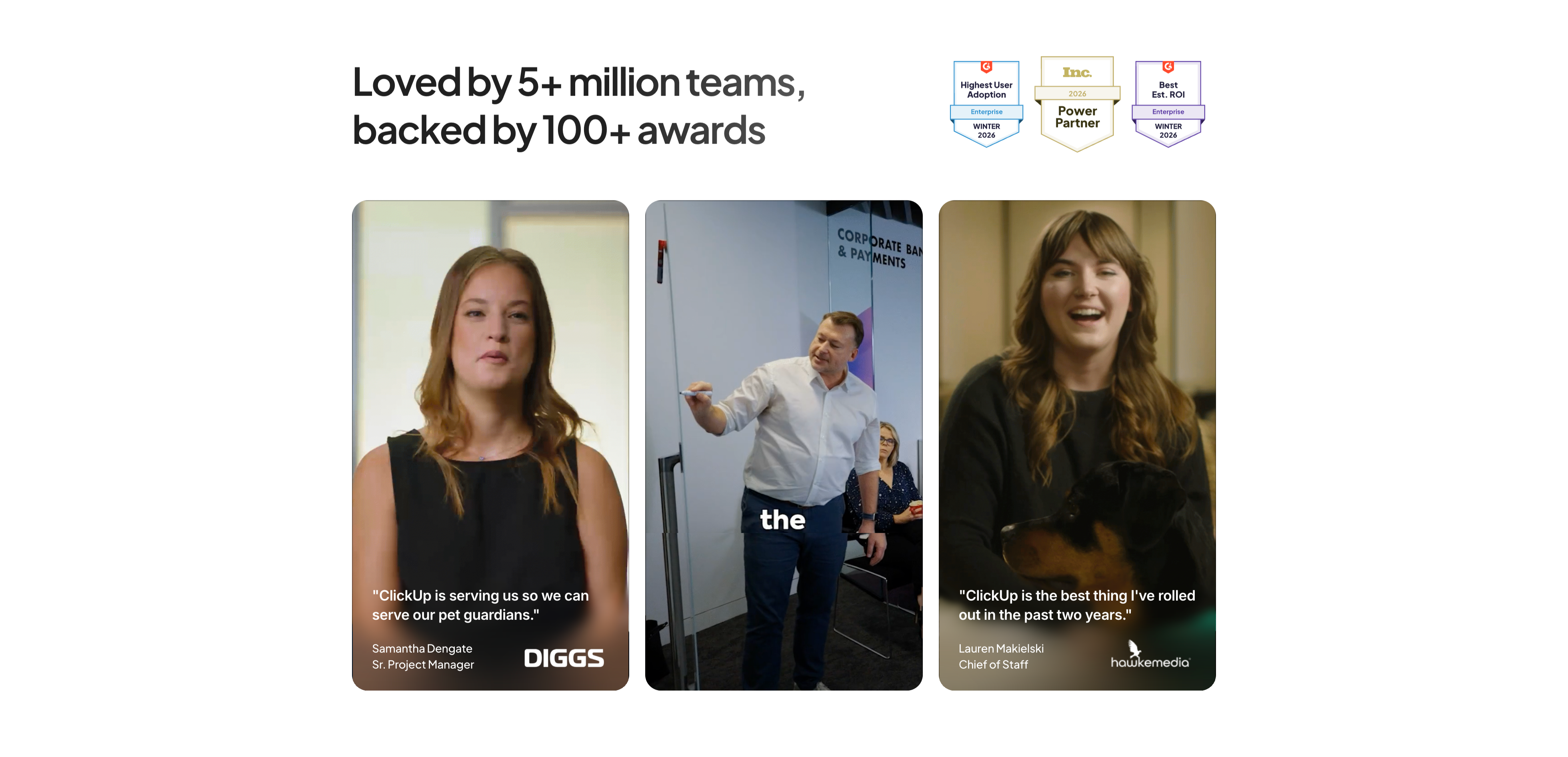
A testimonials section on white. The bold headline 'Loved by 5+ million teams, backed by 100+ awards' sits at the upper left, with a cluster of three award badges (G2 'Highest User Adoption', Inc. 'Power Partner', G2 'Best Est. ROI', all Winter/2026) at the upper right. Below sit three tall rounded video-testimonial cards, each a full-bleed photo of a customer with an overlaid quote and attribution: Samantha Dengate, Sr. Project Manager at Diggs ('ClickUp is serving us so we can serve our pet guardians.'); a middle card showing a man presenting in a corporate-banking room; and Lauren Makielski, Chief of Staff at Hawke Media ('ClickUp is the best thing I've rolled out in the past two years.'). The portrait video stills give the quotes a human, credible face.
Clickup ↗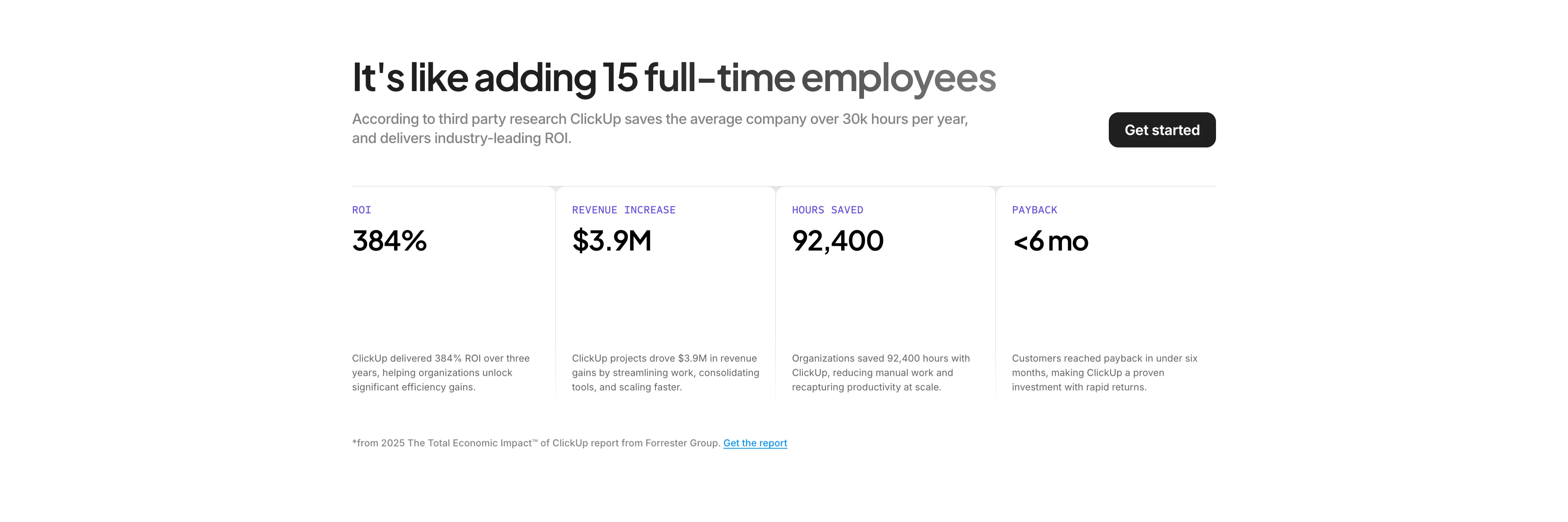
ROI Stats Four-Up Band
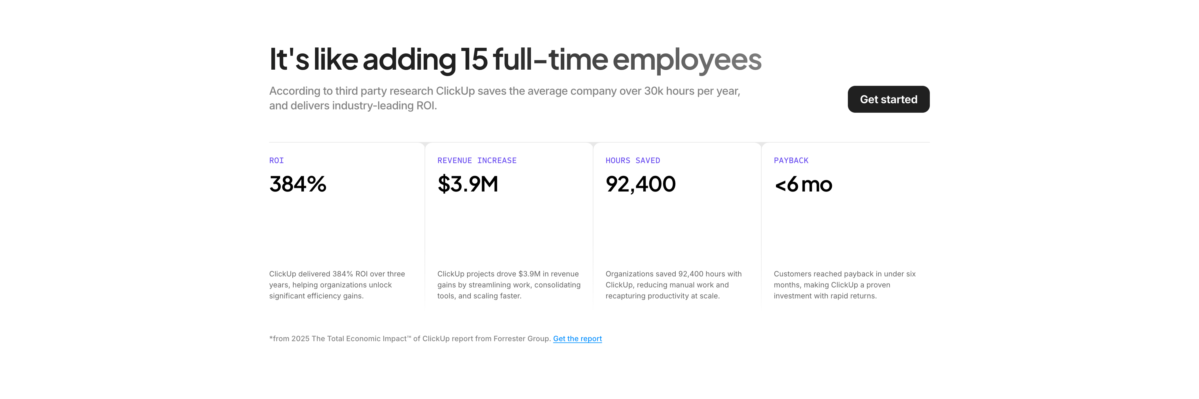
A results-focused section on white. A bold headline 'It's like adding 15 full-time employees' sits beside a grey supporting paragraph and a black 'Get started' button on the right. Below a hairline divider runs a four-column stat band, each column an indigo all-caps label, an oversized black figure, and a short explanatory sentence: ROI '384%', Revenue Increase '$3.9M', Hours Saved '92,400', and Payback '<6 mo'. Thin vertical rules separate the columns. A small footnote credits '2025 The Total Economic Impact of ClickUp report from Forrester Group' with a linked 'Get the report'. The large numerals plus a cited source turn the section into quantified, defensible social proof.
Clickup ↗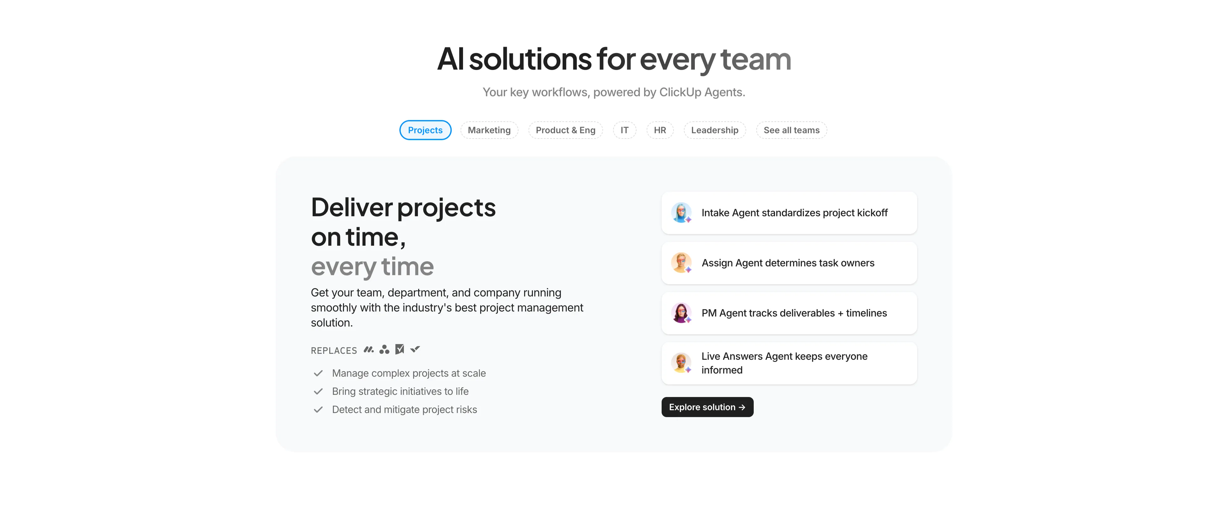
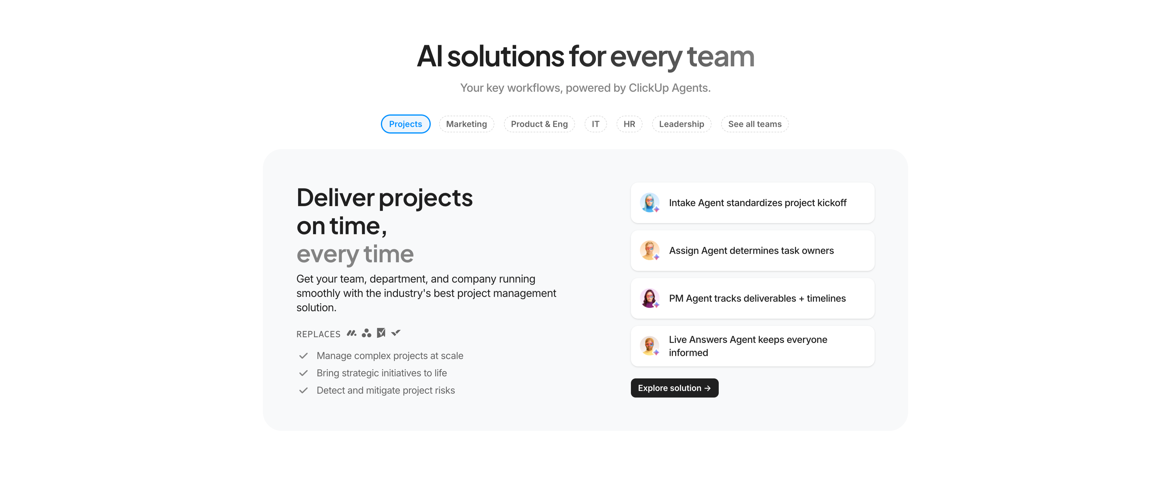
AI Solutions For Every Team Tabs
A centered solutions section on white with a tabbed split layout. The headline 'AI solutions for every team' sits above a grey subhead and a horizontal row of pill tabs — Projects (active, blue outline), Marketing, Product & Eng, IT, HR, Leadership, See all teams. Below, a rounded light-grey panel splits into two columns: the left holds a two-tone heading 'Deliver projects on time, every time', supporting copy, a small grey 'REPLACES' row of competitor icons, and three check-marked bullets; the right stacks four white agent cards, each an avatar plus a one-line capability ('Intake Agent standardizes project kickoff', 'Assign Agent determines task owners', 'PM Agent tracks deliverables + timelines', 'Live Answers Agent keeps everyone informed') with a black 'Explore solution →' button beneath. The tab pattern lets one layout flex across many audiences.
Clickup ↗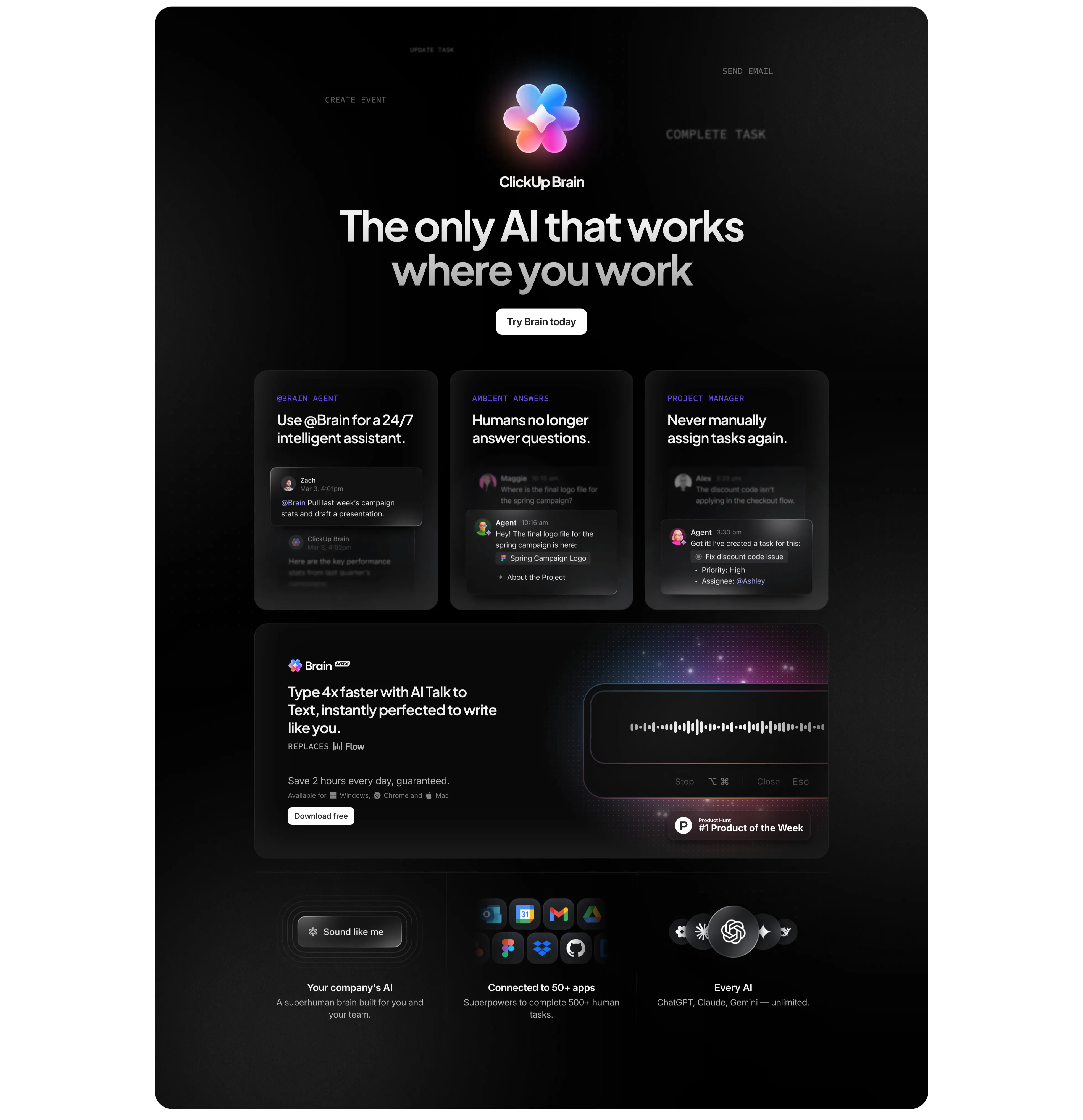
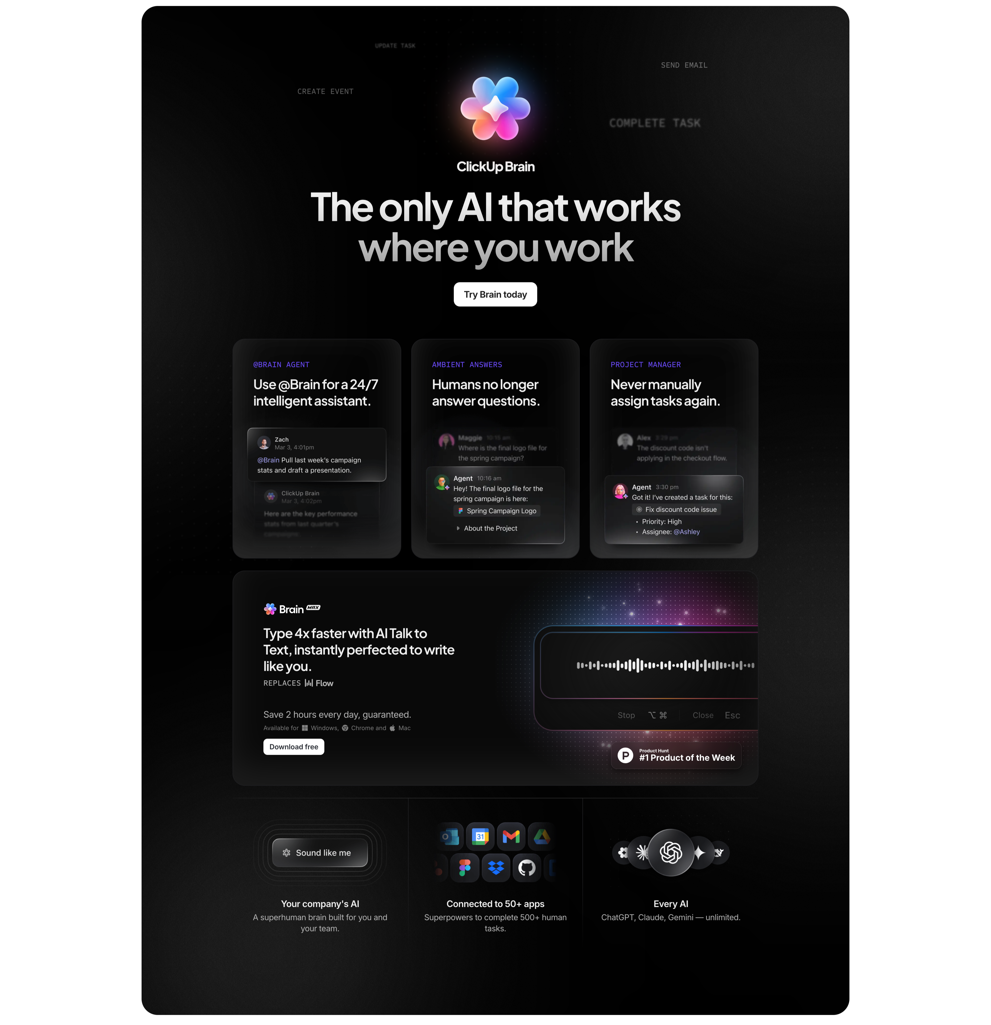
ClickUp Brain Dark Feature Section
A tall dark (near-black) section centered on the ClickUp Brain product. At the top a colourful flower-shaped Brain logo sits between faint all-caps labels (CREATE EVENT, SEND EMAIL, COMPLETE TASK), under a large light headline 'The only AI that works where you work' and a white 'Try Brain today' button. Below, three dark cards each pair an eyebrow label and heading with a mocked chat exchange — '@Brain Agent' (24/7 assistant), 'Ambient Answers' (humans no longer answer questions), and 'Project Manager' (never manually assign tasks). Beneath them a wide 'Brain MAX' panel promotes talk-to-text with a glowing waveform input and a 'Product Hunt #1 Product of the Week' badge. A bottom three-up row adds 'Your company's AI', 'Connected to 50+ apps' (app icon cluster), and 'Every AI' (ChatGPT, Claude, Gemini). The dark theme and glassy cards set the AI feature apart from the white sections around it.
Clickup ↗

Super Agents Centered Promo
A centered promo block on white. A large two-tone headline reads 'A new era of humans, with Super Agents™', directly under which sit two buttons — a solid black 'Build your own agent' primary and a light-grey 'Learn More' secondary. Below the buttons, centered in the lower half, floats a glossy 3D mask-shaped object branded 'Super Agent', rendered in a vivid orange-to-pink-to-blue gradient with soft shadow. There is no body copy; the section relies on the single product hero image and the headline to introduce the Super Agents feature. The abundant whitespace and one bold rendered object give the block a launch-announcement feel.
Clickup ↗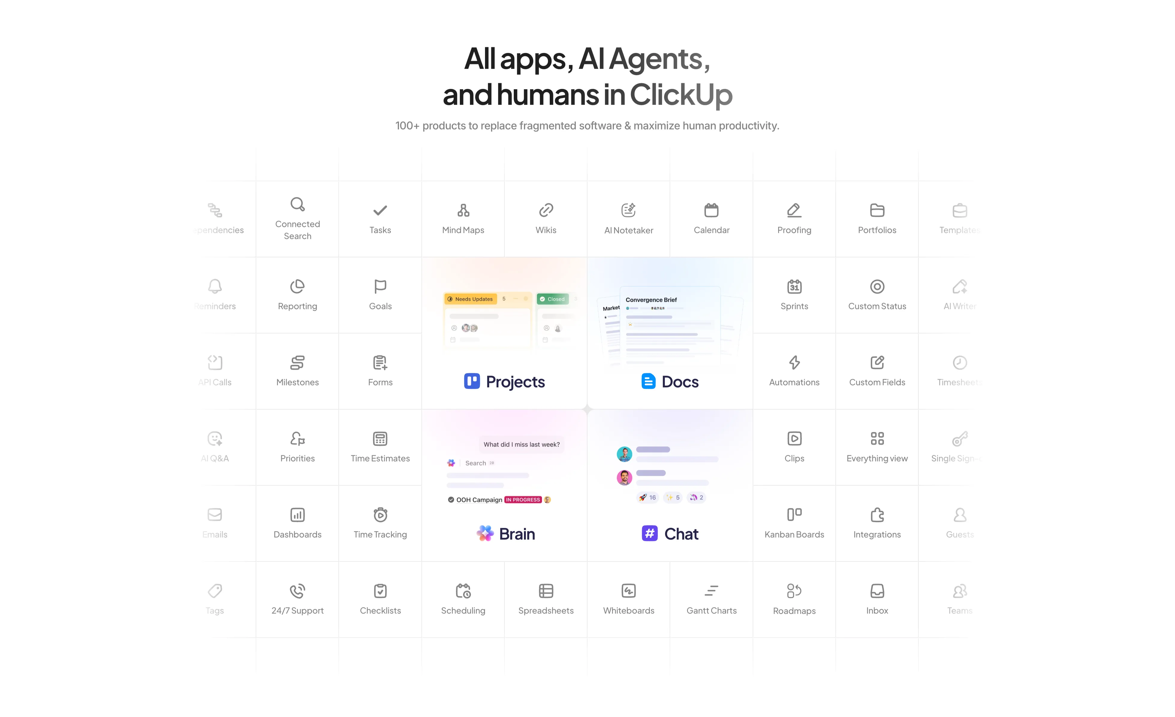
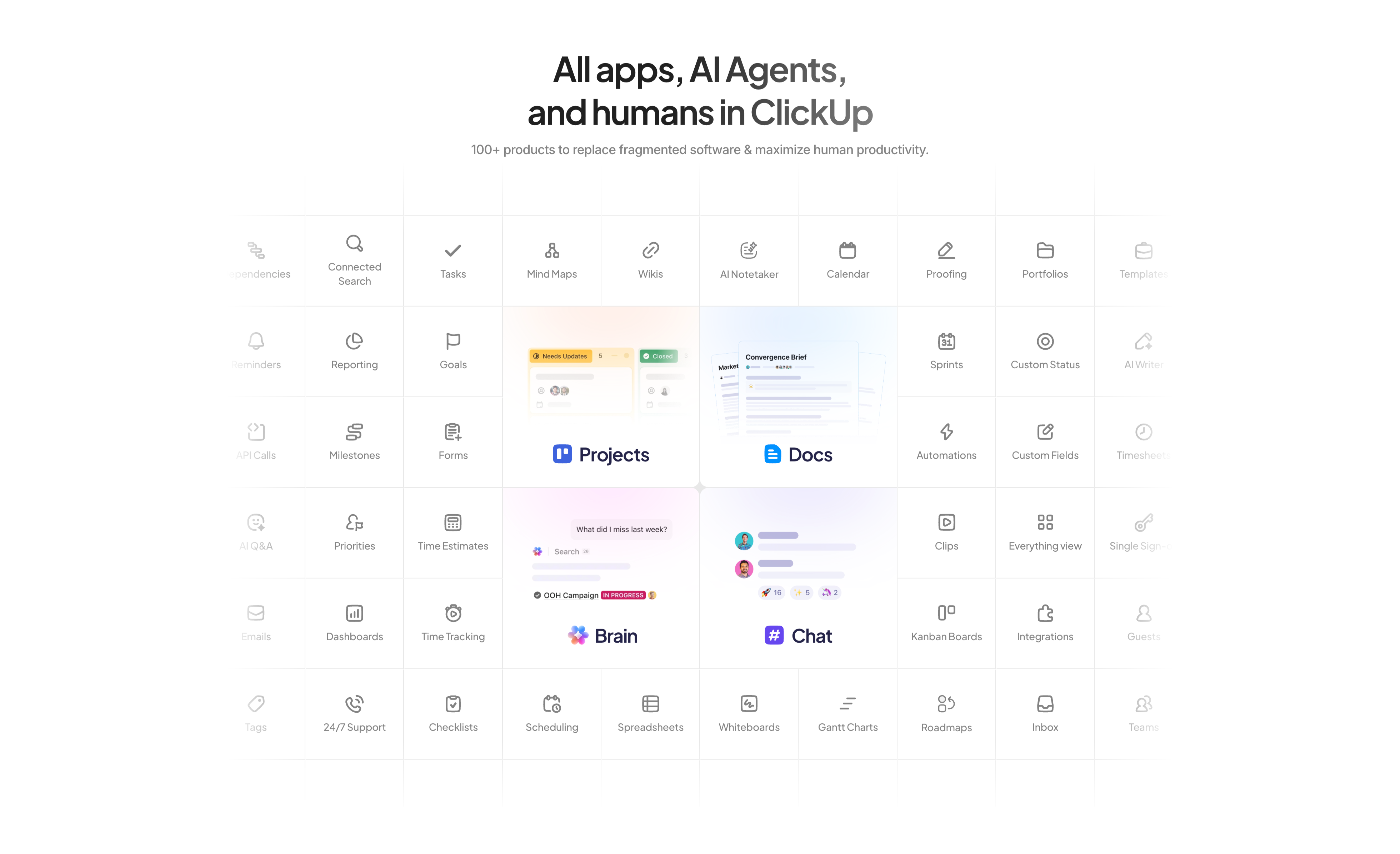
All Apps And AI Agents Feature Grid
A large centered feature matrix on white. The headline 'All apps, AI Agents, and humans in ClickUp' sits above a grey subhead noting '100+ products to replace fragmented software'. Below spans a dense grid of thin-bordered cells, each a small line icon with a label — Tasks, Mind Maps, Wikis, AI Notetaker, Calendar, Proofing, Reporting, Goals, Sprints, Automations, Dashboards, Time Tracking and many more. Four cells are enlarged into soft-gradient product tiles that break the uniform grid: 'Projects', 'Docs', 'Brain', and 'Chat', each showing a mini UI preview. The edge cells fade toward transparent, implying the catalogue continues beyond the frame. The sheer count of tiles visually argues the all-in-one breadth of the platform.
Clickup ↗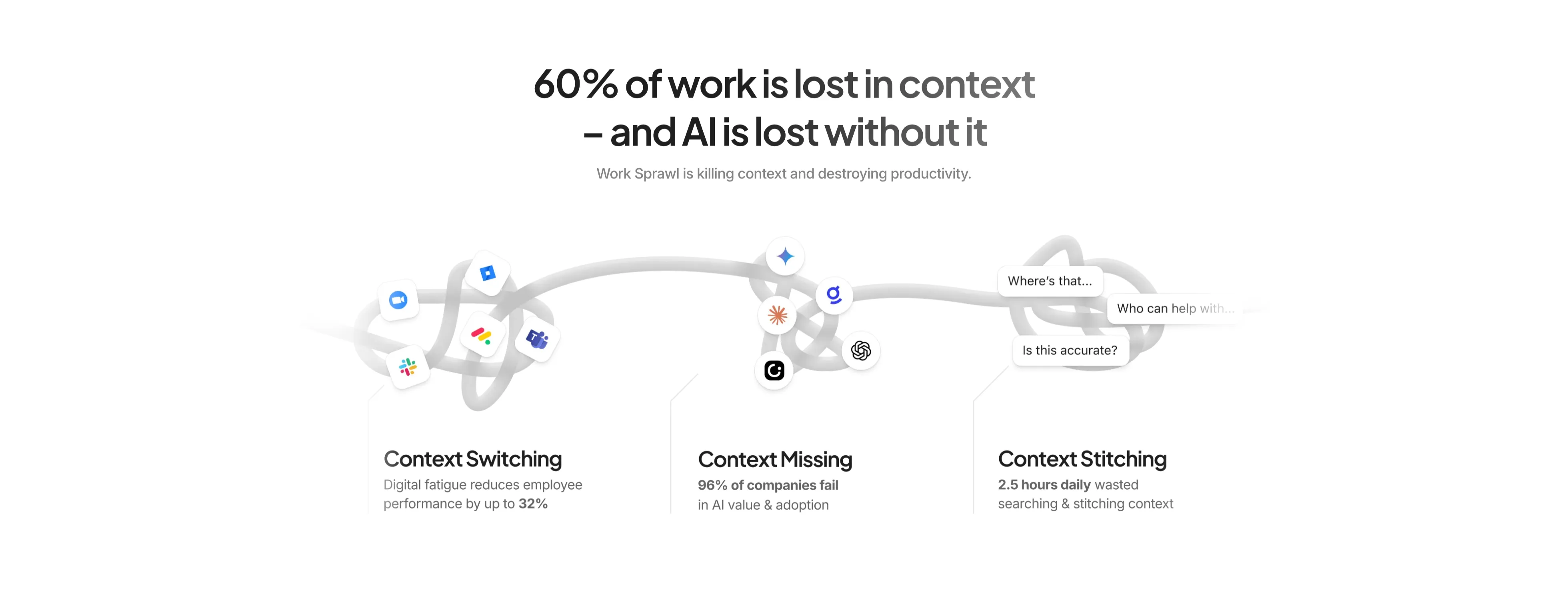
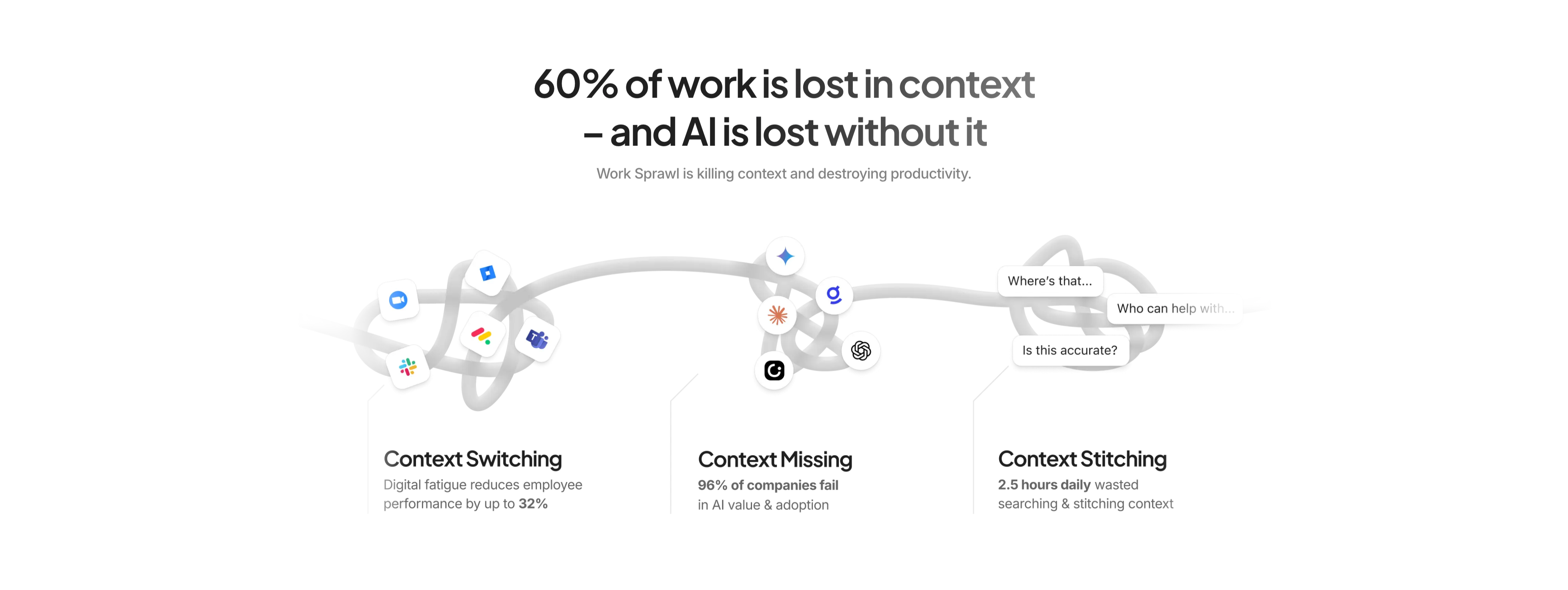
Context Problem Three-Up With Stats
A centered problem-framing section on white. A large two-tone headline reads '60% of work is lost in context – and AI is lost without it', with a grey subhead 'Work Sprawl is killing context and destroying productivity.' Below, a tangled grey rope illustration weaves across the width, snagging clusters of app icons (Zoom, Jira, Slack, Teams, Gemini, ChatGPT) and small chat bubbles ('Where's that…', 'Who can help with…', 'Is this accurate?'). The illustration resolves into a three-up row of labelled points — 'Context Switching' (reduces performance by up to 32%), 'Context Missing' (96% of companies fail), and 'Context Stitching' (2.5 hours daily wasted) — each bolding its key statistic. The metaphorical knot plus hard numbers makes the pain concrete before the product is pitched.
Clickup ↗
ClickUp Split Hero With Product UI
A two-column hero beneath a slim announcement bar ('Meet Super Agents — Maximize human productivity with custom AI teammates') and a full nav with the ClickUp logo, menu links, and 'Get a Demo', 'Login', and a black 'Sign Up' button. The left column stacks a small pill ('Introducing ClickUp 4.0'), an oversized black headline 'Software to replace all software', three check-marked value lines (save money, save time, create infinite productivity), a black 'Get started. It's FREE!' button with 'Free forever / No credit card' beside it, and a row of feature chips (Projects, Chat, Brain MAX, AI Agents…). The right column shows a rounded product screenshot of the ClickUp app with a marketing task board. Clean white background with multicolour brand accents focuses attention on the headline and primary CTA.
Clickup ↗

ClickUp Trusted-By Logo Strip
A single horizontal logo cloud on a plain white background. A small grey all-caps label 'TRUSTED BY THE BEST' sits at the far left, followed by six monochrome customer wordmarks spaced evenly across one row: Dish, Deloitte, Pfizer, Adobe, American, and NBCUniversal. Every logo is rendered in the same muted grey so no single brand dominates, and the generous vertical padding leaves the strip feeling airy. There is no imagery beyond the logos themselves. The flat, uniform treatment reads as quiet social proof, lending enterprise credibility without distracting from surrounding sections.
Clickup ↗

NFINITE Subscribe Call-To-Action
A centered call-to-action band filling the width with a soft pale-blue panel. At the top sits the black 'NFINITE' wordmark with its small dotted infinity-style logo mark. Below it, a large dark charcoal sans-serif heading spans three centered lines — 'Subscribe to learn more about how our paper can eliminate plastic packaging from daily life' — stating the value of converting before the action. Centered beneath the copy is a single solid near-black rounded button labelled 'Contact us', with no competing secondary action. The calm monochrome-on-blue palette, generous vertical padding, and one focused button make this a clean closing conversion block that funnels attention straight to a single next step.
Nfinitepaper ↗
NFINITE Proven Leaders Split Content
A two-column content section on a warm off-white background telling the company-origin story. The left side opens with a small outlined 'Proven Leaders in ALD' eyebrow pill, followed by two paragraphs of dark body copy explaining that 'Nfinite is a spin-out from the Functional Nanomaterials Lab at the University of Waterloo (Canada), led by Dr. Kevin Musselman, a global pioneer in Spatial Atomic Layer Deposition (SALD)' and that two decades of peer-reviewed research now bring proven nanotechnology into industrial packaging. The right half is a large desaturated photograph of a bright, clean lab or production floor lined with white analytical machines and overhead ducting. The roomy left margin, restrained type, and pairing of credentialed narrative with a real facility image give the block a trustworthy, research-grade tone.
Nfinitepaper ↗
NFINITE Amcor Pull-Quote
A single-quote testimonial section on a plain warm off-white background, with no card, photo, or border. An oversized near-black sans-serif pull-quote fills the upper-left, wrapping across three lines: "Amcor is excited to be both an early-stage investor and a strategic collaboration partner to Nfinite on this ground breaking project." Below it, the attribution is set small and left-aligned — the name 'MICHAEL HARTMAN' in bold all-caps, and the role 'Senior Fellow, Emerging Material/Process Development at Amcor' in lighter muted grey beneath. The generous empty space and the sheer scale of the quote let the endorsement from a named industry partner carry the whole section, reading as a credibility anchor rather than a decorative review block.
Nfinitepaper ↗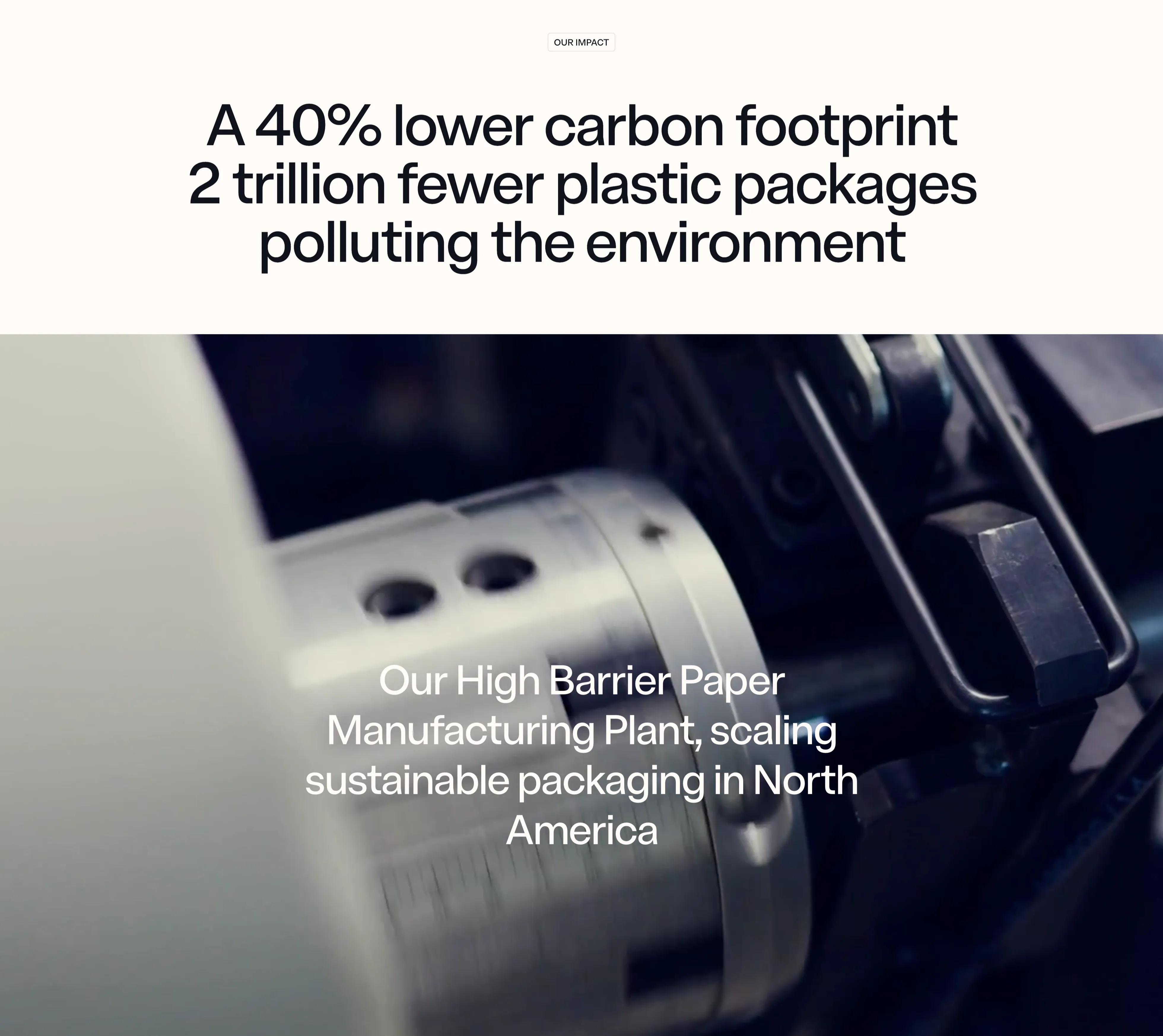
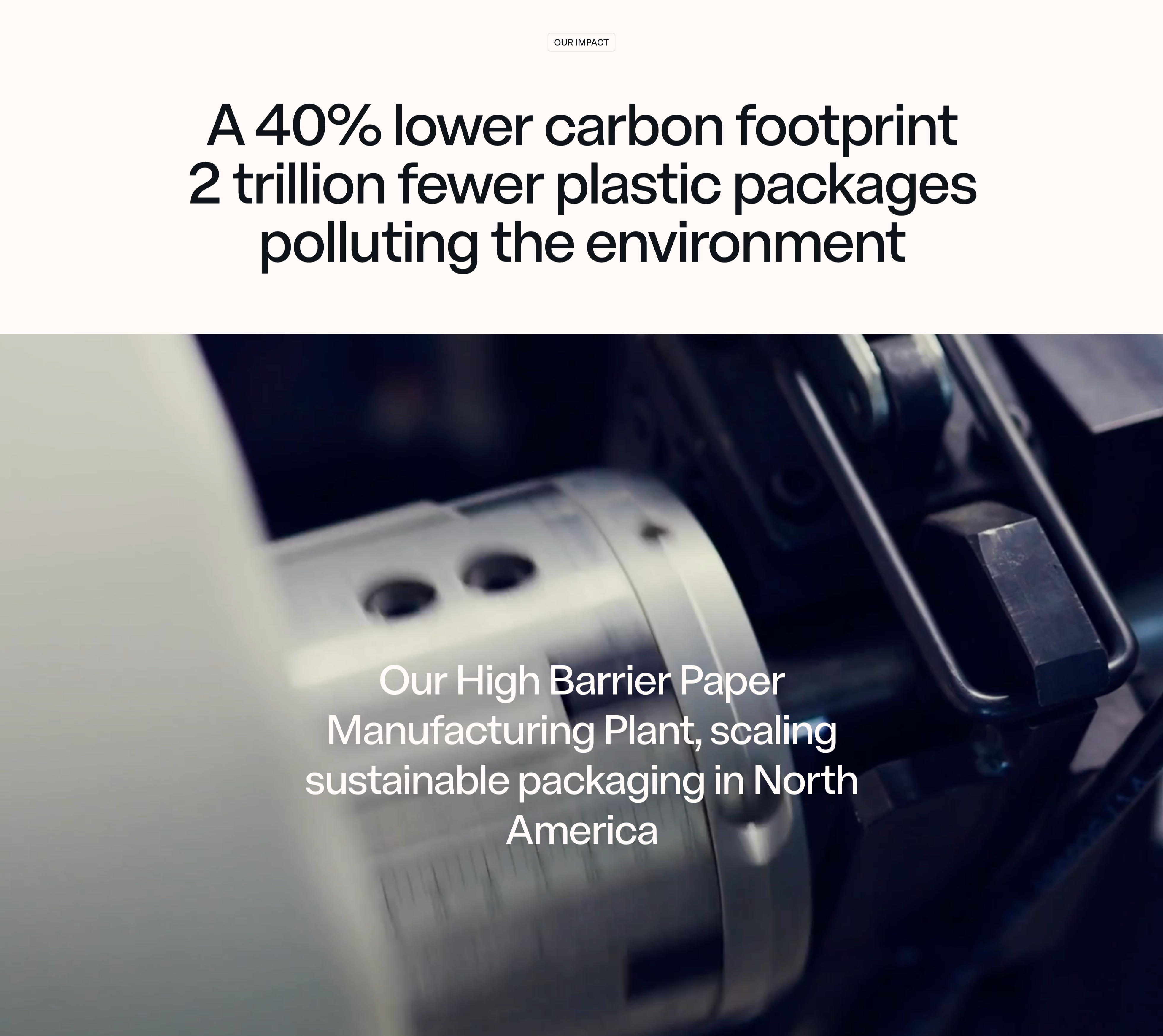
NFINITE Impact Stat Band
An impact section that pairs a centered stat headline on a warm off-white band with a full-bleed machinery photo below. A small outlined 'OUR IMPACT' eyebrow pill sits at the top, above an oversized near-black sans-serif headline that stacks two claims — 'A 40% lower carbon footprint' and '2 trillion fewer plastic packages polluting the environment' — using sheer type scale rather than separate number tiles to make the figures land. Beneath it, a moody, shallow-depth close-up of a chrome slitting machine and paper roll fills the width, dark on the right and bright on the left. Lower-left over the photo, a white caption reads 'Our High Barrier Paper Manufacturing Plant, scaling sustainable packaging in North America'. The split of crisp light band over cinematic dark imagery, with the metrics carried entirely by typography, gives the impact message a confident, editorial weight.
Nfinitepaper ↗
NFINITE Barrier Specs Accordion
A specifications accordion on a soft pale-blue panel, listing the material's properties as a vertical stack of expandable rows. Each row pairs a thin line icon with a label — Barrier Performance, Fiber content, Printability, Flexibility, Sealability, Grammage, Recyclability — separated by hairline dividers, with a downward chevron on the right of every collapsed row. The top row, 'Barrier Performance', is expanded to reveal its detail on the right side: three small rounded sky-blue pills labelled Moisture, Oxygen and Grease, each paired with a grey technical value — '<0.3 g/m2/day WVTR (38°C, 90% RH)', '<1 cc/m2/day OTR (23°C, 50% RH)', and 'Excellent resistance to grease and oils'. The remaining six rows stay collapsed below. The palette is restrained — pale blue field, near-black labels, muted grey values — and the generous spacing plus precise spec formatting give it a credible, engineering-grade feel suited to a technical B2B audience scanning for hard numbers.
Nfinitepaper ↗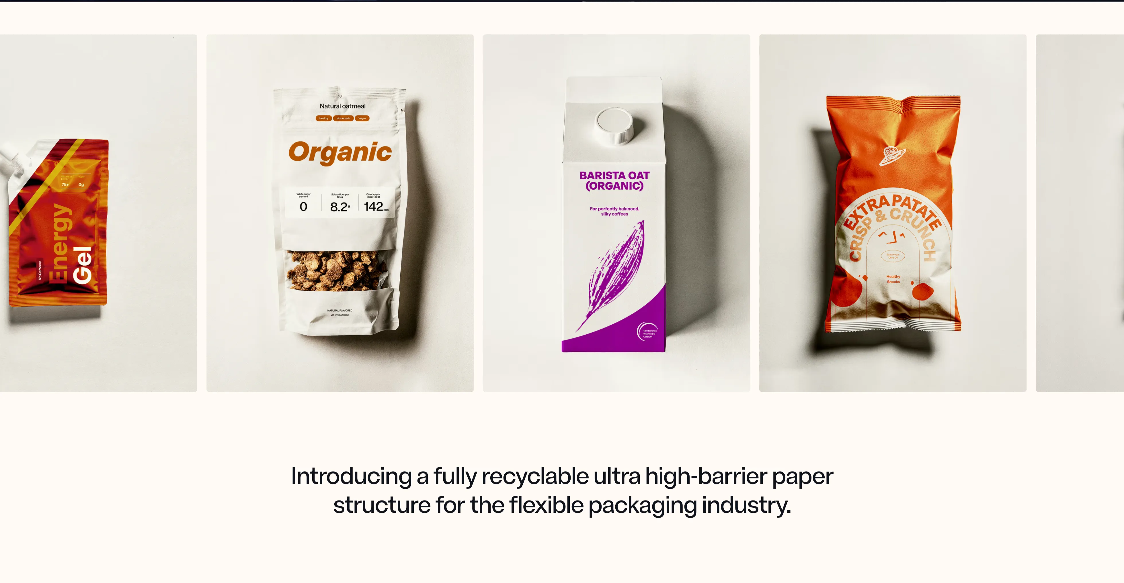
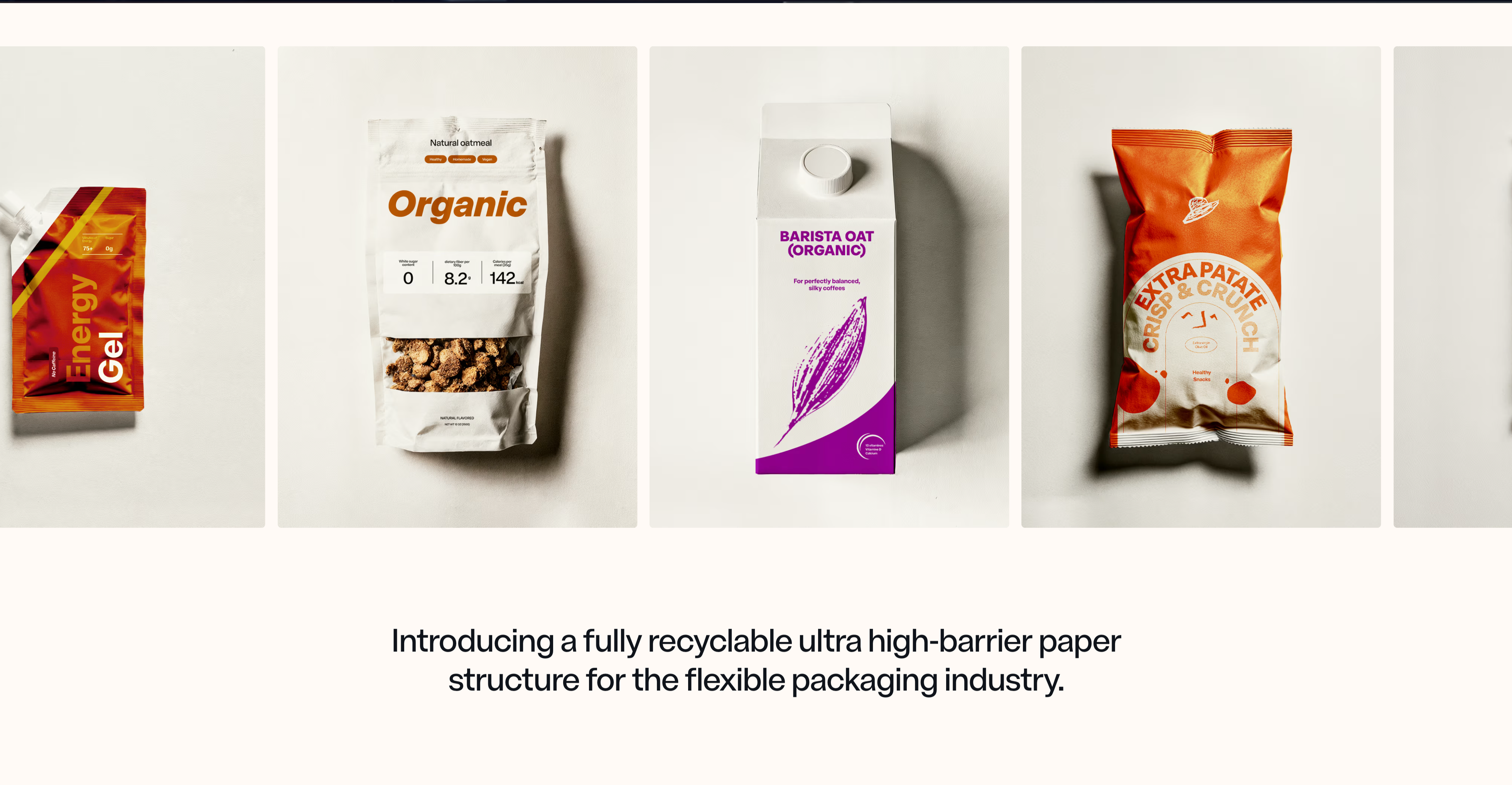
NFINITE Product Showcase Carousel
A horizontally scrolling product carousel set on a warm off-white background. Four packaging mockups sit side by side in tall portrait frames with subtle grey backdrops and soft drop shadows — a red foil energy-gel pouch (partially cut off at the left edge), a white 'Organic' stand-up oatmeal pouch with nutrition callouts, a 'Barista Oat (Organic)' carton with a purple leaf graphic, and an orange 'Extra Patate Crisp & Crunch' chip bag — with the faint edge of a fifth frame peeking in at the right to signal more. The peeking frames and uniform sizing make the row's scrollability obvious without visible arrows or dots. Centered beneath the rail, a large dark-charcoal serif-tinged sans heading reads 'Introducing a fully recyclable ultra high-barrier paper structure for the flexible packaging industry.' The clean neutral canvas and consistent studio photography let the colourful real-world packs carry the visual interest and prove the material's range across food and beverage formats.
Nfinitepaper ↗
NFINITE Full-Bleed Video Hero
A full-bleed hero built over a cinematic, desaturated close-up of a paper roll feeding through a slitting machine, dark on the left and fading to a soft light grey on the right. A slim transparent nav rides the top edge: the 'NFINITE' wordmark with a small dotted logo mark on the left, a centre-right row of links — Specifications, Technology, Impact, News, About — and a pale rounded 'Contact us' button at the far right. There is no separate headline block; instead an oversized sans-serif statement is overlaid low in the frame, with the lead clause '100% Curbside Recyclable, sealable, printable ultra high barrier paper,' in solid white and the continuation 'designed to replace flexible plastic packaging.' dropping to muted grey, so the sentence reads as one idea with built-in emphasis. The imagery-as-background with minimal chrome and a single large typographic overlay gives an industrial, premium feel that foregrounds the product story over UI.
Nfinitepaper ↗

Linear Multi-Column Footer
A wide site footer on near-black. The Linear logo mark sits at the far left, followed by five columns of grey text links under white headings: Product (Intake, Plan, Build, Diffs, Monitor, Pricing, Security), Features (Asks, Agents, Coding Sessions, Customer Requests, Insights, Mobile, Integrations, Changelog), Company (About, Customers, Careers, Blog, Method, Quality, Brand), Resources (Switch, Download, Documentation, Developers, Status, Enterprise, Startups), and Connect (Contact us, Community, X (Twitter), GitHub, YouTube). A bottom row carries small legal links — Privacy, Terms, DPA, AUP. The dense, organised multi-column layout provides comprehensive site navigation in a quiet, low-contrast treatment.
Linear ↗

Linear Centered Closing CTA
A minimal closing call-to-action band on a solid near-black background. Centred on the page, a large white two-line headline reads 'Built for the future. Available today.' Directly beneath it sit two pill buttons side by side: a solid light-grey 'Get started' primary and a dark, subtly outlined 'Contact sales' secondary. There is no imagery or other copy — just the centered headline and button pair surrounded by generous empty space. The stark, focused composition pushes the visitor toward signing up or contacting sales as the final step of the page.
Linear ↗
Linear Two-Card Customer Quotes
A testimonial section with two large side-by-side quote cards on a black background. The left card has a soft lavender-to-white gradient and a faint embossed OpenAI mark; its dark quote reads 'You'll probably build a better product, just because of the craft that using Linear infuses on your brain.', attributed at the bottom to Gabriel Peal, Staff Software Engineer, OpenAI, beside the OpenAI logo. The right card is a vivid lime-yellow block whose black quote reads 'Our speed is intense and Linear helps us be action biased.', attributed to Nik Koblov, Head of Engineering, Ramp, with the Ramp mark. Below the cards a grey line notes 'Linear powers over 33,000 product teams. From ambitious startups to major enterprises.' next to a 'Customer stories →' link. The bold colour-blocked cards make the social proof pop against the dark page.
Linear ↗
Linear Changelog Timeline
A dark changelog teaser section. A large white 'Changelog' heading sits top-left. Beneath it a thin horizontal timeline runs across the full width, marked by four small node dots — the first highlighted red, the rest grey. Hanging below each node is an entry with a white title, a two-line grey excerpt, and an uppercase monospace date: 'Coding sessions in Linear' (JUN 10, 2026), 'Team documents' (JUN 3, 2026), 'Linear Diffs' (MAY 27, 2026), and 'Project Slack channels' (MAY 21, 2026). A small 'View all →' link sits at the lower left. The restrained four-up timeline layout on black makes recent product updates scannable at a glance.
Linear ↗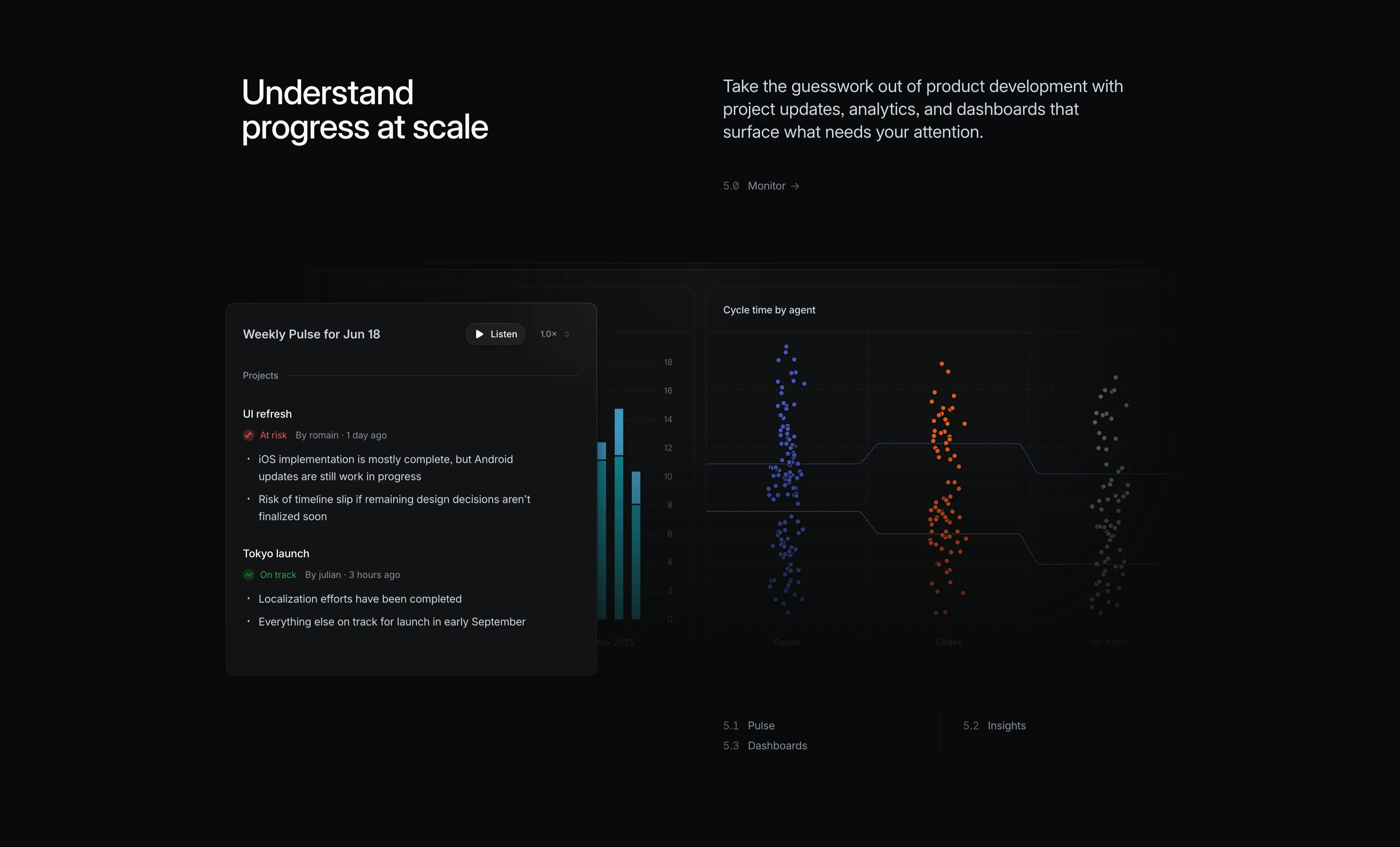
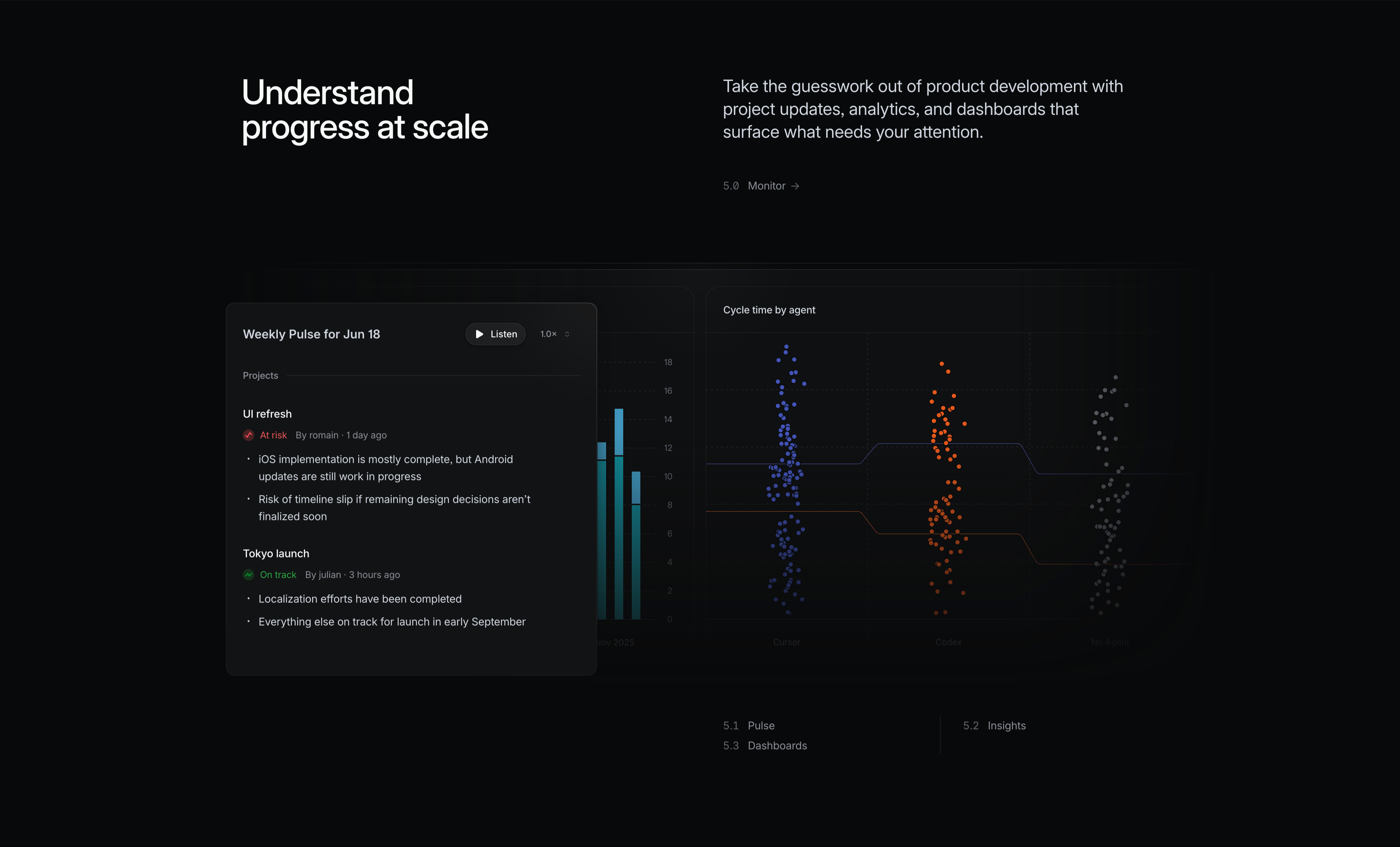
Linear Monitor Feature With Pulse And Charts
A dark 'Monitor' feature block. The left white headline reads 'Understand progress at scale'; the right grey copy says 'Take the guesswork out of product development with project updates, analytics, and dashboards that surface what needs your attention', with a small '5.0 Monitor →' label. Two analytics surfaces sit below. A foreground 'Weekly Pulse for Jun 18' card has a 'Listen' play button and 1.0× speed control, then project updates: 'UI refresh' flagged 'At risk' with bullet notes, and 'Tokyo launch' marked 'On track' with progress bullets. Behind it a partly-hidden bar chart and a large 'Cycle time by agent' panel show three colour-coded swarm/scatter clusters (blue, orange, grey) labelled Cursor, Codex and No Agent over a numeric y-axis, with trend lines comparing them. It conveys data-driven monitoring of progress and agent performance.
Linear ↗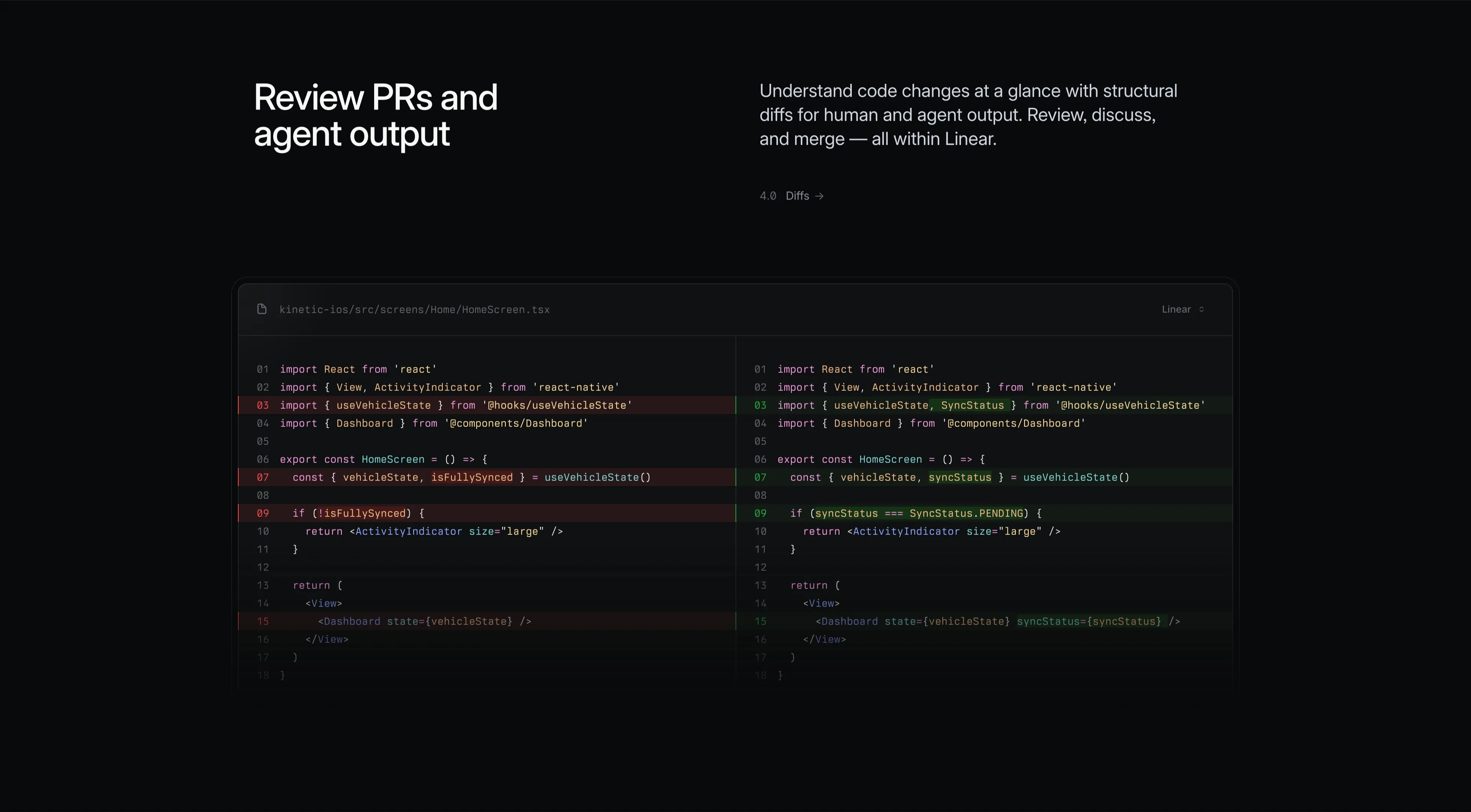
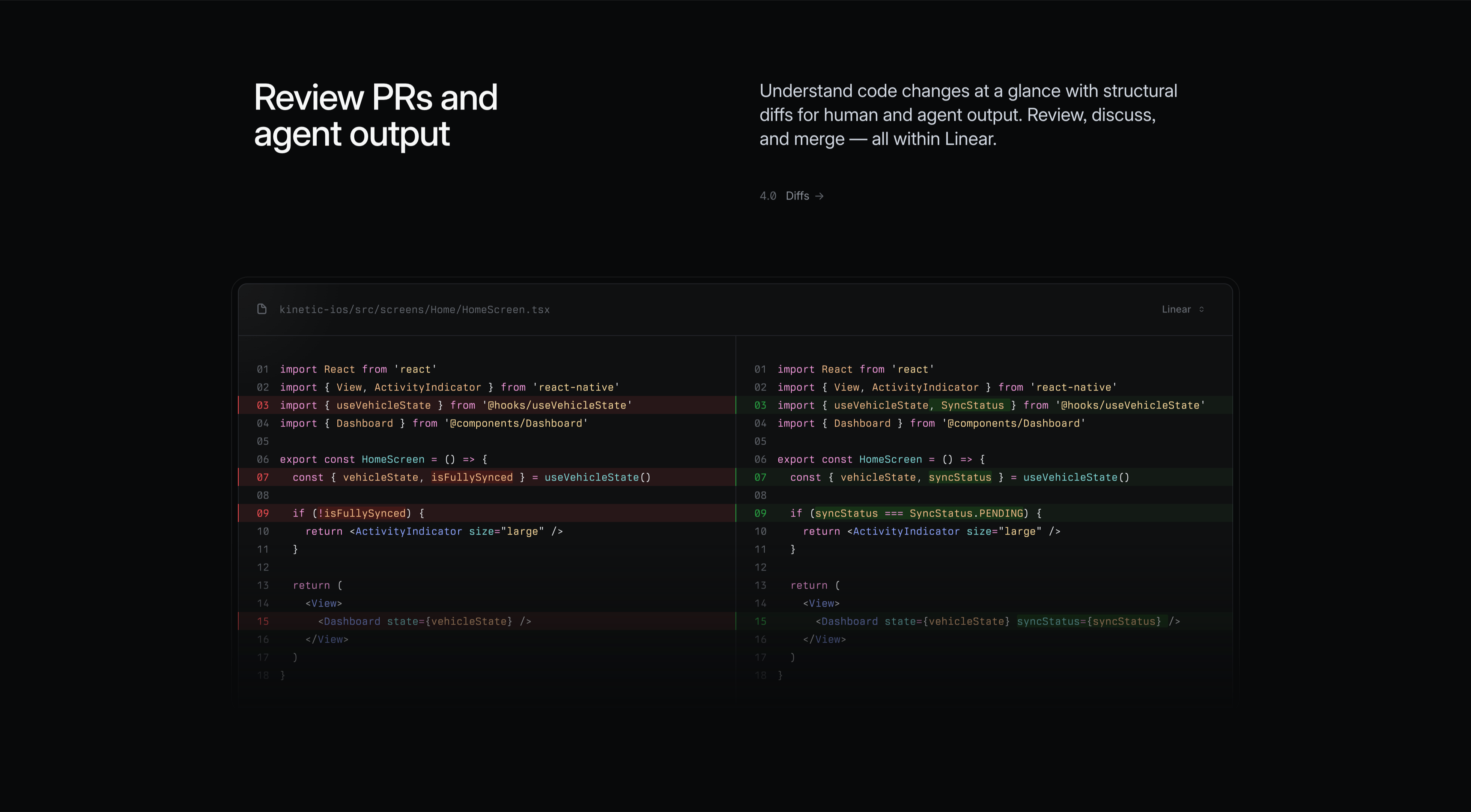
Linear Diffs Feature With Side-By-Side Code
A dark 'Diffs' feature block. The left headline in white reads 'Review PRs and agent output'; the right grey copy says 'Understand code changes at a glance with structural diffs for human and agent output. Review, discuss, and merge — all within Linear', with a small '4.0 Diffs →' label. The lower area is a wide split-pane code diff for the file 'kinetic-ios/src/screens/Home/HomeScreen.tsx', numbered lines 01–18 in a syntax-highlighted monospace font. The left pane highlights removed lines in red (e.g. 'isFullySynced', 'if (!isFullySynced)') and the right pane shows the added replacements in green ('SyncStatus', 'syncStatus === SyncStatus.PENDING', a new syncStatus prop on Dashboard). A 'Linear' source toggle sits in the top-right. The realistic before/after diff communicates in-app code review.
Linear ↗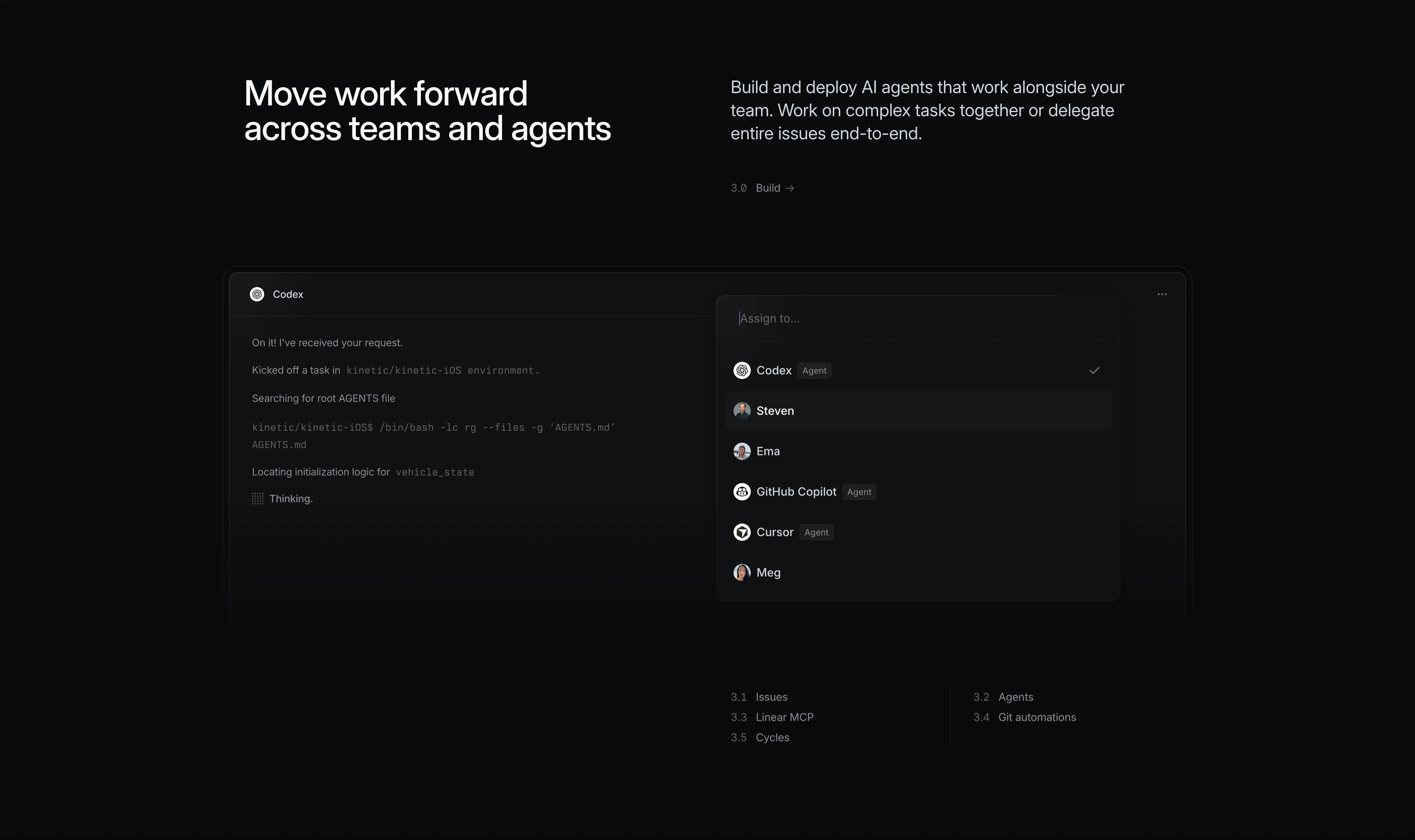
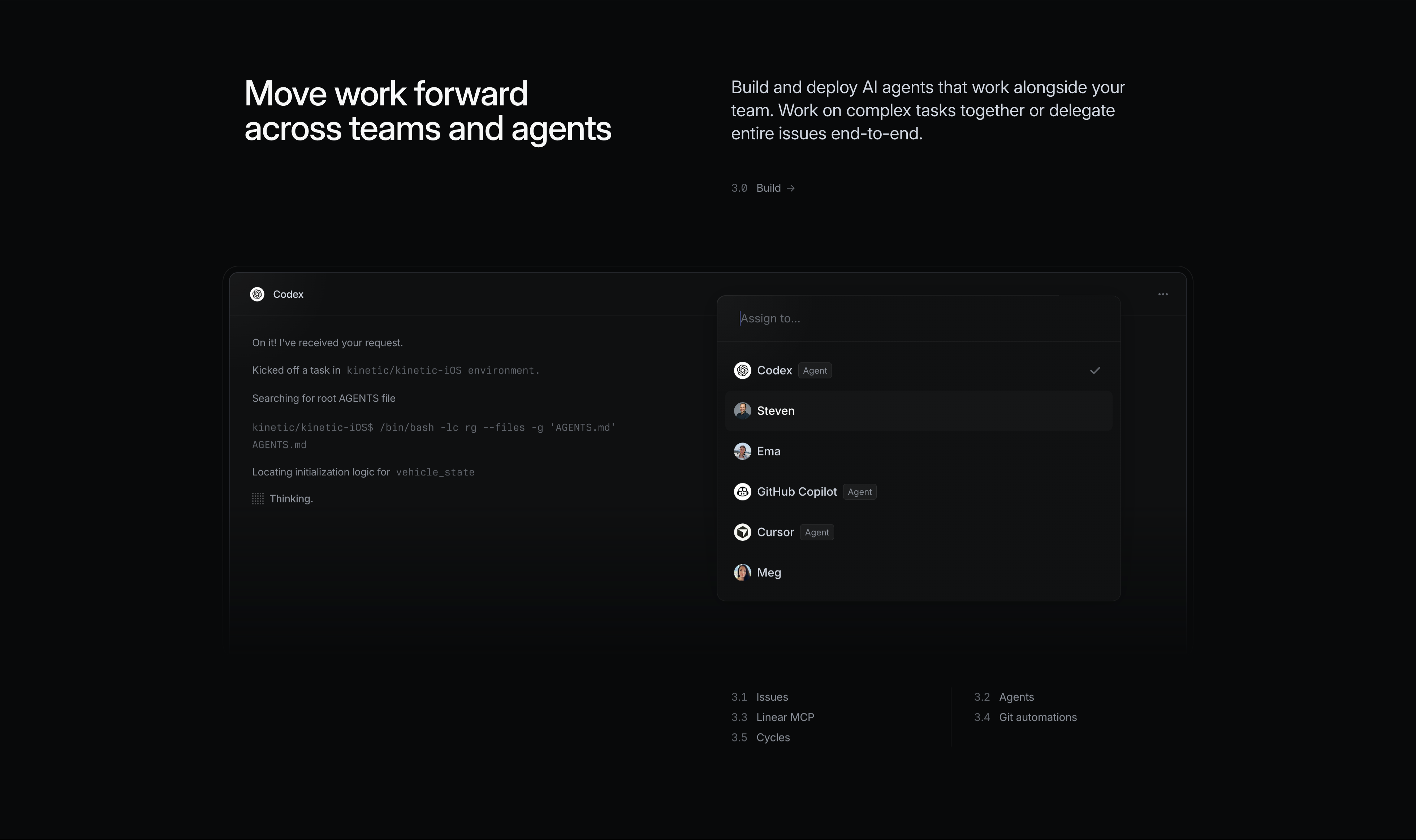
Linear Build Feature With Agent Assignment
A dark 'Build' feature block. The left shows a large white headline 'Move work forward across teams and agents'; the right carries grey copy, 'Build and deploy AI agents that work alongside your team. Work on complex tasks together or delegate entire issues end-to-end', with a small '3.0 Build →' label. The product surface below is an issue assigned to a 'Codex' agent: a chat-style log reads 'On it! I've received your request', 'Kicked off a task in kinetic/kinetic-iOS environment', 'Searching for root AGENTS file', a monospace shell command, and 'Thinking.' A floating 'Assign to…' dropdown lists a mix of humans and agents — Codex (Agent, checked), Steven, Ema, GitHub Copilot (Agent), Cursor (Agent), Meg — each with an avatar. Sub-links (3.1 Issues, 3.2 Agents, 3.3 Linear MCP, 3.4 Git automations, 3.5 Cycles) sit at the bottom. It shows delegating work to AI agents like teammates.
Linear ↗
Linear Plan Feature With Initiatives Timeline
A dark 'Plan' feature block. The left holds a large white headline 'Define the product direction'; the right pairs grey copy, 'Plan and navigate from idea to launch. Align your team with product initiatives, strategic roadmaps, and clear, up-to-date PRDs', with a small '2.0 Plan →' label. Below spans a roadmap/Gantt visualisation against a month scale (FEB through SEP). A dark 'Initiatives' panel on the left lists grouped items with counts — Core Product 99, Infra stability 28, Autonomous systems 16, Mobile apps 8, APAC Expansion 21, Japan Launch 12, Customer-driven priorities 9 — while the timeline to the right shows horizontal bars and milestone diamonds for 'UI Refresh', 'Split fares' and 'Autonomy status clarity', with phase labels like Core screens, Polish, Internal and Public Beta. A curved connector links dependent items. It conveys structured, long-range planning.
Linear ↗
Linear Intake Feature With Slack And Board
A dark feature block introducing the 'Intake' stage. A large white headline on the left reads 'Make product operations self-driving', paired on the right with grey supporting copy, 'Turn conversations and customer feedback into actionable issues that are routed, labeled, and prioritized for the right team', and a small '1.0 Intake →' label. The lower area layers two product surfaces: a floating Slack thread in '#feedback' where teammates lena, didier and andreas discuss a slow iOS launch, with a composer reading '@Linear create urgent issues and assign to me', overlapping a dimmed Linear board showing Todo and In Progress columns of issue cards (ENG-926 'Remove UI inconsistencies', ENG-2088 'TypeError', ENG-924 'Upgrade to Claude Opus 4.5', etc.) with Bug/Design/AI labels. A row of sub-links (1.1 Linear Agent, 1.2 Triage, 1.3 Customer Requests, 1.4 Linear Asks) anchors the bottom. It shows feedback turning straight into triaged issues.
Linear ↗
Linear Three-Up Feature Grid With Line Illustrations
A dark feature section opening with a large two-tone headline where 'A new species of product tool.' is bright white and the continuation 'Purpose-built for modern teams with AI workflows at its core, Linear sets a new standard for planning and building products.' fades to grey. Below sits a three-column grid divided by thin vertical rules. Each column is labelled with a small monospace figure number (FIG 0.2, FIG 0.3, FIG 0.4) above a delicate white wireframe isometric illustration — a stacked slab, a cluster of cubes, and a fanned set of cards. Under each illustration is a white bold title and a short grey paragraph: 'Built for purpose', 'Powered by AI agents', and 'Designed for speed'. The technical, blueprint-like aesthetic on black gives the section an engineered, premium feel.
Linear ↗

Linear Customer Logo Strip
A single full-width logo cloud on a solid near-black background. Eight customer wordmarks sit in one evenly-spaced horizontal row, rendered in flat white for a uniform look: Vercel, Cursor, Oscar, OpenAI, Coinbase, Cash App (with its green-on-white 'S' glyph), Boom, and Ramp. There is no heading or surrounding copy — just the brands, generous padding above and below, and lots of negative space. The minimal monochrome treatment reads as quiet social proof, signalling that well-known tech companies use the product without competing with the hero above it.
Linear ↗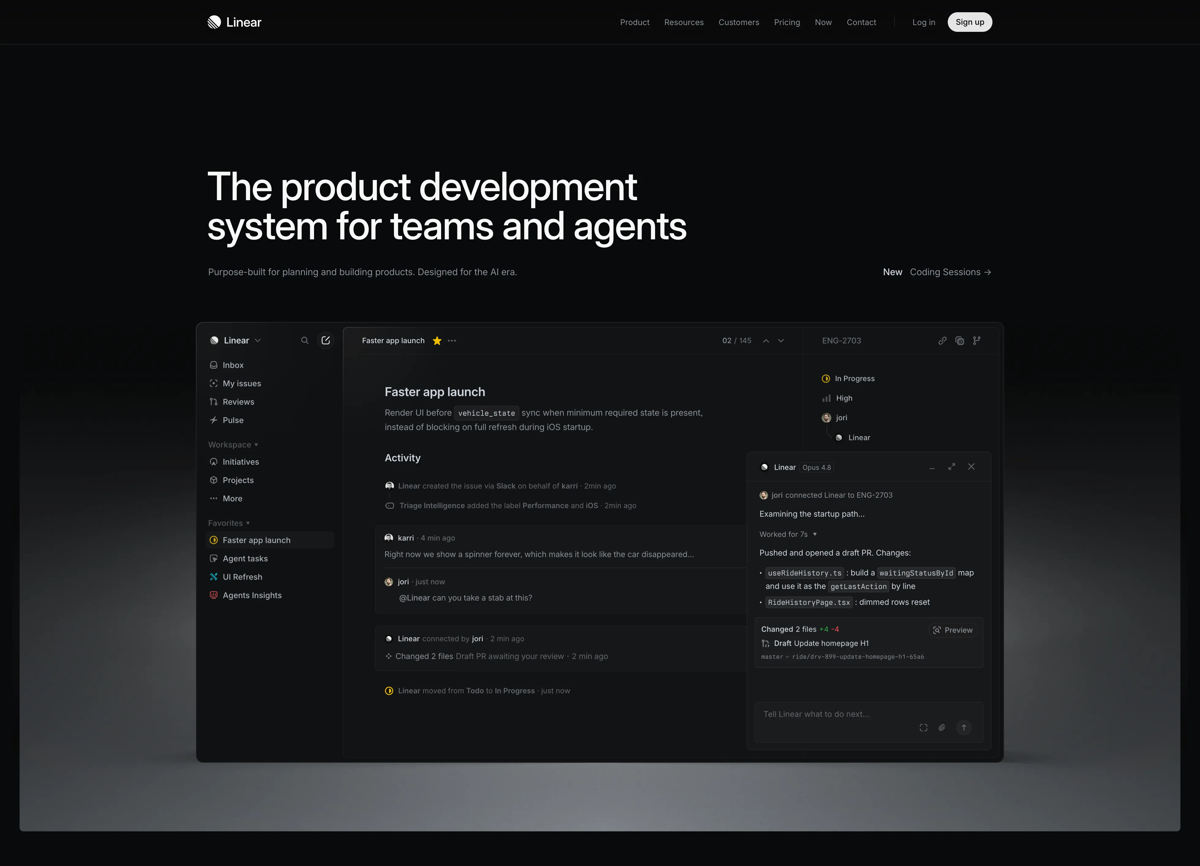
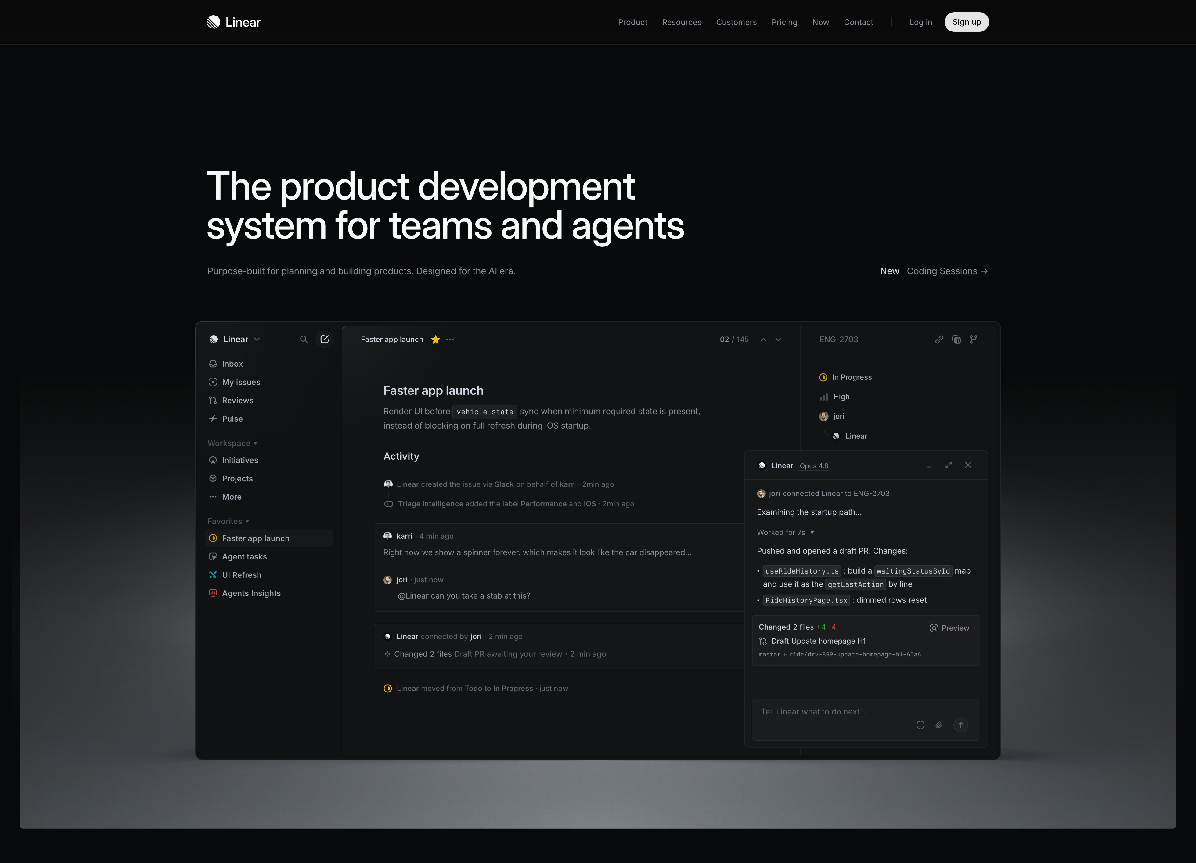
Linear Dark Hero With App Preview
A full-bleed dark hero on near-black. A slim top nav carries the Linear wordmark on the left, centred links (Product, Resources, Customers, Pricing, Now, Contact), and a 'Log in' link beside a white pill 'Sign up' button on the right. Below, a very large white sans-serif headline reads 'The product development system for teams and agents', with a one-line grey subhead 'Purpose-built for planning and building products. Designed for the AI era.' and a right-aligned 'New — Coding Sessions →' link. Dominating the lower half is a large rounded screenshot of the Linear app in dark mode: a left sidebar (Inbox, My issues, Reviews, Pulse, Workspace, Favorites), a central issue 'Faster app launch' with an activity feed, and a floating AI agent panel ('Linear · Opus 4.8') showing a drafted PR. The screenshot sits on a soft grey reflective floor. Confident, high-contrast, product-led hero.
Linear ↗
UrbanLeaf How We Work Icon Cards
A 'How We Work' section on white using an asymmetric two-part header: a small grey 'How We Work' pill sits on the left while a large dark-green paragraph fills the right, describing an approach 'rooted in observation, collaboration, and ongoing care.' Below the header is a three-up row of pale mint-green rounded cards. Each card has a small white rounded icon tile at the top — an eye, a sprout, and a hand holding a heart — followed by a bold dark-green title ('Observe', 'Grow', 'Care') and a short grey paragraph explaining that step of the process. The light-green cards, simple line icons and clear three-step progression make it an approachable process/feature section.
Behance ↗
UrbanLeaf Mission Three-Card Image Grid
An 'Our Mission' section on white, opening with a grey pill, a centered two-line dark-green headline 'To reconnect people with the nature around them.', and a two-line grey subhead about restoring attention to overlooked places. Below sits a three-up row of tall rounded cards, each filled edge-to-edge with a soft, blurred green nature photograph (grasses, leaves, foliage). Each card carries a white title near the top — 'Growing together', 'Designing with care', and 'Sustaining what we grow' — and a small translucent dark box near the bottom holding a few lines of supporting body copy about collaboration, reading each space, and long-term care. The trio of equal photographic cards in muted greens makes the mission feel tactile and consistent.
Behance ↗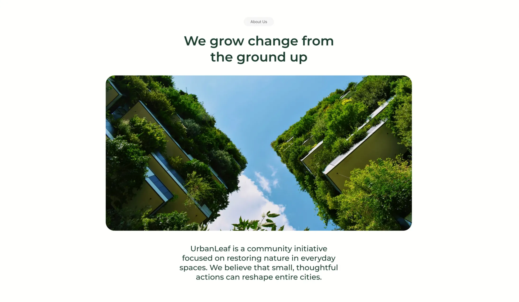
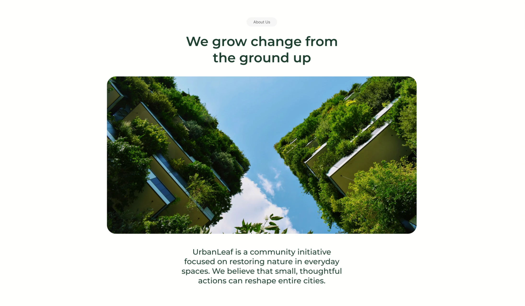
UrbanLeaf About Section With Vertical-Garden Image
A centered 'About Us' content block on a white background. A small grey 'About Us' pill sits at the top, followed by a two-line dark-green headline reading 'We grow change from the ground up'. Beneath the heading is a single large rounded-corner photograph looking straight up between two tall buildings whose facades are completely covered in lush green vertical gardens, framing a bright blue, lightly clouded sky down the centre. Below the image, a short centered dark-green paragraph introduces the organisation: 'UrbanLeaf is a community initiative focused on restoring nature in everyday spaces. We believe that small, thoughtful actions can reshape entire cities.' The symmetrical, image-led, centered composition with lots of whitespace gives it a quiet editorial feel.
Behance ↗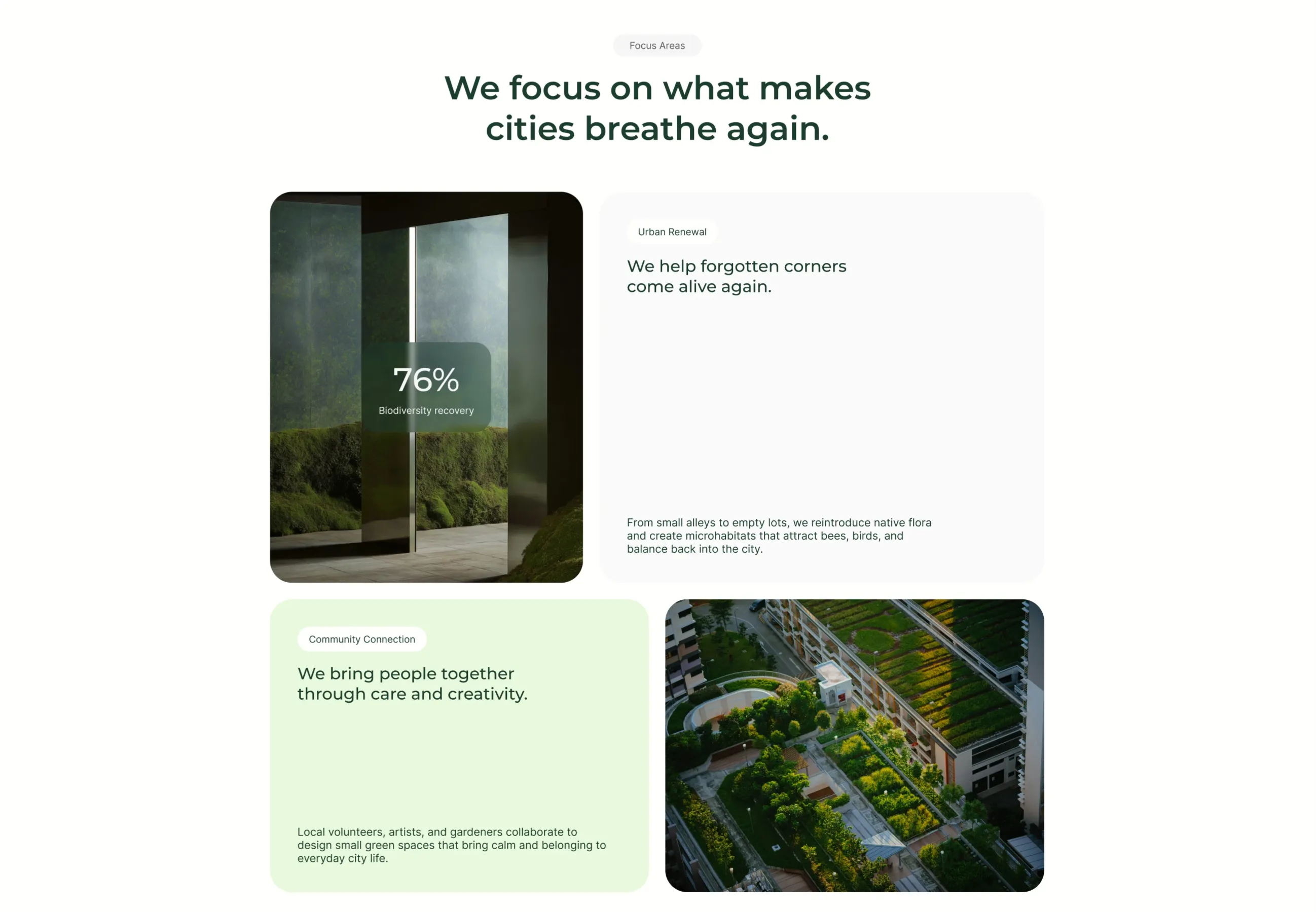
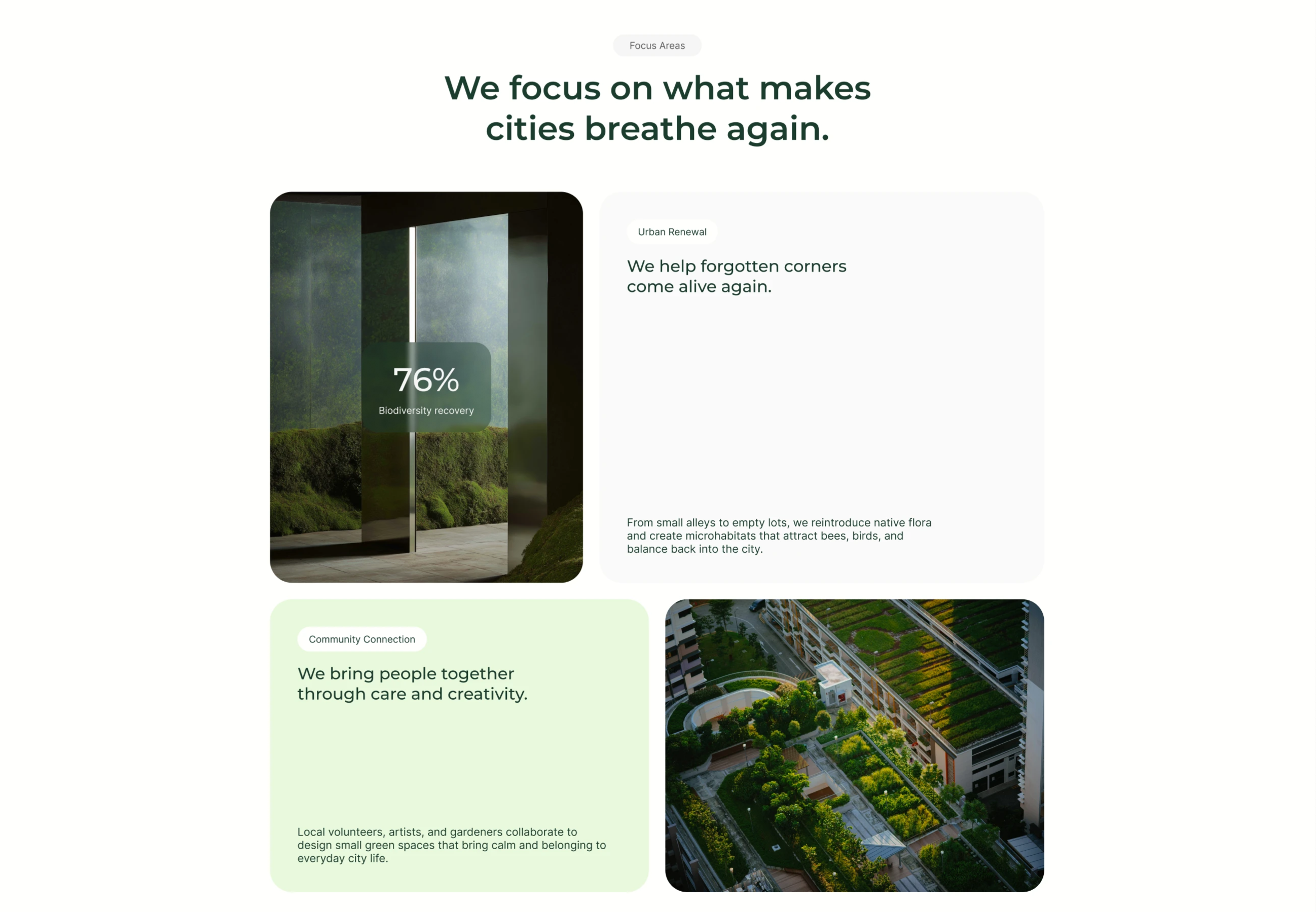
UrbanLeaf Focus Areas Bento Grid
A 'Focus Areas' section on white, introduced by a grey pill and a centered two-line dark-green heading, 'We focus on what makes cities breathe again.' Below it sits a 2×2 bento grid of rounded tiles. Top-left is a photo of a mossy interior with a translucent dark-green card overlaid showing a large '76%' stat and the label 'Biodiversity recovery'. Top-right is a tall white card headed by an 'Urban Renewal' pill, a dark-green sub-headline 'We help forgotten corners come alive again.', and a smaller grey paragraph anchored at the bottom about reintroducing native flora and creating microhabitats. Bottom-left is a pale-green card with a 'Community Connection' pill, the headline 'We bring people together through care and creativity.', and a supporting paragraph. Bottom-right is an aerial photograph of a terraced rooftop garden among buildings. The mix of image tiles, stat overlay and text cards in alternating white/green creates a balanced bento layout.
Behance ↗
UrbanLeaf Centered Hero With Aerial Image
A centered hero on a clean white background. At the top sits a small grey 'Project Overview' pill, beneath it an oversized dark-green serif/sans display headline reading 'The Bloom Initiative', and below that a one-line subhead, 'A community effort to reintroduce native flora to forgotten city corners.' A single soft pill-shaped pale-green button labelled 'Join The Initiative' acts as the primary call to action. Under the button, a very wide rounded-corner photograph fills most of the width — an aerial, top-down view of a patchwork of green fields and vegetation in deep forest-green tones. Below the image, a small grey 'Description' pill on the left pairs with a large dark-green paragraph on the right that begins 'Every small patch of green matters…', explaining the initiative. The generous whitespace, single accent colour and centered stack make it a calm, editorial nonprofit hero.
Behance ↗
UrbanLeaf Oversized Wordmark Footer
A minimal footer on white anchored by an enormous dark-green 'URBANLEAF' wordmark that spans the full width and is cropped by the top edge. Below sit two link columns — 'Pages' (About, Projects, FAQ, Contact) and 'Social' (Instagram, LinkedIn, TikTok as underlined links) — set in dark green. To the right, a 'Newsletter' block holds a rounded email input labelled 'Email Adress' with a circular arrow submit button, plus a small grey note about sharing information per the privacy policy. A centered copyright line, '© 2025 UrbanLeaf. Designed for a cleaner future.', closes the section. Generous whitespace keeps the oversized type as the focal point.
Behance ↗

UrbanLeaf Full-Bleed Join CTA
A full-bleed call-to-action band filled edge to edge with a soft, blurred photograph of green rolling hills under a pale, hazy sky. Centered over the imagery sits a single translucent pale-green pill button carrying a small light-green circular dot on the left and dark-green label text, 'Join UrbanLeaf Today.' There is no other copy, navigation or competing element — the lone frosted button floats on the landscape. The muted green-and-grey palette, gentle motion blur and generous negative space give the section a calm, immersive feel, focusing all attention on the single conversion action that closes the page.
Behance ↗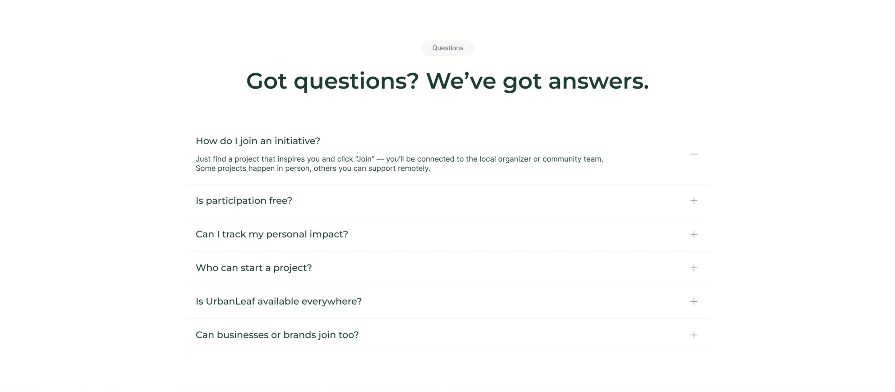
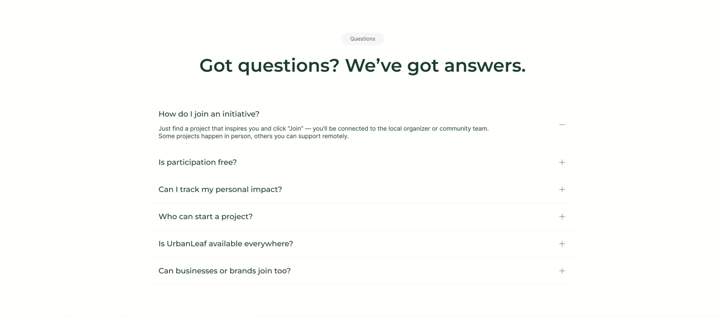
UrbanLeaf FAQ Accordion
A centered FAQ section on white. A small grey 'Questions' tag sits above an oversized dark-green headline, 'Got questions? We've got answers.' Below runs a single-column accordion of six question rows separated by hairline dividers, each showing the question on the left and a toggle control on the right. The first row, 'How do I join an initiative?', is expanded with a minus icon and reveals its answer: find a project, click 'Join', and connect with the local organizer, with some projects in person and others remote. The remaining rows stay collapsed with plus icons and cover participation cost, tracking personal impact, who can start a project, availability, and whether businesses can join. Roomy spacing and a quiet palette make it easy to scan.
Behance ↗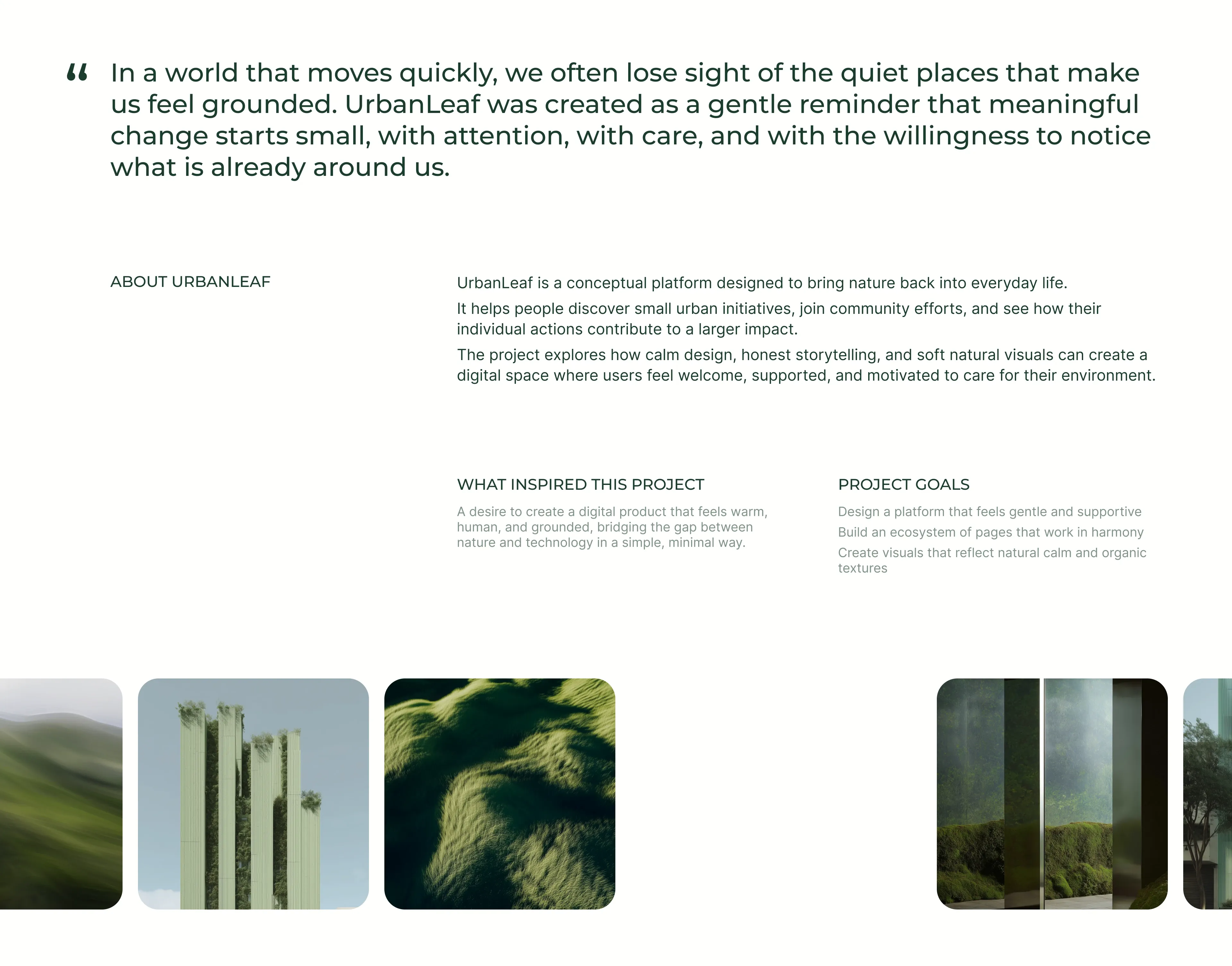
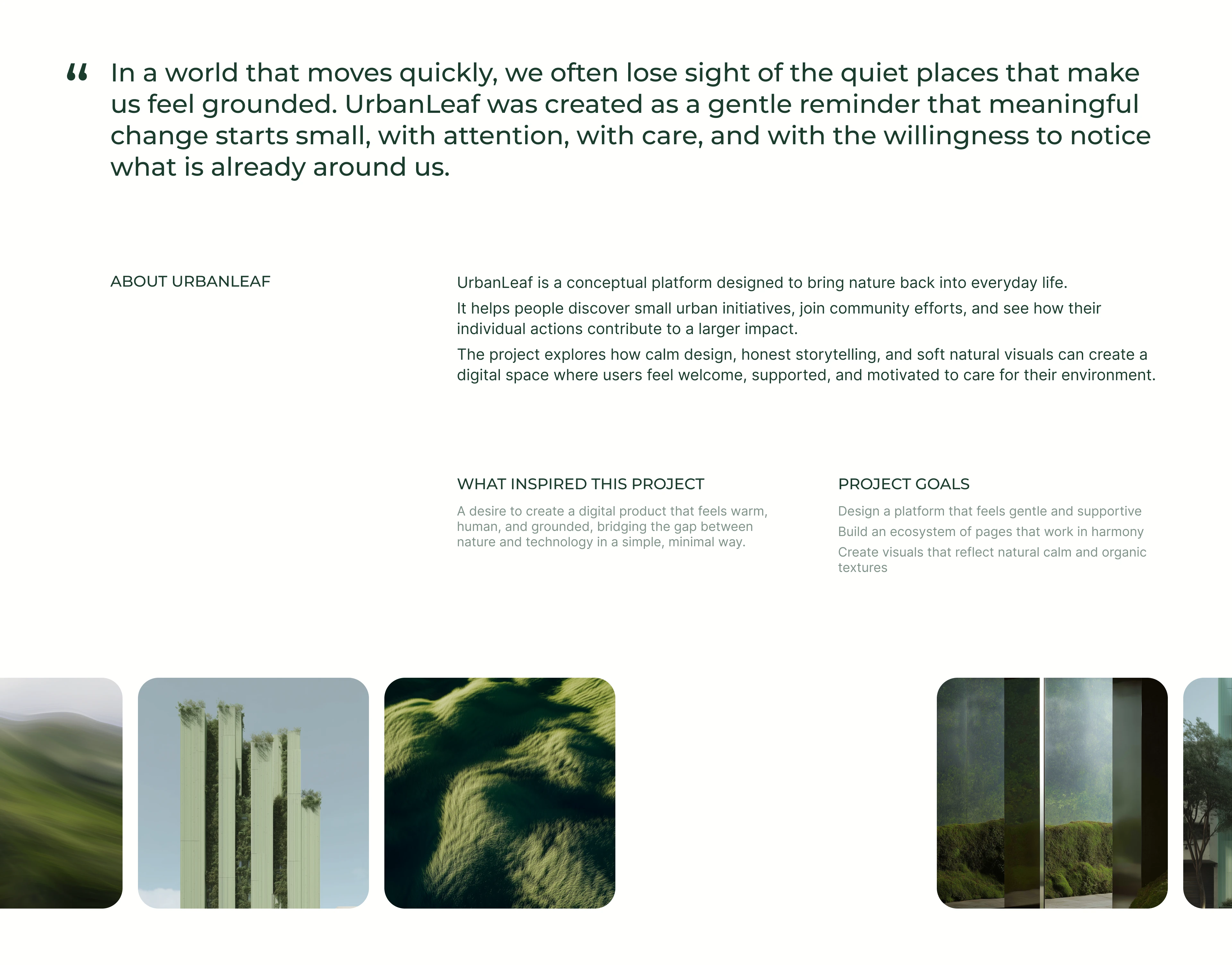
UrbanLeaf About And Project Goals
A calm, editorial about section on white. It opens with an oversized dark-green pull-quote marked by a quotation glyph, reflecting on losing sight of quiet, grounding places and framing UrbanLeaf as a gentle reminder that change starts small. Beneath sits a multi-column text block under a small 'ABOUT URBANLEAF' label: three dark paragraphs explain that UrbanLeaf is a conceptual platform bringing nature into everyday life, helping people find urban initiatives and see their collective impact. Two lighter sub-columns headed 'WHAT INSPIRED THIS PROJECT' and 'PROJECT GOALS' add supporting detail, the latter as a short three-line list. A full-width row of rounded nature photographs (rolling hills, plant-covered towers, grassy textures and mossy mirrored panels) anchors the bottom, bleeding off both edges.
Behance ↗
Mission Statement With Image Pair
A mission section on white opening with a centered grey 'Our Mission' pill above a large two-line green headline, 'We believe small actions create big change.' Below sits a two-column layout: the left column is a tall rounded photo of a lone tree on rolling green hills, while the right column stacks two blocks. The upper right block is a rounded abstract image of flowing green ridges with a white pill button labelled 'Learn How It Works' overlaid at its lower-left. The lower right block is a soft mint-green card whose heading reads 'UrbanLeaf connects people with eco-initiatives in their city,' with a smaller supporting line, 'From planting trees to clean-up events, every small step matters,' anchored at its bottom. The balanced split of one tall image against a stacked image-plus-card column creates a restful, editorial rhythm.
Behance ↗
Eco Hero With Image Carousel
A center-aligned hero on a clean white background that flows into a full-width image carousel. The top stacks a small grey 'Start Here' pill, an oversized two-line display headline in deep forest green reading 'Make your city greener. One action at a time.', a single grey subhead 'Join local eco-initiatives and see your impact grow.', and two centered pill buttons - a soft mint-green filled 'Explore Projects' primary and a white outlined 'Join As Volunteer' secondary. Directly below runs an edge-to-edge row of equally sized rounded photo tiles with a unified green nature theme: a tree-lined urban path, rolling hills, planted vertical towers, an aerial park walkway, a grassy hillside, and a final tile bleeding off the right edge to signal horizontal scroll. The restrained palette, generous whitespace, and geometric sans-serif give the block a calm, premium feel while the clipped last tile invites the visitor to keep browsing.
Behance ↗
Professional Cleaning Service Panel
A professional-cleaning service panel pairing copy, price, method tags, and a feature checklist with a gloved-hand instrument image and a booking CTA.
Behance ↗
Dental Implants Service Panel
A dental-implants service panel pairing a clinical photo with a description, price, method tags, a feature checklist, and a booking CTA.
Behance ↗
Oral Surgery Accent Service Panel
An oral-surgery service panel on a bright accent-blue card with price, method tags, and feature list, paired with a patient treatment photo.
Behance ↗
Teeth Whitening Dark Service Panel
A teeth-whitening service panel on a dark card with price, method tags, and feature list, paired with a patient treatment photo on the right.
Behance ↗
Our Dental Services Split Hero
A split hero pairing a value headline, supporting copy, and a consultation CTA with a large clinic interior image carrying a floating 'Lifetime Smile Care' badge.
Behance ↗
Before And After Smile Comparison
A before-and-after section with a heading, intro, and booking CTA above a split-slider smile comparison flanked by additional result thumbnails.
Behance ↗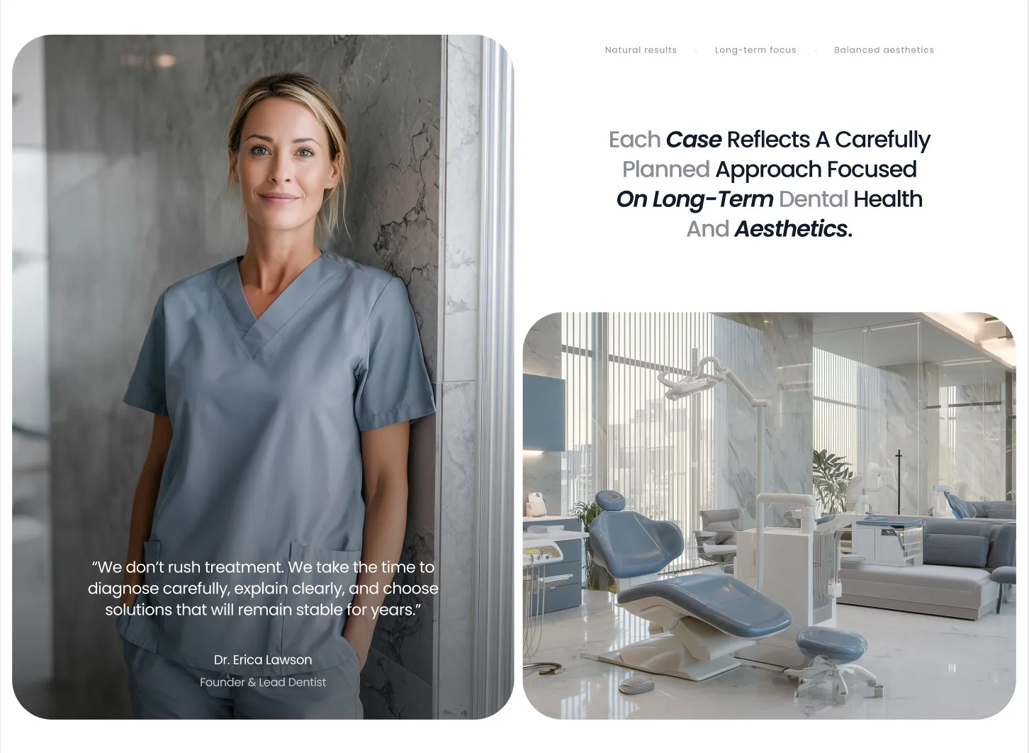
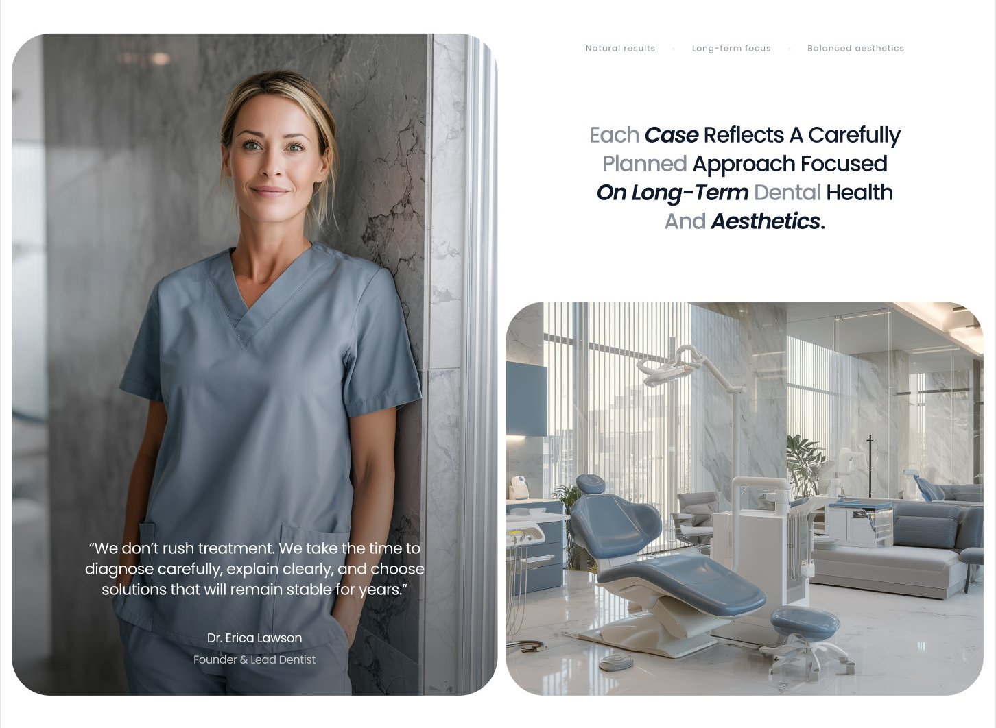
Carefully Planned Treatment About Block
An about block pairing a tall founder portrait with an overlaid quote and a clinic interior image alongside a centered statement about long-term dental health.
Behance ↗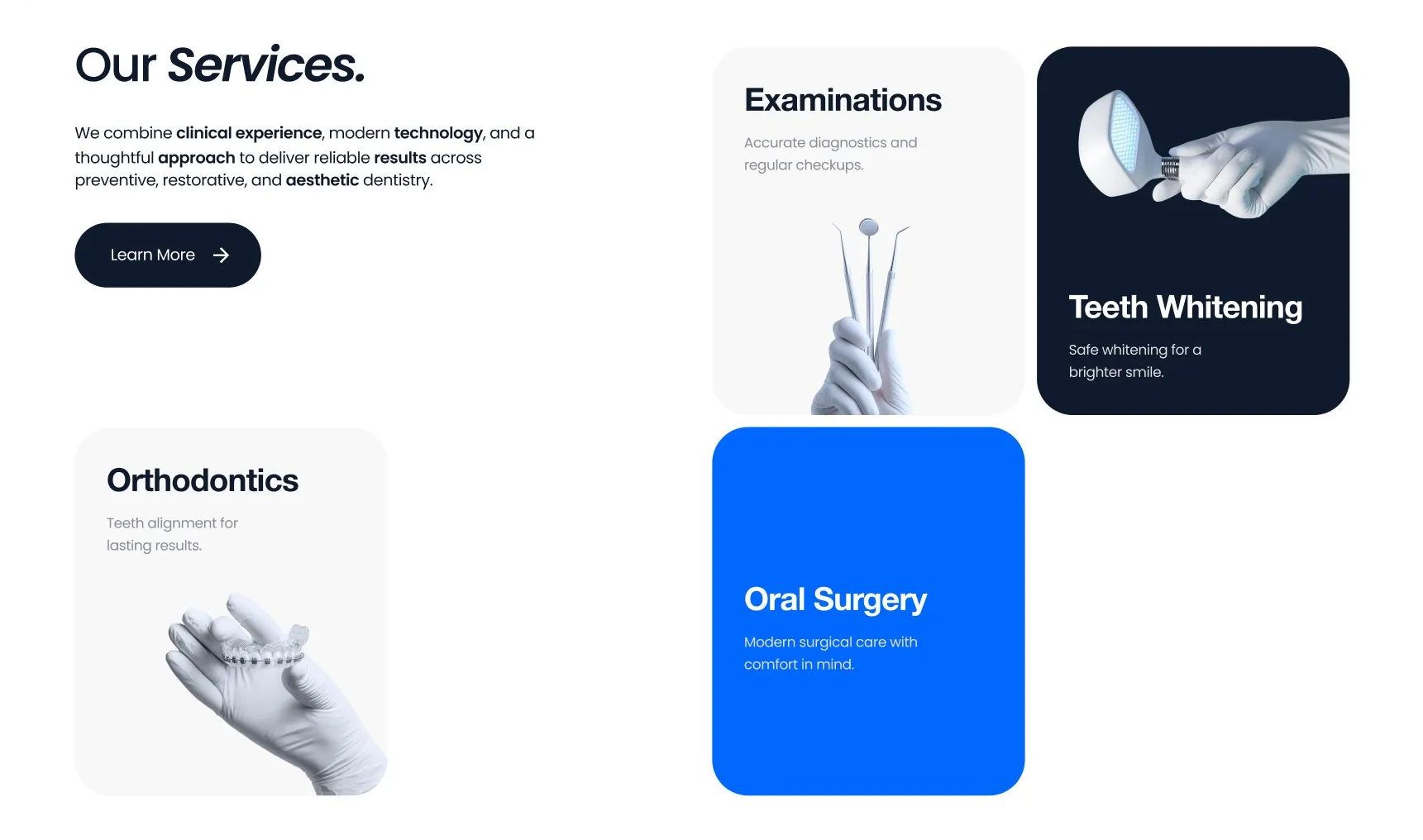
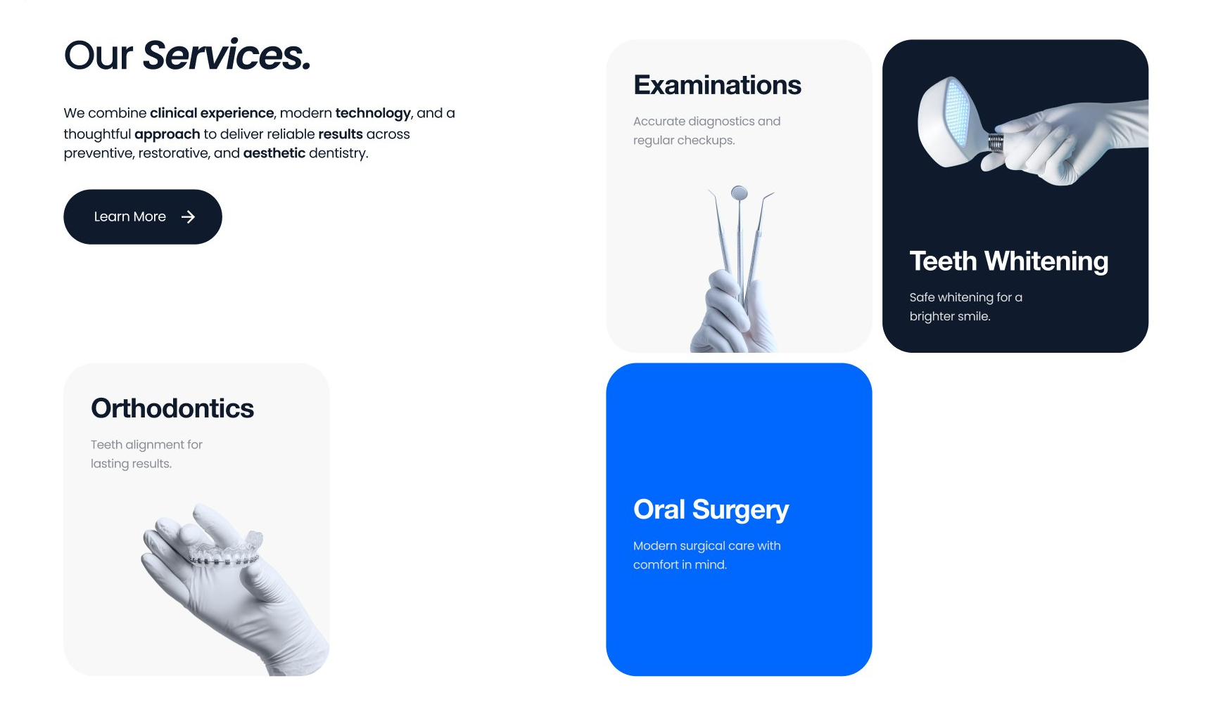
Our Services Mixed Card Grid
A services section pairing an intro and CTA with an asymmetric grid of service cards in white, grey, dark, and accent-blue treatments for visual rhythm.
Behance ↗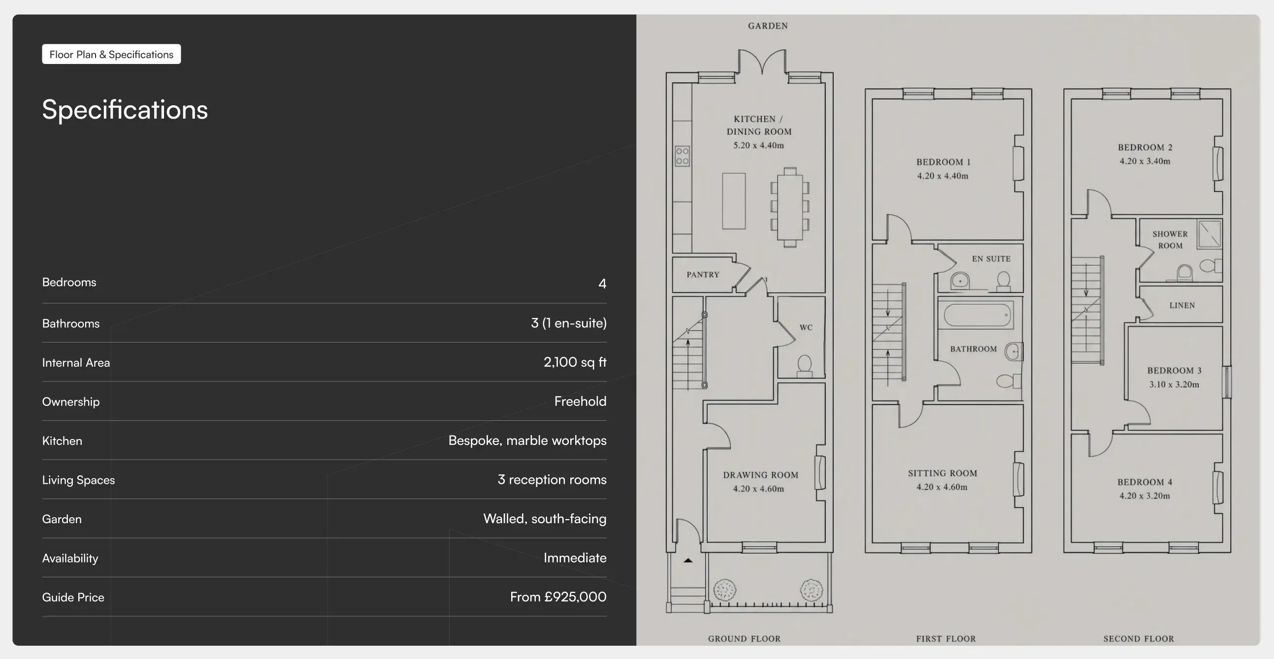
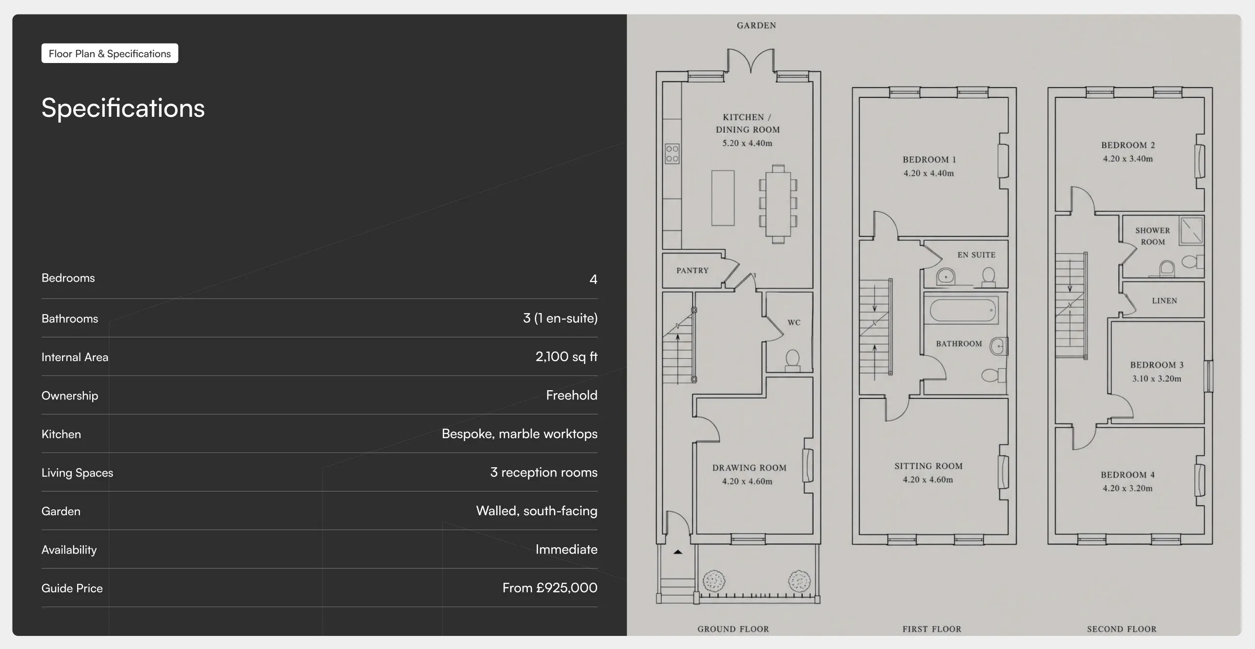
Avenor Specifications & Floor Plan
A two-panel split layout pairing a dark specifications table on the left, with label and value rows for key property details, against a light floor plan panel on the right showing room layouts across multiple levels. Best used on property pages to present technical specs alongside a visual floor plan.
Dribbble ↗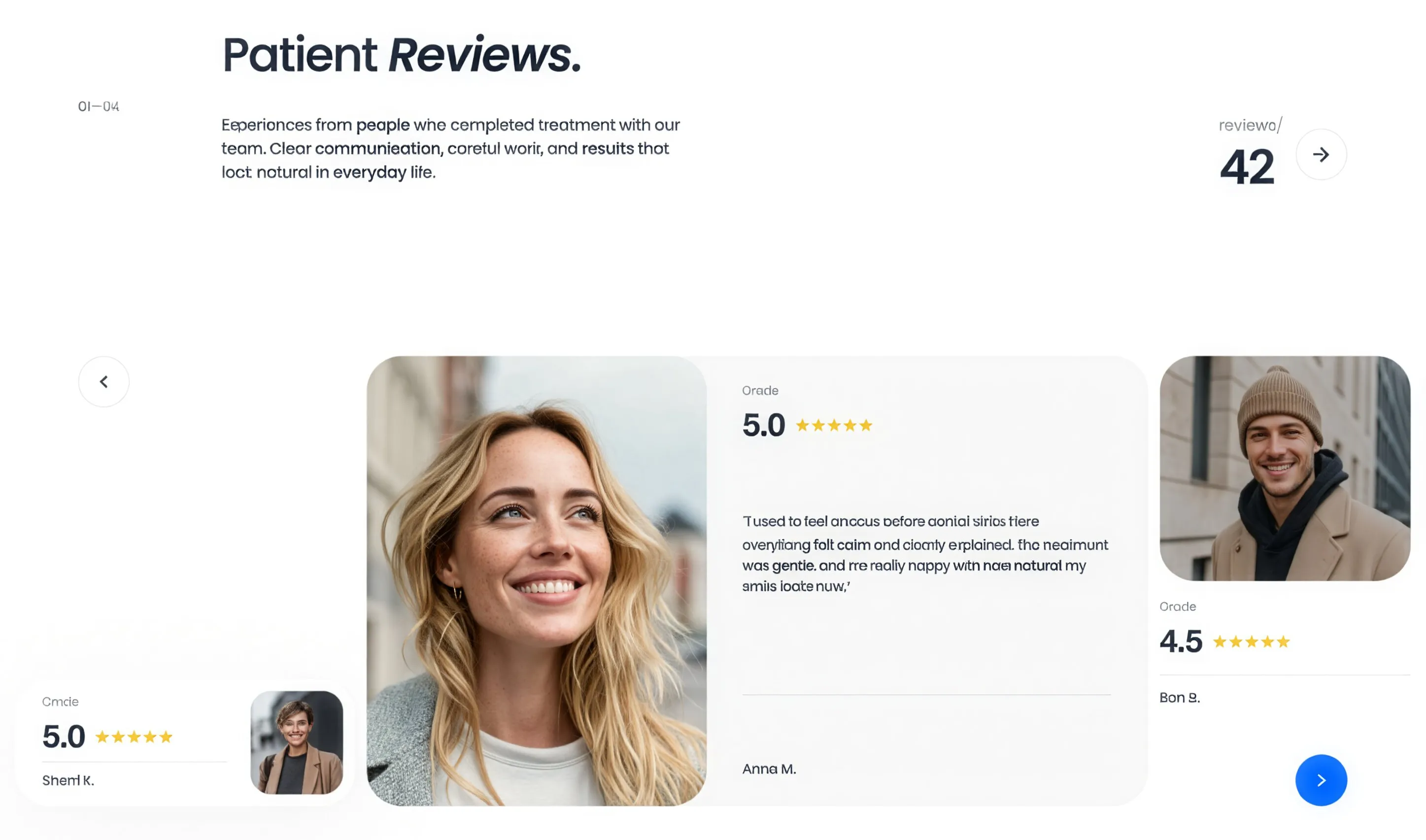
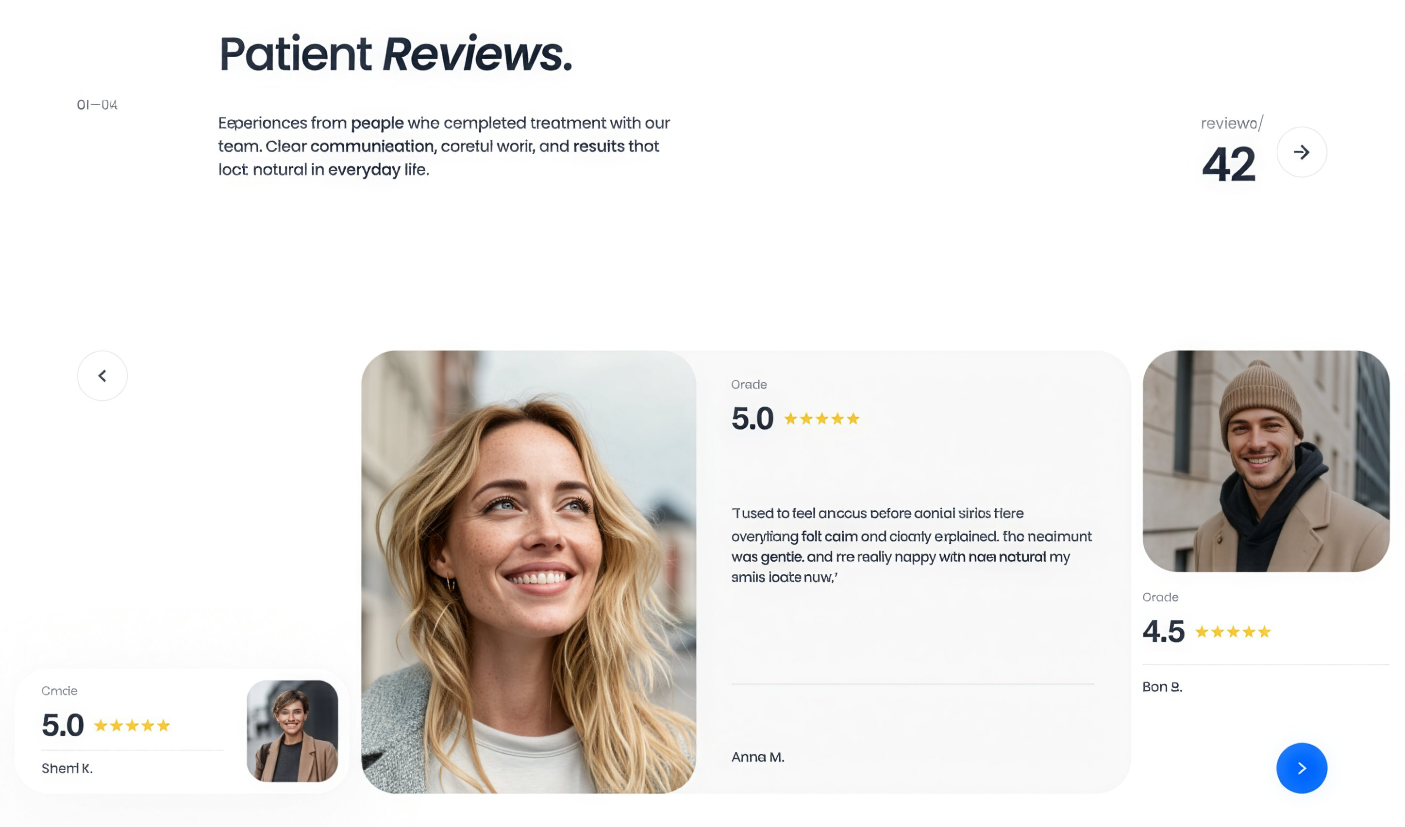
Patient Reviews Testimonial Carousel
A patient reviews section pairing an intro and review count with a sliding testimonial card carousel showing patient photos, star ratings, and quotes.
Behance ↗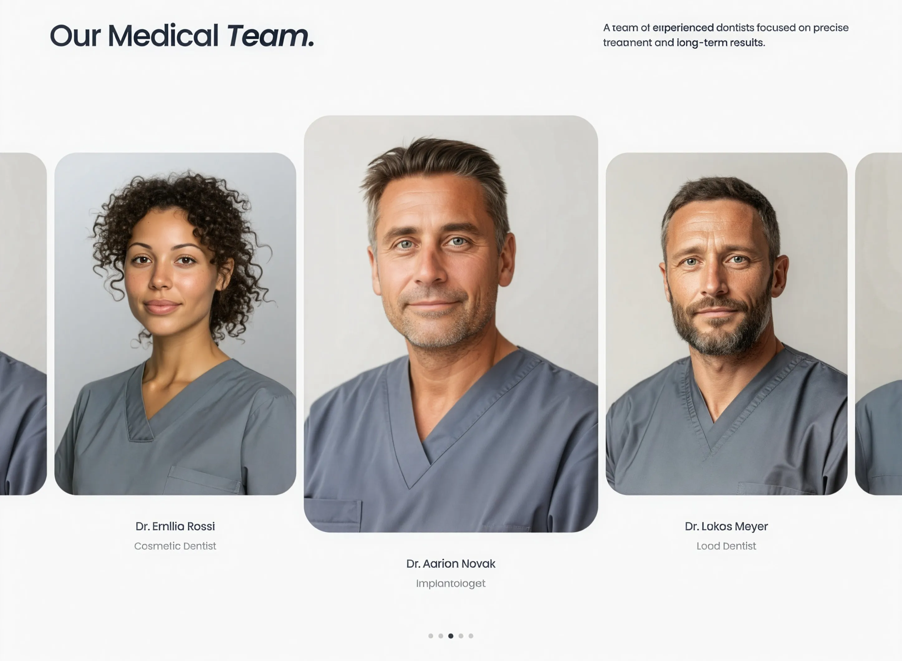
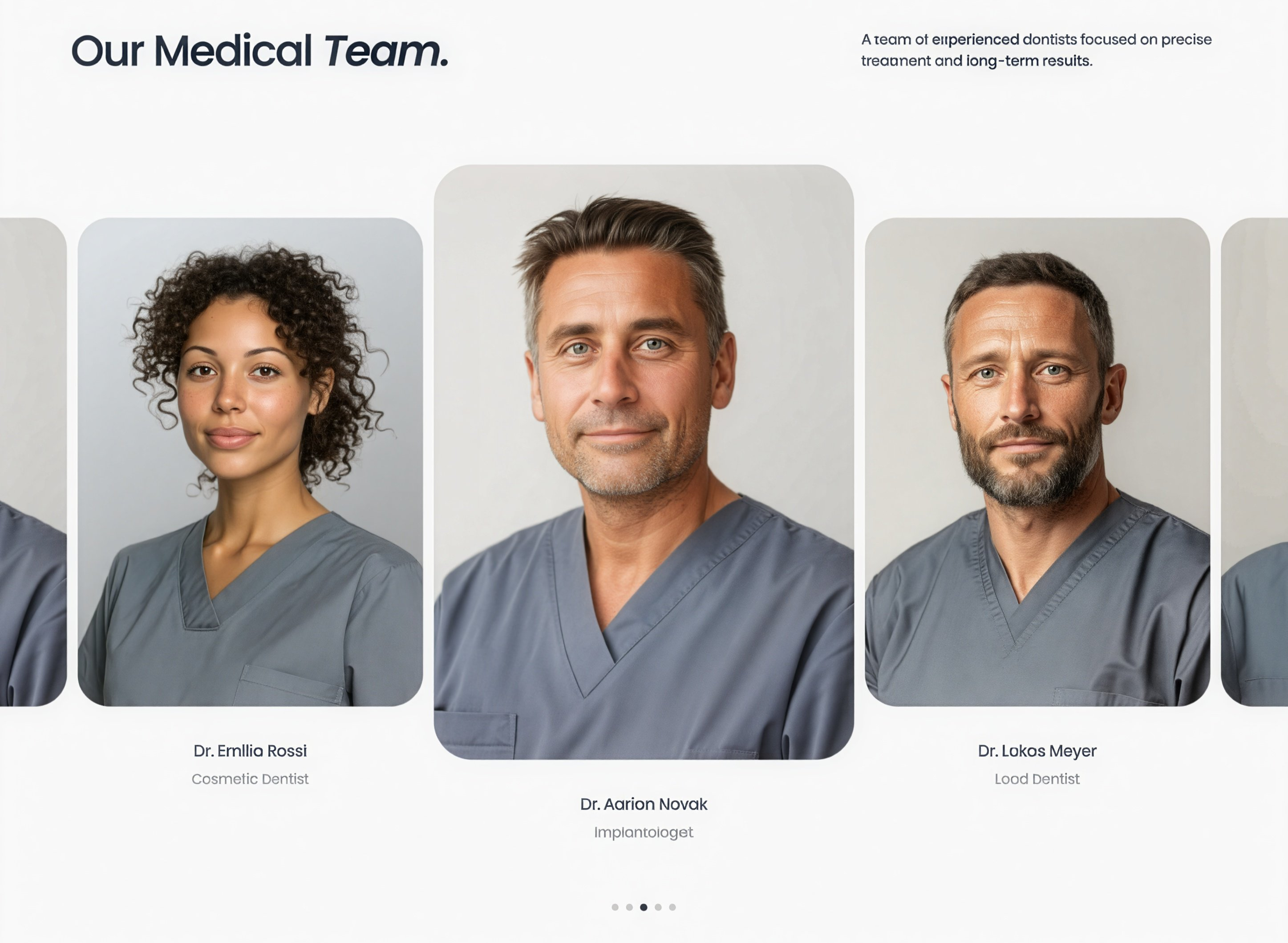
Our Medical Team Portrait Carousel
A team section with a centered, scaled-up active portrait flanked by smaller cards, each labeled with the dentist's name and specialty, plus pagination dots.
Behance ↗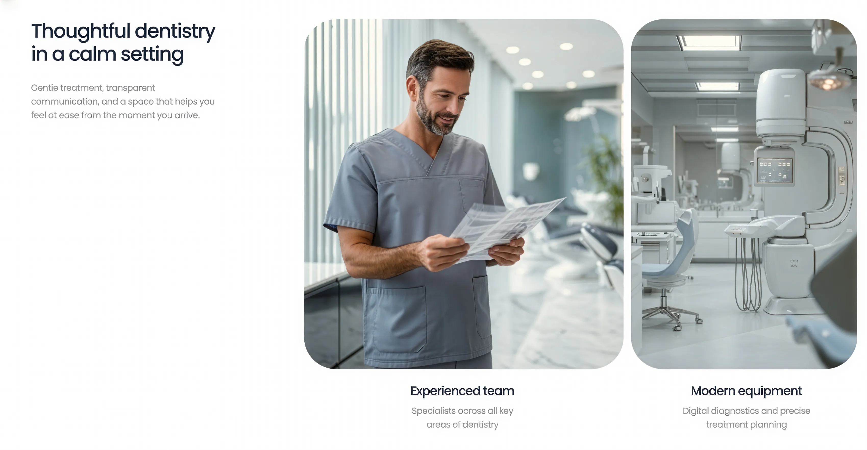
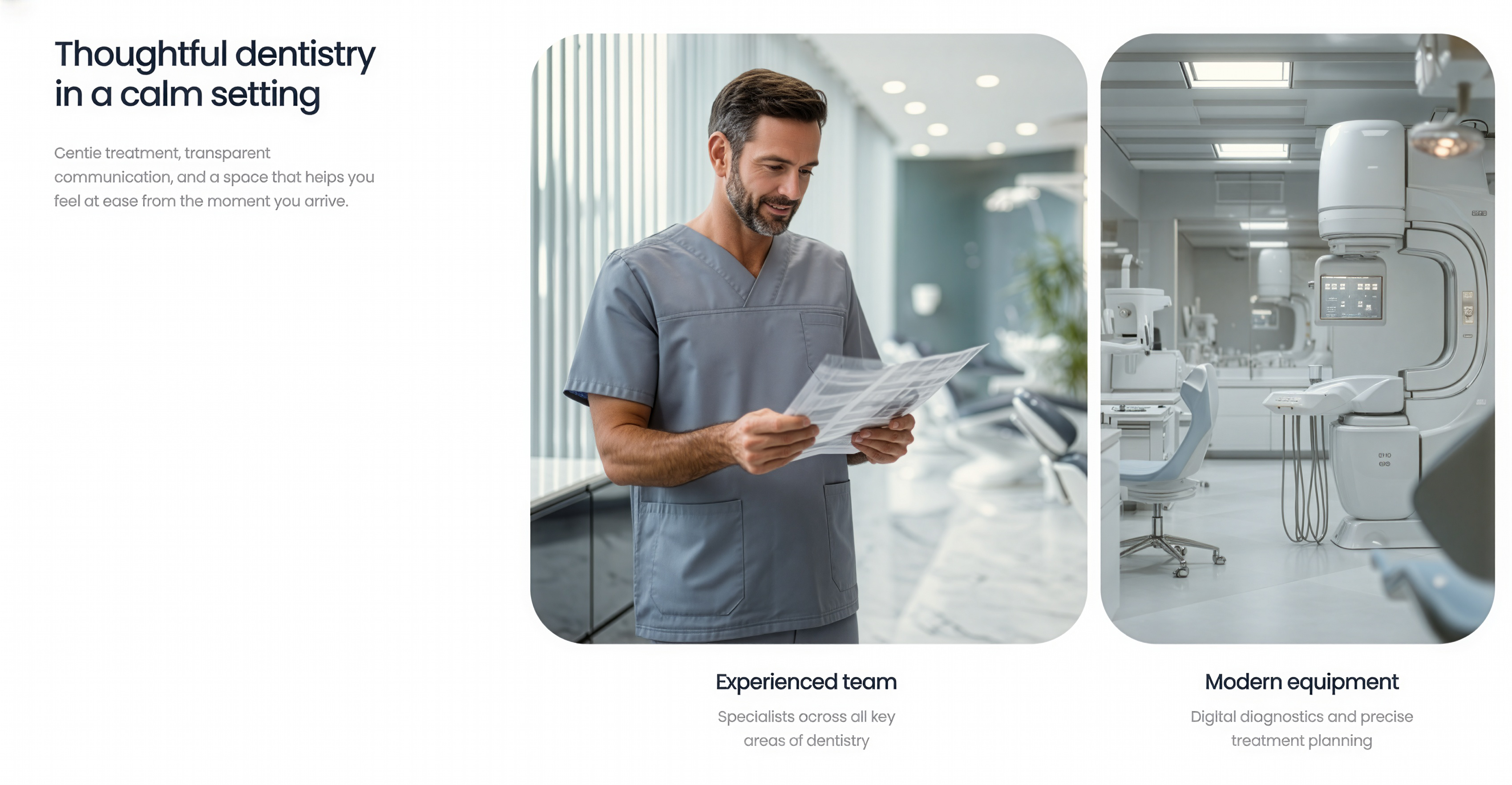
Intro Text with Image Cards
A multi-column section pairing an introductory headline and supporting copy on the left with a row of rounded image cards on the right, each captioned below with a title and short description. Best used to introduce a topic while highlighting two or more supporting points visually.
Behance ↗
Split Hero with Stats
A two-column hero pairing a large headline, supporting copy, and a primary call-to-action button on the left with a full-height image on the right, topped by a logo and navigation bar and overlaid with floating stat cards and a partner logo strip. Best used at the top of a service or business page to introduce the brand and showcase key metrics at a glance.
Behance ↗
Nfinite FAQ Accordion, Split Layout
A two-column FAQ section pairing a badge label and large headline on the left with a stacked list of expandable accordion items on the right, each revealing its answer when opened. Best used to address common questions and reduce friction before a visitor converts.
Nfinitepaper ↗
Nfinite News Article Slider
A horizontal slider of large article cards, each with a full-bleed image, an overlaid headline, a press-release date label, and an arrow link, introduced by an oversized split heading and controlled with previous and next navigation. Best used to surface recent news, press releases, or blog posts in a browsable, editorial layout.
Nfinitepaper ↗
Avenor Footer with CTA & Oversized Logo
A dark full-width footer pairing a closing call-to-action headline, supporting text, and a button on the left with multi-column navigation links on the right, anchored by an oversized brand logo and a bottom bar for copyright, social links, and legal pages. Best used as the closing section of a site to prompt a final action and surface site-wide navigation.
Dribbble ↗
Avenor Inquiry Form with Background
A centred contact form set in a dark card over a full-width background image, with an introductory headline, underline-style input fields for name, email, and free-text details, and a primary submit button. Best used as a lead-capture or enquiry section to invite visitors to get in touch.
Dribbble ↗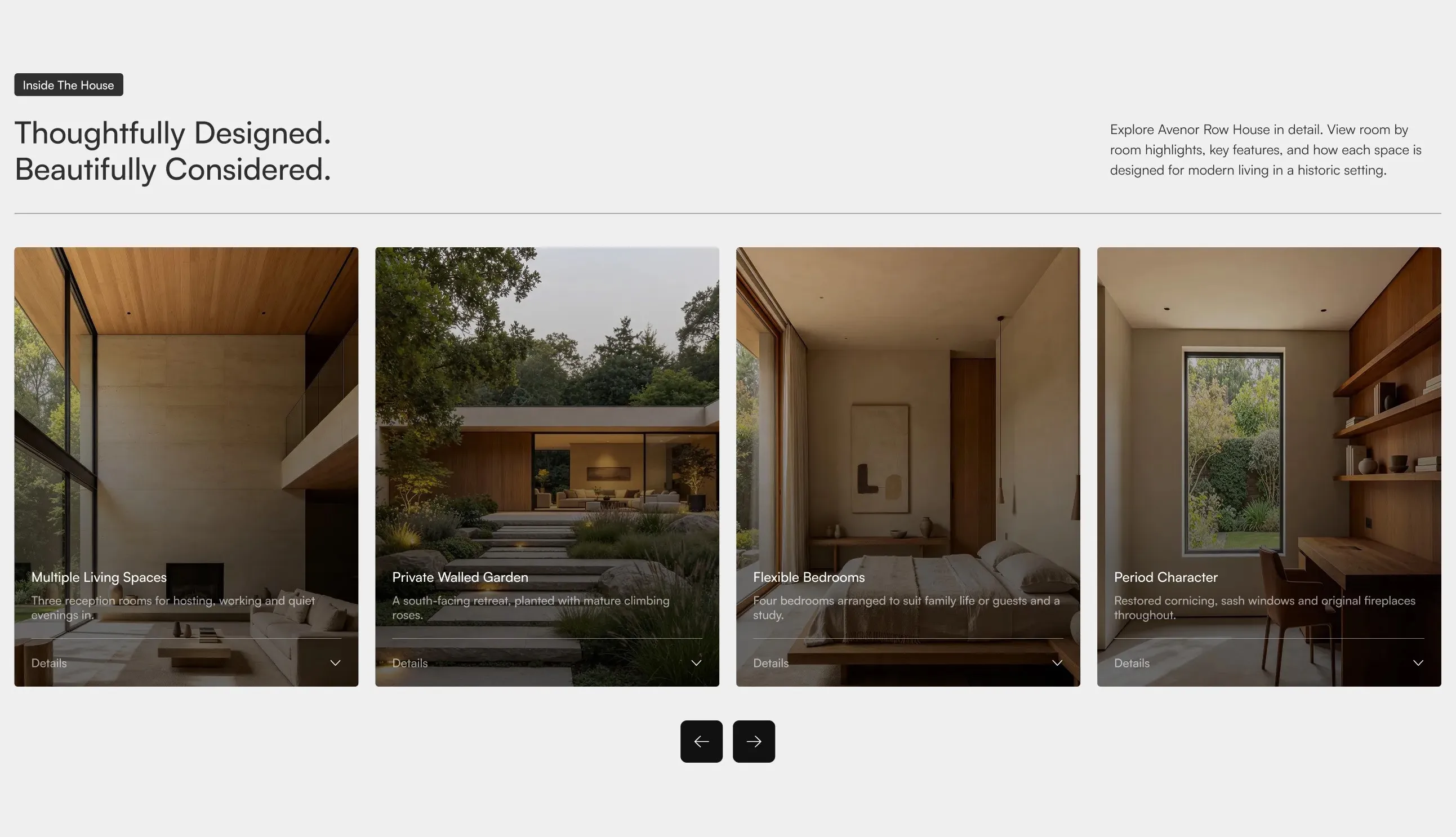
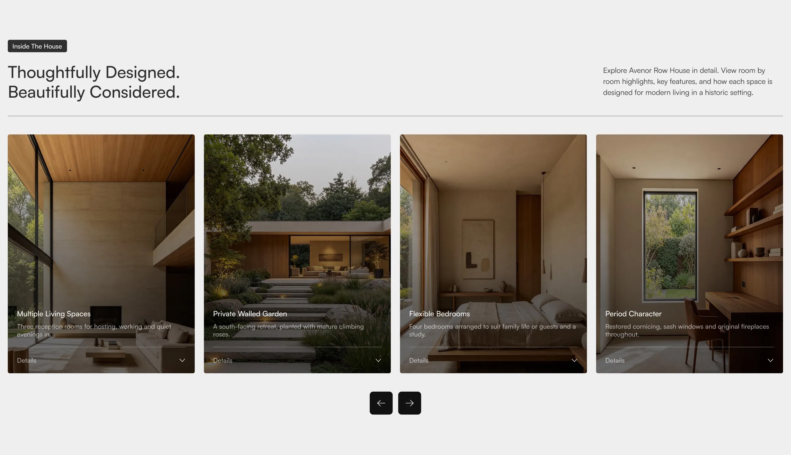
Avenor Feature Cards Carousel
A horizontal carousel of tall image cards, each with an overlaid title, short description, and a "Details" expand control, introduced by a badge, a two-part headline on the left, and supporting copy on the right, with previous and next navigation controls below. Best used on property or product pages to highlight key features in a scrollable, browsable format.
Dribbble ↗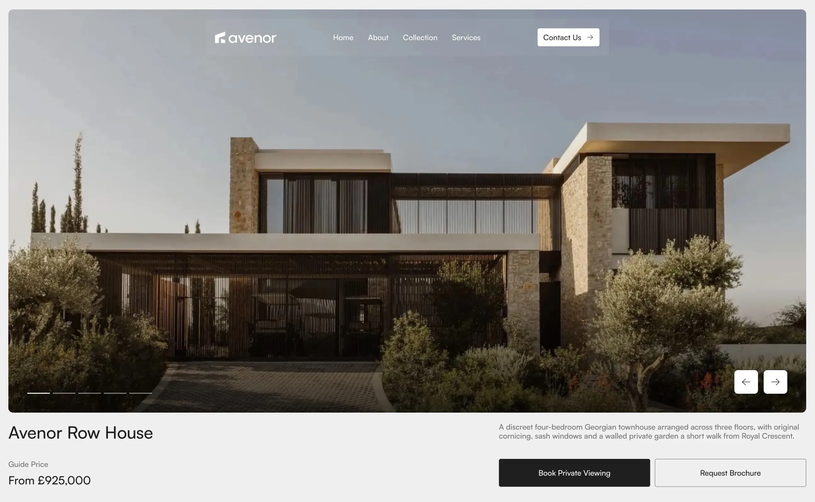
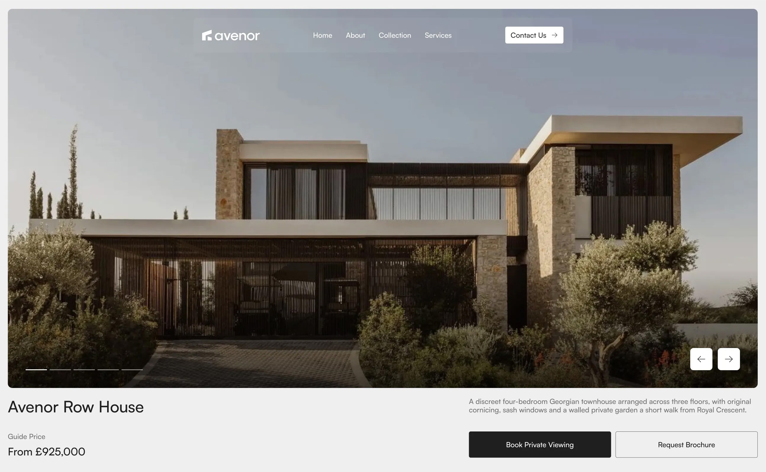
Avenor Property Hero with Carousel
A full-width hero featuring a large property image carousel with navigation controls and slide indicators, topped by a logo and navigation bar, with a property title, guide price, descriptive summary, and primary action buttons arranged below. Best used at the top of a property page to introduce the listing and drive viewing or brochure requests.
Dribbble ↗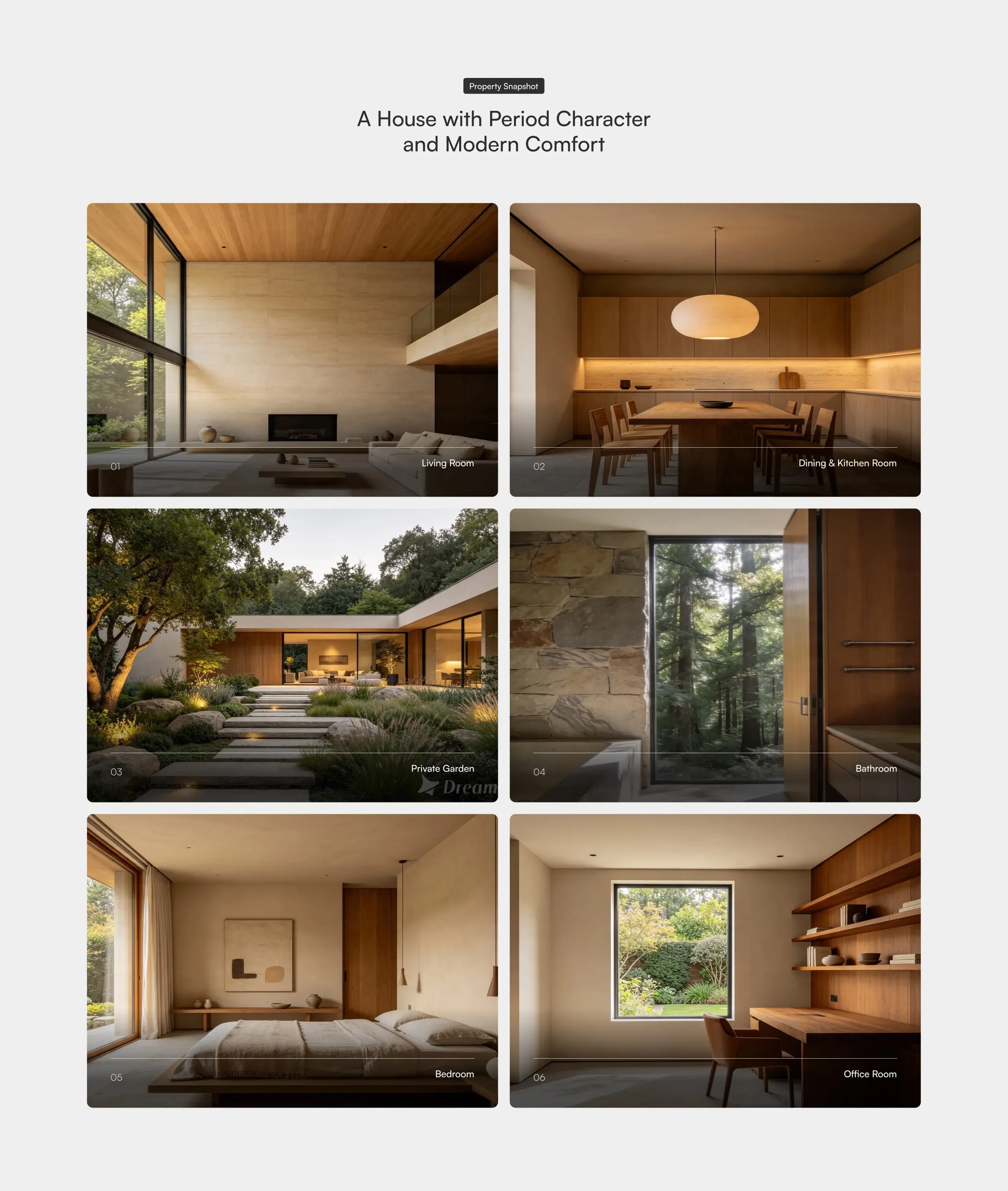
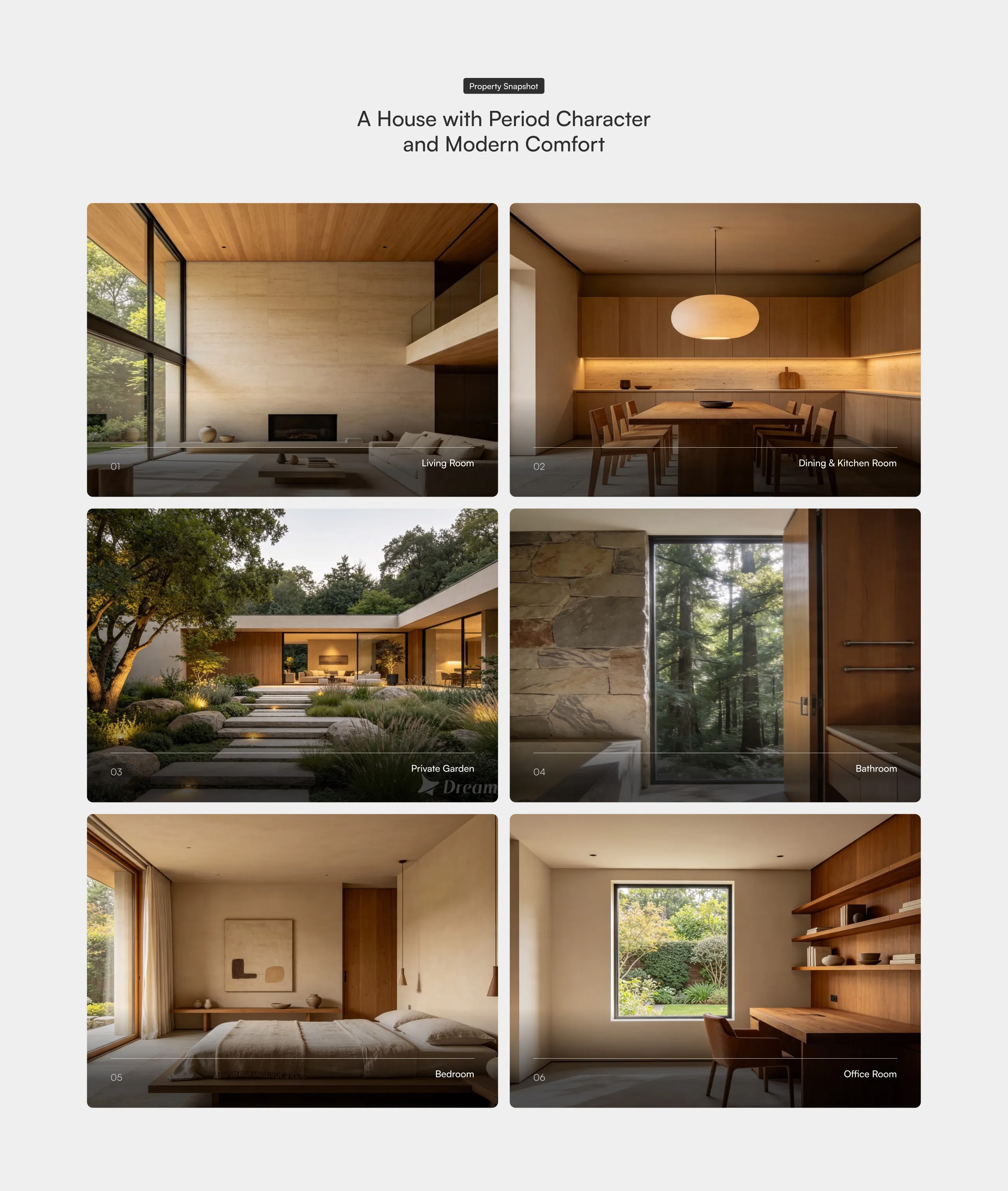
Avenor Image Cards Grid
A two-column grid of large image cards showcasing rooms or spaces, each with a numbered index and a caption label overlaid in the corner, beneath a centred badge label and headline. Best used on property or portfolio pages to present a visual tour of key spaces.
Dribbble ↗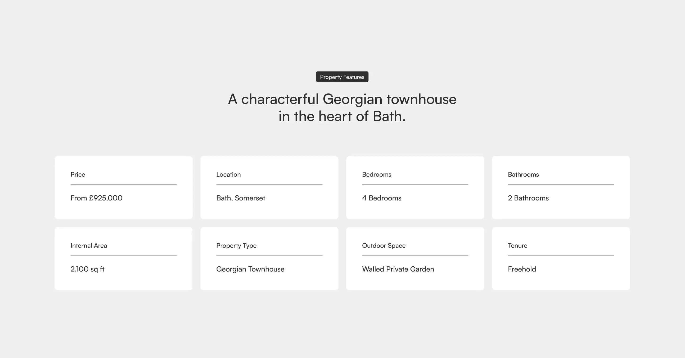
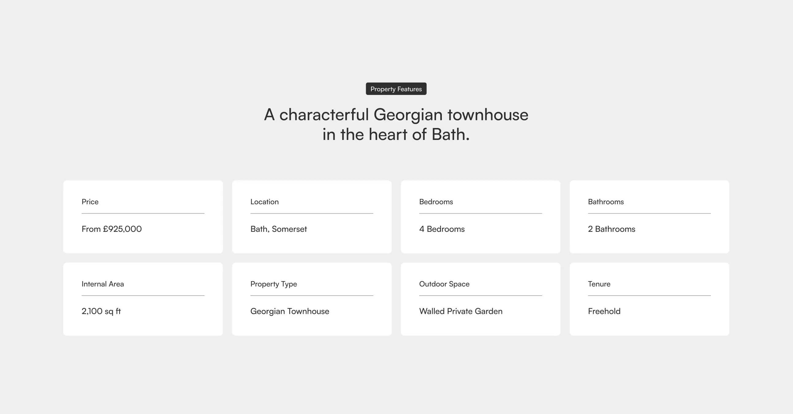
Property Features Grid
A two-row grid of feature cards highlighting a property's key specifications such as price, location, bedrooms, bathrooms, internal area, property type, outdoor space, and tenure, beneath a centred badge label and headline. Best used on property or listing pages to summarise core details at a glance.
Dribbble ↗