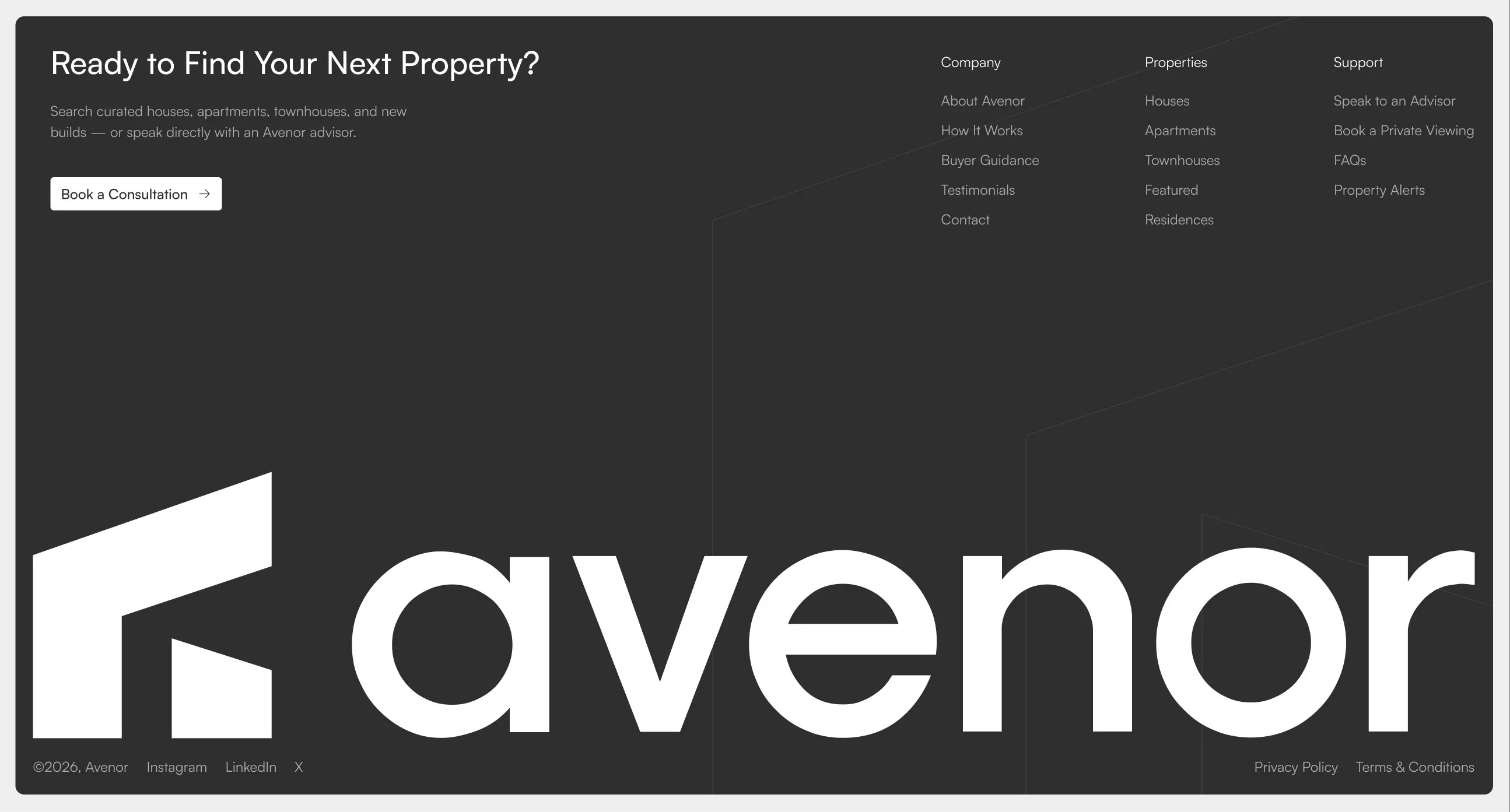
Avenor Footer with CTA & Oversized Logo
Description
A dark full-width footer pairing a closing call-to-action headline, supporting text, and a button on the left with multi-column navigation links on the right, anchored by an oversized brand logo and a bottom bar for copyright, social links, and legal pages. Best used as the closing section of a site to prompt a final action and surface site-wide navigation.
Related
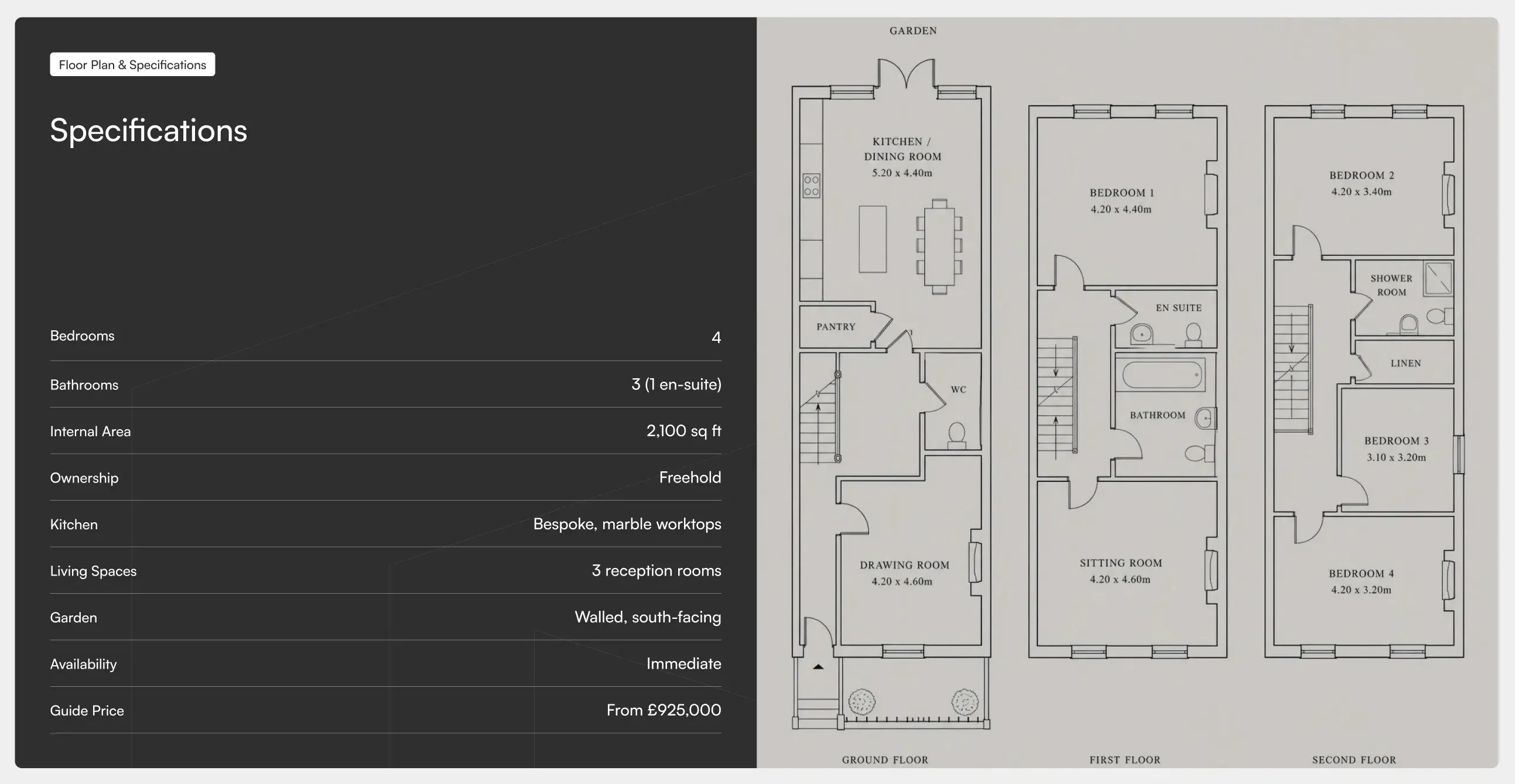
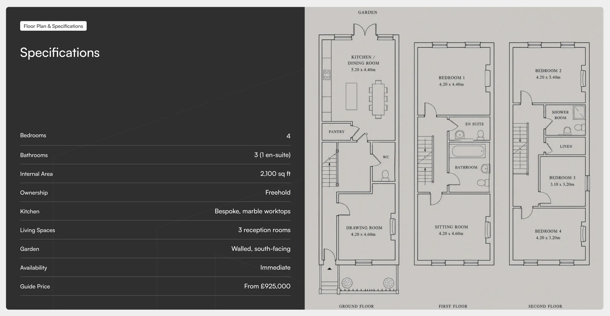
Avenor Specifications & Floor Plan
A two-panel split layout pairing a dark specifications table on the left, with label and value rows for key property details, against a light floor plan panel on the right showing room layouts across multiple levels. Best used on property pages to present technical specs alongside a visual floor plan.
Dribbble ↗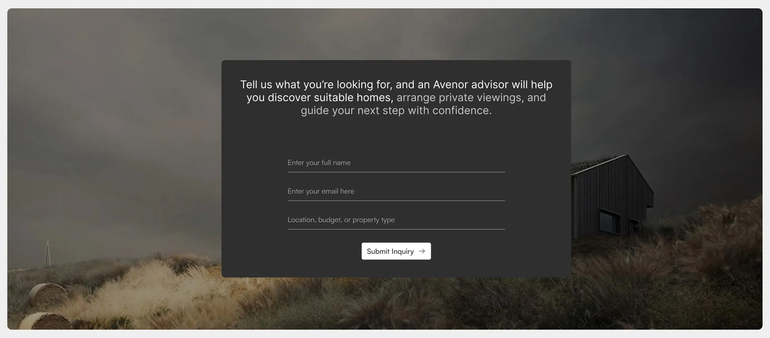
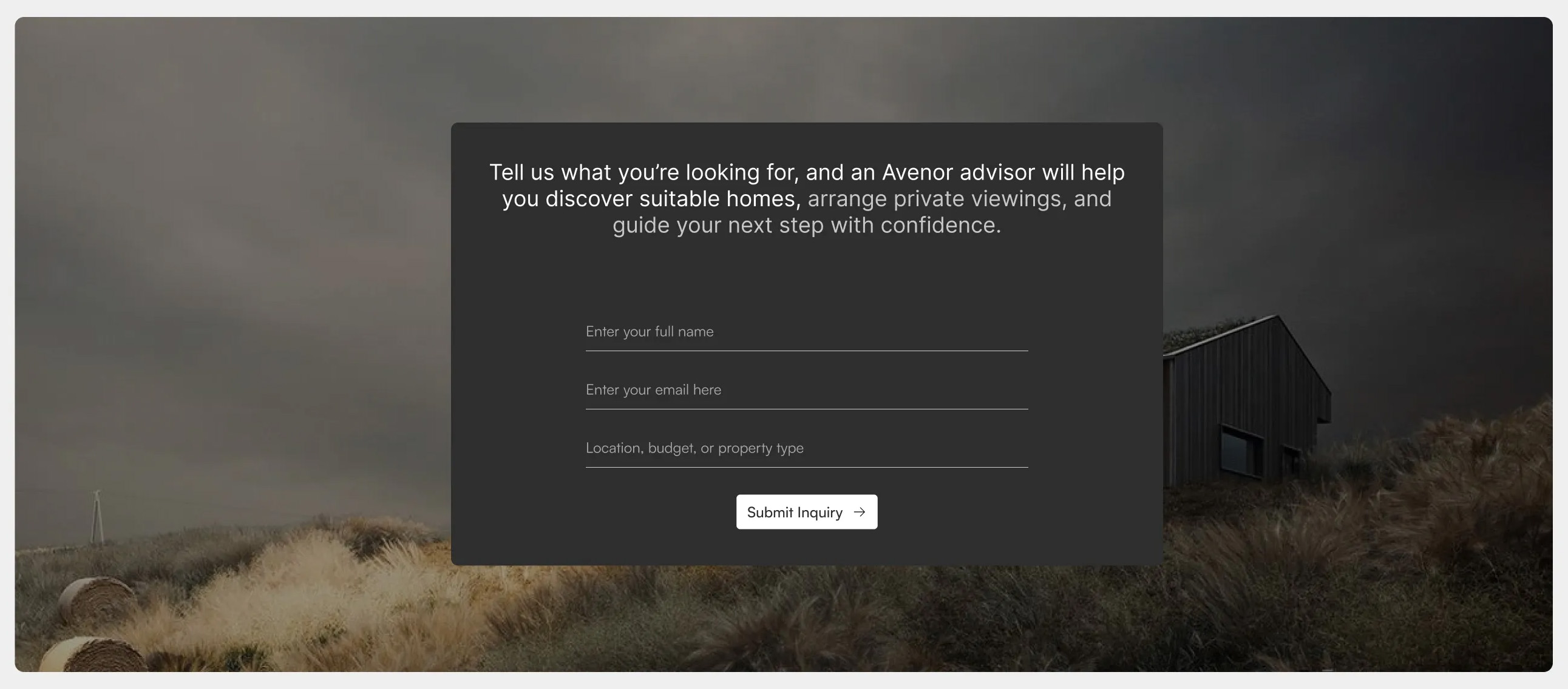
Avenor Inquiry Form with Background
A centred contact form set in a dark card over a full-width background image, with an introductory headline, underline-style input fields for name, email, and free-text details, and a primary submit button. Best used as a lead-capture or enquiry section to invite visitors to get in touch.
Dribbble ↗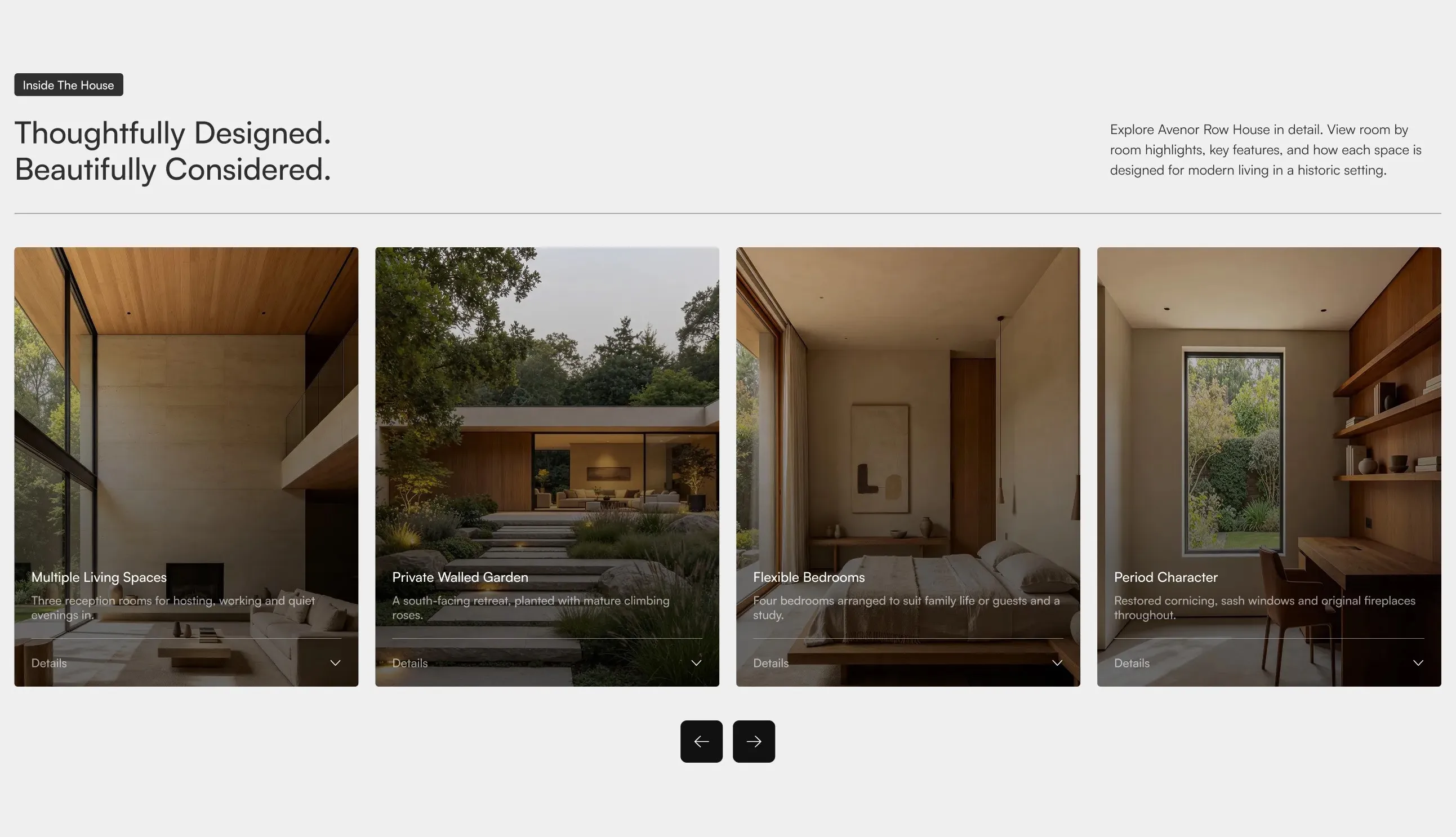
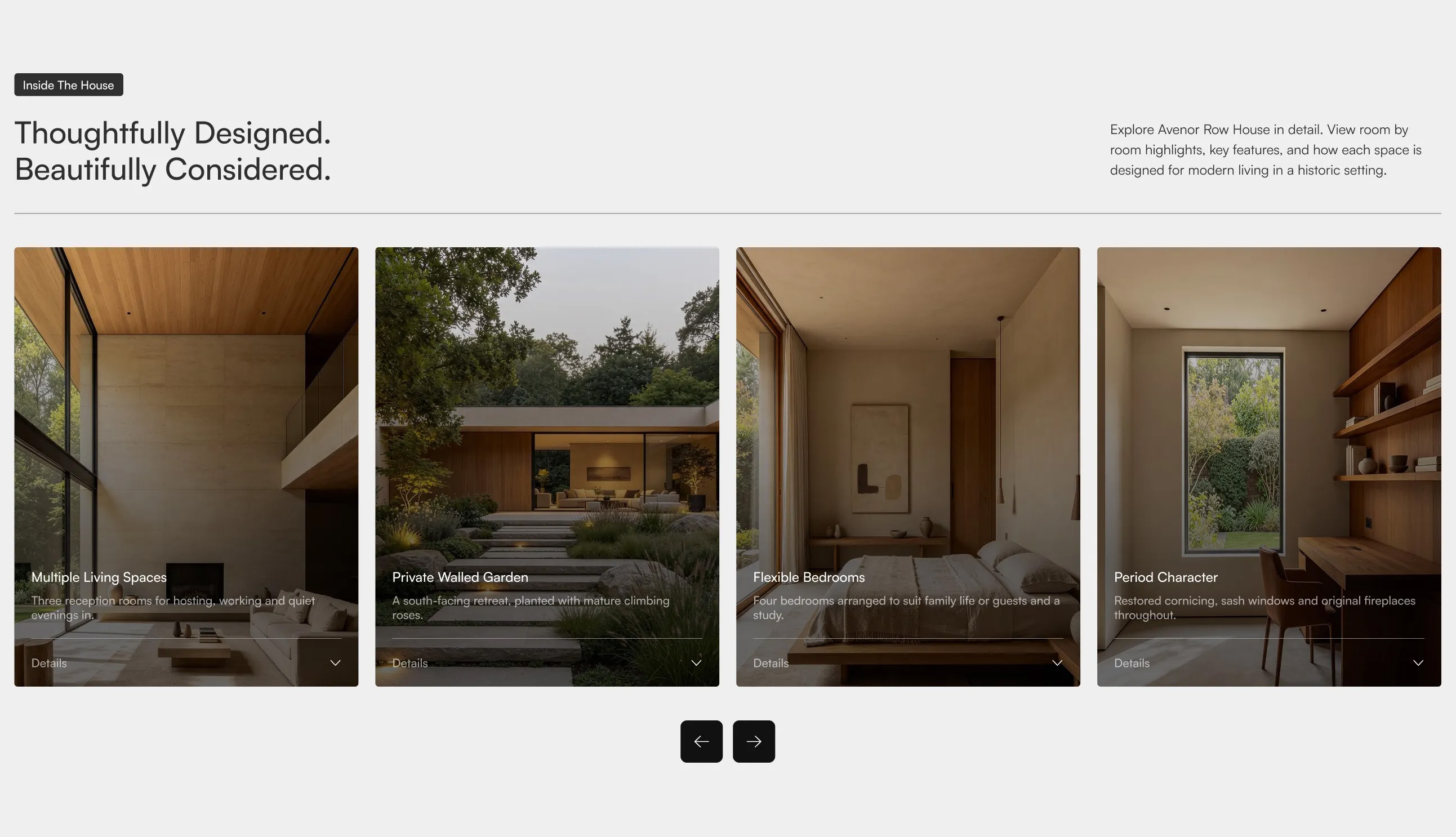
Avenor Feature Cards Carousel
A horizontal carousel of tall image cards, each with an overlaid title, short description, and a "Details" expand control, introduced by a badge, a two-part headline on the left, and supporting copy on the right, with previous and next navigation controls below. Best used on property or product pages to highlight key features in a scrollable, browsable format.
Dribbble ↗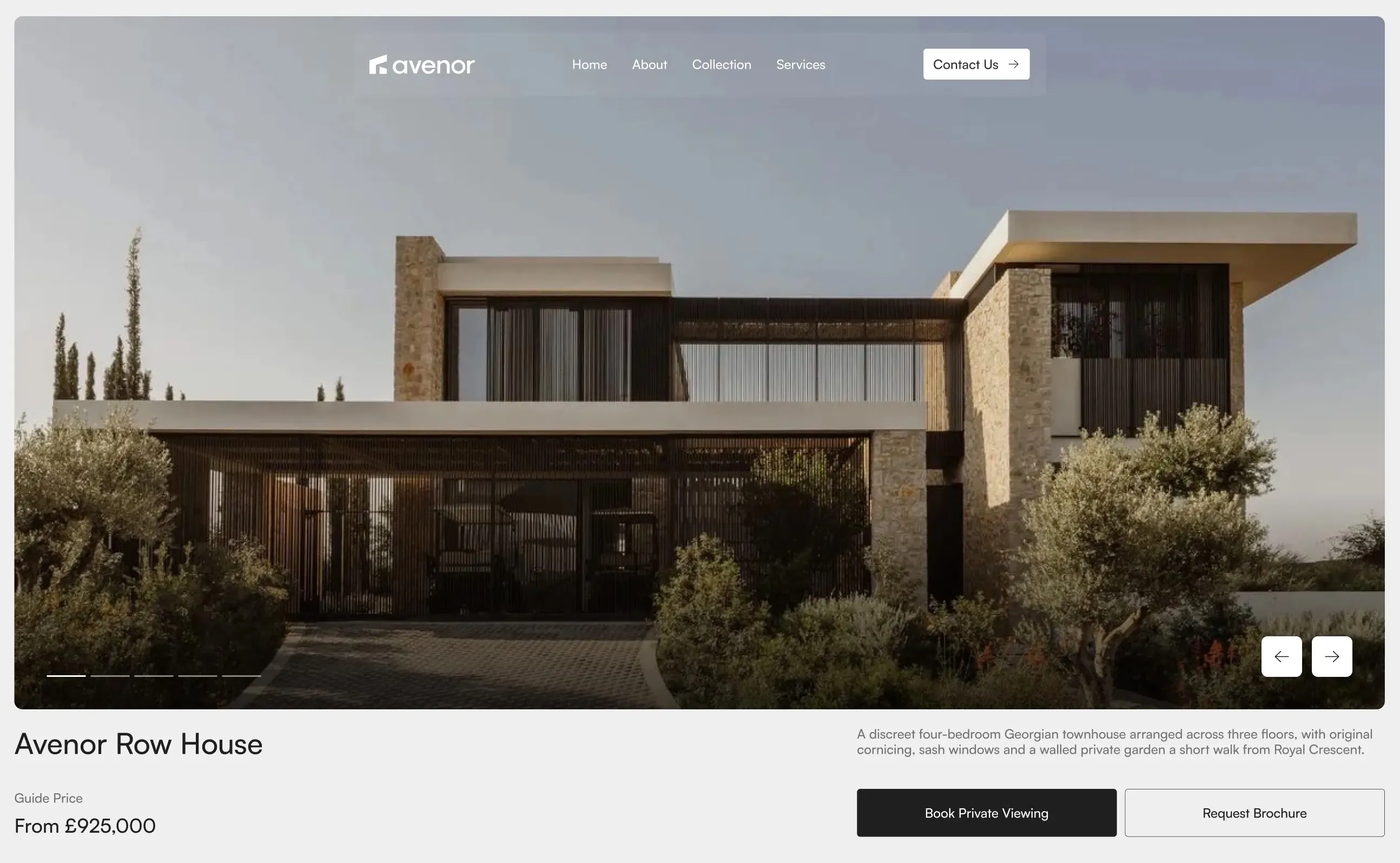
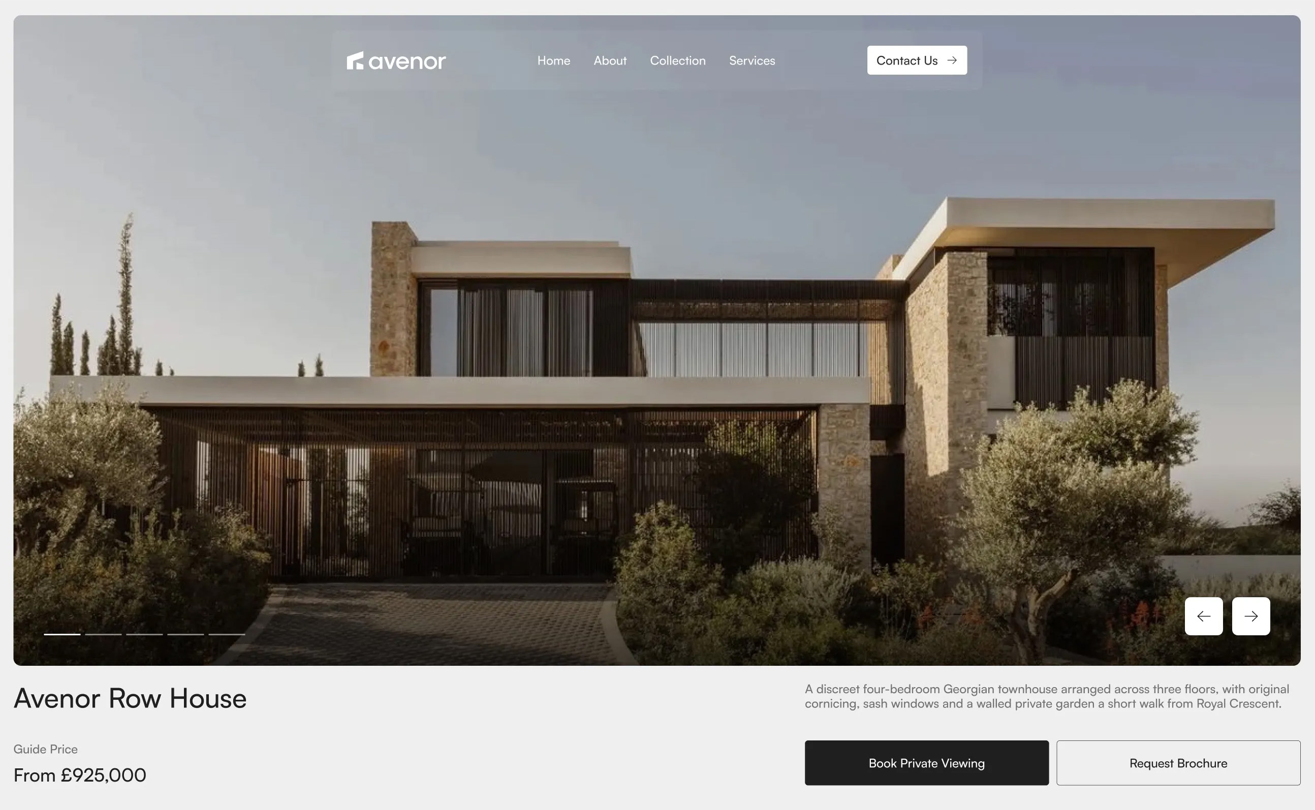
Avenor Property Hero with Carousel
A full-width hero featuring a large property image carousel with navigation controls and slide indicators, topped by a logo and navigation bar, with a property title, guide price, descriptive summary, and primary action buttons arranged below. Best used at the top of a property page to introduce the listing and drive viewing or brochure requests.
Dribbble ↗Similar footer sections
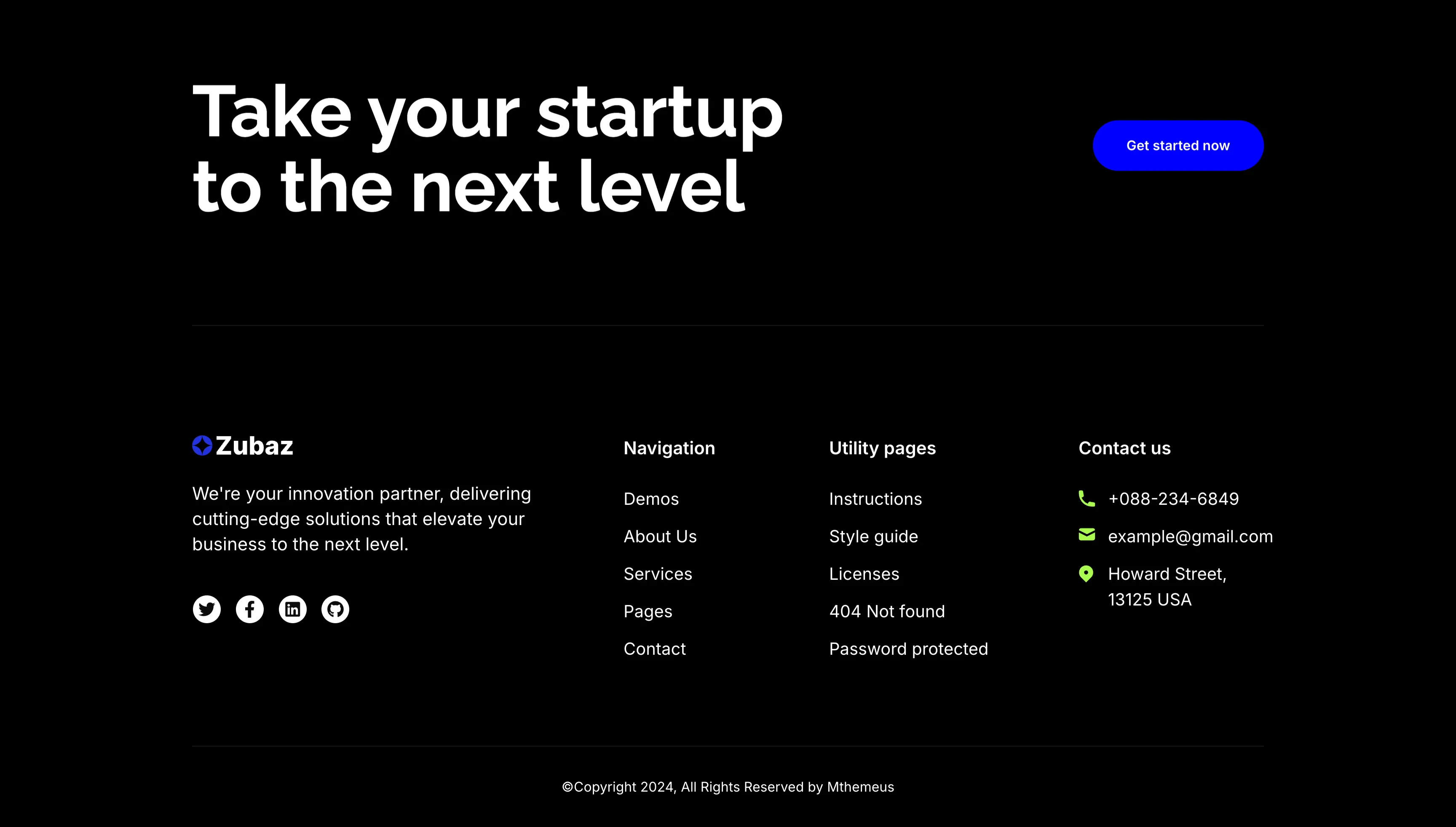
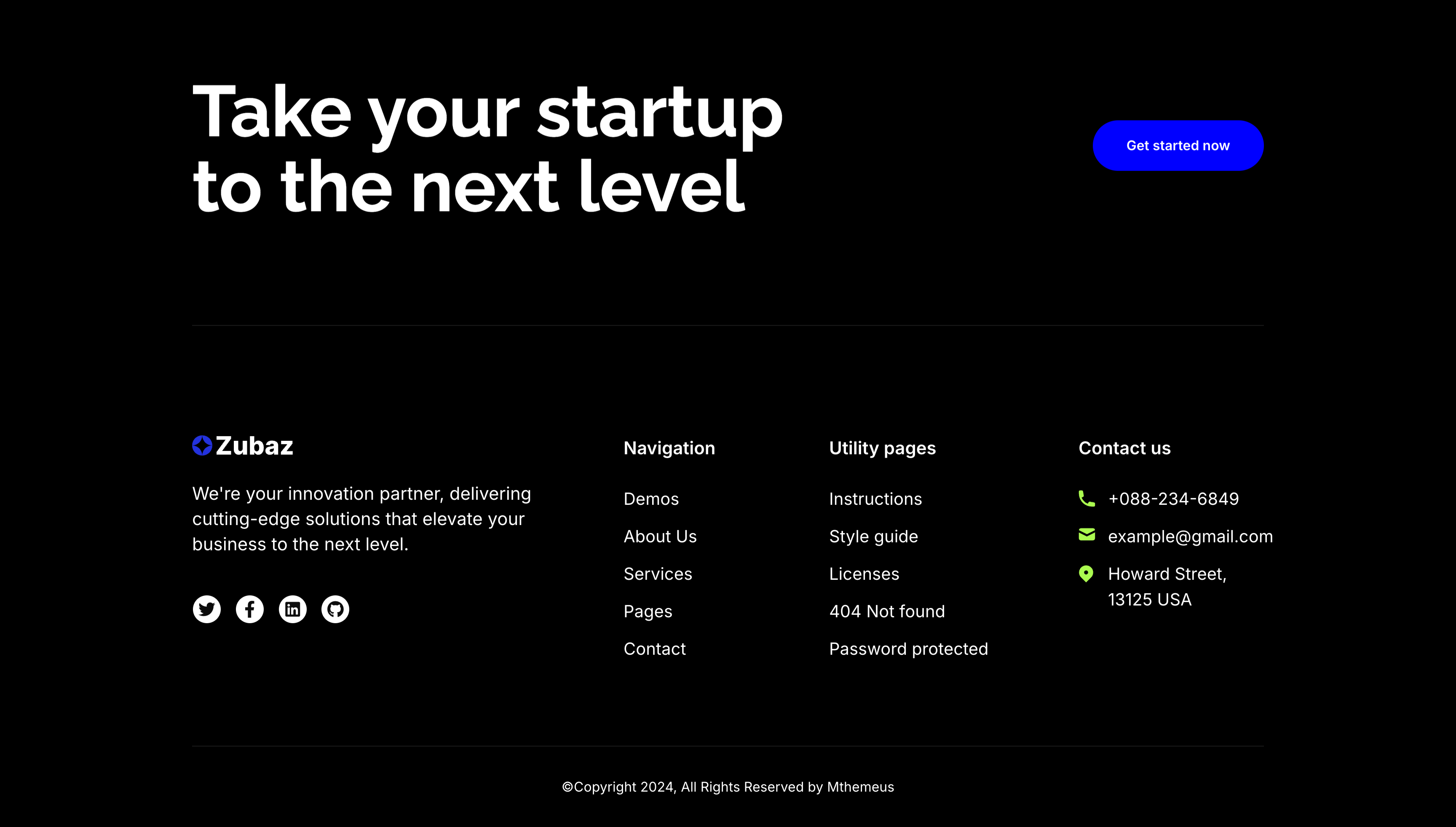
Take Your Startup Dark Footer With CTA
The dark Zubaz footer on a solid black background, opening with a call-to-action band: an oversized white 'Take your startup to the next level' headline on the left and a solid blue 'Get started now' button on the right, above a hairline divider. Below, the footer proper shows the Zubaz logo with a short blurb and a row of Twitter, Facebook, LinkedIn and GitHub icons, beside grouped link columns — 'Navigation' (Demos, About Us, Services, Pages, Contact), 'Utility pages' (Instructions, Style guide, Licenses, 404 Not found, Password protected) and a 'Contact us' column with a phone, email and Howard Street address. A centered '(c)Copyright 2024, All Rights Reserved by Mthemeus' line closes it. Pairing a bold recruiting CTA with the full footer makes it a strong page-closing block.
Zubuz ↗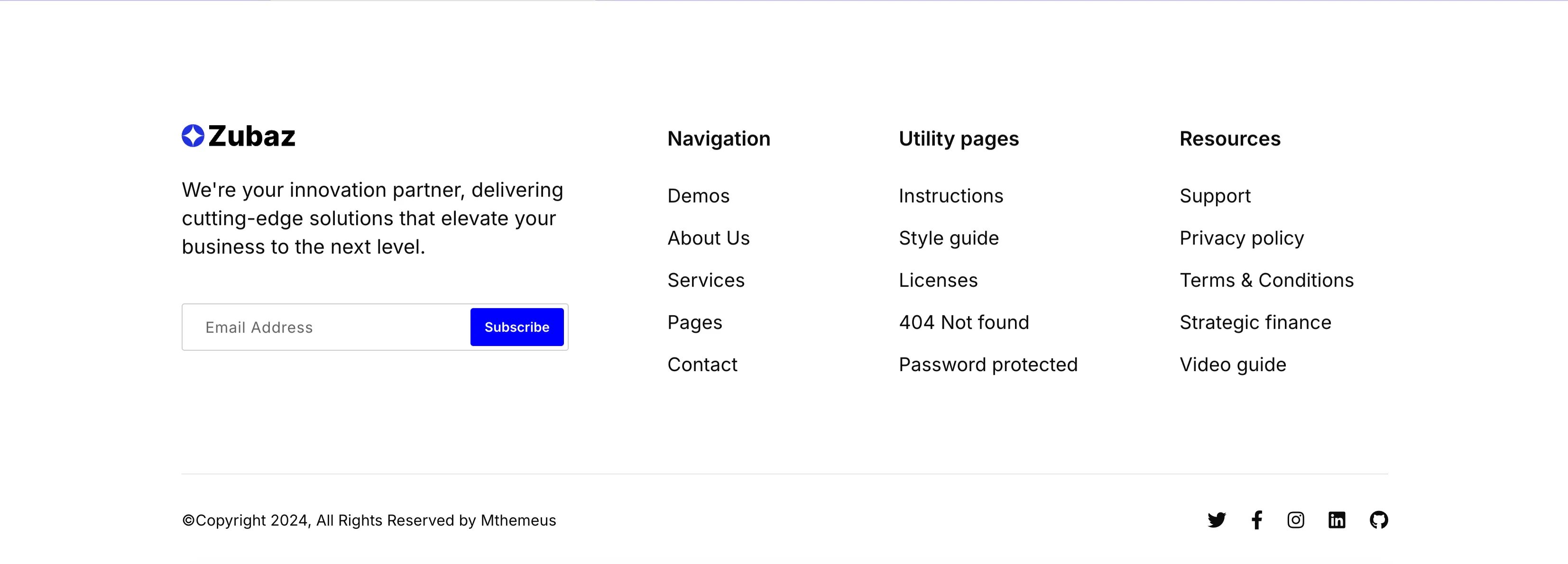
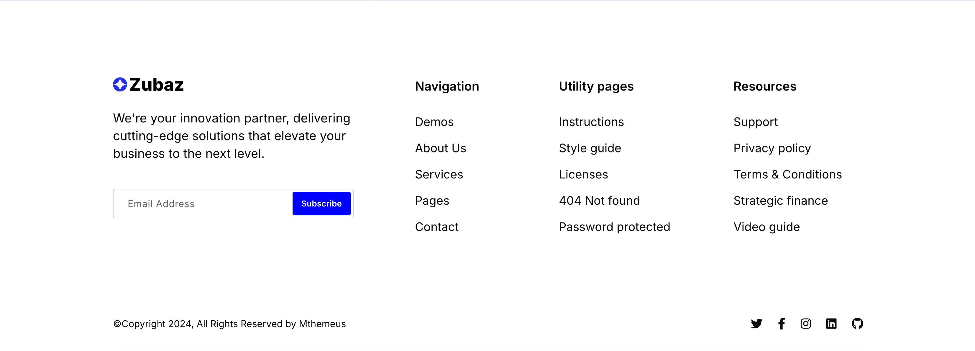
Zubaz Footer With Newsletter Signup
The Zubaz site footer on white. The left column shows the Zubaz logo, a short 'We're your innovation partner…' blurb and a newsletter field pairing an 'Email Address' input with a solid blue 'Subscribe' button. To the right, three link columns are grouped under bold headings — 'Navigation' (Demos, About Us, Services, Pages, Contact), 'Utility pages' (Instructions, Style guide, Licenses, 404 Not found, Password protected) and 'Resources' (Support, Privacy policy, Terms & Conditions, Strategic finance, Video guide). A hairline divider separates a bottom bar with the '(c)Copyright 2024, All Rights Reserved by Mthemeus' line on the left and Twitter, Facebook, Instagram, LinkedIn and GitHub icons on the right. The orderly columns and inline signup make it a complete, conventional global footer.
Zubuz ↗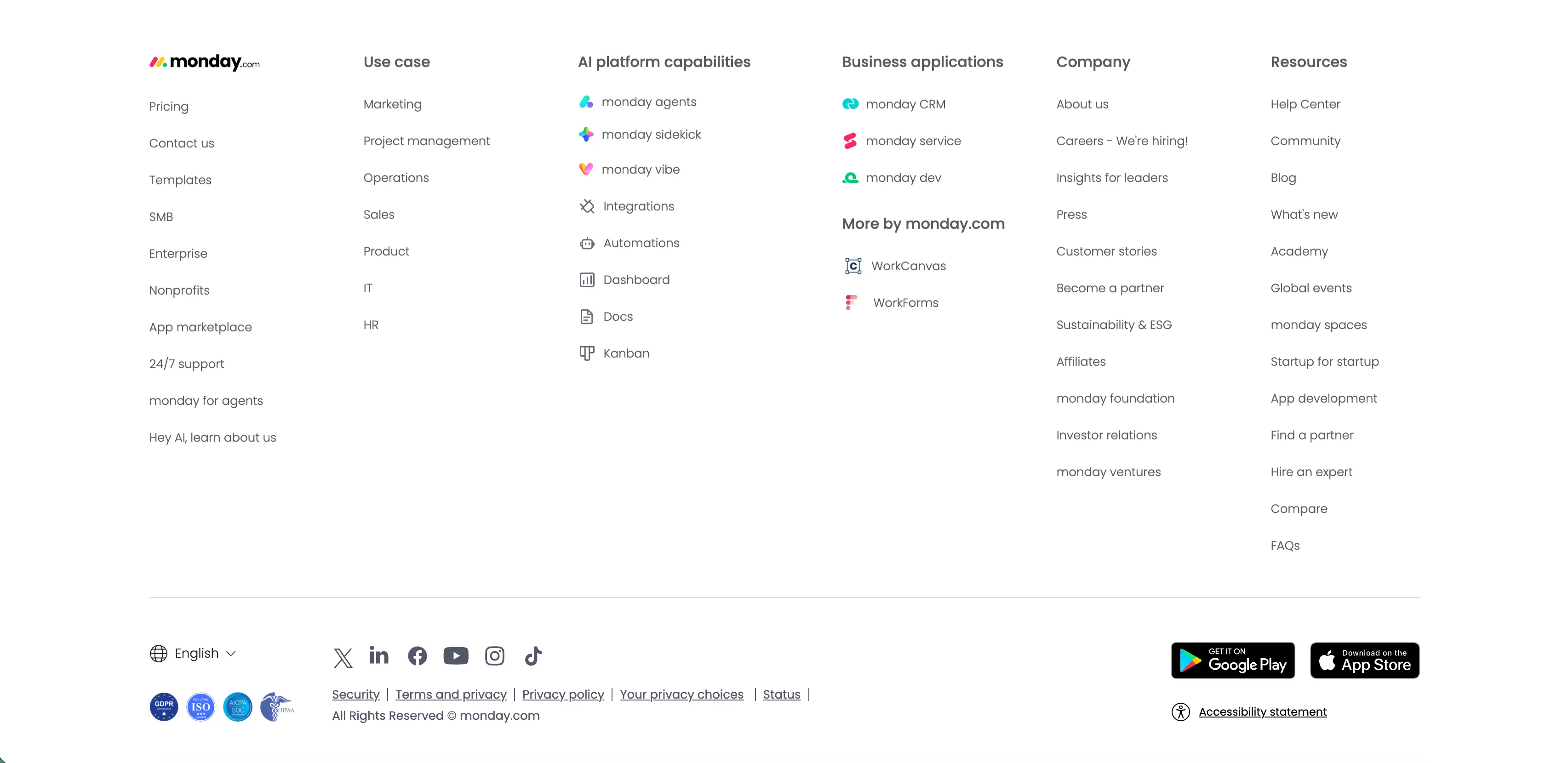
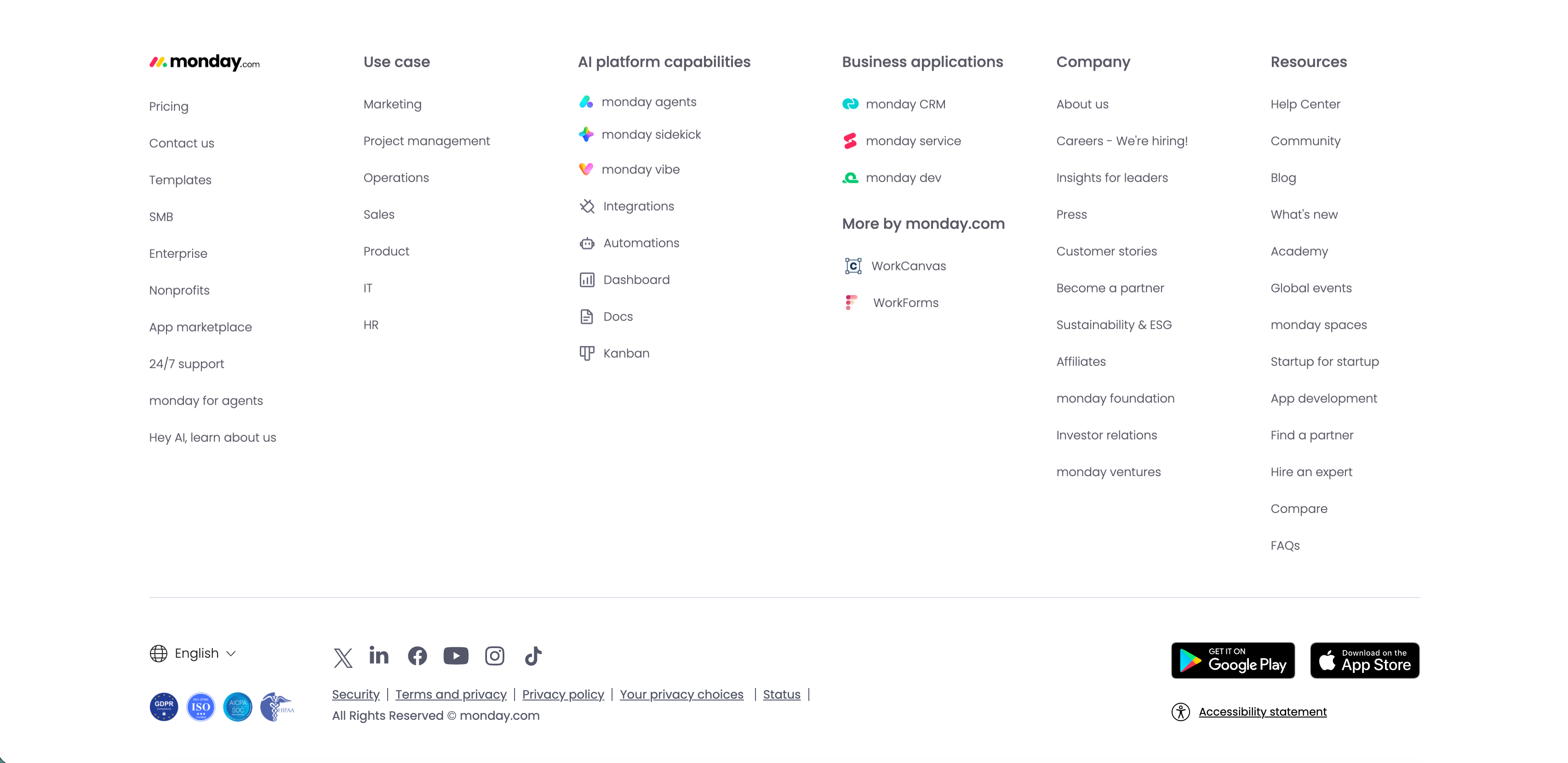
Monday.com Multi-Column Global Footer
The standard monday.com global footer on white. The monday.com logo sits above a left column of links (Pricing, Contact us, Templates, SMB, Enterprise, Nonprofits, App marketplace, 24/7 support, monday for agents, 'Hey AI, learn about us'), followed by grouped link columns — 'Use case', 'AI platform capabilities' (monday agents, sidekick, vibe, Integrations, Automations, Dashboard, Docs, Kanban), 'Business applications' with 'More by monday.com' (WorkCanvas, WorkForms), 'Company' and 'Resources.' A lower bar carries an English language selector, a row of social icons (X, LinkedIn, Facebook, YouTube, Instagram, TikTok), legal links (Security, Terms and privacy, Privacy policy, Your privacy choices, Status), compliance badges, Google Play and App Store download buttons, and an 'Accessibility statement.' The dense, orderly columns are a classic enterprise global-footer pattern.
Monday ↗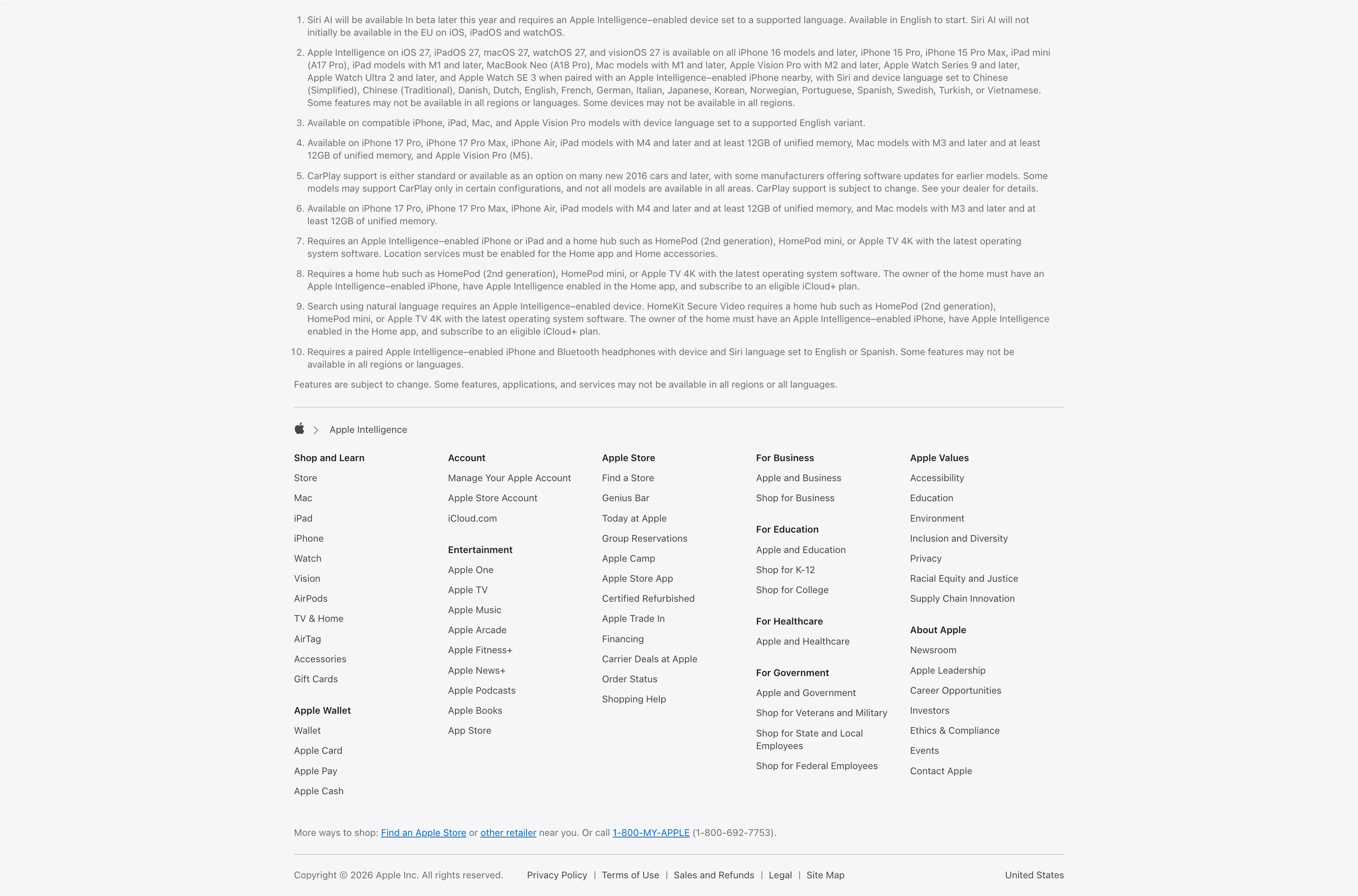
Legal Footnotes And Multi-Column Footer
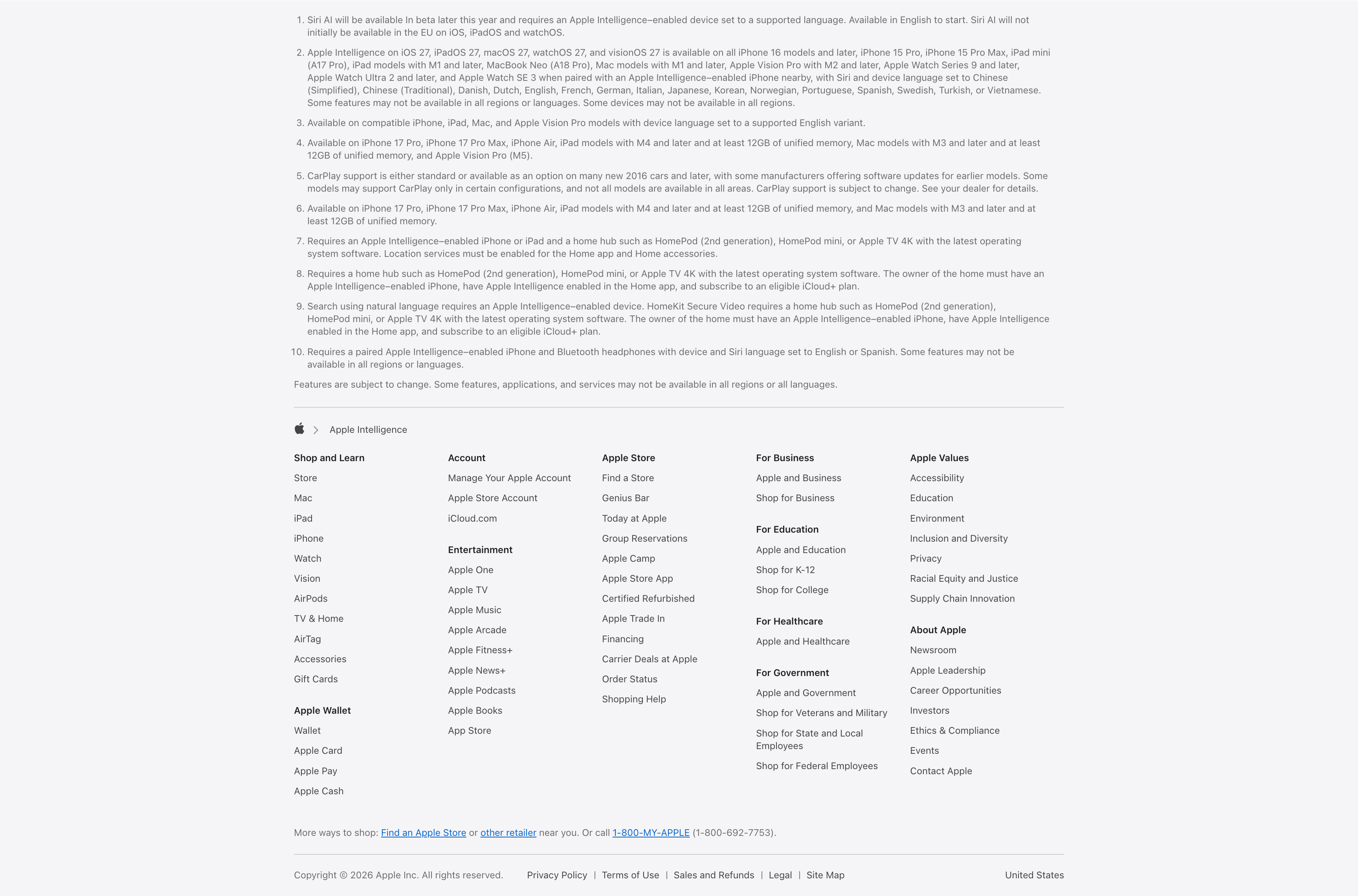
A combined footnotes-and-footer block on white. The top portion is a numbered list of ten fine-print legal disclaimers covering Siri AI availability, supported devices and languages, CarPlay and HomeKit requirements, set in small gray type. Below a hairline divider an Apple-logo breadcrumb ('Apple > Apple Intelligence') introduces the standard Apple footer: a five-plus-column grid of link groups — Shop and Learn, Apple Wallet, Account, Entertainment, Apple Store, For Business, For Education, For Healthcare, For Government, Apple Values and About Apple — each a stack of small text links. A 'More ways to shop' line with a phone number and a bottom row of copyright, Privacy Policy, Terms of Use, Legal, Site Map and the 'United States' region close it out. The dense, orderly columns are a classic global-footer pattern.
Apple ↗