Features sections
Feature sections make a product feel scannable and capable. Explore feature section examples — icon grids, alternating rows, and more.
Wide Range Of SaaS Solutions Services Grid
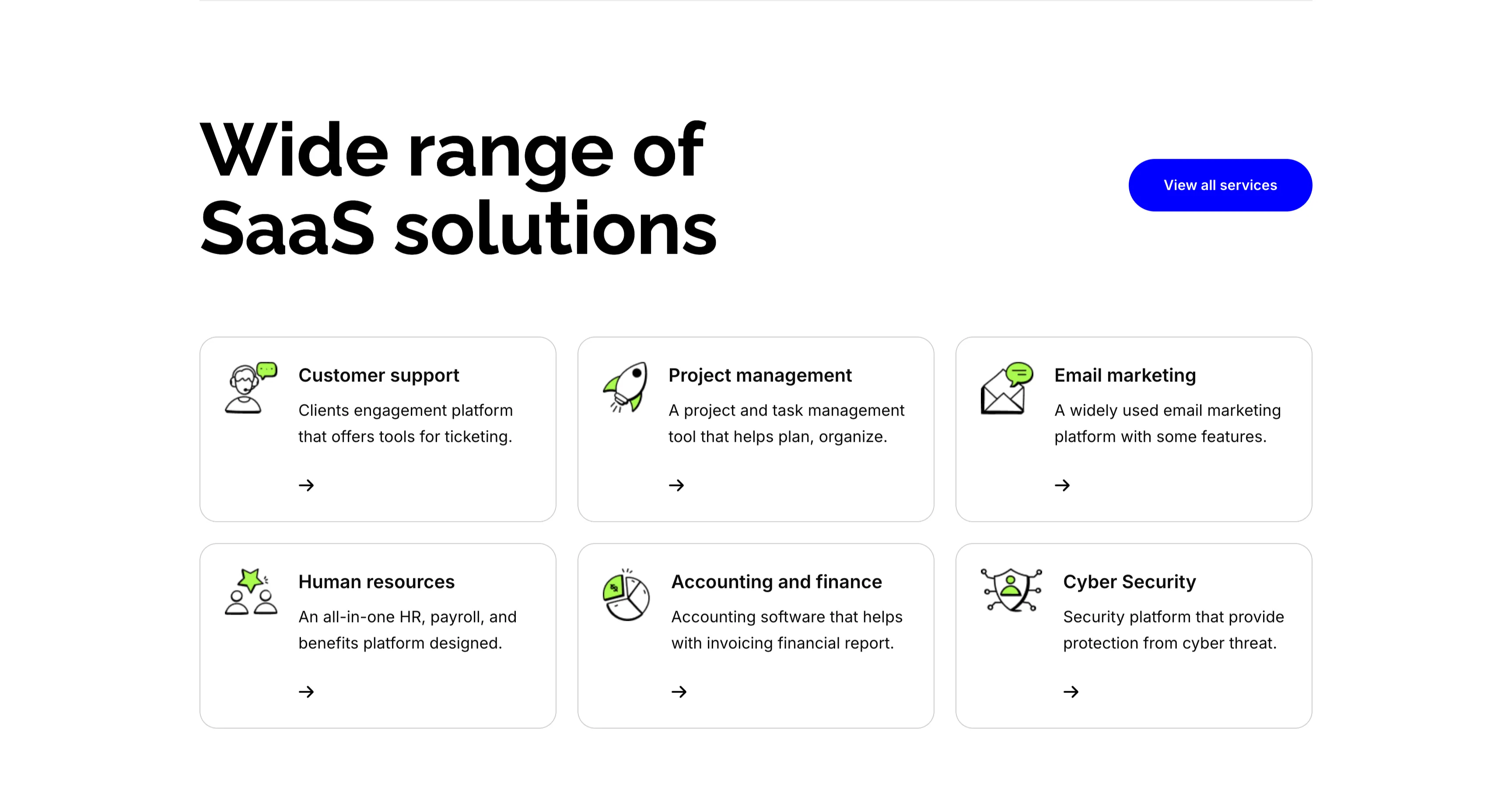
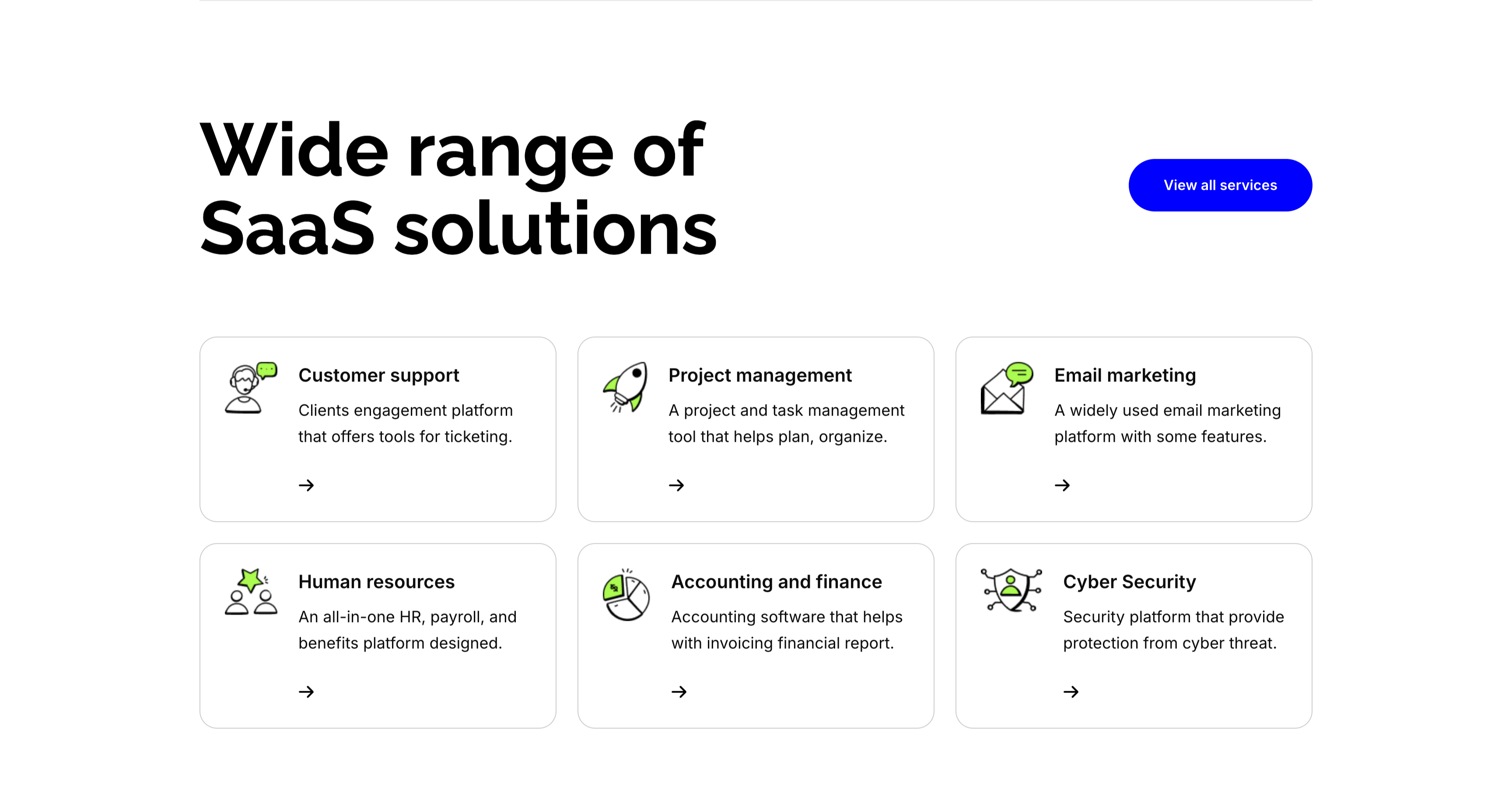
A services section on white. The top pairs an oversized 'Wide range of SaaS solutions' heading on the left with a solid blue 'View all services' button on the right. Below, six white bordered cards form a three-column, two-row grid, each led by a line-and-green illustrative icon, a bold title, a one-line description and a small arrow link: 'Customer support' (ticketing engagement platform), 'Project management' (plan and organize), 'Email marketing' (widely used platform), 'Human resources' (all-in-one HR and payroll), 'Accounting and finance' (invoicing and reports) and 'Cyber Security' (protection from threats). The even icon-card grid makes the breadth of offerings easy to scan.
Zubuz ↗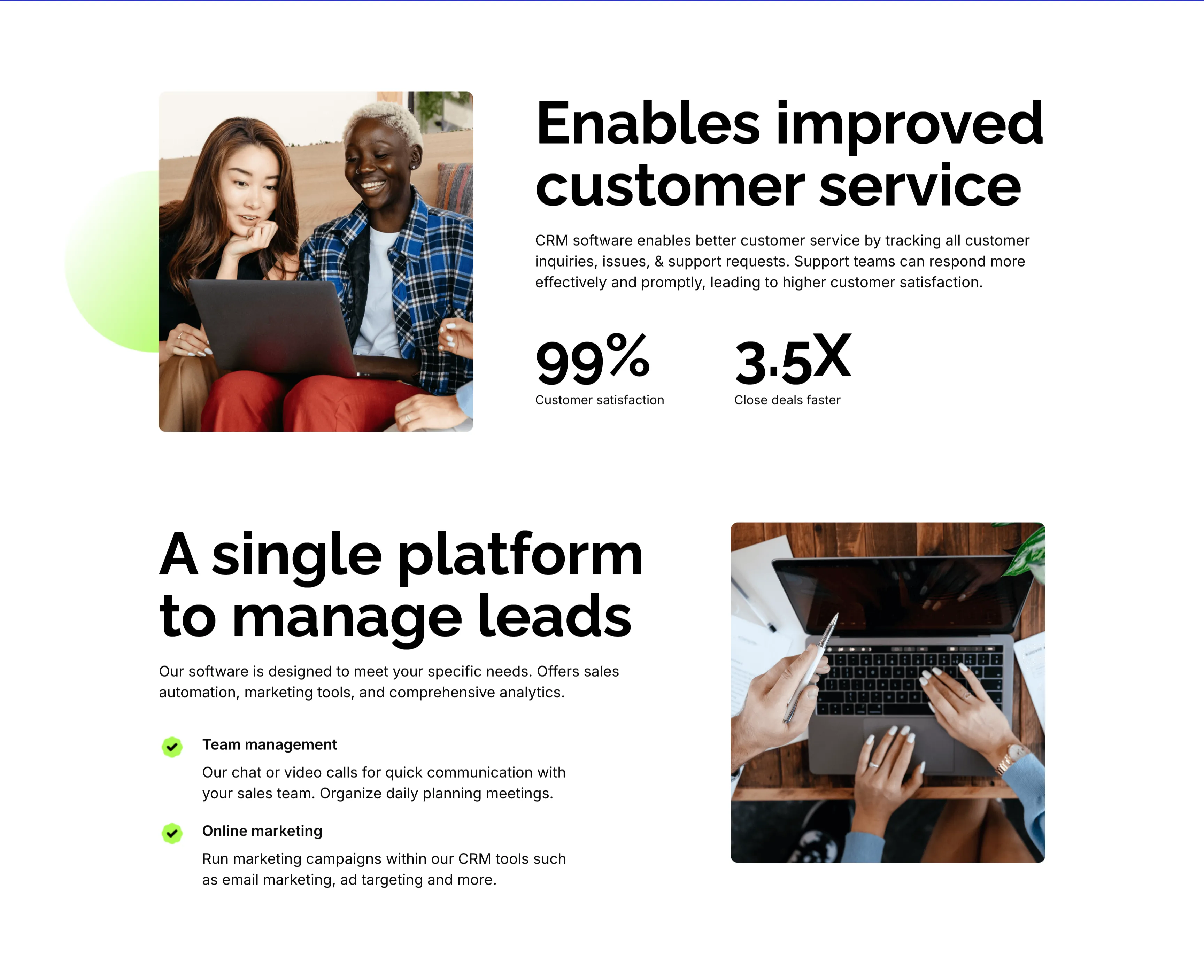
Customer Service And Lead Management Features
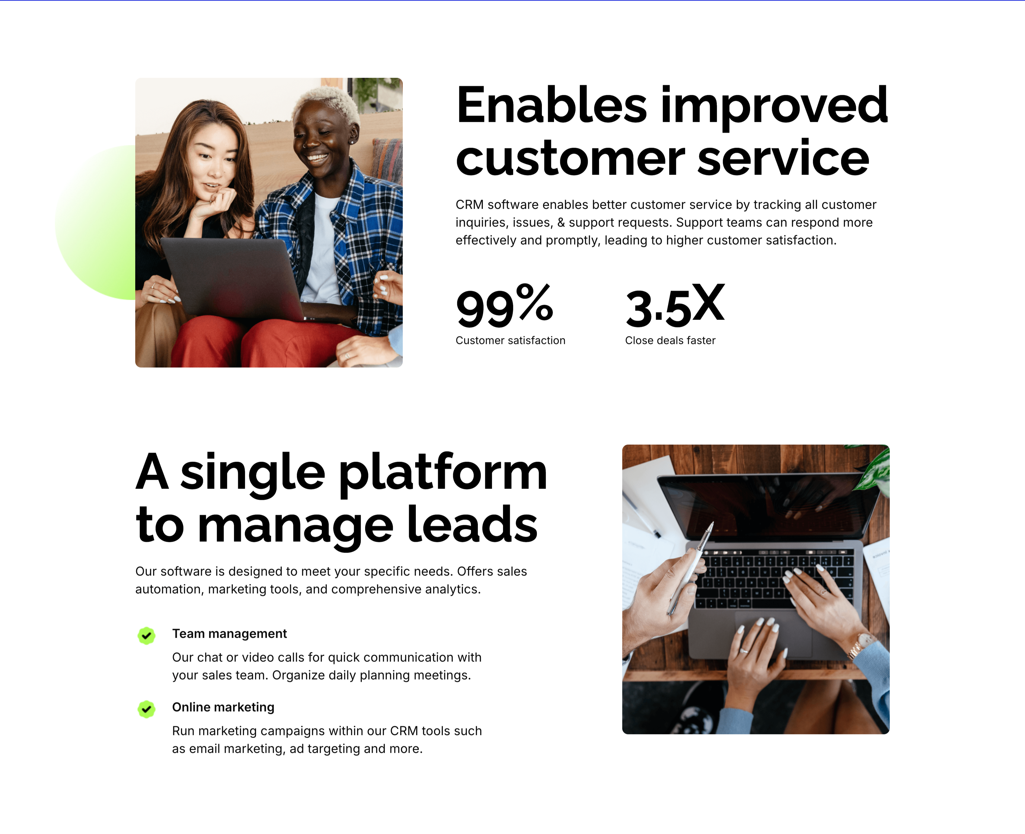
Two stacked alternating feature blocks on white, each mixing photography with copy. The upper block places a rounded photo of two colleagues at a laptop on the left beside an oversized 'Enables improved customer service' heading, a paragraph, and two bold stats — '99%' customer satisfaction and '3.5X' close deals faster. The lower block flips the layout: an oversized 'A single platform to manage leads' heading with green-checked items 'Team management' and 'Online marketing' sits left of a top-down photo of hands working at a laptop. The mirrored image-and-text rhythm, punchy metrics and checklist make the CRM benefits tangible and easy to compare.
Zubuz ↗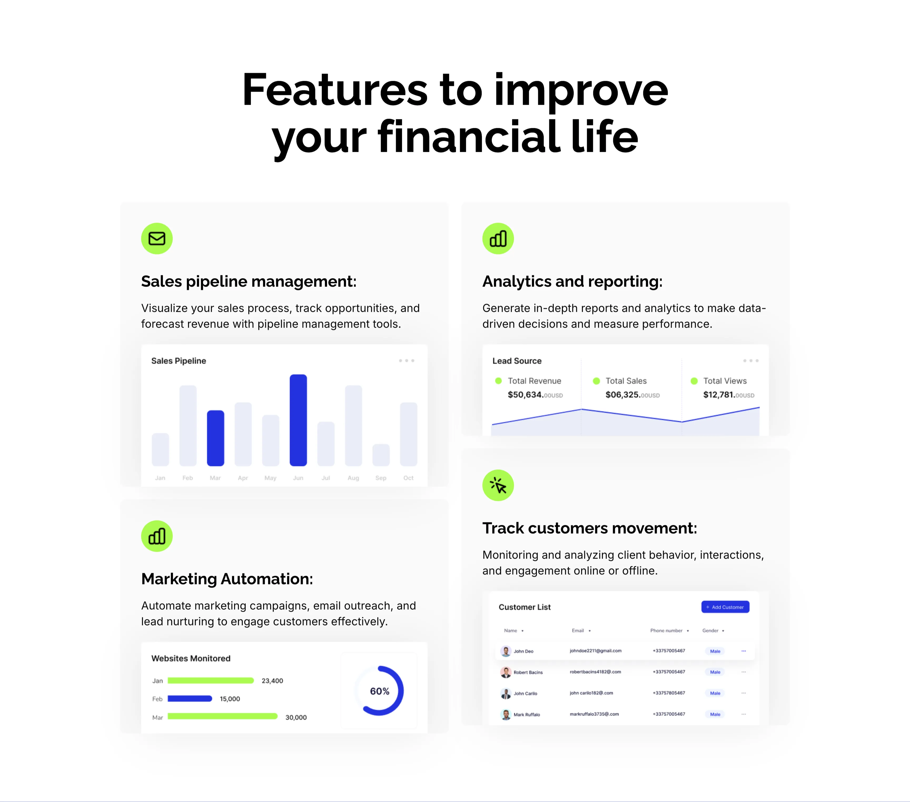
CRM Features With Dashboard Cards
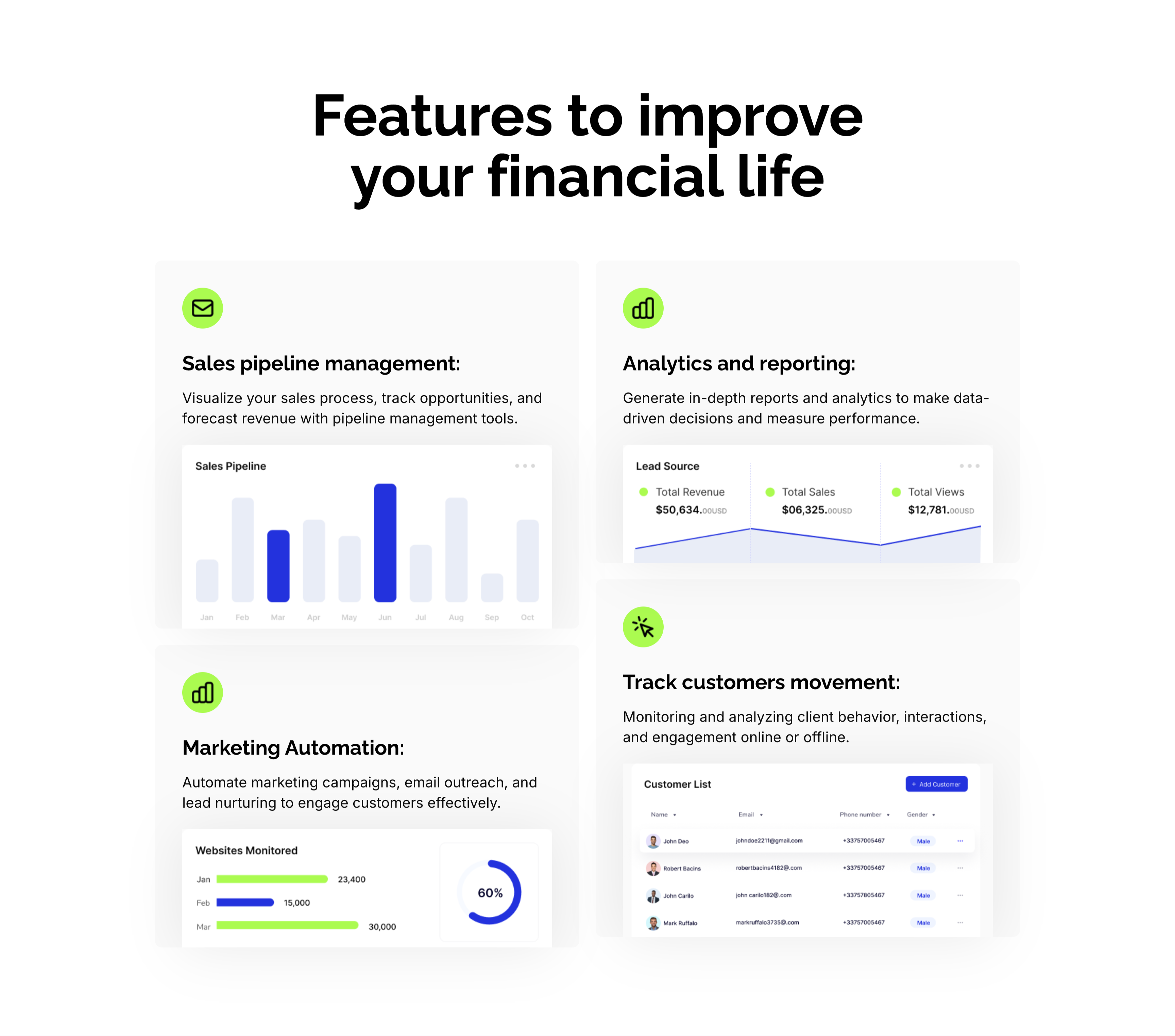
A CRM feature section on a pale background under an oversized centered 'Features to improve your financial life' heading. Four large cards form a 2x2 grid, each led by a lime-green icon, a bold title and a line of copy, then a mini product screenshot: 'Sales pipeline management:' with a monthly bar chart, 'Analytics and reporting:' with a Lead Source panel (Total Revenue $50,634, Total Sales, Total Views), 'Marketing Automation:' with a 'Websites Monitored' bar-and-donut chart, and 'Track customers movement:' with a Customer List table. Embedding a real dashboard fragment in each card makes the abstract CRM capabilities feel concrete and demonstrable.
Zubuz ↗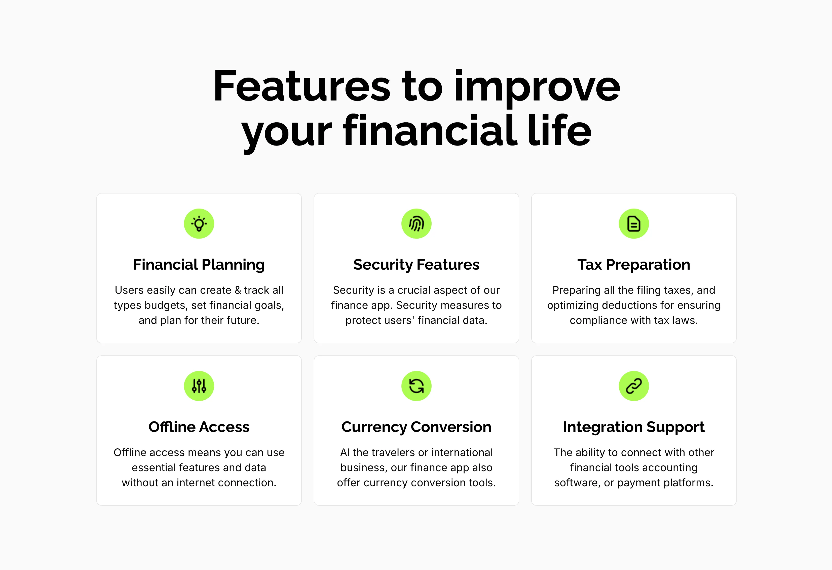
Features To Improve Financial Life Grid
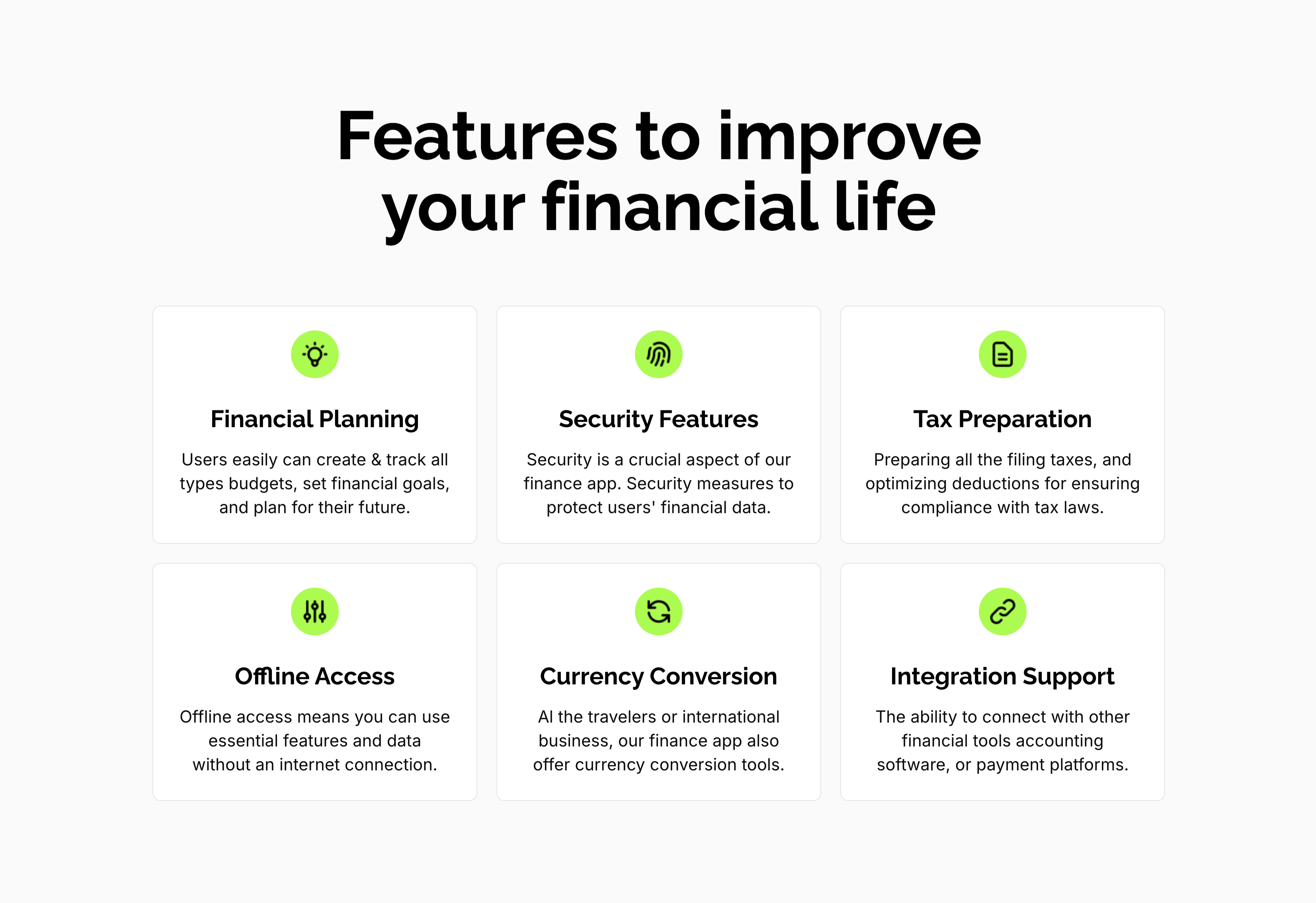
A feature grid on a pale background under a centered oversized 'Features to improve your financial life' heading. Six white rounded cards are arranged three across and two down, each centered on a lime-green circular icon above a bold title and a short gray description: 'Financial Planning' (create and track budgets, set goals), 'Security Features' (measures to protect financial data), 'Tax Preparation' (filing and deductions), 'Offline Access' (use essential features without internet), 'Currency Conversion' (tools for travelers and international business) and 'Integration Support' (connect with other financial tools). The even three-up rhythm and single green accent make the capabilities calm and scannable.
Zubuz ↗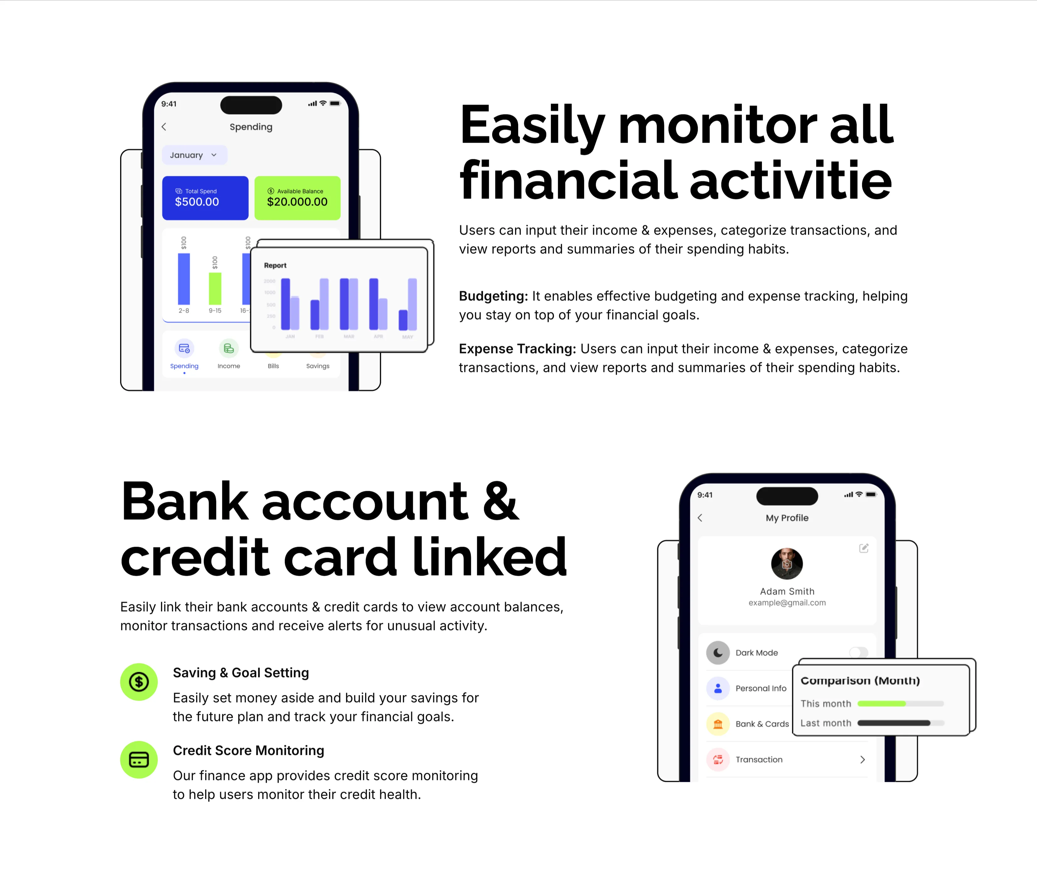
Monitor Finances And Linked Accounts Features
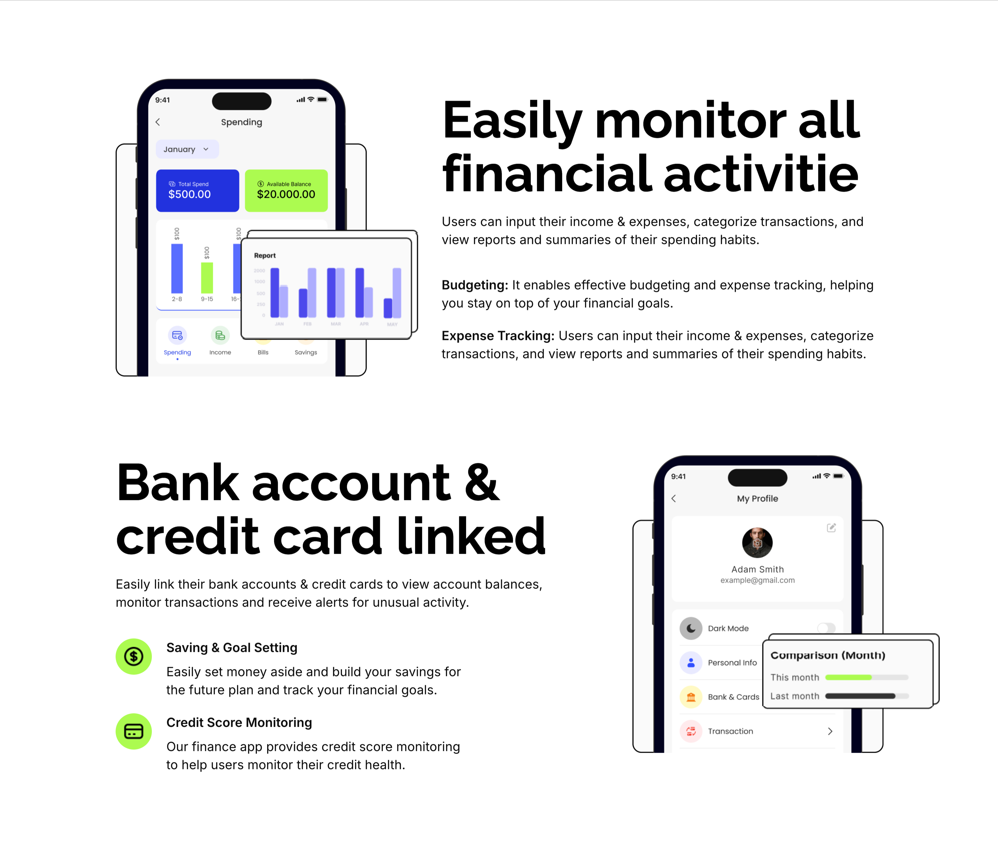
Two stacked alternating feature blocks on white, each pairing a phone mockup with copy. The upper block places a 'Spending' app screen (Total Spend $500, Available Balance $20,000 and a bar report) on the left beside an oversized 'Easily monitor all financial activitie' heading with Budgeting and Expense Tracking sub-points on the right. The lower block flips the layout: an oversized 'Bank account & credit card linked' heading and two green-icon items — 'Saving & Goal Setting' and 'Credit Score Monitoring' — sit left of a 'My Profile' phone screen showing a dark-mode toggle and a floating monthly comparison card. The mirrored phone-and-text rhythm makes each capability concrete and easy to compare.
Zubuz ↗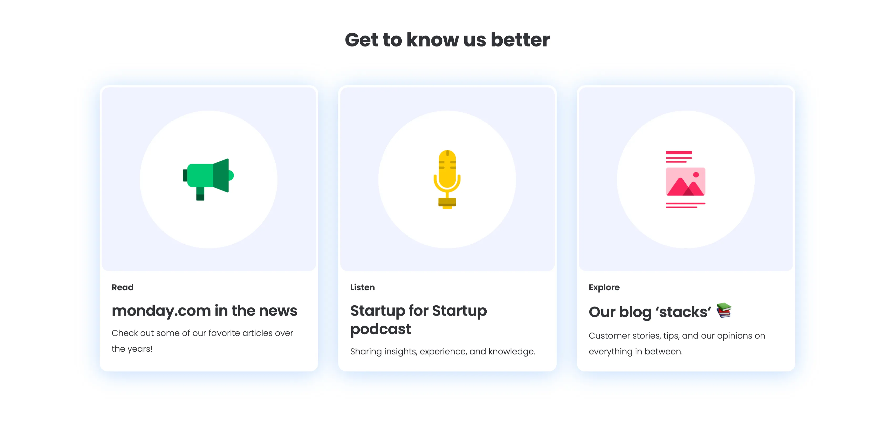
Get To Know Us Better Resource Cards
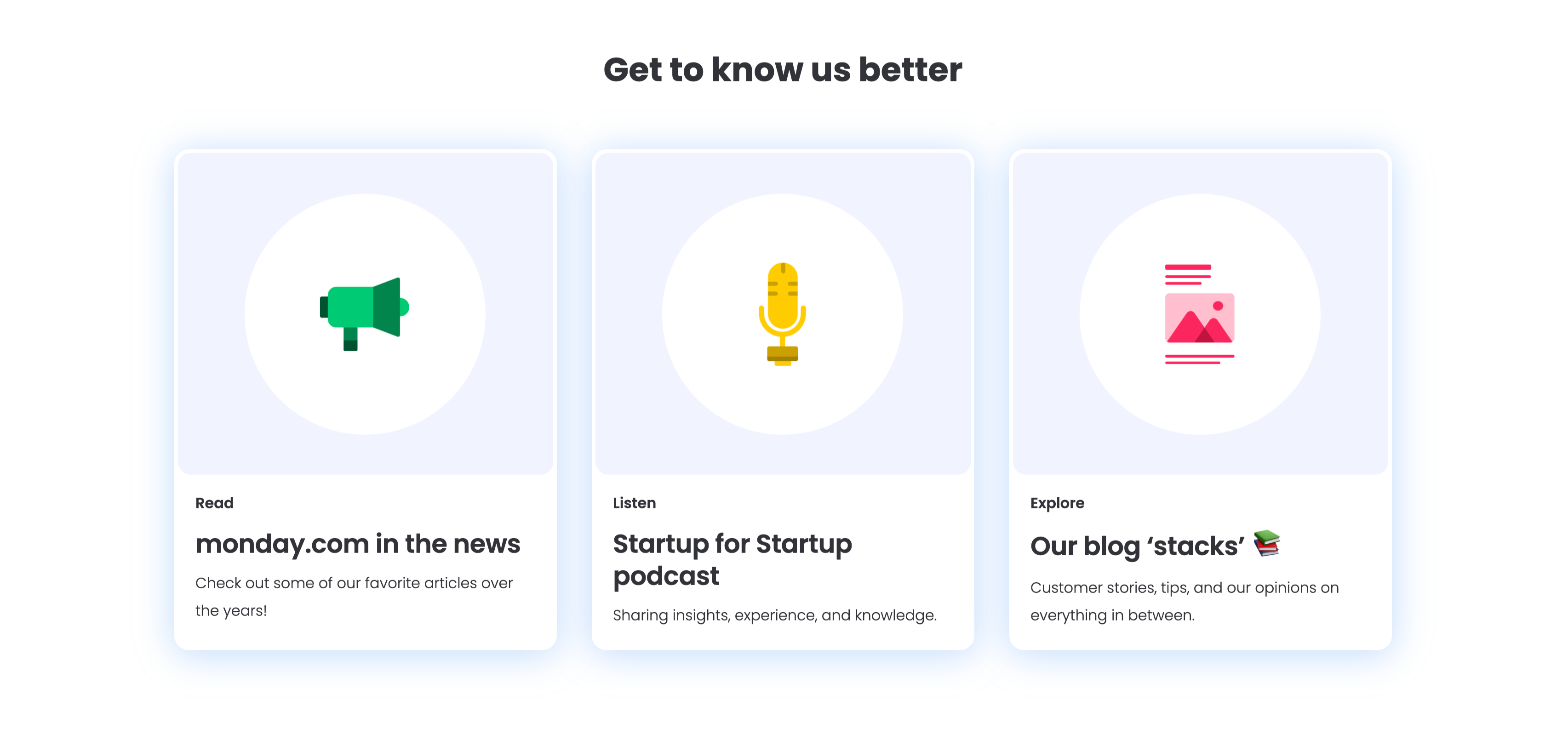
A three-up resource section under a centered bold 'Get to know us better' heading, with a soft blue glow behind the cards. Each of the three white rounded cards pairs a large circular flat icon with a small category label, a bold title and one line of copy: a green megaphone for 'Read — monday.com in the news' ('Check out some of our favorite articles over the years!'), a yellow microphone for 'Listen — Startup for Startup podcast' ('Sharing insights, experience, and knowledge.'), and a pink image icon for 'Explore — Our blog stacks' ('Customer stories, tips, and our opinions on everything in between.'). The colourful icons and consistent Read/Listen/Explore labelling make the content channels instantly distinguishable.
Monday ↗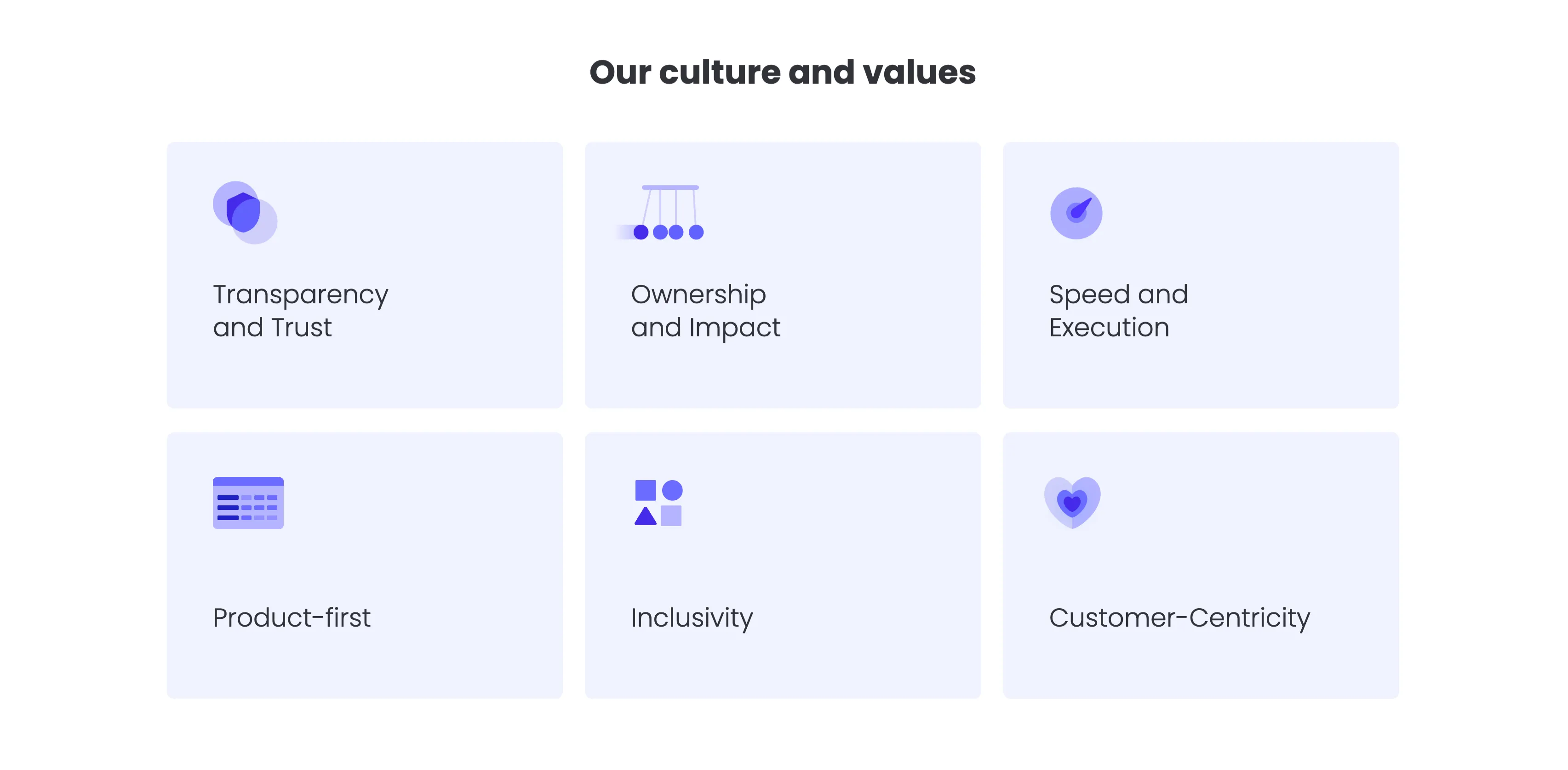
Our Culture And Values Icon Grid
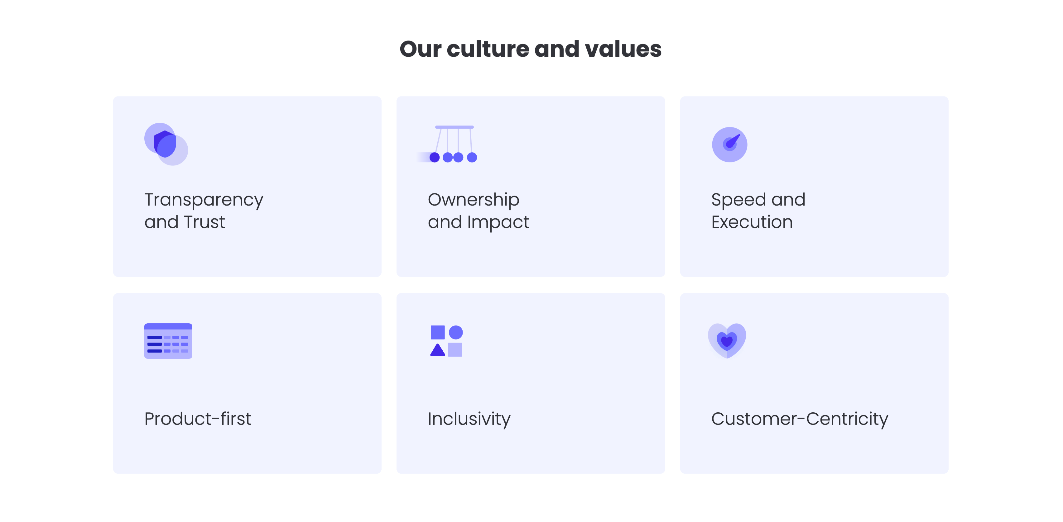
A values grid headed by a centered bold 'Our culture and values' title. Six pale-lavender rounded cards are arranged in a three-column by two-row grid, each holding a soft indigo illustrative icon in its upper-left corner and a value label below: 'Transparency and Trust', 'Ownership and Impact' and 'Speed and Execution' on the top row; 'Product-first', 'Inclusivity' and 'Customer-Centricity' on the bottom. The icons — a shield, a Newton's cradle, a speed gauge, a table, stacked shapes and a heart — visually cue each value. The uniform card sizing, restrained lavender palette and even spacing make the values easy to scan as a set.
Monday ↗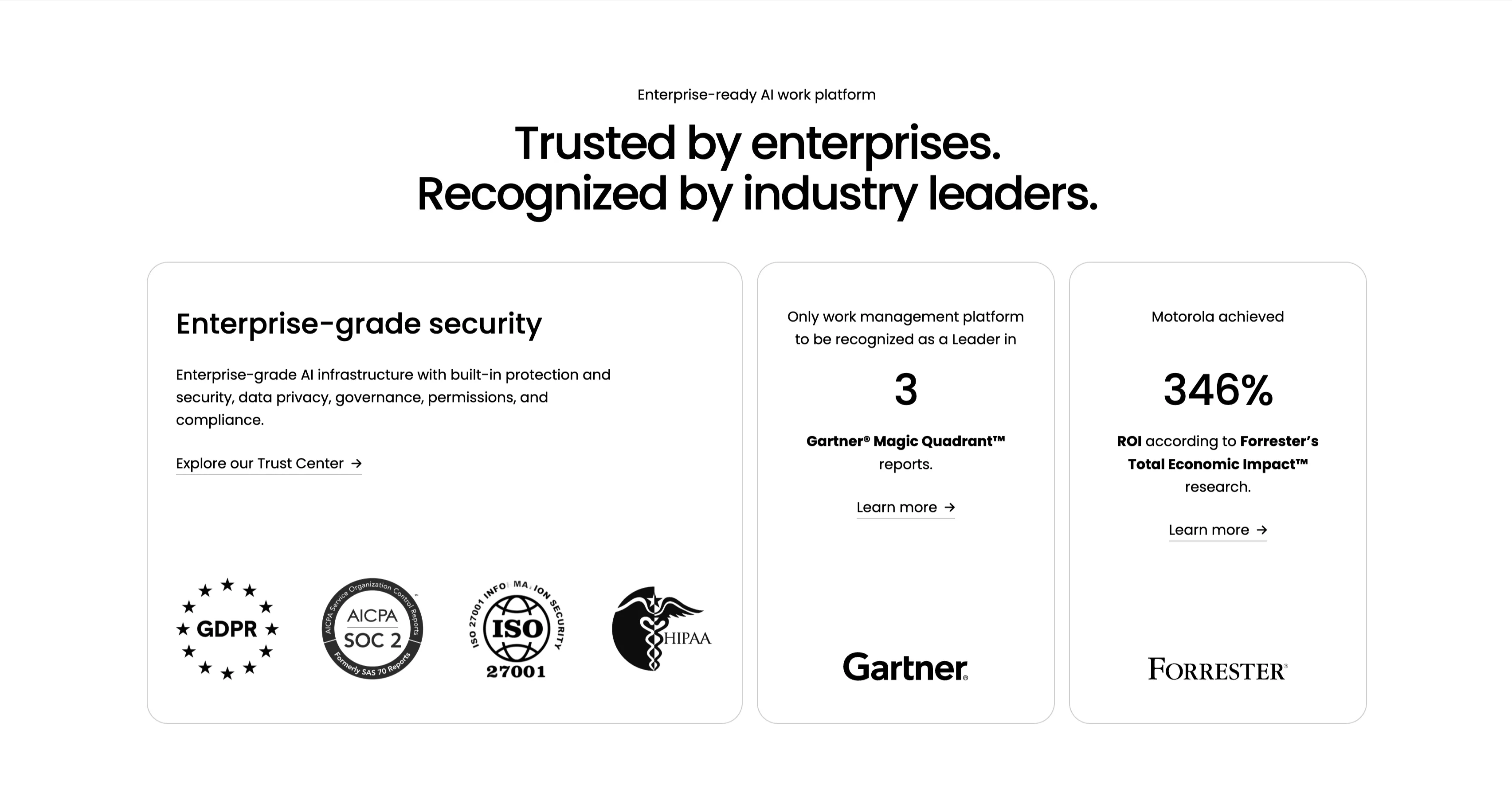
Trusted By Enterprises Recognition Cards
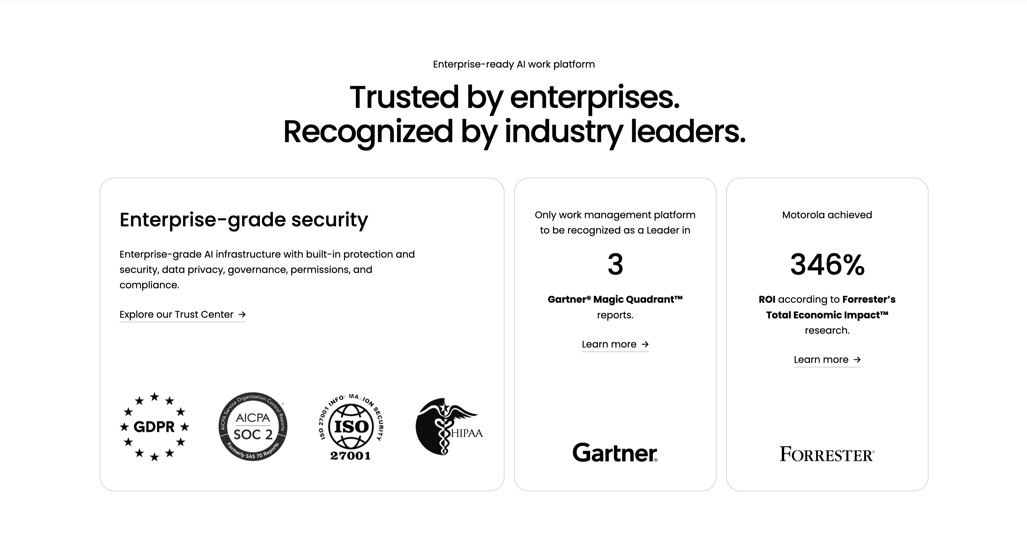
An enterprise-credibility section on white, led by a small 'Enterprise-ready AI work platform' eyebrow and a centered two-line headline, 'Trusted by enterprises. Recognized by industry leaders.' Three cards sit in a row. The wide left card, 'Enterprise-grade security', carries a paragraph on AI infrastructure, privacy and compliance, an 'Explore our Trust Center' link, and a row of compliance badges — GDPR, AICPA SOC 2, ISO 27001 and HIPAA. The middle card centers a large '3' with 'Gartner Magic Quadrant reports' and a 'Learn more' link above the Gartner logo. The right card centers '346%' with 'ROI according to Forrester's Total Economic Impact research', a 'Learn more' link and the Forrester logo. The badges and analyst figures stack third-party validation into one scannable trust row.
Monday ↗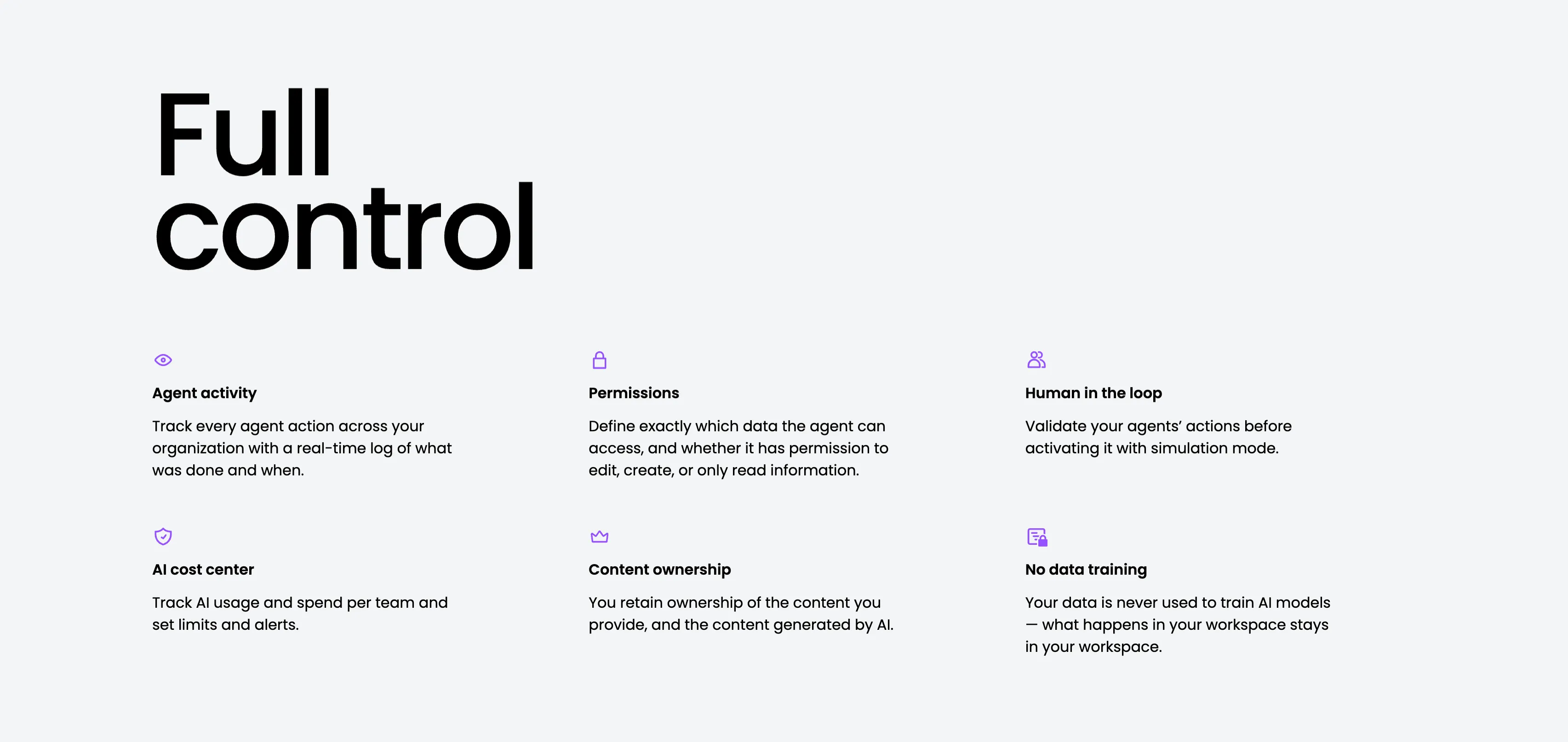
Full Control Governance Feature Grid
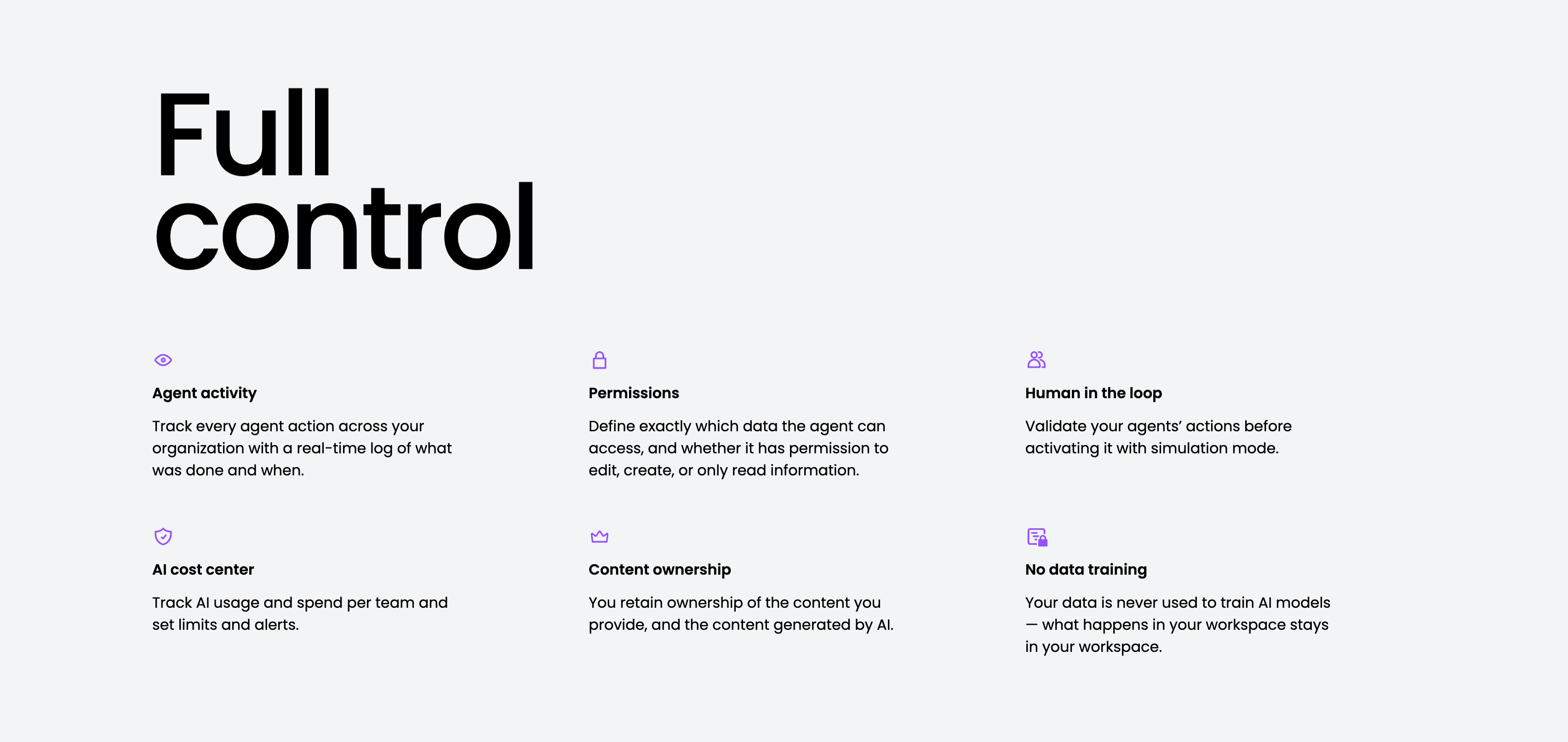
A governance feature grid on a pale-gray background, anchored by an oversized two-line 'Full control' heading in the upper left. Six items are laid out across three columns and two rows, each led by a small purple line icon, a bold title and a gray description: 'Agent activity' (a real-time log of what was done and when), 'Permissions' (define exactly which data an agent can access and whether it can edit, create or only read), 'Human in the loop' (validate actions with simulation mode), 'AI cost center' (track usage and spend, set limits and alerts), 'Content ownership' (you retain ownership of provided and generated content) and 'No data training' (your data is never used to train AI models). The even three-up rhythm and single accent colour keep the trust-and-control message calm and scannable.
Monday ↗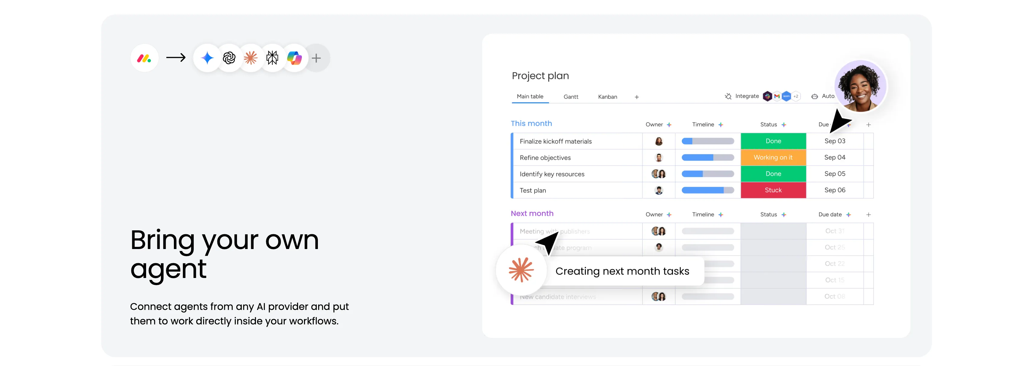
Bring Your Own Agent Split Feature
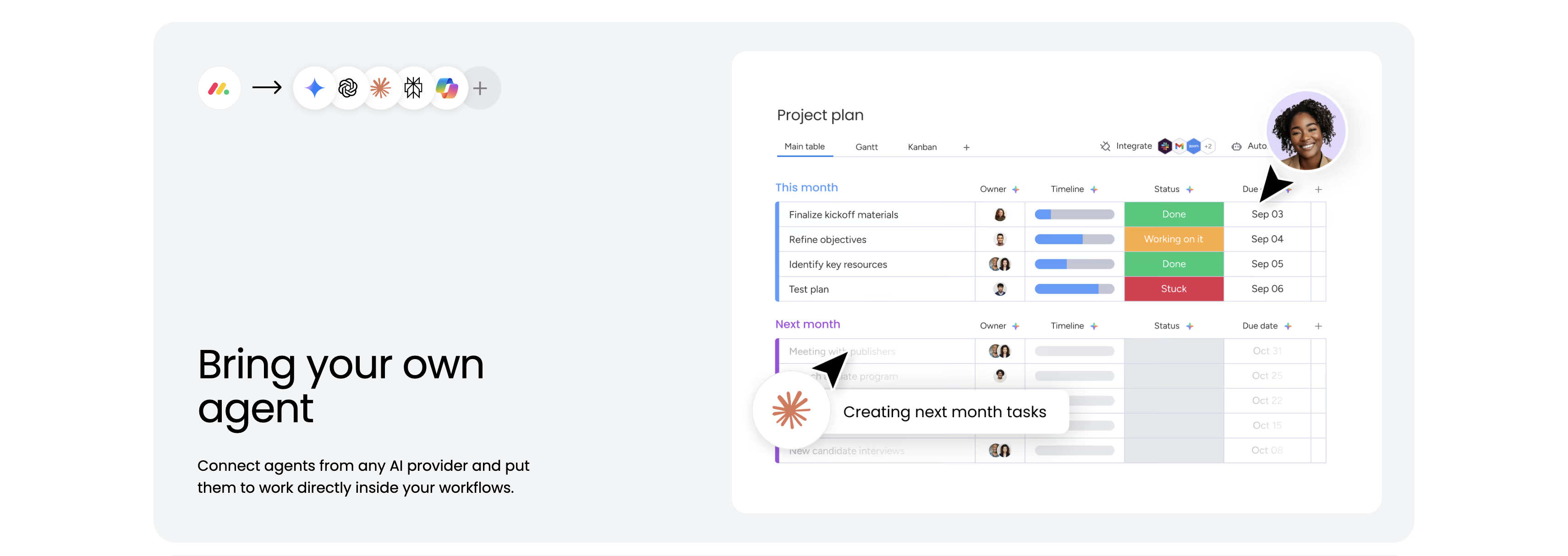
A feature block housed in a large pale-gray rounded panel. The upper area shows the monday logo, an arrow, and a row of AI-provider icons, signalling that outside agents plug in. The right side holds a 'Project plan' board screenshot with Main table / Gantt / Kanban tabs and status-coloured rows — 'Finalize kickoff materials' (Done, Sep 03), 'Refine objectives' (Working on it, Sep 04), 'Identify key resources' (Done), 'Test plan' (Stuck) — plus a 'Next month' group and a running agent chip reading 'Creating next month tasks.' The lower-left corner carries the heading 'Bring your own agent' and the line 'Connect agents from any AI provider and put them to work directly inside your workflows.' The board-with-live-agent visual makes the integration concrete.
Monday ↗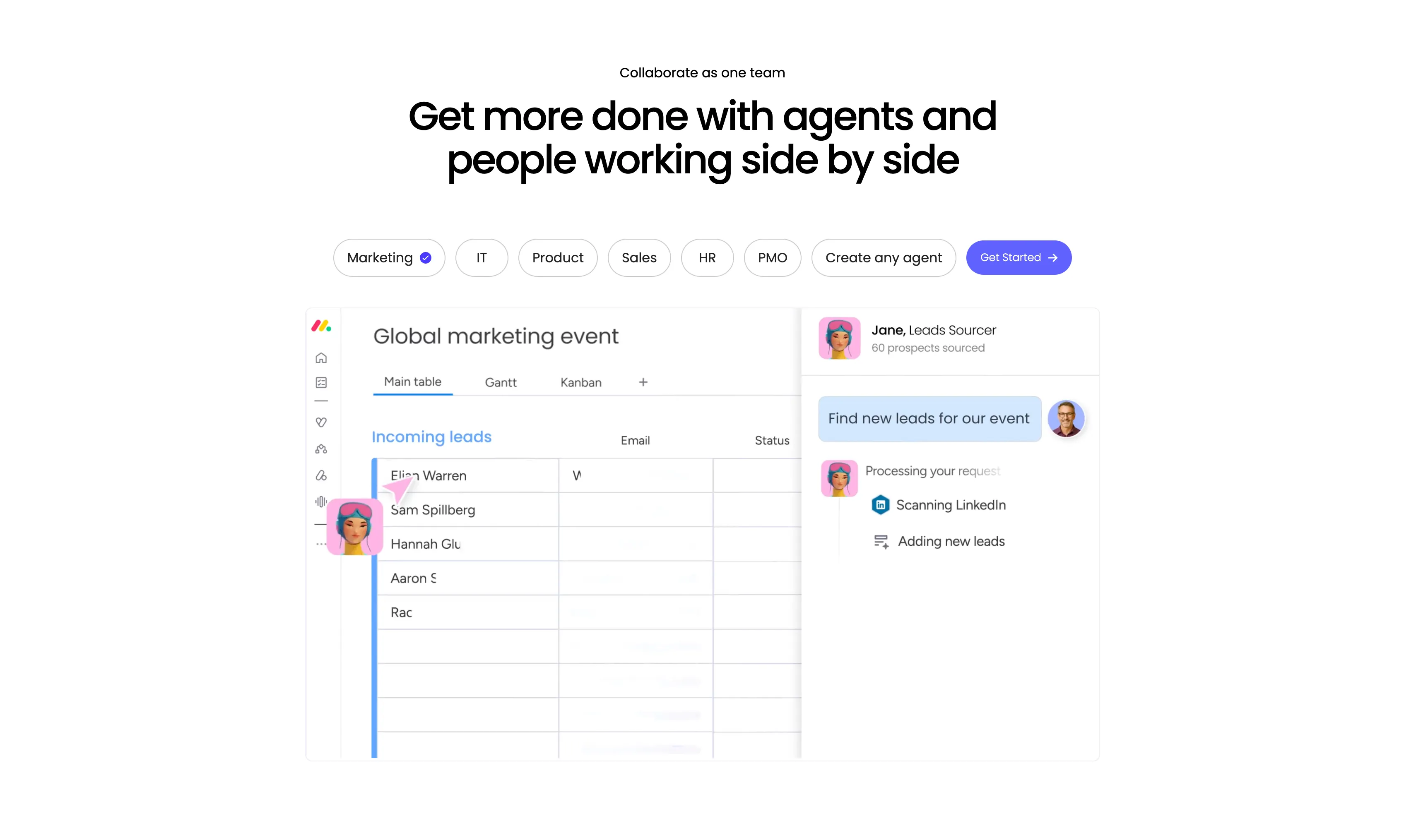
Collaborate As One Team Tabbed Agent Showcase
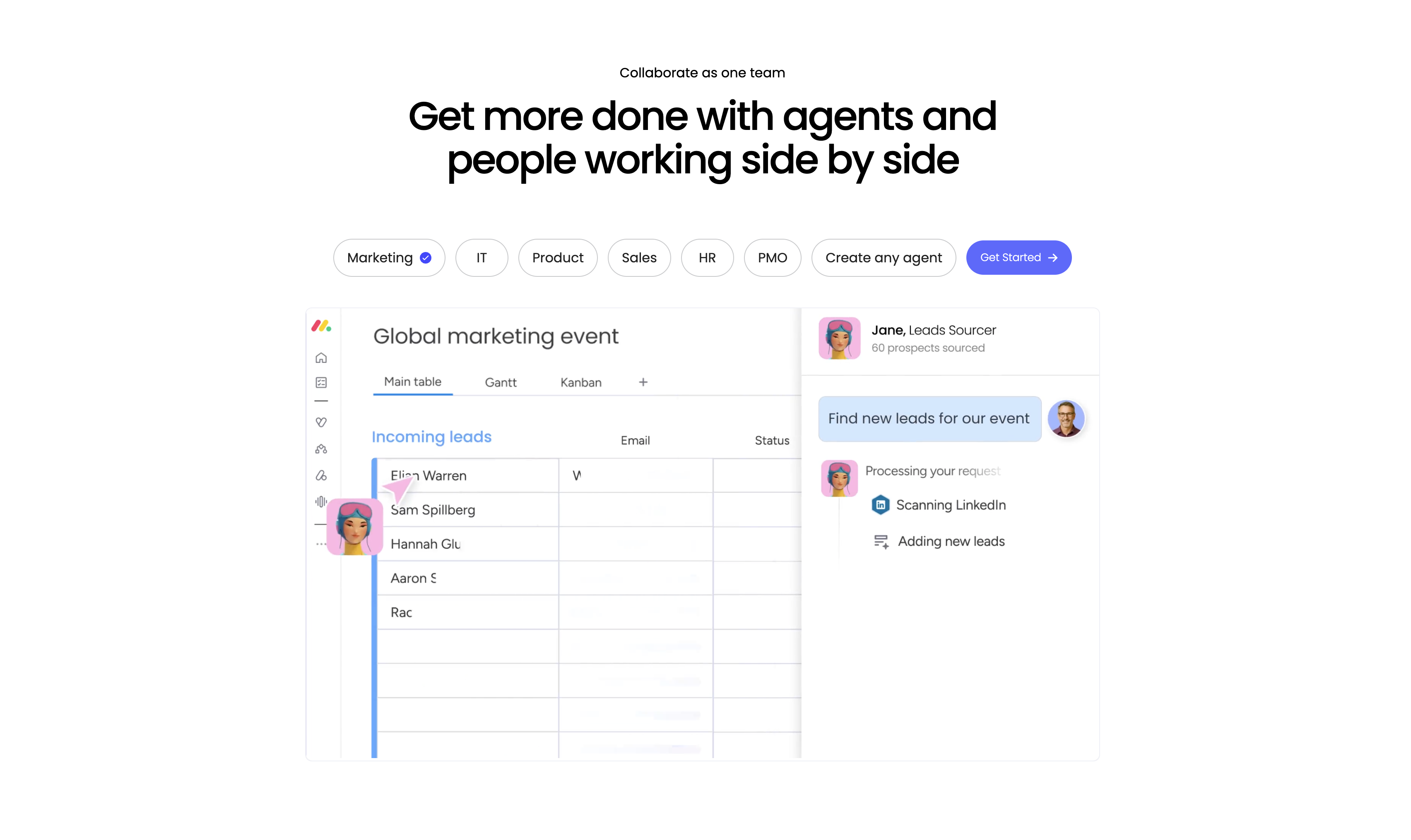
A centered feature showcase led by a small 'Collaborate as one team' eyebrow and a large two-line headline, 'Get more done with agents and people working side by side.' Beneath it sits a horizontal row of pill tabs — Marketing (selected, with a blue check), IT, Product, Sales, HR, PMO and 'Create any agent' — followed by a purple 'Get Started' button. A large product screenshot fills the lower half: on the left a monday board titled 'Global marketing event' with Main table / Gantt / Kanban tabs and an 'Incoming leads' table (Elian Warren, Sam Spillberg, Hannah Glu…) with an agent avatar cursor; on the right a chat panel where 'Jane, Leads Sourcer' responds to 'Find new leads for our event' by 'Scanning LinkedIn' and 'Adding new leads.' The tabbed personas plus the live agent-and-board split make the human-plus-agent workflow tangible.
Monday ↗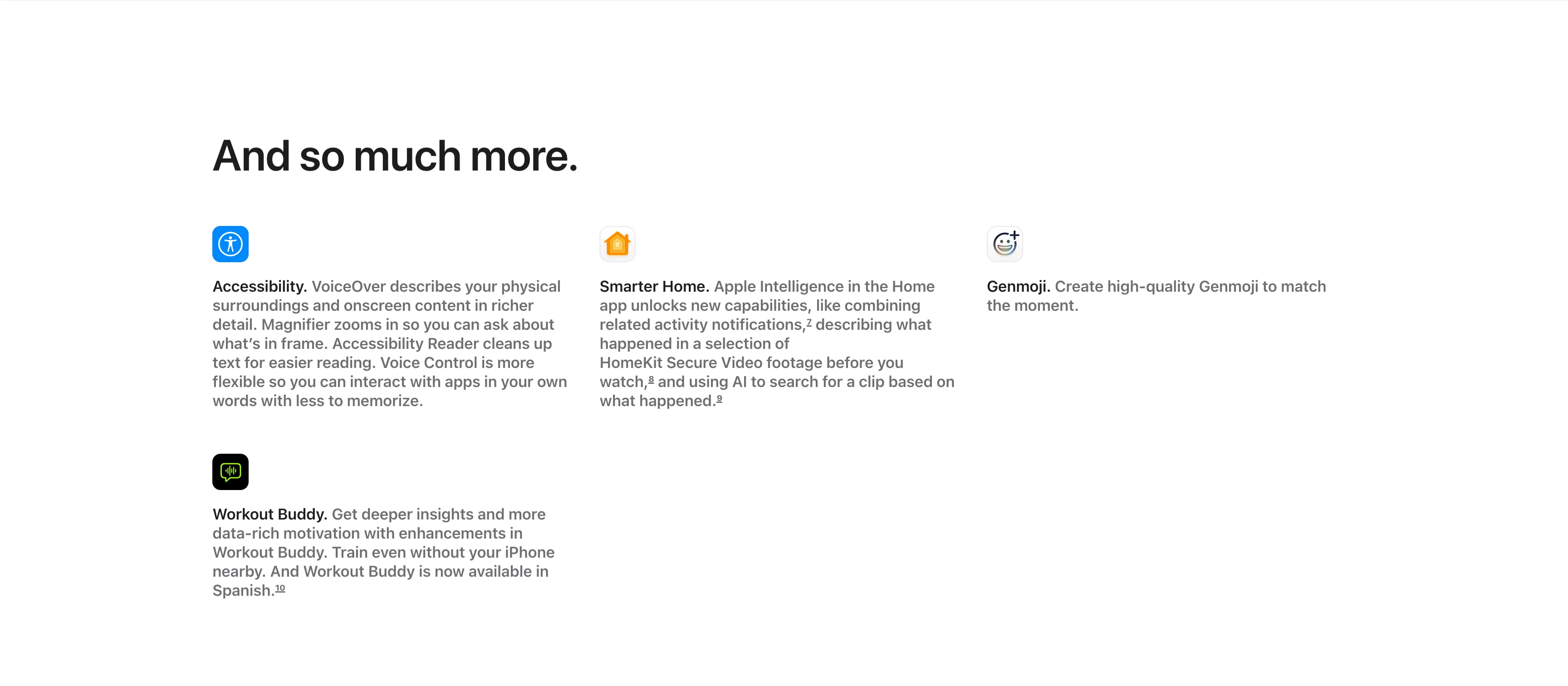
And So Much More Icon Feature Grid
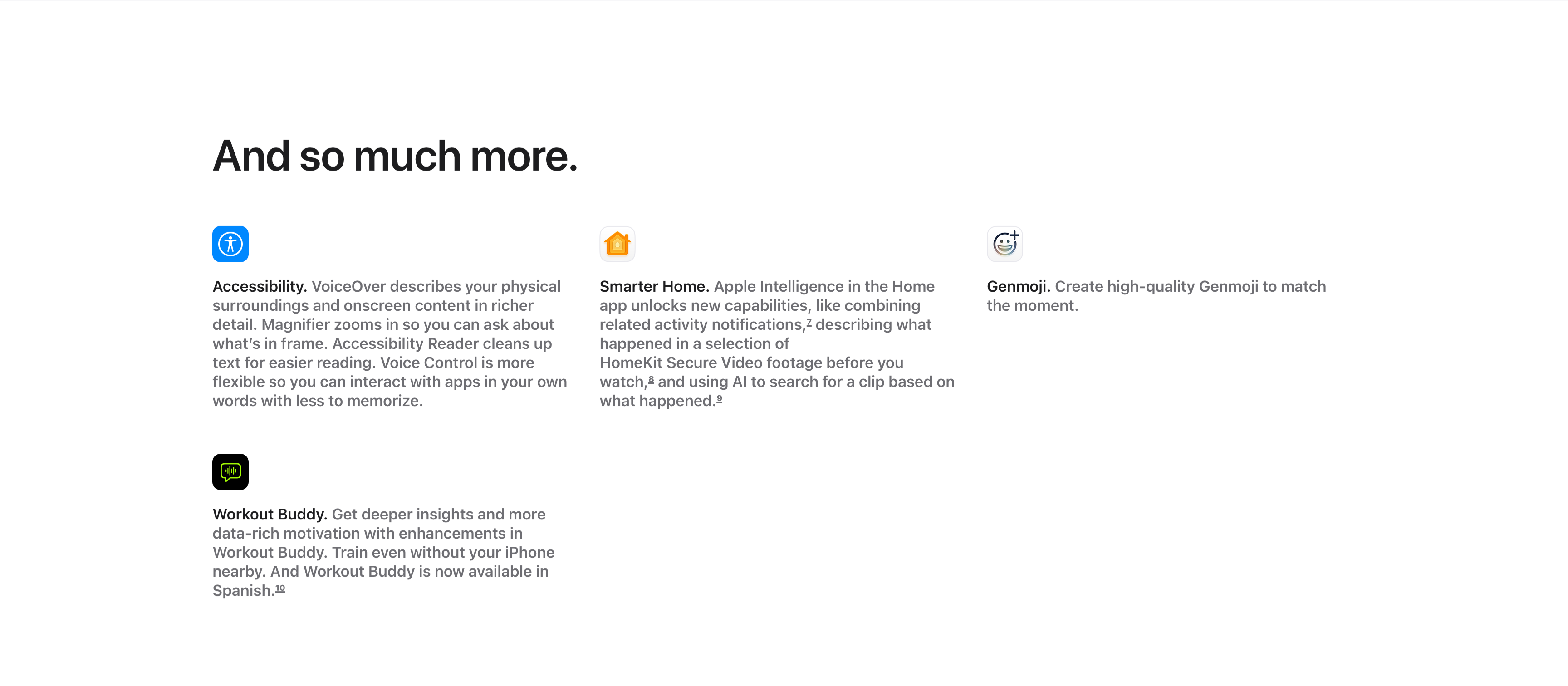
A compact 'And so much more.' feature grid on a white background, with the large left-aligned heading sitting above the items. Four entries are arranged across three columns and two rows, each led by a small rounded app icon, a bold inline title and a gray description: 'Accessibility.' (VoiceOver describing surroundings, Magnifier, Accessibility Reader, Voice Control), 'Smarter Home.' (combining activity notifications and AI search of HomeKit Secure Video), and 'Genmoji.' (creating high-quality Genmoji) fill the top row, with 'Workout Buddy.' (deeper insights, now in Spanish) below the first column. Superscript footnote markers appear after several phrases. The icon-led, text-heavy grid efficiently rounds up smaller features after the main showcases.
Apple ↗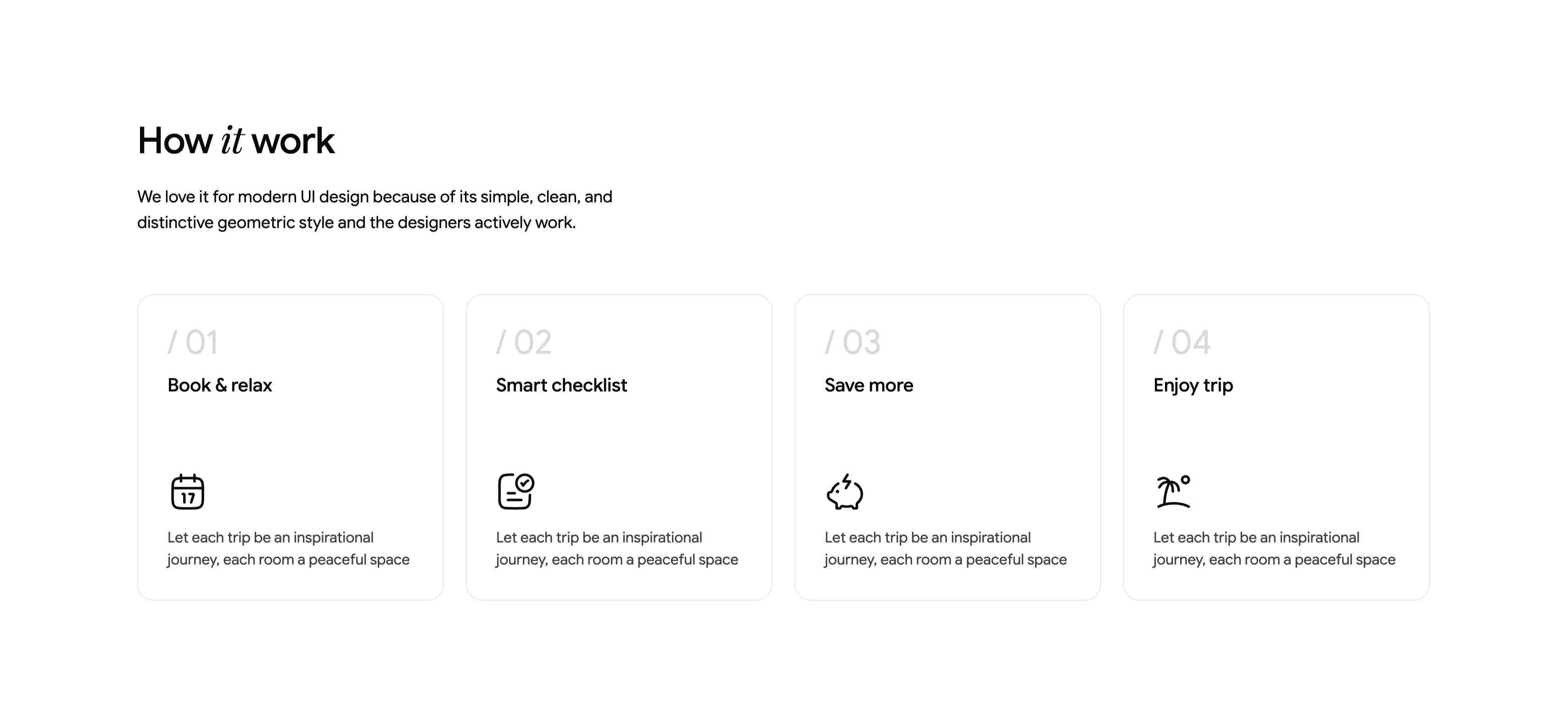
How It Works Four-Step Numbered Cards
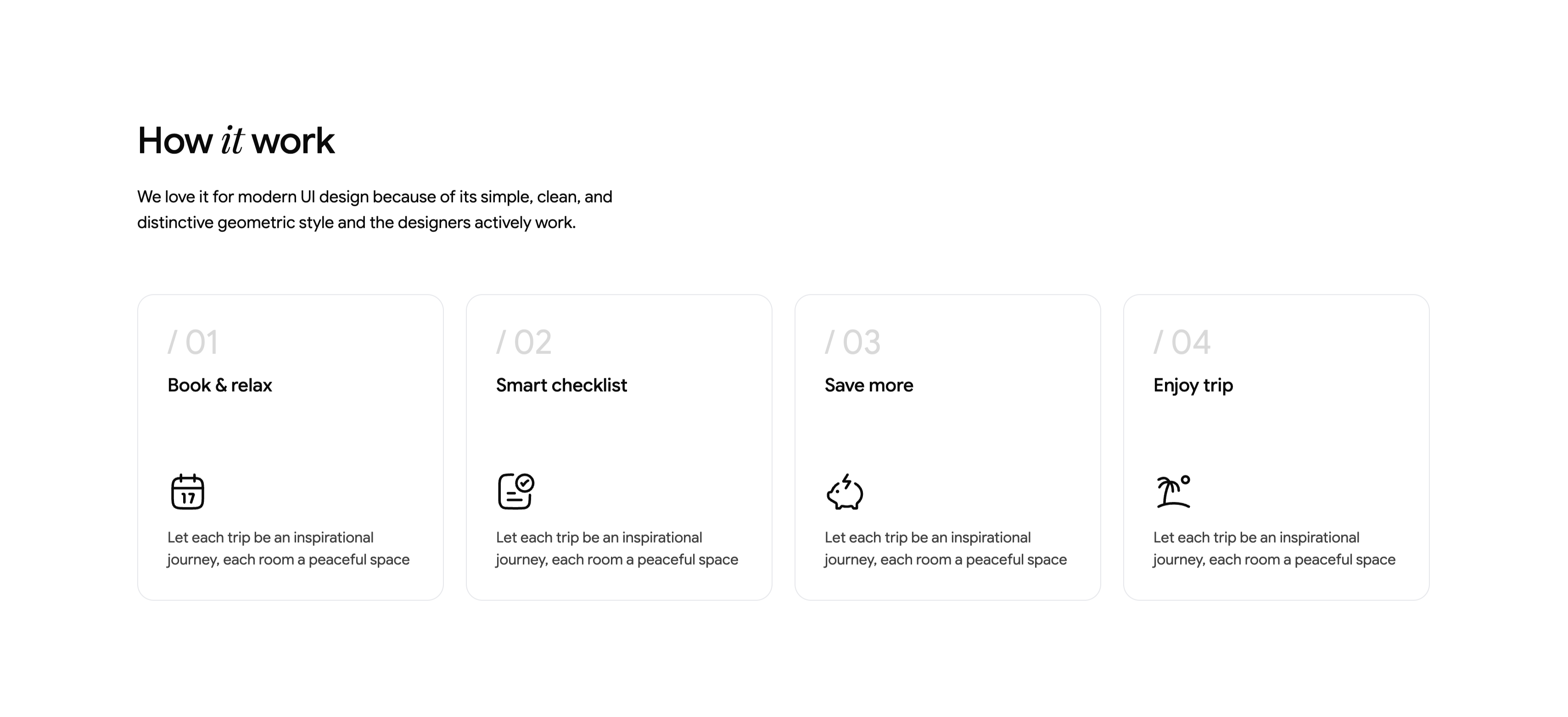
A 'How it work' section (with 'it' in italic serif) introduced by a two-line subhead about a simple, clean, geometric style. Below sits a four-up row of equally sized cards with thin rounded borders, each numbered in light gray — '/ 01', '/ 02', '/ 03', '/ 04'. The cards are titled 'Book & relax', 'Smart checklist', 'Save more' and 'Enjoy trip', each carrying a single monoline icon (a calendar, a checklist, a piggy bank with a lightning bolt, and a palm beach) above the same placeholder body line, 'Let each trip be an inspirational journey, each room a peaceful space'. Set on white with lots of breathing room and uniform card sizing, it reads as a calm, geometric process explainer.
Ceepii-nextjs-template ↗

Rental Category Icon Marquee Strip
A slim horizontal marquee strip listing rental categories, each shown as a small rounded icon tile paired with a label. Across two staggered rows it cycles through 'Apartment rentals', 'Beachfront rentals', 'Condo rentals', 'Pet-friendly rentals', 'House rentals', 'Villa rentals' and 'Unique stays', with simple monoline icons (a building, a palm beach, a boat, a UFO for unique stays, a house, a hot-air balloon). The items repeat and fade out softly at both edges, signalling a continuous auto-scrolling ticker. On a plain light background with thin black line icons and clean sans labels, it reads as a quick, low-key category browser bridging two larger sections.
Ceepii-nextjs-template ↗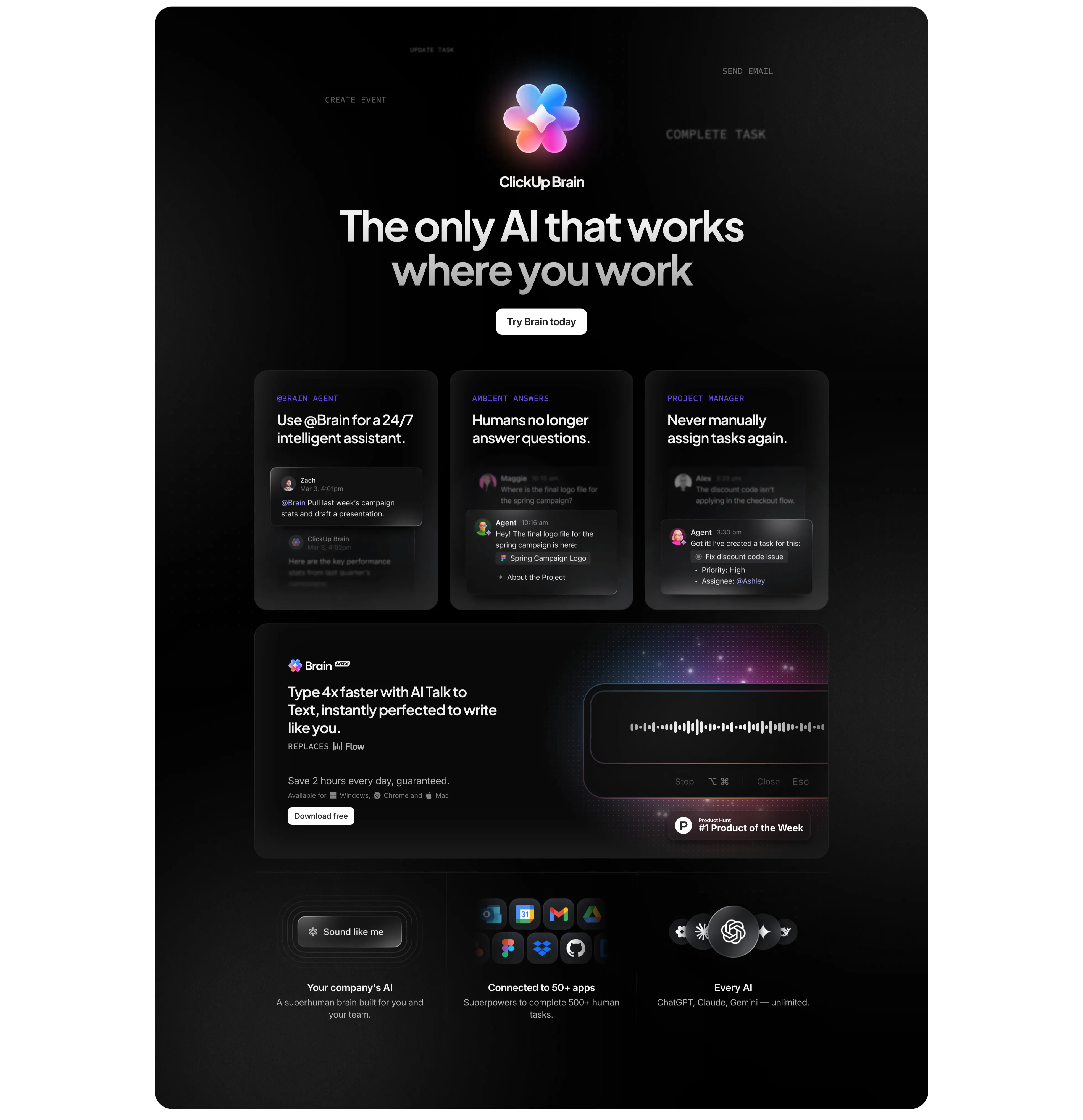
ClickUp Brain Dark Feature Section
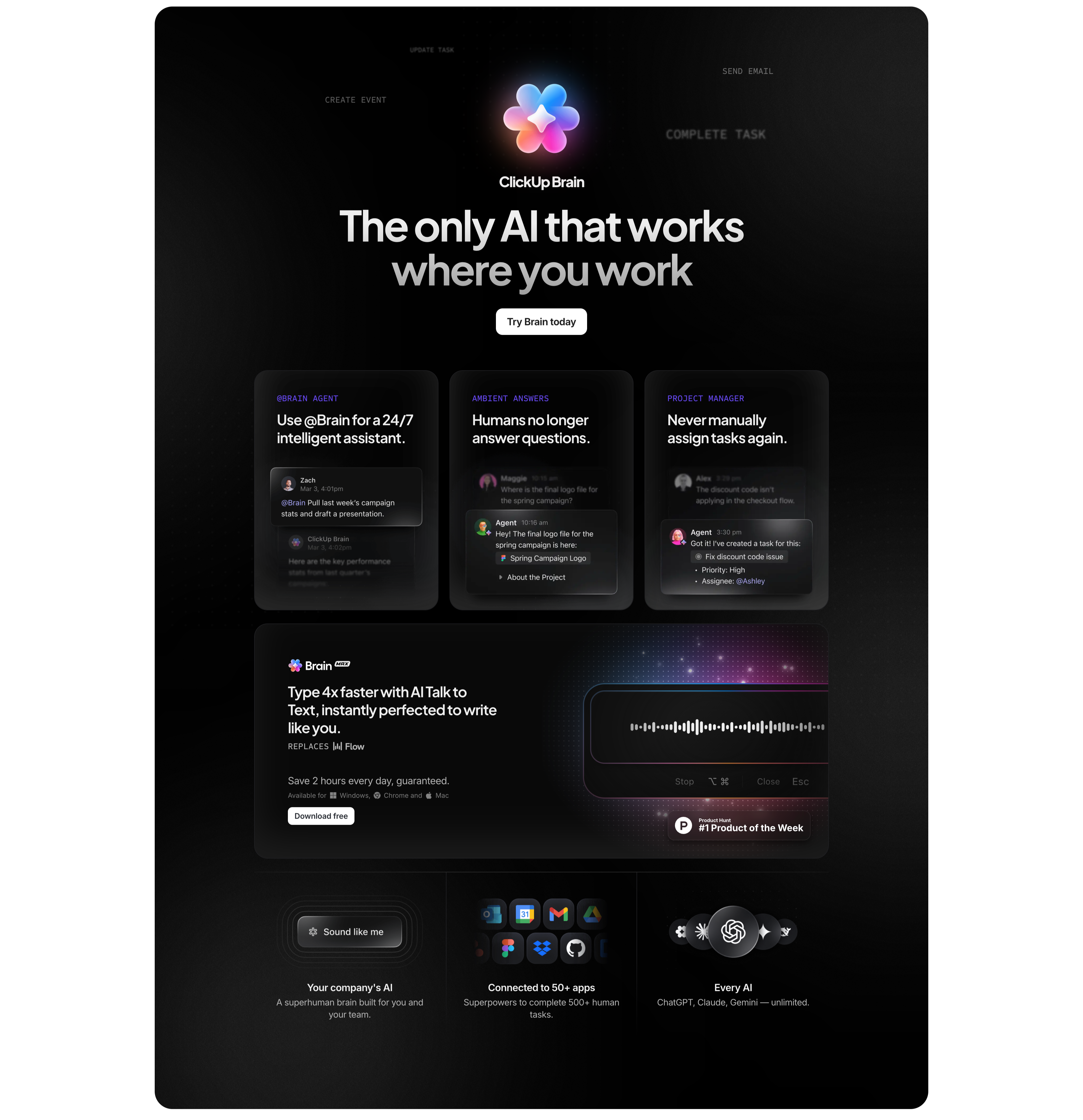
A tall dark (near-black) section centered on the ClickUp Brain product. At the top a colourful flower-shaped Brain logo sits between faint all-caps labels (CREATE EVENT, SEND EMAIL, COMPLETE TASK), under a large light headline 'The only AI that works where you work' and a white 'Try Brain today' button. Below, three dark cards each pair an eyebrow label and heading with a mocked chat exchange — '@Brain Agent' (24/7 assistant), 'Ambient Answers' (humans no longer answer questions), and 'Project Manager' (never manually assign tasks). Beneath them a wide 'Brain MAX' panel promotes talk-to-text with a glowing waveform input and a 'Product Hunt #1 Product of the Week' badge. A bottom three-up row adds 'Your company's AI', 'Connected to 50+ apps' (app icon cluster), and 'Every AI' (ChatGPT, Claude, Gemini). The dark theme and glassy cards set the AI feature apart from the white sections around it.
Clickup ↗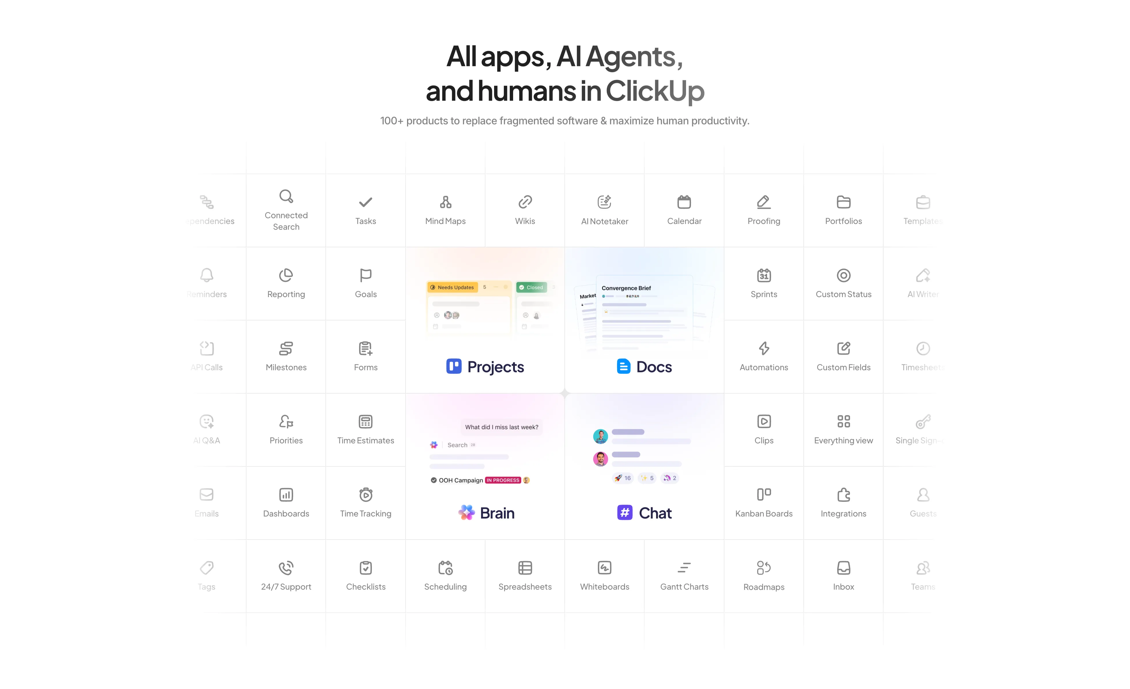
All Apps And AI Agents Feature Grid
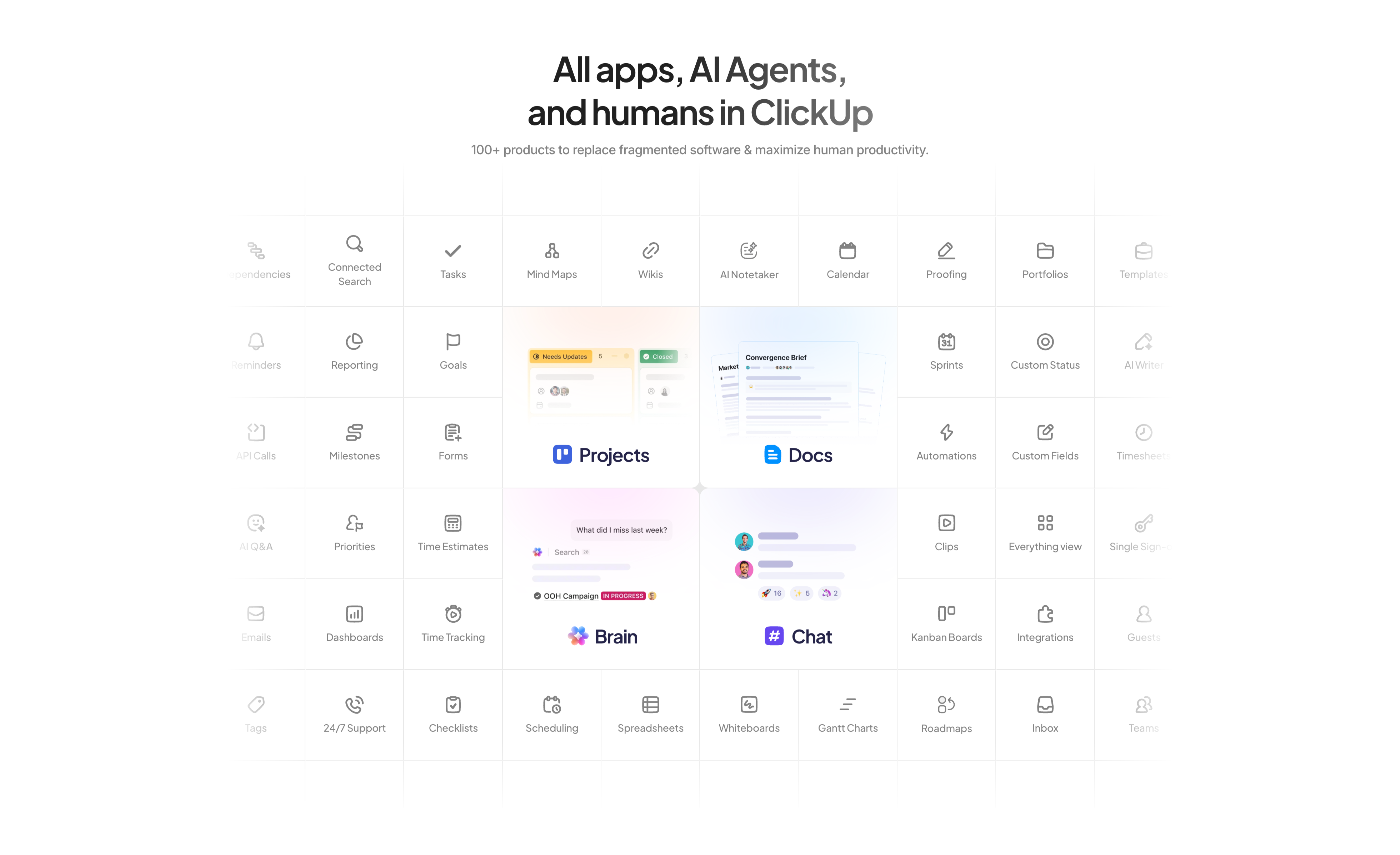
A large centered feature matrix on white. The headline 'All apps, AI Agents, and humans in ClickUp' sits above a grey subhead noting '100+ products to replace fragmented software'. Below spans a dense grid of thin-bordered cells, each a small line icon with a label — Tasks, Mind Maps, Wikis, AI Notetaker, Calendar, Proofing, Reporting, Goals, Sprints, Automations, Dashboards, Time Tracking and many more. Four cells are enlarged into soft-gradient product tiles that break the uniform grid: 'Projects', 'Docs', 'Brain', and 'Chat', each showing a mini UI preview. The edge cells fade toward transparent, implying the catalogue continues beyond the frame. The sheer count of tiles visually argues the all-in-one breadth of the platform.
Clickup ↗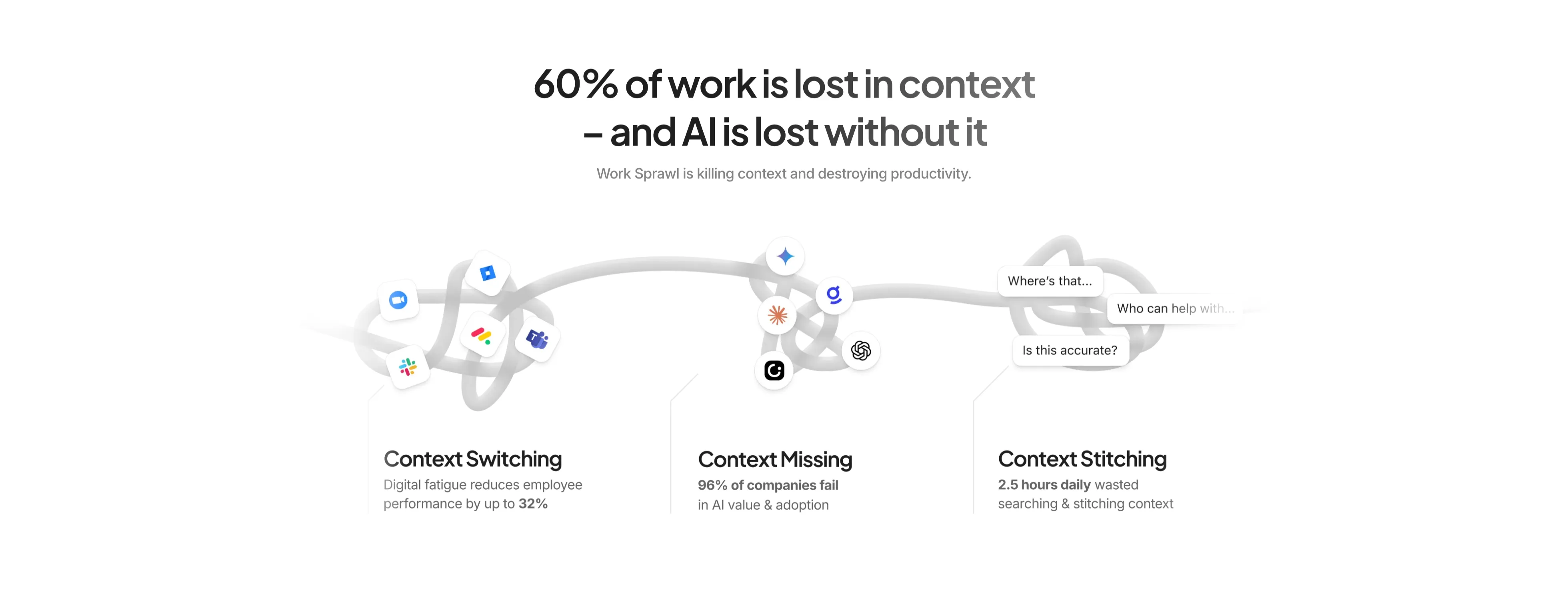
Context Problem Three-Up With Stats
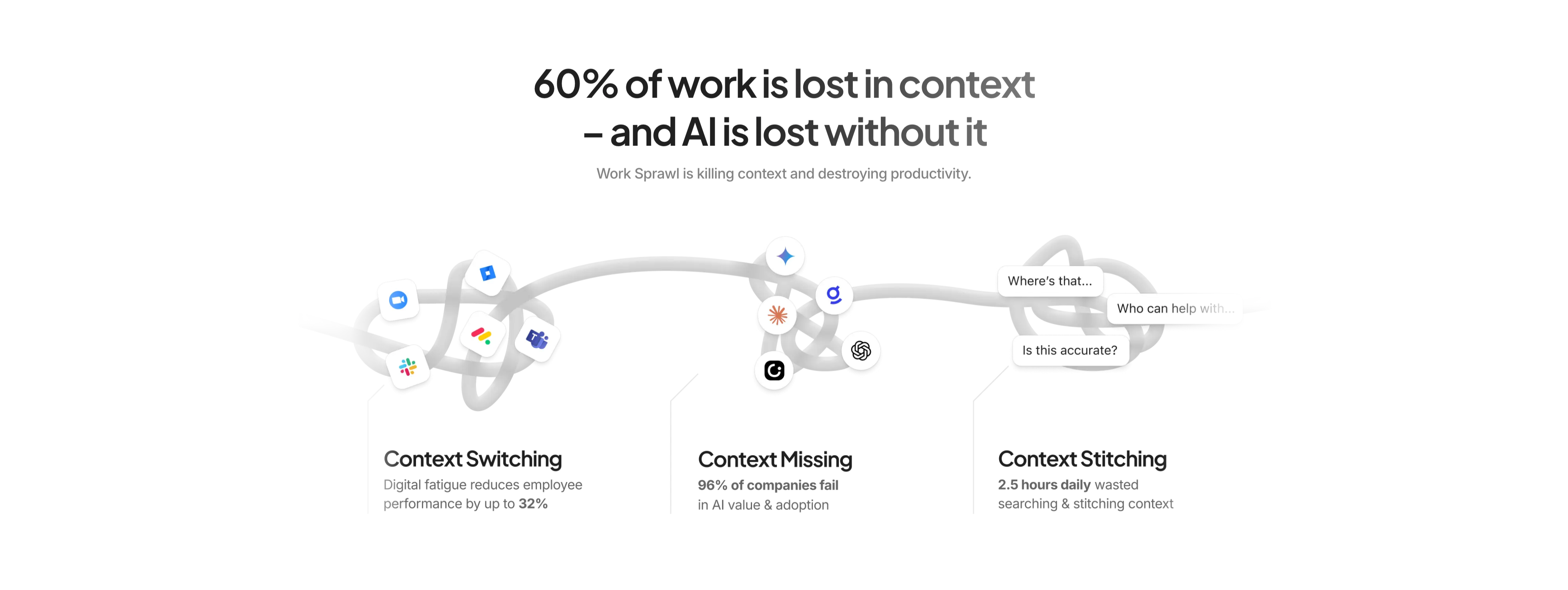
A centered problem-framing section on white. A large two-tone headline reads '60% of work is lost in context – and AI is lost without it', with a grey subhead 'Work Sprawl is killing context and destroying productivity.' Below, a tangled grey rope illustration weaves across the width, snagging clusters of app icons (Zoom, Jira, Slack, Teams, Gemini, ChatGPT) and small chat bubbles ('Where's that…', 'Who can help with…', 'Is this accurate?'). The illustration resolves into a three-up row of labelled points — 'Context Switching' (reduces performance by up to 32%), 'Context Missing' (96% of companies fail), and 'Context Stitching' (2.5 hours daily wasted) — each bolding its key statistic. The metaphorical knot plus hard numbers makes the pain concrete before the product is pitched.
Clickup ↗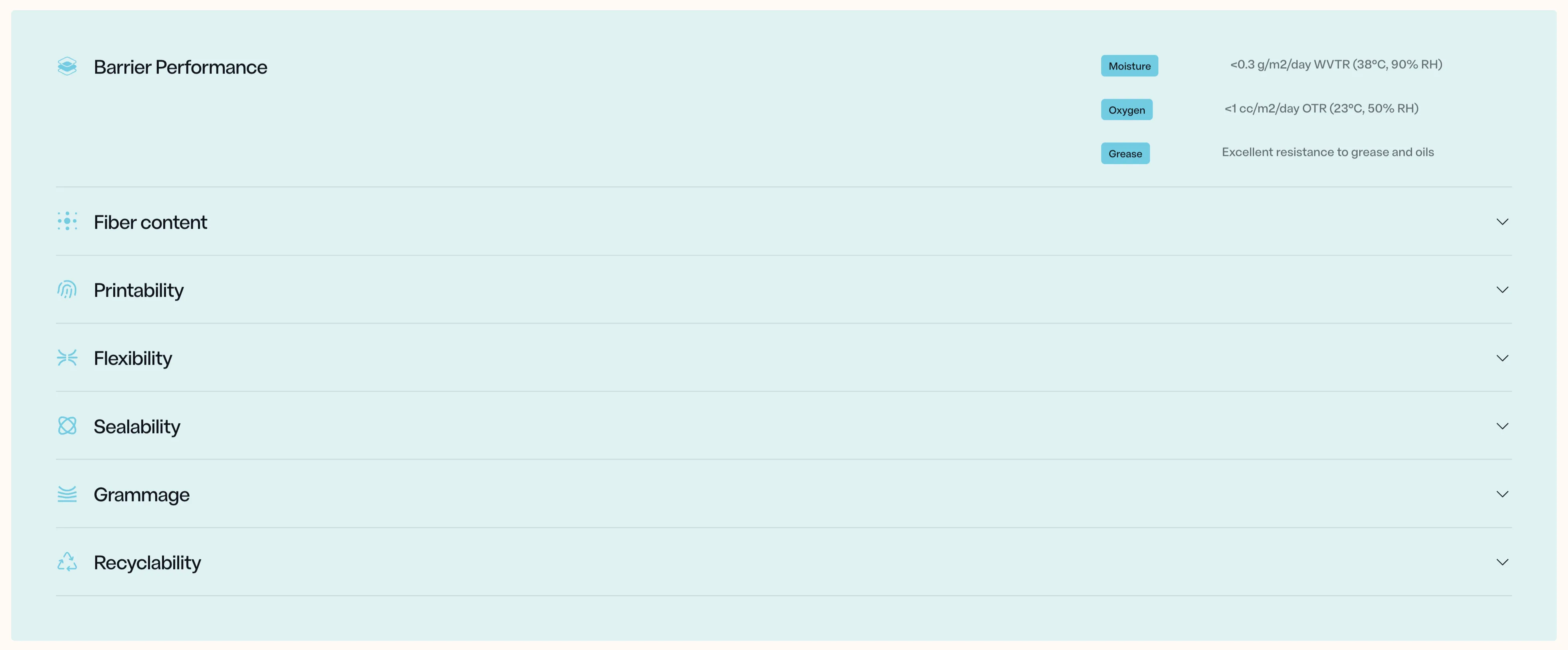
NFINITE Barrier Specs Accordion
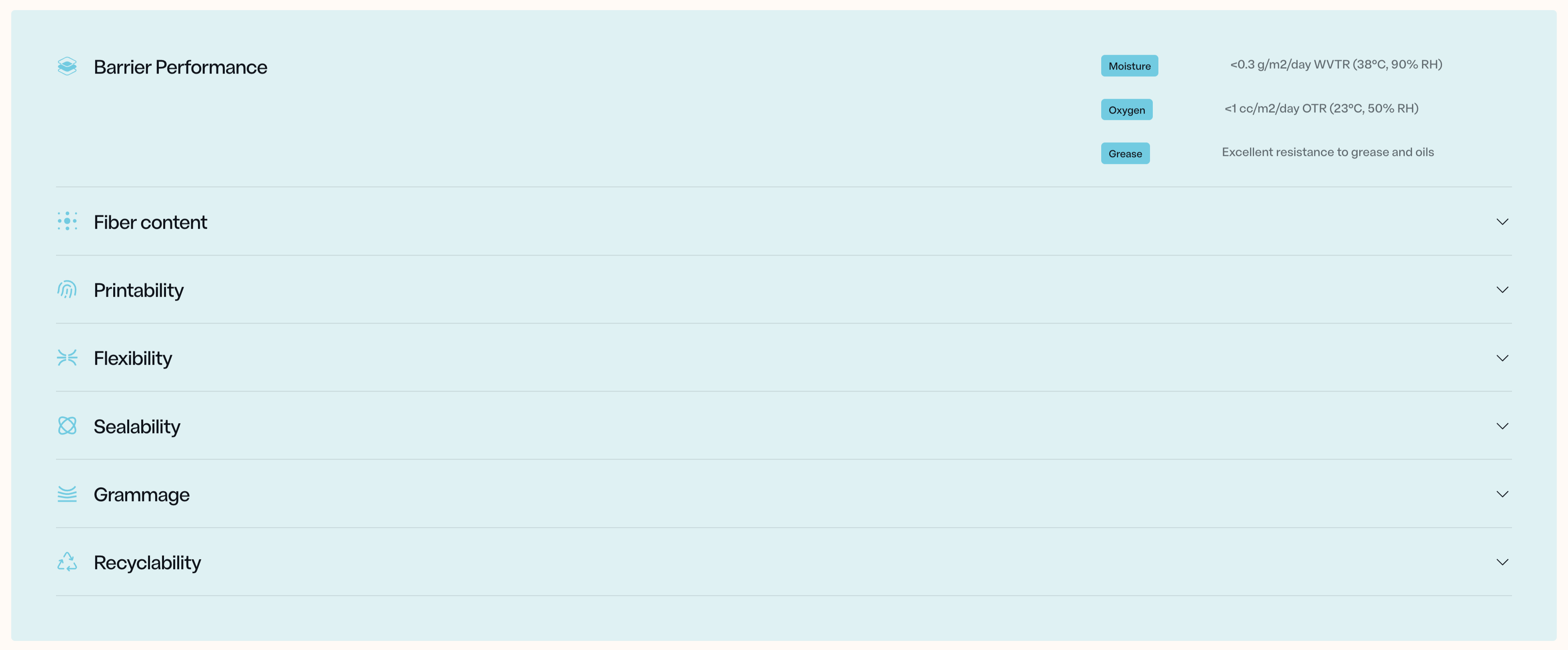
A specifications accordion on a soft pale-blue panel, listing the material's properties as a vertical stack of expandable rows. Each row pairs a thin line icon with a label — Barrier Performance, Fiber content, Printability, Flexibility, Sealability, Grammage, Recyclability — separated by hairline dividers, with a downward chevron on the right of every collapsed row. The top row, 'Barrier Performance', is expanded to reveal its detail on the right side: three small rounded sky-blue pills labelled Moisture, Oxygen and Grease, each paired with a grey technical value — '<0.3 g/m2/day WVTR (38°C, 90% RH)', '<1 cc/m2/day OTR (23°C, 50% RH)', and 'Excellent resistance to grease and oils'. The remaining six rows stay collapsed below. The palette is restrained — pale blue field, near-black labels, muted grey values — and the generous spacing plus precise spec formatting give it a credible, engineering-grade feel suited to a technical B2B audience scanning for hard numbers.
Nfinitepaper ↗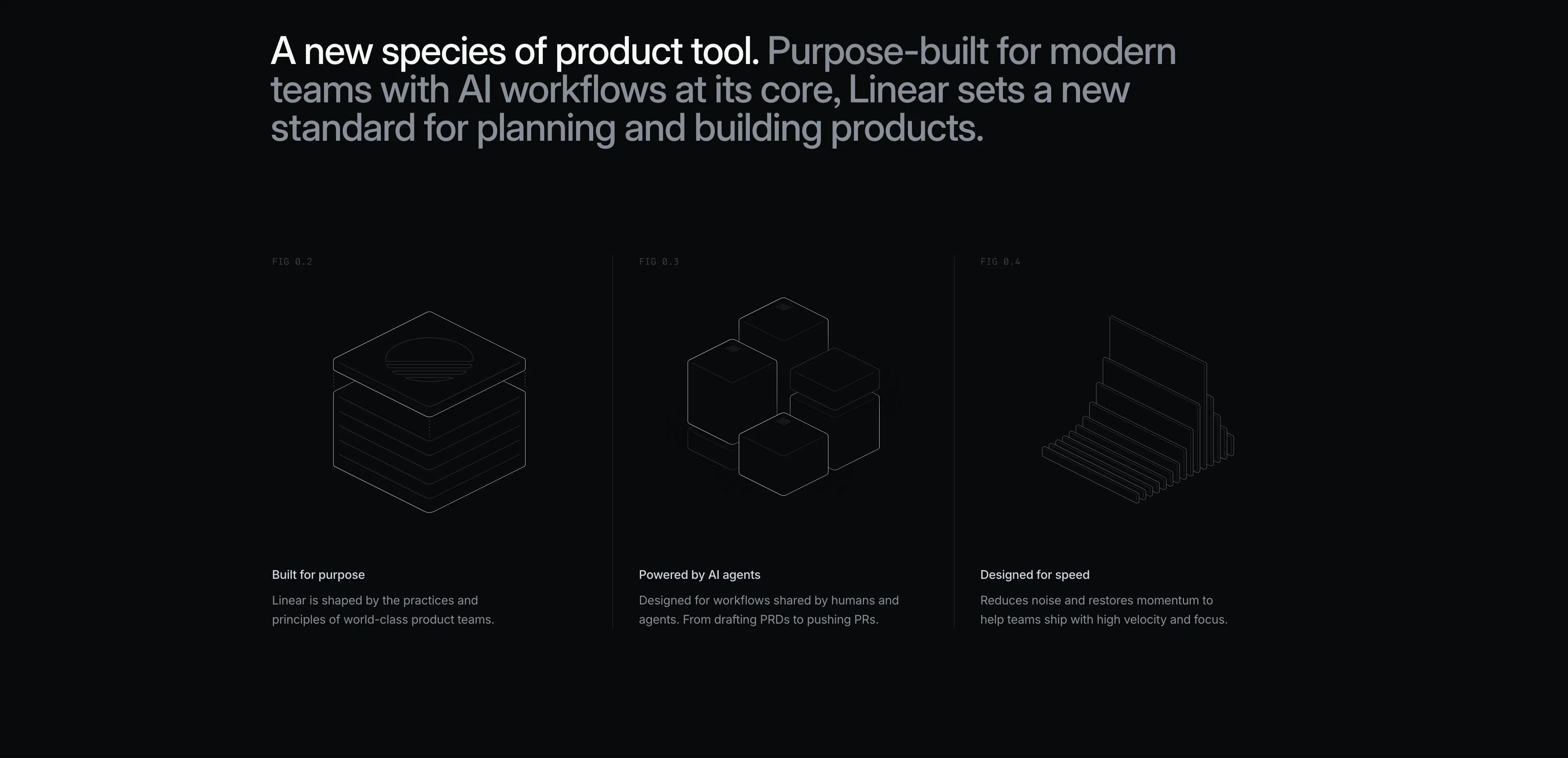
Linear Three-Up Feature Grid With Line Illustrations
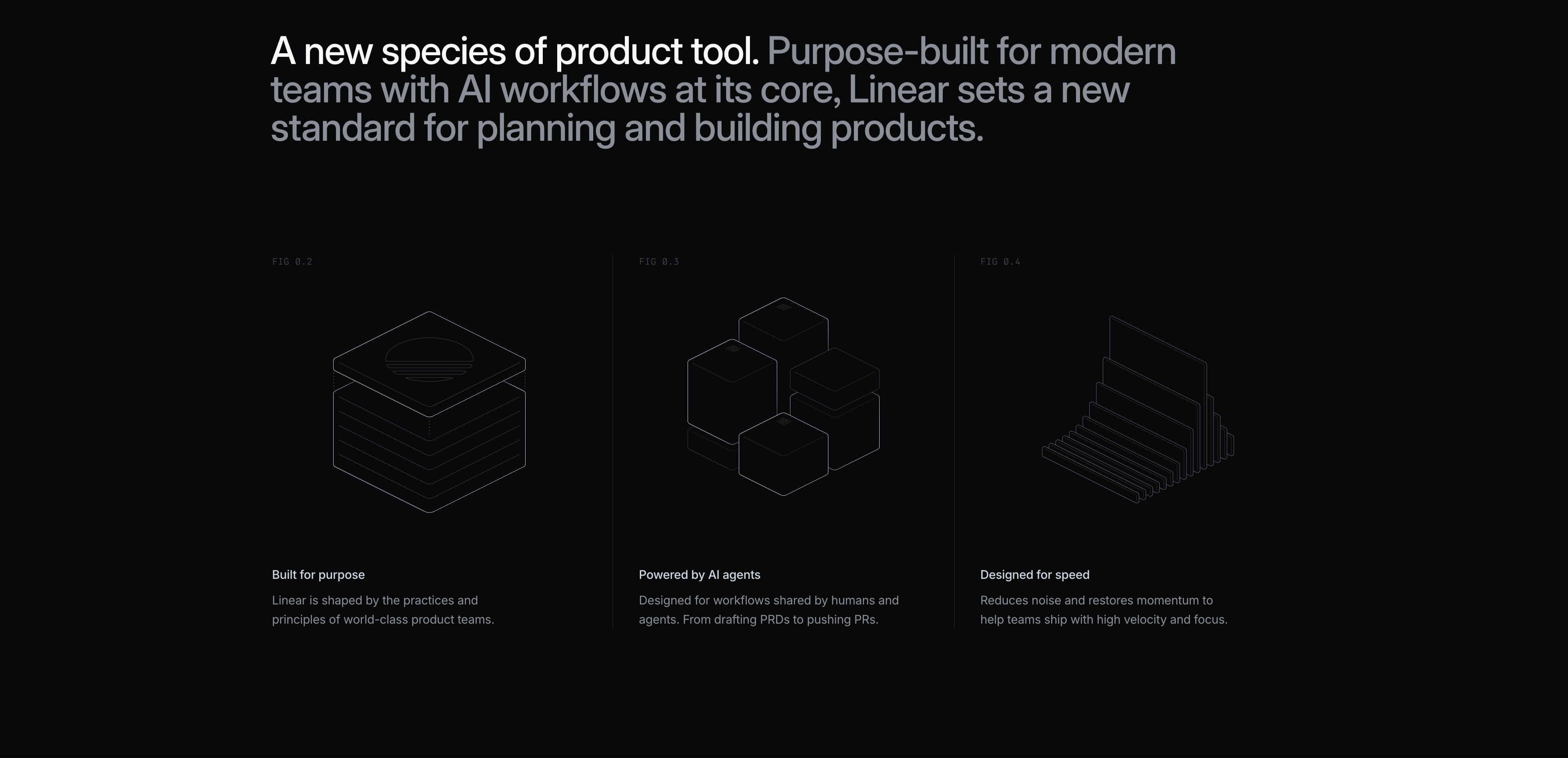
A dark feature section opening with a large two-tone headline where 'A new species of product tool.' is bright white and the continuation 'Purpose-built for modern teams with AI workflows at its core, Linear sets a new standard for planning and building products.' fades to grey. Below sits a three-column grid divided by thin vertical rules. Each column is labelled with a small monospace figure number (FIG 0.2, FIG 0.3, FIG 0.4) above a delicate white wireframe isometric illustration — a stacked slab, a cluster of cubes, and a fanned set of cards. Under each illustration is a white bold title and a short grey paragraph: 'Built for purpose', 'Powered by AI agents', and 'Designed for speed'. The technical, blueprint-like aesthetic on black gives the section an engineered, premium feel.
Linear ↗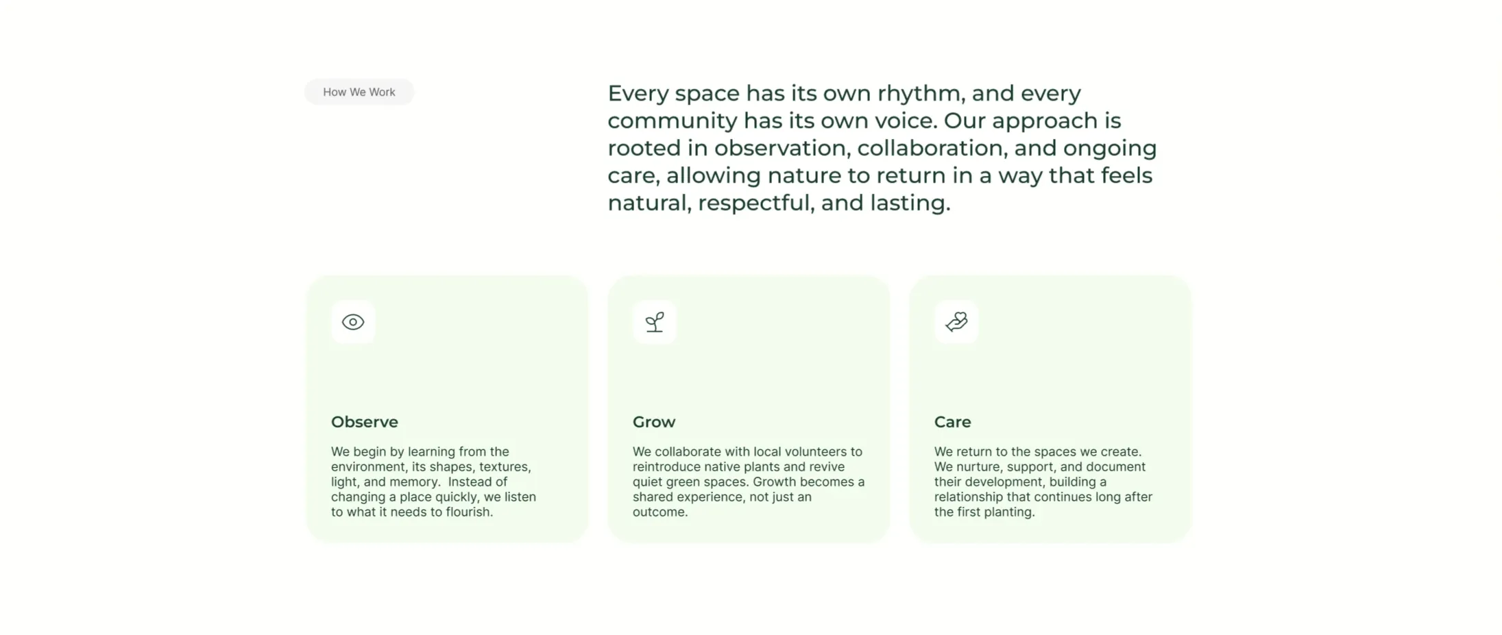
UrbanLeaf How We Work Icon Cards
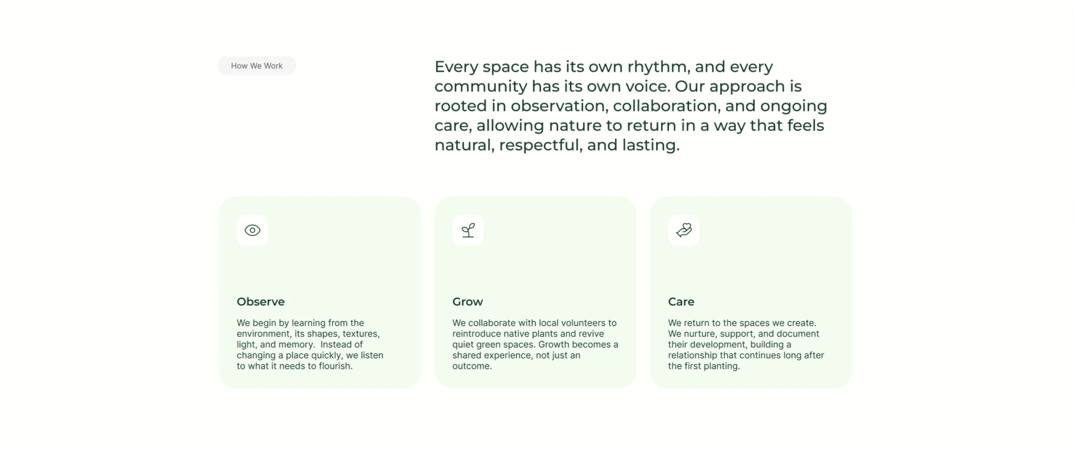
A 'How We Work' section on white using an asymmetric two-part header: a small grey 'How We Work' pill sits on the left while a large dark-green paragraph fills the right, describing an approach 'rooted in observation, collaboration, and ongoing care.' Below the header is a three-up row of pale mint-green rounded cards. Each card has a small white rounded icon tile at the top — an eye, a sprout, and a hand holding a heart — followed by a bold dark-green title ('Observe', 'Grow', 'Care') and a short grey paragraph explaining that step of the process. The light-green cards, simple line icons and clear three-step progression make it an approachable process/feature section.
Behance ↗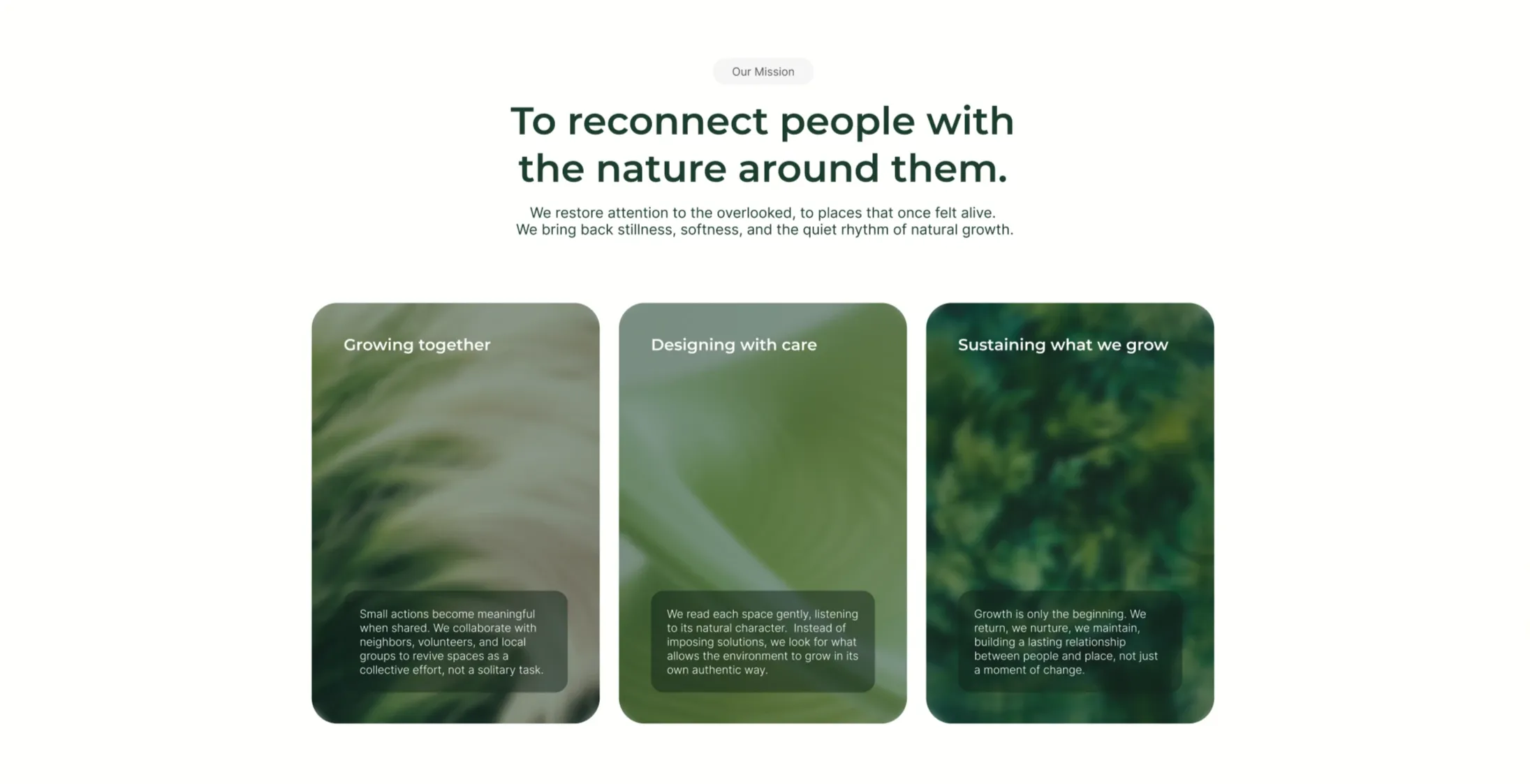
UrbanLeaf Mission Three-Card Image Grid
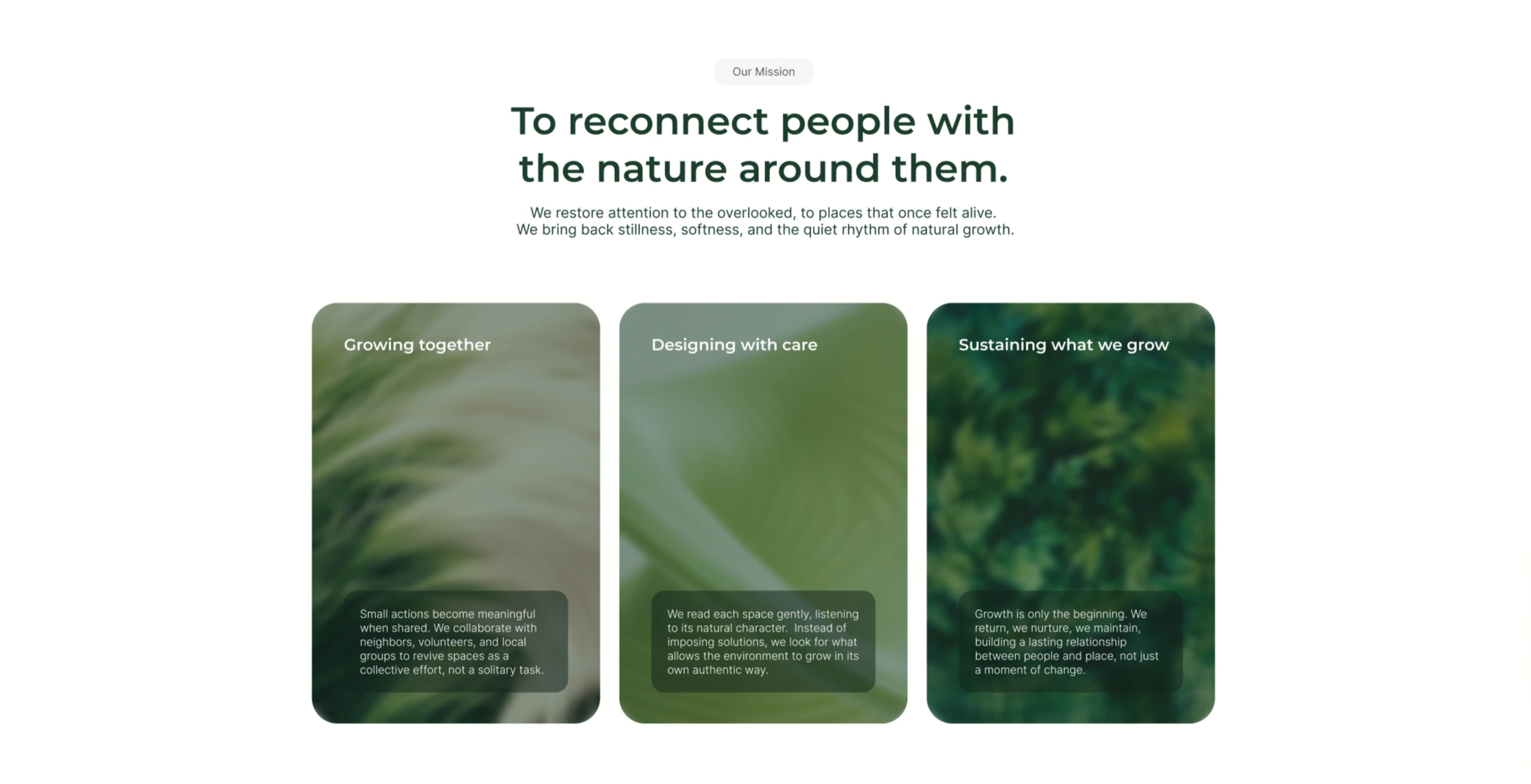
An 'Our Mission' section on white, opening with a grey pill, a centered two-line dark-green headline 'To reconnect people with the nature around them.', and a two-line grey subhead about restoring attention to overlooked places. Below sits a three-up row of tall rounded cards, each filled edge-to-edge with a soft, blurred green nature photograph (grasses, leaves, foliage). Each card carries a white title near the top — 'Growing together', 'Designing with care', and 'Sustaining what we grow' — and a small translucent dark box near the bottom holding a few lines of supporting body copy about collaboration, reading each space, and long-term care. The trio of equal photographic cards in muted greens makes the mission feel tactile and consistent.
Behance ↗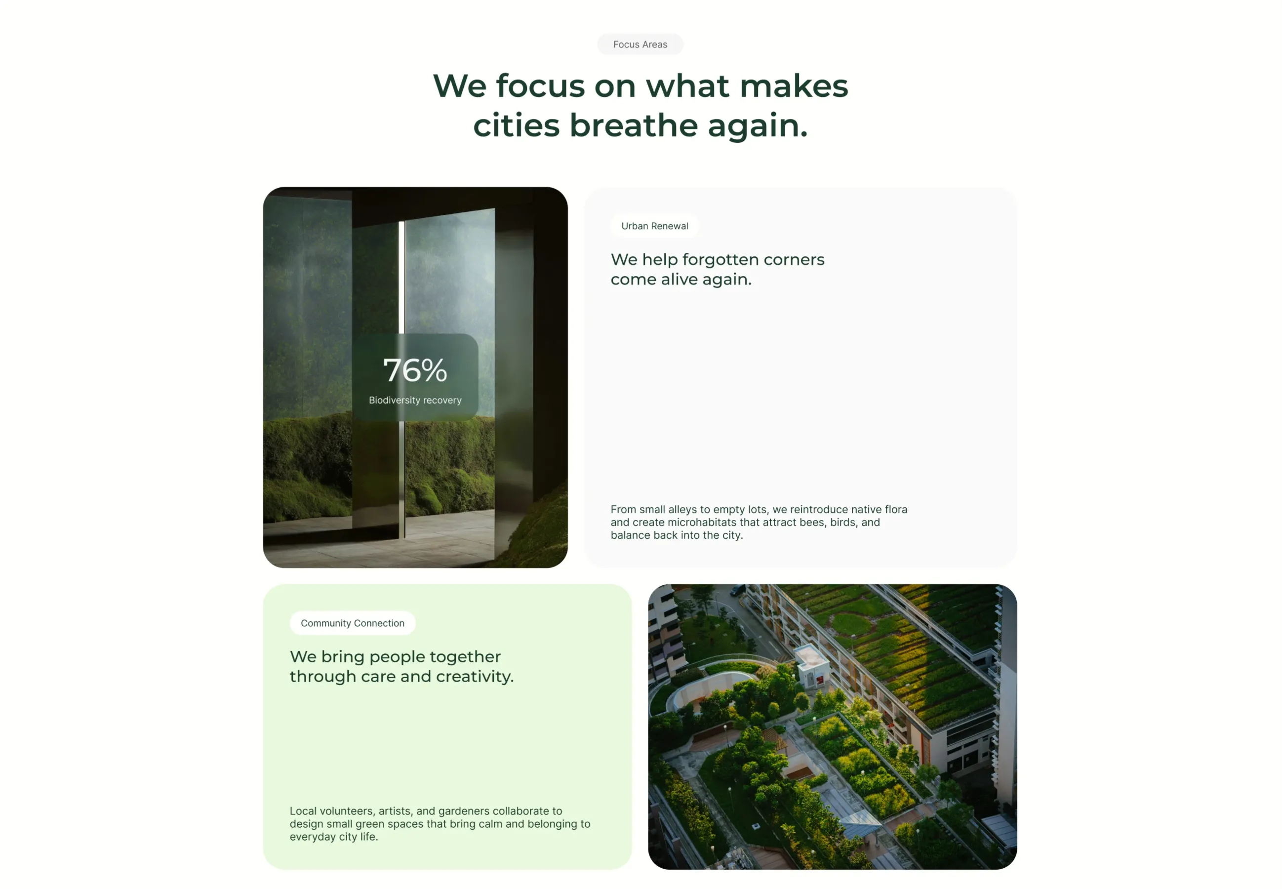
UrbanLeaf Focus Areas Bento Grid
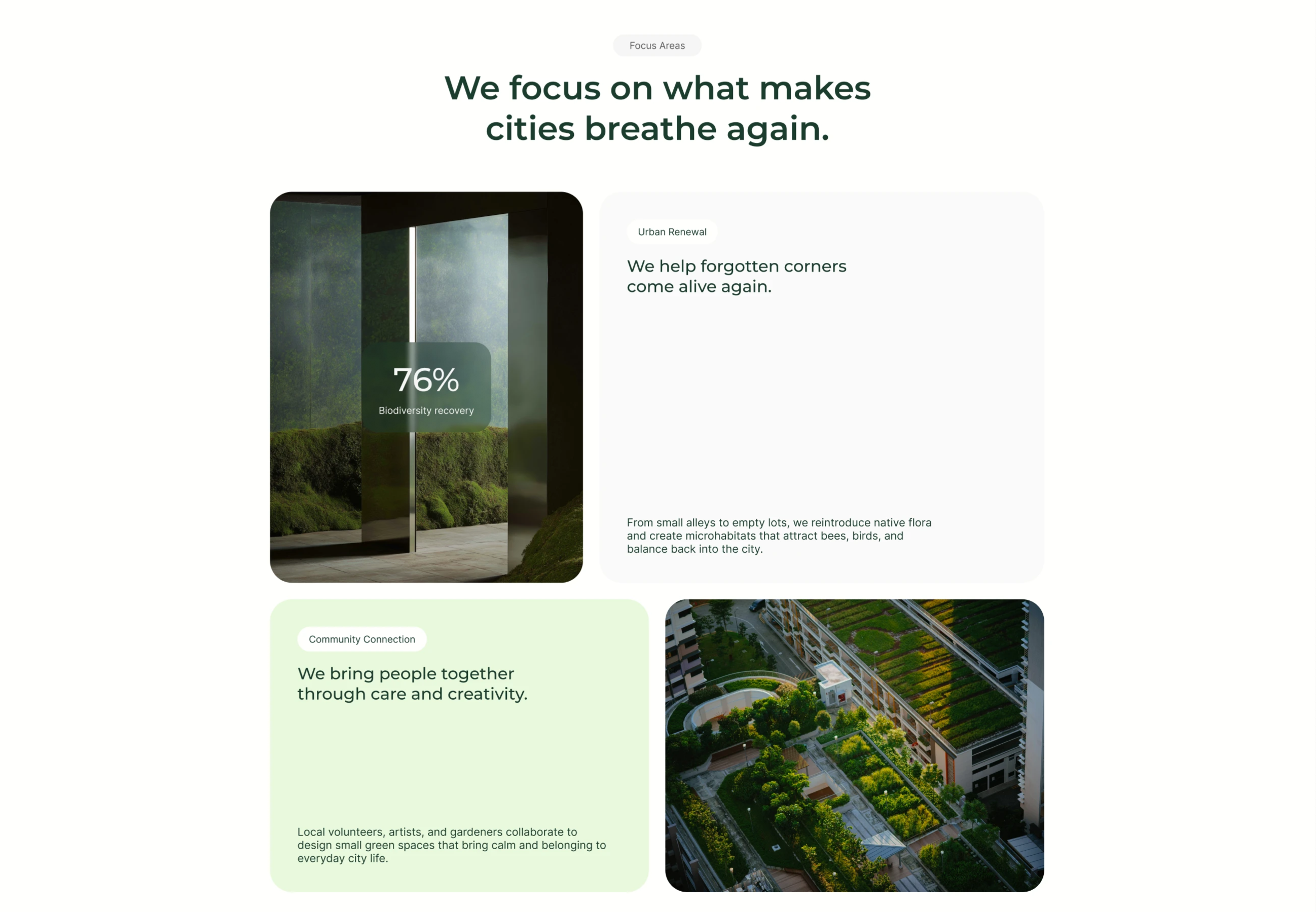
A 'Focus Areas' section on white, introduced by a grey pill and a centered two-line dark-green heading, 'We focus on what makes cities breathe again.' Below it sits a 2×2 bento grid of rounded tiles. Top-left is a photo of a mossy interior with a translucent dark-green card overlaid showing a large '76%' stat and the label 'Biodiversity recovery'. Top-right is a tall white card headed by an 'Urban Renewal' pill, a dark-green sub-headline 'We help forgotten corners come alive again.', and a smaller grey paragraph anchored at the bottom about reintroducing native flora and creating microhabitats. Bottom-left is a pale-green card with a 'Community Connection' pill, the headline 'We bring people together through care and creativity.', and a supporting paragraph. Bottom-right is an aerial photograph of a terraced rooftop garden among buildings. The mix of image tiles, stat overlay and text cards in alternating white/green creates a balanced bento layout.
Behance ↗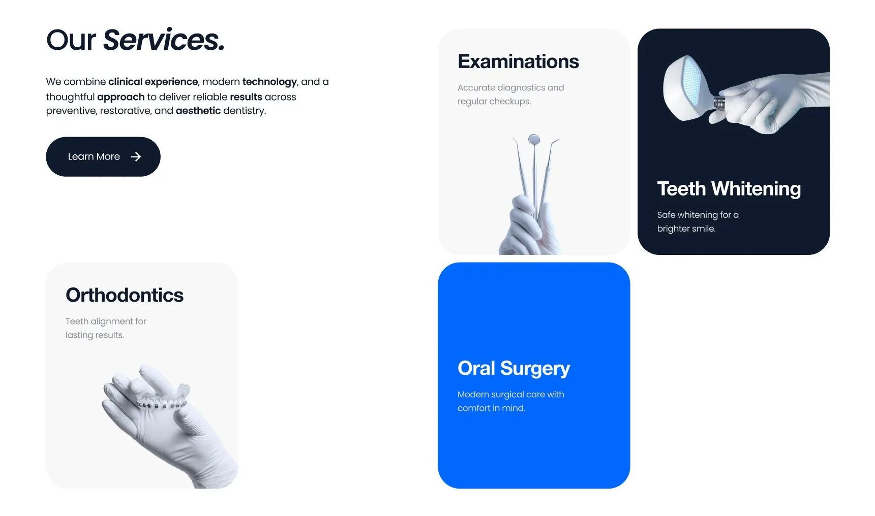
Our Services Mixed Card Grid
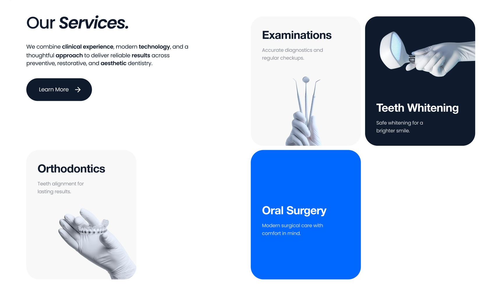
A services section pairing an intro and CTA with an asymmetric grid of service cards in white, grey, dark, and accent-blue treatments for visual rhythm.
Behance ↗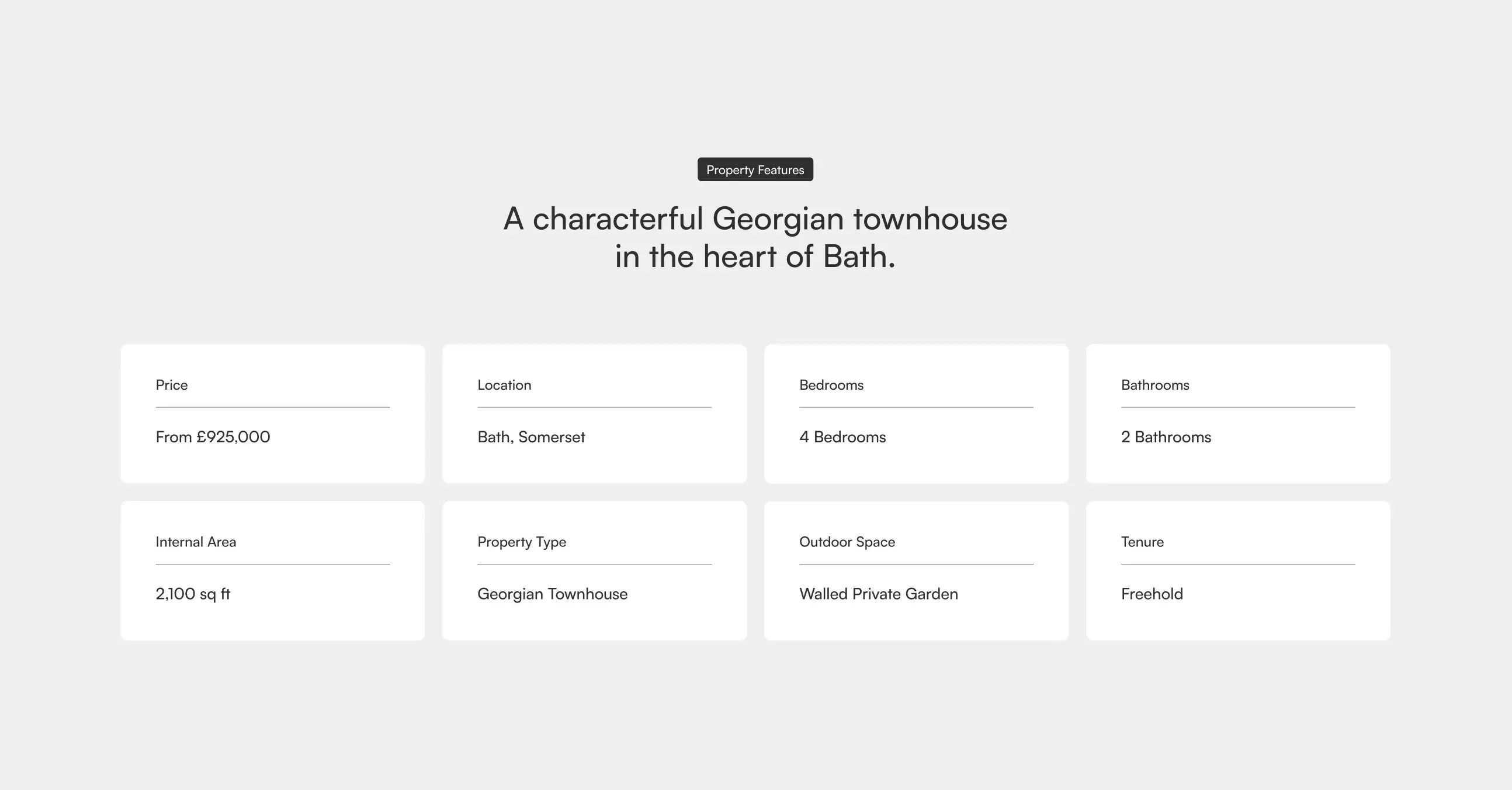
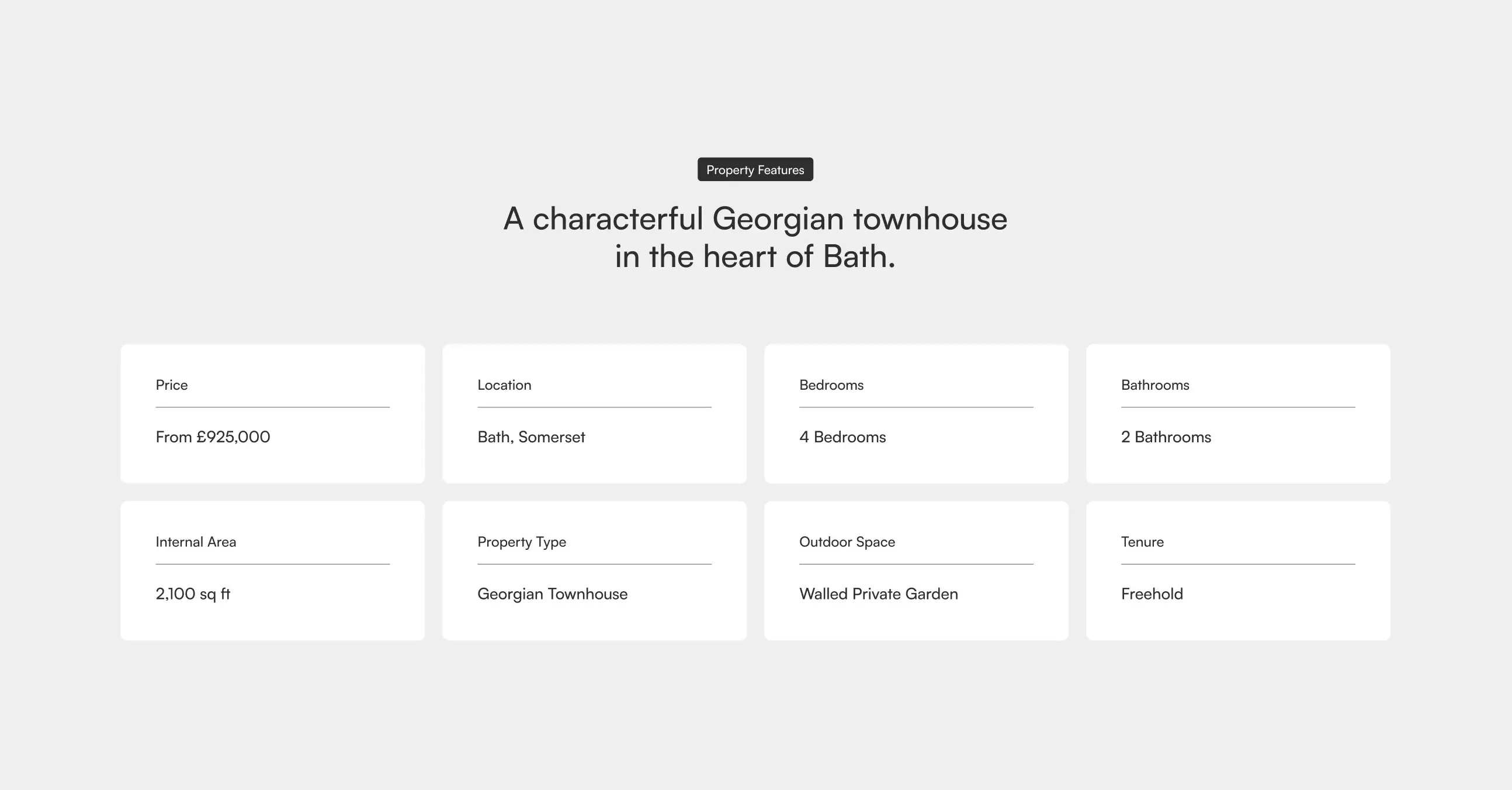
Property Features Grid
A two-row grid of feature cards highlighting a property's key specifications such as price, location, bedrooms, bathrooms, internal area, property type, outdoor space, and tenure, beneath a centred badge label and headline. Best used on property or listing pages to summarise core details at a glance.
Dribbble ↗