Hero sections
The hero is the first thing a visitor sees — it has to land the value proposition in seconds. Browse real hero section examples across styles and industries for inspiration.
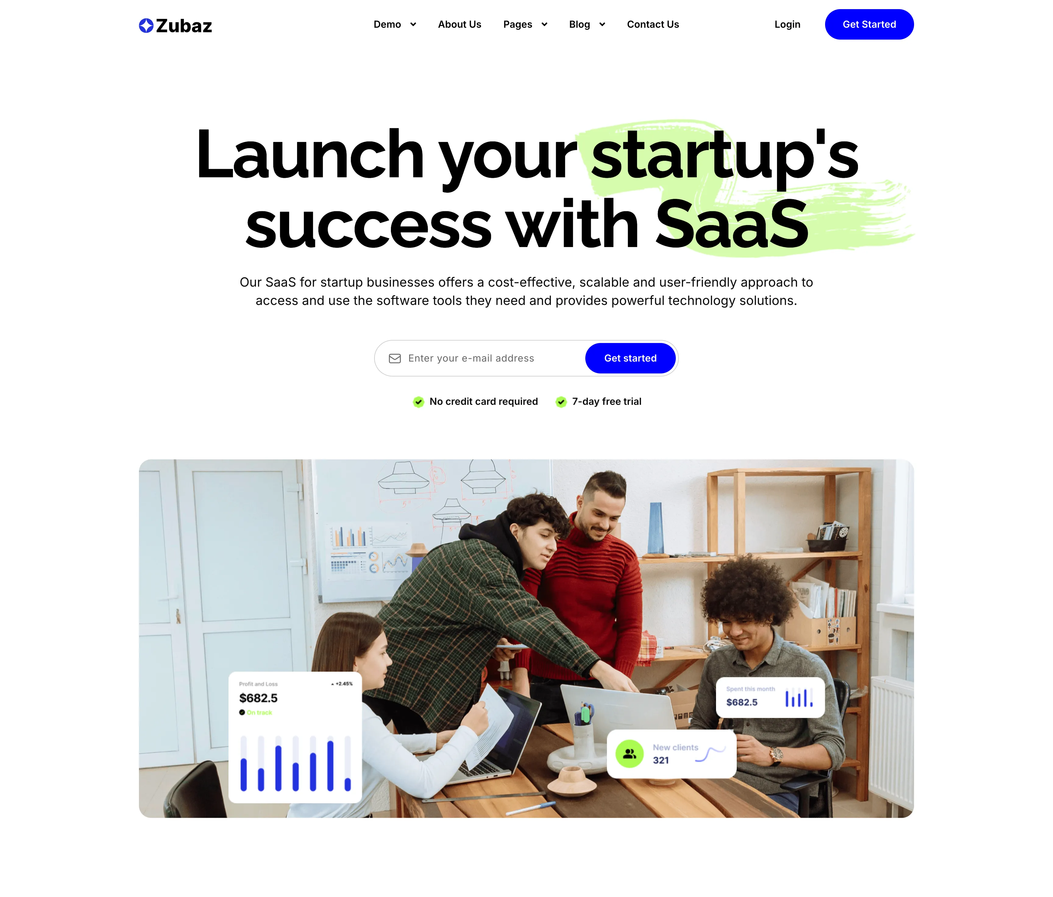
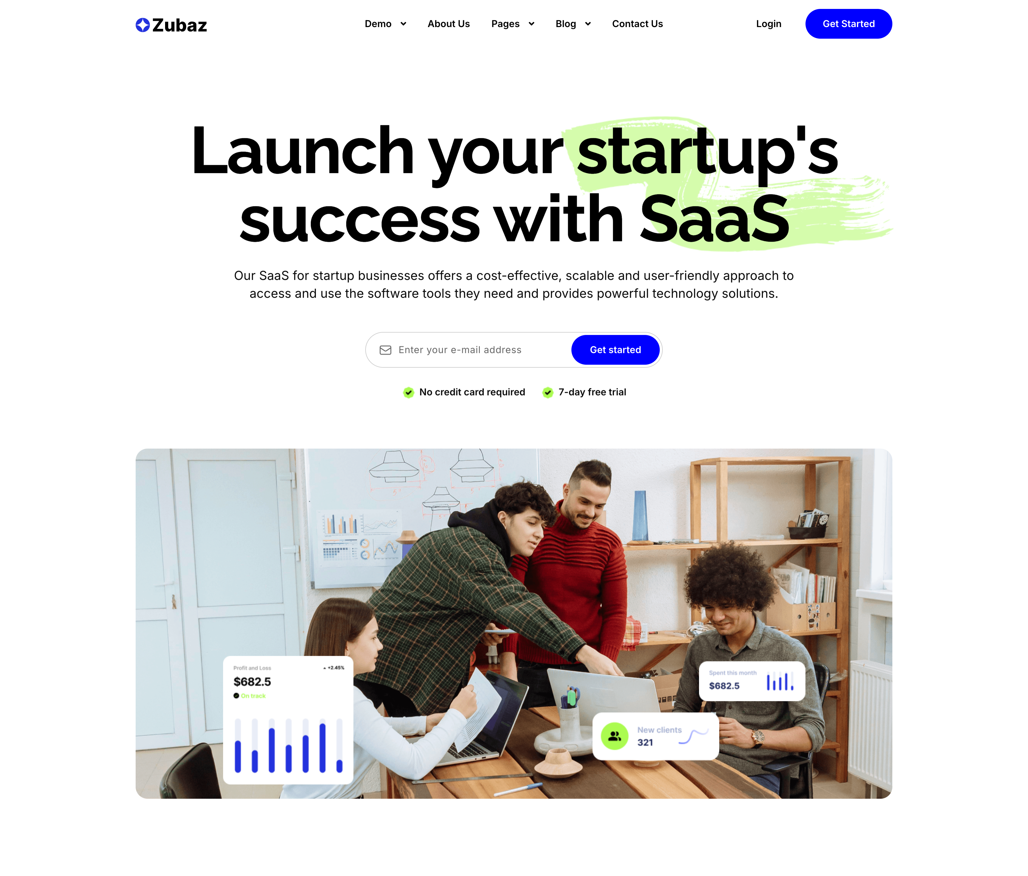
Launch Your Startup's Success SaaS Hero
The startup-SaaS landing hero, topped by the Zubaz nav. A centered oversized black headline, 'Launch your startup's success with SaaS', is accented by a lime-green brush swipe behind the words 'startup's' and 'SaaS', over a two-line gray subhead. Below sit an inline email field with a blue 'Get started' button and two green-checked reassurances — 'No credit card required' and '7-day free trial'. A large rounded photo of a startup team working around a laptop fills the lower half, overlaid with floating UI cards ('Profit and Loss $682.5', a bar chart, 'New clients 321'). The green brush accents and floating stat cards give the hero an energetic, product-backed feel.
Zubuz ↗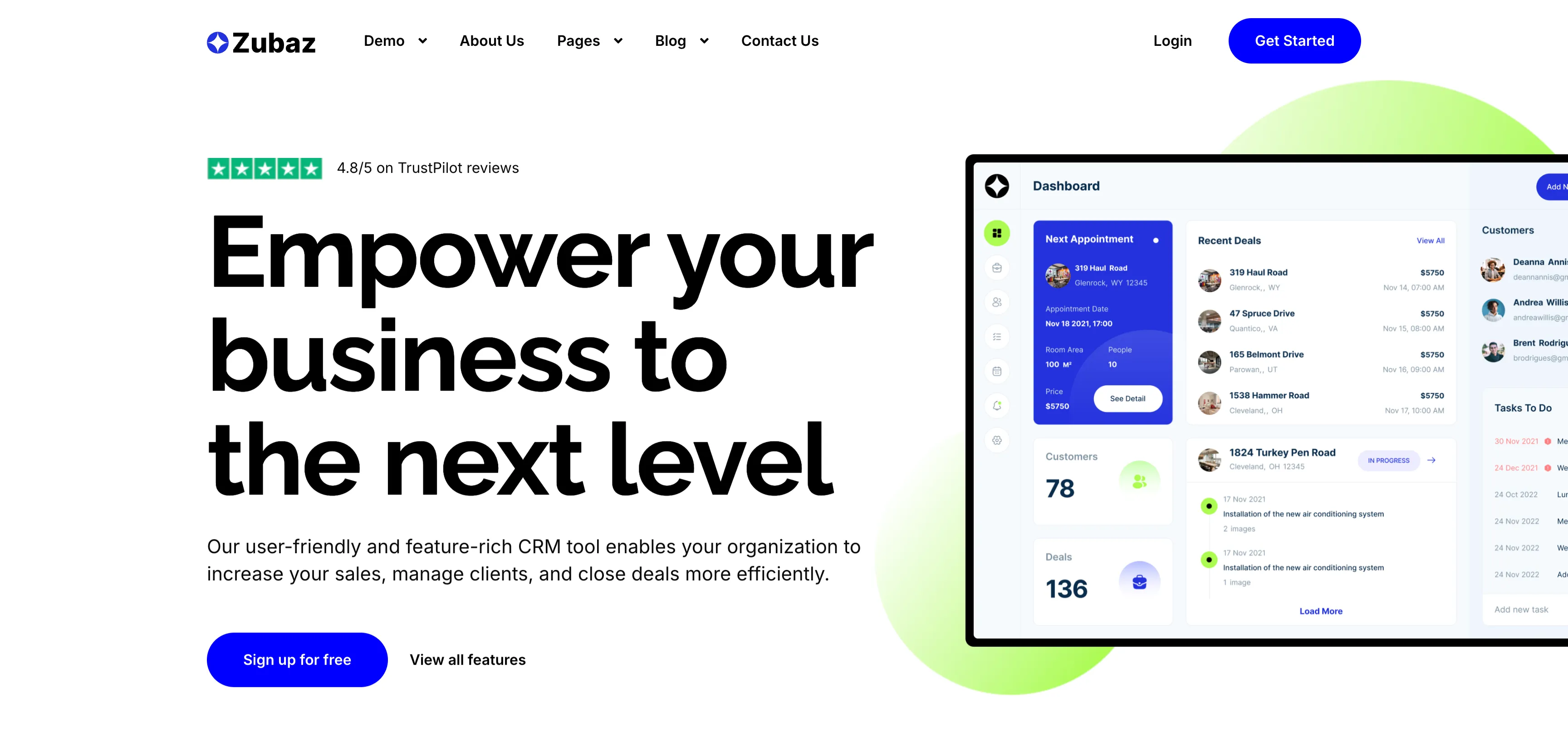
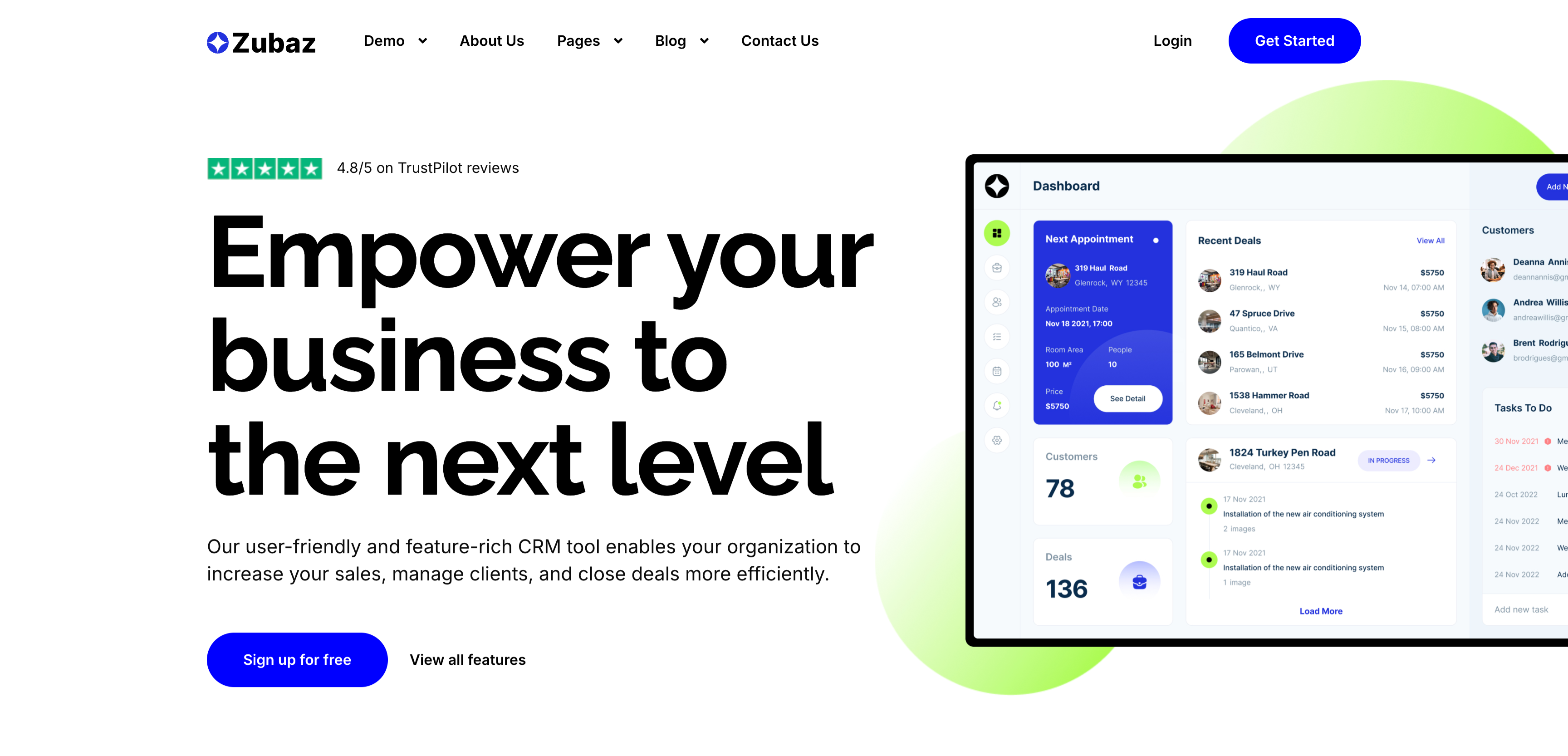
Empower Your Business CRM Hero
The CRM landing hero, topped by the Zubaz nav. The left column stacks a small green Trustpilot '4.8/5 on TrustPilot reviews' badge, an enormous four-line 'Empower your business to the next level' headline, a two-line supporting paragraph, and two actions — a solid blue 'Sign up for free' button and a plain 'View all features' link. The right column shows a large CRM 'Dashboard' screenshot with a Next Appointment card, Recent Deals list, Customers panel and a Tasks To Do column, set against a soft lime blob. The oversized headline plus the detailed product shot immediately convey a feature-rich sales tool.
Zubuz ↗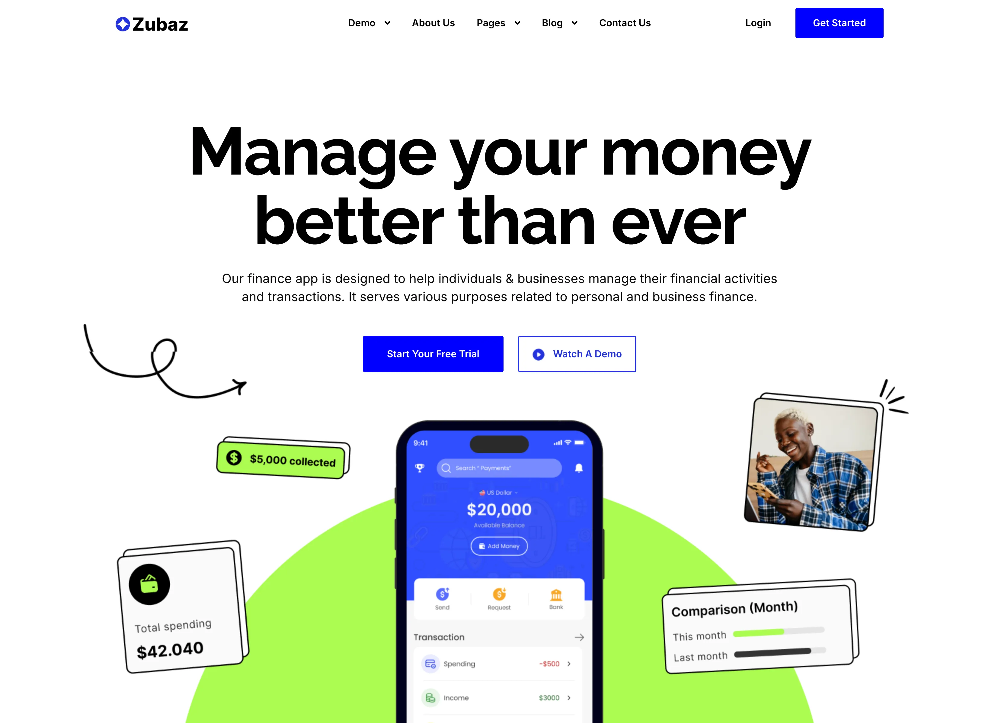
Manage Your Money Finance App Hero
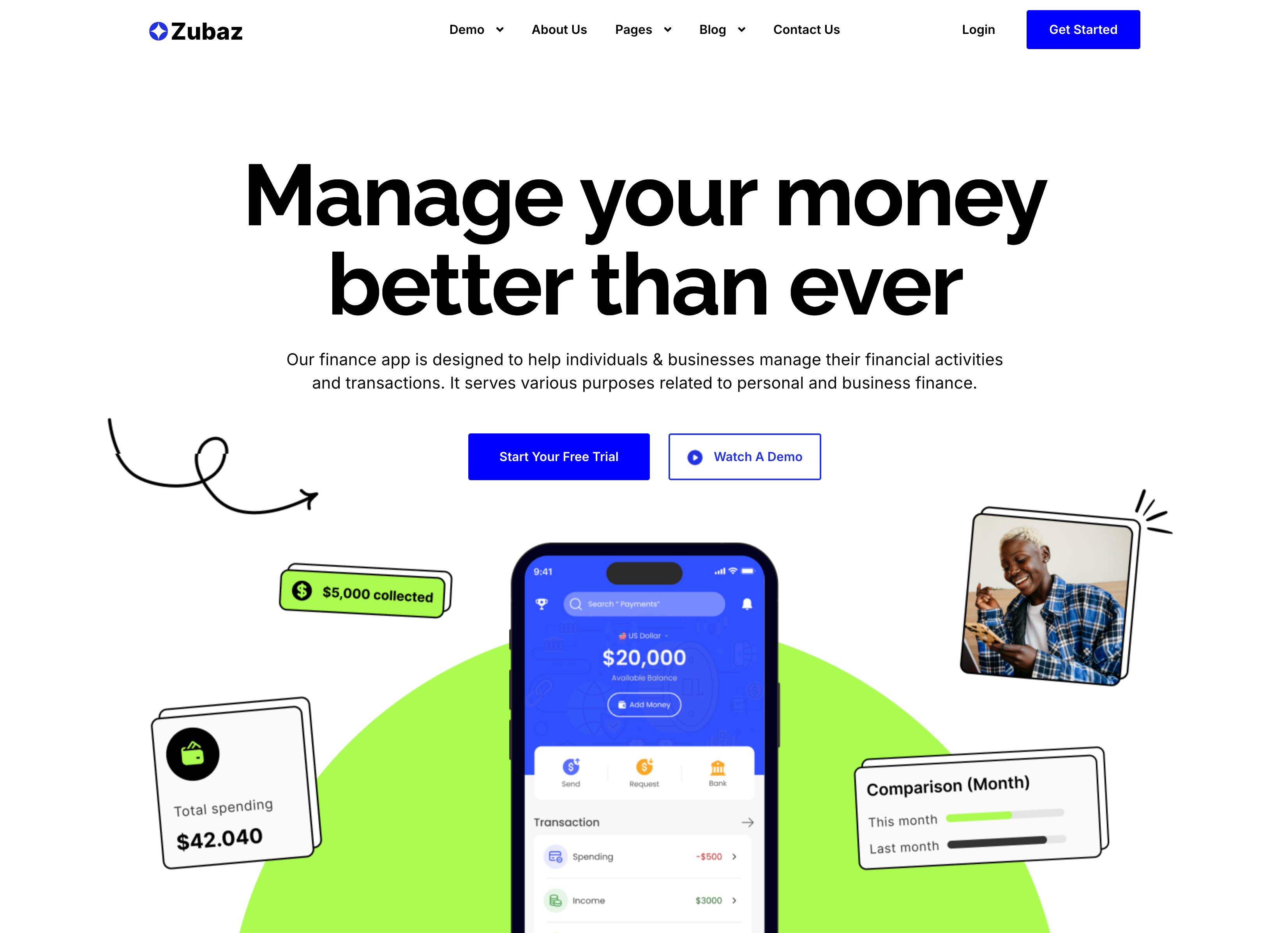
The finance-app landing hero, topped by the Zubaz nav (logo left; Demo, About Us, Pages, Blog, Contact Us center; Login and a blue Get Started right). A centered oversized black headline reads 'Manage your money better than ever' above a two-line gray subhead and two buttons — a solid blue 'Start Your Free Trial' and an outlined 'Watch A Demo' with a play icon. Below, a dark smartphone mockup shows the app's $20,000 balance and transaction list against a lime-green blob, flanked by floating UI cards ('$5,000 collected', 'Total spending $42.040', a monthly 'Comparison' bar) and a small photo of a smiling user. Hand-drawn arrow doodles and the playful green accent give the finance pitch an approachable, energetic tone.
Zubuz ↗

About Us Minimal Page Hero
A minimal page-header hero on a solid black background. A single oversized white 'About Us' headline is centered in the upper third, with no imagery or supporting copy competing for attention. Directly beneath it sits a small breadcrumb trail — 'Home' in white followed by a slash and 'About Us' in blue to mark the current page. The vast empty black field and lone centered title give the header a stark, confident, editorial feel. It works as a lightweight page intro that orients the visitor without distraction.
Zubuz ↗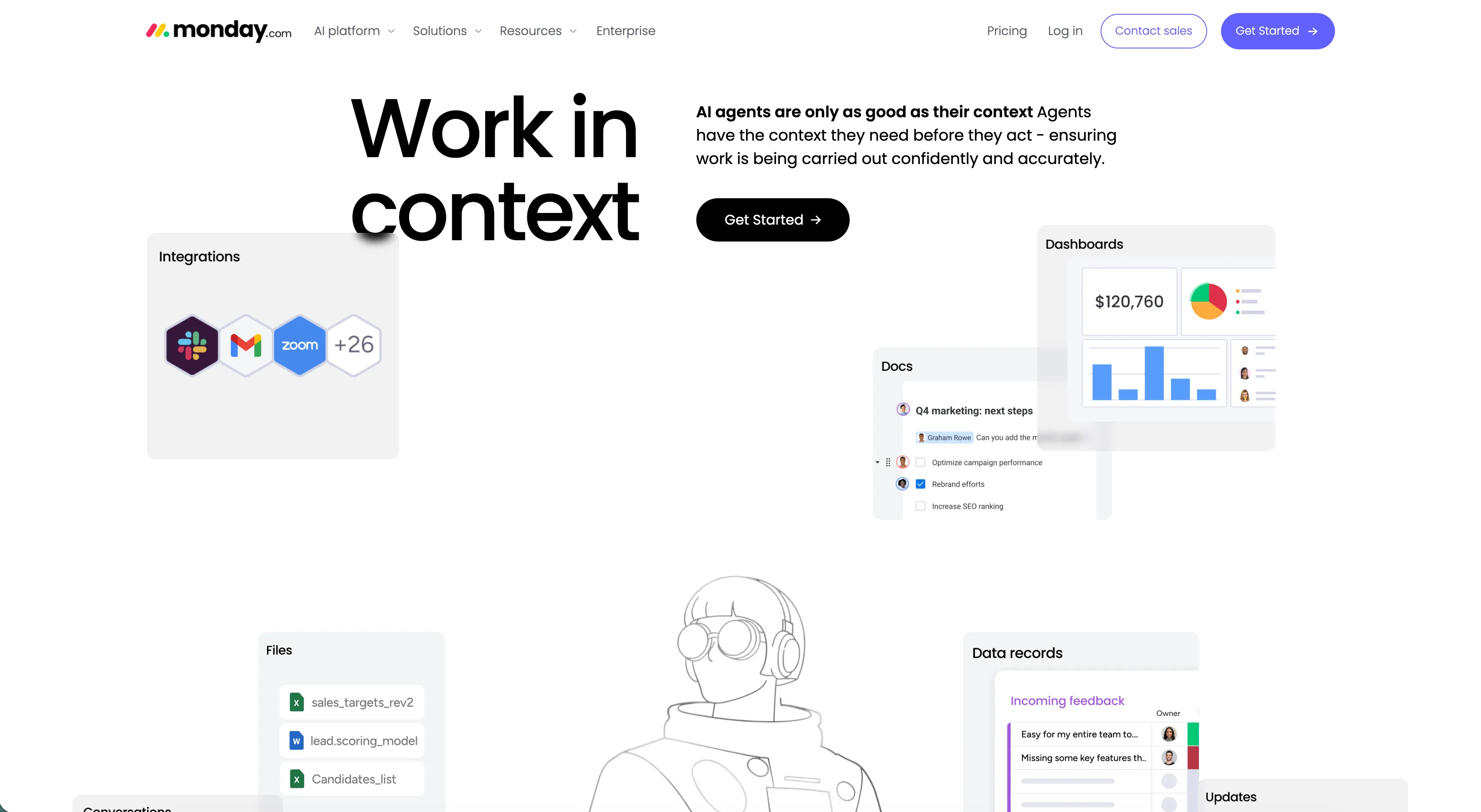
Monday.com Work In Context Hero
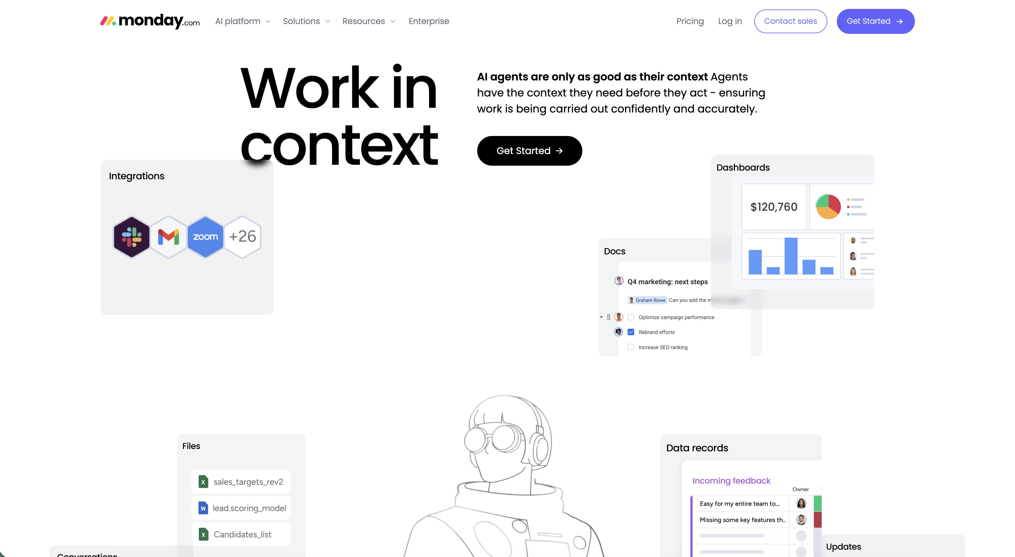
The page hero on a white background, topped by the monday.com nav (AI platform, Solutions, Resources, Enterprise on the left; Pricing, Log in, an outlined Contact sales and a purple Get Started button on the right). The left half is dominated by an oversized two-line 'Work in context' headline, while the right column carries a bold lead line 'AI agents are only as good as their context', a short supporting paragraph, and a black 'Get Started' pill button. Scattered around the headline float rounded product cards — an 'Integrations' card with Slack, Gmail and Zoom hexagon logos plus '+26', a 'Dashboards' card showing a $120,760 figure with pie and bar charts, a 'Docs' checklist, a 'Files' list and a 'Data records' feedback table — with a line-art astronaut illustration anchoring the center. The floating UI fragments make the abstract 'context' idea concrete and product-forward.
Monday ↗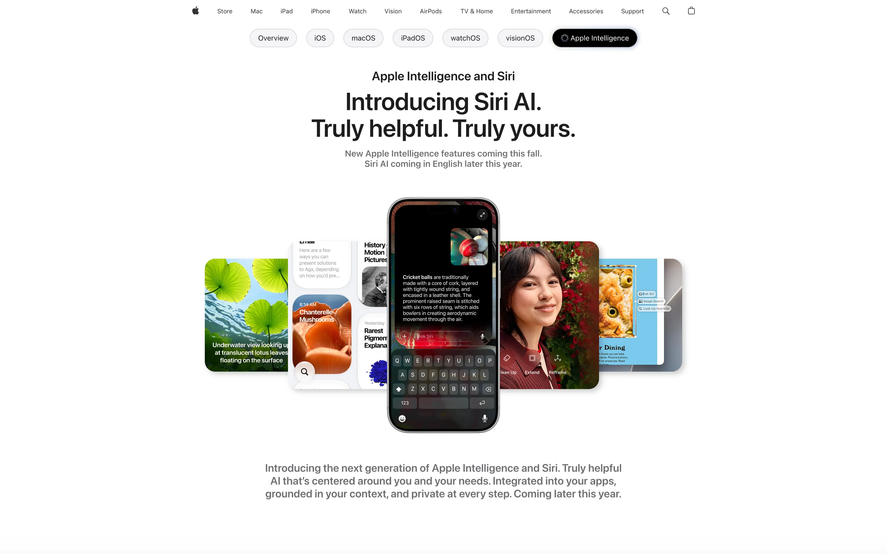
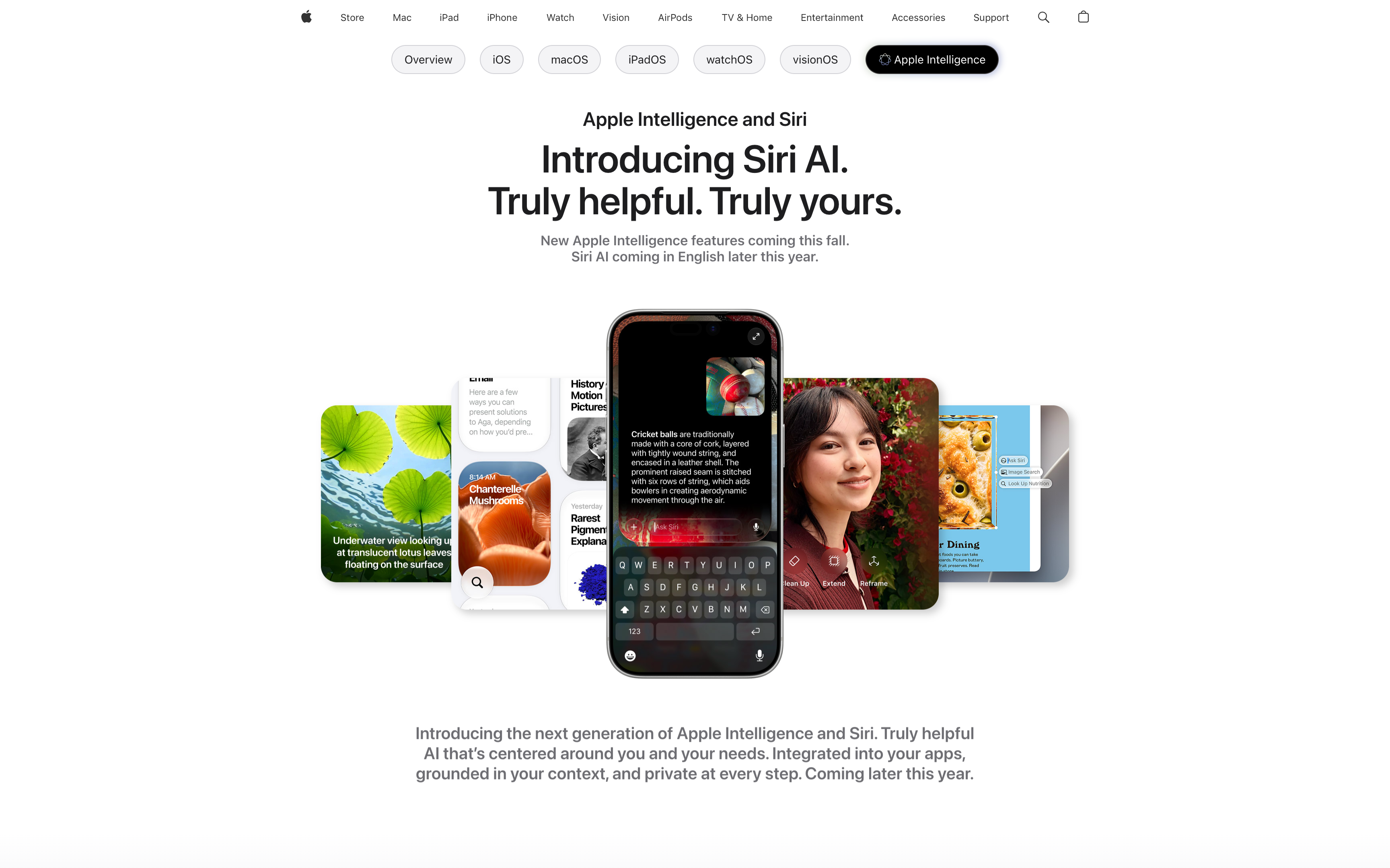
Apple Intelligence Centered Hero With Floating App Cards
A centered hero on a clean white background. A small 'Apple Intelligence and Siri' eyebrow sits above an oversized two-line headline, 'Introducing Siri AI. Truly helpful. Truly yours.', followed by a muted two-line subhead noting features 'coming this fall'. Below the type, a fanned cluster of floating, rounded screenshots surrounds a central dark iPhone showing a Siri 'Ask Siri' conversation about cricket balls — the cards include a green lotus photo, chanterelle mushrooms, a black-and-white history result, a smiling portrait against red flowers, and a dining card. A second gray paragraph closes the block with 'Introducing the next generation of Apple Intelligence and Siri.' Generous whitespace and the single hero device keep all focus on the headline.
Apple ↗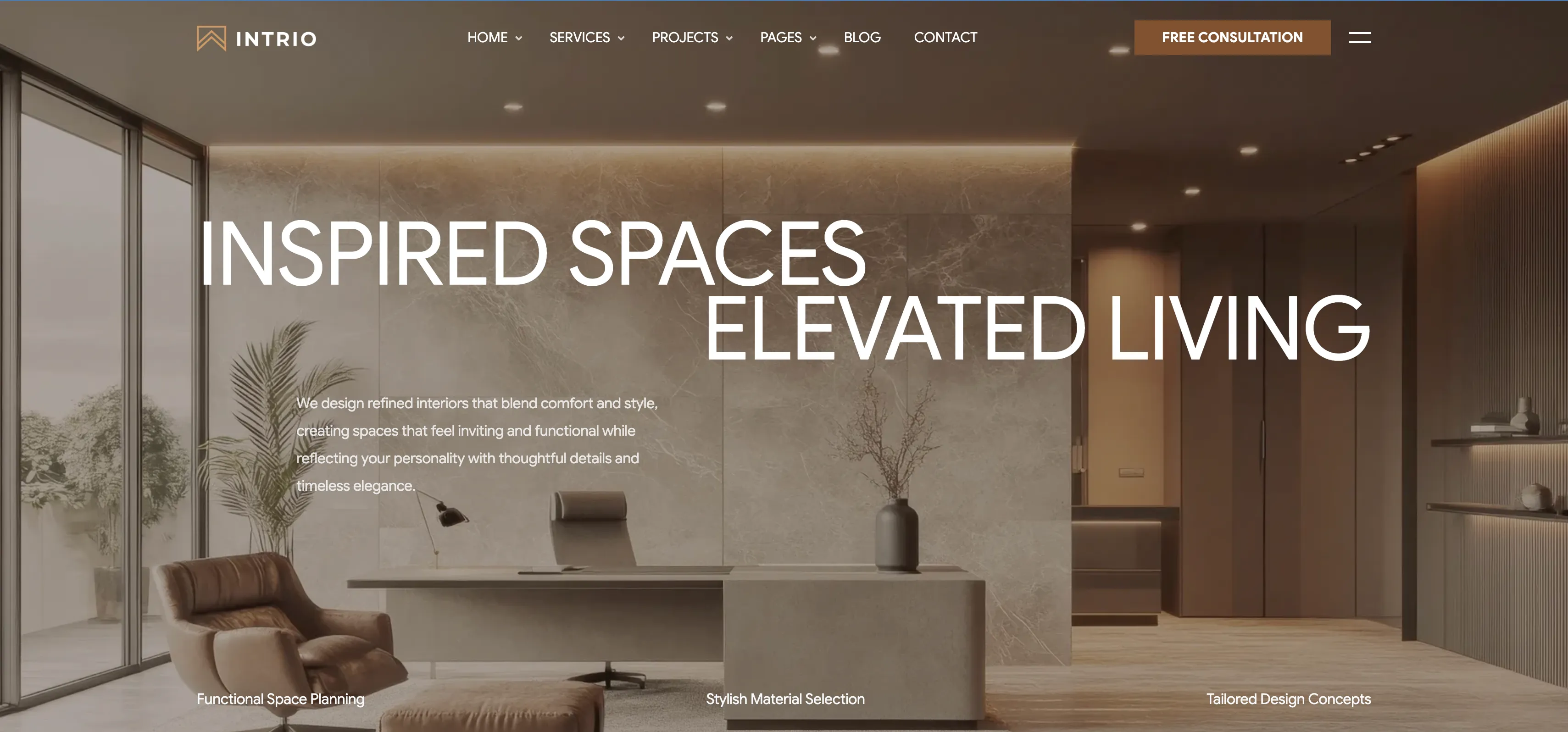
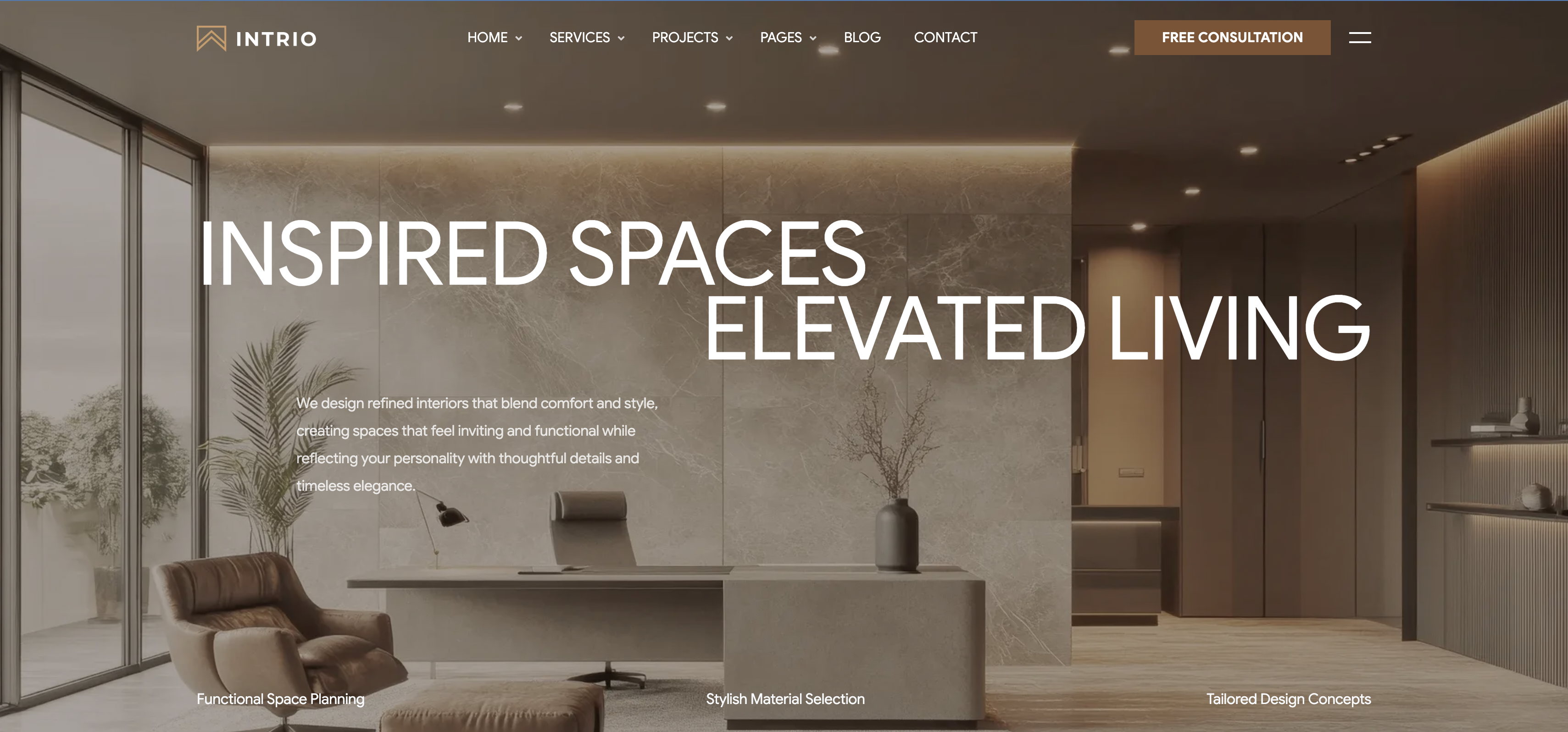
Intrio Full-Bleed Photo Hero
A full-bleed hero set over a warm, luxurious interior photograph of a marble-walled office with a leather lounge chair, desk and potted plants. A transparent top nav runs across the image: the 'INTRIO' wordmark on the left, a centered menu (Home, Services, Projects, Pages, Blog, Contact, each with a dropdown caret), and a bronze 'Free Consultation' button plus a hamburger icon on the right. The headline is an oversized white sans-serif set in two staggered lines, 'INSPIRED SPACES' on top and 'ELEVATED LIVING' shifted to the right below it. A short left-aligned paragraph of supporting copy sits beneath the first line, describing refined, comfortable interiors. Along the bottom edge three quiet labels — 'Functional Space Planning', 'Stylish Material Selection' and 'Tailored Design Concepts' — act as feature highlights. The photographic backdrop with airy white type makes the brand feel premium and immersive from the first scroll.
Madebydesignesia ↗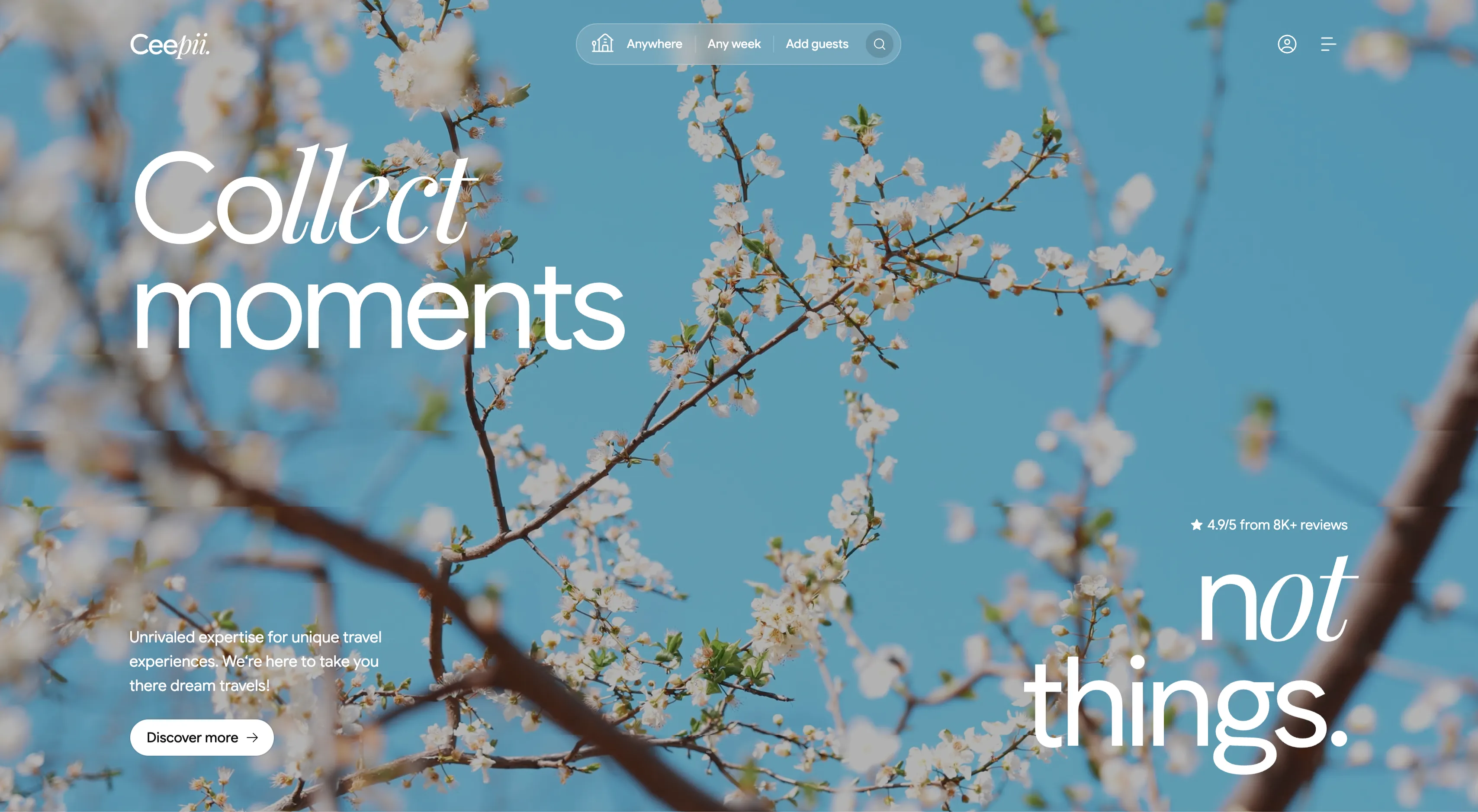
Ceepii Full-Bleed Photo Hero With Search Bar
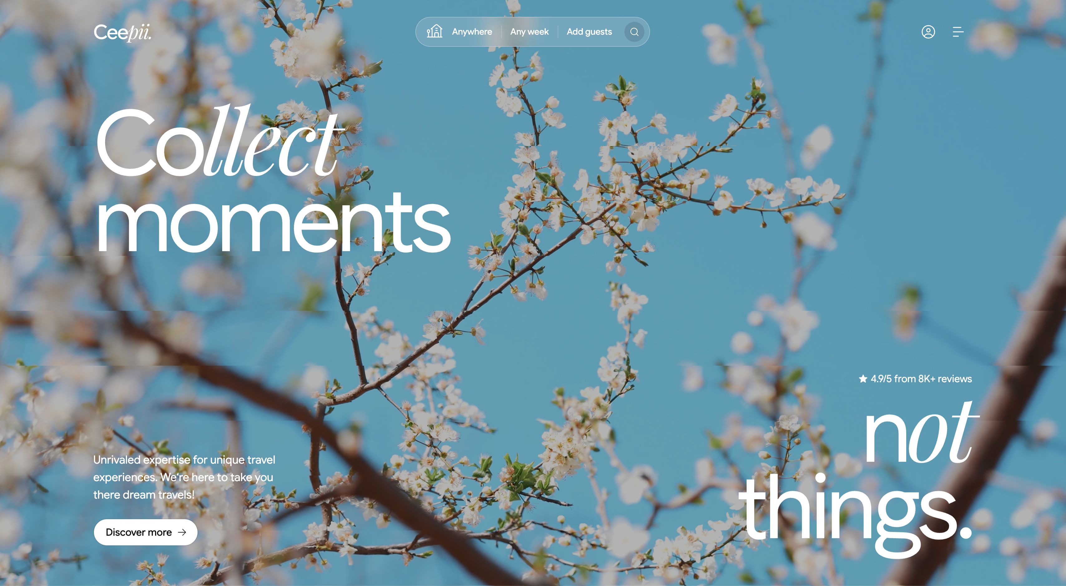
A full-bleed hero built over a soft-focus photograph of white cherry blossom branches against a clear blue sky. A thin top bar carries the 'Ceepii.' wordmark at left, a centered pill-shaped search bar split into 'Anywhere | Any week | Add guests' with a circular search icon, and an account icon plus hamburger menu at right. The headline is set in two contrasting cuts of an oversized display face — an italic serif 'Collect' over a light sans 'moments' top-left, balanced by a giant 'not things.' in the lower-right with an italic 'not'. Lower-left sits a short subhead, 'Unrivaled expertise for unique travel experiences...', above a white pill button reading 'Discover more →', while a small star rating, '4.9/5 from 8K+ reviews', floats mid-right. The airy imagery and split display type give it an editorial, aspirational travel feel.
Ceepii-nextjs-template ↗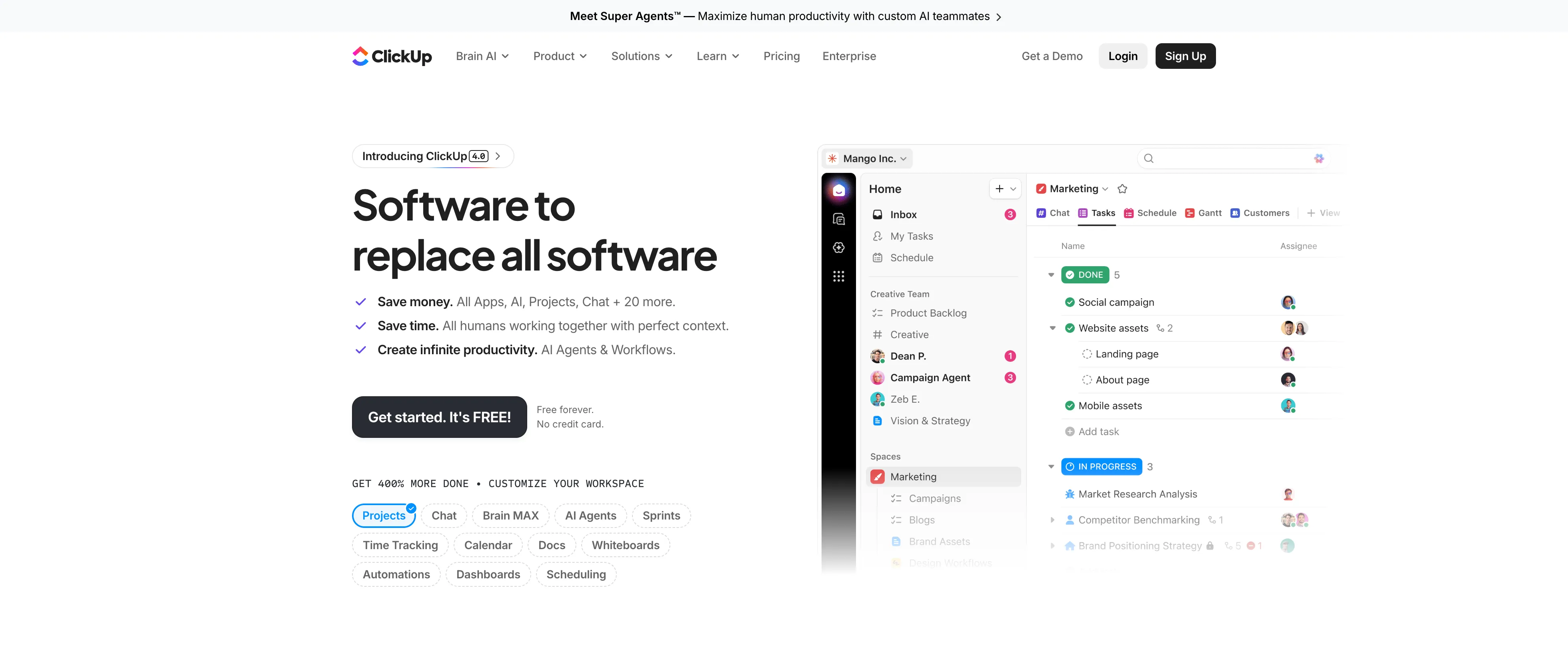
ClickUp Split Hero With Product UI
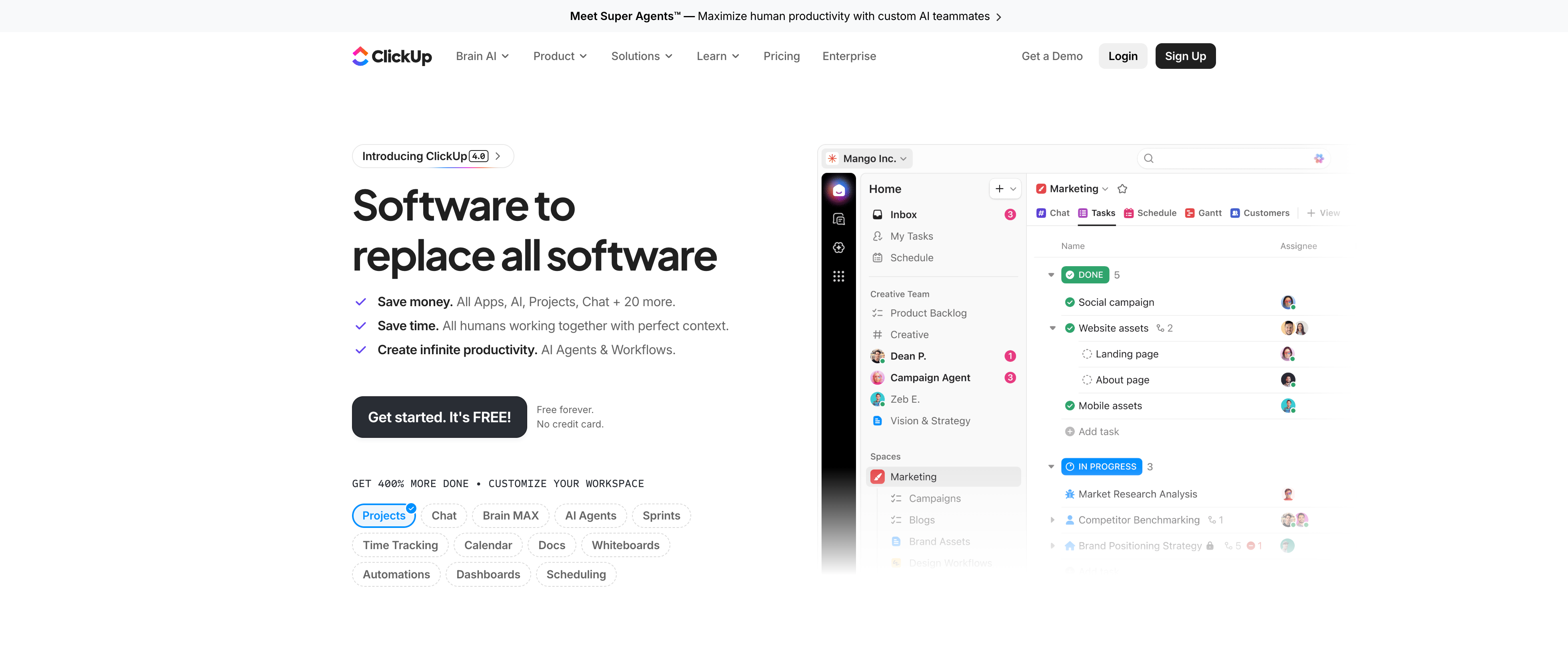
A two-column hero beneath a slim announcement bar ('Meet Super Agents — Maximize human productivity with custom AI teammates') and a full nav with the ClickUp logo, menu links, and 'Get a Demo', 'Login', and a black 'Sign Up' button. The left column stacks a small pill ('Introducing ClickUp 4.0'), an oversized black headline 'Software to replace all software', three check-marked value lines (save money, save time, create infinite productivity), a black 'Get started. It's FREE!' button with 'Free forever / No credit card' beside it, and a row of feature chips (Projects, Chat, Brain MAX, AI Agents…). The right column shows a rounded product screenshot of the ClickUp app with a marketing task board. Clean white background with multicolour brand accents focuses attention on the headline and primary CTA.
Clickup ↗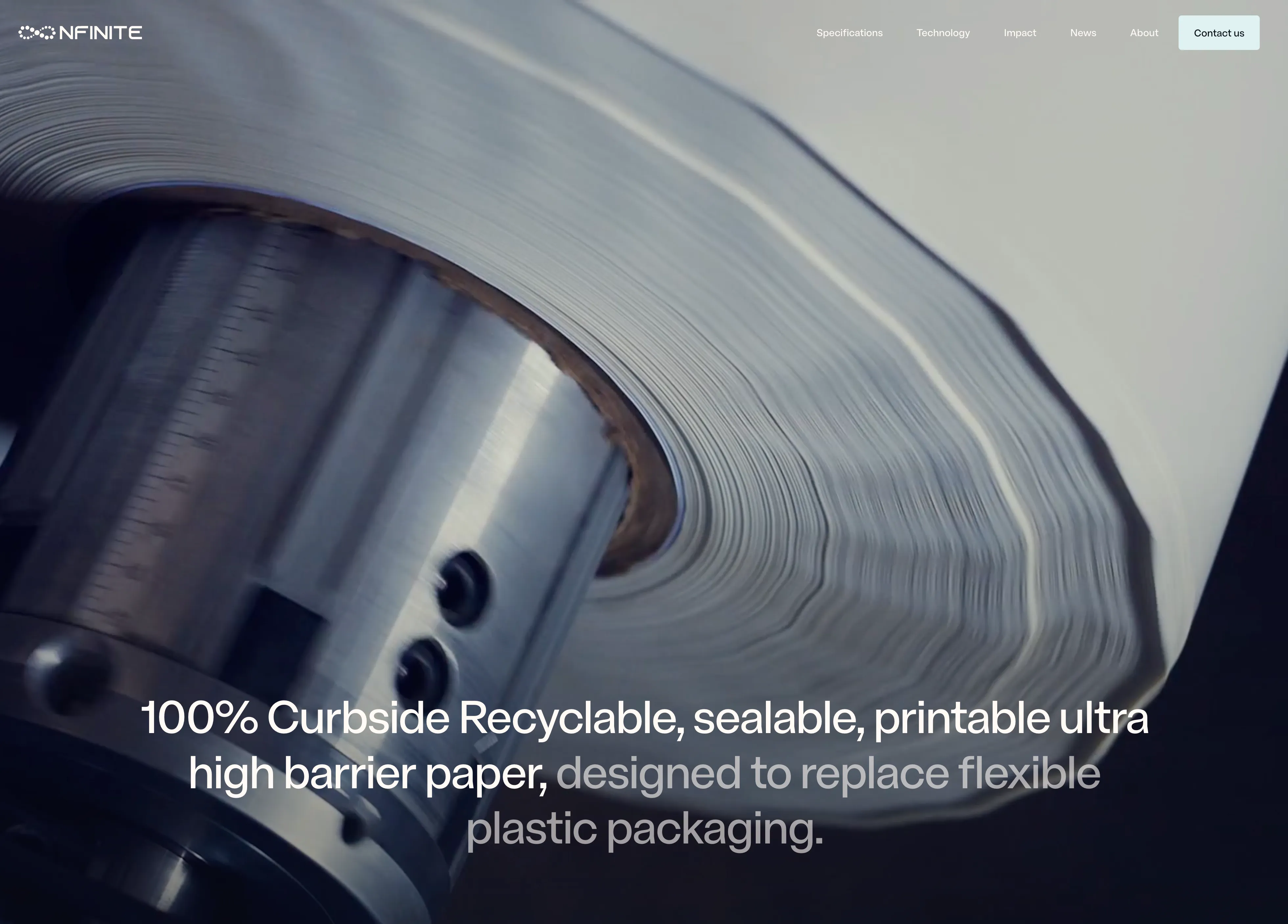
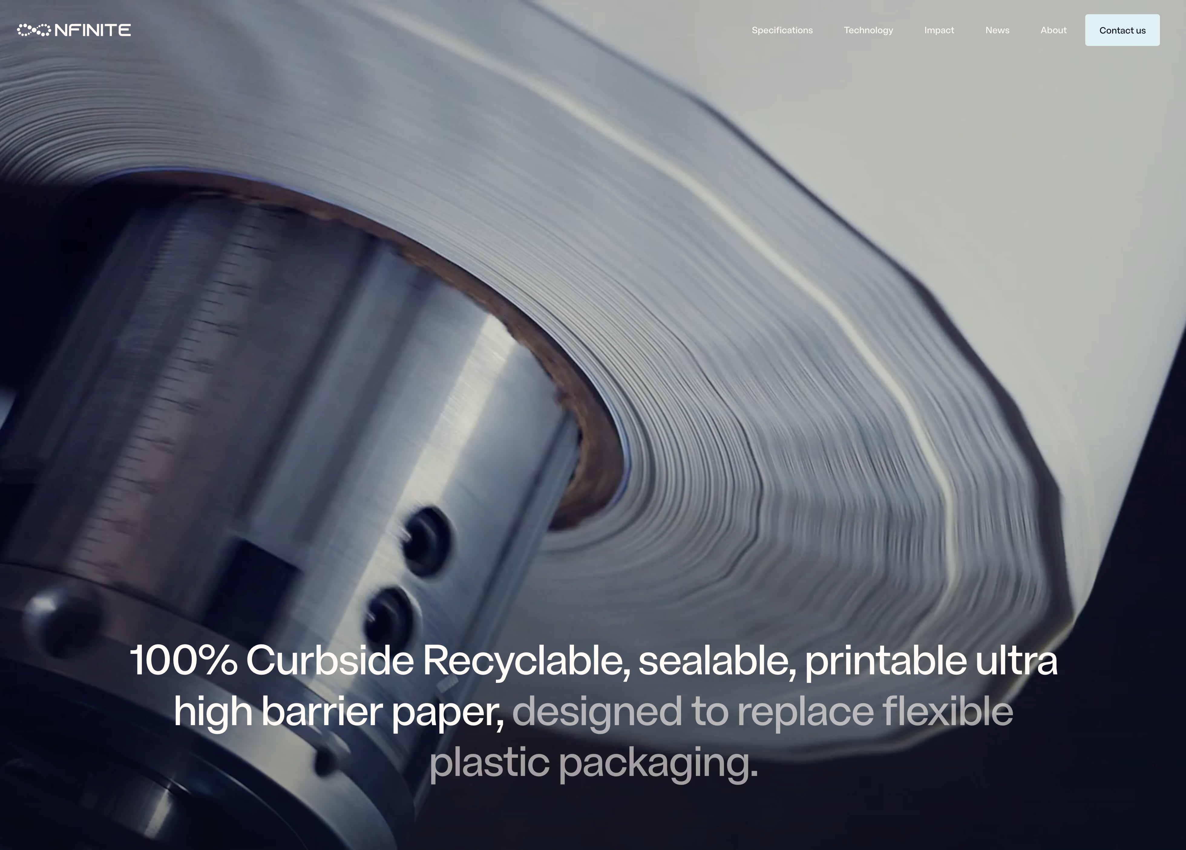
NFINITE Full-Bleed Video Hero
A full-bleed hero built over a cinematic, desaturated close-up of a paper roll feeding through a slitting machine, dark on the left and fading to a soft light grey on the right. A slim transparent nav rides the top edge: the 'NFINITE' wordmark with a small dotted logo mark on the left, a centre-right row of links — Specifications, Technology, Impact, News, About — and a pale rounded 'Contact us' button at the far right. There is no separate headline block; instead an oversized sans-serif statement is overlaid low in the frame, with the lead clause '100% Curbside Recyclable, sealable, printable ultra high barrier paper,' in solid white and the continuation 'designed to replace flexible plastic packaging.' dropping to muted grey, so the sentence reads as one idea with built-in emphasis. The imagery-as-background with minimal chrome and a single large typographic overlay gives an industrial, premium feel that foregrounds the product story over UI.
Nfinitepaper ↗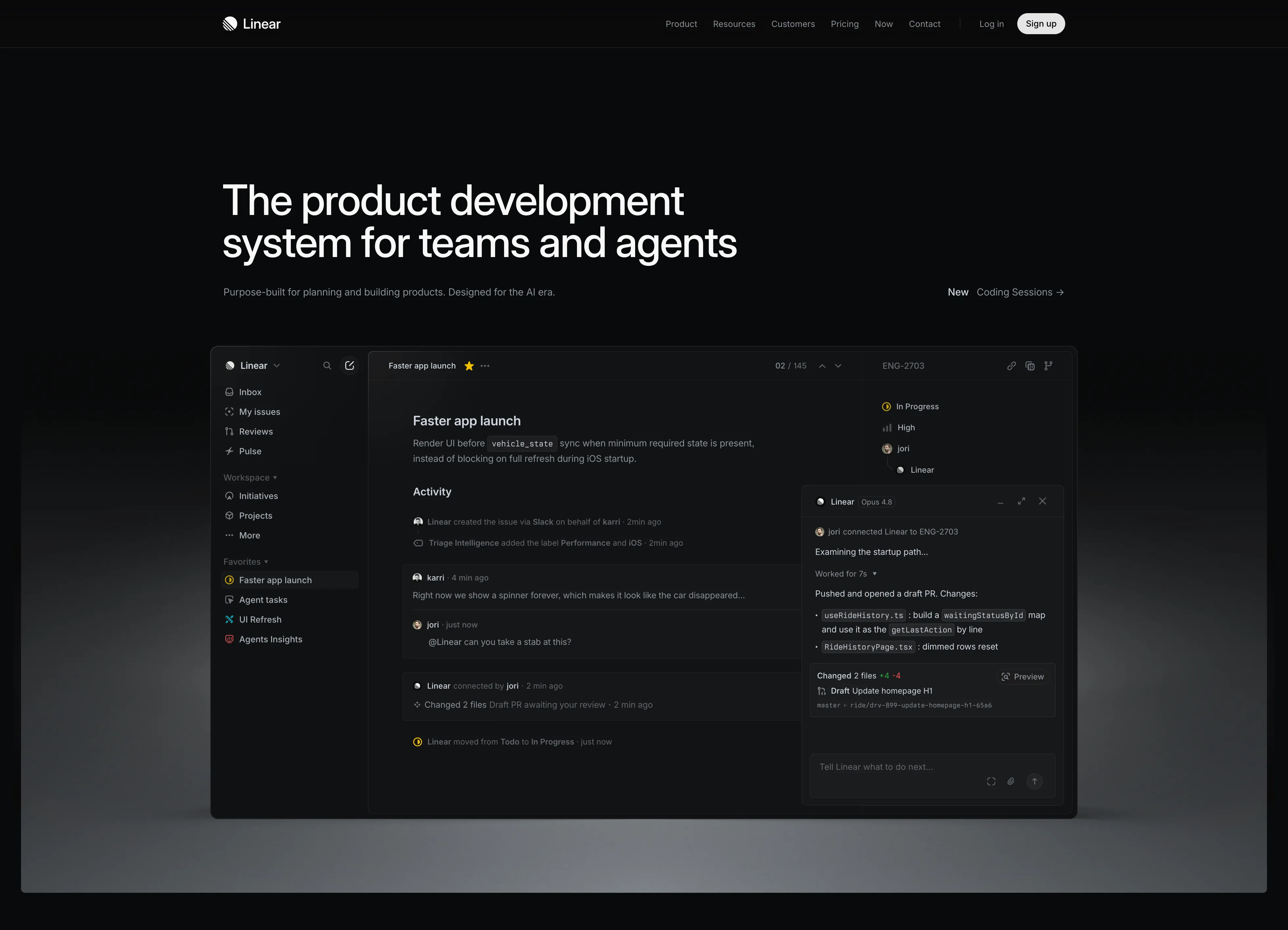
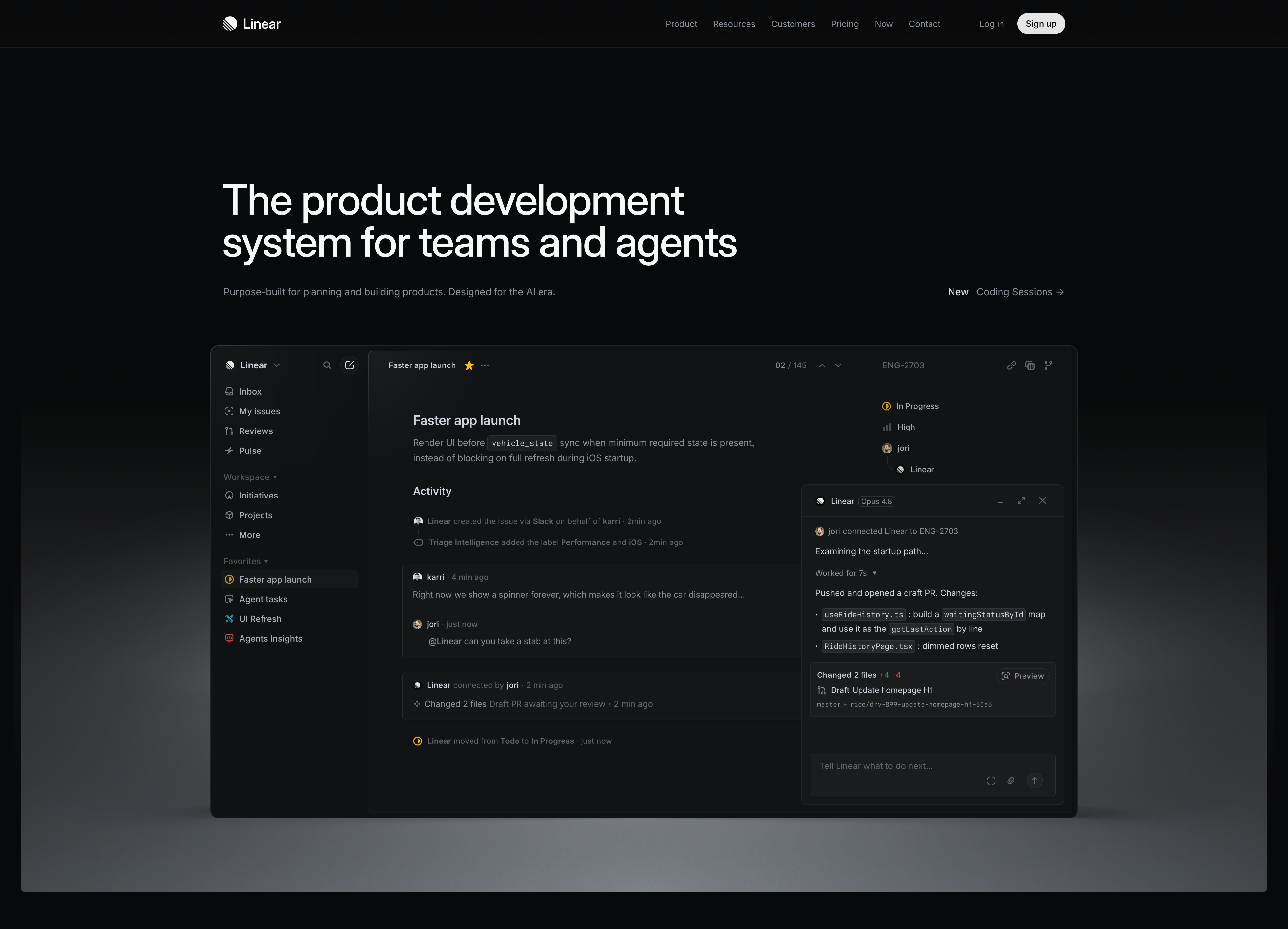
Linear Dark Hero With App Preview
A full-bleed dark hero on near-black. A slim top nav carries the Linear wordmark on the left, centred links (Product, Resources, Customers, Pricing, Now, Contact), and a 'Log in' link beside a white pill 'Sign up' button on the right. Below, a very large white sans-serif headline reads 'The product development system for teams and agents', with a one-line grey subhead 'Purpose-built for planning and building products. Designed for the AI era.' and a right-aligned 'New — Coding Sessions →' link. Dominating the lower half is a large rounded screenshot of the Linear app in dark mode: a left sidebar (Inbox, My issues, Reviews, Pulse, Workspace, Favorites), a central issue 'Faster app launch' with an activity feed, and a floating AI agent panel ('Linear · Opus 4.8') showing a drafted PR. The screenshot sits on a soft grey reflective floor. Confident, high-contrast, product-led hero.
Linear ↗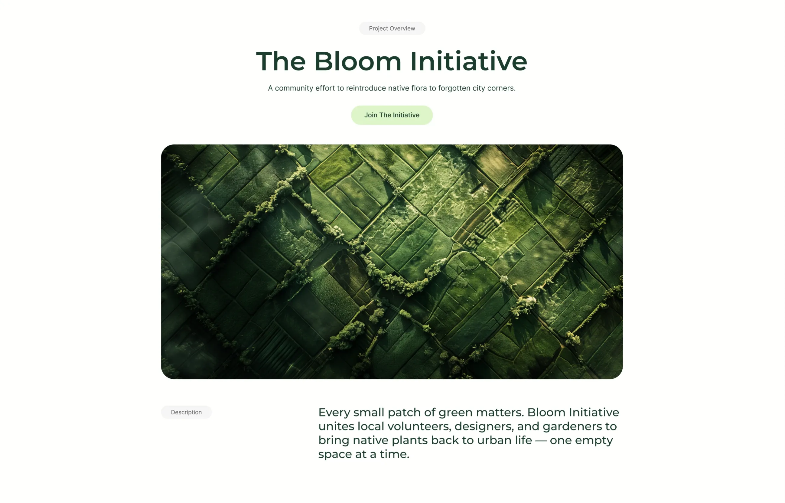
UrbanLeaf Centered Hero With Aerial Image
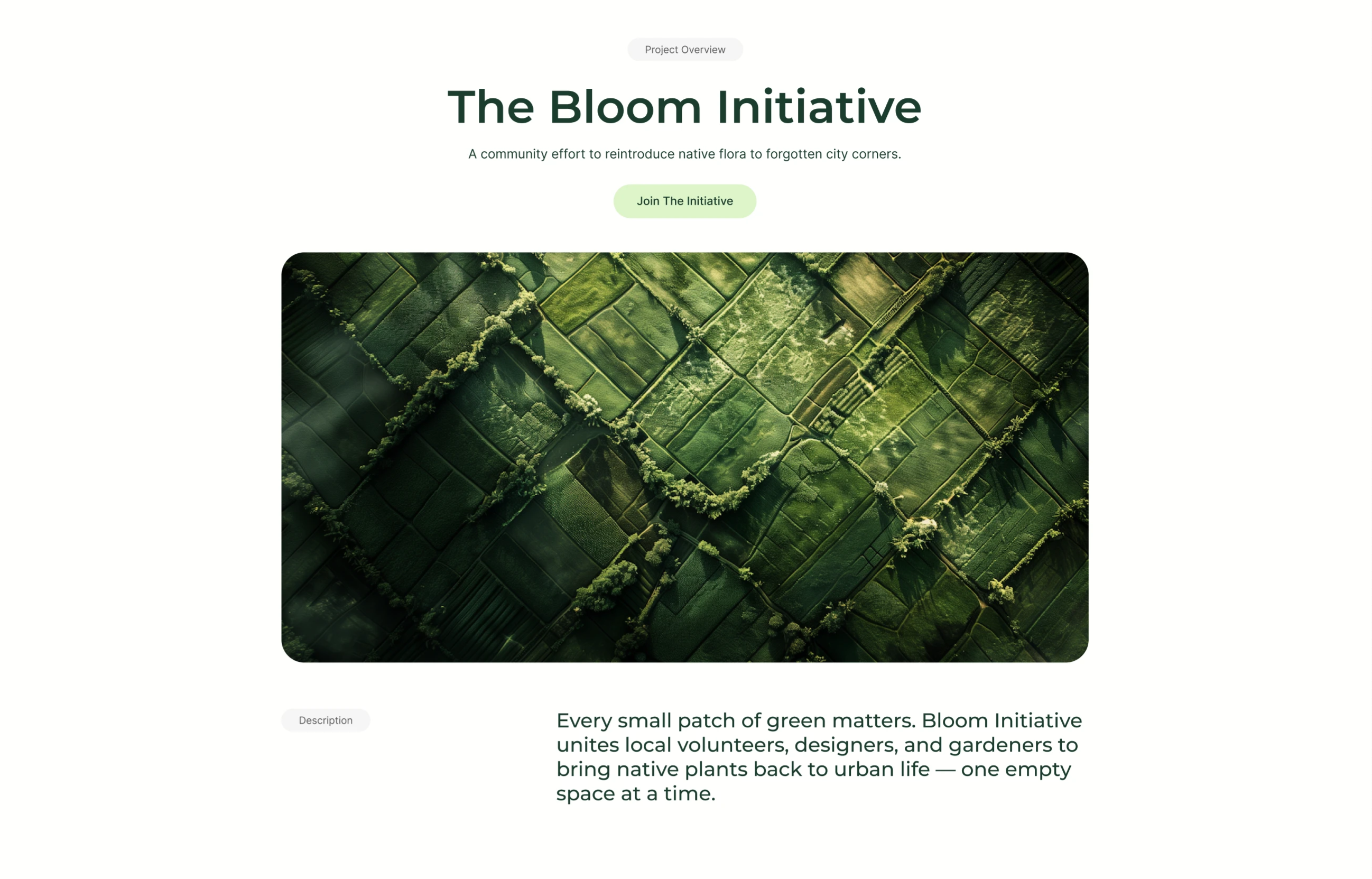
A centered hero on a clean white background. At the top sits a small grey 'Project Overview' pill, beneath it an oversized dark-green serif/sans display headline reading 'The Bloom Initiative', and below that a one-line subhead, 'A community effort to reintroduce native flora to forgotten city corners.' A single soft pill-shaped pale-green button labelled 'Join The Initiative' acts as the primary call to action. Under the button, a very wide rounded-corner photograph fills most of the width — an aerial, top-down view of a patchwork of green fields and vegetation in deep forest-green tones. Below the image, a small grey 'Description' pill on the left pairs with a large dark-green paragraph on the right that begins 'Every small patch of green matters…', explaining the initiative. The generous whitespace, single accent colour and centered stack make it a calm, editorial nonprofit hero.
Behance ↗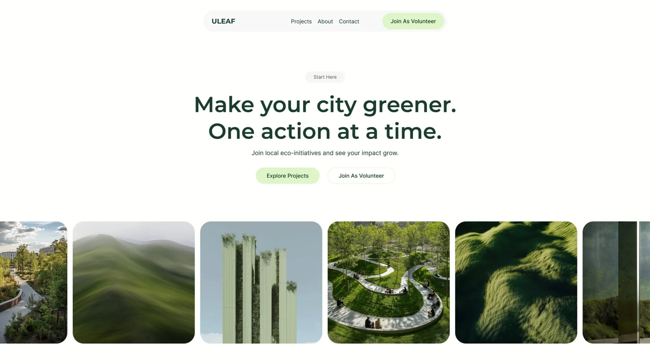
Eco Hero With Image Carousel
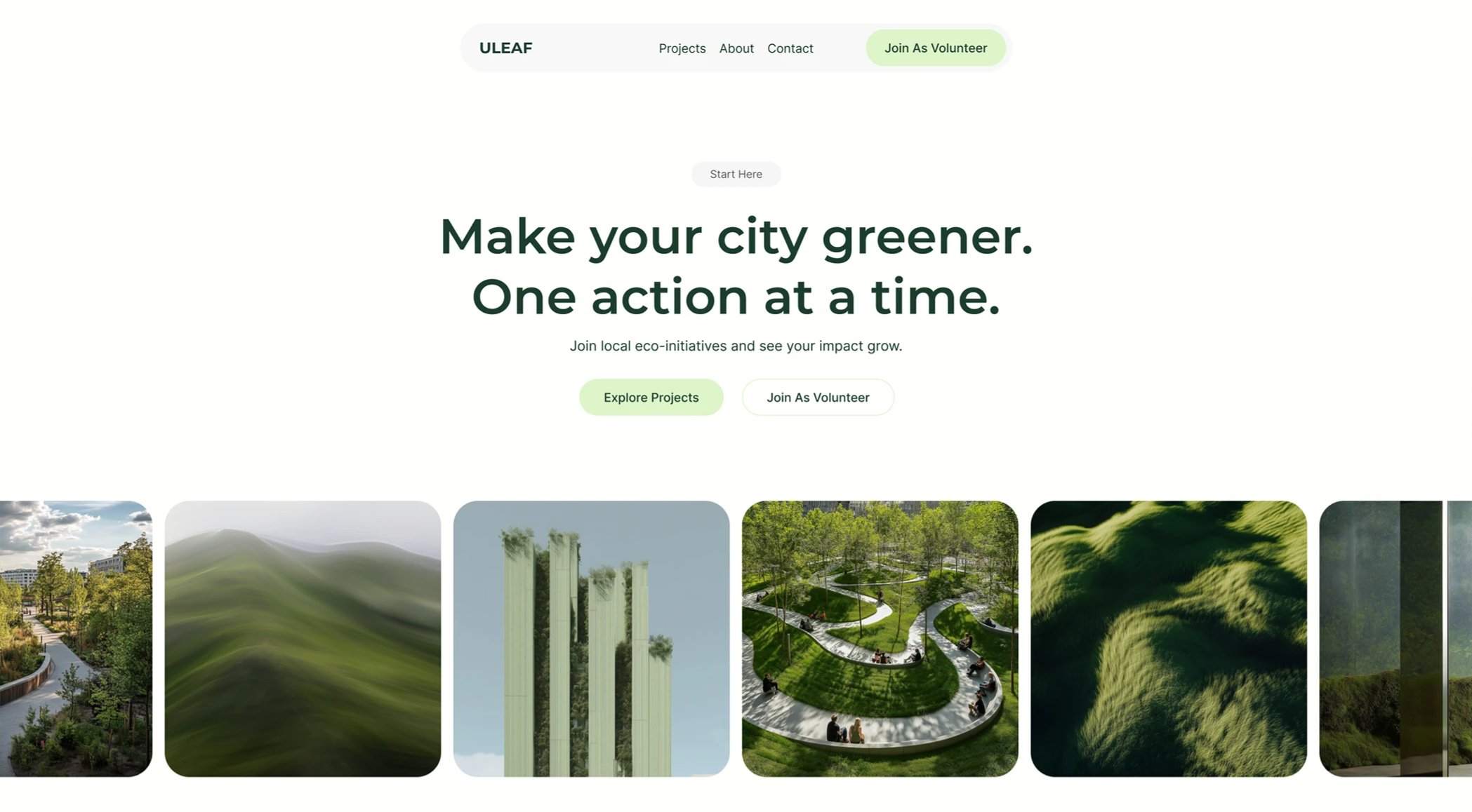
A center-aligned hero on a clean white background that flows into a full-width image carousel. The top stacks a small grey 'Start Here' pill, an oversized two-line display headline in deep forest green reading 'Make your city greener. One action at a time.', a single grey subhead 'Join local eco-initiatives and see your impact grow.', and two centered pill buttons - a soft mint-green filled 'Explore Projects' primary and a white outlined 'Join As Volunteer' secondary. Directly below runs an edge-to-edge row of equally sized rounded photo tiles with a unified green nature theme: a tree-lined urban path, rolling hills, planted vertical towers, an aerial park walkway, a grassy hillside, and a final tile bleeding off the right edge to signal horizontal scroll. The restrained palette, generous whitespace, and geometric sans-serif give the block a calm, premium feel while the clipped last tile invites the visitor to keep browsing.
Behance ↗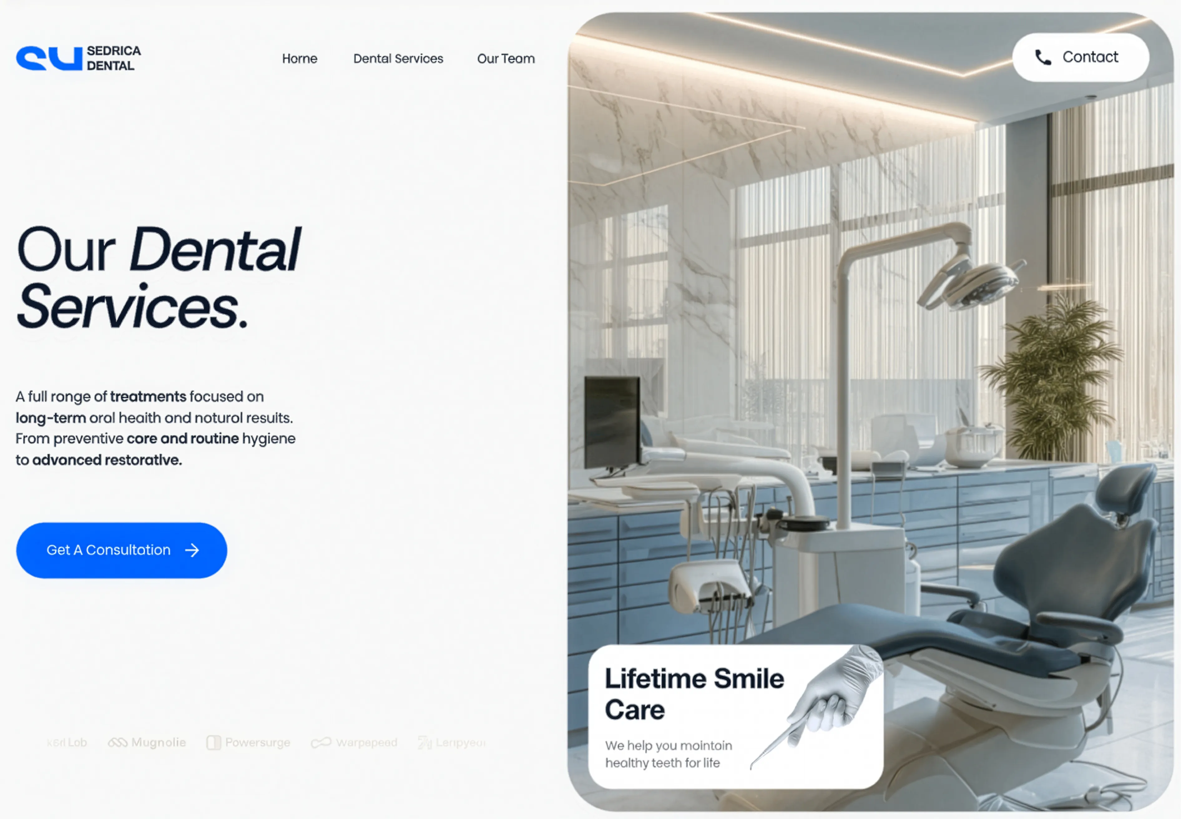
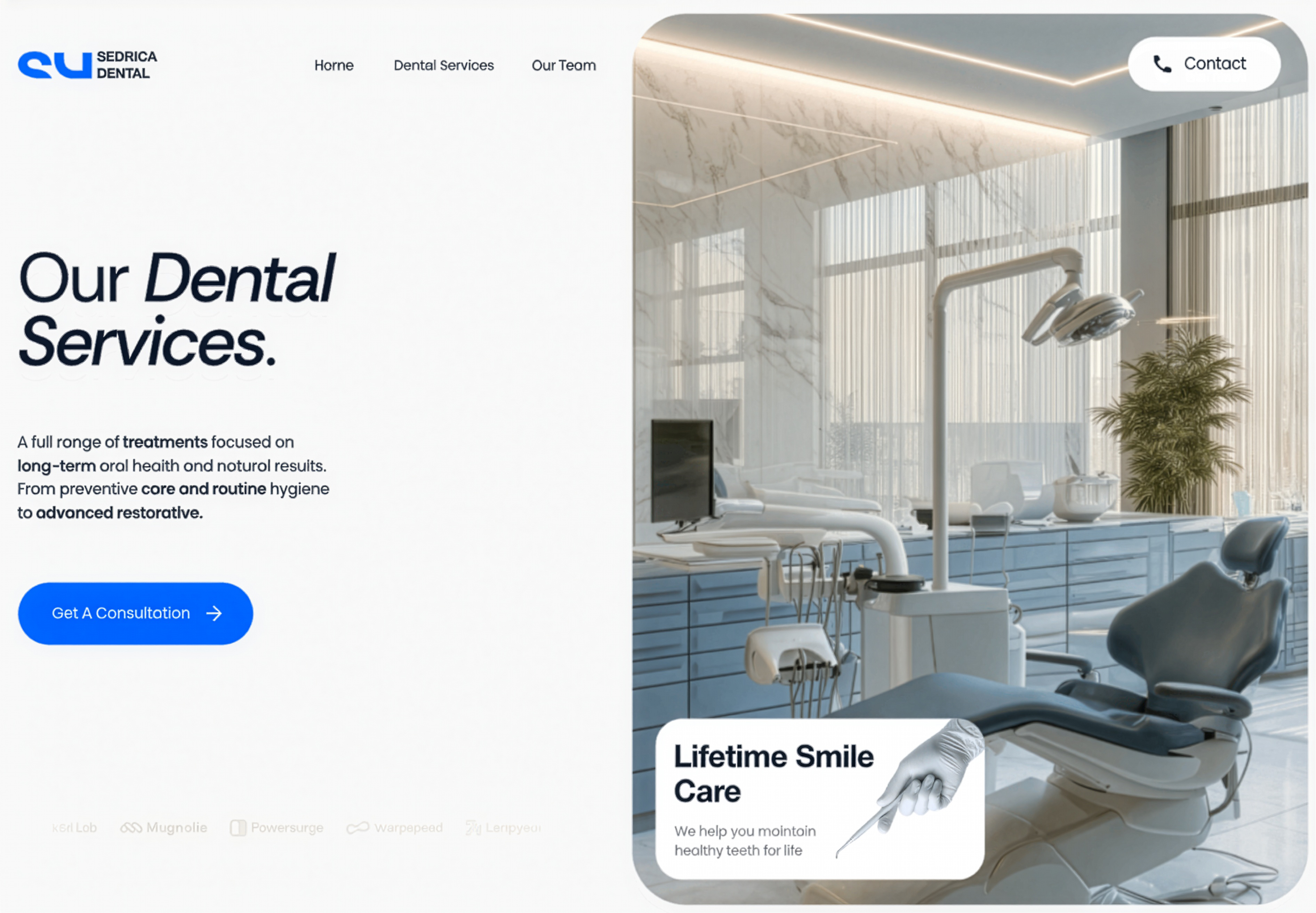
Our Dental Services Split Hero
A split hero pairing a value headline, supporting copy, and a consultation CTA with a large clinic interior image carrying a floating 'Lifetime Smile Care' badge.
Behance ↗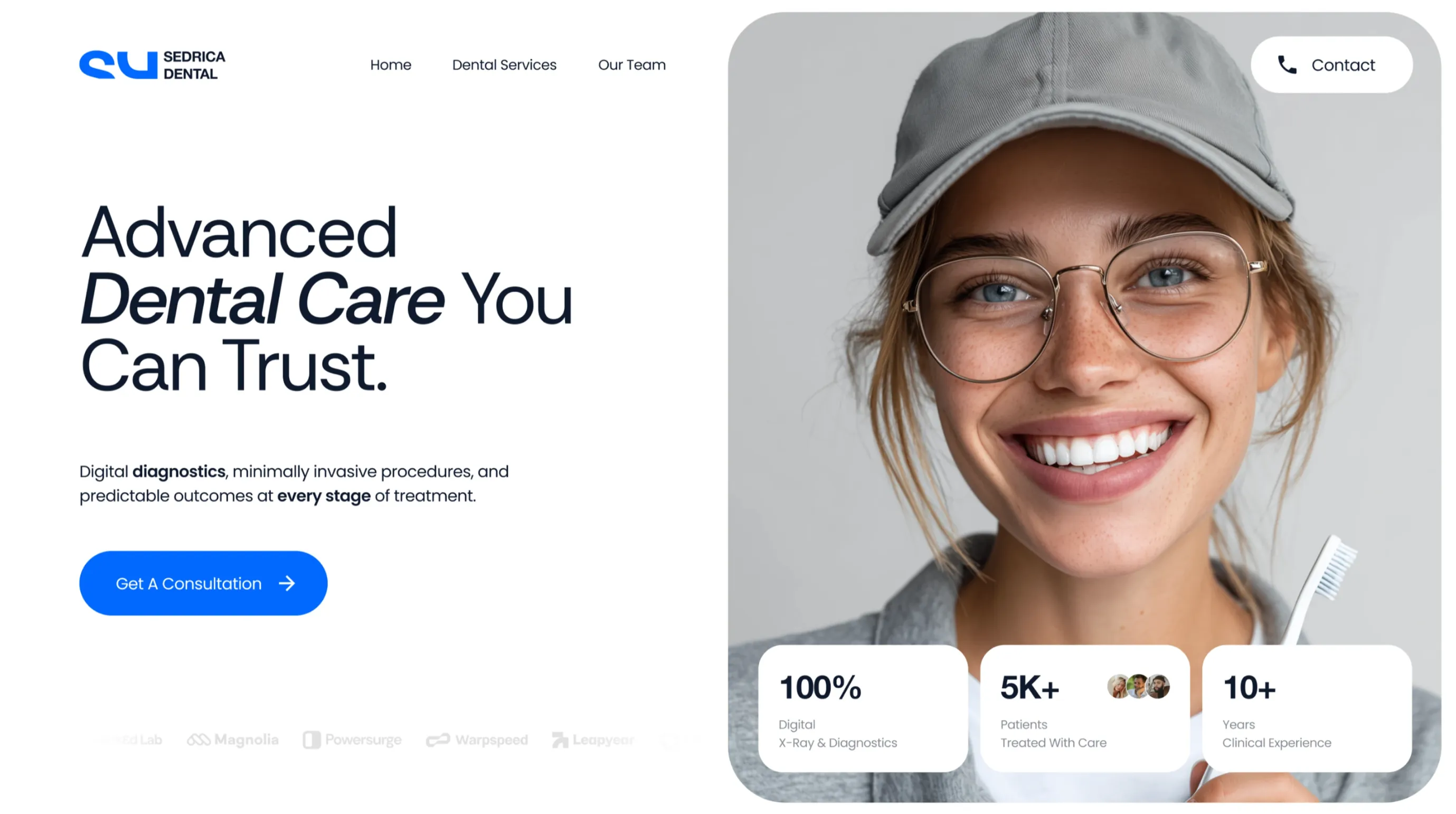
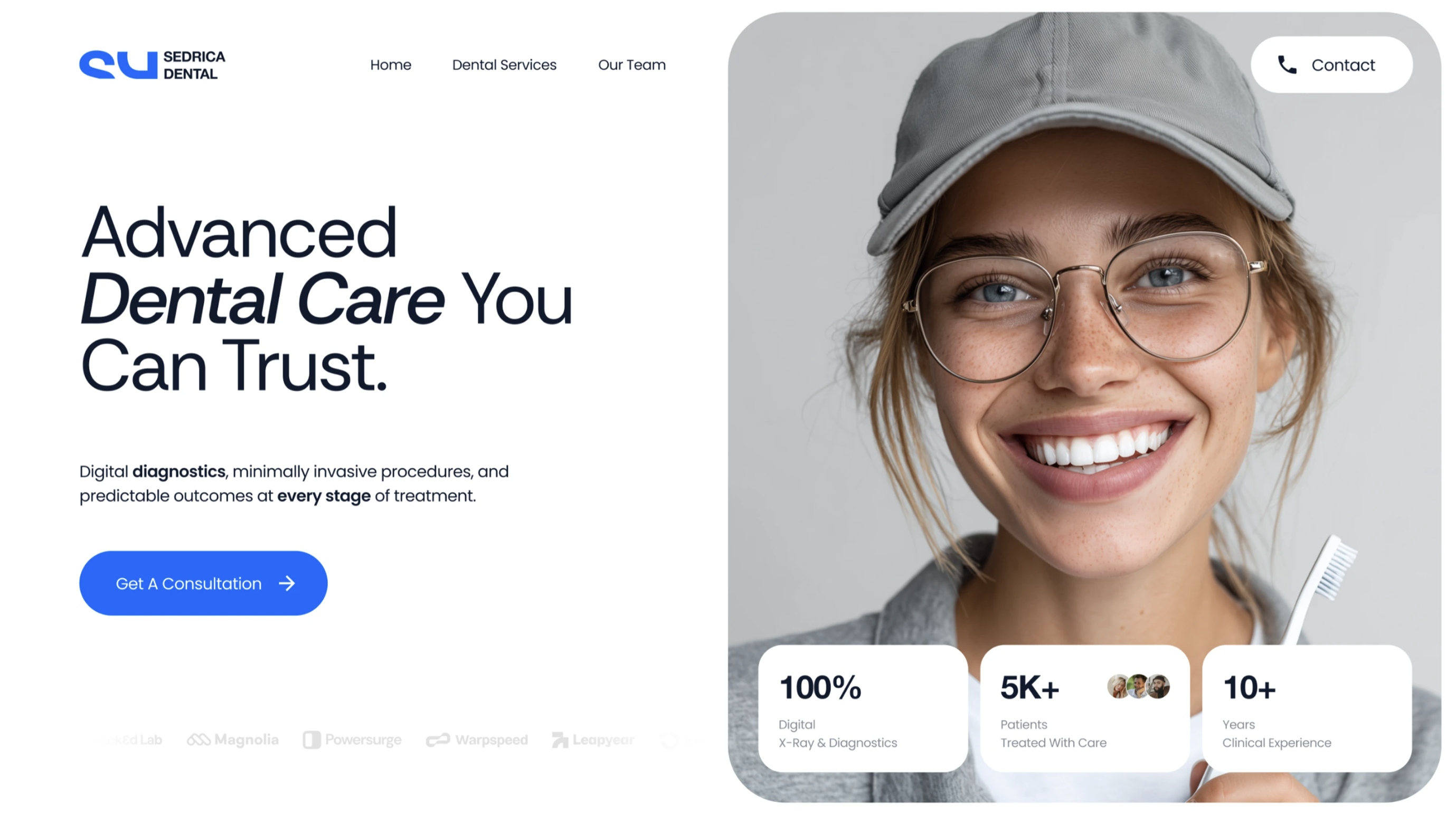
Split Hero with Stats
A two-column hero pairing a large headline, supporting copy, and a primary call-to-action button on the left with a full-height image on the right, topped by a logo and navigation bar and overlaid with floating stat cards and a partner logo strip. Best used at the top of a service or business page to introduce the brand and showcase key metrics at a glance.
Behance ↗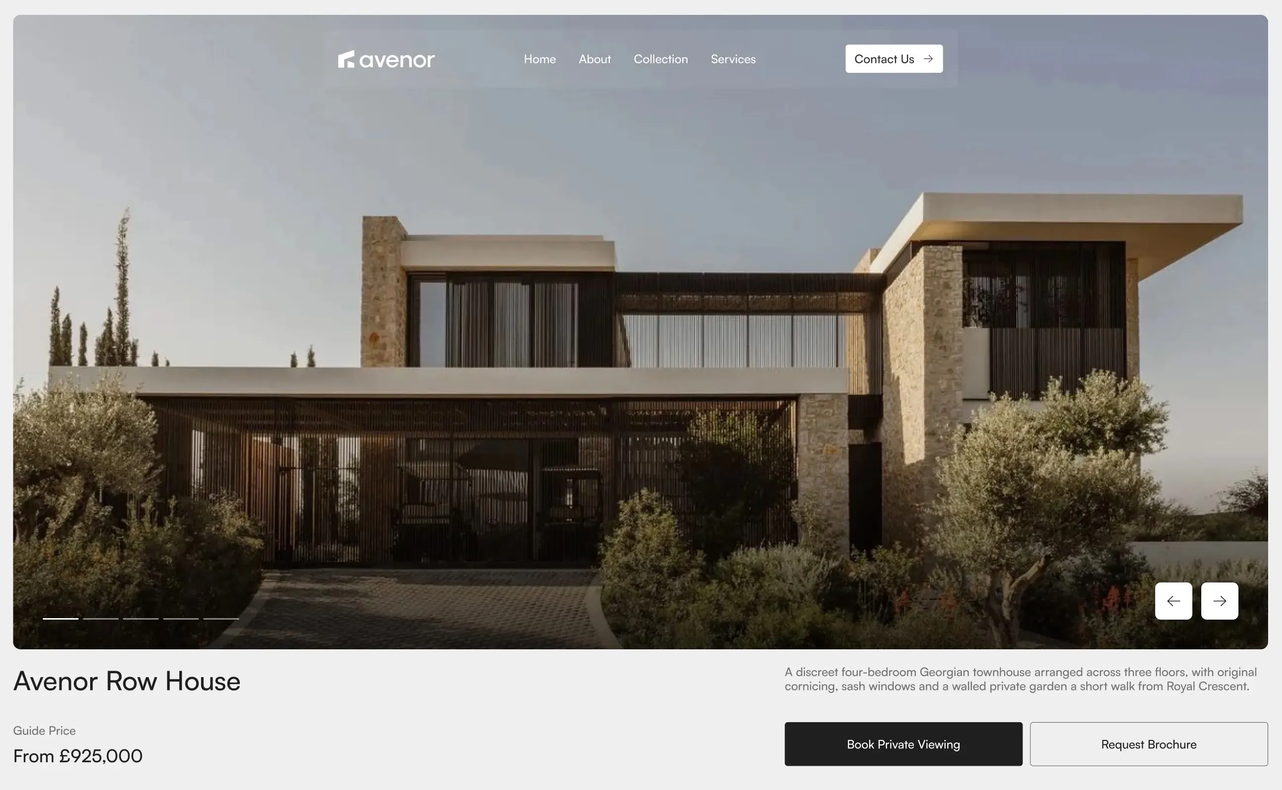
Avenor Property Hero with Carousel
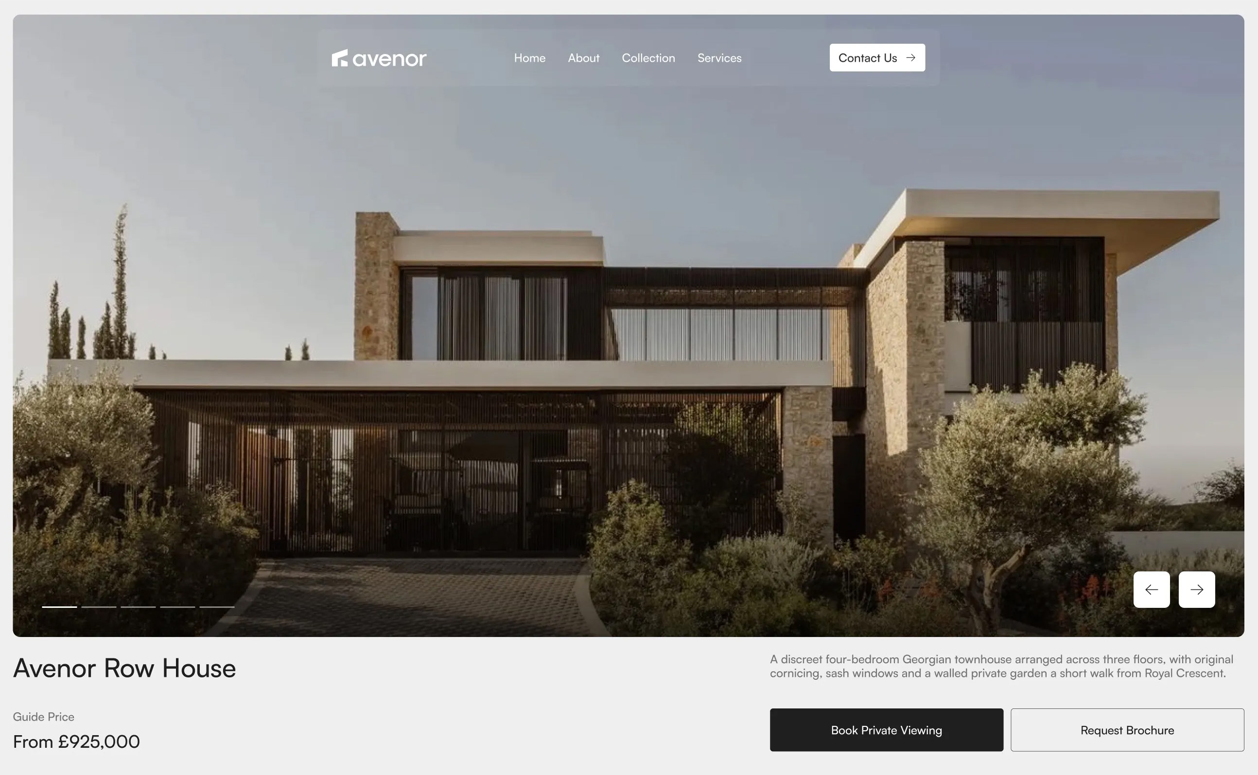
A full-width hero featuring a large property image carousel with navigation controls and slide indicators, topped by a logo and navigation bar, with a property title, guide price, descriptive summary, and primary action buttons arranged below. Best used at the top of a property page to introduce the listing and drive viewing or brochure requests.
Dribbble ↗