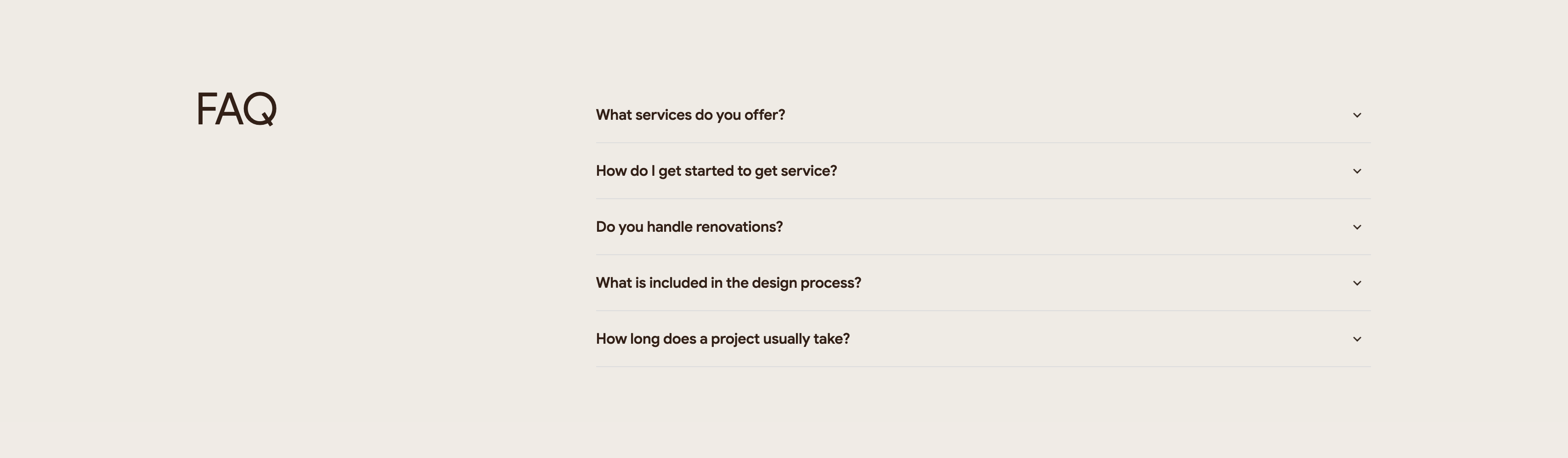
Intrio FAQ Accordion
Description
A quiet two-column FAQ section on an off-white background. The left column holds only a large lowercase-to-caps brown heading, ‘FAQ’, leaving most of that side as whitespace. The right column is a stacked accordion of five collapsed questions, each a bold line of dark text with a chevron-down toggle at the far right and a thin hairline divider between rows. The questions read ‘What services do you offer?’, ‘How do I get started to get service?’, ‘Do you handle renovations?’, ‘What is included in the design process?’ and ‘How long does a project usually take?’. The generous spacing and single accent-free palette keep the focus on the questions themselves. It is a straightforward expandable FAQ pattern that scales cleanly as answers open.
Related
Intrio Multi-Column Footer With Social Links
A tall footer on a deep brown background. The upper-left holds the 'INTRIO' logo above two link columns, 'QUICK LINKS' and 'COMPANY', each listing Home, Our Services, Projects, About Us, Blog and Contact. The center-right is dominated by a very large 'GET IN TOUCH' heading, beside which a small grey-labelled contact block lists Email 'CONTACT@INTRIO.COM', Phone '+929 333 9296' and Office Location '100 S MAIN ST, NEW YORK, NY'. A large outlined up-right arrow sits in the top-right corner as a decorative get-in-touch cue. Below the logo a row of five circular social icons (Facebook, X, Instagram, YouTube, WhatsApp) appears, and a thin bottom bar centers the line 'Copyright 2026 Intrio by Designesia' with a circular scroll-to-top button at the lower right. The dark palette, oversized contact headline and tidy link columns make a confident, well-organised page close.
Madebydesignesia ↗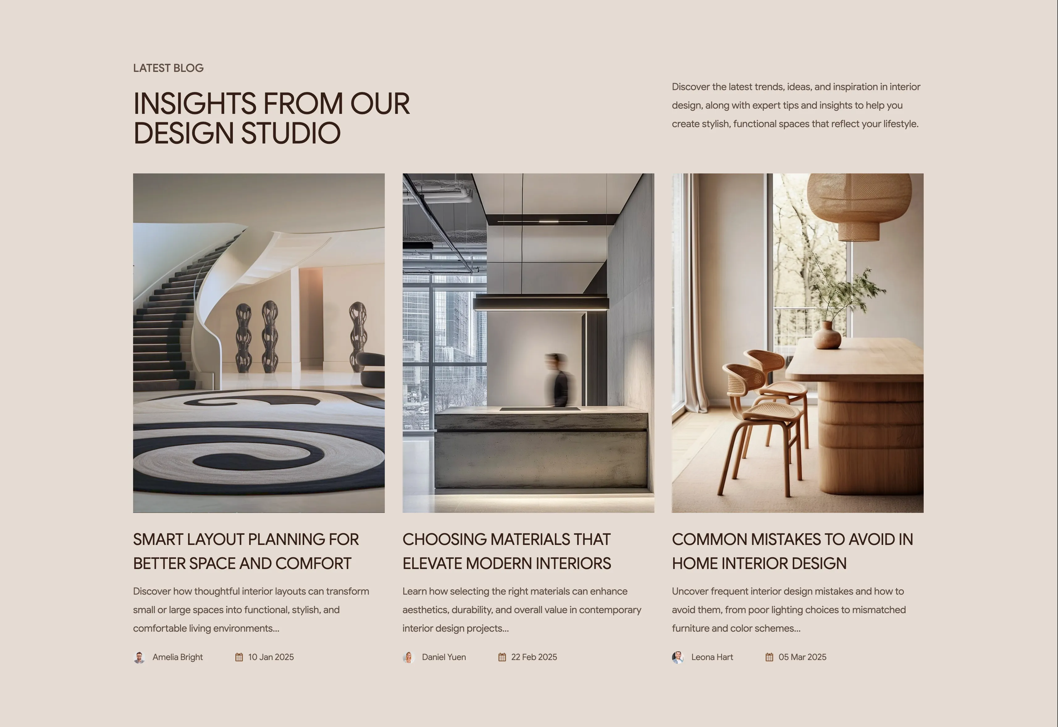
Intrio Latest Blog Three-Card Grid
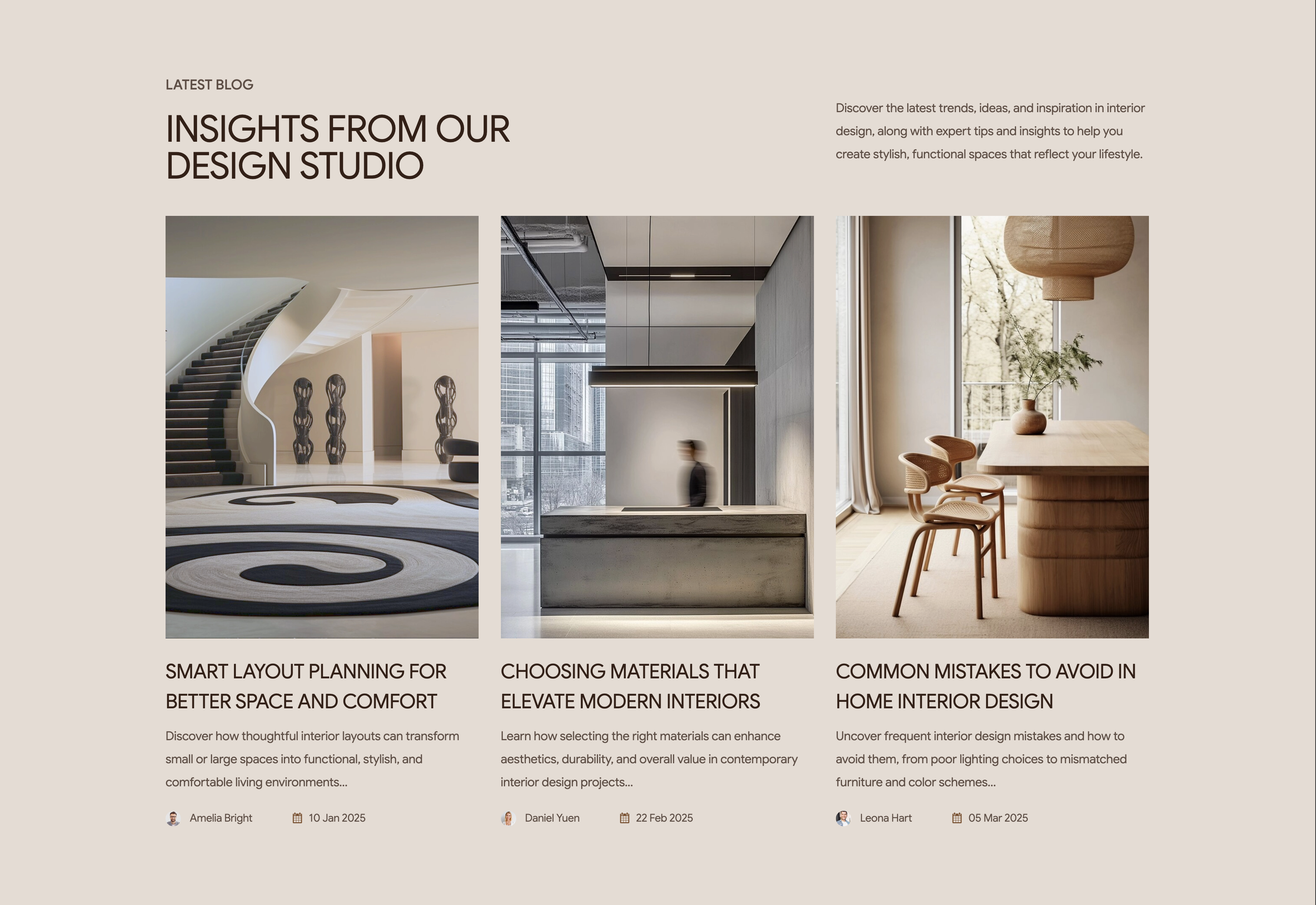
A latest-blog section on a warm beige background presenting three article cards in a row. The header reads 'LATEST BLOG' as an eyebrow above a large brown heading, 'INSIGHTS FROM OUR DESIGN STUDIO', with an introductory paragraph about trends and tips set to the upper right. Each card stacks a tall portrait photograph of an interior, an uppercase article title, a two-line excerpt, and a footer row pairing a small circular author avatar and name with a calendar icon and date. The three posts are 'Smart Layout Planning For Better Space And Comfort' (Amelia Bright, 10 Jan 2025), 'Choosing Materials That Elevate Modern Interiors' (Daniel Yuen, 22 Feb 2025) and 'Common Mistakes To Avoid In Home Interior Design' (Leona Hart, 05 Mar 2025). The even three-up grid with consistent imagery, bylines and dates reads as a clean editorial index. It invites browsing while reinforcing the studio's expertise.
Madebydesignesia ↗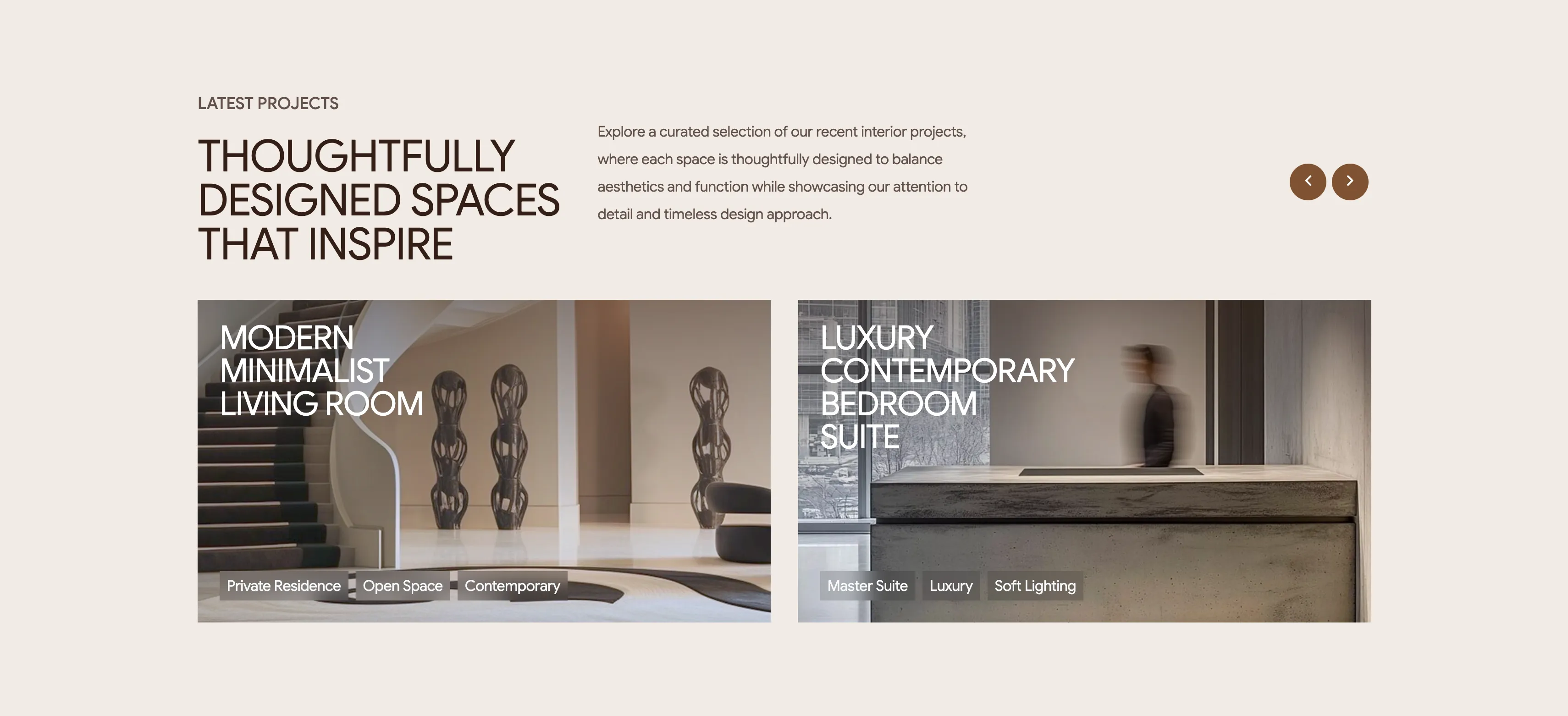
Intrio Latest Projects Showcase
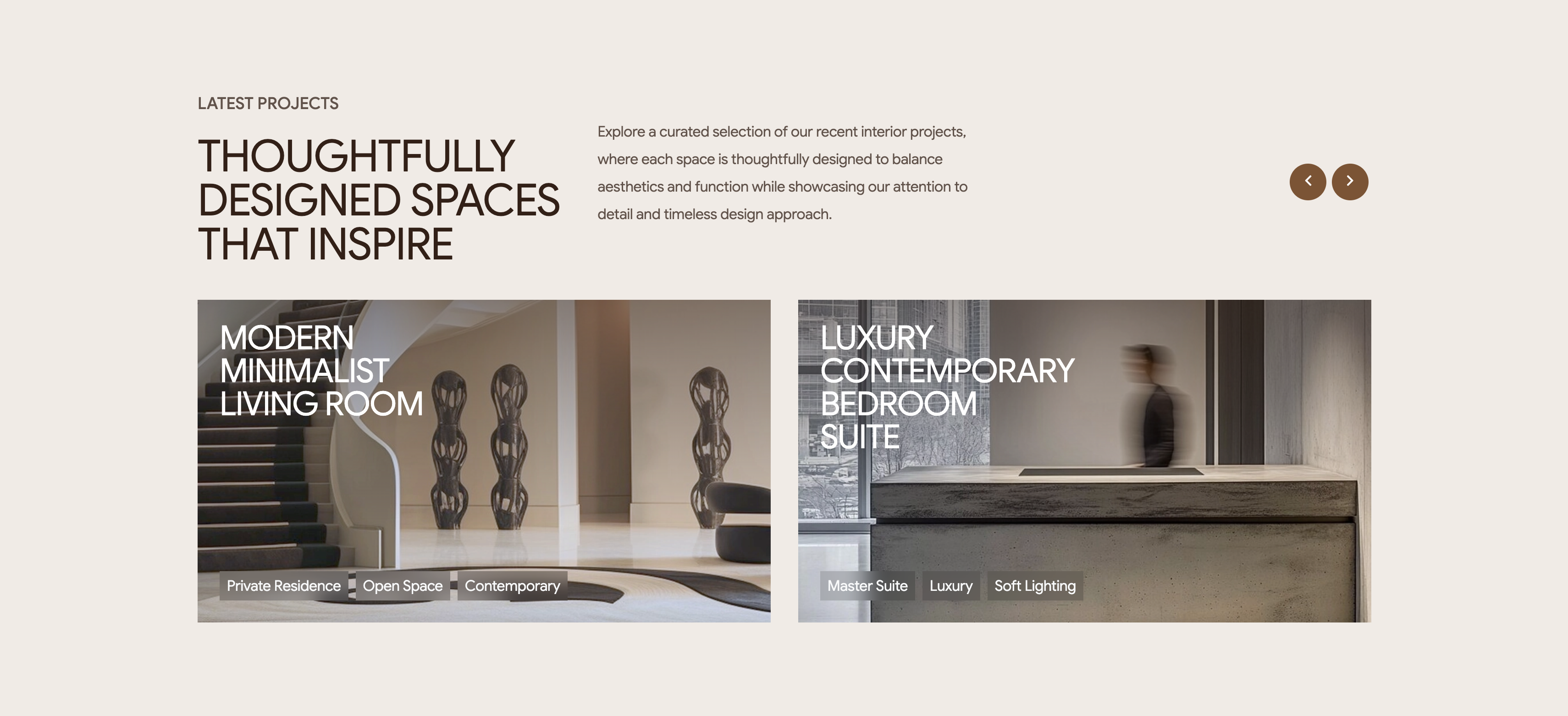
A latest-projects section on a pale background with a two-up row of wide project cards. The header stacks a 'LATEST PROJECTS' eyebrow over a large brown heading, 'THOUGHTFULLY DESIGNED SPACES THAT INSPIRE', a paragraph of intro copy to the right, and two circular bronze carousel arrows at the far right. Below, two landscape image cards sit side by side: the left shows a minimalist staircase-and-sculpture interior titled 'MODERN MINIMALIST LIVING ROOM', the right a concrete-and-glass space titled 'LUXURY CONTEMPORARY BEDROOM SUITE'. Each card overlays a white uppercase title on the upper-left and a row of small translucent tag pills along the bottom — 'Private Residence / Open Space / Contemporary' and 'Master Suite / Luxury / Soft Lighting' respectively. The arrows imply the two visible projects are the first of a longer scrollable set. Large photography with overlaid text and category chips makes the portfolio feel curated and browsable.
Madebydesignesia ↗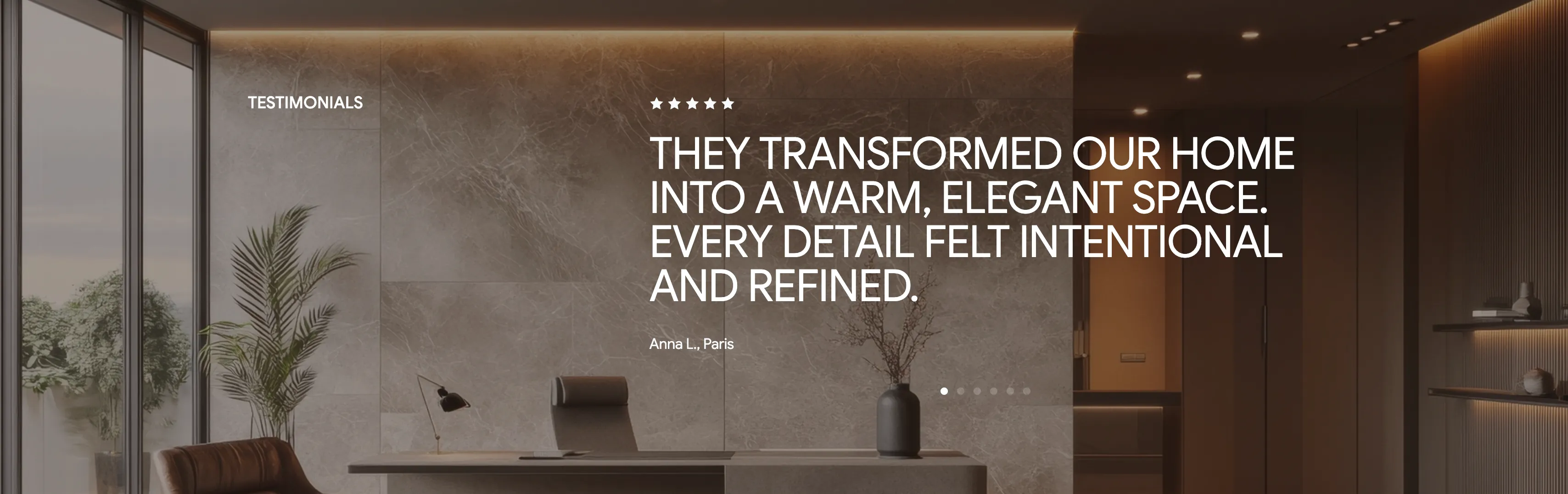
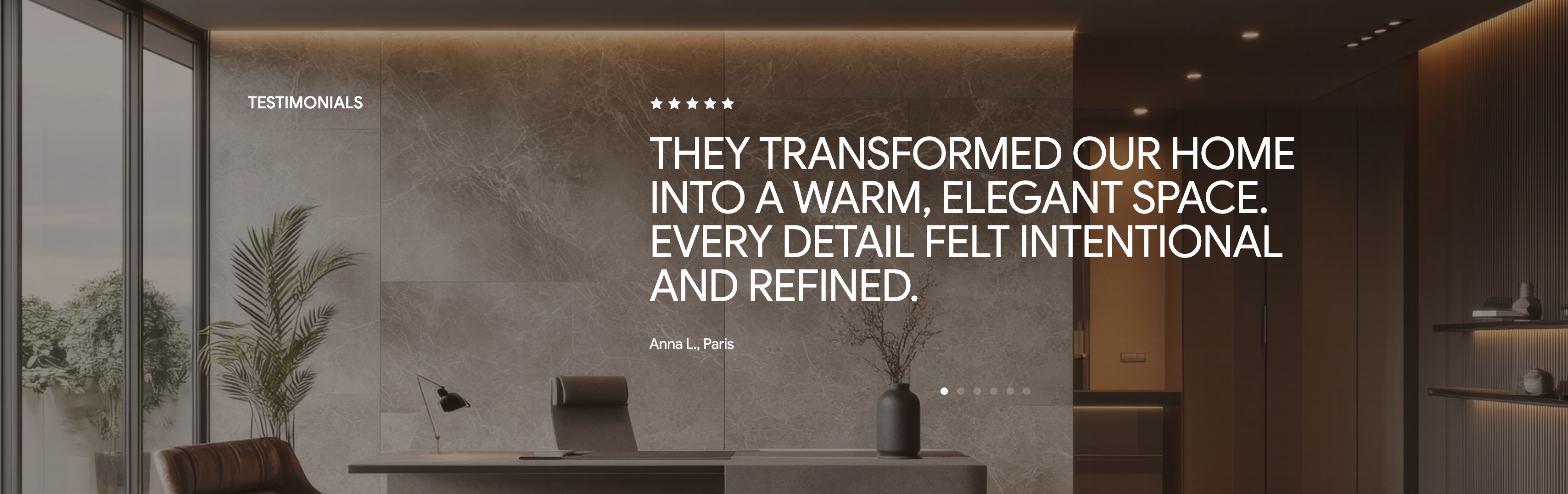
Intrio Full-Bleed Testimonial Quote
A single-testimonial section laid over a darkened full-bleed photo of a refined marble interior with a desk, plant and warm cove lighting. A small 'TESTIMONIALS' label sits to the left, while the focal content is centered: a row of five filled stars above a large white pull-quote, 'THEY TRANSFORMED OUR HOME INTO A WARM, ELEGANT SPACE. EVERY DETAIL FELT INTENTIONAL AND REFINED.' The attribution 'Anna L., Paris' appears in smaller grey type just beneath the quote. A row of six pagination dots at the bottom, with the first active, signals that several reviews rotate through this slot. The moody photographic backdrop and oversized quote give the praise a confident, editorial weight. It is a classic one-review-at-a-time carousel pattern that foregrounds a single strong endorsement.
Madebydesignesia ↗Similar faq sections
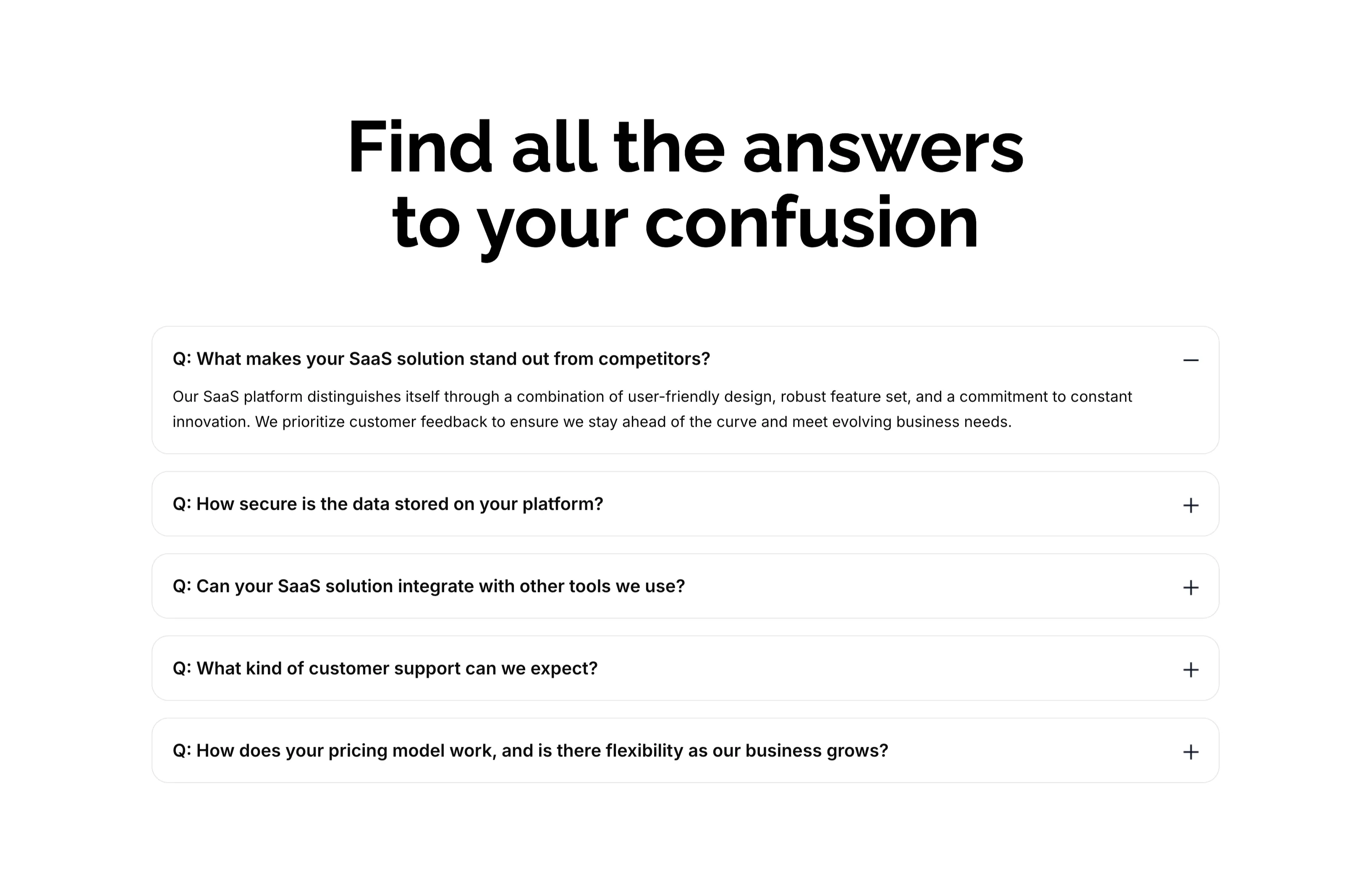
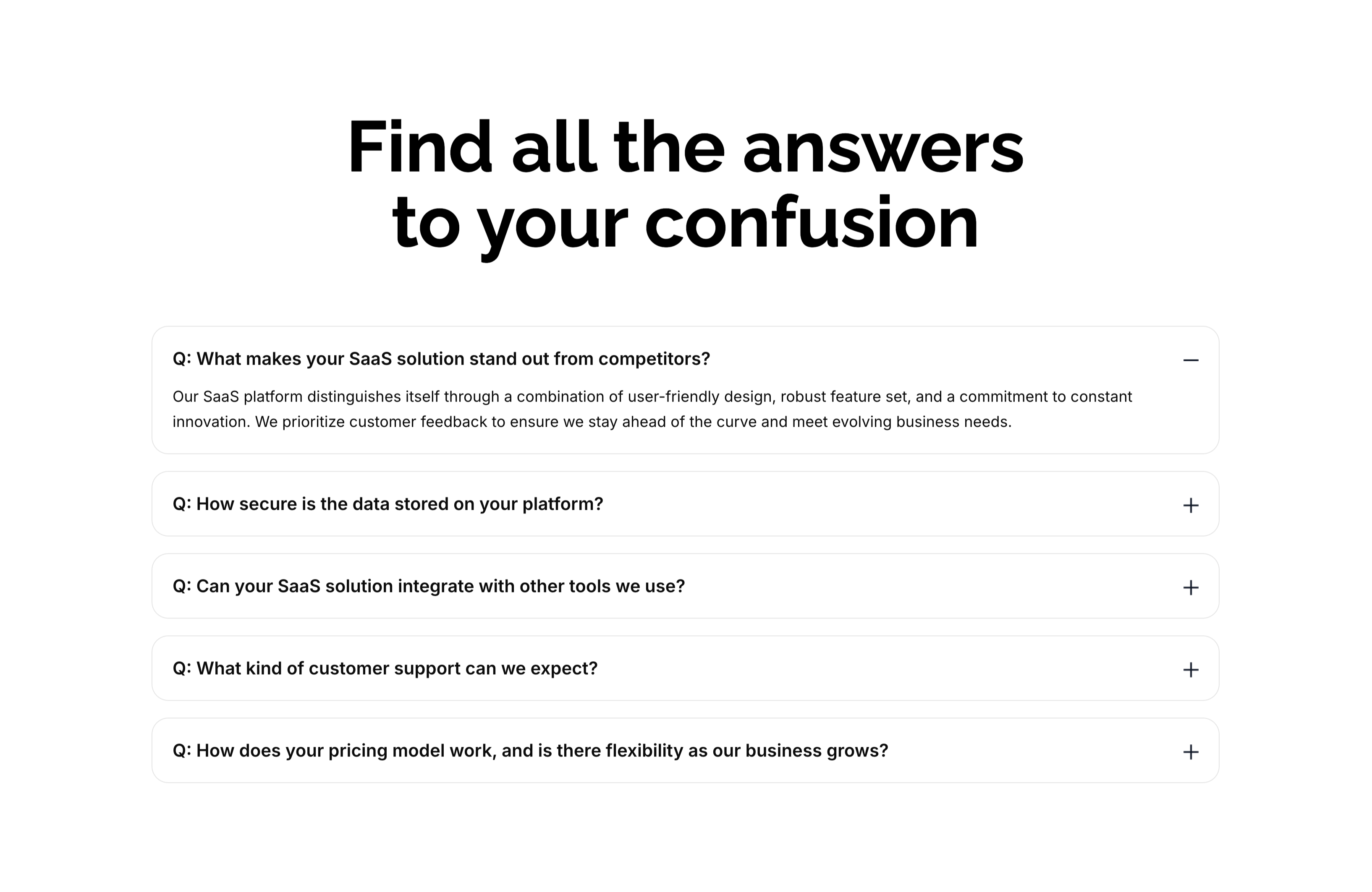
Find All The Answers FAQ Accordion
A FAQ section on white, led by an oversized centered two-line heading, 'Find all the answers to your confusion.' Below sit five stacked, rounded accordion rows, each a bold question prefixed with 'Q:'. The first row — 'What makes your SaaS solution stand out from competitors?' — is expanded, showing a gray paragraph answer and a minus toggle, while the remaining rows ('How secure is the data…', 'Can your SaaS solution integrate…', 'What kind of customer support…', 'How does your pricing model work…') are collapsed with plus toggles on the right. The clean single-column accordion with clear expand/collapse affordances makes the answers easy to scan one at a time.
Zubuz ↗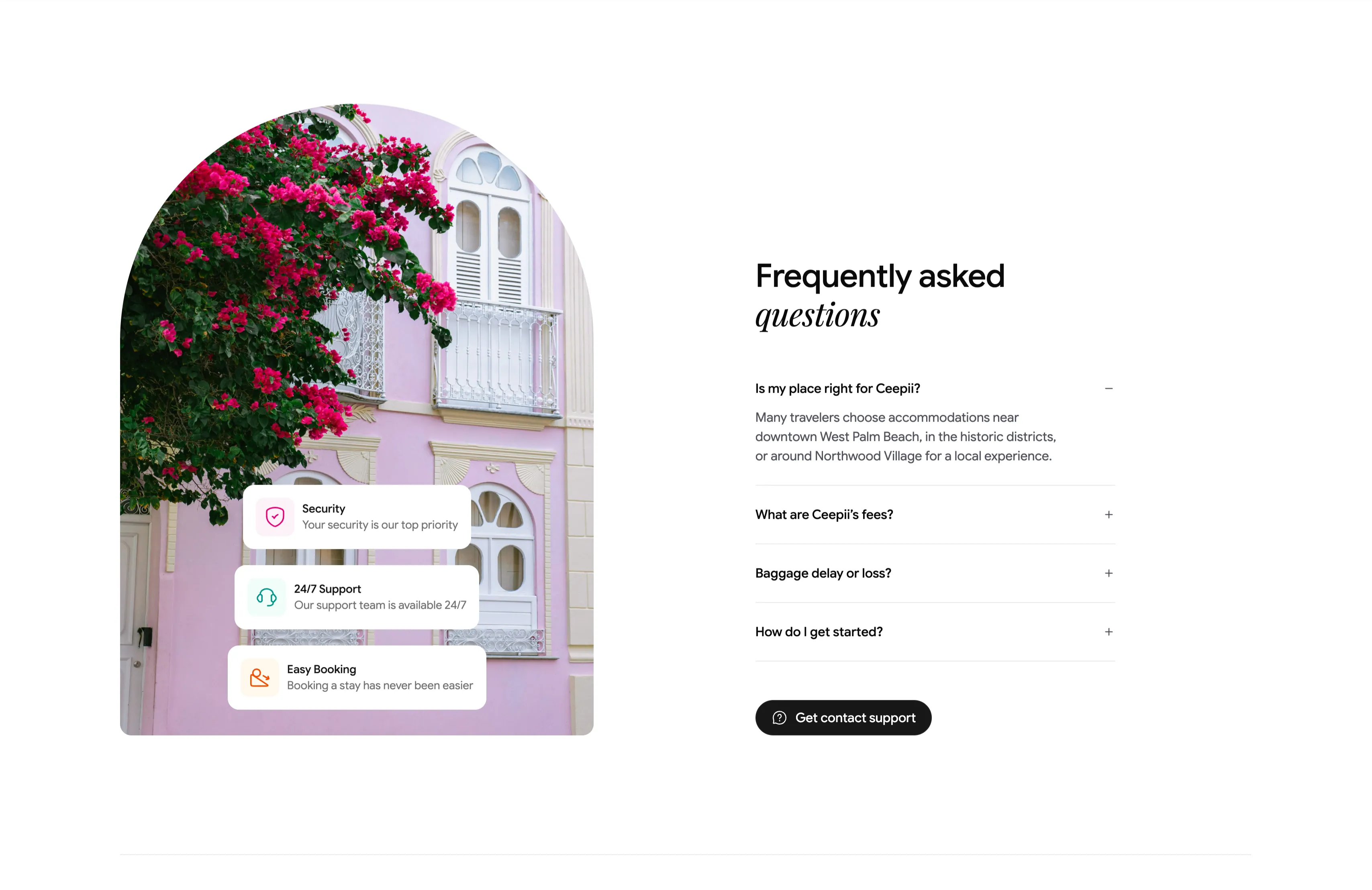
Frequently Asked Questions Accordion With Image
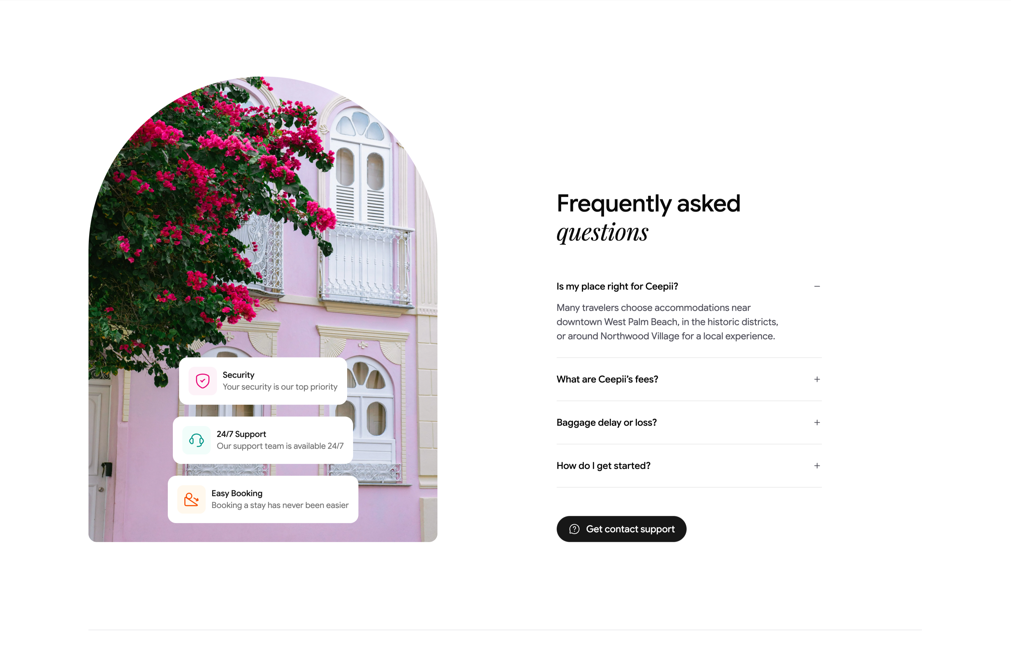
A two-column FAQ section. The left column is a tall arch-topped photograph of a pink colonial facade draped in magenta bougainvillea, with three floating white cards stacked over it — 'Security / Your security is our top priority', '24/7 Support / Our support team is available 24/7', and 'Easy Booking / Booking a stay has never been easier' — each fronted by a colored icon. The right column heads 'Frequently asked questions' (with 'questions' in italic serif) above an accordion list: 'Is my place right for Ceepii?' is expanded to reveal a paragraph about West Palm Beach neighborhoods, followed by collapsed rows 'What are Ceepii's fees?', 'Baggage delay or loss?' and 'How do I get started?', each with a +/− toggle. A black pill 'Get contact support' button closes the column. The expand/collapse toggles and supporting trust cards make a standard but polished FAQ.
Ceepii-nextjs-template ↗
UrbanLeaf FAQ Accordion
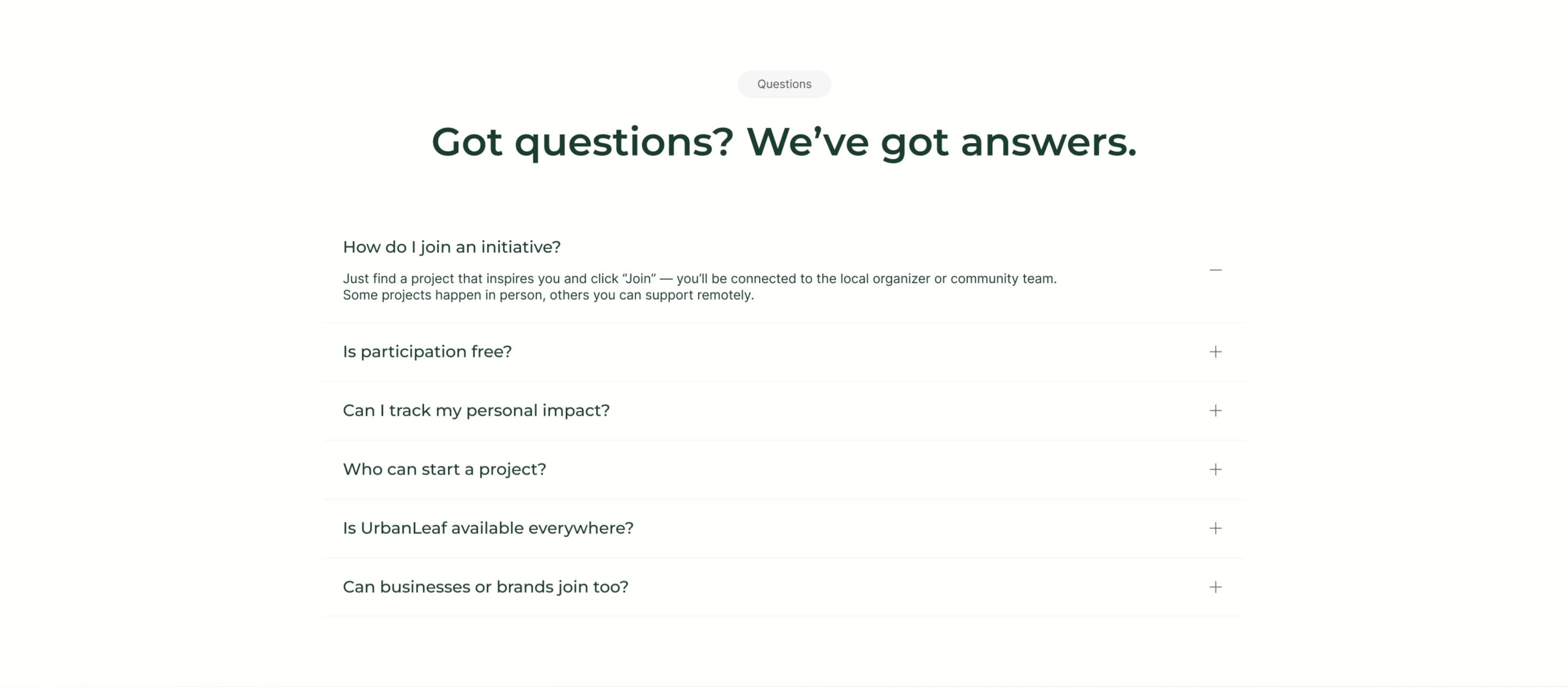
A centered FAQ section on white. A small grey 'Questions' tag sits above an oversized dark-green headline, 'Got questions? We've got answers.' Below runs a single-column accordion of six question rows separated by hairline dividers, each showing the question on the left and a toggle control on the right. The first row, 'How do I join an initiative?', is expanded with a minus icon and reveals its answer: find a project, click 'Join', and connect with the local organizer, with some projects in person and others remote. The remaining rows stay collapsed with plus icons and cover participation cost, tracking personal impact, who can start a project, availability, and whether businesses can join. Roomy spacing and a quiet palette make it easy to scan.
Behance ↗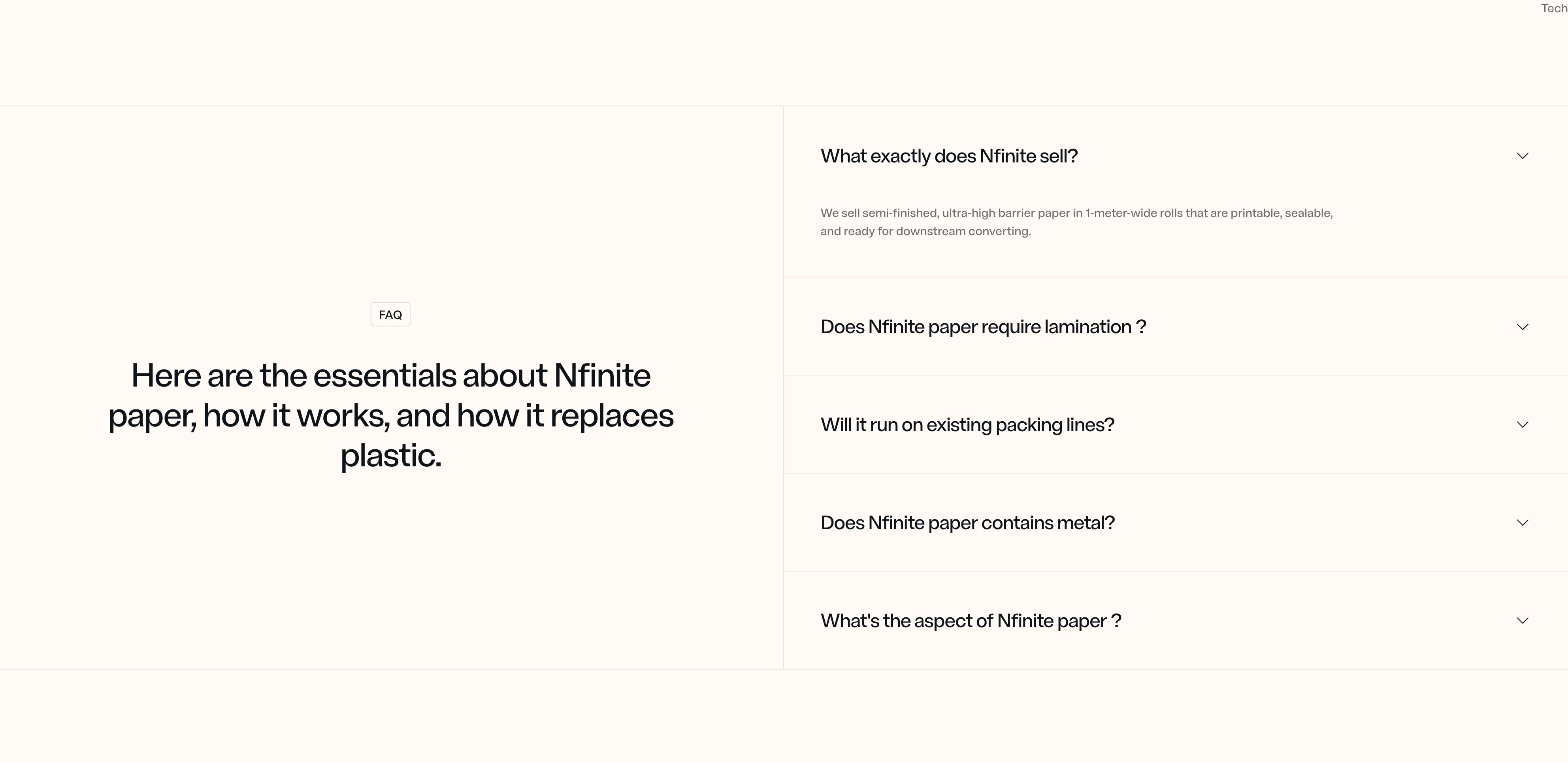
Nfinite FAQ Accordion, Split Layout
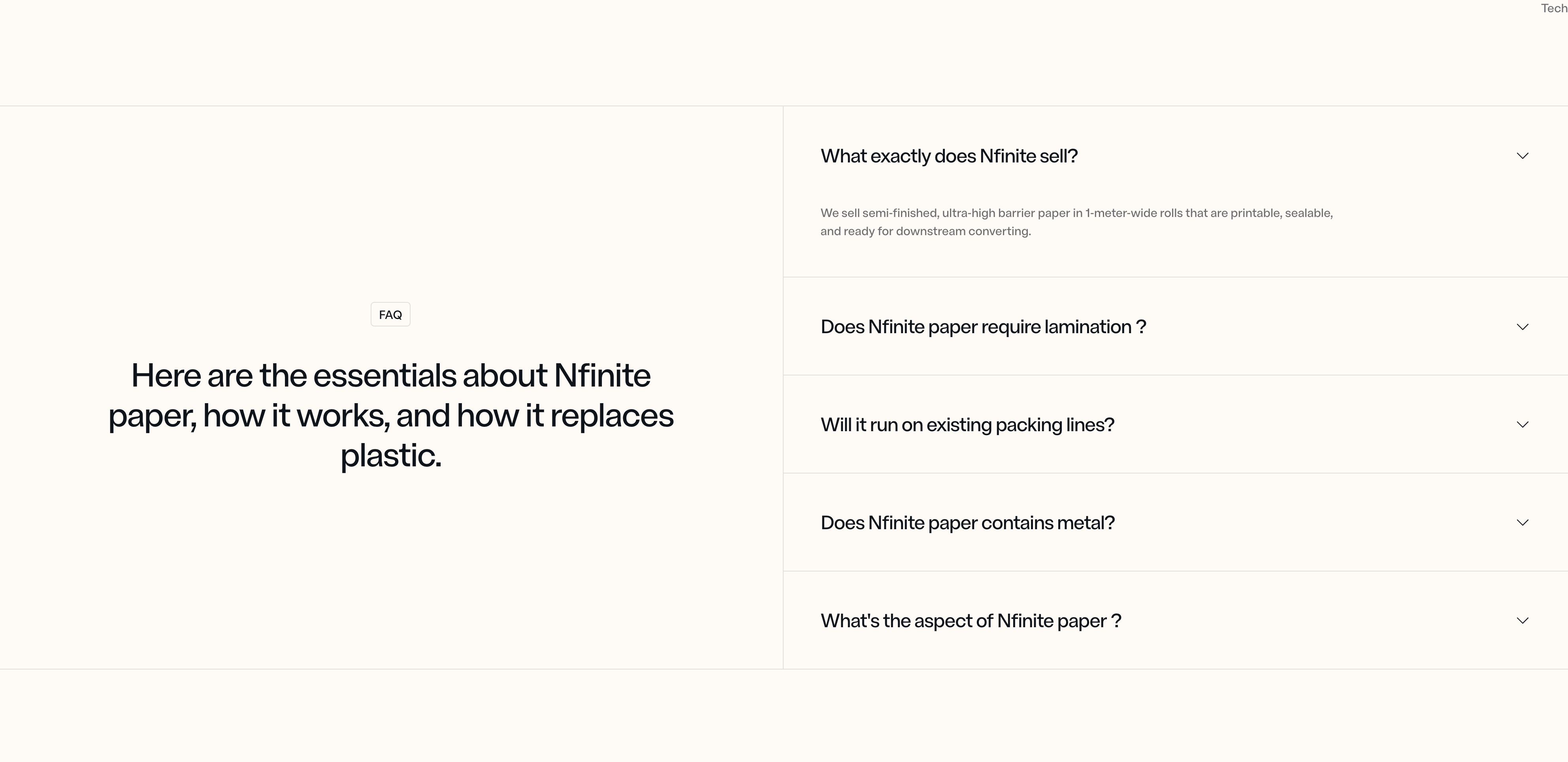
A two-column FAQ section pairing a badge label and large headline on the left with a stacked list of expandable accordion items on the right, each revealing its answer when opened. Best used to address common questions and reduce friction before a visitor converts.
Nfinitepaper ↗