
Linear Multi-Column Footer
Description
A wide site footer on near-black. The Linear logo mark sits at the far left, followed by five columns of grey text links under white headings: Product (Intake, Plan, Build, Diffs, Monitor, Pricing, Security), Features (Asks, Agents, Coding Sessions, Customer Requests, Insights, Mobile, Integrations, Changelog), Company (About, Customers, Careers, Blog, Method, Quality, Brand), Resources (Switch, Download, Documentation, Developers, Status, Enterprise, Startups), and Connect (Contact us, Community, X (Twitter), GitHub, YouTube). A bottom row carries small legal links — Privacy, Terms, DPA, AUP. The dense, organised multi-column layout provides comprehensive site navigation in a quiet, low-contrast treatment.
Related


Linear Centered Closing CTA
A minimal closing call-to-action band on a solid near-black background. Centred on the page, a large white two-line headline reads 'Built for the future. Available today.' Directly beneath it sit two pill buttons side by side: a solid light-grey 'Get started' primary and a dark, subtly outlined 'Contact sales' secondary. There is no imagery or other copy — just the centered headline and button pair surrounded by generous empty space. The stark, focused composition pushes the visitor toward signing up or contacting sales as the final step of the page.
Linear ↗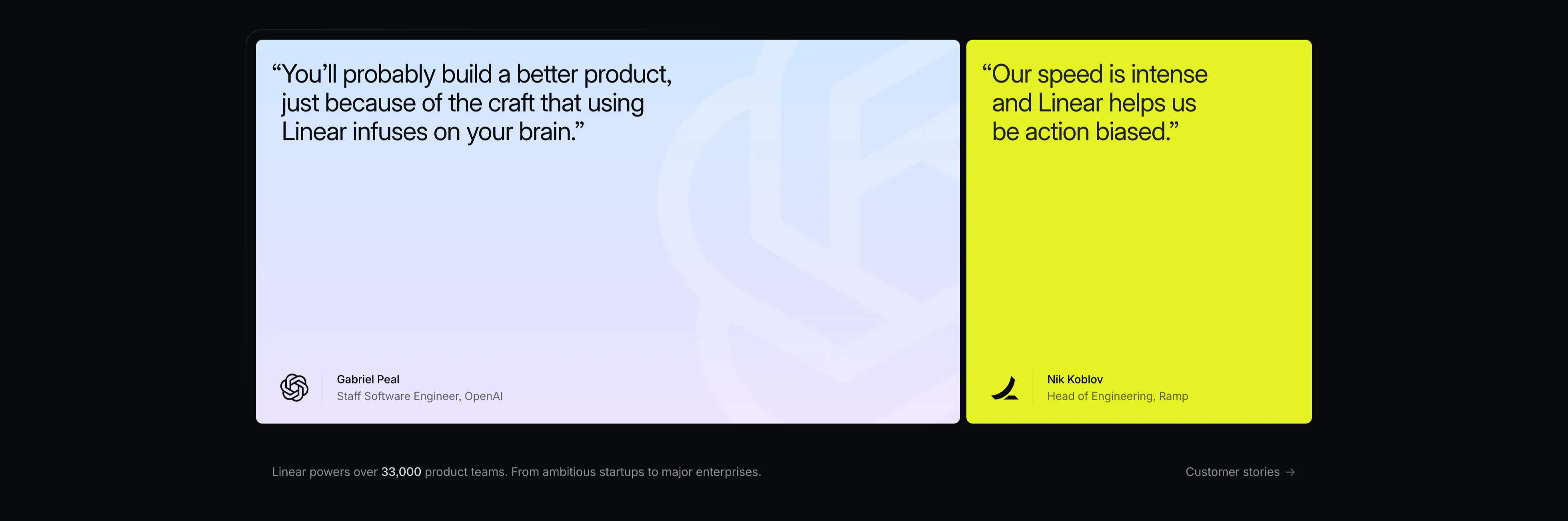
Linear Two-Card Customer Quotes
A testimonial section with two large side-by-side quote cards on a black background. The left card has a soft lavender-to-white gradient and a faint embossed OpenAI mark; its dark quote reads 'You'll probably build a better product, just because of the craft that using Linear infuses on your brain.', attributed at the bottom to Gabriel Peal, Staff Software Engineer, OpenAI, beside the OpenAI logo. The right card is a vivid lime-yellow block whose black quote reads 'Our speed is intense and Linear helps us be action biased.', attributed to Nik Koblov, Head of Engineering, Ramp, with the Ramp mark. Below the cards a grey line notes 'Linear powers over 33,000 product teams. From ambitious startups to major enterprises.' next to a 'Customer stories →' link. The bold colour-blocked cards make the social proof pop against the dark page.
Linear ↗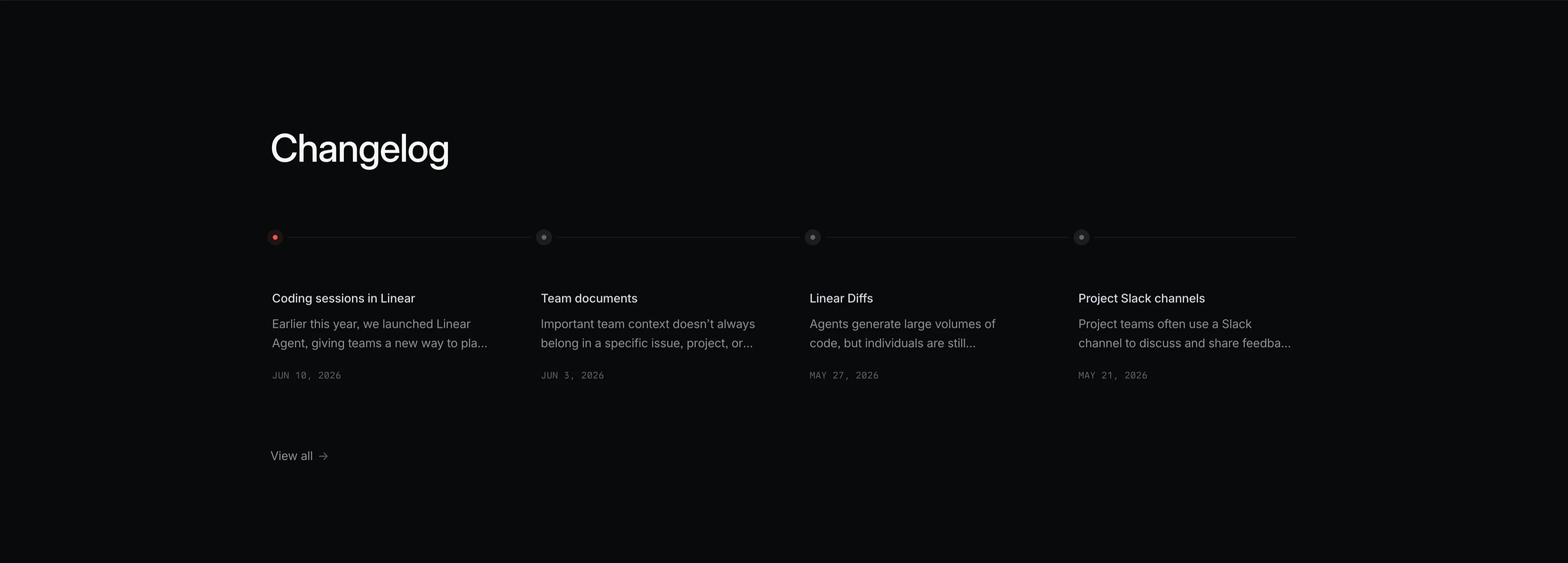
Linear Changelog Timeline
A dark changelog teaser section. A large white 'Changelog' heading sits top-left. Beneath it a thin horizontal timeline runs across the full width, marked by four small node dots — the first highlighted red, the rest grey. Hanging below each node is an entry with a white title, a two-line grey excerpt, and an uppercase monospace date: 'Coding sessions in Linear' (JUN 10, 2026), 'Team documents' (JUN 3, 2026), 'Linear Diffs' (MAY 27, 2026), and 'Project Slack channels' (MAY 21, 2026). A small 'View all →' link sits at the lower left. The restrained four-up timeline layout on black makes recent product updates scannable at a glance.
Linear ↗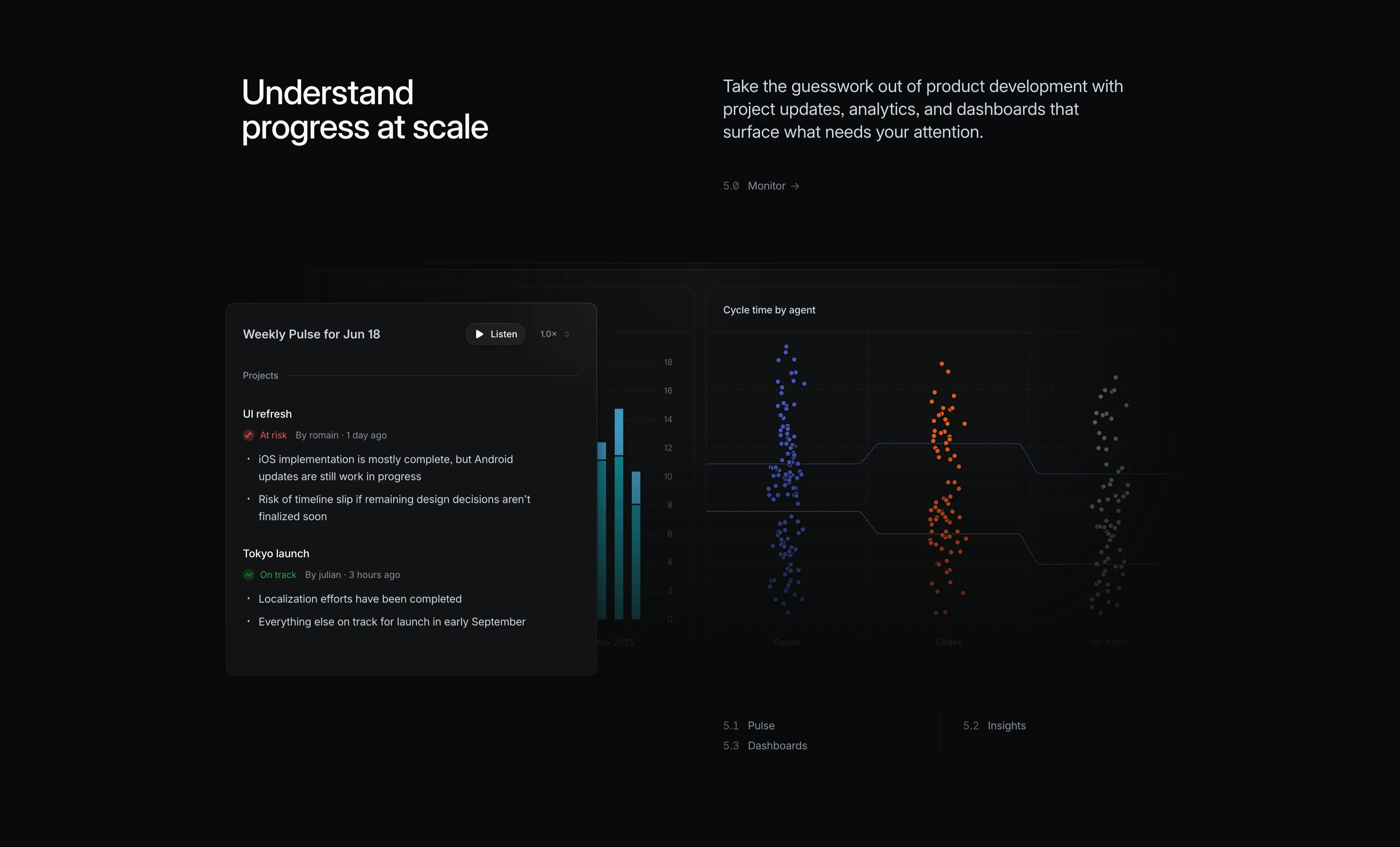
Linear Monitor Feature With Pulse And Charts
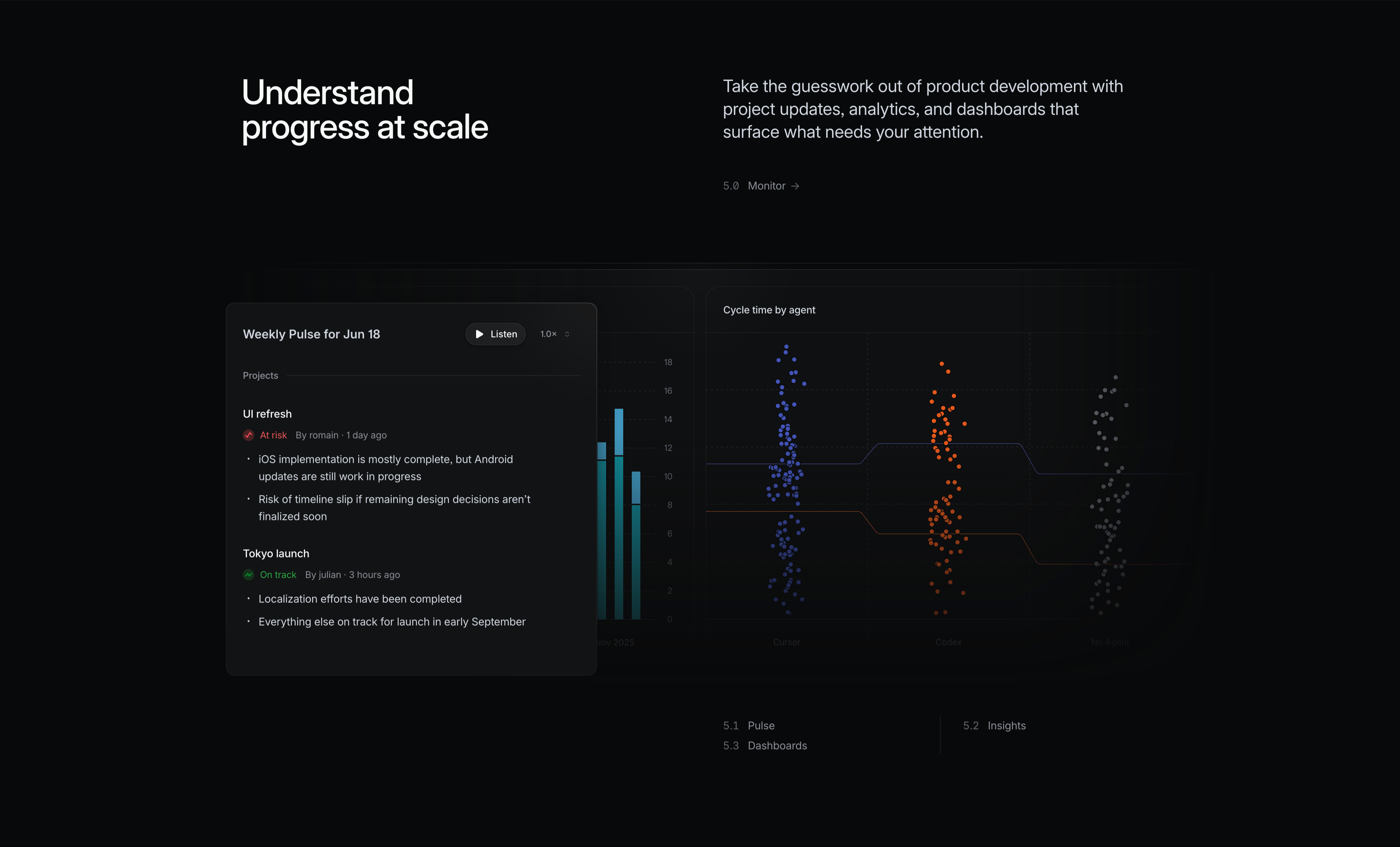
A dark 'Monitor' feature block. The left white headline reads 'Understand progress at scale'; the right grey copy says 'Take the guesswork out of product development with project updates, analytics, and dashboards that surface what needs your attention', with a small '5.0 Monitor →' label. Two analytics surfaces sit below. A foreground 'Weekly Pulse for Jun 18' card has a 'Listen' play button and 1.0× speed control, then project updates: 'UI refresh' flagged 'At risk' with bullet notes, and 'Tokyo launch' marked 'On track' with progress bullets. Behind it a partly-hidden bar chart and a large 'Cycle time by agent' panel show three colour-coded swarm/scatter clusters (blue, orange, grey) labelled Cursor, Codex and No Agent over a numeric y-axis, with trend lines comparing them. It conveys data-driven monitoring of progress and agent performance.
Linear ↗Similar footer sections
Take Your Startup Dark Footer With CTA
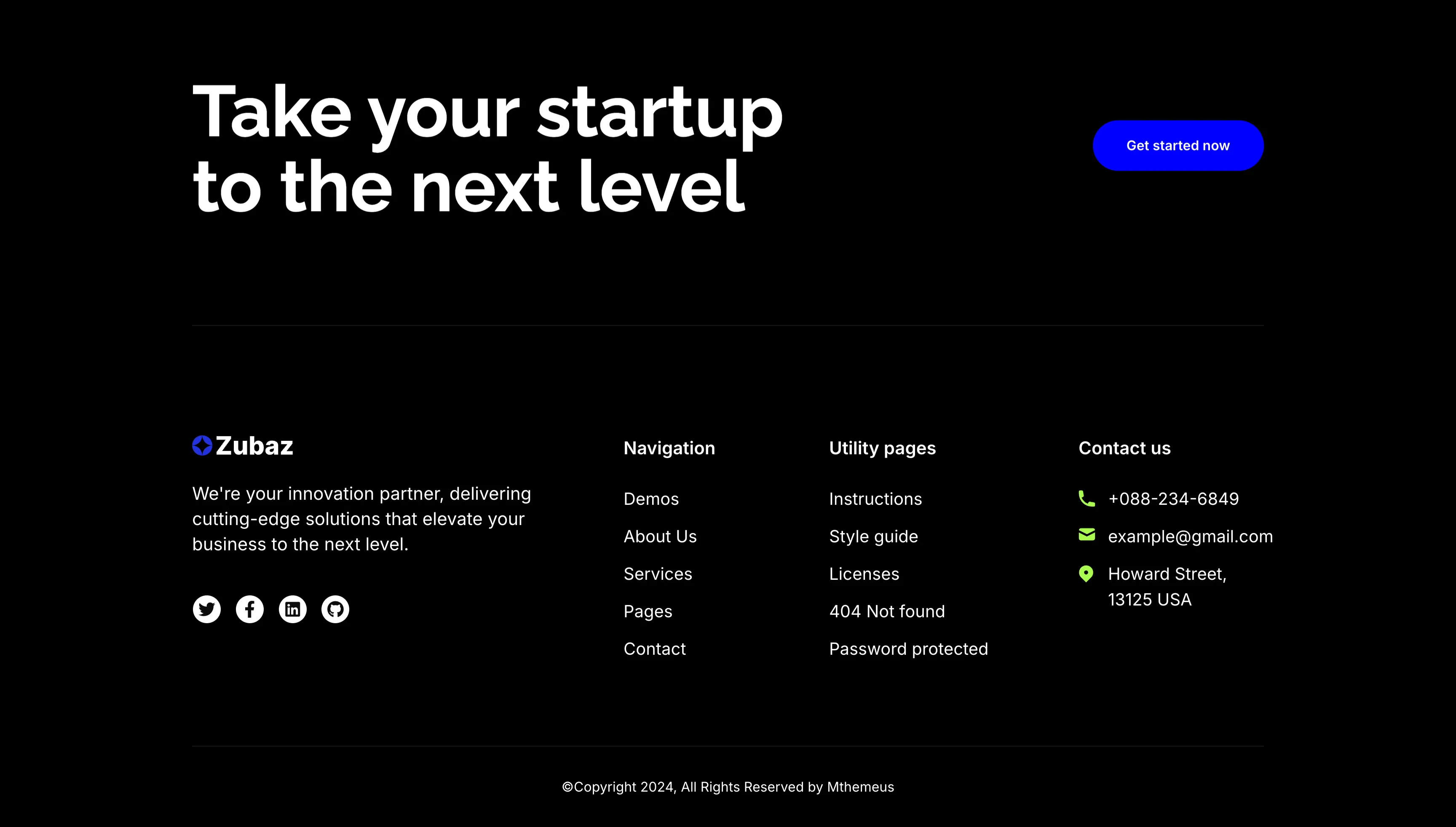
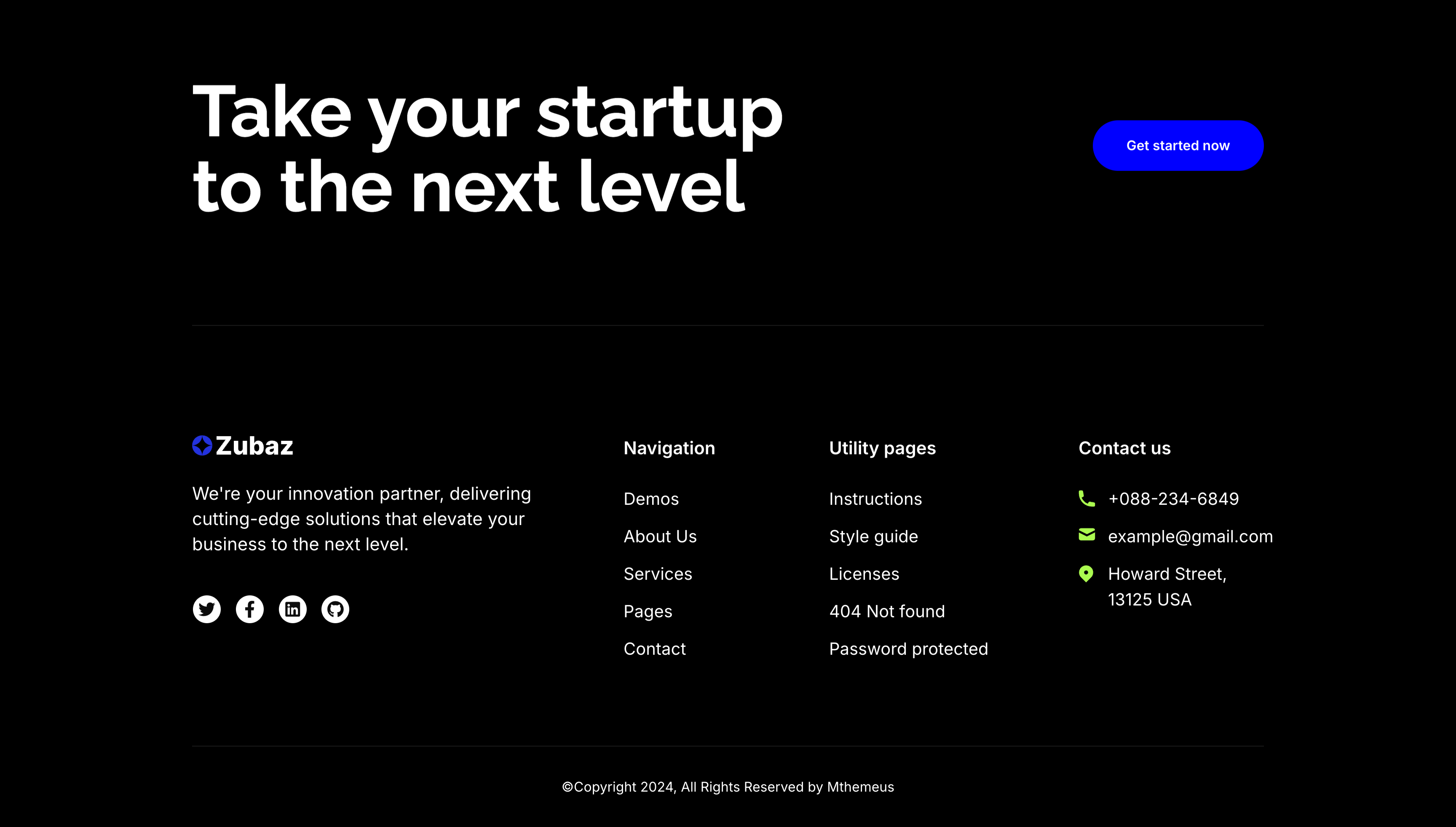
The dark Zubaz footer on a solid black background, opening with a call-to-action band: an oversized white 'Take your startup to the next level' headline on the left and a solid blue 'Get started now' button on the right, above a hairline divider. Below, the footer proper shows the Zubaz logo with a short blurb and a row of Twitter, Facebook, LinkedIn and GitHub icons, beside grouped link columns — 'Navigation' (Demos, About Us, Services, Pages, Contact), 'Utility pages' (Instructions, Style guide, Licenses, 404 Not found, Password protected) and a 'Contact us' column with a phone, email and Howard Street address. A centered '(c)Copyright 2024, All Rights Reserved by Mthemeus' line closes it. Pairing a bold recruiting CTA with the full footer makes it a strong page-closing block.
Zubuz ↗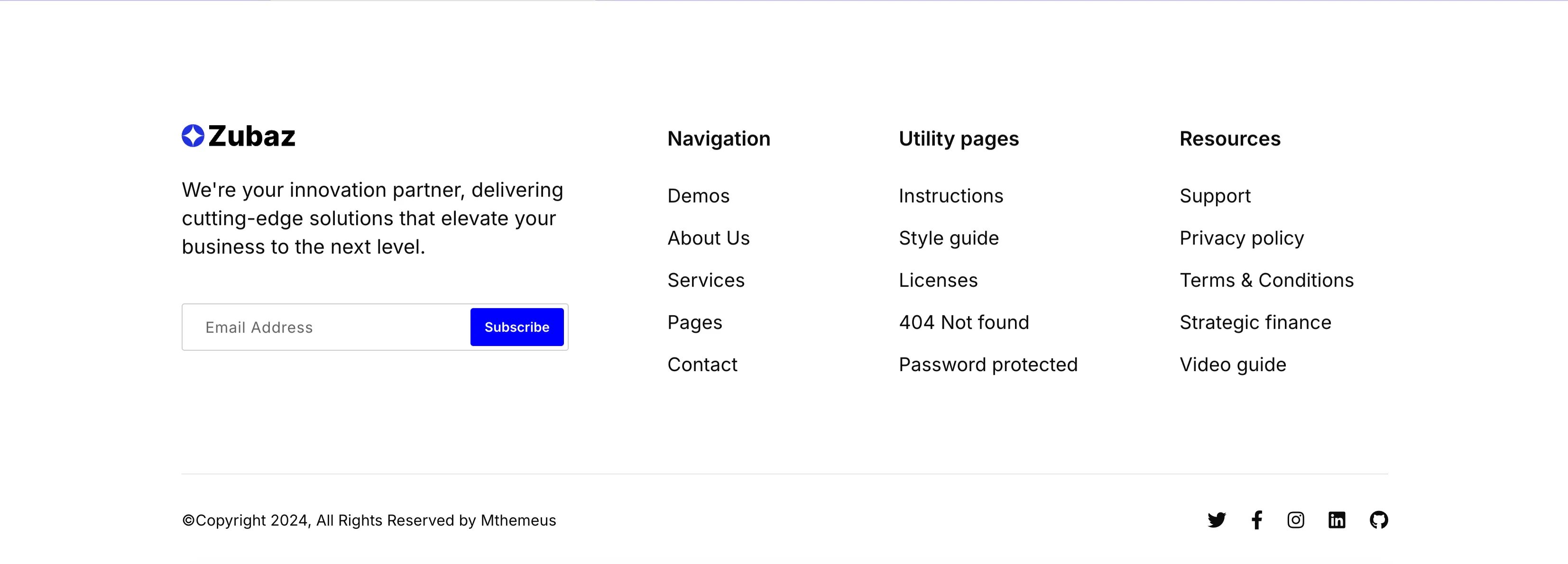
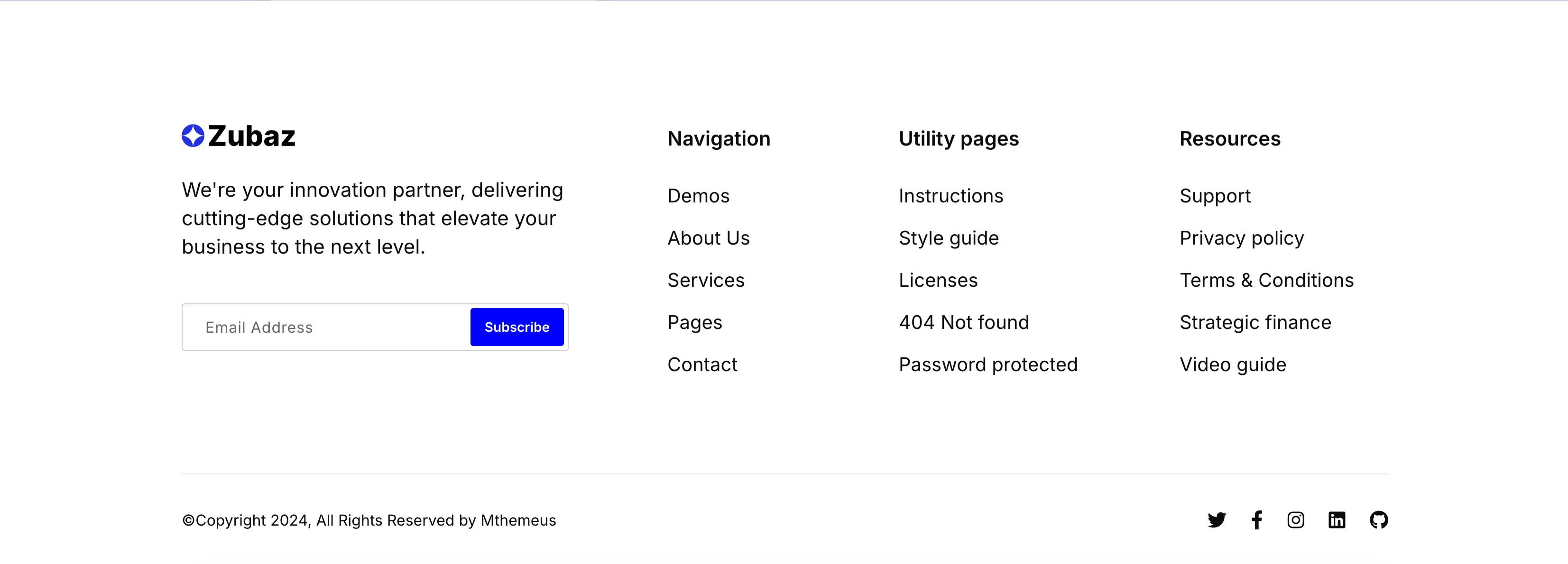
Zubaz Footer With Newsletter Signup
The Zubaz site footer on white. The left column shows the Zubaz logo, a short 'We're your innovation partner…' blurb and a newsletter field pairing an 'Email Address' input with a solid blue 'Subscribe' button. To the right, three link columns are grouped under bold headings — 'Navigation' (Demos, About Us, Services, Pages, Contact), 'Utility pages' (Instructions, Style guide, Licenses, 404 Not found, Password protected) and 'Resources' (Support, Privacy policy, Terms & Conditions, Strategic finance, Video guide). A hairline divider separates a bottom bar with the '(c)Copyright 2024, All Rights Reserved by Mthemeus' line on the left and Twitter, Facebook, Instagram, LinkedIn and GitHub icons on the right. The orderly columns and inline signup make it a complete, conventional global footer.
Zubuz ↗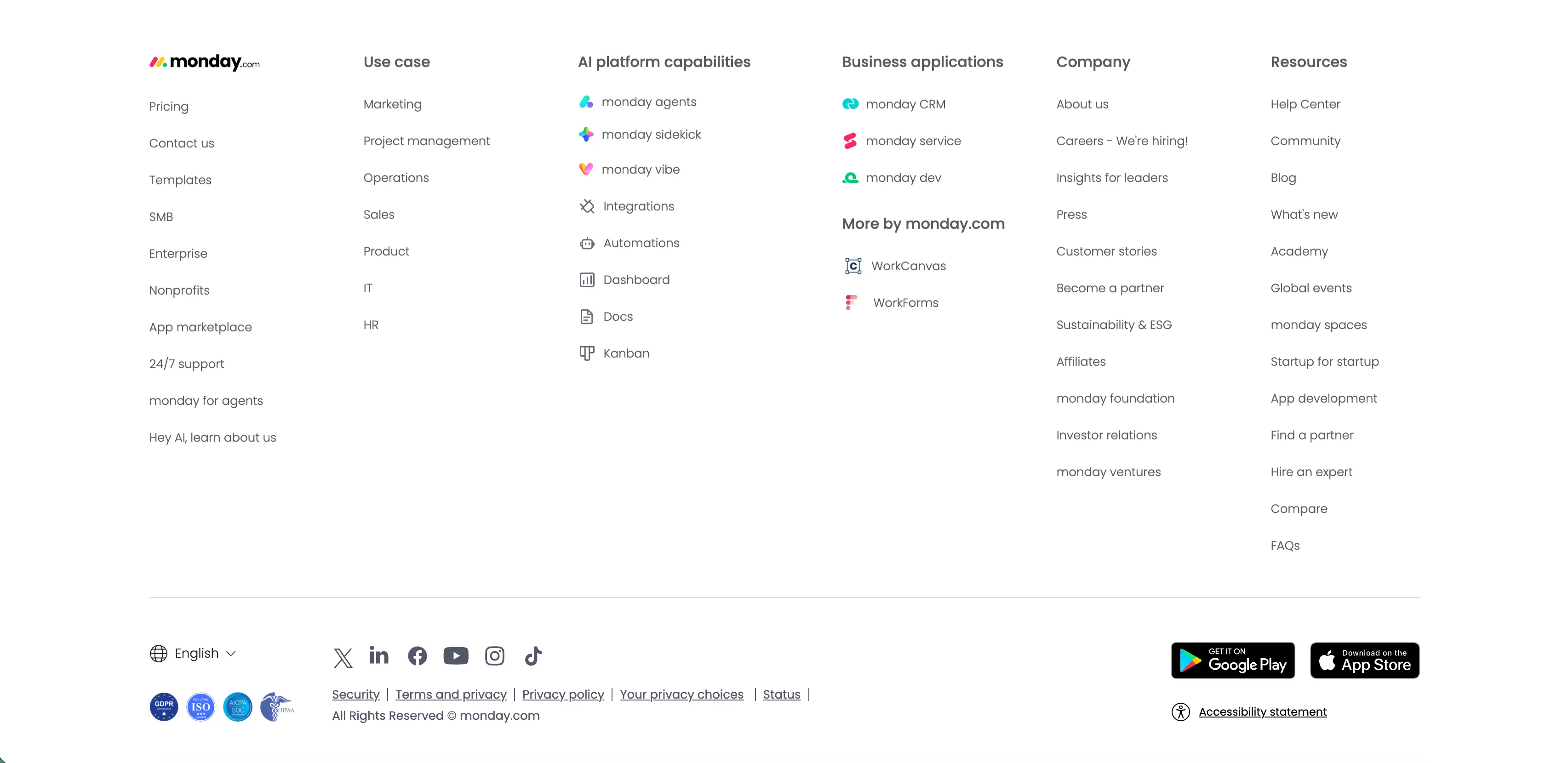
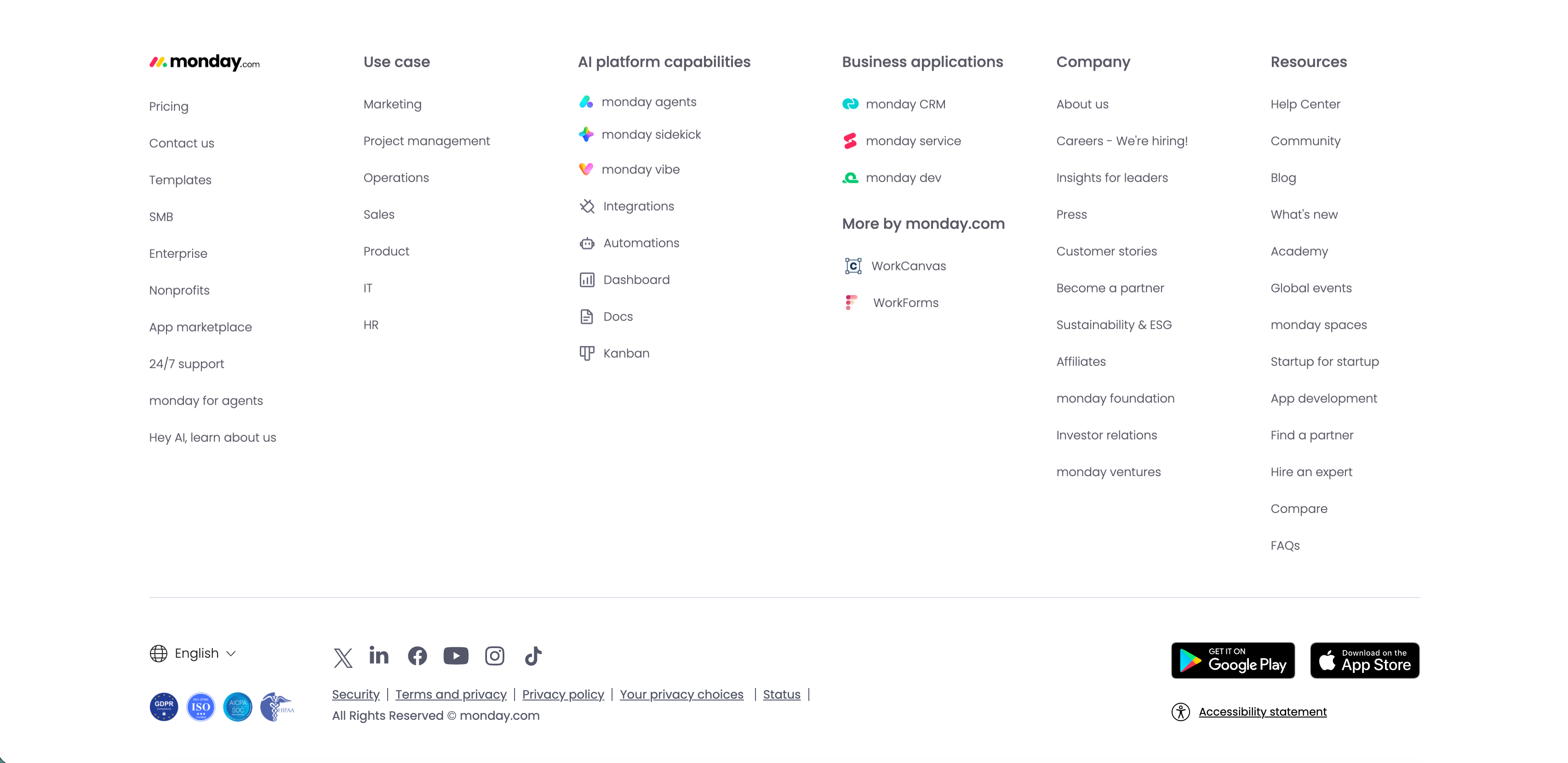
Monday.com Multi-Column Global Footer
The standard monday.com global footer on white. The monday.com logo sits above a left column of links (Pricing, Contact us, Templates, SMB, Enterprise, Nonprofits, App marketplace, 24/7 support, monday for agents, 'Hey AI, learn about us'), followed by grouped link columns — 'Use case', 'AI platform capabilities' (monday agents, sidekick, vibe, Integrations, Automations, Dashboard, Docs, Kanban), 'Business applications' with 'More by monday.com' (WorkCanvas, WorkForms), 'Company' and 'Resources.' A lower bar carries an English language selector, a row of social icons (X, LinkedIn, Facebook, YouTube, Instagram, TikTok), legal links (Security, Terms and privacy, Privacy policy, Your privacy choices, Status), compliance badges, Google Play and App Store download buttons, and an 'Accessibility statement.' The dense, orderly columns are a classic enterprise global-footer pattern.
Monday ↗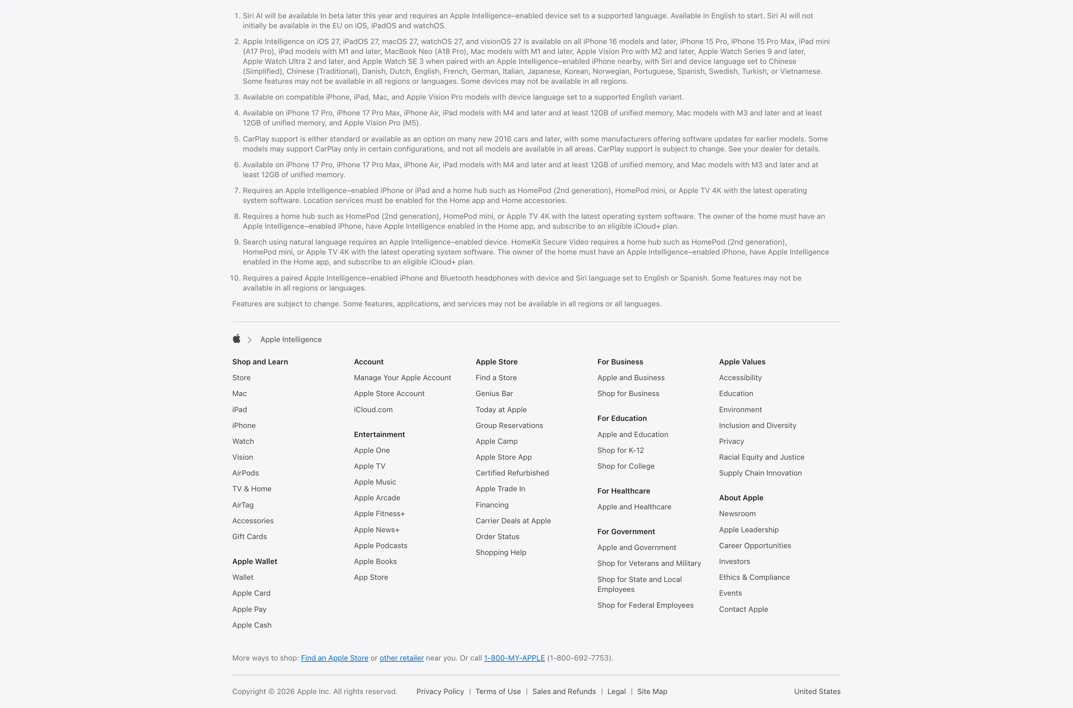
Legal Footnotes And Multi-Column Footer
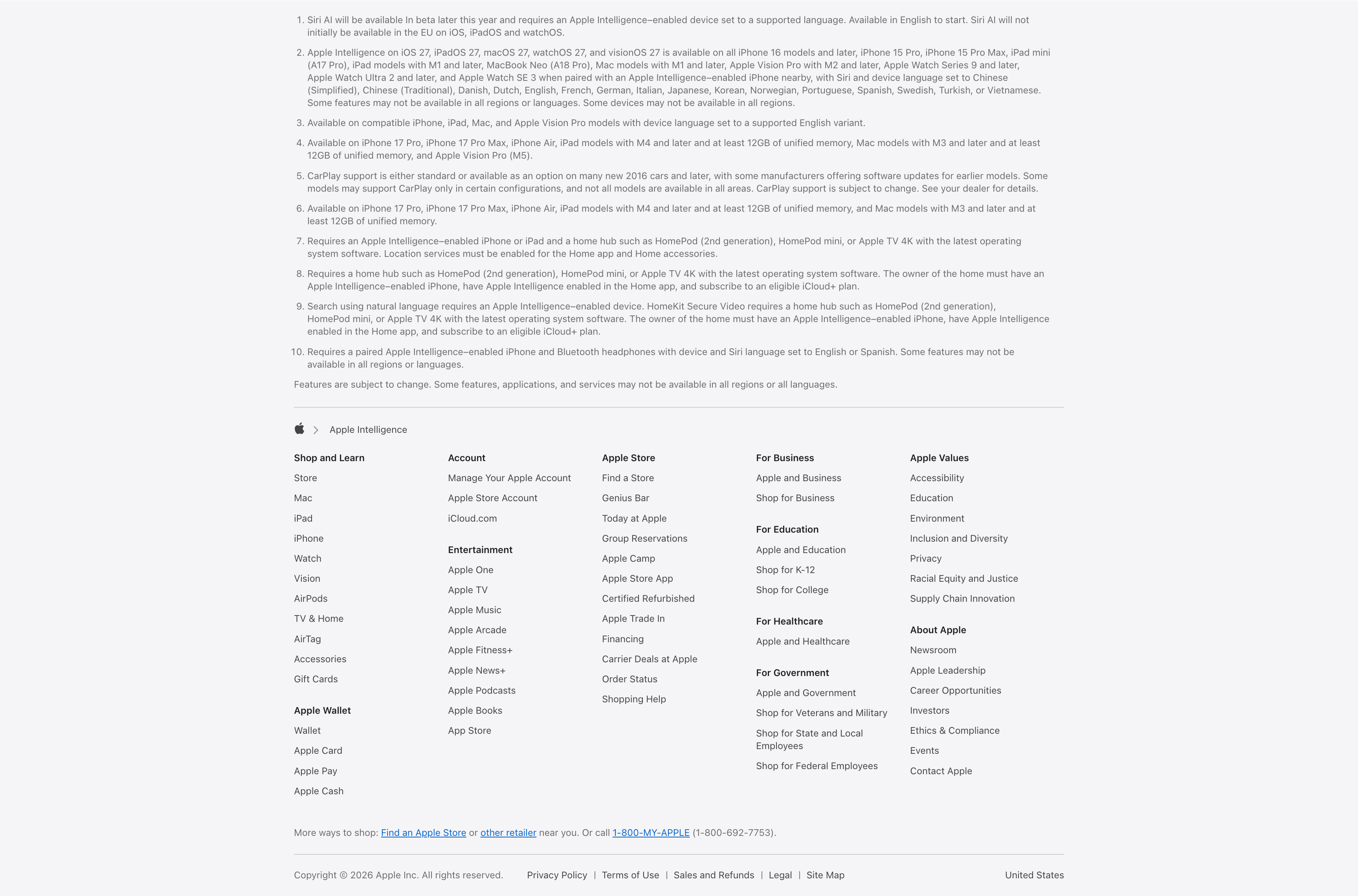
A combined footnotes-and-footer block on white. The top portion is a numbered list of ten fine-print legal disclaimers covering Siri AI availability, supported devices and languages, CarPlay and HomeKit requirements, set in small gray type. Below a hairline divider an Apple-logo breadcrumb ('Apple > Apple Intelligence') introduces the standard Apple footer: a five-plus-column grid of link groups — Shop and Learn, Apple Wallet, Account, Entertainment, Apple Store, For Business, For Education, For Healthcare, For Government, Apple Values and About Apple — each a stack of small text links. A 'More ways to shop' line with a phone number and a bottom row of copyright, Privacy Policy, Terms of Use, Legal, Site Map and the 'United States' region close it out. The dense, orderly columns are a classic global-footer pattern.
Apple ↗