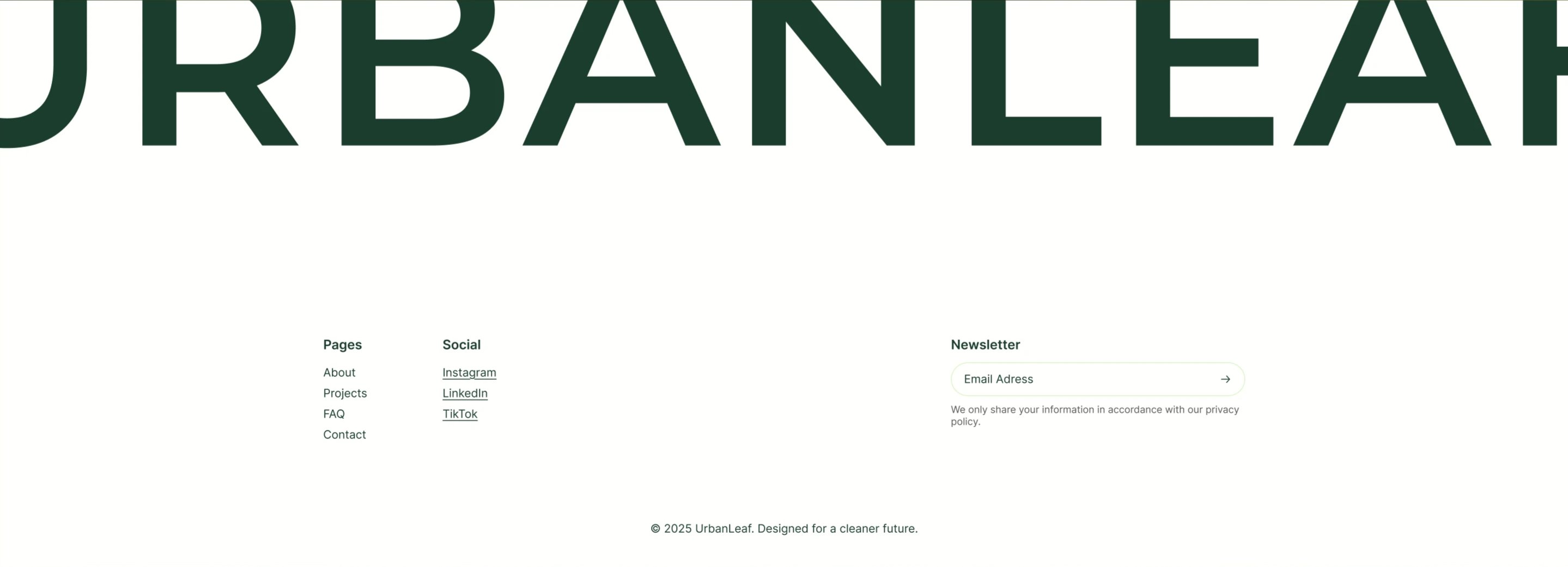
UrbanLeaf Oversized Wordmark Footer
Description
A minimal footer on white anchored by an enormous dark-green ‘URBANLEAF’ wordmark that spans the full width and is cropped by the top edge. Below sit two link columns — ‘Pages’ (About, Projects, FAQ, Contact) and ‘Social’ (Instagram, LinkedIn, TikTok as underlined links) — set in dark green. To the right, a ‘Newsletter’ block holds a rounded email input labelled ‘Email Adress’ with a circular arrow submit button, plus a small grey note about sharing information per the privacy policy. A centered copyright line, ‘© 2025 UrbanLeaf. Designed for a cleaner future.’, closes the section. Generous whitespace keeps the oversized type as the focal point.
Related
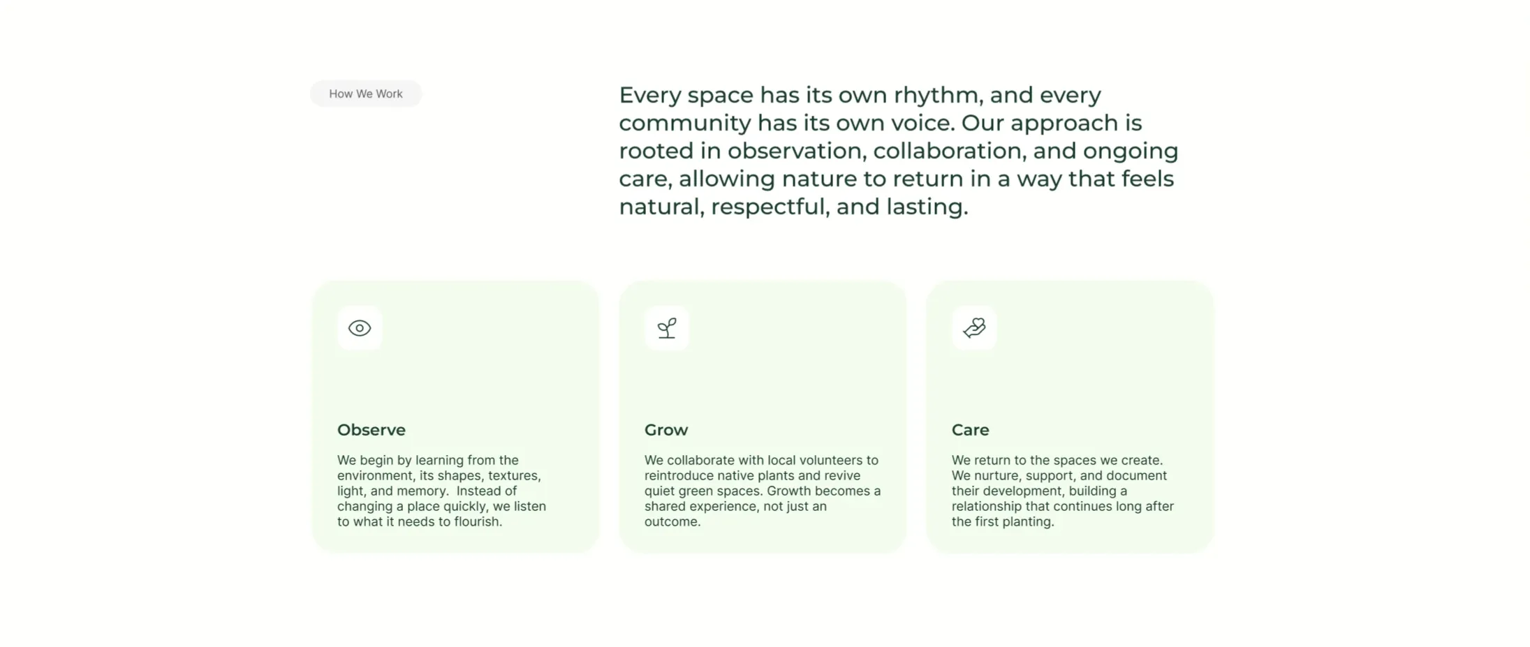
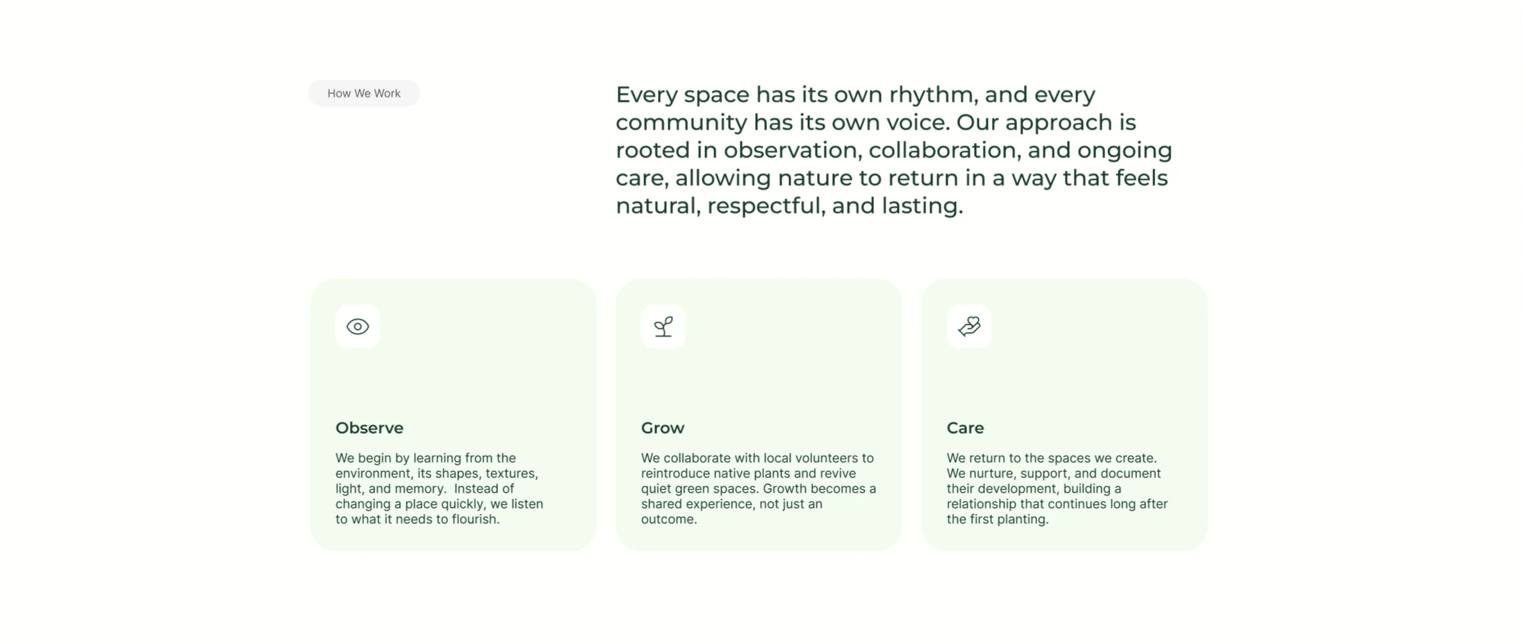
UrbanLeaf How We Work Icon Cards
A 'How We Work' section on white using an asymmetric two-part header: a small grey 'How We Work' pill sits on the left while a large dark-green paragraph fills the right, describing an approach 'rooted in observation, collaboration, and ongoing care.' Below the header is a three-up row of pale mint-green rounded cards. Each card has a small white rounded icon tile at the top — an eye, a sprout, and a hand holding a heart — followed by a bold dark-green title ('Observe', 'Grow', 'Care') and a short grey paragraph explaining that step of the process. The light-green cards, simple line icons and clear three-step progression make it an approachable process/feature section.
Behance ↗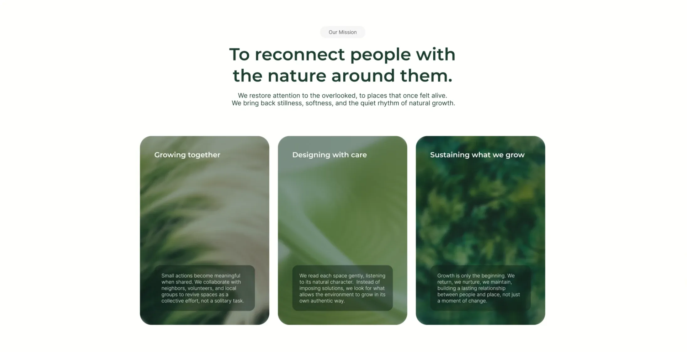
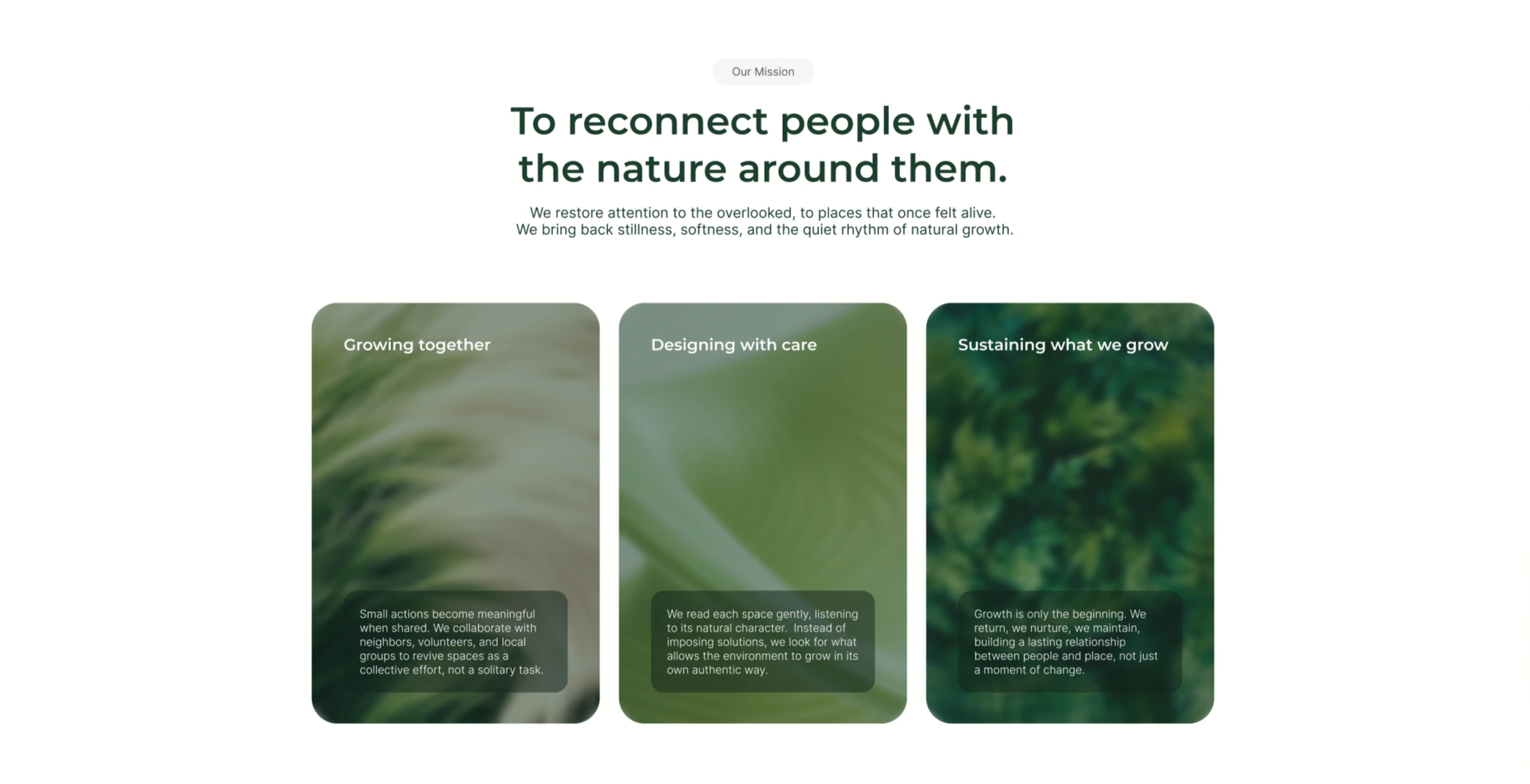
UrbanLeaf Mission Three-Card Image Grid
An 'Our Mission' section on white, opening with a grey pill, a centered two-line dark-green headline 'To reconnect people with the nature around them.', and a two-line grey subhead about restoring attention to overlooked places. Below sits a three-up row of tall rounded cards, each filled edge-to-edge with a soft, blurred green nature photograph (grasses, leaves, foliage). Each card carries a white title near the top — 'Growing together', 'Designing with care', and 'Sustaining what we grow' — and a small translucent dark box near the bottom holding a few lines of supporting body copy about collaboration, reading each space, and long-term care. The trio of equal photographic cards in muted greens makes the mission feel tactile and consistent.
Behance ↗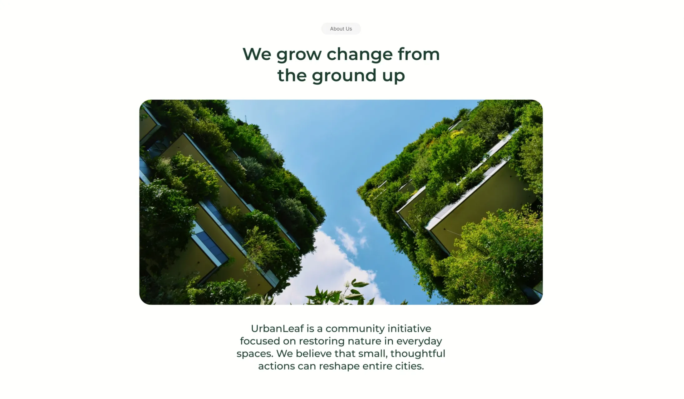
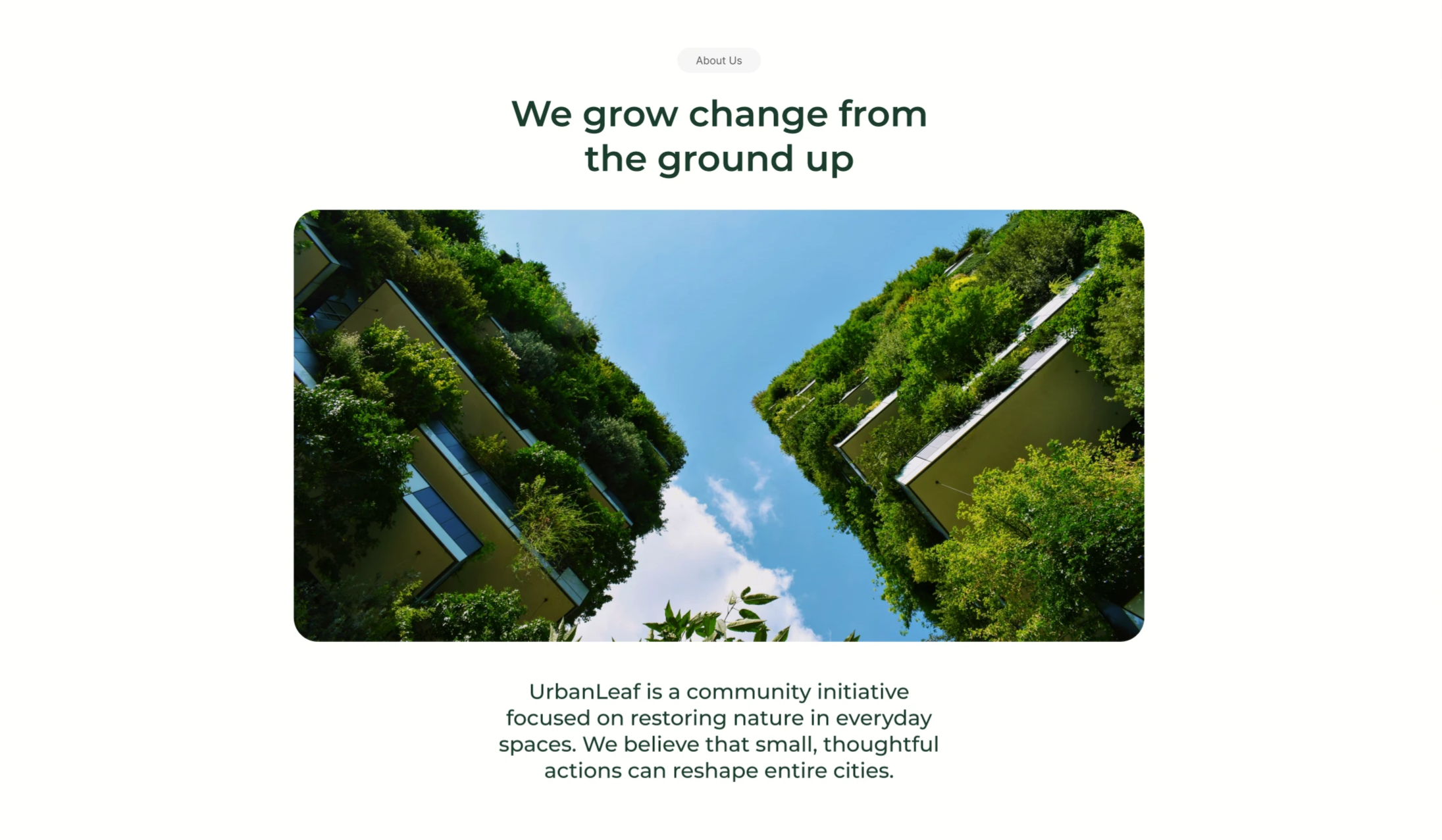
UrbanLeaf About Section With Vertical-Garden Image
A centered 'About Us' content block on a white background. A small grey 'About Us' pill sits at the top, followed by a two-line dark-green headline reading 'We grow change from the ground up'. Beneath the heading is a single large rounded-corner photograph looking straight up between two tall buildings whose facades are completely covered in lush green vertical gardens, framing a bright blue, lightly clouded sky down the centre. Below the image, a short centered dark-green paragraph introduces the organisation: 'UrbanLeaf is a community initiative focused on restoring nature in everyday spaces. We believe that small, thoughtful actions can reshape entire cities.' The symmetrical, image-led, centered composition with lots of whitespace gives it a quiet editorial feel.
Behance ↗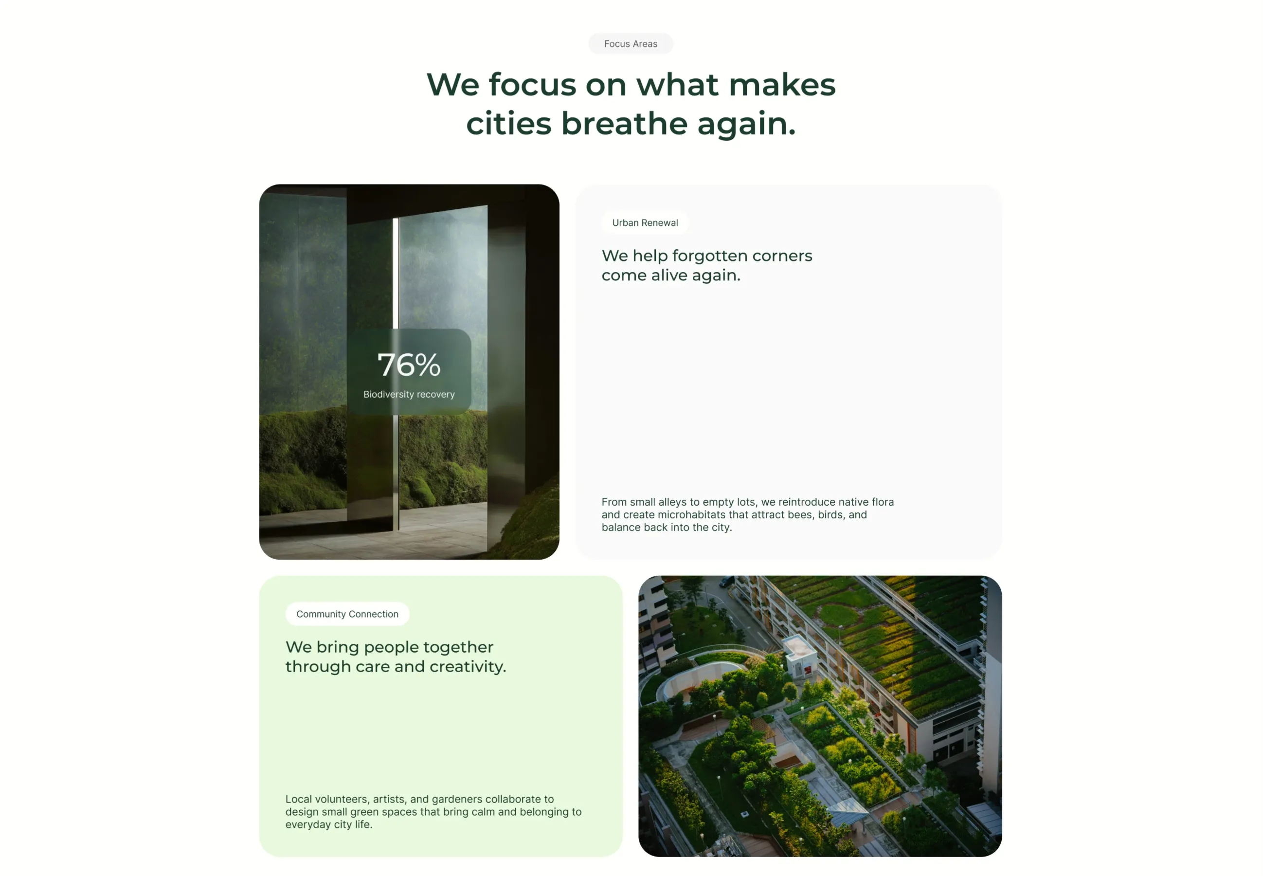
UrbanLeaf Focus Areas Bento Grid
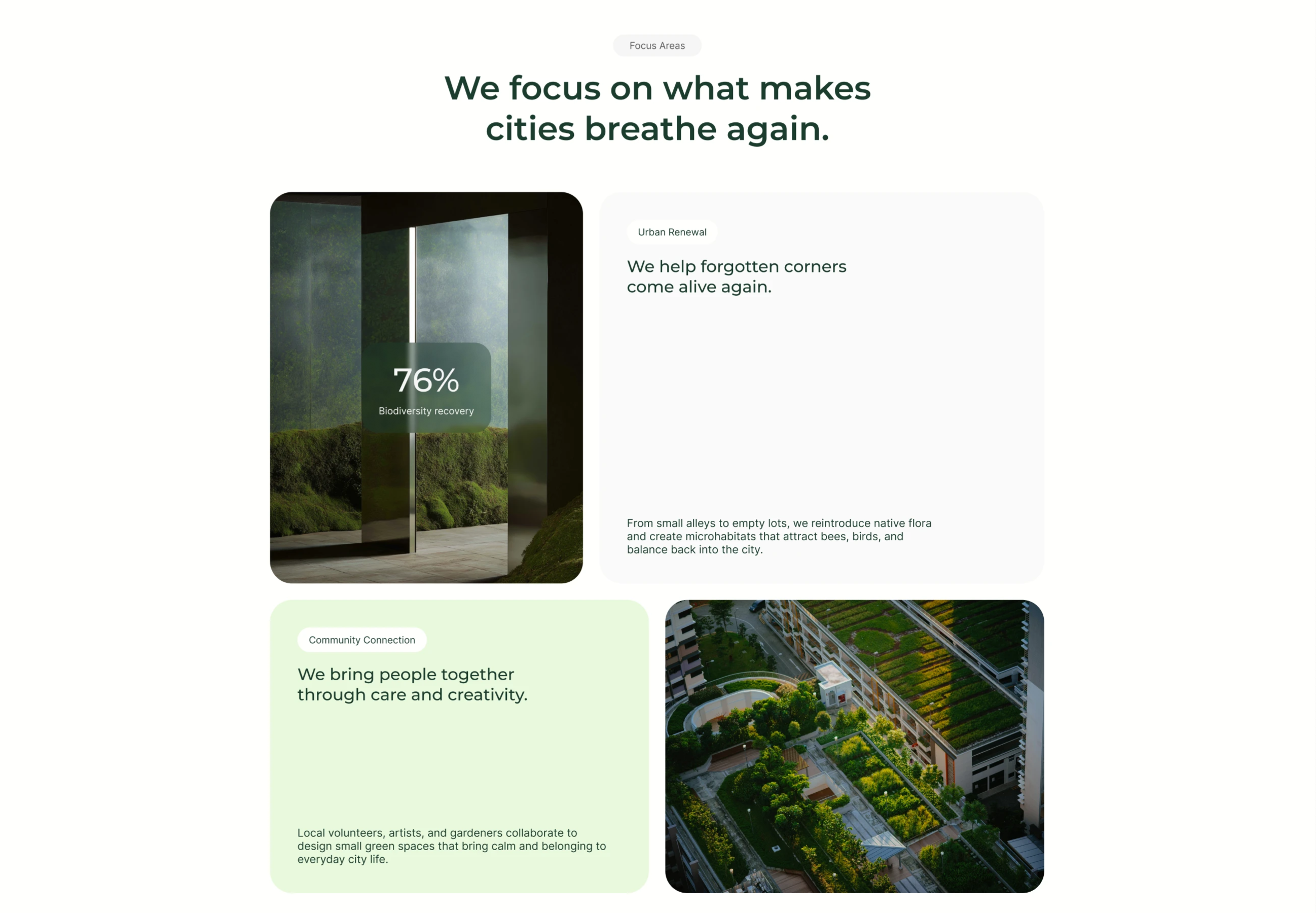
A 'Focus Areas' section on white, introduced by a grey pill and a centered two-line dark-green heading, 'We focus on what makes cities breathe again.' Below it sits a 2×2 bento grid of rounded tiles. Top-left is a photo of a mossy interior with a translucent dark-green card overlaid showing a large '76%' stat and the label 'Biodiversity recovery'. Top-right is a tall white card headed by an 'Urban Renewal' pill, a dark-green sub-headline 'We help forgotten corners come alive again.', and a smaller grey paragraph anchored at the bottom about reintroducing native flora and creating microhabitats. Bottom-left is a pale-green card with a 'Community Connection' pill, the headline 'We bring people together through care and creativity.', and a supporting paragraph. Bottom-right is an aerial photograph of a terraced rooftop garden among buildings. The mix of image tiles, stat overlay and text cards in alternating white/green creates a balanced bento layout.
Behance ↗Similar footer sections
Take Your Startup Dark Footer With CTA
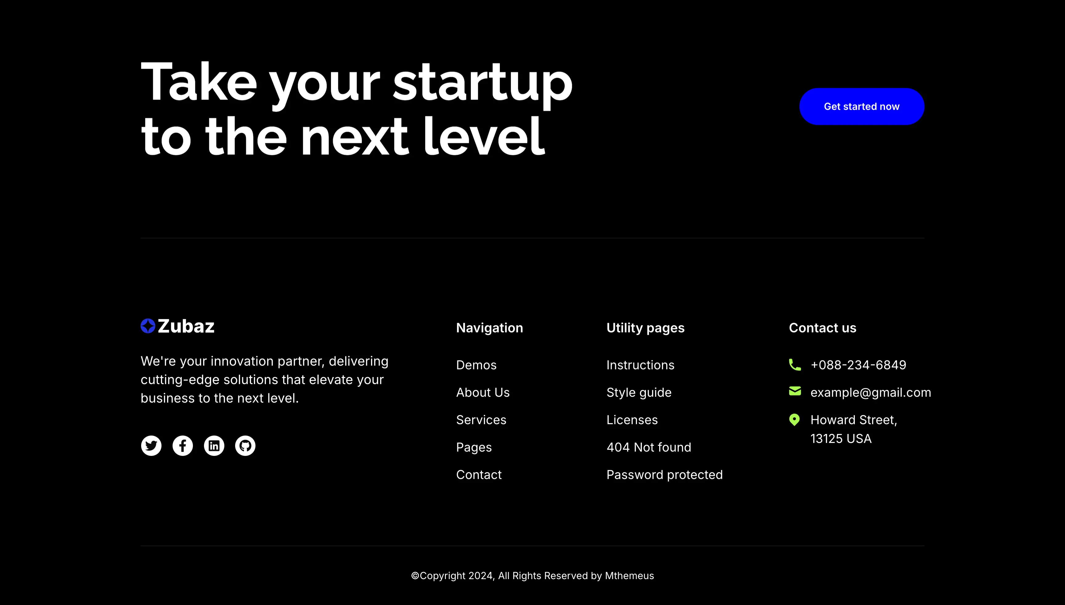
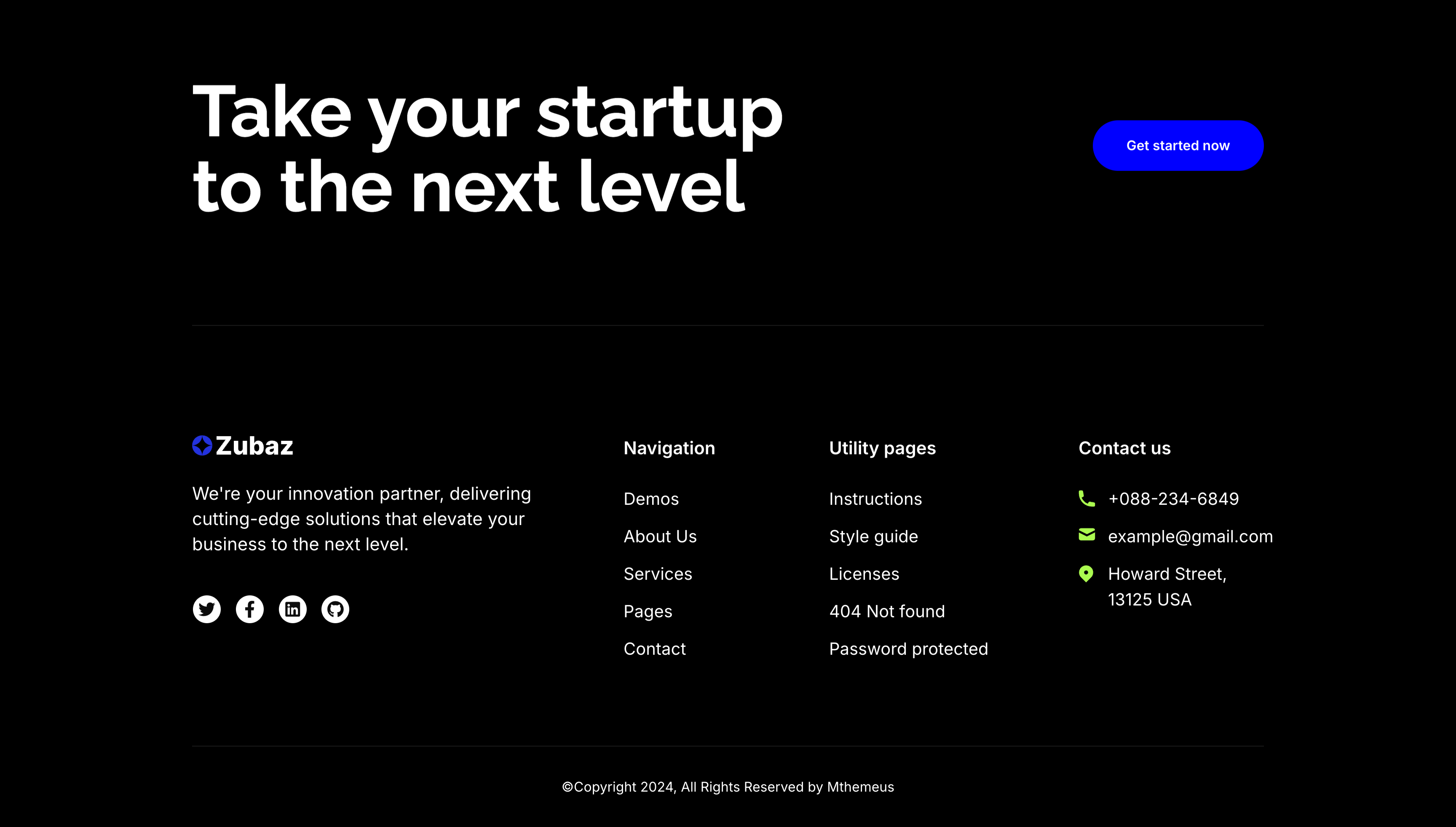
The dark Zubaz footer on a solid black background, opening with a call-to-action band: an oversized white 'Take your startup to the next level' headline on the left and a solid blue 'Get started now' button on the right, above a hairline divider. Below, the footer proper shows the Zubaz logo with a short blurb and a row of Twitter, Facebook, LinkedIn and GitHub icons, beside grouped link columns — 'Navigation' (Demos, About Us, Services, Pages, Contact), 'Utility pages' (Instructions, Style guide, Licenses, 404 Not found, Password protected) and a 'Contact us' column with a phone, email and Howard Street address. A centered '(c)Copyright 2024, All Rights Reserved by Mthemeus' line closes it. Pairing a bold recruiting CTA with the full footer makes it a strong page-closing block.
Zubuz ↗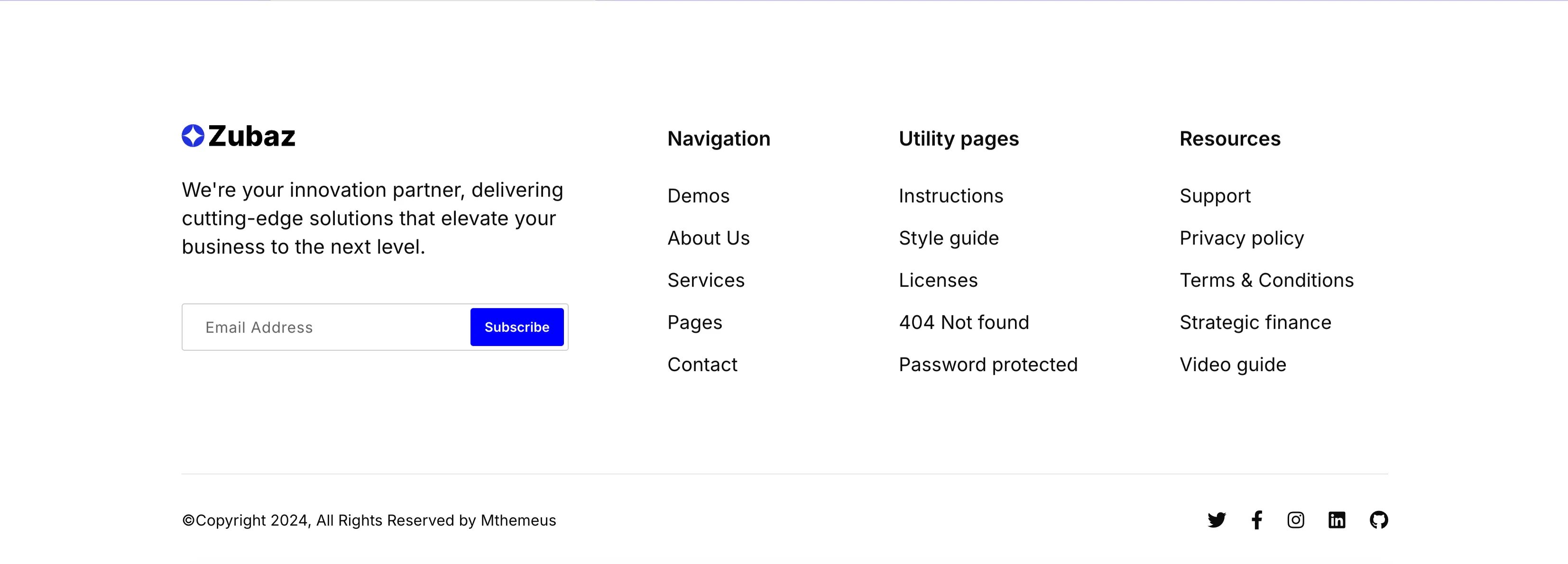
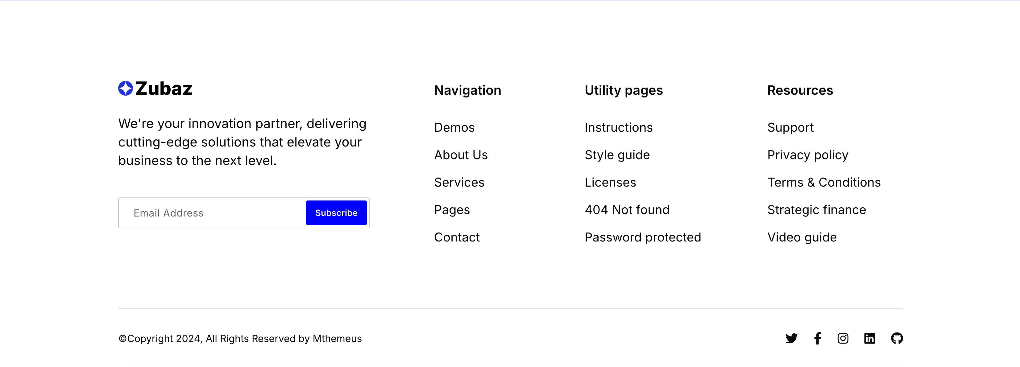
Zubaz Footer With Newsletter Signup
The Zubaz site footer on white. The left column shows the Zubaz logo, a short 'We're your innovation partner…' blurb and a newsletter field pairing an 'Email Address' input with a solid blue 'Subscribe' button. To the right, three link columns are grouped under bold headings — 'Navigation' (Demos, About Us, Services, Pages, Contact), 'Utility pages' (Instructions, Style guide, Licenses, 404 Not found, Password protected) and 'Resources' (Support, Privacy policy, Terms & Conditions, Strategic finance, Video guide). A hairline divider separates a bottom bar with the '(c)Copyright 2024, All Rights Reserved by Mthemeus' line on the left and Twitter, Facebook, Instagram, LinkedIn and GitHub icons on the right. The orderly columns and inline signup make it a complete, conventional global footer.
Zubuz ↗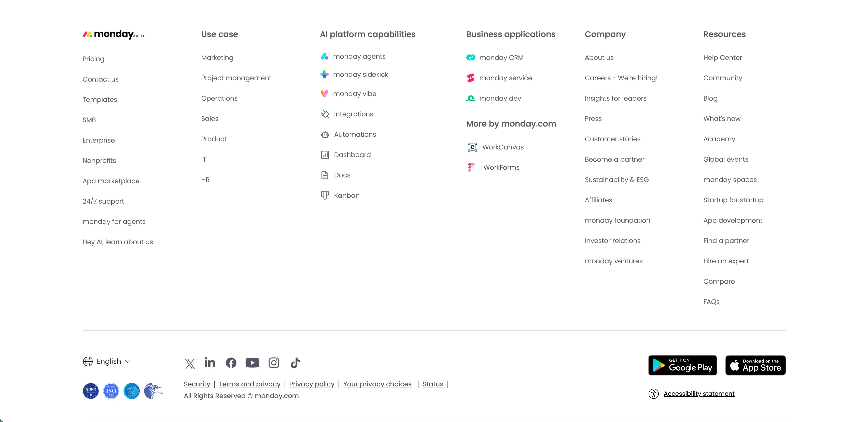
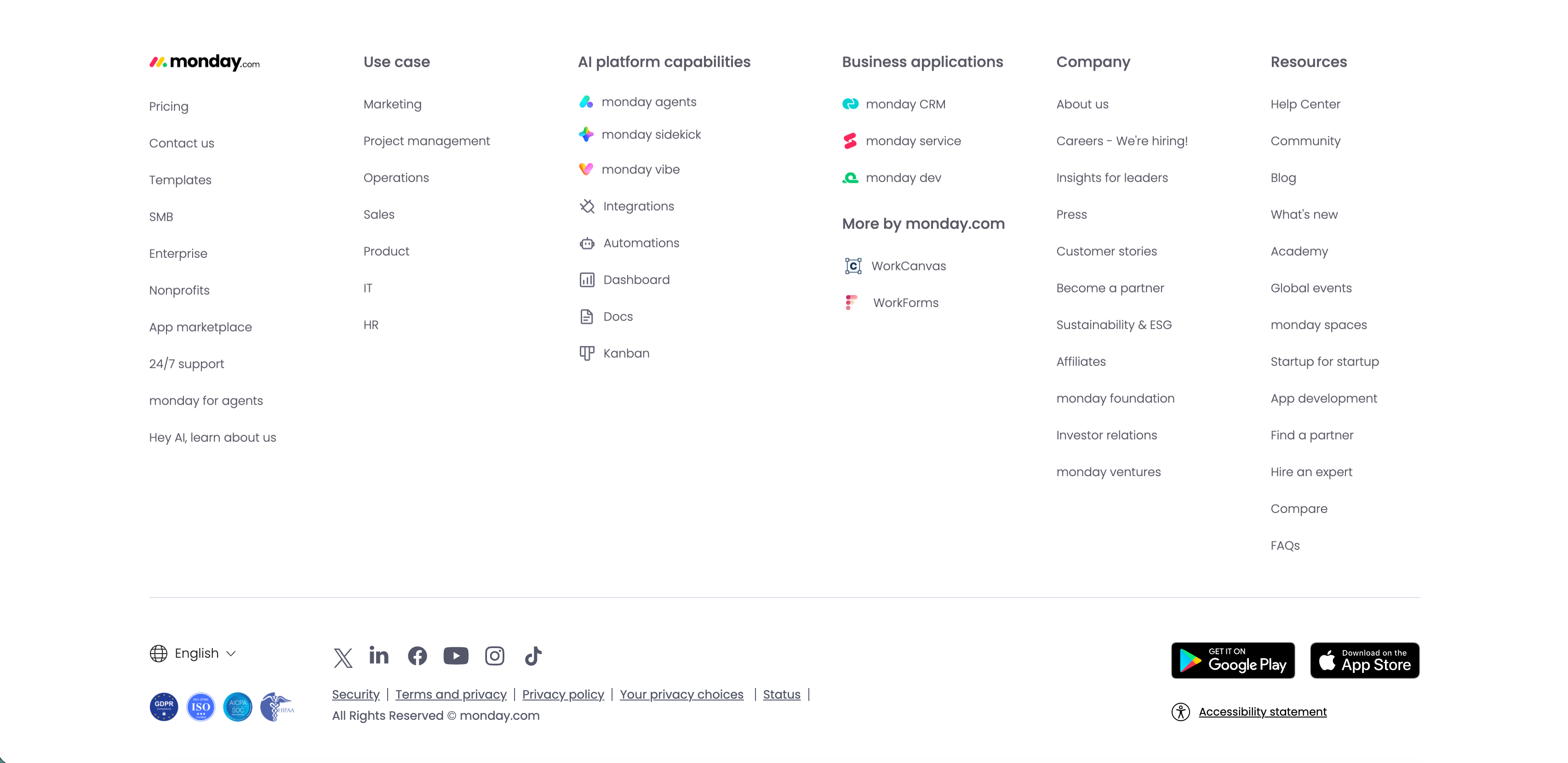
Monday.com Multi-Column Global Footer
The standard monday.com global footer on white. The monday.com logo sits above a left column of links (Pricing, Contact us, Templates, SMB, Enterprise, Nonprofits, App marketplace, 24/7 support, monday for agents, 'Hey AI, learn about us'), followed by grouped link columns — 'Use case', 'AI platform capabilities' (monday agents, sidekick, vibe, Integrations, Automations, Dashboard, Docs, Kanban), 'Business applications' with 'More by monday.com' (WorkCanvas, WorkForms), 'Company' and 'Resources.' A lower bar carries an English language selector, a row of social icons (X, LinkedIn, Facebook, YouTube, Instagram, TikTok), legal links (Security, Terms and privacy, Privacy policy, Your privacy choices, Status), compliance badges, Google Play and App Store download buttons, and an 'Accessibility statement.' The dense, orderly columns are a classic enterprise global-footer pattern.
Monday ↗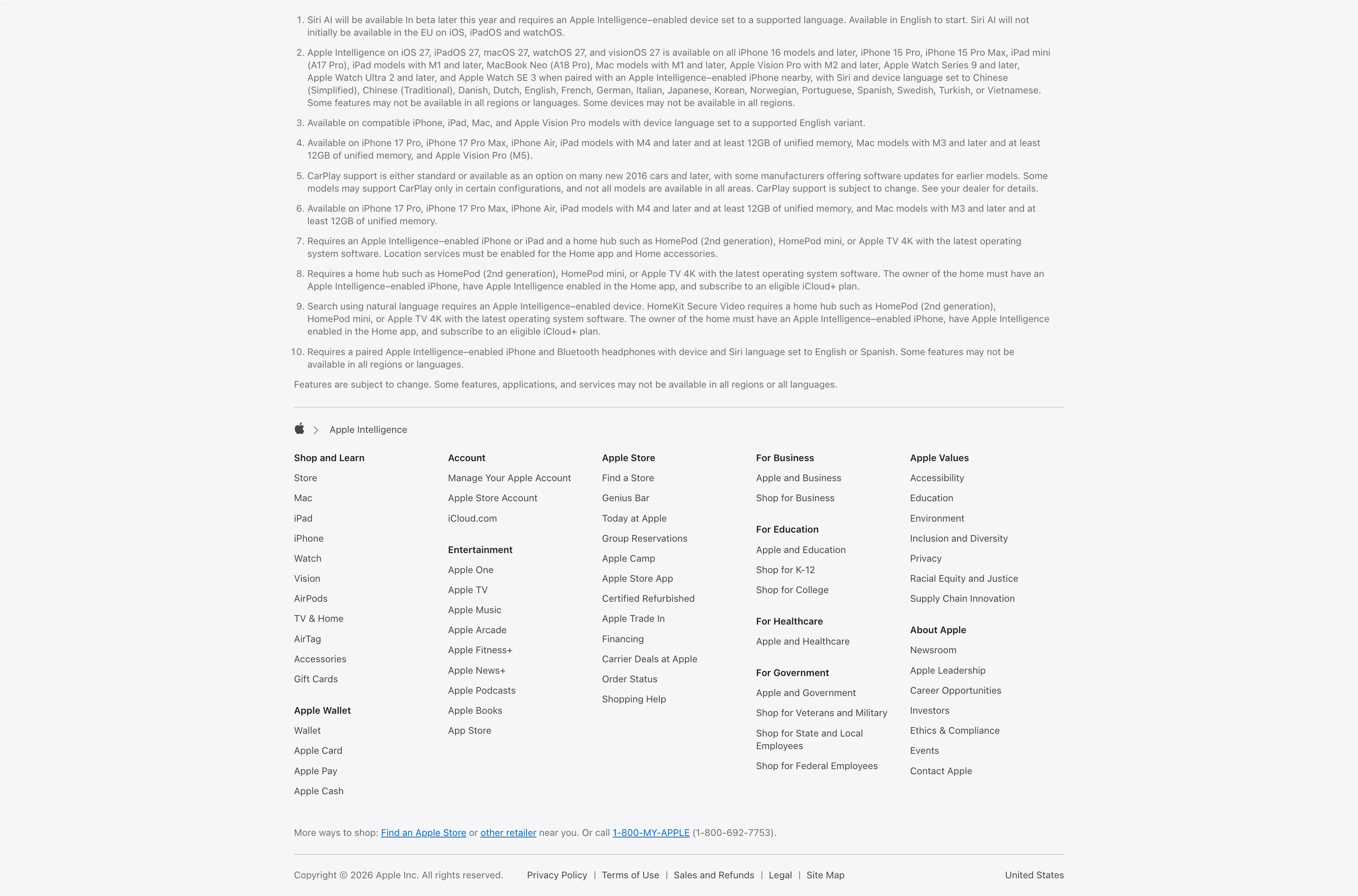
Legal Footnotes And Multi-Column Footer
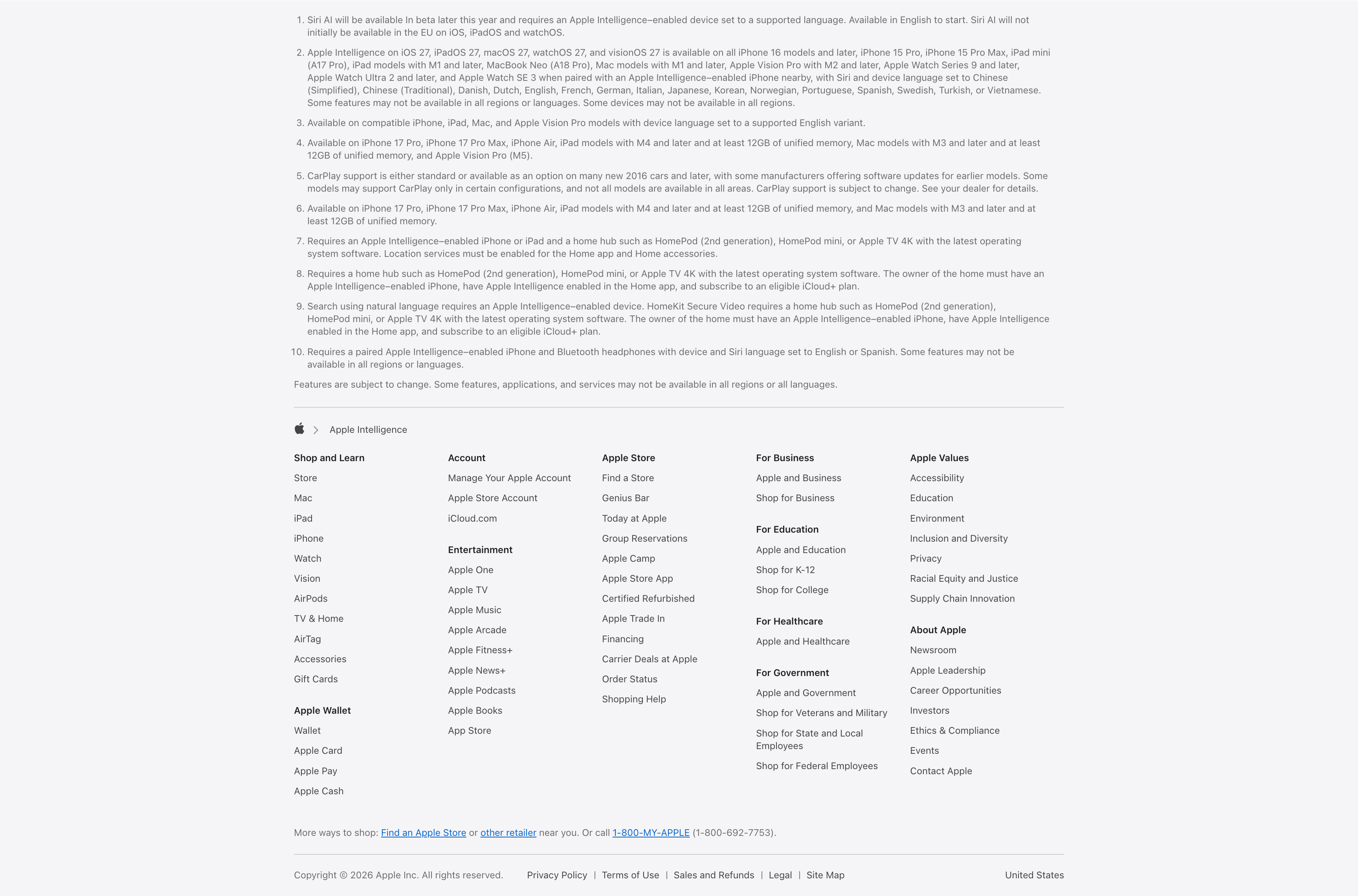
A combined footnotes-and-footer block on white. The top portion is a numbered list of ten fine-print legal disclaimers covering Siri AI availability, supported devices and languages, CarPlay and HomeKit requirements, set in small gray type. Below a hairline divider an Apple-logo breadcrumb ('Apple > Apple Intelligence') introduces the standard Apple footer: a five-plus-column grid of link groups — Shop and Learn, Apple Wallet, Account, Entertainment, Apple Store, For Business, For Education, For Healthcare, For Government, Apple Values and About Apple — each a stack of small text links. A 'More ways to shop' line with a phone number and a bottom row of copyright, Privacy Policy, Terms of Use, Legal, Site Map and the 'United States' region close it out. The dense, orderly columns are a classic global-footer pattern.
Apple ↗