NFINITE Subscribe Call-To-Action
Description
A centered call-to-action band filling the width with a soft pale-blue panel. At the top sits the black ‘NFINITE’ wordmark with its small dotted infinity-style logo mark. Below it, a large dark charcoal sans-serif heading spans three centered lines — ‘Subscribe to learn more about how our paper can eliminate plastic packaging from daily life’ — stating the value of converting before the action. Centered beneath the copy is a single solid near-black rounded button labelled ‘Contact us’, with no competing secondary action. The calm monochrome-on-blue palette, generous vertical padding, and one focused button make this a clean closing conversion block that funnels attention straight to a single next step.
Related
NFINITE Proven Leaders Split Content
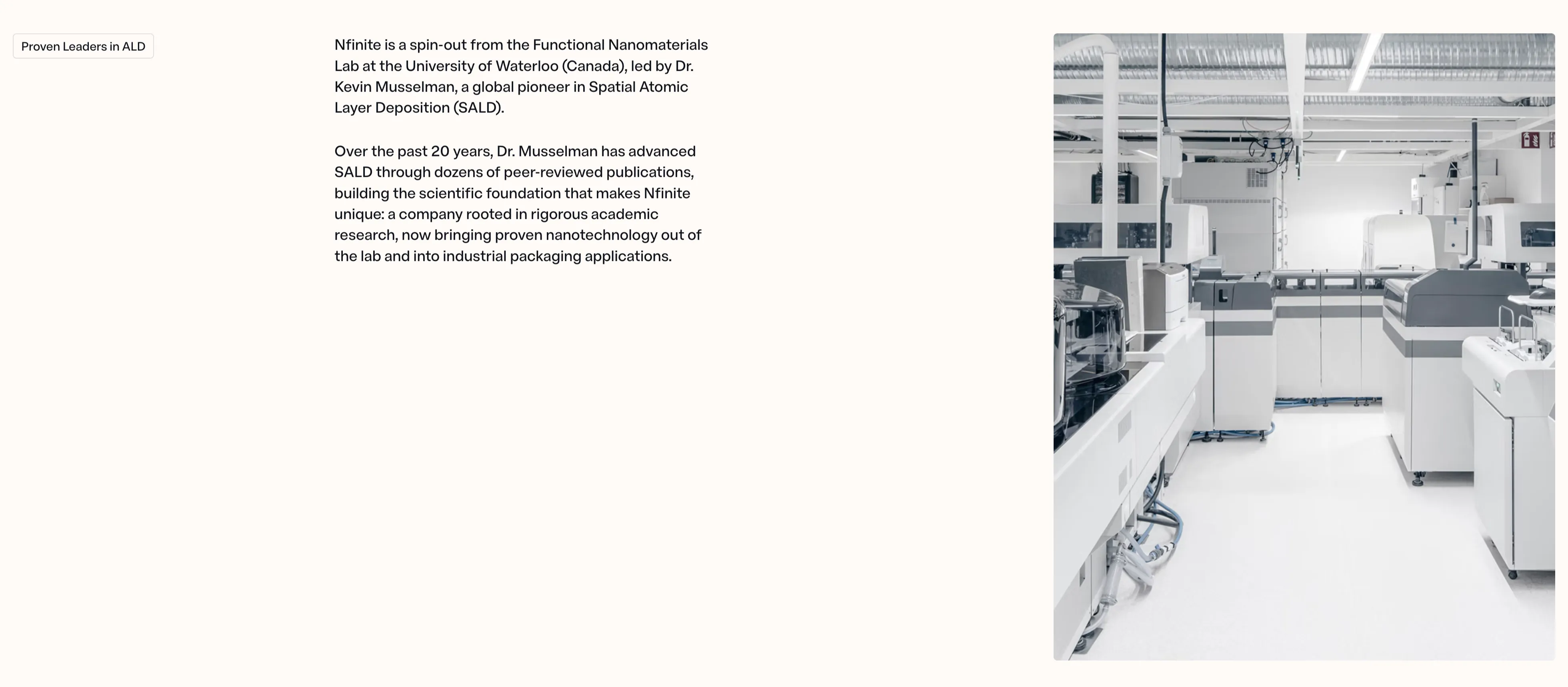
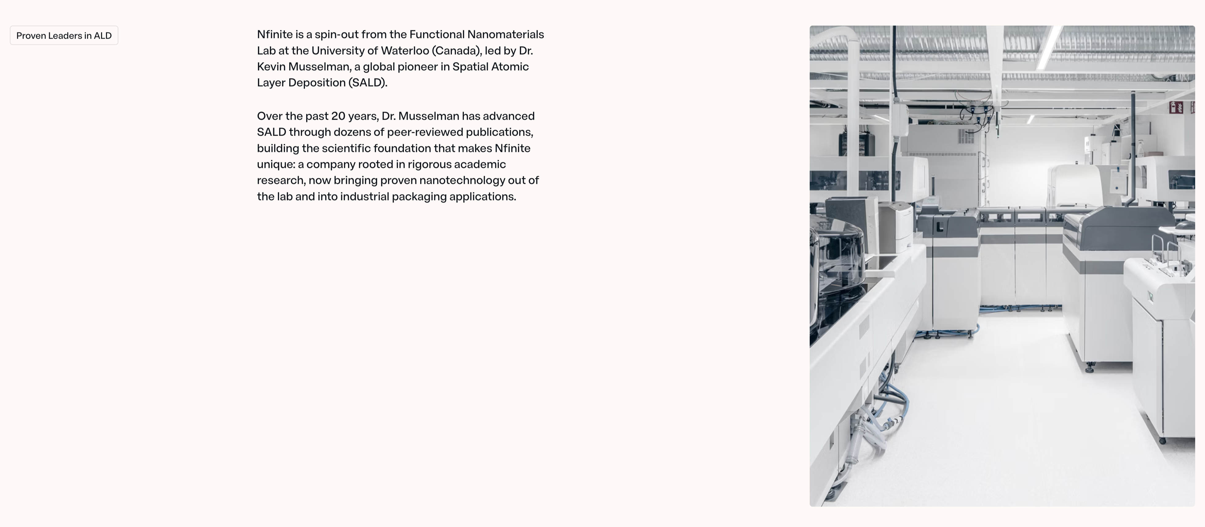
A two-column content section on a warm off-white background telling the company-origin story. The left side opens with a small outlined 'Proven Leaders in ALD' eyebrow pill, followed by two paragraphs of dark body copy explaining that 'Nfinite is a spin-out from the Functional Nanomaterials Lab at the University of Waterloo (Canada), led by Dr. Kevin Musselman, a global pioneer in Spatial Atomic Layer Deposition (SALD)' and that two decades of peer-reviewed research now bring proven nanotechnology into industrial packaging. The right half is a large desaturated photograph of a bright, clean lab or production floor lined with white analytical machines and overhead ducting. The roomy left margin, restrained type, and pairing of credentialed narrative with a real facility image give the block a trustworthy, research-grade tone.
Nfinitepaper ↗
NFINITE Amcor Pull-Quote
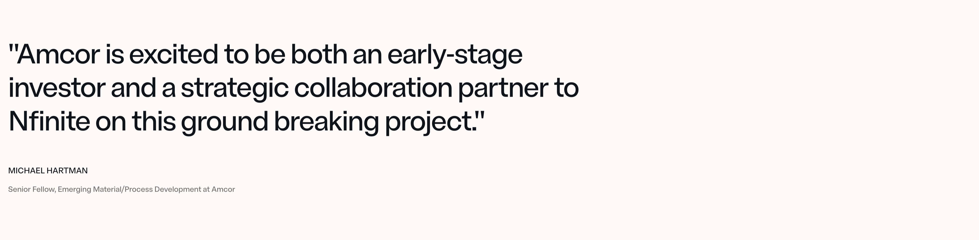
A single-quote testimonial section on a plain warm off-white background, with no card, photo, or border. An oversized near-black sans-serif pull-quote fills the upper-left, wrapping across three lines: "Amcor is excited to be both an early-stage investor and a strategic collaboration partner to Nfinite on this ground breaking project." Below it, the attribution is set small and left-aligned — the name 'MICHAEL HARTMAN' in bold all-caps, and the role 'Senior Fellow, Emerging Material/Process Development at Amcor' in lighter muted grey beneath. The generous empty space and the sheer scale of the quote let the endorsement from a named industry partner carry the whole section, reading as a credibility anchor rather than a decorative review block.
Nfinitepaper ↗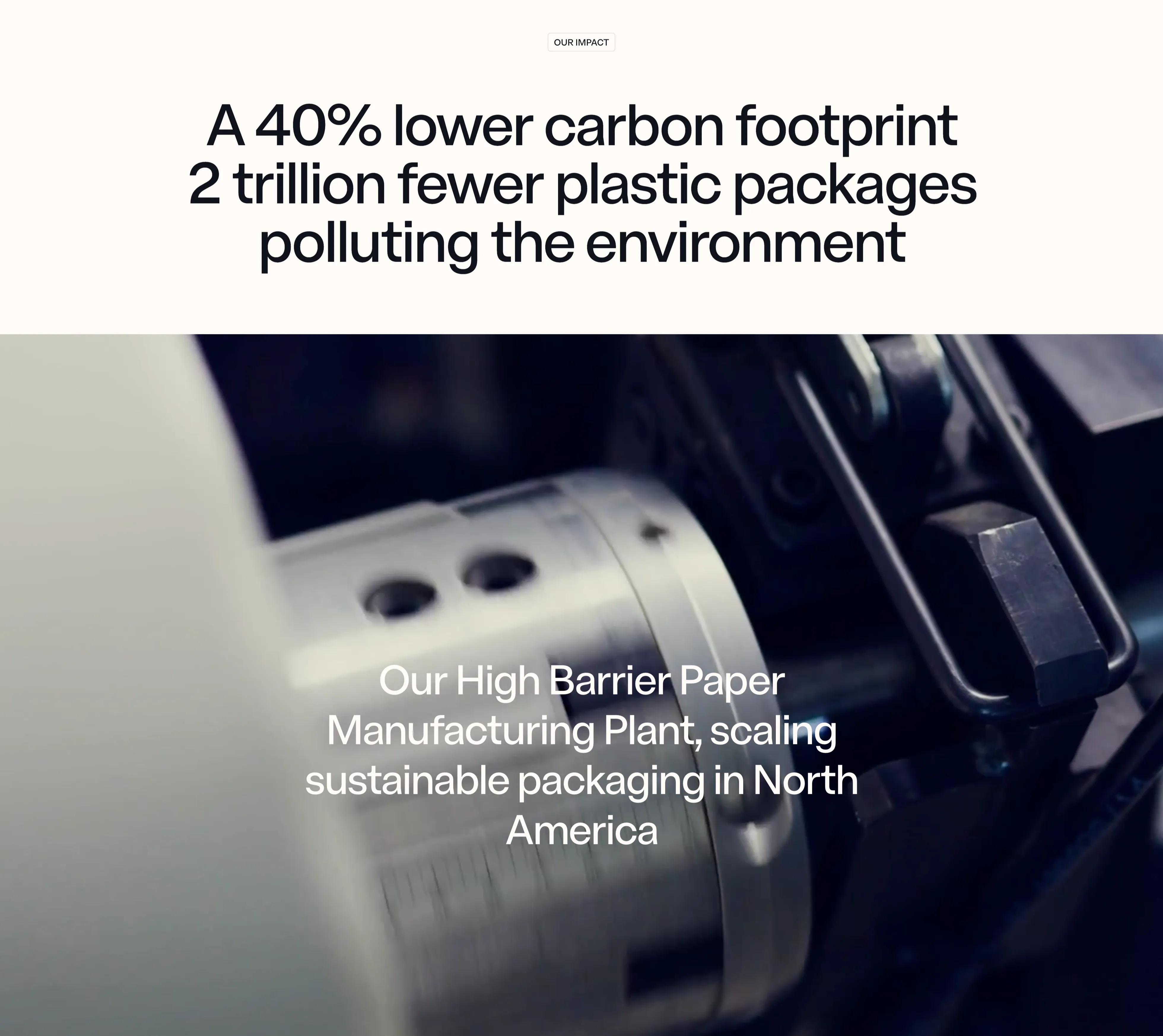
NFINITE Impact Stat Band
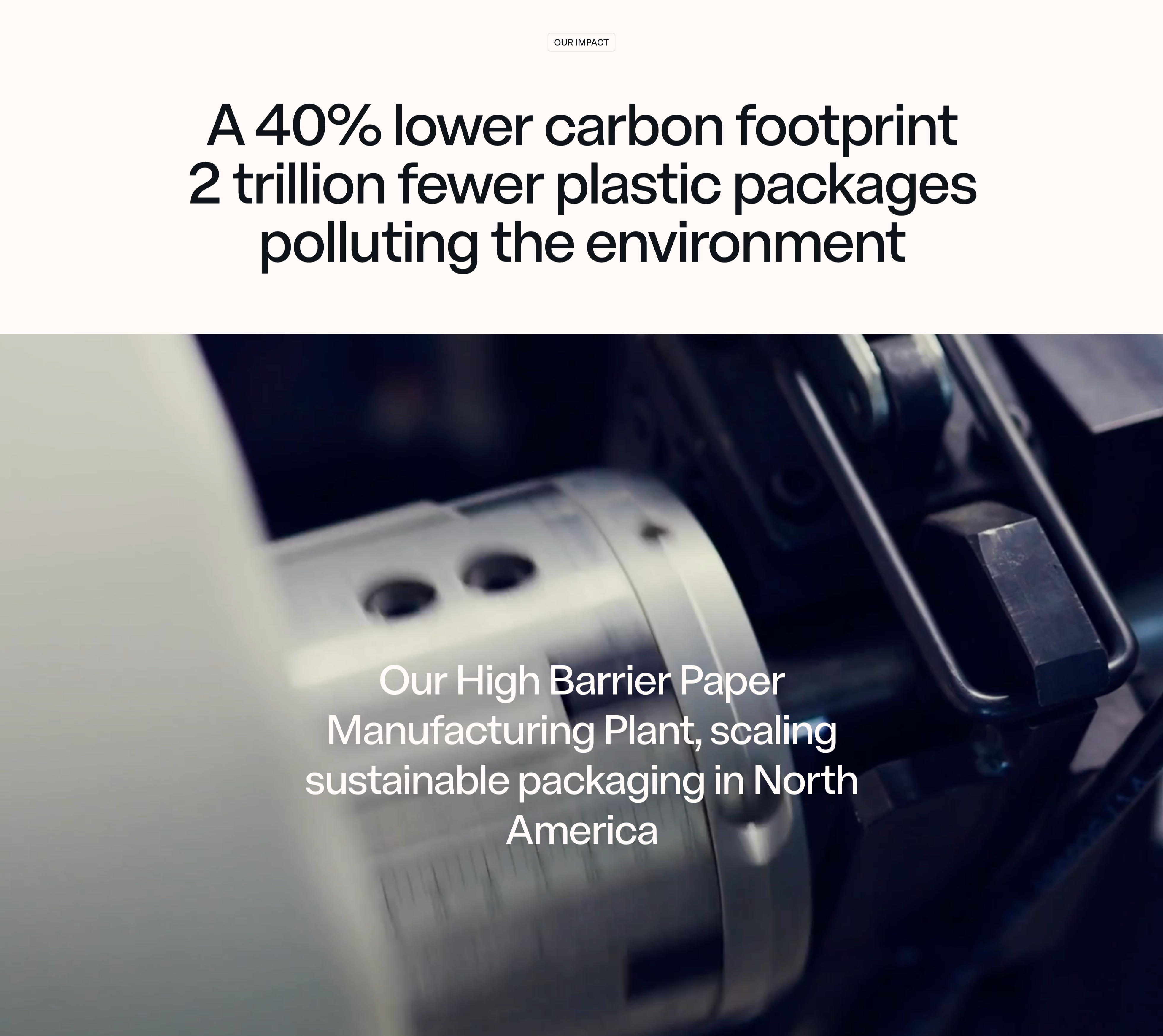
An impact section that pairs a centered stat headline on a warm off-white band with a full-bleed machinery photo below. A small outlined 'OUR IMPACT' eyebrow pill sits at the top, above an oversized near-black sans-serif headline that stacks two claims — 'A 40% lower carbon footprint' and '2 trillion fewer plastic packages polluting the environment' — using sheer type scale rather than separate number tiles to make the figures land. Beneath it, a moody, shallow-depth close-up of a chrome slitting machine and paper roll fills the width, dark on the right and bright on the left. Lower-left over the photo, a white caption reads 'Our High Barrier Paper Manufacturing Plant, scaling sustainable packaging in North America'. The split of crisp light band over cinematic dark imagery, with the metrics carried entirely by typography, gives the impact message a confident, editorial weight.
Nfinitepaper ↗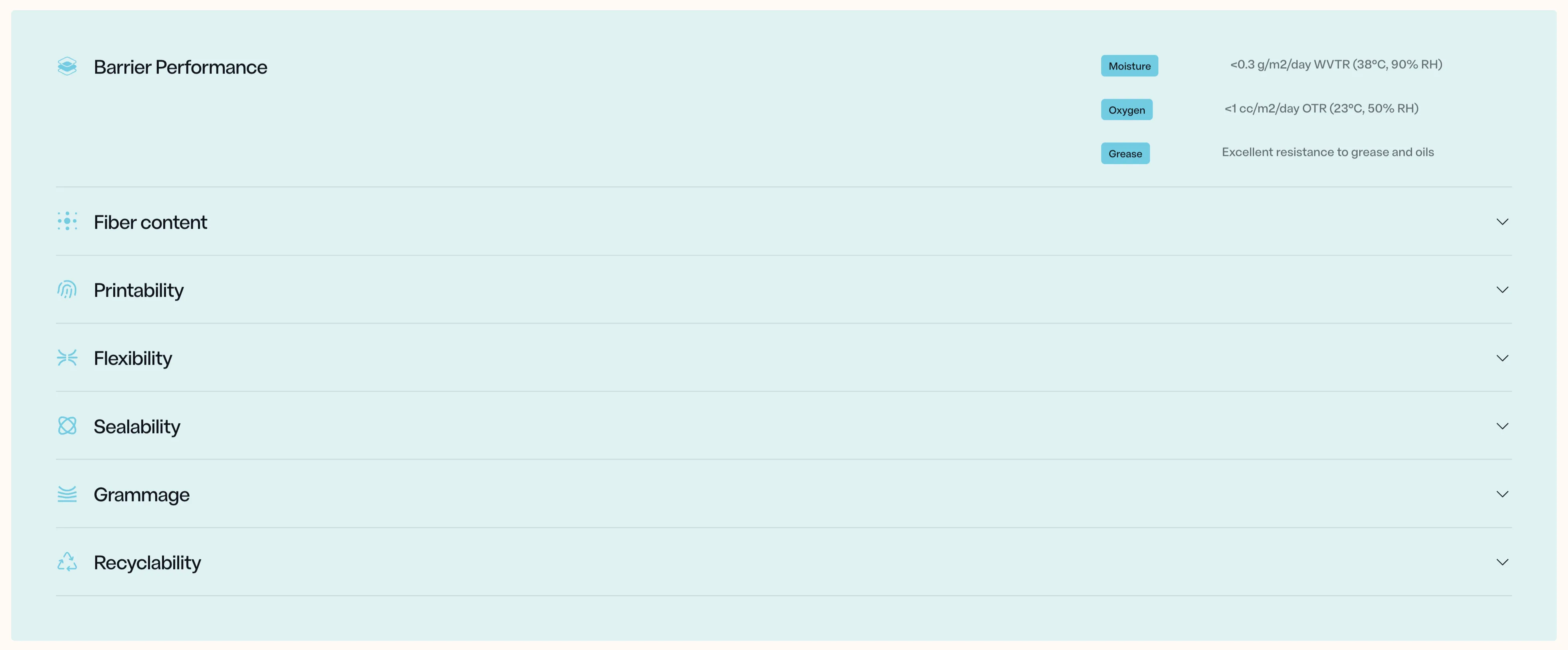
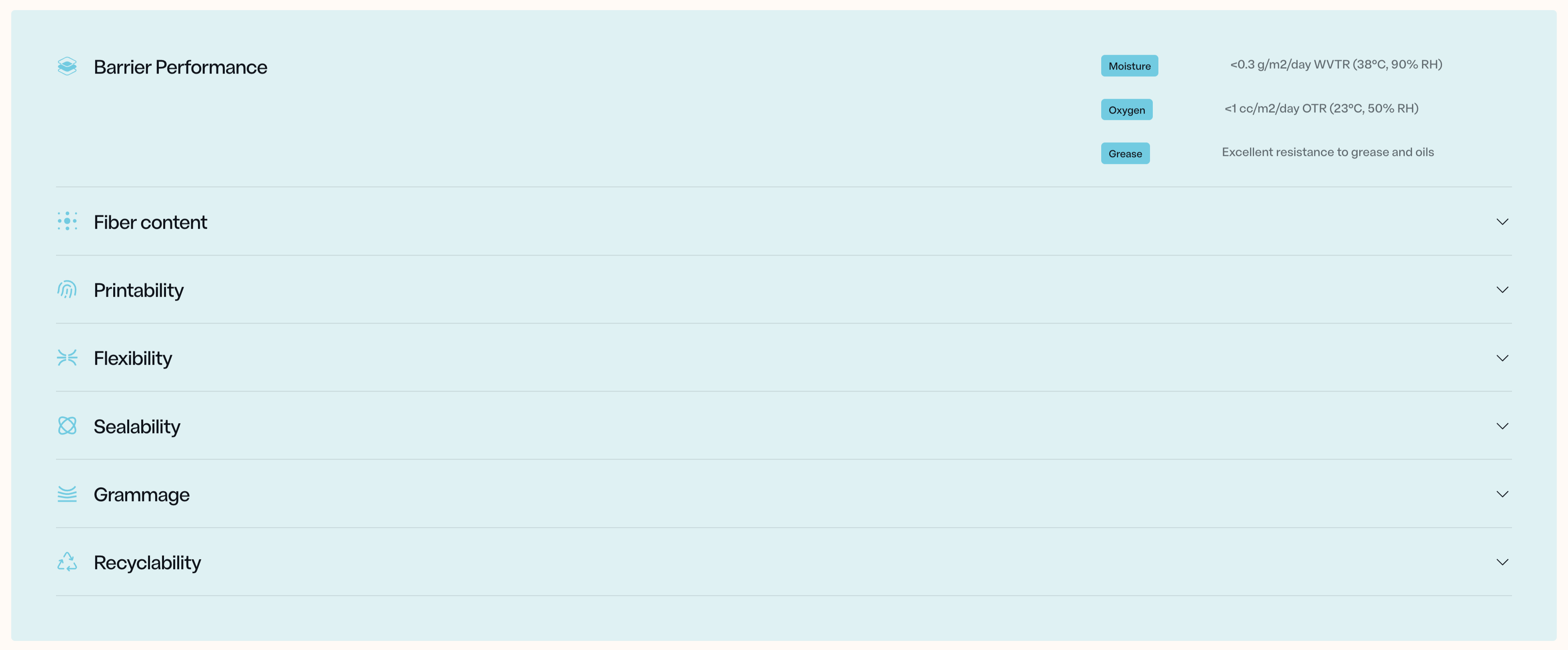
NFINITE Barrier Specs Accordion
A specifications accordion on a soft pale-blue panel, listing the material's properties as a vertical stack of expandable rows. Each row pairs a thin line icon with a label — Barrier Performance, Fiber content, Printability, Flexibility, Sealability, Grammage, Recyclability — separated by hairline dividers, with a downward chevron on the right of every collapsed row. The top row, 'Barrier Performance', is expanded to reveal its detail on the right side: three small rounded sky-blue pills labelled Moisture, Oxygen and Grease, each paired with a grey technical value — '<0.3 g/m2/day WVTR (38°C, 90% RH)', '<1 cc/m2/day OTR (23°C, 50% RH)', and 'Excellent resistance to grease and oils'. The remaining six rows stay collapsed below. The palette is restrained — pale blue field, near-black labels, muted grey values — and the generous spacing plus precise spec formatting give it a credible, engineering-grade feel suited to a technical B2B audience scanning for hard numbers.
Nfinitepaper ↗Similar cta sections


Start Managing Your Money Email CTA Band
A compact call-to-action set in a wide rounded blue band with a green-to-white wave sweeping across it. A centered bold white 'Start managing your money now!' headline spans the upper area, and directly beneath sits a single inline capture control — a white rounded field reading 'Enter your e-mail address' with an attached solid blue 'Get started' button. No imagery or extra copy competes with the message. The saturated blue field, one headline and single email input make this a focused, low-friction signup prompt.
Zubuz ↗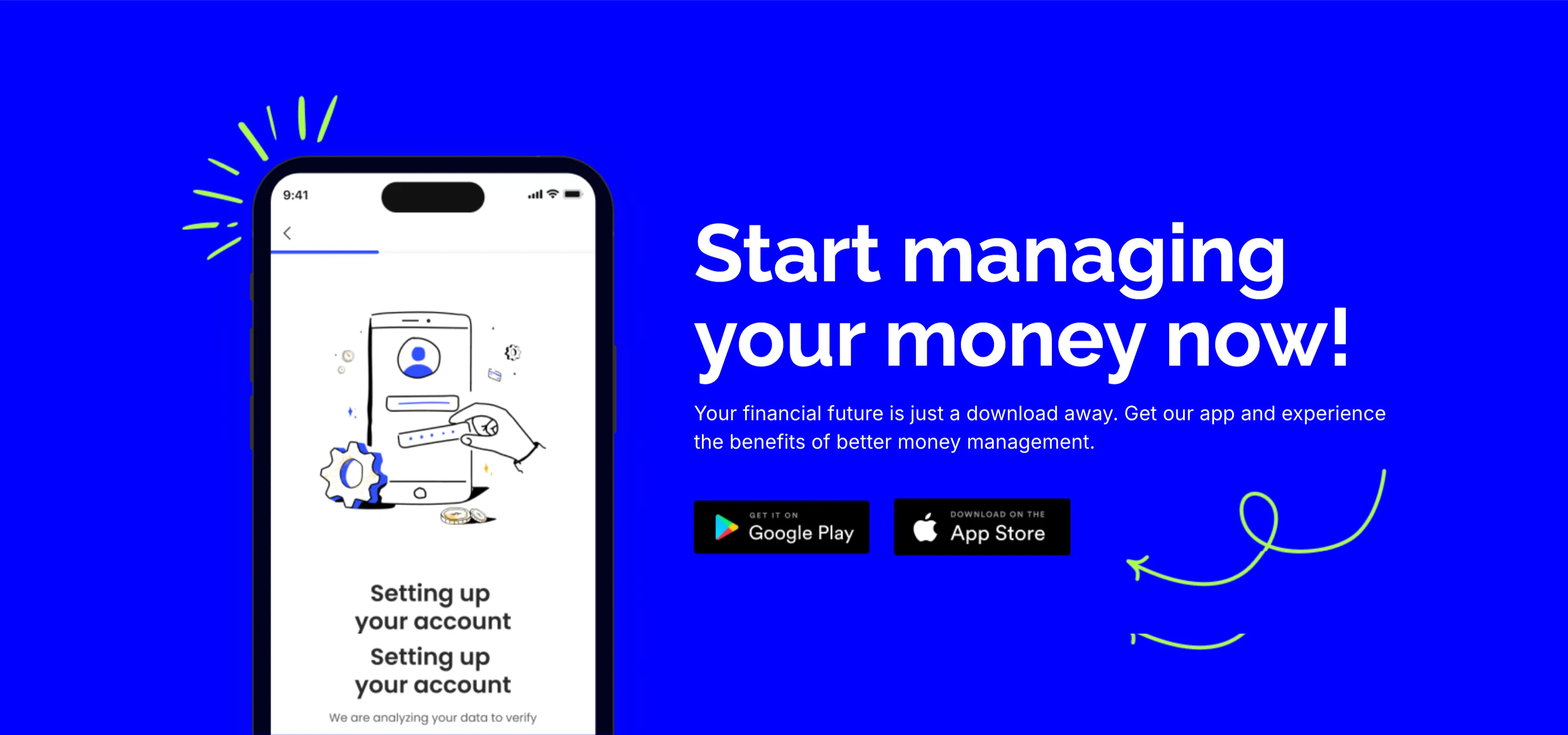
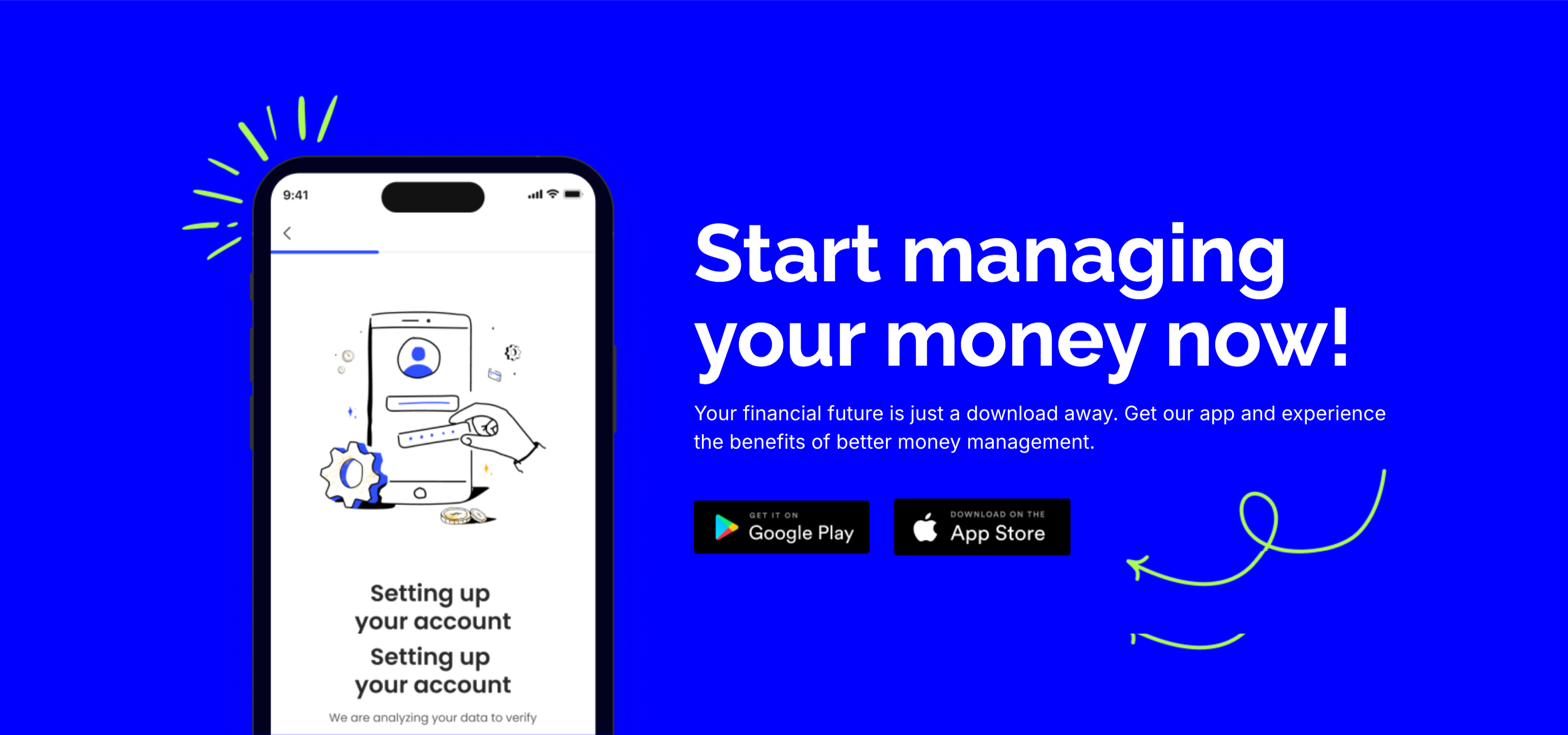
Start Managing Your Money App CTA
A bold call-to-action set on a saturated blue background. The left side shows a smartphone mockup on an onboarding 'Setting up your account' screen with a line-art illustration and a green doodle burst. The right side stacks a large white 'Start managing your money now!' headline, a two-line subhead ('Your financial future is just a download away…'), and two dark app-store buttons — 'Get it on Google Play' and 'Download on the App Store' — with a hand-drawn green arrow curling toward them. The vivid blue field, device shot and store badges make downloading the obvious next step. The playful arrow adds energy to an otherwise direct conversion prompt.
Zubuz ↗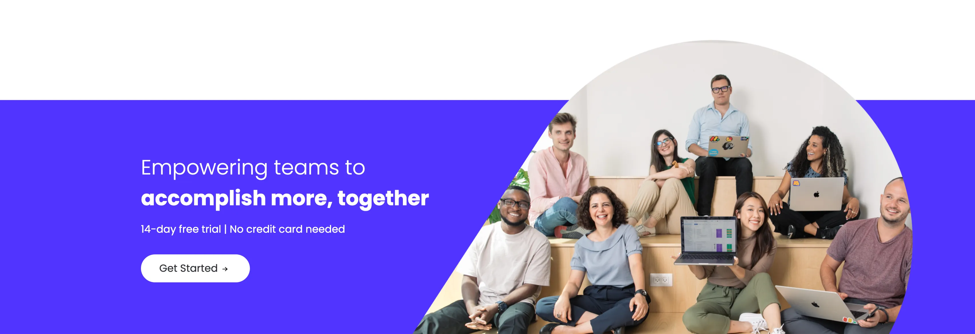
Empowering Teams Final Signup CTA
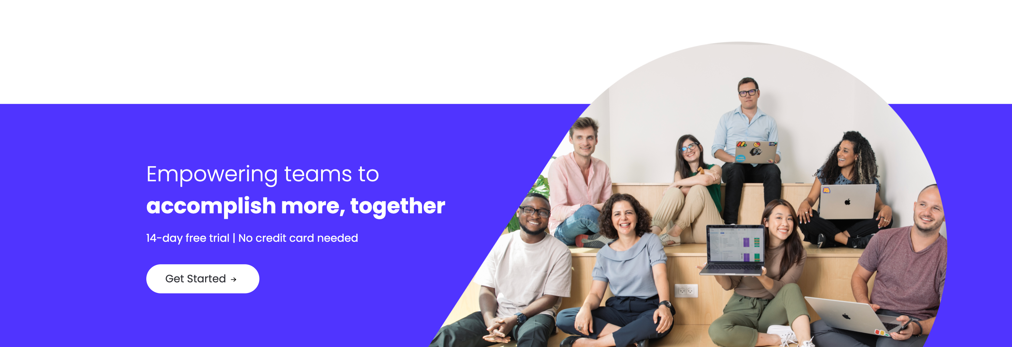
A closing sign-up call-to-action split between an indigo panel on the left and a large photo on the right. The left side stacks a two-line headline — a lighter 'Empowering teams to' over a bold 'accomplish more, together' in white — followed by the qualifier '14-day free trial | No credit card needed' and a white 'Get Started' pill button with an arrow. The right side is a circular-masked photograph of a diverse group of eight colleagues seated on tiered wooden steps, several holding laptops (one displaying a monday board), smiling toward the camera. The bold value headline, risk-reducing trial note and friendly team photo combine into a warm, low-friction final conversion prompt.
Monday ↗
Together We Can Impact Careers CTA Band
A careers call-to-action set in a wide dark-indigo rounded band. On the left, a two-line headline mixes weights — a bold 'Together we can impact' leading into a lighter 'how teams work across the globe' — in white type. Directly beneath sits a white pill button labelled 'Join our team!' with a right arrow. The right side of the band is pure decoration: overlapping brighter-indigo circular and arc shapes with a small glowing dot, adding depth without imagery or copy. The deep background, single bold headline and lone button make the recruiting ask focused and unmissable.
Monday ↗