CTA sections
A call-to-action section removes friction at the moment of decision. Browse CTA section examples that convert without shouting.


Start Managing Your Money Email CTA Band
A compact call-to-action set in a wide rounded blue band with a green-to-white wave sweeping across it. A centered bold white 'Start managing your money now!' headline spans the upper area, and directly beneath sits a single inline capture control — a white rounded field reading 'Enter your e-mail address' with an attached solid blue 'Get started' button. No imagery or extra copy competes with the message. The saturated blue field, one headline and single email input make this a focused, low-friction signup prompt.
Zubuz ↗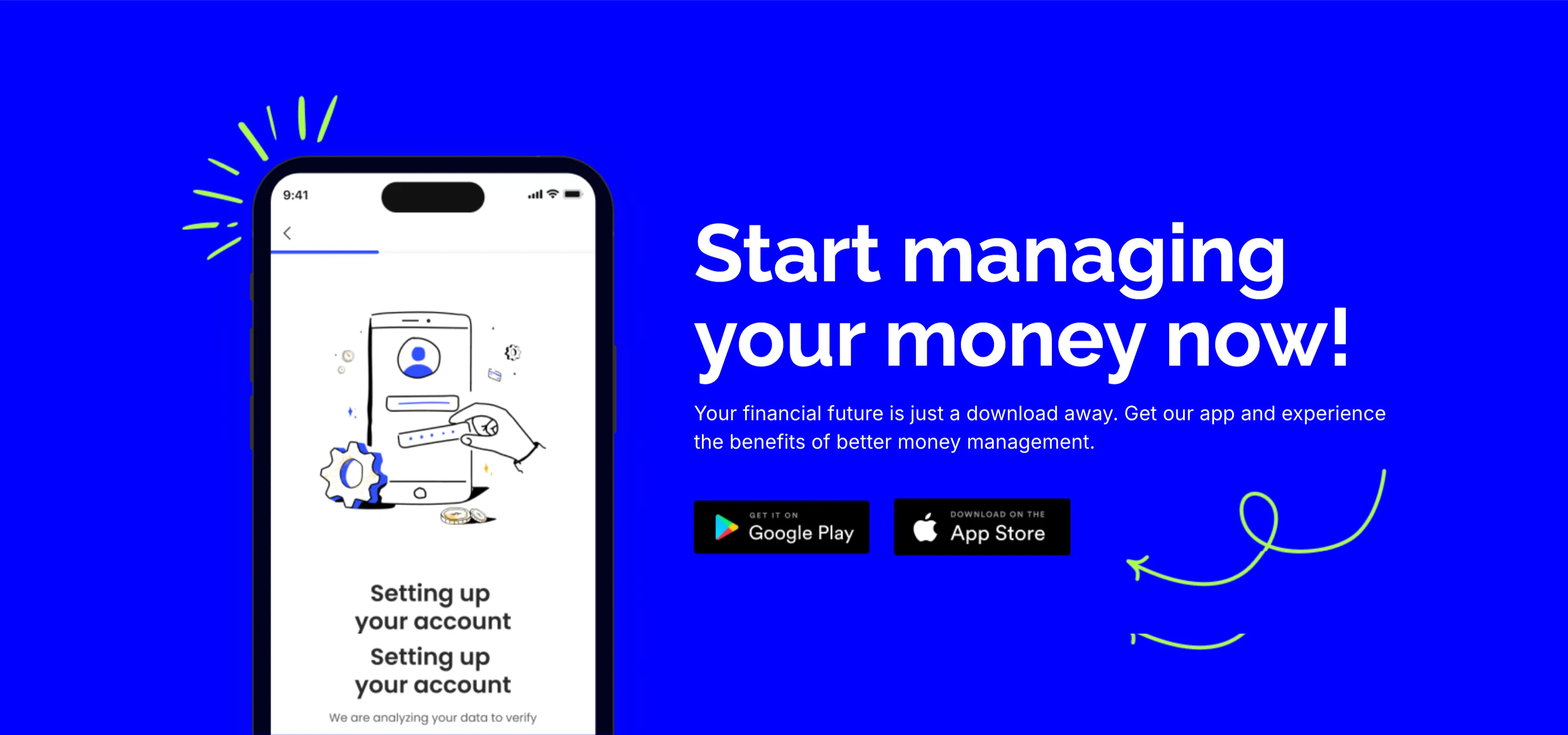
Start Managing Your Money App CTA
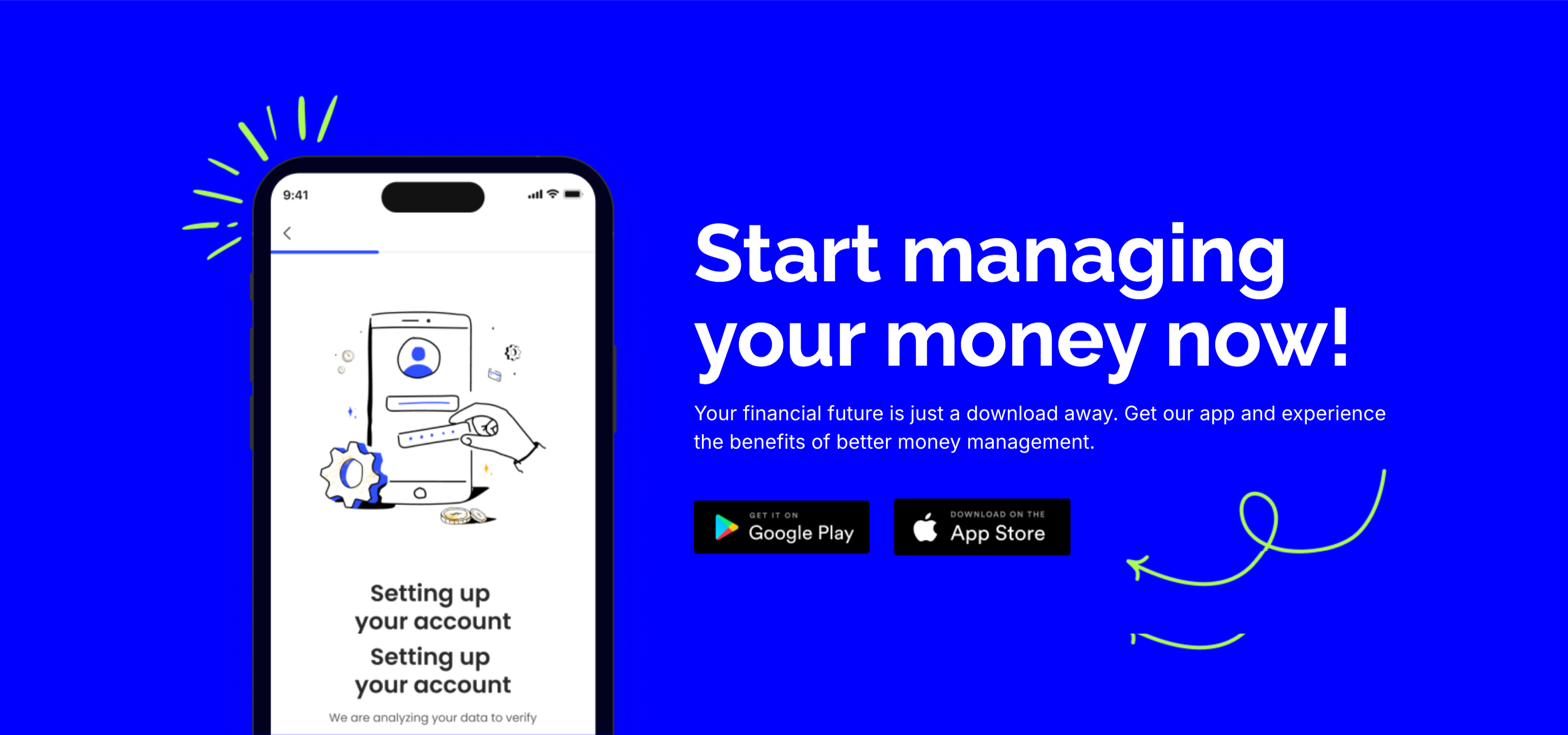
A bold call-to-action set on a saturated blue background. The left side shows a smartphone mockup on an onboarding 'Setting up your account' screen with a line-art illustration and a green doodle burst. The right side stacks a large white 'Start managing your money now!' headline, a two-line subhead ('Your financial future is just a download away…'), and two dark app-store buttons — 'Get it on Google Play' and 'Download on the App Store' — with a hand-drawn green arrow curling toward them. The vivid blue field, device shot and store badges make downloading the obvious next step. The playful arrow adds energy to an otherwise direct conversion prompt.
Zubuz ↗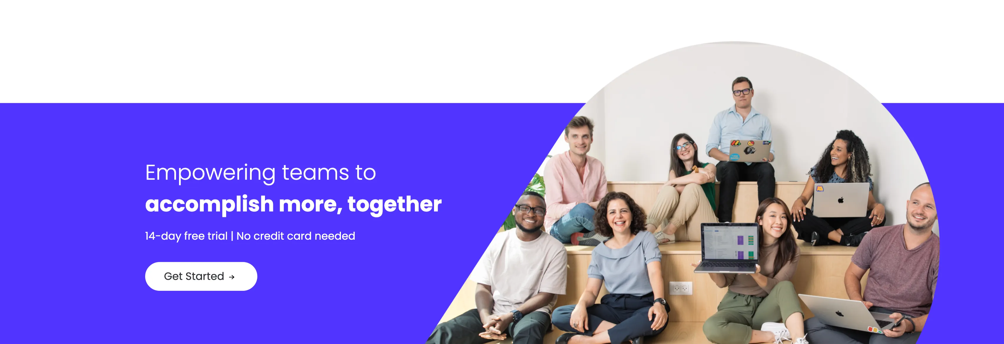
Empowering Teams Final Signup CTA
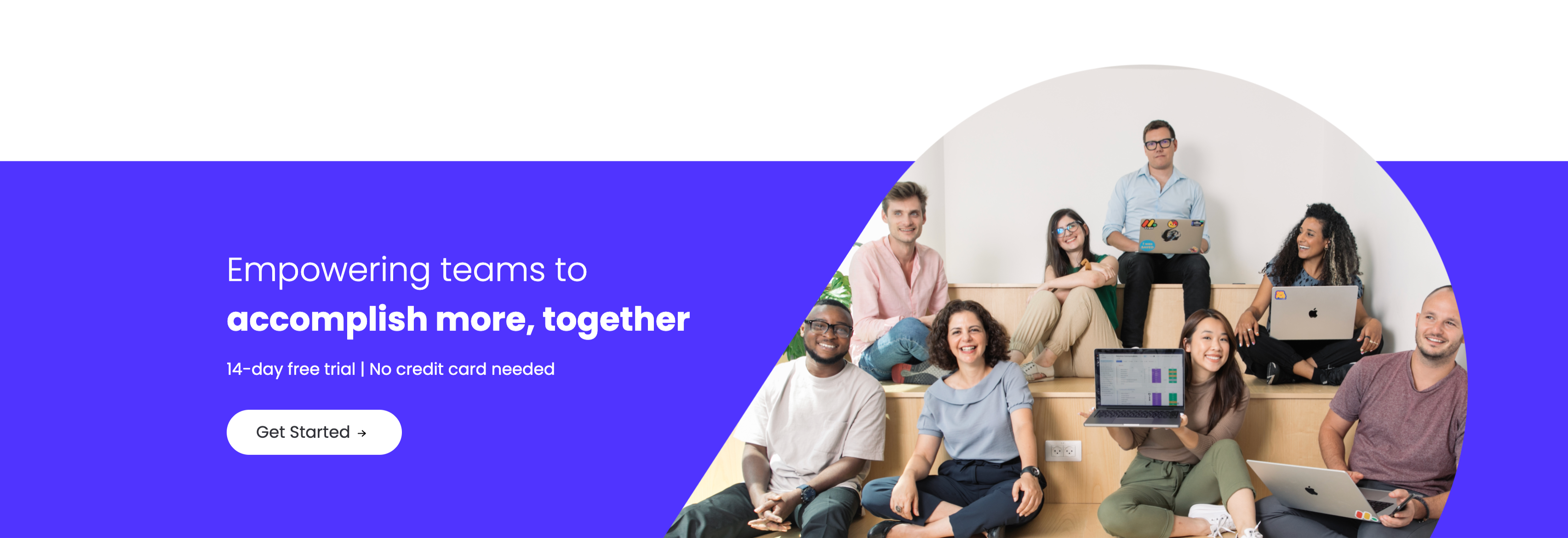
A closing sign-up call-to-action split between an indigo panel on the left and a large photo on the right. The left side stacks a two-line headline — a lighter 'Empowering teams to' over a bold 'accomplish more, together' in white — followed by the qualifier '14-day free trial | No credit card needed' and a white 'Get Started' pill button with an arrow. The right side is a circular-masked photograph of a diverse group of eight colleagues seated on tiered wooden steps, several holding laptops (one displaying a monday board), smiling toward the camera. The bold value headline, risk-reducing trial note and friendly team photo combine into a warm, low-friction final conversion prompt.
Monday ↗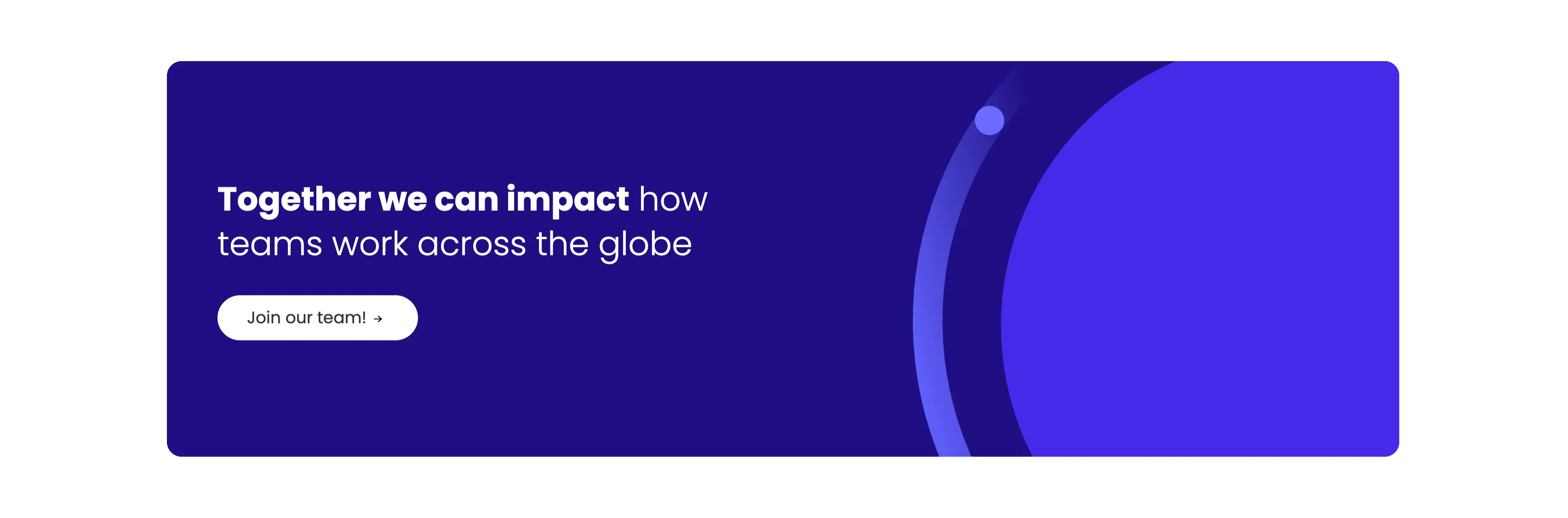
Together We Can Impact Careers CTA Band
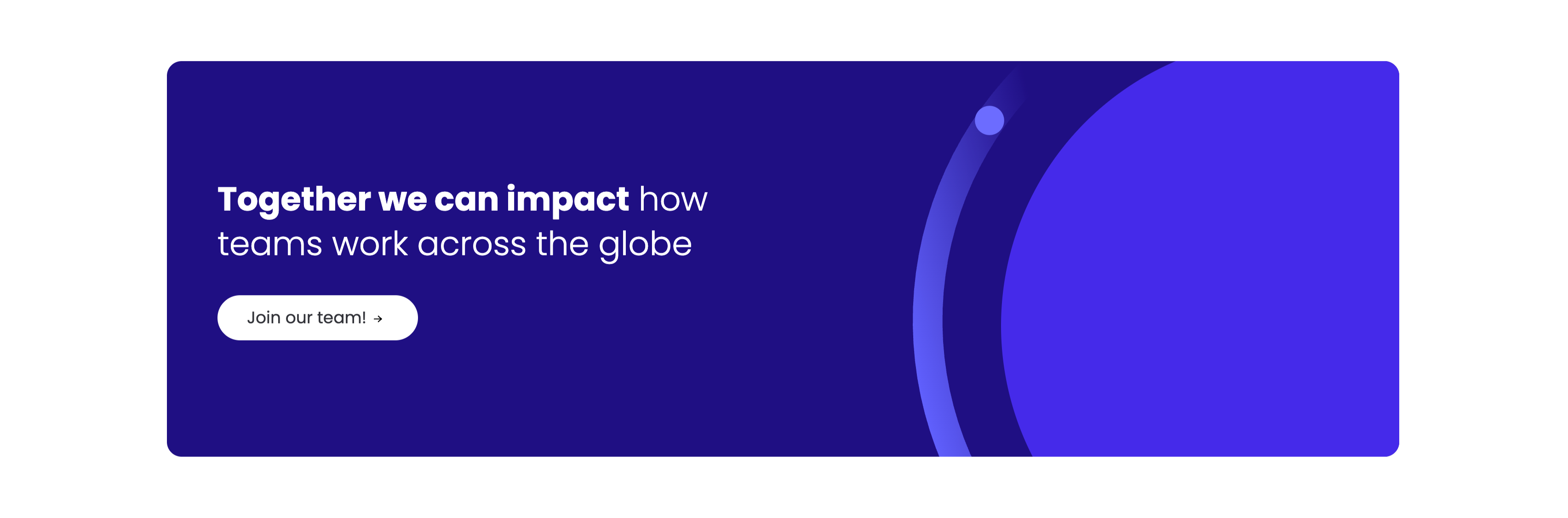
A careers call-to-action set in a wide dark-indigo rounded band. On the left, a two-line headline mixes weights — a bold 'Together we can impact' leading into a lighter 'how teams work across the globe' — in white type. Directly beneath sits a white pill button labelled 'Join our team!' with a right arrow. The right side of the band is pure decoration: overlapping brighter-indigo circular and arc shapes with a small glowing dot, adding depth without imagery or copy. The deep background, single bold headline and lone button make the recruiting ask focused and unmissable.
Monday ↗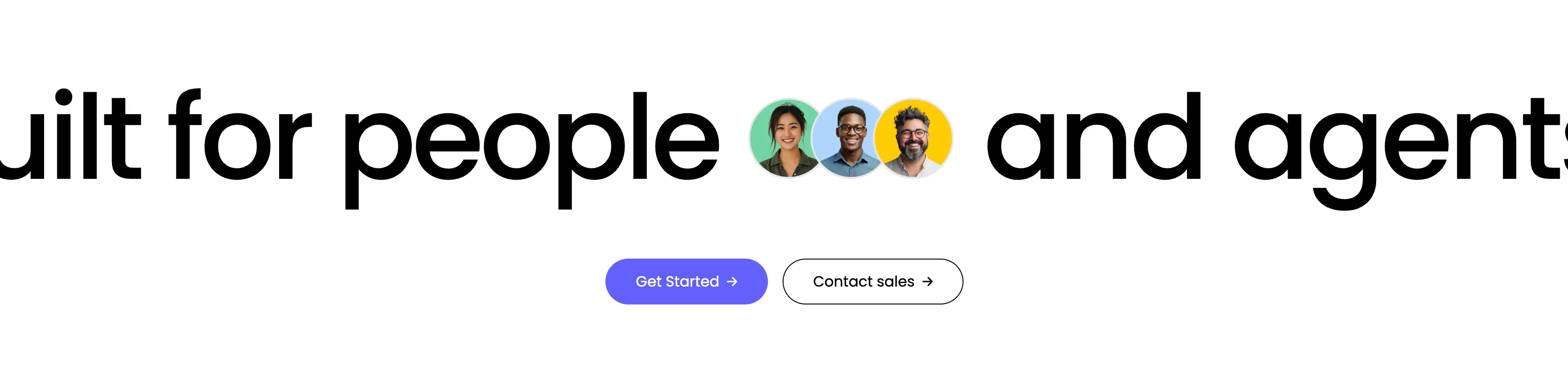
Built For People And Agents CTA
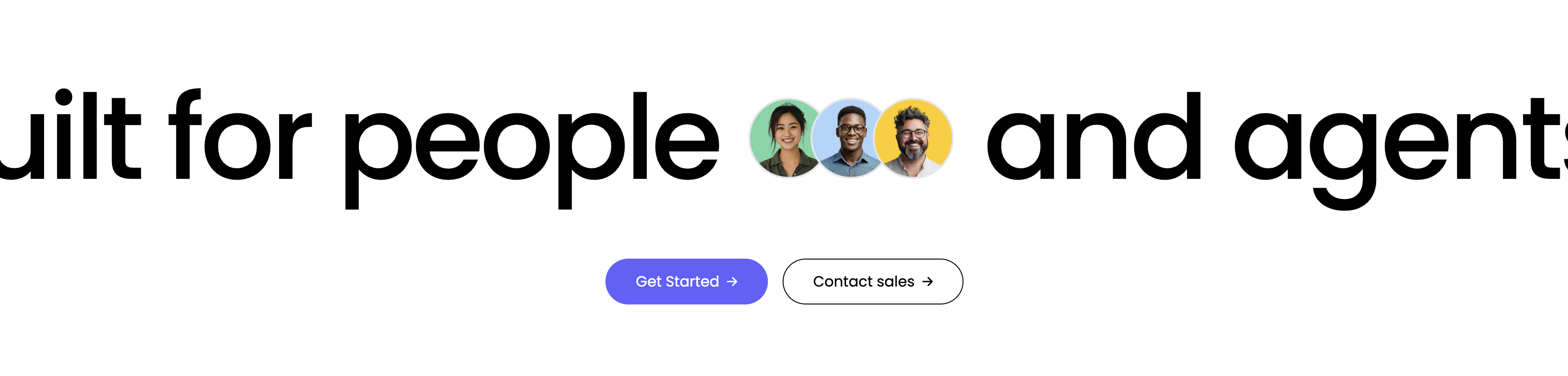
A minimal full-width call-to-action built around one enormous line of type, 'Built for people and agents', that bleeds off both edges of the frame. Three circular human avatars in green, blue and yellow are set inline between the words 'people' and 'and', visually joining humans to the agent message. Centered directly beneath the headline sit two buttons — a solid purple 'Get Started' primary and an outlined 'Contact sales' secondary, each with a trailing arrow. The near-empty white canvas and the oversized headline give the closing pitch a confident, spacious feel.
Monday ↗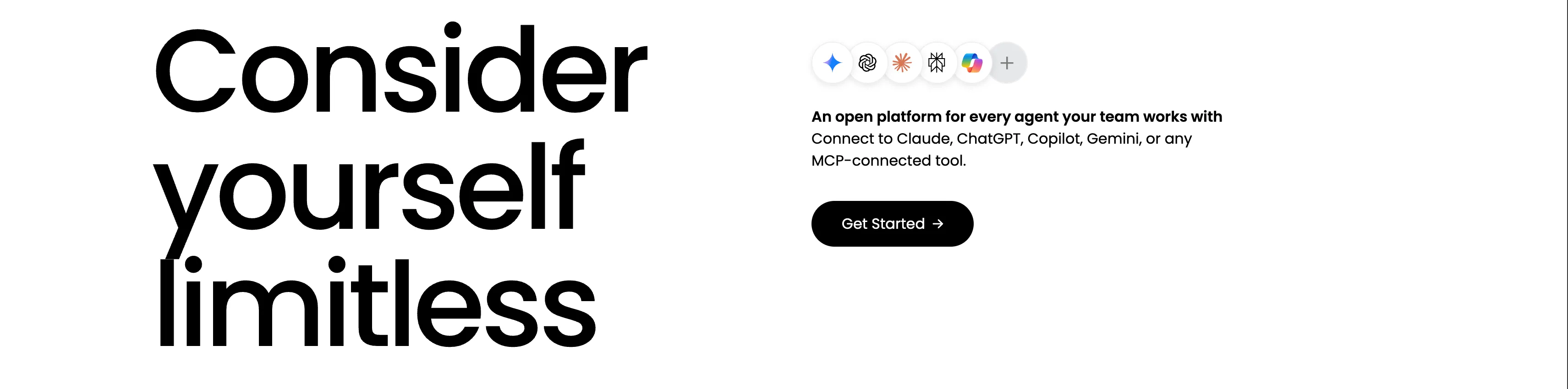
Consider Yourself Limitless Open Platform Band
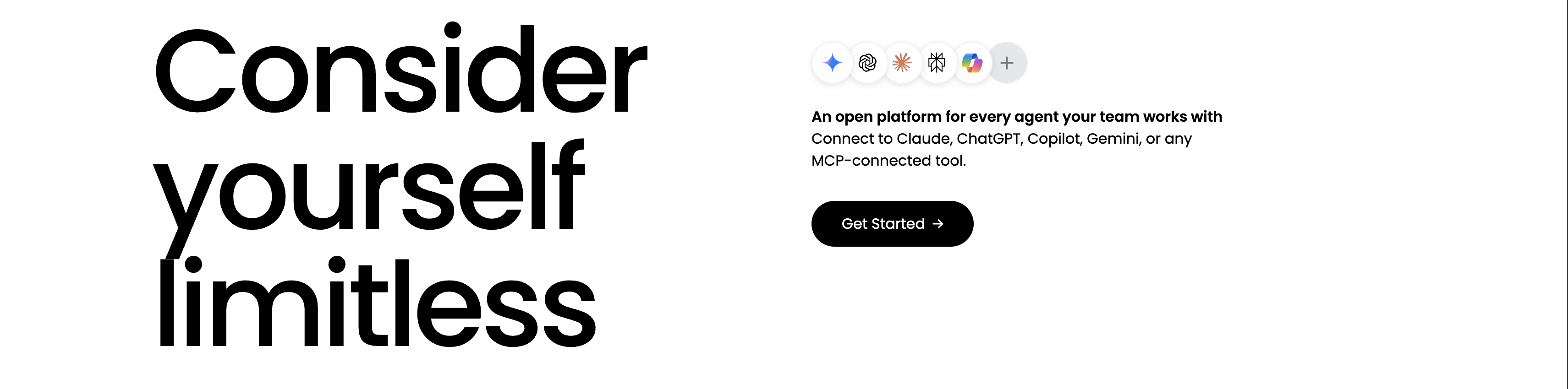
A bold split call-to-action band on white. The left column is filled by a massive black three-line headline, 'Consider yourself limitless', its scale making it the visual anchor. The right column stacks a row of circular AI-provider icons (Gemini, OpenAI, an Anthropic-style burst, another mark, Microsoft Copilot and a '+' for more), then a bold line 'An open platform for every agent your team works with', the supporting sentence 'Connect to Claude, ChatGPT, Copilot, Gemini, or any MCP-connected tool.', and a black 'Get Started' pill button. The oversized type against generous whitespace and the recognizable model logos sell openness and breadth in a single glance.
Monday ↗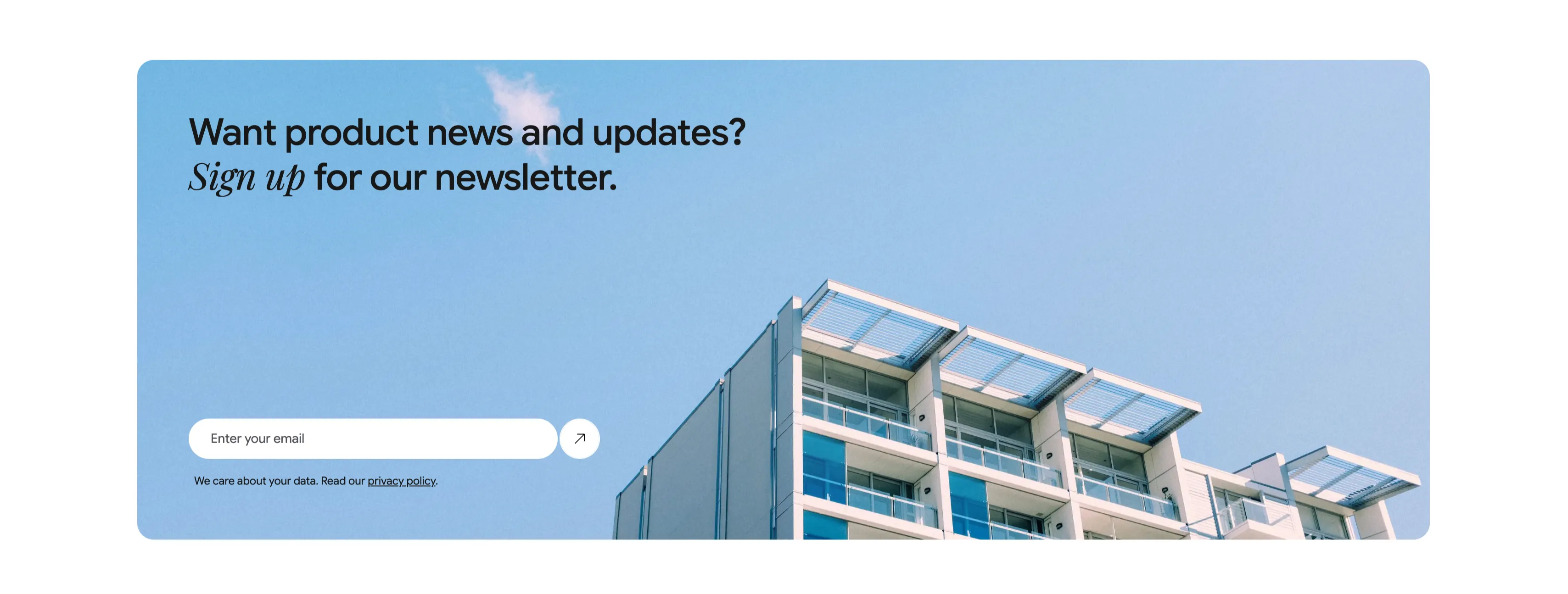
Newsletter Signup Banner With Email Field
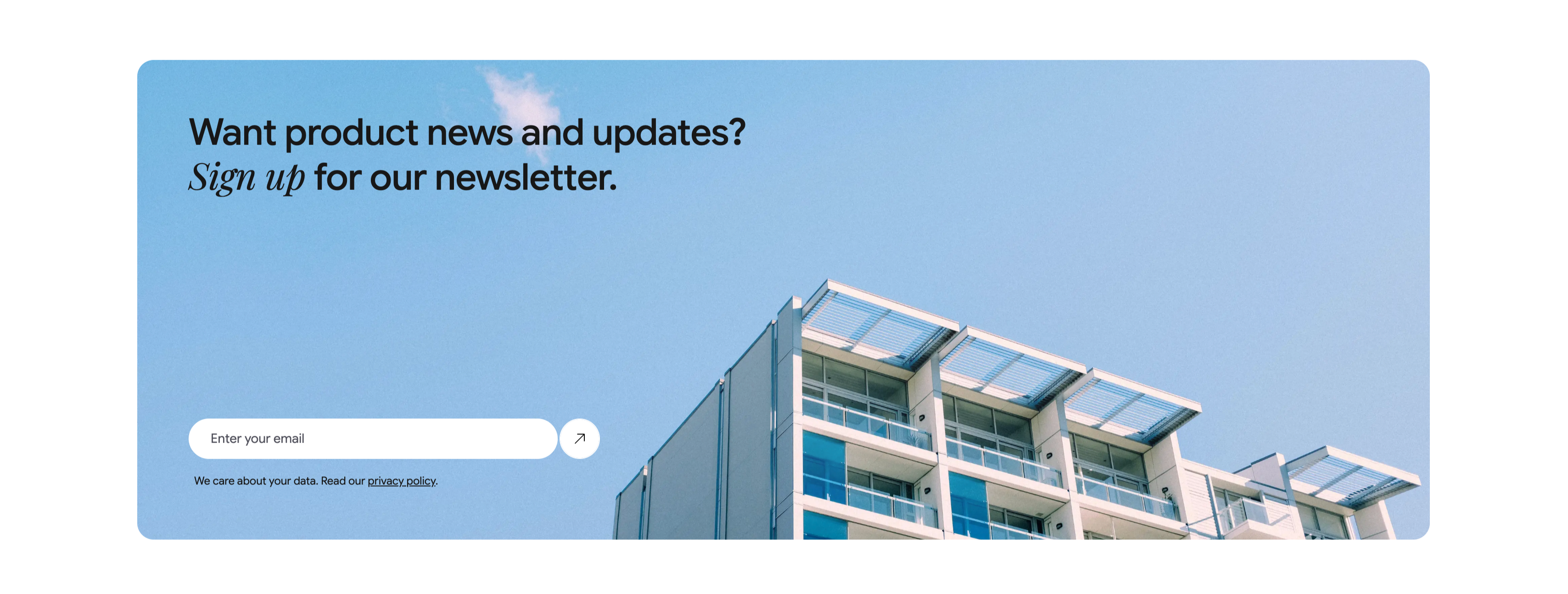
A wide, rounded light-blue banner with a photograph of a modern apartment building against a clear sky filling its right side. The left side carries a two-line heading, 'Want product news and updates? Sign up for our newsletter.', with 'Sign up' set in italic serif. Beneath it is a single email capture: a white rounded input placeheld 'Enter your email' paired with a circular up-right arrow submit button. A small line of fine print below reads 'We care about your data. Read our privacy policy.', with 'privacy policy' underlined as a link. The soft blue field, generous rounding and single-field form make a friendly, low-friction newsletter call-to-action.
Ceepii-nextjs-template ↗
Gradient Closing CTA With App UI
A full-bleed closing call-to-action on a vivid purple-to-pink-to-orange gradient. Centered near the top sit the rounded ClickUp app icon, a large white headline 'All your work, all your people, all powered by AI', and a white 'Get started FREE' button. Below, a large rounded product screenshot of the ClickUp desktop app (a marketing workspace with task lists) overlaps the gradient, with a smaller mobile app screen layered at its right edge. A small footnote at the very bottom on white reads 'Our agreements ensure zero data training & retention on all third-party model providers'. The saturated gradient and oversized UI make this the upbeat final conversion push before the footer.
Clickup ↗
NFINITE Subscribe Call-To-Action
A centered call-to-action band filling the width with a soft pale-blue panel. At the top sits the black 'NFINITE' wordmark with its small dotted infinity-style logo mark. Below it, a large dark charcoal sans-serif heading spans three centered lines — 'Subscribe to learn more about how our paper can eliminate plastic packaging from daily life' — stating the value of converting before the action. Centered beneath the copy is a single solid near-black rounded button labelled 'Contact us', with no competing secondary action. The calm monochrome-on-blue palette, generous vertical padding, and one focused button make this a clean closing conversion block that funnels attention straight to a single next step.
Nfinitepaper ↗

Linear Centered Closing CTA
A minimal closing call-to-action band on a solid near-black background. Centred on the page, a large white two-line headline reads 'Built for the future. Available today.' Directly beneath it sit two pill buttons side by side: a solid light-grey 'Get started' primary and a dark, subtly outlined 'Contact sales' secondary. There is no imagery or other copy — just the centered headline and button pair surrounded by generous empty space. The stark, focused composition pushes the visitor toward signing up or contacting sales as the final step of the page.
Linear ↗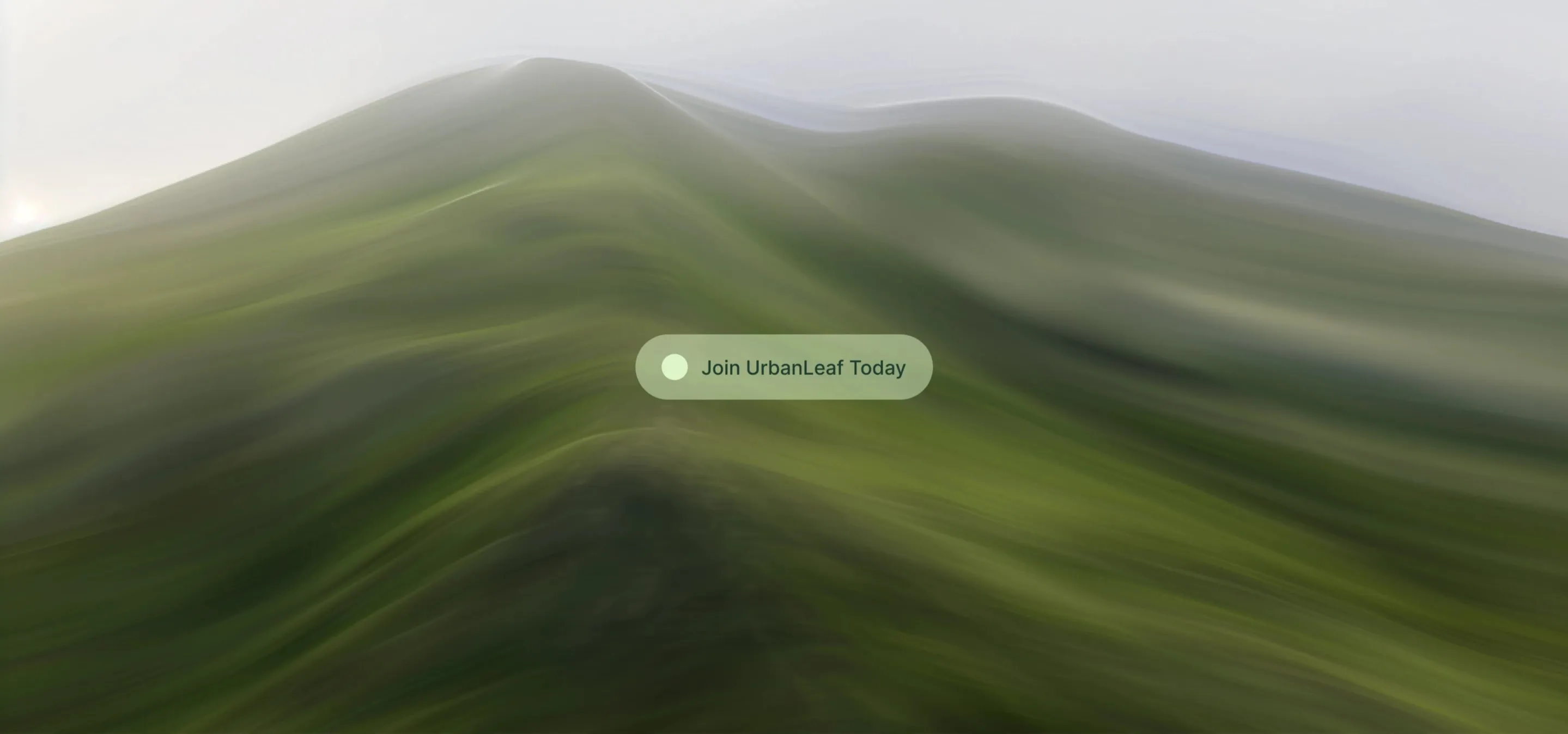
UrbanLeaf Full-Bleed Join CTA
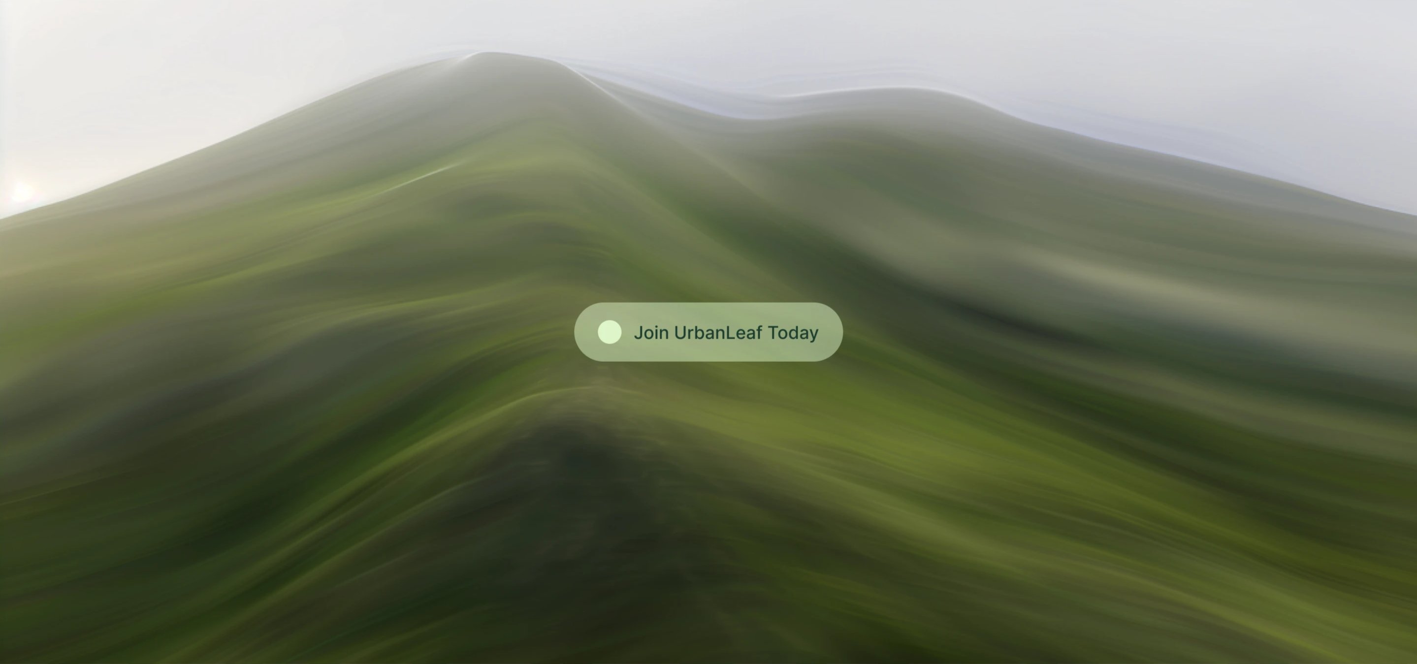
A full-bleed call-to-action band filled edge to edge with a soft, blurred photograph of green rolling hills under a pale, hazy sky. Centered over the imagery sits a single translucent pale-green pill button carrying a small light-green circular dot on the left and dark-green label text, 'Join UrbanLeaf Today.' There is no other copy, navigation or competing element — the lone frosted button floats on the landscape. The muted green-and-grey palette, gentle motion blur and generous negative space give the section a calm, immersive feel, focusing all attention on the single conversion action that closes the page.
Behance ↗