Carousel sections
Carousel sections for design inspiration. Browse real carousel section examples across styles and industries.
Our Story Timeline Carousel
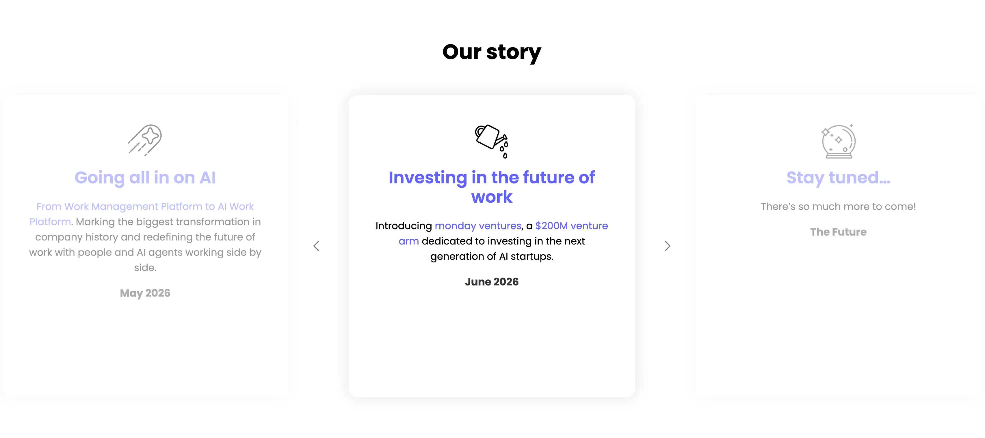
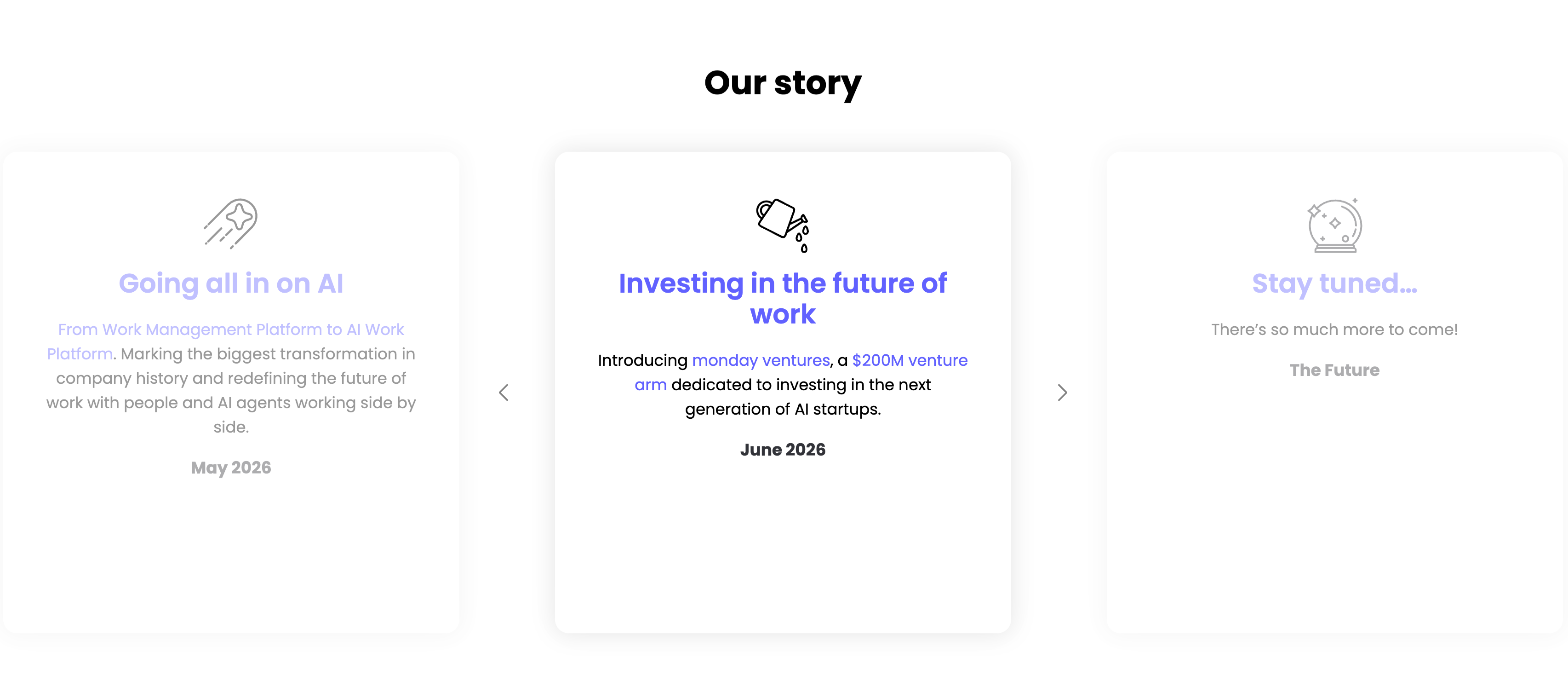
A milestone carousel titled 'Our story', centered on a white background. Three tall rounded cards sit in a row with faded neighbours and left/right chevron arrows signalling more. The center, active card leads with a watering-can line icon and an indigo heading 'Investing in the future of work', body copy 'Introducing monday ventures, a $200M venture arm dedicated to investing in the next generation of AI startups.', and a bold 'June 2026' date. The dimmed left card reads 'Going all in on AI' ('From Work Management Platform to AI Work Platform…', May 2026) and the right card 'Stay tuned…' ('There's so much more to come!', The Future), each with its own line icon. The card-per-milestone format turns the roadmap into an easy horizontal browse.
Monday ↗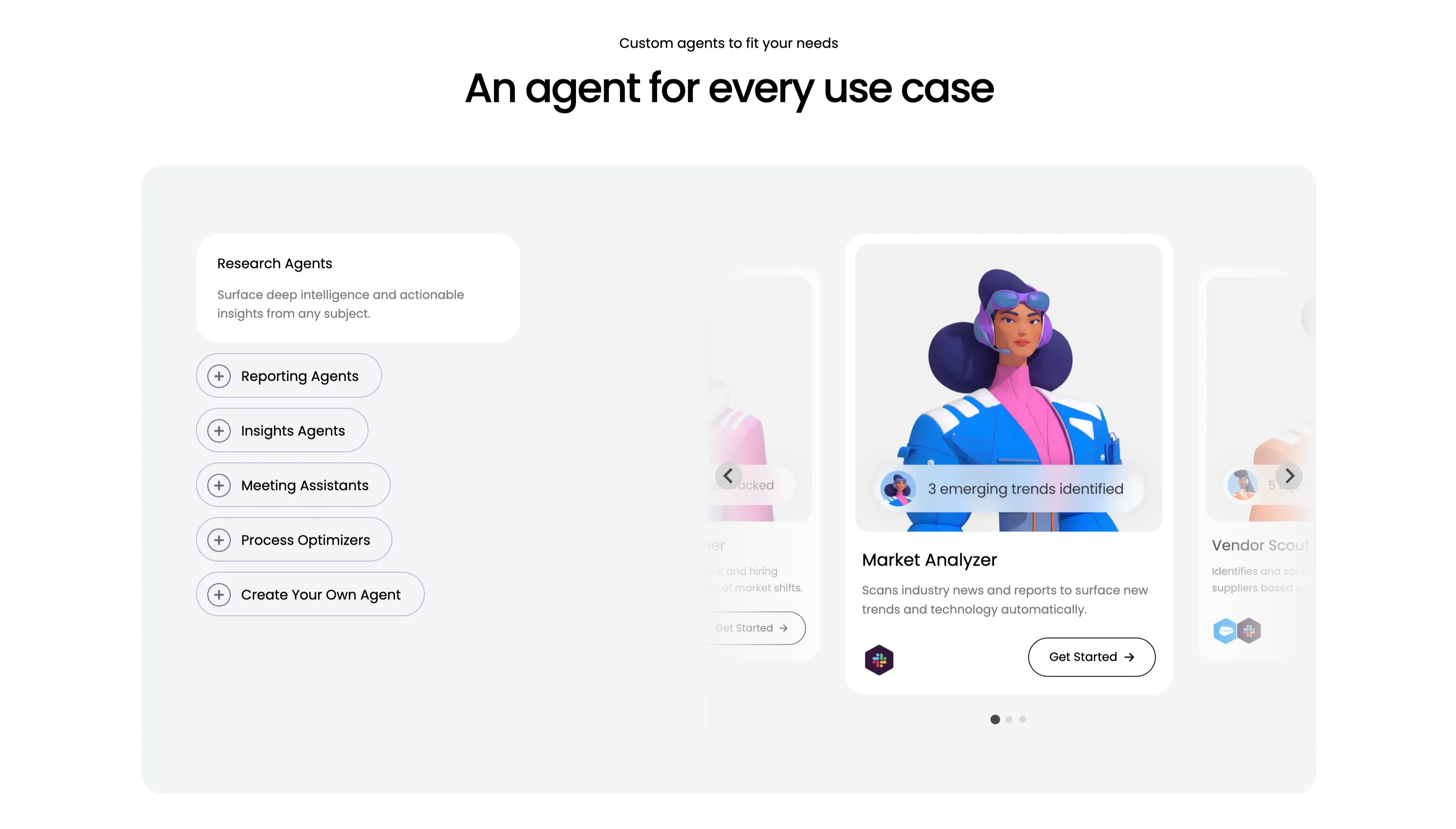
An Agent For Every Use Case Carousel
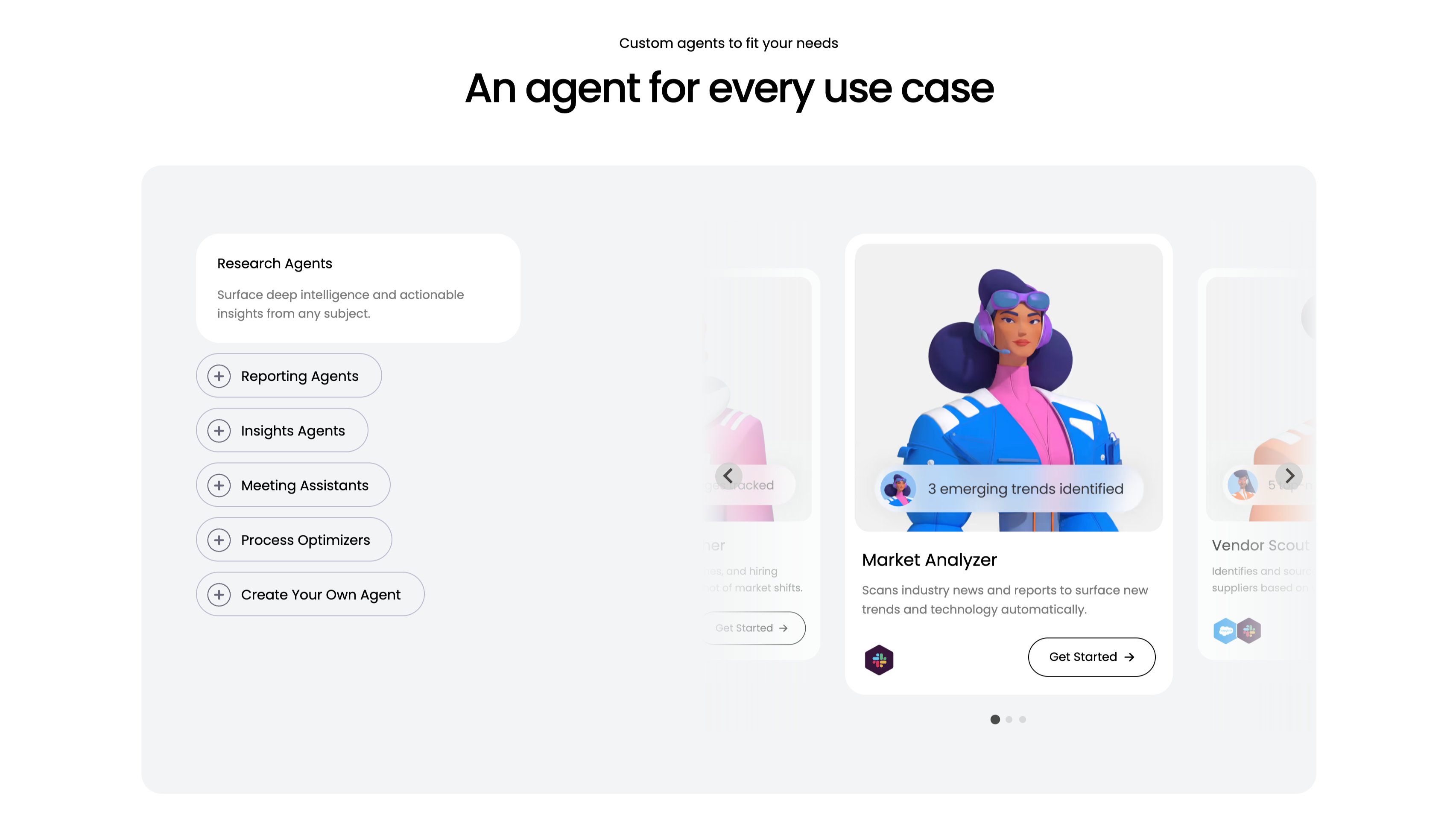
A use-case carousel introduced by a small 'Custom agents to fit your needs' eyebrow and the centered headline 'An agent for every use case.' Inside a large pale-gray panel, the left column is a vertical selector: a highlighted white 'Research Agents' card ('Surface deep intelligence and actionable insights from any subject.') above outlined pill buttons with plus icons — Reporting Agents, Insights Agents, Meeting Assistants, Process Optimizers and 'Create Your Own Agent.' The right column is a scrollable card deck centered on a 'Market Analyzer' card with a stylised 3D character, a '3 emerging trends identified' chip, the line 'Scans industry news and reports to surface new trends and technology automatically', an integration icon and a 'Get Started' button, flanked by faded neighbouring cards including 'Vendor Scout.' Circular arrows and three pagination dots confirm it scrolls. The category list plus previewed agent cards make the breadth easy to browse.
Monday ↗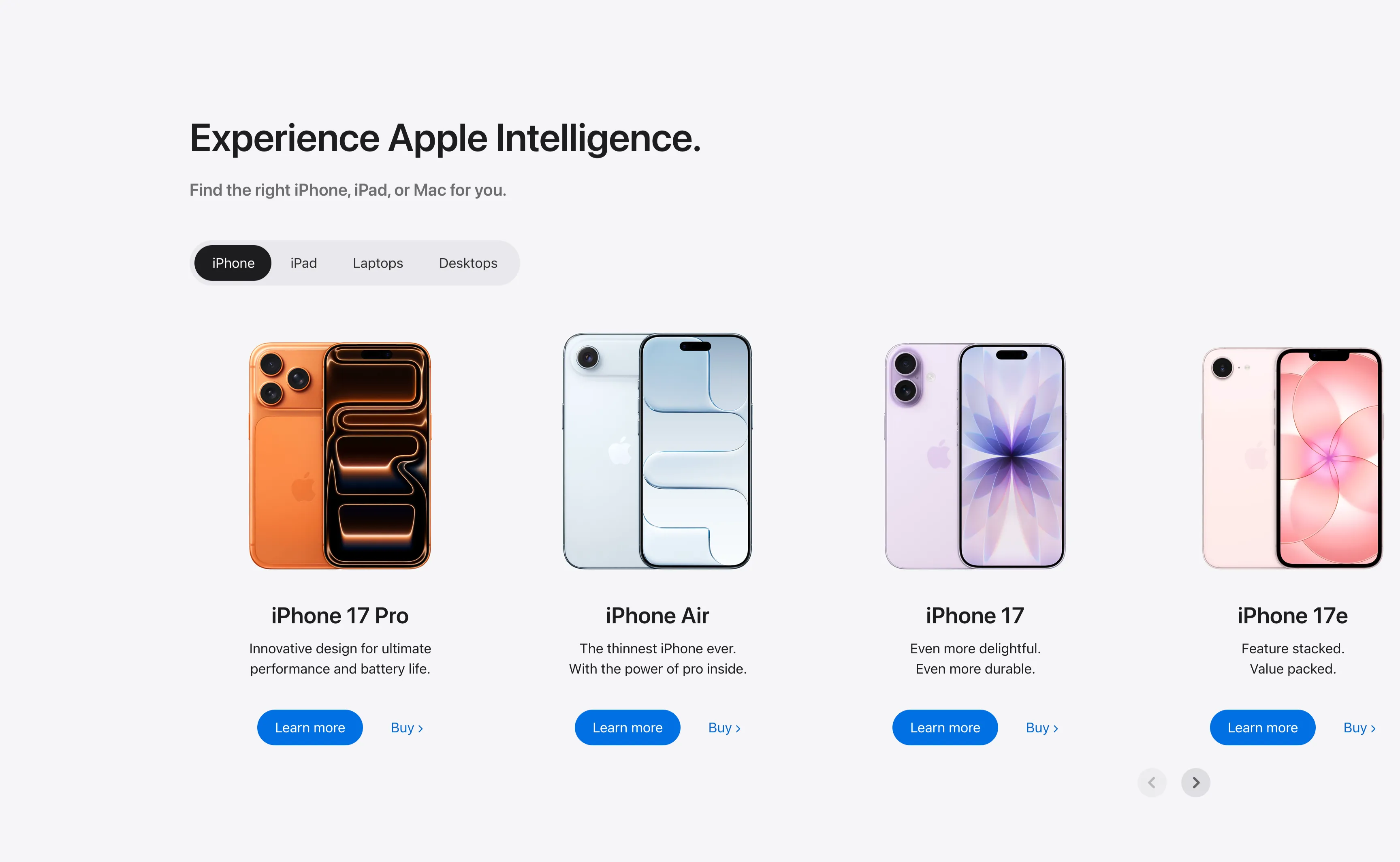
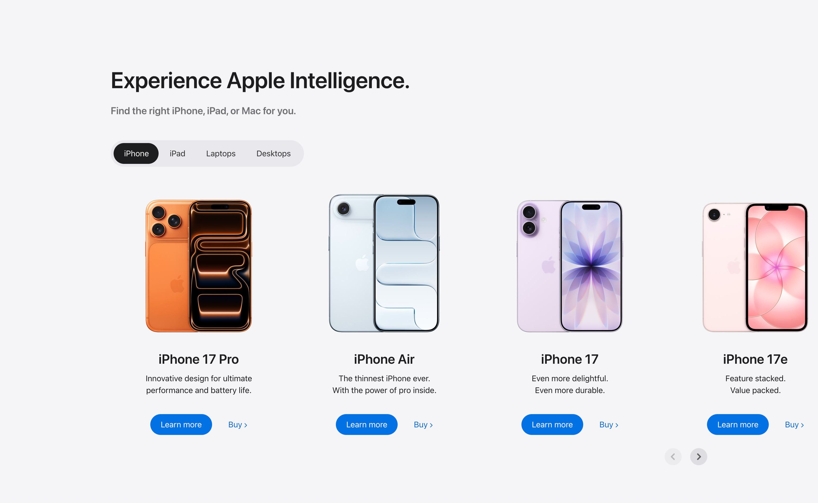
Experience Apple Intelligence Product Carousel
A product-finder carousel headed 'Experience Apple Intelligence.' with the subhead 'Find the right iPhone, iPad, or Mac for you.' A pill-shaped tab switcher offers iPhone (selected, dark), iPad, Laptops and Desktops. Below it four product cards sit in a scrollable row, each showing a device render, a bold model name, a two-line tagline, a solid blue 'Learn more' button and a 'Buy' text link: iPhone 17 Pro (orange), iPhone Air (light blue), iPhone 17 (purple) and iPhone 17e (pink). Circular previous/next arrows in the lower right reveal further models. The tabbed filter plus dual learn/buy calls-to-action make it a conversion-focused product showcase.
Apple ↗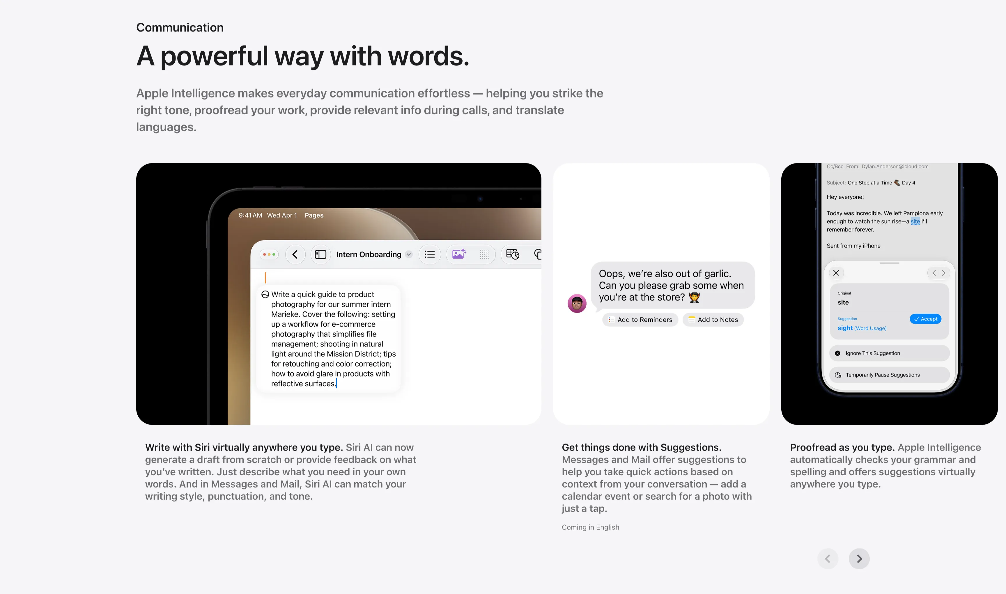
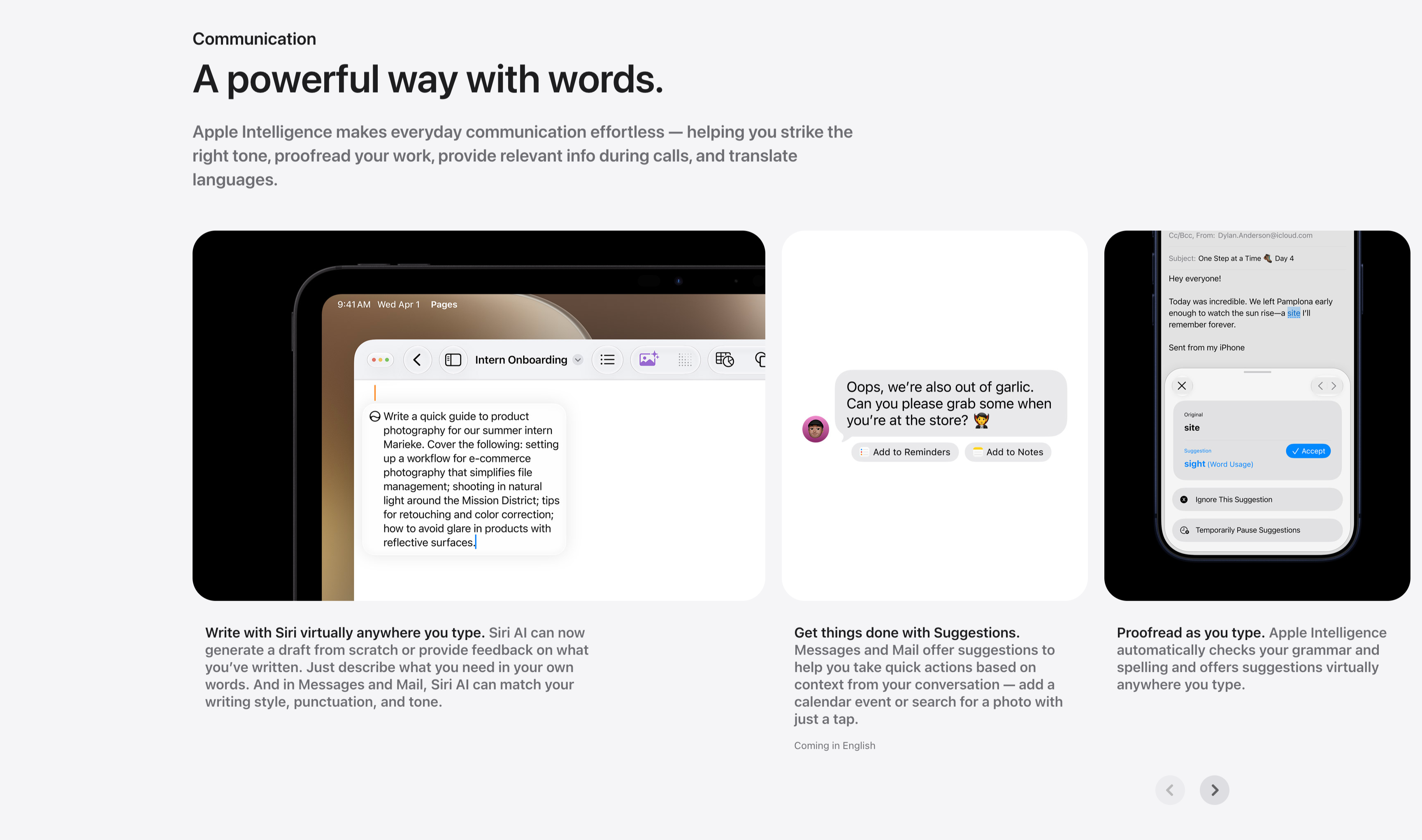
Communication Three-Up Feature Carousel
A communication feature row under a small 'Communication' label and the headline 'A powerful way with words.', with a gray paragraph about striking the right tone, proofreading and translating. Three cards sit side by side, each a screenshot with a bold-lead caption beneath: an iPad in Pages drafting a product-photography guide ('Write with Siri virtually anywhere you type.'), a Messages thread offering 'Add to Reminders' and 'Add to Notes' suggestion chips ('Get things done with Suggestions.'), and a Mail proofreading panel suggesting 'site' → 'sight' with an Accept button ('Proofread as you type.'). Circular previous/next arrows in the lower right indicate more cards. The consistent three-up screenshot layout keeps the writing-tool capabilities clear and comparable.
Apple ↗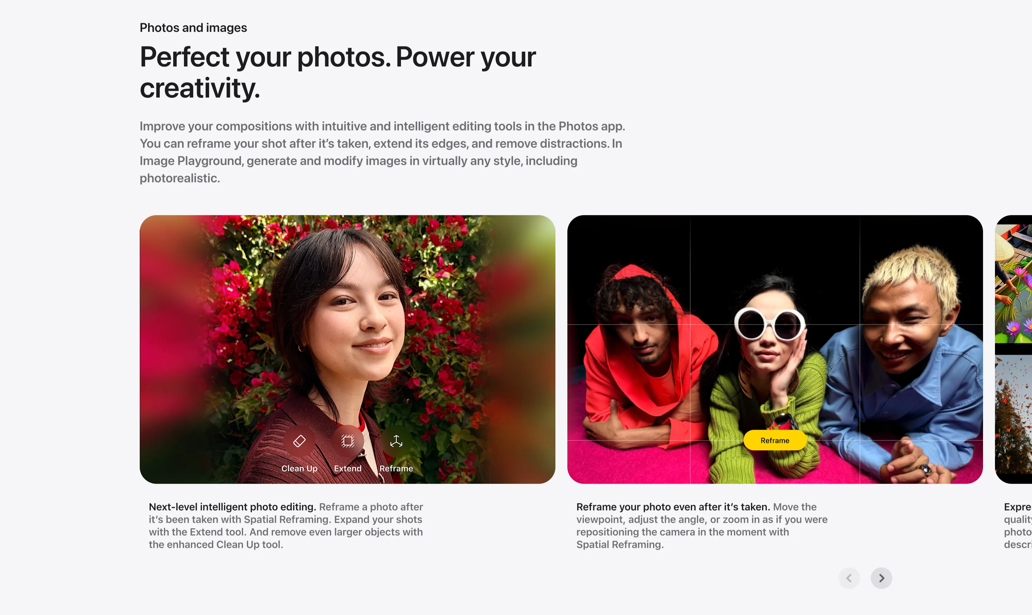
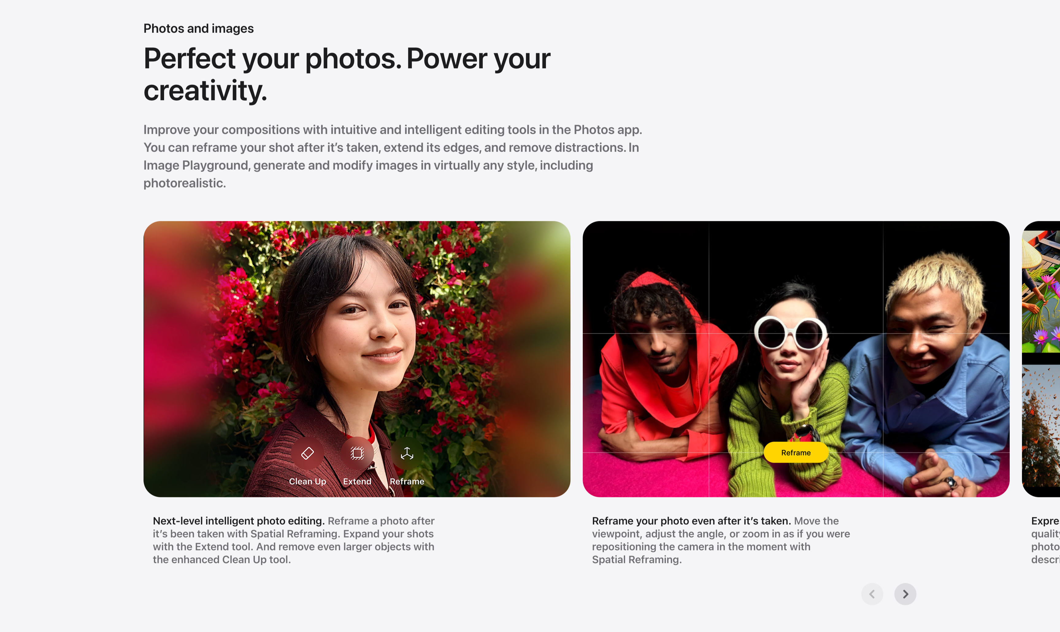
Photos And Images Editing Carousel
A photo-editing showcase carousel introduced by a small 'Photos and images' label and a two-line headline, 'Perfect your photos. Power your creativity.', with a gray paragraph about reframing, extending and Image Playground. Below, large rounded image cards scroll horizontally: a portrait of a woman against red bougainvillea overlaid with Clean Up, Extend and Reframe tool icons ('Next-level intelligent photo editing.'), and a wide shot of three friends on a pink floor with a Reframe grid and yellow 'Reframe' button ('Reframe your photo even after it's taken.'), with a third card just entering from the right edge. Bold-lead captions sit beneath each card and circular previous/next arrows anchor the lower right. The full-bleed photography and on-image tool chips make the editing features feel tangible.
Apple ↗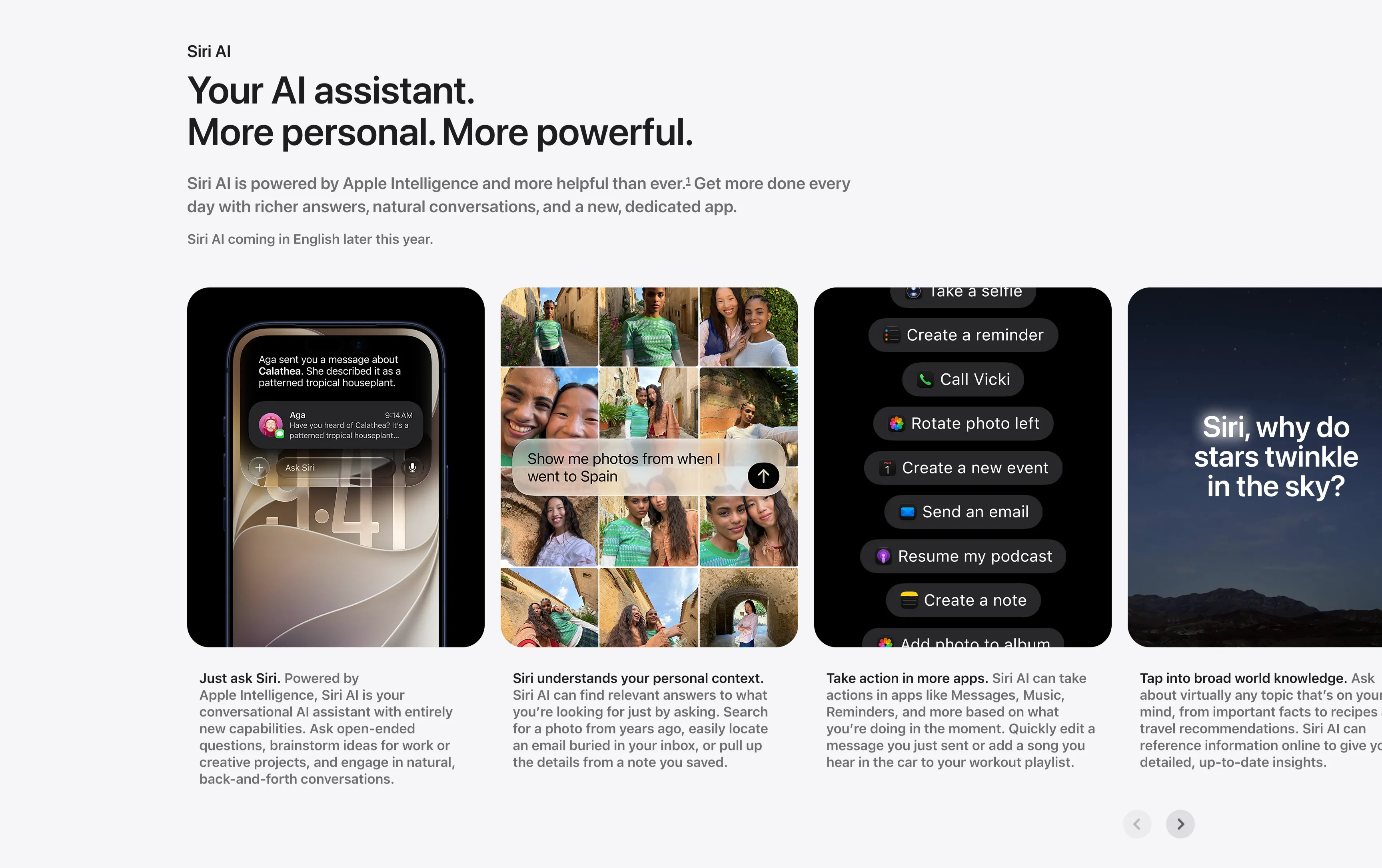
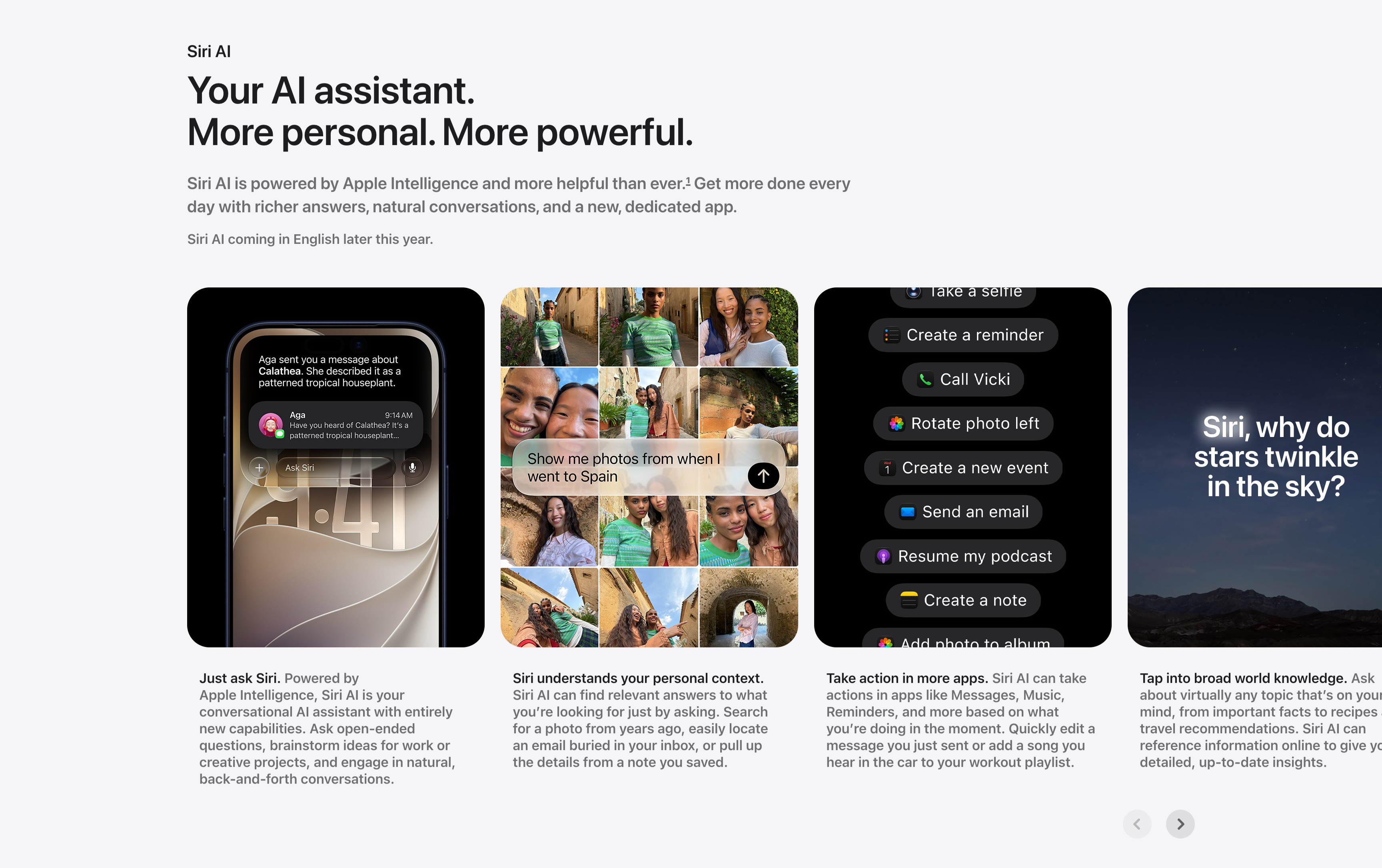
Siri AI Feature Card Carousel
A horizontally scrolling feature carousel under a small 'Siri AI' label and a two-line headline, 'Your AI assistant. More personal. More powerful.', with a gray supporting paragraph and a 'Siri AI coming in English later this year.' note. Four tall rounded cards sit in a row, each a screenshot with a bold-lead caption below it: a phone showing an 'Ask Siri' message thread ('Just ask Siri.'), a photo grid responding to 'Show me photos from when I went to Spain' ('Siri understands your personal context.'), a dark list of Siri actions like 'Create a reminder' and 'Call Vicki' ('Take action in more apps.'), and a starry-sky card asking 'Siri, why do stars twinkle in the sky?' ('Tap into broad world knowledge.'). A pair of circular previous/next arrows in the lower right confirms it scrolls. The captioned-screenshot rhythm makes each capability easy to scan.
Apple ↗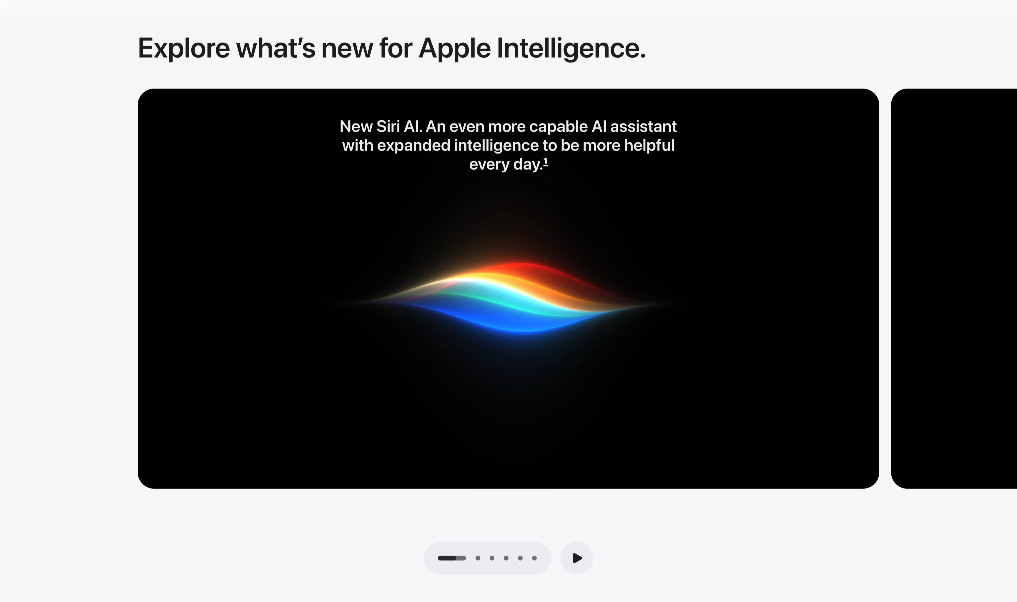
Explore What's New Dark Media Carousel
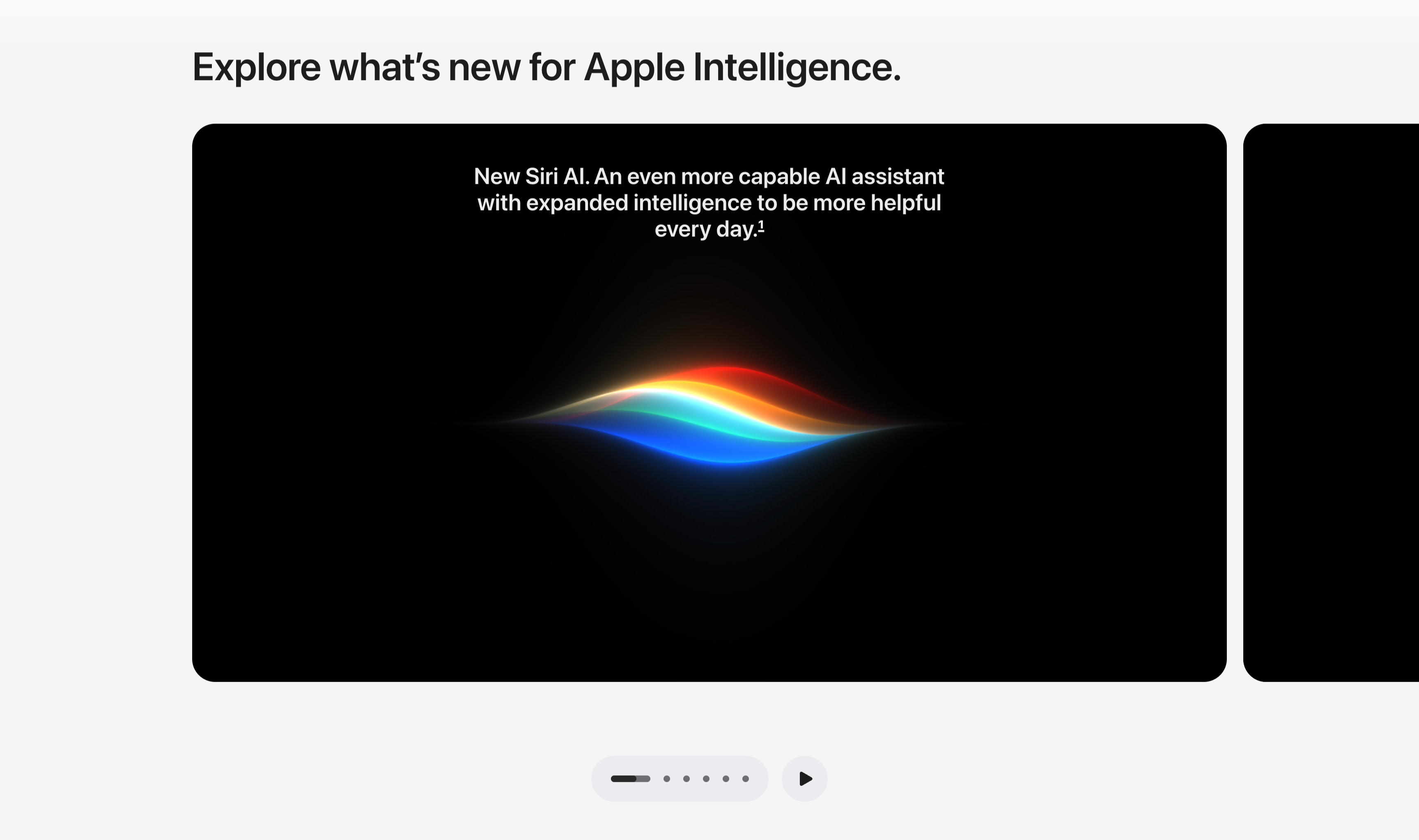
A media carousel set on a light gray background, led by a left-aligned section heading, 'Explore what's new for Apple Intelligence.' Below it a large black rounded-corner card dominates the row, with the edge of a second identical dark card peeking in from the right to signal scrollability. The active card centers white caption text — 'New Siri AI. An even more capable AI assistant with expanded intelligence to be more helpful every day.' — above the colorful Siri waveform glowing in red, orange, blue and cyan on black. Beneath the carousel sits a pill-shaped pagination control with five dots (the first elongated to mark position) and a circular play button to auto-advance. The dark cards against the pale frame give the section a cinematic, gallery-like feel.
Apple ↗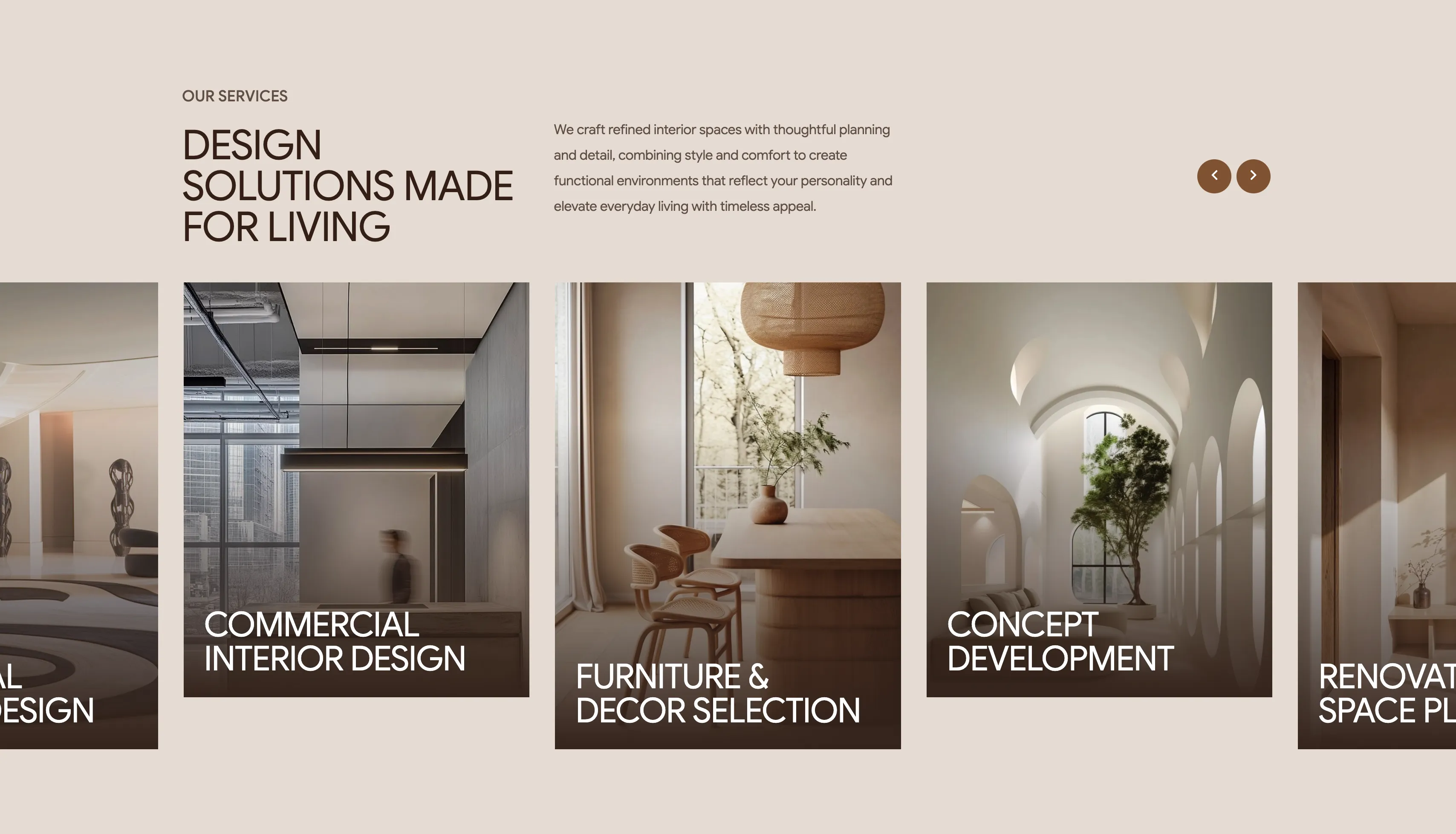
Intrio Services Image-Card Carousel
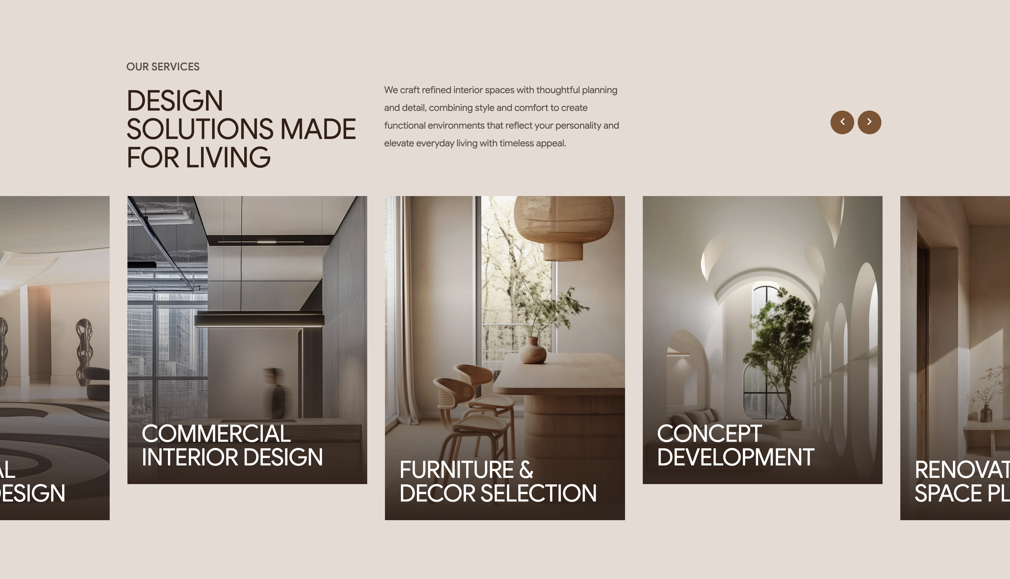
A services showcase on a soft beige background built as a horizontal carousel of tall image cards. The header area reads 'OUR SERVICES' as an eyebrow above a large brown heading, 'DESIGN SOLUTIONS MADE FOR LIVING', with a paragraph of supporting copy to the right and two circular bronze arrow buttons for navigating the slider. Beneath it, full-height portrait cards each show an interior photograph darkened by a gradient overlay with the service name set in white at the bottom: visible cards include 'Commercial Interior Design', 'Furniture & Decor Selection' and 'Concept Development', with neighbouring cards ('Residential Design', 'Renovation & Space Planning') cropped at the left and right edges to signal more on scroll. The consistent dark-overlaid imagery and white labels create a clean, gallery-like rhythm. The partially shown cards plus arrow controls make the carousel interaction obvious.
Madebydesignesia ↗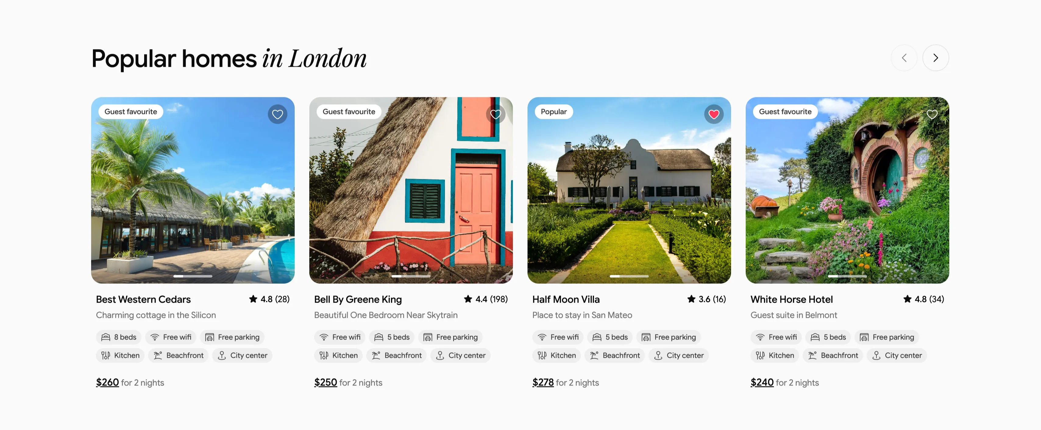
Popular Homes In London Listing Carousel
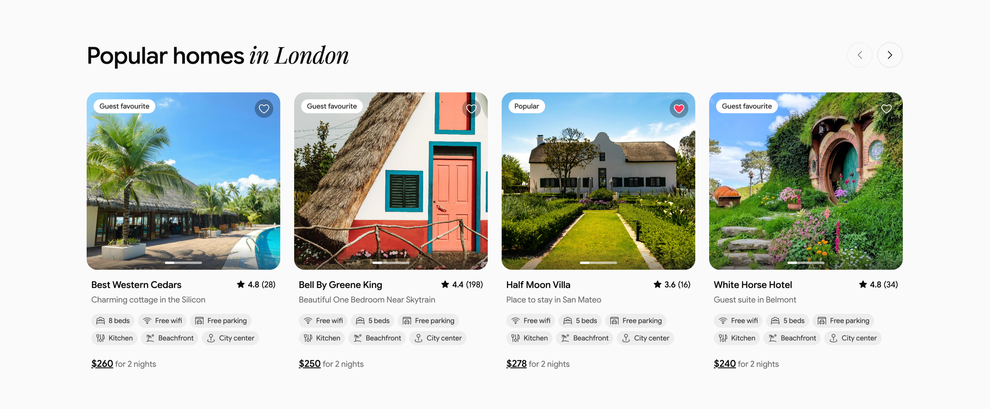
A property carousel headed 'Popular homes in London', with 'in London' in italic serif and circular previous/next arrows at upper-right. Four rounded listing cards sit in a row, each a large property photo topped with a status pill ('Guest favourite' or 'Popular') and a heart icon, above a title, location subline and star rating. The listings are 'Best Western Cedars' ★4.8 (28) at $260, 'Bell By Greene King' ★4.4 (198) at $250, 'Half Moon Villa' ★3.6 (16) at $278, and 'White Horse Hotel' ★4.8 (34) at $240. Each card stacks two rows of amenity chips (Free wifi, beds, Free parking, Kitchen, Beachfront, City center) and an underlined price with 'for 2 nights'. The consistent card anatomy and arrow controls make it a familiar marketplace listing carousel.
Ceepii-nextjs-template ↗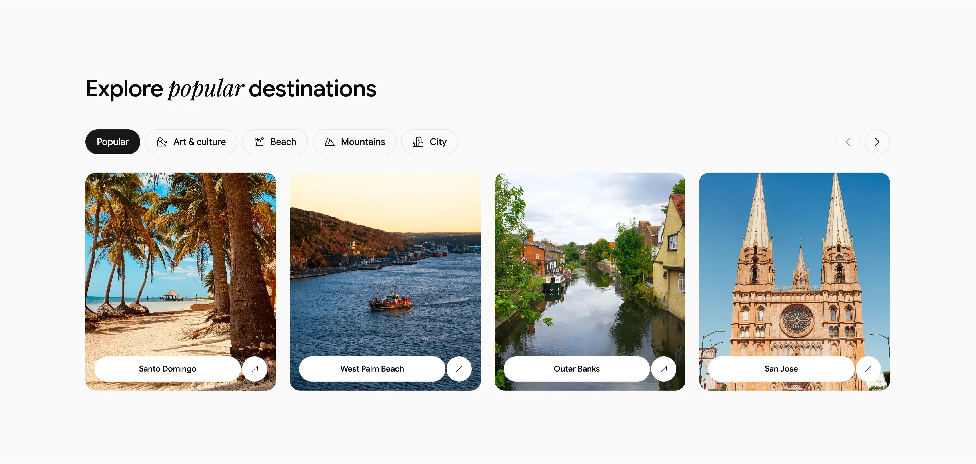
Explore Popular Destinations Carousel With Tabs
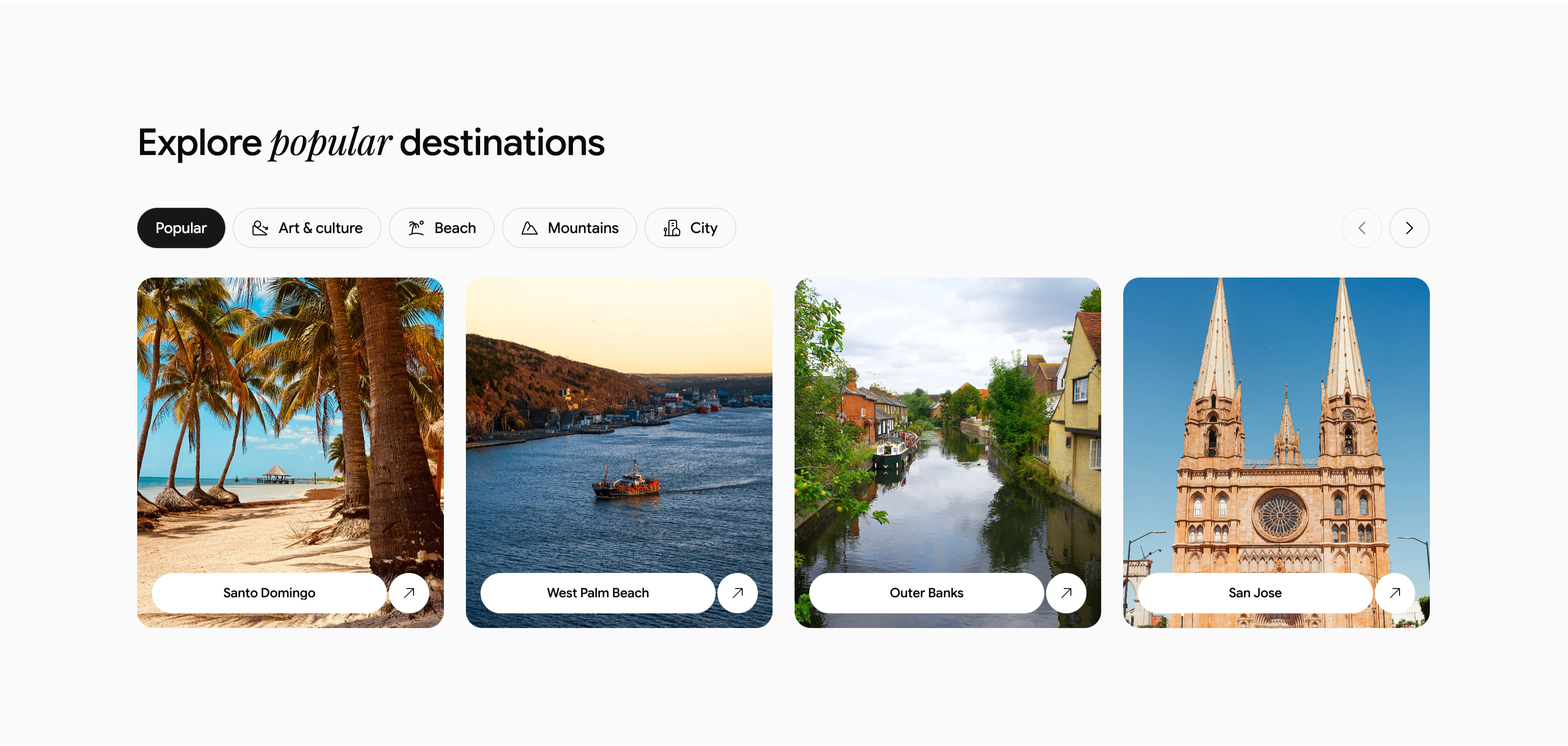
A destination browser headed 'Explore popular destinations', with 'popular' set in italic serif. Beneath it runs a row of filter tabs — a dark active 'Popular' pill followed by outlined 'Art & culture', 'Beach', 'Mountains' and 'City', each prefixed by a small icon — with circular previous/next carousel arrows at the far right. The body is a four-up row of rounded photographic cards, each with a white pill label and an up-right arrow: 'Santo Domingo' (a palm-lined beach), 'West Palm Beach' (a boat on water), 'Outer Banks' (a canal lined with houses), and 'San Jose' (a twin-spired cathedral). On a near-white background, the tabbed filtering plus arrow controls clearly signal a swappable, scrollable destination carousel.
Ceepii-nextjs-template ↗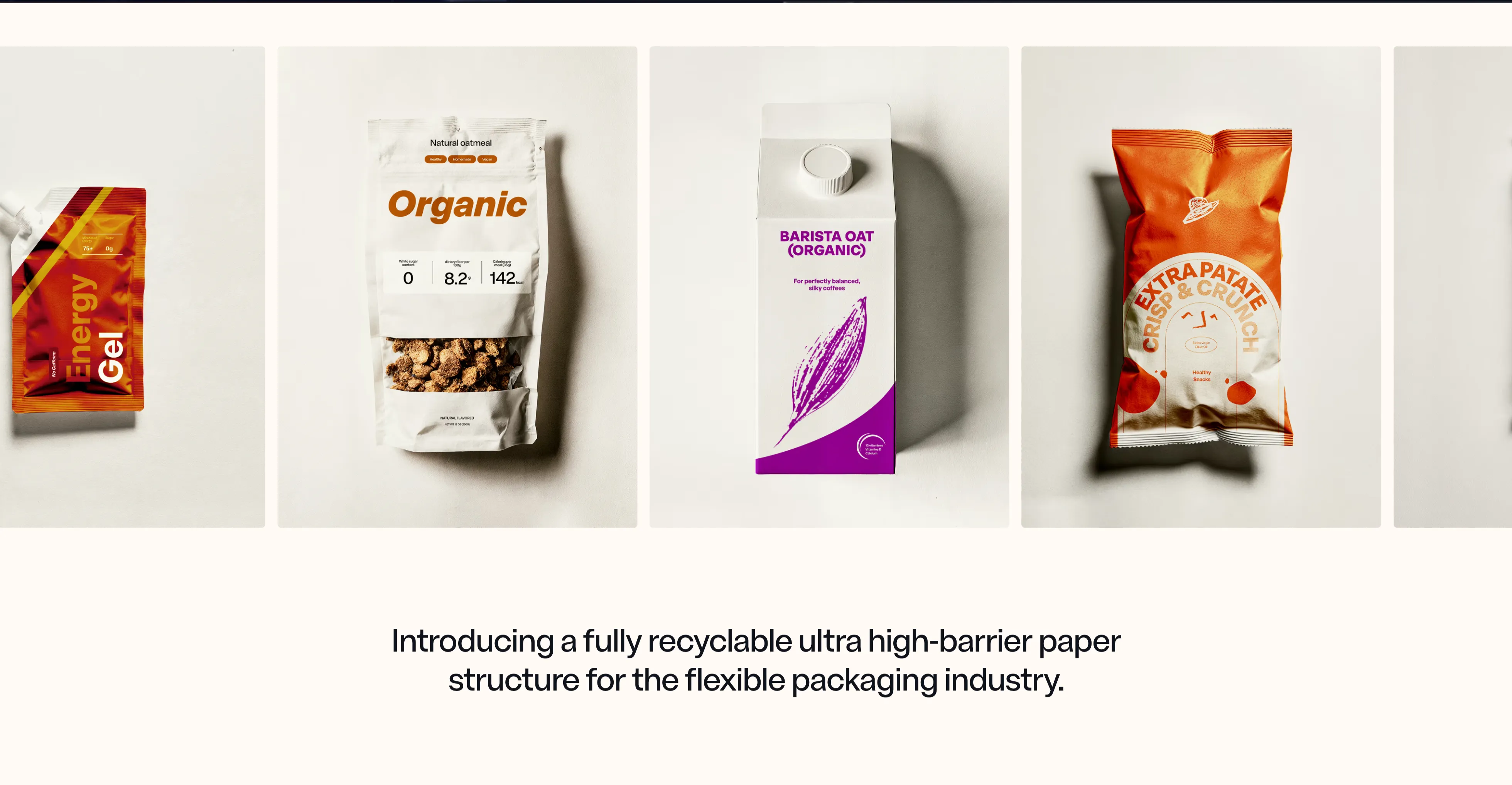
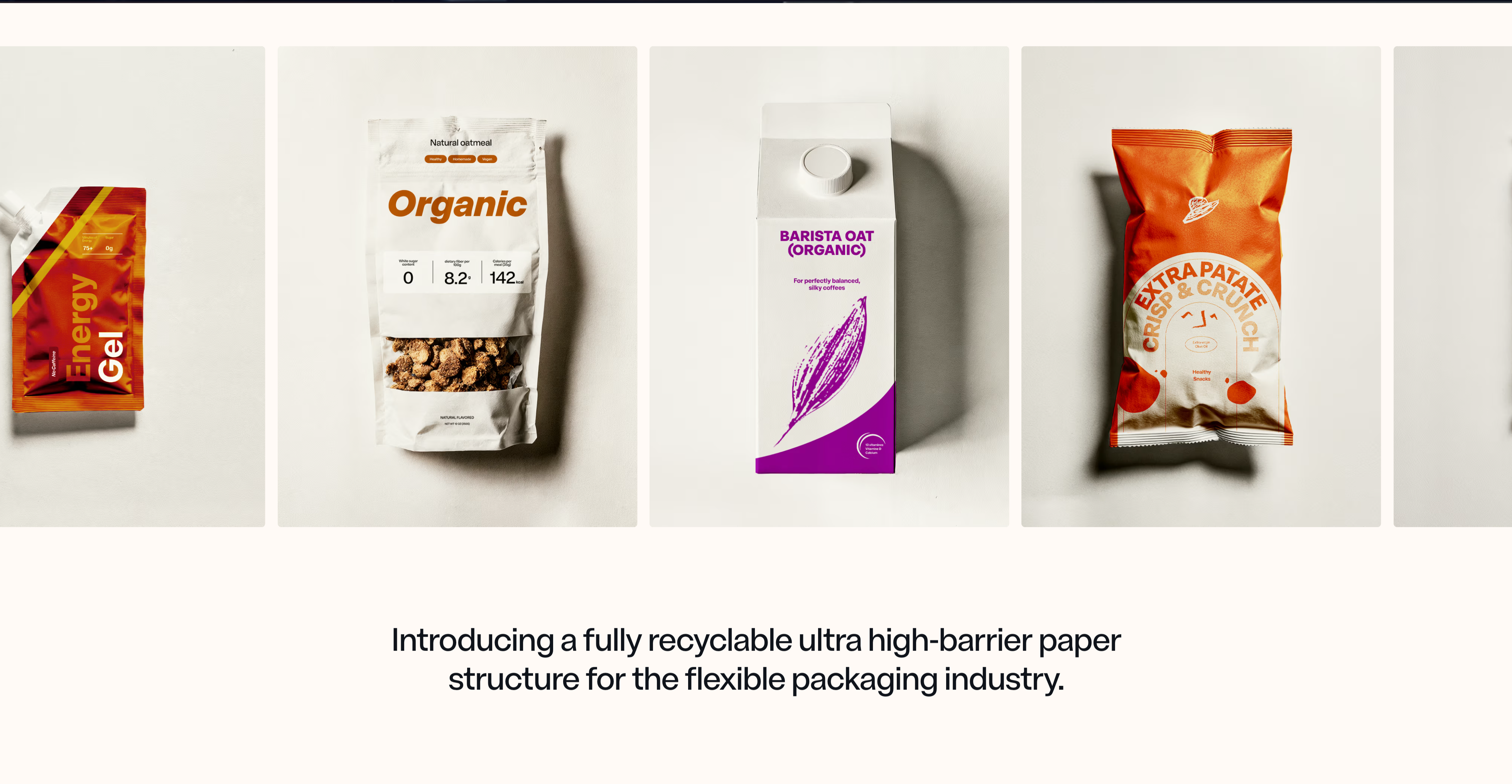
NFINITE Product Showcase Carousel
A horizontally scrolling product carousel set on a warm off-white background. Four packaging mockups sit side by side in tall portrait frames with subtle grey backdrops and soft drop shadows — a red foil energy-gel pouch (partially cut off at the left edge), a white 'Organic' stand-up oatmeal pouch with nutrition callouts, a 'Barista Oat (Organic)' carton with a purple leaf graphic, and an orange 'Extra Patate Crisp & Crunch' chip bag — with the faint edge of a fifth frame peeking in at the right to signal more. The peeking frames and uniform sizing make the row's scrollability obvious without visible arrows or dots. Centered beneath the rail, a large dark-charcoal serif-tinged sans heading reads 'Introducing a fully recyclable ultra high-barrier paper structure for the flexible packaging industry.' The clean neutral canvas and consistent studio photography let the colourful real-world packs carry the visual interest and prove the material's range across food and beverage formats.
Nfinitepaper ↗

Our Medical Team Portrait Carousel
A team section with a centered, scaled-up active portrait flanked by smaller cards, each labeled with the dentist's name and specialty, plus pagination dots.
Behance ↗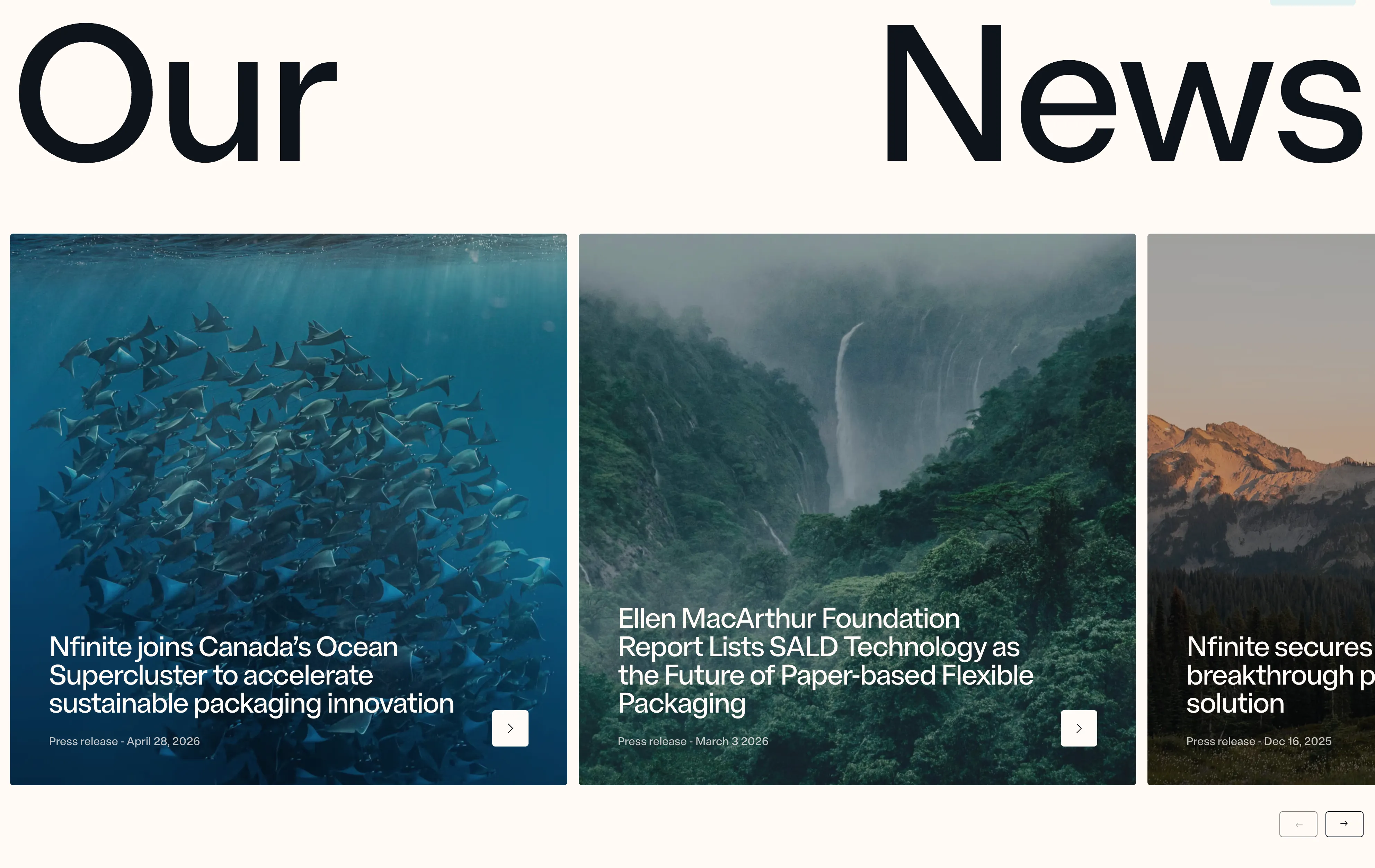
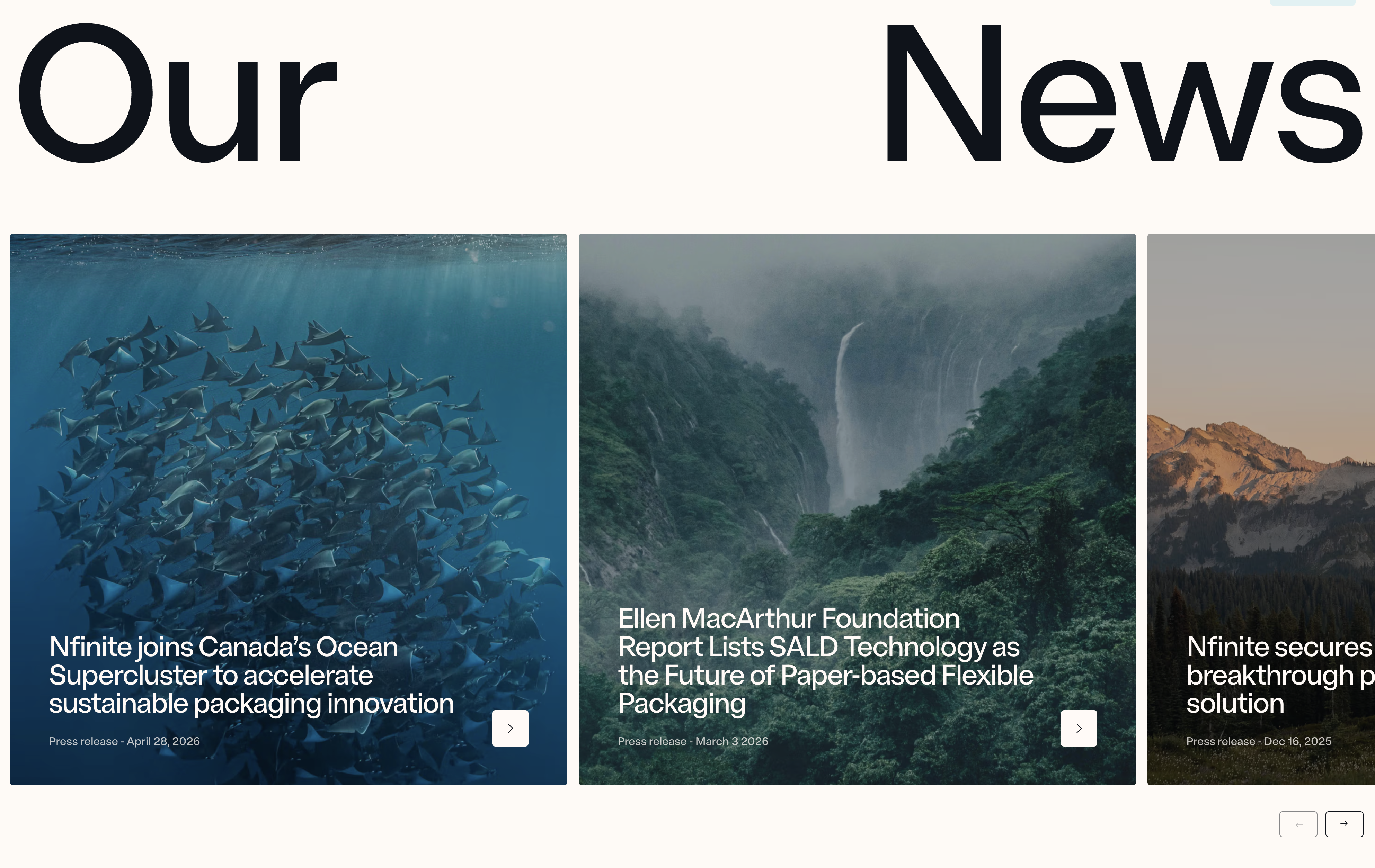
Nfinite News Article Slider
A horizontal slider of large article cards, each with a full-bleed image, an overlaid headline, a press-release date label, and an arrow link, introduced by an oversized split heading and controlled with previous and next navigation. Best used to surface recent news, press releases, or blog posts in a browsable, editorial layout.
Nfinitepaper ↗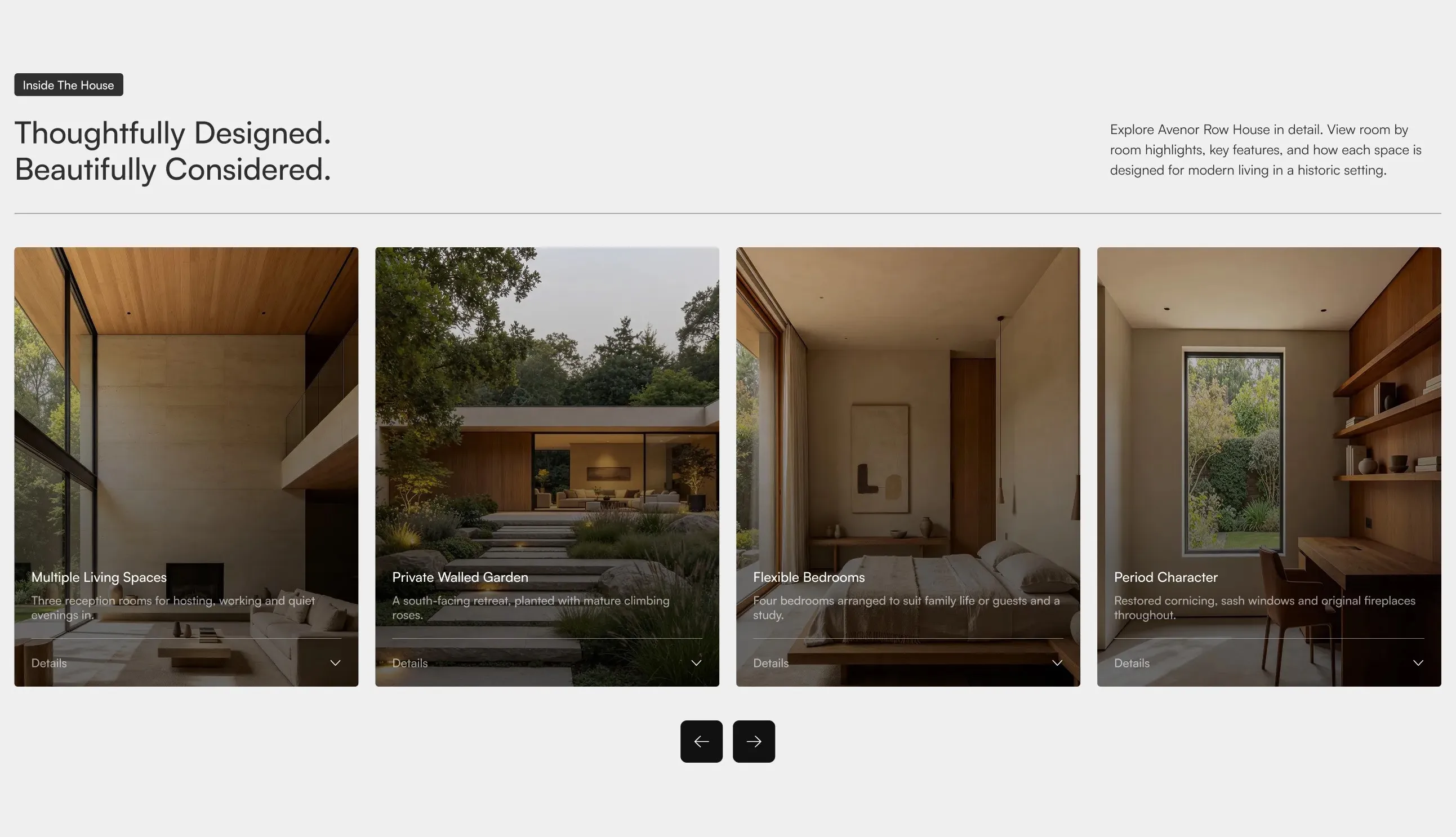
Avenor Feature Cards Carousel
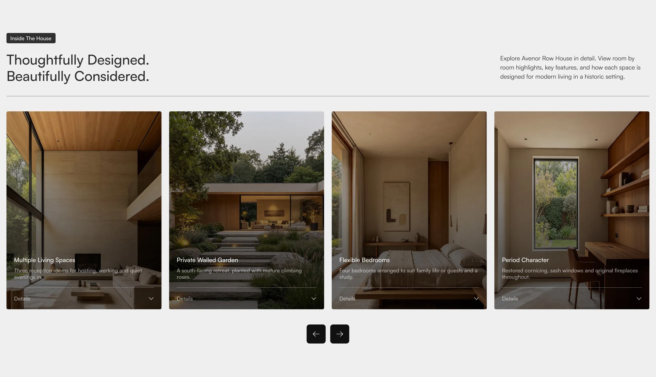
A horizontal carousel of tall image cards, each with an overlaid title, short description, and a "Details" expand control, introduced by a badge, a two-part headline on the left, and supporting copy on the right, with previous and next navigation controls below. Best used on property or product pages to highlight key features in a scrollable, browsable format.
Dribbble ↗