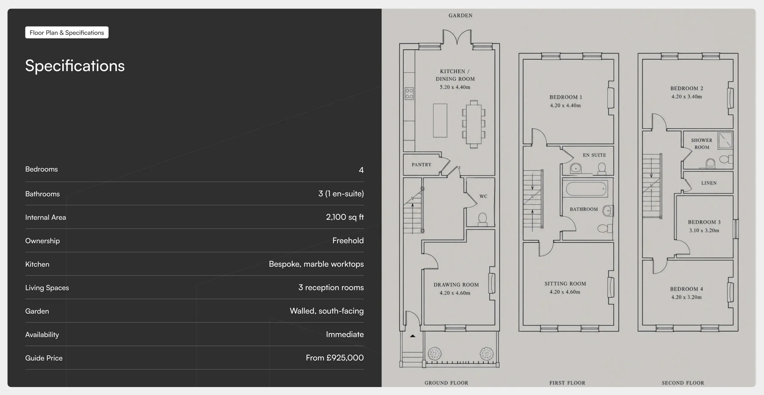
Avenor Specifications & Floor Plan
Description
A two-panel split layout pairing a dark specifications table on the left, with label and value rows for key property details, against a light floor plan panel on the right showing room layouts across multiple levels. Best used on property pages to present technical specs alongside a visual floor plan.
Related
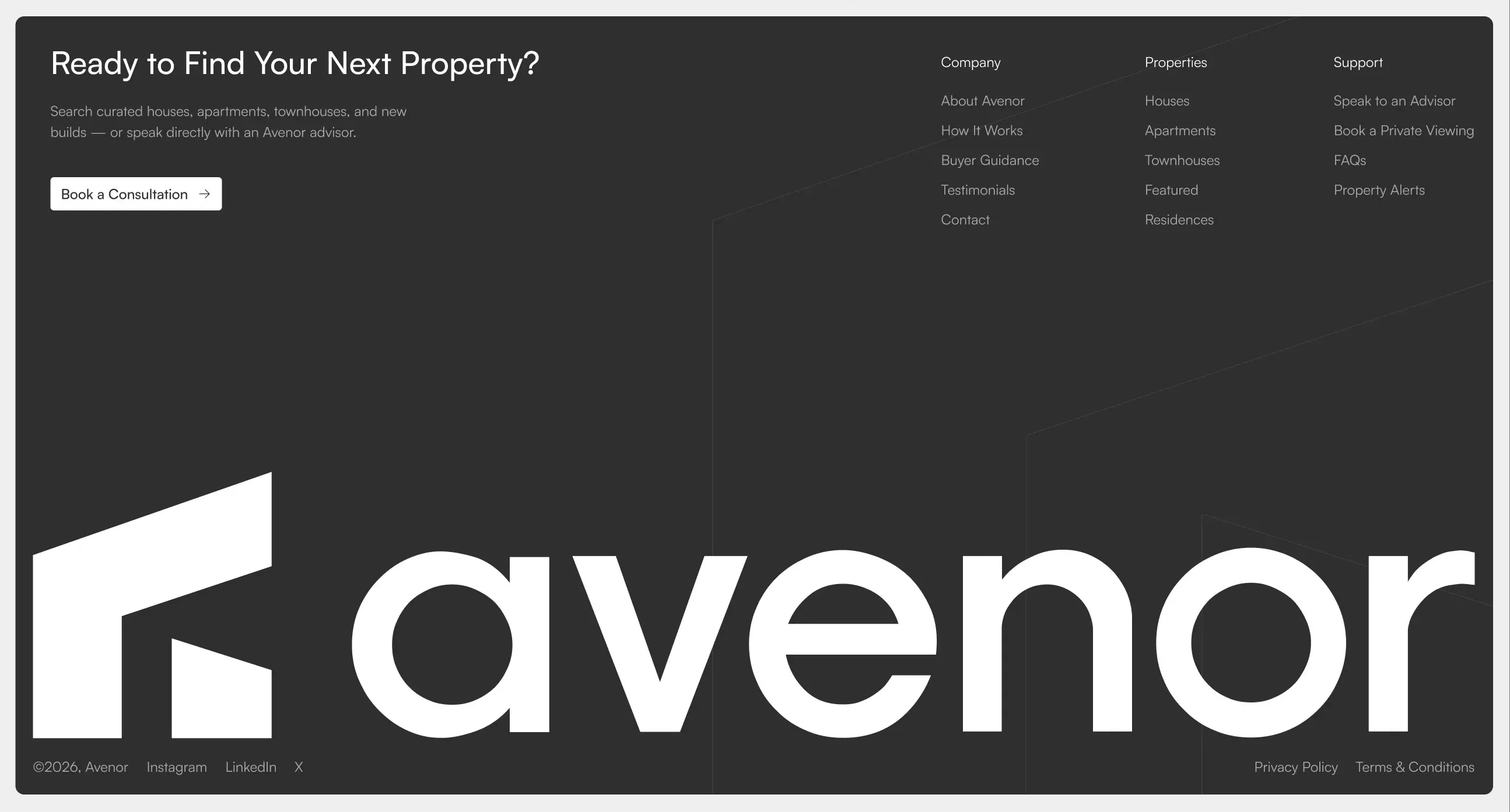
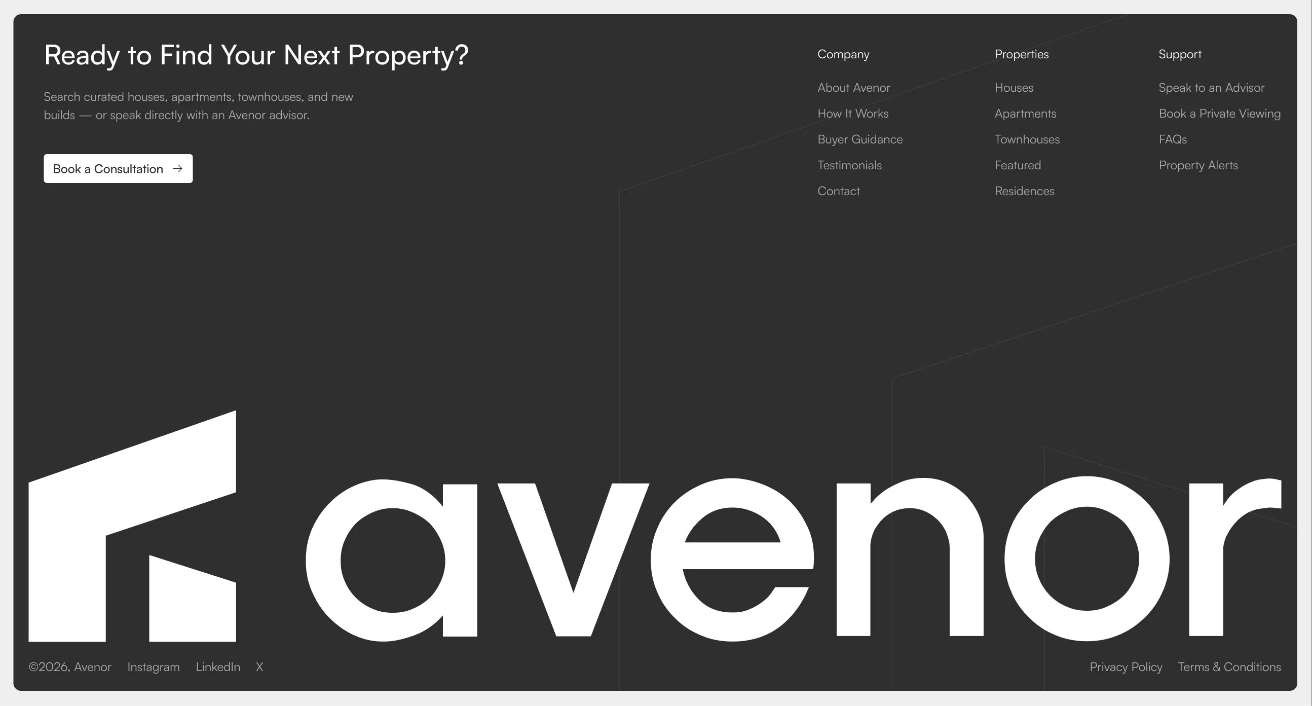
Avenor Footer with CTA & Oversized Logo
A dark full-width footer pairing a closing call-to-action headline, supporting text, and a button on the left with multi-column navigation links on the right, anchored by an oversized brand logo and a bottom bar for copyright, social links, and legal pages. Best used as the closing section of a site to prompt a final action and surface site-wide navigation.
Dribbble ↗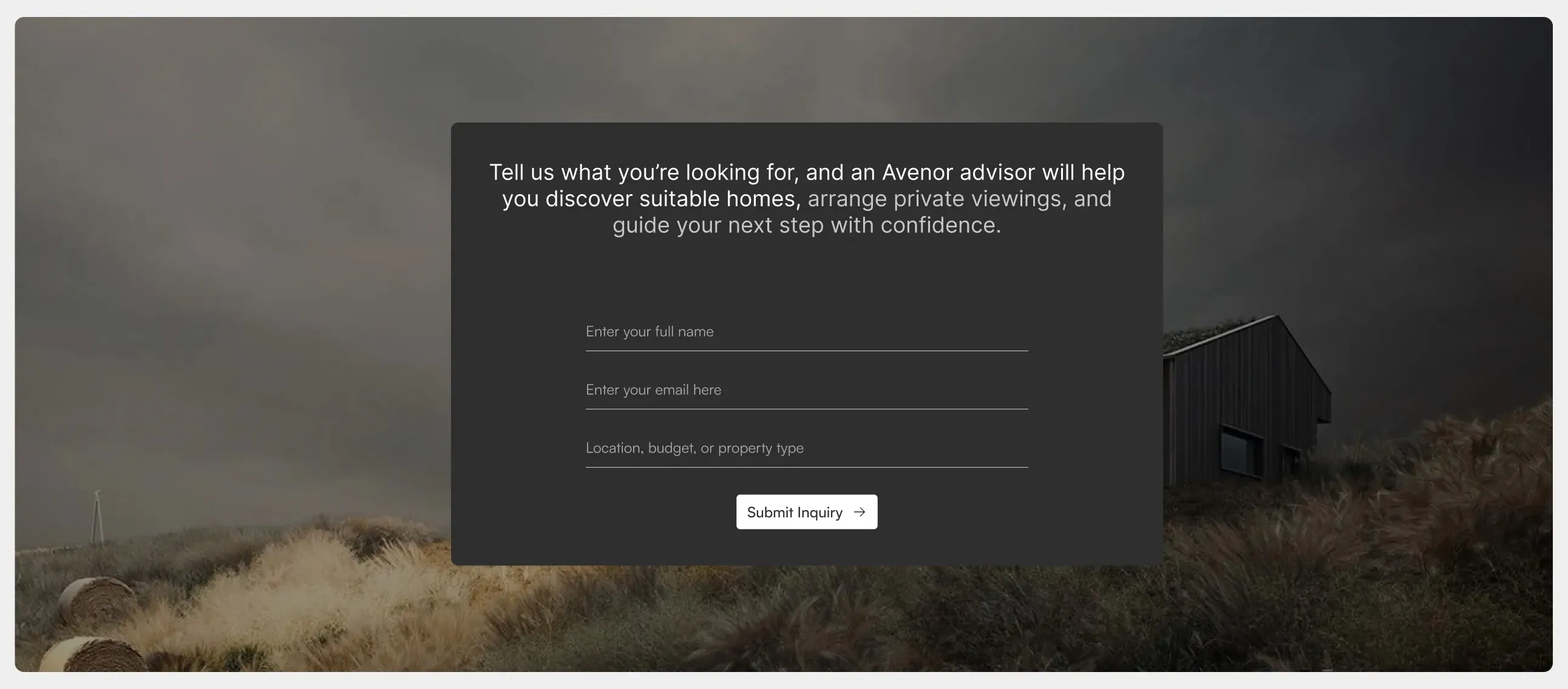
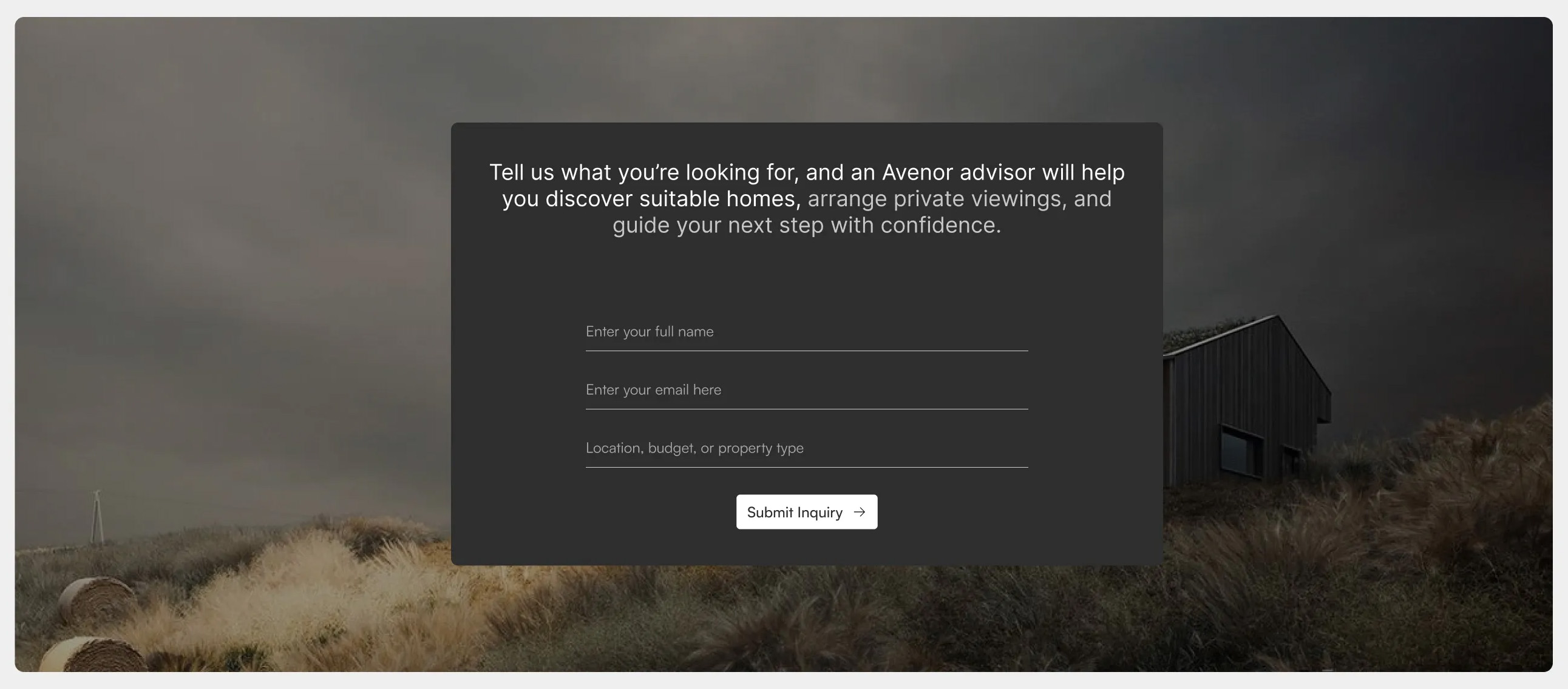
Avenor Inquiry Form with Background
A centred contact form set in a dark card over a full-width background image, with an introductory headline, underline-style input fields for name, email, and free-text details, and a primary submit button. Best used as a lead-capture or enquiry section to invite visitors to get in touch.
Dribbble ↗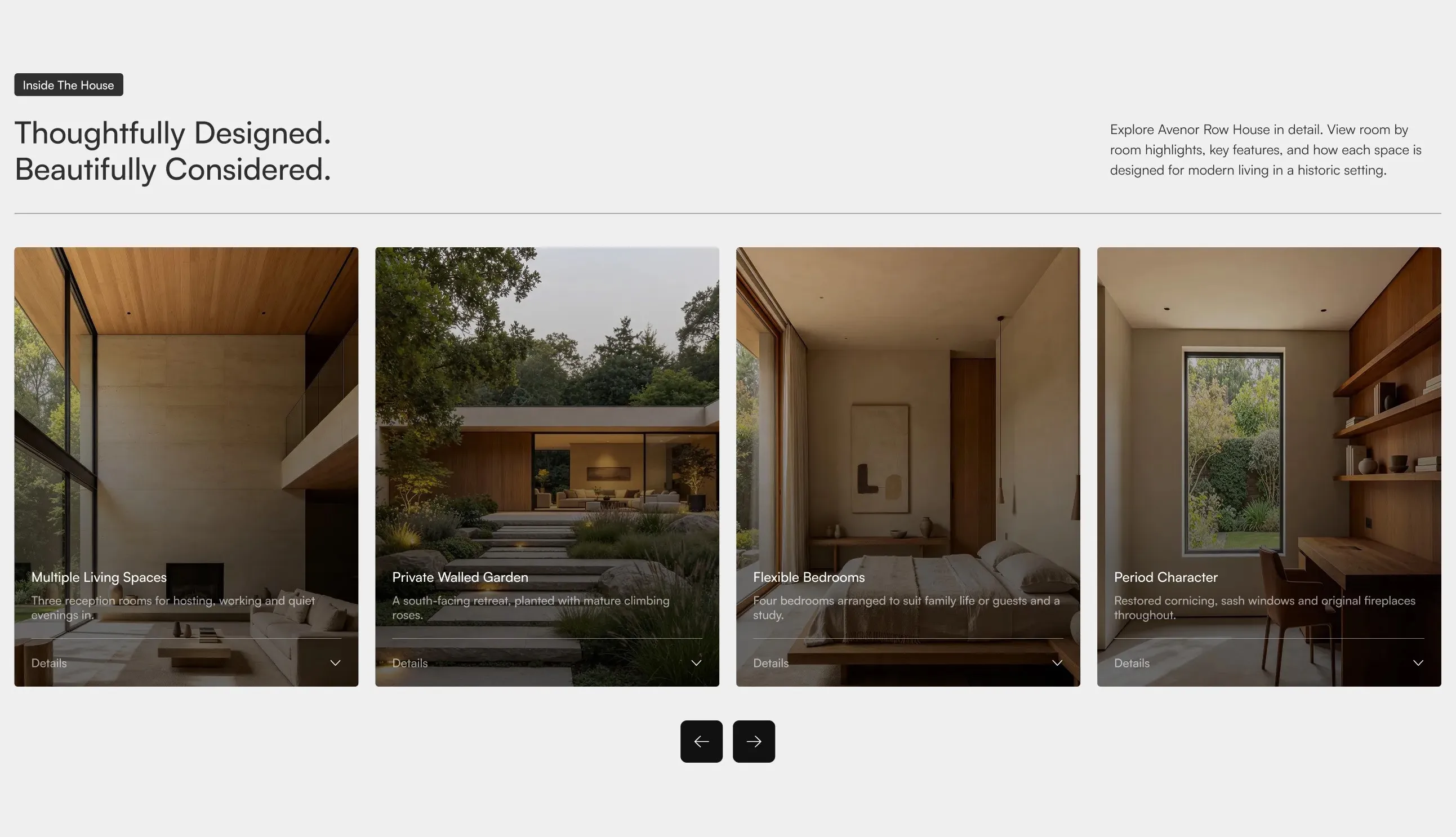
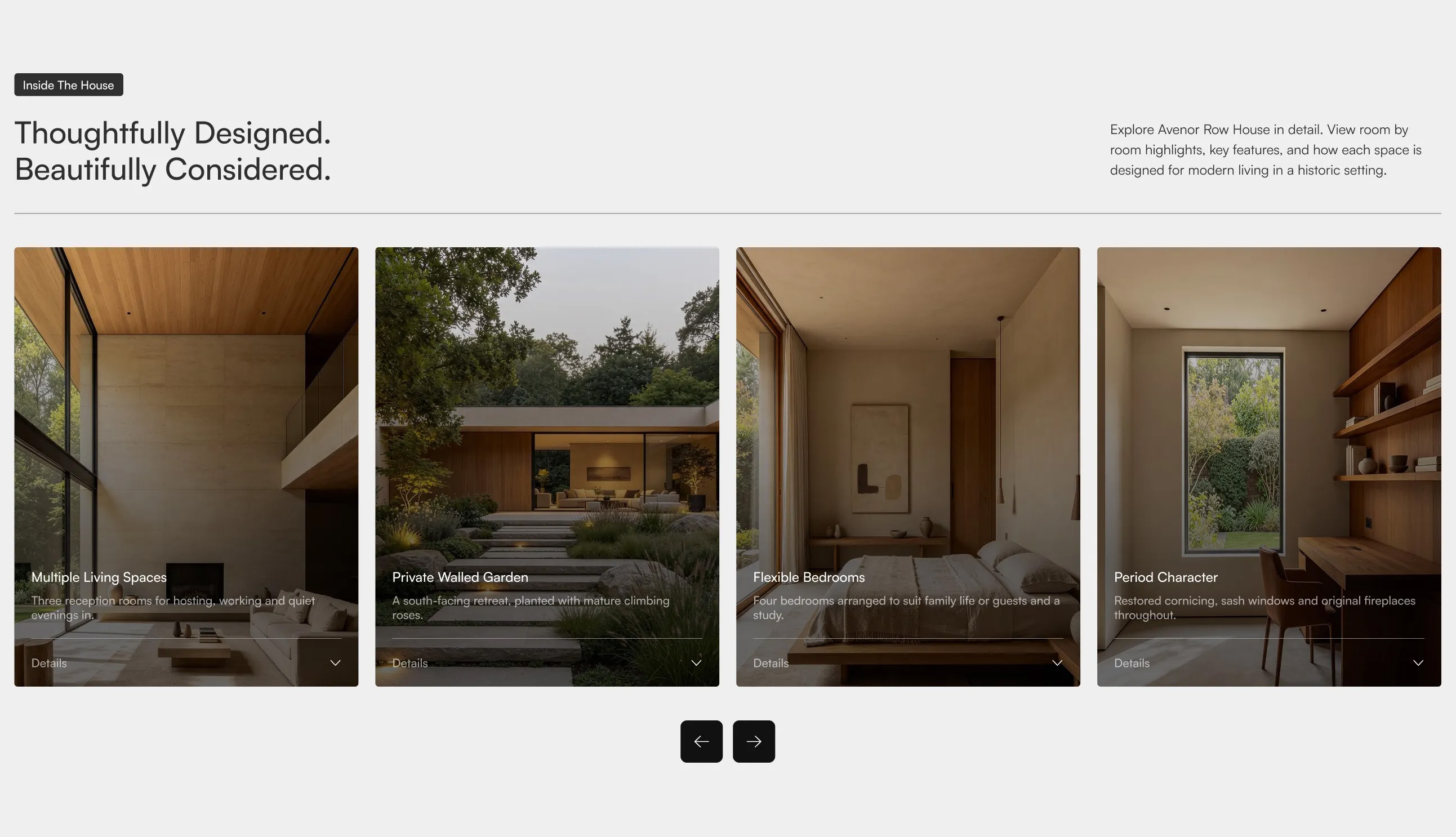
Avenor Feature Cards Carousel
A horizontal carousel of tall image cards, each with an overlaid title, short description, and a "Details" expand control, introduced by a badge, a two-part headline on the left, and supporting copy on the right, with previous and next navigation controls below. Best used on property or product pages to highlight key features in a scrollable, browsable format.
Dribbble ↗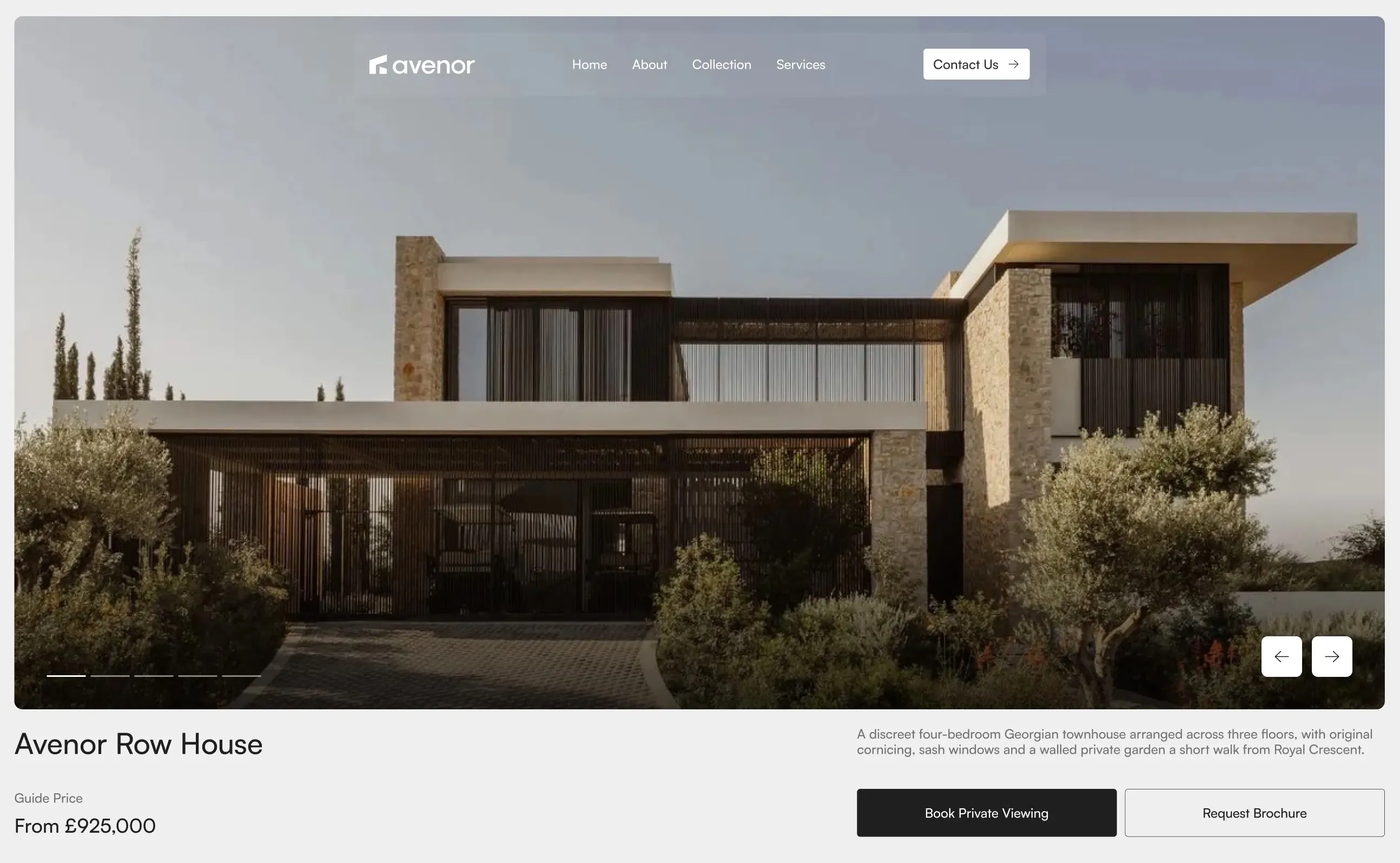
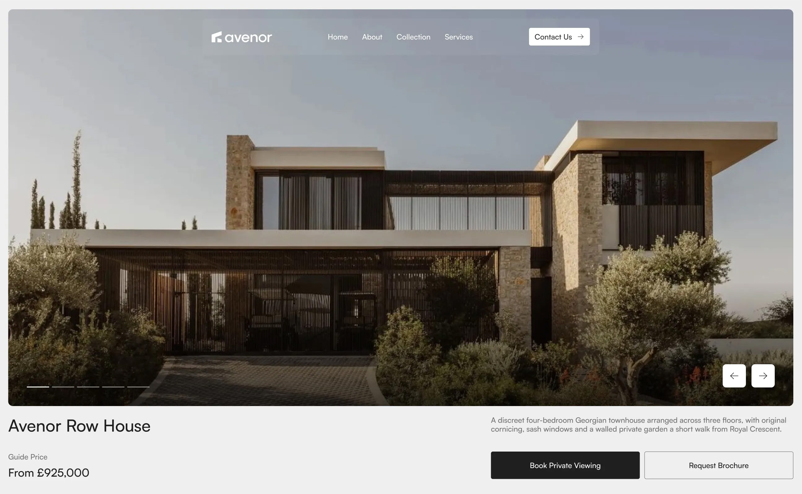
Avenor Property Hero with Carousel
A full-width hero featuring a large property image carousel with navigation controls and slide indicators, topped by a logo and navigation bar, with a property title, guide price, descriptive summary, and primary action buttons arranged below. Best used at the top of a property page to introduce the listing and drive viewing or brochure requests.
Dribbble ↗Similar table sections
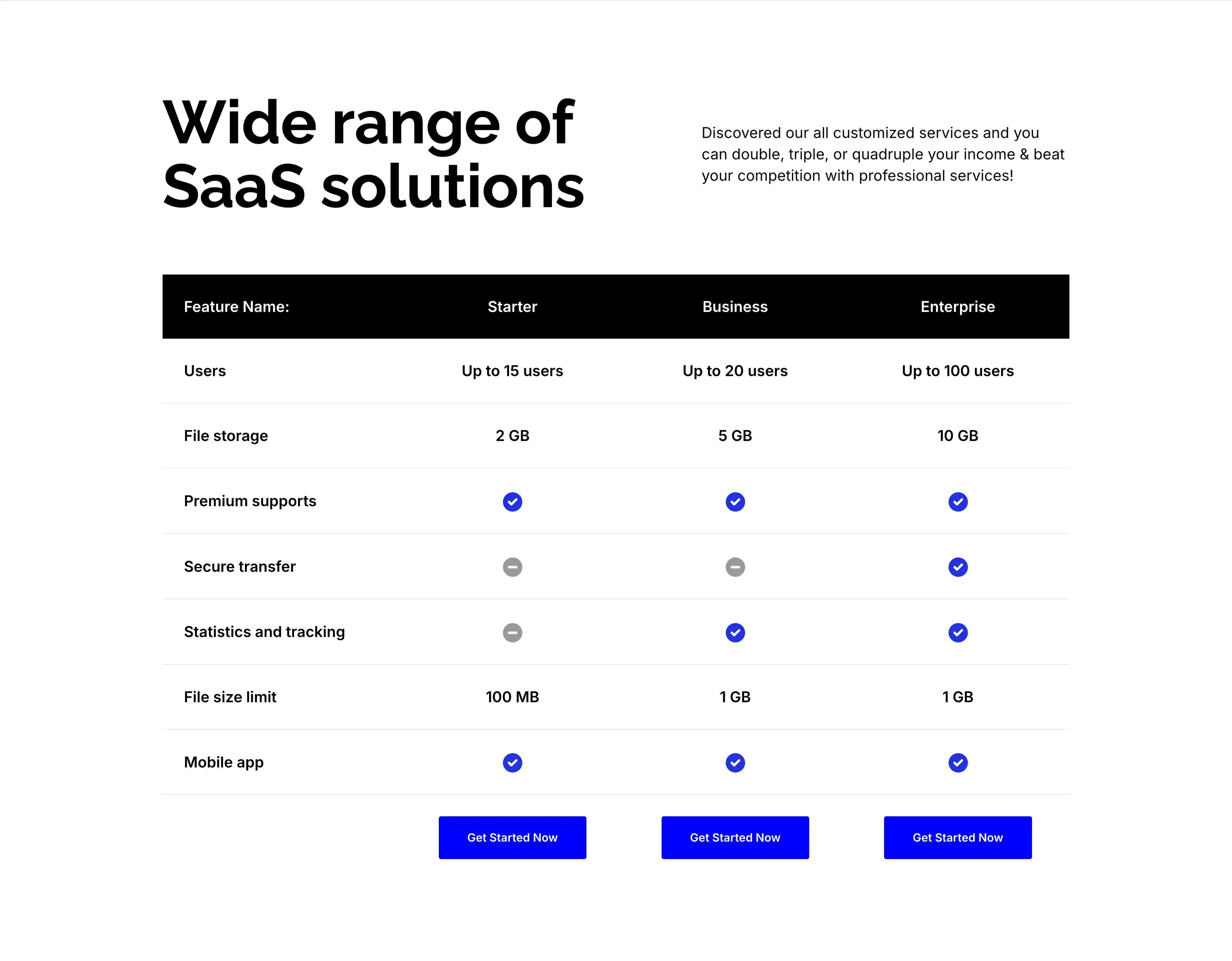
Wide Range Of SaaS Solutions Comparison Table
A plan-comparison section on white, introduced by an oversized 'Wide range of SaaS solutions' heading with a short right-column intro. Below sits a comparison table whose black header row names three columns — Starter, Business and Enterprise — over a 'Feature Name:' label. Successive rows compare features down the left ('Users', 'File storage', 'Premium supports', 'Secure transfer', 'Statistics and tracking', 'File size limit', 'Mobile app'), filled with either text values ('Up to 15 users', '2 GB', '100 MB') or blue check / gray dash status icons per tier. A row of blue 'Get Started Now' buttons under each column closes the table. The gridded matrix makes tier-by-tier differences easy to compare at a glance.
Zubuz ↗