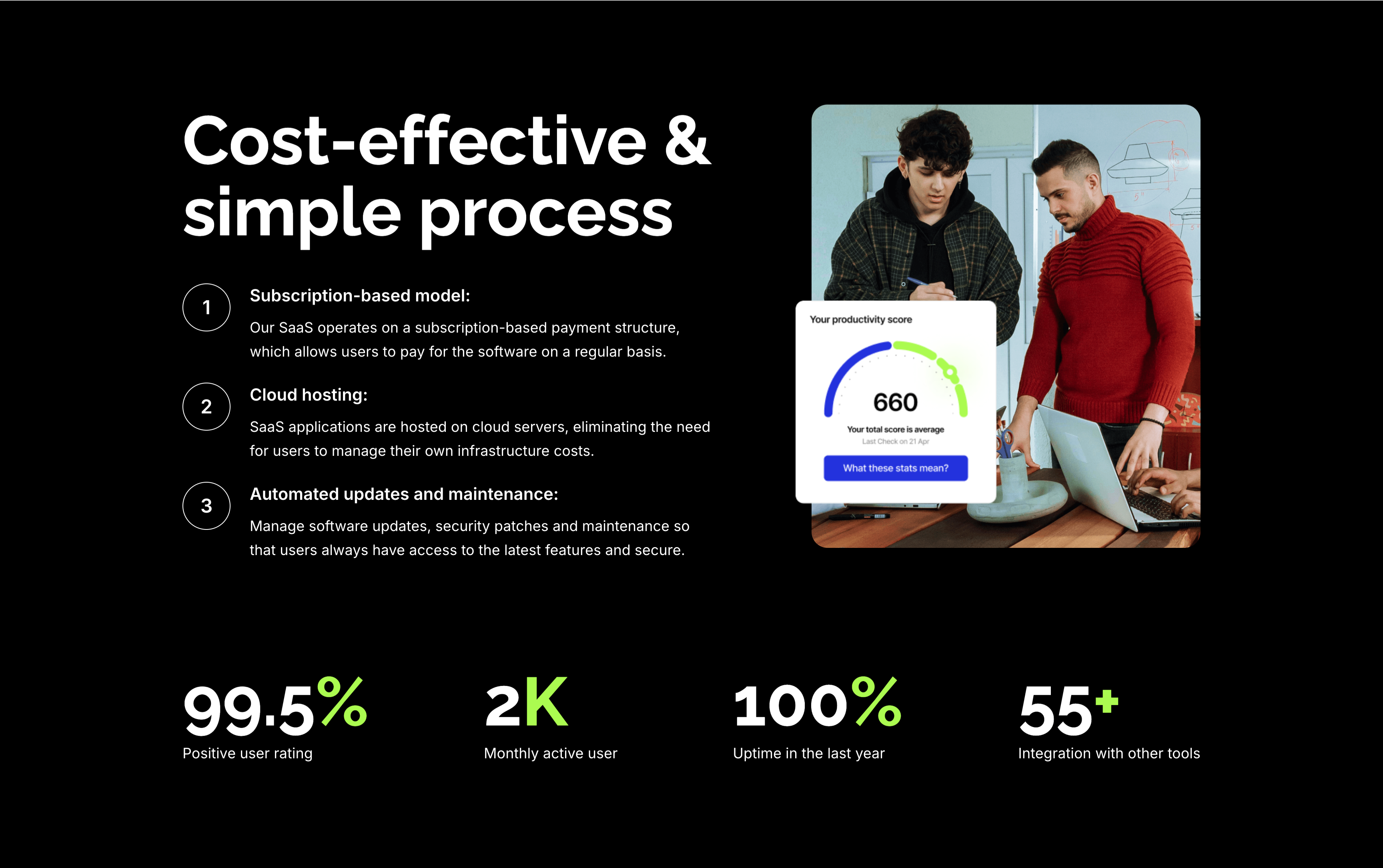
Cost-Effective Simple Process With Stats
Description
A feature section on a solid black background. The left column stacks an oversized white ‘Cost-effective & simple process’ heading over three numbered points — ‘Subscription-based model:’, ‘Cloud hosting:’ and ‘Automated updates and maintenance:’ — each with a circled number and a short white description. The right column shows a rounded photo of two colleagues at a laptop with a floating white ‘Your productivity score’ card reading 660. A row of four lime-green-accented stats runs across the bottom: ‘99.5%’ positive user rating, ‘2K’ monthly active users, ‘100%’ uptime in the last year and ‘55+’ integrations. The dark canvas, numbered list and green metrics give the section a confident, data-backed tone.
Related
Take Your Startup Dark Footer With CTA
The dark Zubaz footer on a solid black background, opening with a call-to-action band: an oversized white 'Take your startup to the next level' headline on the left and a solid blue 'Get started now' button on the right, above a hairline divider. Below, the footer proper shows the Zubaz logo with a short blurb and a row of Twitter, Facebook, LinkedIn and GitHub icons, beside grouped link columns — 'Navigation' (Demos, About Us, Services, Pages, Contact), 'Utility pages' (Instructions, Style guide, Licenses, 404 Not found, Password protected) and a 'Contact us' column with a phone, email and Howard Street address. A centered '(c)Copyright 2024, All Rights Reserved by Mthemeus' line closes it. Pairing a bold recruiting CTA with the full footer makes it a strong page-closing block.
Zubuz ↗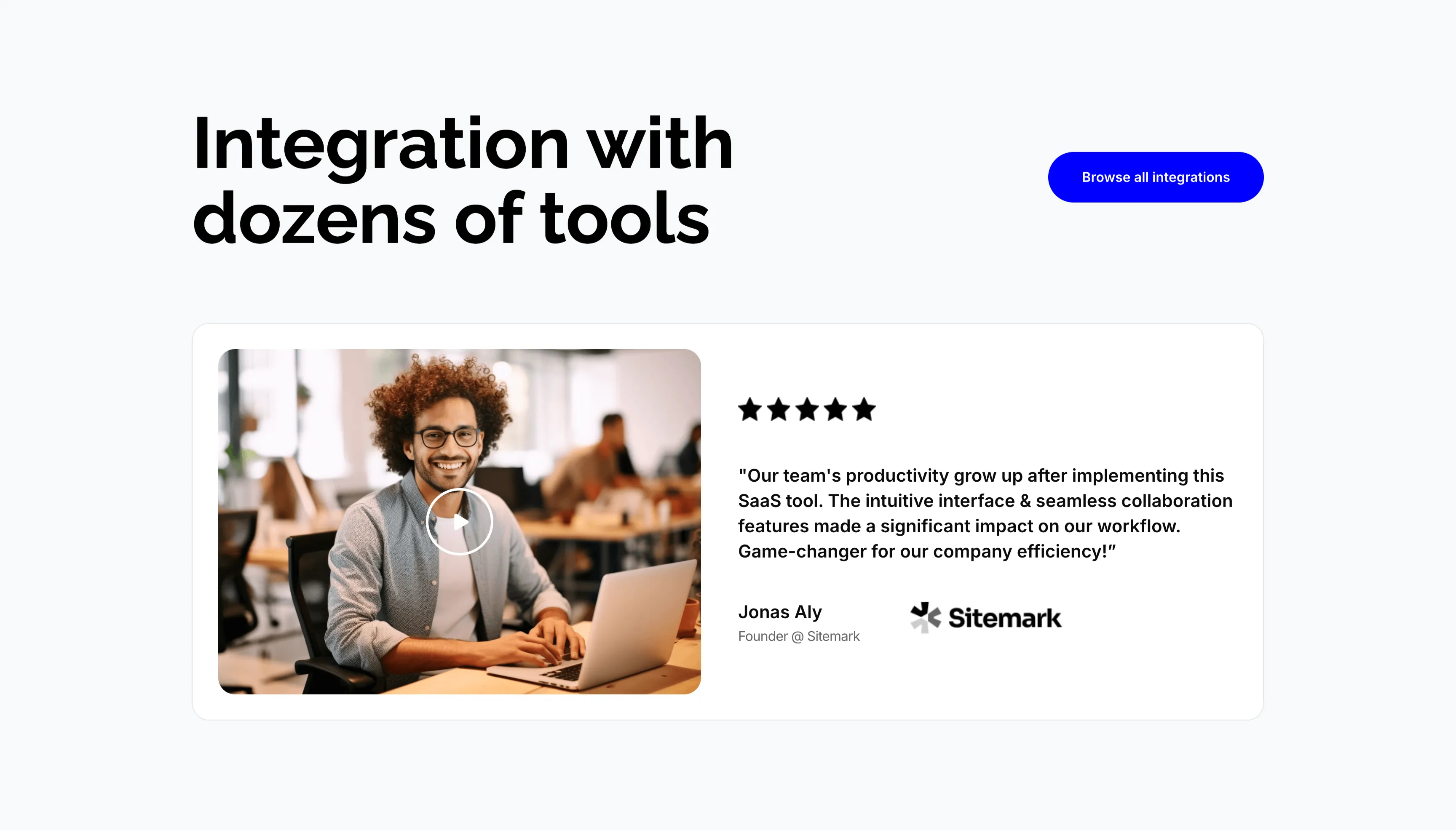
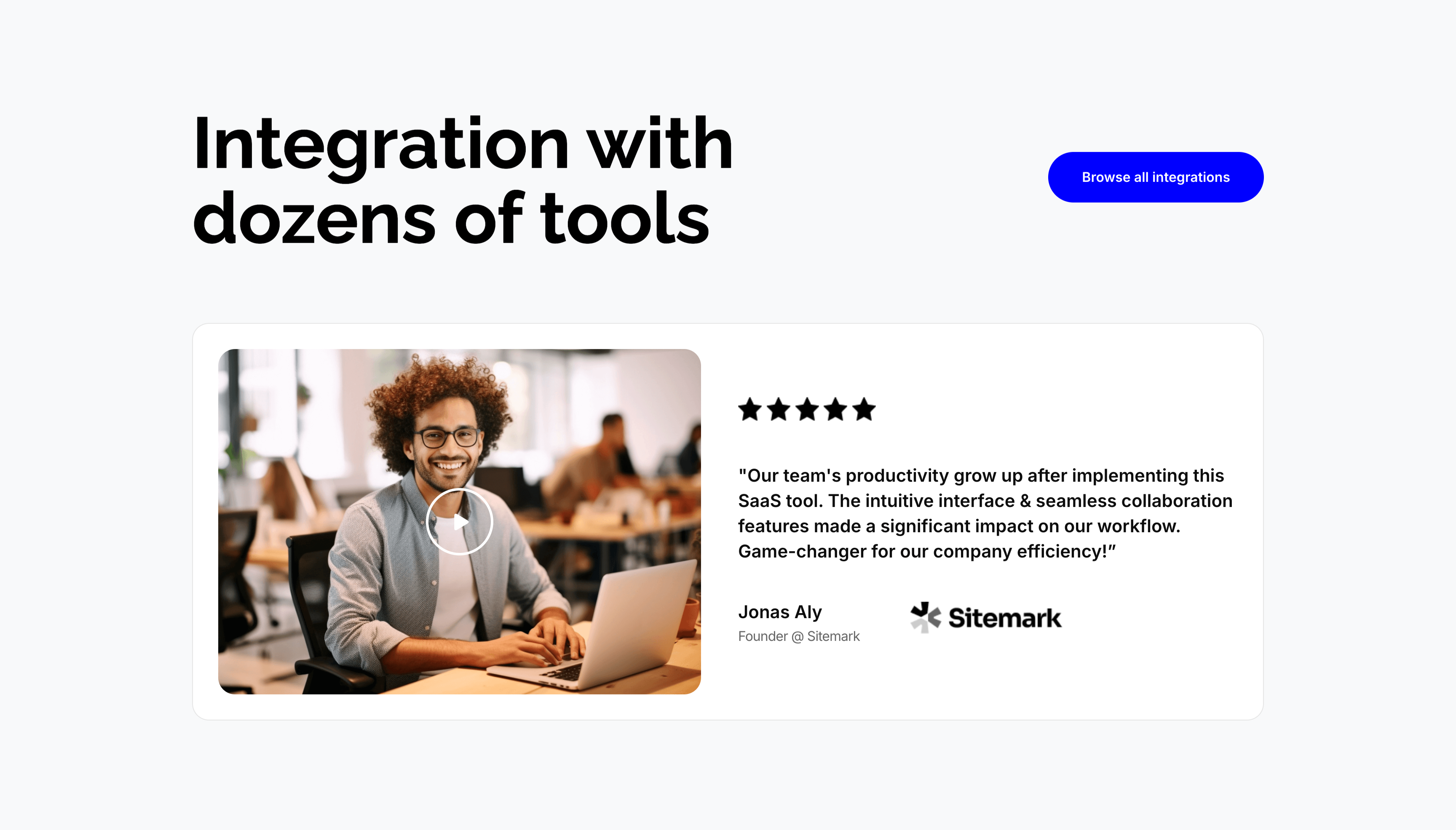
Integration Video Testimonial Card
A section on a pale gray background pairing an integrations header with a video testimonial. The top places an oversized 'Integration with dozens of tools' heading on the left and a solid blue 'Browse all integrations' button on the right. Below sits a wide white card split in two: a left video thumbnail of a smiling man at a laptop with a circular play button, and a right panel showing five black stars, a bold quoted testimonial about team productivity growing after adopting the SaaS tool, and the attribution 'Jonas Aly, Founder @ Sitemark' beside the Sitemark logo. Combining a playable clip with a starred quote gives the endorsement both a face and a claim.
Zubuz ↗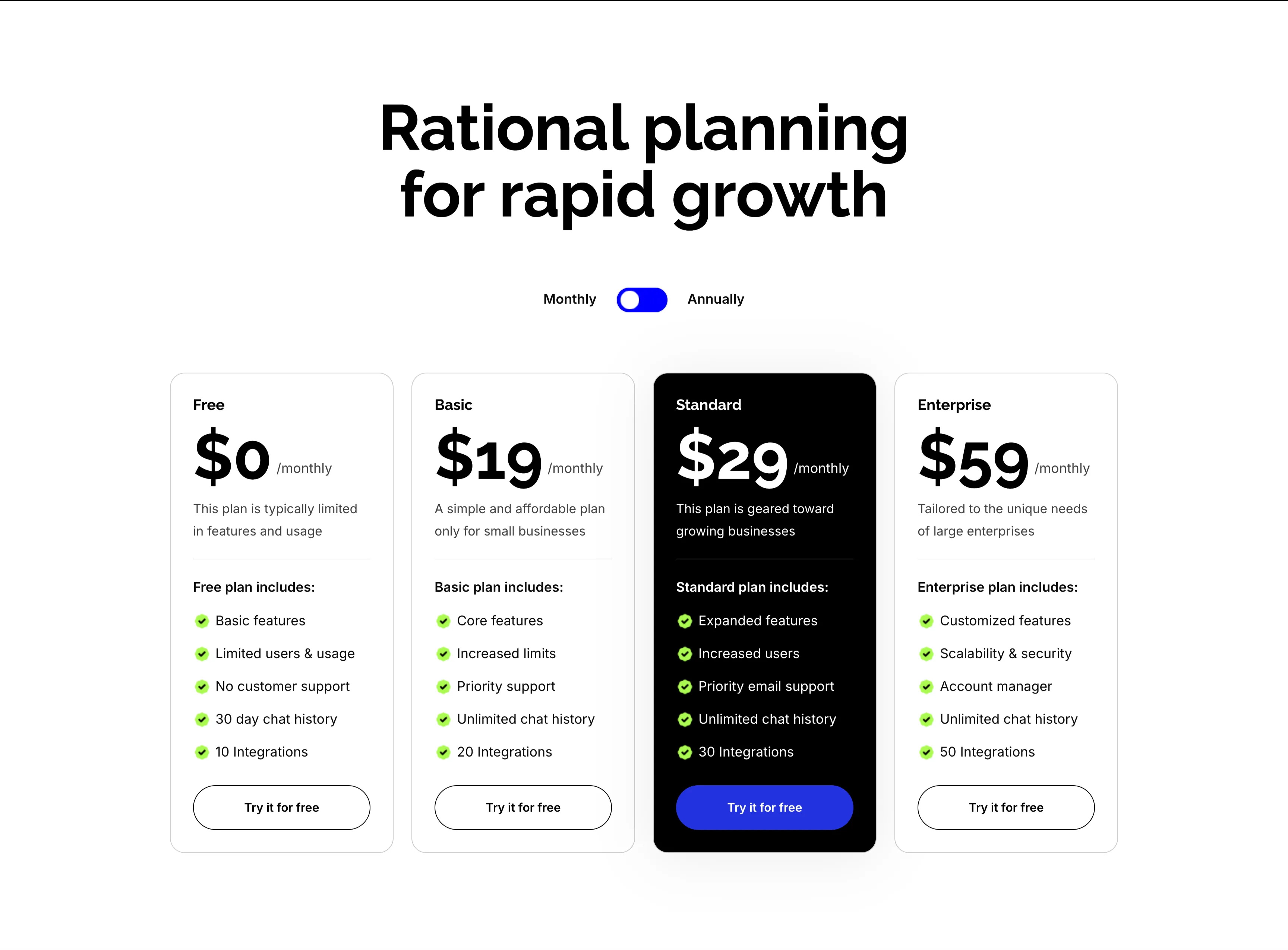
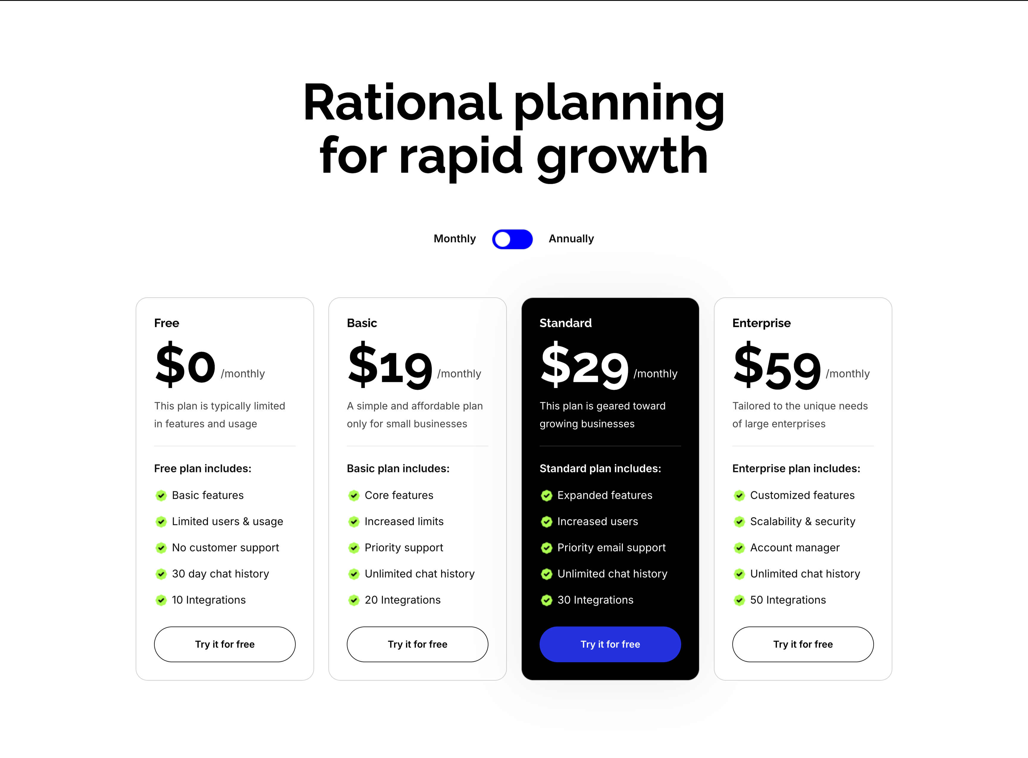
Rational Planning Four-Tier Pricing Cards
A four-tier pricing section on white under an oversized centered 'Rational planning for rapid growth' heading with a Monthly/Annually toggle. Four cards run in a row — Free ($0/monthly), Basic ($19/monthly), Standard ($29/monthly, elevated in a black card) and Enterprise ($59/monthly) — each pairing a large price and one-line description with a green-checkmarked feature list ('Basic features', 'Priority email support', 'Unlimited chat history', integration counts from 10 to 50). Every card closes with a 'Try it for free' button, solid blue on the highlighted Standard plan and outlined elsewhere. Rendering the Standard tier in black draws the eye straight to the recommended plan.
Zubuz ↗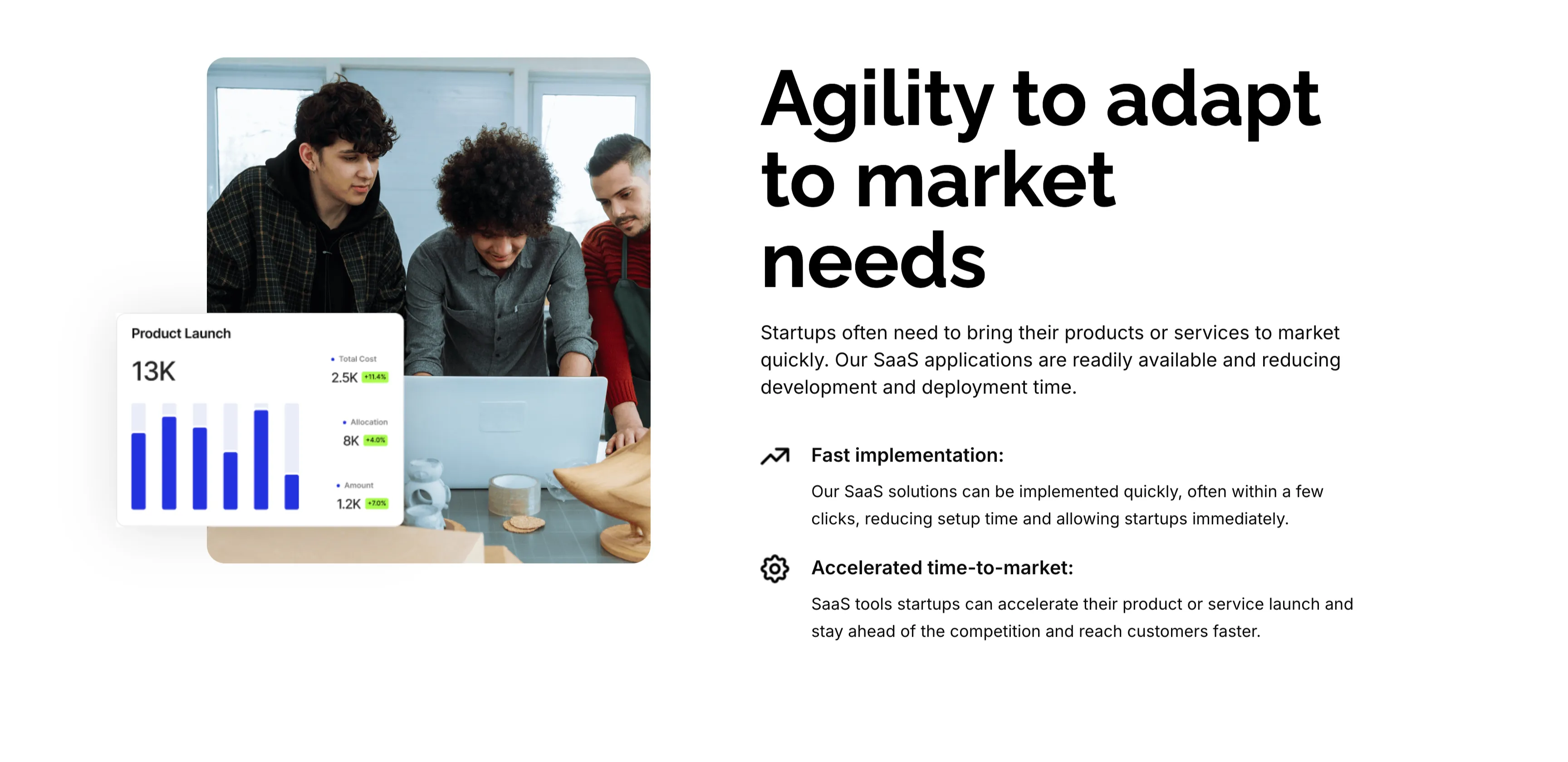
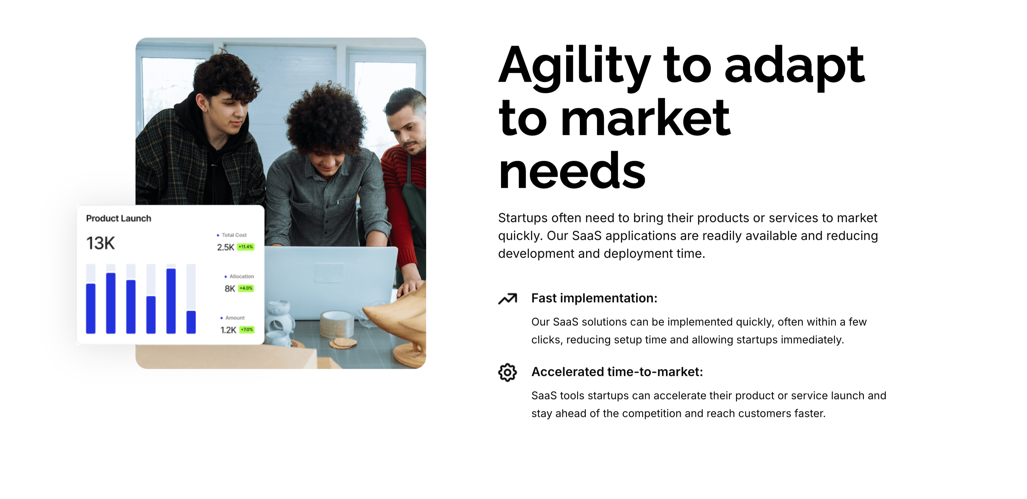
Agility To Adapt Split Feature
A two-column feature block on white. The left column holds a rounded photo of three colleagues at a laptop, overlaid at the corner with a floating 'Product Launch' analytics card (a 13K figure, bar chart and green percentage badges). The right column leads with an oversized 'Agility to adapt to market needs' heading and a short paragraph, then two icon-led points: 'Fast implementation:' (SaaS solutions deployed in a few clicks) and 'Accelerated time-to-market:' (launch faster and stay ahead of competitors). A small outline icon precedes each point. The photo-plus-icon-list layout pairs a human scene with a crisp benefit statement.
Zubuz ↗Similar content sections
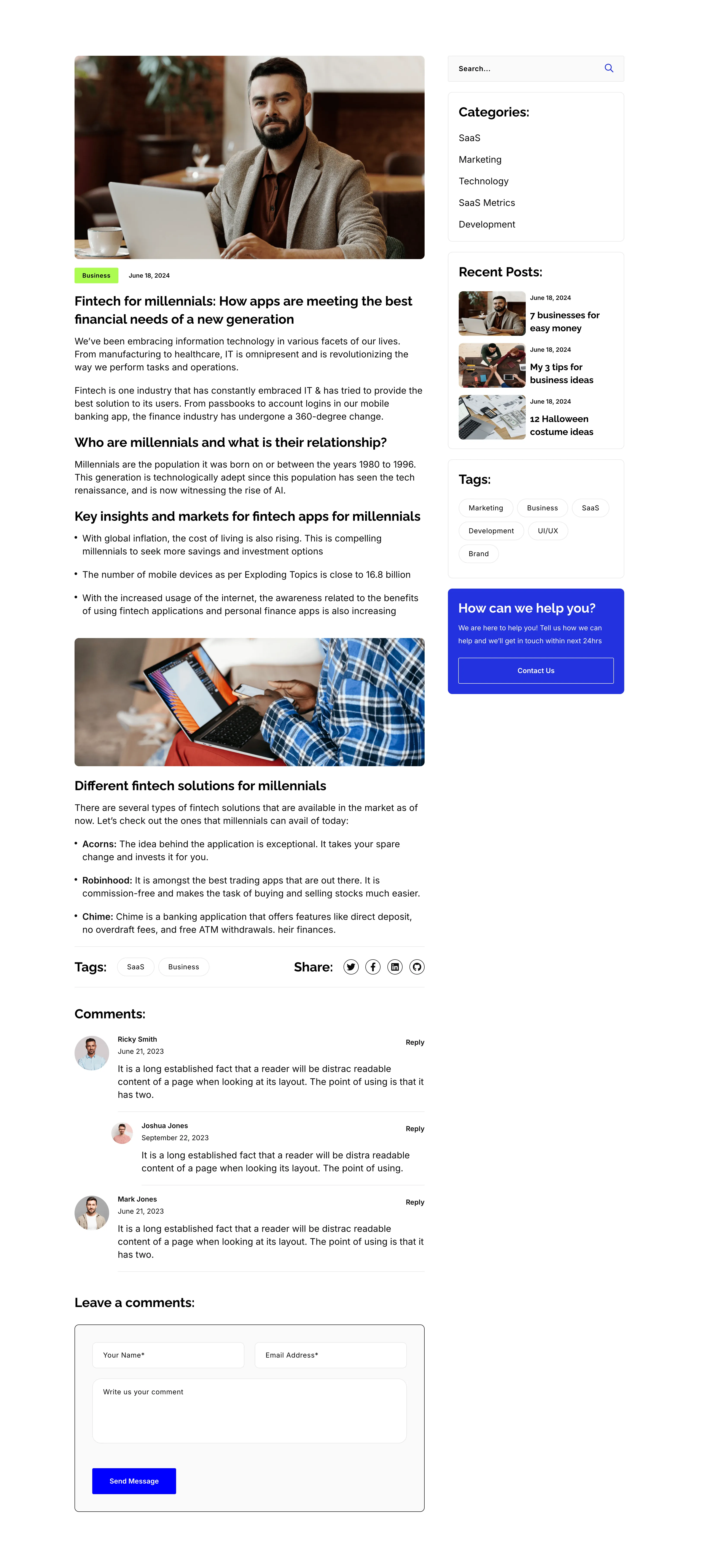
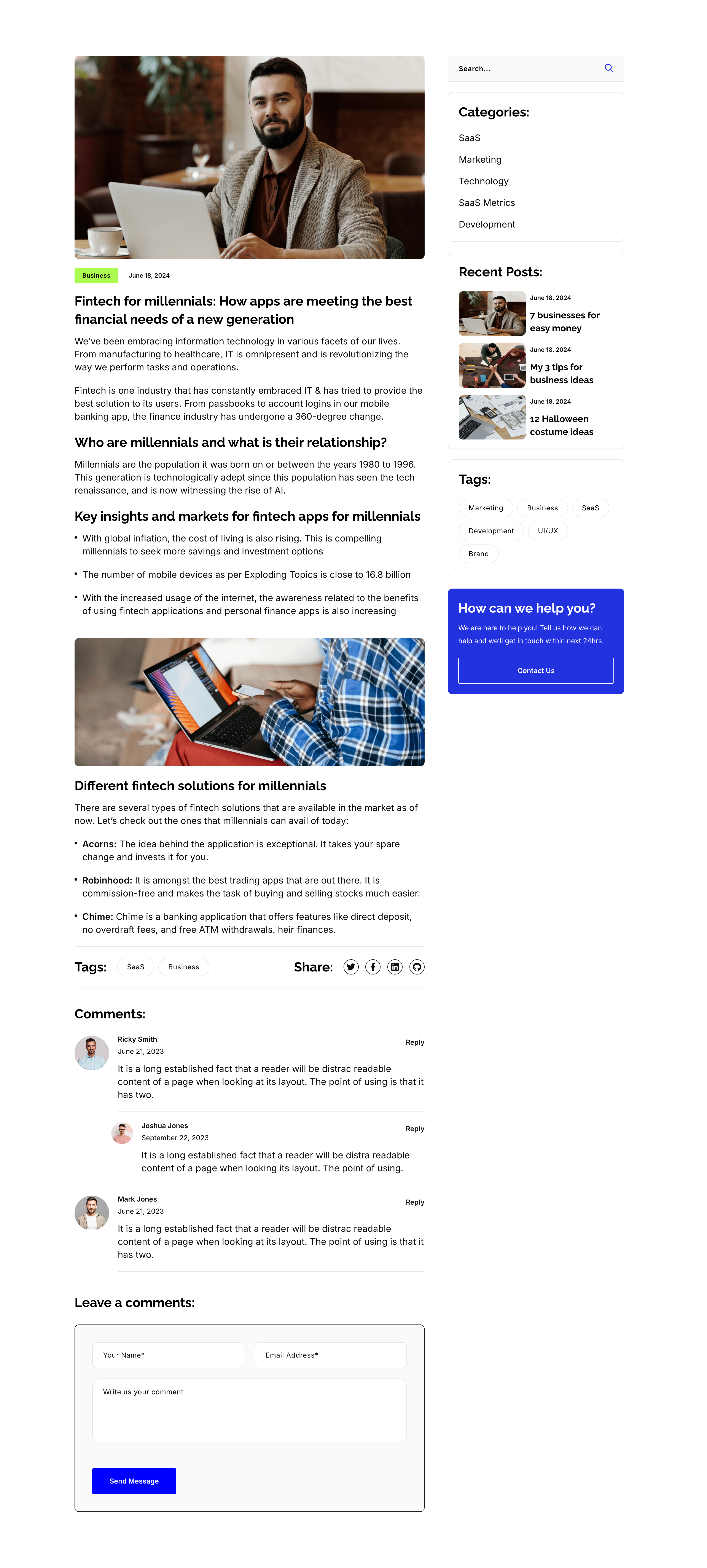
Blog Post Article Page With Comments
A single blog-post layout on white, again split into an article column and a right sidebar. The article opens with a hero photo, a 'Business' tag and date, the title 'Fintech for millennials: How apps are meeting the best financial needs of a new generation', then body copy broken by sub-headings ('Who are millennials…', 'Key insights…', 'Different fintech solutions…'), bullet lists, an inset photo, a Tags/Share row, and a threaded 'Comments:' list with a 'Leave a comments:' form. The sidebar repeats the search, Categories, Recent Posts, Tags and blue help card from the archive. The long-form column with a persistent sidebar is the standard editorial article template.
Zubuz ↗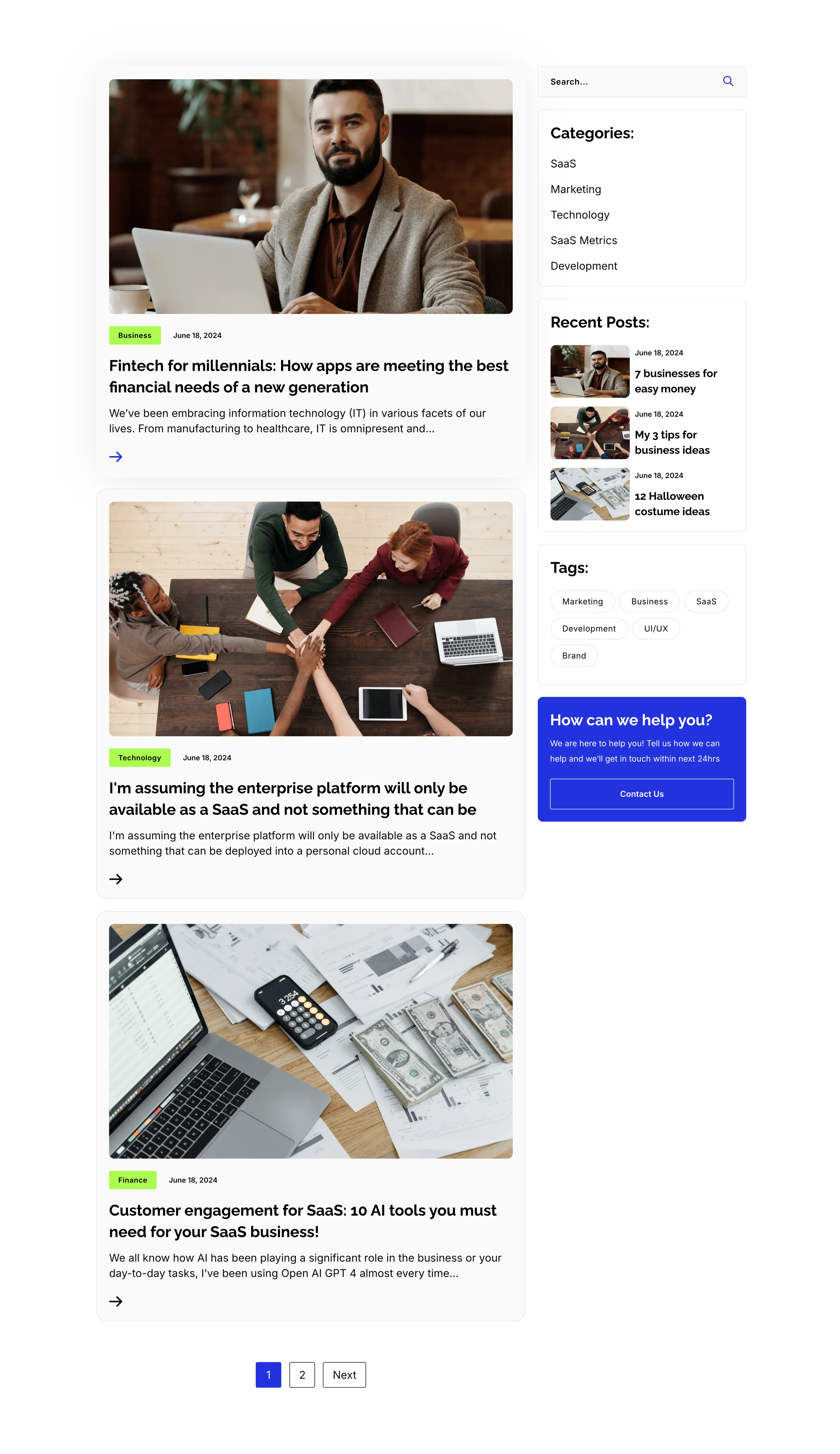
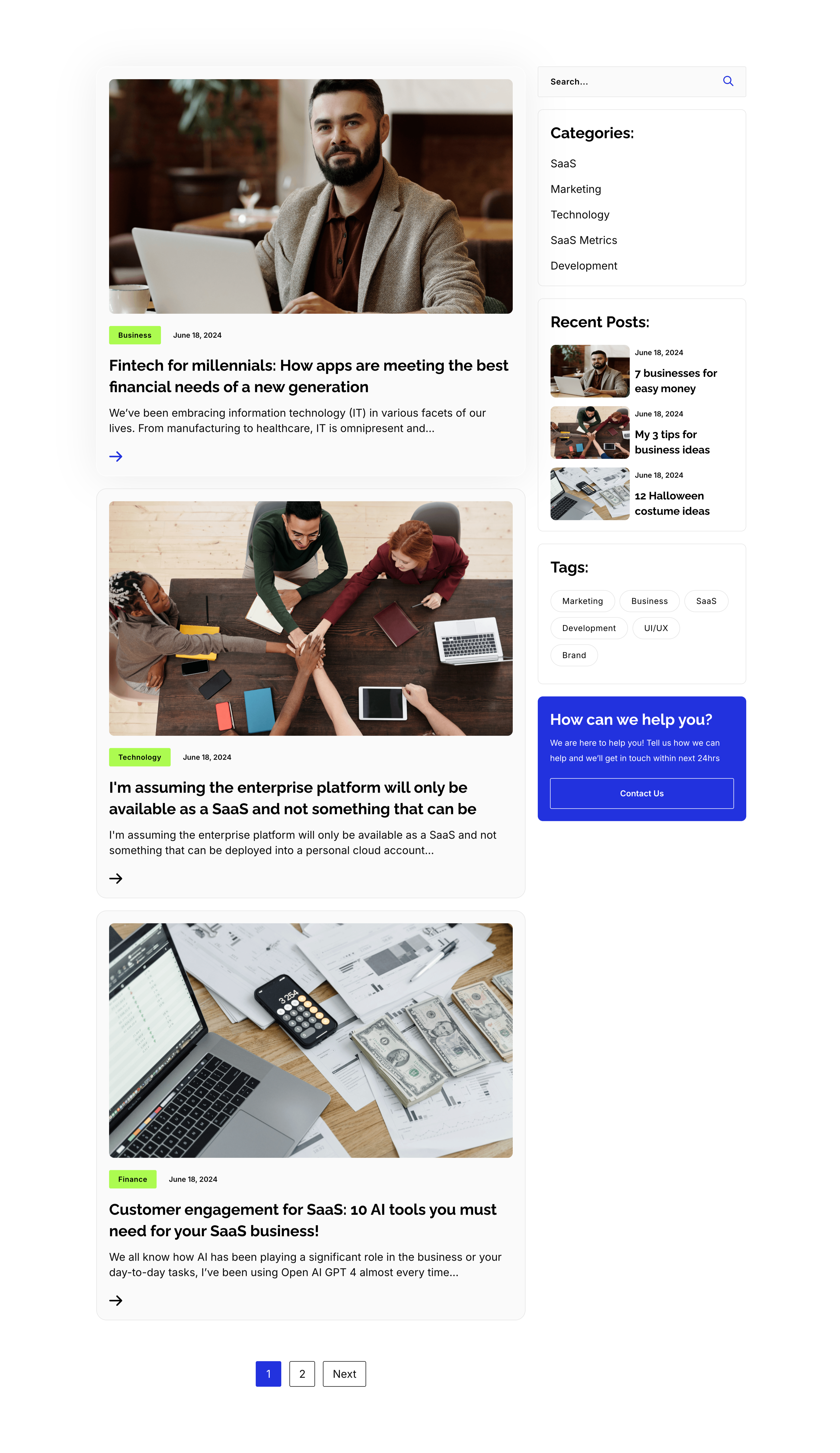
Blog Listing Page With Sidebar
A full blog-listing layout on white, split into a wide article column and a right sidebar. The main column stacks post previews, each a photo with a category tag and date over a bold title, an excerpt and an arrow link — 'Fintech for millennials…', 'I'm assuming the enterprise platform…' and 'Customer engagement for SaaS: 10 AI tools…' — closing with a '1 / 2 / Next' pager. The sidebar holds a search field, a 'Categories:' list (SaaS, Marketing, Technology, SaaS Metrics, Development), a 'Recent Posts:' list with thumbnails, a 'Tags:' pill cloud, and a blue 'How can we help you?' card with a Contact Us button. The article-plus-sidebar structure is the classic content-hub archive pattern.
Zubuz ↗

Contact Details Dark Info Band
A slim contact-details band on a solid black background, laid out as three evenly spaced columns. Each column pairs a lime-green circular icon with a bold white label and two lines of detail: a phone icon beside 'Call us directly' (+088-234-6532-789 / +088-456-3217-005), an envelope beside 'Email us' (example@gmail.com, twice) and a location pin beside 'Our office address' (4132 Thornridge City, New York.). There is no other imagery or copy competing for attention. The dark field, bright green icons and tidy three-up split make the key contact methods instantly readable.
Zubuz ↗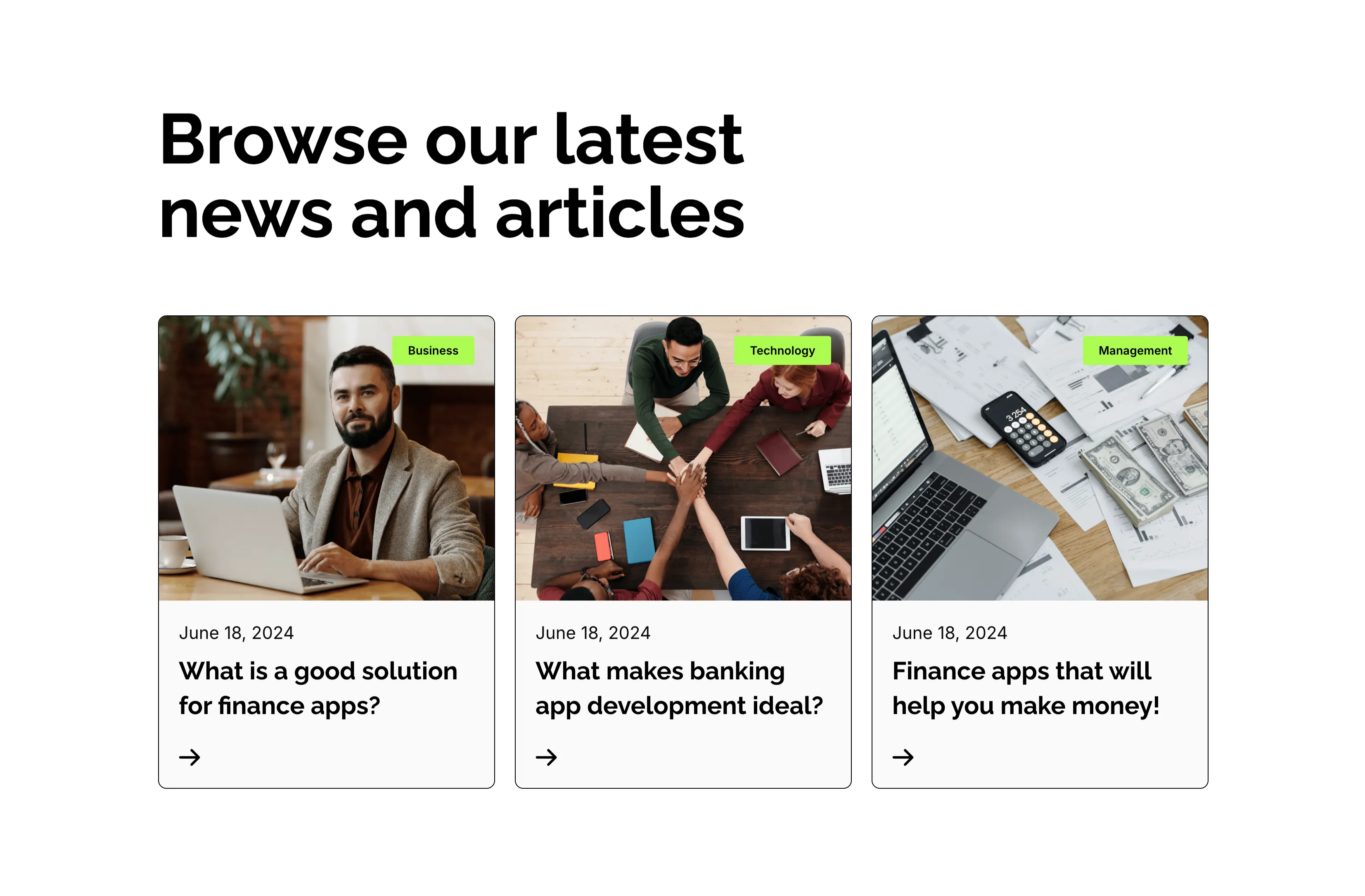
Browse Our Latest News Blog Cards
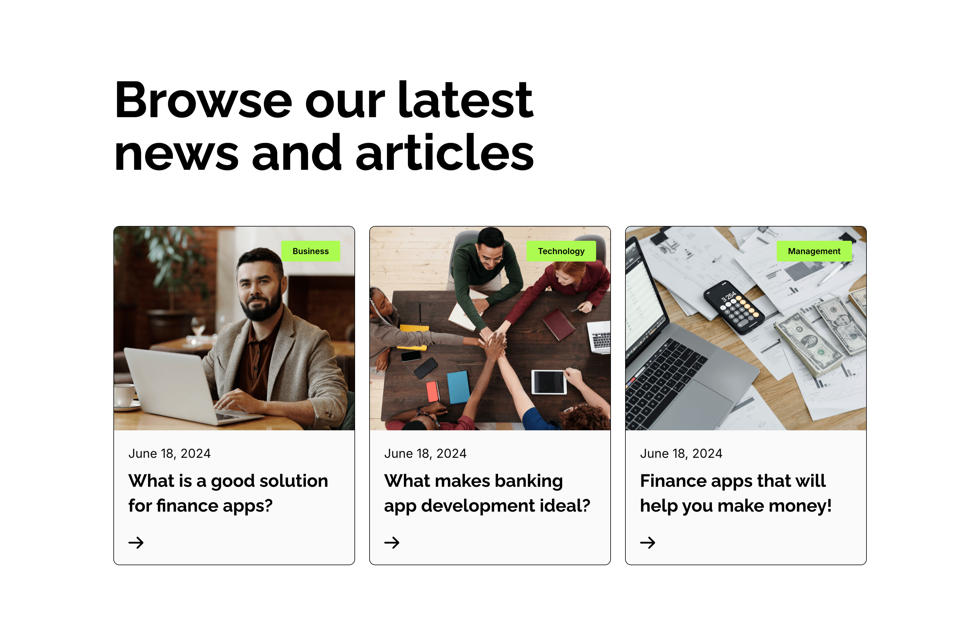
A blog-preview section on white under an oversized two-line 'Browse our latest news and articles' heading. Three equal cards sit in a row, each topped by a photograph with a small lime-green category tag in the corner — 'Business', 'Technology' and 'Management'. Beneath each image a light panel shows a 'June 18, 2024' date, a bold two-line article title ('What is a good solution for finance apps?', 'What makes banking app development ideal?', 'Finance apps that will help you make money!') and a small right-arrow link. The consistent image-over-text card rhythm and tidy category tags make the latest posts easy to browse.
Zubuz ↗