Content sections
Content sections for design inspiration. Browse real content section examples across styles and industries.
Cost-Effective Simple Process With Stats
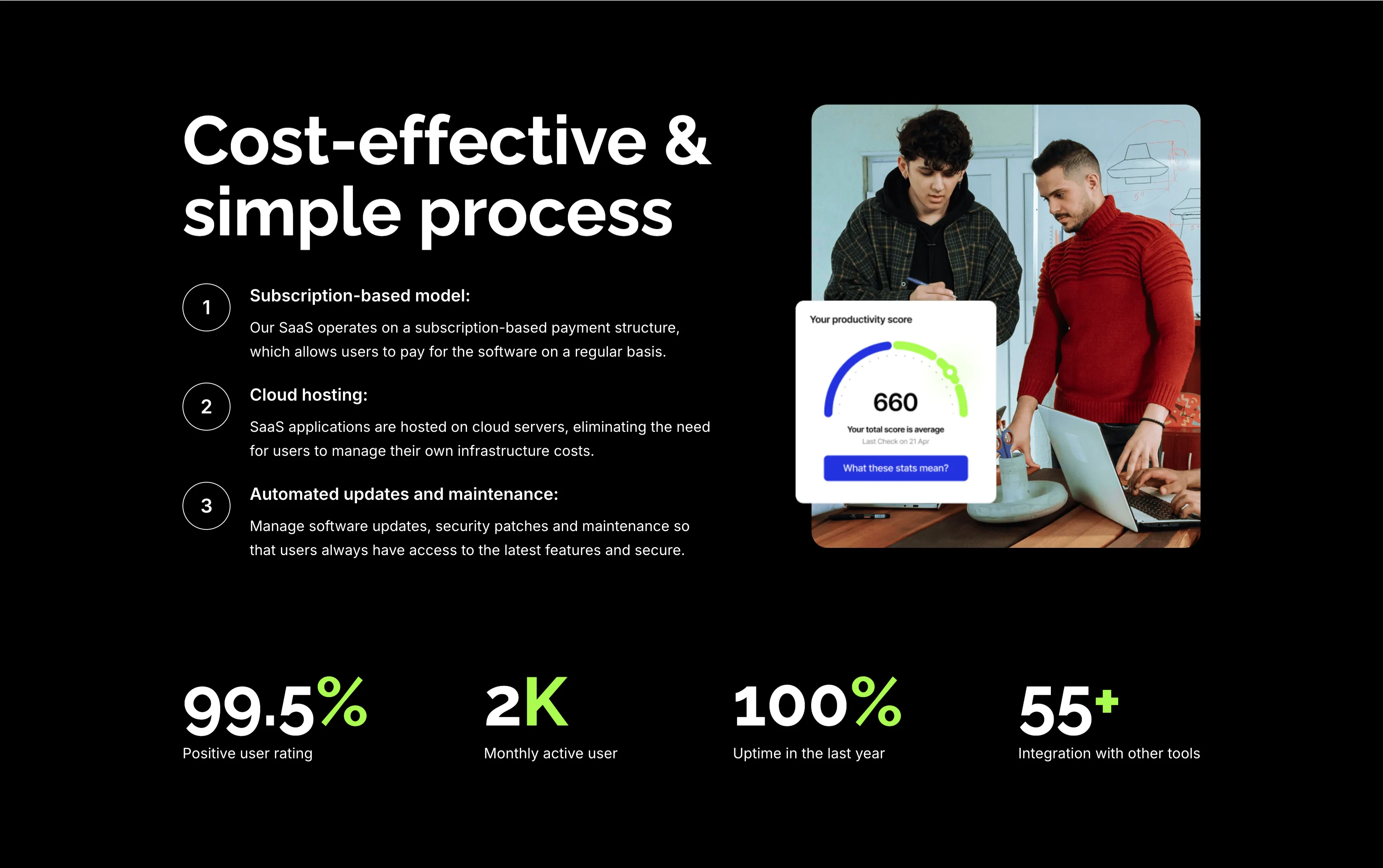
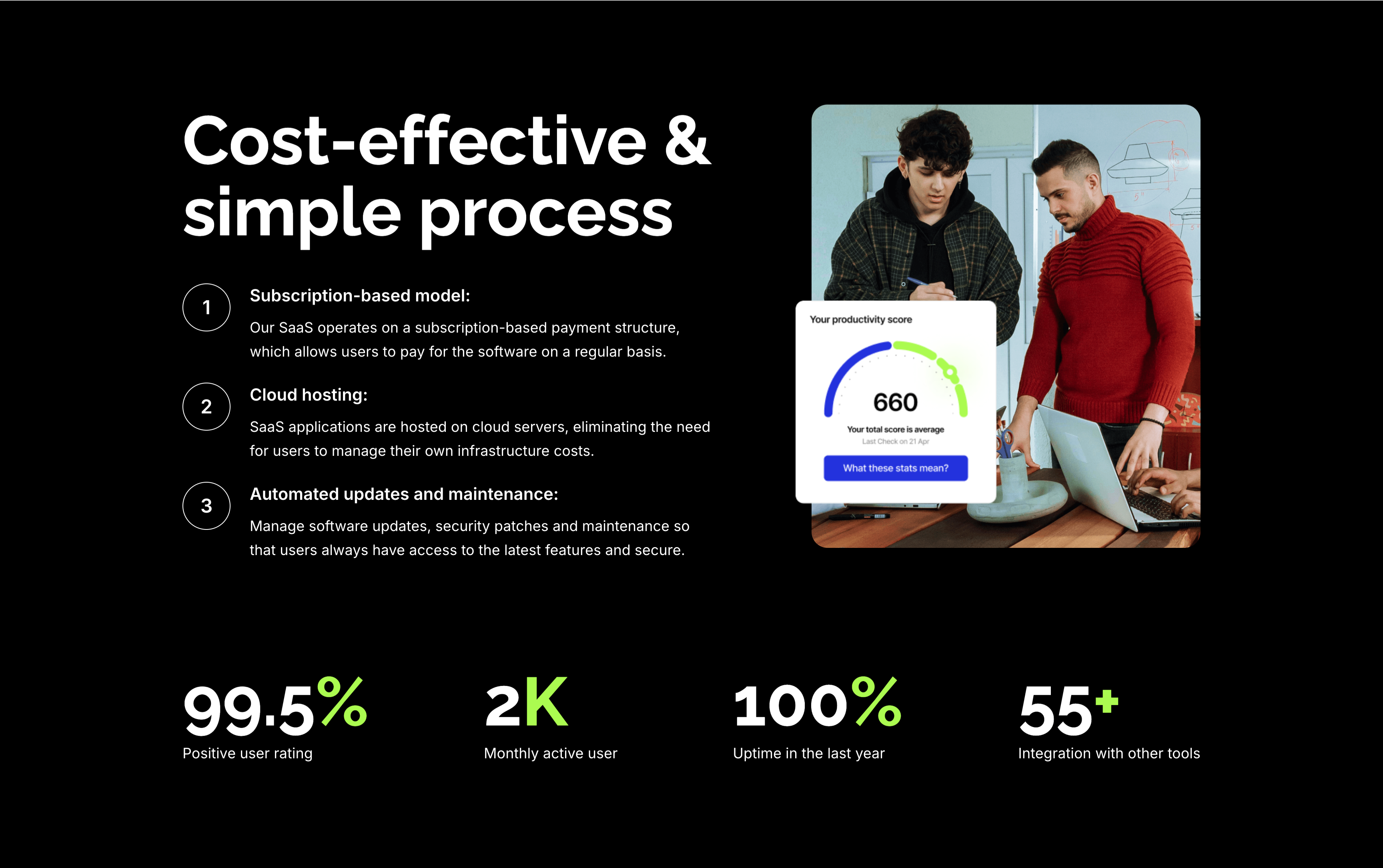
A feature section on a solid black background. The left column stacks an oversized white 'Cost-effective & simple process' heading over three numbered points — 'Subscription-based model:', 'Cloud hosting:' and 'Automated updates and maintenance:' — each with a circled number and a short white description. The right column shows a rounded photo of two colleagues at a laptop with a floating white 'Your productivity score' card reading 660. A row of four lime-green-accented stats runs across the bottom: '99.5%' positive user rating, '2K' monthly active users, '100%' uptime in the last year and '55+' integrations. The dark canvas, numbered list and green metrics give the section a confident, data-backed tone.
Zubuz ↗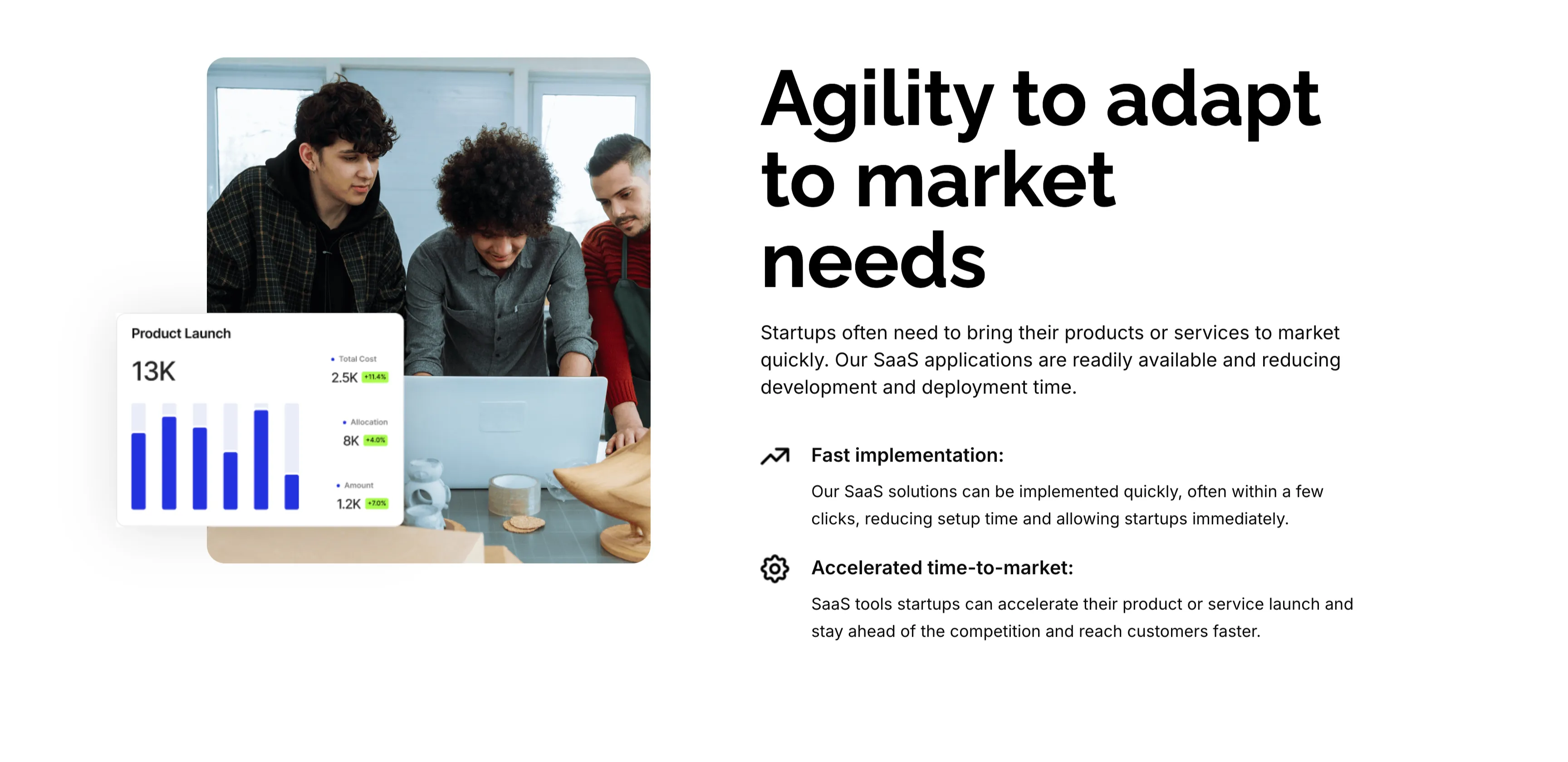
Agility To Adapt Split Feature
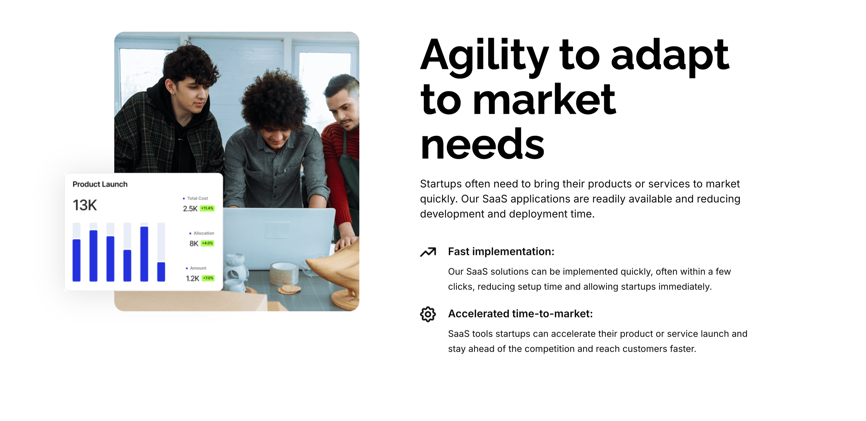
A two-column feature block on white. The left column holds a rounded photo of three colleagues at a laptop, overlaid at the corner with a floating 'Product Launch' analytics card (a 13K figure, bar chart and green percentage badges). The right column leads with an oversized 'Agility to adapt to market needs' heading and a short paragraph, then two icon-led points: 'Fast implementation:' (SaaS solutions deployed in a few clicks) and 'Accelerated time-to-market:' (launch faster and stay ahead of competitors). A small outline icon precedes each point. The photo-plus-icon-list layout pairs a human scene with a crisp benefit statement.
Zubuz ↗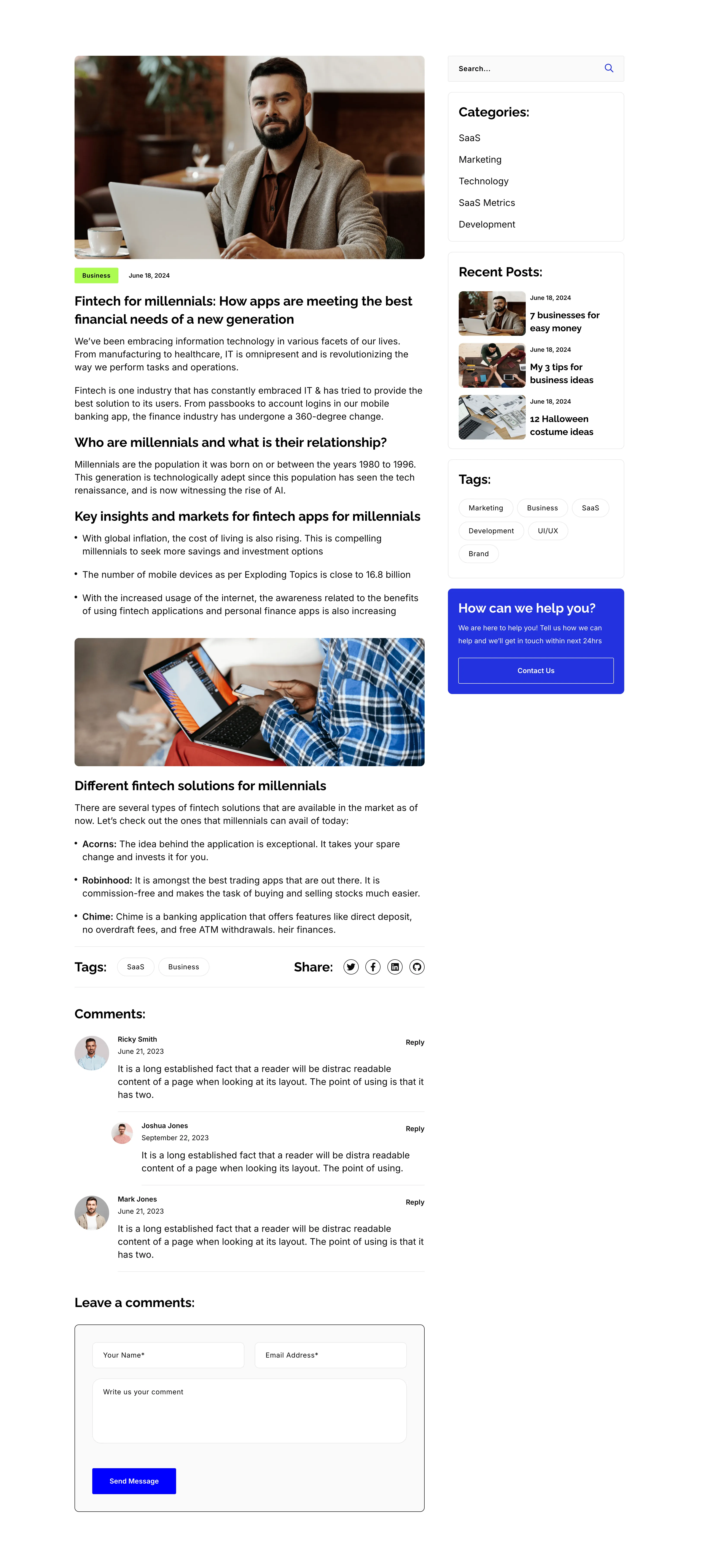
Blog Post Article Page With Comments
A single blog-post layout on white, again split into an article column and a right sidebar. The article opens with a hero photo, a 'Business' tag and date, the title 'Fintech for millennials: How apps are meeting the best financial needs of a new generation', then body copy broken by sub-headings ('Who are millennials…', 'Key insights…', 'Different fintech solutions…'), bullet lists, an inset photo, a Tags/Share row, and a threaded 'Comments:' list with a 'Leave a comments:' form. The sidebar repeats the search, Categories, Recent Posts, Tags and blue help card from the archive. The long-form column with a persistent sidebar is the standard editorial article template.
Zubuz ↗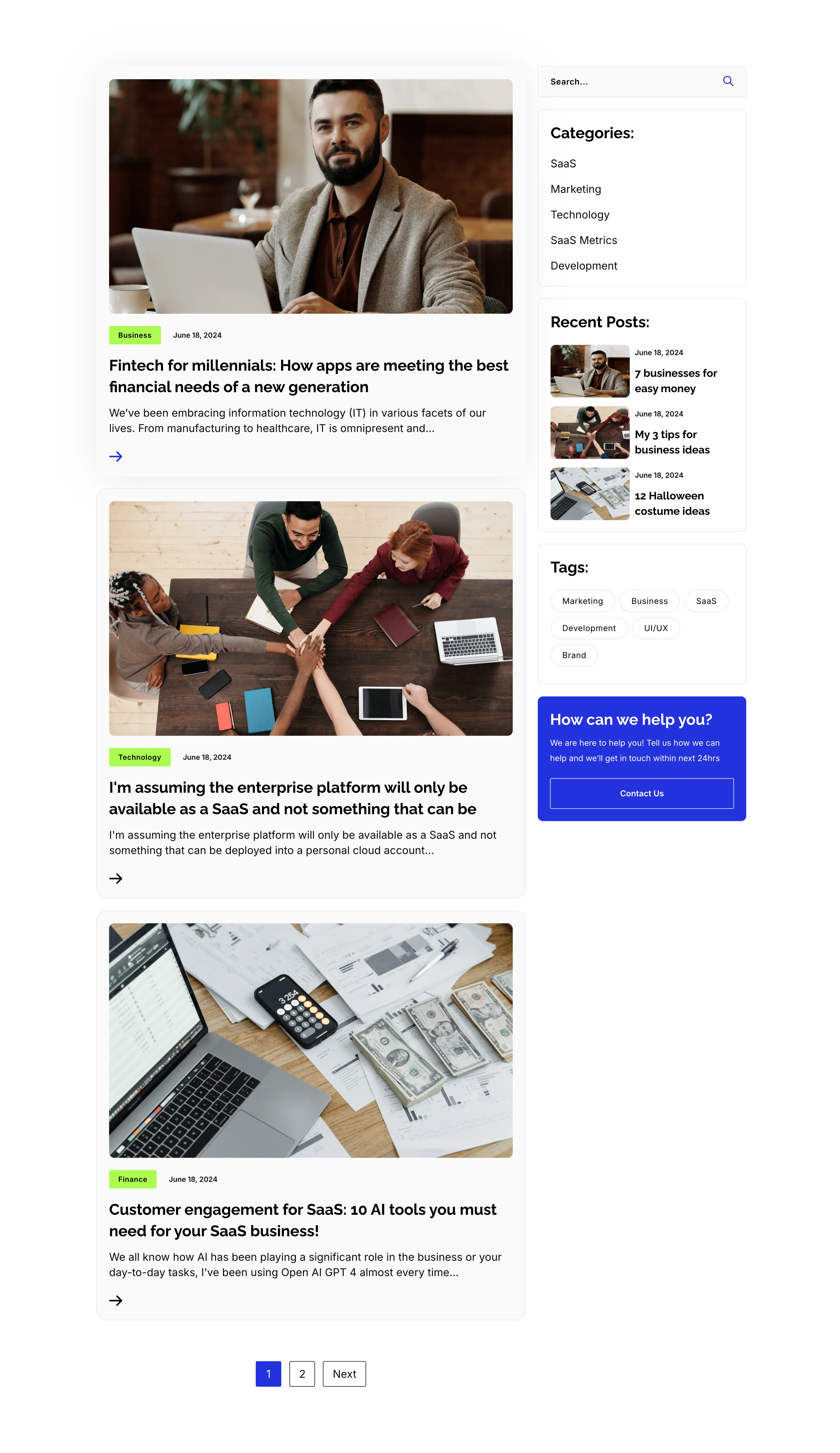
Blog Listing Page With Sidebar
A full blog-listing layout on white, split into a wide article column and a right sidebar. The main column stacks post previews, each a photo with a category tag and date over a bold title, an excerpt and an arrow link — 'Fintech for millennials…', 'I'm assuming the enterprise platform…' and 'Customer engagement for SaaS: 10 AI tools…' — closing with a '1 / 2 / Next' pager. The sidebar holds a search field, a 'Categories:' list (SaaS, Marketing, Technology, SaaS Metrics, Development), a 'Recent Posts:' list with thumbnails, a 'Tags:' pill cloud, and a blue 'How can we help you?' card with a Contact Us button. The article-plus-sidebar structure is the classic content-hub archive pattern.
Zubuz ↗

Contact Details Dark Info Band
A slim contact-details band on a solid black background, laid out as three evenly spaced columns. Each column pairs a lime-green circular icon with a bold white label and two lines of detail: a phone icon beside 'Call us directly' (+088-234-6532-789 / +088-456-3217-005), an envelope beside 'Email us' (example@gmail.com, twice) and a location pin beside 'Our office address' (4132 Thornridge City, New York.). There is no other imagery or copy competing for attention. The dark field, bright green icons and tidy three-up split make the key contact methods instantly readable.
Zubuz ↗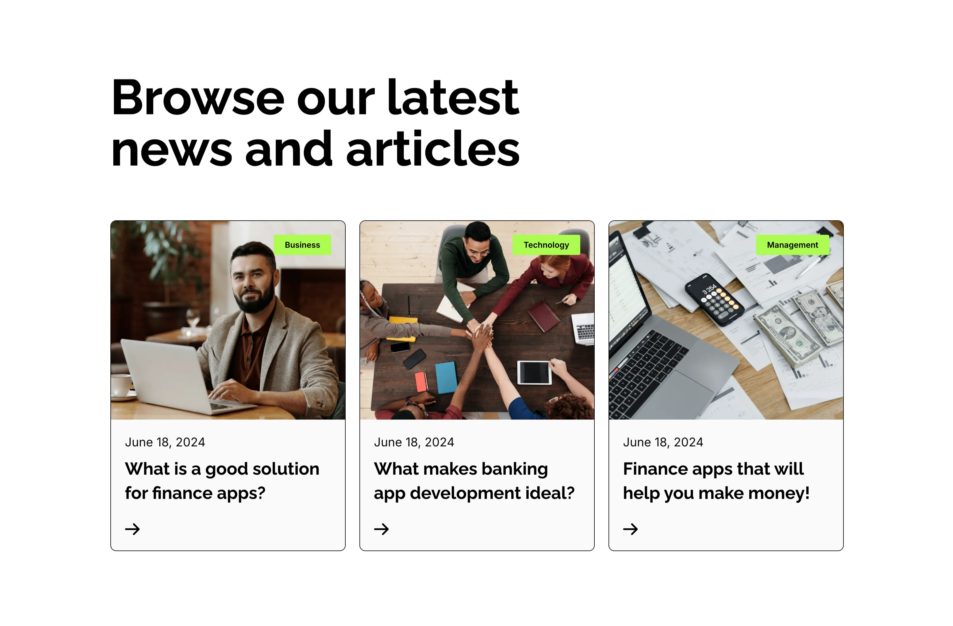
Browse Our Latest News Blog Cards
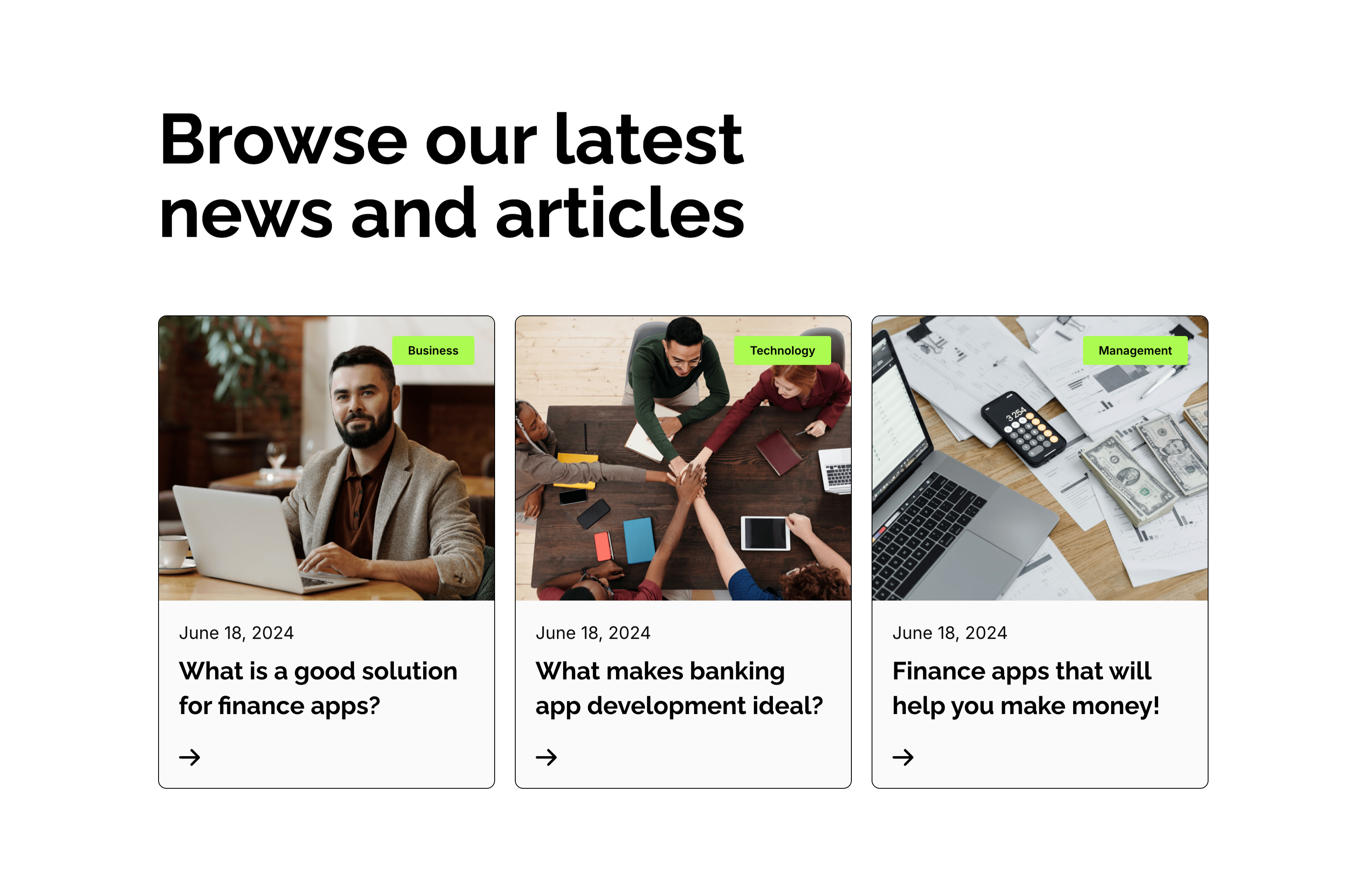
A blog-preview section on white under an oversized two-line 'Browse our latest news and articles' heading. Three equal cards sit in a row, each topped by a photograph with a small lime-green category tag in the corner — 'Business', 'Technology' and 'Management'. Beneath each image a light panel shows a 'June 18, 2024' date, a bold two-line article title ('What is a good solution for finance apps?', 'What makes banking app development ideal?', 'Finance apps that will help you make money!') and a small right-arrow link. The consistent image-over-text card rhythm and tidy category tags make the latest posts easy to browse.
Zubuz ↗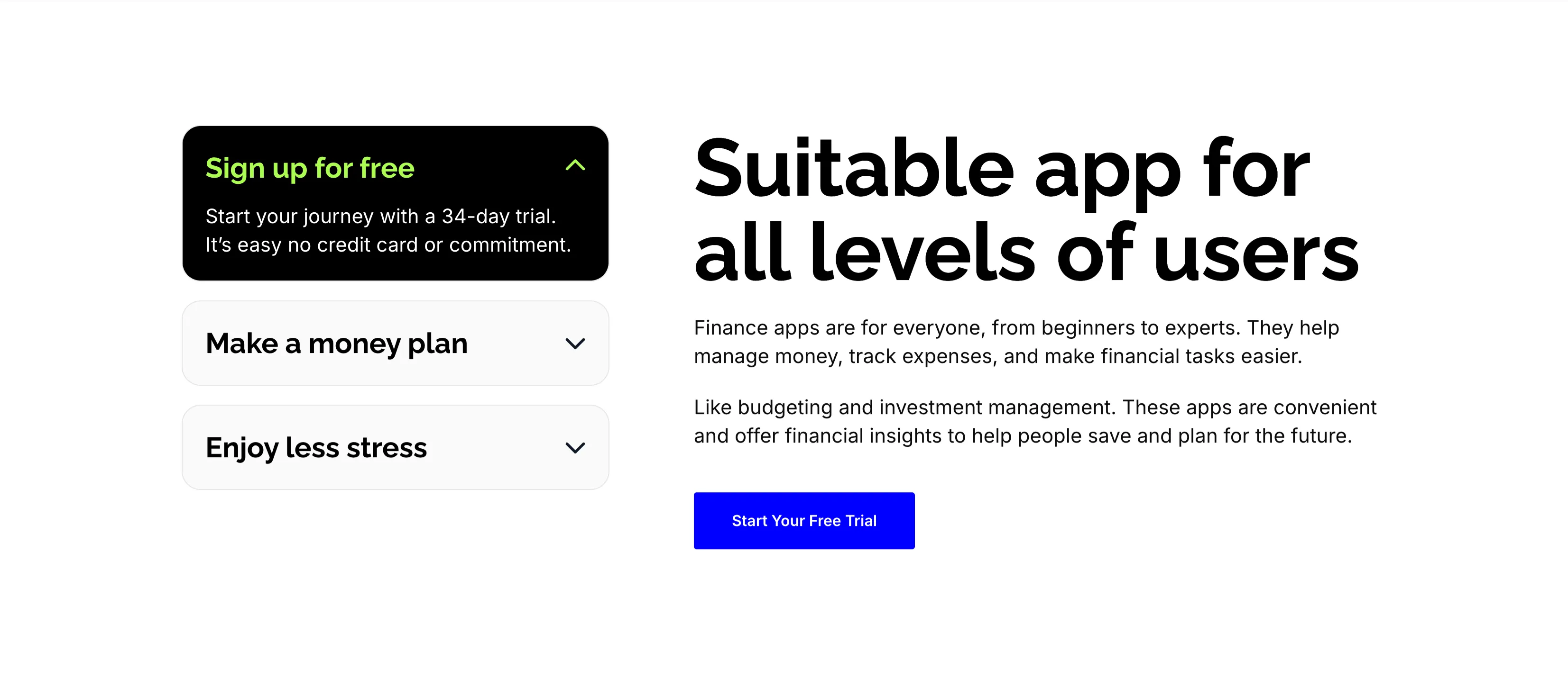
Suitable App For All Levels Accordion
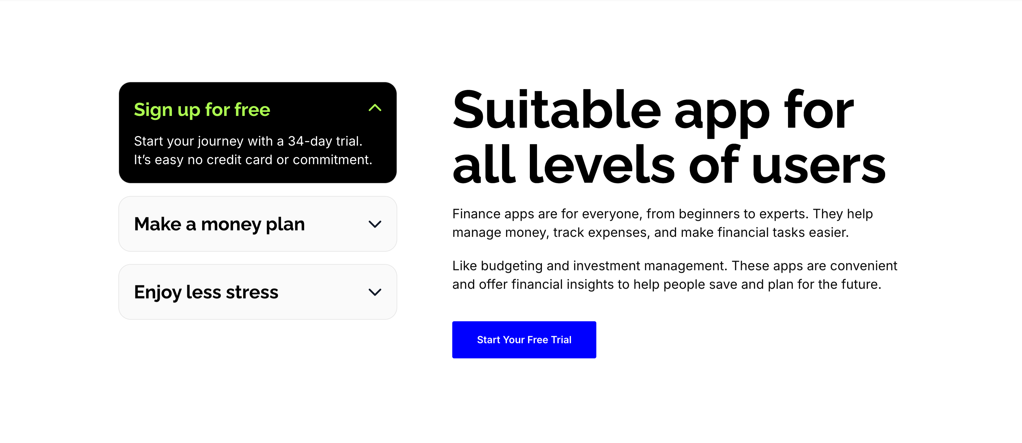
A split content section on white. The left column is a stacked accordion: an expanded black card, 'Sign up for free', with a lime-highlighted title and the line 'Start your journey with a 34-day trial. It's easy no credit card or commitment.', above two collapsed light rows, 'Make a money plan' and 'Enjoy less stress', each with a chevron. The right column carries an oversized 'Suitable app for all levels of users' heading, two explanatory paragraphs about budgeting and investment management, and a solid blue 'Start Your Free Trial' button. The expandable left panel plus the reassuring right-hand copy guide beginners and experts alike toward the trial.
Zubuz ↗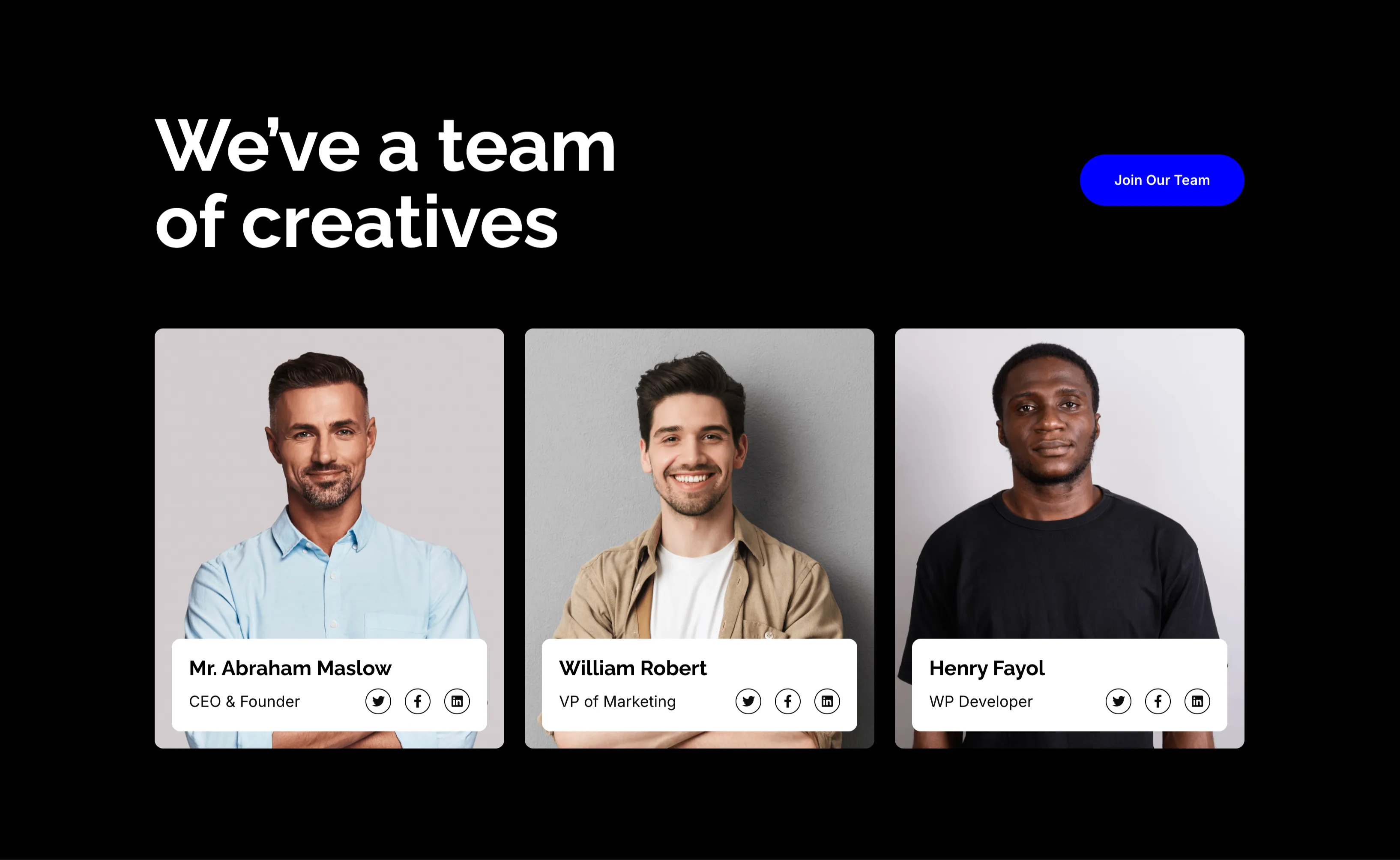
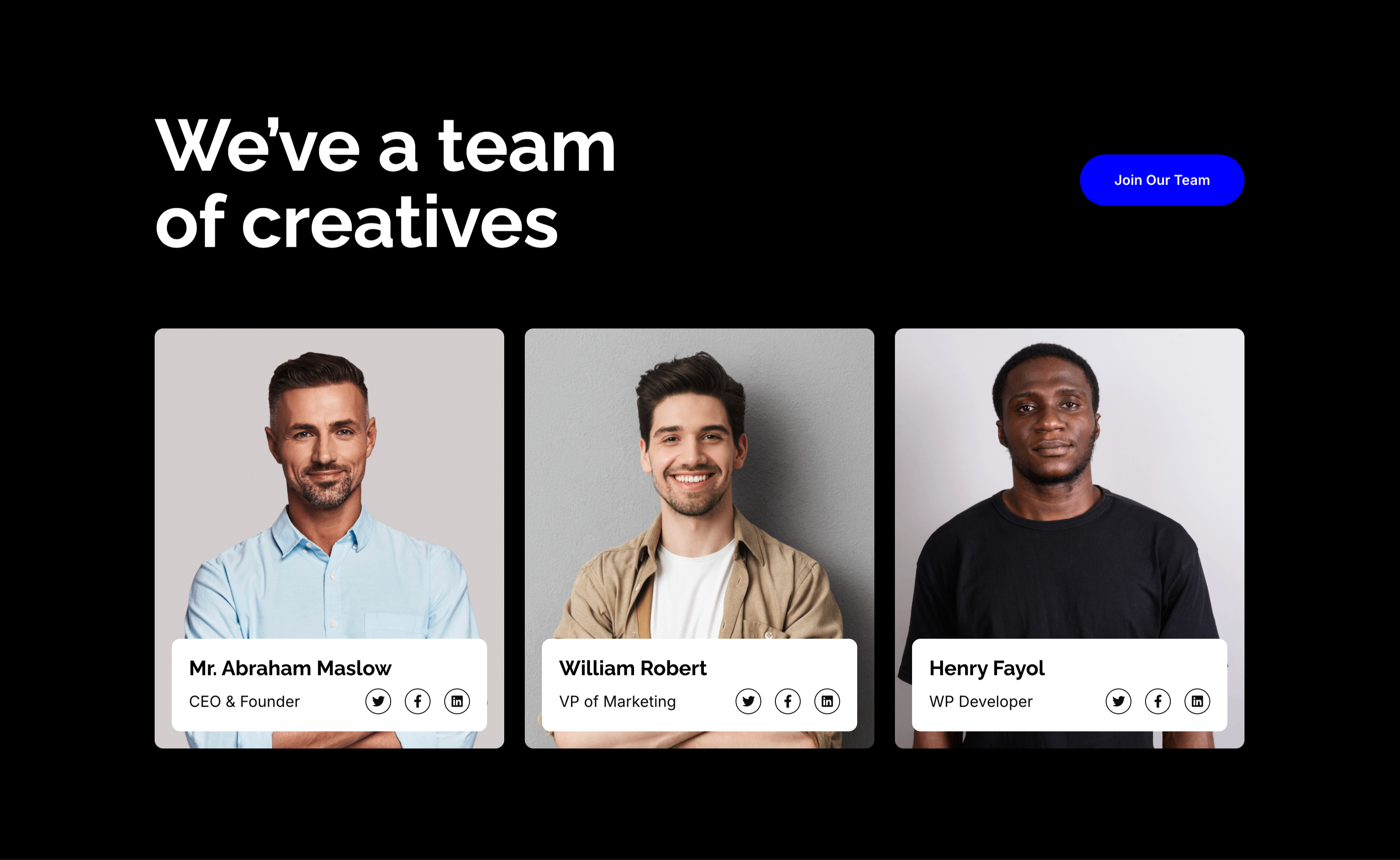
We've A Team Of Creatives Member Cards
A team section on a solid black background. The upper left carries a large white 'We've a team of creatives' headline, balanced by a blue 'Join Our Team' pill button floated to the upper right. Below sit three equal member cards, each a portrait photograph with a white info panel overlapping its lower edge: 'Mr. Abraham Maslow — CEO & Founder', 'William Robert — VP of Marketing' and 'Henry Fayol — WP Developer', each panel carrying small Twitter, Facebook and LinkedIn icons. The dark canvas makes the portraits and white cards pop. The recruiting headline plus the leadership line-up reads as both a team showcase and a hiring nudge.
Zubuz ↗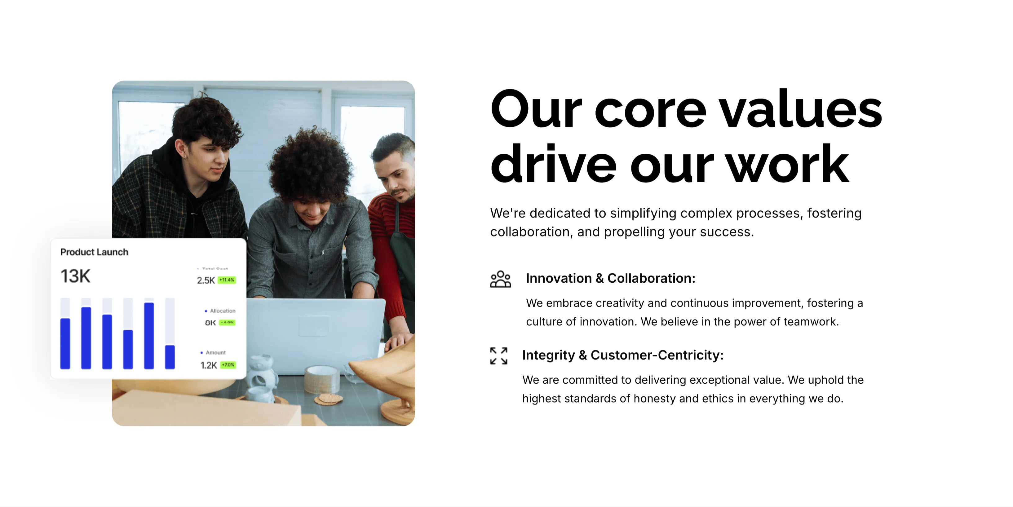
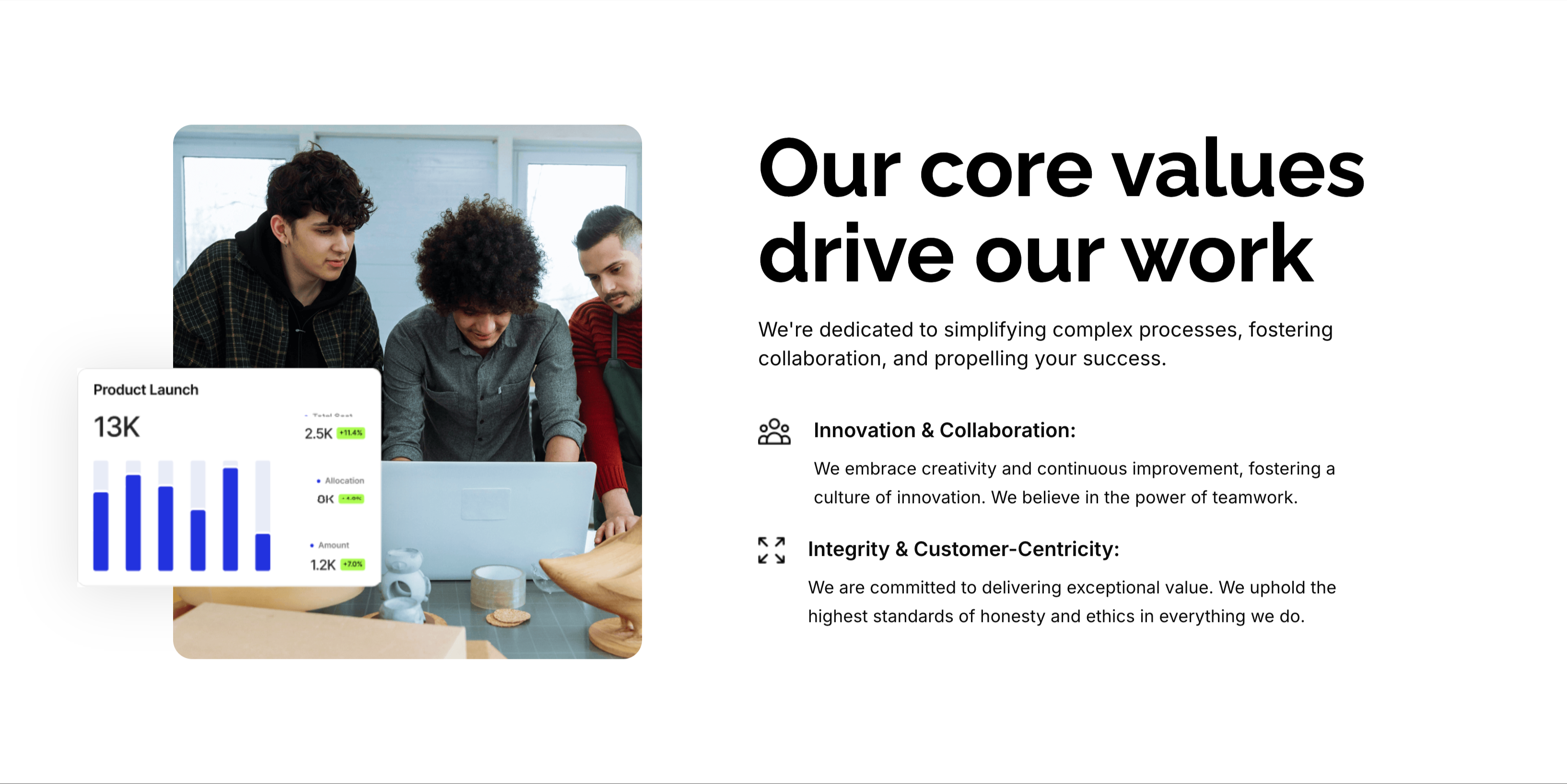
Our Core Values Split Feature
A two-column values section on white. The left column holds a rounded photo of three colleagues gathered around a laptop, overlaid at the corner with a floating 'Product Launch' analytics card showing a 13K figure and a small bar chart. The right column leads with an oversized 'Our core values drive our work' heading and a one-line intro, then two icon-led value blocks: 'Innovation & Collaboration:' (embracing creativity, continuous improvement and teamwork) and 'Integrity & Customer-Centricity:' (delivering exceptional value with the highest standards of honesty). A small outline icon precedes each value title. The photo-plus-icon-list layout balances human warmth with a crisp statement of principles.
Zubuz ↗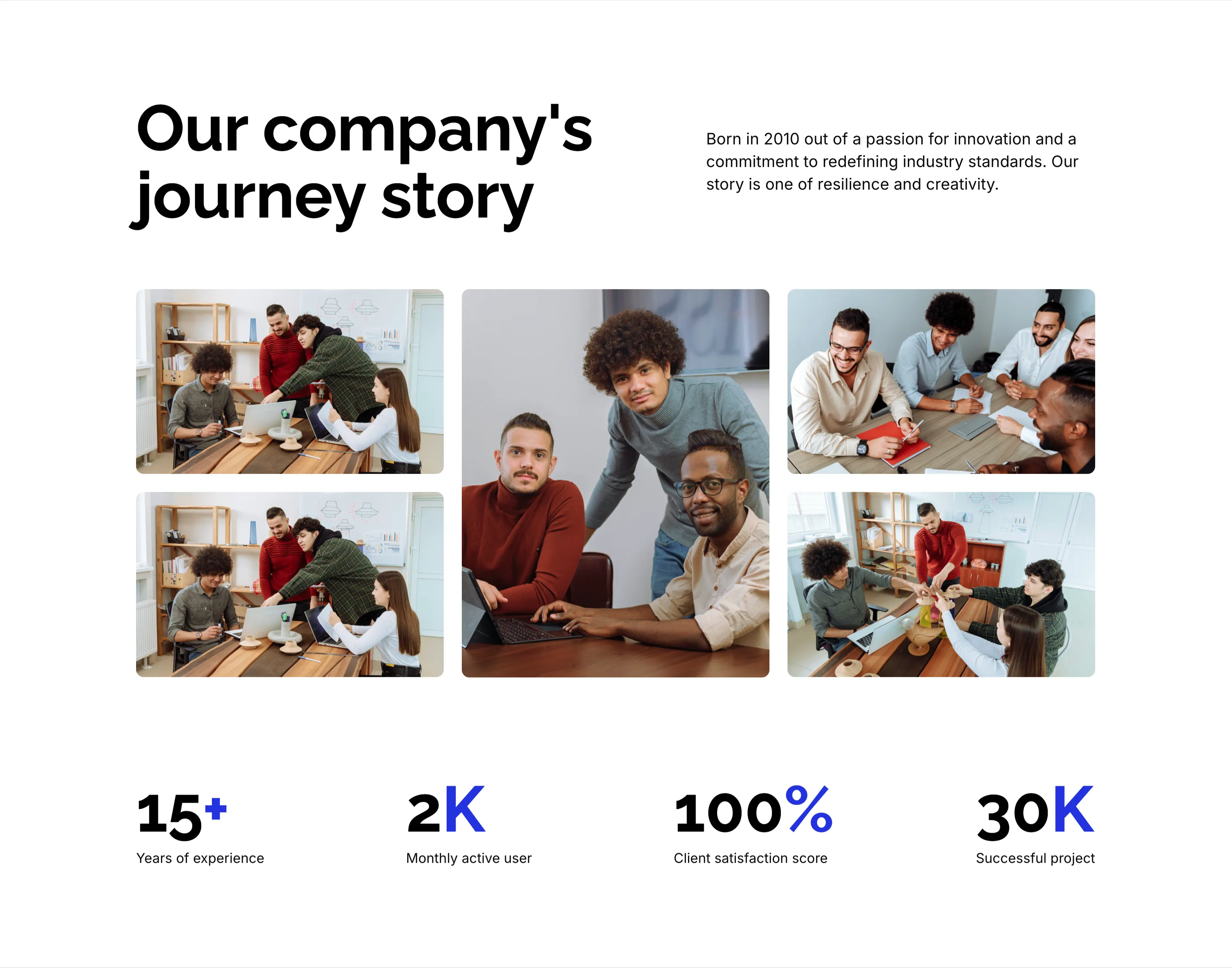
Our Company's Journey Story With Stats
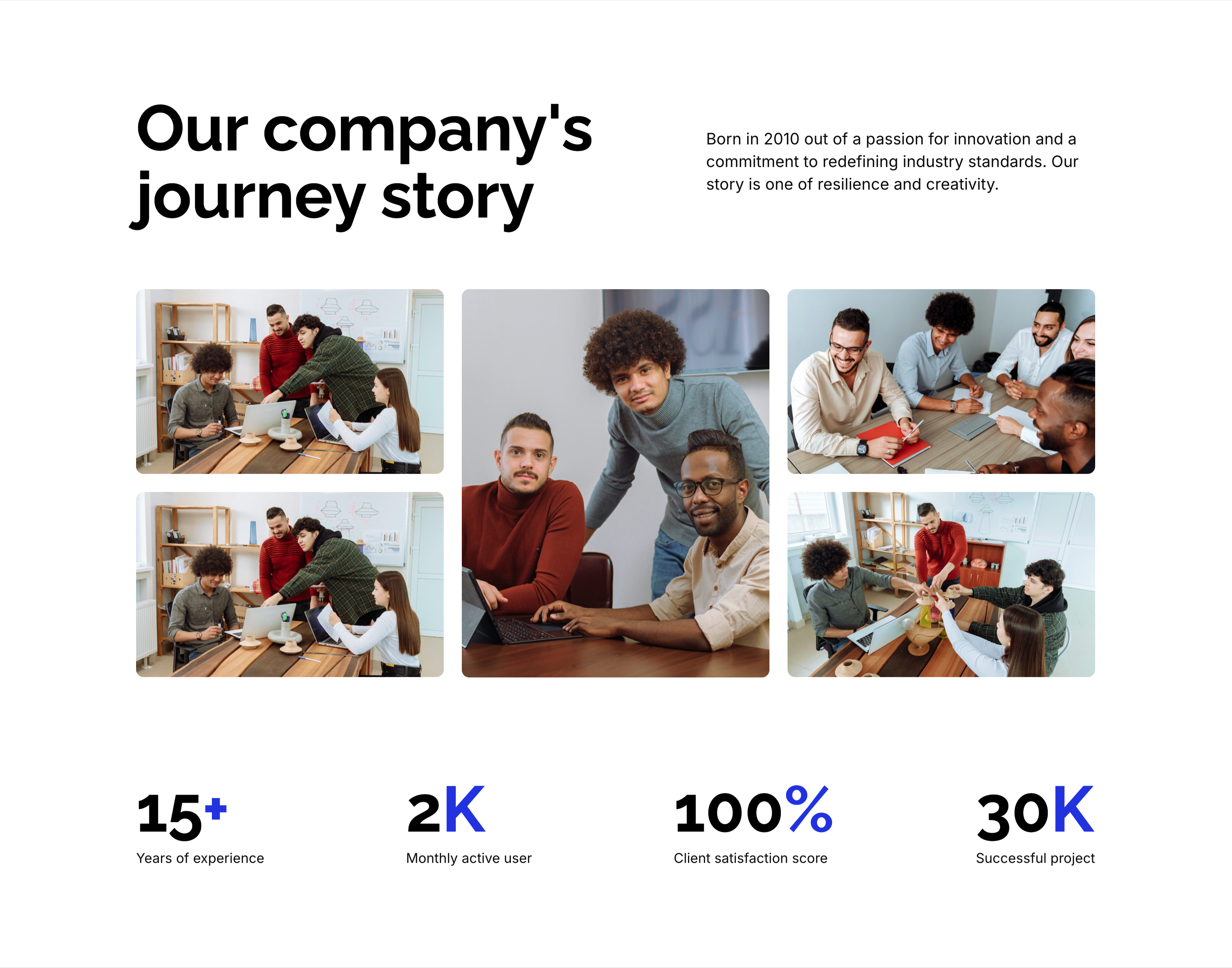
A company-story section on white. The top pairs an oversized black 'Our company's journey story' heading on the left with a short right-column paragraph noting the firm was 'Born in 2010 out of a passion for innovation…'. Below spans a five-image collage of candid office and team photos in a mixed grid, with one taller central portrait anchoring the group. A row of four blue-accented statistics closes the block — '15+' years of experience, '2K' monthly active users, '100%' client satisfaction score and '30K' successful projects — each figure over a small gray caption. The heading, photo montage and hard numbers together build an at-a-glance credibility story.
Zubuz ↗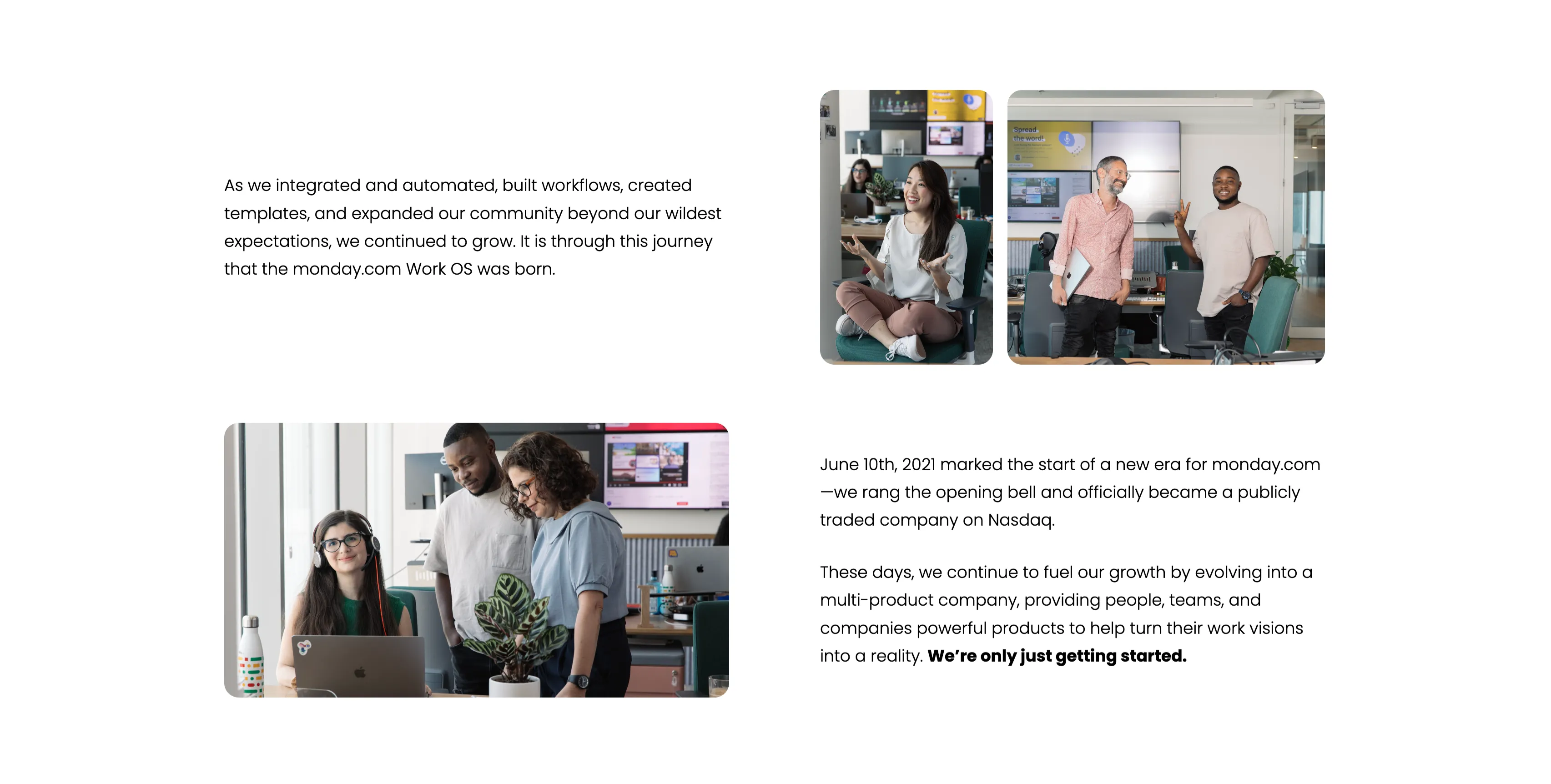
Company Journey Narrative With Team Photos
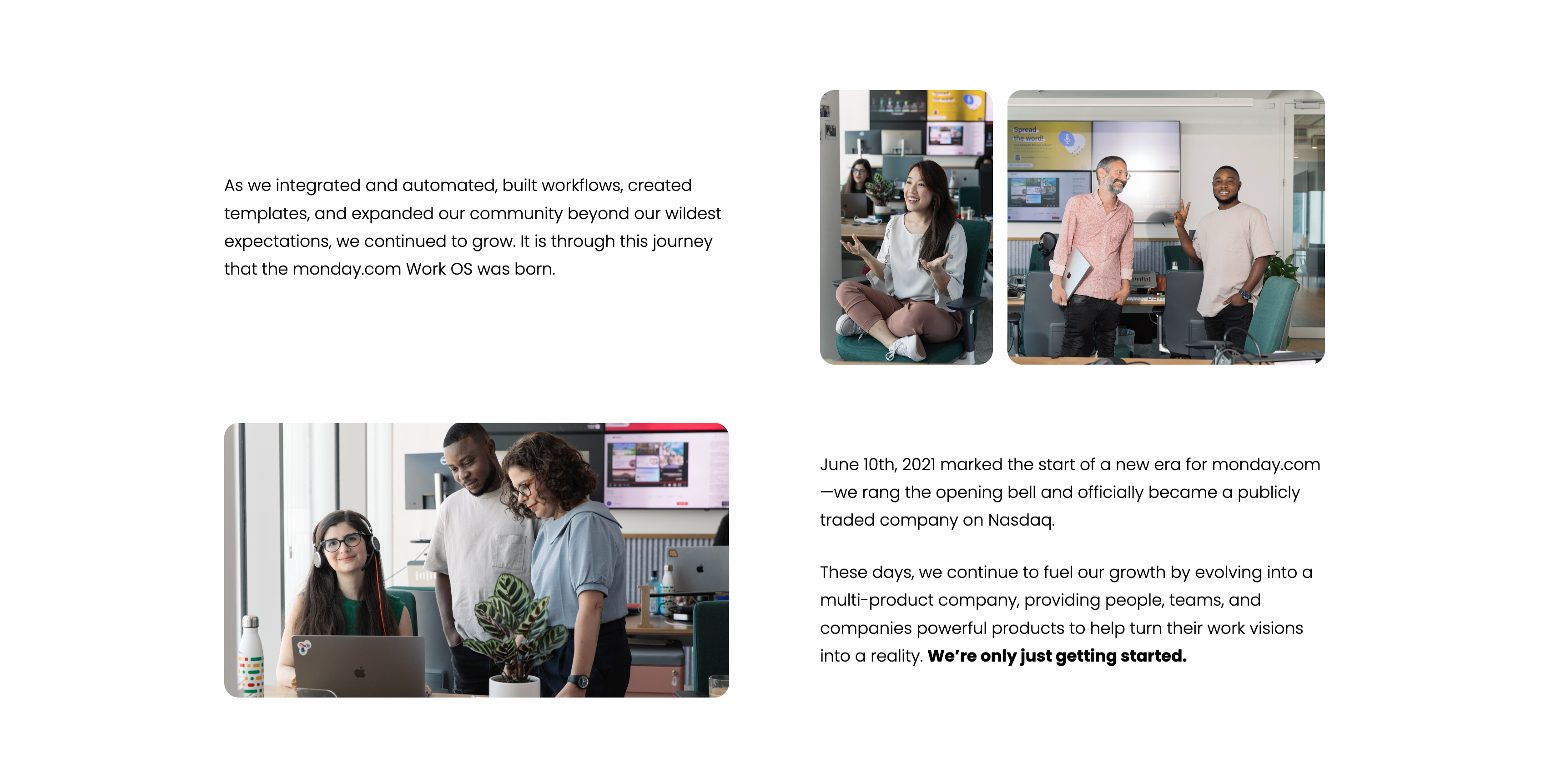
A narrative section alternating text and photography across a loose two-column grid on white. A top-left paragraph recounts how monday.com 'integrated and automated, built workflows, created templates, and expanded our community…', concluding 'It is through this journey that the monday.com Work OS was born', paired with an upper-right pair of candid office photos of employees. Lower down, a second block of copy notes the 'June 10th, 2021' Nasdaq IPO and the evolution into a multi-product company, ending with a bold 'We're only just getting started.', beside a lower-left photo of three colleagues at a desk with a plant. The mix of milestone copy and authentic team imagery makes the growth story feel personal rather than corporate.
Monday ↗

It's All About The People Photo Banner
A full-bleed photographic banner. The image shows three colleagues gathered around a laptop in a bright, plant-dotted open office — a woman with curly hair and two men, one leaning in and pointing at the screen, all smiling. Overlaid at the left in large bold white type, stacked across four lines, is the phrase 'It's all about the people', its weight and white colour standing out against the darker office background. There is no button or extra copy; the photo and headline alone carry the section. The candid workplace imagery gives the company-story a warm, human tone.
Monday ↗

So How Did Monday.com Come To Be Intro
A two-column narrative intro on a white background. The left column carries an oversized bold question, 'So how did monday.com come to be?', with 'monday.com' emphasised in the brand's indigo while the rest sits in near-black. The right column answers in a short gray paragraph: 'Well for us, it happened somewhere in between collaborating and communicating, engaging, and scaling rapidly. All while being totally transparent and working the way we want.' The generous whitespace and the single splash of brand colour keep the section calm and editorial, easing the reader into the company-story sequence.
Monday ↗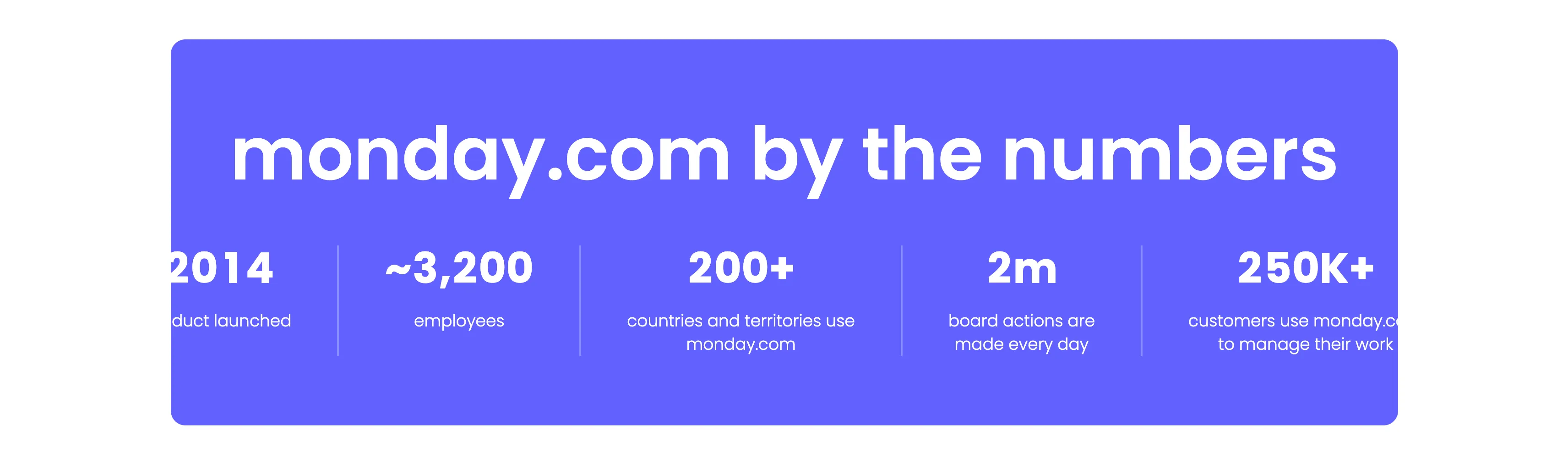
Monday.com By The Numbers Stats Band
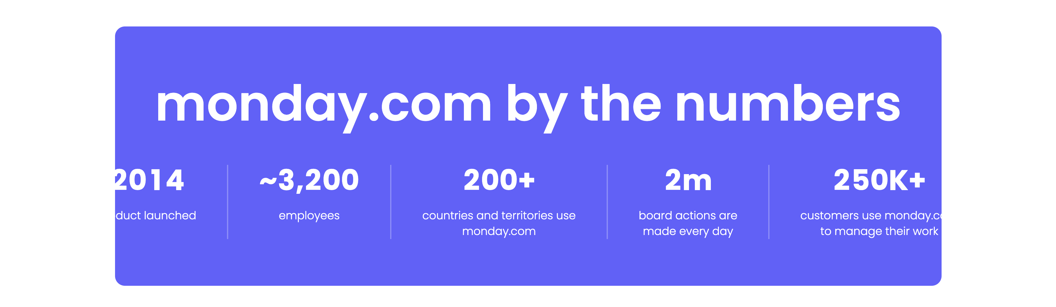
A bold statistics band set on a vibrant indigo rounded panel. A very large white headline, 'monday.com by the numbers', spans the top. Beneath it a single row of five metrics is separated by thin vertical dividers, each pairing an oversized white figure with a small caption: '2014' (product launched), '~3,200' (employees), '200+' (countries and territories use monday.com), '2m' (board actions are made every day) and '250K+' (customers use monday.com to manage their work). The saturated purple background and heavy numerals make the growth figures the sole focus. The clean five-up split reads as confident, at-a-glance proof.
Monday ↗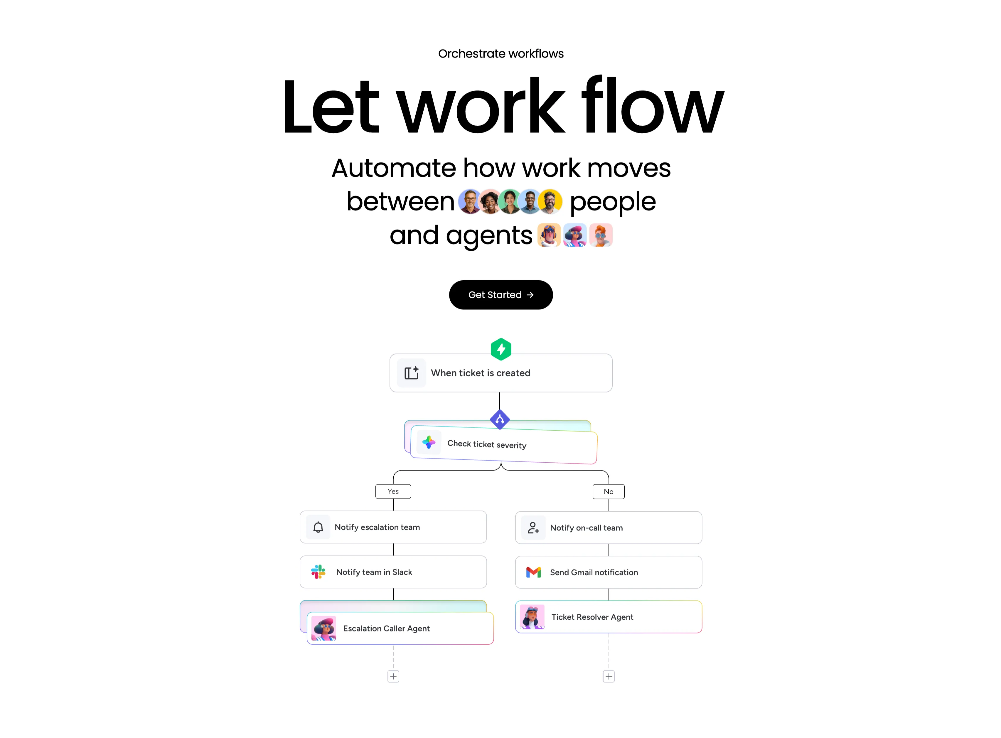
Let Work Flow Workflow Orchestration Diagram
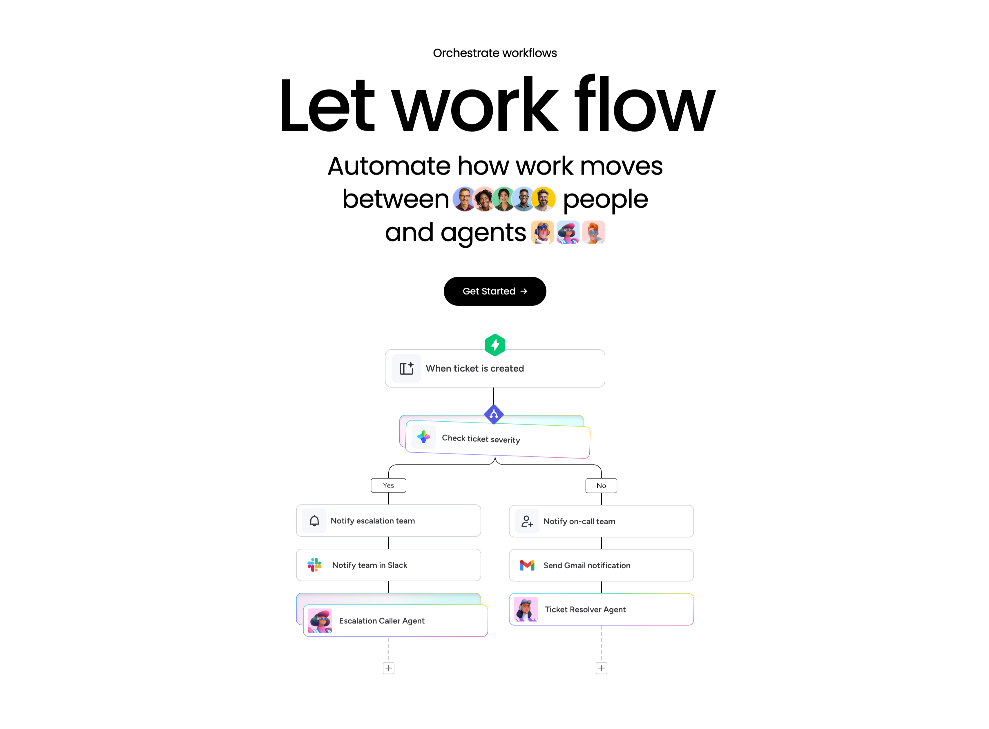
A workflow-orchestration section, centered, on a white background. A small 'Orchestrate workflows' eyebrow tops an enormous 'Let work flow' headline, followed by the subhead 'Automate how work moves between people and agents' with inline rows of human avatars and agent avatars set into the sentence, and a black 'Get Started' pill button. Below, a branching flowchart illustrates the concept: a green lightning trigger 'When ticket is created' leads into a rainbow-bordered decision node 'Check ticket severity', which splits into Yes and No paths. The Yes branch stacks 'Notify escalation team' → 'Notify team in Slack' → 'Escalation Caller Agent'; the No branch stacks 'Notify on-call team' → 'Send Gmail notification' → 'Ticket Resolver Agent', each step a labelled card with an app icon. The literal node diagram makes automation between people and agents easy to grasp.
Monday ↗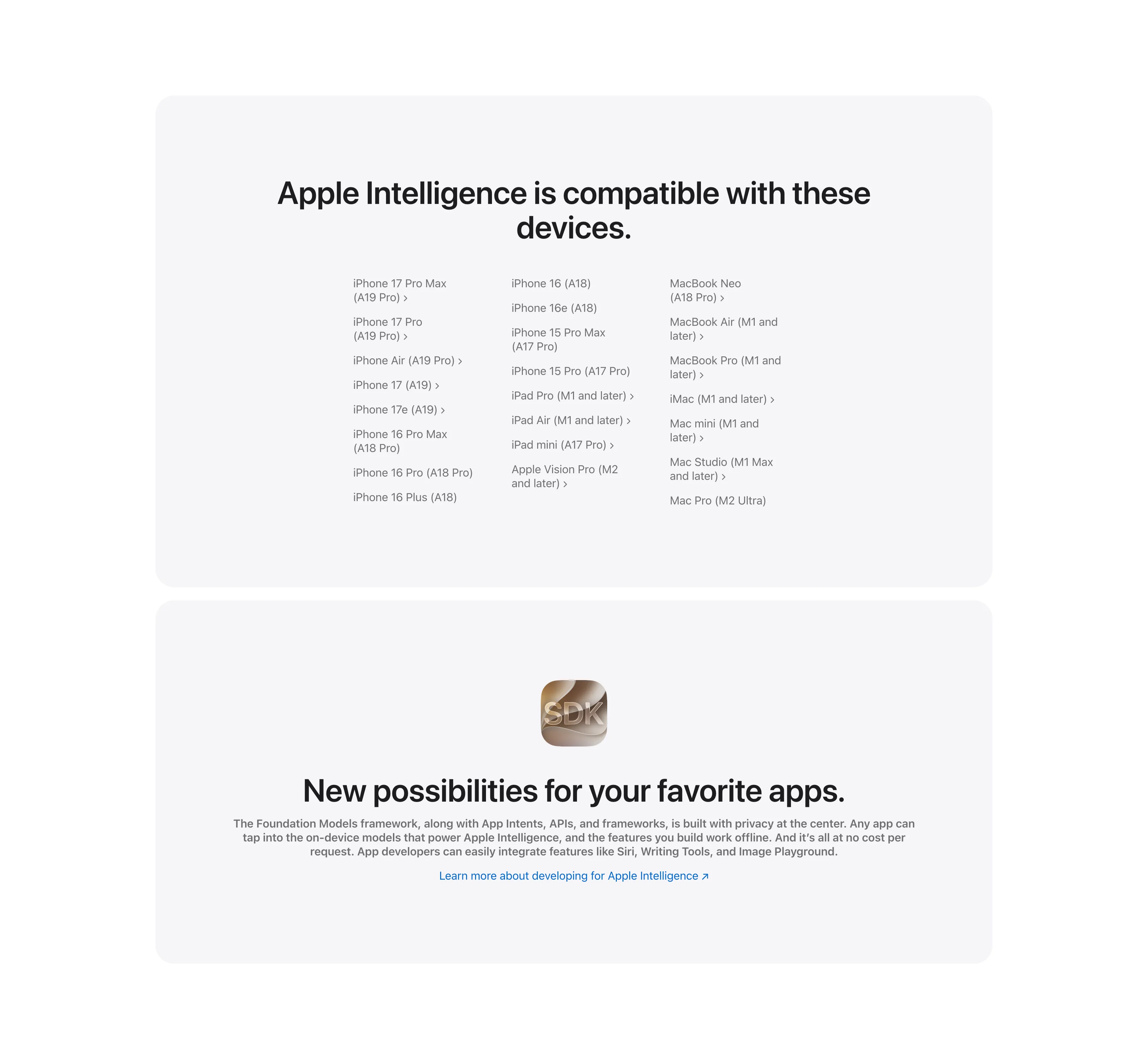
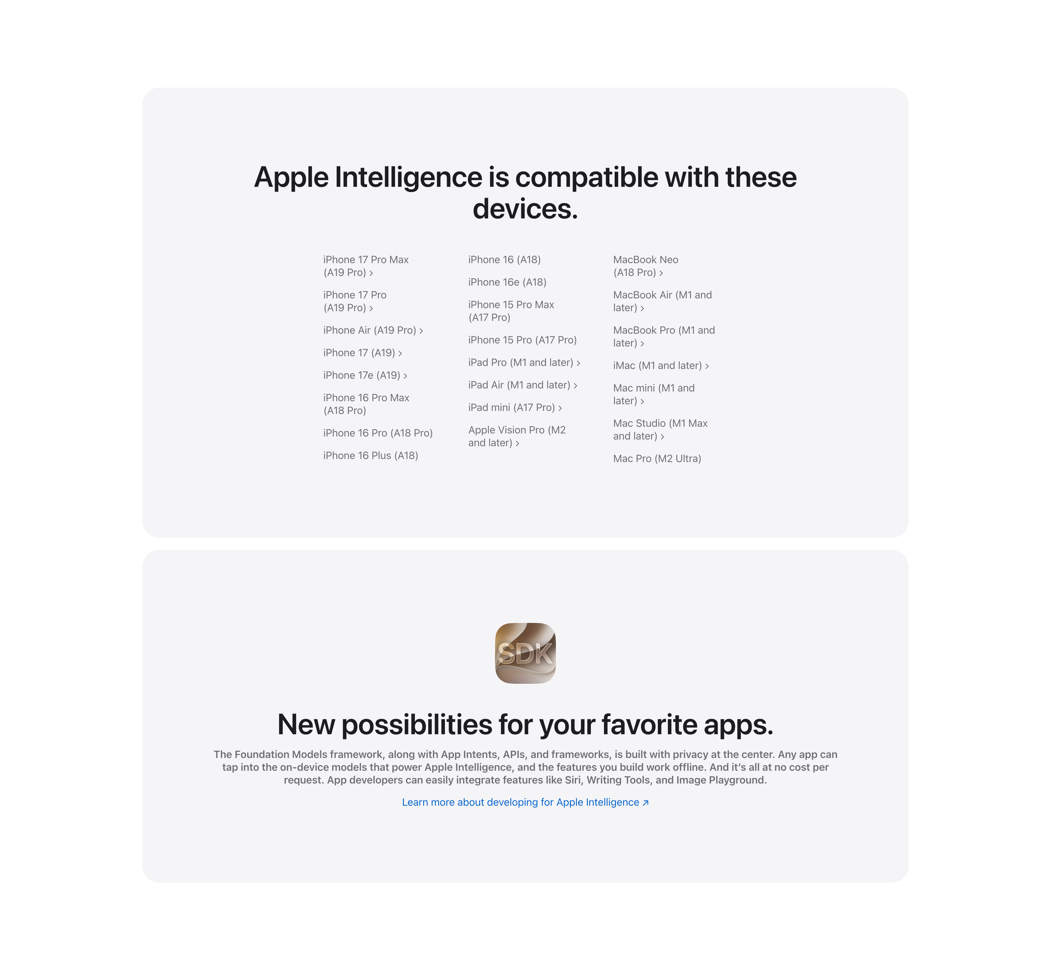
Compatible Devices List And Developer SDK Cards
Two stacked pale-gray rounded cards. The upper card, headed 'Apple Intelligence is compatible with these devices.', lays out a long three-column list of supported hardware — iPhone 17 Pro Max through iPhone 16 models, iPad Pro/Air/mini and Apple Vision Pro, and Mac models from MacBook Neo to Mac Pro — many entries carrying chevron links to detail pages. The lower card centers a glossy 'SDK' app icon above the bold headline 'New possibilities for your favorite apps.', a gray paragraph about the Foundation Models framework and App Intents, and a blue 'Learn more about developing for Apple Intelligence' link. The restrained monochrome cards keep the dense reference content and the developer call-to-action visually calm.
Apple ↗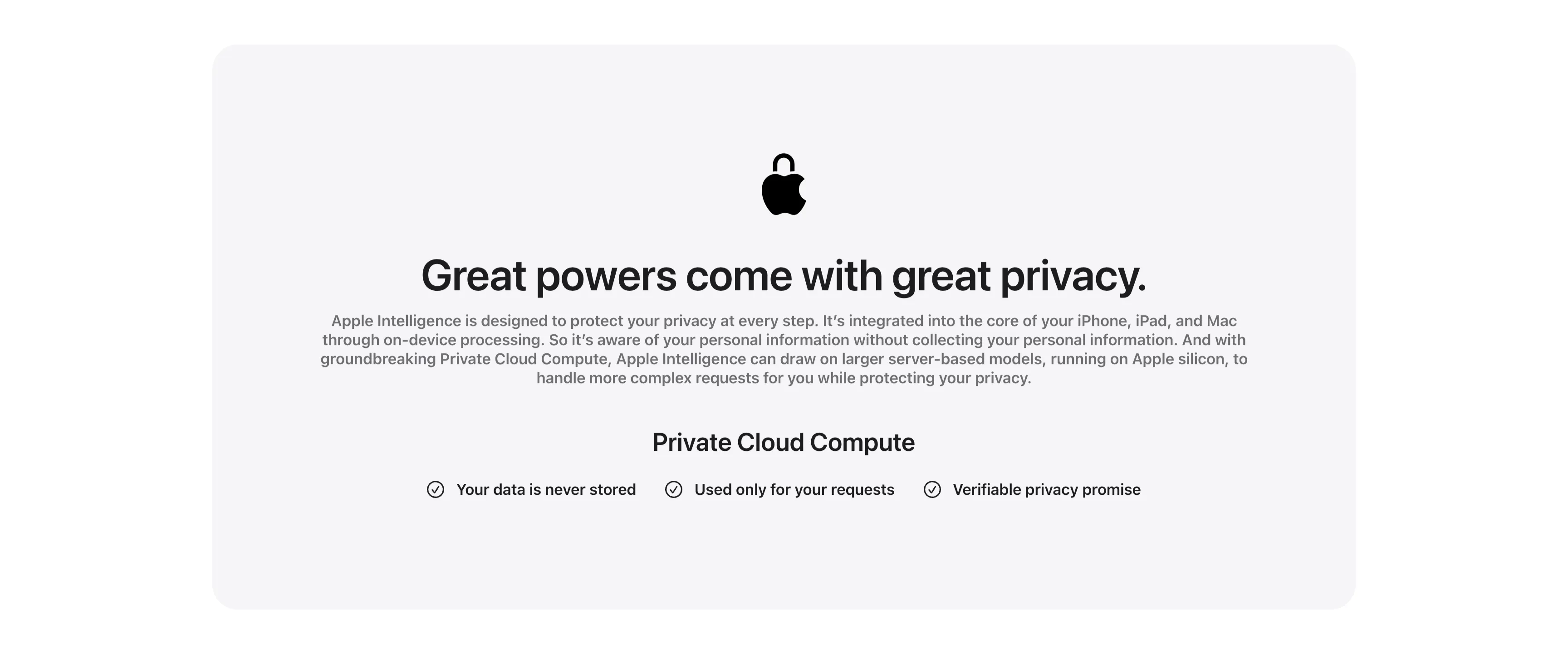
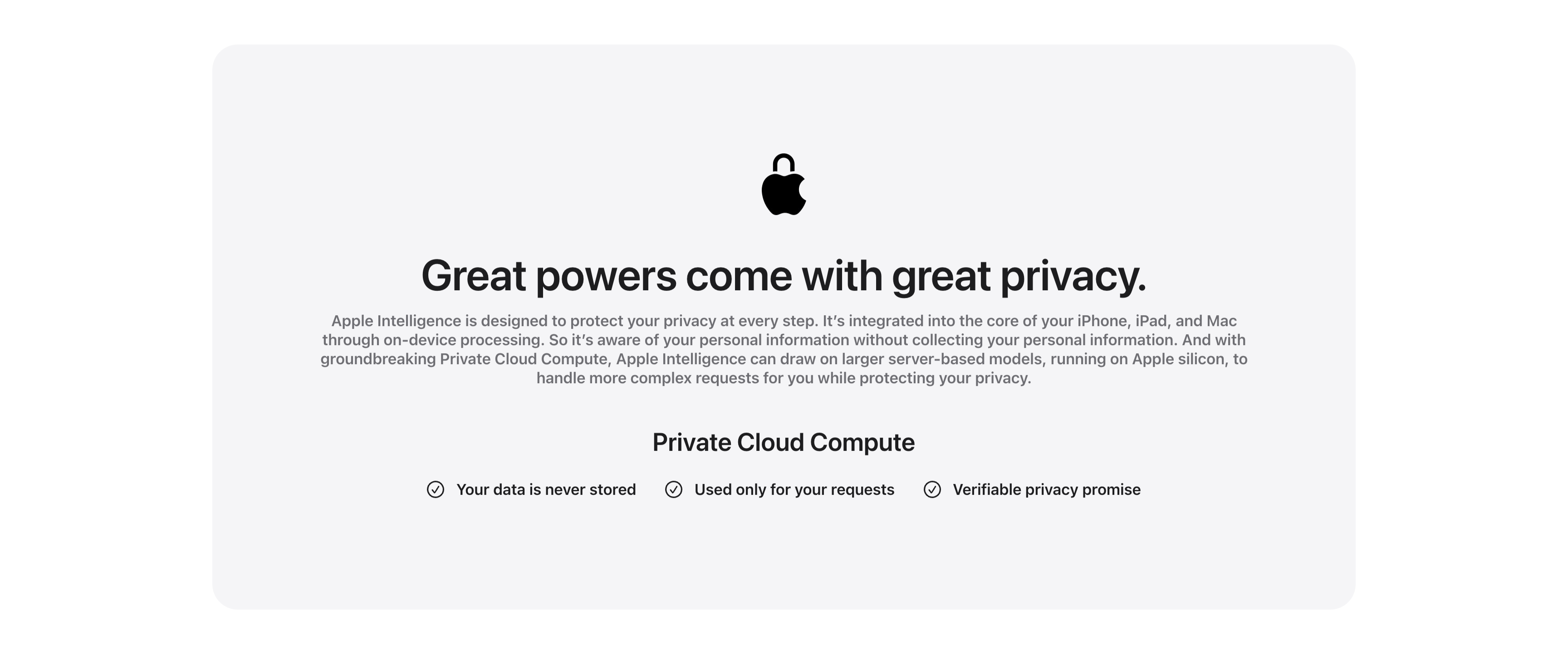
Great Powers Come With Great Privacy Band
A centered privacy content band housed in a large pale-gray rounded card. At the top a black Apple logo rendered as a padlock sits above the centered headline 'Great powers come with great privacy.' A justified gray paragraph explains on-device processing and Private Cloud Compute running on Apple silicon. Below, a bold 'Private Cloud Compute' subhead introduces a single horizontal row of three checkmarked claims — 'Your data is never stored', 'Used only for your requests' and 'Verifiable privacy promise' — each prefixed by a circled check icon. The symmetrical, generously padded layout and restrained monochrome palette give the privacy message a calm, trustworthy, reassuring tone.
Apple ↗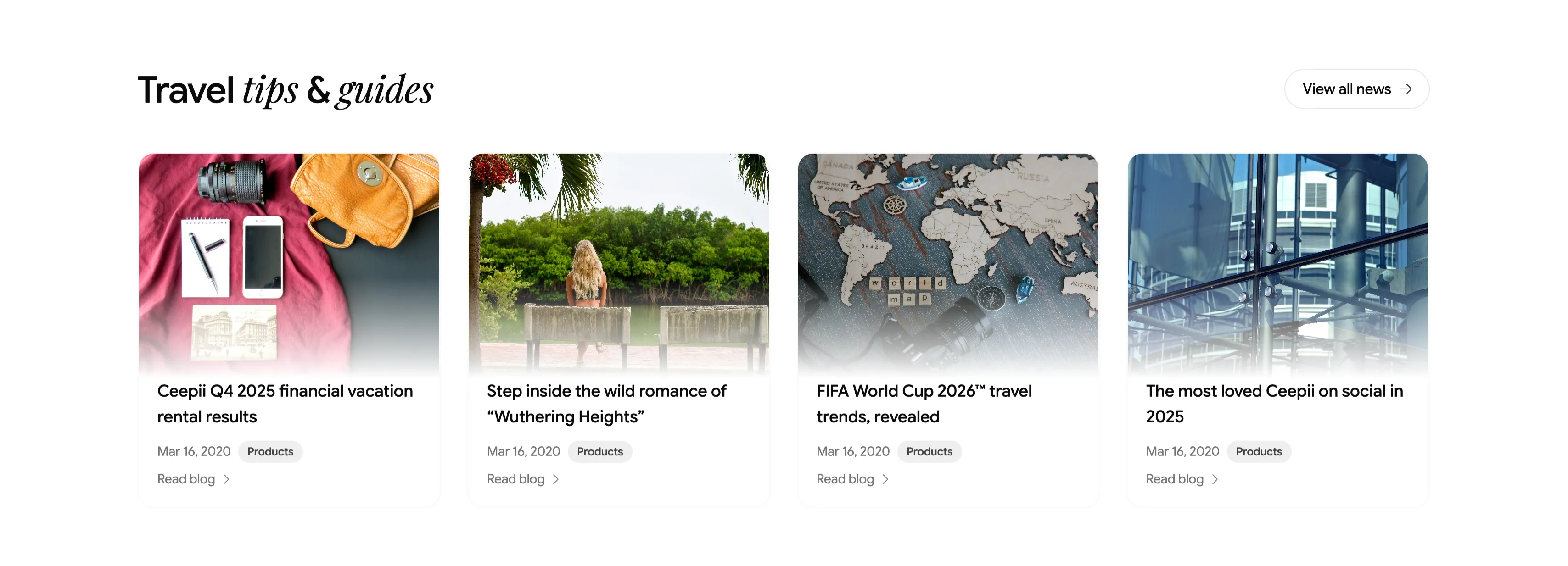
Travel Tips And Guides Blog Card Row
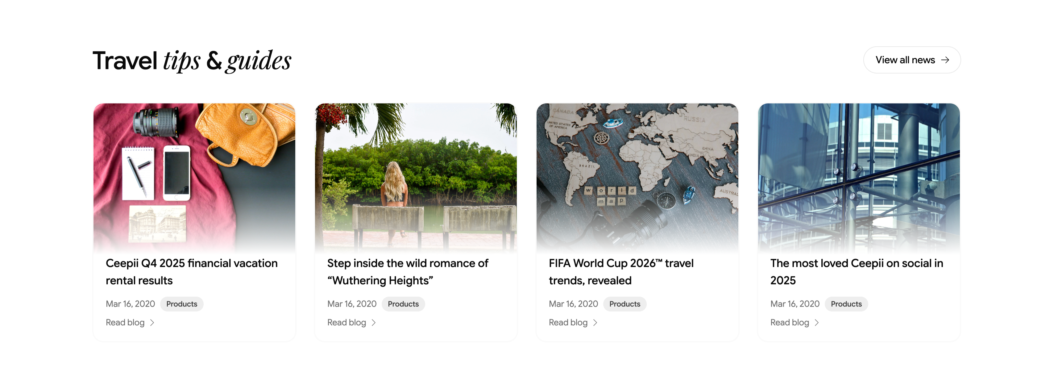
A blog teaser section headed 'Travel tips & guides', with 'tips & guides' in italic serif and a pill 'View all news →' button at upper-right. Below runs a four-up row of article cards, each a rounded cover image above a title, a 'Mar 16, 2020' date, a gray 'Products' category tag, and a 'Read blog →' link. The featured posts are 'Ceepii Q4 2025 financial vacation rental results', 'Step inside the wild romance of "Wuthering Heights"', 'FIFA World Cup 2026™ travel trends, revealed', and 'The most loved Ceepii on social in 2025', with editorial photography (a flat-lay travel kit, a lakeside figure, a wooden world map, and glass architecture). The clean image-over-text cards give a tidy, magazine-style content row.
Ceepii-nextjs-template ↗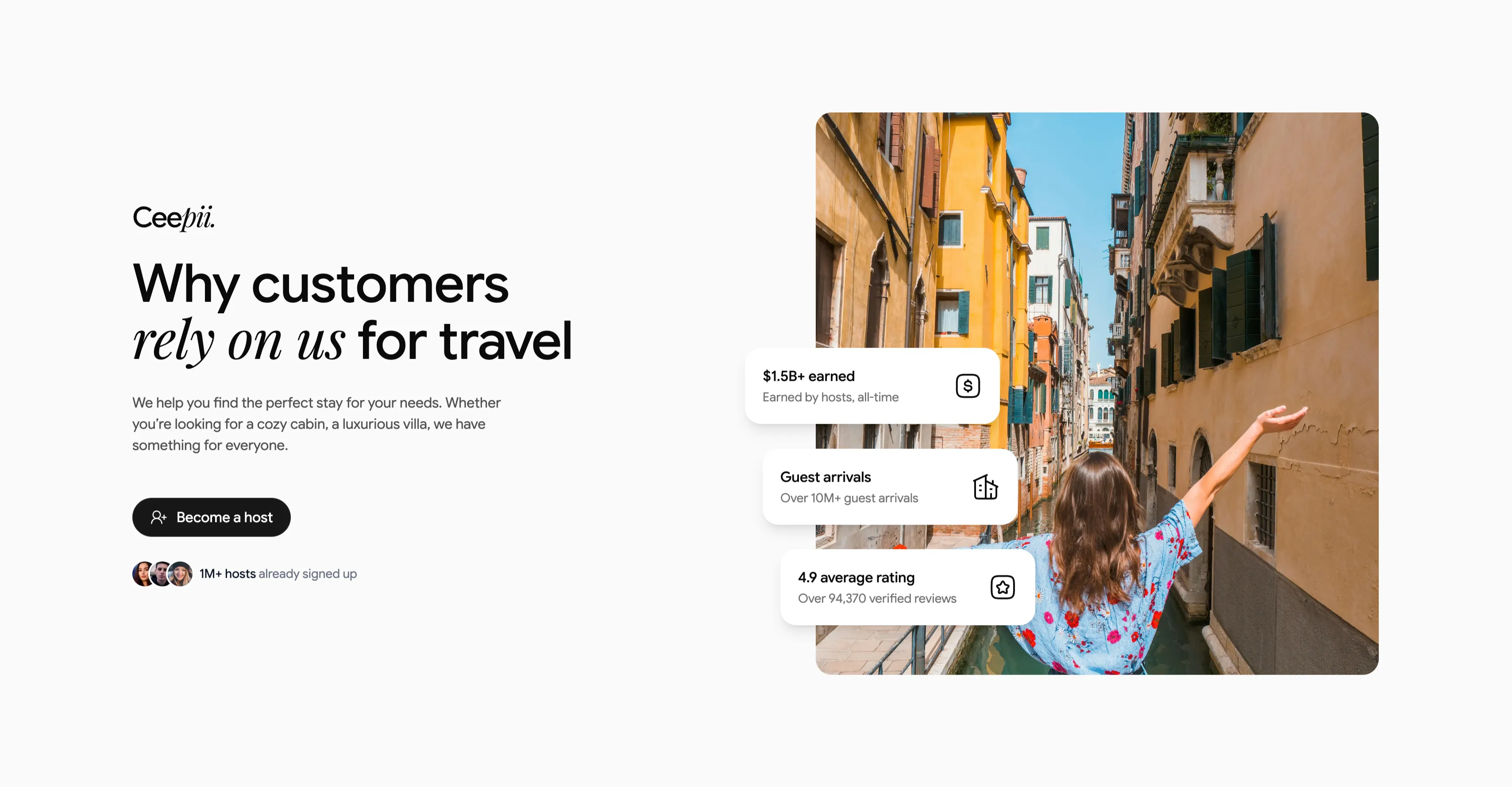
Why Customers Rely On Us Value Block
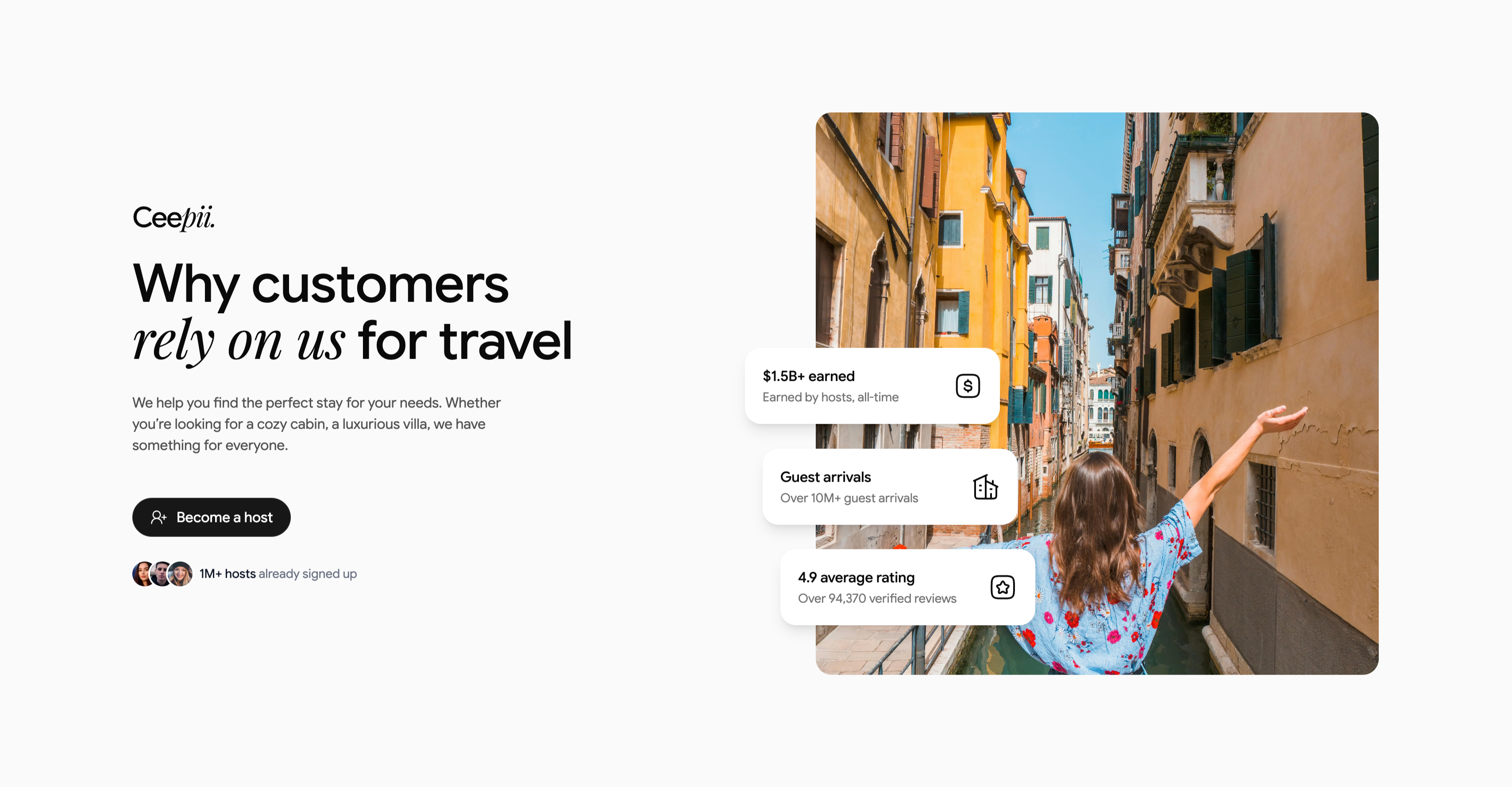
A two-column value proposition on a light gray background. The left column carries the 'Ceepii.' wordmark, a large heading 'Why customers rely on us for travel' (with 'rely on us' in italic serif), a short paragraph about finding the perfect stay, a black pill 'Become a host' button with a person-plus icon, and an avatar trio beside '1M+ hosts already signed up'. The right column is a tall rounded photograph of a woman with outstretched arms in a sunlit Venice canal, overlaid by three floating white stat cards, each with an icon: '$1.5B+ earned / Earned by hosts, all-time', 'Guest arrivals / Over 10M+ guest arrivals', and '4.9 average rating / Over 94,370 verified reviews'. The floating proof cards over an evocative travel photo turn a host-recruitment pitch into a credibility-led CTA.
Ceepii-nextjs-template ↗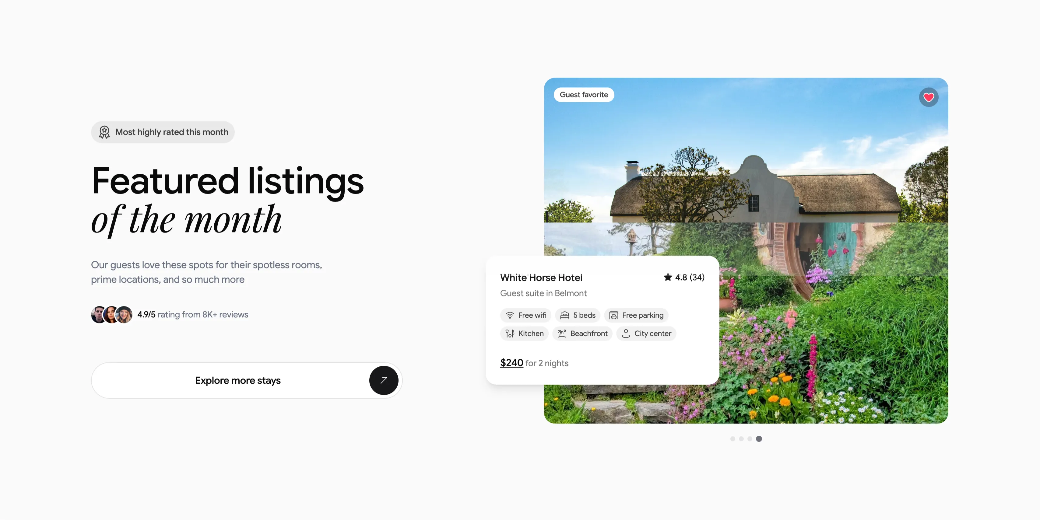
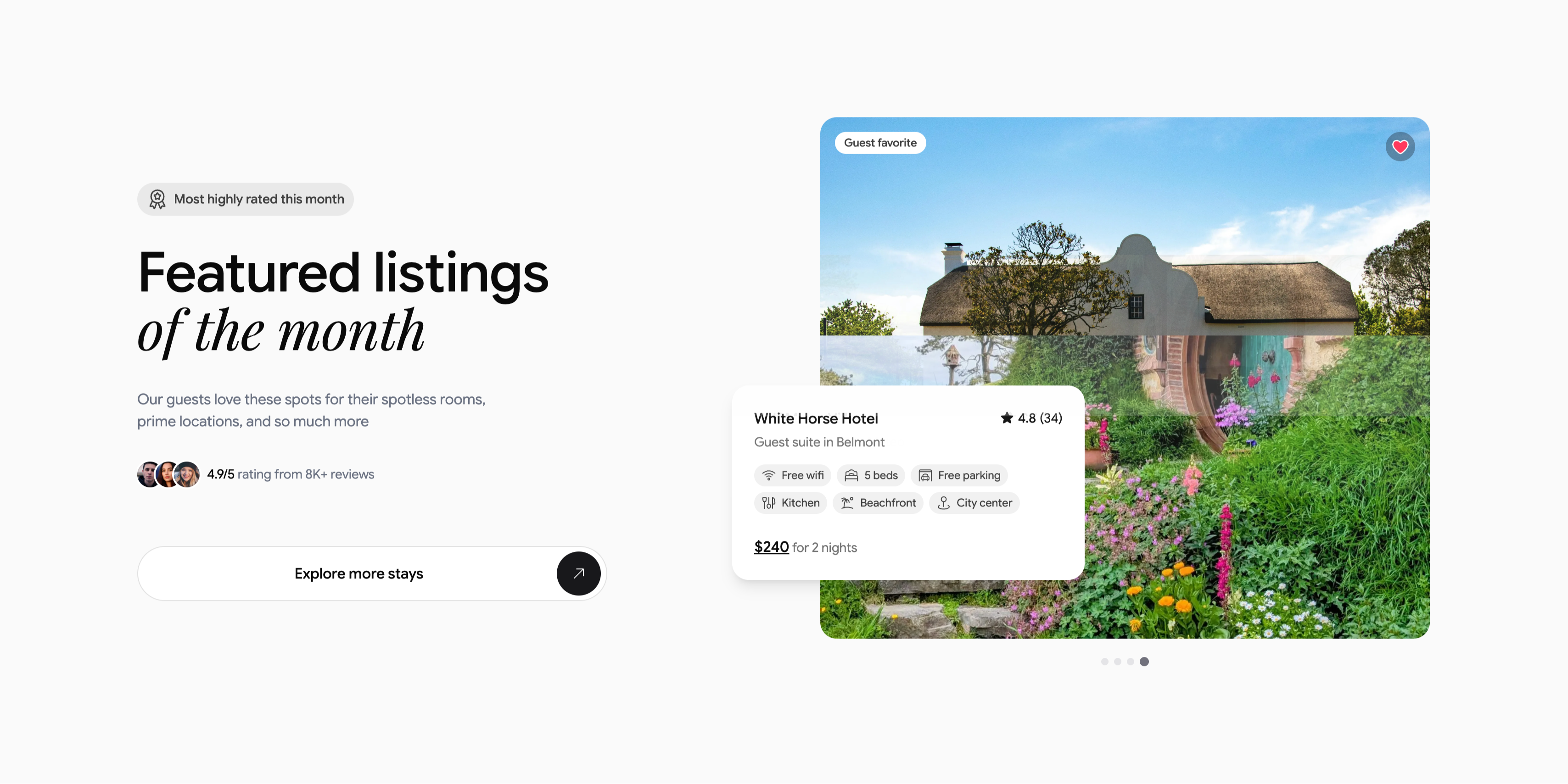
Featured Listing Of The Month Spotlight
A two-column spotlight on a light gray background. The left column stacks a small pill badge, 'Most highly rated this month', a large heading 'Featured listings of the month' (with 'of the month' in italic serif), a short subhead about spotless rooms and prime locations, an avatar trio beside '4.9/5 rating from 8K+ reviews', and a wide white 'Explore more stays' button capped with a circular arrow. The right column shows a large rounded photograph of a thatched cottage in a lush flowering garden, tagged 'Guest favorite' with a heart icon. Overlapping its lower-left corner is a white listing card: 'White Horse Hotel', '★ 4.8 (34)', 'Guest suite in Belmont', a set of amenity chips (Free wifi, 5 beds, Free parking, Kitchen, Beachfront, City center) and '$240 for 2 nights', with carousel dots beneath. The overlapping card and proof points make a single listing feel premium and clickable.
Ceepii-nextjs-template ↗

Enterprise-Grade Security Strip
A compact security-assurance strip on white. The left side carries a two-tone heading 'Enterprise-grade everything' above a small grey line: 'Out of the box security & AI that's even more private than ChatGPT'. The right side lines up four monochrome compliance badges — AICPA SOC 2, ISO 27001 Certified, GDPR, and a HIPAA caduceus. A thin baseline row repeats them as all-caps labels (24/7 SUPPORT, SOC 2 TYPE II, ISO 27001, GDPR, HIPAA) with a small globe icon at the far left. The restrained grey palette and certification marks reassure enterprise buyers about security and privacy in a single horizontal band.
Clickup ↗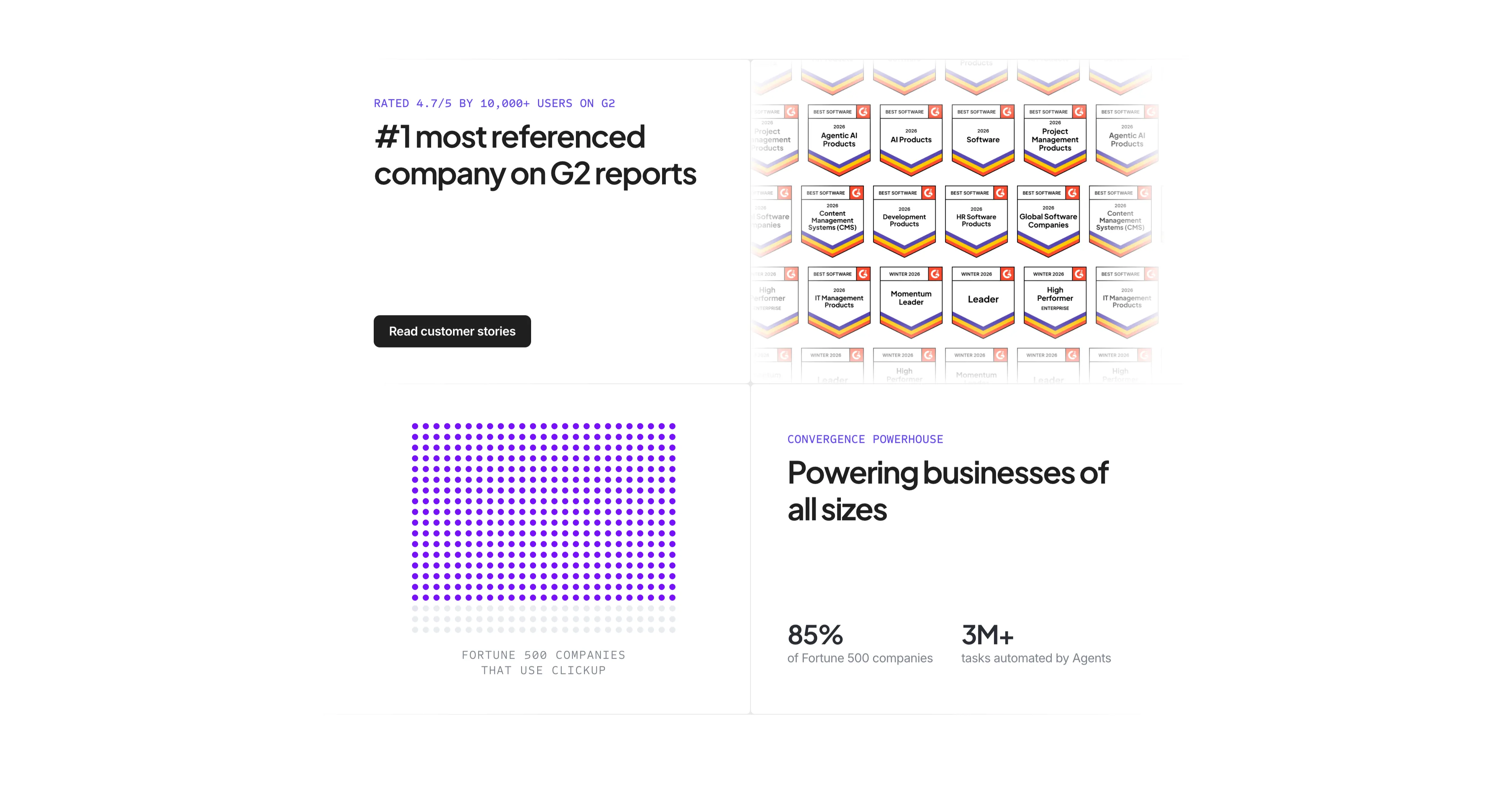
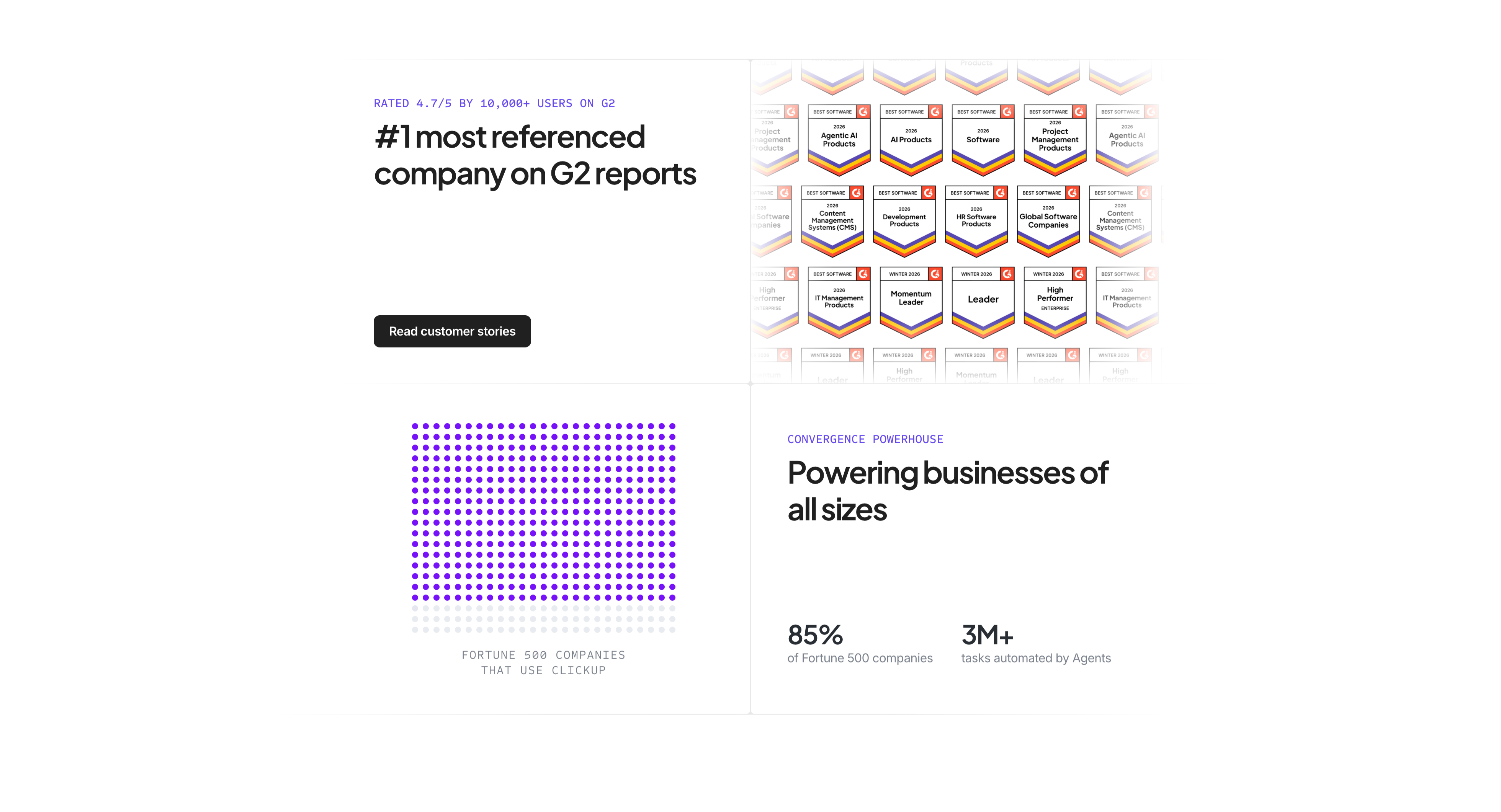
G2 Awards And Fortune 500 Proof
A four-quadrant social-proof section on white. The top-left quadrant carries an indigo label 'RATED 4.7/5 BY 10,000+ USERS ON G2', a bold headline '#1 most referenced company on G2 reports', and a black 'Read customer stories' button. The top-right shows a dense wall of G2 'Best Software 2026' award badges in rows, fading at the edges. The bottom-left renders 'FORTUNE 500 COMPANIES THAT USE CLICKUP' as a grid of purple dots (most filled, a few faded) acting as an infographic. The bottom-right pairs an indigo eyebrow 'CONVERGENCE POWERHOUSE' and heading 'Powering businesses of all sizes' with two stats — '85% of Fortune 500 companies' and '3M+ tasks automated by Agents'. The quadrant layout stacks multiple proof types into one screen.
Clickup ↗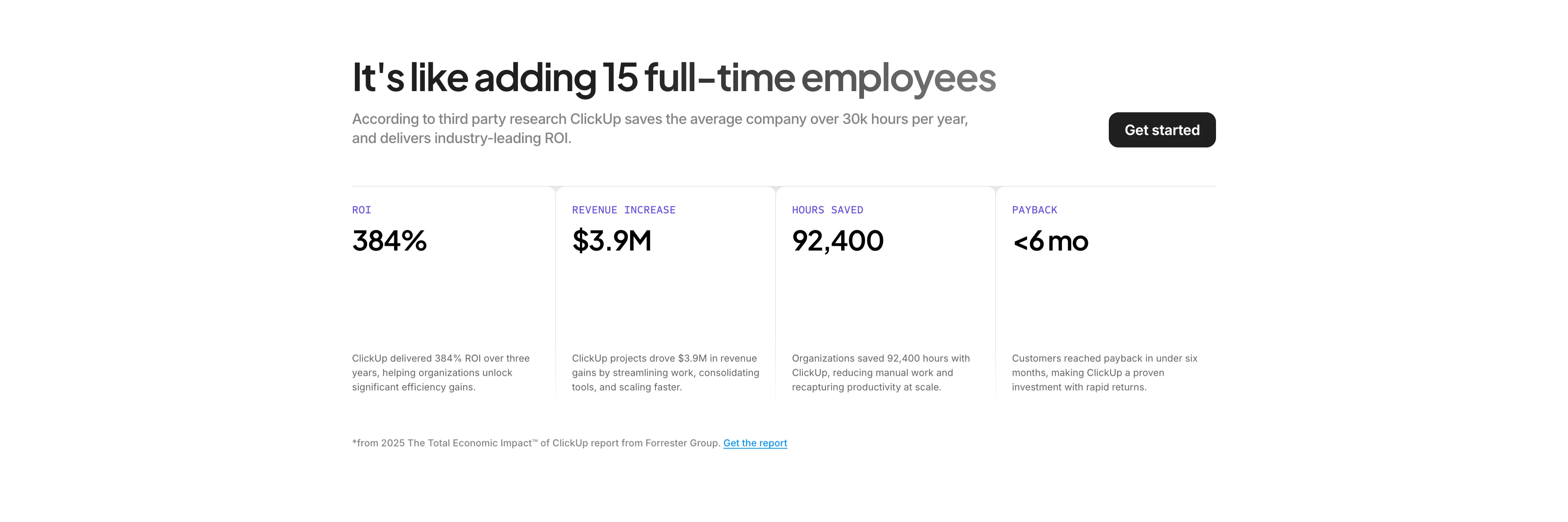
ROI Stats Four-Up Band
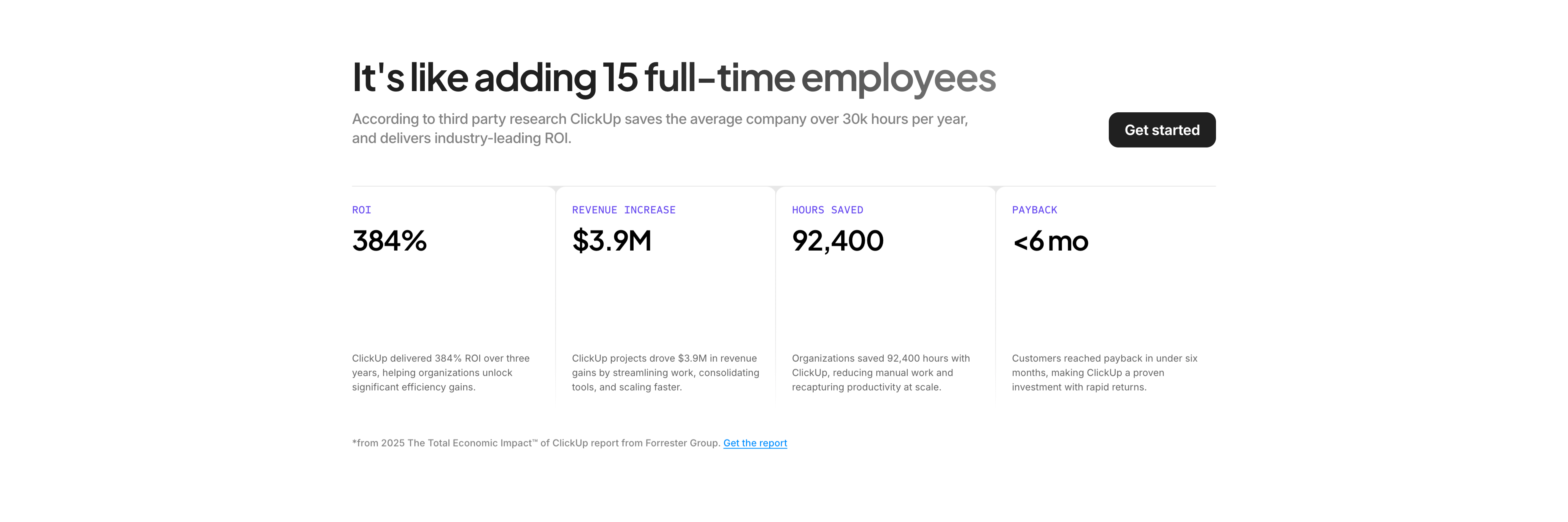
A results-focused section on white. A bold headline 'It's like adding 15 full-time employees' sits beside a grey supporting paragraph and a black 'Get started' button on the right. Below a hairline divider runs a four-column stat band, each column an indigo all-caps label, an oversized black figure, and a short explanatory sentence: ROI '384%', Revenue Increase '$3.9M', Hours Saved '92,400', and Payback '<6 mo'. Thin vertical rules separate the columns. A small footnote credits '2025 The Total Economic Impact of ClickUp report from Forrester Group' with a linked 'Get the report'. The large numerals plus a cited source turn the section into quantified, defensible social proof.
Clickup ↗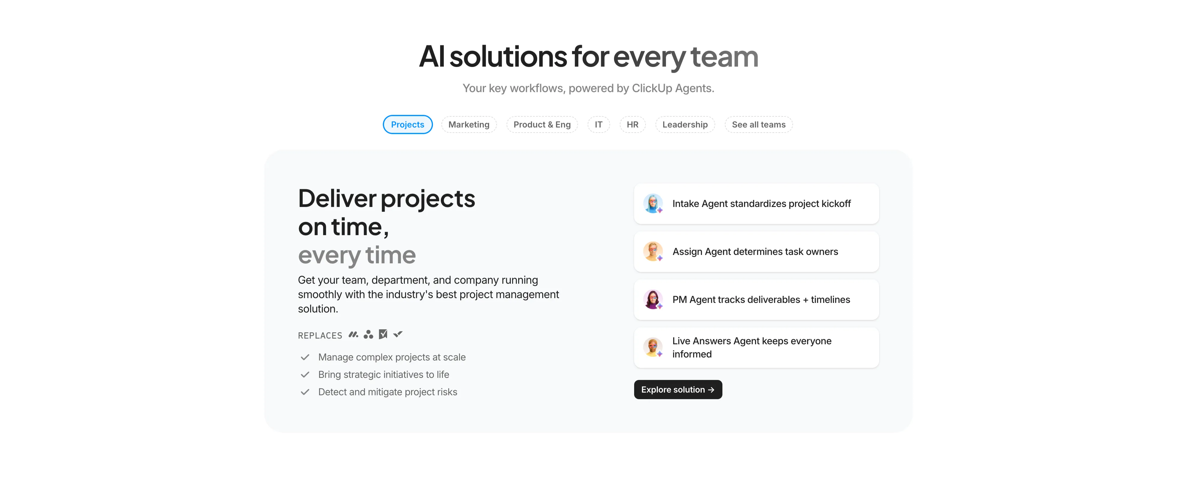
AI Solutions For Every Team Tabs
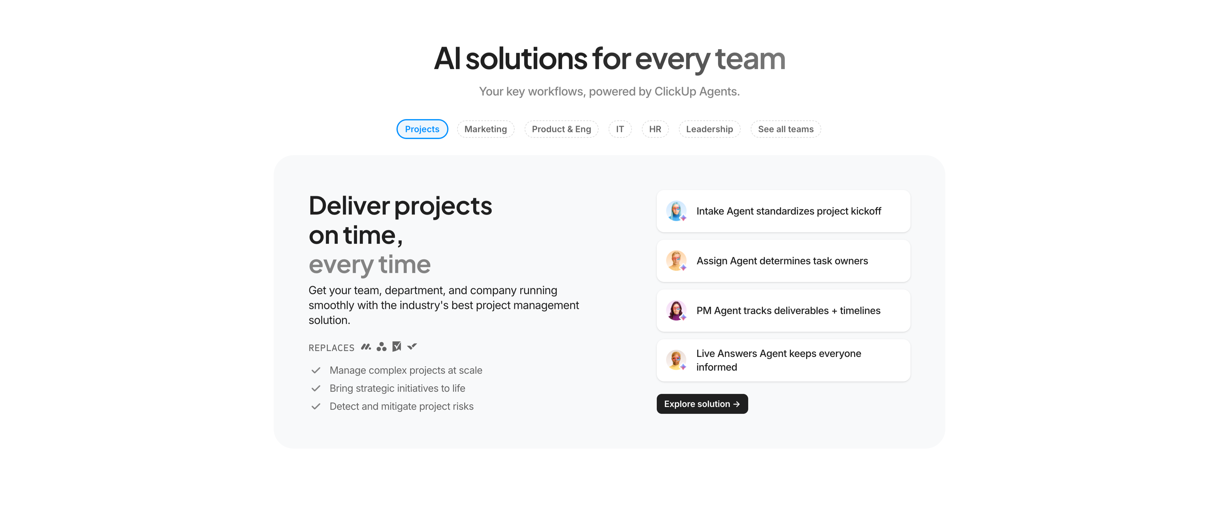
A centered solutions section on white with a tabbed split layout. The headline 'AI solutions for every team' sits above a grey subhead and a horizontal row of pill tabs — Projects (active, blue outline), Marketing, Product & Eng, IT, HR, Leadership, See all teams. Below, a rounded light-grey panel splits into two columns: the left holds a two-tone heading 'Deliver projects on time, every time', supporting copy, a small grey 'REPLACES' row of competitor icons, and three check-marked bullets; the right stacks four white agent cards, each an avatar plus a one-line capability ('Intake Agent standardizes project kickoff', 'Assign Agent determines task owners', 'PM Agent tracks deliverables + timelines', 'Live Answers Agent keeps everyone informed') with a black 'Explore solution →' button beneath. The tab pattern lets one layout flex across many audiences.
Clickup ↗

Super Agents Centered Promo
A centered promo block on white. A large two-tone headline reads 'A new era of humans, with Super Agents™', directly under which sit two buttons — a solid black 'Build your own agent' primary and a light-grey 'Learn More' secondary. Below the buttons, centered in the lower half, floats a glossy 3D mask-shaped object branded 'Super Agent', rendered in a vivid orange-to-pink-to-blue gradient with soft shadow. There is no body copy; the section relies on the single product hero image and the headline to introduce the Super Agents feature. The abundant whitespace and one bold rendered object give the block a launch-announcement feel.
Clickup ↗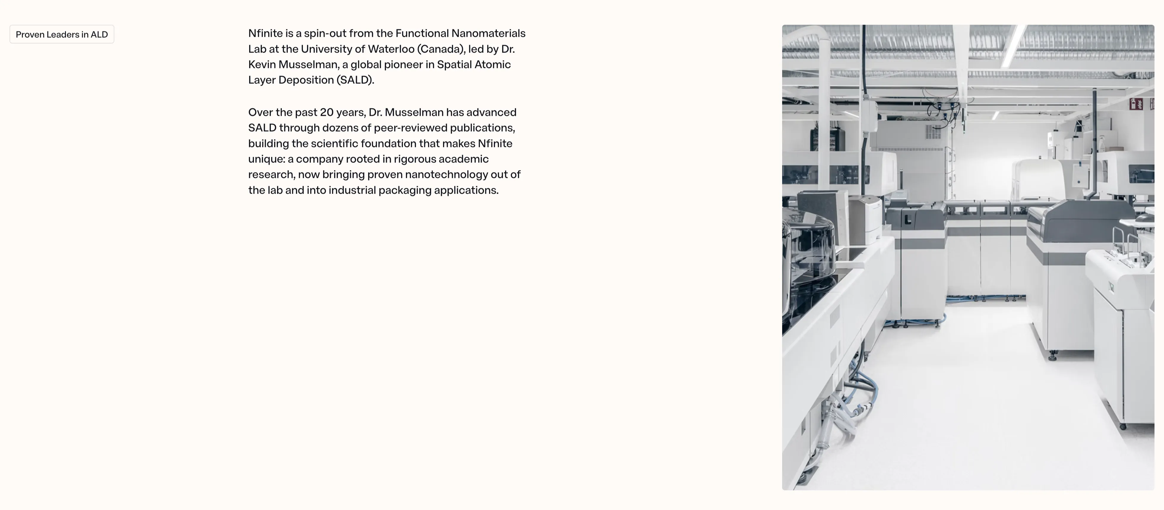
NFINITE Proven Leaders Split Content
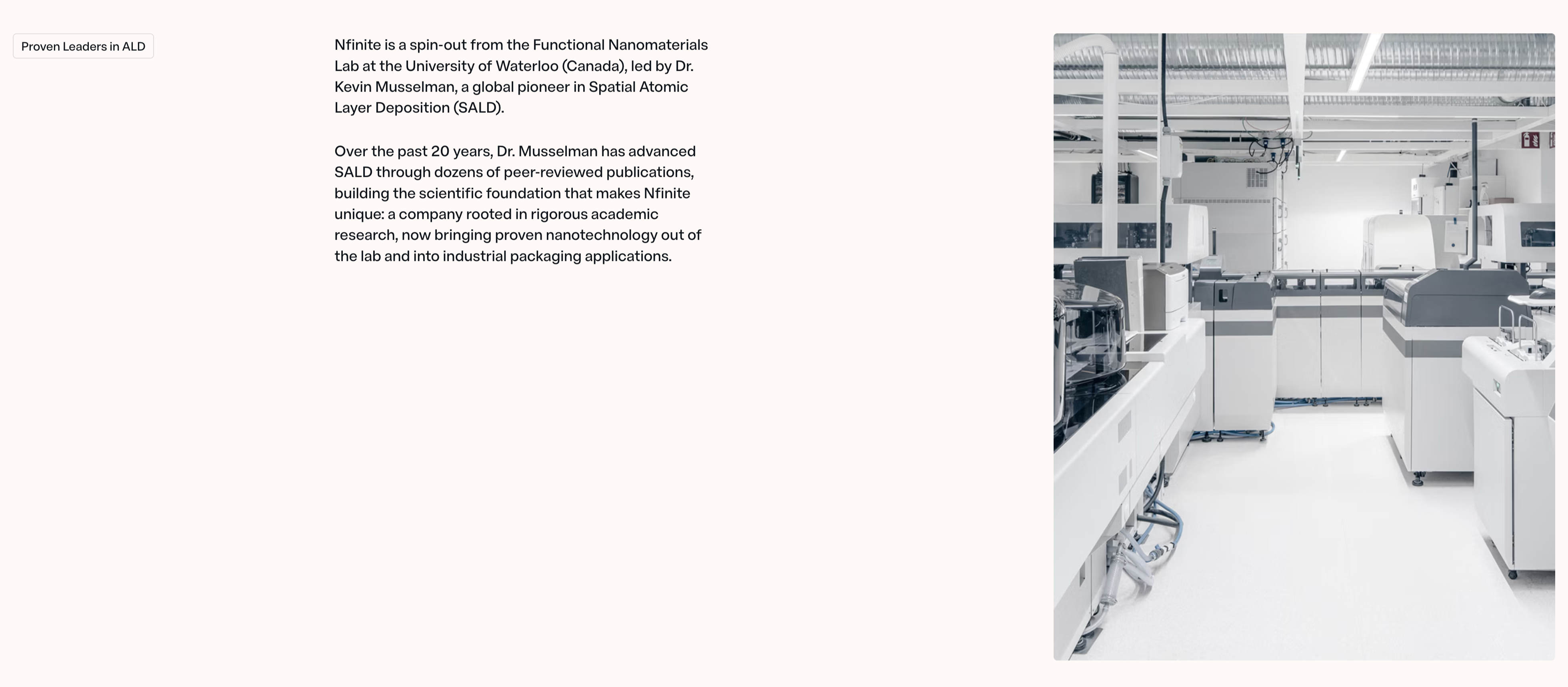
A two-column content section on a warm off-white background telling the company-origin story. The left side opens with a small outlined 'Proven Leaders in ALD' eyebrow pill, followed by two paragraphs of dark body copy explaining that 'Nfinite is a spin-out from the Functional Nanomaterials Lab at the University of Waterloo (Canada), led by Dr. Kevin Musselman, a global pioneer in Spatial Atomic Layer Deposition (SALD)' and that two decades of peer-reviewed research now bring proven nanotechnology into industrial packaging. The right half is a large desaturated photograph of a bright, clean lab or production floor lined with white analytical machines and overhead ducting. The roomy left margin, restrained type, and pairing of credentialed narrative with a real facility image give the block a trustworthy, research-grade tone.
Nfinitepaper ↗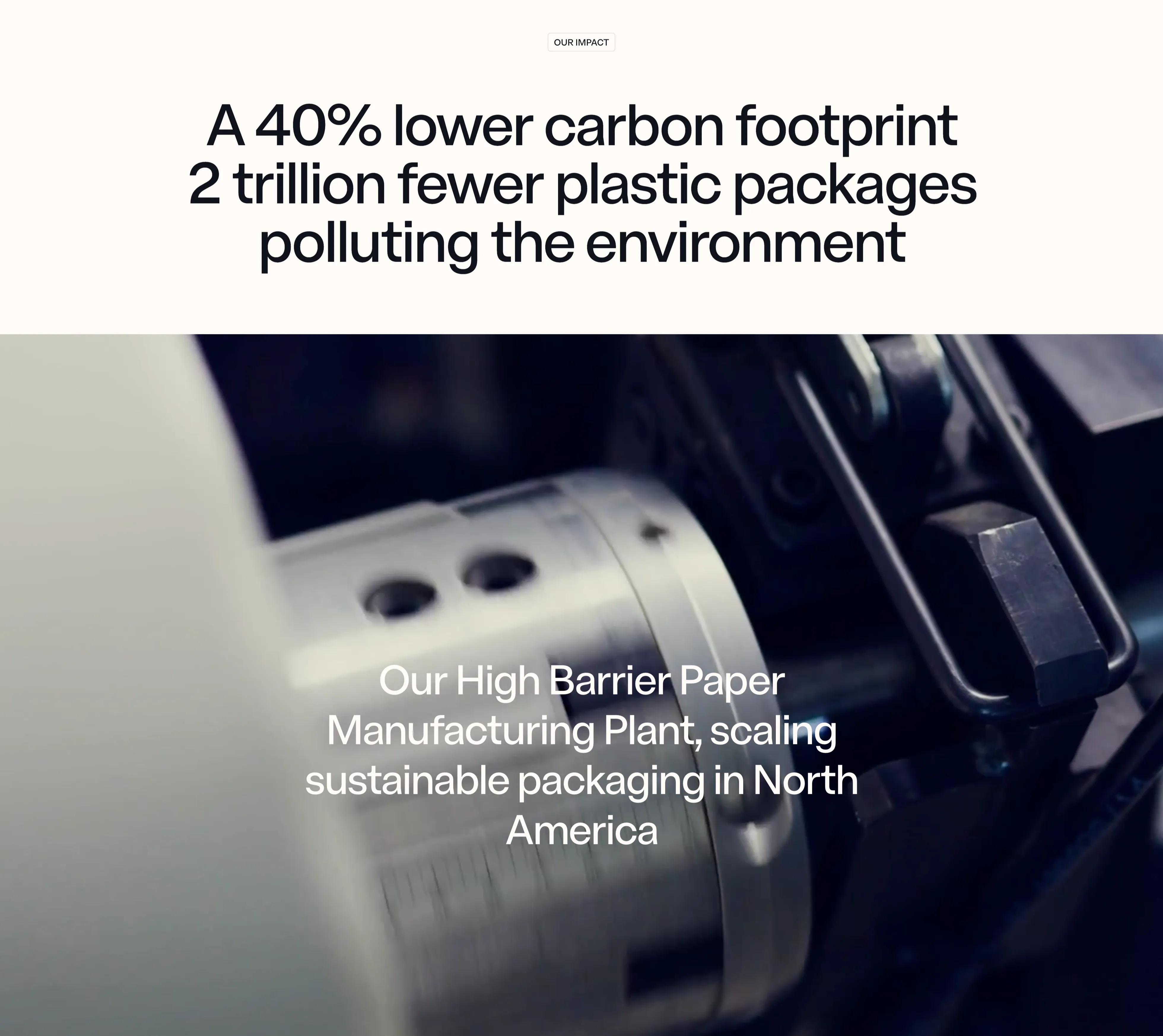
NFINITE Impact Stat Band
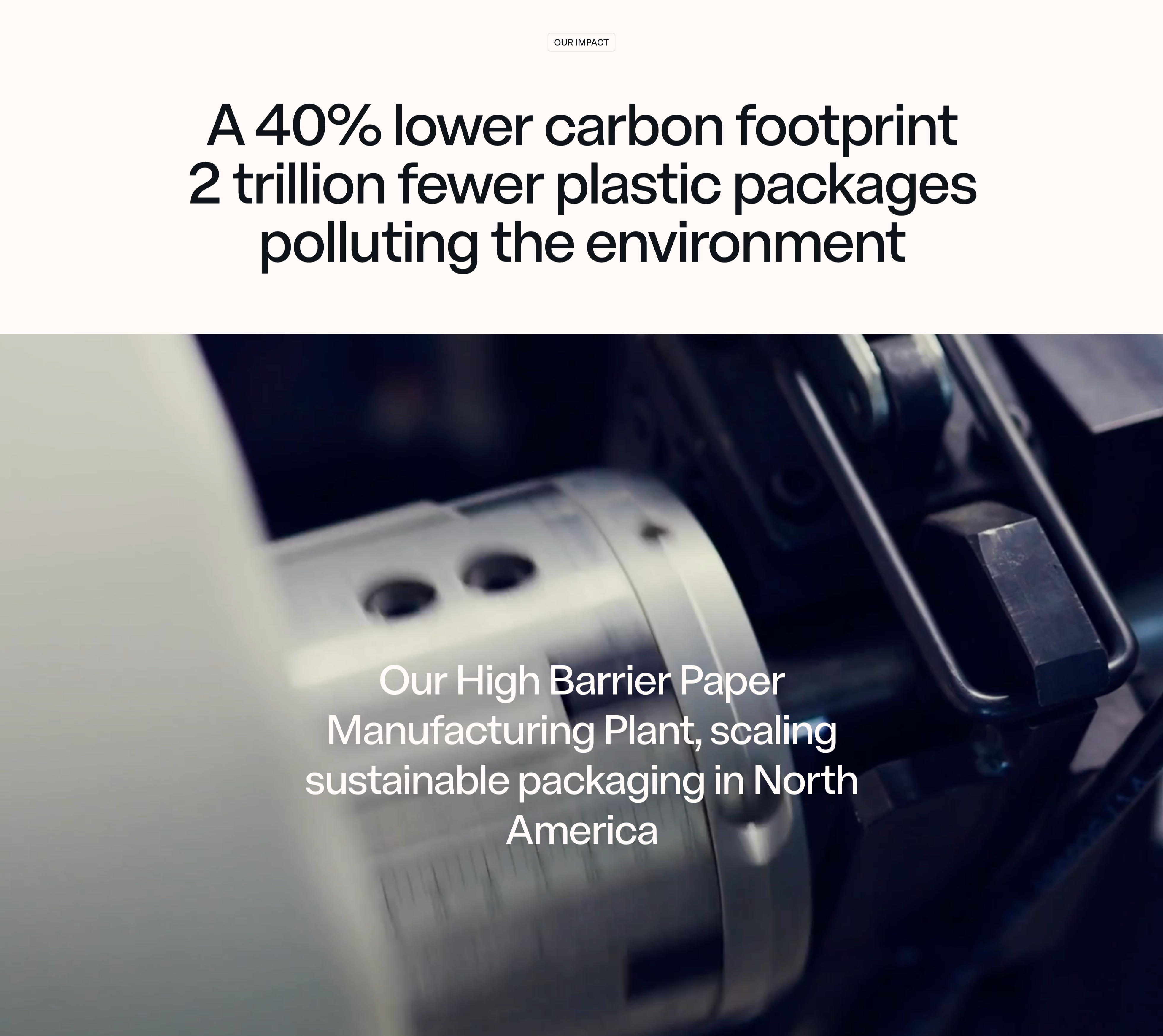
An impact section that pairs a centered stat headline on a warm off-white band with a full-bleed machinery photo below. A small outlined 'OUR IMPACT' eyebrow pill sits at the top, above an oversized near-black sans-serif headline that stacks two claims — 'A 40% lower carbon footprint' and '2 trillion fewer plastic packages polluting the environment' — using sheer type scale rather than separate number tiles to make the figures land. Beneath it, a moody, shallow-depth close-up of a chrome slitting machine and paper roll fills the width, dark on the right and bright on the left. Lower-left over the photo, a white caption reads 'Our High Barrier Paper Manufacturing Plant, scaling sustainable packaging in North America'. The split of crisp light band over cinematic dark imagery, with the metrics carried entirely by typography, gives the impact message a confident, editorial weight.
Nfinitepaper ↗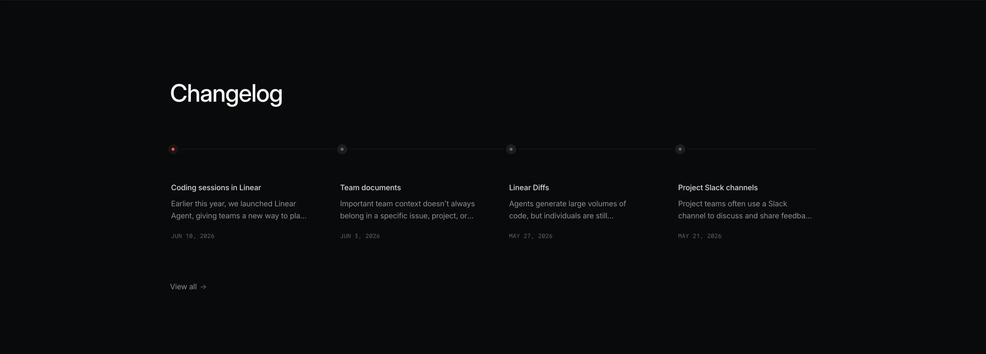
Linear Changelog Timeline
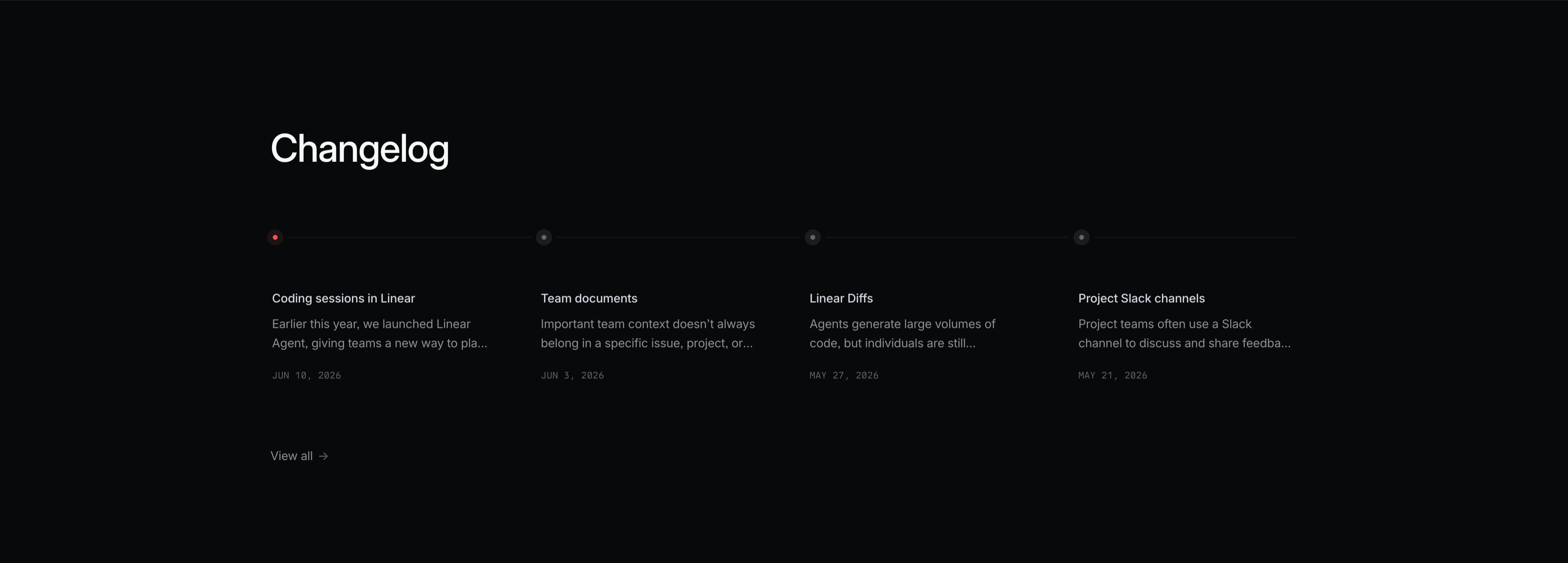
A dark changelog teaser section. A large white 'Changelog' heading sits top-left. Beneath it a thin horizontal timeline runs across the full width, marked by four small node dots — the first highlighted red, the rest grey. Hanging below each node is an entry with a white title, a two-line grey excerpt, and an uppercase monospace date: 'Coding sessions in Linear' (JUN 10, 2026), 'Team documents' (JUN 3, 2026), 'Linear Diffs' (MAY 27, 2026), and 'Project Slack channels' (MAY 21, 2026). A small 'View all →' link sits at the lower left. The restrained four-up timeline layout on black makes recent product updates scannable at a glance.
Linear ↗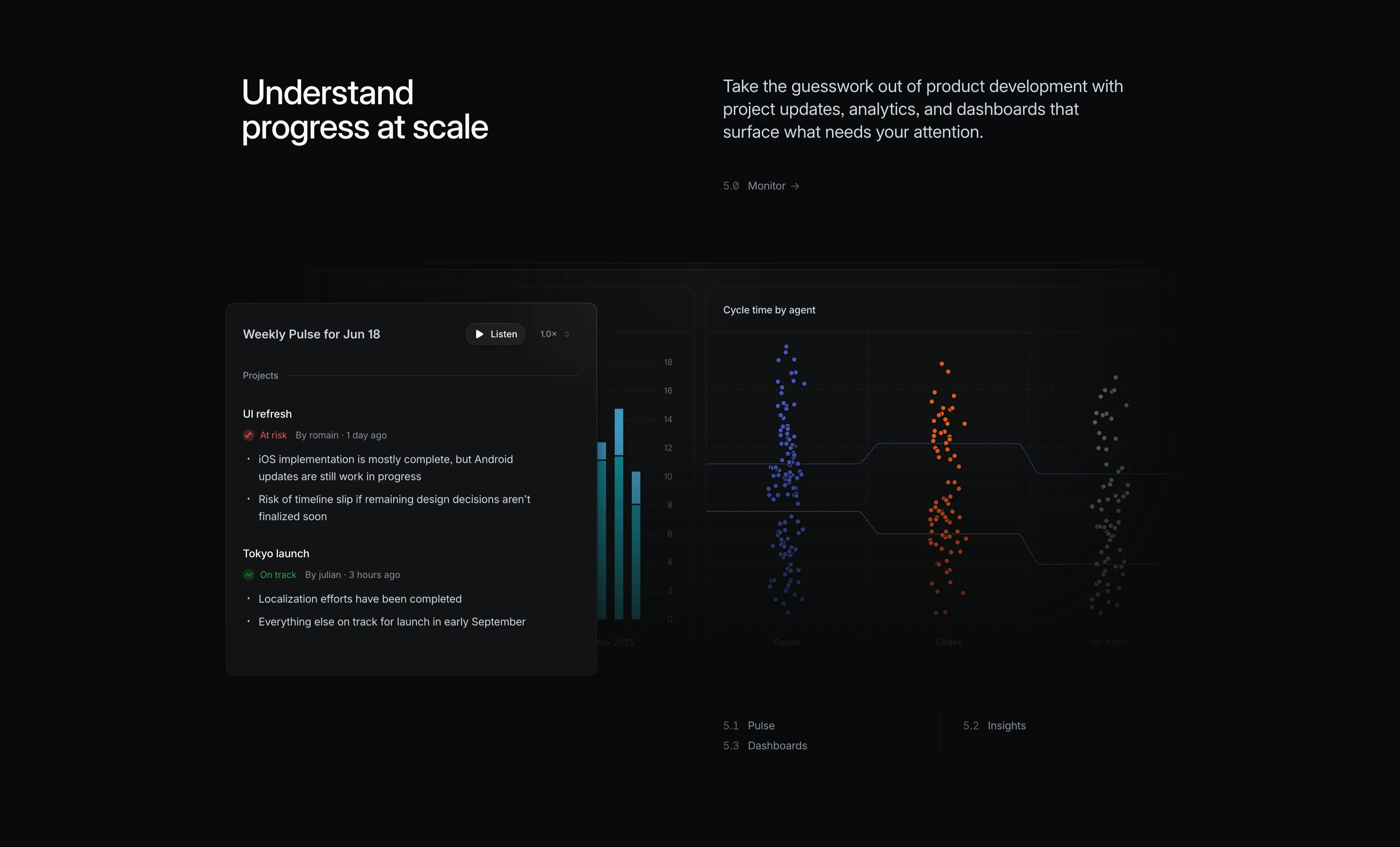
Linear Monitor Feature With Pulse And Charts
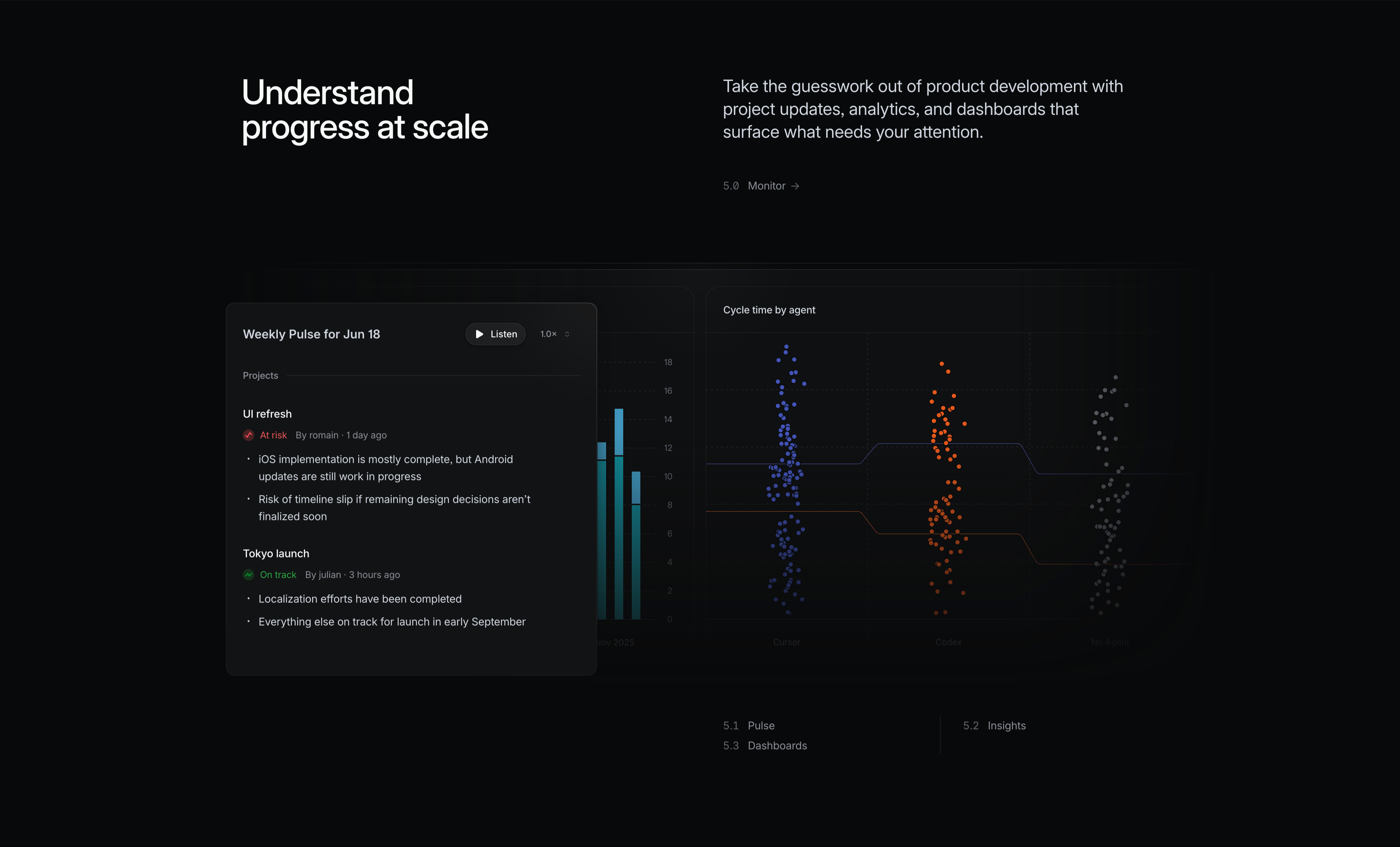
A dark 'Monitor' feature block. The left white headline reads 'Understand progress at scale'; the right grey copy says 'Take the guesswork out of product development with project updates, analytics, and dashboards that surface what needs your attention', with a small '5.0 Monitor →' label. Two analytics surfaces sit below. A foreground 'Weekly Pulse for Jun 18' card has a 'Listen' play button and 1.0× speed control, then project updates: 'UI refresh' flagged 'At risk' with bullet notes, and 'Tokyo launch' marked 'On track' with progress bullets. Behind it a partly-hidden bar chart and a large 'Cycle time by agent' panel show three colour-coded swarm/scatter clusters (blue, orange, grey) labelled Cursor, Codex and No Agent over a numeric y-axis, with trend lines comparing them. It conveys data-driven monitoring of progress and agent performance.
Linear ↗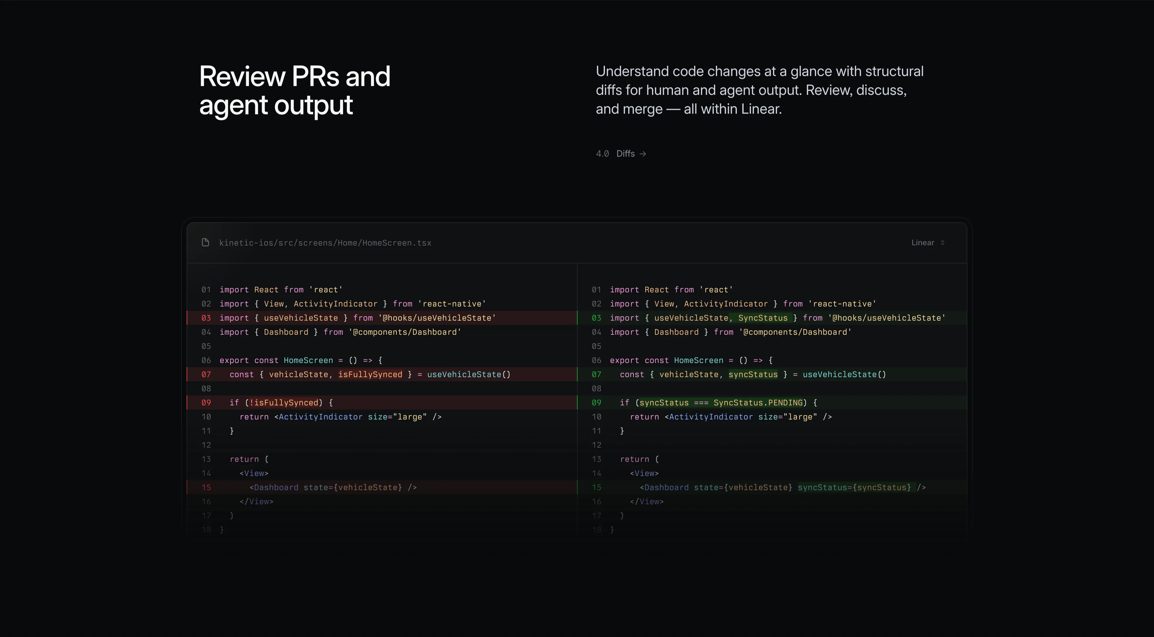
Linear Diffs Feature With Side-By-Side Code
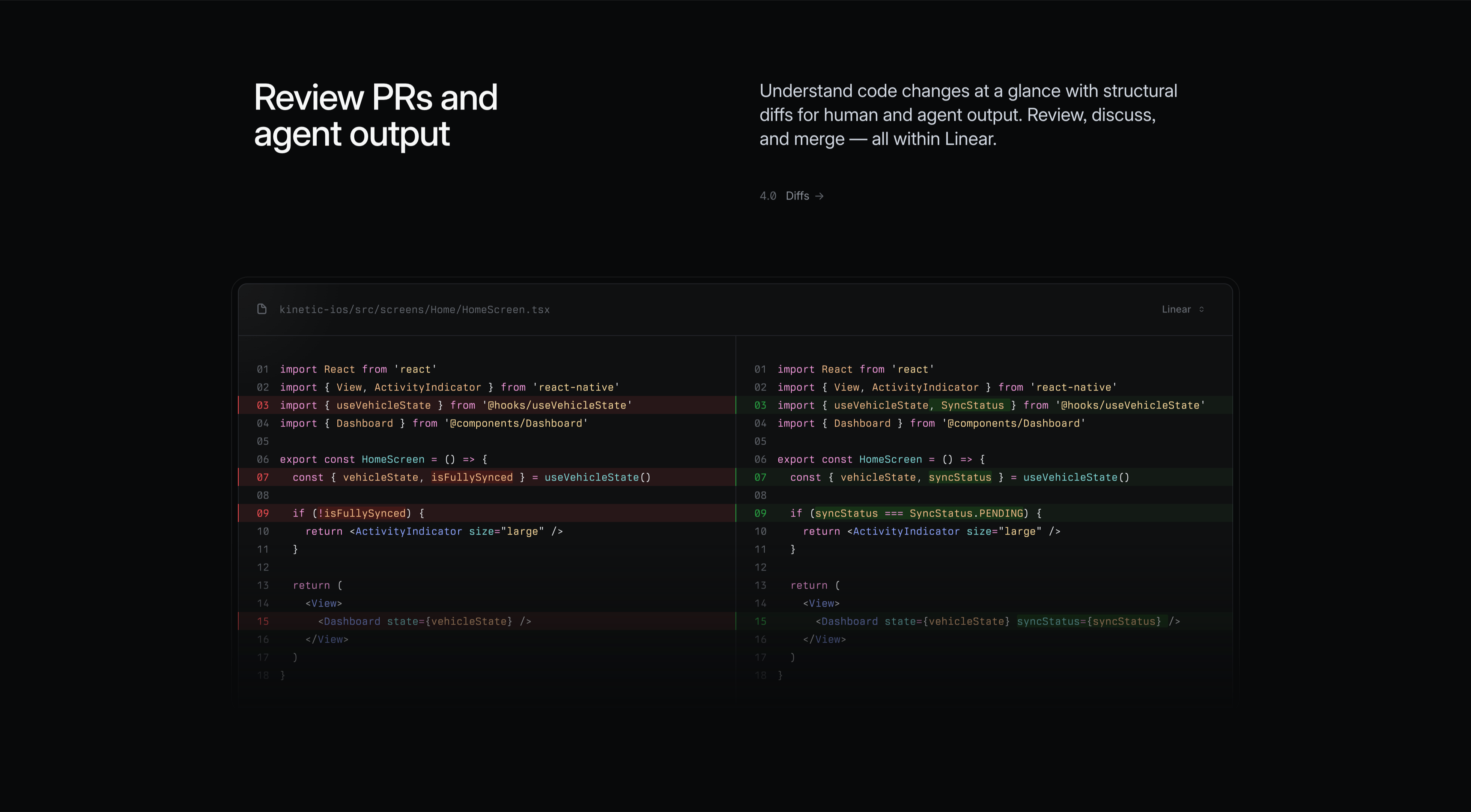
A dark 'Diffs' feature block. The left headline in white reads 'Review PRs and agent output'; the right grey copy says 'Understand code changes at a glance with structural diffs for human and agent output. Review, discuss, and merge — all within Linear', with a small '4.0 Diffs →' label. The lower area is a wide split-pane code diff for the file 'kinetic-ios/src/screens/Home/HomeScreen.tsx', numbered lines 01–18 in a syntax-highlighted monospace font. The left pane highlights removed lines in red (e.g. 'isFullySynced', 'if (!isFullySynced)') and the right pane shows the added replacements in green ('SyncStatus', 'syncStatus === SyncStatus.PENDING', a new syncStatus prop on Dashboard). A 'Linear' source toggle sits in the top-right. The realistic before/after diff communicates in-app code review.
Linear ↗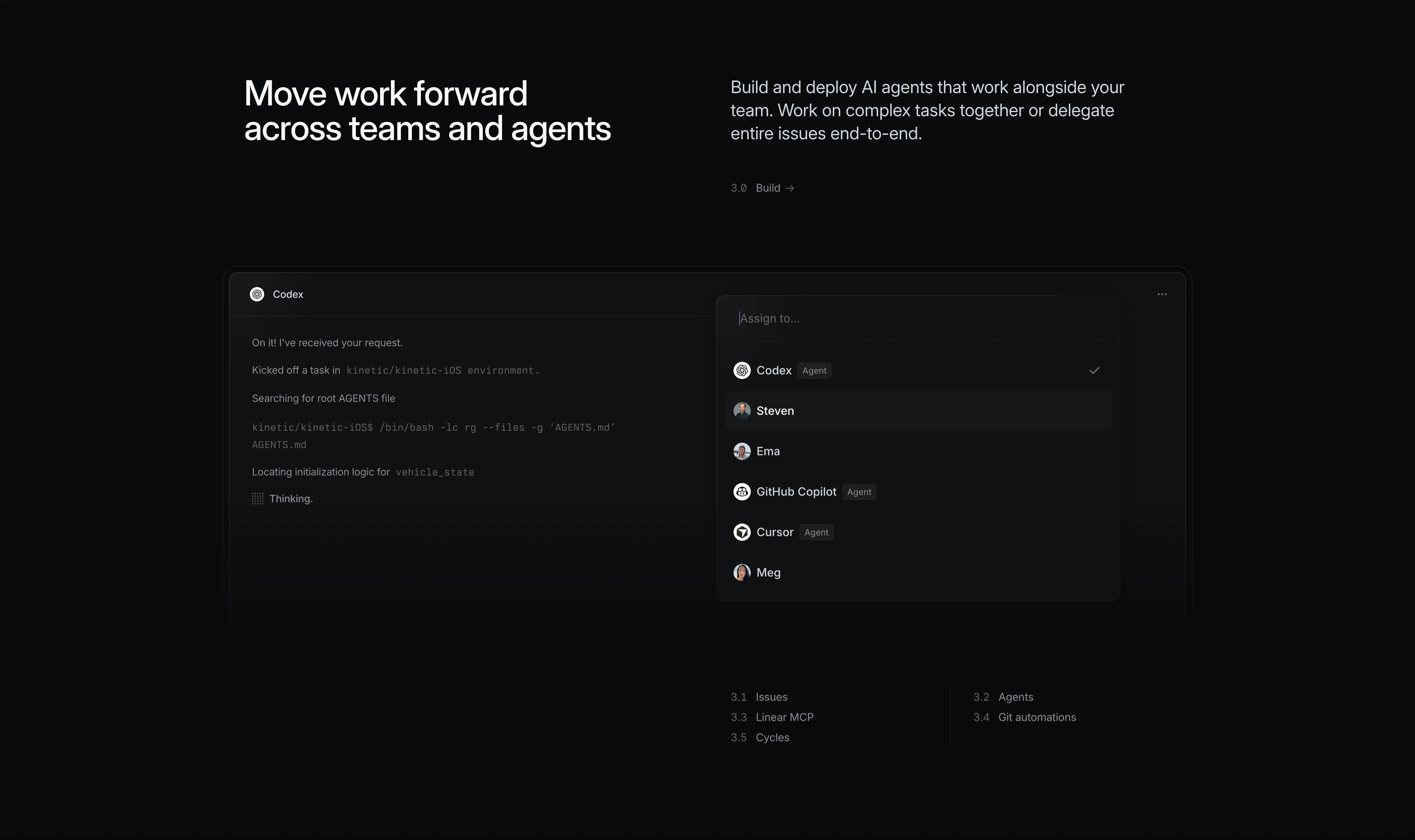
Linear Build Feature With Agent Assignment
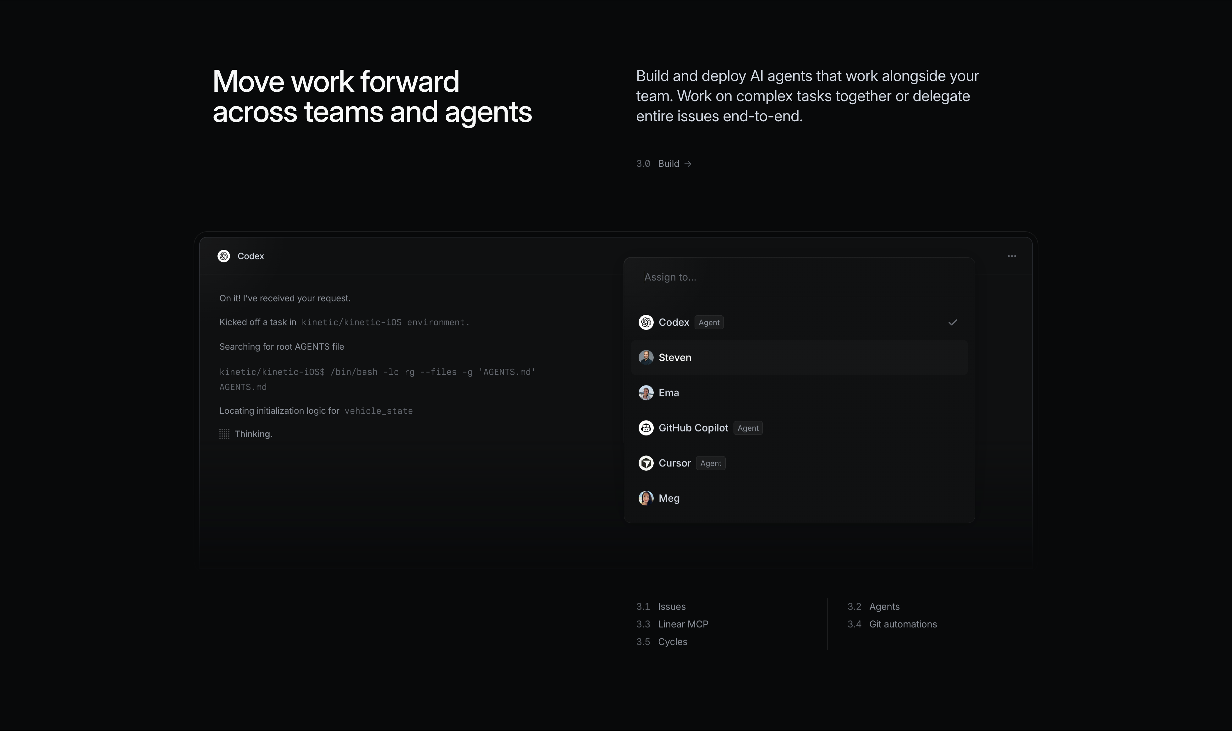
A dark 'Build' feature block. The left shows a large white headline 'Move work forward across teams and agents'; the right carries grey copy, 'Build and deploy AI agents that work alongside your team. Work on complex tasks together or delegate entire issues end-to-end', with a small '3.0 Build →' label. The product surface below is an issue assigned to a 'Codex' agent: a chat-style log reads 'On it! I've received your request', 'Kicked off a task in kinetic/kinetic-iOS environment', 'Searching for root AGENTS file', a monospace shell command, and 'Thinking.' A floating 'Assign to…' dropdown lists a mix of humans and agents — Codex (Agent, checked), Steven, Ema, GitHub Copilot (Agent), Cursor (Agent), Meg — each with an avatar. Sub-links (3.1 Issues, 3.2 Agents, 3.3 Linear MCP, 3.4 Git automations, 3.5 Cycles) sit at the bottom. It shows delegating work to AI agents like teammates.
Linear ↗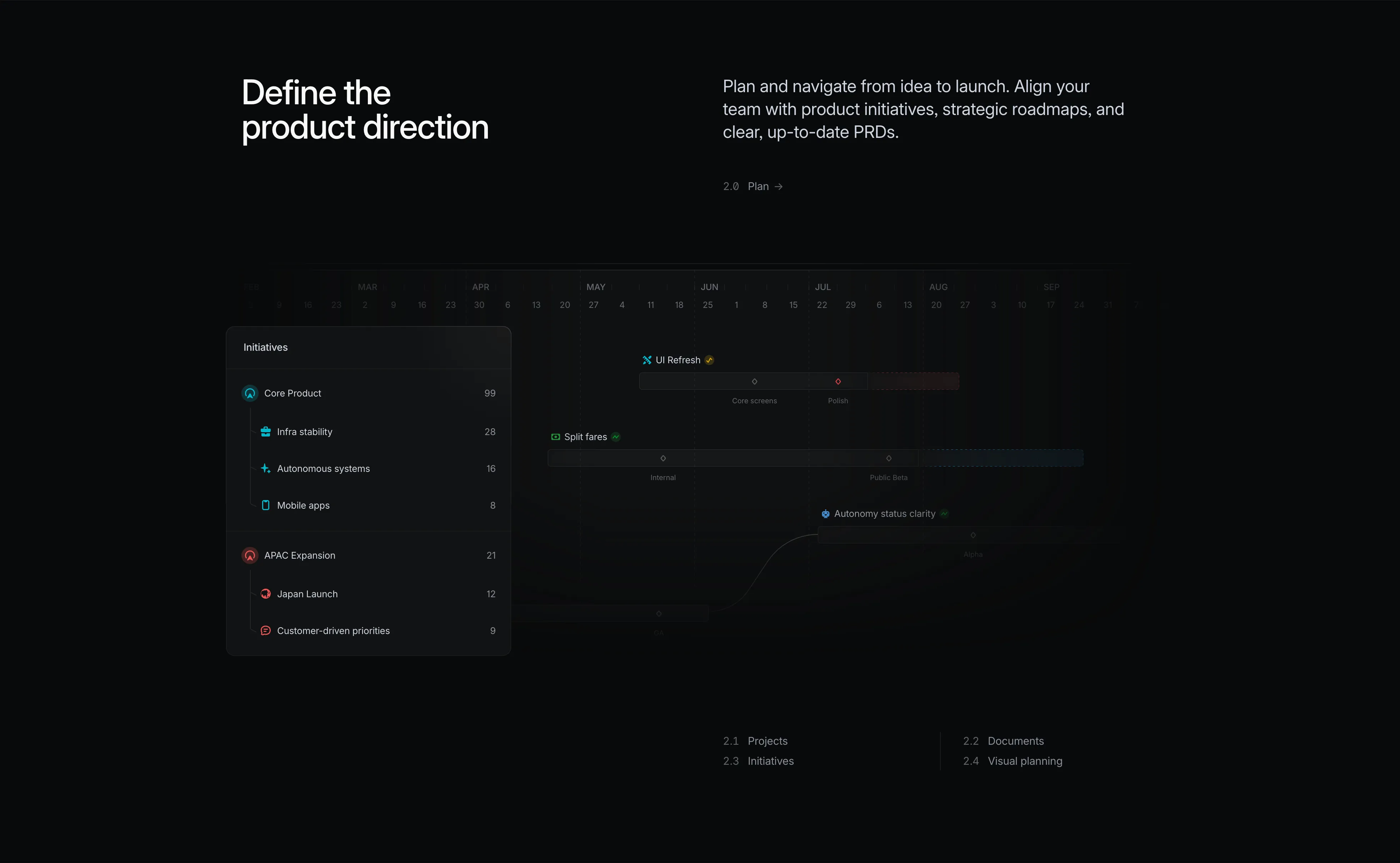
Linear Plan Feature With Initiatives Timeline
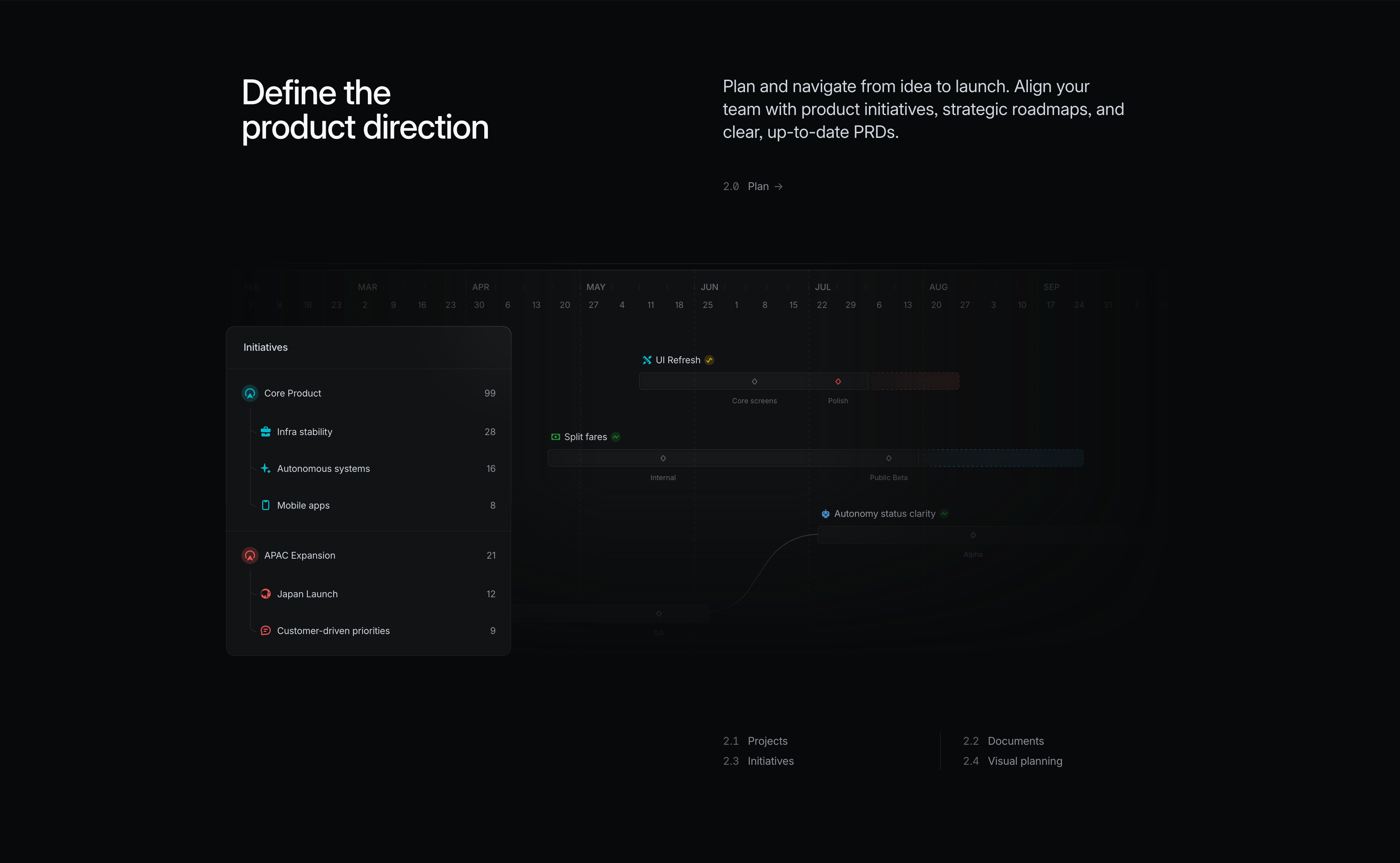
A dark 'Plan' feature block. The left holds a large white headline 'Define the product direction'; the right pairs grey copy, 'Plan and navigate from idea to launch. Align your team with product initiatives, strategic roadmaps, and clear, up-to-date PRDs', with a small '2.0 Plan →' label. Below spans a roadmap/Gantt visualisation against a month scale (FEB through SEP). A dark 'Initiatives' panel on the left lists grouped items with counts — Core Product 99, Infra stability 28, Autonomous systems 16, Mobile apps 8, APAC Expansion 21, Japan Launch 12, Customer-driven priorities 9 — while the timeline to the right shows horizontal bars and milestone diamonds for 'UI Refresh', 'Split fares' and 'Autonomy status clarity', with phase labels like Core screens, Polish, Internal and Public Beta. A curved connector links dependent items. It conveys structured, long-range planning.
Linear ↗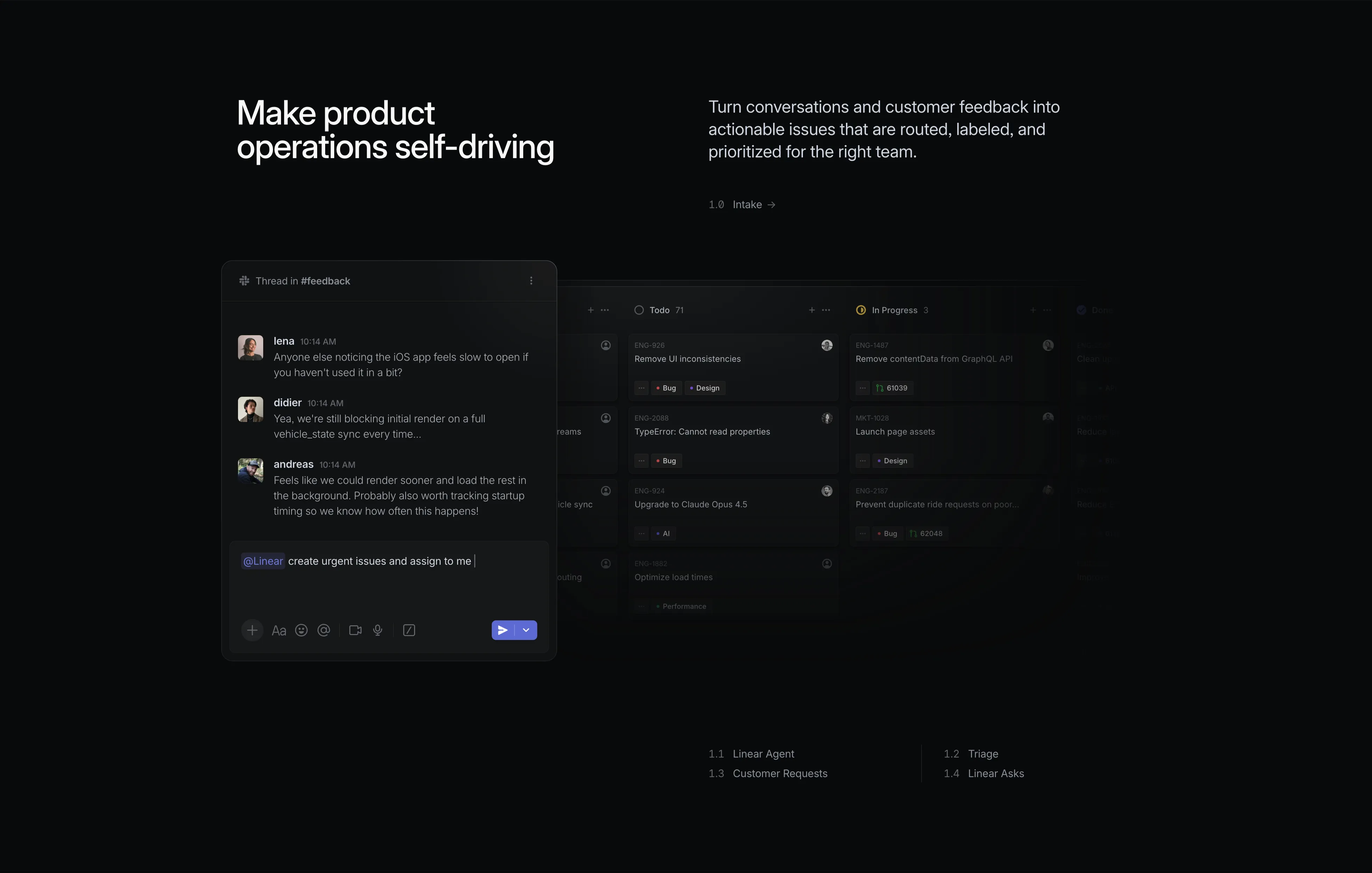
Linear Intake Feature With Slack And Board
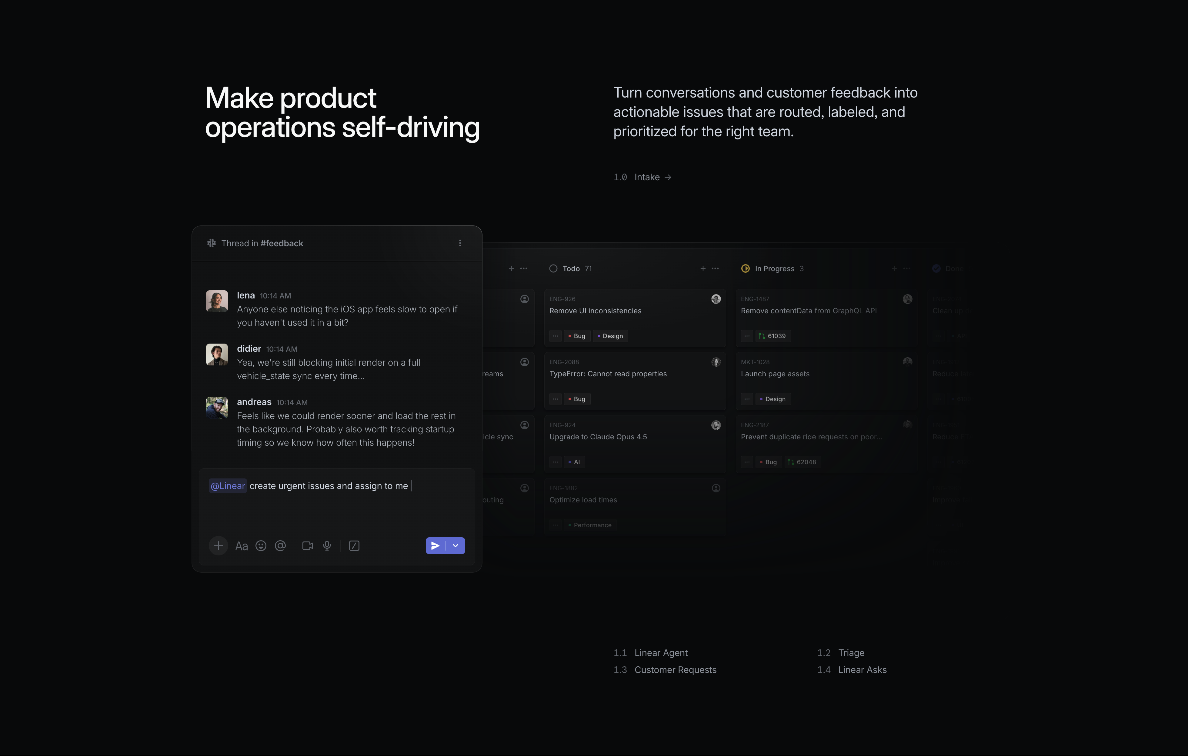
A dark feature block introducing the 'Intake' stage. A large white headline on the left reads 'Make product operations self-driving', paired on the right with grey supporting copy, 'Turn conversations and customer feedback into actionable issues that are routed, labeled, and prioritized for the right team', and a small '1.0 Intake →' label. The lower area layers two product surfaces: a floating Slack thread in '#feedback' where teammates lena, didier and andreas discuss a slow iOS launch, with a composer reading '@Linear create urgent issues and assign to me', overlapping a dimmed Linear board showing Todo and In Progress columns of issue cards (ENG-926 'Remove UI inconsistencies', ENG-2088 'TypeError', ENG-924 'Upgrade to Claude Opus 4.5', etc.) with Bug/Design/AI labels. A row of sub-links (1.1 Linear Agent, 1.2 Triage, 1.3 Customer Requests, 1.4 Linear Asks) anchors the bottom. It shows feedback turning straight into triaged issues.
Linear ↗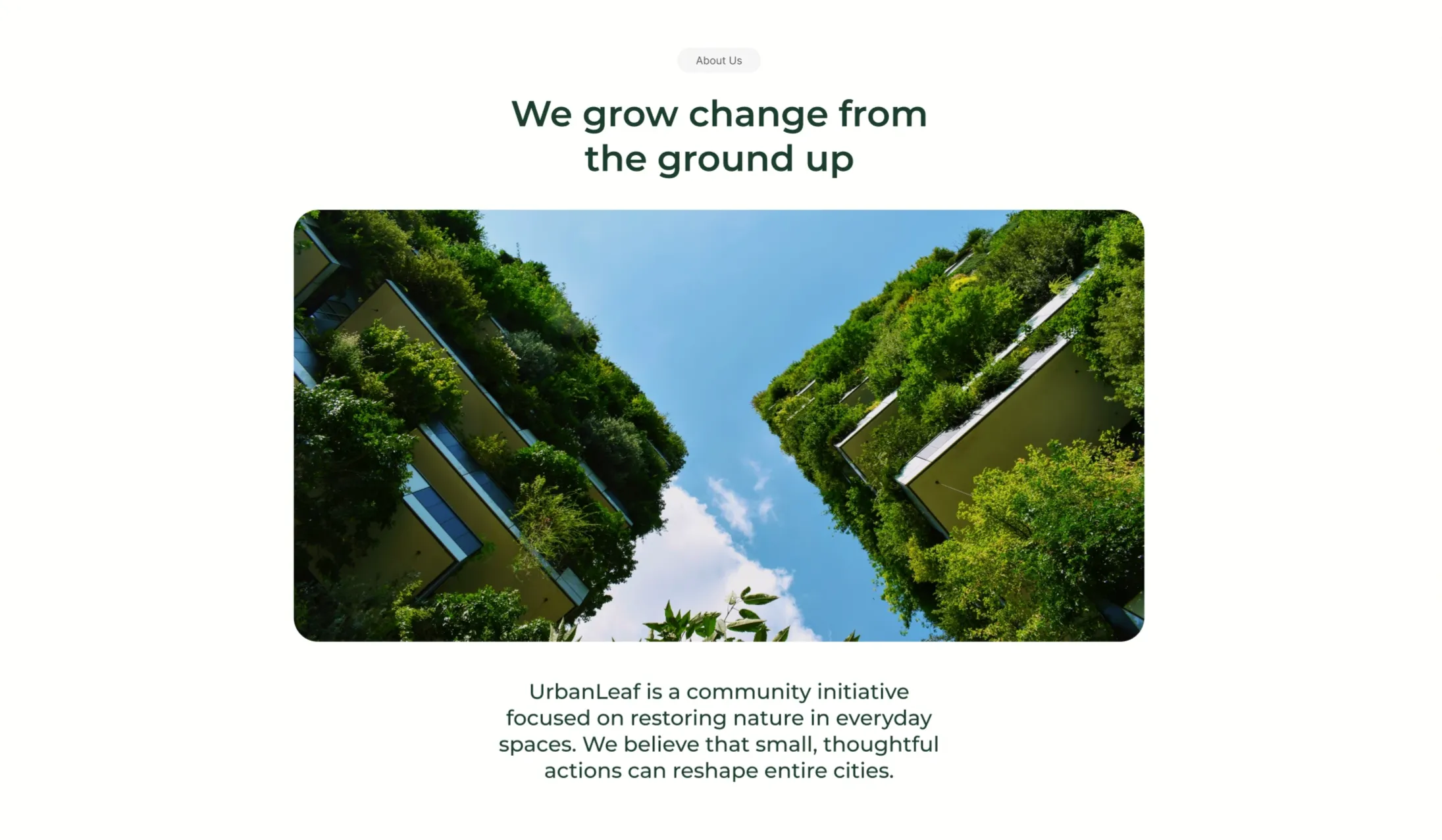
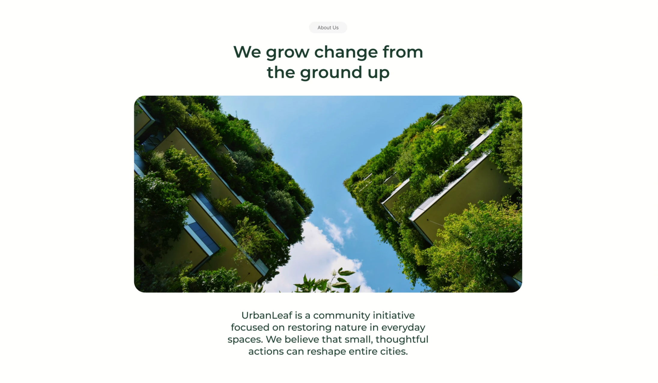
UrbanLeaf About Section With Vertical-Garden Image
A centered 'About Us' content block on a white background. A small grey 'About Us' pill sits at the top, followed by a two-line dark-green headline reading 'We grow change from the ground up'. Beneath the heading is a single large rounded-corner photograph looking straight up between two tall buildings whose facades are completely covered in lush green vertical gardens, framing a bright blue, lightly clouded sky down the centre. Below the image, a short centered dark-green paragraph introduces the organisation: 'UrbanLeaf is a community initiative focused on restoring nature in everyday spaces. We believe that small, thoughtful actions can reshape entire cities.' The symmetrical, image-led, centered composition with lots of whitespace gives it a quiet editorial feel.
Behance ↗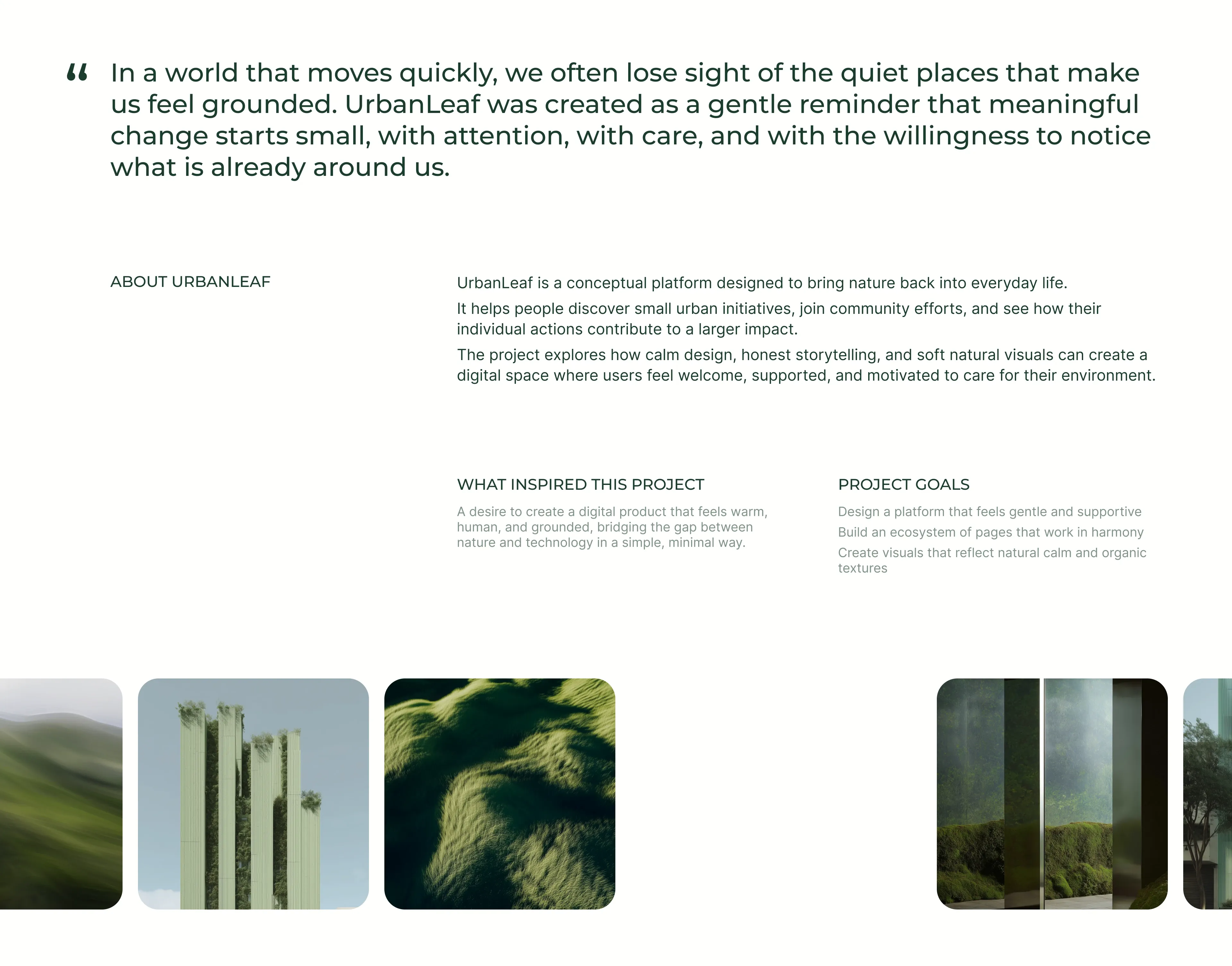
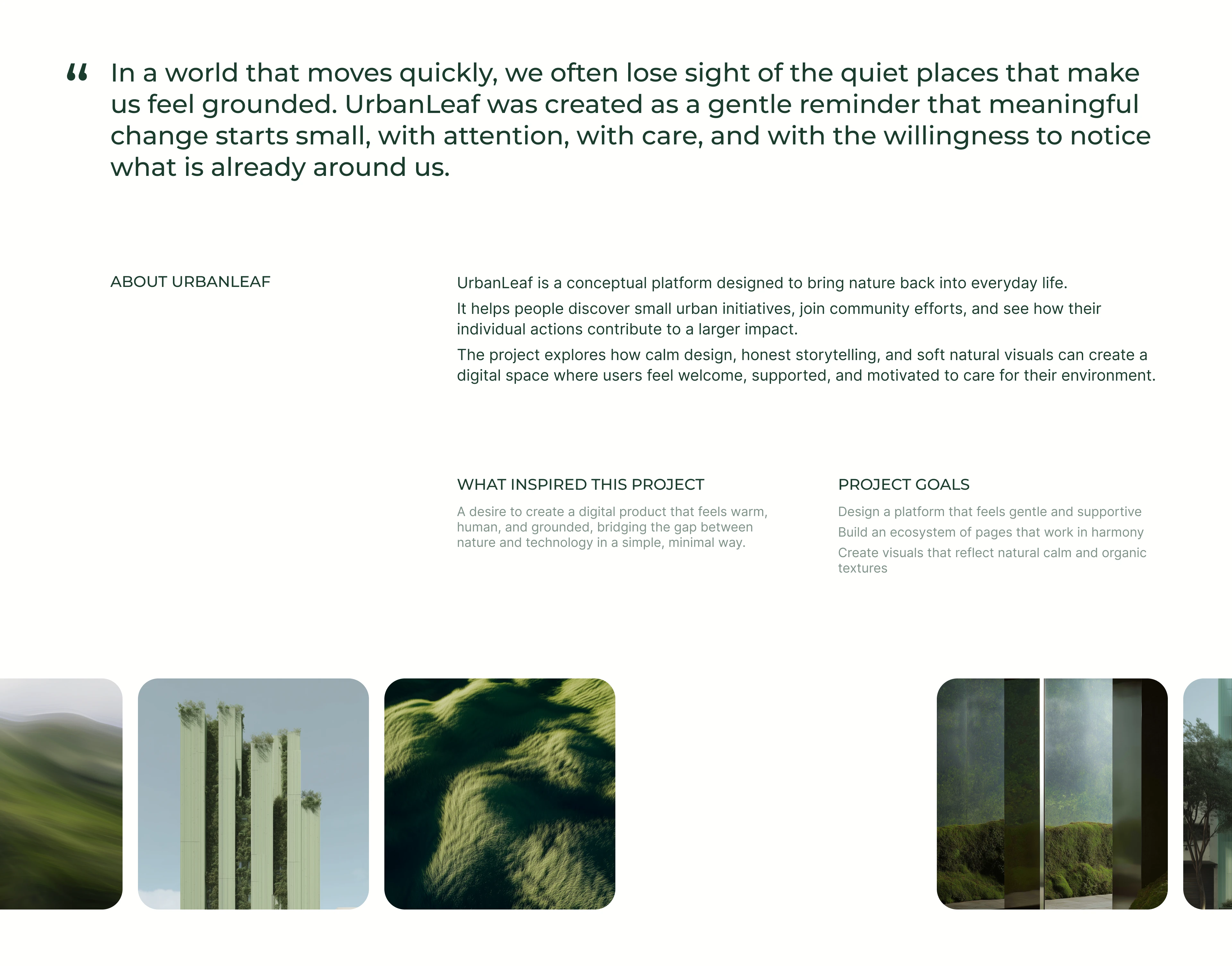
UrbanLeaf About And Project Goals
A calm, editorial about section on white. It opens with an oversized dark-green pull-quote marked by a quotation glyph, reflecting on losing sight of quiet, grounding places and framing UrbanLeaf as a gentle reminder that change starts small. Beneath sits a multi-column text block under a small 'ABOUT URBANLEAF' label: three dark paragraphs explain that UrbanLeaf is a conceptual platform bringing nature into everyday life, helping people find urban initiatives and see their collective impact. Two lighter sub-columns headed 'WHAT INSPIRED THIS PROJECT' and 'PROJECT GOALS' add supporting detail, the latter as a short three-line list. A full-width row of rounded nature photographs (rolling hills, plant-covered towers, grassy textures and mossy mirrored panels) anchors the bottom, bleeding off both edges.
Behance ↗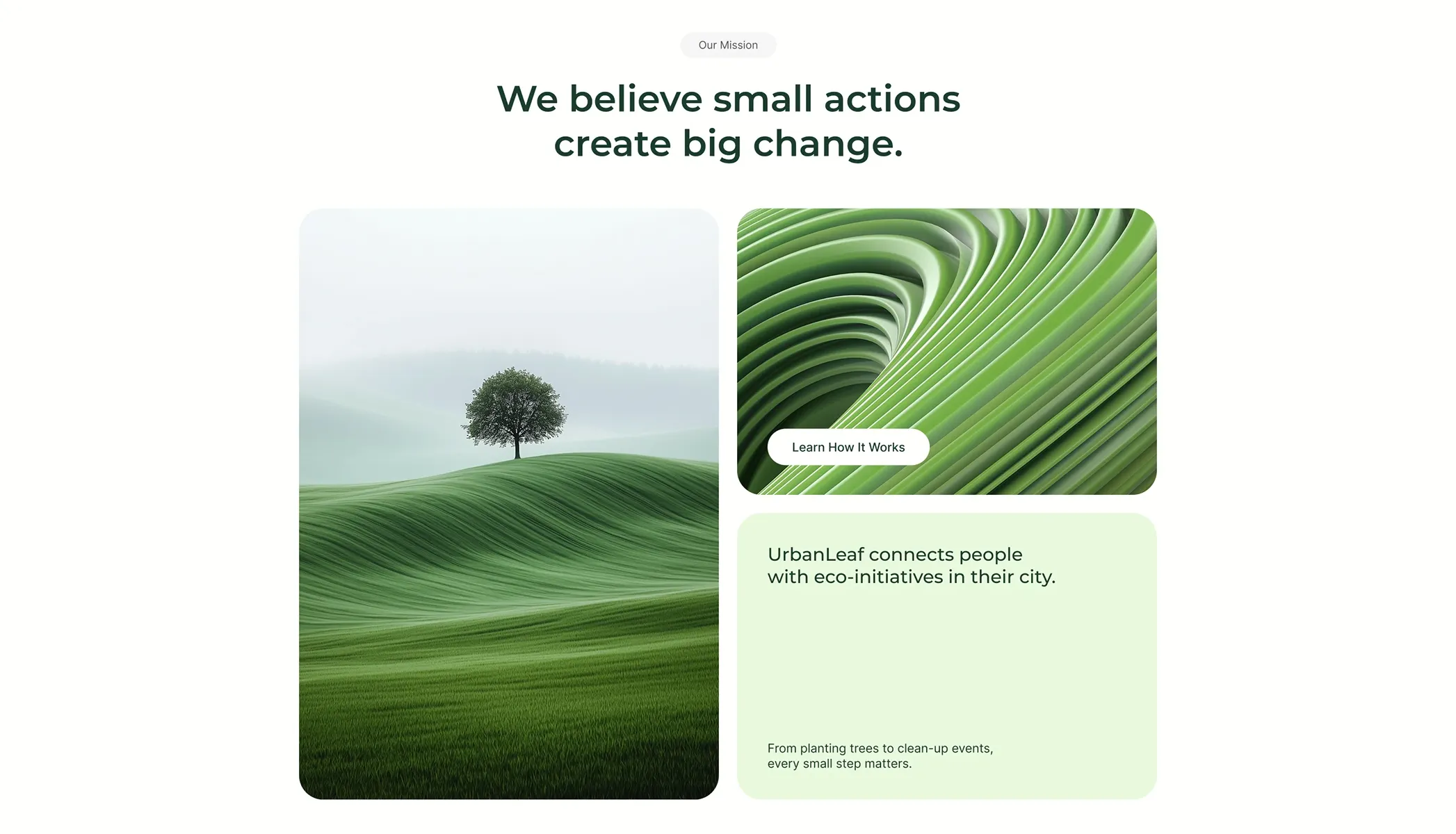
Mission Statement With Image Pair
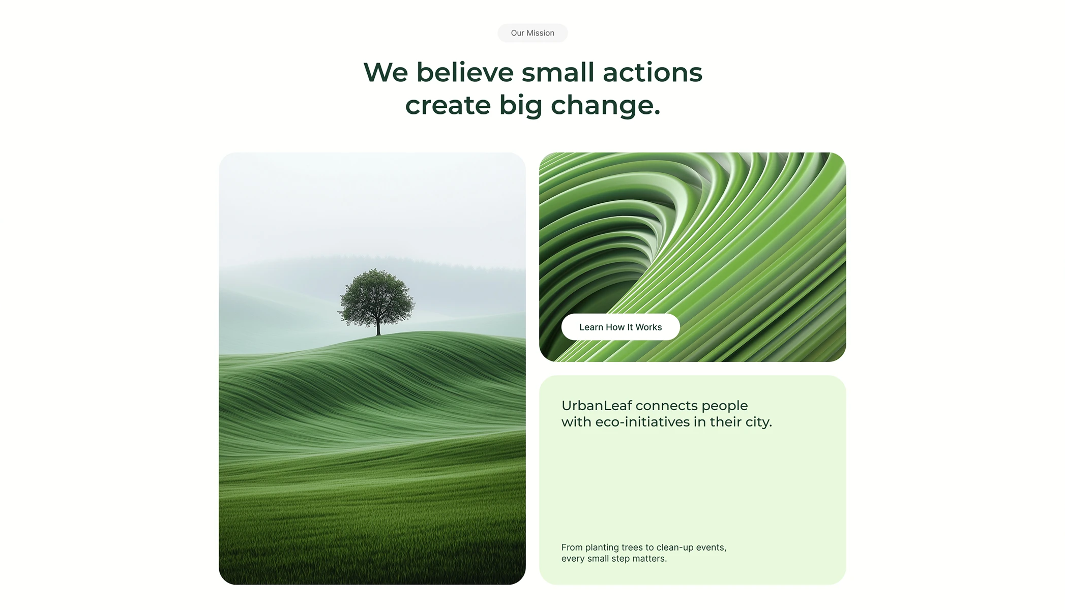
A mission section on white opening with a centered grey 'Our Mission' pill above a large two-line green headline, 'We believe small actions create big change.' Below sits a two-column layout: the left column is a tall rounded photo of a lone tree on rolling green hills, while the right column stacks two blocks. The upper right block is a rounded abstract image of flowing green ridges with a white pill button labelled 'Learn How It Works' overlaid at its lower-left. The lower right block is a soft mint-green card whose heading reads 'UrbanLeaf connects people with eco-initiatives in their city,' with a smaller supporting line, 'From planting trees to clean-up events, every small step matters,' anchored at its bottom. The balanced split of one tall image against a stacked image-plus-card column creates a restful, editorial rhythm.
Behance ↗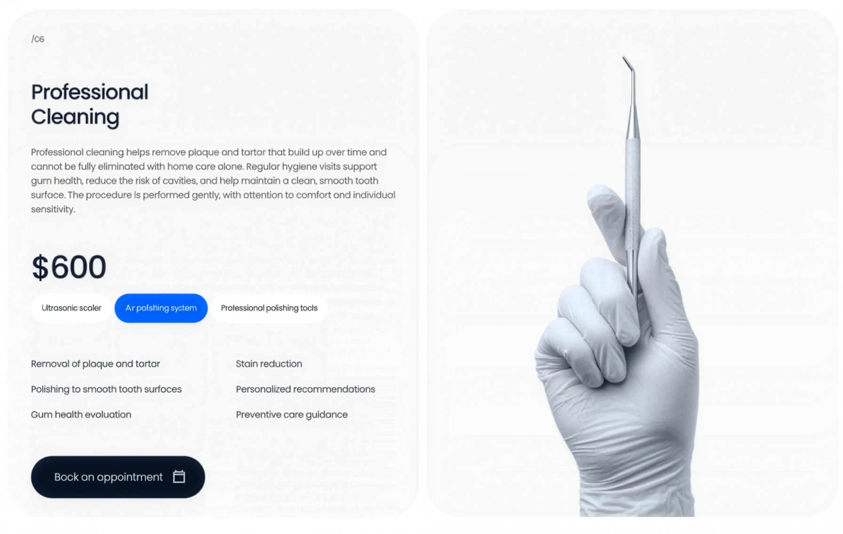
Professional Cleaning Service Panel
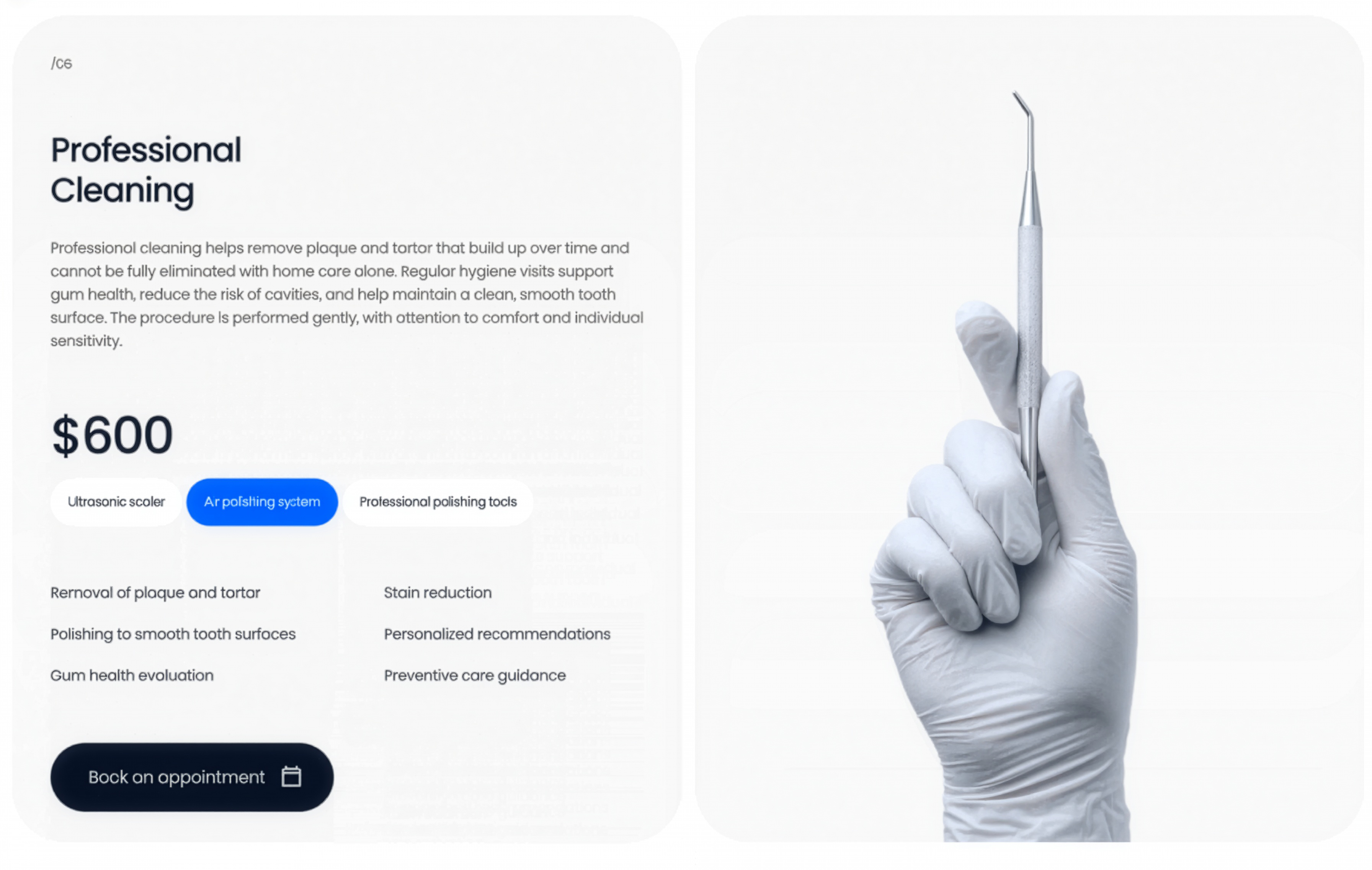
A professional-cleaning service panel pairing copy, price, method tags, and a feature checklist with a gloved-hand instrument image and a booking CTA.
Behance ↗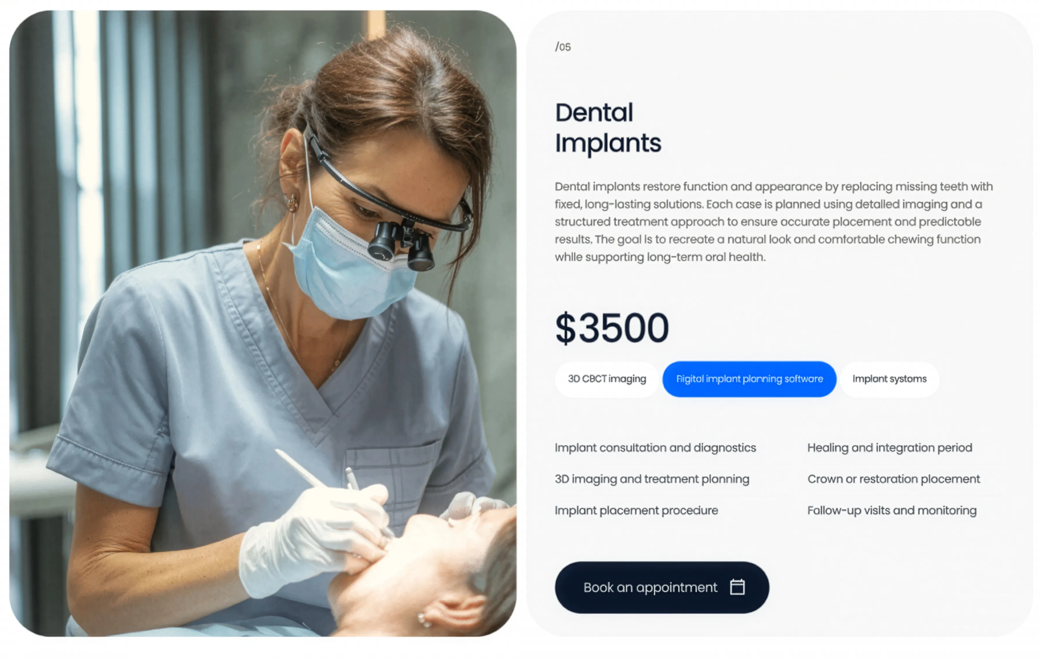
Dental Implants Service Panel
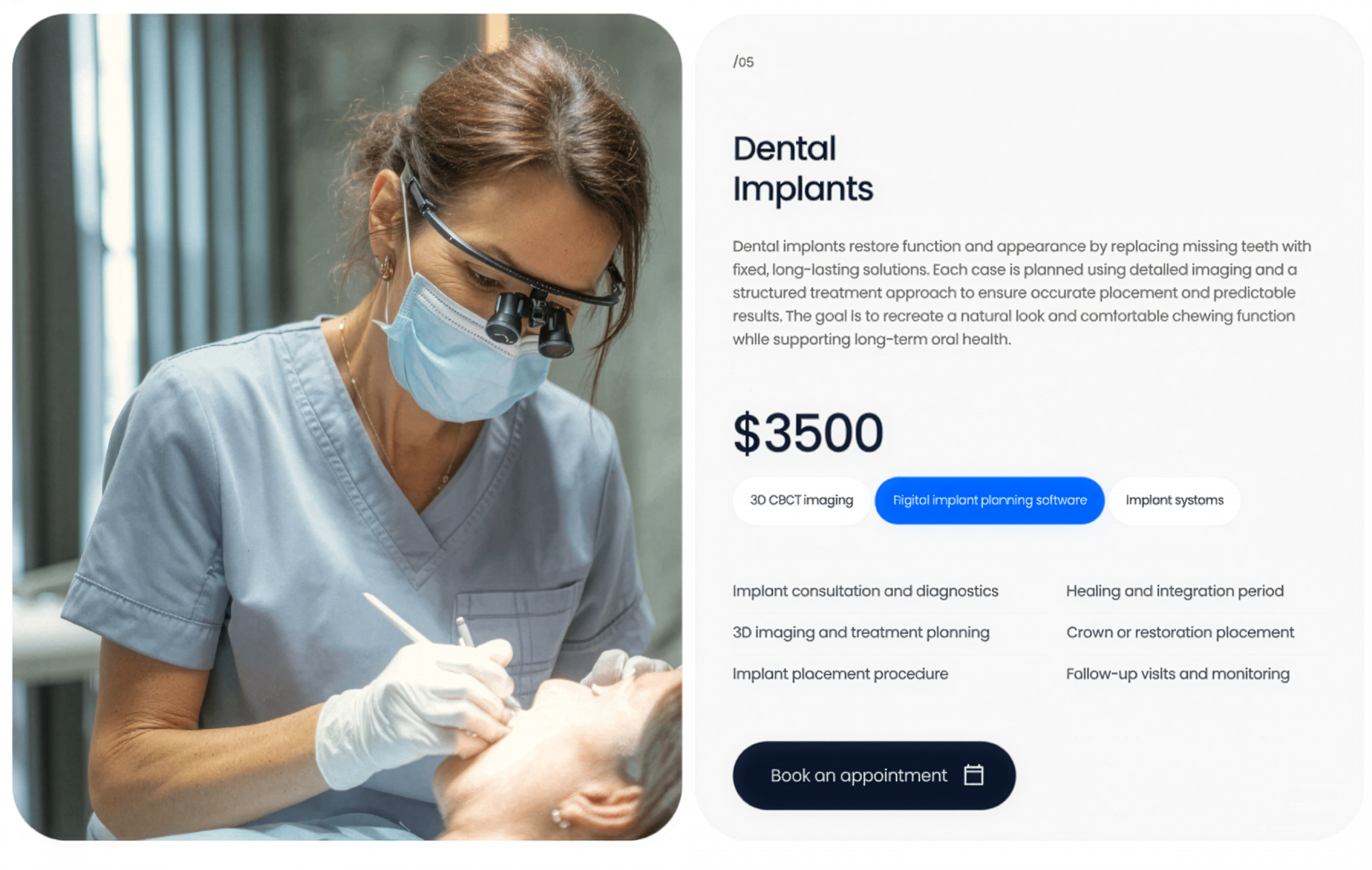
A dental-implants service panel pairing a clinical photo with a description, price, method tags, a feature checklist, and a booking CTA.
Behance ↗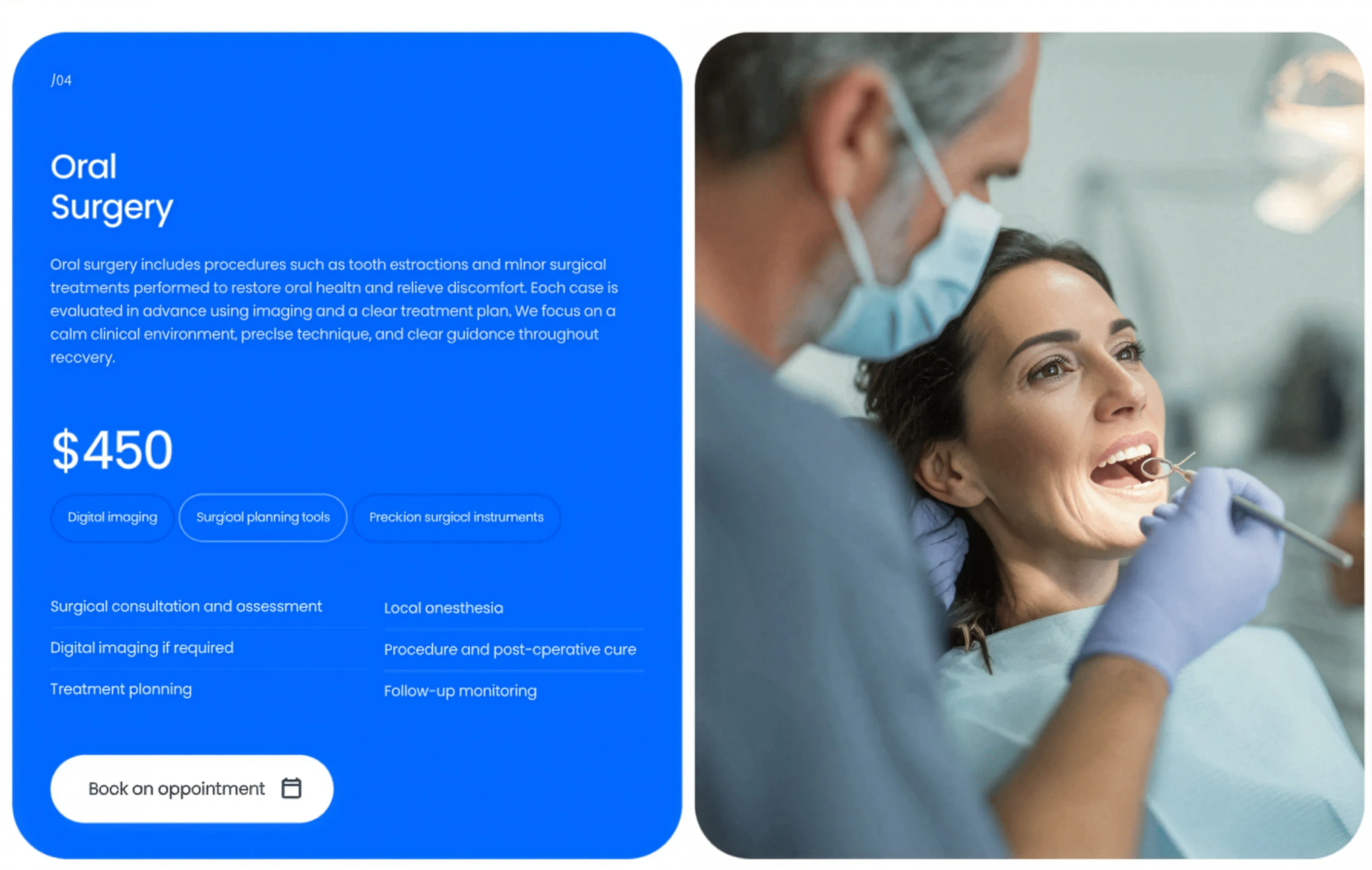
Oral Surgery Accent Service Panel
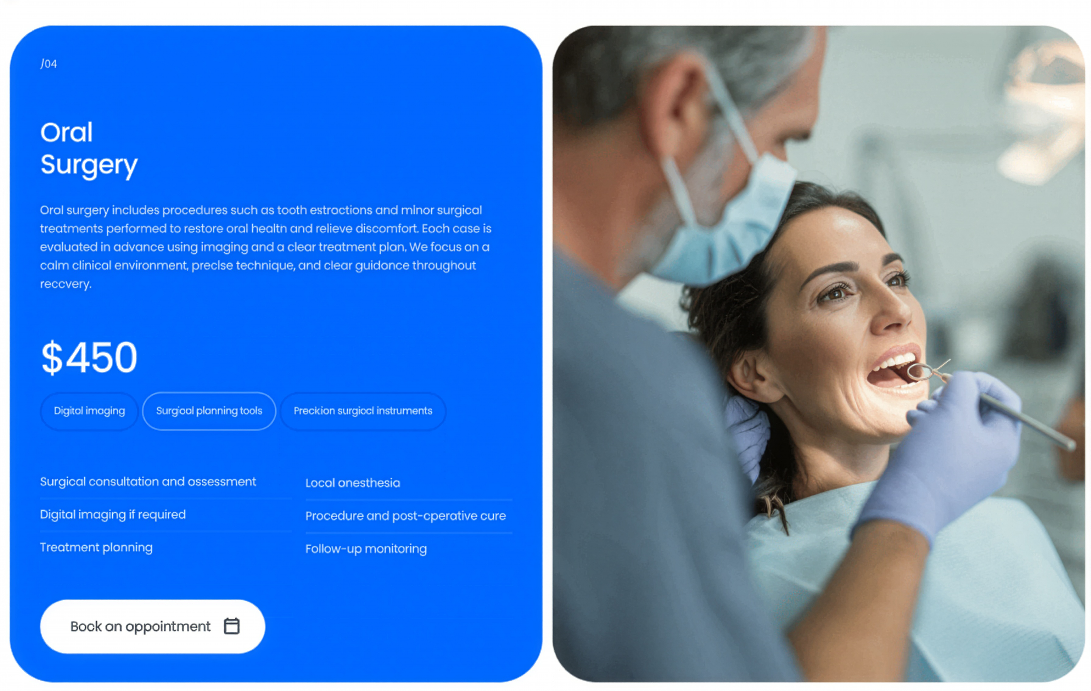
An oral-surgery service panel on a bright accent-blue card with price, method tags, and feature list, paired with a patient treatment photo.
Behance ↗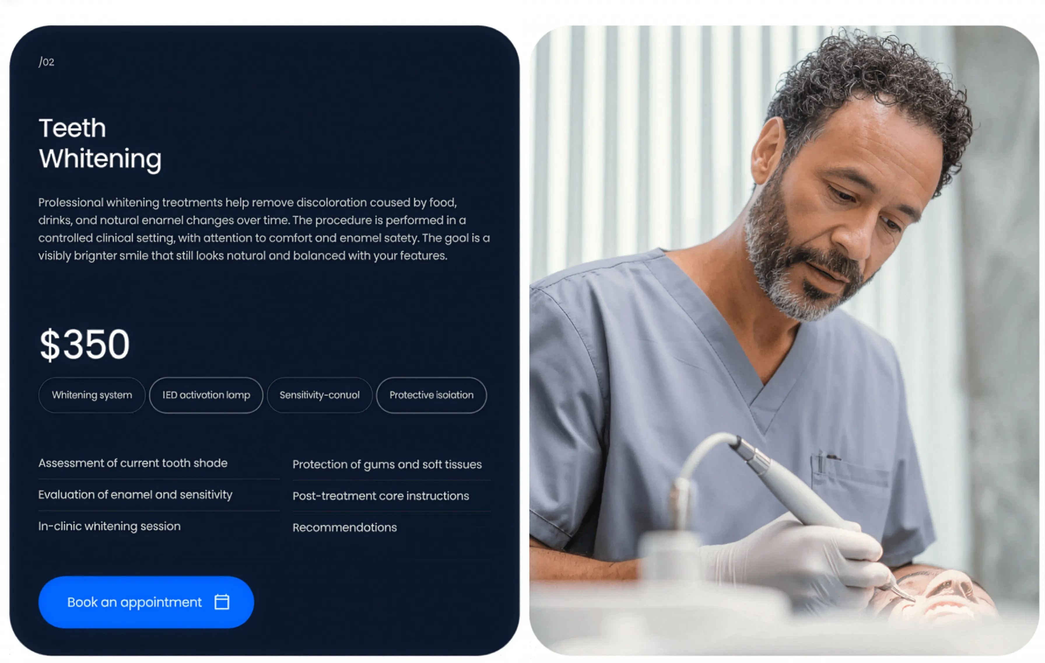
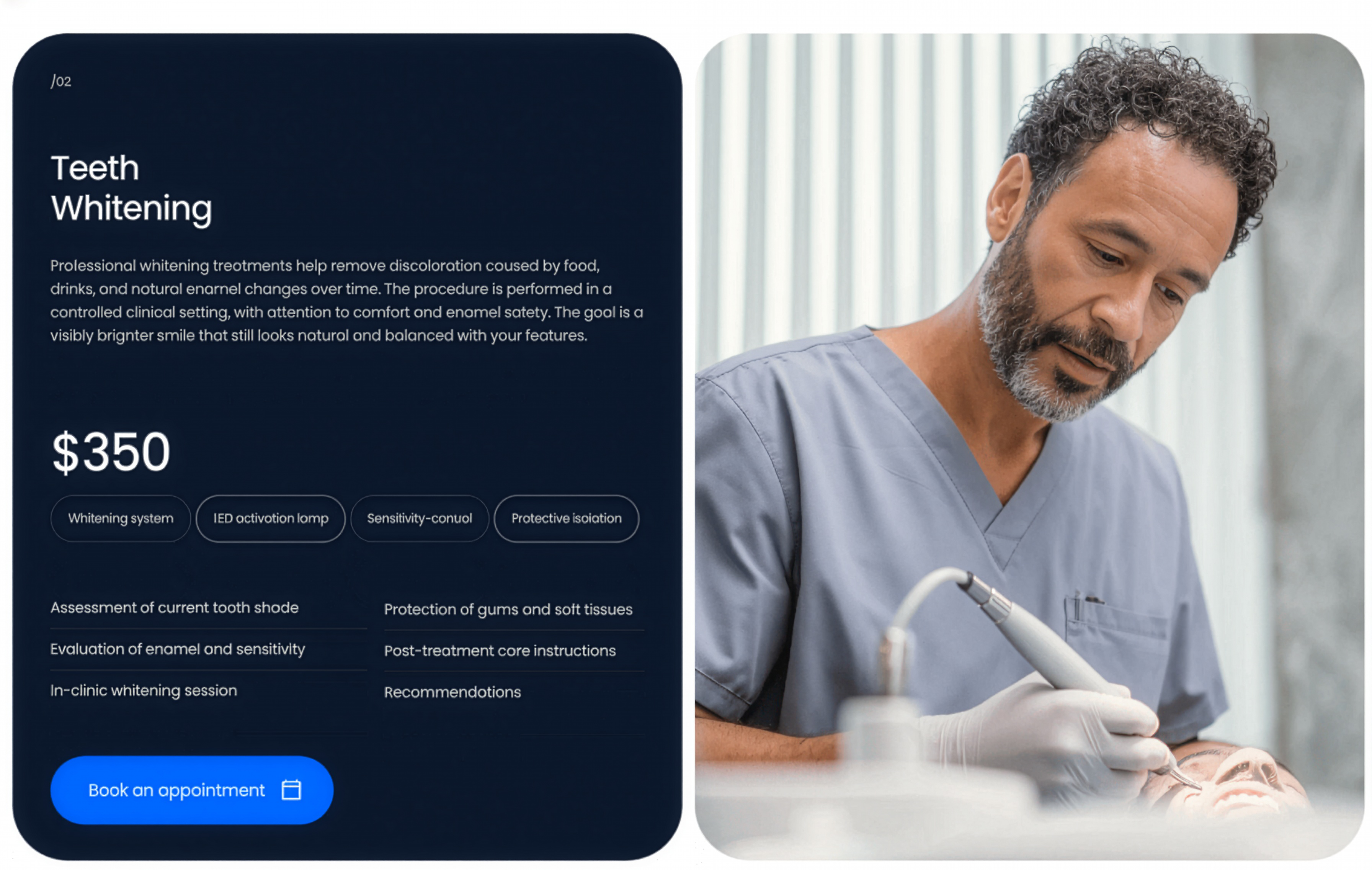
Teeth Whitening Dark Service Panel
A teeth-whitening service panel on a dark card with price, method tags, and feature list, paired with a patient treatment photo on the right.
Behance ↗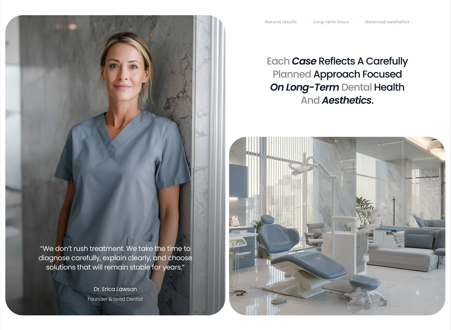
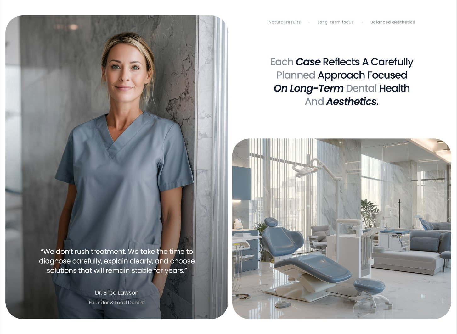
Carefully Planned Treatment About Block
An about block pairing a tall founder portrait with an overlaid quote and a clinic interior image alongside a centered statement about long-term dental health.
Behance ↗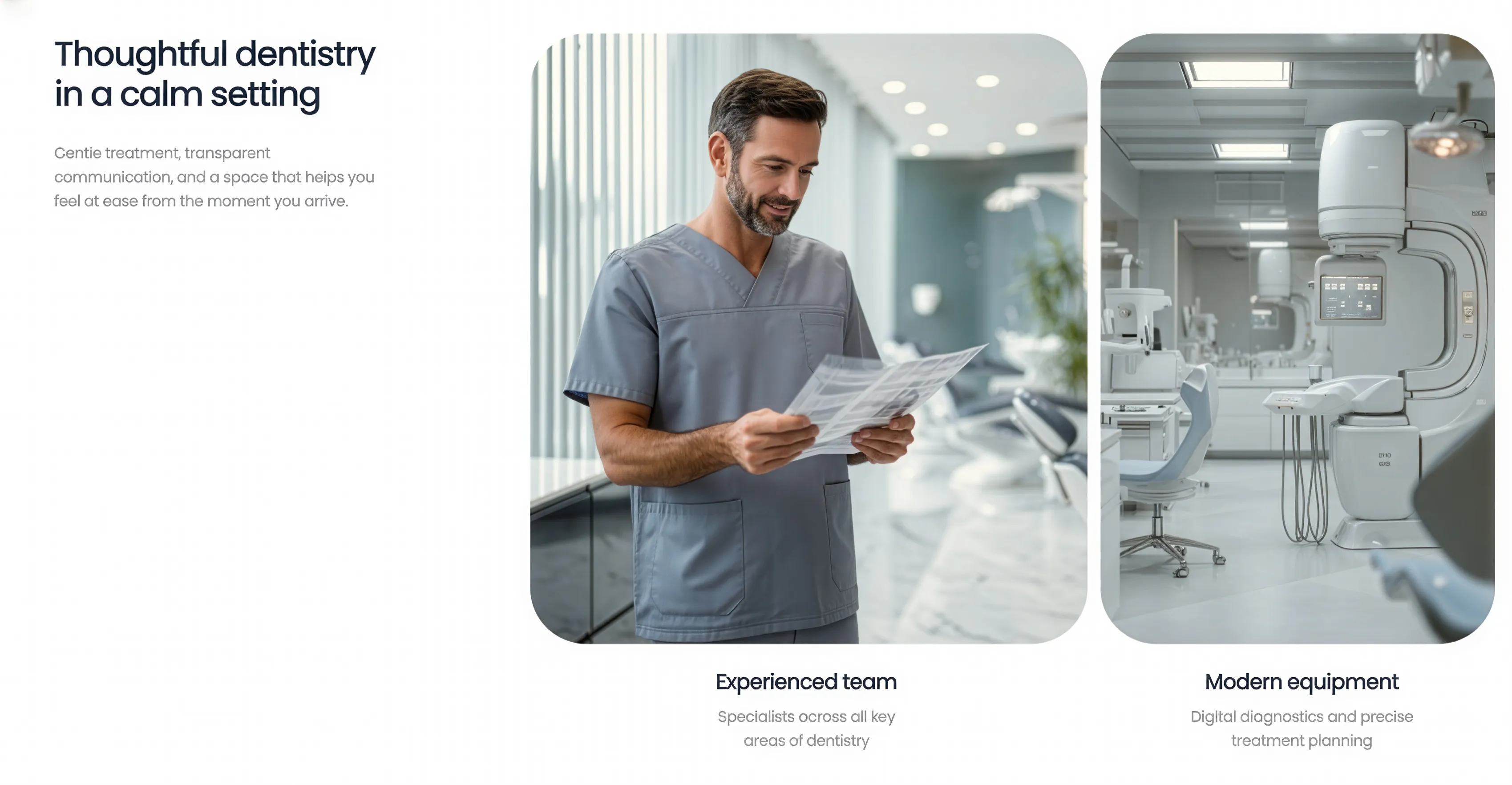
Intro Text with Image Cards
A multi-column section pairing an introductory headline and supporting copy on the left with a row of rounded image cards on the right, each captioned below with a title and short description. Best used to introduce a topic while highlighting two or more supporting points visually.
Behance ↗