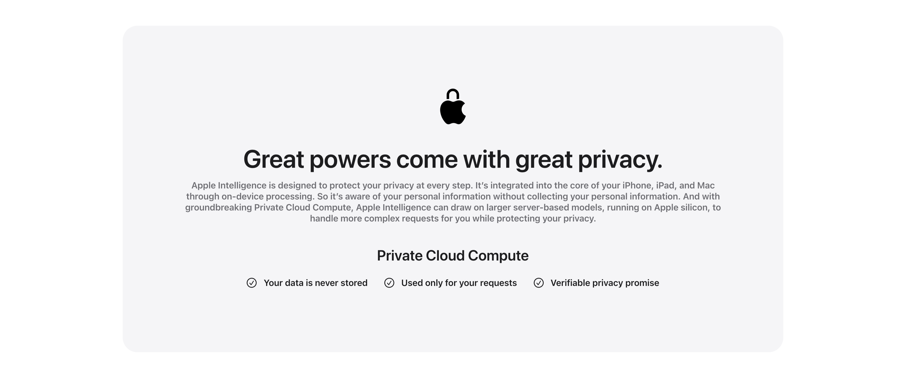
Great Powers Come With Great Privacy Band
Description
A centered privacy content band housed in a large pale-gray rounded card. At the top a black Apple logo rendered as a padlock sits above the centered headline ‘Great powers come with great privacy.’ A justified gray paragraph explains on-device processing and Private Cloud Compute running on Apple silicon. Below, a bold ‘Private Cloud Compute’ subhead introduces a single horizontal row of three checkmarked claims — ‘Your data is never stored’, ‘Used only for your requests’ and ‘Verifiable privacy promise’ — each prefixed by a circled check icon. The symmetrical, generously padded layout and restrained monochrome palette give the privacy message a calm, trustworthy, reassuring tone.
Related
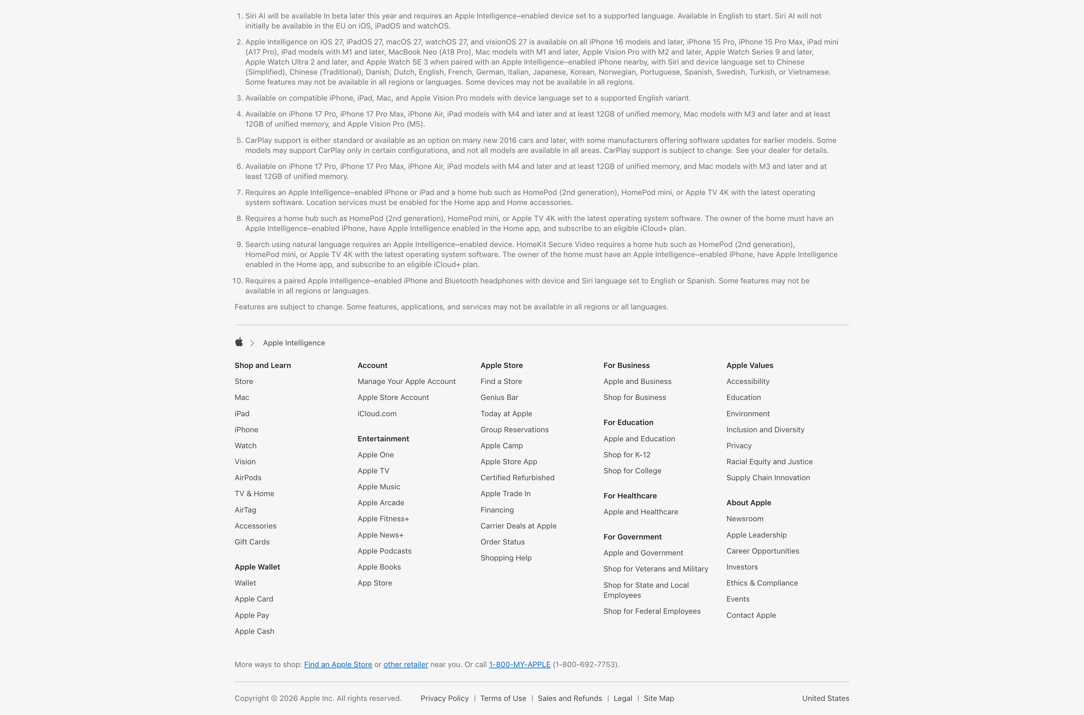
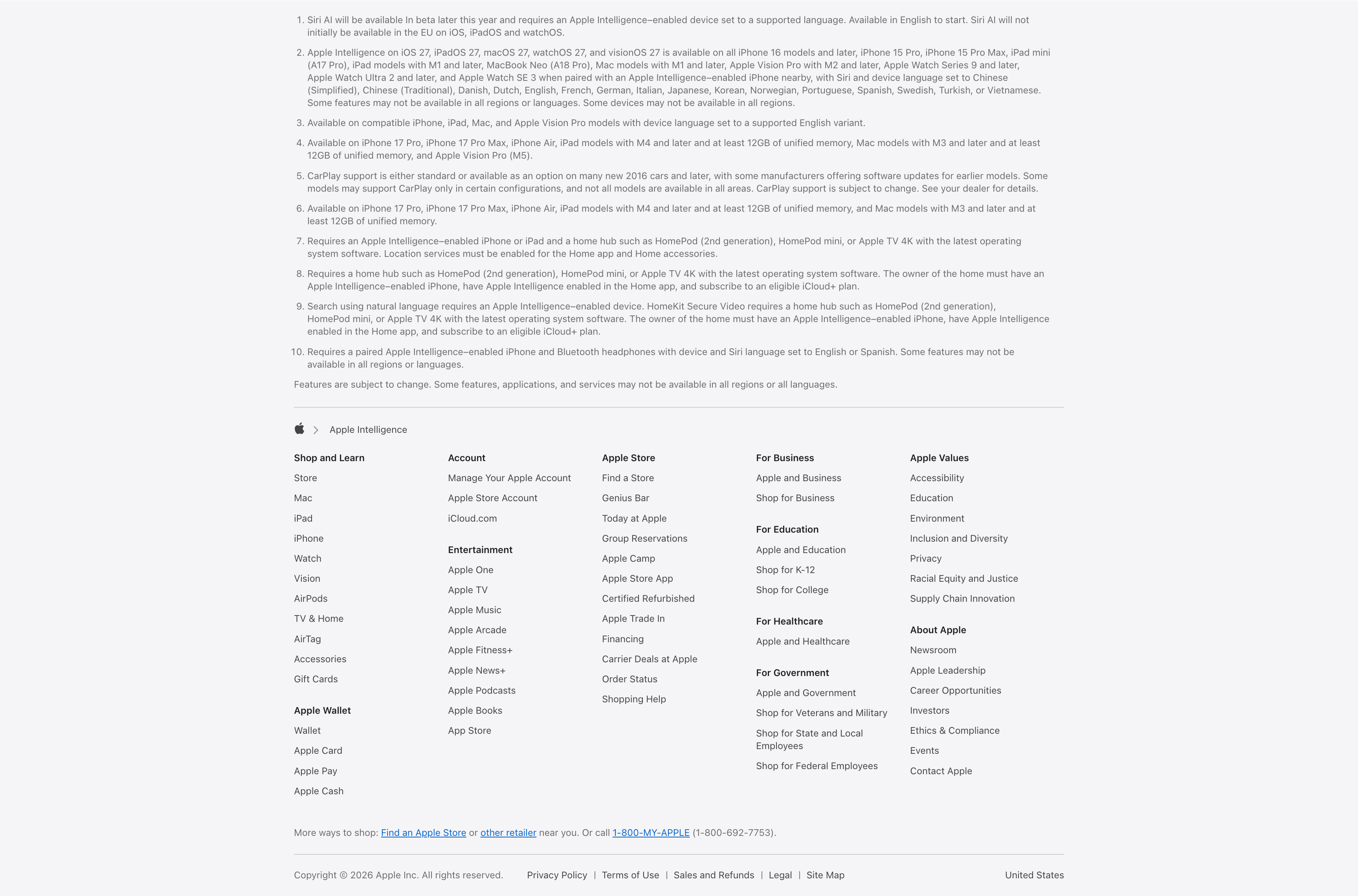
Legal Footnotes And Multi-Column Footer
A combined footnotes-and-footer block on white. The top portion is a numbered list of ten fine-print legal disclaimers covering Siri AI availability, supported devices and languages, CarPlay and HomeKit requirements, set in small gray type. Below a hairline divider an Apple-logo breadcrumb ('Apple > Apple Intelligence') introduces the standard Apple footer: a five-plus-column grid of link groups — Shop and Learn, Apple Wallet, Account, Entertainment, Apple Store, For Business, For Education, For Healthcare, For Government, Apple Values and About Apple — each a stack of small text links. A 'More ways to shop' line with a phone number and a bottom row of copyright, Privacy Policy, Terms of Use, Legal, Site Map and the 'United States' region close it out. The dense, orderly columns are a classic global-footer pattern.
Apple ↗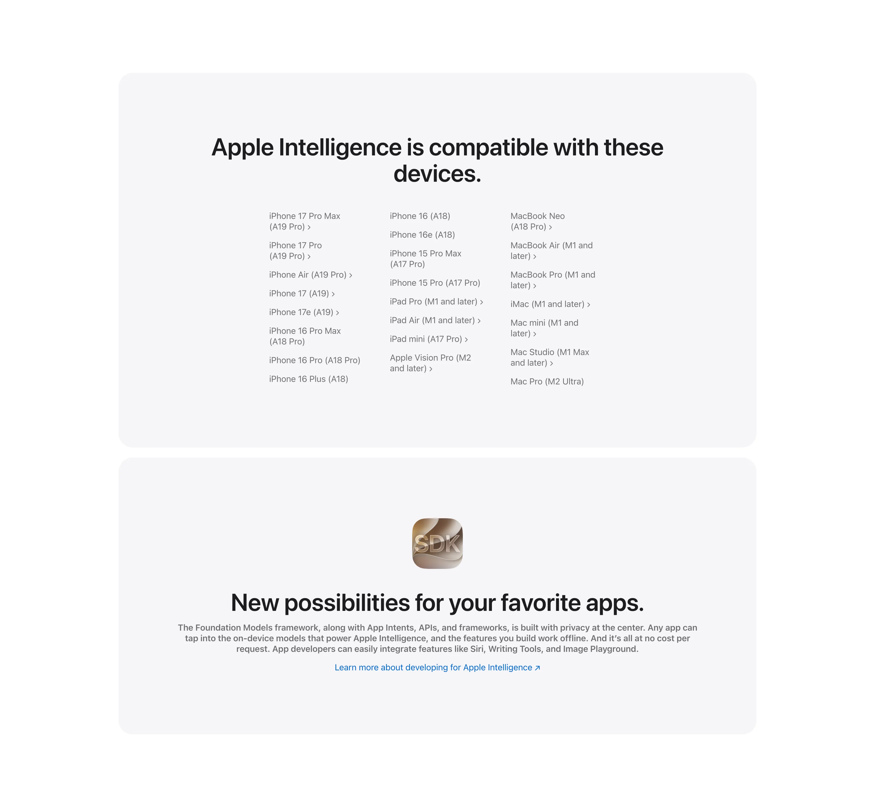
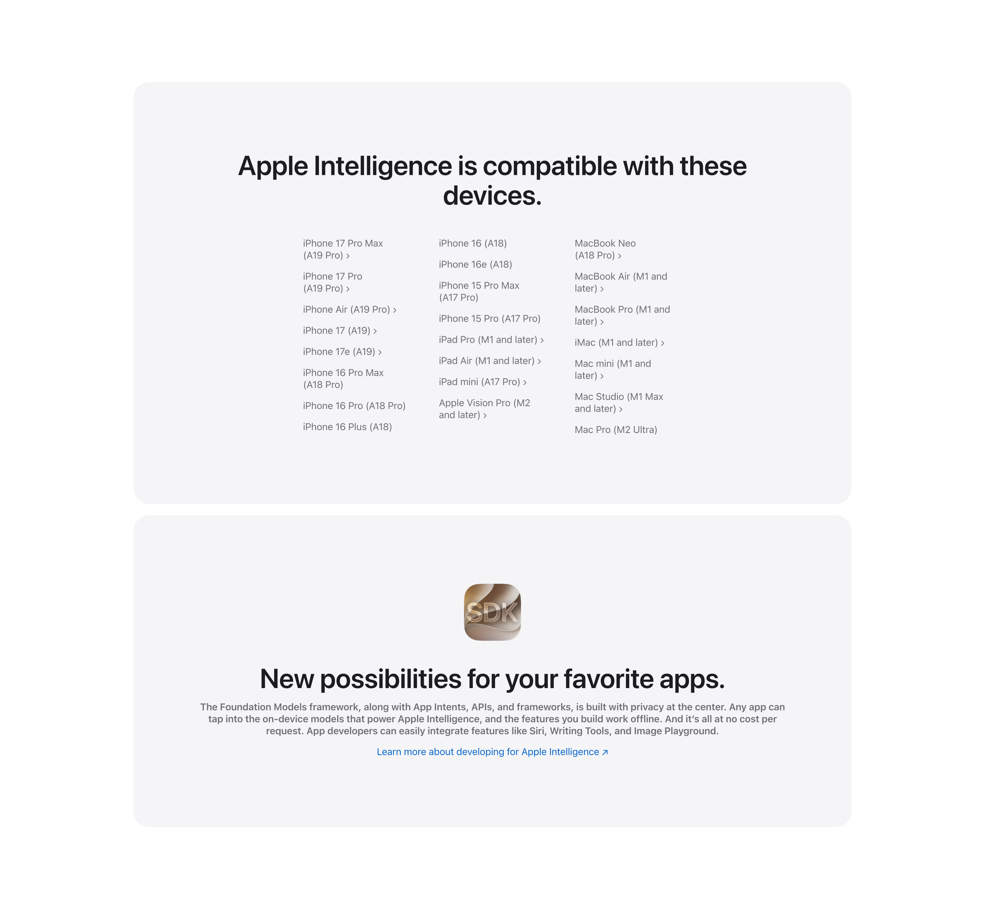
Compatible Devices List And Developer SDK Cards
Two stacked pale-gray rounded cards. The upper card, headed 'Apple Intelligence is compatible with these devices.', lays out a long three-column list of supported hardware — iPhone 17 Pro Max through iPhone 16 models, iPad Pro/Air/mini and Apple Vision Pro, and Mac models from MacBook Neo to Mac Pro — many entries carrying chevron links to detail pages. The lower card centers a glossy 'SDK' app icon above the bold headline 'New possibilities for your favorite apps.', a gray paragraph about the Foundation Models framework and App Intents, and a blue 'Learn more about developing for Apple Intelligence' link. The restrained monochrome cards keep the dense reference content and the developer call-to-action visually calm.
Apple ↗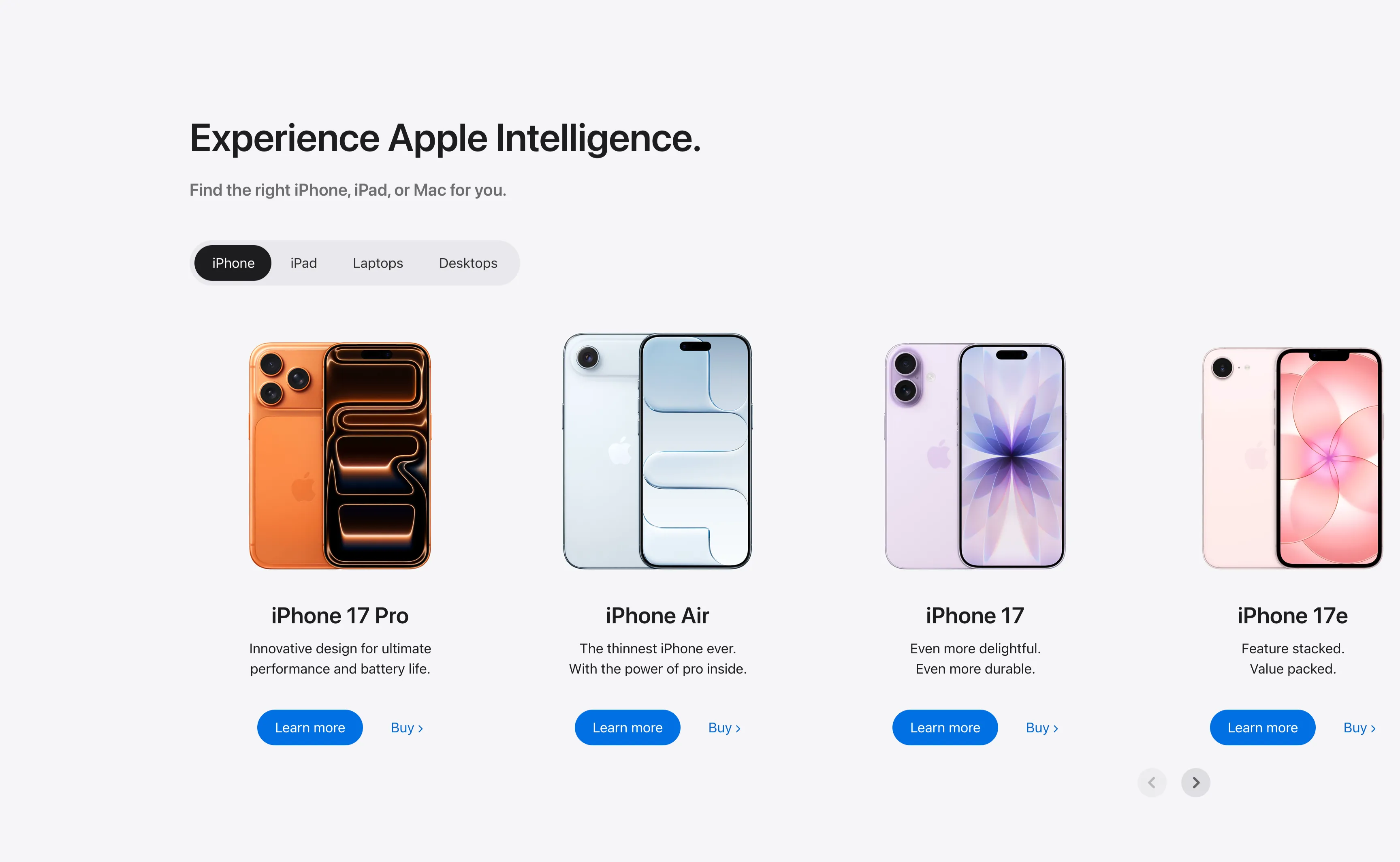
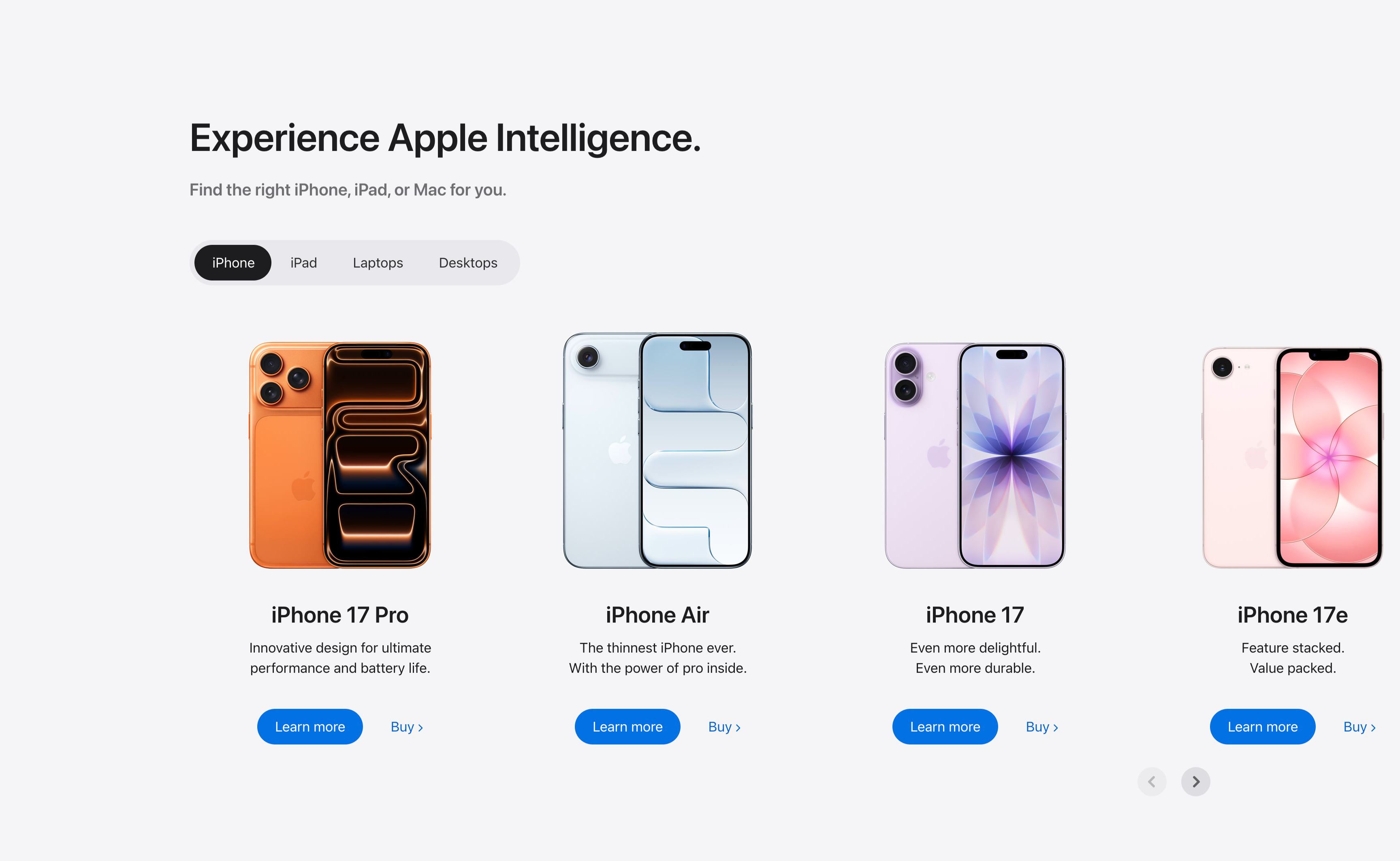
Experience Apple Intelligence Product Carousel
A product-finder carousel headed 'Experience Apple Intelligence.' with the subhead 'Find the right iPhone, iPad, or Mac for you.' A pill-shaped tab switcher offers iPhone (selected, dark), iPad, Laptops and Desktops. Below it four product cards sit in a scrollable row, each showing a device render, a bold model name, a two-line tagline, a solid blue 'Learn more' button and a 'Buy' text link: iPhone 17 Pro (orange), iPhone Air (light blue), iPhone 17 (purple) and iPhone 17e (pink). Circular previous/next arrows in the lower right reveal further models. The tabbed filter plus dual learn/buy calls-to-action make it a conversion-focused product showcase.
Apple ↗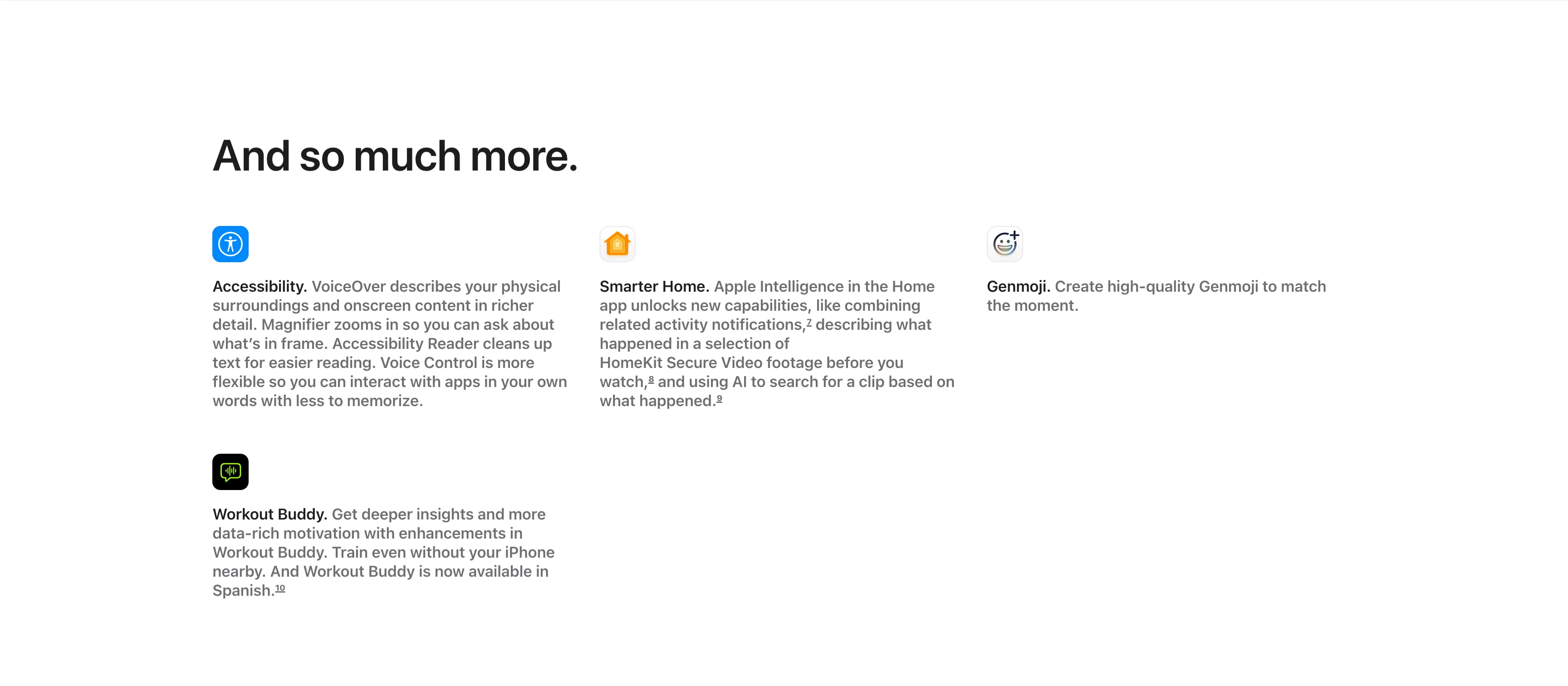
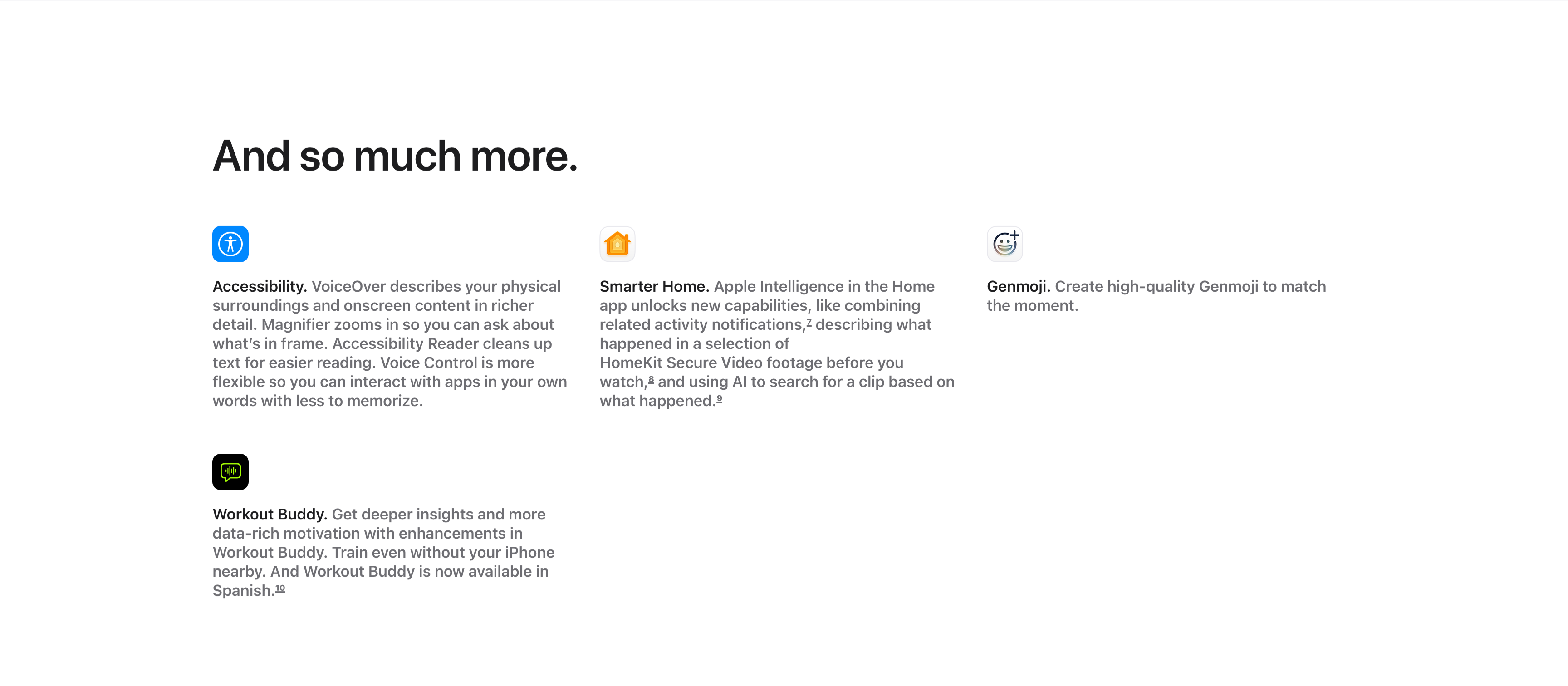
And So Much More Icon Feature Grid
A compact 'And so much more.' feature grid on a white background, with the large left-aligned heading sitting above the items. Four entries are arranged across three columns and two rows, each led by a small rounded app icon, a bold inline title and a gray description: 'Accessibility.' (VoiceOver describing surroundings, Magnifier, Accessibility Reader, Voice Control), 'Smarter Home.' (combining activity notifications and AI search of HomeKit Secure Video), and 'Genmoji.' (creating high-quality Genmoji) fill the top row, with 'Workout Buddy.' (deeper insights, now in Spanish) below the first column. Superscript footnote markers appear after several phrases. The icon-led, text-heavy grid efficiently rounds up smaller features after the main showcases.
Apple ↗Similar content sections
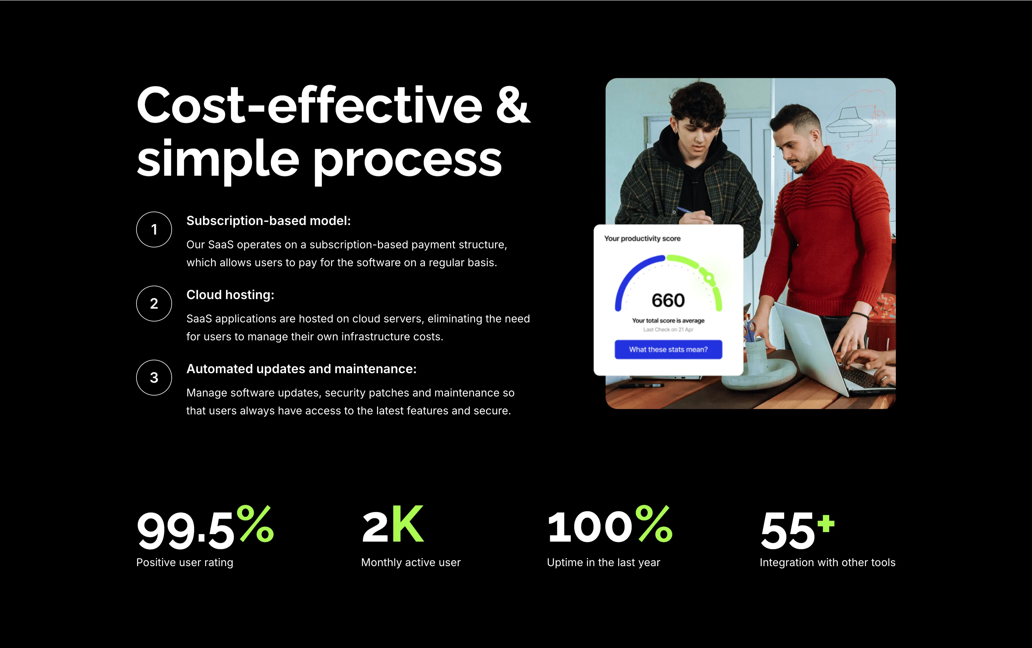
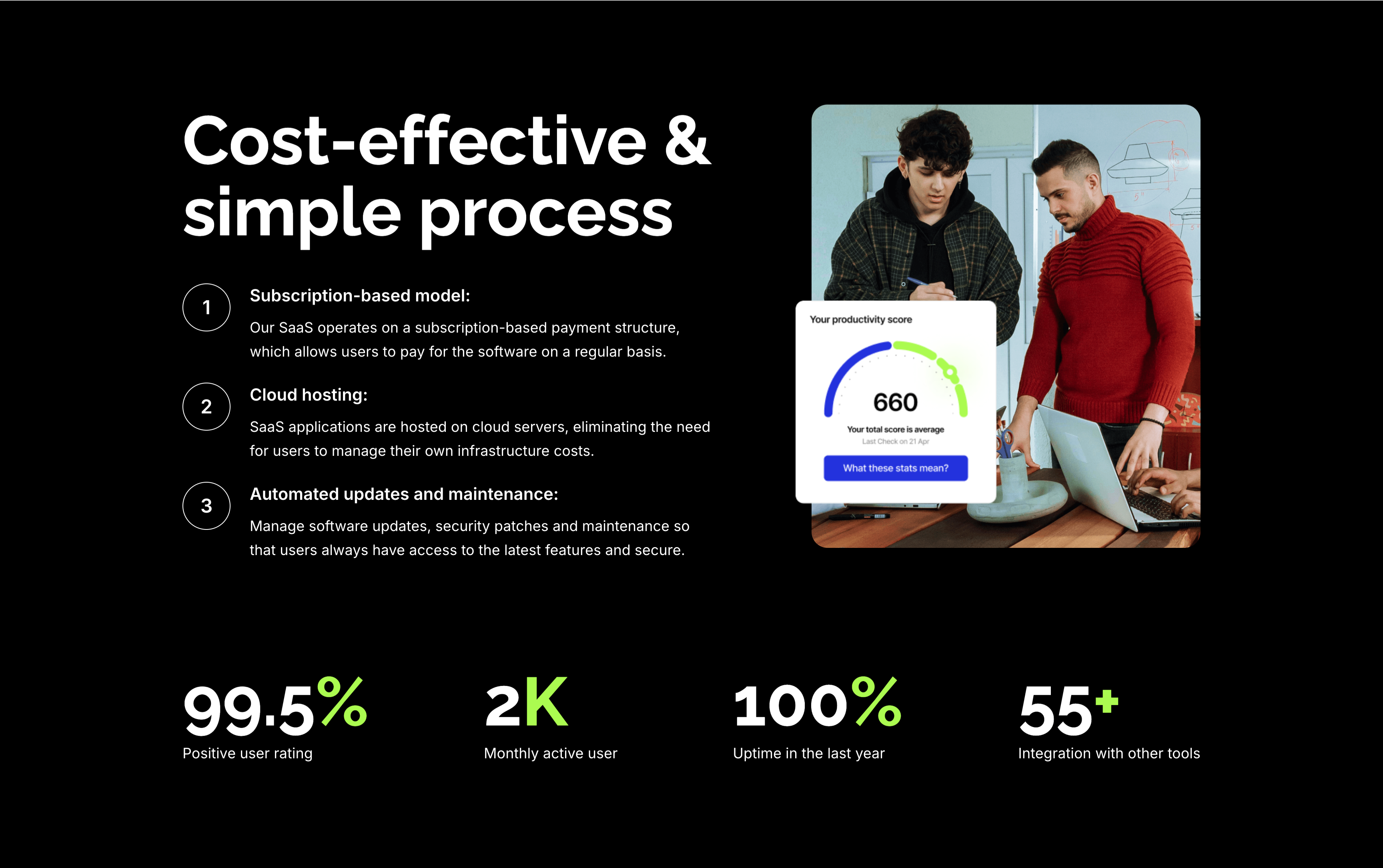
Cost-Effective Simple Process With Stats
A feature section on a solid black background. The left column stacks an oversized white 'Cost-effective & simple process' heading over three numbered points — 'Subscription-based model:', 'Cloud hosting:' and 'Automated updates and maintenance:' — each with a circled number and a short white description. The right column shows a rounded photo of two colleagues at a laptop with a floating white 'Your productivity score' card reading 660. A row of four lime-green-accented stats runs across the bottom: '99.5%' positive user rating, '2K' monthly active users, '100%' uptime in the last year and '55+' integrations. The dark canvas, numbered list and green metrics give the section a confident, data-backed tone.
Zubuz ↗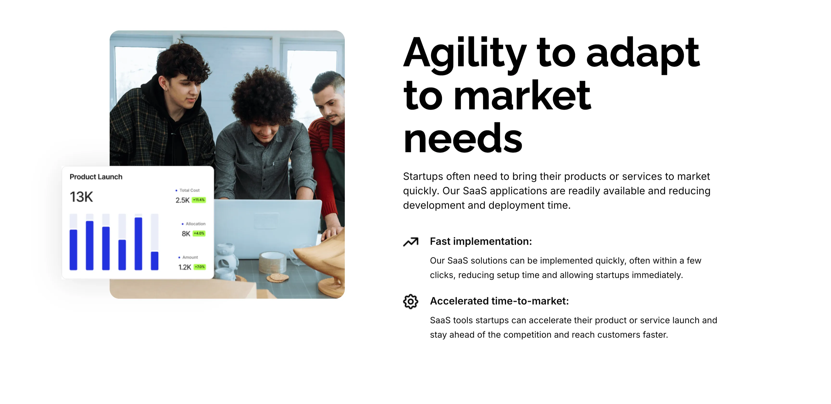
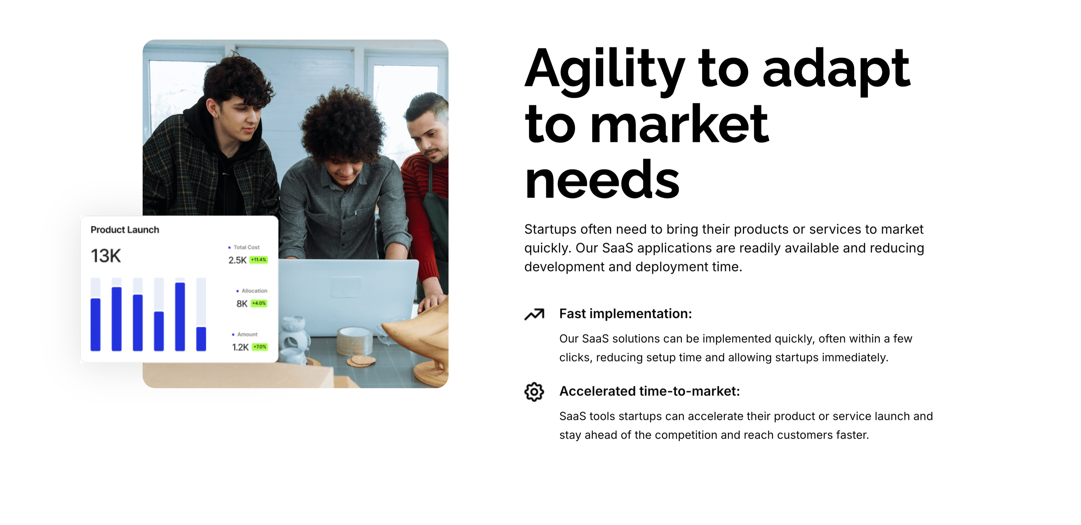
Agility To Adapt Split Feature
A two-column feature block on white. The left column holds a rounded photo of three colleagues at a laptop, overlaid at the corner with a floating 'Product Launch' analytics card (a 13K figure, bar chart and green percentage badges). The right column leads with an oversized 'Agility to adapt to market needs' heading and a short paragraph, then two icon-led points: 'Fast implementation:' (SaaS solutions deployed in a few clicks) and 'Accelerated time-to-market:' (launch faster and stay ahead of competitors). A small outline icon precedes each point. The photo-plus-icon-list layout pairs a human scene with a crisp benefit statement.
Zubuz ↗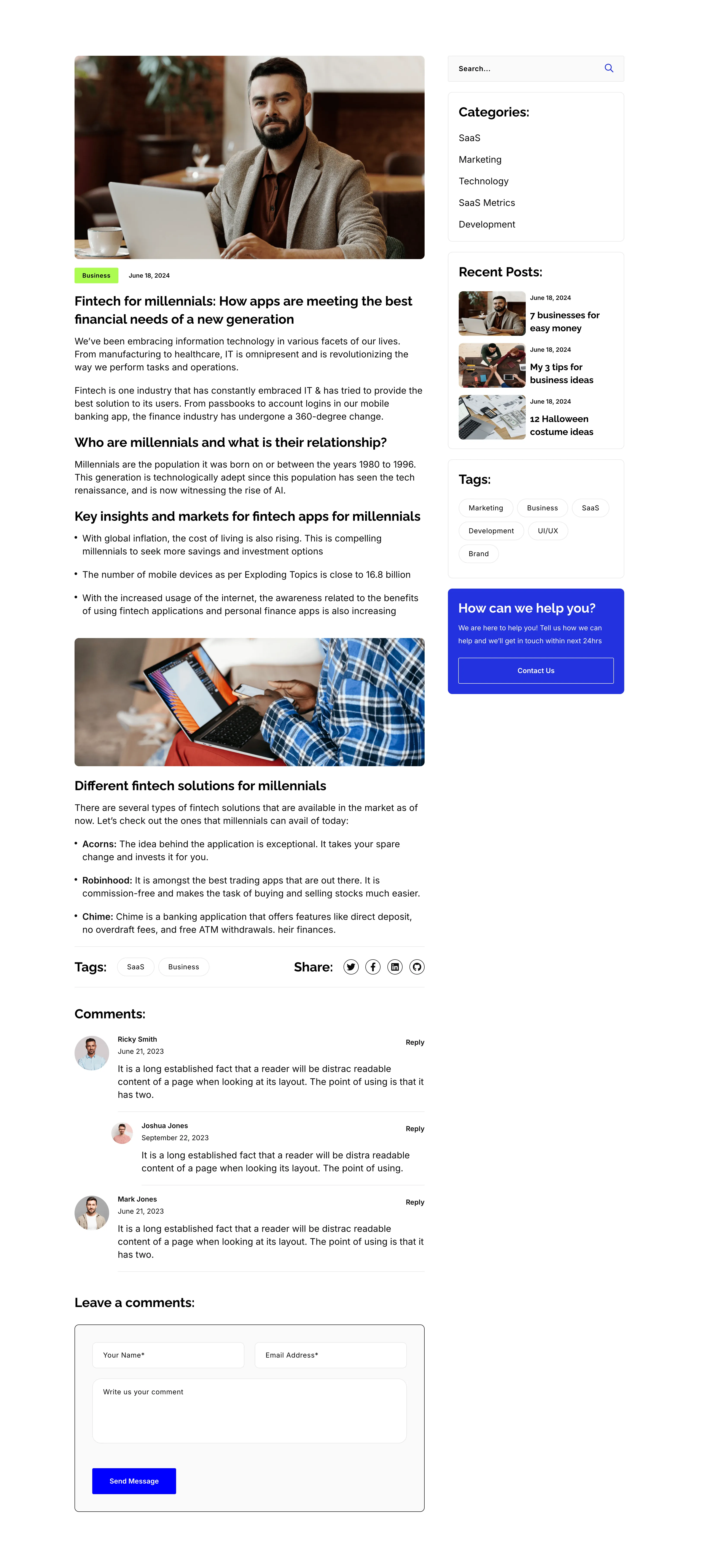
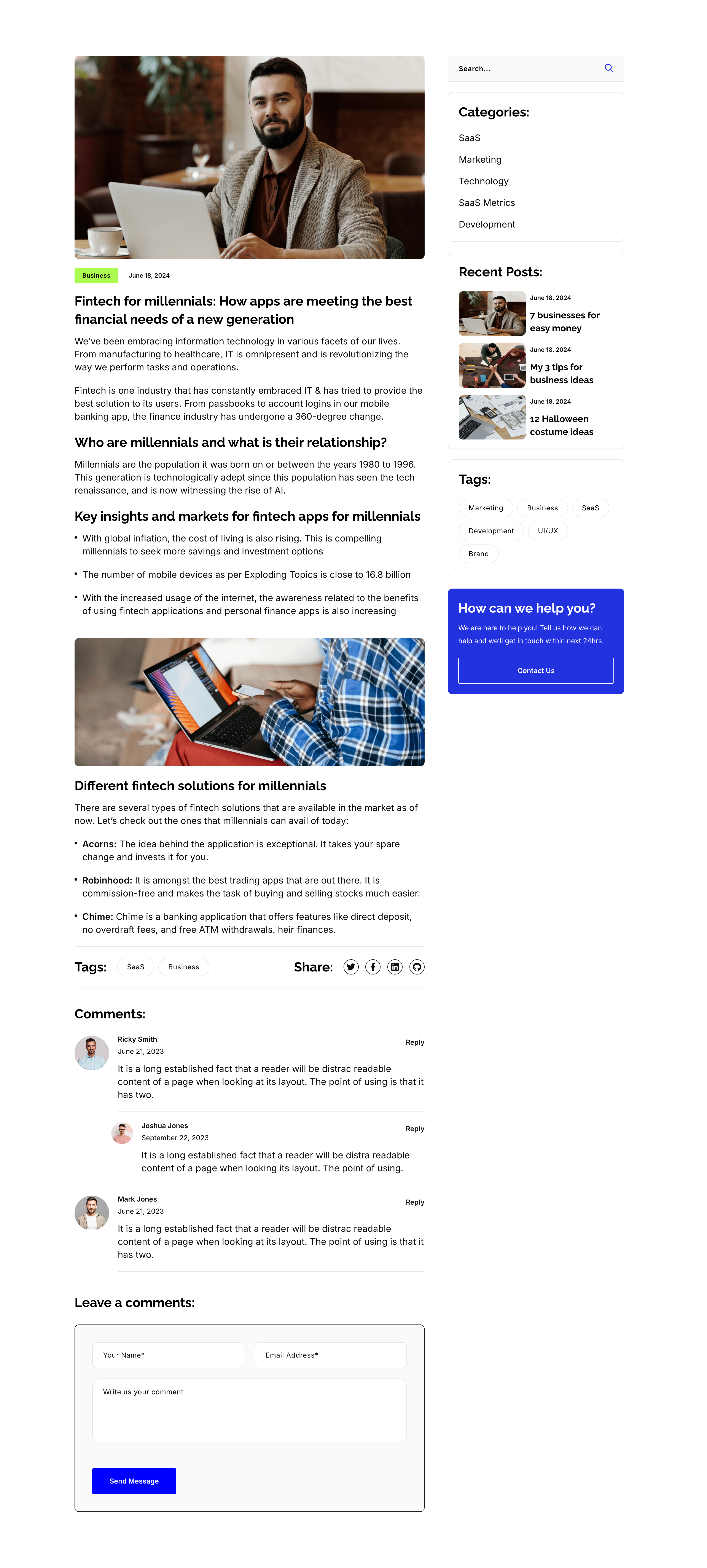
Blog Post Article Page With Comments
A single blog-post layout on white, again split into an article column and a right sidebar. The article opens with a hero photo, a 'Business' tag and date, the title 'Fintech for millennials: How apps are meeting the best financial needs of a new generation', then body copy broken by sub-headings ('Who are millennials…', 'Key insights…', 'Different fintech solutions…'), bullet lists, an inset photo, a Tags/Share row, and a threaded 'Comments:' list with a 'Leave a comments:' form. The sidebar repeats the search, Categories, Recent Posts, Tags and blue help card from the archive. The long-form column with a persistent sidebar is the standard editorial article template.
Zubuz ↗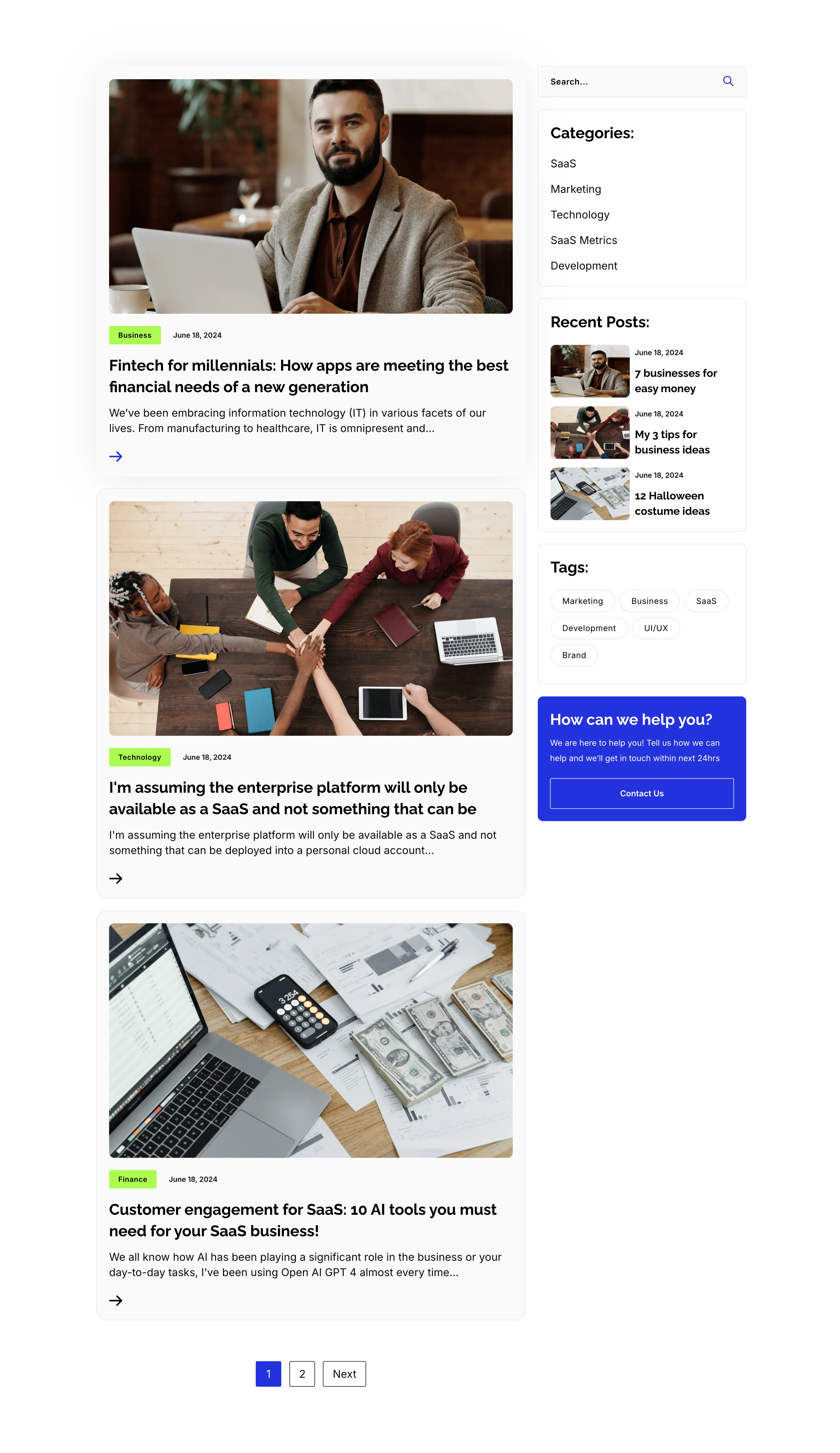
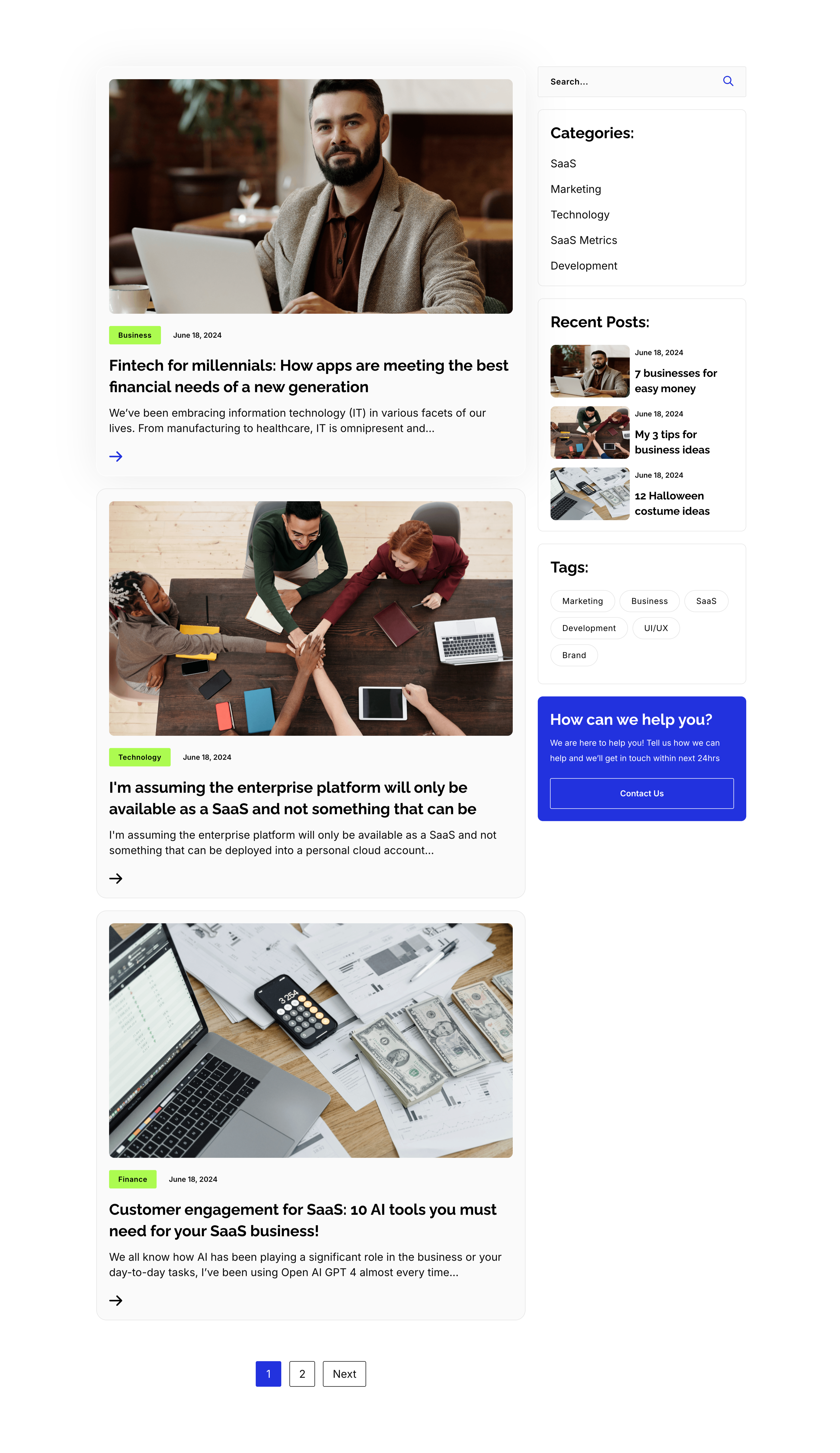
Blog Listing Page With Sidebar
A full blog-listing layout on white, split into a wide article column and a right sidebar. The main column stacks post previews, each a photo with a category tag and date over a bold title, an excerpt and an arrow link — 'Fintech for millennials…', 'I'm assuming the enterprise platform…' and 'Customer engagement for SaaS: 10 AI tools…' — closing with a '1 / 2 / Next' pager. The sidebar holds a search field, a 'Categories:' list (SaaS, Marketing, Technology, SaaS Metrics, Development), a 'Recent Posts:' list with thumbnails, a 'Tags:' pill cloud, and a blue 'How can we help you?' card with a Contact Us button. The article-plus-sidebar structure is the classic content-hub archive pattern.
Zubuz ↗