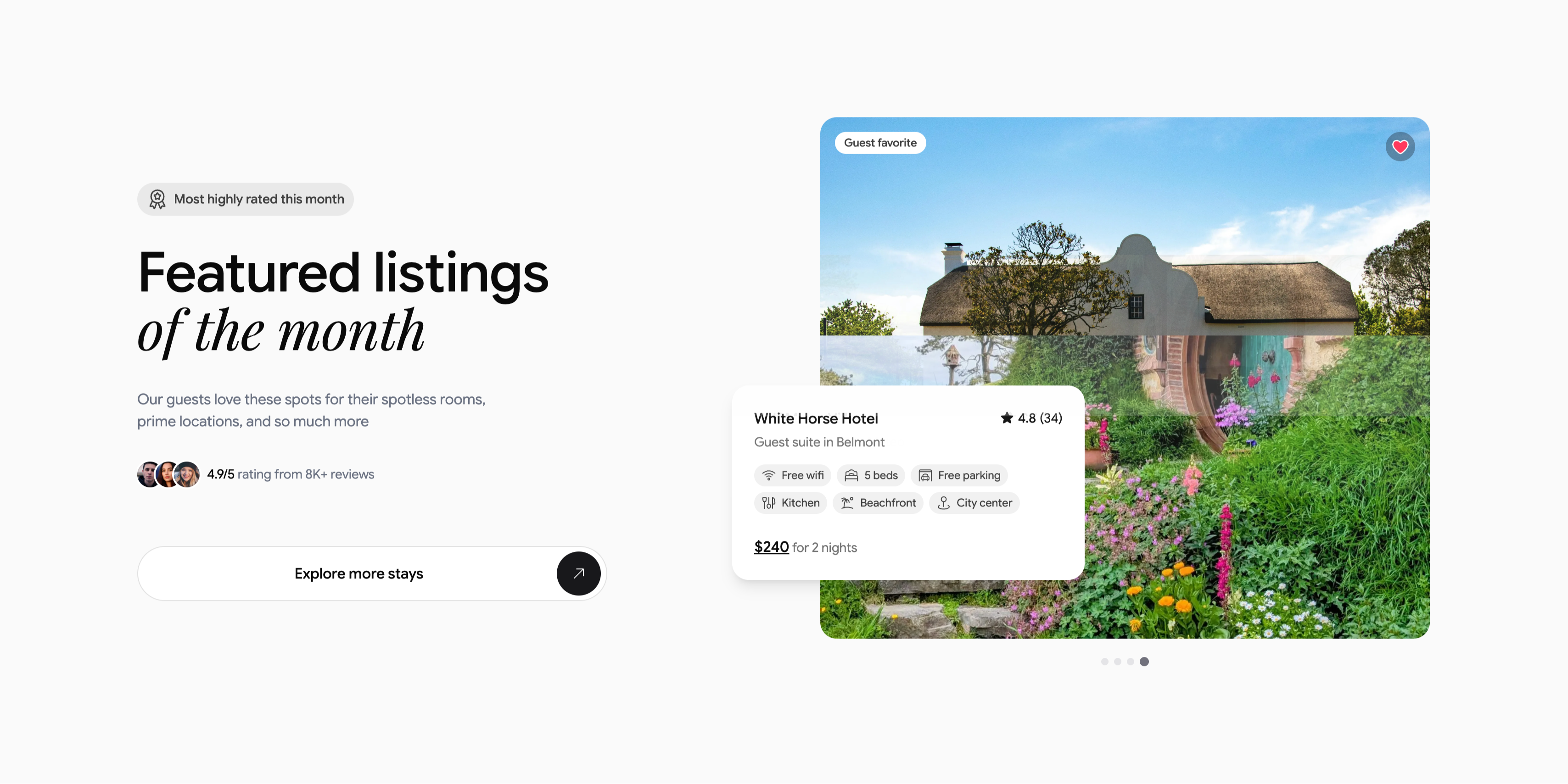
Featured Listing Of The Month Spotlight
Description
A two-column spotlight on a light gray background. The left column stacks a small pill badge, ‘Most highly rated this month’, a large heading ‘Featured listings of the month’ (with ‘of the month’ in italic serif), a short subhead about spotless rooms and prime locations, an avatar trio beside ‘4.9/5 rating from 8K+ reviews’, and a wide white ‘Explore more stays’ button capped with a circular arrow. The right column shows a large rounded photograph of a thatched cottage in a lush flowering garden, tagged ‘Guest favorite’ with a heart icon. Overlapping its lower-left corner is a white listing card: ‘White Horse Hotel’, ‘★ 4.8 (34)’, ‘Guest suite in Belmont’, a set of amenity chips (Free wifi, 5 beds, Free parking, Kitchen, Beachfront, City center) and ‘$240 for 2 nights’, with carousel dots beneath. The overlapping card and proof points make a single listing feel premium and clickable.
Related
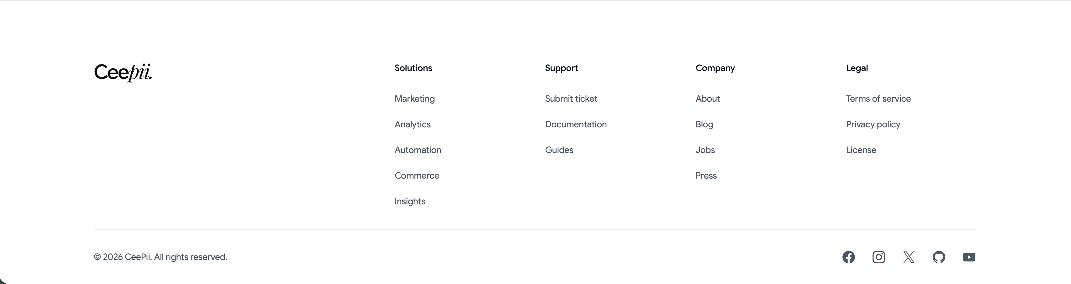
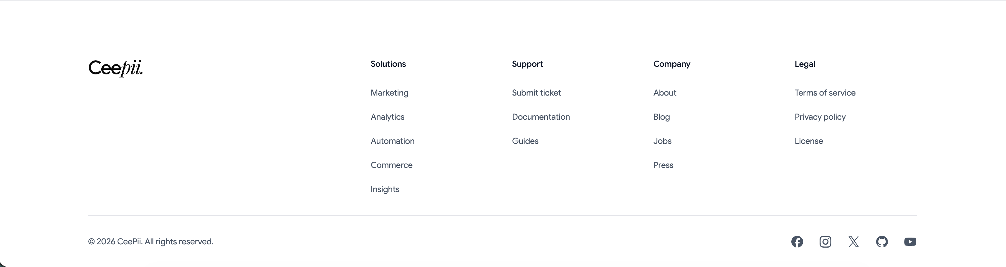
Ceepii Multi-Column Footer With Social Links
A clean white footer anchored by the 'Ceepii.' wordmark at far left. To its right sit four link columns under bold headings: 'Solutions' (Marketing, Analytics, Automation, Commerce, Insights), 'Support' (Submit ticket, Documentation, Guides), 'Company' (About, Blog, Jobs, Press) and 'Legal' (Terms of service, Privacy policy, License). A hairline divider runs across the full width, below which a copyright line, '© 2026 CeePii. All rights reserved.', sits at left and a row of monochrome social icons — Facebook, Instagram, X, GitHub and YouTube — sits at right. The restrained type, ample spacing and single divider give a simple, corporate-clean sitemap footer.
Ceepii-nextjs-template ↗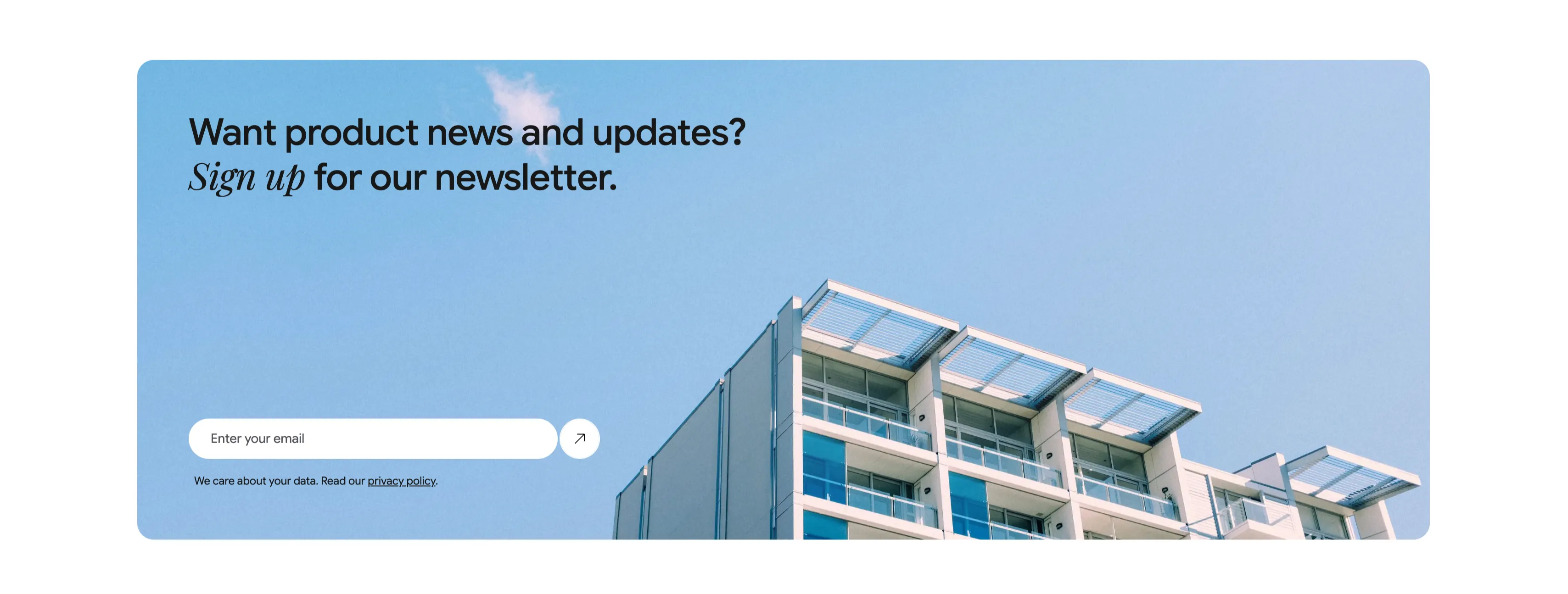
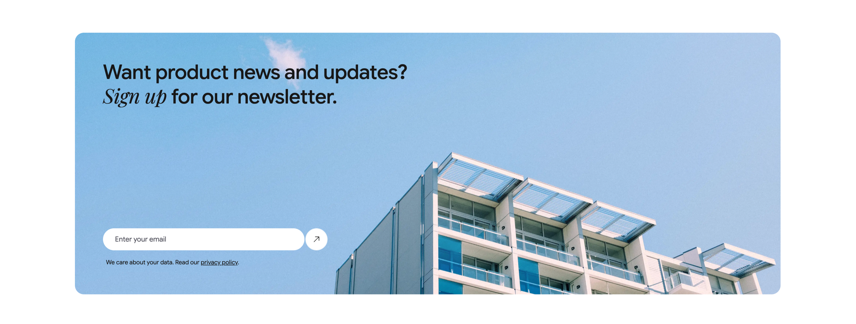
Newsletter Signup Banner With Email Field
A wide, rounded light-blue banner with a photograph of a modern apartment building against a clear sky filling its right side. The left side carries a two-line heading, 'Want product news and updates? Sign up for our newsletter.', with 'Sign up' set in italic serif. Beneath it is a single email capture: a white rounded input placeheld 'Enter your email' paired with a circular up-right arrow submit button. A small line of fine print below reads 'We care about your data. Read our privacy policy.', with 'privacy policy' underlined as a link. The soft blue field, generous rounding and single-field form make a friendly, low-friction newsletter call-to-action.
Ceepii-nextjs-template ↗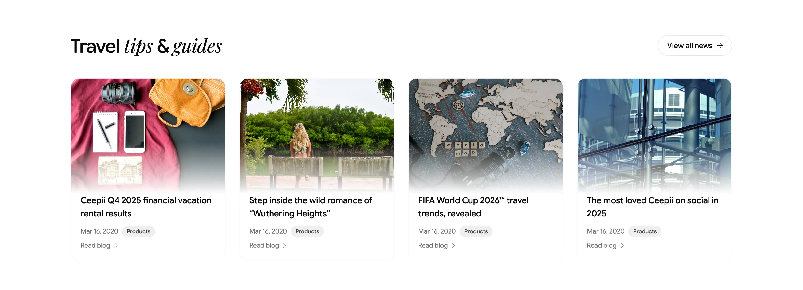
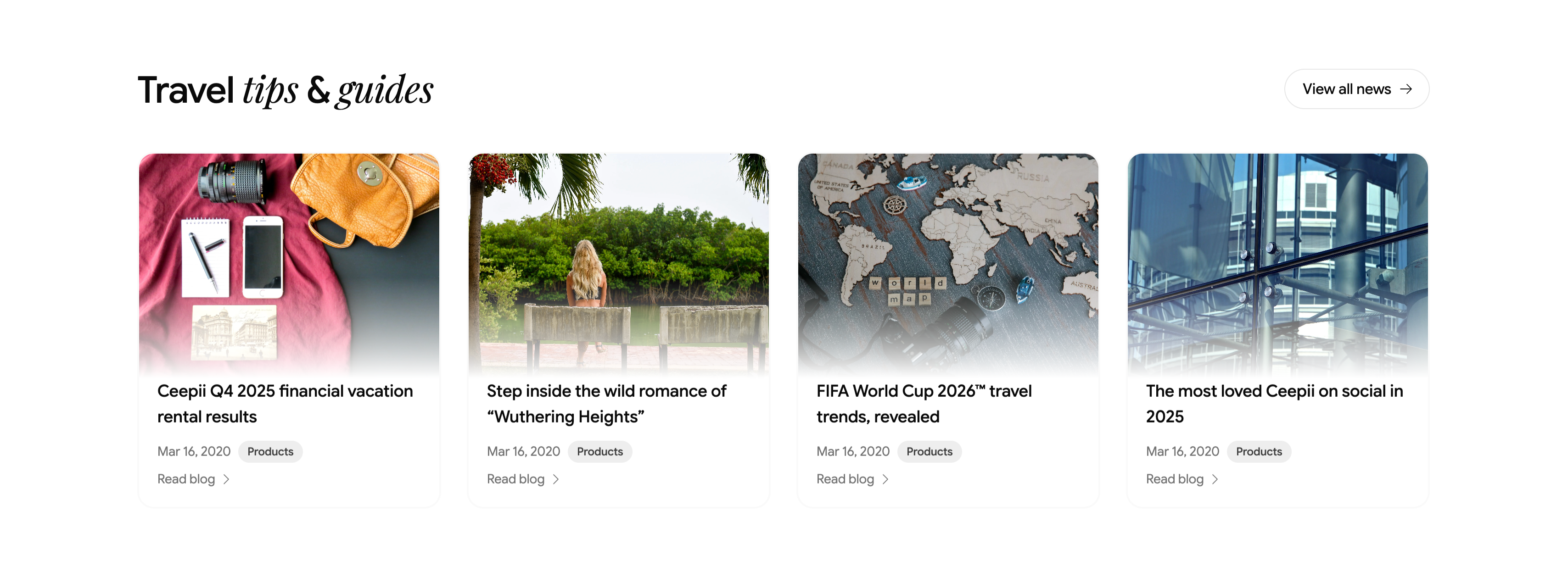
Travel Tips And Guides Blog Card Row
A blog teaser section headed 'Travel tips & guides', with 'tips & guides' in italic serif and a pill 'View all news →' button at upper-right. Below runs a four-up row of article cards, each a rounded cover image above a title, a 'Mar 16, 2020' date, a gray 'Products' category tag, and a 'Read blog →' link. The featured posts are 'Ceepii Q4 2025 financial vacation rental results', 'Step inside the wild romance of "Wuthering Heights"', 'FIFA World Cup 2026™ travel trends, revealed', and 'The most loved Ceepii on social in 2025', with editorial photography (a flat-lay travel kit, a lakeside figure, a wooden world map, and glass architecture). The clean image-over-text cards give a tidy, magazine-style content row.
Ceepii-nextjs-template ↗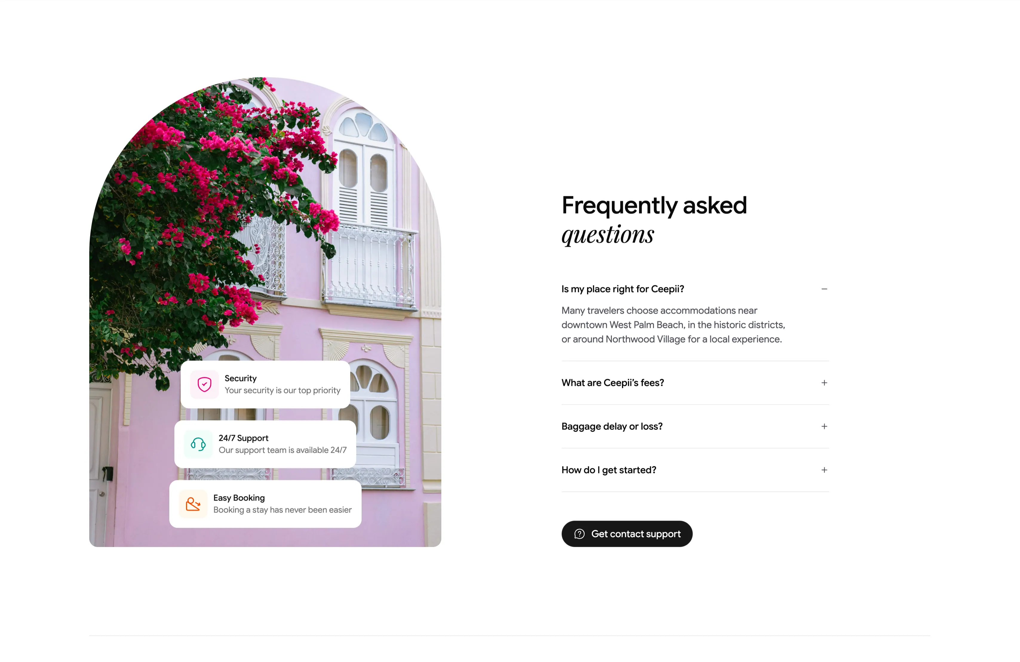
Frequently Asked Questions Accordion With Image
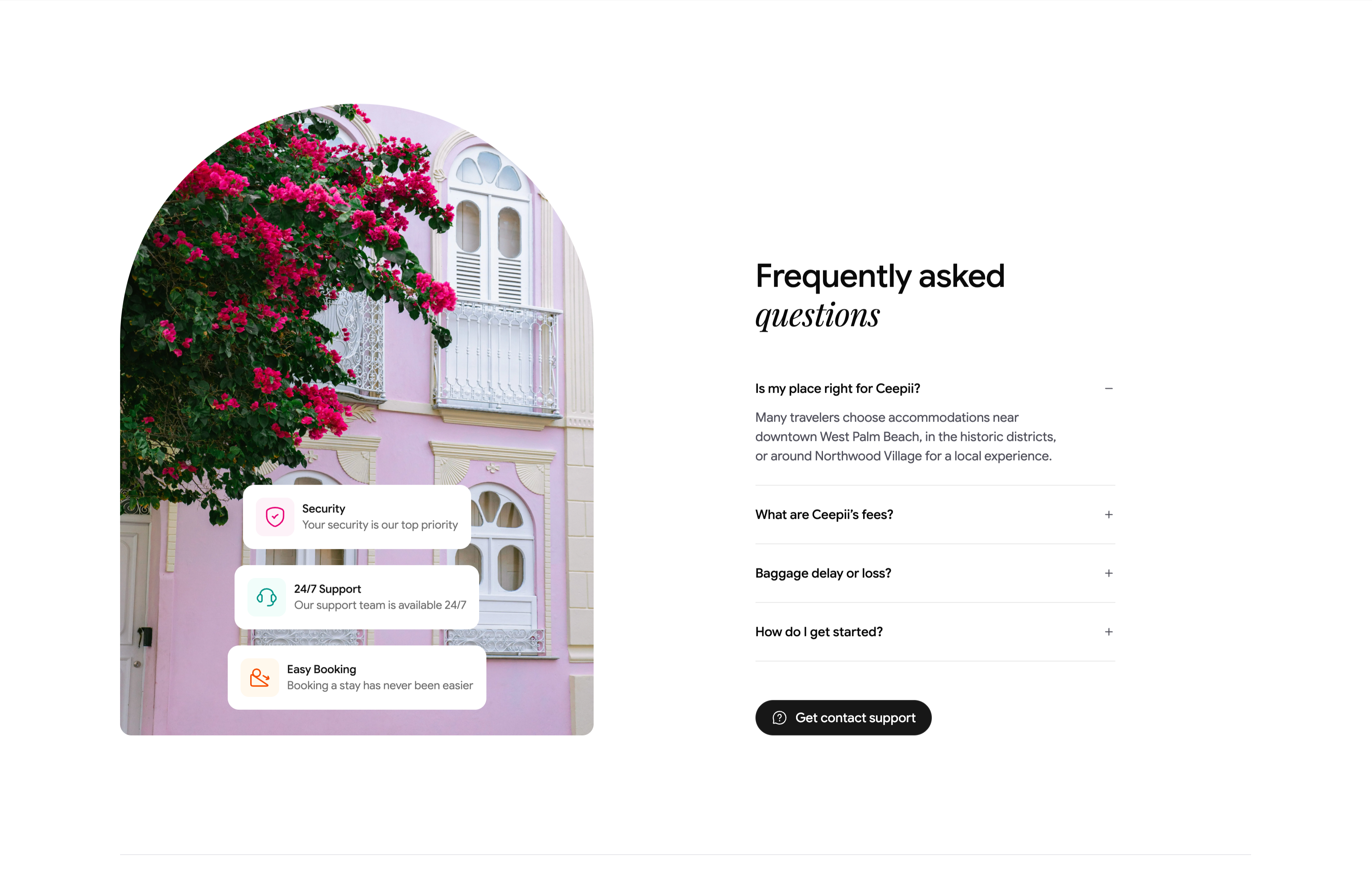
A two-column FAQ section. The left column is a tall arch-topped photograph of a pink colonial facade draped in magenta bougainvillea, with three floating white cards stacked over it — 'Security / Your security is our top priority', '24/7 Support / Our support team is available 24/7', and 'Easy Booking / Booking a stay has never been easier' — each fronted by a colored icon. The right column heads 'Frequently asked questions' (with 'questions' in italic serif) above an accordion list: 'Is my place right for Ceepii?' is expanded to reveal a paragraph about West Palm Beach neighborhoods, followed by collapsed rows 'What are Ceepii's fees?', 'Baggage delay or loss?' and 'How do I get started?', each with a +/− toggle. A black pill 'Get contact support' button closes the column. The expand/collapse toggles and supporting trust cards make a standard but polished FAQ.
Ceepii-nextjs-template ↗Similar content sections
Cost-Effective Simple Process With Stats
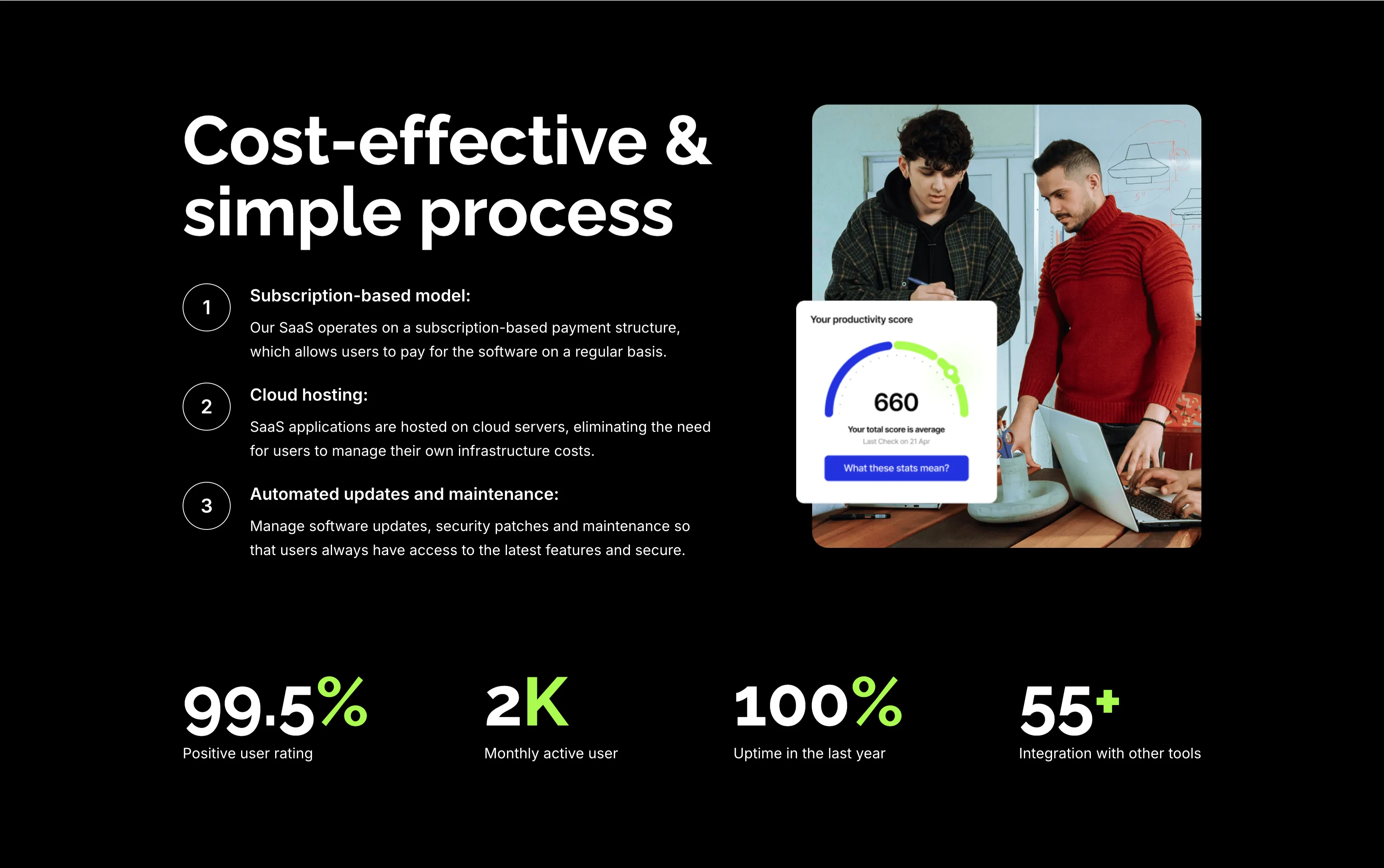
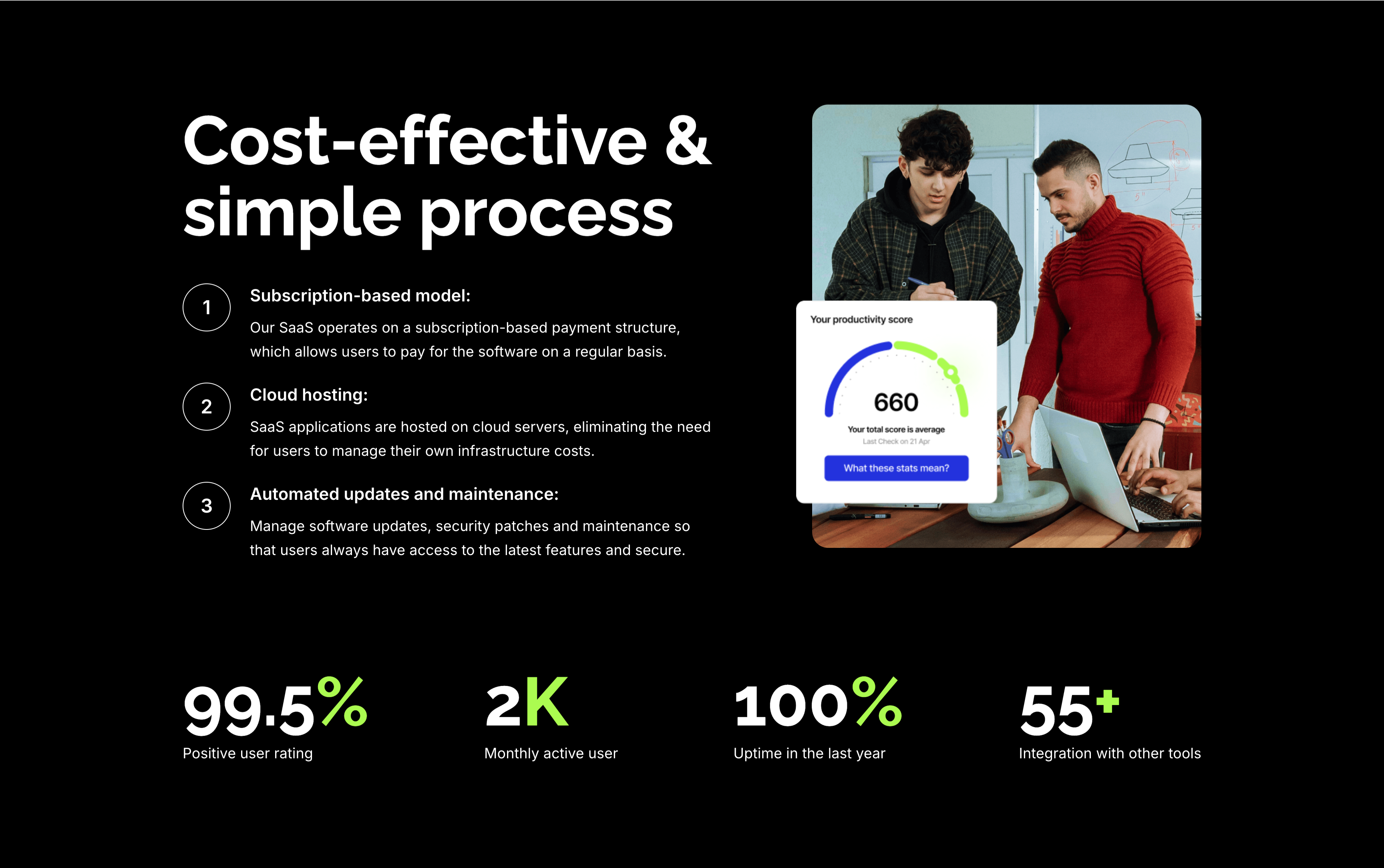
A feature section on a solid black background. The left column stacks an oversized white 'Cost-effective & simple process' heading over three numbered points — 'Subscription-based model:', 'Cloud hosting:' and 'Automated updates and maintenance:' — each with a circled number and a short white description. The right column shows a rounded photo of two colleagues at a laptop with a floating white 'Your productivity score' card reading 660. A row of four lime-green-accented stats runs across the bottom: '99.5%' positive user rating, '2K' monthly active users, '100%' uptime in the last year and '55+' integrations. The dark canvas, numbered list and green metrics give the section a confident, data-backed tone.
Zubuz ↗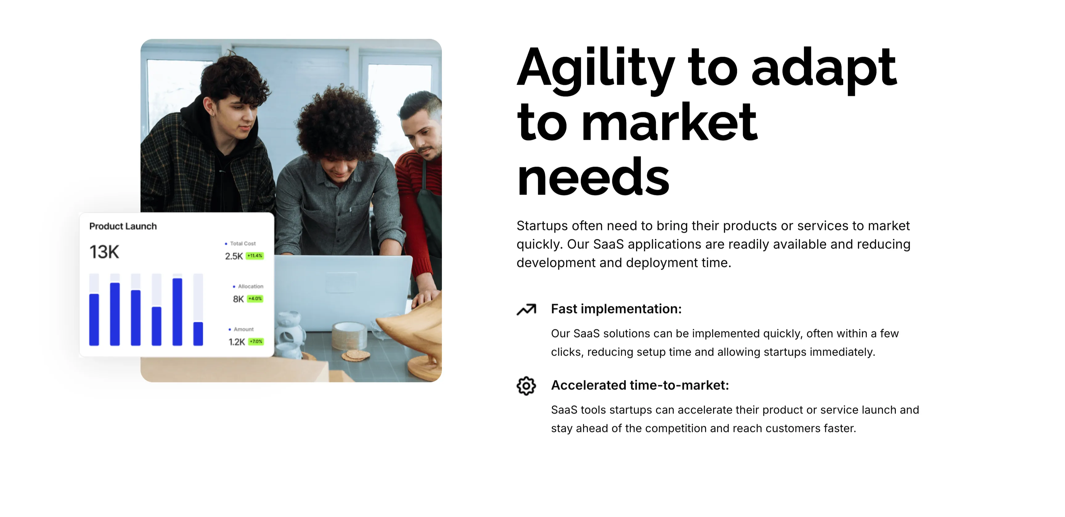
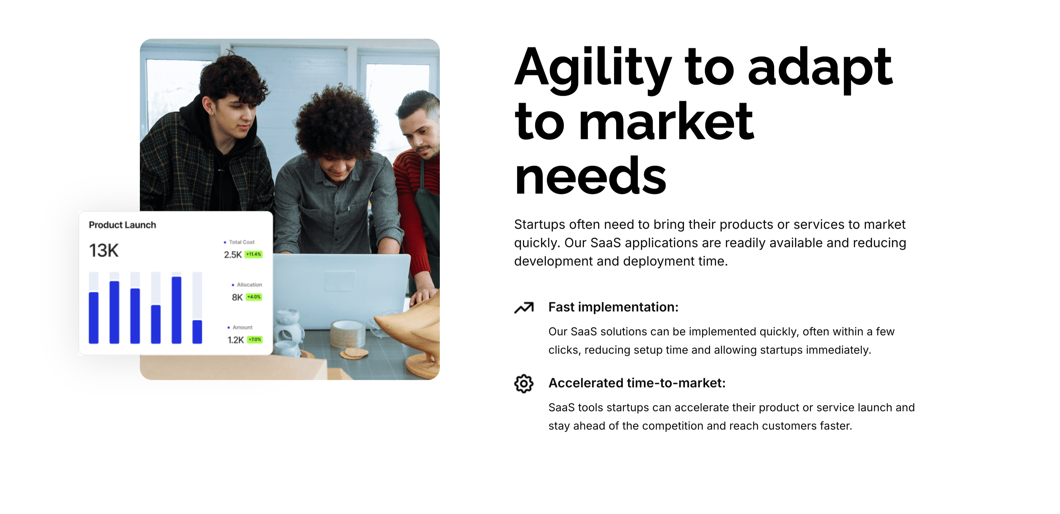
Agility To Adapt Split Feature
A two-column feature block on white. The left column holds a rounded photo of three colleagues at a laptop, overlaid at the corner with a floating 'Product Launch' analytics card (a 13K figure, bar chart and green percentage badges). The right column leads with an oversized 'Agility to adapt to market needs' heading and a short paragraph, then two icon-led points: 'Fast implementation:' (SaaS solutions deployed in a few clicks) and 'Accelerated time-to-market:' (launch faster and stay ahead of competitors). A small outline icon precedes each point. The photo-plus-icon-list layout pairs a human scene with a crisp benefit statement.
Zubuz ↗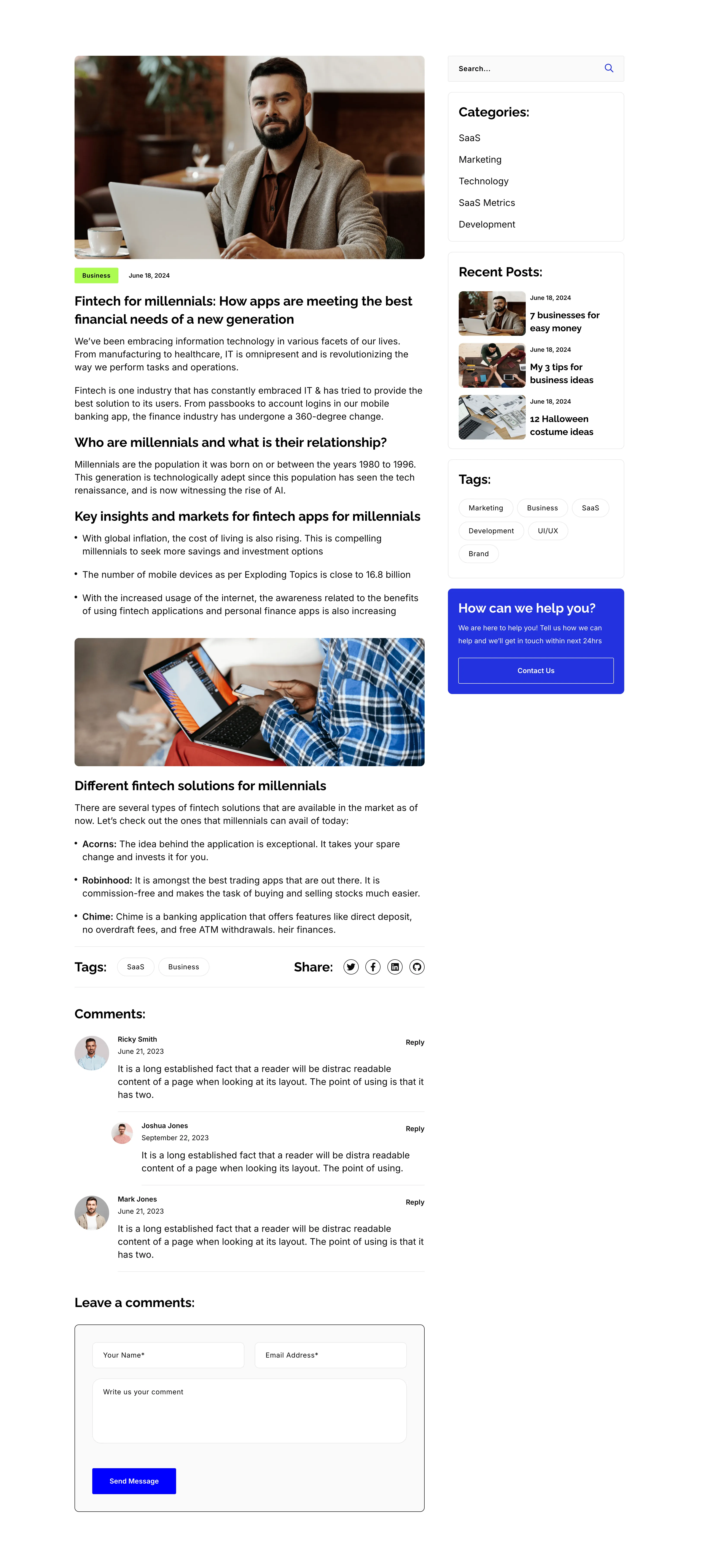
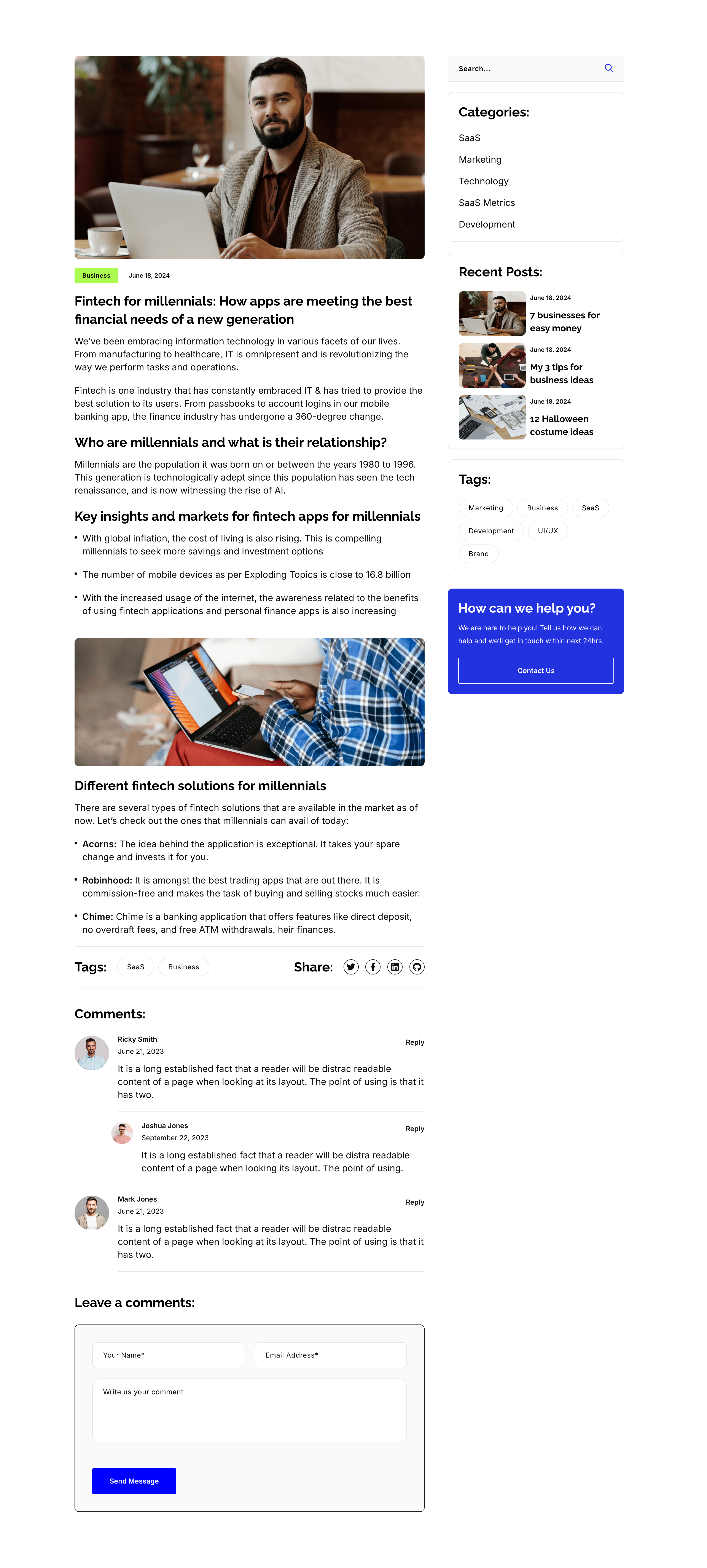
Blog Post Article Page With Comments
A single blog-post layout on white, again split into an article column and a right sidebar. The article opens with a hero photo, a 'Business' tag and date, the title 'Fintech for millennials: How apps are meeting the best financial needs of a new generation', then body copy broken by sub-headings ('Who are millennials…', 'Key insights…', 'Different fintech solutions…'), bullet lists, an inset photo, a Tags/Share row, and a threaded 'Comments:' list with a 'Leave a comments:' form. The sidebar repeats the search, Categories, Recent Posts, Tags and blue help card from the archive. The long-form column with a persistent sidebar is the standard editorial article template.
Zubuz ↗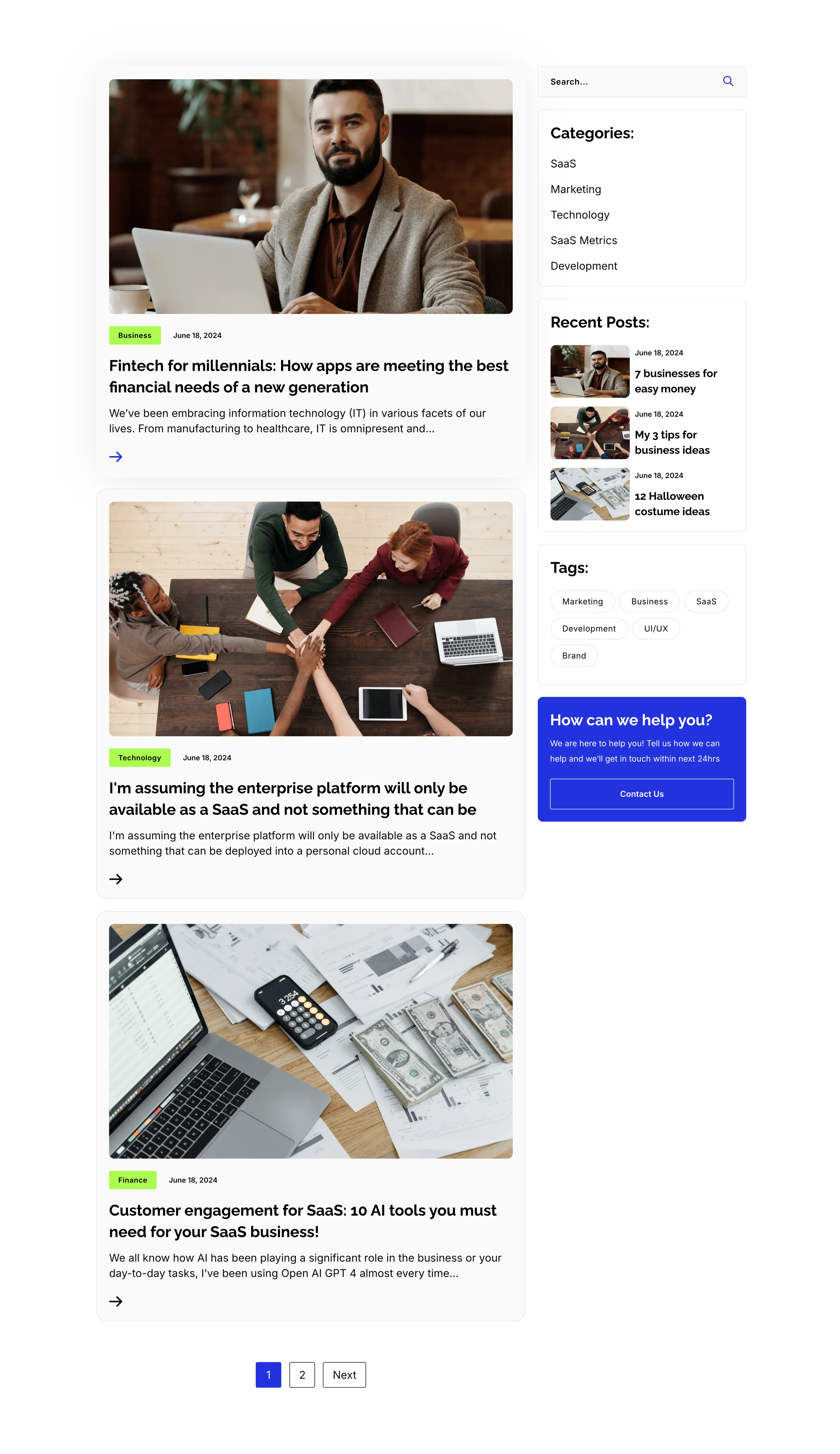
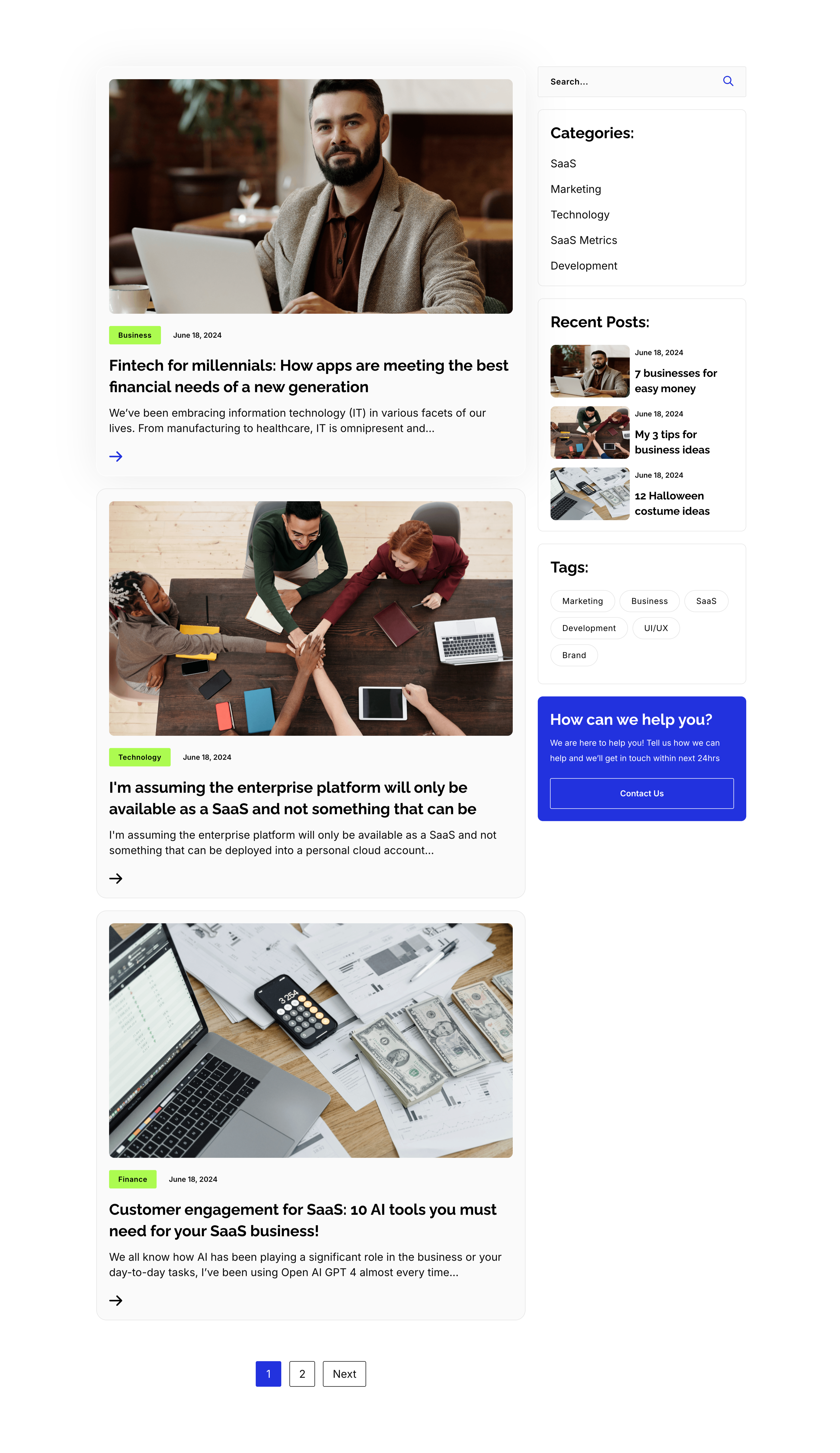
Blog Listing Page With Sidebar
A full blog-listing layout on white, split into a wide article column and a right sidebar. The main column stacks post previews, each a photo with a category tag and date over a bold title, an excerpt and an arrow link — 'Fintech for millennials…', 'I'm assuming the enterprise platform…' and 'Customer engagement for SaaS: 10 AI tools…' — closing with a '1 / 2 / Next' pager. The sidebar holds a search field, a 'Categories:' list (SaaS, Marketing, Technology, SaaS Metrics, Development), a 'Recent Posts:' list with thumbnails, a 'Tags:' pill cloud, and a blue 'How can we help you?' card with a Contact Us button. The article-plus-sidebar structure is the classic content-hub archive pattern.
Zubuz ↗