
Start Managing Your Money Email CTA Band
Description
A compact call-to-action set in a wide rounded blue band with a green-to-white wave sweeping across it. A centered bold white ‘Start managing your money now!’ headline spans the upper area, and directly beneath sits a single inline capture control — a white rounded field reading ‘Enter your e-mail address’ with an attached solid blue ‘Get started’ button. No imagery or extra copy competes with the message. The saturated blue field, one headline and single email input make this a focused, low-friction signup prompt.
Related
Take Your Startup Dark Footer With CTA
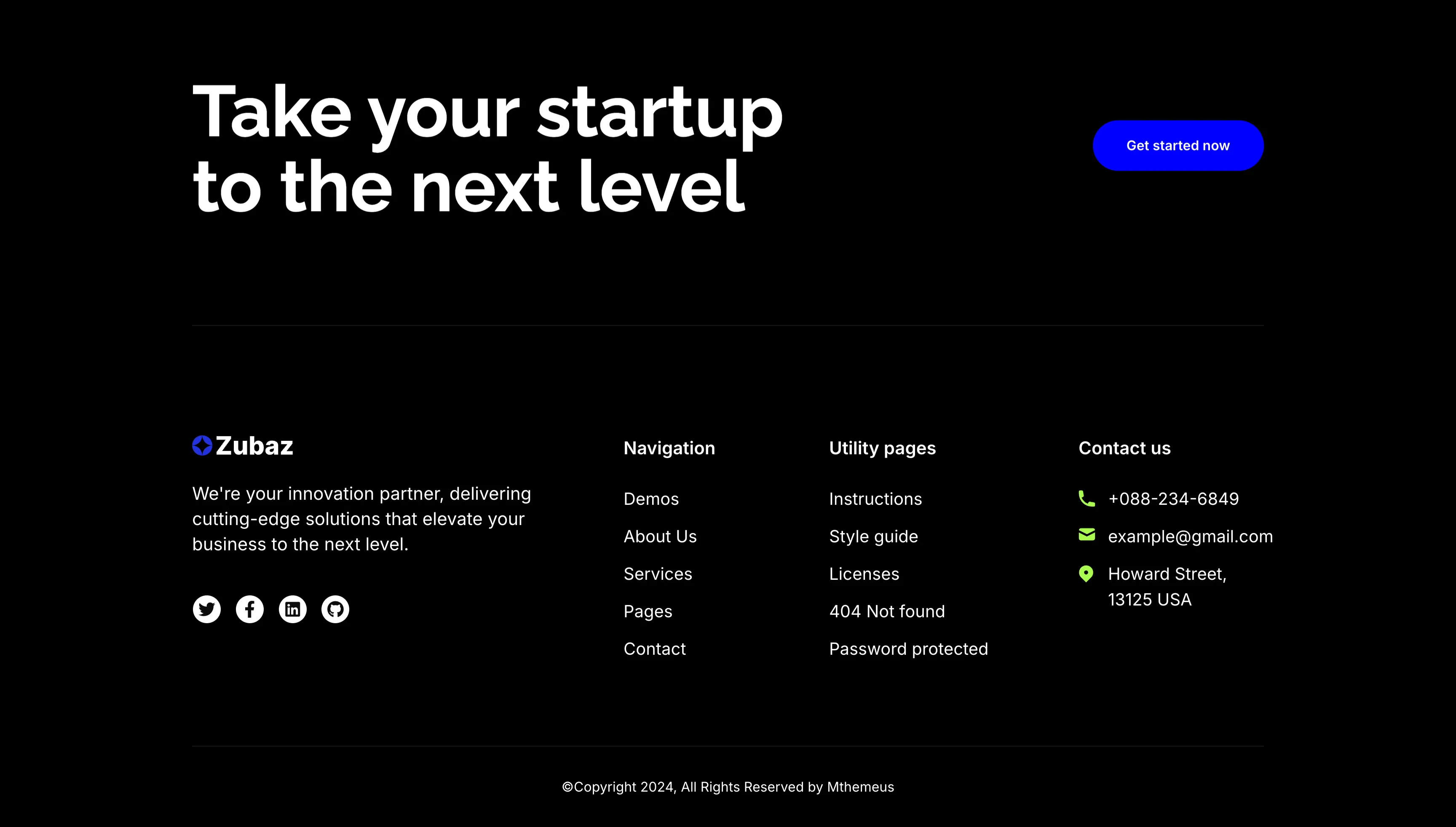
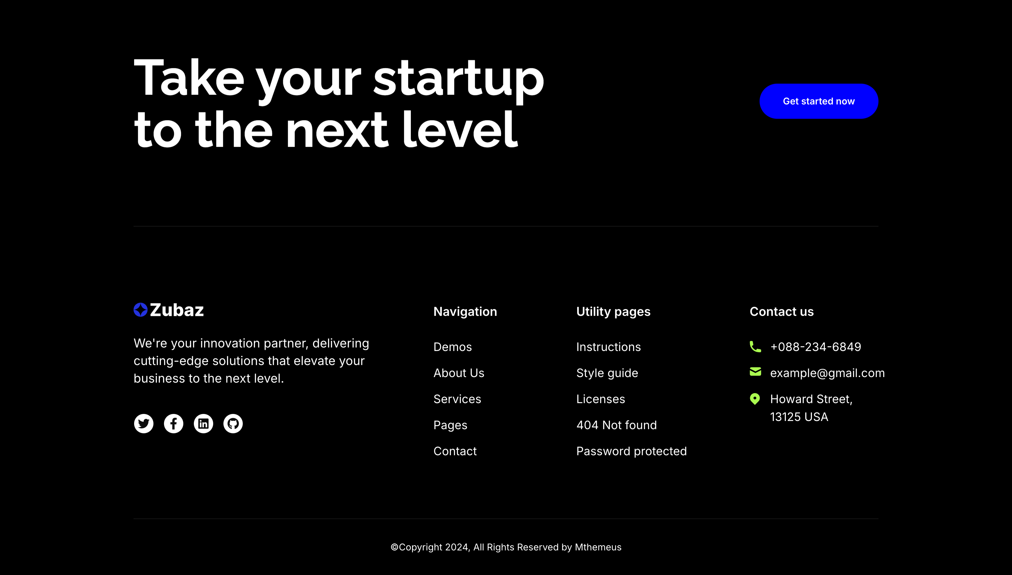
The dark Zubaz footer on a solid black background, opening with a call-to-action band: an oversized white 'Take your startup to the next level' headline on the left and a solid blue 'Get started now' button on the right, above a hairline divider. Below, the footer proper shows the Zubaz logo with a short blurb and a row of Twitter, Facebook, LinkedIn and GitHub icons, beside grouped link columns — 'Navigation' (Demos, About Us, Services, Pages, Contact), 'Utility pages' (Instructions, Style guide, Licenses, 404 Not found, Password protected) and a 'Contact us' column with a phone, email and Howard Street address. A centered '(c)Copyright 2024, All Rights Reserved by Mthemeus' line closes it. Pairing a bold recruiting CTA with the full footer makes it a strong page-closing block.
Zubuz ↗

Integration Video Testimonial Card
A section on a pale gray background pairing an integrations header with a video testimonial. The top places an oversized 'Integration with dozens of tools' heading on the left and a solid blue 'Browse all integrations' button on the right. Below sits a wide white card split in two: a left video thumbnail of a smiling man at a laptop with a circular play button, and a right panel showing five black stars, a bold quoted testimonial about team productivity growing after adopting the SaaS tool, and the attribution 'Jonas Aly, Founder @ Sitemark' beside the Sitemark logo. Combining a playable clip with a starred quote gives the endorsement both a face and a claim.
Zubuz ↗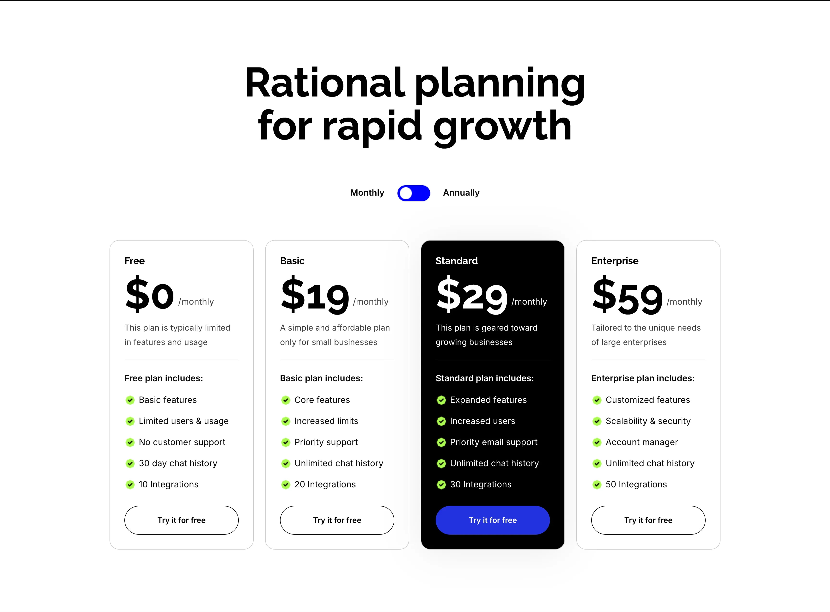
Rational Planning Four-Tier Pricing Cards
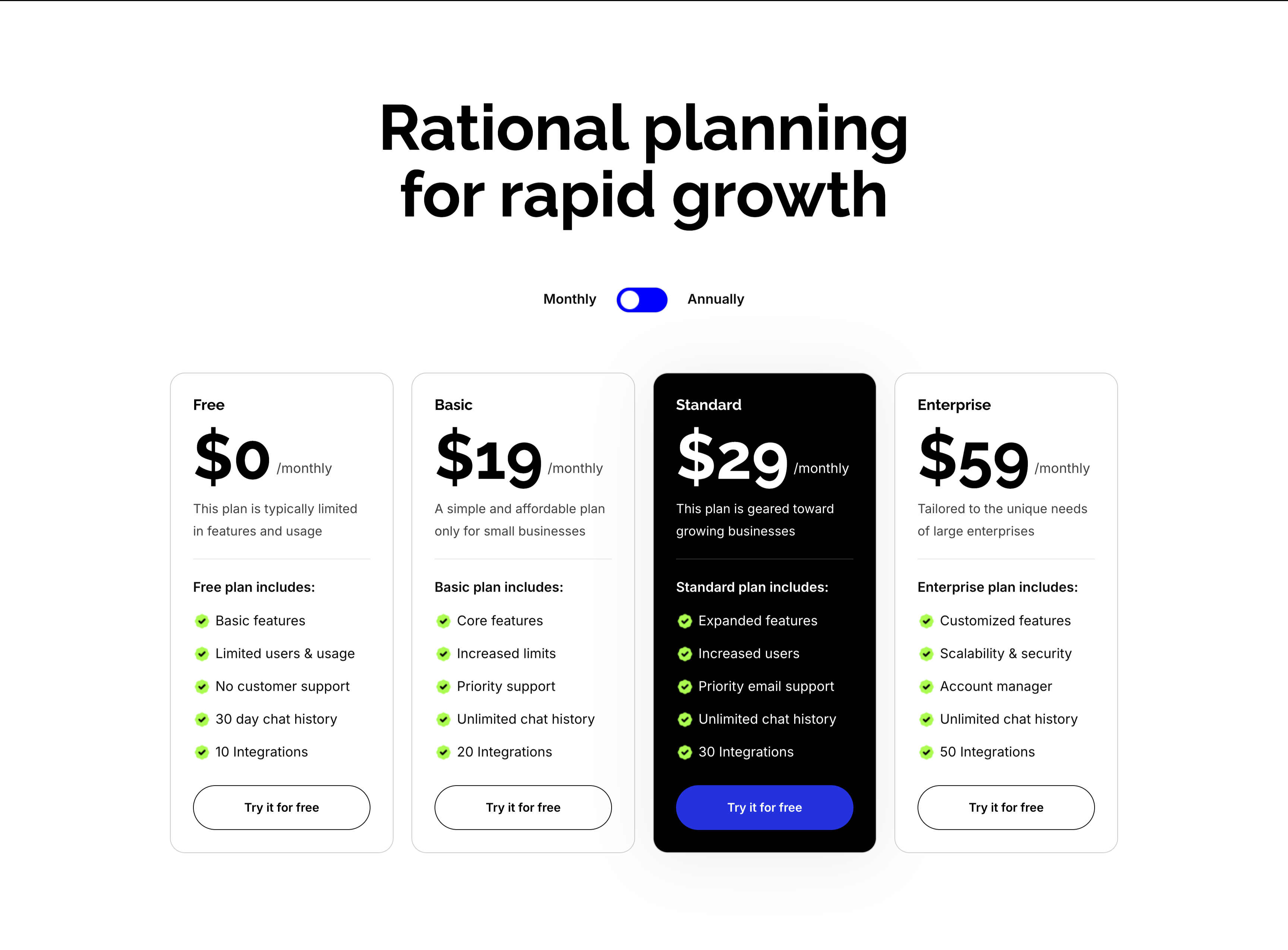
A four-tier pricing section on white under an oversized centered 'Rational planning for rapid growth' heading with a Monthly/Annually toggle. Four cards run in a row — Free ($0/monthly), Basic ($19/monthly), Standard ($29/monthly, elevated in a black card) and Enterprise ($59/monthly) — each pairing a large price and one-line description with a green-checkmarked feature list ('Basic features', 'Priority email support', 'Unlimited chat history', integration counts from 10 to 50). Every card closes with a 'Try it for free' button, solid blue on the highlighted Standard plan and outlined elsewhere. Rendering the Standard tier in black draws the eye straight to the recommended plan.
Zubuz ↗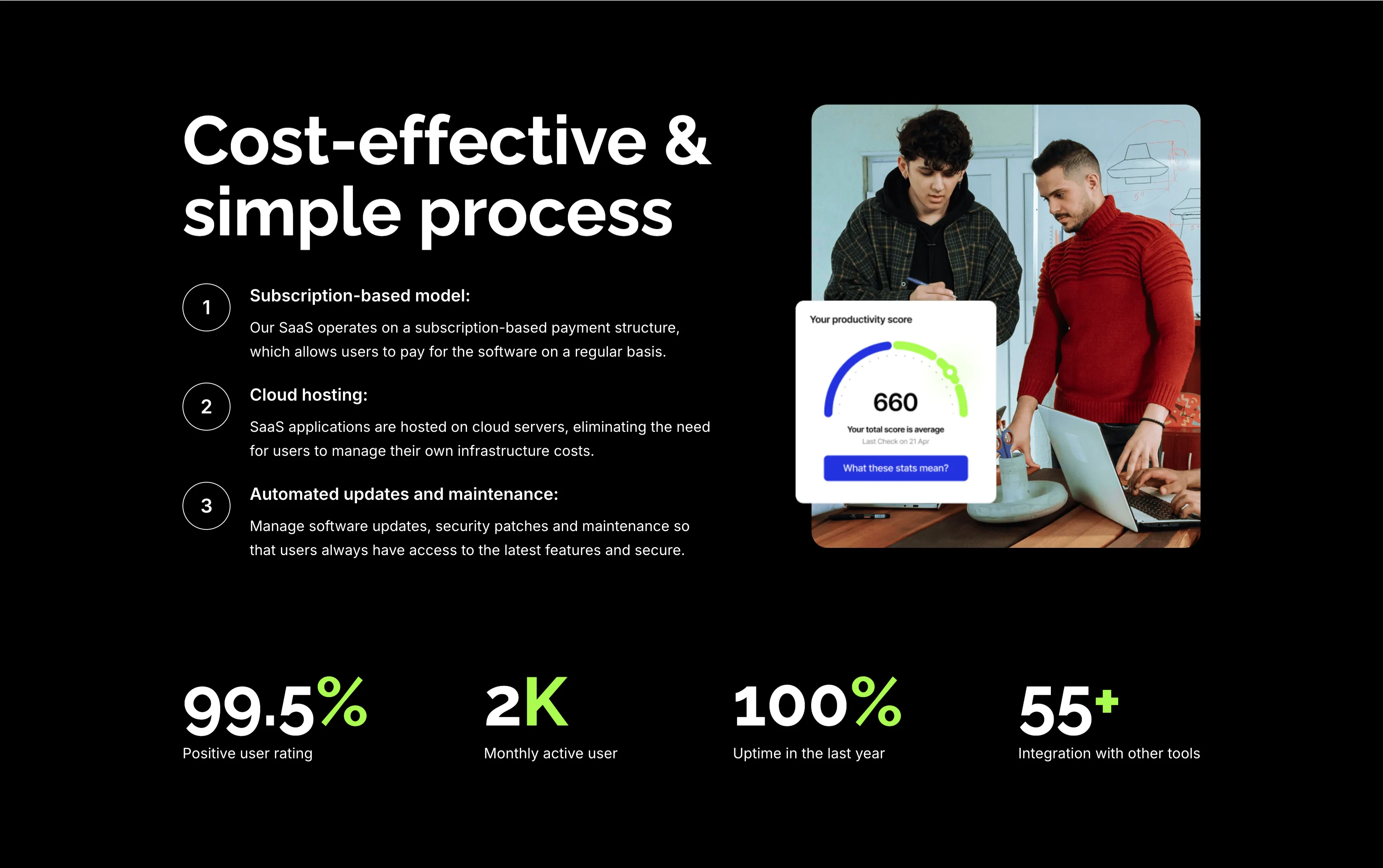
Cost-Effective Simple Process With Stats
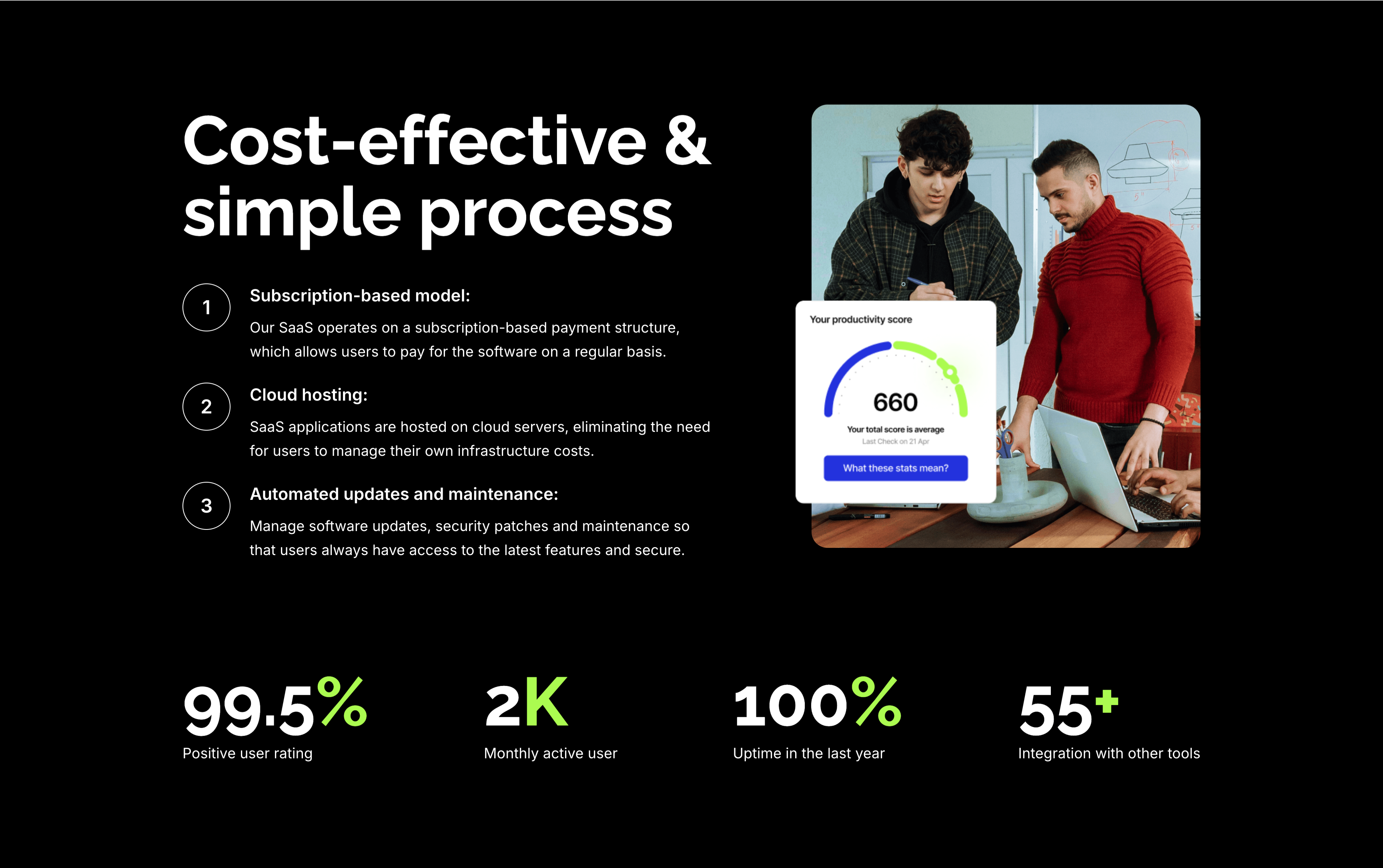
A feature section on a solid black background. The left column stacks an oversized white 'Cost-effective & simple process' heading over three numbered points — 'Subscription-based model:', 'Cloud hosting:' and 'Automated updates and maintenance:' — each with a circled number and a short white description. The right column shows a rounded photo of two colleagues at a laptop with a floating white 'Your productivity score' card reading 660. A row of four lime-green-accented stats runs across the bottom: '99.5%' positive user rating, '2K' monthly active users, '100%' uptime in the last year and '55+' integrations. The dark canvas, numbered list and green metrics give the section a confident, data-backed tone.
Zubuz ↗Similar cta sections


Start Managing Your Money App CTA
A bold call-to-action set on a saturated blue background. The left side shows a smartphone mockup on an onboarding 'Setting up your account' screen with a line-art illustration and a green doodle burst. The right side stacks a large white 'Start managing your money now!' headline, a two-line subhead ('Your financial future is just a download away…'), and two dark app-store buttons — 'Get it on Google Play' and 'Download on the App Store' — with a hand-drawn green arrow curling toward them. The vivid blue field, device shot and store badges make downloading the obvious next step. The playful arrow adds energy to an otherwise direct conversion prompt.
Zubuz ↗

Empowering Teams Final Signup CTA
A closing sign-up call-to-action split between an indigo panel on the left and a large photo on the right. The left side stacks a two-line headline — a lighter 'Empowering teams to' over a bold 'accomplish more, together' in white — followed by the qualifier '14-day free trial | No credit card needed' and a white 'Get Started' pill button with an arrow. The right side is a circular-masked photograph of a diverse group of eight colleagues seated on tiered wooden steps, several holding laptops (one displaying a monday board), smiling toward the camera. The bold value headline, risk-reducing trial note and friendly team photo combine into a warm, low-friction final conversion prompt.
Monday ↗

Together We Can Impact Careers CTA Band
A careers call-to-action set in a wide dark-indigo rounded band. On the left, a two-line headline mixes weights — a bold 'Together we can impact' leading into a lighter 'how teams work across the globe' — in white type. Directly beneath sits a white pill button labelled 'Join our team!' with a right arrow. The right side of the band is pure decoration: overlapping brighter-indigo circular and arc shapes with a small glowing dot, adding depth without imagery or copy. The deep background, single bold headline and lone button make the recruiting ask focused and unmissable.
Monday ↗

Built For People And Agents CTA
A minimal full-width call-to-action built around one enormous line of type, 'Built for people and agents', that bleeds off both edges of the frame. Three circular human avatars in green, blue and yellow are set inline between the words 'people' and 'and', visually joining humans to the agent message. Centered directly beneath the headline sit two buttons — a solid purple 'Get Started' primary and an outlined 'Contact sales' secondary, each with a trailing arrow. The near-empty white canvas and the oversized headline give the closing pitch a confident, spacious feel.
Monday ↗