Legal Footnotes And Multi-Column Footer
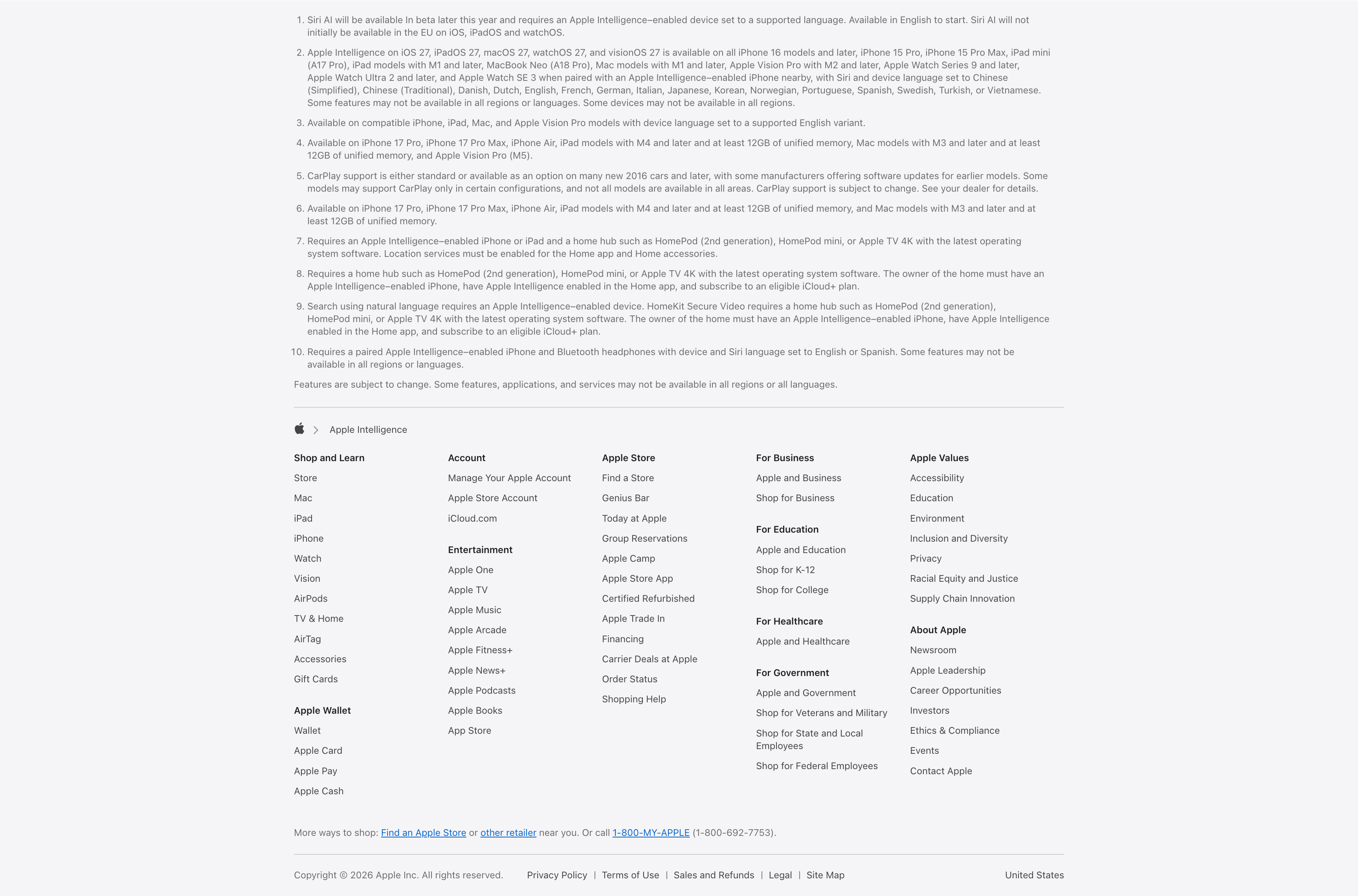
Description
A combined footnotes-and-footer block on white. The top portion is a numbered list of ten fine-print legal disclaimers covering Siri AI availability, supported devices and languages, CarPlay and HomeKit requirements, set in small gray type. Below a hairline divider an Apple-logo breadcrumb (‘Apple > Apple Intelligence’) introduces the standard Apple footer: a five-plus-column grid of link groups — Shop and Learn, Apple Wallet, Account, Entertainment, Apple Store, For Business, For Education, For Healthcare, For Government, Apple Values and About Apple — each a stack of small text links. A ‘More ways to shop’ line with a phone number and a bottom row of copyright, Privacy Policy, Terms of Use, Legal, Site Map and the ‘United States’ region close it out. The dense, orderly columns are a classic global-footer pattern.
Related
Compatible Devices List And Developer SDK Cards
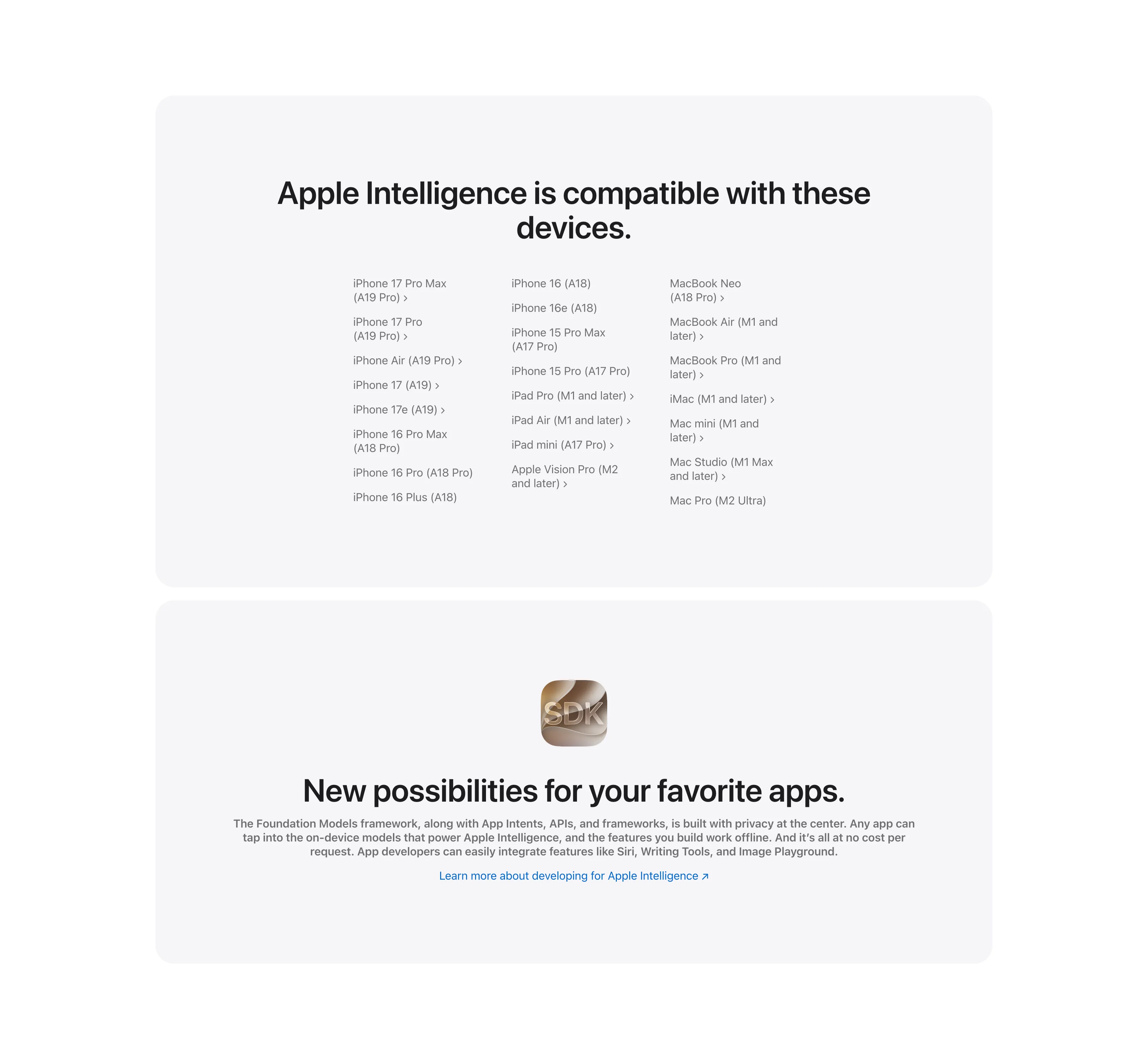
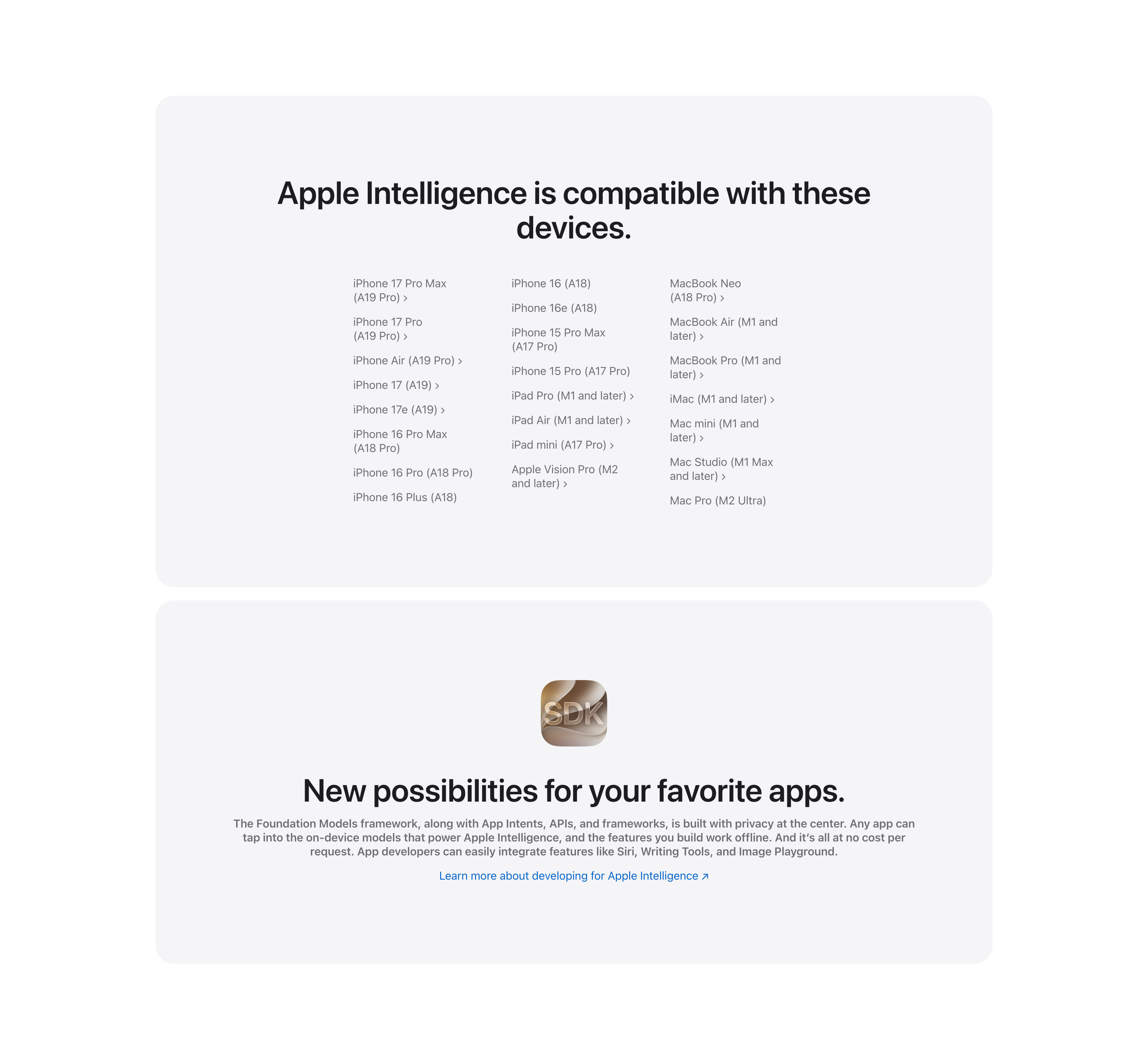
Two stacked pale-gray rounded cards. The upper card, headed 'Apple Intelligence is compatible with these devices.', lays out a long three-column list of supported hardware — iPhone 17 Pro Max through iPhone 16 models, iPad Pro/Air/mini and Apple Vision Pro, and Mac models from MacBook Neo to Mac Pro — many entries carrying chevron links to detail pages. The lower card centers a glossy 'SDK' app icon above the bold headline 'New possibilities for your favorite apps.', a gray paragraph about the Foundation Models framework and App Intents, and a blue 'Learn more about developing for Apple Intelligence' link. The restrained monochrome cards keep the dense reference content and the developer call-to-action visually calm.
Apple ↗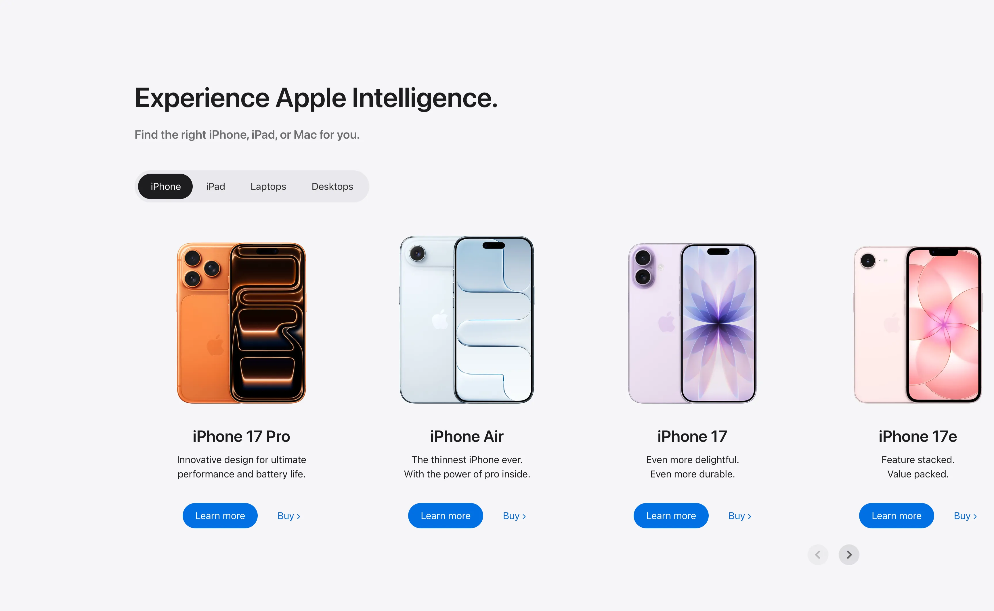
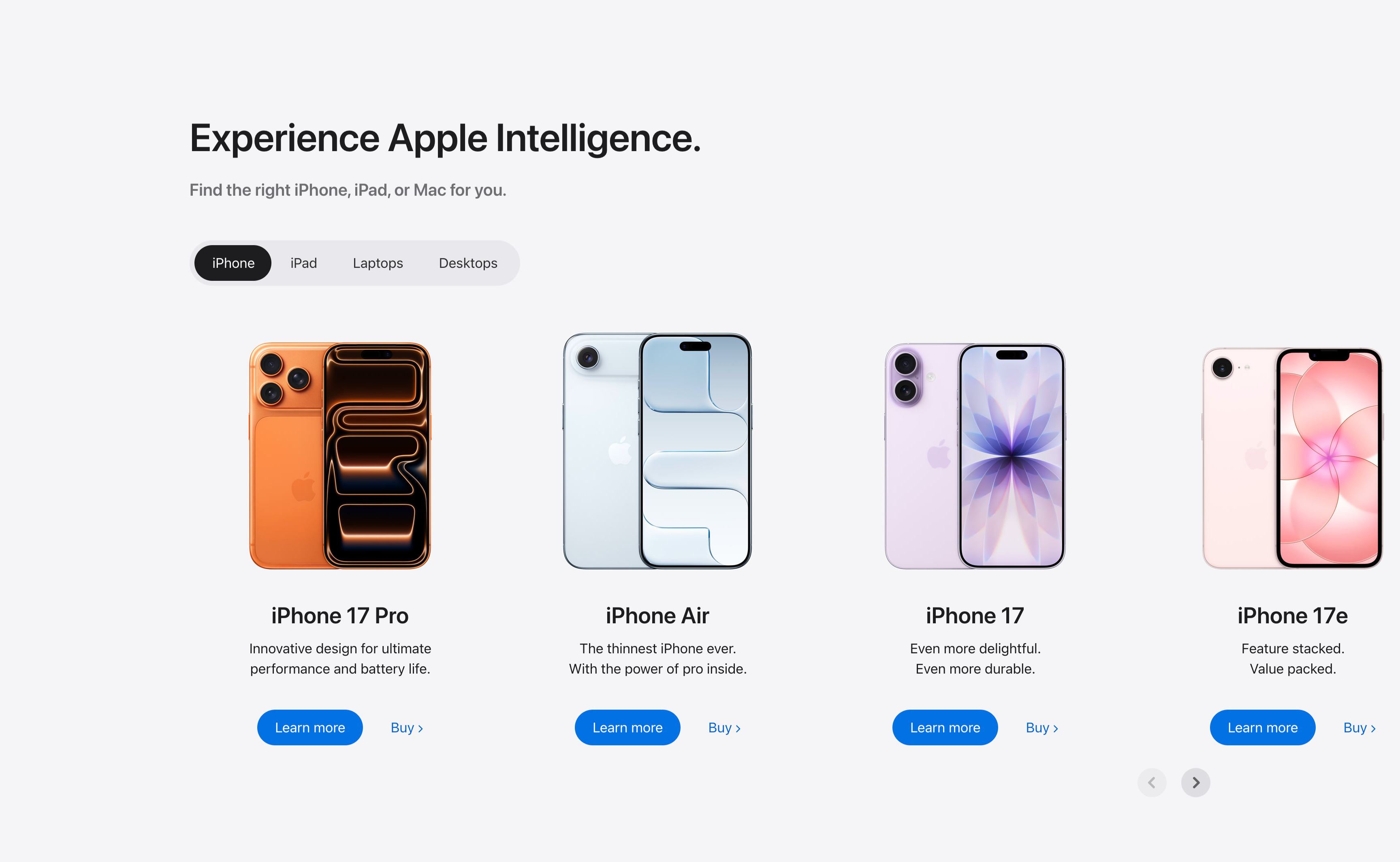
Experience Apple Intelligence Product Carousel
A product-finder carousel headed 'Experience Apple Intelligence.' with the subhead 'Find the right iPhone, iPad, or Mac for you.' A pill-shaped tab switcher offers iPhone (selected, dark), iPad, Laptops and Desktops. Below it four product cards sit in a scrollable row, each showing a device render, a bold model name, a two-line tagline, a solid blue 'Learn more' button and a 'Buy' text link: iPhone 17 Pro (orange), iPhone Air (light blue), iPhone 17 (purple) and iPhone 17e (pink). Circular previous/next arrows in the lower right reveal further models. The tabbed filter plus dual learn/buy calls-to-action make it a conversion-focused product showcase.
Apple ↗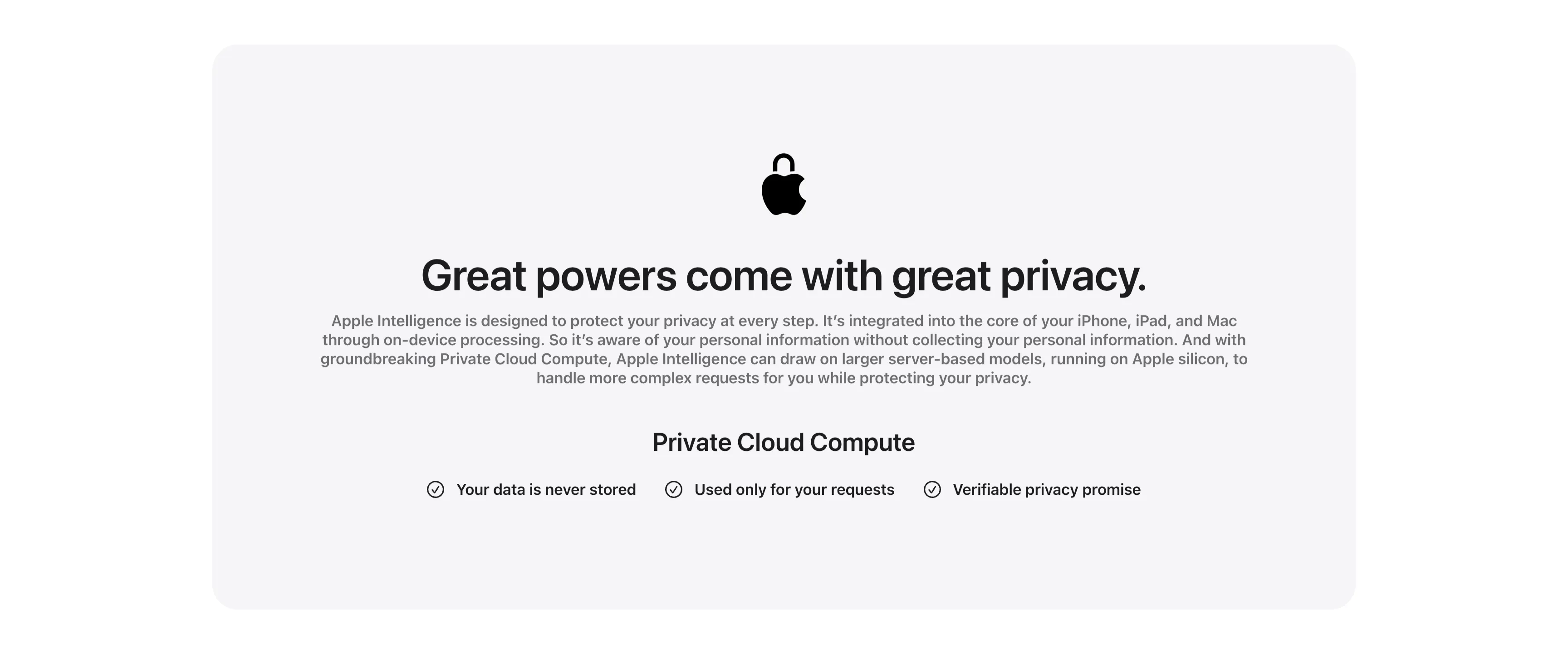
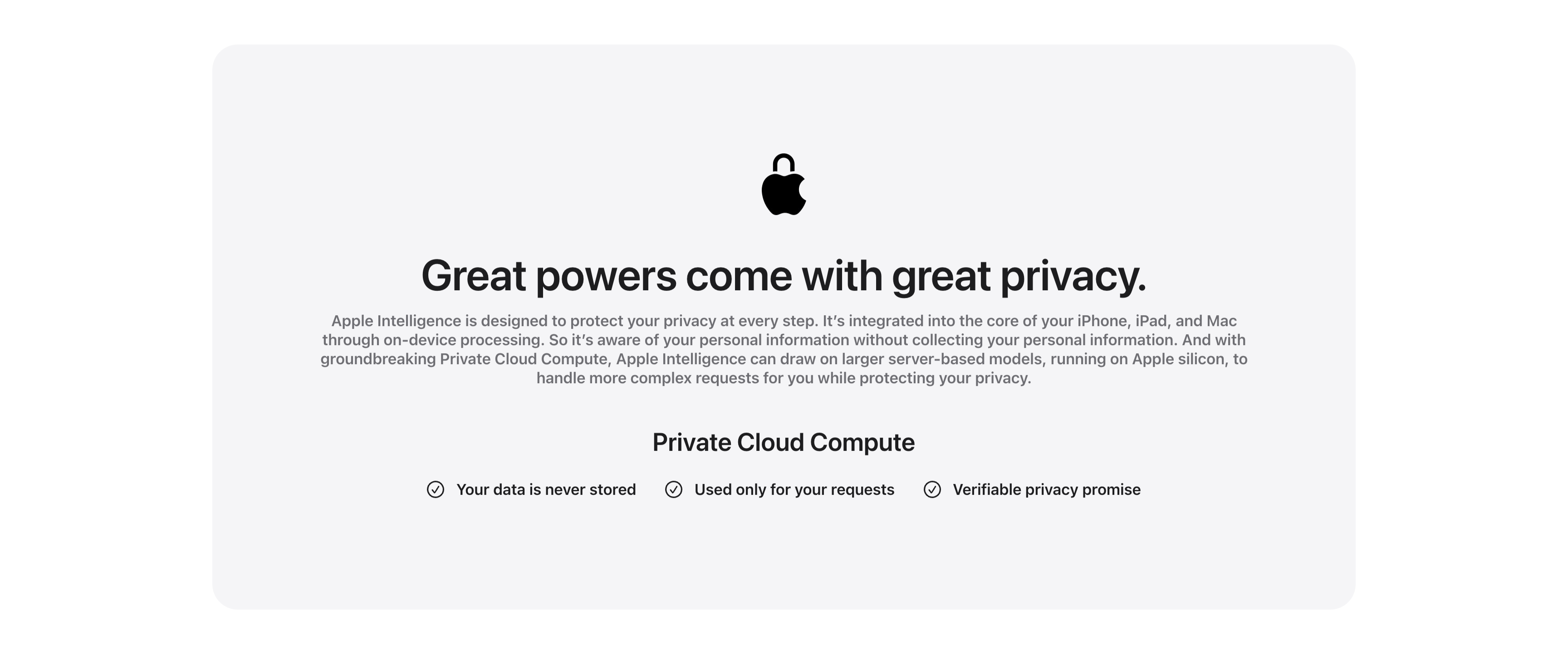
Great Powers Come With Great Privacy Band
A centered privacy content band housed in a large pale-gray rounded card. At the top a black Apple logo rendered as a padlock sits above the centered headline 'Great powers come with great privacy.' A justified gray paragraph explains on-device processing and Private Cloud Compute running on Apple silicon. Below, a bold 'Private Cloud Compute' subhead introduces a single horizontal row of three checkmarked claims — 'Your data is never stored', 'Used only for your requests' and 'Verifiable privacy promise' — each prefixed by a circled check icon. The symmetrical, generously padded layout and restrained monochrome palette give the privacy message a calm, trustworthy, reassuring tone.
Apple ↗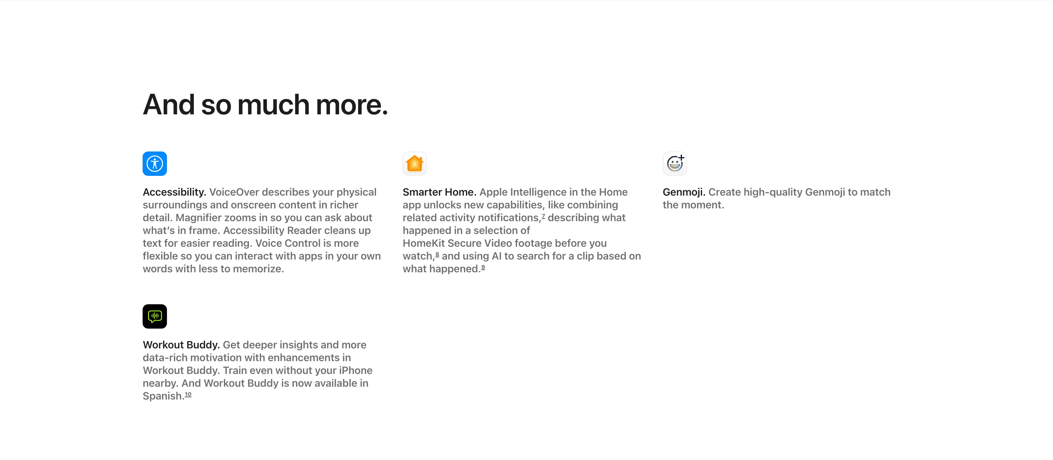
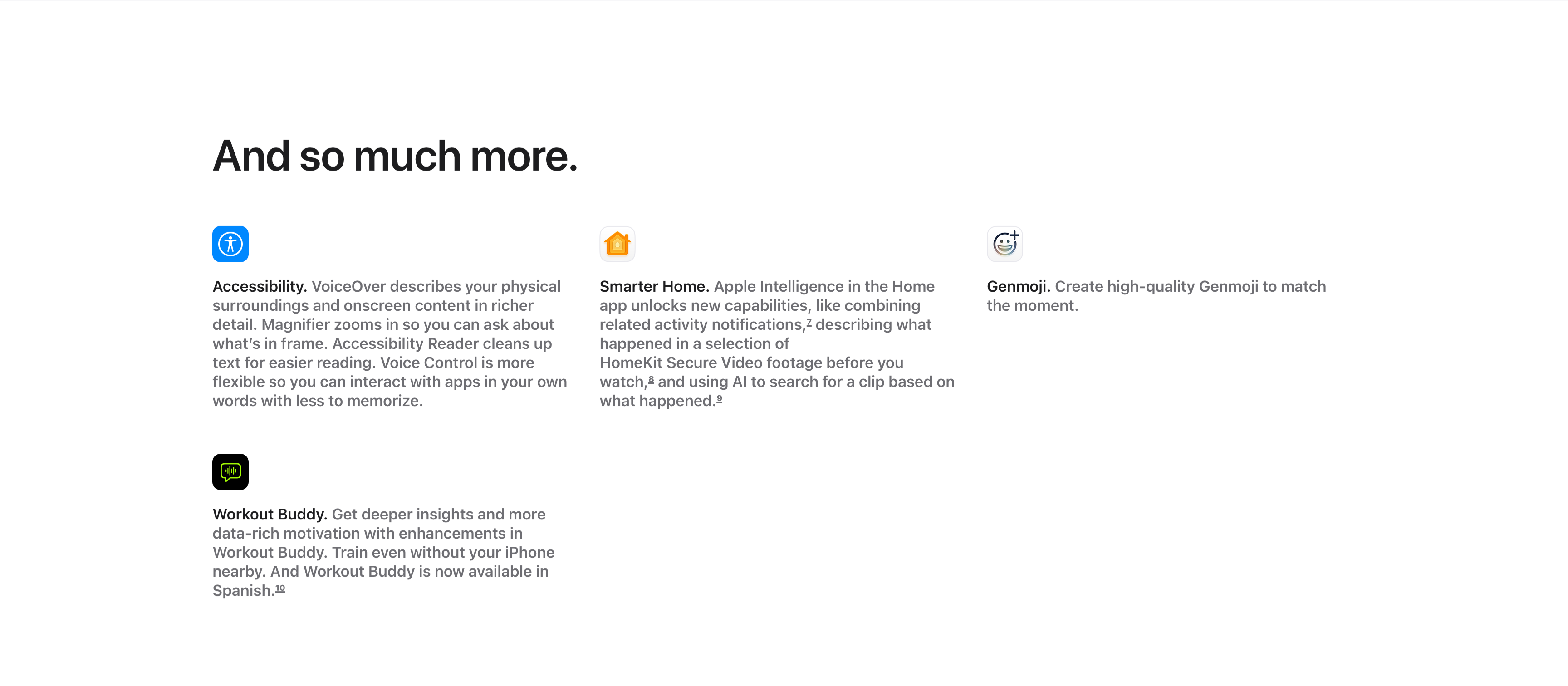
And So Much More Icon Feature Grid
A compact 'And so much more.' feature grid on a white background, with the large left-aligned heading sitting above the items. Four entries are arranged across three columns and two rows, each led by a small rounded app icon, a bold inline title and a gray description: 'Accessibility.' (VoiceOver describing surroundings, Magnifier, Accessibility Reader, Voice Control), 'Smarter Home.' (combining activity notifications and AI search of HomeKit Secure Video), and 'Genmoji.' (creating high-quality Genmoji) fill the top row, with 'Workout Buddy.' (deeper insights, now in Spanish) below the first column. Superscript footnote markers appear after several phrases. The icon-led, text-heavy grid efficiently rounds up smaller features after the main showcases.
Apple ↗Similar footer sections
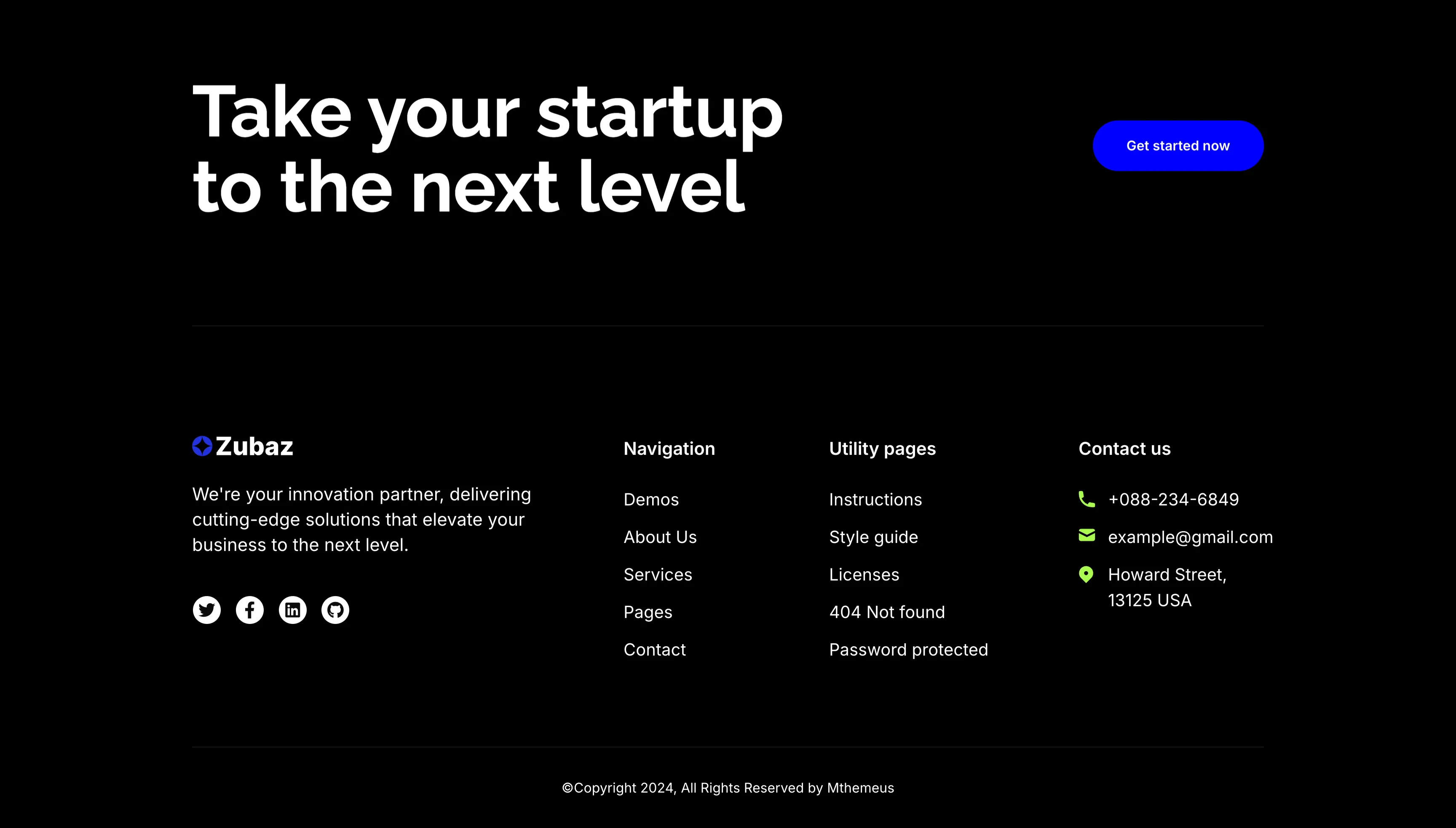
Take Your Startup Dark Footer With CTA
The dark Zubaz footer on a solid black background, opening with a call-to-action band: an oversized white 'Take your startup to the next level' headline on the left and a solid blue 'Get started now' button on the right, above a hairline divider. Below, the footer proper shows the Zubaz logo with a short blurb and a row of Twitter, Facebook, LinkedIn and GitHub icons, beside grouped link columns — 'Navigation' (Demos, About Us, Services, Pages, Contact), 'Utility pages' (Instructions, Style guide, Licenses, 404 Not found, Password protected) and a 'Contact us' column with a phone, email and Howard Street address. A centered '(c)Copyright 2024, All Rights Reserved by Mthemeus' line closes it. Pairing a bold recruiting CTA with the full footer makes it a strong page-closing block.
Zubuz ↗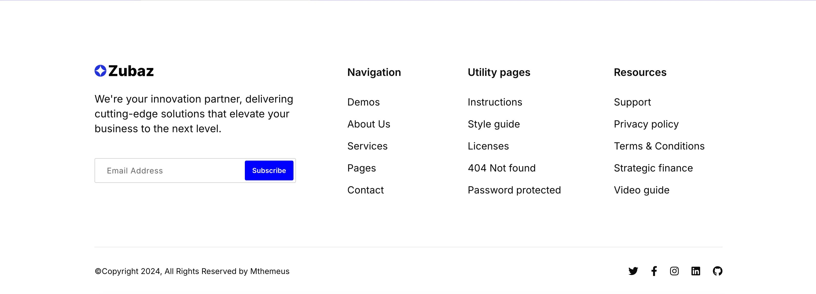
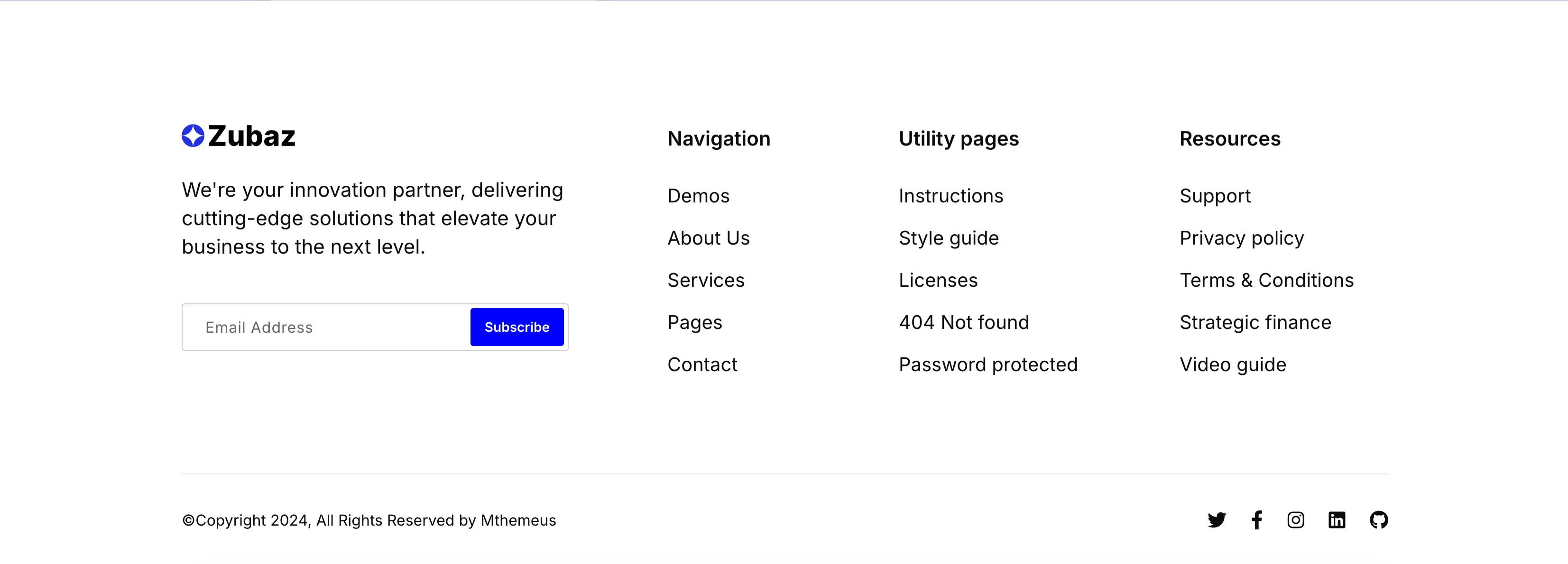
Zubaz Footer With Newsletter Signup
The Zubaz site footer on white. The left column shows the Zubaz logo, a short 'We're your innovation partner…' blurb and a newsletter field pairing an 'Email Address' input with a solid blue 'Subscribe' button. To the right, three link columns are grouped under bold headings — 'Navigation' (Demos, About Us, Services, Pages, Contact), 'Utility pages' (Instructions, Style guide, Licenses, 404 Not found, Password protected) and 'Resources' (Support, Privacy policy, Terms & Conditions, Strategic finance, Video guide). A hairline divider separates a bottom bar with the '(c)Copyright 2024, All Rights Reserved by Mthemeus' line on the left and Twitter, Facebook, Instagram, LinkedIn and GitHub icons on the right. The orderly columns and inline signup make it a complete, conventional global footer.
Zubuz ↗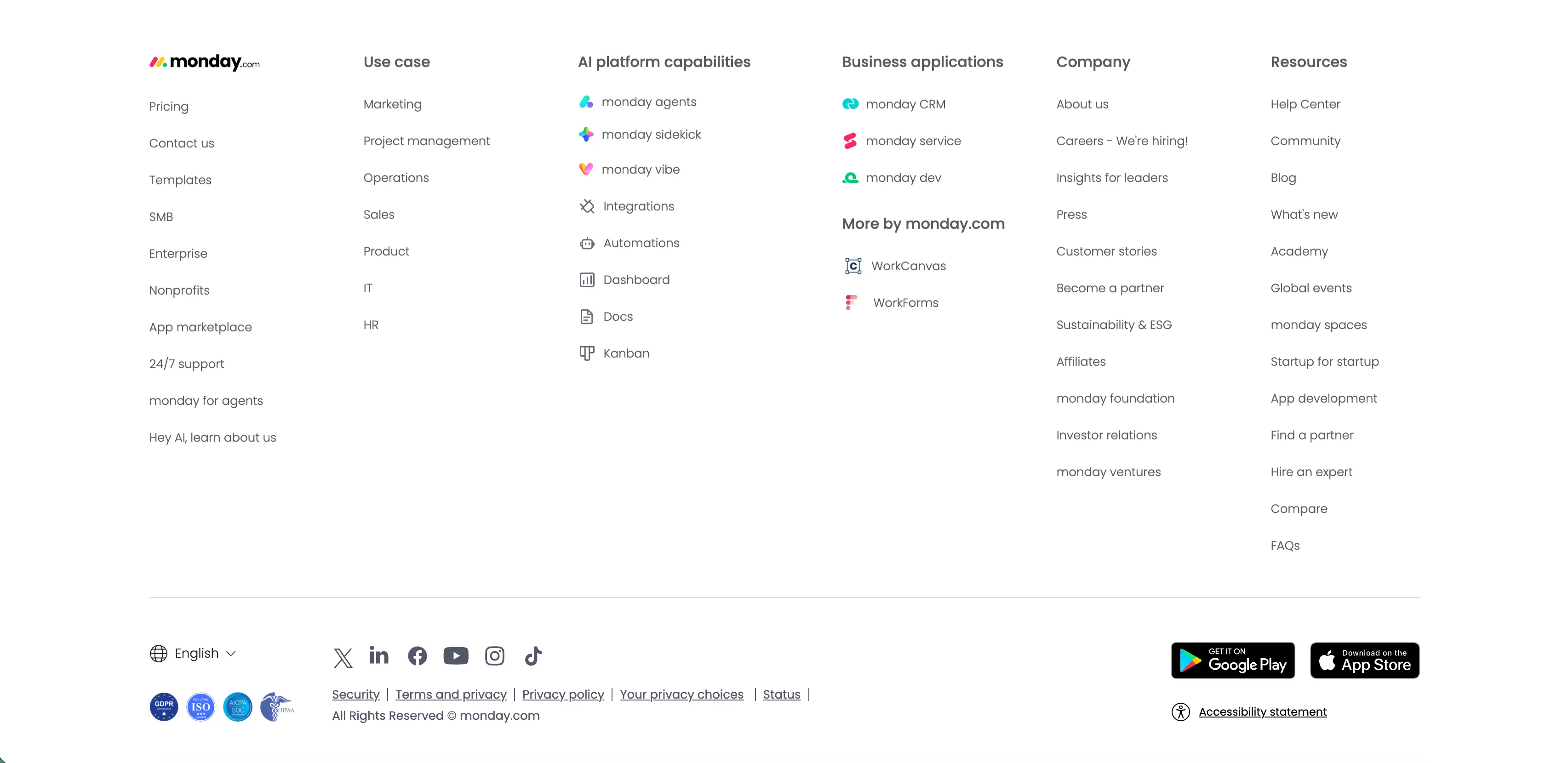
Monday.com Multi-Column Global Footer
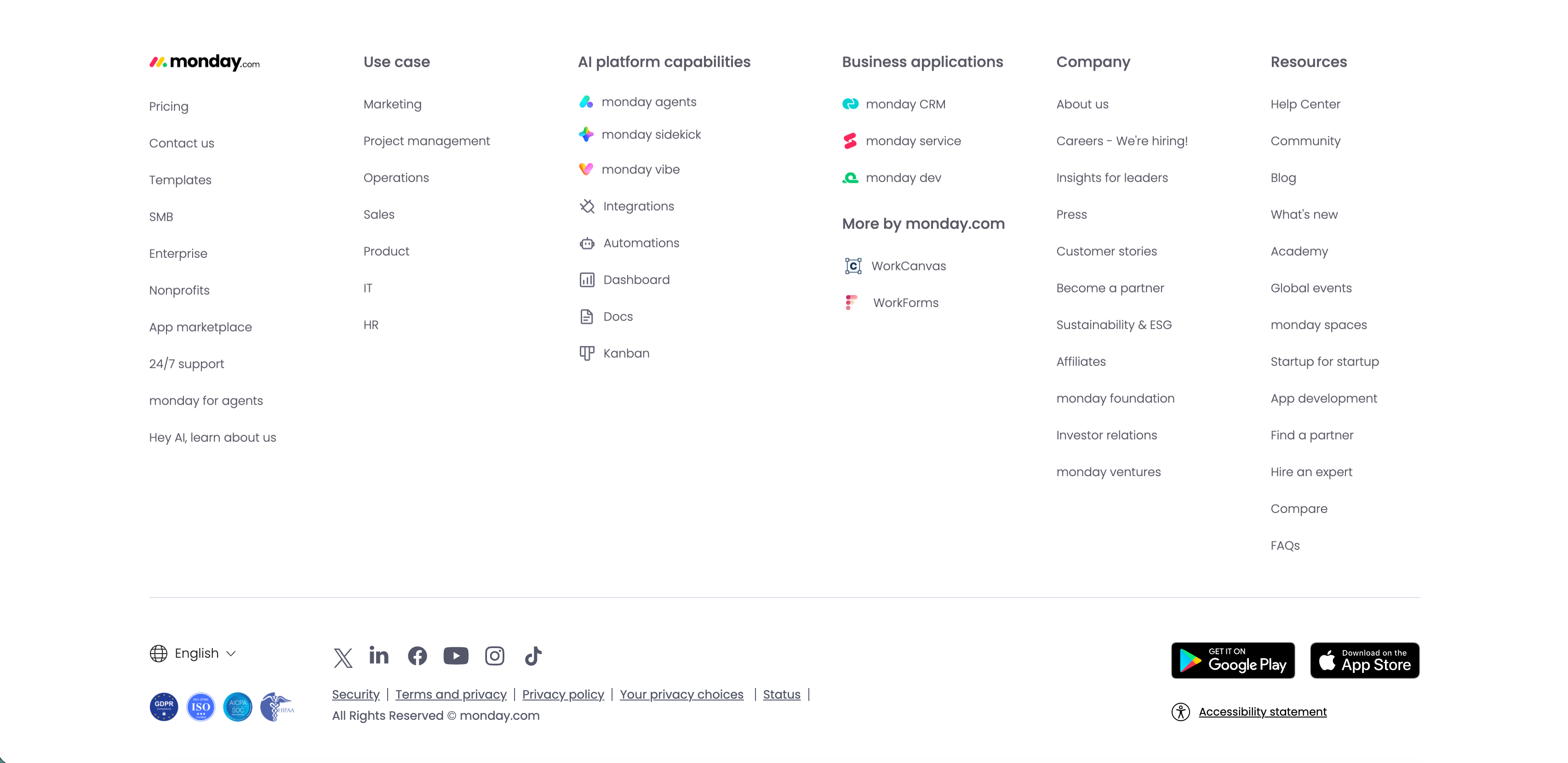
The standard monday.com global footer on white. The monday.com logo sits above a left column of links (Pricing, Contact us, Templates, SMB, Enterprise, Nonprofits, App marketplace, 24/7 support, monday for agents, 'Hey AI, learn about us'), followed by grouped link columns — 'Use case', 'AI platform capabilities' (monday agents, sidekick, vibe, Integrations, Automations, Dashboard, Docs, Kanban), 'Business applications' with 'More by monday.com' (WorkCanvas, WorkForms), 'Company' and 'Resources.' A lower bar carries an English language selector, a row of social icons (X, LinkedIn, Facebook, YouTube, Instagram, TikTok), legal links (Security, Terms and privacy, Privacy policy, Your privacy choices, Status), compliance badges, Google Play and App Store download buttons, and an 'Accessibility statement.' The dense, orderly columns are a classic enterprise global-footer pattern.
Monday ↗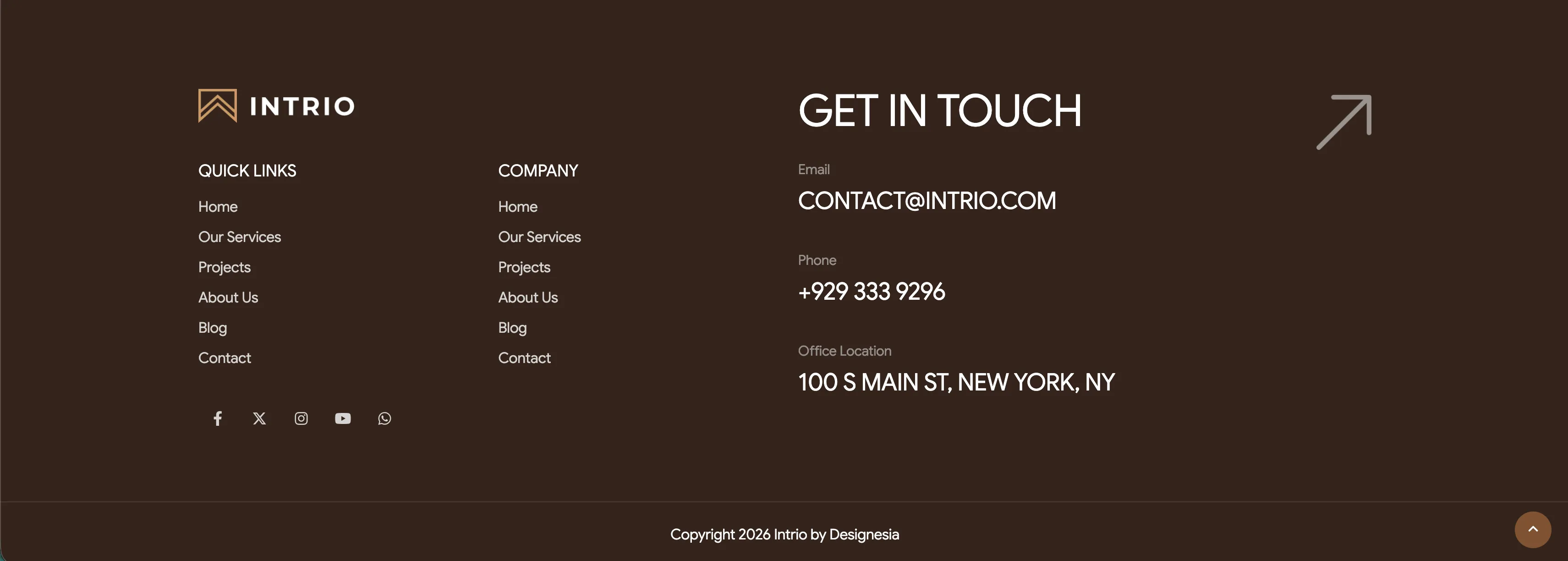
Intrio Multi-Column Footer With Social Links
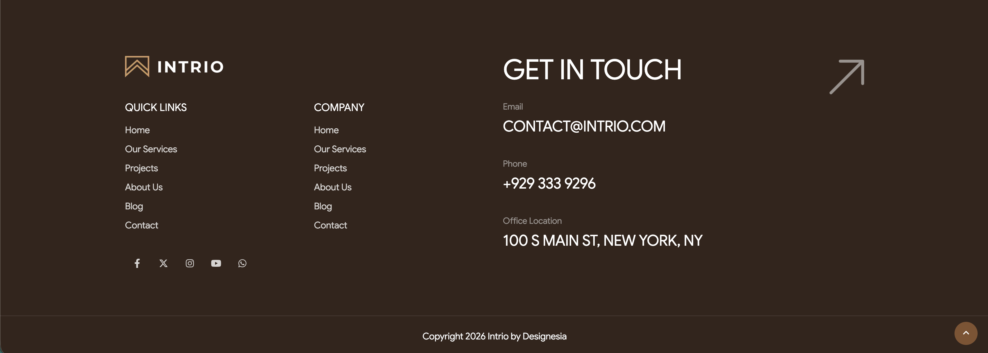
A tall footer on a deep brown background. The upper-left holds the 'INTRIO' logo above two link columns, 'QUICK LINKS' and 'COMPANY', each listing Home, Our Services, Projects, About Us, Blog and Contact. The center-right is dominated by a very large 'GET IN TOUCH' heading, beside which a small grey-labelled contact block lists Email 'CONTACT@INTRIO.COM', Phone '+929 333 9296' and Office Location '100 S MAIN ST, NEW YORK, NY'. A large outlined up-right arrow sits in the top-right corner as a decorative get-in-touch cue. Below the logo a row of five circular social icons (Facebook, X, Instagram, YouTube, WhatsApp) appears, and a thin bottom bar centers the line 'Copyright 2026 Intrio by Designesia' with a circular scroll-to-top button at the lower right. The dark palette, oversized contact headline and tidy link columns make a confident, well-organised page close.
Madebydesignesia ↗