Monday.com By The Numbers Stats Band
Description
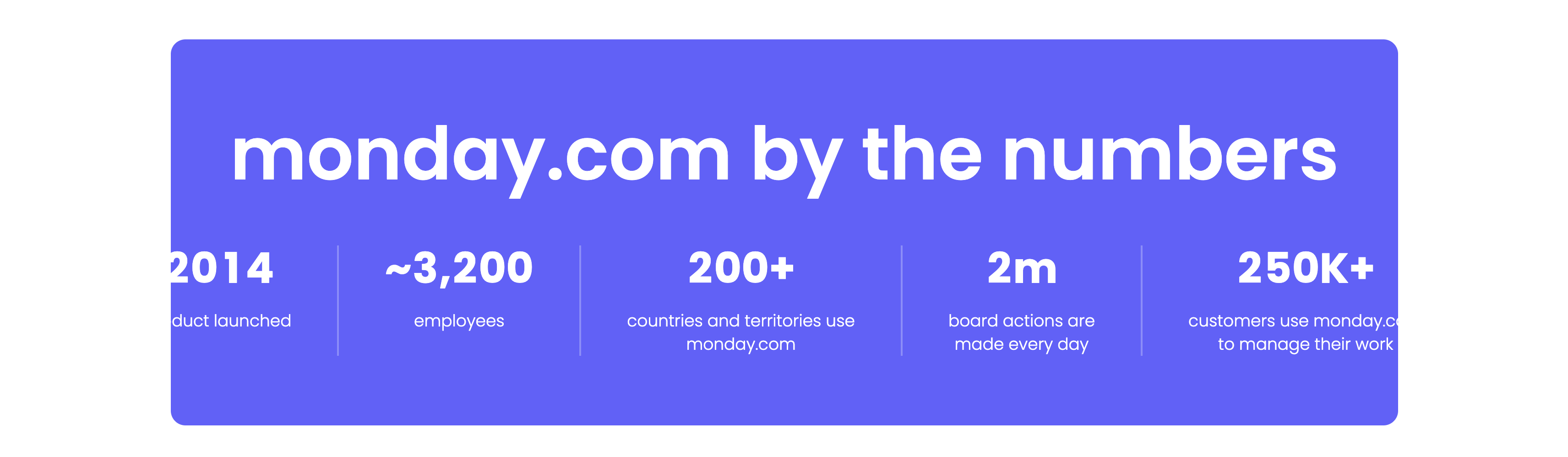
A bold statistics band set on a vibrant indigo rounded panel. A very large white headline, ‘monday.com by the numbers’, spans the top. Beneath it a single row of five metrics is separated by thin vertical dividers, each pairing an oversized white figure with a small caption: ‘2014’ (product launched), ‘~3,200’ (employees), ‘200+’ (countries and territories use monday.com), ‘2m’ (board actions are made every day) and ‘250K+’ (customers use monday.com to manage their work). The saturated purple background and heavy numerals make the growth figures the sole focus. The clean five-up split reads as confident, at-a-glance proof.
Related
Empowering Teams Final Signup CTA
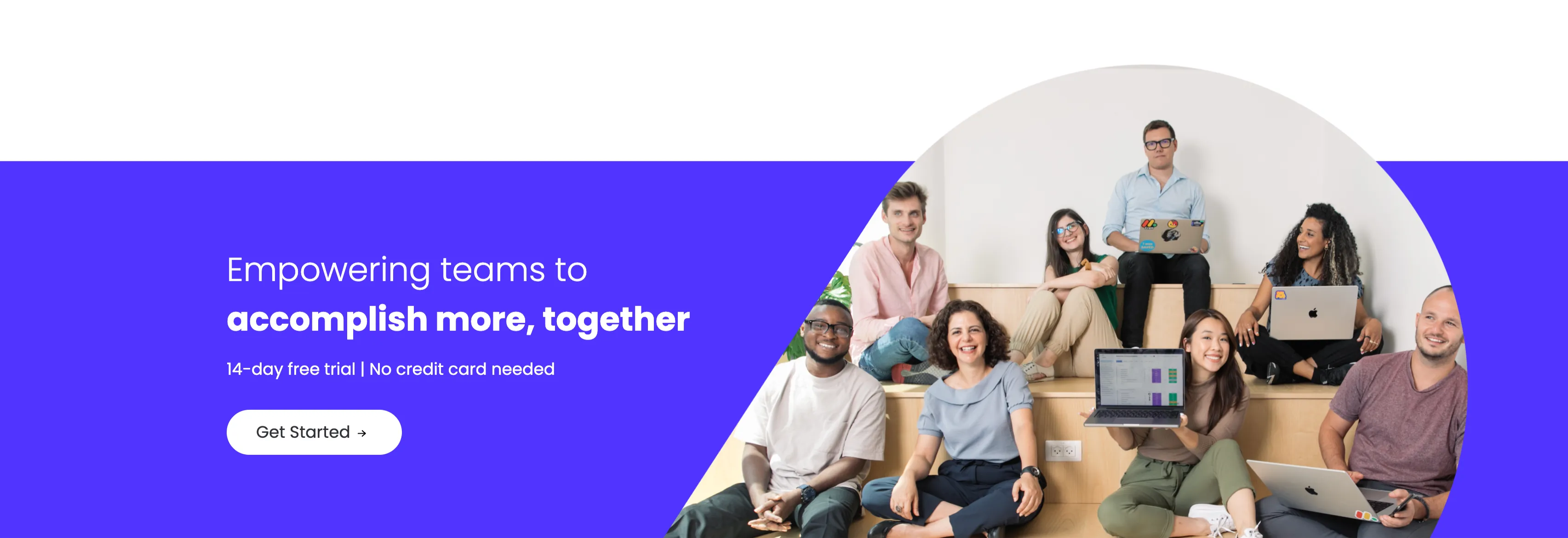
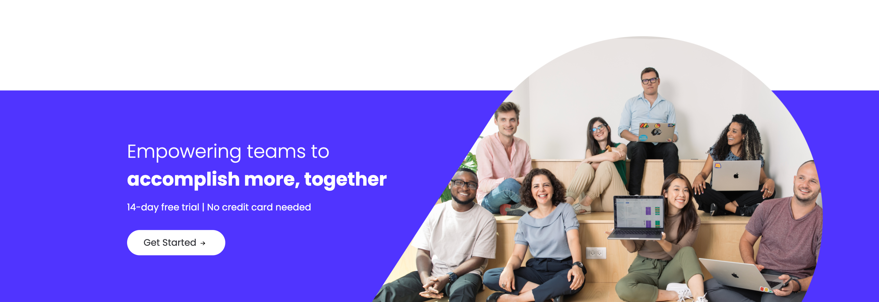
A closing sign-up call-to-action split between an indigo panel on the left and a large photo on the right. The left side stacks a two-line headline — a lighter 'Empowering teams to' over a bold 'accomplish more, together' in white — followed by the qualifier '14-day free trial | No credit card needed' and a white 'Get Started' pill button with an arrow. The right side is a circular-masked photograph of a diverse group of eight colleagues seated on tiered wooden steps, several holding laptops (one displaying a monday board), smiling toward the camera. The bold value headline, risk-reducing trial note and friendly team photo combine into a warm, low-friction final conversion prompt.
Monday ↗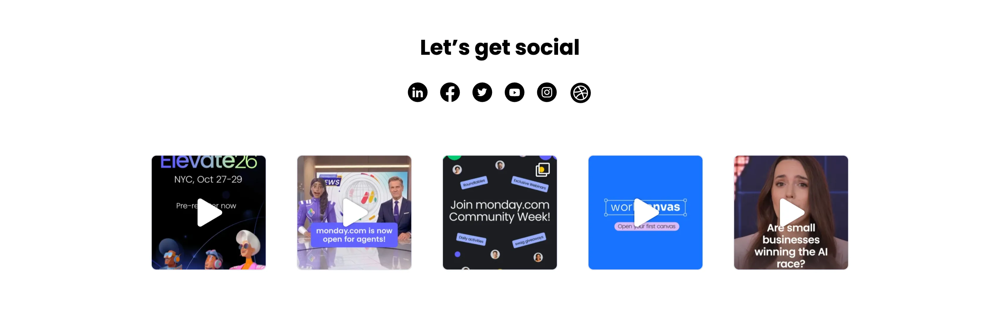
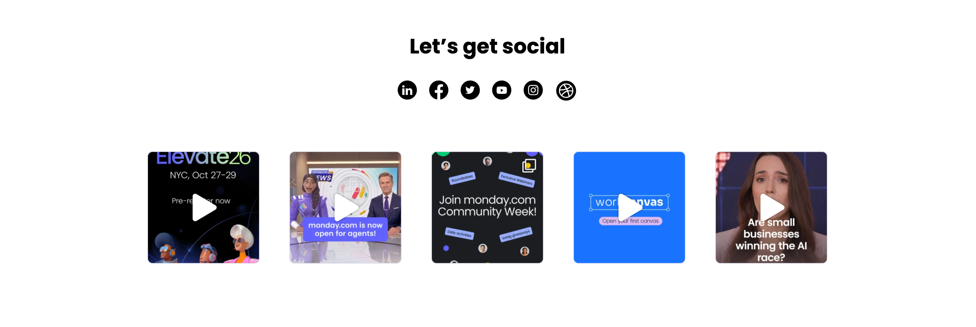
Let's Get Social Video Thumbnail Grid
A social section headed by a centered bold 'Let's get social' with a row of six round black social icons (LinkedIn, Facebook, Twitter, YouTube, Instagram and Dribbble) beneath it. Below sits a single row of five square video thumbnails, each with a white play-triangle overlay: an 'Elevate26 — NYC, Oct 27–29 / Pre-register now' event graphic with 3D characters, a news-desk clip captioned 'monday.com is now open for agents!', a dark 'Join monday.com Community Week!' promo, a bright blue 'workcanvas — Open your first canvas' card, and a talking-head clip asking 'Are small businesses winning the AI race?'. The icon row plus playable video tiles invites the visitor to follow and watch, and the uniform square grid reads as a lightweight social feed.
Monday ↗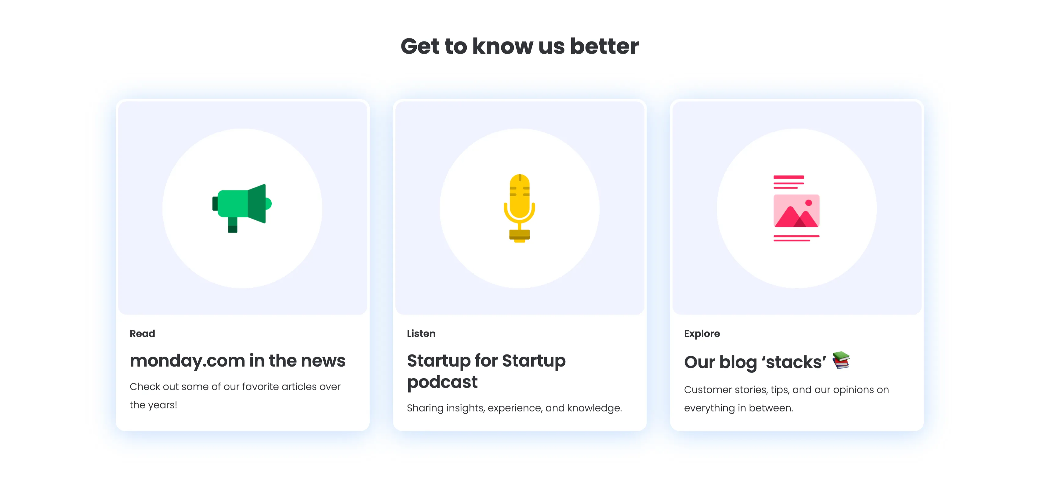
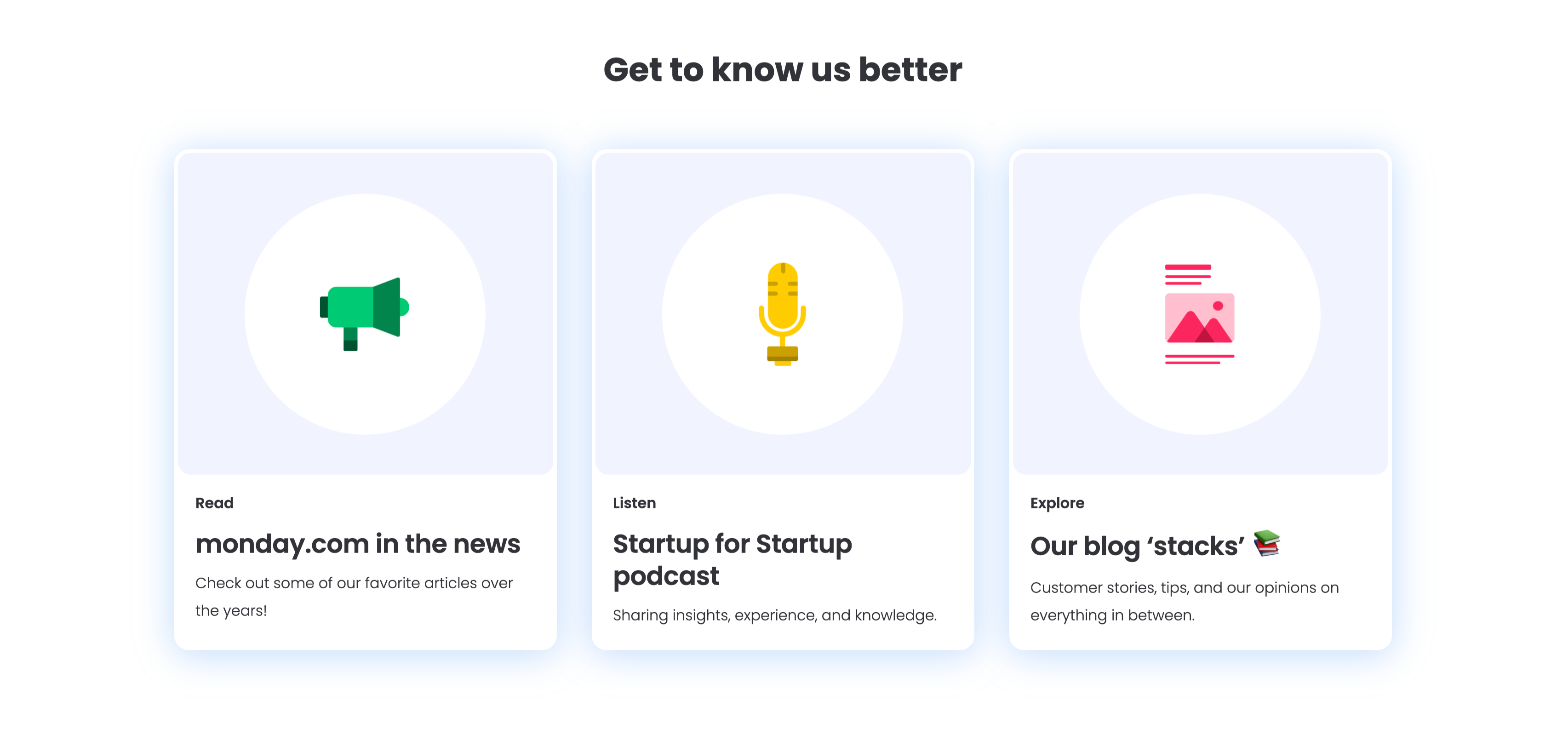
Get To Know Us Better Resource Cards
A three-up resource section under a centered bold 'Get to know us better' heading, with a soft blue glow behind the cards. Each of the three white rounded cards pairs a large circular flat icon with a small category label, a bold title and one line of copy: a green megaphone for 'Read — monday.com in the news' ('Check out some of our favorite articles over the years!'), a yellow microphone for 'Listen — Startup for Startup podcast' ('Sharing insights, experience, and knowledge.'), and a pink image icon for 'Explore — Our blog stacks' ('Customer stories, tips, and our opinions on everything in between.'). The colourful icons and consistent Read/Listen/Explore labelling make the content channels instantly distinguishable.
Monday ↗
Together We Can Impact Careers CTA Band
A careers call-to-action set in a wide dark-indigo rounded band. On the left, a two-line headline mixes weights — a bold 'Together we can impact' leading into a lighter 'how teams work across the globe' — in white type. Directly beneath sits a white pill button labelled 'Join our team!' with a right arrow. The right side of the band is pure decoration: overlapping brighter-indigo circular and arc shapes with a small glowing dot, adding depth without imagery or copy. The deep background, single bold headline and lone button make the recruiting ask focused and unmissable.
Monday ↗Similar content sections
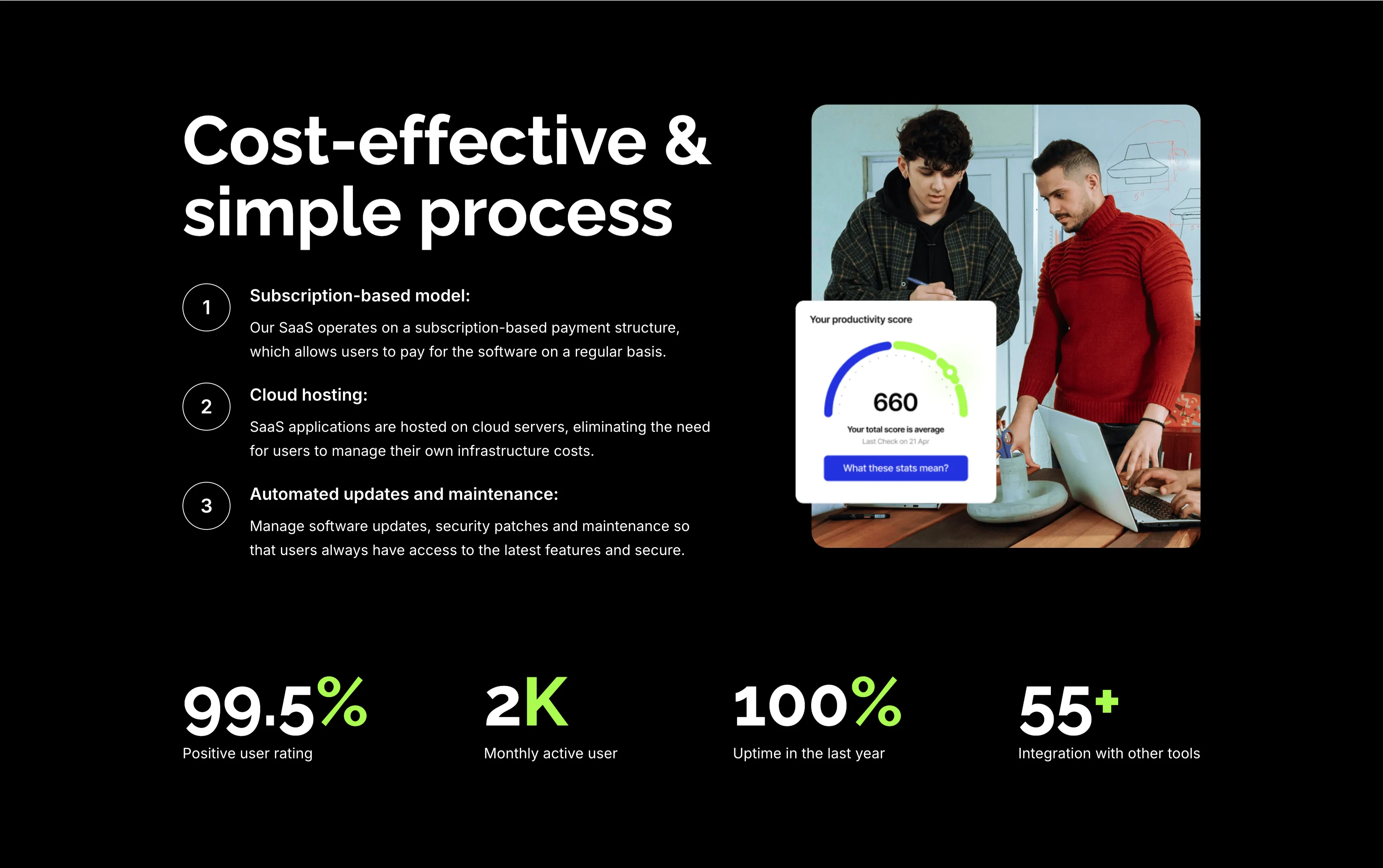
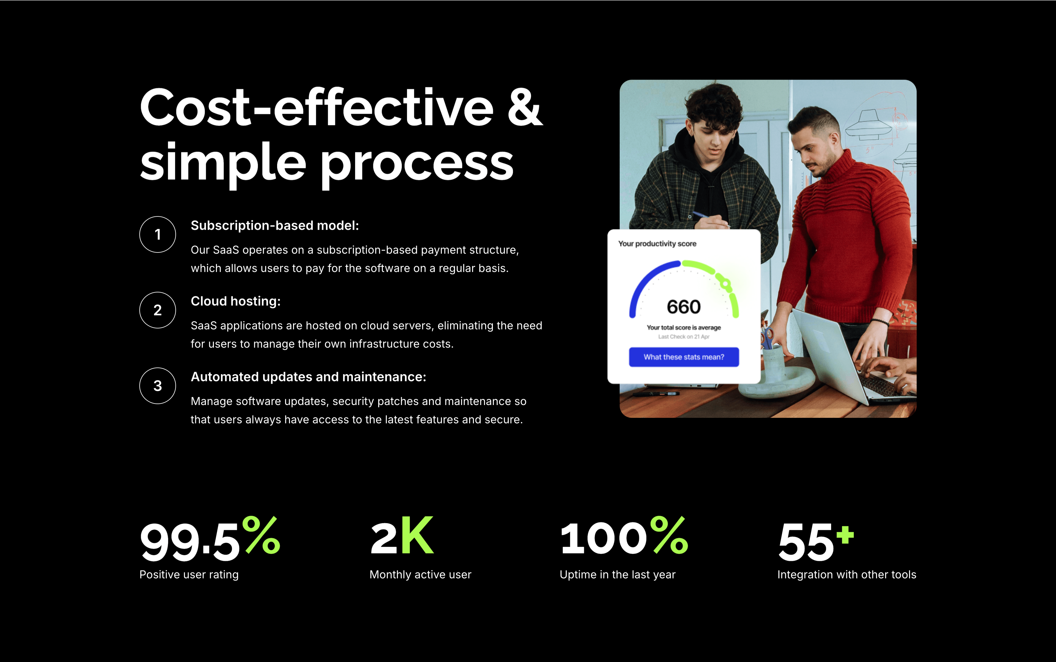
Cost-Effective Simple Process With Stats
A feature section on a solid black background. The left column stacks an oversized white 'Cost-effective & simple process' heading over three numbered points — 'Subscription-based model:', 'Cloud hosting:' and 'Automated updates and maintenance:' — each with a circled number and a short white description. The right column shows a rounded photo of two colleagues at a laptop with a floating white 'Your productivity score' card reading 660. A row of four lime-green-accented stats runs across the bottom: '99.5%' positive user rating, '2K' monthly active users, '100%' uptime in the last year and '55+' integrations. The dark canvas, numbered list and green metrics give the section a confident, data-backed tone.
Zubuz ↗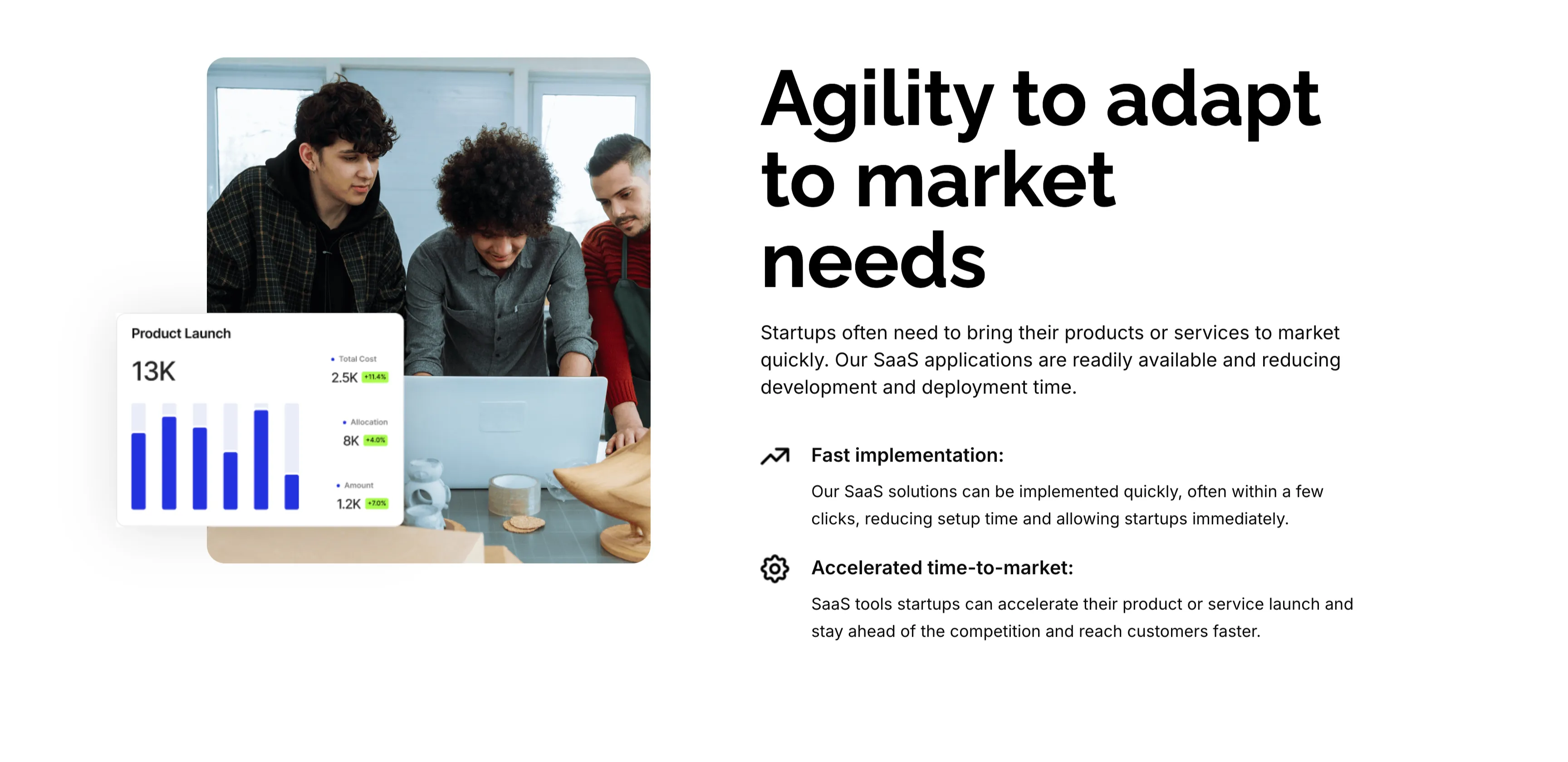
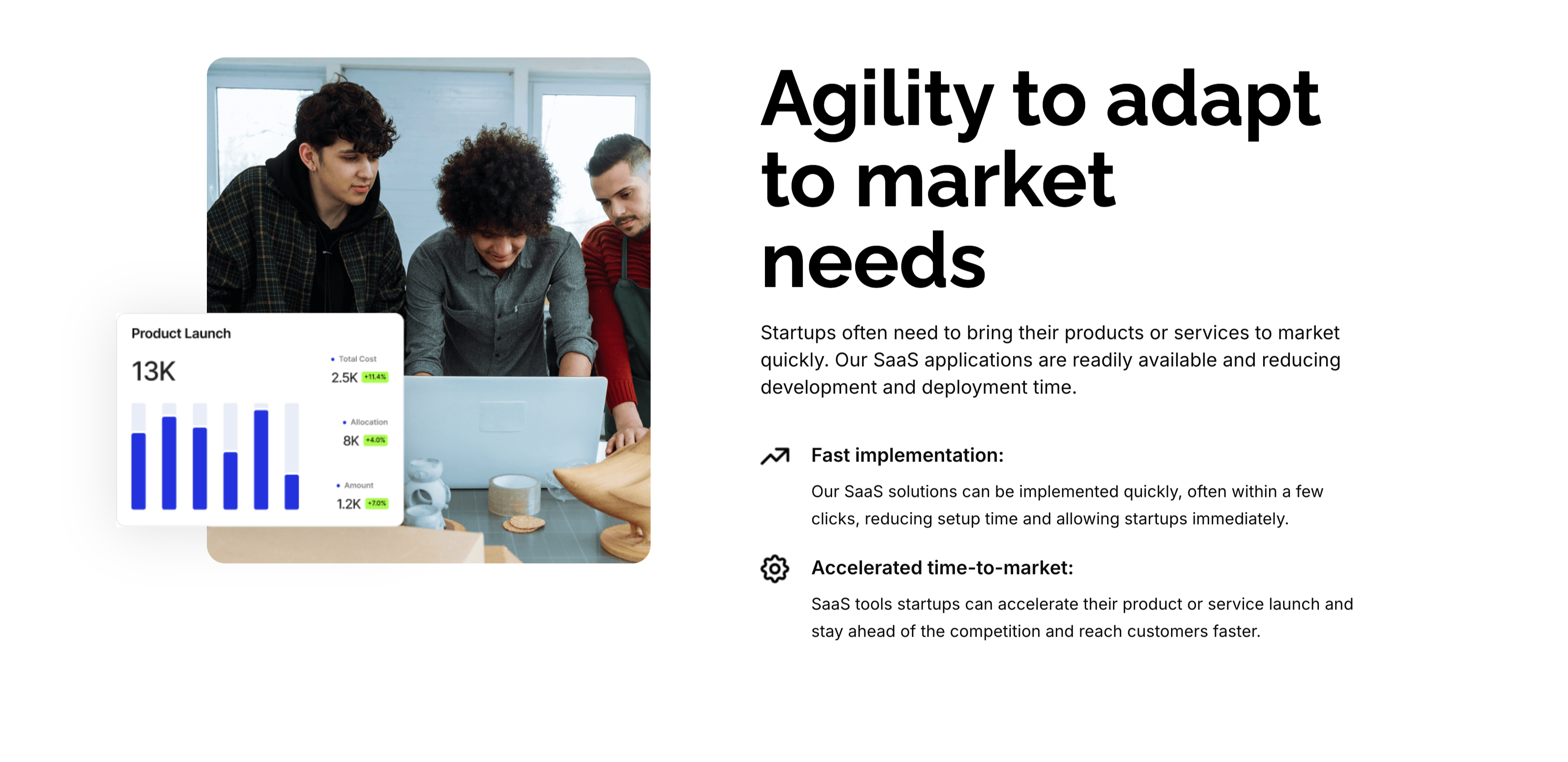
Agility To Adapt Split Feature
A two-column feature block on white. The left column holds a rounded photo of three colleagues at a laptop, overlaid at the corner with a floating 'Product Launch' analytics card (a 13K figure, bar chart and green percentage badges). The right column leads with an oversized 'Agility to adapt to market needs' heading and a short paragraph, then two icon-led points: 'Fast implementation:' (SaaS solutions deployed in a few clicks) and 'Accelerated time-to-market:' (launch faster and stay ahead of competitors). A small outline icon precedes each point. The photo-plus-icon-list layout pairs a human scene with a crisp benefit statement.
Zubuz ↗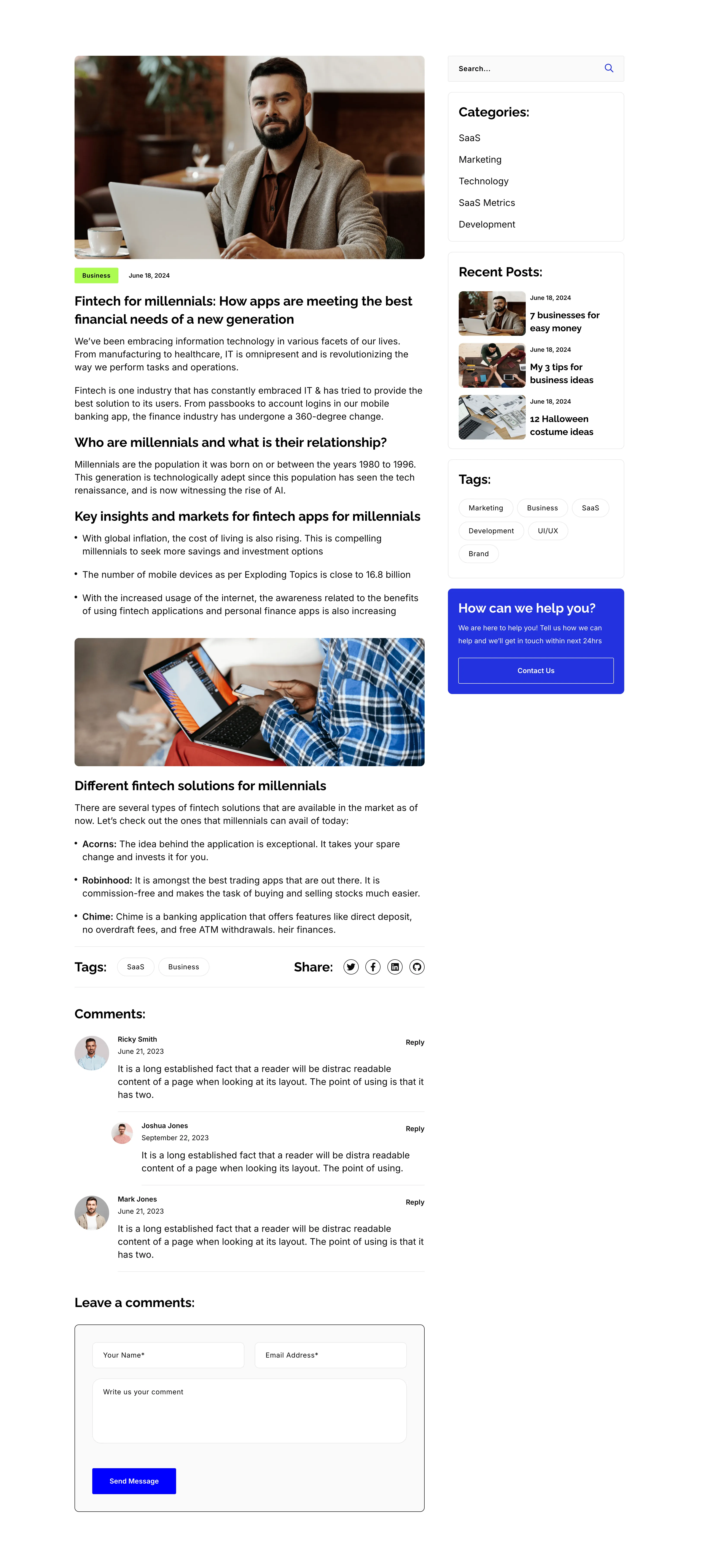
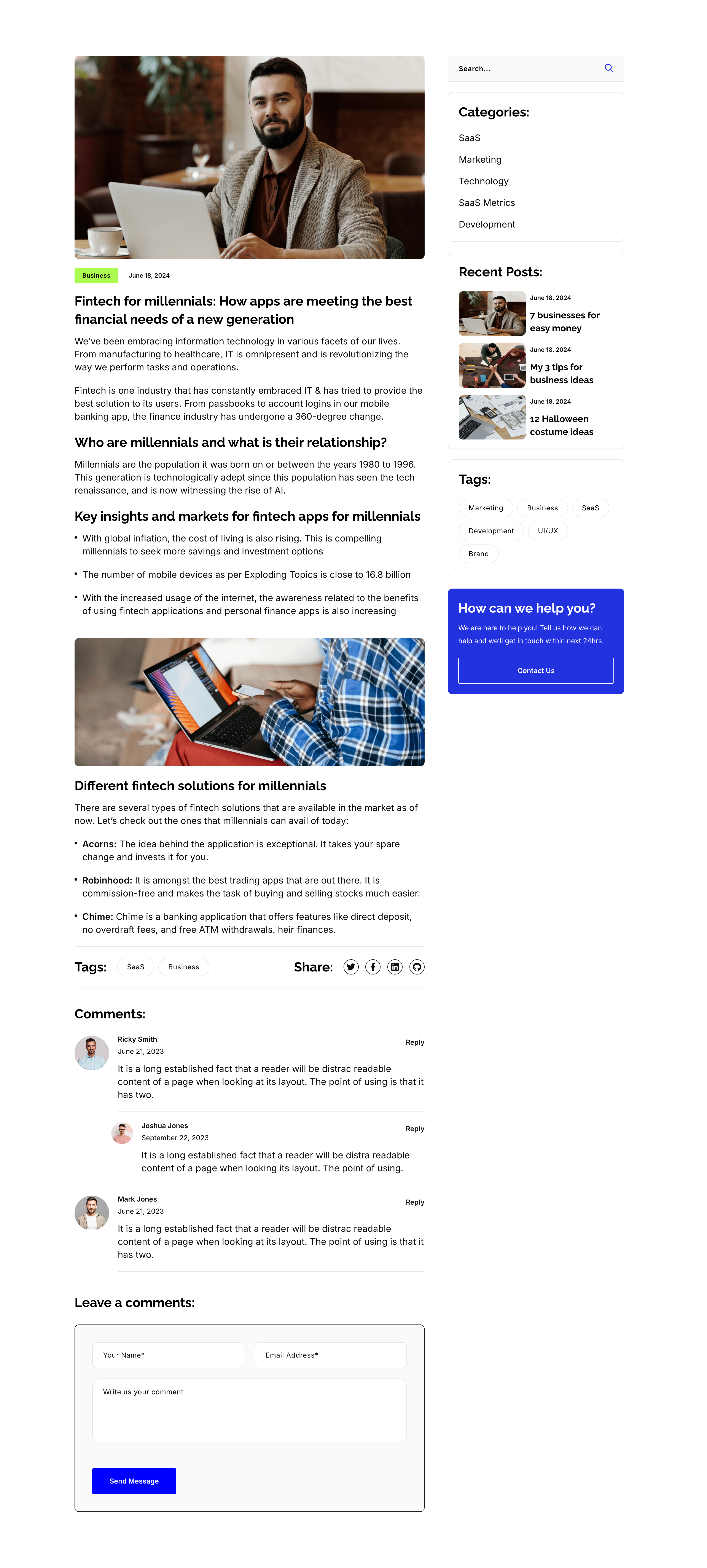
Blog Post Article Page With Comments
A single blog-post layout on white, again split into an article column and a right sidebar. The article opens with a hero photo, a 'Business' tag and date, the title 'Fintech for millennials: How apps are meeting the best financial needs of a new generation', then body copy broken by sub-headings ('Who are millennials…', 'Key insights…', 'Different fintech solutions…'), bullet lists, an inset photo, a Tags/Share row, and a threaded 'Comments:' list with a 'Leave a comments:' form. The sidebar repeats the search, Categories, Recent Posts, Tags and blue help card from the archive. The long-form column with a persistent sidebar is the standard editorial article template.
Zubuz ↗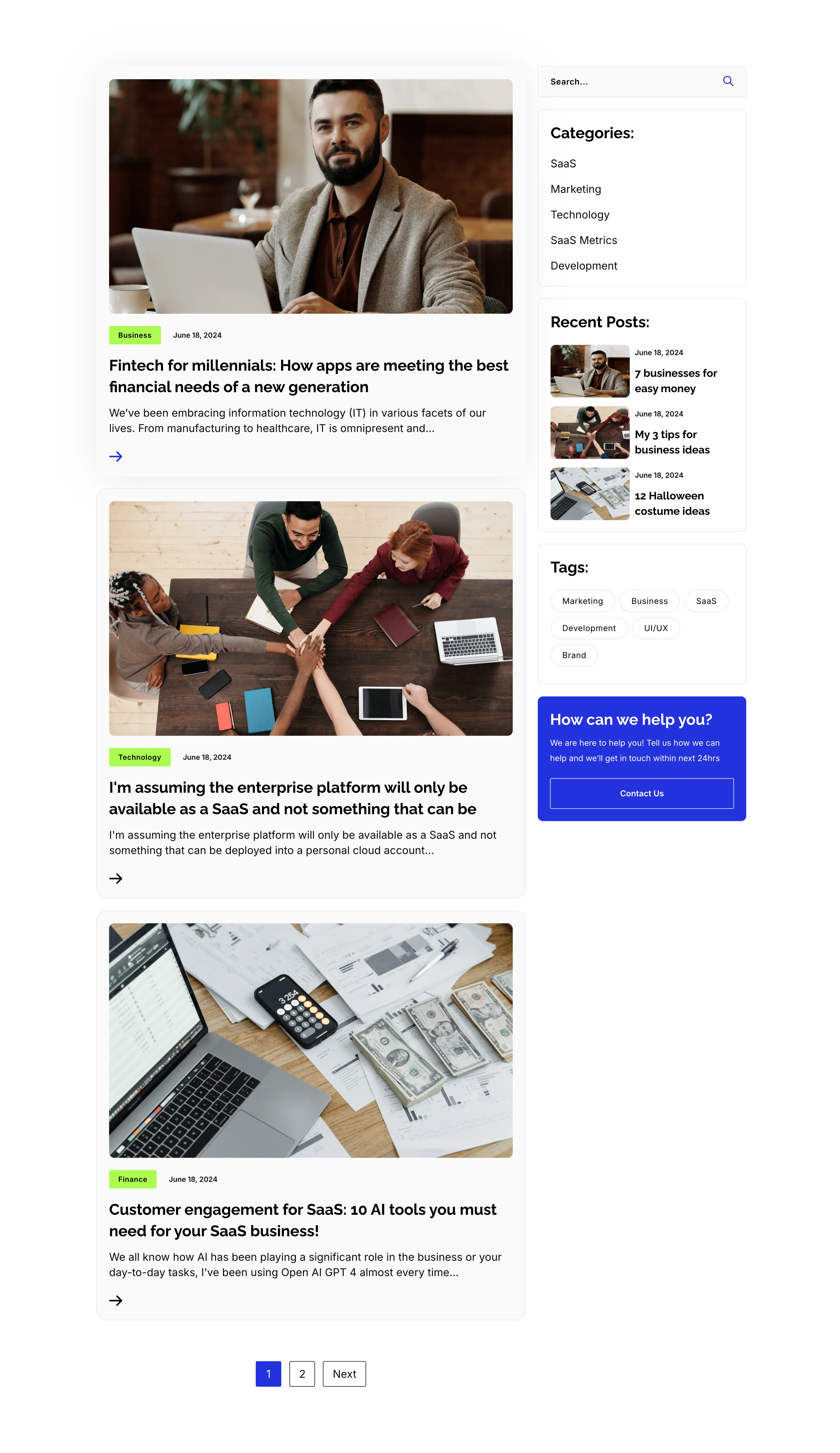
Blog Listing Page With Sidebar
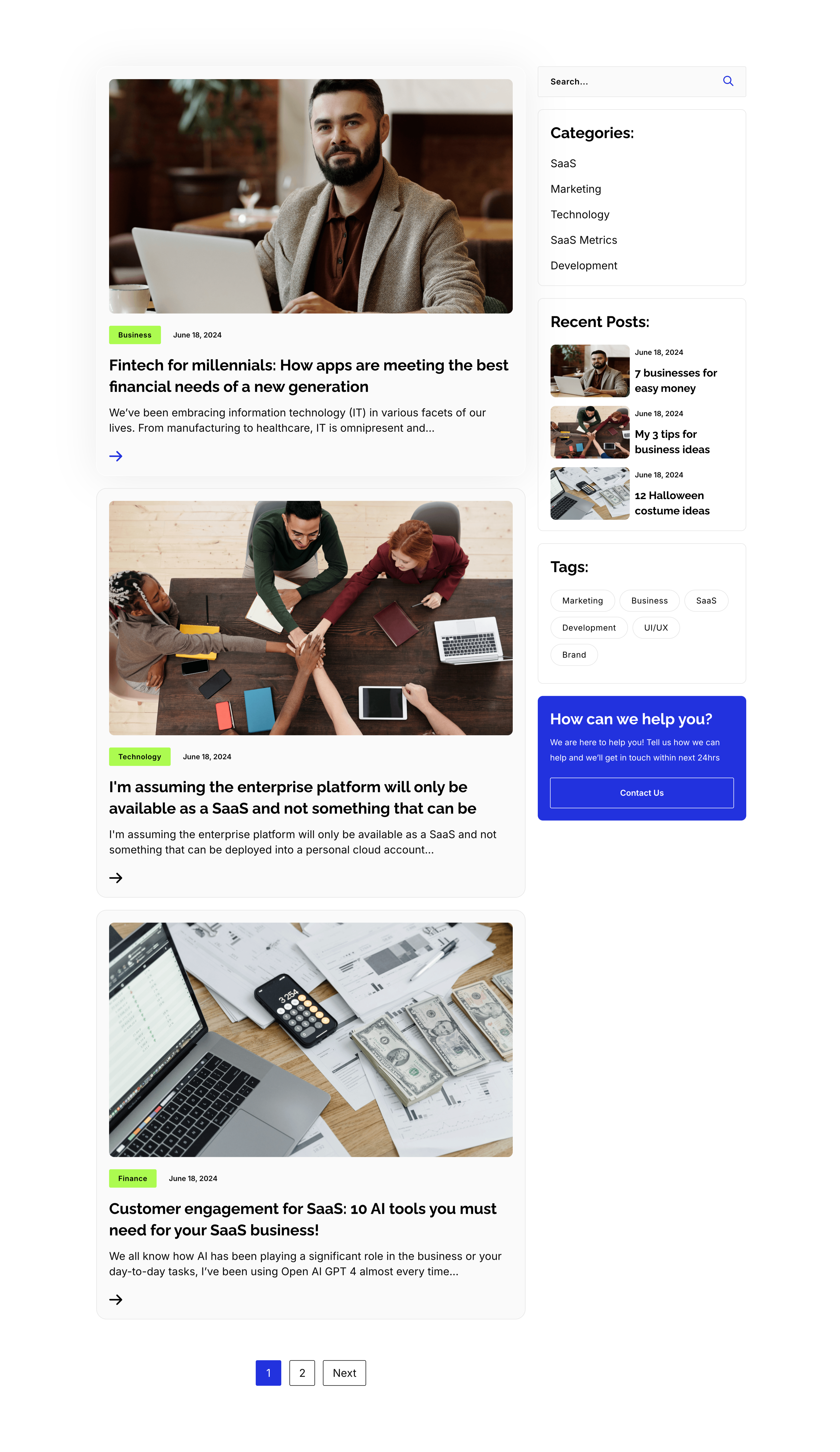
A full blog-listing layout on white, split into a wide article column and a right sidebar. The main column stacks post previews, each a photo with a category tag and date over a bold title, an excerpt and an arrow link — 'Fintech for millennials…', 'I'm assuming the enterprise platform…' and 'Customer engagement for SaaS: 10 AI tools…' — closing with a '1 / 2 / Next' pager. The sidebar holds a search field, a 'Categories:' list (SaaS, Marketing, Technology, SaaS Metrics, Development), a 'Recent Posts:' list with thumbnails, a 'Tags:' pill cloud, and a blue 'How can we help you?' card with a Contact Us button. The article-plus-sidebar structure is the classic content-hub archive pattern.
Zubuz ↗