And So Much More Icon Feature Grid
Description
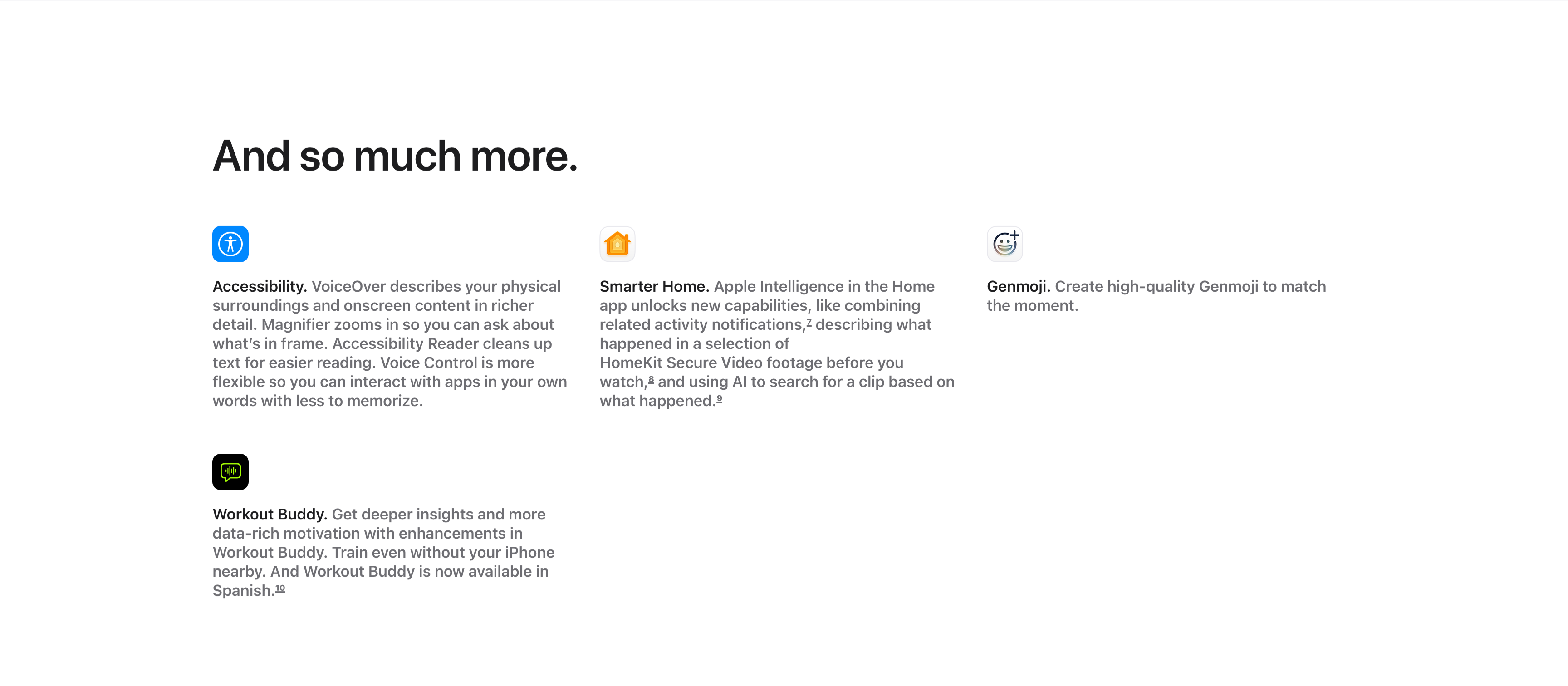
A compact ‘And so much more.’ feature grid on a white background, with the large left-aligned heading sitting above the items. Four entries are arranged across three columns and two rows, each led by a small rounded app icon, a bold inline title and a gray description: ‘Accessibility.’ (VoiceOver describing surroundings, Magnifier, Accessibility Reader, Voice Control), ‘Smarter Home.’ (combining activity notifications and AI search of HomeKit Secure Video), and ‘Genmoji.’ (creating high-quality Genmoji) fill the top row, with ‘Workout Buddy.’ (deeper insights, now in Spanish) below the first column. Superscript footnote markers appear after several phrases. The icon-led, text-heavy grid efficiently rounds up smaller features after the main showcases.
Related
Legal Footnotes And Multi-Column Footer
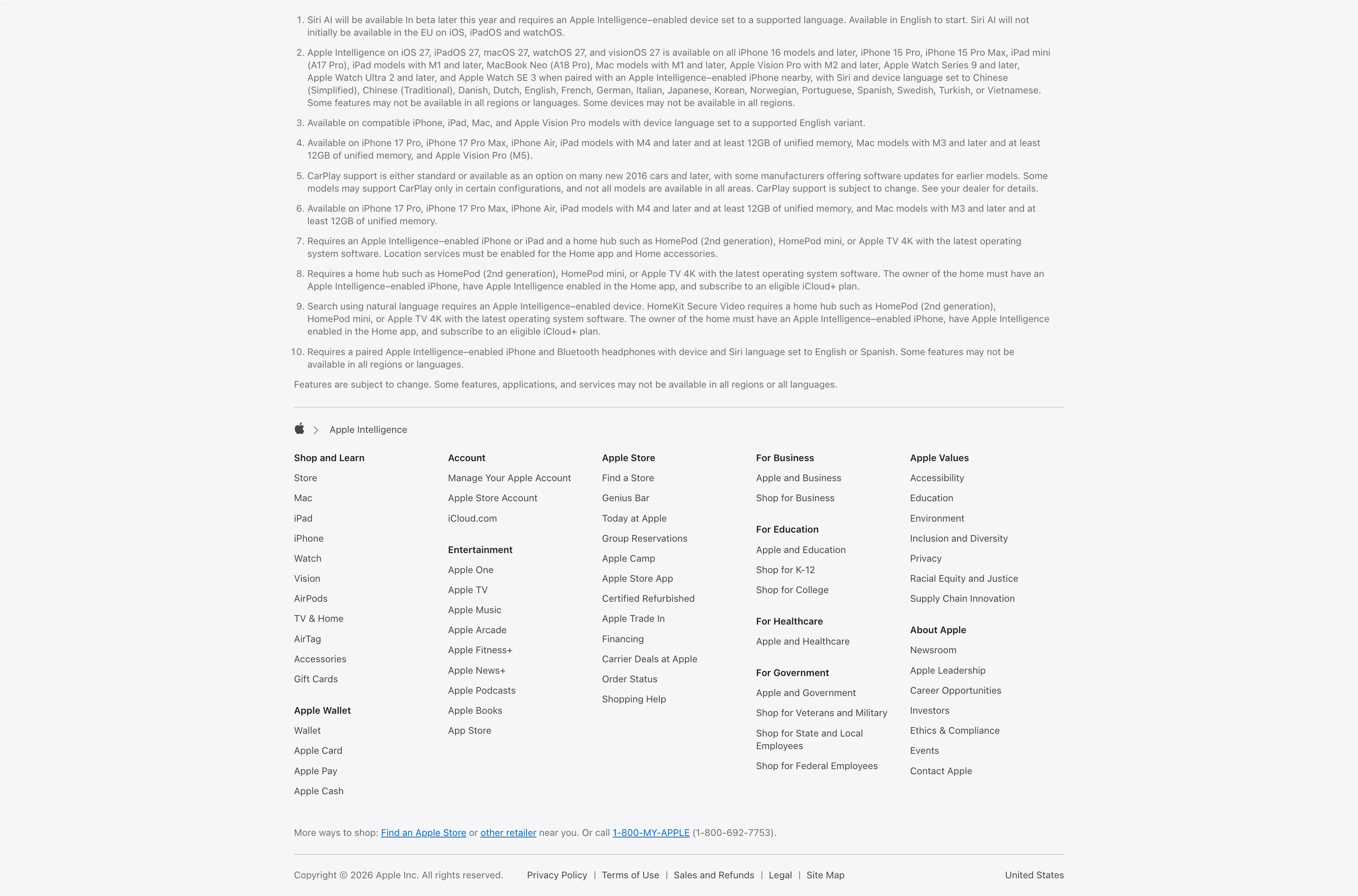
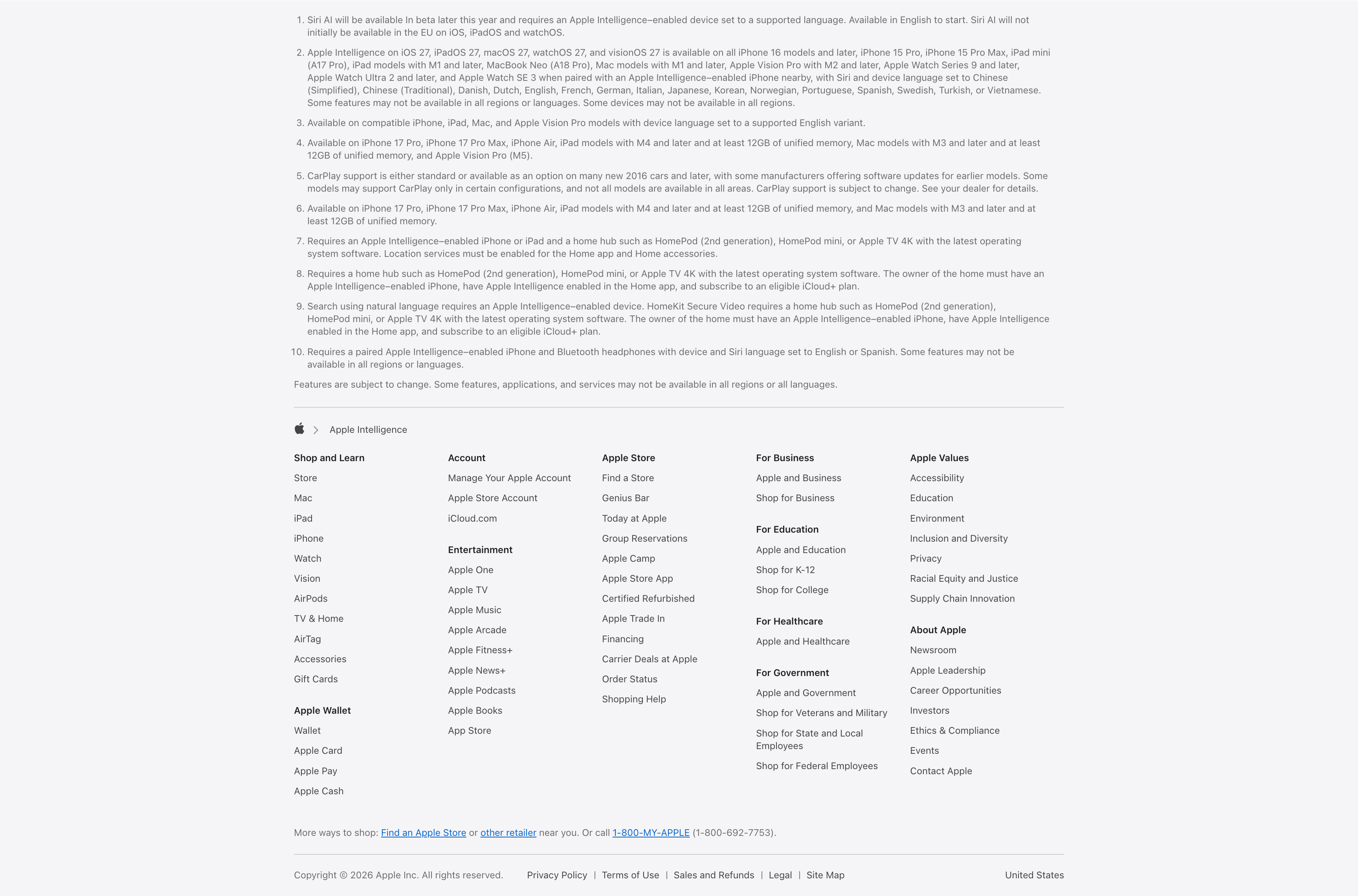
A combined footnotes-and-footer block on white. The top portion is a numbered list of ten fine-print legal disclaimers covering Siri AI availability, supported devices and languages, CarPlay and HomeKit requirements, set in small gray type. Below a hairline divider an Apple-logo breadcrumb ('Apple > Apple Intelligence') introduces the standard Apple footer: a five-plus-column grid of link groups — Shop and Learn, Apple Wallet, Account, Entertainment, Apple Store, For Business, For Education, For Healthcare, For Government, Apple Values and About Apple — each a stack of small text links. A 'More ways to shop' line with a phone number and a bottom row of copyright, Privacy Policy, Terms of Use, Legal, Site Map and the 'United States' region close it out. The dense, orderly columns are a classic global-footer pattern.
Apple ↗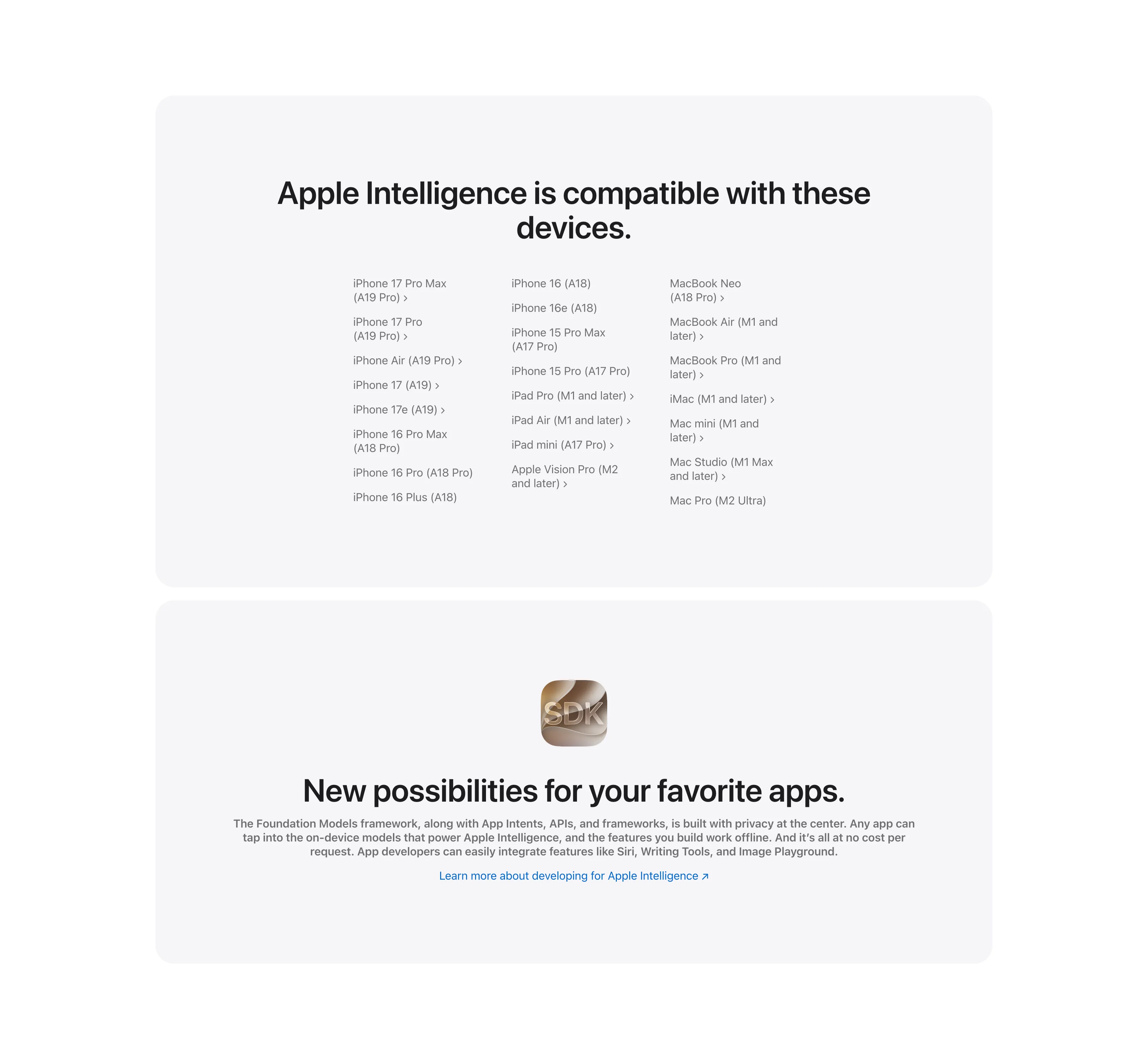
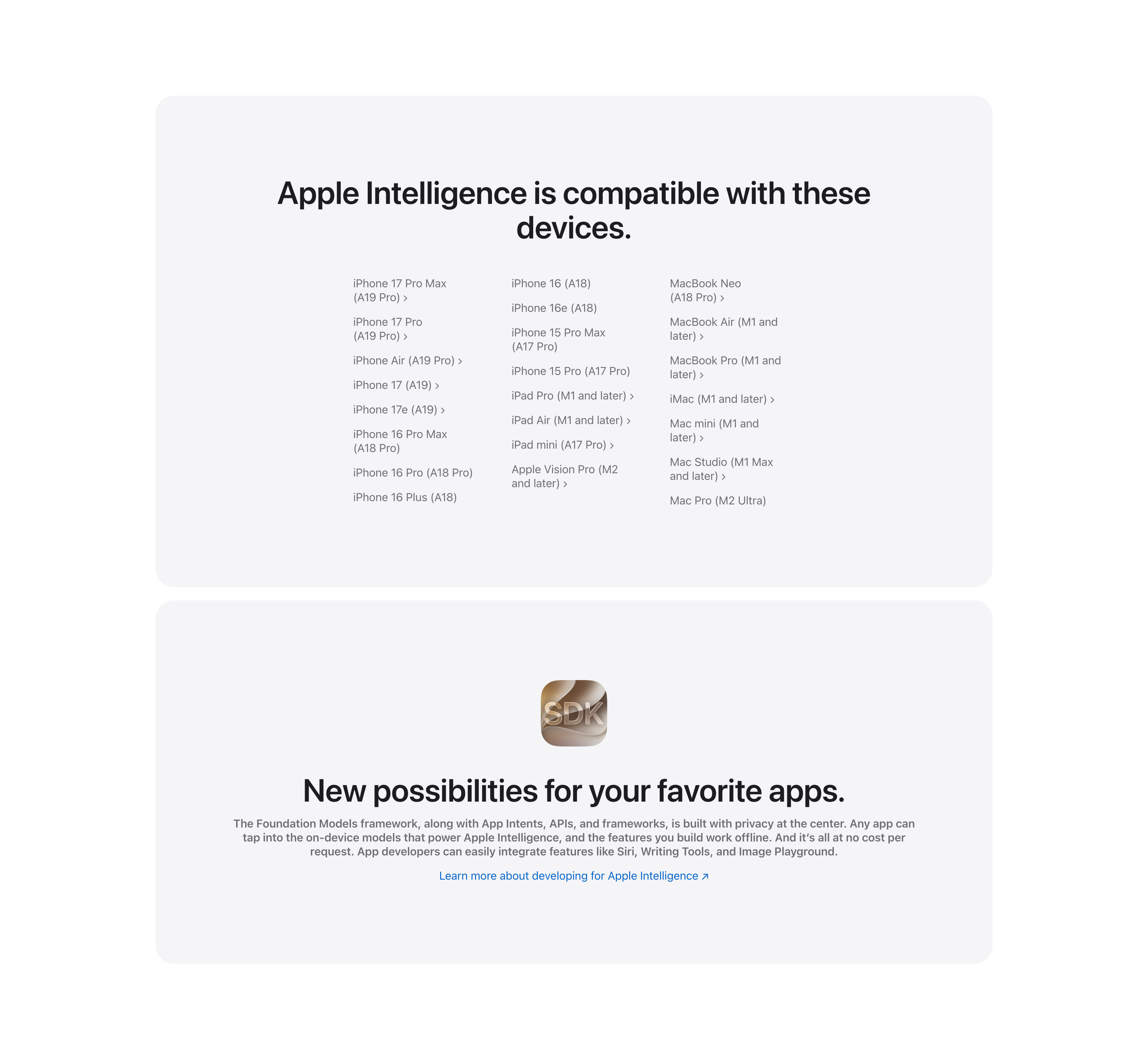
Compatible Devices List And Developer SDK Cards
Two stacked pale-gray rounded cards. The upper card, headed 'Apple Intelligence is compatible with these devices.', lays out a long three-column list of supported hardware — iPhone 17 Pro Max through iPhone 16 models, iPad Pro/Air/mini and Apple Vision Pro, and Mac models from MacBook Neo to Mac Pro — many entries carrying chevron links to detail pages. The lower card centers a glossy 'SDK' app icon above the bold headline 'New possibilities for your favorite apps.', a gray paragraph about the Foundation Models framework and App Intents, and a blue 'Learn more about developing for Apple Intelligence' link. The restrained monochrome cards keep the dense reference content and the developer call-to-action visually calm.
Apple ↗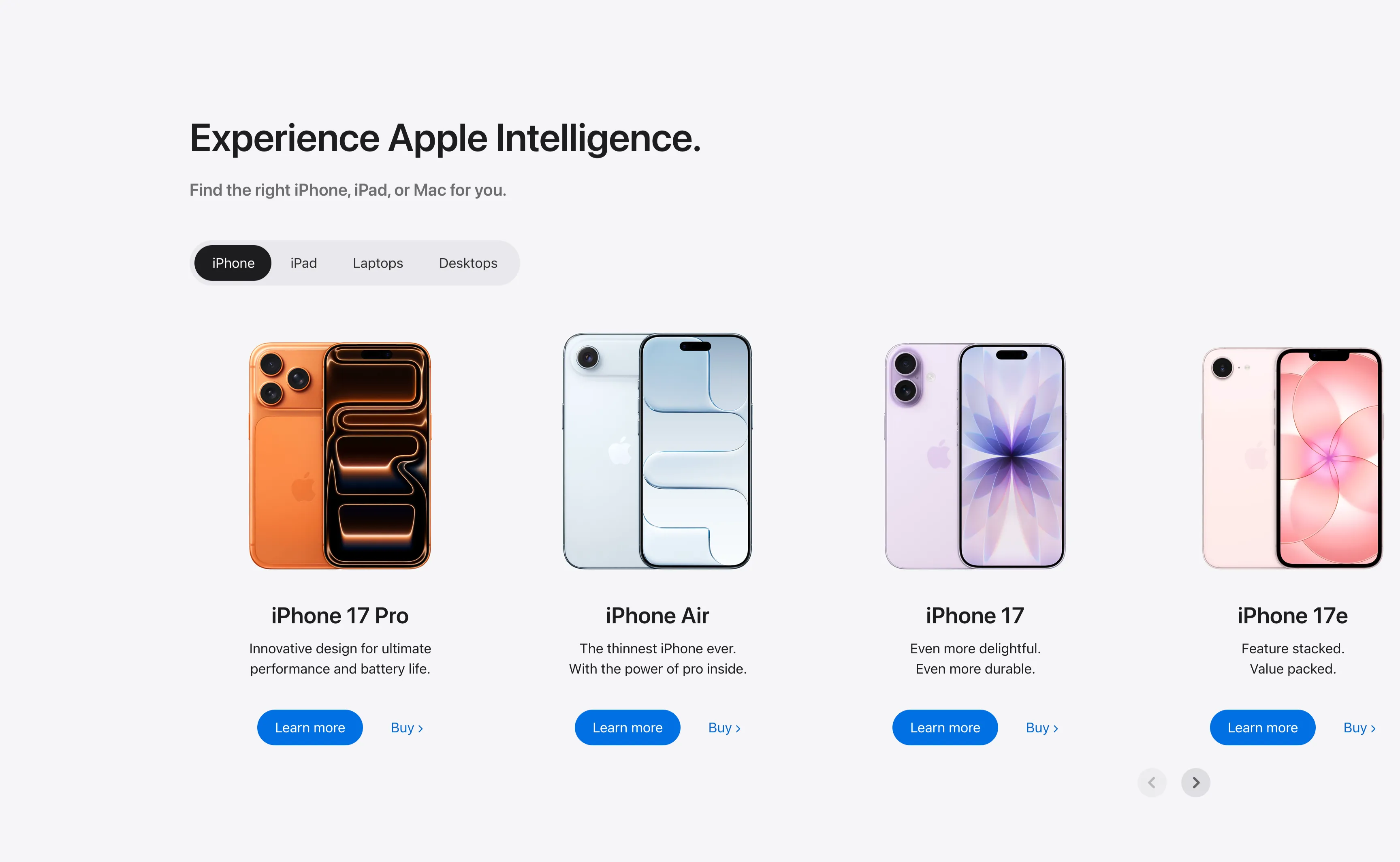
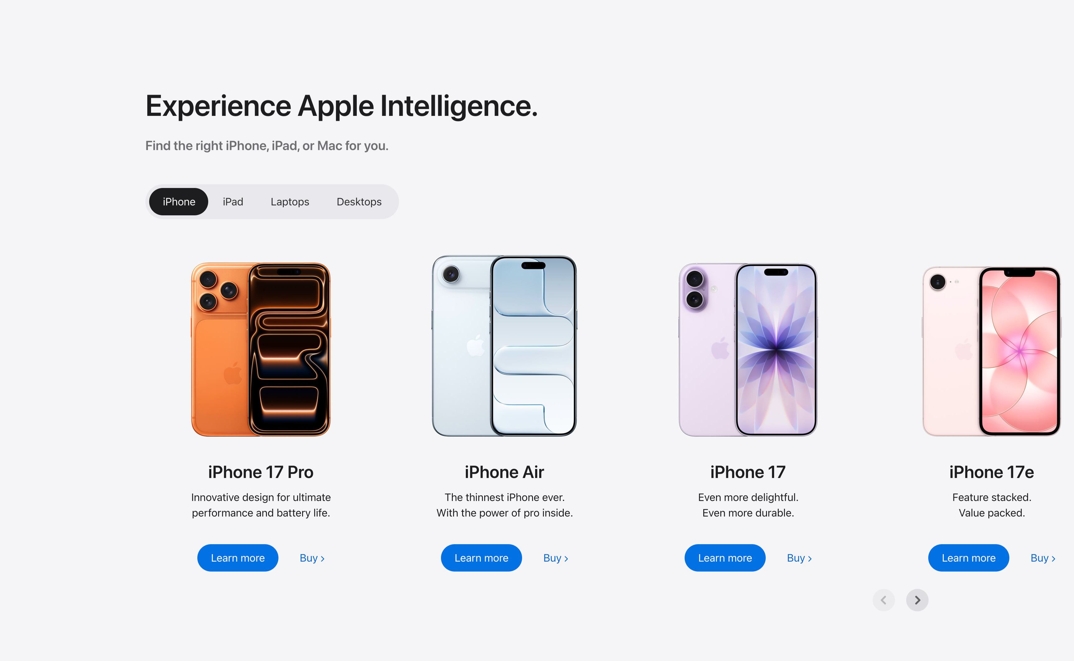
Experience Apple Intelligence Product Carousel
A product-finder carousel headed 'Experience Apple Intelligence.' with the subhead 'Find the right iPhone, iPad, or Mac for you.' A pill-shaped tab switcher offers iPhone (selected, dark), iPad, Laptops and Desktops. Below it four product cards sit in a scrollable row, each showing a device render, a bold model name, a two-line tagline, a solid blue 'Learn more' button and a 'Buy' text link: iPhone 17 Pro (orange), iPhone Air (light blue), iPhone 17 (purple) and iPhone 17e (pink). Circular previous/next arrows in the lower right reveal further models. The tabbed filter plus dual learn/buy calls-to-action make it a conversion-focused product showcase.
Apple ↗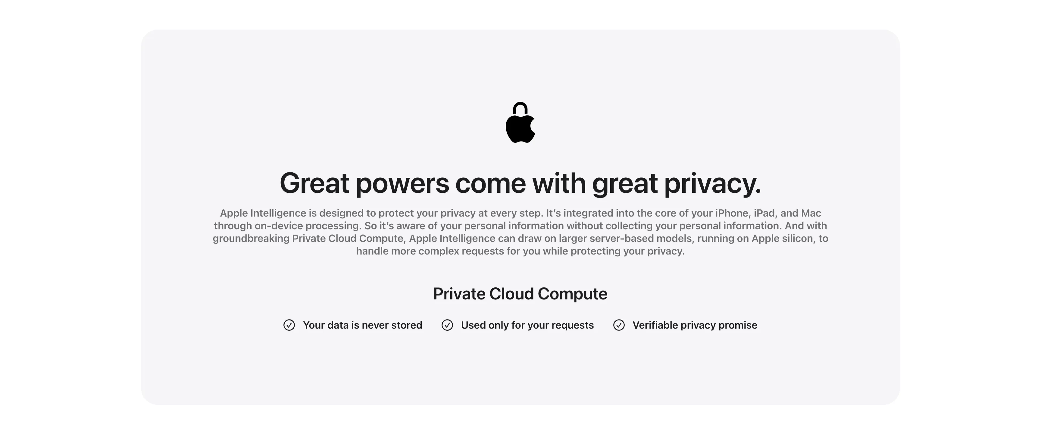
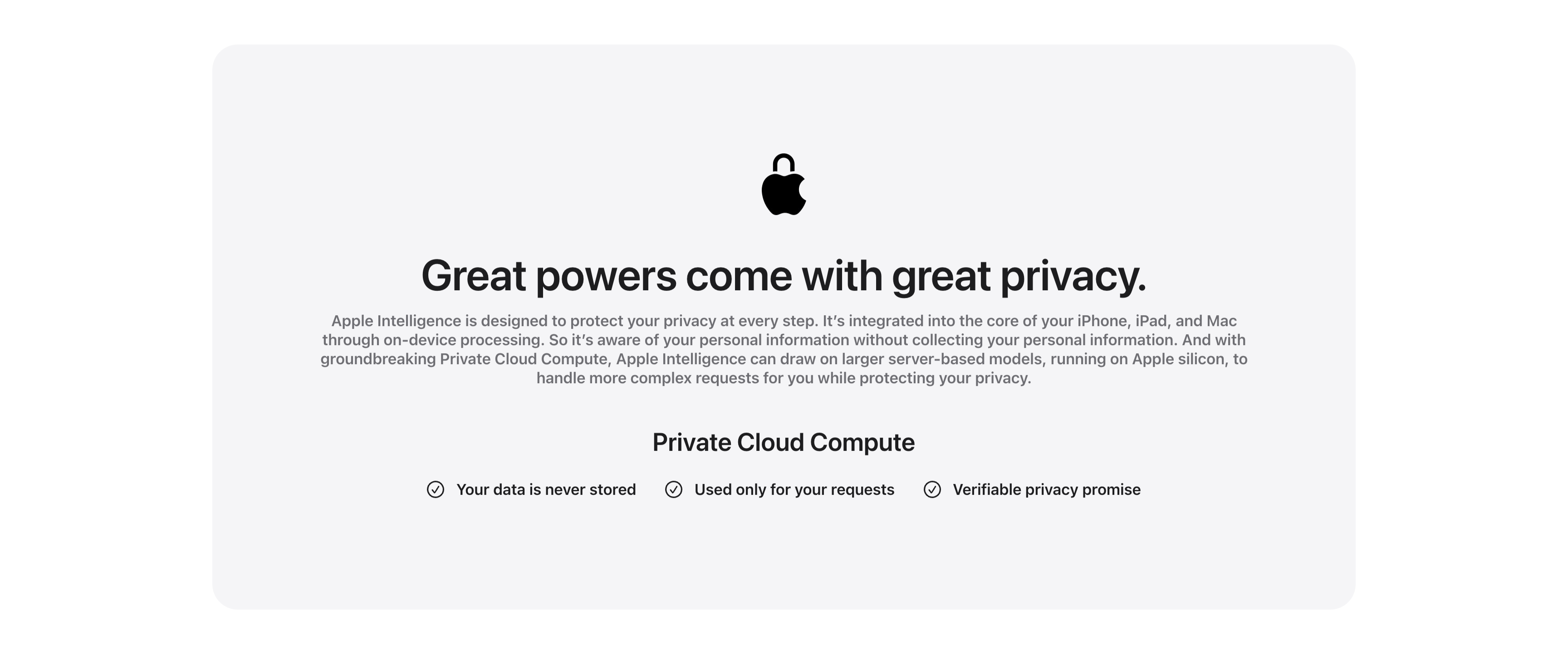
Great Powers Come With Great Privacy Band
A centered privacy content band housed in a large pale-gray rounded card. At the top a black Apple logo rendered as a padlock sits above the centered headline 'Great powers come with great privacy.' A justified gray paragraph explains on-device processing and Private Cloud Compute running on Apple silicon. Below, a bold 'Private Cloud Compute' subhead introduces a single horizontal row of three checkmarked claims — 'Your data is never stored', 'Used only for your requests' and 'Verifiable privacy promise' — each prefixed by a circled check icon. The symmetrical, generously padded layout and restrained monochrome palette give the privacy message a calm, trustworthy, reassuring tone.
Apple ↗Similar features sections
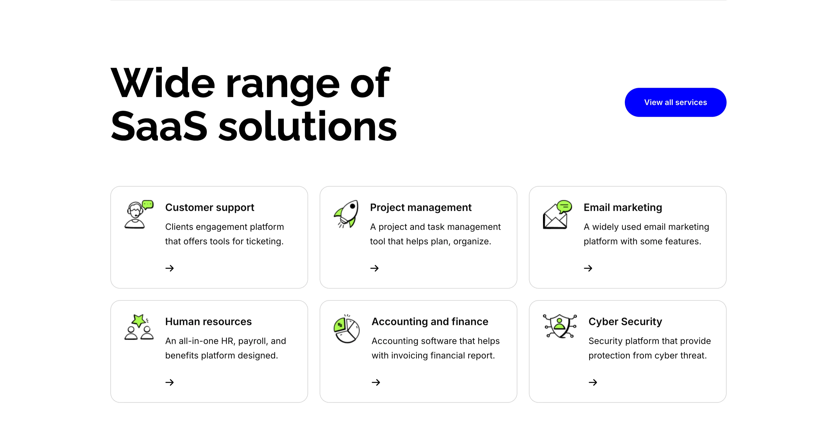
Wide Range Of SaaS Solutions Services Grid
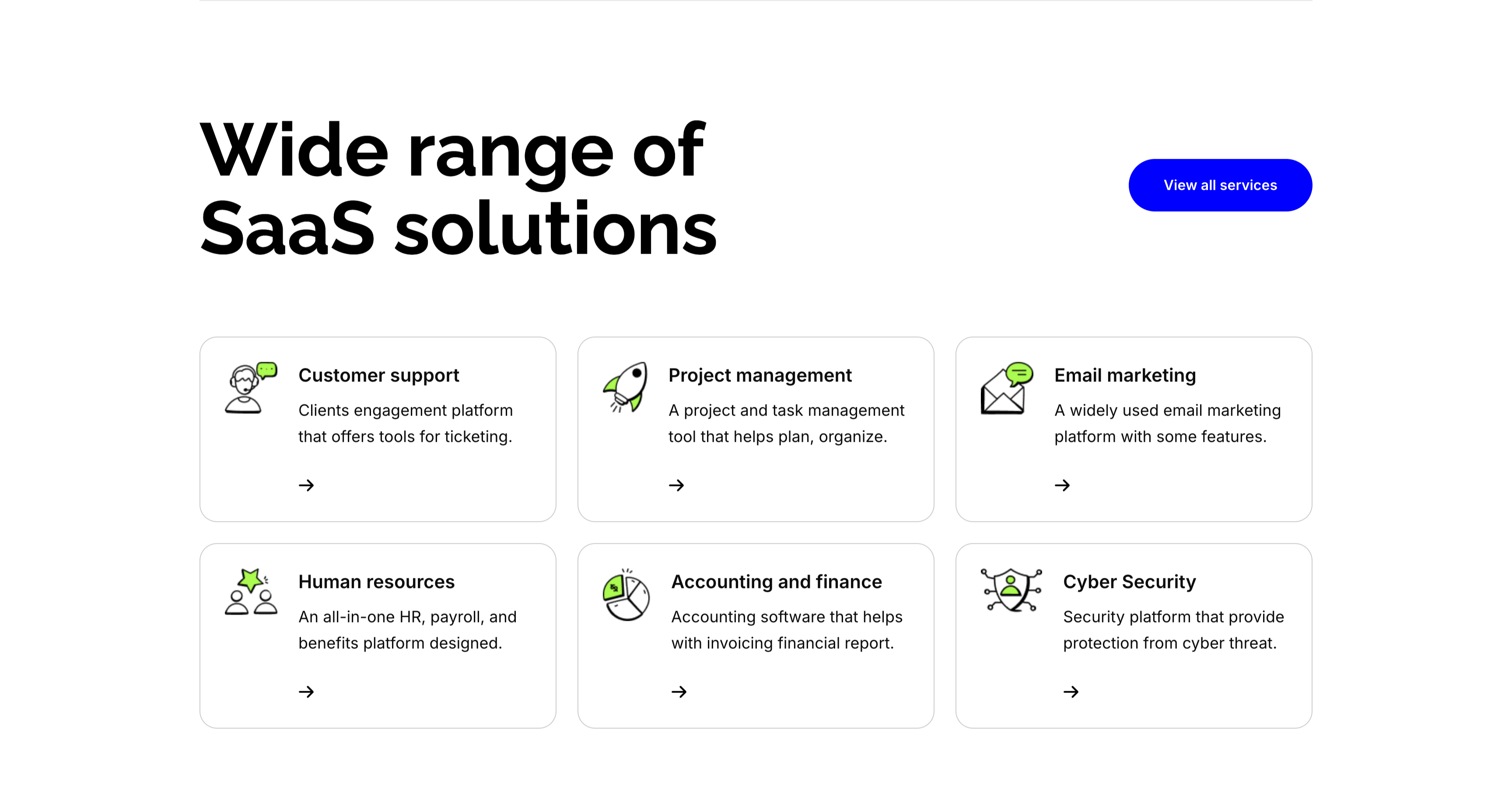
A services section on white. The top pairs an oversized 'Wide range of SaaS solutions' heading on the left with a solid blue 'View all services' button on the right. Below, six white bordered cards form a three-column, two-row grid, each led by a line-and-green illustrative icon, a bold title, a one-line description and a small arrow link: 'Customer support' (ticketing engagement platform), 'Project management' (plan and organize), 'Email marketing' (widely used platform), 'Human resources' (all-in-one HR and payroll), 'Accounting and finance' (invoicing and reports) and 'Cyber Security' (protection from threats). The even icon-card grid makes the breadth of offerings easy to scan.
Zubuz ↗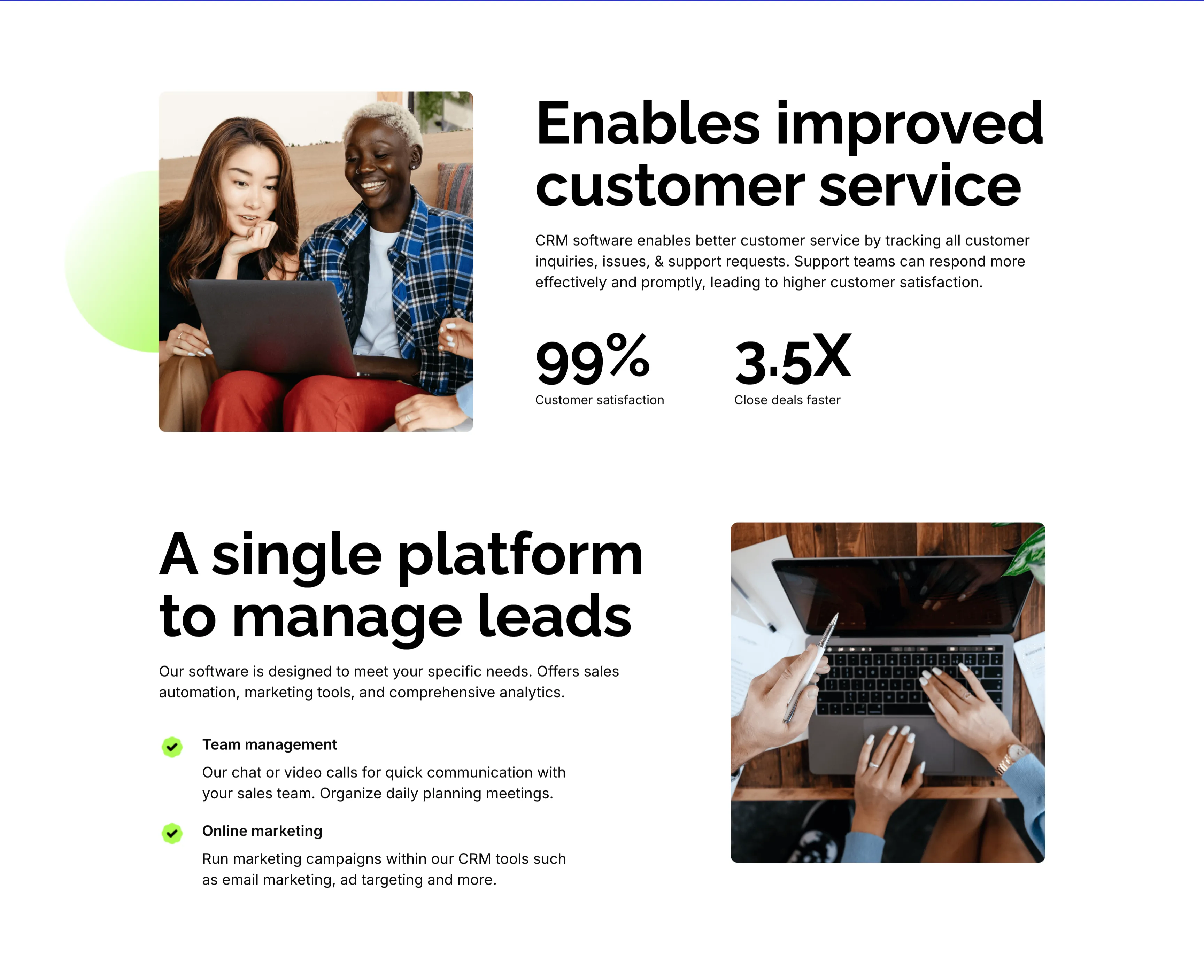
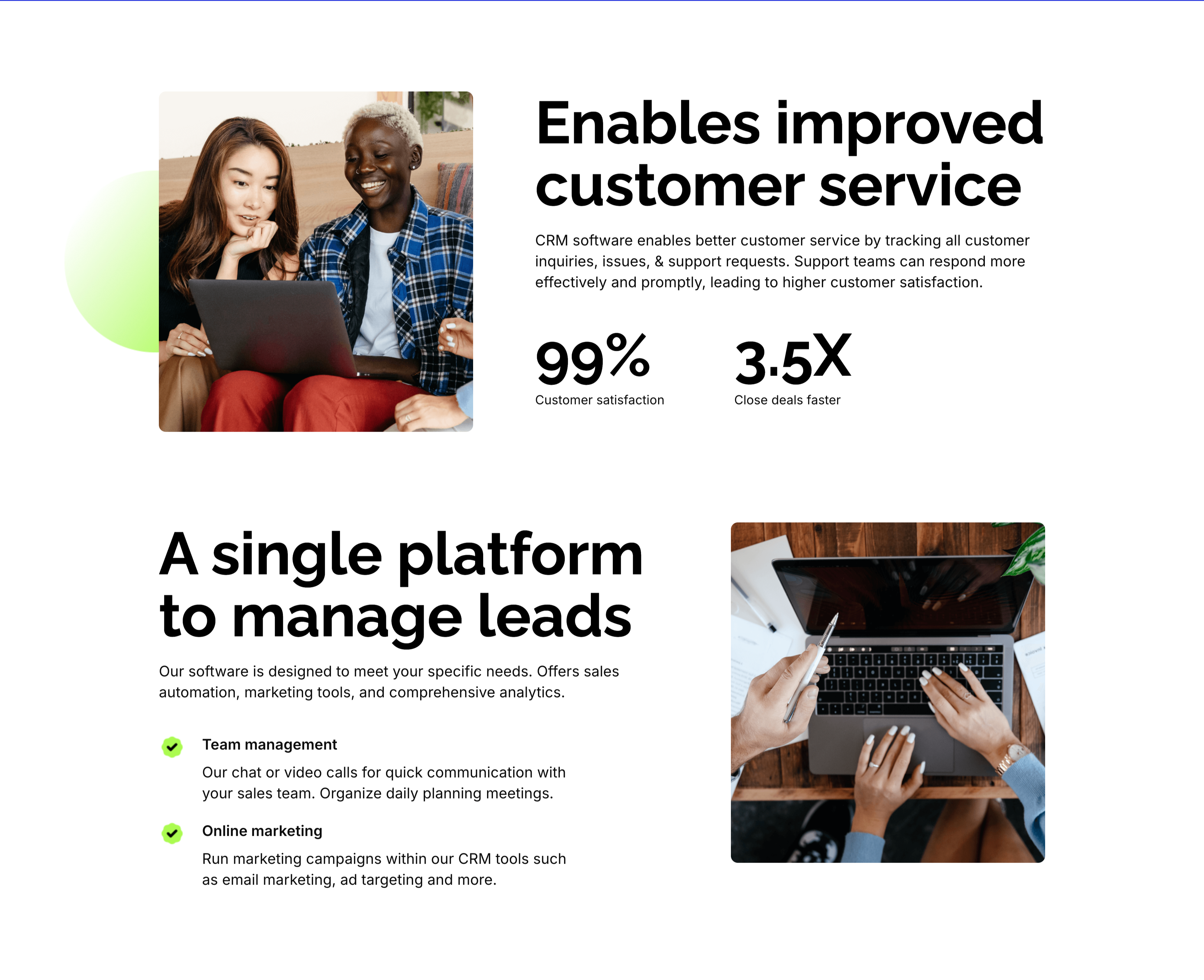
Customer Service And Lead Management Features
Two stacked alternating feature blocks on white, each mixing photography with copy. The upper block places a rounded photo of two colleagues at a laptop on the left beside an oversized 'Enables improved customer service' heading, a paragraph, and two bold stats — '99%' customer satisfaction and '3.5X' close deals faster. The lower block flips the layout: an oversized 'A single platform to manage leads' heading with green-checked items 'Team management' and 'Online marketing' sits left of a top-down photo of hands working at a laptop. The mirrored image-and-text rhythm, punchy metrics and checklist make the CRM benefits tangible and easy to compare.
Zubuz ↗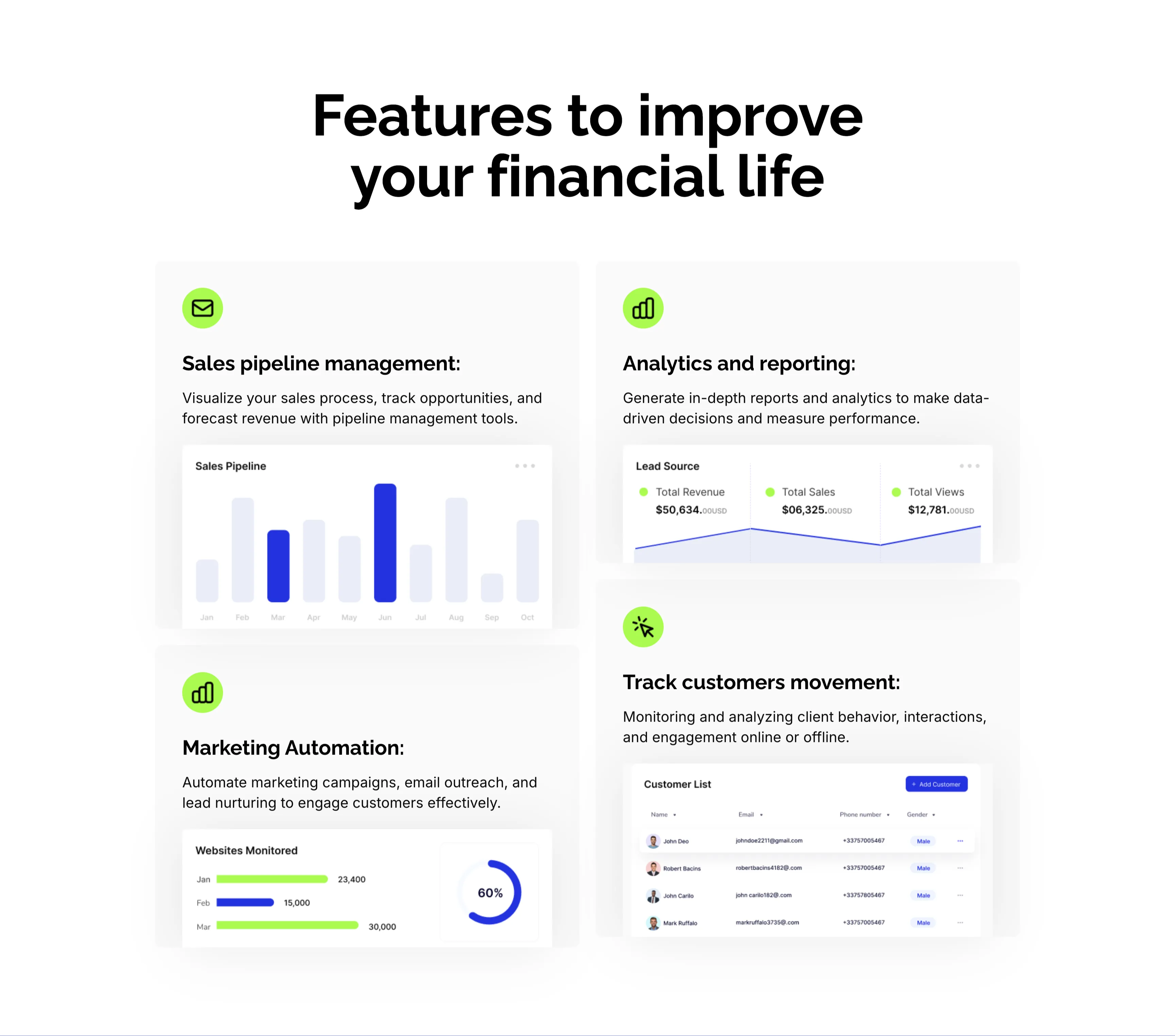
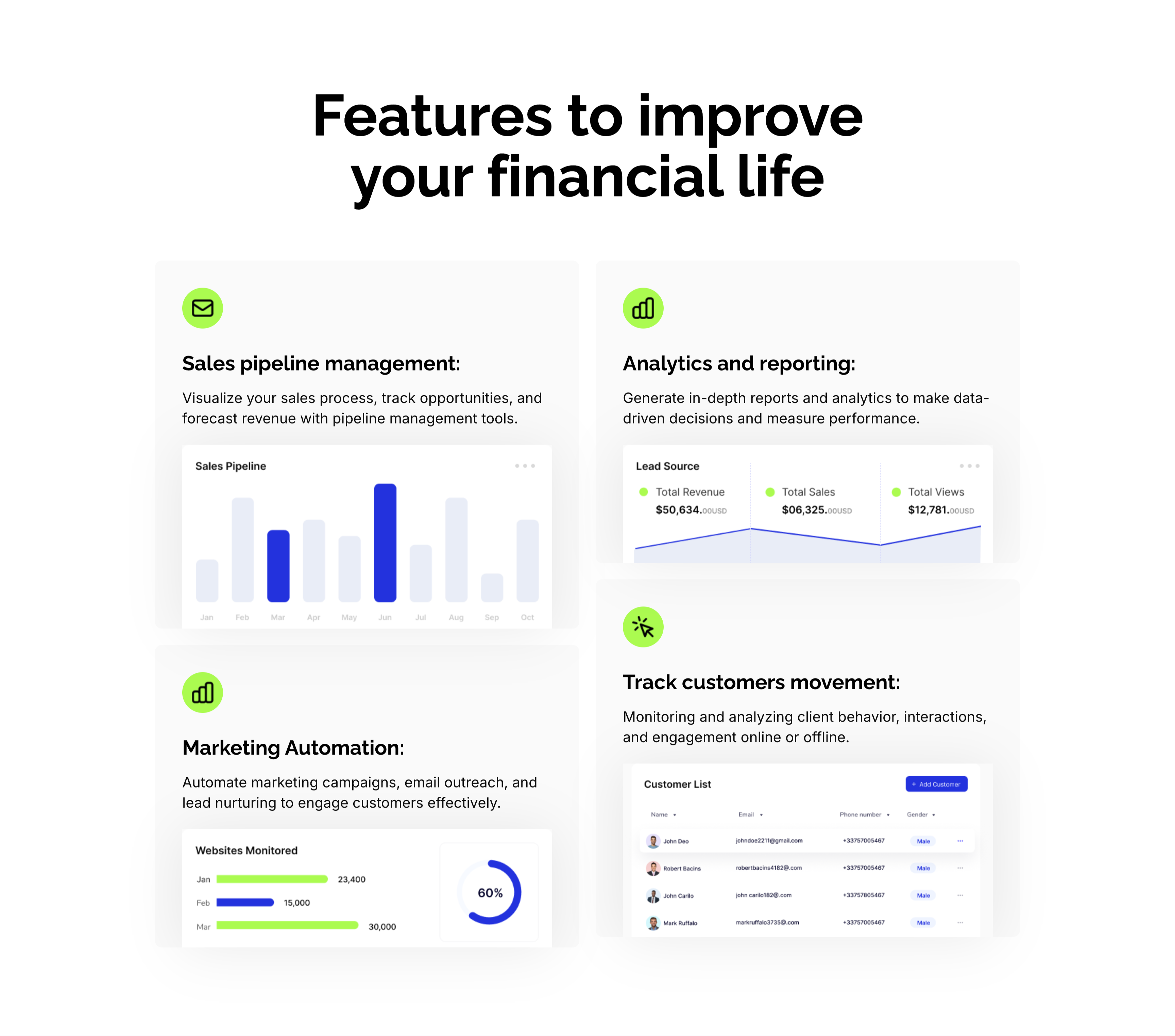
CRM Features With Dashboard Cards
A CRM feature section on a pale background under an oversized centered 'Features to improve your financial life' heading. Four large cards form a 2x2 grid, each led by a lime-green icon, a bold title and a line of copy, then a mini product screenshot: 'Sales pipeline management:' with a monthly bar chart, 'Analytics and reporting:' with a Lead Source panel (Total Revenue $50,634, Total Sales, Total Views), 'Marketing Automation:' with a 'Websites Monitored' bar-and-donut chart, and 'Track customers movement:' with a Customer List table. Embedding a real dashboard fragment in each card makes the abstract CRM capabilities feel concrete and demonstrable.
Zubuz ↗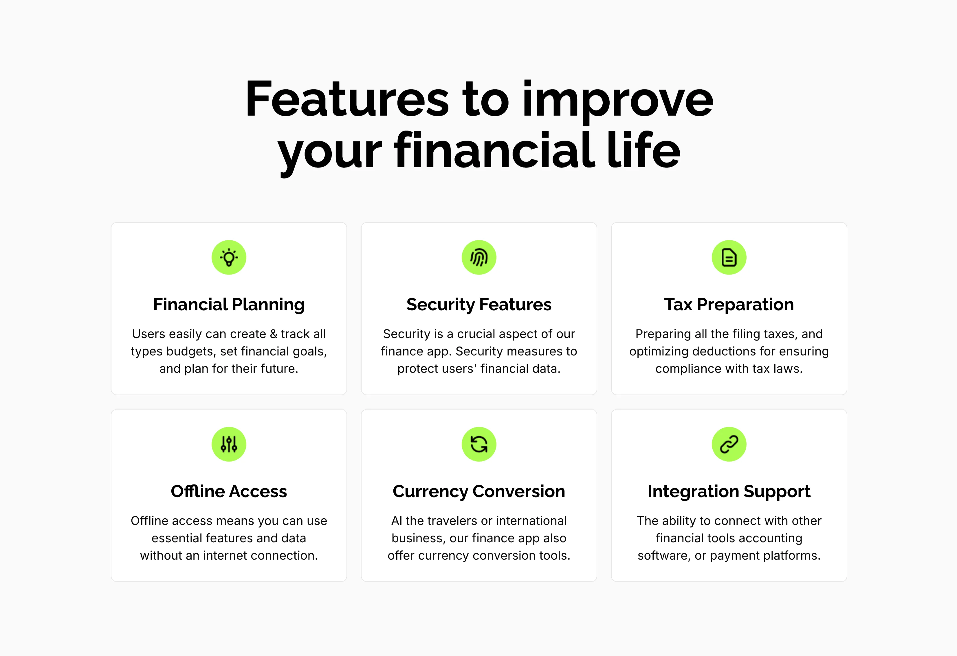
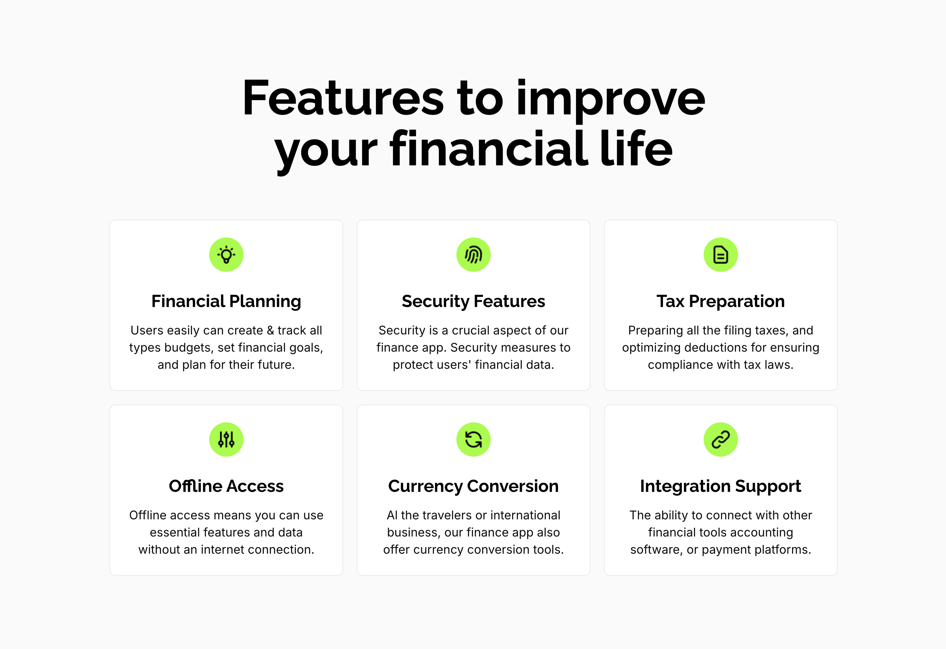
Features To Improve Financial Life Grid
A feature grid on a pale background under a centered oversized 'Features to improve your financial life' heading. Six white rounded cards are arranged three across and two down, each centered on a lime-green circular icon above a bold title and a short gray description: 'Financial Planning' (create and track budgets, set goals), 'Security Features' (measures to protect financial data), 'Tax Preparation' (filing and deductions), 'Offline Access' (use essential features without internet), 'Currency Conversion' (tools for travelers and international business) and 'Integration Support' (connect with other financial tools). The even three-up rhythm and single green accent make the capabilities calm and scannable.
Zubuz ↗