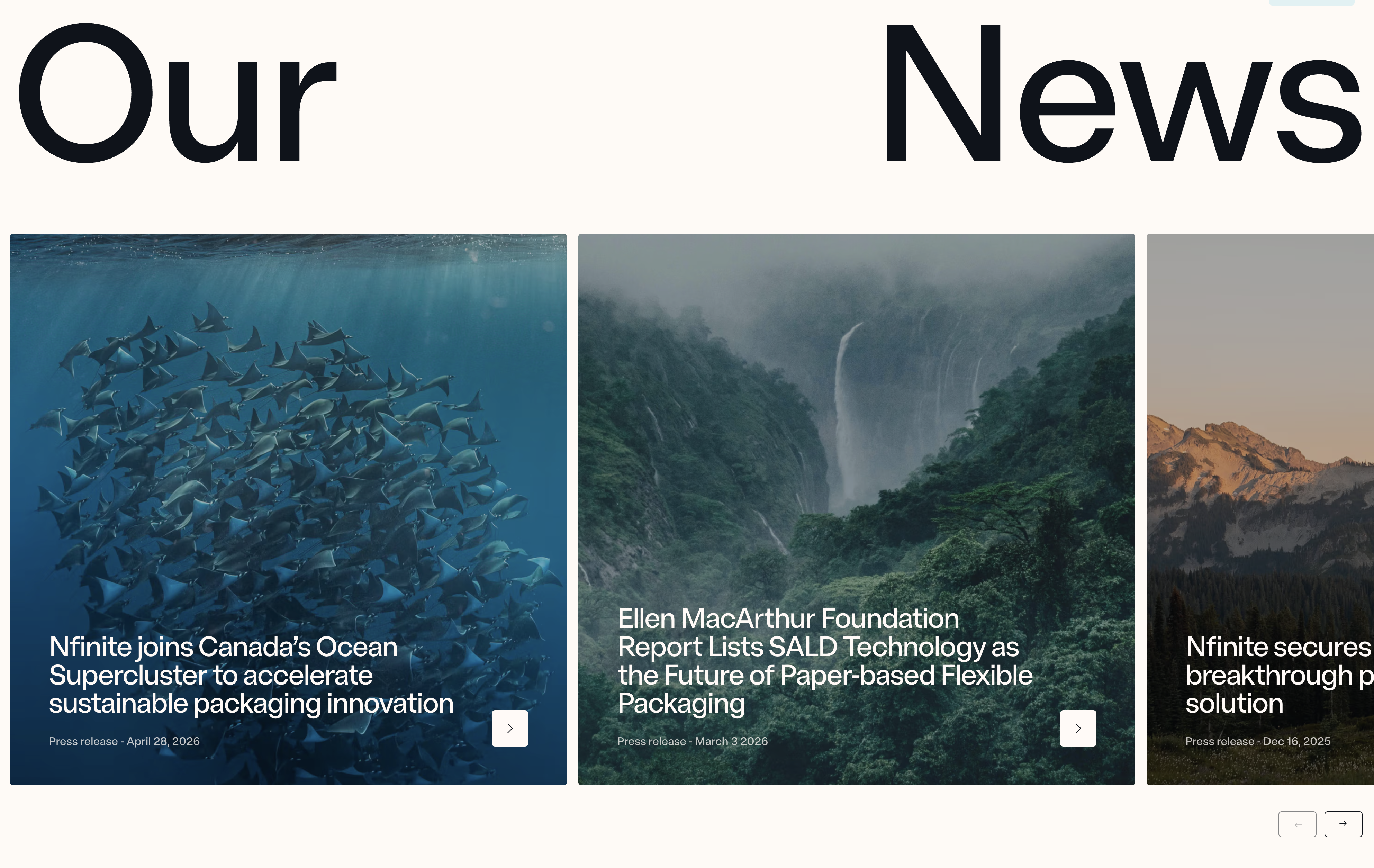
Nfinite News Article Slider
Description
A horizontal slider of large article cards, each with a full-bleed image, an overlaid headline, a press-release date label, and an arrow link, introduced by an oversized split heading and controlled with previous and next navigation. Best used to surface recent news, press releases, or blog posts in a browsable, editorial layout.
Related


NFINITE Subscribe Call-To-Action
A centered call-to-action band filling the width with a soft pale-blue panel. At the top sits the black 'NFINITE' wordmark with its small dotted infinity-style logo mark. Below it, a large dark charcoal sans-serif heading spans three centered lines — 'Subscribe to learn more about how our paper can eliminate plastic packaging from daily life' — stating the value of converting before the action. Centered beneath the copy is a single solid near-black rounded button labelled 'Contact us', with no competing secondary action. The calm monochrome-on-blue palette, generous vertical padding, and one focused button make this a clean closing conversion block that funnels attention straight to a single next step.
Nfinitepaper ↗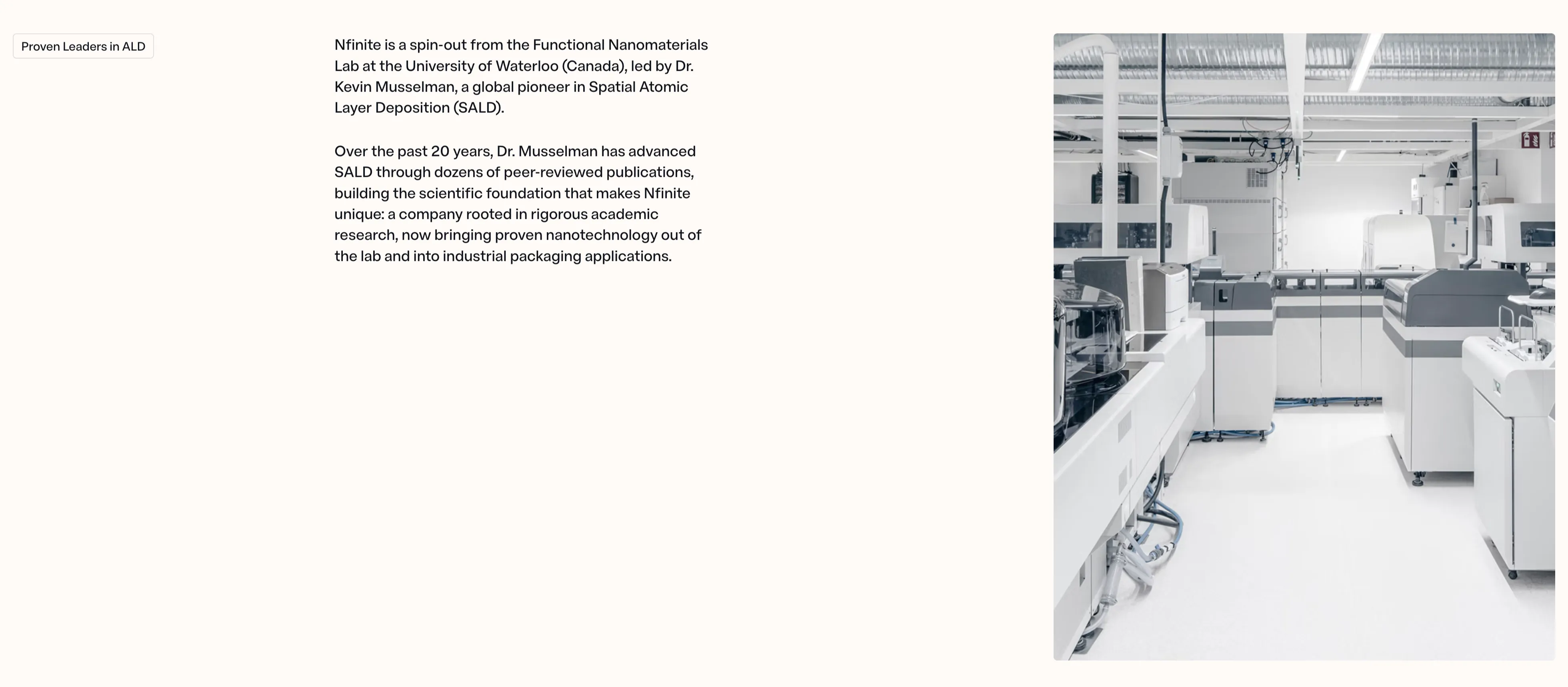
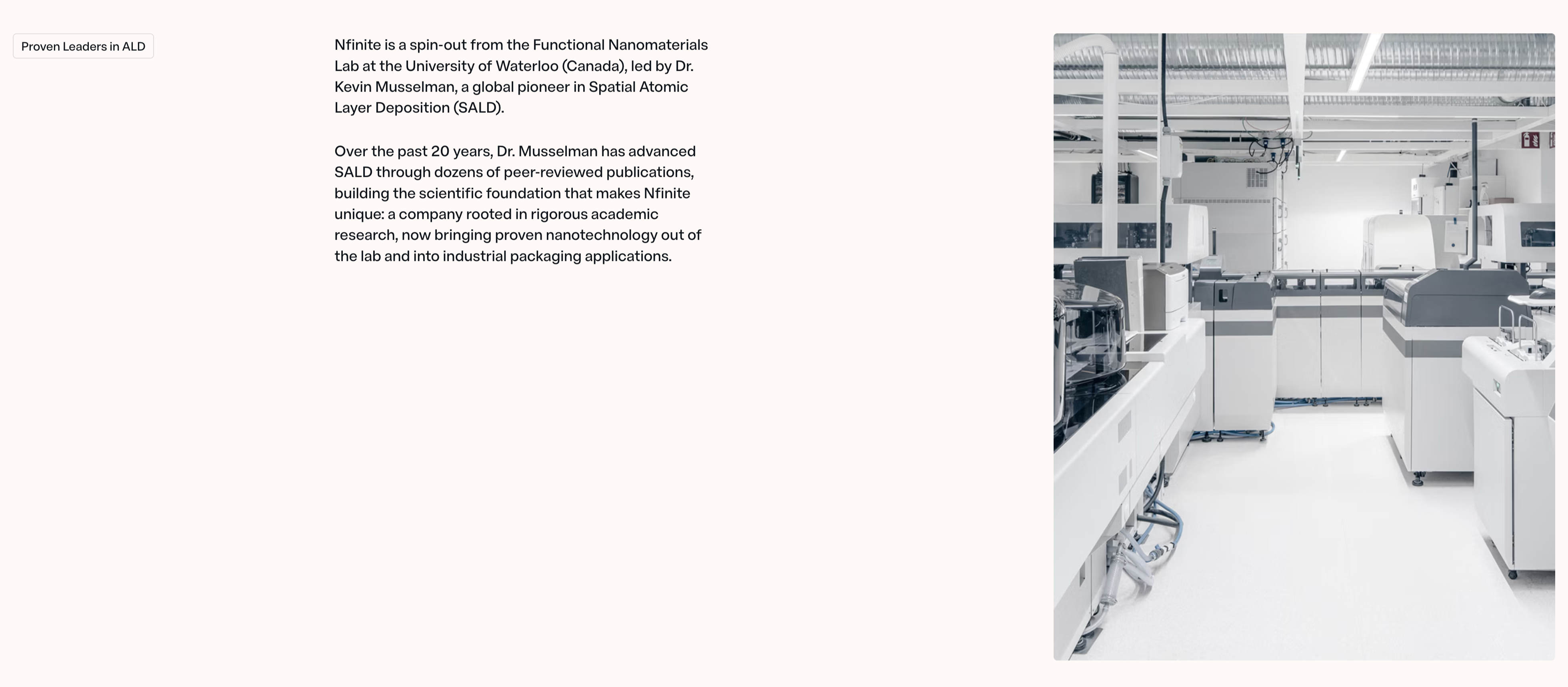
NFINITE Proven Leaders Split Content
A two-column content section on a warm off-white background telling the company-origin story. The left side opens with a small outlined 'Proven Leaders in ALD' eyebrow pill, followed by two paragraphs of dark body copy explaining that 'Nfinite is a spin-out from the Functional Nanomaterials Lab at the University of Waterloo (Canada), led by Dr. Kevin Musselman, a global pioneer in Spatial Atomic Layer Deposition (SALD)' and that two decades of peer-reviewed research now bring proven nanotechnology into industrial packaging. The right half is a large desaturated photograph of a bright, clean lab or production floor lined with white analytical machines and overhead ducting. The roomy left margin, restrained type, and pairing of credentialed narrative with a real facility image give the block a trustworthy, research-grade tone.
Nfinitepaper ↗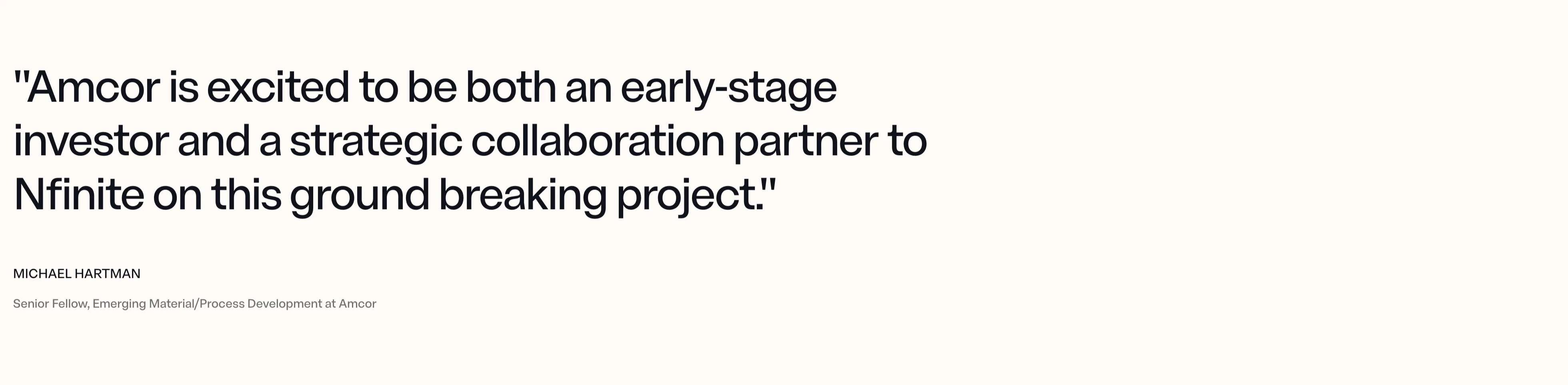
NFINITE Amcor Pull-Quote
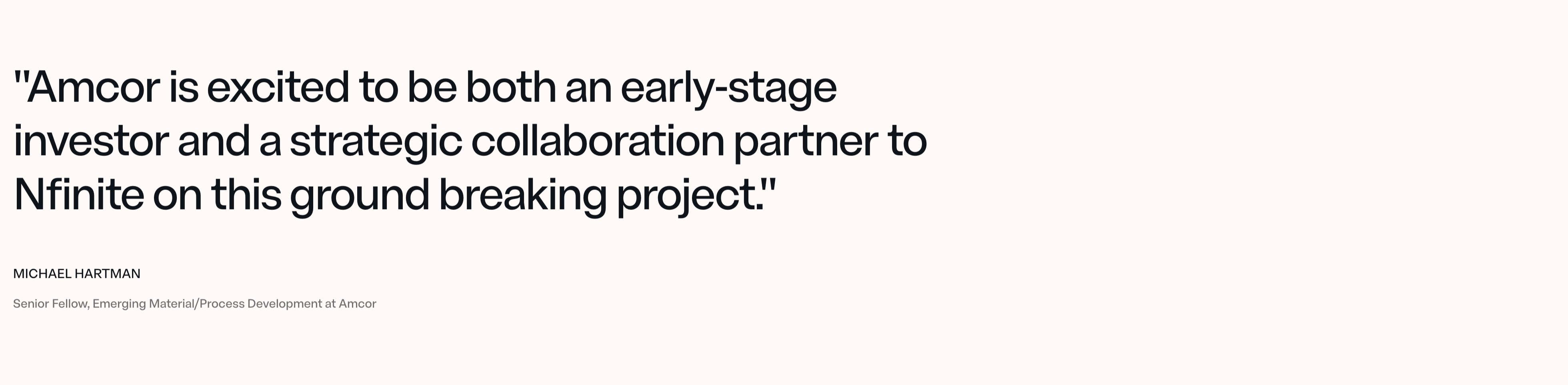
A single-quote testimonial section on a plain warm off-white background, with no card, photo, or border. An oversized near-black sans-serif pull-quote fills the upper-left, wrapping across three lines: "Amcor is excited to be both an early-stage investor and a strategic collaboration partner to Nfinite on this ground breaking project." Below it, the attribution is set small and left-aligned — the name 'MICHAEL HARTMAN' in bold all-caps, and the role 'Senior Fellow, Emerging Material/Process Development at Amcor' in lighter muted grey beneath. The generous empty space and the sheer scale of the quote let the endorsement from a named industry partner carry the whole section, reading as a credibility anchor rather than a decorative review block.
Nfinitepaper ↗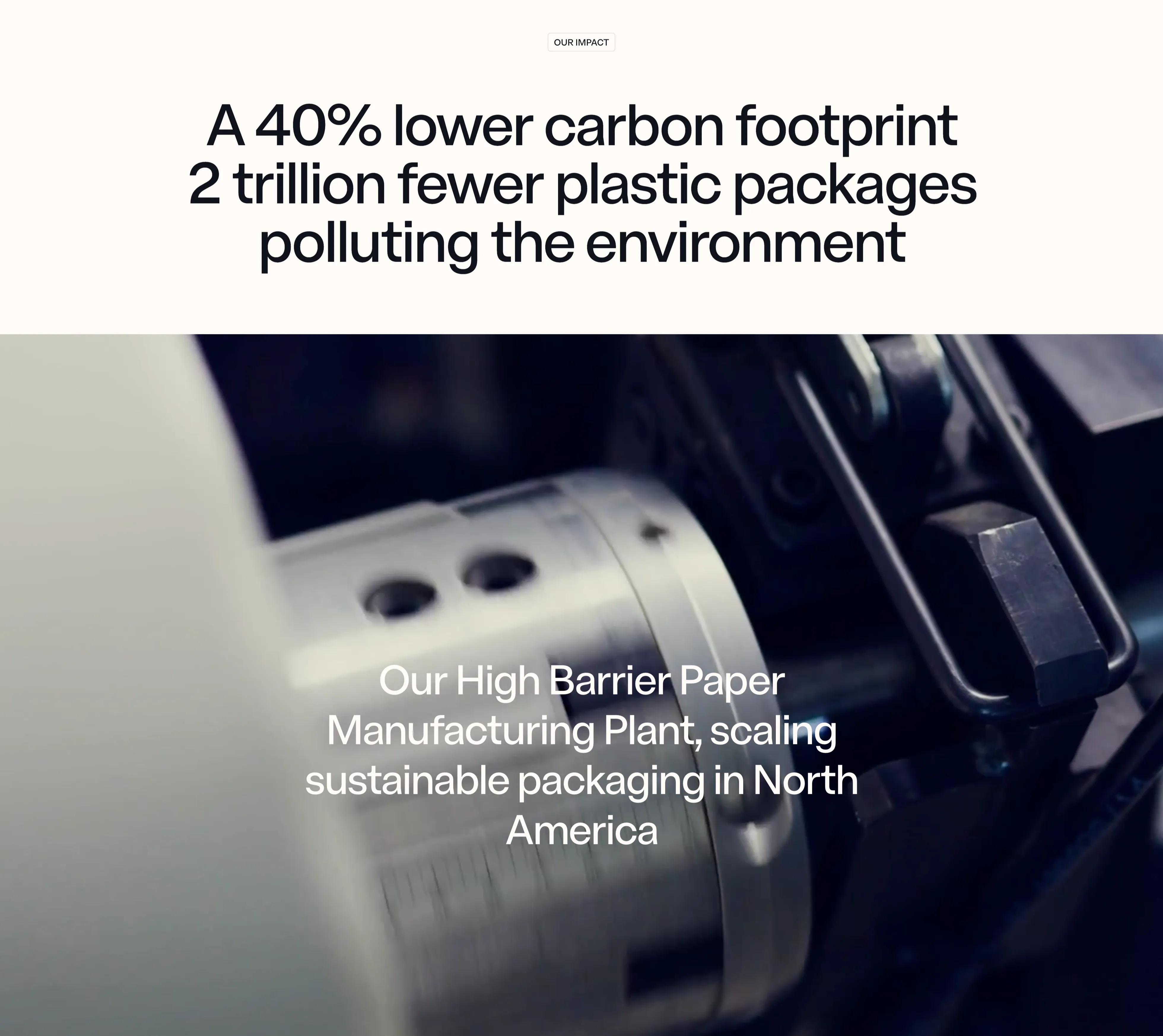
NFINITE Impact Stat Band
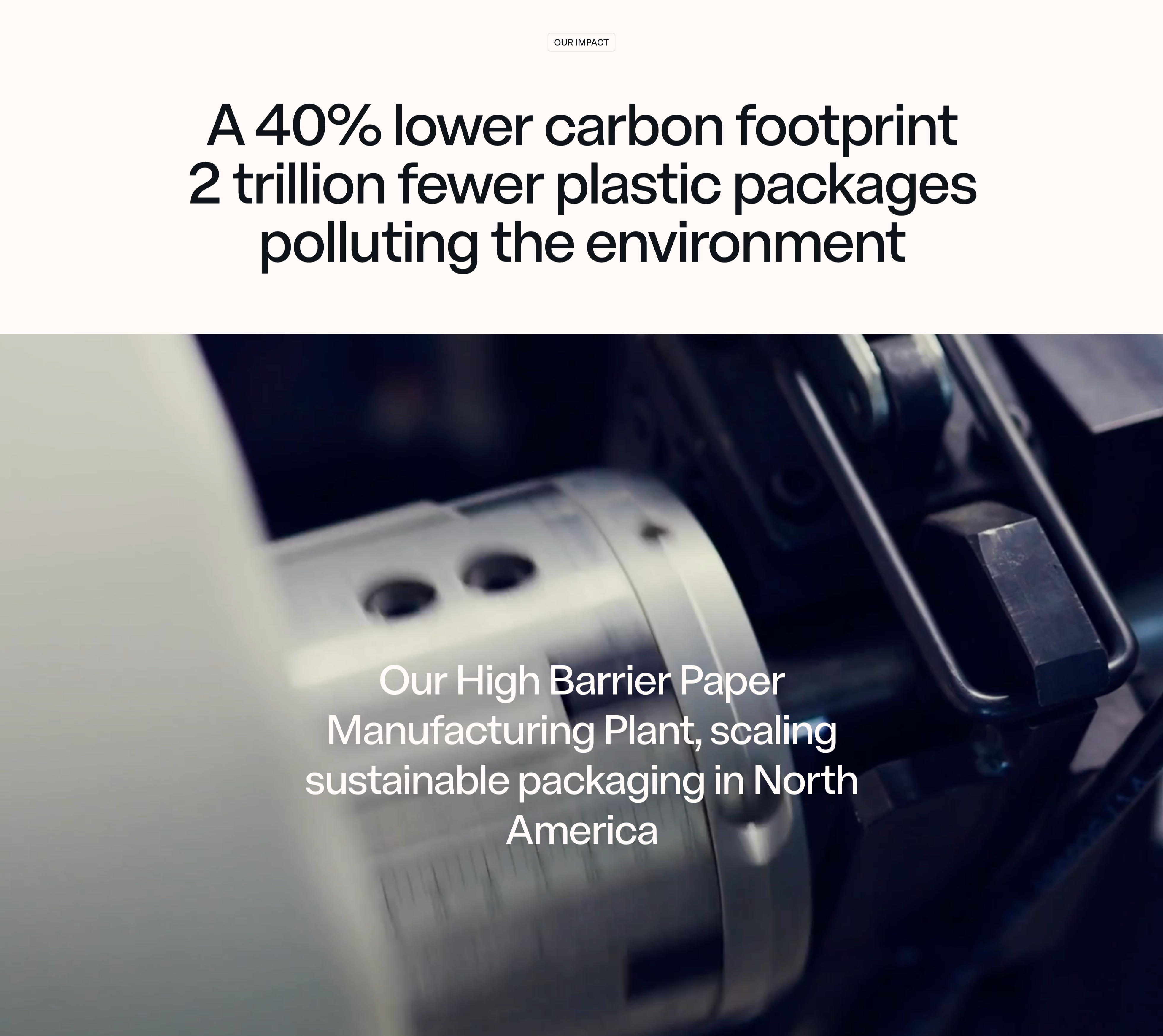
An impact section that pairs a centered stat headline on a warm off-white band with a full-bleed machinery photo below. A small outlined 'OUR IMPACT' eyebrow pill sits at the top, above an oversized near-black sans-serif headline that stacks two claims — 'A 40% lower carbon footprint' and '2 trillion fewer plastic packages polluting the environment' — using sheer type scale rather than separate number tiles to make the figures land. Beneath it, a moody, shallow-depth close-up of a chrome slitting machine and paper roll fills the width, dark on the right and bright on the left. Lower-left over the photo, a white caption reads 'Our High Barrier Paper Manufacturing Plant, scaling sustainable packaging in North America'. The split of crisp light band over cinematic dark imagery, with the metrics carried entirely by typography, gives the impact message a confident, editorial weight.
Nfinitepaper ↗Similar carousel sections
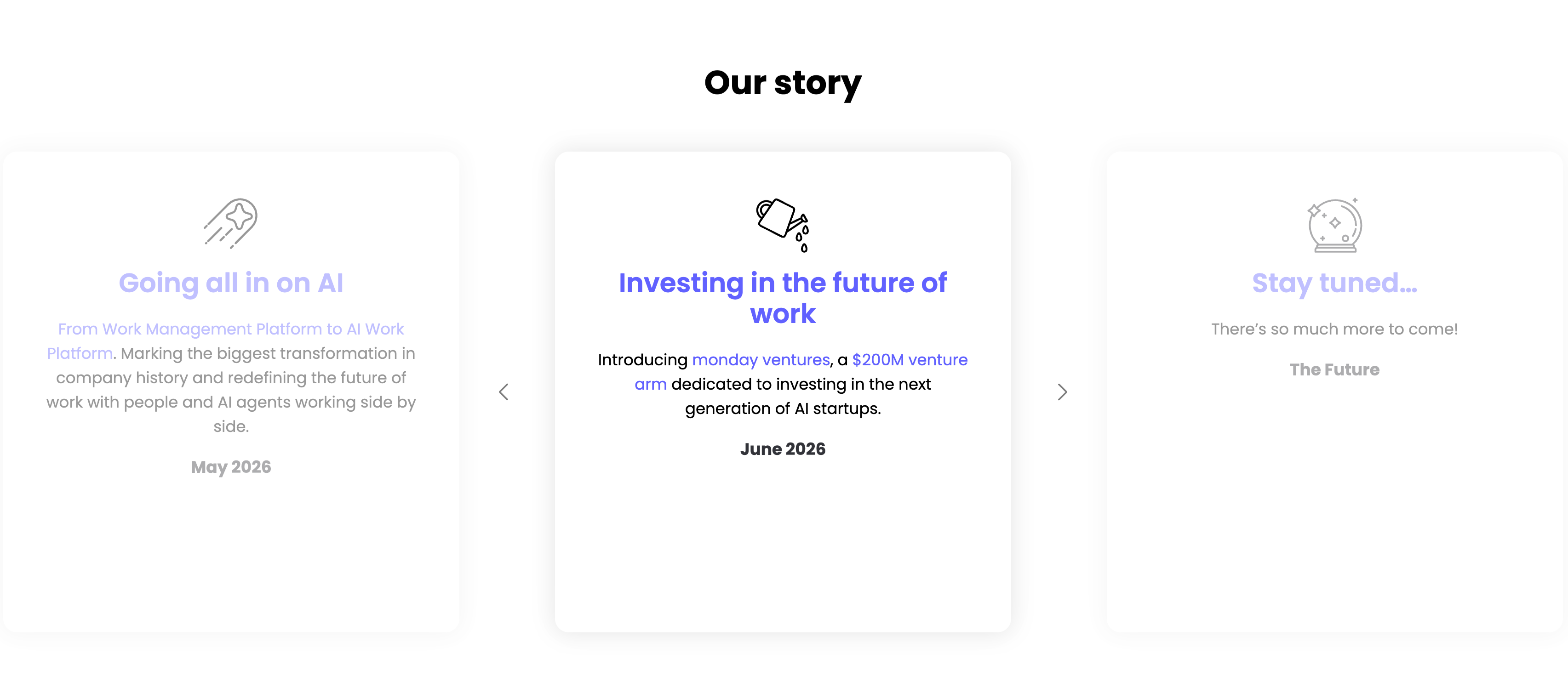
Our Story Timeline Carousel
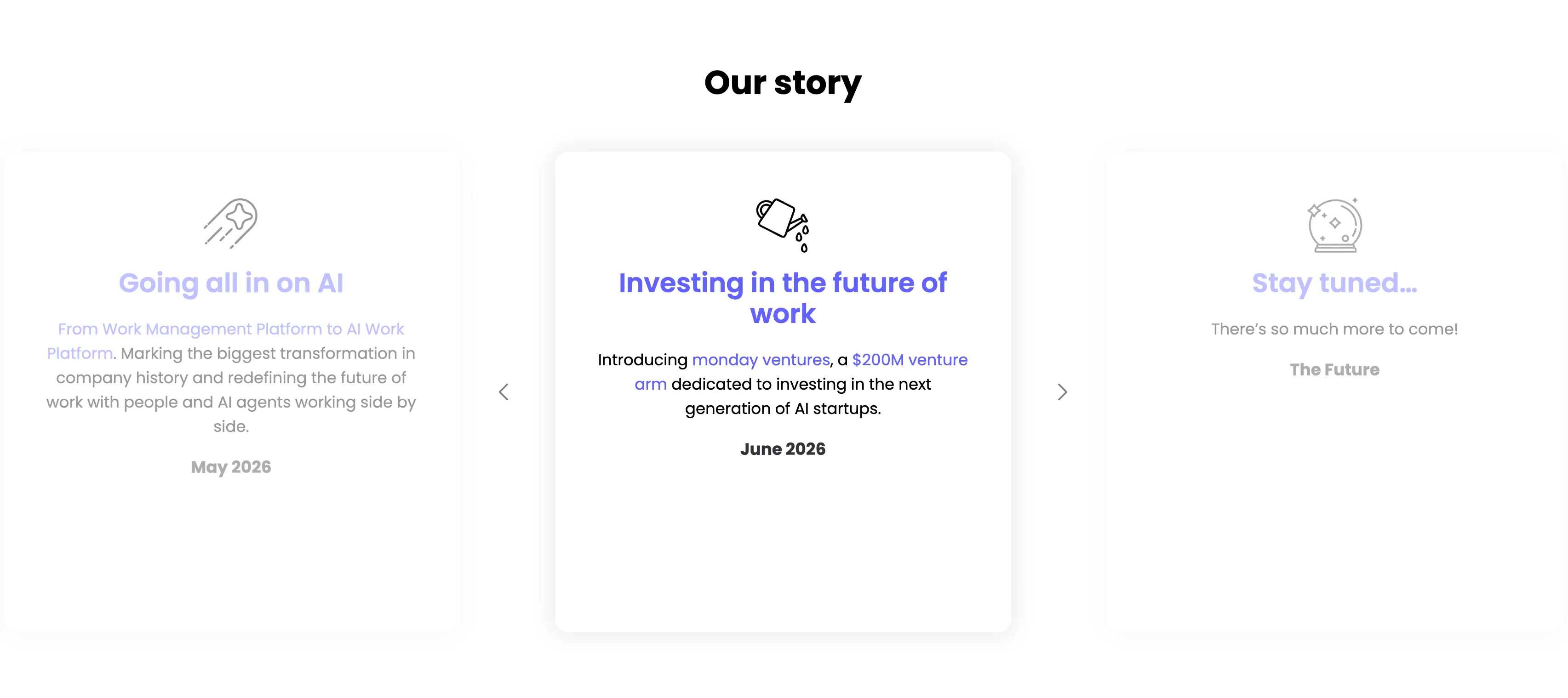
A milestone carousel titled 'Our story', centered on a white background. Three tall rounded cards sit in a row with faded neighbours and left/right chevron arrows signalling more. The center, active card leads with a watering-can line icon and an indigo heading 'Investing in the future of work', body copy 'Introducing monday ventures, a $200M venture arm dedicated to investing in the next generation of AI startups.', and a bold 'June 2026' date. The dimmed left card reads 'Going all in on AI' ('From Work Management Platform to AI Work Platform…', May 2026) and the right card 'Stay tuned…' ('There's so much more to come!', The Future), each with its own line icon. The card-per-milestone format turns the roadmap into an easy horizontal browse.
Monday ↗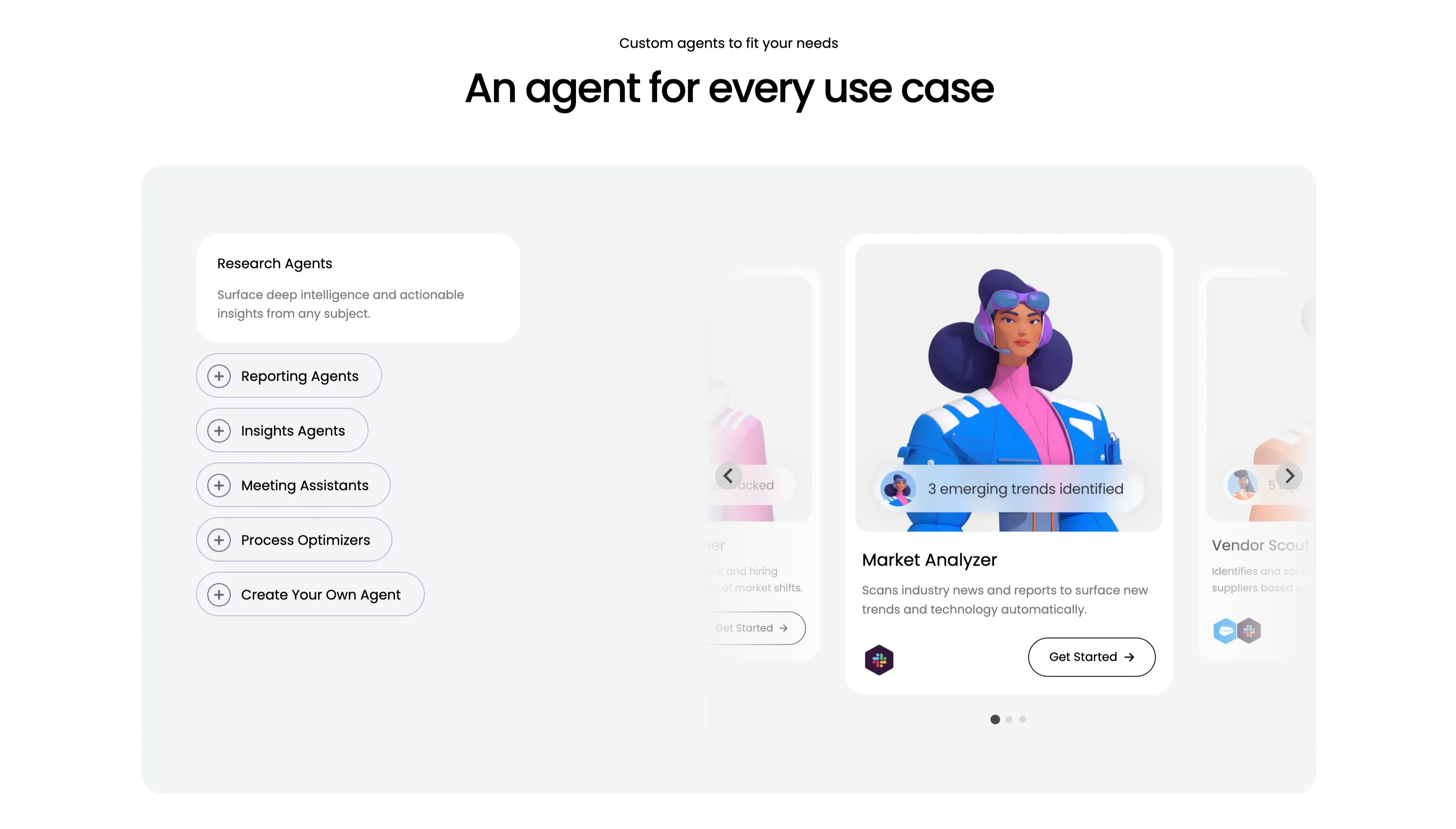
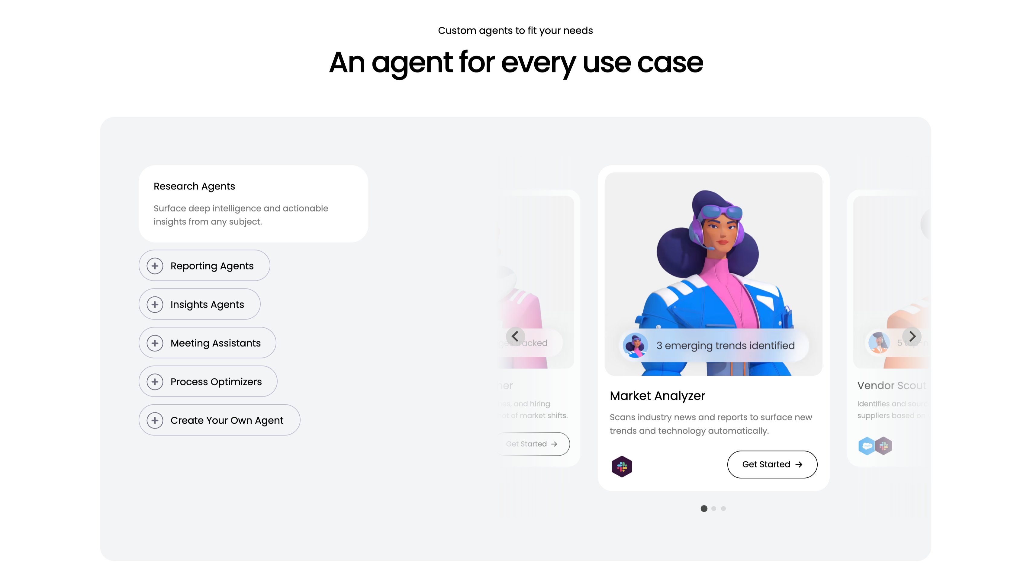
An Agent For Every Use Case Carousel
A use-case carousel introduced by a small 'Custom agents to fit your needs' eyebrow and the centered headline 'An agent for every use case.' Inside a large pale-gray panel, the left column is a vertical selector: a highlighted white 'Research Agents' card ('Surface deep intelligence and actionable insights from any subject.') above outlined pill buttons with plus icons — Reporting Agents, Insights Agents, Meeting Assistants, Process Optimizers and 'Create Your Own Agent.' The right column is a scrollable card deck centered on a 'Market Analyzer' card with a stylised 3D character, a '3 emerging trends identified' chip, the line 'Scans industry news and reports to surface new trends and technology automatically', an integration icon and a 'Get Started' button, flanked by faded neighbouring cards including 'Vendor Scout.' Circular arrows and three pagination dots confirm it scrolls. The category list plus previewed agent cards make the breadth easy to browse.
Monday ↗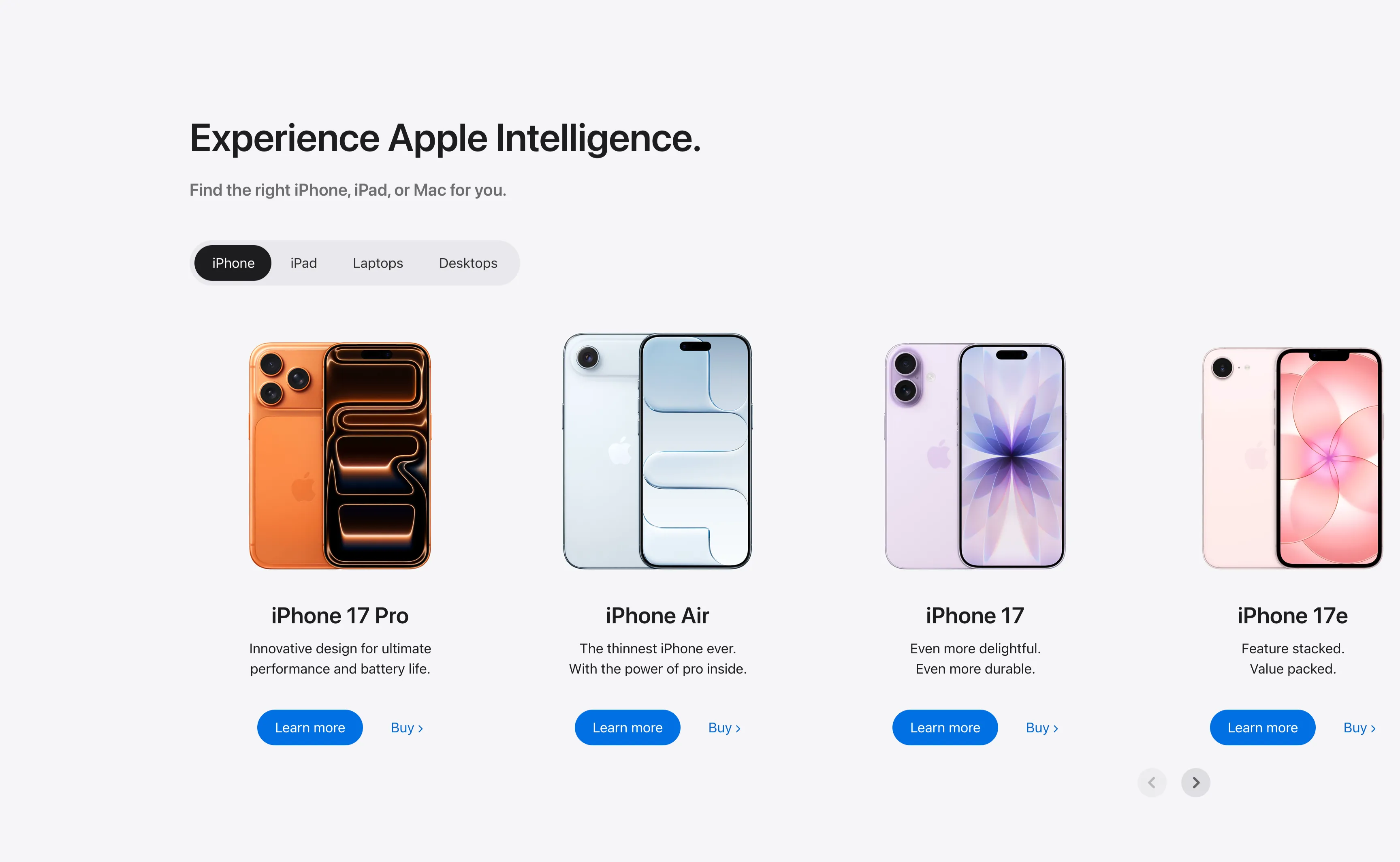
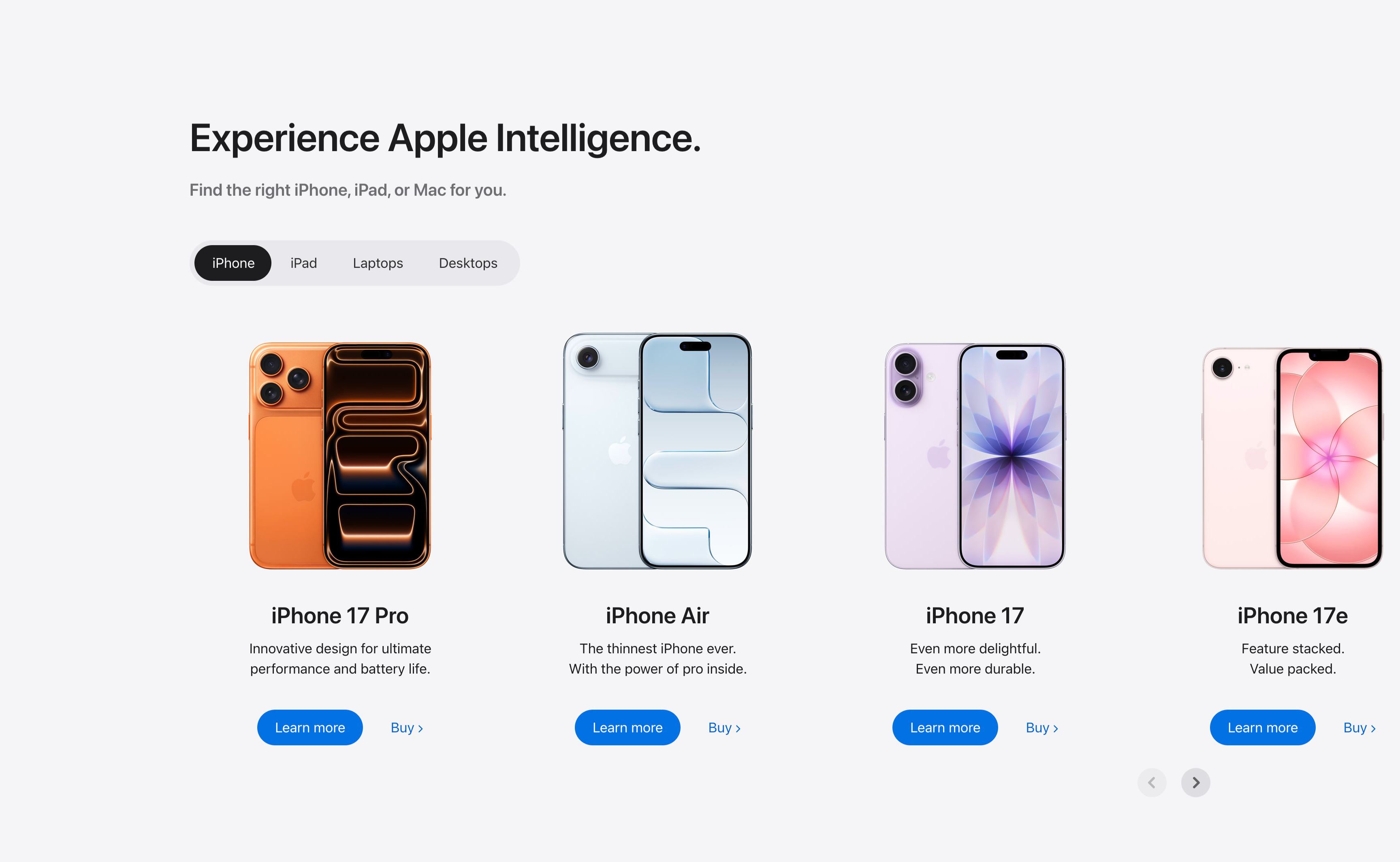
Experience Apple Intelligence Product Carousel
A product-finder carousel headed 'Experience Apple Intelligence.' with the subhead 'Find the right iPhone, iPad, or Mac for you.' A pill-shaped tab switcher offers iPhone (selected, dark), iPad, Laptops and Desktops. Below it four product cards sit in a scrollable row, each showing a device render, a bold model name, a two-line tagline, a solid blue 'Learn more' button and a 'Buy' text link: iPhone 17 Pro (orange), iPhone Air (light blue), iPhone 17 (purple) and iPhone 17e (pink). Circular previous/next arrows in the lower right reveal further models. The tabbed filter plus dual learn/buy calls-to-action make it a conversion-focused product showcase.
Apple ↗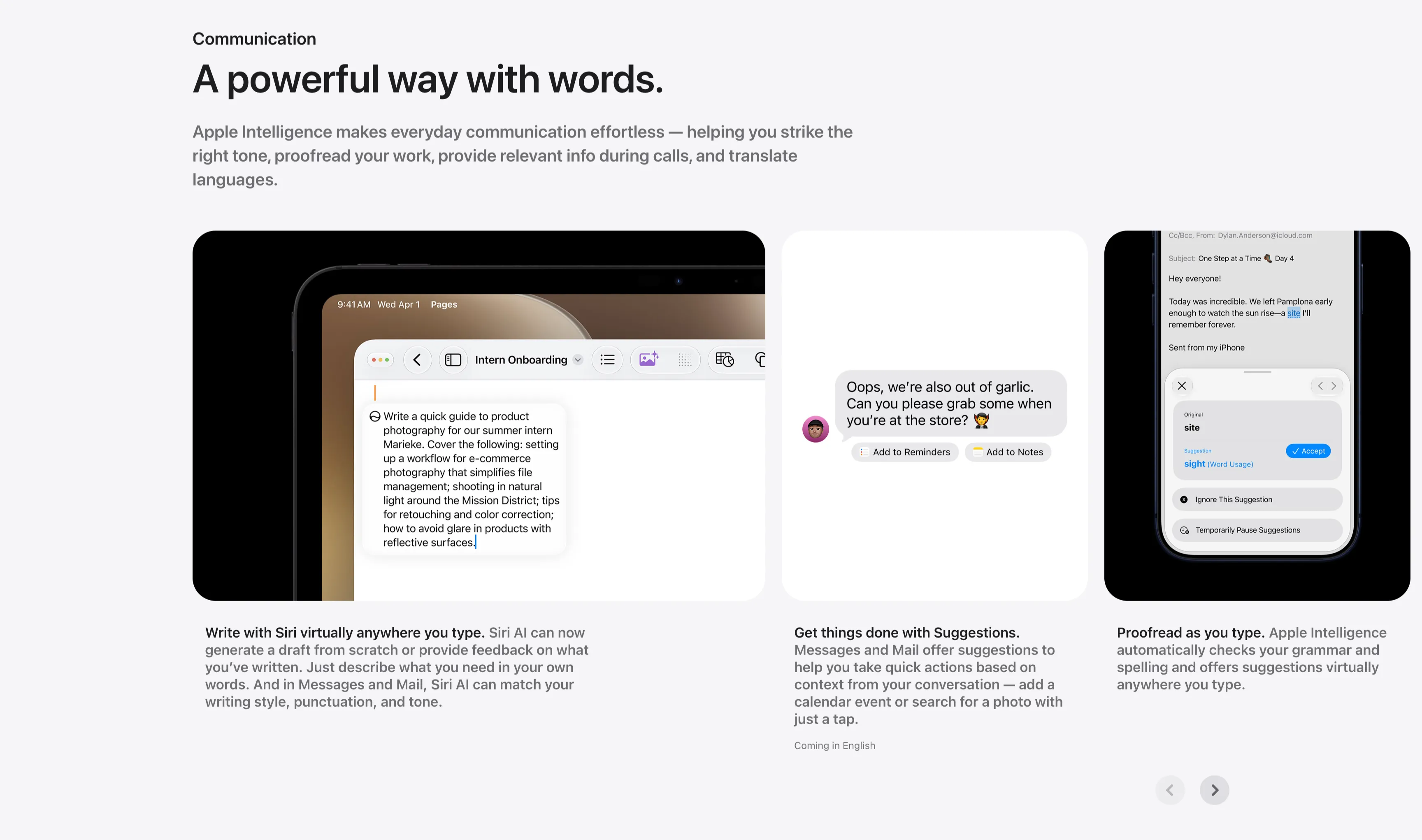
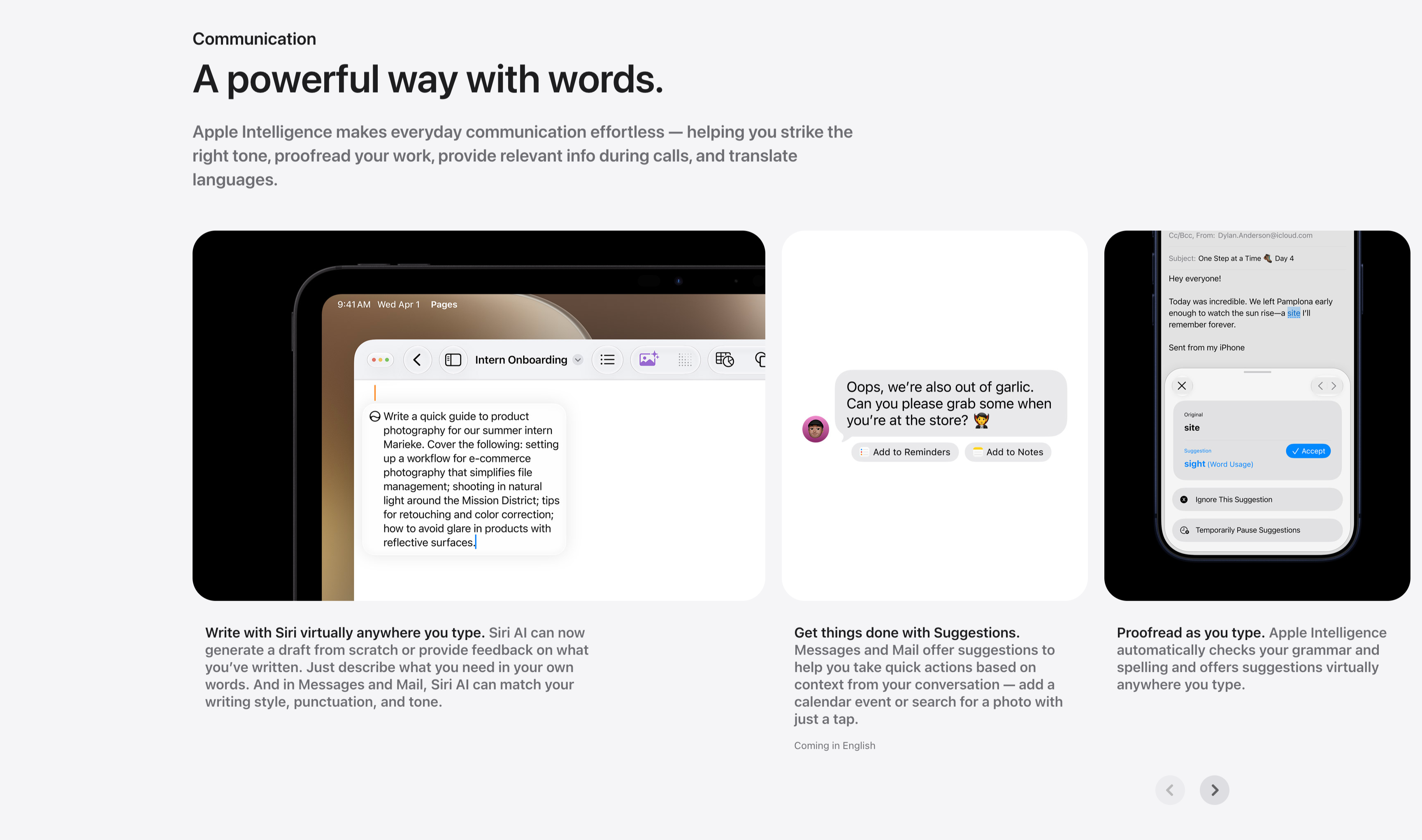
Communication Three-Up Feature Carousel
A communication feature row under a small 'Communication' label and the headline 'A powerful way with words.', with a gray paragraph about striking the right tone, proofreading and translating. Three cards sit side by side, each a screenshot with a bold-lead caption beneath: an iPad in Pages drafting a product-photography guide ('Write with Siri virtually anywhere you type.'), a Messages thread offering 'Add to Reminders' and 'Add to Notes' suggestion chips ('Get things done with Suggestions.'), and a Mail proofreading panel suggesting 'site' → 'sight' with an Accept button ('Proofread as you type.'). Circular previous/next arrows in the lower right indicate more cards. The consistent three-up screenshot layout keeps the writing-tool capabilities clear and comparable.
Apple ↗