Photos And Images Editing Carousel
Description
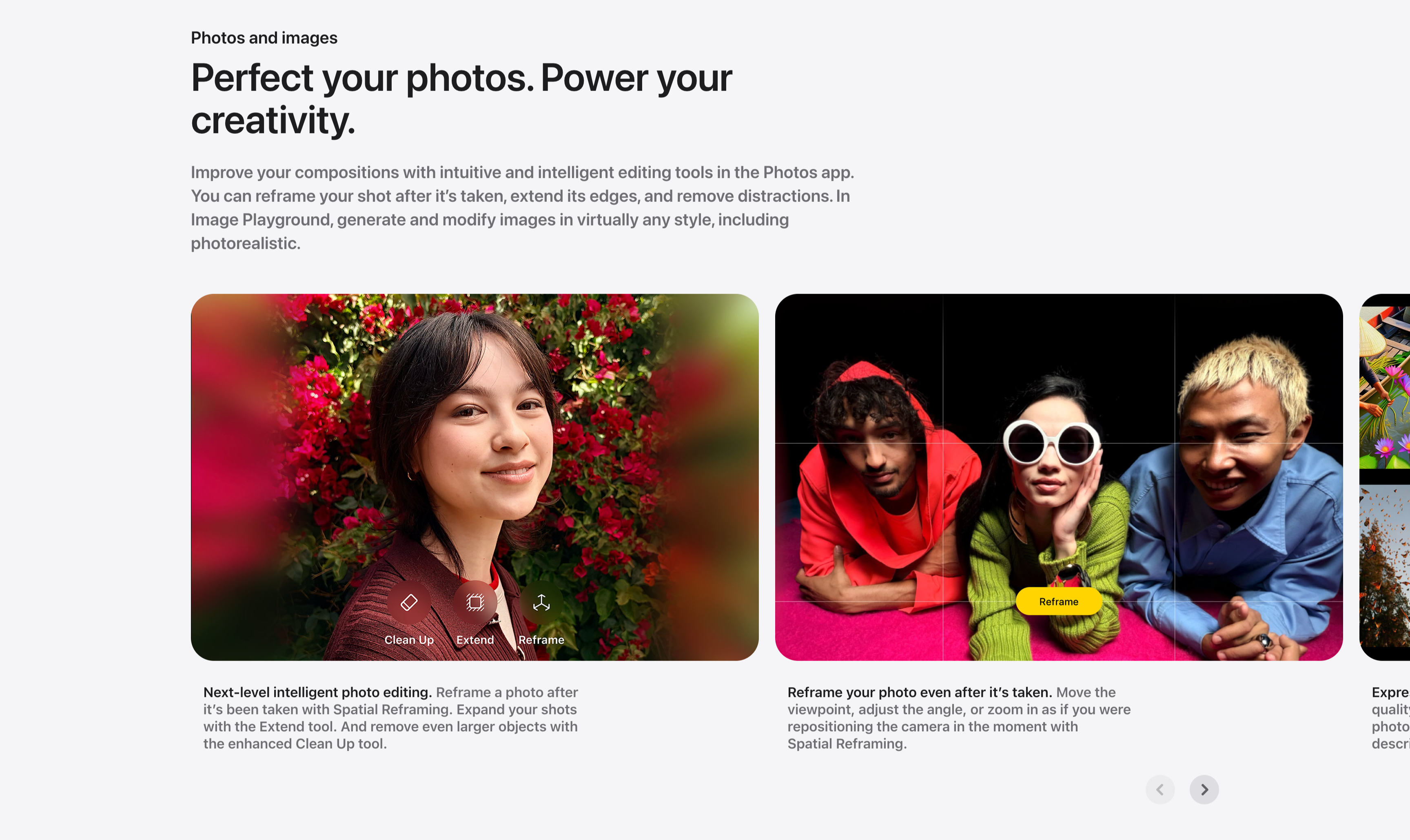
A photo-editing showcase carousel introduced by a small ‘Photos and images’ label and a two-line headline, ‘Perfect your photos. Power your creativity.’, with a gray paragraph about reframing, extending and Image Playground. Below, large rounded image cards scroll horizontally: a portrait of a woman against red bougainvillea overlaid with Clean Up, Extend and Reframe tool icons (‘Next-level intelligent photo editing.’), and a wide shot of three friends on a pink floor with a Reframe grid and yellow ‘Reframe’ button (‘Reframe your photo even after it’s taken.’), with a third card just entering from the right edge. Bold-lead captions sit beneath each card and circular previous/next arrows anchor the lower right. The full-bleed photography and on-image tool chips make the editing features feel tangible.
Related
Legal Footnotes And Multi-Column Footer
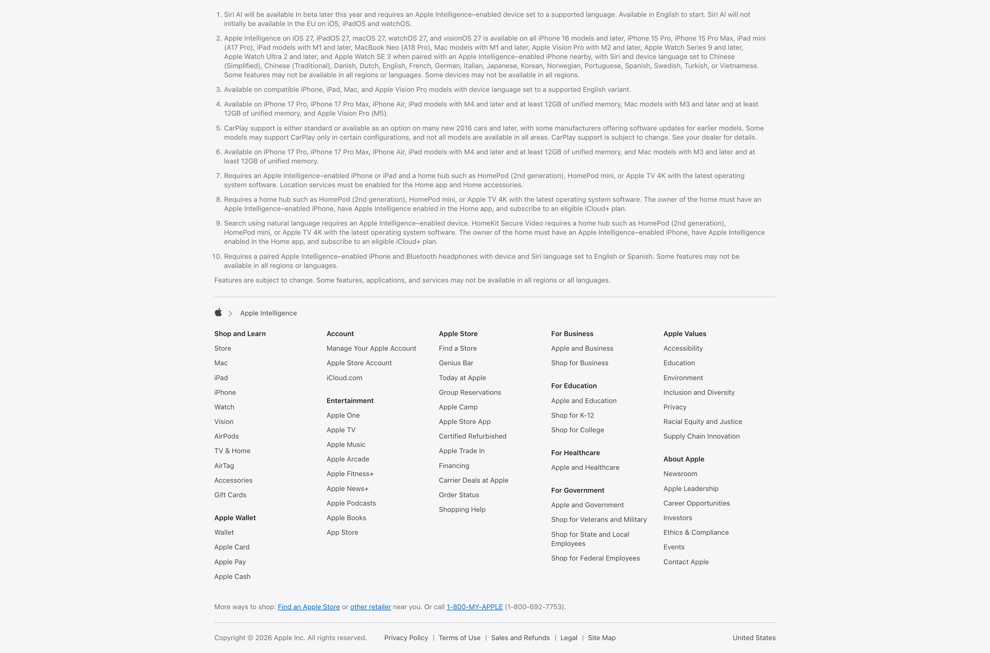
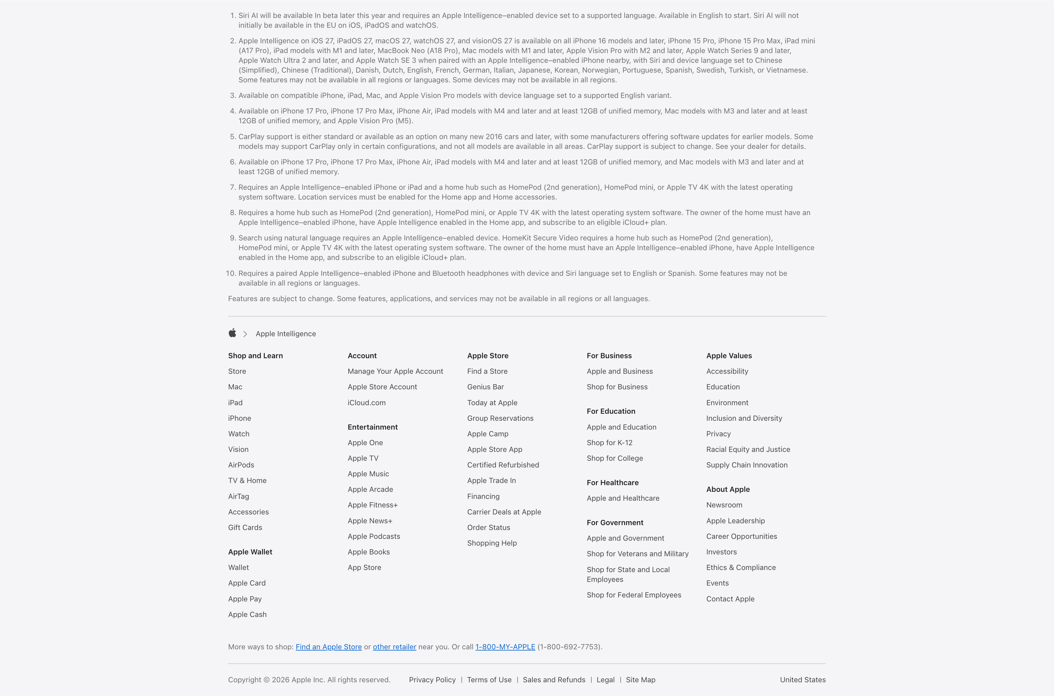
A combined footnotes-and-footer block on white. The top portion is a numbered list of ten fine-print legal disclaimers covering Siri AI availability, supported devices and languages, CarPlay and HomeKit requirements, set in small gray type. Below a hairline divider an Apple-logo breadcrumb ('Apple > Apple Intelligence') introduces the standard Apple footer: a five-plus-column grid of link groups — Shop and Learn, Apple Wallet, Account, Entertainment, Apple Store, For Business, For Education, For Healthcare, For Government, Apple Values and About Apple — each a stack of small text links. A 'More ways to shop' line with a phone number and a bottom row of copyright, Privacy Policy, Terms of Use, Legal, Site Map and the 'United States' region close it out. The dense, orderly columns are a classic global-footer pattern.
Apple ↗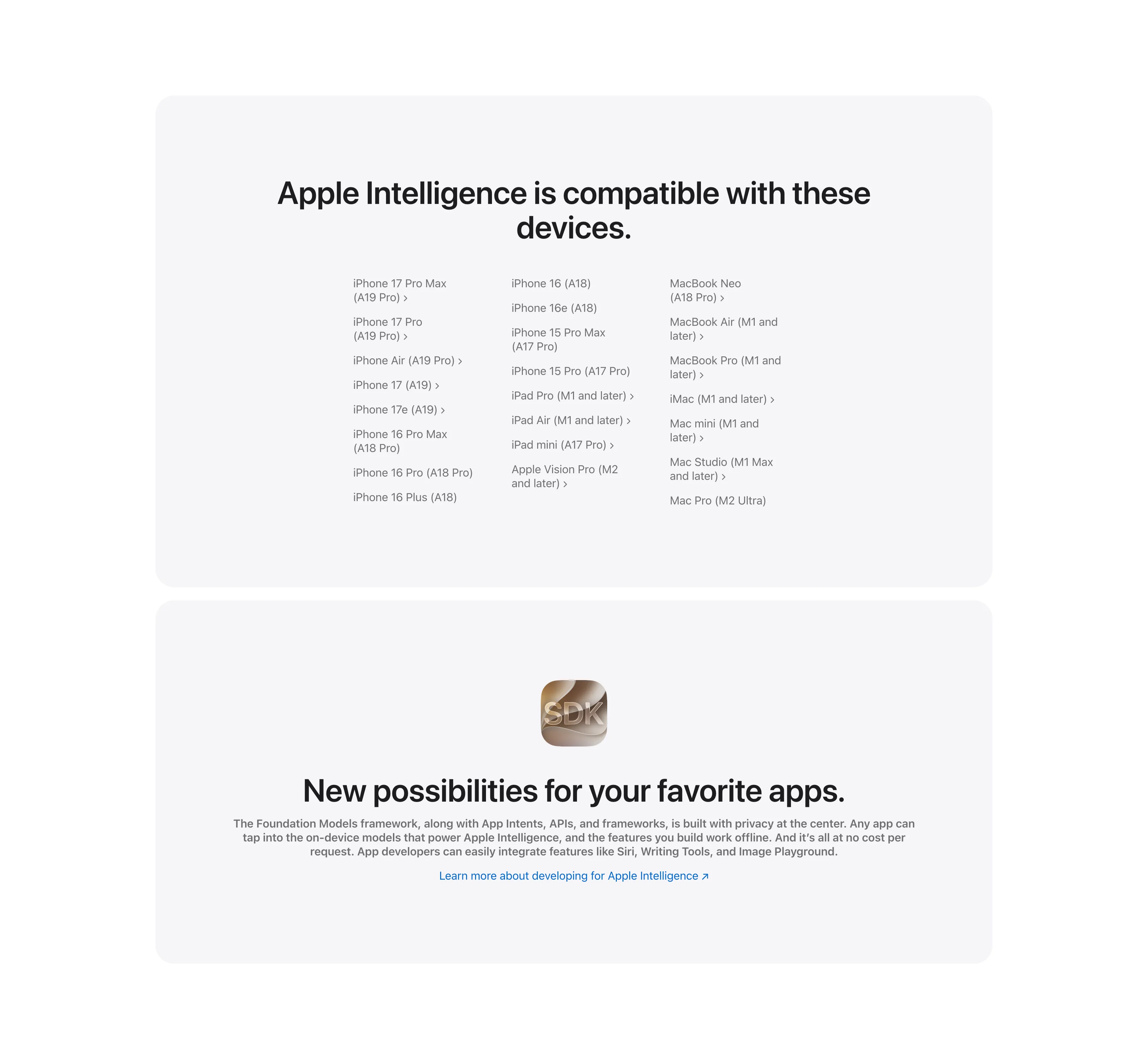
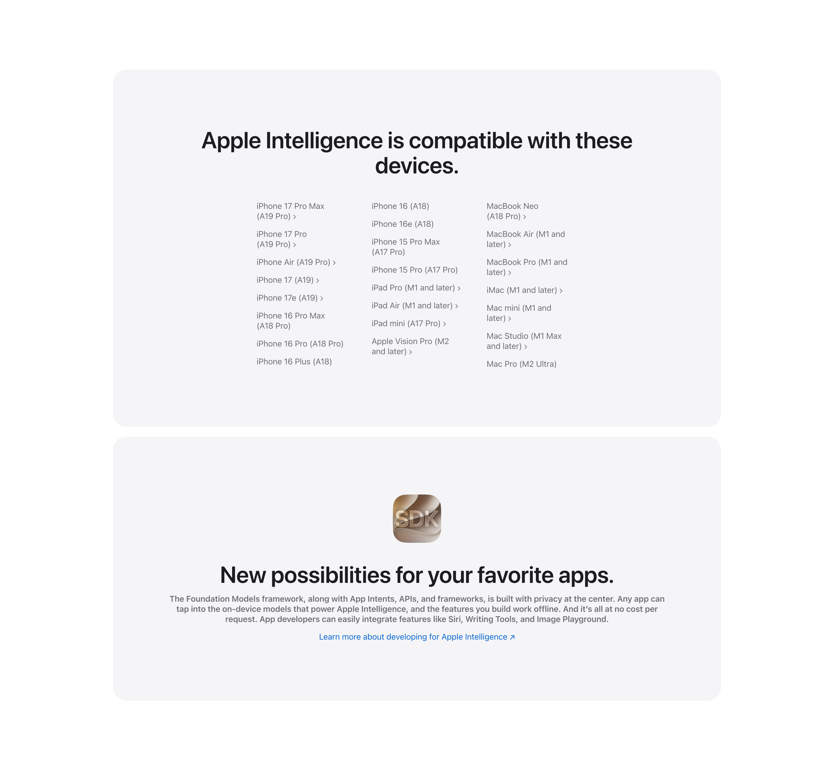
Compatible Devices List And Developer SDK Cards
Two stacked pale-gray rounded cards. The upper card, headed 'Apple Intelligence is compatible with these devices.', lays out a long three-column list of supported hardware — iPhone 17 Pro Max through iPhone 16 models, iPad Pro/Air/mini and Apple Vision Pro, and Mac models from MacBook Neo to Mac Pro — many entries carrying chevron links to detail pages. The lower card centers a glossy 'SDK' app icon above the bold headline 'New possibilities for your favorite apps.', a gray paragraph about the Foundation Models framework and App Intents, and a blue 'Learn more about developing for Apple Intelligence' link. The restrained monochrome cards keep the dense reference content and the developer call-to-action visually calm.
Apple ↗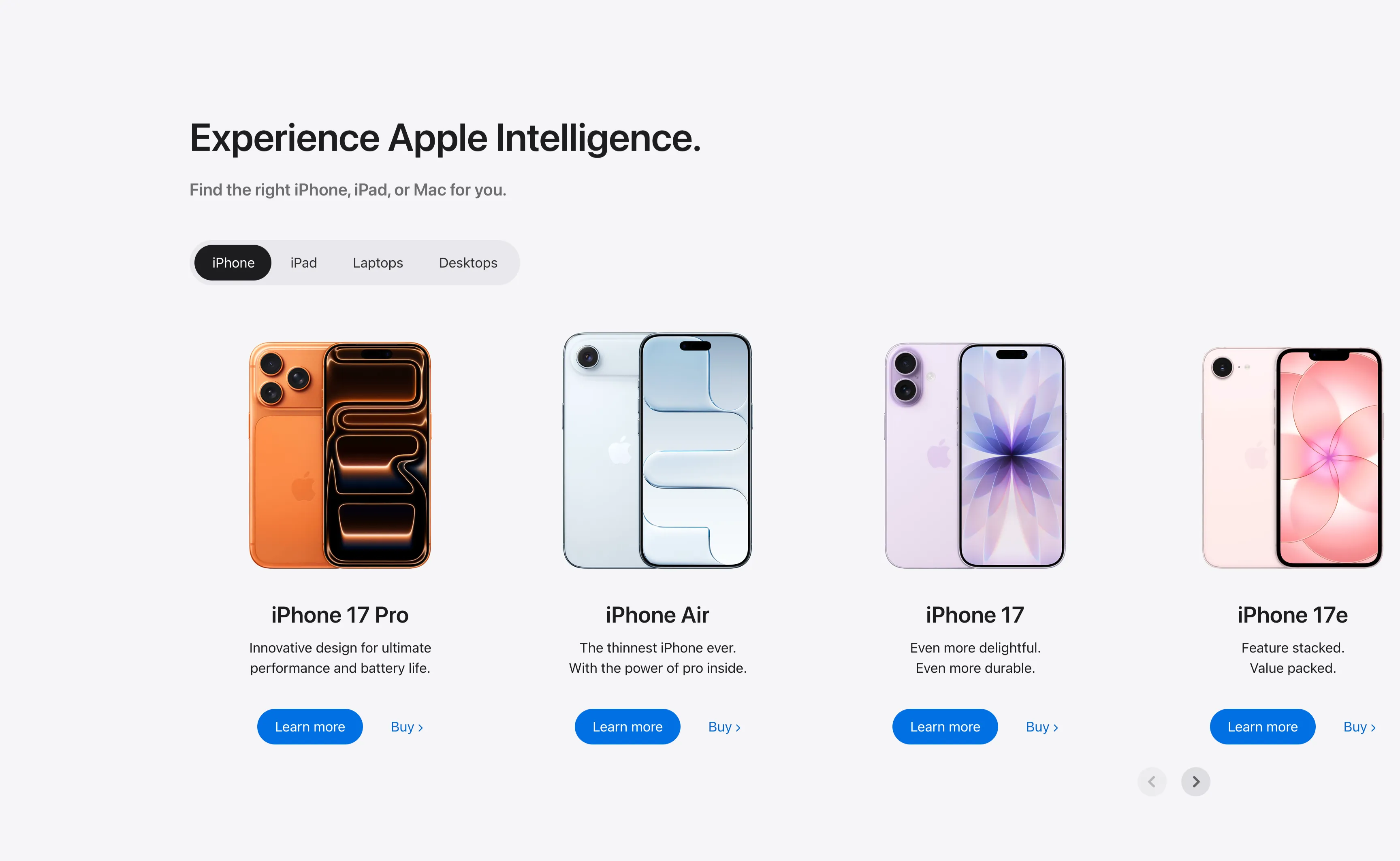
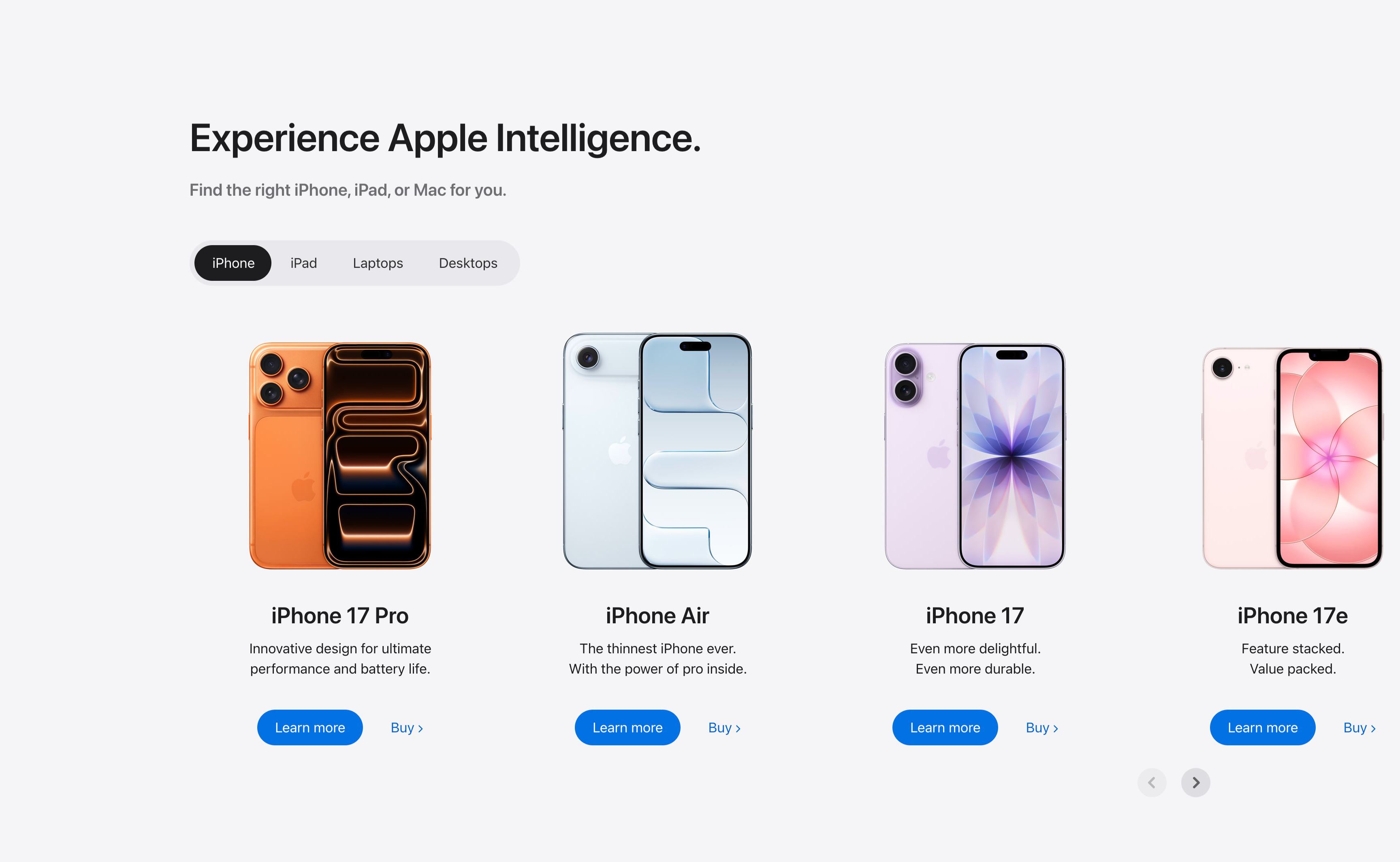
Experience Apple Intelligence Product Carousel
A product-finder carousel headed 'Experience Apple Intelligence.' with the subhead 'Find the right iPhone, iPad, or Mac for you.' A pill-shaped tab switcher offers iPhone (selected, dark), iPad, Laptops and Desktops. Below it four product cards sit in a scrollable row, each showing a device render, a bold model name, a two-line tagline, a solid blue 'Learn more' button and a 'Buy' text link: iPhone 17 Pro (orange), iPhone Air (light blue), iPhone 17 (purple) and iPhone 17e (pink). Circular previous/next arrows in the lower right reveal further models. The tabbed filter plus dual learn/buy calls-to-action make it a conversion-focused product showcase.
Apple ↗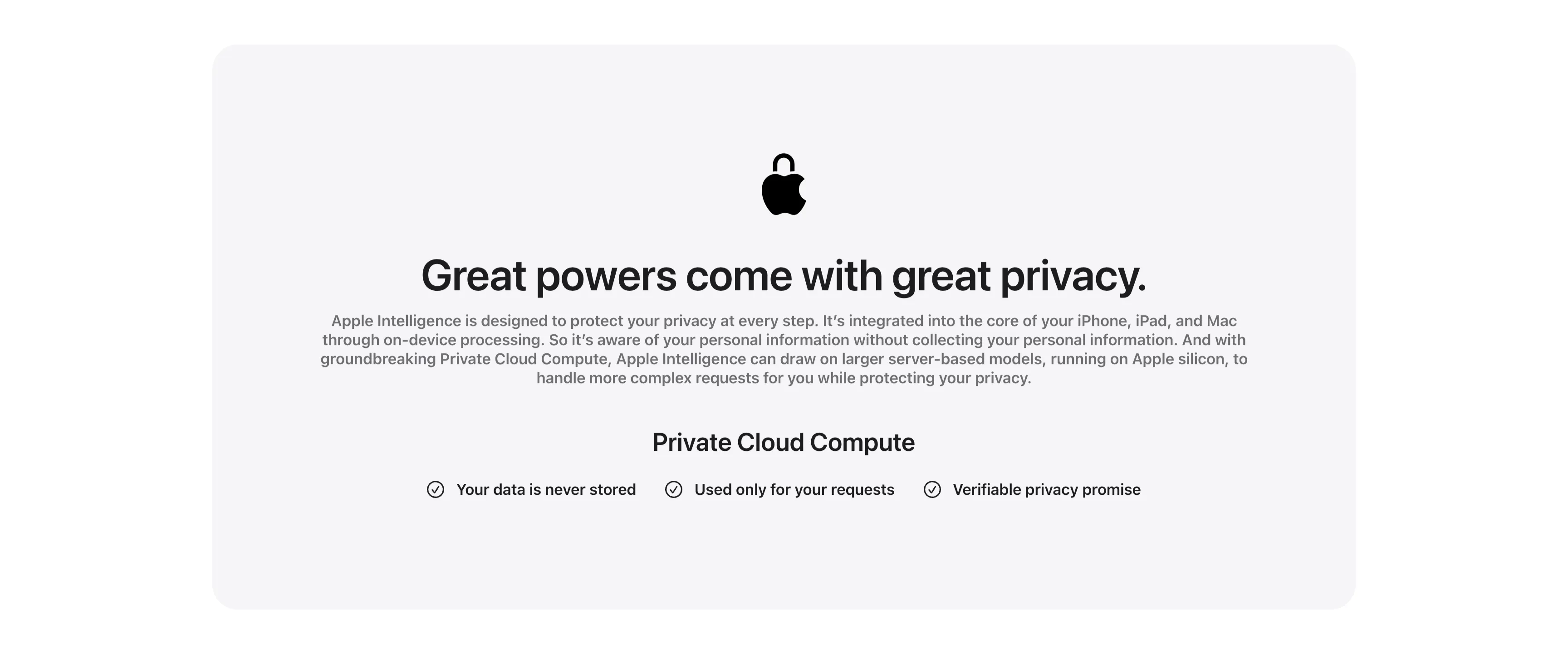
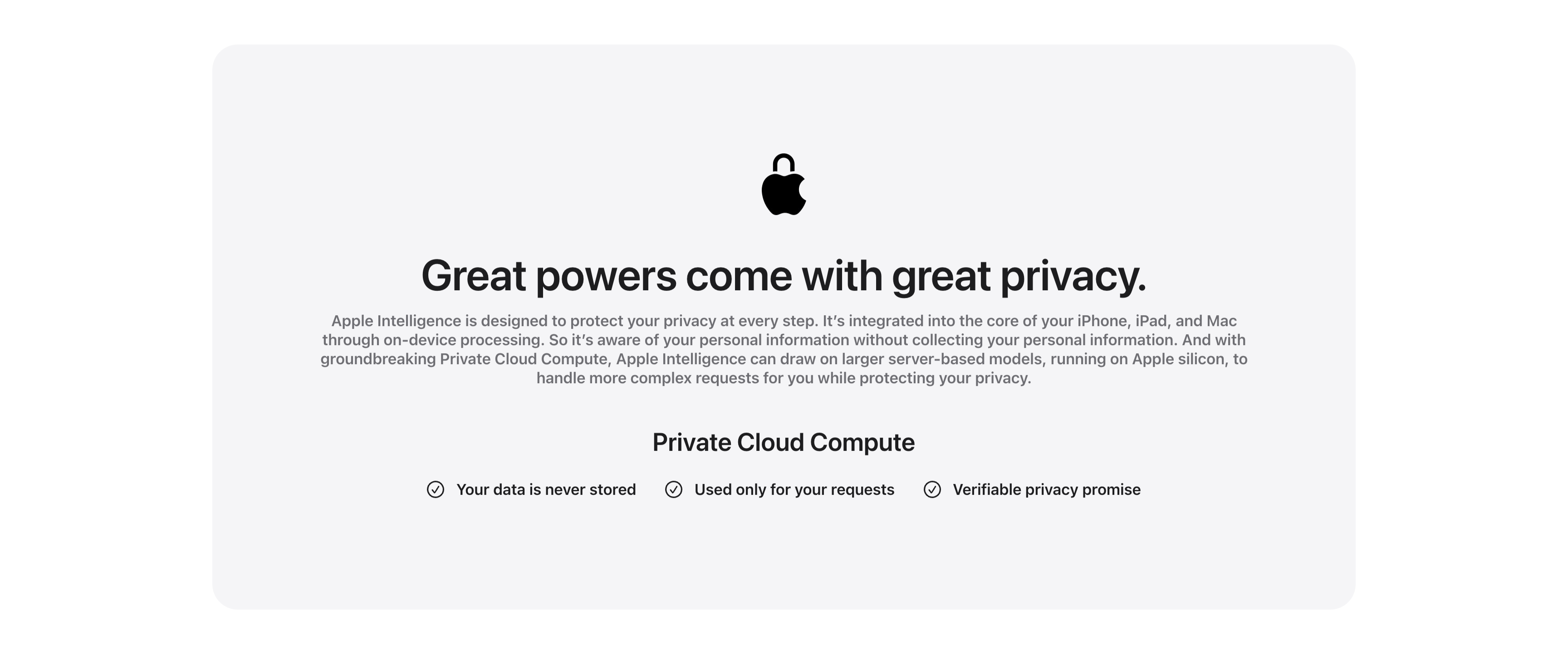
Great Powers Come With Great Privacy Band
A centered privacy content band housed in a large pale-gray rounded card. At the top a black Apple logo rendered as a padlock sits above the centered headline 'Great powers come with great privacy.' A justified gray paragraph explains on-device processing and Private Cloud Compute running on Apple silicon. Below, a bold 'Private Cloud Compute' subhead introduces a single horizontal row of three checkmarked claims — 'Your data is never stored', 'Used only for your requests' and 'Verifiable privacy promise' — each prefixed by a circled check icon. The symmetrical, generously padded layout and restrained monochrome palette give the privacy message a calm, trustworthy, reassuring tone.
Apple ↗Similar carousel sections
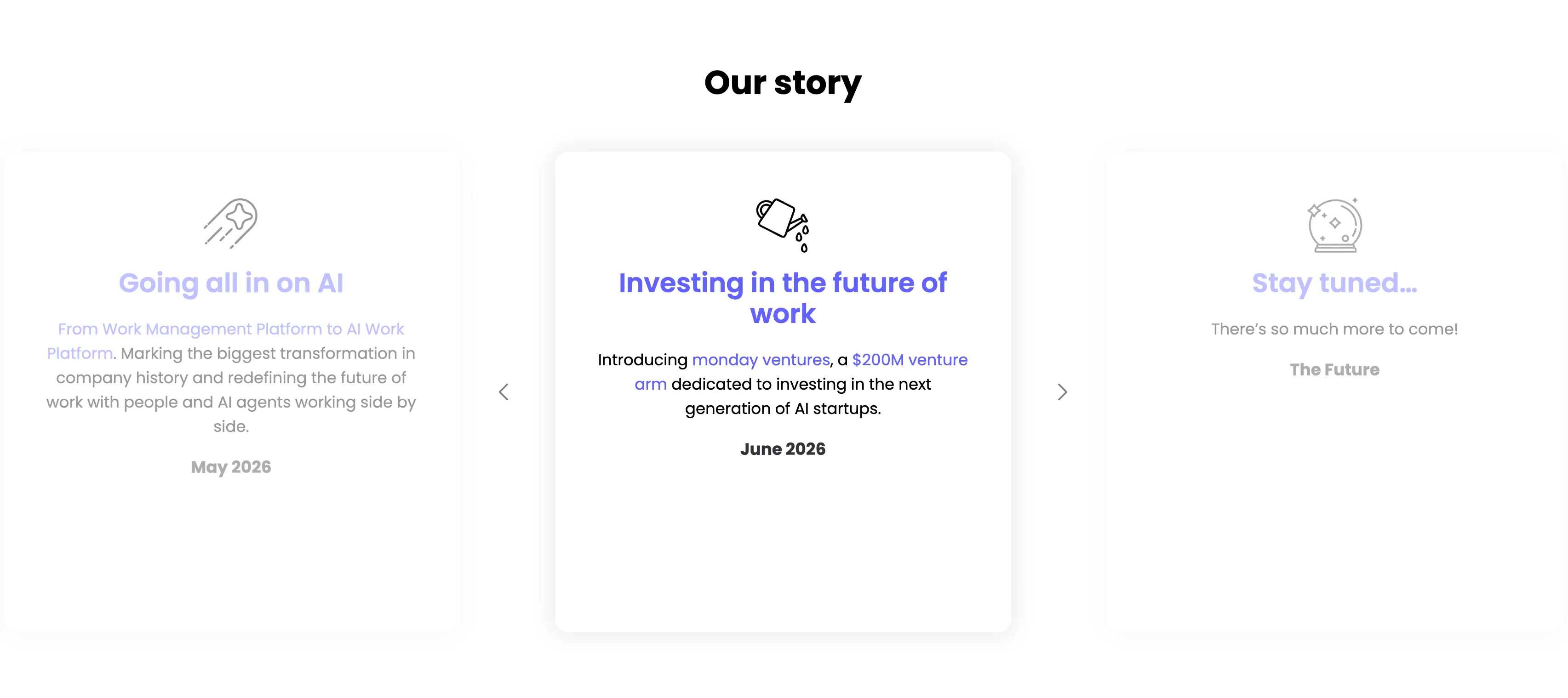
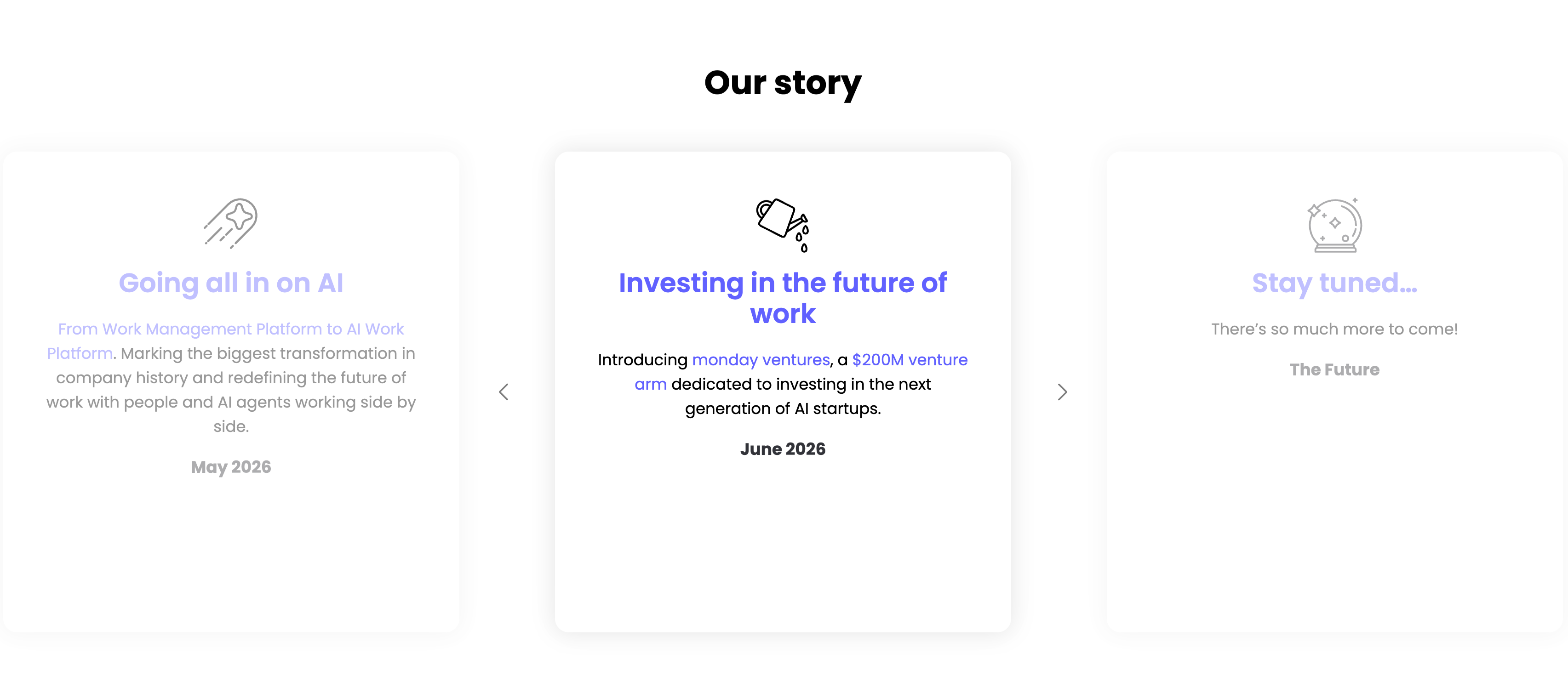
Our Story Timeline Carousel
A milestone carousel titled 'Our story', centered on a white background. Three tall rounded cards sit in a row with faded neighbours and left/right chevron arrows signalling more. The center, active card leads with a watering-can line icon and an indigo heading 'Investing in the future of work', body copy 'Introducing monday ventures, a $200M venture arm dedicated to investing in the next generation of AI startups.', and a bold 'June 2026' date. The dimmed left card reads 'Going all in on AI' ('From Work Management Platform to AI Work Platform…', May 2026) and the right card 'Stay tuned…' ('There's so much more to come!', The Future), each with its own line icon. The card-per-milestone format turns the roadmap into an easy horizontal browse.
Monday ↗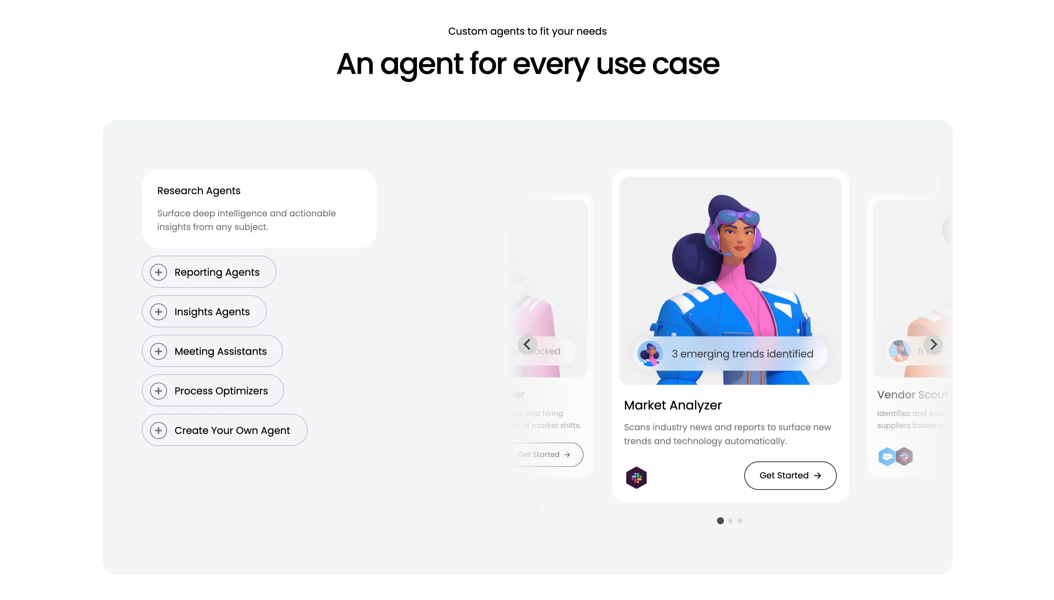
An Agent For Every Use Case Carousel
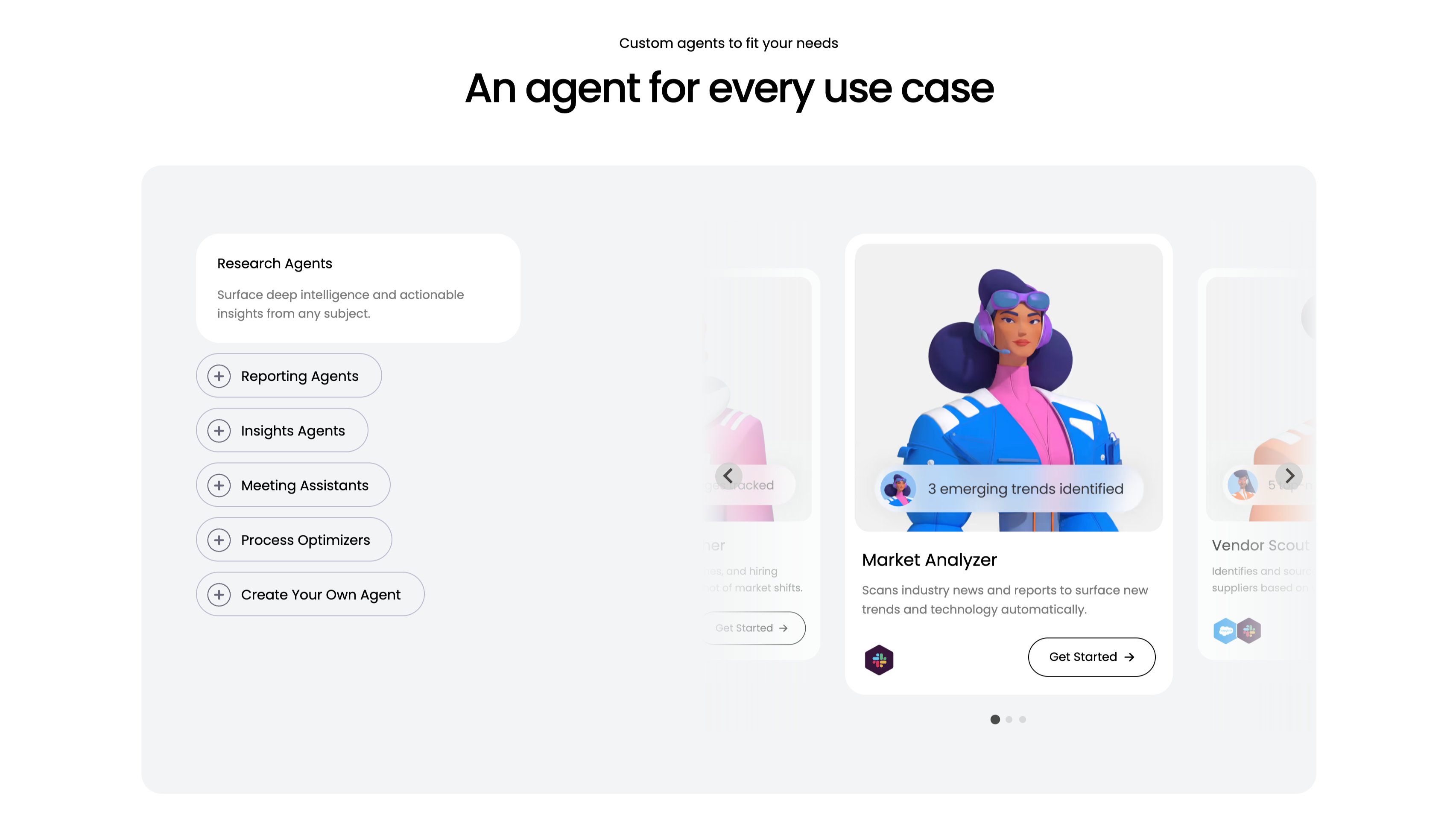
A use-case carousel introduced by a small 'Custom agents to fit your needs' eyebrow and the centered headline 'An agent for every use case.' Inside a large pale-gray panel, the left column is a vertical selector: a highlighted white 'Research Agents' card ('Surface deep intelligence and actionable insights from any subject.') above outlined pill buttons with plus icons — Reporting Agents, Insights Agents, Meeting Assistants, Process Optimizers and 'Create Your Own Agent.' The right column is a scrollable card deck centered on a 'Market Analyzer' card with a stylised 3D character, a '3 emerging trends identified' chip, the line 'Scans industry news and reports to surface new trends and technology automatically', an integration icon and a 'Get Started' button, flanked by faded neighbouring cards including 'Vendor Scout.' Circular arrows and three pagination dots confirm it scrolls. The category list plus previewed agent cards make the breadth easy to browse.
Monday ↗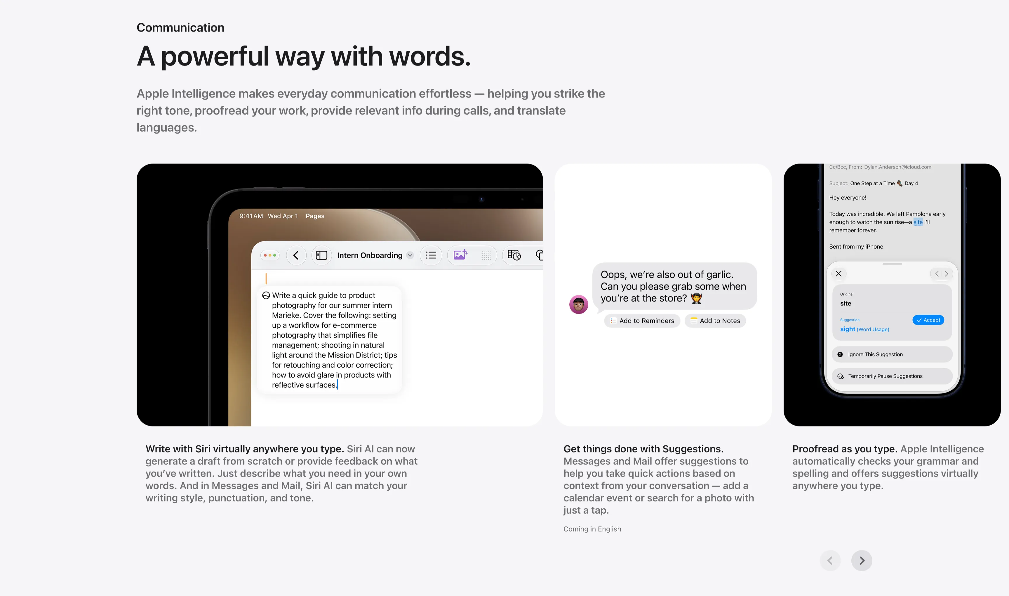
Communication Three-Up Feature Carousel
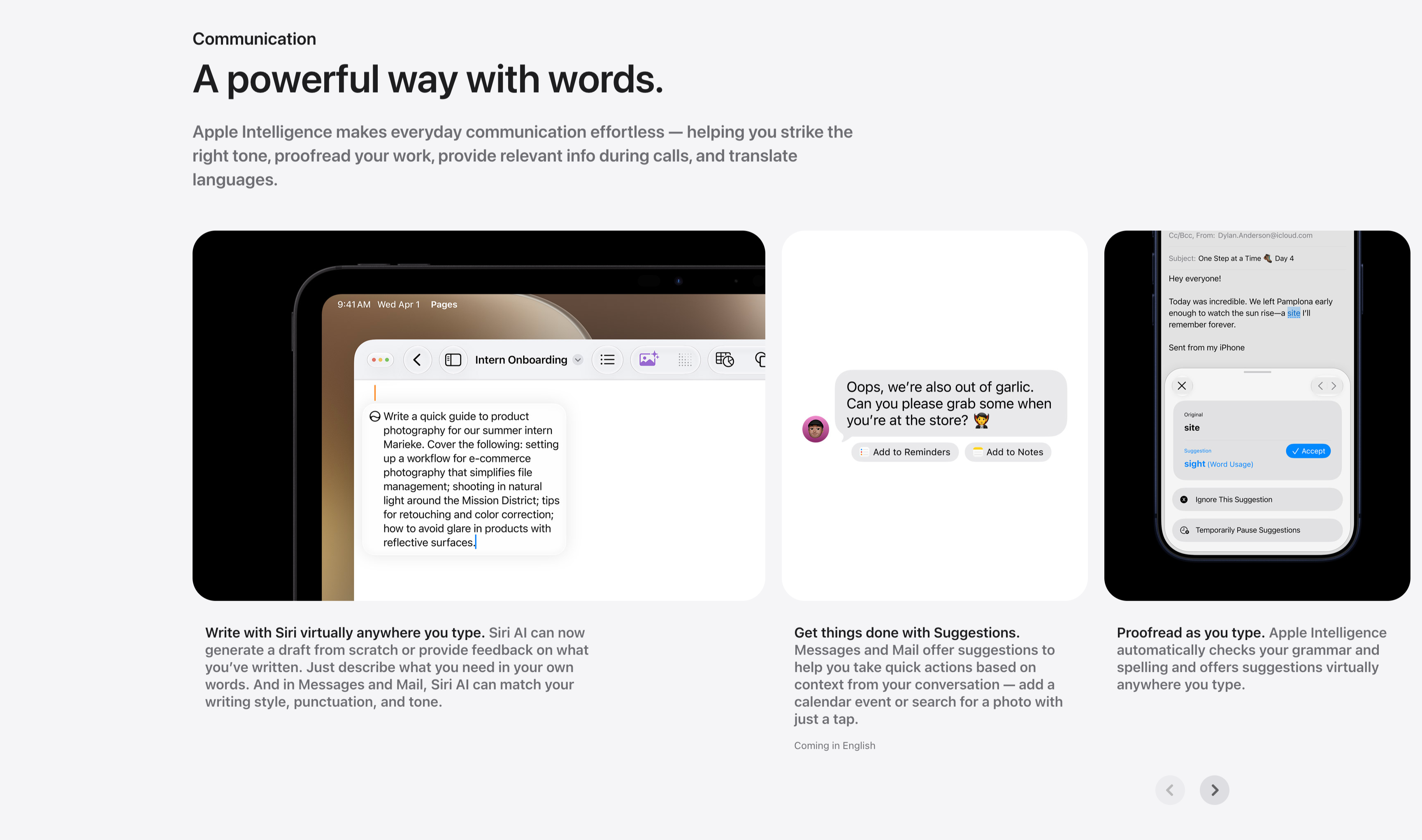
A communication feature row under a small 'Communication' label and the headline 'A powerful way with words.', with a gray paragraph about striking the right tone, proofreading and translating. Three cards sit side by side, each a screenshot with a bold-lead caption beneath: an iPad in Pages drafting a product-photography guide ('Write with Siri virtually anywhere you type.'), a Messages thread offering 'Add to Reminders' and 'Add to Notes' suggestion chips ('Get things done with Suggestions.'), and a Mail proofreading panel suggesting 'site' → 'sight' with an Accept button ('Proofread as you type.'). Circular previous/next arrows in the lower right indicate more cards. The consistent three-up screenshot layout keeps the writing-tool capabilities clear and comparable.
Apple ↗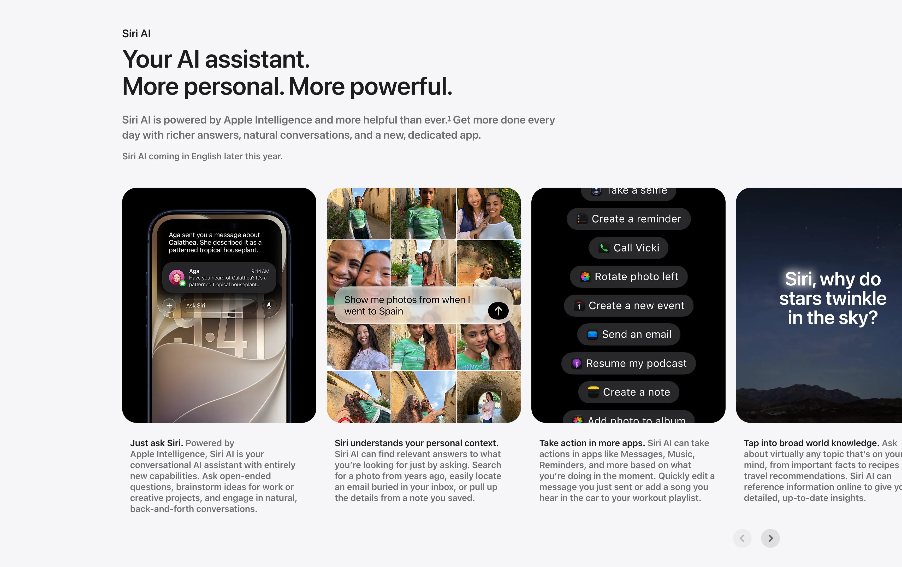
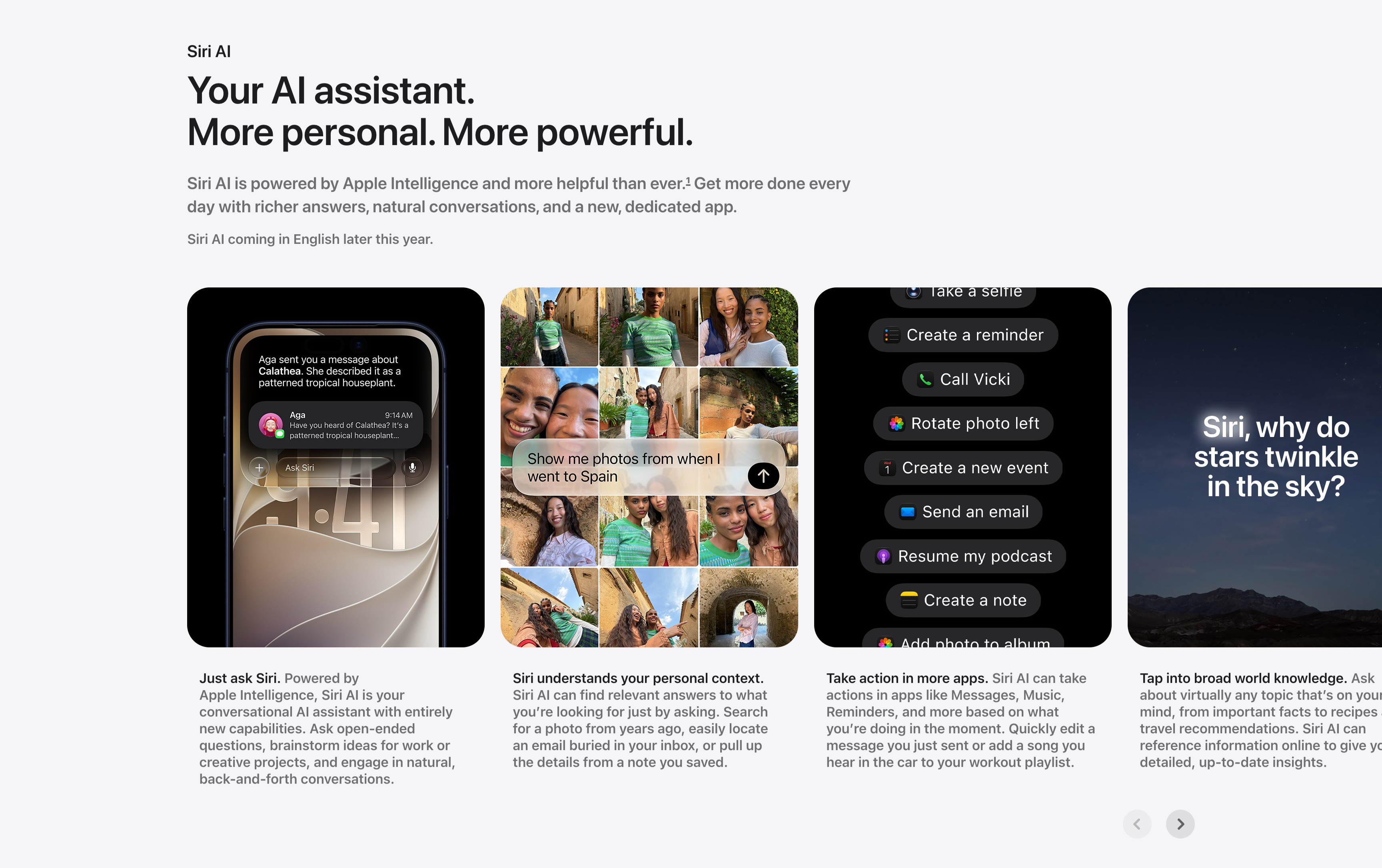
Siri AI Feature Card Carousel
A horizontally scrolling feature carousel under a small 'Siri AI' label and a two-line headline, 'Your AI assistant. More personal. More powerful.', with a gray supporting paragraph and a 'Siri AI coming in English later this year.' note. Four tall rounded cards sit in a row, each a screenshot with a bold-lead caption below it: a phone showing an 'Ask Siri' message thread ('Just ask Siri.'), a photo grid responding to 'Show me photos from when I went to Spain' ('Siri understands your personal context.'), a dark list of Siri actions like 'Create a reminder' and 'Call Vicki' ('Take action in more apps.'), and a starry-sky card asking 'Siri, why do stars twinkle in the sky?' ('Tap into broad world knowledge.'). A pair of circular previous/next arrows in the lower right confirms it scrolls. The captioned-screenshot rhythm makes each capability easy to scan.
Apple ↗